#archillustration
Explore tagged Tumblr posts
Text
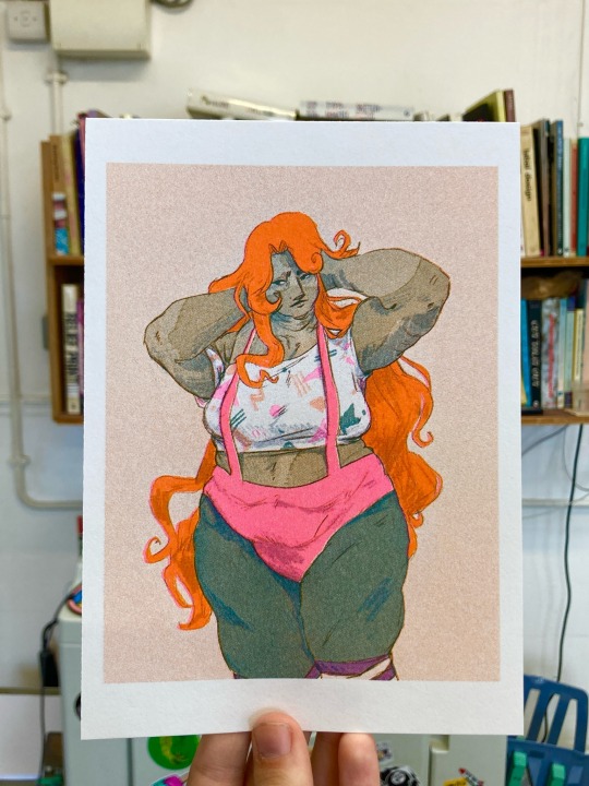
Yes, she is Riso printed. Yes, I would die for her.
Riso printed using Melon, Teal and Fluorescent Pink inks!
#zombiecleo fanart#zombiecleo#hermitcraft#archillustrates#illustration#life series#trafficblr#traffic smp#hermitblr#risograph#Riso
1K notes
·
View notes
Text
28th June ‘24 - [arch] One Page Limitation??? - My process for Traffic Zine #5

Hello All!
A couple months ago, I got accepted to @trafficzine, a digital anthology of pieces by a large group of artists and writers based on the most recent season of the Life Series. I made this piece back in April, but thankfully I kept some notes of my process.
Heads up - this contains spoilers for Secret Life :D
We were able to choose our own prompt from a list! For this project, I wanted to push my comic making - especially how to communicate a lot of information in a small space. I went through and watched a few clips from the series to see which prompt would fit a comic and settled on Scott’s death.
As usual, I began by getting some reference images and going ham on some big paper. This gets me excited about the project and helps generate ideas. I go for whatever interests me in terms of medium and subject matter, but I try to use a process that doesn’t let me control too much (in this case brush and ink)
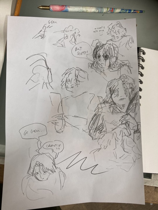
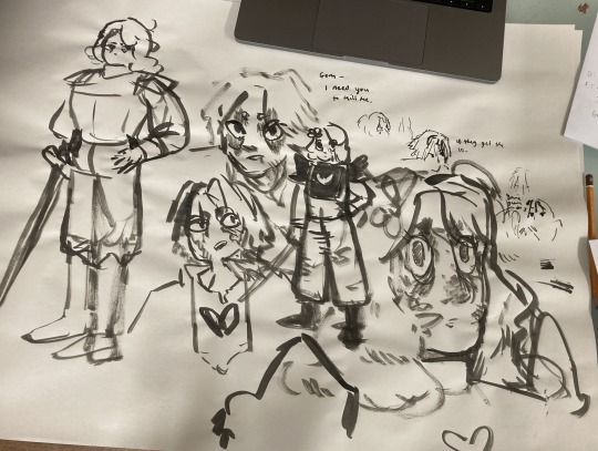
initial sketches for fun and vibes :D
During this, I also took the time to transcribe the scene - I wanted to use the dialogue directly, and see how much I could fit into the single page that I was allowed for the zine.
In these early planning stages I make sure to do warm-up sketches to remind myself of the energy I want to communicate. This also keeps things fun and fresh so I'm not ONLY thinking about page composition and making things 'good'. (the expectation for it to be 'good' kills a project prove me wrong)
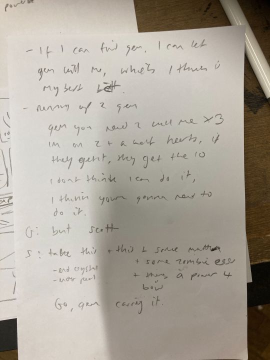
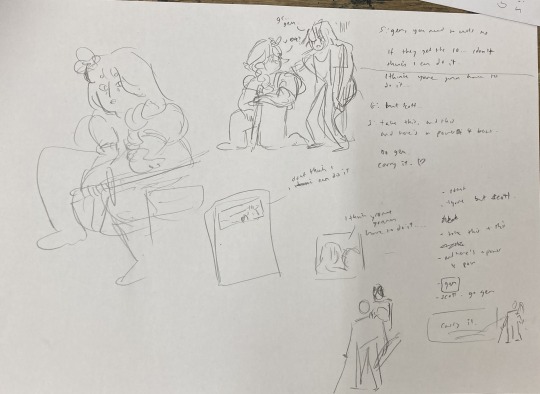
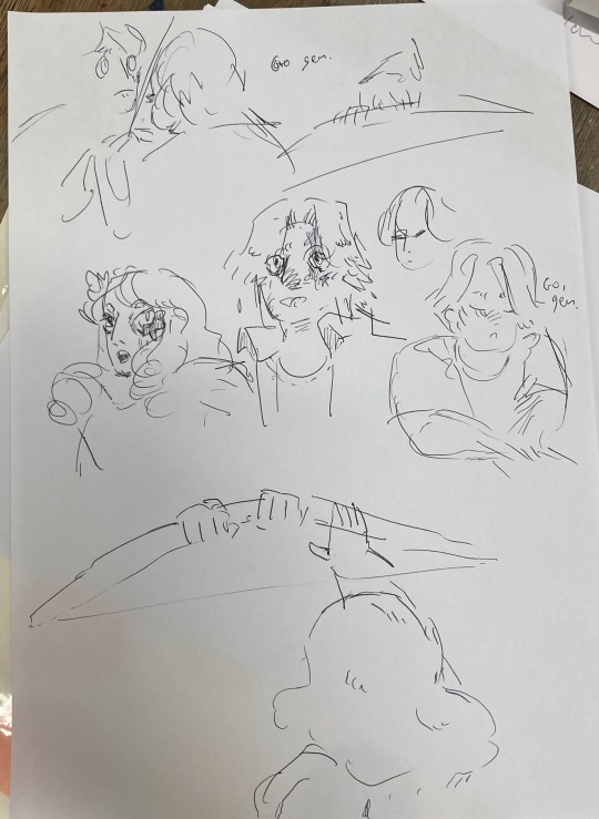
Dialogue from the clip + warm up sketches
Next up, I started to plan what panels I have on the page. At this stage, some panels might just be a box with some words, and some may have a sketch if I have a clear composition in mind. This stage is mostly for pacing and plot, so instead of focusing on what the panel and page will look like, I will think about:
what will happen in the panel
it's purpose and
what it will communicate
Sometimes I'll illustrate a string of panels that tell the story and fit them on a page after - but this depends on the project and my confidence with the size of it.
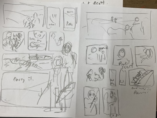
After messing around with these and coming up with a pretty clear direction, I draw a bunch of boxes to see how the panels could sit nicely together. At this stage I might realise I have too many panels, and need to cut a few or come up with a creative solution. Nothing is set in stone at this point.
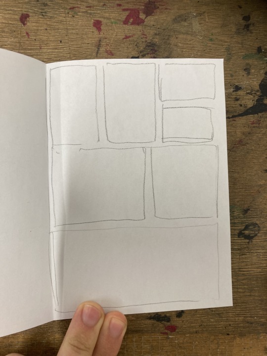
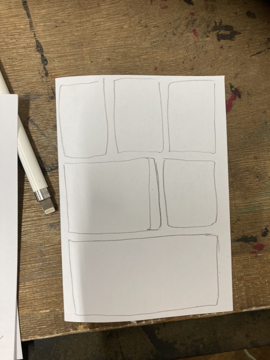
sketching panel layouts
Now begins the fun! I decide on the layout I prefer and I can start putting planned compositions into the boxes. I often do this digitally, or a digital editing process will be involved.

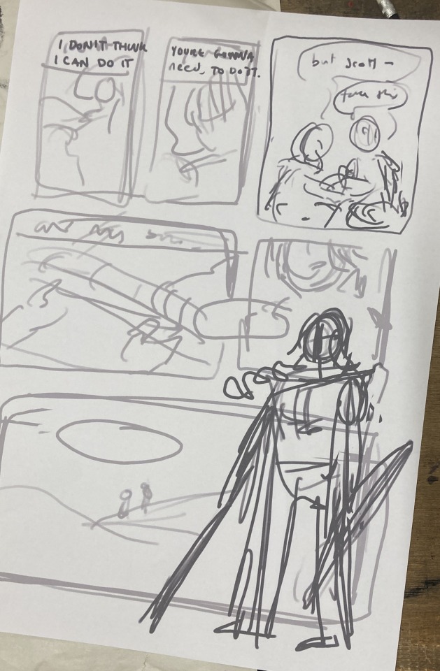
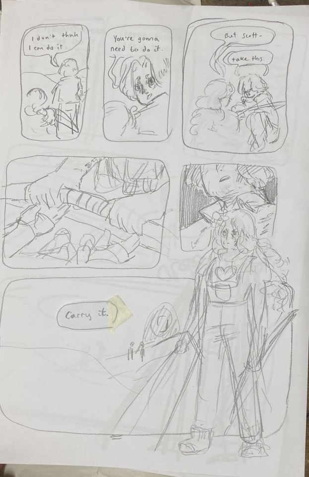
Once planned, I print these out to do a more refined sketch over. I find that my traditional drawings have a lot more life and character to them than digital ones, so I try to keep the majority of the process traditional, with passes of scanning and digital editing.


I tried a version with her looking out at the distance - ready to face the oncoming battle. But it still felt off. So I turned to my slides to ask myself some questions!!

I tried to think of more things that were working - but I really felt like it was lacking a lot. I was going for this slower emotional feeling because that came more naturally to me, but it just wasn't working for this image. The original clip is quite rushed and chaotic - which would be harder to communicate in a comic format but the challenge interested me. Either way, I knew I wasn't happy with this direction so... i decided to start from scratch! Back to the drawing board!!!
In the previous version, I had cut out a lot of the dialogue, but I decided to go back to the original clip and use AS MUCH as possible. Since passing the bow was my favourite part of that first composition, I really wanted to lean into it as the emotional height and final goodbye before Scott's death. It's a moment to slow down and absorb the vibes :D

I made a list of panels along with their descriptions to refer to when trying to figure out the order of panels. there were SO MANY and it was VERY CONFUSING when they were too small to read.
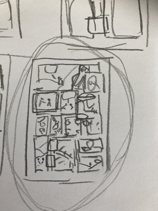
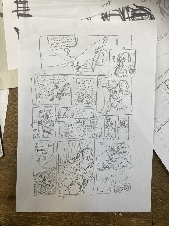
These thumbnails were super small and would not have made sense without my list, I swear.
I printed this tiny thumbnail out at A4, so I could sketch over it and get a clearer sense of flow. Then began a loooong process of printing out tiny photocopies and rearranging the panels to be legible. It was a difficult balance of communicating busyness while making sure the hierarchy/reading order made sense.


After some tweaking, i printed out an A3 copy to draw my panel borders and text.
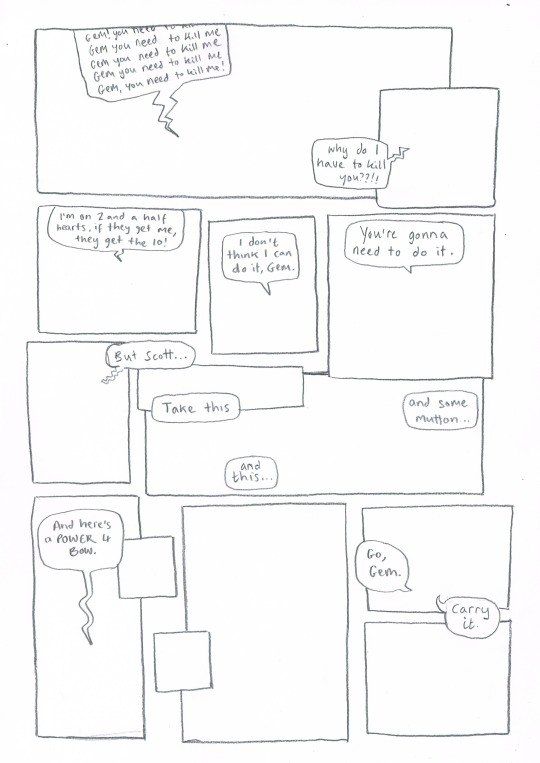
Doing this on a separate piece of paper means I don't have to worry so much about messing up the text or borders when drawing the characters. This allows me to be more free and expressive with my illustration.
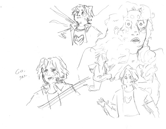
Woah! Quick trip back in time!! During the thumbnailing process I drew these warm up sketches! I looooved the way the linework came out. I drew this on an A3 piece of paper - and the shocked Gem would, in theory, be one of the smallest panels. So I decided to do a crazy thing.
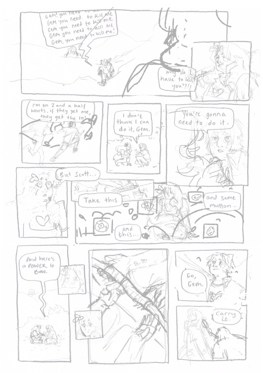
I touched up the sketch digitally, compiling some of my favourite warm up sketches, some traditional sketches made for the panels, and filling the rest in digitally. Then I printed this image out in QUATERS at A3!! This meant the final sketch layer, printed out was A1!! (aka very large, considering the final file would be at A4, about 8x smaller)
I did this so I could get fairly small detailed lines with my pencil while being quite expressive and firm with my mark-making. Slowly, I dlined all of the panels traditionally and scanned them in. Then I assembled the finished linework on Photoshop, along with the text and panel borders and got to colouring :D

final linework :D
For colouring, I played a little bit with halftone but I found the texture made it feel a bit too busy - the panels are already doing enough. Because of this, I also decided to use a limited colour palette. Here are some images of the colouring process, which I won't go into today.


I'm really happy with how this came out - I think it captures the chaos of the moment, while taking time to linger on the emotion of it. Keeping that bow moment really made it, I think.
I think the last panel is still quite weak. Earlier in the process there was a low-angle shot of Gem about to kill Scott which may have been more powerful, but I think I was struggling with my actual drawing skill when it comes to perspective. A lot of learning how to draw, and in particular with comics, is about knowing where your skills are at, how to utilise them best and how to test and push them.
I'm glad that I started again, instead of finishing that composition I wasn't happy with. It was a tough project but I learnt sooooo much from it, and it's been essential skill-building for.... the current comic I'm working on (stay tuned!!! :0) Thanks for reading this incredibly long post! Go check out @trafficzine and look at all the other cool art Cool vibes and silly men,
Archie :D
#archillustrates#arch is learning#project development#art#art process#art resource#process#artists on tumblr#illustration#comic#picture book#art blog#illustration blog#queer artists on tumblr#illustrator#female illustrator#queer illustrator#comic artist#comic art#female artists on instagram#artists on instagram#procreate#digital artwork#artist blog#artist on tumblr#web comics#tumblr art#tumblr art blog#art on tumblr#life series
143 notes
·
View notes
Text
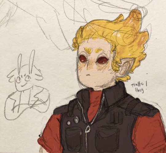
been sketchbooking more lately, and here's a tango!!
#tango#tangotek#hermitcraft#life series#traffic smp#smallishbeans#the life series#life series smp#traffic life#trafficblr#secret life smp#hermitcraft smp#archillustrates
73 notes
·
View notes
Text

@nomercifulpercival's dnd character alina whom i love very deeply
#dnd#dnd art#dnd character#dnd oc#dungeons and dragons#tiefling#tiefling oc#dnd tiefling#monk#dnd monk#original art#artists on tumblr#digital art#digital illustration#archillustrates
21 notes
·
View notes
Photo
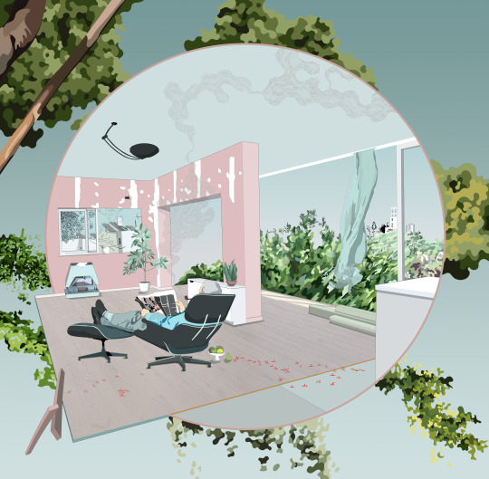
#archdraw#archillustration#illustarch#architecturaldrawing#digitalart#digital art#illustrator#photoshop#perdpective#isometricart#pale pink#smokeycolors#smokey#blue grey#surrealart#large
2 notes
·
View notes
Photo
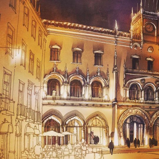
In progress... #digitalillustration #digitalpainting #sketch @wacom #cintiq #architecture #archillustration #archsketch #architecturefactor #archisketcher #illustration https://www.instagram.com/p/B7raEBjh8x8/?igshid=1tdzufpyg0yhq
#digitalillustration#digitalpainting#sketch#cintiq#architecture#archillustration#archsketch#architecturefactor#archisketcher#illustration
28 notes
·
View notes
Photo
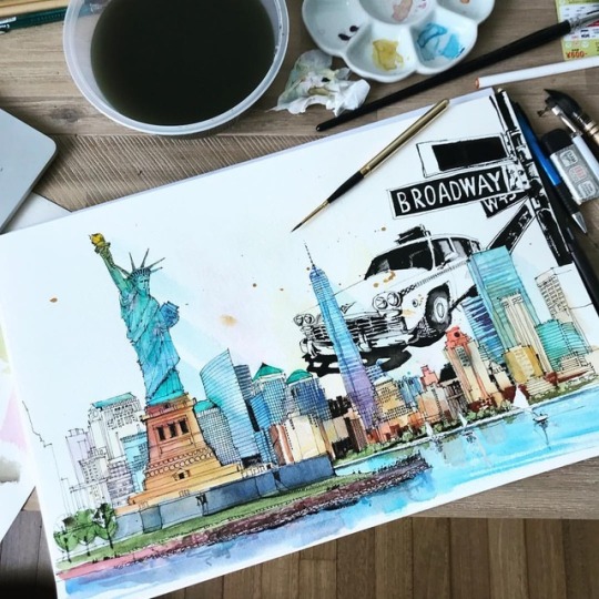
New York ❤️ commissioned drawing ... Нью Йорк, иллюстрация на заказ ... #mysquiggles_RR ... #Illustration #watercolorsketch #architecturelover #next_top_architects #arch #archmore #arch_more #arquitetapage #watercolor #illustrationnow #artfeatured #atraveldiary #sketch_arq #waterblog #topcreator #art_we_inspire #archisketcher #illustrationnow #architecture#nycab #newyorkcity #newyorkcab #newyorktaxi #statueofliberty #archillustration #archisketch #archsketch (at New York, New York)
#archillustration#archisketcher#art_we_inspire#newyorktaxi#newyorkcity#architecturelover#newyorkcab#arch#waterblog#sketch_arq#statueofliberty#atraveldiary#watercolorsketch#illustrationnow#artfeatured#watercolor#topcreator#mysquiggles_rr#archisketch#illustration#architecture#arch_more#next_top_architects#archmore#arquitetapage#archsketch#nycab
26 notes
·
View notes
Photo
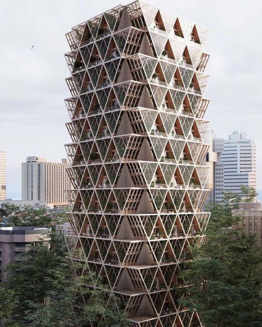
#repost • @designcitylab Farmhouse is an attempt to reconnect people in the city with the process of growing our food 🌿 Designed by @studioprecht @chrisprecht ”Our motivation for ‘the Farmhouse’ is personal. 2 years ago we relocated our office from the centre of Beijing to the mountains of Austria. We live and work now off the grid and try to be as self-sufficient as somehow possible. We grow most of the food ourselves and get the rest from neighbouring farmers. We have now a very different relation to food. A tomato from your garden tastes different then the one shipped around the globe. We are aware that this life-style is not an option for everyone, so we try to develop projects, that brings food back to cities.” In the next 50 years more food will be consumed than in the last 10.000 years combined and 80% will be eaten in cities. It is clear that we need to find an ecological alternative to our current food system. What and where we grow and eat. Topics like organic agriculture, clean meat, social sourcing and ‘farm to table’ will be key elements of this change. That means that our urban areas need to become part of an organic loop with the countryside to feed our population and provide food security for cities. If food is grown within the region, the supply chain and the use of packaging gets shortened. Stacked gardens reduce the need to convert forests, savannahs and mangroves and allows used farmland to naturally restore itself. Vertical farms can produce a higher ratio of crop per planted area. ◾Design City | www.designcitylab.com ◾Follow @designcitylab To See More ◾Turn On Post Notifications, Daily Sustainable Design News ◾Credit or Removal: DM or mail 📩 ◾Use #designcitylab to be featured #biophilicdesign #urbanfarming #architecture #archillustration #architectureillustration #conceptdesign #farmhouse #studioprecht #serra #greenhouse #landscape #landscapearchitecture #landscapedesign #farminglife #cityfarming #architecturedesign #architecturephoto #architecturedetail #arquitetura #arquitectura #arquitetas #arquitecturelovers #arquiteturaresidencial #arquitecturamoderna #arquiteturacontemporanea https://www.instagram.com/p/CWsem6WlATf/?utm_medium=tumblr
#repost#designcitylab#biophilicdesign#urbanfarming#architecture#archillustration#architectureillustration#conceptdesign#farmhouse#studioprecht#serra#greenhouse#landscape#landscapearchitecture#landscapedesign#farminglife#cityfarming#architecturedesign#architecturephoto#architecturedetail#arquitetura#arquitectura#arquitetas#arquitecturelovers#arquiteturaresidencial#arquitecturamoderna#arquiteturacontemporanea
0 notes
Video
instagram
Photoshop Masterclass: Decipher the secrets of Urban Mapping and Visualisation One of the best ways to present an urban project is by through mapping. Thus, Urban Design Lab brings you a course, where together we will create multiple maps, all the way from basic and small to large scale complex maps with integration of Photoshop, AutoCad and SketchUp. More than just lessons The masterclass will not only be a learning experience but along with the hands-on workshop session the participants will also be provided with multiple resources that can be used in their future projects: • E-certificate for all participants • Workshop manual (detailed process, tips and techniques) • Working files will be included (all base files and incorporated material) • UDL Photoshop Library (diverse PNG collection of more than 100 elements) • Assorted collection of costom brushes & textures Early Bird Registration ends on 8th September, 2021 🔗 Registration link in bio 🔗 Limited seats available Register now! Event Date: 12th September, 2021 . . Urban Design | Landscape | Architecture ▪️Follow @urbandesign.lab ▪️Get featured @urbandesign.lab ▪️Turn on post notifications . . . . . . #mapping #3dmapping #actofmapping #aerialmapping #visualmapping #allofarchi #arch #archdaily #archidaily #archigram #archillustration #archisource #archilovers #architektur #architettura #architizer #archolution #citylab #illustrarch #masterplan #masterplanning #newurbanism #townplanning #urbanarchitecture #urbanist #urbanlandscape #urbanspace #crazy_architecturee #learnupstairs #archinked (at Prague, Czech Republic) https://www.instagram.com/p/CTPPvOXHvAb/?utm_medium=tumblr
#mapping#3dmapping#actofmapping#aerialmapping#visualmapping#allofarchi#arch#archdaily#archidaily#archigram#archillustration#archisource#archilovers#architektur#architettura#architizer#archolution#citylab#illustrarch#masterplan#masterplanning#newurbanism#townplanning#urbanarchitecture#urbanist#urbanlandscape#urbanspace#crazy_architecturee#learnupstairs#archinked
0 notes
Text
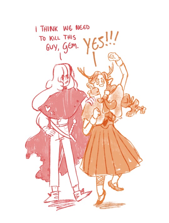
gem/pearl art as requested for @glitrahasconsumedme
based on, y'know that meme format. Based on the edit by @shinyduo
#geminitay#pearlescentmoon#hermitcraft#traffic smp#illustration#archillustrates#life series#artists on tumblr#gem/pearl#shiny duo#geminitay fanart#pearlesentmoon fanart#life series fanart#soup group#geminislay#pearlecentmoon#i think we have to kill this guy#shinyduo
4K notes
·
View notes
Text
9th feb '24 - [arch] characters, interactions and emotion - making a mini webcomic
Gahhhh Shri this has been an absolutely crazy couple of weeks!!!! Hope you are doing well :)) First of all, WOW! You have a lot of goals, and I’m sure you’ll get them done! I’ve worked a lot on my graphic design during the process of making Winter Wellbeing. If you wanna see a blog post dedicated just to that, I can do so! It would be cool to compare notes on the approaches we take for graphic layouts. If you wanna share your knowledge of camera skills when you build that up that would be awesome 😭😭
It’s been a tough few weeks, art wise. I have been reflecting on my process, motivations to create, the ego and all the baggage that’s lumped into the creative process for me. It turns out there’s a lot. I took some space from my illustration practise (literally for a weekend!) and began to realise how dysfunctional it is. I’ve been writing a lot about that so there may be a larger piece of writing coming about that at some point (no promises!!)
But for now, let's talk about little successes!
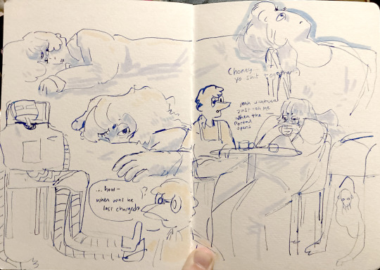
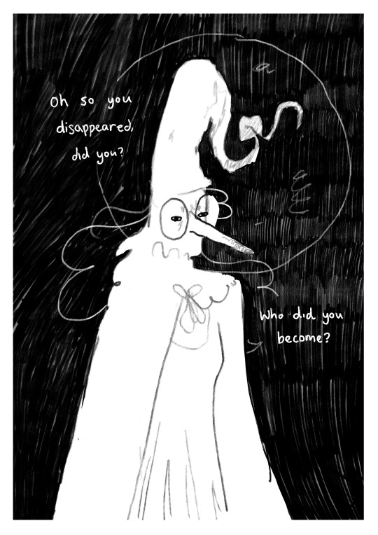
I’ve been playing with some characters for a while but I’d hit a bit of a block with the plot. I realised the expectation of having a finished project of high quality soon is unrealistic, and an unhealthy expectation to put on myself. I rarely give myself time to play with concepts for a long time and let the characters, plot and interactions evolve naturally. Maybe this in part came from sticking to the short university module turnaround. I noticed that that short turnaround was causing a lot of block, so I have decided to bench it as a comic for now and focus on using it as a playground - falling in love with the characters, creating stories and drawing them for fun. Maybe years down the line I’ll make them into a comic - we shall see!
I *tried* to do hourly comics day this year and it didn’t quite work for me. I think I made 3 comics? And then got distracted with a bigger project that ended up taking a week or so to complete. Let’s have a look at it, shall we?
[you can find the full version here]
First of all, it’s based on an unfinished fanfiction I started a couple of months ago, which was mostly bad, but there was one nice scene that I liked and wanted to expand on. I started by having a look at the script I wrote and thumbnailing on the iPad. I’m away from home at the mo and usually would prefer to do most of my artwork traditionally, but because I don’t have access to a scanner, the whole process was digital this time. A lot of the pages got scrapped because the dialogue wasn’t necessary, and I’m not drawing pages that aren’t necessary.

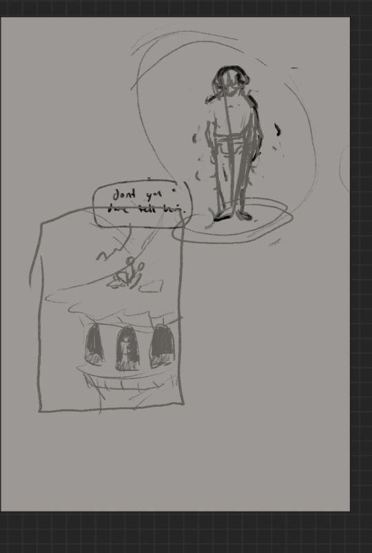
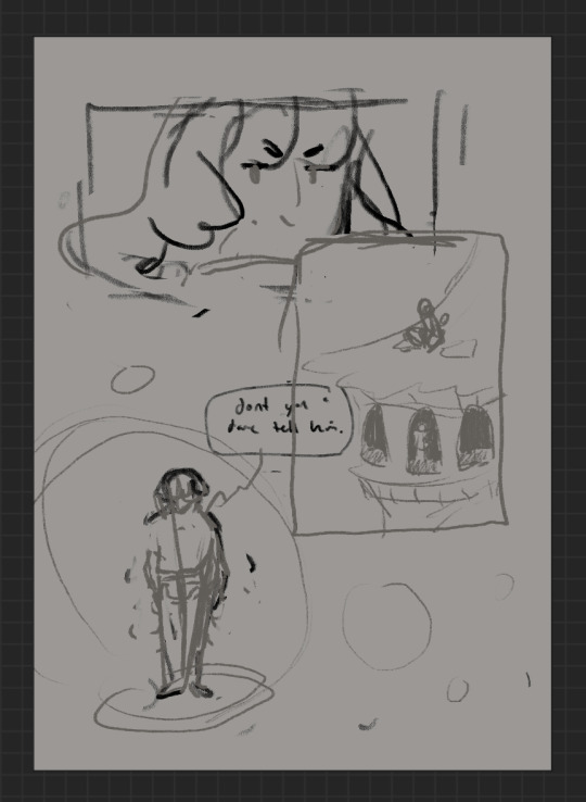
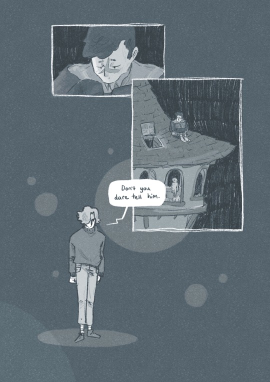
some more development screenshots
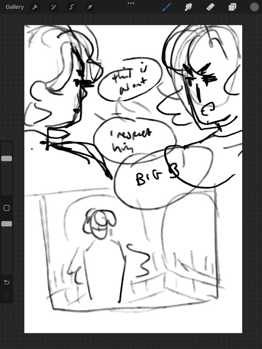

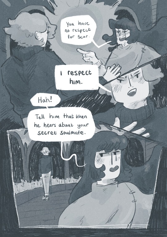
I thought a lot about posing during the process, acting the scenes out in my mind and sometimes physically, really understanding the emotions of the characters, why they’re saying what they’re saying, their tone and how to convey that though their body language and expression (i find grian really annoying normally [affectionate] but I want this grian to step on me).

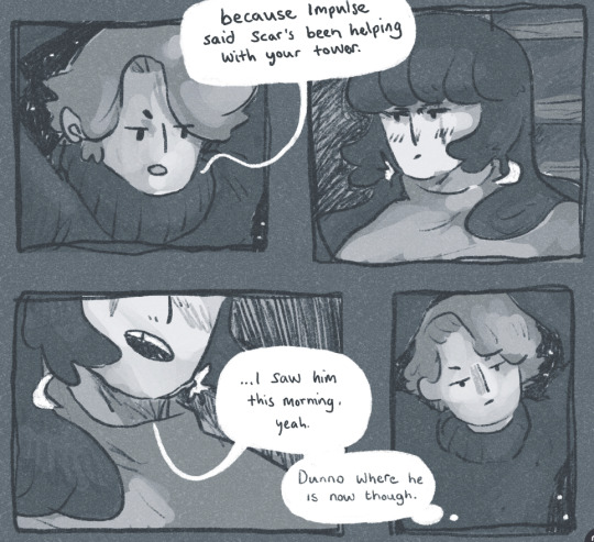
Pearl was hard with this because she’s quite erratic and unpredictable in this series, so I wanted her to switch from raw explodey anger to playful jabs at Grian. I’m hoping this comes across as somewhat insane, rather than tonally off and inconsistent. I did super enjoy drawing her and her explosive nature though, especially in comparison to Grian’s coldness.


I played with levels and monotone colour too - I’m not working with multiple colours much at the moment so I’m able to focus on things like values composition, characters and backgrounds. My skills limit the kind of stories I can tell currently, so I’m working to improve those foundations. Maybe when I’m back in the riso studio I can play with colours a little more.
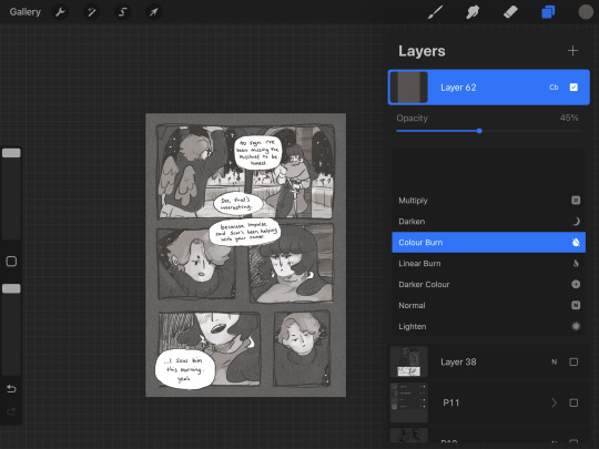
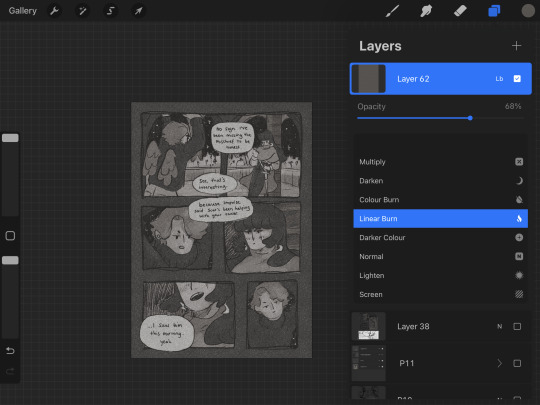
Colours - despite the simple pallete it gets a bit nerdy here.I stuck to specific flat percentages for most of it - Pearl’s hair and Grians jumper are 60%, Grian’s hair and Pearl’s cloak are 20%. Then I added a 14% layer for shadows, using a ahrd blend eraser tool for highlights, making the images quite dark. I fill a layer with texture from Forystr’s riso brush for procreate, and turn it into a 40% opacity colour dodge layer. This gives it some much needed texture and makes the lighting feel low and nighttimecore. It also pushes the values to look really nice - I tend to be too scared to push them by myself.
I tried a few different colour layers to get a *vibe* but settled on a low percentage riso blue in a colour layer. All layers besides the riso blue are in a riso black, colour picked from a riso colour pallete. I learnt these tools - using percentages to get good values - from working with risograph. I really recommend having a look at these techniques and doing some monotone work. It's really improved by character designs, page layouts and compositions.




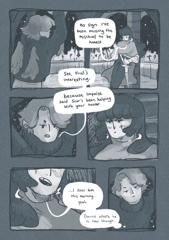
That's all from me today, though I have had MANY other thoughts over the past two weeks about creating, but perhaps we'll dive into them another time. If you (or anyone else) has any questions, hit me up with a reblog or an ask and I will get right to it. Lovely to hear from you! Hope your art is going great too :)) Arch :)
#archillustrates#arch is learning#project development#art#art process#art resource#process#artists on tumblr#illustration#comic#picture book#small art blog#art blog#illustration blog#female artists on tumblr#queer artists on tumblr#illustrator#book illustrator#female illustrator#queer illustrator#comic artist#comic art#female artists on instagram#artists on instagram#procreate#digital artwork#digital artist#artist blog#artist on tumblr#web comics
29 notes
·
View notes
Text

Colour experimentation!!! mixed media - inks, acrylic, pencils :))
I did this as a cover for my griancore playlist (wip!!)
#grian#watcher grian#life series#the life series#grian fanart#grianmc#hermitcraft grian#hermitcraft#hermitcraft 9#traffic smp#life series smp#trafficblr#secret life smp#artists on tumblr#traditional illustration#archillustrates
37 notes
·
View notes
Text

I make mixed media comics and sequential illustration. I’m super passionate about all kinds of texture, digital and traditional print and paper craft, and love to expand on traditional print formats we have (make books weird!). Also!! I love thinking about the weird fact that we’re alive and experience things?? This comes into my work a teeny bit too! I’m super excited to share my illustration journey with you :0
Big inspo: <3 In by Will McPhail (makes me cry every time I read it please check it out) <3 Natalie Andrewson’s awesome riso and colour work <3 Folky/Punk/Alt music of many kinds!! (Currently The Oh Hellos, Ball Park Music, The Beths, Jonah Corren) <3 Lizzy Stewart has my heart <3 Adventure Time <3 My wonderful beautiful D&D group
Currently obsessed with: new sibling ocs, life series, hermitcraft, thinking about what life is
Currently working on: improving anatomy and character interactions
My tags: #archillustrates - drawings n stuff #arch is learning - essays n development n thoughts!!
Links!! https://www.archillustrates.com/ - website https://www.instagram.com/archillustrates/ - instagram https://linktr.ee/archillustrates - other stuff!! @archandshri - art process blog!!
#archillustrates#arch is learning#project development#small art blog#art blog#illustration blog#artist blog#artist on tumblr#web comics#tumblr art#tumblr art blog#art on tumblr
0 notes
Photo
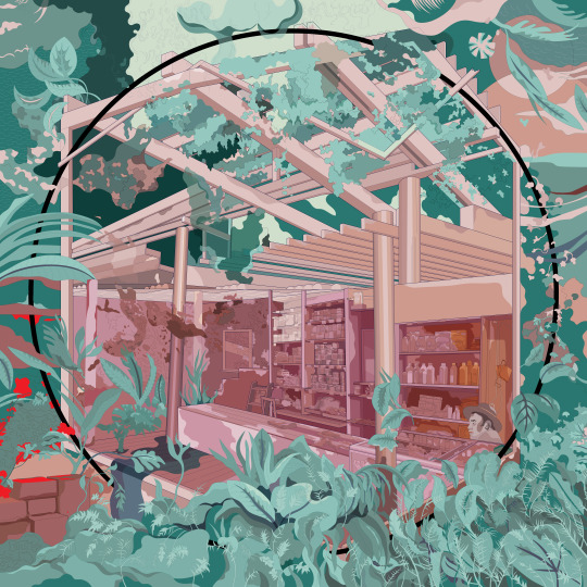
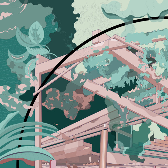
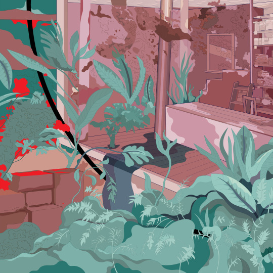
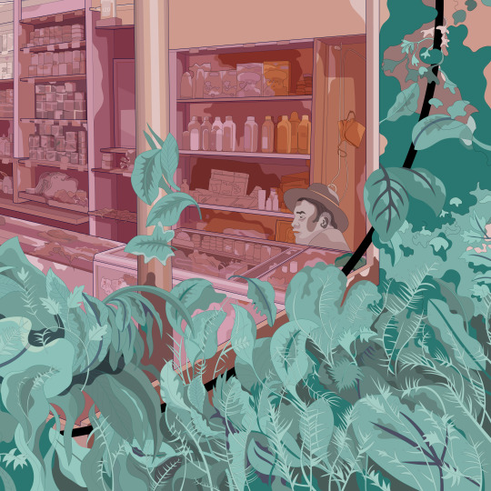
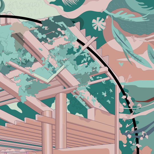
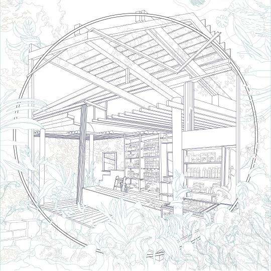
Junglome_2
#large#archdraw#archillustration#vectorart#lushwithgreenery#vibrant#junglehome#colourful#green#green and pink#lushwithvegetation
3 notes
·
View notes
Photo
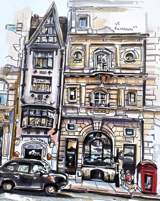
#Repost @uliana_artcollection • • • • • Лондон с разных ракурсов 🤗 #prettycitylondon #prettylittlelondon #londonarchitecture #markerillustration #markersketching #archsketch #arch_sketch #archillustration #ilovesketchmarker #sketchmarkersclub #uliana_sketching_art #скетчингмаркерами #архскетч #урбанскетчинг #иллюстрациямаркерами #иллюстрациямаркерами https://www.instagram.com/p/CKmbg2SnszB/?igshid=16rwor86k8nhm
#repost#prettycitylondon#prettylittlelondon#londonarchitecture#markerillustration#markersketching#archsketch#arch_sketch#archillustration#ilovesketchmarker#sketchmarkersclub#uliana_sketching_art#скетчингмаркерами#архскетч#урбанскетчинг#иллюстрациямаркерами
0 notes
Photo
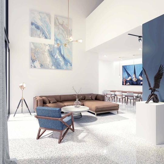
www.acercadearquitectura.com/instagram #Repost @amasarquitectos • • • • • • Xalapa, Mexico Casa Dseta / 2020 / Xalapa #casadseta . . . . . . #rendering #vray #sketch #archillustration #archisource #architecturehunter #archolution #illustration #illustrarch #architectureonpaper #architecturedesign #nextarch #architecturedrawing #desing #desinghouse #desingboom #architektur #architecture #arquitecturamx #arquitetura #arquitecturamexicana #archdaily #archdailymx #diseñomexicano #blueandwhite #xalapa #mexico #amasarquitectos https://www.instagram.com/p/CHQxIjXh_1X/?igshid=3sir8lisczm9
#repost#casadseta#rendering#vray#sketch#archillustration#archisource#architecturehunter#archolution#illustration#illustrarch#architectureonpaper#architecturedesign#nextarch#architecturedrawing#desing#desinghouse#desingboom#architektur#architecture#arquitecturamx#arquitetura#arquitecturamexicana#archdaily#archdailymx#diseñomexicano#blueandwhite#xalapa#mexico#amasarquitectos
1 note
·
View note