#artist degas
Text


Happy World Art Day! 🌍 🎨 At JSTOR, we're celebrating the vibrant tapestry of creativity that colors our world. From the studios of renowned masters to the cozy corners where emerging talents find their voice, let's honor the spaces that ignite imagination and the artists who bring them to life. Join us in celebrating the power of art to inspire, provoke, and unite us all.
Images:
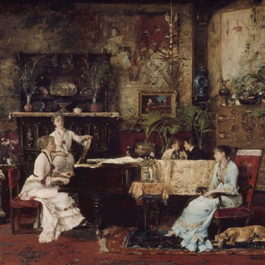
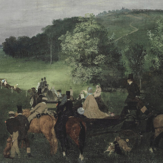
Mihály Munkácsy. The Music Room. 1878. The Metropolitan Museum of Art.
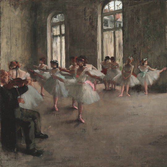
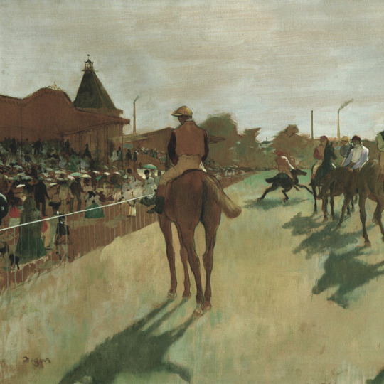
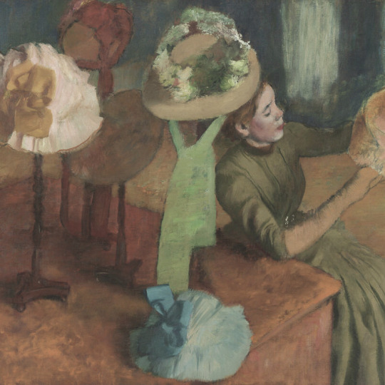
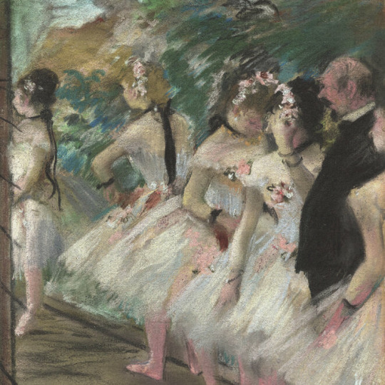
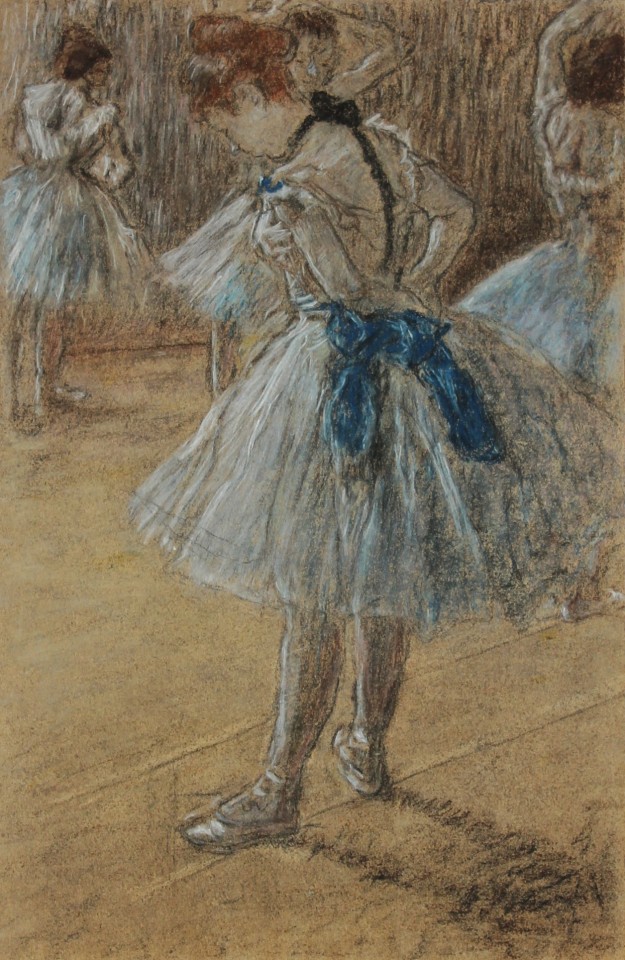
Edgar Degas. Dancers in the Rehearsal Room with a Double Bass. ca. 1882-85. The Metropolitan Museum of Art.
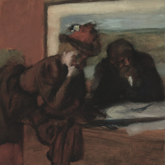
Léon Cogniet. The Artist in His Room at the Villa Medici, Rome. 1817. Cleveland Museum of Art.
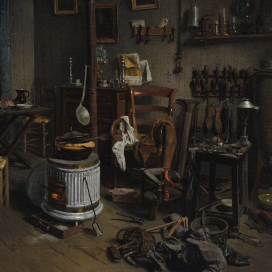
Jean-Alphonse Duplessy. Cobbler’s Quarters. 1860s. The Cleveland Museum of Art.
#jstor#world art day#artists#art#fine art#mihaly munkacsy#adolph menzel#edgar degas#leon cogniet#edited to correct a citation
227 notes
·
View notes
Text


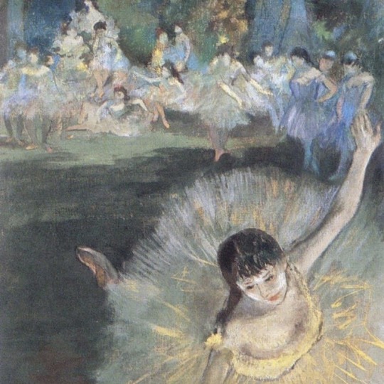
favorite artists (5/10): edgar degas (1834-1917)
167 notes
·
View notes
Text


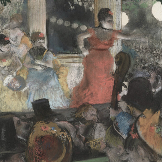
Edgar Degas, Musicians in the Orchestra, 1872
Edgar Degas, Orchestra Musicians, 1870
#edgar degas#french artist#french art#french painting#french painter#french impressionism#impressionist painter#impressionism#impressionist art#impressionist#aesthetic#musicians#orchestra#ballet#ballet art#ballet aesthetic#french impressionist#modern art#art history#tumblr art#tumblrpic#tumblrpictures#tumblraesthetic#aesthetictumblr
111 notes
·
View notes
Text

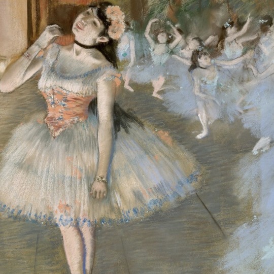
Edgar Degas (French, 1834–1917) • The Singer in Green • 1884 • Pastel on paper • Metropolitan Museum of Art, New York City
#art#painting#fine art#art history#edgar degas#french artist#impressionism#late 19th century european art#1880s art#portrait#female portrait#portraits of singers#master of color#oil painting#painting paris#pagan sphinx art blog#art blogs on tumblr#art lovers on tumblr#artwork
31 notes
·
View notes
Photo
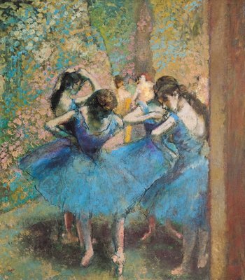
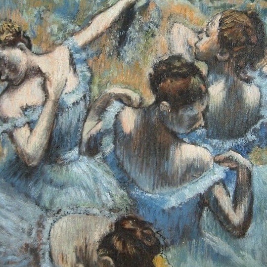
Dancers in blue, 1890 by Edgar Degas
#Edgar Degas#Degas#dancers#dancers in blue#impressionism#impressionist#impressionist art#art#artist#artwork#dancing#dance#ballet#ballerina#ballerinas#wings#blue#tutu#painting#oil painting#malerei#gemälde#kunst#kunstwerk#tanz#tänzer#tanzen#musee d'orsay#museum#art gallery
42 notes
·
View notes
Text

Collaboration with Edgar Degas
buckhead1111
73 notes
·
View notes
Text

Η τέχνη δεν είναι αυτό που βλέπεις, αλλά αυτό που κάνεις τους άλλους να δουν.
-Edgar Degas
#greek quotes#writers on tumblr#greek aesthetic#artists on tumblr#aesthetic#ελληνικά στιχάκια#blue aesthetic#ποίηση#τέχνη#αγάλματα#άγαλμα#Edgar Degas
218 notes
·
View notes
Photo

Wallace Polsom, The Hateful Promise (2023), paper collage, 20.7 x 26.7 cm.
#wallace polsom#the hateful promise#paper collage#collage#collage art#art#artists on tumblr#analog collage#contemporary art#handmade collage#handcut collage#21st century#wallacepolsom2023#surreal#surrealism#art history#edgar degas
354 notes
·
View notes
Text

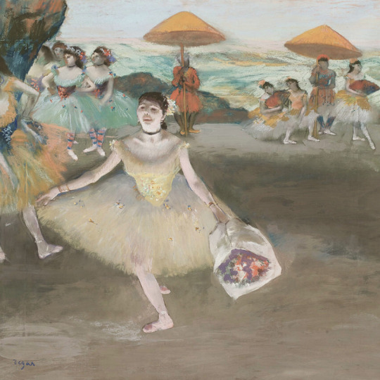
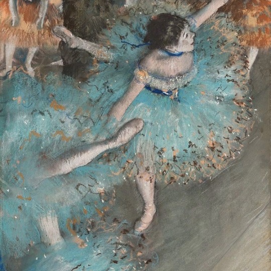
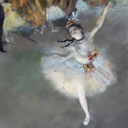
Edgar Degas (French, 1834-1917) • The Star • 1879/81 • Art Institute of Chicago
#art#painting#fine art#art history#edgar degas#french artist#ballet in artworks#impressionism#history painting#la robe blanche art blog#art blog#women in white#french painter#women in paintings
27 notes
·
View notes
Text
[APOLOGIES FOR THE DELAY- check end notes for explanations- example images should be coming in future edits]
alright, another week has passed, another anatomy class was attended. this one was actually a lot more vague than the previous, with a lot of notions previously mentioned coming back in a way or another, and based itself a lot on showcasing examples. i wasn’t able to take that many “concrete” notes this time unfortunately, but i can still distill what i have written down.
anyway. here goes:
SCENE O-2: BLOCKING IN SHAPES
repeating once, when in front of your support of choice, whether it be a sheet of paper, your sketchbook or a digital canvas (or anything, really), there is a certain series of events leading to the existence of a drawing. these events are influenced by our own personal methods when drawing, such as how you start, what do you always draw first, etc. often these are patterns you follow without noticing.
once you’ve noticed your own patterns, you may start to question them. if you always start by drawing the head, ask yourself, why do you do that?
these may come from a more subconscient part of yourself. maybe that’s how you’ve always done it, maybe you saw an artist you love do it once and that affected you so much you now do it too.
an interesting exercise you may want to do to try and break away from these habits is starting to look at the world through different filters of perception (as mentioned in the previous post). teach gave us the example of looking at strangers in the commute with a single point of view: only focusing on their ears, their nose, maybe look at them like colored shapes. (if you do not commute/use a public transports system regularly, i suggest you try looking for references online, whether they be youtube videos or life model sites like quickposes or lineofaction. these two will be linked below.)
but, in any case, during this class (the one i am attending, i mean), there is one big first step which is: drawing the whole model in its simplest form.
usually, when doing just that, there are twoe factors to keep in mind:
Composition
Setting things up
to start, let’s talk about composition.
when composing an image, yet again, you have to think about certain factors (subfactors of factors! wow!). these generally are:
the 2D-3D perception of your drawing
knowing how and where to place your drawing within your canvas
negative spaces and the void
when drawing in structures (aka using inner “skeleton” lines at the very start) the drawing itself is existing only within a single dimension (1D). when drawing using “shapes” (aka at least three points connected to each other) the drawing transforms to become 2D. 2d adds a dimension of “thickness” to the piece, since you’ve now added a new dimension.
seeing the world in 2d is similar to seeing it like certain painters do: with the aforementioned “shapes” now colored flat, before starting to add in lights.
when drawing, proportion checking is actually done in 2D, and not in 3D (as you might, maybe think). think of it as very simple forms bound by lines. adding in volume is a very risky move, since it adds the notion of distance (“what is closer/what is farther away”), which can be too detailed for the simple block-in stage.
when thinking about this, you should also think about where you place your drawing within your canvas. when you are drawing, you are composing an image. drawing a character close up and standing in the bottom right corner of the page gives a whole other impression than if you were drawing it small, in the middle of the page.
when creating images, these images usually have a meaning, and this whole meaning and wanted feeling you want to transmit is heavily affected by composition.
when a more “academic” artist first thinks and thumbnails their piece, they may think “where will i place the horizon line?” which in itself is the very first step of composing your drawing.
the way you place your horizon line gives away most, if not all of your intentions with this piece.
finally, “void” and “negative spaces” in a drawing are part of what makes it legible and interesting. it is heavily tied to the concept of “silhouette”, and, with good placement within the canvas, adds a lot to the piece. but when drawing a model, these “negative spaces” are here to help you draw the correct proportions: the triangle formed by the arm and elbow when a hand is placed on a hip, the space between legs when the model is standing up, all this should be taken into account when drawing.
but, when drawing, you should pretty much mostly worry about drawing the “general shape” of the model, but accurately, as always, which in turn transforms into a general view of your drawing. in terms of additional things you may want to do when thinking about the composition and proportions of your drawing, you can always
try drawing “over” your model (simply put, hold your pencil over the model while trying to see important lines to draw, whether they be action lines or countour lines)
thumbnail your drawings using your fingers (putting them in a square shape framing the part you want to draw) or a template (like a card that’s been gutted to form a thumbnail viewer)
if you want to transfer your drawing to another surface, you can trace a grid over the sketch and use it as a guideline for the transferred piece (this technique is called “mise au carreau” in French and i cannot for the life of me find the english term, i’m afraid). this is a technique that’s been used since pretty much the beginning of “western fine arts” (aka stuff from the Renaissance era).
now, let’s get to the meat and potatoes:
setting up your drawing
when setting up your drawing, the ideal should be to do so with as little lines as you can. this can prove especially hard, especially when drawing a model from life.
what you can do is stop seeing the model’s body as a body, and more as a series of geometric shapes set one next to the other. (this does sound fairly dehumanizing, but don’t be afraid! the humanity should still exist within the shapes you draw, and will appear even more once the proportions are corrected and the details are added in.) the moment you add another line, you are adding in measures, proportions, and direction to your drawing.
your base should have a limited number of lines, but, as always, they should be proportionally accurate.
“i am simplifying and always checking my shapes”, pretty much.
(i think i am going to make you hate the concept of proportional accuracy with all the emphasis i put onto it… sorry!)
a small tip when drawing these shapes: draw them lightly! the block-in should ideally be very light for the later parts to be drawn with more force. (teach compared it to an architect’s plan, but i yet again cannot attest to the validity of this claim as i completely lost interest in architecture the moment i found out about Bravely Default and how cool the Job designs were. anyway,)
alright, so the rest of my notes are mostly about “mistakes you should avoid”, and given this is coming from only one person, whose ideas are being transferred by another (who is obviously much less skilled) to a post to be seen by others, you can see that this can rapidly become an opinion-piece about “what is good in drawing and what is wrong” (you know, kinda like youtube thumbnails with two drawings, one “bad” and one “good” posted by certain art youtubers…you know what i mean, right?)
so, i am going to share them, but do keep in mind that these are even more subjective than anything written before, so, as always, take them with a spoonful of salt.
so, these are:
drawing using very short lines, the kind that makes for a “hairy” looking drawing
pushing too hard on your pencil (see the paragraphs above for reasons, with the added reason of being really hard to erase afterwards and often leaving a dark mark after having been erased the best possible)
relying solely on lines for proportions, aka using one line as a reference, then adding up more lines until you think you are done, which nets you the risk of having a badly proportioned drawing by the end. (this is something weirdly common when drawing as a whole, but that especially shines when drawing architecture, in my own experience both drawing and looking at my classmates’ drawings).
fuzzy/blurry lines, which can strip the drawing of precision, adding noise where it isn’t needed. this doesn’t really apply if you only draw over the line only a couple of times, or is rather moderate, doing so has its own name in French which is a “repentir” (masculine word, i wonder if there is an English equivalent. “repentir”, aka repenting your other line with a more accurate one. “repent motherfucker!” )
a final note that i think is worth sharing is this one:
there is a whole system of proportional setups, multiple methods, but the more important thing is
i understand what i am doing
well, that should be about it for this week (or rather last saturday, oops). for some reason i have gotten exhausted these last handful of days, and i don’t even know thanks to what god i was able to wake up to attend class this week. it was only the second, too!! really would’ve been upsetting if i couldn’t have attended. but it didn’t happen, fortunately. next week should be about correcting your mistakes and proportions.
and, just like last time, all these notes are from a class by Mr. Francis Buchet i am attending to at the Académie de la Grande Chaumière. if you live close to/in Paris, i suggest you look up what classes he is going to be teaching, as a live class is always a lot better than simple notes written down by a student.
and, may i remind you (again): these notes are only here to showcase one approach among many others, so they don’t mean much in the grand scheme of things. i myself am in absolutely no way a professional, so please, take all of this with a grain of salt (or a spoonful, even). draw how you enjoy drawing, and find happiness in the way you want to draw.
Francis Buchet's instagram: x
[NOTE: this was written last weekend, in the hopes of being posted during a weekday with some added visual examples, but due to school as well as health related issues (physical exhaustion among others) i couldn't get to draw said examples in time, so i decided to just go ahead and post it without any and add them later via edits. is this a good idea? no, but i do not think i can give good examples when my shoulders feel like they'll drop from my torso. i cannot say when part 0-3 will be posted but i hope it will be quick. exhaustion is a bitch but i hope i can still manage eventually.]
#art tips#artist tips#art tutorial#art help#drawing tips#wow this ended up being even less concrete than the last one#ooooooh the magic of basing yourself off examples#teach mostly showed us Klimt; Egon Schiele and Degas as well as a bit of Sargent#i still apologize for the lack of personal handmade examples#and the huge delay#breating feels more difficult than it ought to sometimes yknow?#ah well#will do my best to get part 0-3 up before next weekend#no promises tho. sorry
24 notes
·
View notes
Text

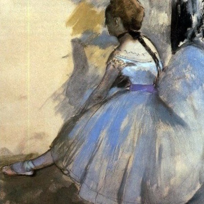


Artists: Edgar Degas (1834 – 1917)
#edgar degas#ballet#balletcore#dancers#impressionism#impressionist art#french artists#french impressionism#fine art#european art#blue aesthetic#pastel aesthetic#pastel art#lights camera action#contemporary dance#impressionist#ballet aesthetic#ballet academia#light academia#light academia aesthetic#artists
61 notes
·
View notes
Text

Edgar Degas
Absinthe (Originally ’Dans un Café’) (The Absinthe Drinker or Glass of Absinthe)
1875-1876
#edgar degas#absinthe#green fairy#impressionist painter#impressionism#impressionist#french art#french artist#french painter#french painting#cafe scene#cafe aesthetic#art on tumblr#aesthetic#modern art#art history#tumblr art#beauty#tumblrpictures#tumblrpic#aesthetictumblr#tumblraesthetic
66 notes
·
View notes
Text

Edgar Degas (French, 1834-1917) Achille De Gas in the Uniform of a Cadet, 1856/57, National Gallery of Art, Washington, D.C.
Degas is often regarded as an impressionist by association, though technically he differs from the impressionists. He continually belittled their practice of painting "en plein air".
"You know what I think of people who work out in the open. If I were the government I would have a special brigade of gendarmes to keep an eye on artists who paint landscapes from nature. Oh, I don't mean to kill anyone; just a little dose of bird-shot now and then as a warning."
- Edgar Degas
#degas#edgar degas#art#painting#fine art#art history#portraiture#portrait#portrait painting#realism#impressionism#french artist#19th century art#19th century painting
57 notes
·
View notes
Text
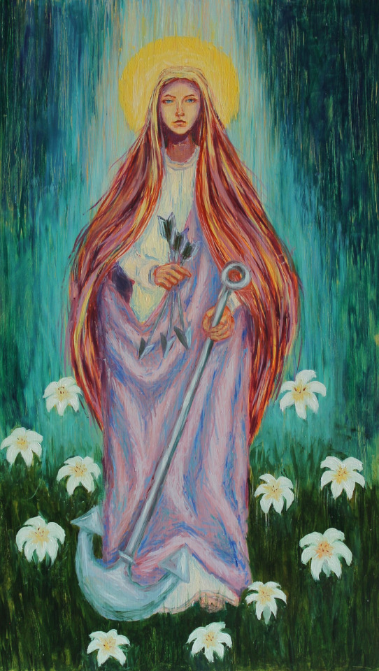

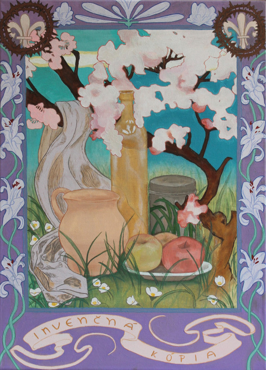


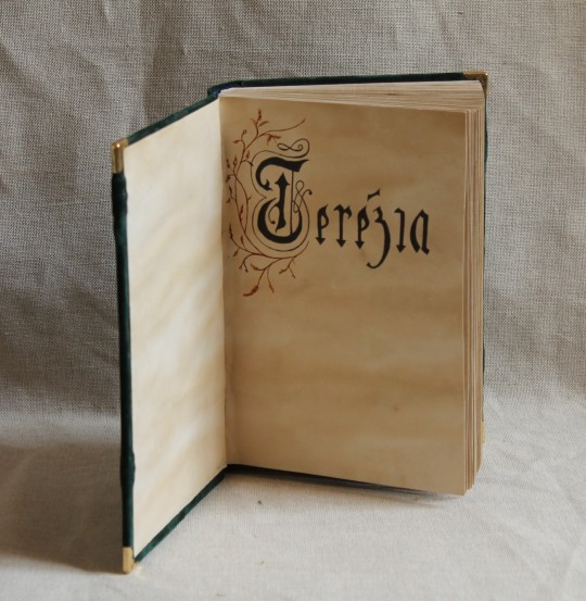
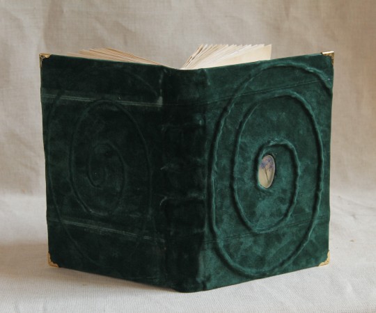
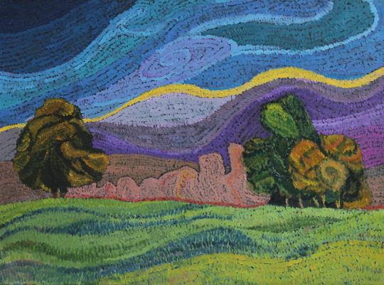
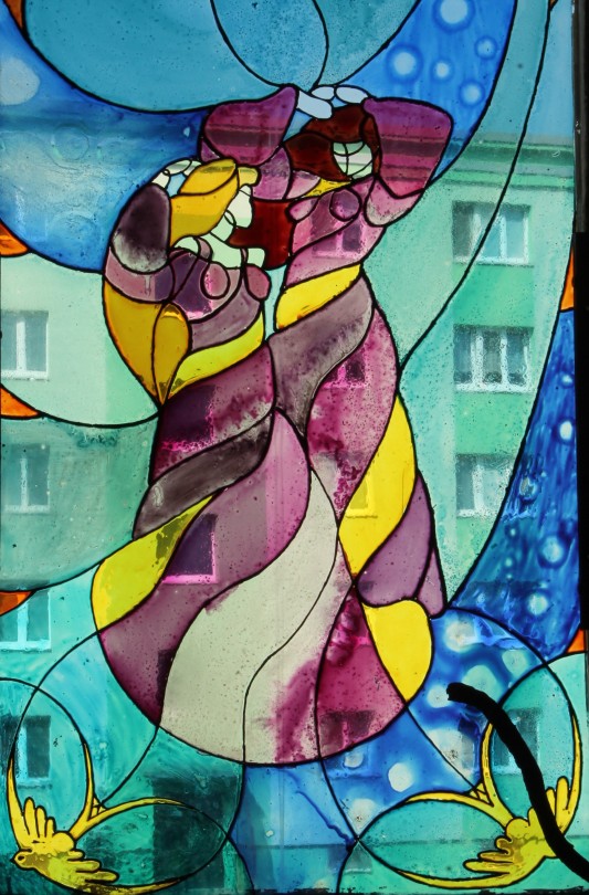
My portfolio
#artwork#art#small artist#portfolio#school work#my art#stained glass#watercolor#oil painting#dry pastel#charcoal#book binding#own design#my artwork#illuminated manuscript#my portfolio#portrait#facsimile#inventive#edgar degas#oil on canvas#alfons mucha#still life#tempera painting
10 notes
·
View notes
Text
Mary Cassatt was born #OTD (22 May 1844 - 15 Jun 1926).

Mary Cassatt
Little Girl in a Blue Armchair, 1878
oil on canvas
89.5 × 129.8 cm (35 1/4 × 51 1/8 in.)
National Gallery of Art
The cute dog in her famous 1878 painting Little Girl in a Blue is Baptiste, a Brussels Griffon she got through her good friend and fellow Impressionist artist Edgar Degas (1834-1917). She became a devotee to the breed thereafter and you can find them in a number of her other works! (The girl was a daughter of a friend of Degas' too.)


#Mary Cassatt#Edgar Degas#Impressionism#French Impressionism#19th century art#European art#National Gallery of Art#OTD#birthday post#dog#dogs in art#Brussels Griffon#pet#famous pets#painting#oil painting#child#dog breeds#women artists#animals in art
12 notes
·
View notes
Photo

Wallace Polsom, Angel of the Morning (2022), paper collage, 20.5 x 25.5 cm.
#wallace polsom#angel of the morning#paper collage#collage#collage art#art#artists on tumblr#analog collage#contemporary art#handmade collage#handcut collage#21st century#wallacepolsom2022#surreal#surrealism#art history#edgar degas#defamiliarization#recontextualization
117 notes
·
View notes
Last Seen Blogs

dragongutsixofficial
Dragon Guts


elekinz
get ready for some SMOOTHIE MOVES

sirenjose
IDV Analyses, Theories, and Other Nonsense

codyhogan
Untitled