#as to create a canvas for viewer desire and fantasy
Explore tagged Tumblr posts
Visit Tumblr Blog
Explore Tumblr blogs with no restrictions, modern design and the best experience.
Last Seen Tumblr Blogs


Fun Fact
The “We are the 99%” Tumblr blog became the slogan for the Occupy Wall Street movement.
Text
the more i read about the construction and deliberate engineering of celebrity the more it becomes painfully transparent how cynical the idol business is
#finding out that idols were deliberately selected and engineered to be talentless but attractive at first blush#as to create a canvas for viewer desire and fantasy#and this was perfected as a practice back in the mid aughts is crazy#really puts every piece of hallucinatory vtuber fan art into perspective
35 notes
·
View notes
Text
Elevate Your Erotic Imaginations with AI Artistry!

In a world where technology continually evolves, it's no surprise that even the most intimate aspects of human experience are being touched by innovation. Enter the realm of AI artistry, where the boundaries of creativity are pushed beyond limits, and eroticism finds new expressions. From tantalizing visuals to provocative narratives, AI-generated erotic art offers a unique opportunity to explore the depths of desire and fantasy in ways previously unimaginable.
Unveiling the Canvas of Imagination:
Art has always been a conduit for exploring human desires, and with AI, the canvas of imagination expands exponentially. Using algorithms trained on vast datasets of images, texts, and human preferences, AI can create visuals that evoke a spectrum of emotions, including those of a more sensual nature. These images transcend the limitations of traditional art forms, offering a glimpse into fantastical worlds where passion knows no bounds.
Breaking Taboos and Embracing Liberation:
Erotic art has often been shrouded in taboo, relegated to the fringes of society. However, AI artistry provides a platform for breaking free from these constraints, allowing individuals to explore their desires without judgment or stigma. Whether it's through surreal landscapes or abstract compositions, NSFW AI invites viewers to confront their inhibitions and embrace the liberation that comes with self-expression.
The Intersection of Technology and Sensuality:
Technology and sensuality may seem like unlikely bedfellows, but AI artistry seamlessly merges the two, creating a harmonious fusion of the digital and the sensual. Through the use of machine learning algorithms, AI can analyze and interpret human preferences, crafting artworks that resonate on a deeply personal level. Whether it's a subtle suggestion or an explicit depiction, AI artistry navigates the delicate balance between titillation and tastefulness with finesse.
Beyond the Visual:
While AI-generated images may capture our attention, the true power of erotic AI art lies in its ability to stimulate the imagination. Through interactive storytelling and immersive experiences, AI can transport us to worlds where our deepest fantasies come to life. From virtual reality simulations to choose-your-own-adventure narratives, AI-driven erotic art offers a level of engagement that transcends passive observation, inviting viewers to become active participants in the creative process.
Exploring Boundless Possibilities:
The beauty of AI artistry lies in its endless possibilities. With algorithms constantly learning and evolving, the realm of erotic AI art is limited only by our imagination. From exploring different cultural perspectives on sensuality to experimenting with new forms of expression, AI opens doors to uncharted territories of erotic exploration. Whether you're a seasoned connoisseur or a curious newcomer, there's always something new to discover in the world of AI-generated erotica.
Ethical Considerations:
Of course, with any emerging technology, ethical considerations must be taken into account. As AI continues to push the boundaries of creativity, questions arise about consent, privacy, and the impact of AI-generated content on society. It's essential to approach the creation and consumption of erotic AI art with mindfulness and respect for ethical boundaries, ensuring that all parties involved are treated with dignity and agency.
Conclusion:
In a world where technology permeates every aspect of our lives, AI artistry offers a fresh perspective on erotic expression. From stimulating the senses to challenging societal norms, AI-generated erotica invites us to explore the depths of desire with newfound curiosity and imagination. As we continue to push the boundaries of creativity and innovation, the intersection of technology and sensuality promises to be a fertile ground for exploration and discovery. So why not take a leap into the realm of AI artistry and elevate your erotic imaginations to new heights? After all, the only limit is your imagination.
1 note
·
View note
Text
Unveiling the Art of Photoshop Manipulation: A Creative Journey
In the era of digitalization, where visual content is king, the art of Photoshop manipulation photo has become an indispensable skill for photographers and graphic designers alike. This transformative technique allows artists to push the boundaries of reality, creating stunning and surreal images that captivate audiences. Let's delve into the world of photo manipulation in Photoshop and explore the creative possibilities it offers.
The Basics of Photoshop Manipulation
At its core, Photoshop manipulation involves altering and enhancing photographs through digital means. This can include combining multiple images, adjusting colours, manipulating textures, and employing various filters to achieve the desired effect. The procedure calls for acute attention to detail and a mastery of Photoshop tools, enabling artists to seamlessly blend elements and create visually striking compositions.
Creating Surreal Landscapes
One famous avenue for photo manipulation in Photoshop is the creation of surreal landscapes. Artists can transport viewers to fantastical realms by merging disparate images of nature, architecture, and fantasy elements. Through careful blending and manipulation, a mundane landscape can be transformed into a breathtaking scene that sparks the imagination. The possibilities are limited only by the artist's creativity and skill.
Enhancing Portraits with Artistic Flair
Beyond landscapes, Photoshop manipulation and photo techniques are frequently employed to enhance portraits with an artistic flair. From subtle retouching to more elaborate transformations, artists can manipulate facial features, add or remove elements, and play with lighting to achieve a desired mood or style. This opens up new possibilities for photographers looking to elevate their portraits to the realm of fine art.
The Ethical Considerations of Photo Manipulation
While Photoshop manipulation offers a canvas for creative expression, it also raises ethical considerations. The line between enhancing reality and distorting it can be thin, prompting discussions about the authenticity of images. It is crucial for artists to navigate this terrain responsibly, ensuring transparency when their work involves altering the truth. Finding a middle ground between creative freedom and moral integrity is key in the world of photo manipulation.
The Evolution of Photo Manipulation in the Digital Age
Digital technology's introduction has had a significant impact on the evolution of photo manipulation. With the rise of advanced software like Adobe Photoshop, artists now have powerful tools at their fingertips. The accessibility of these tools has democratized the art form, allowing aspiring creatives to explore and hone their skills. As a result, the digital landscape is brimming with a diverse array of manipulated images, each telling a unique visual story.
Pushing the Boundaries of Imagination
Photo manipulation in Photoshop has become a playground for pushing the boundaries of imagination. From mind-bending distortions to dreamlike compositions, artists continually challenge the conventions of reality. This form of artistic expression not only holds the attention of spectators but also acts as evidence of the limitless possibilities afforded by digital technology. It is a celebration of creativity unencumbered by the constraints of the physical world.
Conclusion:
In conclusion, it has transformed the way they perceive and interact with visual content. As creators persist in pushing the limits of creativity, the world of photo manipulation in Photoshop evolves and expands. For individuals looking for motivation and a venue to display their work, photomanipulation.com stands as a dedicated space for enthusiasts to connect, learn, and celebrate the artistry of photo manipulation. Take advantage of the possibilities, use your creativity freely, and let photomanipulation be your guide in this captivating journey of visual storytelling.
Blog Source URL:
0 notes
Text
Fiona Rae

Fiona Rae, Cinderella plucks my magic garment, oil on canvas, 183 x 129.5cm, 2017
Fiona Rae, Sleeping Beauty cools the air with sighs, oil on canvas, 183 x 129.5cm, 2017
The colourful chaos offers a profusion of visual choices for the viewer, generating fantastic worlds stimulating complex desires and emotions. The names of the artworks remind me of the princess story from Disney, which further recalls the fairy tales I read in my childhood. Through research, I discovered that Fiona Rae's abstract-pop universe is filled with references to contemporary painting, digital technology, and pop art culture. Walt Disney is one of the figurative elements that Rae borrowed in her artwork. The elements, including contemporary visual culture, data, and signs, are not primarily related to me. However, the colour, impressions, atmospheres and how she explores the possibilities of painting have inspired me, as lots of my inspiration of my artwork comes from childhood memories, dreams, and fantasies. I want to explore how to use, explore and express them better through the discovery of painting. Rae’s combination of abstract components, biomorphic forms, kaleidoscopic colours, and dotted and lash-like lines create a mashing and melding of successive levels. Through exploring the potential of painting, every piece directs the viewers towards the cartographic space of a mental and physical utopia.
1 note
·
View note
Text
Art History 06/10/2020
Although Leonid Afremov claimed to be influenced by a myriad of artists – including March Chagnall and Modigliani – his style is unique and cannot be confused with others. However, when I first discovered Afremov’s work, I was reminded of Van Gogh in the emotive way that he applies paint, and how they both share such distinctive and instantly recognisable styles, although they are vastly different in subject matter and approach. In the way that the yellow café in ‘Terrace of the Café’ by Van Gogh provided somewhat a welcoming haven for the artist himself in the painting, I think that Afremov’s work is also a haven: his pictures lend the opportunity to spend some time getting lost in compelling urban landscapes and let time slow down, if only for a little while.
Considered to be one of the greatest and best-known modern art impressionists of all time, recently deceased Russian-Israeli artist Leonid Afremov’s paintings have been declared beneficial to mental health by notable psychologists and psychiatrists. The first time I saw his work I felt this - they are genuinely mood-altering. This is one of the many reasons I love and admire his paintings so much.
I chose his painting ‘Evening Close Encounter’ because of the way that it catalyses a narrative in the viewer’s mind. Additionally, unlike some of his monochrome pieces that invoke loneliness and lack, this one is amazingly uplifting and beautiful. ‘Evening Close Encounter’ is a 75cm x 60cm oil on canvas. His use of impasto with a palette knife is expressive and gives a unique edge to his paintings that I love. I think that this post-impressionist urban landscape is picturesque and evocative.
In the foreground of the detailed composition are two figures, mostly in shadow. They are both holding umbrellas above them and by their stance it is clear that they are engaged in conversation. Most of the other people in the image appear to be walking along the rain-soaked plaza, whereas the main subjects are still. Additionally, aside from one figure close behind them, walking away, all of the other people are very far away, drawing our attention to them in the way that an author would introduce their protagonists in a novel.
On the left of the image, where the couple are stood, the colour palette is warm and the leaves on the trees have a myriad of bright yellows, purples, oranges, blues, pinks and reds. The colours on the trees are unusual, perhaps suggesting the many shades of Autumn but potentially an idealistic nod to an almost fantasy-like world.
The right of the image is a lot colder: the trees are bleak and without leaves and blue light floods out from the shop windows. The fact that the two people are away from the buzz of the Highstreet, and other people, shows how they are so engrossed in their encounter that they have stopped to talk to each other instead. However, the right of the image isn’t totally lacking warmth due to the intense orange and yellow nimbuses around the streetlights.
There is a vast tonal range from the bright reflections of the streetlights on the dark shadows bleeding in long swathes from every figure. Rainfall is implied by the umbrellas, but also by the fact that the pavement is turned into an obsidian mirror, reflecting all of the incredible colours from the blue-tinted shop windows to the yellowish flats. The palette knife strokes help to emphasise this reflective surface by the dragged out horizontal strokes.
Every person in the image seems to have their own story unfolding: a couple stroll down the street, linking arms; a solitary figure waits in a corner under a shelter and somebody peers into a blinding shop window. It all feels very ethereal and sensationalised due to his vibrant colour palette but at the same time little details like these keep it somehow very believable and grounded – as if places like these are real on Earth if only we’d take the time to look at life in a different way.
I think that the fact that Afremov himself suffered with serious hypertension made him want to create a relaxing piece of escapism for others. It could be argued that the vibrancy of his colour palette is the opposite of tranquil and that muted, hazy colours would be more suited for this purpose. Nevertheless, I disagree because I think that it makes the images all the more sensory and alive, and therefore even more appealing and immersive for the viewer to absorb and feel a sense of peace.
The figures are enigmatic in the sense that all traces of identity are concealed by shadow and the umbrellas, leaving the narrative totally to the imagination of the individual. In my opinion, it also promotes Afremov’s politically neutral attitude. I think that due to his own experience of being on the receiving end of prejudiced government anti-Semitism in Russia, where he was not allowed to participate in exhibitions because of his Jewish roots, he wants the people in this image to not be associated with a certain race or ethnicity because that is unimportant, whereas the raw emotion is universal.
I think that this image is slightly abstract due to the bold, unusual colour choices and texture, especially on the trees, and because of the uncommon use of perspective. The figures at the front are large, and then in the background, there’s a couple by the building on the right that suddenly get very small. In my opinion I don’t mind this, because the composition works as the two at the front are the most significant.
To conclude, personally, I believe that Afremov has been very successful in manifesting this desired positive and serene mood because of the way that it instantly transports you into the image itself . Although rain is often strongly associated with negativity and all things melancholy, this painting presents the downpour as something stunning by the way that every colour is reflected with such intensity onto the mirrored ground. Afremov believed that art “helps us to be free from aggression and depression”; I think that his work is incredible, and his attitude is an inspiration to all.
Bibliography
Of Sources Referenced
Leonid, A. (2019). Evening Close Encounter. Available: https://afremov.com/evening-close-encounter.html. Last accessed 12th Oct 2020.
Unknown. (2019). Leonid Afremov Bio. Available: https://afremov.com/Leonid-Afremov-bio.html. Last accessed 12th Oct 2020.
1 note
·
View note
Text
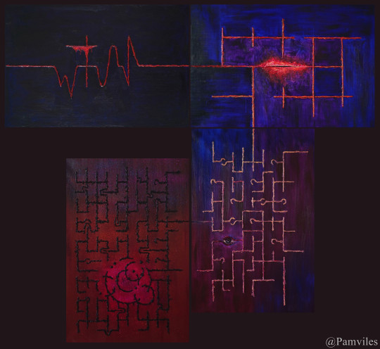
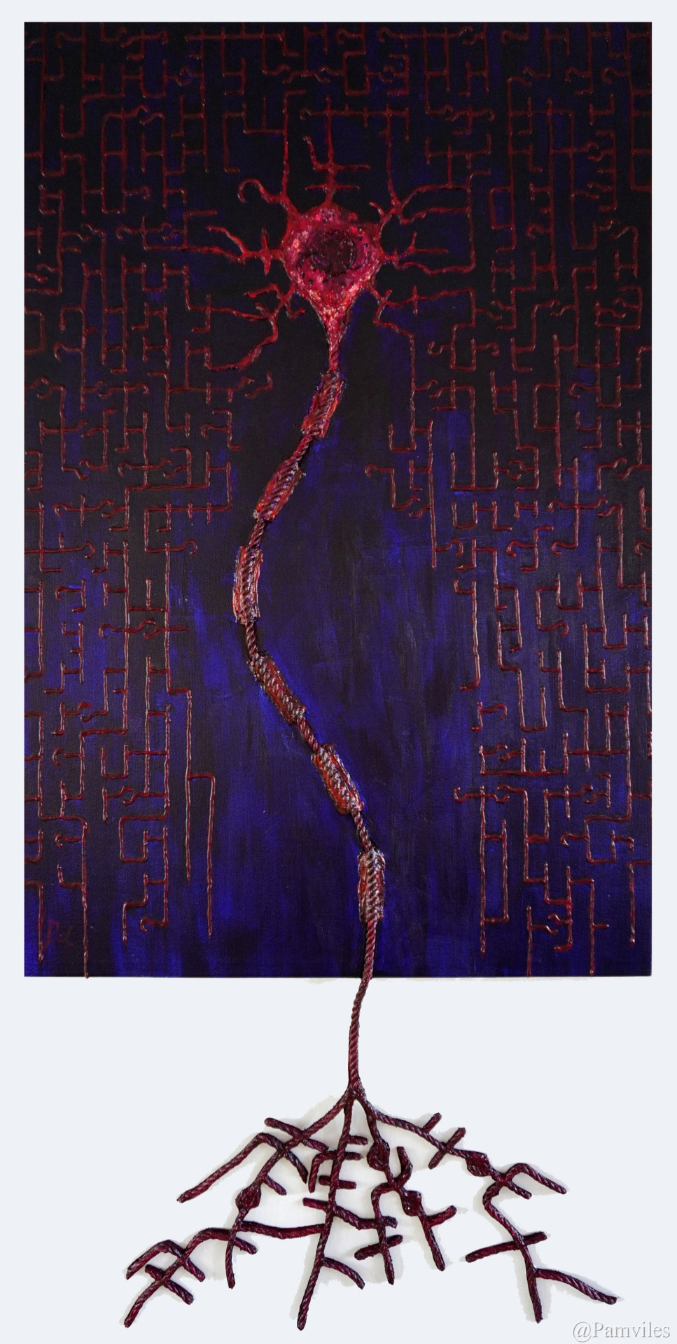
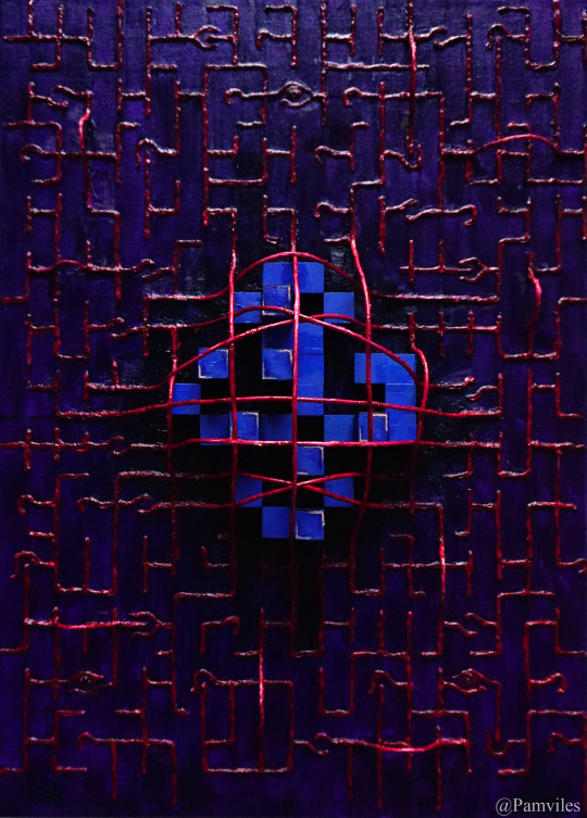
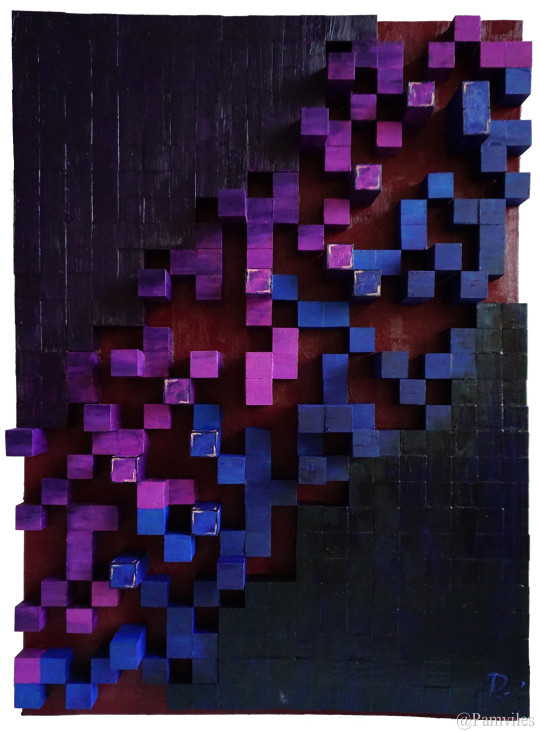
Codism Manifesto
By Pamviles
Ⅰ Background
When I was eighteen, I suffered from a mental disorder for half a year, and it was during this time that I discovered art. My philosophy also began to take form during this period of time. I had read extensively into the fields of philosophy and science (especially quantum physics), Plato's cave enlightens the imagination to unknown spaces, Descartes’ demon destroys previous structures of philosophy to rebuild a new system and Wittgenstein's mirror of the game captures the essence of philosophy through language. The centuries-long debate surrounding the nature of matter as either a particle or a wave, and its reflection on the real world has perpetuated through the theories of Einstein, Bohr, Heisenberg, Schrodinger and others. As well as the fragility of knowledge itself, all the above helped me re-understand the world. In university, I spent three years creating my own philosophy, I used ‘imagination’ as the basis of my philosophy, through the form of Dialogues (The Dialogues of Mr. Walter and Mr. Galson, a total of seven articles, included in my book ‘Drifting: an artist's madness, sex, art and philosophy’), involving questions concerning existence in reality, the possibility of god, the truth in history, the vanity of inspiration, time, and fate. All of the aforementioned are presented in my artworks. I believe an artist above all things should be a thinker, and to a certain extent, examine the dissionance of their thoughts through their own art.
My early artworks refer to surrealism. The mystery and fantasy of surrealism is what led me into the realm of art. Surrealism is a means of elaborating dreams. It can break reality and bring reality back to a fantasy realm, distorted and merged with forms of the inner desires, struggles and pursuits of an artist. To me, the charm of surrealism lies in that it can fully show the inner world of an artist. But as time passed, I was no longer content with surrealist expressions, because if I wanted my art to leave a mark on history, I had to create something that had never been done before.
Since 2018, I have been rethinking my artworks. Using my educational background of mathematics in my practice, my current artworks incorporate the form of code as a major element of my art style. In fact, my early artworks also had an element of coding, but only in recent years have I gradually formed a theory of my own.
I was self-taught in painting while I majored in mathematics in university. The element of mathematics may seem to have no relation to art, but for me, mathematics is the basic explanation of how things work in the universe. Art, on the other hand, is a manifestation of unique human emotions and souls, the former being the cornerstone of reason, and the latter the ultimate sublimation of emotion. Both are important forms of human understanding and expression of the world. What kind of collision can be brought about by combining the two together? Integration or contradiction? I merge mathematics and art based on my own understanding of both fields and the reflection of the past torture and encouragement from these two. I hope to bring viewers to new thoughts about math and art.
To me, painting is like a colorful shell, and theory is its soul. After two years of summarizing my own ideas of art, the time comes to solidify the first draft of my Codism Manifesto.
Ⅱ Definition
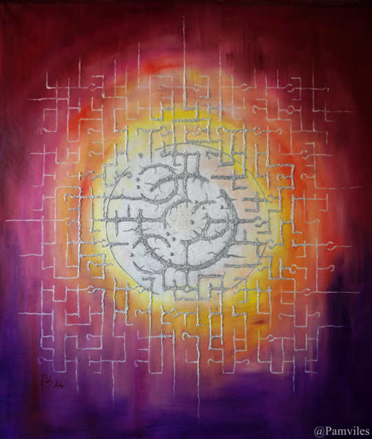
Codism in art refers to the recompilation of common language systems into new images or symbol systems by means of mathematics, linguistics, etc. and incorporating them into works of art. The compiled cryptosystem can be symbols, lines, geometric figures, color changes, cubes arrangement, etc. It is a rigorous system with regular rules instead of random, it hides the original information to be expressed in the form of codes. This cryptosystem needs to fuse with the created artwork. They are complementary and not independent of each other. It is precisely because of a variety of patterns that different cryptosystems can show, that it can be embedded into artworks and become an inseparable part of it.
Ⅲ Meaning and purpose
1. Symbolic meaning
In the art of painting, you can often see the traces of symbolization, and use certain images or symbols to harness a concept or meaning. For example, people think of religion or death when they see the cross. There is also a certain symbolic meaning in my art. In addition to the specific objects in the painting, my code has become a part of the symbol. So far, I have created over ten code systems and integrated them into the artworks. Sometimes a painting is just one code system, and sometimes multiple codes are superimposed. The shape of each set of codes is different (some are lines, some are geometric, some are round deformations, some are symbols similar to hieroglyphics, etc.), because in different paintings, I will choose according to the theme of the painting, and it is because of the different forms of these codes, they have different symbolic meanings to the picture. Since these codes are formed through mathematical processing, and mathematics is the basis of all scientific and technological progress today, the presentation of these codes on canvas represents technology and science. The code itself is a hidden method, sometimes symbolizing secrets or unacceptable ideas or even a reflection of the virtual world.
I could have presented numbers or mathematical formulas directly on the canvas, and even extracted a part of my Apm theorem to add to my paintings, but I think said approach is too blunt. Trying to combine mathematics and art by selecting some random symbolic elements of mathematics and forcing it into the picture would be reckless and rather dull-witted. The works created in this way seem to me to have no meaning of mathematics but a shallow representation, let alone apply any mathematical knowledge. Throughout my works I have to capture the essence of mathematics through my own coded system, because only in this way can I be more organically connected with the subject I need to express and integrate with the picture.
The symbolic meaning of artworks is based on the artist and the audience having a common cultural knowledge background. But in pure mathematics, in a series of theorems and proofs, no symbolic elements can be found. The world of mathematics is so pure that it only has logic and reasoning. And when this cryptographic code with mathematics is introduced into art, it is to a certain extent a betrayal of symbolism, and this is also one of the processes that will gradually appear in my works.
2. Words and communication
Before becoming an artist, most of my work was in writing. When I started to paint, I always thought about the difference and connection between painting and writing.
Reading a paragraph of words requires clear and organized thinking and time in order to understand the meaning in the text. In contrast, processing a painting can be scattered or even instantaneous. Reading text is like a narrow stream flowing, and it is single and coherent in time. It can only be understood by reading one word after another, as this is the brain's way of clearly organizing and making a single-channel sequence. But viewing a painting is like standing on the edge of a radiant lake, and the result is immediate sensory pleasure or other instant experience. The former is the perception of understanding, while the latter is a sensory experience. Words are constrained by time, yet it is the most ideal tool for expressing thoughts, because words (or language) itself is the basic way of thinking. The painting is an instant impact, and its viewing is not constrained by time. (Of course, to understand some certain paintings still requires time, but that would be a different subject.)
My code embeds the narrative and comprehension elements of text into the painting, which makes my work, not only have the immediate sensibility as the painting itself, but also implies step-by-step understanding. The existence of the code does not necessarily suggest that the audience needs to understand the story or meaning behind it, but work as a representative of the comprehension and revelation that can be obtained by reading.
My code system brings a time-like depth of procedural understanding to the painting in addition to the visual characteristics of the painting itself.
When a piece of art is presented, it is a non-verbal communication between artist and audience. It does not have a concise expression of information like verbal communication, and the information of the work may be transmitted unconsciously by the artist to the viewer. Since this nonverbal communication between the artist and viewer is unclear, not all audiences can receive the message.
The most direct way to convey information is to through language. At this functional level, art is unable to match. And there is no need to compare, because an artist, to a certain extent, is hiding information rather than to exposing it, especially in contemporary art, the information that the artist wants to express through various forms of presentation lets the viewer explores its meaning like a maze, layer by layer. Perhaps one of the charms of contemporary art stems from this. Organizing and hiding a message is to give it a sense of mystery to arouse the viewer’s interest, and allow the viewer to experience the pleasure it brings little by little when solving the mystery of the message. Therefore, in addition to visual enjoyment and stimulation, for the viewer, art also has a bit of pleasure in the decryption process, although this information itself may be rather bland. As Oscar Wilde once said, "the commonest thing is delightful if one only hides it." At some point, art is a fantasy lie with psychedelic color, and it is through this lie can the viewer more fully experience the preciousness of the truth lying behind.
My artworks that conceal the information in the form of codes symbolize the process of constructing this lie of art.
3. The Mirror of Math
Mathematics is a law that exists in all things in the universe. It exists at the beginning of everything, and will exist until the end of time. It is a pure world that can be independent of the physical world. It is not swayed by any biological or physical events, but at the same time it is the basis of the law of everything physical. Mathematics can exist beyond time, and is the only thing that never changes. In the modern society, it is also the basis of today's technological progress and represents the glory of our times.
In my work, as the elements of mathematics have been embedded, the eternal side of mathematics is introduced. In the form of cryptography, the data and information in science and technology is given a contemporary aspect, representing the development of the modern world and the possibilities of the future. This is also expressed in some of my paintings. They depict not only a current state of time, but also a trend or possibility into the future. Nowadays, humans have created all the glory in technology, but perhaps in the near future, with the development of AI, technology would have promoted the evolution of humanity itself or even more radical changes, as the intelligent life form that existed at that time, what would they think about the origin and pursuit of the human beings that existed and their own?
For me, the creation of the codes is an attachment to the conservation laws of all things in the universe. When I see various lines or different shapes in a picture, it is like seeing a series of random numbers. I always want to find the pattern in this chaos that explains it and gives it a sense of meaning in a regular form of order. And in our lives, aren’t they similar? Both spiritual and material pursuits give us a meaning in life, and maintain its continuation through inherent laws such as a stable social system, morals, etc.
In addition to the code with the sense of order in my artworks, it is also accompanied by elements of randomness, and this reflects the events or emotions in our lives that are unpredictable or controlled.
So in a way, my work is not only like a cryptographic map with hidden information, but also a microcosm of life and a world in the form of symbols.
Therefore, when I use the math to create different code systems for my art creation, I am attempting to construct a completely new world in its purest form, a mathematical form mirrored by the physical world that we live in. In this new world, there is no trace of tangible living things. Instead, exist abstract expressions of feeling and reason, and the merging and struggles between them. Within these artworks, the use of code symbolizes the constant laws of our physical world and the various inherent methods of comprehending our reality.
Ⅳ Overview
Codism is the product of the collision between math and art. It has a very characteristic symbolic meaning in the performance of art, and organically integrates related elements such as written word and communication, math and logic, data and information and various other concepts into art. The emergence of codism will hopefully add a different movement in art history.
First draft: 2019.12.31
3 notes
·
View notes
Text
CanvasWatches: KonoSuba: God's Blessing on This Wonderful World!
You know what was a surprisingly nice discovery? Crunchyroll has the english dub of the first… season? Cour? First ten episodes of KonoSuba: God's Blessing on This Wonderful World! (also known and henceforth referred to as KonoSuba) with the english dub. How magnanimous of the Dub-unfriendly service.
Konosuba was a pleasant follow-up to Kill la Kill (the review of which I’d been struggling with as I write this essay, so we’ll see if anything from that materializes). The network of Youtube Anime Reviewers had decided this was real good and funny and is worth the time. And, hey, I did have that free month courtesy of Twitch Prime, I might as well![1]
I thought it was fine! But the massive hype might’ve dragged it down. Comedy’s difficult. A lot relies on the unexpected, so if you prime viewers with “It’s really funny,” you raise critical expectations, which can undercut the weaker material.
Or maybe I’m too much of a comedic writer to get the full effect. Learned to read set-ups and such.
But I can recommend it if you have access and are interested. You won’t be disappointed.
Possibly another hurdle to my enjoyment is I went in intending to mine ideas for my own works. Spoofing RPGs and such is something I’ve long been wanting to set my skills towards, and it’s not always clear the best way to interpret mechanics.
Anyways, Konosuba has decided to parody the increasingly popular isekai[3] genre.
First ingredient: an average loser everyman for the viewer to project on. Filling the role is Kazuma Sato.[5] He goes out to buy a video game, decides to save a girl’s life from a perceived threat, and dies.
So, he needs to be reincarnated. As part of the typical Isekai set-up, he’s allowed to ask for whatever he needs to make himself massively overpowered.
So he takes Aqua, the sassy goddess offering him the choice.
This is the point where the typical formula breaks down. Kazuma has no notable advantages, and Aqua isn’t actually competent. Thus, we spend the 10 episodes stuck in the starting town of the pseudo-video game world.
So, when you throw someone into a video game or (less commonly) TRPG world, there’s the question of how to depict the actual GUI and game mechanics.
There’s the Sword Art Online and Log Horizon method, where the mechanics and their relationship with the world is unchanged, including the “players” being able to pull up a system menu to do… system menu things.
On the other end, we have Overlord, where the menu and other visuals vanish, and the tasks they accomplished must either be intuited by those translated into the world, or become part of their innate knowledge.
KonoSuba has everyone talk about the mechanics and such freely (in a tutorial NPC sort of way), but the menu has been replaced by an Adventurers ID, which shows stats and allows the adventurers to swipe and learn skills. Functional and easy for the viewer to accept.[6]
From this starting point, we have Aqua as the healer, and Kazuma as… an unclear role. He learns a Steal skill early, but he then starts learning magic, so he’s a bit of a Jack-of-all-Trades. The show’s not shy about the Master of None side of that, because the only decent stat our protagonist has is Luck, which counts just enough for him not to die and get the crucial things to fall in his lap.
Such crucial things include a Mage (who refuses to cast any spell except an excessive explosion spell) named Megumin, and a Tank-Fighter (who is… rather excited to take damage) named Darkness. Not the ideal companions, but functional.
But that also means we don’t have a straight Rouge, so I’m required to be salty about that.
Kazuma attempts to build a sustainable and fulfilling life, but the quests available are either above his capabilities or menial labor. Because life is more funny whenever things don’t go well for the hero.
The first three episodes are dedicated to establishing the setting and the characters, and aren’t actually that funny. Yes, there are things I can identify as attempts at comedy, but they’re modest attempts that don’t really build to a satisfying laugh. Kazuma’s attempt at straight-manning the shenanigans of his allies is restricted to complaining and feeling put upon, which flattens the funny moment by drawing attention to how wacky it’s meant to be.
Episode four, however, finally introduces a desperately needed element: a victim. In the form of a Dullahan who is up to his nonexistent neck with annoyance at Megumin casting a daily explosion spell on his castle.
His attempts at intimidation fall flat due to the apathy of our main party, and then Darkness steps in with her masochism, which bewilders him. He casts a death curse on Darkness, to her delight, and rides off to await Megumin to fight him in his castle.
Aqua then casually removes the curse, and our party forgets about the encounter.
A character desperately trying to do his job in spite of the ideocentricies of the main cast is much funnier than a character that just complains.
Comedy works better when it builds off what is established in narrative than over-relying on meta-knowledge and lampshade hanging. Those things have their place, but they work better as augmenting jokes or to speed up delivery, not as whole jokes themselves.
The next episode does a better job in that respect by introducing another guy with the same deal as Kazuma, except he’s a more traditional Isekai protagonist, and thus kind of a loser NEET. He also chose a massively overpowered sword instead of Aqua, and is doing better because of it.
Kazuma easily outwits him, steals the sword, and fences it. This sets a stronger character base for Kazuma: a genre savvy jerk willing to exploit the world around him for a quick buck. It turns him from a put-upon everyman into a jerk able to cause the same sort of chaos as the rest of his party.
Unfortunately, such moments are few and far between, as the rest of the season has Kazuma back to being a useless whiner. We do get closure with the Dullahan, which showcases Kazuma is actually pretty good at analytical thinking and tactics, but lacks the personal capabilities to actually fight.
The show then introduces an important character (a lich named Wiz) in a manner that clearly cut segments from the source material that, if shown in full, probably would’ve strengthened the rest of the story.
Instead, that time is used for an episode where Kazuma patronizes a succubus business that offers customized dreams. We watch an extended Q&A segment that raises uneasy implications about Kazuma’s predilections, then an uncomfortable encounter between him and Darkness which I don’t know how to fairly judge, since Kazuma is forcing Darkness into foreplay and intends to go further, but he thinks it’s a dream while Darkness doesn’t know that and thinks he’s being forceful, but she also could very easily overpower him and the show’s established…
Look, episode 9 should’ve been cut and I don’t wish to dwell on it any further.[7]
Anyways, the fall-out of that adventure is suddenly ignored as Howl’s Moving Castle (Dark Edition) lurches towards the town. Deary dear.
It belongs to the Dark Lord, though the exact nature of it and it’s controller is rather ambiguous. But it’s scary, powerful, and has immense defense. What will the town do?
Fortunately, Kazuma’s surprisingly powerful party and his tactical scheming allows them to stop it. However, in true villain lair fashion, the moving fortress starts a self destruct sequence. So now that needs to be addressed.
While searching the place to figure out how to deactivate it, Kazuma finds the corpse of the builder/driver with his diary.
Turns out, the guy was hired to build it, but thought the requirements were excessive and he didn’t really want to do the job. So he told his employers he needed a rare relic to power it, thinking it’d never get supplied.
The relic gets supplied.
So he builds the fortress, turns it on, and immediately loses control. The fortress goes on an unstoppable rampage as the builder is stuck inside. Oops. So he just kind of kept bluffing his way along.
Which tells us something crucial about this world: it runs on a narrativium fueled by malicious luck. Kazuma’s form of luck is not unique, wherein he is only fortunate enough for the next inconvenience to come along. He gets a rent-free manor not because he particularly deserves it, but because fate demands he be able to survive the winter. His companions are just competent enough to excuse their quirks. Even a second isekai protagonist finds success for only long enough to become a punchline.
It is a universe with a cruel sense of humor, and the greatest success goes to those who stumble uphill while trying to avoid detection.
It’s a world that rewards not the Aragorns, but the Rincewinds. So that’s fun.
This is best exemplified when Kazuma’s rousing success in saving the town results in him being arrested for at least property damage if not regicide.[8] And that is where the first 10 episodes end.
Now to wait for the season 2 and OVA dubs…
It’s a fine anime, but I think it’s been oversold. The premise is strong, the characters are fun, but the storytelling felt more like an attempt to hit the Greatest Hits beats. It might be worth the effort to read the Light Novel, as I suspect that might be the superior version in this case.[9]
Still, there are strong ideas, and a few things I’d aim to emulate. Especially the distinct leads. I do struggle with making a cast of diverse personalities.
If you enjoyed reading this review, please consider paying me. I have a patreon, a Ko-fi, and a burning desire to branch out into other projects but require investment to make it worth it.
We can’t all reincarnate into a fantasy world. Some of us need support to create them for ourselves.
Kataal kataal.
---
[1] My brother, meanwhile, has been binging Deltora Quest for… some reason… I know the books were pretty good for elementary school Canvas, while the succeeding series made less of an impression.[2] [2] Which is to say, bother Vulpin if you think it deserves a review. [3] Isekai (Japanese: 異世界, transl. "different world") is a subgenre of Japanese fantasy light novels, manga, anime, and video games revolving around a normal person from Earth being transported to, reborn, or trapped in a parallel universe. (Wikipedia)[4] [4] Yes, I actually used a footnote to cite a source and provide further information. Don’t get used to it. [5] I desperately want to make a Yakuza joke, but I got nothing. [6] The solution I devised for Penn & Pauper puts the Stats read-out on smartphones, with everything else being as it is in the normal world. IE, you have to manually equip weapons and armor and such. [7] Not just because my Mom is my only patreon patron. [8] They don’t specify if anyone was in the manor that got exploded. [9] Not that the Light Novels I’ve read thus far have been particularly strong. The writing of Melancholy of Haruhi Suzumiya and Spice & Wolf felt very stiff on the other end of the translation process. Log Horizon, meanwhile, has meandering Light Novels with a poor sense of rhythm for page breaks.[10] [10] Also, the Mighty Santa Clara Library System refused to accept my Spice & Wolf books, so now I don’t know what to do with them.
3 notes
·
View notes
Photo

🌞🌼 "Summertime is always the best of what might be." - Charles Bowden ☀️🌺 🔥🌊 Ah, the arrival of summer, a season bursting with endless possibilities and dreams waiting to unfold. As the sun casts its warm embrace and the world awakens to vibrant hues, I, the adventurous and heartfelt petite redhead Lev, invite you to join me on a journey that embodies luxury, playfulness, and the thrill of embracing the extraordinary. Are you ready to seize the magic of this season with me? Let's create a summer of cherished memories that will forever dance in our hearts! 🎩✨ ✨💃 Picture this: a captivating redhead, perched on the edge of your dining table, her cascading, fiery locks mirroring the brilliance of the summer sun. From this enchanting vantage point, I extend an invitation to experience the epitome of indulgence, immersive roleplay, and curated content tailored to your deepest desires. Together, we'll embark on an extraordinary journey where fantasy meets reality, and where every encounter is infused with the spirit of passion. Are you ready to let your imagination soar? 🌌📸 For those who appreciate life's finer pleasures, from captivating content to opulent leisure and the thrill of romantic connections. As a connoisseur of sophistication, you understand that true luxury transcends material possessions, residing in the connections we foster and the moments we cherish. Allow me to be your guide in this world of elegance and pleasure, where every interaction is a testament to the richness of life. 🥂💎 ✨💕 So, my dear viewer, are you ready to embark on this thrilling summer adventure with me? Let's awaken our senses, embrace the playfulness of the season, and forge a community where dreams come alive. Your presence is the catalyst that will transform this journey into an extraordinary tapestry of shared experiences. Will you join me in painting the canvas of this vibrant season? 🌼🌟 👍 Double-tap if you're eager to embrace the enchantment of summer's embrace, and let's weave connections that transcend the ordinary. 💖🔥 💬 Share your most cherished summer memories in the comments below☀️ #SummerMagic #EmbraceTheExtraordinary #LeverageUrAssets — view on Instagram https://ift.tt/RX5wBAa
0 notes
Text

Artwork details
Title: Fantastical Feasts
Date: 2020
Medium: Acrylic on canvas
Dimensions: 92 x 122cm
Fantastical Feast
By Kirsty Boddington
I had a marvellous dream so intense,
About a fantastical feast which I eyed with suspense.
I pondered how to recreate such a scene through this lens,
This fantasy was so bizarre I wondered if it would make sense.
A cornucopia spilling with fruit and vegetables so colourful,
A tiny paintbrush endeavoured to paint details so abundantly cultural.
A fresh lobster bedded with succulent lemons and generous oysters,
And a golden roast chicken plump with much moisture.
The buffet was placed on a grass bed beneath tropical trees,
In oblivion, my wildest adventures await me.
Desperately trying to capture the theatrics that played on my unconscious mind,
Silver tableware, delicate teacups and embellished platters I consciously desired to find.
Anything and everything were sought to match what I experienced from memory,
I dined, drank and drowned in paint until a blank canvas became visionary.
The mouth of the abyss was fed both day and night,
Until the void was full and the illusion appeared right.
Brightly sitting in contrast to a vast white room that mattered,
The strange portal to my world certainly aroused audience chatter.
17/09/22 9:52pm
Explanation:
My poem ‘Fantastical Feast’ is inspired by a dream I had which gave me a surrealist painting idea. I record my dreams in a diary and use still life practices using found objects to re-create my dreams for painting. The poem embodies this process and aims to express the thrill and labour of getting my ideas from my mind to canvas. The poem describes an Arcadian landscape where bountiful nature generously provides for one’s needs and comforts with extreme luxury. The poem also touches on the concept of Surrealism as my work depicts the meeting of bizarre scenes; an opulent banquet isolated in rampant paradise jungle. The painting acts as a portal for the viewer to momentarily escape reality and enter a hallucinatory charged space, therefore the poem describes the painting as ‘the abyss.’ The poem conveys my interest in Sigmund Freud’s theory that untapped experience, emotion, desire and knowledge are hidden in the unconscious mind; the key to improving the quality of life. Therefore, the poem conveys that this untapped data should be explored and shared creatively.
0 notes
Text
The Green Knight Review: A King Arthur Movie Imbued with Dark Magic
https://ift.tt/eA8V8J
It’s been observed that to create, you must first destroy. There’s truth in this axiom, although at least in the case of Hollywood it’s worth a partial amendment. First, you must understand what it is you are destroying to make way for something new. Take the poems and tales of King Arthur and the Knights of the Round Table, including Sir Gawain and the Green Knight: As centuries old IP, these stories have been adapted countless times, including recently—and often by filmmakers with no greater concern for their appeal than the public domain title they’ve decided to exploit.
Well, the team writer-director David Lowery assembled for his and A24’s The Green Knight understand Sir Gawain intimately. It’s there in the first scene when the alliterative prose from the 14th century poem is quoted near verbatim. And yet, by juxtaposing these words next to Dev Patel’s yet-to-be-knighted Gawain sitting on the throne of Camelot, stoic in all his kingly majesty, Lowery and company signal they’re doing more than just repeating an oft-told yarn. There is a darker force at work here, which can be as unsettling as the image of Gawain’s crowned head inexplicably being lit aflame at the end of this sequence.
The Green Knight is thus both a student of the past and a well-meaning raider of it; this is a film which will honor a story J.R.R. Tolkien singled out as one of the greatest works of English literature, as well as gracefully deconstruct it. There’s a singular, faintly mad vision at play in Lowery’s The Green Knight, and it’s led to one of the best films ever adapted from Arthurian lore.
When we meet Patel’s Gawain in earnest in the movie, he is clearly not yet a knight or a man of honor. After all, it’s Christmas morning when he’s awakened from his stupor in a brothel. As the nephew of old King Arthur (Sean Harris), Gawain is imbued by Patel with an earnest desire to live up to the laurels already bestowed on the Knights of the Round Table, but there’s also something unmistakably desperate and hungry about him when he arrives at his uncle’s court for a feast.
It is there that Arthur invites Gawain to sit by his throne on the high dais, next to Queen Guinevere (Kate Dickie), for the first time. Several chairs are conspicuously empty, including one intended for Gawain’s mother (Sarita Choudhury), but Gawain can sense his station is on the rise, even before the Green Knight (Ralph Ineson) enters. Carved from the literal leafy greens and weeds of the earth, Ineson’s knight better resembles a pagan god than any sort of man-at-arms. Yet it’s arms that concern this Yuletide intruder.
The Green Knight comes offering a game: Any man who has the courage to strike at him with a sword as harsh or kindly as he pleases can do so freely… so long as he agrees to endure the same blow in one year’s time. Gawain leaps at the opportunity to prove his valor, beheading the Green Knight in one smooth motion. The Emerald deity then picks up his rolling skull. It then laughs. A bargain’s been struck and they’ll meet again at the Green Chapel next Christmas.
The setup is painfully simple, including its roots in medieval notions of chivalry and the type of magical realism where talking severed heads are as common as ladies living in lakes. Yet the draw of Lowery’s film is how it encases viewers into this world with surreal splendor. There has not been another movie this year as sumptuously designed or elegantly framed. Nearly every shot of The Green Knight—particularly in the climactic Green Chapel—looks as if it was ripped from a fantasy novel’s cover or a 19th century canvas, and the inclusion of elements like ghosts, giants, and talking foxes (all of which Gawain will encounter on his quest to find that blasted chapel) only heightens the peculiar beauty of the piece.
Lowery is also allowed to lean into the painterly lushness of the piece because of the vitality and humanity Patel brings to every single scene he’s on screen: which is nearly all of them. Despite starring in a Best Picture winner more than a decade ago, Patel is an actor who’s seemed strangely underrated by the industry. As of late, the natural leading man has broken out with winning roles as David Copperfield and in Lion, but as Gawain he may have at last found a vehicle to display the full range of his charisma to a larger audience.
Patel’s Gawain is neither a hero nor a revisionist fiend. Rather he’s a well realized portrait of paradoxes. Here’s a young man who wishes to be noble and true, but is driven on his seemingly suicidal quest to find the Green Knight’s chapel entirely out of fear of shame and what others might say; he fears death to the point of seeming cowardly, and yet is eager to face the Green Knight’s axe, if only to learn what this game might really be about. Gawain is a flawed, potentially doomed protagonist, but Patel keeps the pathos of the would-be knight always at the surface, even during the character’s most scandalous and selfish moments.
The rest of the cast is also formidable in helping The Green Knight weave its enchantment. Despite being covered under makeup and prosthetics, The Witch’s Ineson brings a playfulness to the title character somewhat akin to a Disney character with a bloodlust; and Alicia Vikander pulls double duty in dual roles that it would be a spoiler to detail beyond that they represent twin sides of femininity for Gawain—and the inherent limitations of living your life by chivalric codes or medieval thinking. However, in one of these roles Vikander gets the best monologue in the film where she raises more questions than answers about what this quest is all about… including why is a green knight green?
That may be what challenges audiences most. Despite being based on a well-worn folk tale, The Green Knight is not an easy movie to follow once Gawain accepts his fate and leaves Camelot behind for a wilderness drenched in magic and weirdness. Shrouded in mysteries, both medieval and modern, it is designed to confound and intrigue, and probably be viewed more than once. It is a bit like discovering an ancient tome of witchcraft that’s not intended for young eyes. You’re not entirely sure what its incantations mean, but you cannot look away. For some that will be infuriating, but I found it spellbinding.
The Green Knight opens Friday, July 30.
cnx.cmd.push(function() { cnx({ playerId: "106e33c0-3911-473c-b599-b1426db57530", }).render("0270c398a82f44f49c23c16122516796"); });
The post The Green Knight Review: A King Arthur Movie Imbued with Dark Magic appeared first on Den of Geek.
from Den of Geek https://ift.tt/3BHxSbU
0 notes
Photo


The Gazing Ball Exhibition research and a study in perspective When researching exhibition spaces earlier on in the project, I knew that I wanted my project to have more dimensions than the platform of a few photos stuck to a wall, I wanted it to be more of an instillation, something more immersive. The main source of inspiration for my project was John Berger’s ‘ways of seeing’ particularly the last essay comparing classic western paintings to contemporary publicity images. One thing I found pertinent in this text was contrast and perspective. Berger comments on the subjects of oil paintings being the commissioner, their possessions and land, food, furs and estate. A tool of narcissism to secure social status, either by featuring in the painting or owning a great piece by a popular artist, something enviable to showcase what one owns. Often these works of art would be hung in opulent gold frames to emphasise this purpose. Berger compares these works of art with modern day publicity images, the idea behind them to make the viewer envy what they see, to want to purchase an object or experience to in turn become enviable or to improve their lifestyle, to want for what they’re missing.
When looking at appropriation of art in regards to advertising and graphic design, it was very clear that the two went hand in hand, brands would gratuitously use famous paintings as a theme for an ad campaign. Sometimes it made sense and sometimes it didn’t but all the same the use of an instantly recognisable work of art paired with a recognisable brand gave a sort of double connection in the mind of the viewer, pairing the two together. What I wanted to achieve was a meaningful connection, each painting connecting to current trends to see if that recognisability could be pushed to connect a product in the mind of a consumer.
I also wanted to experiment with the idea of making someone want for more. In ways of seeing, modern colour photography publicity images are described as making the viewer envy the subject of the image, that if they purchase the object in question, their life will improve in some way. Thinking of the contrast of an oil painting in an opulent gold frame and a modern publicity image, I imagined a billboard, perhaps in an urban gritty background, surrounded by litter and pollution, on a grey day in England. I imagined this billboard contained a promotional image for a holiday, giving the viewer the promise of bathing in a warm distant sea, to escape from their every day life. I wanted to take this concept and enhance it, what if the destination was one of fantasy, the destination the calm beauty of a Bouguereau painting, the warm summers eve of a John Singer Sargent, the Art Deco glamour of Tamara de Lempicka, enhancing this concept and creating a hyperreal destination. Could I capture the beauty of an oil painting and take a consumer there?
Thinking of gold frames in gallery settings and billboards on gritty roads, I became interested in the idea of perspective. As an experiment, I wanted to both combine the two, and remove them. To combine the two I looked at gallery spaces in London and even viewed some of the paintings I referenced, I looked at the spacing. I also looked into publicity images. When at the cinema I saw A poster for ‘Ready Player One’ and thought the backlit LED frame made the poster look stunning. The combination of the two helped my initial ideas for presentation evolve into my final outcome. A combination of gallery spacing and backlit posters. In removal of the two perspectives I wanted to use mirrors, early on in my project I knew I wanted to involve mirrors in some way, my dad obtained a large sheet of mirror that could be scored into whatever shapes I wanted. Initially I toyed with presenting broken shards of mirror around my images so that the viewer can see themselves while looking at them. I felt this was a good tool to remove any backdrop (the surroundings of that billboard) which would make the consumer think differently, “do I really need this”
An interesting development in this part of my project came when I was researching Jeff Koons. I looked at his collaboration with Lady GaGa for her Artpop album artwork. As a fan, I’d seen the blue gazing ball on her album cover before but not researched into it. Clicking through Wikipedia I found a page on his ‘Gazing Ball’ series, he explained the meaning behind it, recreating classic works of art from the masters with one addition, a blue reflective sphere. This was a tool of perspective and allowed the viewer to look at themselves looking at the art as well as “contemplating the vastness of the universe” I wasn’t sure on the second part but the perspective part was exactly what I wanted to achieve. As an important part of my research and a very similar idea to mine, I feel that, as my project is about appropriation of the work of artists I revere, that I would appropriate this concept too, applying it within my context. I am very interested to see if people will make the connection and how this is interpreted in the exhibition. My final diagram on sketch up includes a plinth with a gazing ball placed in the centre of my images. An article from the Guardian summarises this project perfectly; “the artist has taken 35 masterpieces, including Manet’s Déjeuner sur l’Herbe, Géricault’s Raft of the Medusa and Rembrandt’s Self-Portrait Wearing a Hat, had them repainted in oil on canvas, and added a little shelf, painted as if it had sprouted directly from the image. On each of these shelves, Koons has placed a large, blue glass bauble, or “gazing ball”, popularised by King Ludwig II of Bavaria and now more often used as garden ornaments. These baubles were specially hand-blown in Pennsylvania – Koons commissioned 350 and picked the best 35. “Each one’s unique,” he says. “Looking at the Gazing Ball Paintings, all credited to Koons and called, for instance, Gazing Ball (El Greco Vision of Saint John), the viewer sees him- or herself reflected in the perfectly shiny surface as well as the famous image. “This experience is about you,” says Koons, “your desires, your interests, your participation, your relationship with this image.” Koons said that the images he’d used – some of the most famous in art history – were not intended to represent the canon but instead were “works that I enjoy … my cultural DNA”.” When researching this series, I saw a lot of my project in it, selecting my favourite pieces and studying perspective and appropriation. I decided my final act of appropriation would be to include a gazing ball as an homage to Koons, hopefully in crediting him, I can draw attention to his work and interest younger generations in art and attending gallery spaces.
4 notes
·
View notes
Text
Learn Log #3 - GUI
This week I studied various elements of Graphical User Interfaces (GUI) including text, logos, buttons and cursors. For practice, I made a mock-up of a fantasy RPG menu which turned out alright. Apologies for the late post. I was a bit busy this past week. Hopefully this doesn’t cause a delay in next week’s post but we’ll have to wait and see!
Text and Font
To practice my font making skills, this week, I tried to make readable fonts in the smallest sizing possible. My reasoning behind this is letters might be read in large passages of text, so a smaller size will likely be required – especially for small menu spaces such as inventories.

Above was my first attempt which used 3x4 pixel letters. While many of the characters were recognisable, a good number were not. The ‘M’ and ‘W’ were utterly unreadable, and some of the characters were difficult to read, like ‘S’ and ‘X’. I decided to move up to a 4x5 size.
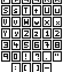
With this slightly larger size, I attempted to make both uppercase and lower case letters, most of which worked pretty well. While most characters such as the ‘S’, ‘E’, ‘3’, ‘Z’ and so forth benefited from the extra pixel in the Y-axis – characters were still needed an extra pixel along the X-axis. Characters such as ‘M’ and ‘W’ were still basically unreadable, and characters such as ‘T’ and ‘I’ were difficult to align along the even number of pixels. To fix this, I moved up to 5x5.
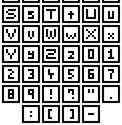
Finally! I have successful ‘M’s and ‘W’s! From this test, I really think that there are a few principals for creating nice fonts. 1) If you know or unsure about if the letters ‘M’ and ‘W’ are involved then make the canvas size for each letter at least 5 pixels wide. The same can go for characters like ‘S’ with regards to height. 2) Make the canvas size an odd number along the X-axis to better align specific letters.
With this last font set, I was also able to size the canvas for different types of characters differently. Capital letters occupied the full 5x5 canvas, lowercase letters occupied a 3x4 canvas (except for the ‘M’ and ‘W’ which had to be 5x4), and numbers and symbols filled a 3x5 canvas. I did this so readers could better distinguish between uppercase and lowercase letters, and similar characters like ‘O’ and ‘0’. I’ll have to see what it’s like an actual game later, but I think it’ll be a pretty useful trick.
I do think I will be able to make larger fonts than this and size them down in the Unity engine. Even if this is the case, I think this worked pretty well as practice within tricky boundaries.
Logos
I think logos and titles are pretty crucial to a game. They plaster the cover and main menu of the screen, and I’m sure we can all think of a few memorable logos we’ve seen in games. So, now that I’d practised making text I wanted to make a banner logo for my Itch.io page. The first thing I did was a little sketching on paper before converting it to a small pixel art concept, as shown below.

The recommended banner size for Itchi.io is about 900px wide. I was not going to start here, so I decided to do my rough draft at 45x26 and detail it as I scale up. I made this draft by implementing the concepts I really wanted first and building around that. I knew I wanted to include the ‘S’ wrapped around the ‘T’, so I started there and worked my way through the logo. I also wanted to include a little ghost, so I left a space for it in the bottom left corner. Next, I wanted to add some detail and hollow out the letters, so they were white with a black outline. This is useful as it means the letters are both white and black, allowing the logo to be read on dark and light backgrounds.
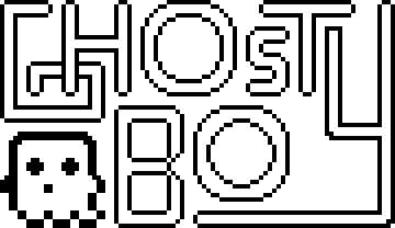
To add the detail, I scaled up the previous logo by 400%. This allowed me to round out the edges and create a nice ‘blocky-but-smooth’ look. I also adjusted the ‘G’, ‘T’ and ‘S’. The original ‘S’ and ‘T’ combo made the ‘S’ seem a little bit strange, but this new version was a lot better. With the hollowed out ‘G’ I made it seem like it was beneath the ‘H’ which I thought was a nice effect. I left one of the ends of the ‘Y’ very blocky to make it seem like it had been interrupted by the T. At this point the logo was 180x104, so I scaled it up by 500% to reach 900x520 before adding more detail.
If someone were to ask me, ‘Hey, should I make a 900x520 pixel art logo dealing round edges and circles?’ I would slap them. In fact, I’ve slapped myself because I did precisely this, and it took ages. At smaller sizes, circles can easily be adjusted, viewed, or manipulated to trick the viewer into thinking they are looking at a round edge. When you need to make 4 circles, the largest being 220x220 this becomes insanely difficult. Looking back on this issue I definitely should have used anti-aliasing - I completely forgot about it if I’m honest. The ‘O’s didn’t even come out looking that great. They look quite boxy – definitely should have used anti-aliasing. I have regrets.
Luckily the other letters turned out much better. I did adjust the ‘Y’ also as previously the logo read ‘Ghosty Boy’ rather than ‘Ghost Boy’. This did make the canvas 840x520, but I don’t think it’ll be a noticeable change. I’m pretty happy with it, especially after all the time it took. I may revisit the logo at another time (especially to fix up those ‘O’s).
Above is the final logo, I added the pattern used in my profile picture (slightly desaturated to make it easy on the eyes) to the insides of the letters and called it a day (or 3 days. I hate the letter ‘O’).
Buttons
So, we’ve got our game’s font and title, what we need now are some buttons for interacting with the menus. To practice making button sprites, I decided to make link buttons for social media sites. I started by making the designs of the buttons, as shown below.

I started with small, white 9x9 designs of each social media sites’ logo on a background of their associated colour. I wanted the buttons to be small (to be put on the sidebar of a website) and completely circular. The Itch.io logo could not fit onto the small size, so I made a rough-looking videogame controller instead.
I then expanded these designs into a larger 13x13 circle which I would later turn into the button. Not much happened in this step but this.

And the buttons were done! I shifted the logos of each button upwards before adding a shadow and highlight line on the bottom. Buttons require some sense of depth or separation from the background to show that they can be interacted with. This is really all that’s needed, but more detail can be added to make the button look more appealing.

I added a shadow around the back of the buttons to emphasise the edges of the buttons, separating them from background. I then added some more detail to the highlight to make the button seem shiny and draw attention to it. By alternating between highlights and normal tones, the button appears metallic. Finally, I changed the white logos to a light yellow so the white didn’t seem too bright.
Overall, I’m pretty happy with how the buttons look. The colours on the Itch.io button are a bit desaturated which conflicts with the metallic look. This is due to the colours of the actual logo being quite desaturated. If I were to return to it, I would change it to be pink or orange to capture a similar colour but make the button as bright and eye-catching as the others.
Cursors
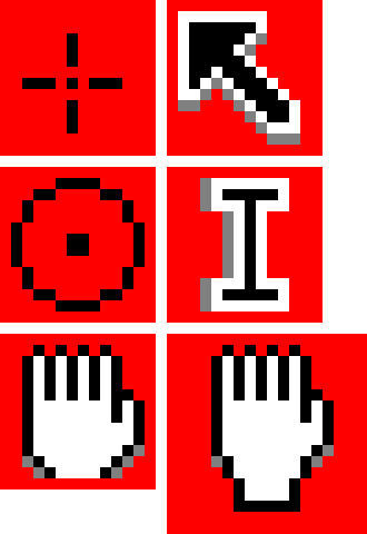
There’s not much to talk about in regards to cursors. The default cursors of PCs and Macs are pretty good, however, adding a custom cursor image to a game makes it look really cool I think – even if it’s just a simple adjustment. I tried my hand at making some cursors. The circular points make fitting cursors for shoot games as they’re reminiscent of a gun scope. The hand cursor is a little tricky to do in a small space and might not be worth it as cursors need to be small. Like I said regarding text - if Unity has an option to scale down cursors that will make things much easier. These are some simple ones, but I’m sure there could be more eccentric designs even within these cursor shapes.
Assessment
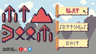
So, for this week’s learning assessment, I wanted to make a mock-up fantasy RPG menu based on the items I made last week. This was definitely not a lazy excuse to use the same colour palette and 100% a sincere artistic decision.

The first thing I started with was the buttons. It is crucial a menu’s buttons are clear and easy to read so they should dictate the size and presentation of the rest of the screen. I really liked the scroll item from last week, so I decided to make the buttons scrolls. This made the addition of depth more complicated, but I think I did an alright job by adding a shadow bottom right of the scroll.
For the text on the buttons, I wanted to delve into the fantasy aspect and use rune-like letters. I had to tread a fine line between clarity and the desired aesthetic of the letters which took a lot of trial and error, but I think I got there in the end.
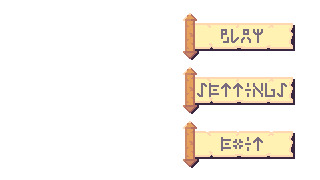
I then scaled up the buttons to add some further detail to the scroll and the runes. I thought the plain white background looked pretty bland so I decided to make a background.
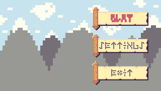
I made a mountain range as a background for the menu and changed the text of the ‘PLAY’ button to an outlined red. I kept the background quite simple as this week’s topic was interfaces, and I was concerned that a detailed background might distract from the interface elements. I turned the ‘PLAY’ red because I wanted to give the impression that the option was being selected. I had ample empty space to the left of the screen, so I decided to create a logo for the game to fill that space.
[photo]
After some more trial and error with different rune letters, I created this logo giving this fake game the title ‘Mt Doom’, inspired by the mountain range background. The rigid rune style really gave the title a more menacing feeling which was good. The ‘O’s used looked a bit weird as I had trouble turning them into a rigid rune style. I increased the size of the logo to add more detail and popped it into the menu screen.
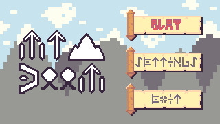
The extra detail made the runes look a bit nicer. The ‘O’s were still off but did fit the rest of the font a little better after adjustment. My biggest concern was how out of place the whole logo looked. This was quite clearly because of the pure white colour used for the letters. I could change this to the white within the colour palette; however, this colour was used in the background, so I decided to match the selected button and use the colour red for the logo.
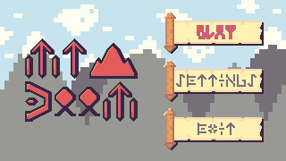
The red made the logo really pop while fitting in with the rest of the piece. Additionally, some light shading on each of the letters made letters stand out even more. I also moved the black outline of the text slightly to the right to make it feel more like a shadow rather than just an outline. Unfortunately, I didn’t feel like the logo had a grand enough presence for its purpose and menace to shine through. To fix this up, I digitally resized the logo by approximately 133.33%. Now, digital resizing really works well for stuff like 200%, 500%, 1000% and so on because it just adds pixels. However, a resize of 150% means you are resizing the image by 1 and a half-pixel which is not possible. This creates jagged, messy lines – but I decided to give it a shot because why not?
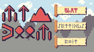
To my surprise, the sizing was perfect, and the messy lines actually worked somewhat with the aesthetic. The shading did get messed up a bit, and if I were to do this again I would go back and adjust the shading, but overall I actually think it improved the piece. Finally, I decided to add a cursor, a watermark and social media buttons into the piece, as shown below.
This watermark and the social media buttons do look a bit out of place in the piece, but I think that works in their favour. It draws attention to them and makes it clear that these are not part of the game or menu. This is particularly useful as those social media sites will open an external tab so showing they’re not part an internal part of the game is important.
Looking back on this piece, I do wish the background had more detail. Initially, I didn’t add it so the interface was clear and this may have worked. Still, the fact the background is very simple makes it aesthetically different and distracting. Also, while the scrolls were a nice concept, they could be designed to have more depth and a better select state. Overall, what I took from this practice is that this design process of ‘Buttons to Background to Logo’ is quite useful, but I do need to make adjustments as I go through each stage in the process.
Conclusion
That concludes week 3 of learning pixel art. In week 4, I will be diving into environments starting with grass, trees, bushes and some other features of nature. I’m really excited to build pixel art environments, and I think I’ll enjoy it more than this week as I got a bit sick of making letters over and over again.
My learning and this blog post wouldn’t have been made possible without these fantastic resources. Go check them out if you wanna learn some stuff about pixel art!
Creating A Pixel Art Font by TutsByKai
How to Make a Pixel Logo by TutsByKai
Pixel Art 101: Buttons by Pixel Pete
How to Animate a Button by TutsByKai
How to Make Pixel Art Cursors by TutsByKai
0 notes
Text
Ten Moments That Basically Sum Up Your Classical Painting Filter Experience - Classical Painting Filter
Glory's Arrival by Julie Bell 30" x 40” oil on artisan console army on wood
An app that turns your photos into Renaissance paintings .. | classical painting filter An adorable woman reclined in a classical affectation belted by flamingos calculating cups a filter-like bill in her hands, while amphibian on an adorable beanbag of colossal adorable blush feathers. A ball emerges, creating movement on the affected canvas, the wading bird in the high larboard extending its long, agile limbs in an admiration to the artist’s own accomplishment as a ballerina, with the blow about to cheep in any direction."Glory's Arrival,” a 30-inch-by-40-inch oil on artisan console army on wood, is one of 13 new works in the aboriginal abandoned exhibition of Julie Bell, an award-winning fantasy artist, wildlife painter, illustrator, and photographer, awful admired for assortment ballsy fantasy and absurd realism.An adorable woman reclined in a classical affectation belted by flamingos calculating cups a filter-like bill in her hands, while amphibian on an adorable beanbag of colossal adorable blush feathers. A ball emerges, creating movement on the affected canvas, the wading bird in the high larboard extending its long, agile limbs in an admiration to the artist’s own accomplishment as a ballerina, with the blow about to cheep in any direction.“Lush: Paradisiac Fantasies Of Julie Bell,” opens to the accessible on May 4 at Rehs Abreast in New York. The exhilarant paintings, on auction for amid $4,000 and $25,000, will be on affectation until May 24. Rehs Galleries first opened in the backward 1930s, and today comprises a capital 19th and 20th aeon specialty, alongside the abreast arcade operated by the fourth generation.“We’ve been alive with Julie for about bristles years now and accept apparent absolutely a affecting about-face in her compositions and all-embracing anatomy of work. Aside from actuality awful accomplished in her craft, there is a assertive alive affection that permeates her assignment and allows admirers to affix in a altered way," said Lance Rehs, administrator of Rehs Abreast Galleries, Inc. “She’s absolutely activate her stride, accumulation altered elements from a continued career abounding with assorted adventures and influences. She has seamlessly attenuated the genres, which she is so amorous about, and created article beginning and exciting, while actual accurate to herself. I anticipate that adeptness and actuality are article to be celebrated.”

Forget FaceApp -- now you can turn your selfie into a .. | classical painting filter Bell describes her address and activity with the acuteness and attention that rivals her every meticulous, amorous brushstroke.“I anticipate flamingos are so amazing, with all their colors and feathers, and how, at the aforementioned time, they are acutely awkward and gawky, and accept these funny faces, like a clown. I anticipate they are so accepted because bodies affix with that activity of admirable and awkward,” said Bell.The afflatus for "Glory's Arrival” emerges from Bell’s acknowledgment of classical abstracts forth with her able affiliation to attributes and wildlife.“It took off like a ballet, and that flamingo creates a accomplished breeze of the ballet,” said Bell, who borrows from her assorted and complicated activity acquaintance to characterize acute paintings that attract the viewer. “This is of this fourth blazon of flamingo painting, and it feels like so abundant activity on, affectionate of like a Greek chorus. Bodies are activity to anticipate celebrity is a woman. But the flamingo in a funny ballet affectation is glory, and she’s accession there in a cloud, in the sun.”Layering countless influences in "Glory's Arrival,” Bell celebrates the colors Venice, as “I was cerebration of the burghal with this accessible sky.”
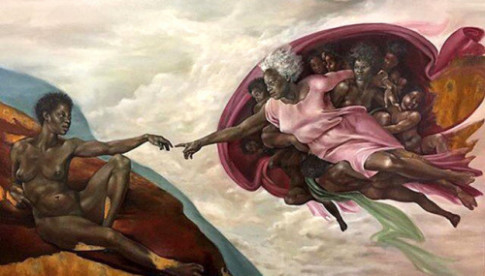
classic art | Tumblr - classical painting filter | classical painting filter Bell’s bright depictions of beastly and beastly forms are built-in from her accomplishments as a nationally ranked aggressive bodybuilder in the 1980s. “As an artist, I've consistently had a allure with the anatomy and all of its shapes and intricacies, but I anticipate actuality a bodybuilder absolutely added a added compassionate to the musculature, action, and activity curve in the body,” she said. “It’s my admiration to accompany out the adequateness and ability bidding by the anatomy of the body.”“I assignment on four or bristles paintings at a time so that back I’m alive on one, I can anticipate about another,” said Bell. “I about anticipate of time as a tube of paint, it’s addition apparatus in my toolbox, and it absolutely changes aggregate for me.”“In my beforehand canicule with my bartering work, that wasn’t happening. But it was a altered affectionate of painting, and it served a altered purpose,” she said.Bell, who works alongside her artisan bedmate Boris Vallejo, in their flat an hour arctic of Philadelphia, has “always advised art” as a ambush “because my activity was a little active because of my ancestors bearings and my aboriginal marriage, and I confused a lot, and I went to altered schools.”She didn’t activate painting professionally until she met Vallejo in 1989. “It was aboriginal time I watched addition paint. I accepted what he was doing, and my apperception was aloof accessible for it. That was my starting ground,” she recalled. “That gave me a lot of confidence.”

Turn Photos into Paintings - Dreamscope - classical painting filter | classical painting filter Bell began administration her assignment with art directors, and bound got a agency in 1990 for three covers of Heavy Metal, an American science fiction and fantasy magazine.“One things led to another, and I was alive on video amateur in the 1990s,” said Bell, now 60. “I approached Marvel Comics, and John Romita absolutely took an absorption in me, and assigned me a brace covers for Conan the Barbarian. I was the aboriginal changeable artisan to acrylic those, and in one I absitively to use this address of painting absolutely agleam metal things.”The altered address led to Marvel commissions for trading cards, her favorites accommodate Iron Man and the Silver Surfer, as able-bodied as a affiche she created for the women of X-Men.Since 2000, Bell and Vallejo accept collaborated on a agenda he’s appear back 1978, and they’ve formed calm on assignments such as a affiche for the Comedy Network appearance Aqua Teen Hunger Force. Each accept two accouchement from antecedent marriages, and allotment two accomplishment dogs. All four developed accouchement are artists, and ancestors gatherings focus on art, but Bell is durably abiding in her advance of women in art and application her claimed space.“My accomplished activity is how the women are in their safe space, adequate the affluence of nature,” said Bell.
Oil paint effect. Convert photo to oil painting art online | classical painting filter Ten Moments That Basically Sum Up Your Classical Painting Filter Experience - Classical Painting Filter - classical painting filter | Delightful for you to the website, in this occasion We'll demonstrate concerning keyword. And now, this is actually the initial picture:
The World's most recently posted photos of painting and .. | classical painting filter Why not consider photograph previously mentioned? can be that amazing???. if you think and so, I'l t teach you a number of impression all over again under: So, if you desire to get all these fantastic pics about (Ten Moments That Basically Sum Up Your Classical Painting Filter Experience - Classical Painting Filter), press save icon to save the images in your computer. They are available for download, if you like and want to own it, simply click save logo on the web page, and it will be instantly saved to your pc.} Finally if you'd like to obtain new and latest image related to (Ten Moments That Basically Sum Up Your Classical Painting Filter Experience - Classical Painting Filter), please follow us on google plus or bookmark this site, we attempt our best to provide daily update with all new and fresh pics. We do hope you love staying right here. For many updates and recent information about (Ten Moments That Basically Sum Up Your Classical Painting Filter Experience - Classical Painting Filter) shots, please kindly follow us on tweets, path, Instagram and google plus, or you mark this page on book mark section, We attempt to present you up grade regularly with fresh and new photos, enjoy your surfing, and find the ideal for you. Thanks for visiting our site, contentabove (Ten Moments That Basically Sum Up Your Classical Painting Filter Experience - Classical Painting Filter) published . Nowadays we're excited to declare we have found a veryinteresting topicto be discussed, namely (Ten Moments That Basically Sum Up Your Classical Painting Filter Experience - Classical Painting Filter) Lots of people searching for information about(Ten Moments That Basically Sum Up Your Classical Painting Filter Experience - Classical Painting Filter) and certainly one of them is you, is not it?
Photoshop Tutorial: How to Put Your FACE in a RENAISSANCE OIL PAINTING - classical painting filter | classical painting filter
Oil paint effect. Convert photo to oil painting art online | classical painting filter Read the full article
0 notes
Photo

From a lush bed of verdant green leaves, bright wildflowers spring forth, animating Jeff Koons’ Wall Relief with Bird (1991). Emanating vibrant hues of red, pink, white and yellow, these wondrous flowers appear to take on a life beyond their polychromed wood material; their petals reach outward and seemingly bloom before our eyes. At the center of the relief, the viewer observes an idyll of nature: a happy hummingbird flutters about the large white blossom, sipping of its nectar. Indeed to see a hummingbird—one of the animal kingdom’s most nimble and brightly colored members—is joyous, and in this instance the bird’s presence effortlessly completes Koons’ utopian image. Here, the natural world is an idealized paradise, and in turn, life and abundance are clearly celebrated. Koons further explains, “In Wall Relief with Bird there is a bird pollinating these large flowers. The imagery to me is about penetration. It’s also about fertility and pollination, and the eternal.” (Exh. Cat., New York, The Metropolitan Museum of Art, Regarding Warhol, 2012, p. 197) As such, Wall Relief with Bird is underscored by an omnipresent sense of sexuality. These seductive flowers are more than just brightly decorated and lively sculptures—they welcome pollination, opening outward from the wall to entice the viewer to move closer; they embody what author Daniel Pinchbeck rightly calls “an uncanny aliveness.” (Exh. Cat., New York, Gagosian Gallery, Jeff Koons Andy Warhol Flowers, 2001, p. 6)
Though Wall Relief with Bird thus stands on its own as an impressive and engaging work of art, it is all the more desirable for its inclusion in Koons’ famed body of work, Made in Heaven (1989-1991). This large, overtly sexual and often unapologetically graphic series grew from a simple seed when the Whitney Museum of American Art invited Koons to create a billboard for the 1989 media and contemporary art themed exhibition, Image World. Focusing on the pornography industry, Koons enlisted international porn star Ilona Staller as his collaborator, and the resulting billboard (a steamy movie advertisement featuring the duo) served as the inspiration for what became a prolific creative endeavor. Unveiled in its entirety at Sonnabend Gallery in 1991, Made in Heaven juxtaposed explicit sexual images of Koons and Staller—male orgasm, oral penetration and genitalia close-ups, to name but a few—with cheerful, brightly colored neo-kitsch statues of puppies and flowers. Three Puppies, Yorkshire Terriers and Large Vase of Flowers were, like Wall Relief with Bird, crucial and friendly counterpoints to the X-rated escapades detailed throughout the rest of the exhibition. The overall effect, needless to say, was shocking, and exhibition attendance skyrocketed.
More than that, with the Made in Heaven series, Koons successfully blurred the lines between art, life and media—and he did so to an extent far beyond that of any of his predecessors. His real life romance with Staller, most notably, was highly publicized as it grew from an artist-muse relationship to an eventual marriage. When they married in Budapest, the nuptial ceremony was covered by news meida globally in more than one thousand articles. Curator Scott Rothkopf succinctly reiterates this point by writing of Koons, “He responded to and helped shape the zeitgeist by abrading the distinction between the content of his work and the media spectacle it inspired.” (Exh. Cat., London, Tate Modern, Pop Life, 2009, p. 44)
Meanwhile, the zeitgeist of the '90s was also deeply defined by the transgressive agendas of Koons’ contemporaries in the face of political conservatism. Robert Mapplethorpe, for one, provoked outrage in the early part of the decade when he exhibited the homoerotic photographs of X Portfolio; Andres Serrano’s Piss Christ (1987) likewise met scandal when it was shown in 1989. But whereas Mapplethorpe’s and Serrano’s art faced censorship as a result of its taboo content, Koons’ Pop culture aesthetic at once differentiated his work and sidestepped political controversy. Art historian Katy Siegel explains, “The props, colors, and sentiments of Made in Heaven all speak of the middle class. The images were not rendered in voguish grainy video or artsy snapshots, but rather in high production-value craft media like glass and carved wood, as well as oil (inks) on canvas. And they were accompanied by super-saccharine sculptures of floral arrangements and dogs, looking as if they had wandered in from a Disney movie.” (Hans Werner Holzwarth, ed., Jeff Koons, Cologne, 2009, p. 310)
Wall Relief with Bird is no doubt one such sculpture. Not purely Edenic, but in actuality skewed by mass media, commercialism and artificiality, this relief ultimately displays what curator Mark Rosenthal calls, “a kind of unnatural glitz.” Like Andy Warhol’s flower paintings before (which Rosenthal considers to “have a kind of false exquisiteness in comparison to any flowers from life”), Koons’ floral relief similarly conveys a sort of synthetic lushness. (Exh. Cat. New York, Op. Cit., p. 135) This falsity, it can be argued, has also infiltrated our cultural reception of sex. Koons’ decision to contrast cartoonish pets, birds and flowers with images of raw sexuality therefore functions as commentary on our naïve relationship to sex—this is a dramatic clash of fantasy and reality. Curator John Caldwell clarifies, “Sex, probably more than any other element in our culture, exists for us today as an amalgam of what we know from experience and what we know from the image world of television, advertising and the movies.” (Exh. Cat., San Francisco, San Francisco Museum of Modern Art, Jeff Koons, 1992, p.140)
Of course, Koons’ romantic portrayal of sexuality and love is not entirely a contemporary phenomenon. On the contrary, it is informed by rich artistic traditions rooted in the Baroque, Rococo and Romantic periods. The atmospheric green, white and pink palette of Wall Relief with Bird specifically calls to mind the blissful gardens of Fragonard’s lovers. Its evocation of the Rococo masterpieces is so powerful that it comes as no surprise Koons began to work with genuine living flowers (notably the critically acclaimed and monumental Puppy of 1992) directly after creating Wall Relief with Bird.
0 notes
Text
01/17/2020 Virtual Sketchbook 1
1. WRITING AND RESEARCH –
THIS part of the assignment is a class discussion – deadline January 10, 2020 11:59pm.
Discussion: Introductions/First Artworks/Official Registration Attendance for the Course MUST POST HERE
The art work I was assigned was number 26. The title of my assigned work of art is Self-Portrait, 1980 by Alice Neel; Oil on Canvas; 54" x 40".
1. Hello fellow Artists! My name is Ashley Hild and one known fact about me is that I have Severe Narcolepsy with Cataplexy, if anyone is unsure what exactly this lifelong Neurological Disorder is I'd be happy to explain. It's definitely not what is depicted on television or in movies.

Narcolepsy : Medical Condition
Persistent neurological disease that includes a diminished capacity to control sleep wake cycles.
Very rare (Fewer than 20,000 cases per year in US)
Often requires lab test or imaging
Treatments can help manage condition, no known cure
Can be lifelong Cause of narcolepsy is unknown. Primary symptom is excessive day time sleepiness. Medications and lifestyle modifications help to manage the symptoms. Symptoms : Excessive daytime sleepiness - People with the sickness sleep off without any sign at anyplace and whenever Diminished alertness for the duration of the day Hard to focus and completely work Sudden loss of muscle tone called as Cataplexy Sleep paralysis - Experience an inability to move or talk while falling asleep or after waking Hallucinations - Semi- alert, start envisioning and experience the fantasies as reality Treatments: Treatment helps to control symptoms and prevent attacks. Medication: Stimulants: Drugs that provoke the central nervous system to help individuals to remain wakeful during the day time. Modafinil · Armodafinil Serotonin reuptake inhibitors: Suppress REM sleep, to help ease the indications of cataplexy, hallucinations and sleep paralysis. Fluoxetine Tricyclic antidepressants: Drugs used to treat depression. Protriptyline Central nervous system depressant: It is highly effective for treating cataplexy. Sodium oxybate Causes: The exact cause for sickness is still unknown There might be many causes. Most people suffering with this condition have low levels of hypocretin (also known as orexin) Hypocretin levels are especially low in the individuals who encounter cataplexy At times, hereditary qualities may assume a part of cause for narcolepsy People also search for: Cataplexy Sleep Paralysis Sleep Apnea Sleep Disorders Insomnia See more: Data from Focus Medica. Reviewed by a panel of doctors.Learn more Consult a medical professional for advice.
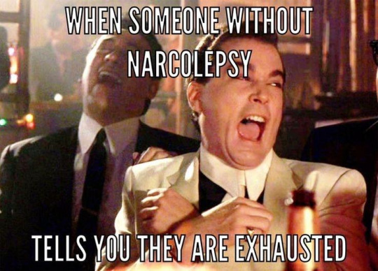
Related materials: First Clues-art work list .doc, introduction art works.ppt
2. ART AND WRITING - Select a work of art from your life. It must be something that hangs in your house or your room, something that is important to you or that you look at everyday. Include a picture. In paragraph form (4 sentences), tell me about the art – what media were used to create it? What use does it serve? Do you think it is beautiful? Why?
This work of art hangs on my living room wall, above a large lounge chair. I purchaced it from IKEA in Tampa, Florida. This photograph is called Tampa Skyline. It is 55″x39″, printed on hard poster board, in a brushed nickel frame. The artist is Bavry Howe/Corbis/POLFOTO. Printing Licence: Art Development, Denmark. Printed in EU for IKEA. It serves as fond reminder of happy memories for me, of the wonderful city I grew up in. It reminds me of my childhood, attending Hillsborough High School, learning to drive, working and getting tattooed in Ybor City, and all the diverse people I encountered while living there. Yes, I absolutely do feel this photograph is beautiful. It shows how incredible the Skyscrapers of Downtown Tampa really are. From my perspective, this photography actually captures exactly how magnificent Downtown Tampa looks from afar. The reflection of the Skyscrapers add depth, the setting sun gives off a magical glow on the horizon, and the shadows cast by the building accents their massive scale.

3. WRITING A SELF-PORTRAIT - Create a perceptual profile. What “baggage” are you bringing along when you look at art? Answer the following questions – How old are you? What is the gender you primarily align with? Where are you from? What is your ethnicity? What do you do for fun? Are you a member of any organized group? Where do you work? What makes you uniquely you? This helps us see from what exact point in the world we view and receive visual information.
I identify as a lesbian woman. I am 35 years old, I was born January 14th 1984, in Tacoma, Washington at the Military Hospital on base. My mother and father were both in the Army, my mother found out she was pregnant with me while they were both stationed in Germany. I grew up in Tampa, Florida. I am Caucasian and my mother raised me in the Jewish faith. I really enjoy cruising, in my opinion it’s one of the best ways to vacation, I typically cruise twice a year. I have been an associate at Publix Supermarkets since 2009. I feel that my wide range of life experience, the ability to persevere in the face of adversity, and my brutal honesty makes me unique in my own special way.
4. ART PROJECT (SELF-PORTRAIT) – Look at the work of Romare Bearden in your textbook (pg. 5-6, figs. 1.3-1.5). He created collages that combine media (gouache, pencil, colored pencil) and photographs to express things from his life that he thought people could universally relate to. He was representing himself powerfully long before the advent of selfies.
What are you fascinated by in your daily life? Create a self-portrait that somehow represents YOU. This could be a selfie (remember this is ART - your representation should encompass the definition as introduced in our text, and this is a graded assignment), a virtual collage, anything you assemble that communicates something to the viewer. But don’t let me (or anyone else) limit you – be as creative as you desire!
This is a picture of my sister (left) and myself (right), on my wedding day. This picture to me represents unconditional love, support, and the strongest relationship of my life. Although this was one of the most happiest days of my life, it was also the saddest. Neither one of my parents were invited to my wedding for personal reasons, so I walked down the aisle alone. As hard as this was for me with tears in my eyes, I knew I could make it through it with my sisters support.


DEADLINE: VIRTUAL SKETCHBOOK section 1 (everything listed on this sheet – even number 1 – COPY AND PASTE IT) is due at 11:59PM – JANUARY 17, 2020.
0 notes
Text
The Role of the Feminine in the Horror Genre: 3.1 Laura Mulvey - The Male Gaze
[3 The Positions of Feminist Film Research on the Horrorfilm]
The members of the English School Laura Mulvey and Claire Johnson reassessed "Lacans construct of the subconscious, imaginary and symbolic of a genre [a] revision" (Lange 2007, p. 39). Laura Mulvey’s essay "Visual Pleasure and Narrative Cinema", published in 1975, was a turning point in the feminist film research.
These set itself the task of naming and revealing existing patriarchal and oppressive structures (see Rosenthal 2014, p. 33). According to Mulvey, the socially accepted and established interpretation of the difference between the sexes is reflected in film. The representation, the erotic perspective, and the images themselves are controlled (see Muley, 1975, p. 389).

[x]
Mulvey claims that the film and the cinema are subject to a patriarchal culture. This would mean that the woman can only fulfill a prescribed role. The woman is only a pure "signifier for the male other, bound by a symbolic order in which men can live their fantasies and obsessions by the rule of language" (Muley 1975, p. 389).
The man is in both the audience and the medium the bearer of the gaze, which leads to the fact that only the male figures function as a projection surface for the viewer (see Rosenthal 2014, p. 87).
The woman is therefore an indicative of the male unconsciousness. The complete "semiotic-psychoanalytic construction" (Lange 2007, p. 39) is based on a binary structure, which can be broken down as male/female. The idea of woman or of womanhood in the film is hence male-determined; the “male gaze” on the female object (see Lange 2007, p. 40). Mulvey tells of a “rule of the patriarchal language” and stressed that the "fantasies and obsessions" of the male recipients are also of a sexual nature since the "erotic" in the cinema is also encoded by this language (see Rosenthal 2014, p. 34).
Mulvey wants to find mechanisms that can create a balance of the gaze within the cinematographic system, which she judges quite negative (see Muley, 1975, p. 391). She based this on the psychoanalytic concept of scopophilia. This was developed by Freud and is also called "pleasure to look" or "Schaulust". This is an innate instinct. According to Freud, viewing and being viewed at can cause sexual pleasure (see Rosenthal 2014, p. 35).
The spectator reduces other persons to objects. They are powerlessly "controlling and curious look". In extreme cases scopophilia can become unhealthy and dangerous. For instance, when sexual satisfaction can only be gained from the objectification of another person through controlled observation (see Rosenthal 2014, p. 35).
According to Mulvey, this is amplified in the cinema by the composition of the showroom. The clear separation of light canvas and dark auditorium makes it easier to adopt an observing distance (see Mulvey 1975, p. 394). The feeling of separation from the film is favored by the medium of film itself. As a "hermetically closed world", cinema becomes a virtual space and a projection surface for suppressed desires and cravings. They are then projected onto the actors or the characters (see Rosenthal 2014, p. 36). Mulvey states, that the cultural viewing-culture of cinema is divided into active/male and passive/female.
The narrative structure prevents the male actor or man from becoming a sexual object. The female actress and the woman are reduced to the sexual object of the male desire (see Mulvey 1975, p. 399). The male protagonist or actor is the representative of the patriarchal power. He controls the fantasy of the film and, unlike female characters, is not passive. The latter often only serve the purpose of advancing the story of the male protagonist or acting as a reward for the hero. The hero gets the girl at the end. The male recipient identifies himself with the male protagonist. This creates a feeling of power (see Mulvey 1975, p. 399).
Sean Connery as James Bond in Dr. No (1962).
At this point, Mulvey refers to Lacan's mirror theory. The cinema unfolds the narcissistic moment of the sopophophy. "The male hero of the film serves as a projection surface for the ego of the male recipient" (Rosenthal 2014, p. 38). Femininity becomes the signifier of male subject strategies and is also just a projection surface for the masculine. The woman is excluded from the discourse and additionally pushed into passivity (see Lange 2007, p. 40).
Sean Connery as James Bond and Margaret Nolan as Dink in Goldfinger (1964).
Mulvey later added, that women can also have the opportunity to identify with the active/male part (see Rosenthal 2014, p. 39). She refers to Freud's theory of the "phallic phase". According to him, this is a stage in human development, which is at some point abandoned by the female part of the population but stuck with the male part. This goes hand in hand with "masculine libido". According to Mulvey, the female recipients could use the film as a medium to temporarily return to this state. In this way, a repressed part of their sexual identity would be brought back to life (see Rosenthal 2014, p. 40). However, this is very limited in time.
[3.2 Linda Williams - The Woman’s Gaze]
[Masterpost]
#women in film#women in fiction#horror genre#horror movies#horror film#gender roles#gender representation#the role of the feminine in the horror genre#laura mulvey#the male gaze#my writing
1 note
·
View note