#basic shot composition basic camera movement fairly basic lighting
Explore tagged Tumblr posts
Visit Tumblr Blog
Explore Tumblr blogs with no restrictions, modern design and the best experience.
Last Seen Tumblr Blogs


Fun Fact
Tumblr’s website traffic is steadily declining.
Text
would it be sacrilege of me to say that i am kinda hashtag Underwhelmed by the percy jackson show
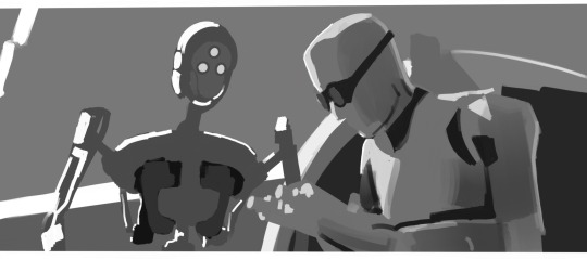
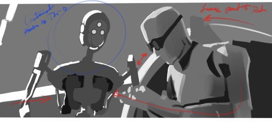
#first off. the directing is just not that good.#like you could have taken the unique story and made interesting choices that make the story feel more exciting but so far it’s just so basi#basic shot composition basic camera movement fairly basic lighting#also like i can understand changes from the book. going from a first person novel to a show is difficult and you have to make changes.#but also some of them are just like nonsensical. why would you change the claiming from a moment of victory for percy to whatever that was#<- well okay not really victory. more confusion and fear and desperation with a tad bit of victory#(also the claiming symbol looked bad and i’m salty about that)#i liked that annabeth had it figured out though that was fun. the introduction to her character kinda slayed#oh my god also the decision for that scene where luke is telling percy abt him annabeth and thalia to Not have any broll type shots overtop#-of the explaination actually Showing what luke was saying was lame#i get that they don’t have the actor for thalia chosen yet but you could have easily done it to where you only showed young luke+annabeth-#-and just thalia’s like sillohuette or hand reaching out or whatever#also again about the claiming scene they just took away all of the hints toward future twists. the hellhound summoned by someone in camp-#-and the hints toward the Big prophecy :(#anyway overall it’s awesome and it’s so fun to see pjo on screen. it’s just a bit lacking imo ☹️#oh and the reduction of gabe into an almost comedic character rather than as an absolutely foul person that percy and sally have had to-#-suffer just does not work for me. it’s such an important detail thematically and also gives so much more context and meaning to percy and-#-sally’s lives and relationship. i think it’s so important but they changed it to something more palletable :(#ash rambles#ash.txt
7 notes
·
View notes
Text
Because I have a tendency to get stuck in art blocks and s t r u g g l e badly with composition, and because I think The Bad Batch is a beautifully shot show, I’ve started doing rough grayscale studies of bad batch to unpack how line and value can be used to direct a viewer’s eye to where people want the audience to look. (I’m doing it with other movies and shows, but I do really like TBB, so….) That way, if I’m sitting in a period where I can’t draw, then maybe I can at least learn something. It’s not fan art, it’s just trying to break the composition down and make it make sense to me, but I think it’s interesting so I figured I’d throw them all here.
So! Potentially very boring things under the cut:
The thing that started this off was getting sent a gifset of the scene in “The Return” where Wrecker gives Crosshair his armor back. It’s a great scene, and one of the things that allows for the show to pull that moment off is the way that most everything in many of the shots is designed to draw the viewer’s attention to Crosshair’s face so that we’re paying attention to his reaction. For example:
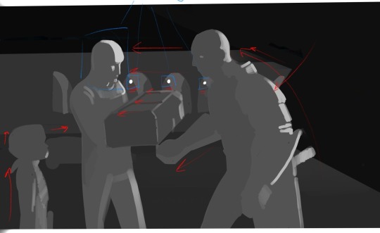
It’s not a very high contrast shot, but if we block out the basics, most of the lines in the scene are directing us towards Crosshair. Both Wrecker and Omega make movements towards him in this shot, and then this movement is sort of carried over to Crosshair via the various lines in the background/Wrecker’s arm/even the crate. Additionally, our eyes tend to be drawn towards points of highest contract, which, in this shot, include the lamps in the far background against the pillars (forming a line from Wrecker to Crosshair) and the light hitting Crosshair’s face against the much darker background. Between all of this most people in the audience are going to end up automatically looking right at Crosshair who is, of course, the main person we’re supposed to paying attention to here.
This isn’t actually a full frame. I sort of grabbed a screenshot over the interwebs for this one, but The Bad Batch actually has a very wide aspect ratio. From what I understand it’s shot and aired in a CinemaScope ratio (2:39:1 or 2:35:1, though TBB is 2:39:1). It’s basically super ultra widescreen, an aspect ratio used when a filmmaker wants to make something feel more epic or cinematic, and as far as I know it’s the same aspect ratio used for the original trilogy before any cropping happened. (For reference, The Clone Wars was also shot in a CinemaScope ratio, 2:35:1, but was cropped to 16:9 for airing on Cartoon Network, and Rebels was shot and aired in 1:78/more or less 16:9.) So an uncropped screenshot of TBB would look more like this:

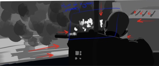
This is from “The Outpost.” It’s actually a fairly dark shot with Crosshair faced away from the camera and the value of his figure blending right into the rest of the foreground, which actually comes communicate a sense of someone who isn’t trying to draw attention to themselves (to me, anyway), but our eyes are drawn to Crosshair anyway by every major line in the shot as well as the highest point of contrast converging right over Crosshair’s shoulder. That, and the line of his rifle/shoulder and the support pole forming a big, well, cross-hair right in that same spot. Otherwise, he would blend right into the foreground and be easier to miss.
Unlike Hunter in this shot from “Plan 99”
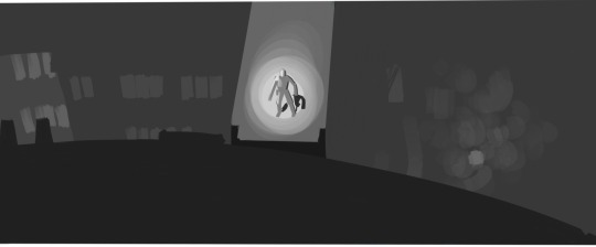
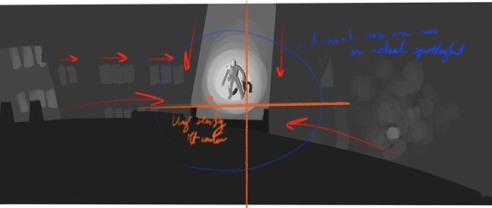
Where basically you’ve got the exact same thing happening, every line in the shot converges on Hunter’s location, but instead of using just high contrast to draw our attention, we’ve got a fairly middle-gray scene with our eyes being drawn to the focal point by having one bright spotlight.
The orange cross mark I’ve drawn here is just to mark the center of the frame, which I wanted to point out since, at least as far as I’ve noticed, TBB has a tendency to save center and slightly off-center shots for really specific moments. I’d have to check on that and what the pattern is, though, since a few of the remaining shots in this post are center shot. (Filmmakers area generally taught shoot in thirds or, alternatively, on a phi grid or other away from center set of focal points, though you do get some center shot movies and shows. I think Raiders of the Lost Arc has a lot of center shots.)
In fact, a pretty good example of shooting in thirds (or on a phi grid—I laid it out and I think it fits the phi grid slightly better) is this shot from “Faster”
Where you’ve got Tech and Tay-0 placed on slightly close thirds on either side of the frame. If we’re just looking at line and value, with this shot we actually get this sort of interesting back and forth between where our eye is being drawn. A lot of the lines in the shot are directing us to look at Tech, but then you’ve got one of the lines going through, and the sweep of Tech’s arm and datapad pointing towards, Tay-0, whose face and body are outlined with a much higher contrast in value. And then we have that one very bold arc connecting the two. The result of this is that our eyes sort of bounce back and forth between these two characters as they get into their conversation.
Most of these shots have had just one or two (at most three) characters, and there are many scenes of TBB with everyone where our gaze is sort of directed to the group collectively, but sometimes you’ll have group scene where our attention is directed more towards one individual than others, like with this shot from “Battle Scars”
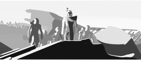
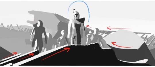
Once again, you’ve got most of the lines in the shot converging towards Rex as well as Rex’s person serving as the point of highest contrast while everyone else sort of melds into the background in terms of value. He’s also the first (and maybe only) figure who breaks fully above objects in the background to be shot directly against the sky. Line and value aren’t the only things directing the audience’s gaze towards Rex in this shot—there’s actually a lot of desaturation happening as we move from Rex, to the other characters, to the far background that helps as well, buuuuut this is a grayscale breakdown so that unfortunately doesn’t show up...here. (This is a center shot scene if we’re going horizontally, but Rex’s head, which is really the focal point, is right around the top third of the frame; it’s not exactly a low angle shot, but we are still looking up at him.)
Anyway, the reason any of this is important is because when you’re shooting with an incredibly wide aspect ratio like this, there’s a LOT of information being conveyed with every frame. You can fit a lot of stuff on screen at once. And while people generally going to rewatch and pay attention to background details (if nothing else, TBB is a goldmine for those background details), you do want to draw your audience’s attention to the most important parts of the frame—especially when an individual shot typically lasts only a few seconds. Or less. Like with this:
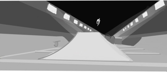
So this shot from "Faster" is up for less than a second before the camera turns to follow the speeders and then changes to another shot, and I had a devil of a time even getting screengrab of it. (Mostly because I was trying to grab it on my phone, but that's not really the point.) In less than a second the people making this have to communicate where Tech's speeder is, what's happening, what we're even looking at, while the objects in the scene are all moving incredibly fast. .
So, to communicate that, you've got multiple speeders moving in the shot, but only one (Tech's) standing out in terms of value against a fairly dark ceiling, as well as a combination of some real direct one-point linear perspective and the more or less arrow shape of the ramp pointing directly at the point Tech's speeder is going to be when it reaches the peak of its crest over the ramp. That way we're already looking at where Tech is going to be before he gets there and end up following his speeder as he zooms by.
#the bad batch#so anyway it's a very pretty show#and a very visually deliberate one too#(I think it's deliberate in other ways too but that's the kind of stuff I save for my endless old lady yells we're not done at clouds box)#there's no real conclusion to this#I just have a hard time getting my head around composition so I thought the way TBB does it is neat#also I know in animation it’s scene and sequence instead of shot and scene#but it’s easier to communicate it with shot and scene
25 notes
·
View notes
Text
FMP - Camera Angles
I've blocked in my camera angles based on the storyboard. Here is a video comparing the storyboard to the angles.
You can see that it's mostly fairly matched up. I did change the water pipes for a coffee machine as I felt that this fit better with the room being the bedroom/living quarters. I also ended up having the astronaut walking a little further away an more from the side. This worked better with the terrain and composition of the shot looking out of the window.
I felt that the basic lighting I'd put in using the light assets I'd made was a little flat for the individual shots, so I added a rect light directed at the hero assets with an orangey/golden glow that slightly moves up during each shot. This adds to the effect of the shutter moving upwards that we see in the in-between shots. I think this adds a nice extra detail and dimension and makes the hero assets pop a lot better.

The camera also moves in slowly towards each asset in the shot, just to give a little movement.
I also added in a rect light in front of the astronaut that is parented to them to mimic a bit of a rim light from the sun for the camera view. I used lighting channels to only affect the astronaut with that so there wasn't too much light hitting the floor. It only makes a small difference but it highlights the astronaut quite well.
0 notes
Text
Sessions
Pairing: College!Din Djarin x F!Reader
Word Count: 2.6k
Warnings: None (let me know if I missed something!)
Summary: Everyone is talking about the mysterious new guy on campus
A/N: I had a ton of fun writing this extremely self-indulgent AU and I have plans to keep writing more about these two. It won’t be an actual chaptered fic, but at some point I’ll throw together a masterlist with a chronological order to things.
Series Masterlist // Main Masterlist
Introductions
The semester had only started four weeks ago and he was already a legend around campus. Almost everywhere someone could be found whispering about him. You'd even heard faculty speculating, wondering about the rumors they overheard their students sharing.
You first heard of him in your literature seminar, some of your fellow classmates discussing a recent rumor about the now fabled man. Something about a motorcycle and a child caught your ear, prompting you to interrupt and the girls in front of you who they were talking about.
The looks you received from the pair were incredulous at best. “You mean you haven’t heard about him?”
“Heard about who?” you asked, genuinely confused. It had only been the first week of class at the time and you were too caught up with your own busy start to check in on the rumor mill.
“Mando, obviously. He’s all anyone is talking about.” From there the girls had happily filled you in on all the latest sightings and rumors.
Mando, as they called him, was shrouded in mystery. He'd popped up on Corellia University's campus when the semester began and no one knew a thing about him. He hadn't gone to Corellia before, internet searches turned up nothing, and even the skull-like symbol on the back of his leather jacket wasn't familiar to anyone. Any information on him was conjecture at best and there was plenty to go around. Once the rest of the class caught onto what you three were discussing, theories began to fly.
People discussed how he’d been spotted downtown, beating on some guys in a back alley. He’d also been seen uptown the same night though, strolling through Basalt Park. One girl was nearly certain that she’d gone to elementary school with Mando, but he’d mysteriously disappeared one day without explanation. Someone else was confident he was just a cop trying some weird shtick to go undercover. Then one person insisted he had a kid with him sometimes while another was trying to explain that he was actually a murderer. The rumors only became more ludicrous from there.
By the end of the discussion you only ascertained two things for certain. He went by the name Mando and he wore some kind of special helmet. Information you could have gotten by watching him pick up a drink at the Java Hut. Not nearly enough to warrant this level of fervor in your opinion.
From there, hearing about Mando was inescapable. You got home that night only to have your roommate and best friend, Layla, launch into theories about him. Within the week someone set up a social media page to try and track his location around campus via DMs fellow students sent in. That had struck you as invasive and unsettling, but the messages about him kept flooding in.
By pure chance, you had yet to actually see him for yourself. There weren't even any creep shots for you to look at. People had been trying to take photos of him, but he was like a ghost. In the time it took them to pull up their cameras he'd disappear.
There wasn't even more concrete information about him beyond what you'd learned that first day. Just more and more speculation, a good amount of it made up purely for the shock factor. Another week slipped by, the semester picking up, and Mando news became standard in your day. There was always something new going around about him and as much as you tried to avoid it and focus on your studies, you couldn’t help but wonder about him yourself.
Who was this guy? Was this all some stunt or ‘social experiment’ that would be revealed by a sociology student at the end of the semester? Or was he a legitimate peculiarity, doomed to stick out like a sore thumb? You weren’t sure if you should hate him for making a big deal out of himself or pity him for all the unwarranted attention. Either way, you were sure that whenever you met this enigmatic Mando, you’d know.
×××××
You grumble looking at the submission form. The name and student ID information is blank again. You told Todd last week those fields needed to be made mandatory. How else were you supposed to know who to email when you end up with a no-show for the hour?
Looking further down you're pleased to note that they're at least a grad student. Despite the unfinished form, graduates almost never skip sessions like these. You're thrilled to have the opportunity to discuss something other than freshman composition for once. It's fun helping the wide-eyed freshies, but you can only go over basic comma rules so many times before you start to lose it a little.
There's a knock at the study room door and you look up only to be rendered speechless. It's him. Mando. With a kid on his hip. So Alissandra hadn’t been lying when she told you about the toddler she saw with him. Interesting. Continuing to take him in, you can’t help but focus on the obvious - the only thing you knew about him other than his supposed name, the helmet.
It’s unlike anything you've seen before. You're fairly certain it's a motorcycle helmet, but it's been modified. Rather than the typical rounded shape, his is all sharp angles and flat at the front. It’s colored a sleek, shining chrome that gleams under the washed out fluorescent lighting. Most arresting is the way he's changed the face of the helmet. The cheeks dip inward at a sharp angle, creating deep, curved contours. His visor is a T of black glass in the center, entirely impossible to see through. It's intimidating and… kinda hot?
The little boy he's holding starts to wiggle in his grasp, physically demanding to be set down in the study room. Once his feet touch the floor, he immediately runs over and climbs into the chair next to you. He's a welcome distraction from his father’s? brother's? guardian's? commanding presence in the room.
The boy can't be older than three, smiling up at you with a wide toothy grin. His hair is covered by a green beanie with large floppy ears sewn onto it and he's wearing a little brown jacket with a sherpa collar. Maybe a bit too heavy for the early autumnal weather, but if the rumor that the kid rides on a motorcycle with Mando is true, it’s perfect. His eyes are large and brown, shining up at you with a slightly mischievous glint.
"Hello, what's your name?" you ask, smiling back at the child.
"Grogu," comes the reply, not from the kid, but from Mando.
You arch an eyebrow at him. He can't be serious with that name. "Grogu?" you ask.
He shrugs, placing his bag on the table. "I came home one day and he told his babysitter that was his name now. He won't respond to anything else. So, Grogu."
You look back to the bouncing toddler. He's still grinning, nodding along with what's been said about his name. They must not be lying then. Either that, or it was some elaborate prank between them and you would never be in on the joke.
"Well okay, Grogu it is."
You extend your hand out to Mando, offering your name alongside it. He offers a leather clad hand in return, giving you a firm handshake. You're pleased when he only gives your hand a gentle squeeze, not crushing it like so many other students have done. His gloves are unique as well, black with orange fingers, the leather well worn in. It's warm to the touch, his body heat radiating through the thick fabric.
"Mando," he says, officially introducing himself as he takes the seat on your other side, across from Grogu.
"Mando," you repeat, cementing it as a truth from the rumor mill. "Got any other names?" You hope that comes across as casual and not intrusive. He hasn't even gone to remove his helmet, telling you he isn't a man who cares much for people prying into his business.
"No. Why?" Mando cocks his head slightly as he asks, the helmet adding an exaggerated look to the movement. He reaches into his bag, pulls out some crayons and a pad of paper, pushing them over to Grogu.
You shrug, trying not to think about how you heard his name might be David from someone in your composition course. "Just thought I'd ask. One hears many things around campus and it's hard to tell what's true or not."
"What do you mean?"
That question makes you pause. Surely he knows. Part of you is still convinced he’s doing this act on purpose, trying to gain notoriety for some reason. The way he asked though, something about it tells you that the poor man is clueless about the buzz he's caused.
"Mando, you're like the talk of the town right now. We only just met but I've heard plenty about you," you explain. It's hard to tell with the helmet on, but you're fairly sure he's shocked underneath. Grogu ignores you both, excitedly scribbling away on his paper.
"I'm fairly sure most of it's just rumor and speculation, but still. You're like a thing around campus," you add.
He's quiet for a moment, his laptop only half out of his bag. "Oh," he finally says. "I didn't know."
Grogu gives a happy shriek not a second later, breaking the awkward tension that had begun to creep into the room. He's beaming, holding up his crayola masterpiece. On the paper there is what appears to be a hastily drawn frog using every color in the box.
Mando returns to himself, pulling his laptop the rest of the way and continues to get set up. "Great job, kid. It looks good."
Most people would have said that dismissively, a platitude to get their child to stop bothering them. When Mando says it though, the authenticity is palpable. He said six words and you can hear the pride lacing them all together. It’s sweet, the obvious affection this clearly private man has for the toddler.
You can’t help but wonder what his connection to Grogu actually is. The way he spoke just then, if you had to put your money on it, you’d say father. The kicker then though is if he’s biological or not. And if not, then how else does a grad student get strapped with a three year old? Thinking about all the potential scenarios is enough to make your head hurt.
You’re also left wondering where all the more violent rumors about him are coming from. His tenderness is so readily on display that it’s hard to imagine the man before you choking someone because they cut him in line at the local froyo shop. He’s mysterious and gives off a vaguely dangerous vibe, sure, but less than five minutes around him and the kid and it’s obvious he’s no threat to you. He’s just a guy trying to get his assignments done for class, same as everyone else.
Your stomach still catches in your throat as Mando starts unexpectedly tugging off his gloves. From what you’d heard, he never takes anything off: not his jacket, not his gloves, and certainly not his helmet. All anyone knows of his true appearance on campus is that he’s obviously male with rumors flying around about everything else including simple attributes, like the color of his skin. Now, here he is, casually revealing this groundbreaking information to you.
His hands move fluidly, pulling off each glove in just a few easy tugs. His skin matches the heat you felt from them just minutes ago, a warm golden tan, with a few faded lines of scars worn in. Watching him type, pulling his paper up for you to discuss, you feel a deep and sudden ache to have his hands touch you again. A simple handshake is no longer enough. Every stroke of the keys is measured, deliberate, and leaves you wondering how he would use those fingers on you.
“This is what I have so far.”
His voice snaps you back to reality, a quick wave of shame washing over you. Where did all of that come from? It was just a man’s hands for heaven’s sake, certainly not something you should be horny about at two in the afternoon. Not to mention that he came in here looking for your help, not wanting you to start fantasizing about his hands expertly working you over.
You clear your throat and tear your eyes away from the offending appendages. “Great, let me just read the introduction here so I can get an idea for what you’re writing about.”
You settle into working with him easily. His paper is already well-written, just needing tweaks here and there to bring it to the next level. It’s nice working with him. He’s attentive, clearly listening to everything you have to say and taking it into account. He doesn’t even try to challenge you as some of the more macho male students are wont to do. By the end of the session, you can’t help but wish all of your time as a tutor was that easy.
“Thank you,” he says sincerely, tucking his laptop away. “You really helped.”
You smile at him, thrilled with his genuine complement. “Of course, that’s what I’m here for.”
He finishes packing up his and Grogu’s things, with you silently lamenting as his gloves slide back on. It still feels like a ridiculous thought, but he really does have beautiful hands. There’s a small tap on your arm and you look to your left to see Grogu patiently waiting. He’s offering something to you, paper outstretched in his little hands.
“Thank you,” you say, taking the sheet from him. You look at it to see a frog carefully drawn on the page. It’s not the same as the first one he showed you and Mando, this one more deliberate and thoughtful. The colors are still just as varied, but it’s obvious he took more time to think about where he was using each one. You can’t help but smile at his small masterpiece.
“It looks great, buddy. I’ll keep it forever,” you tell him. Grogu beams at your praise, excitedly looking over to Mando.
Mando nods at the kid. “Yeah kid, I heard her too.” He turns his head towards you. “Thank you again. I’d take good care of that drawing. He’ll never forgive you if he finds out you got rid of it.”
“Does that mean I’ll be seeing you again?” Your own boldness takes you by surprise. You have no idea where that came from, how those words spilled without a second thought. Part of you is already cringing at Mando’s potential reaction.
He surprises you once again though, holding a hand out for Grogu to take. Shouldering his backpack, you hear an amused huff of air from under the helmet. “Yeah, mesh’la, I’ll see you around.”
There isn’t a chance to reply as Mando turns, escorting his tiny charge out of the room with him. You’re a little dumbstruck, now equally surprised with him as you had been with yourself.
And what was that name he just called you? Mesh’la? You don’t even know what language that could have been, much less the meaning. Something about his tone when he said it tells you it’s a good thing though, that he’s not secretly calling you rude names in some unknown language. You can’t help but wonder if you’ll ever get to find out.
.
.
.
taglist: @honestly-shite
#din djarin x reader#din djarin x female reader#din djarin x you#college!din#college!mando#the mandalorian fanfiction#pedro pascal x reader#mandocrasis fic#sessions
247 notes
·
View notes
Text
Live Brief
What: Dance Show
When: 26/01/2019
Research: Before the date of the show, I had not done any specific research on dance shows, as I have experienced them for myself and felt like I knew enough about the subject to not warrant extra research. I had a basic idea of the layout and what would be happening and used my own knowledge instead of research.
Type of shots I hoped to achieve: My aim was to capture as many different shots as possible, including; frozen movement, blurring motion, varied focal lengths and use of composition techniques.
Kit I used: I used two cameras for this shoot. For videoing, I used my Nikon D3200 with a standard 18-55mm kit lens. I also used my Canon EOS 4000D and a selection of lenses; a standard 18-55mm kit lens, a 50mm f/1.8 lens and a 75-300 mm lens. As well as the cameras and lenses, I used a tripod to set up the camera videoing at the front. A ring light was provided by Nicole for the portraits of the girls.
Final images:


Evaluation: As this was my first time photographing any kind of show/dancing, I am fairly happy with how my images turned out. I feel like I could have done more to experiment with different compositions of the girls, but am still pleased with the images I did get. As for the portraits, I am not particularly keen on the shadows and background in the majority of them. This was due to space limitations, as well as not having a clean wall to use as a background. I am however pleased with a few of the portraits, and think I done a reasonable job given the circumstances. I am especially happy with the head shots I am submitting and feel like they are some of my stronger images. Overall, I am reasonably happy with how the shoot went and with the images I captured. I would like to try and shoot some more dancing/dance shows in the future as I had a lot of fun doing it.
1 note
·
View note
Photo

Panning - f/13, 1/60s, 100 ISO. I was happy that I got a shot where the watermelon is fairly crisp, while the background shows movement due to the slow enough shutter speed and I like the vibrant colours. I used f/13 to give myself some flexibility as I had to focus before the object started moving, predicting where it would go and a wider aperture would have made the depth of field shallower and I would have had to focus very precisely. If I were to do it again, I would shoot from a different angle to prevent the direct sunlight from bouncing off the surface of the melon as it’s a little distracting. A friend further up the hill released the skateboard when I was ready, which took a bit of trial and error.

Frozen Movement - f/5.6, 1/800s, 100 ISO. I used a shutter speed of 1/800s to capture the oranges in mid-air with the aperture wide open to allow enough light in for such a fast shutter speed. This also created a shallow depth of field which I think works well for this image, with some oranges in focus and others not. I like that the subject’s face is covered by an orange, drawing your attention to the flying fruit and away from him - I find the writing on his shirt a little distracting though and, in retrospect, would have chosen a plain tshirt but I do think that the vibrant, contrasting orange and green take your eye away from this. 2 friends below the frame threw the oranges after a countdown to catch them in mid-air, this also took lots of trial and error to get the timing right.

Wide Focal Length, Extended Depth of Field - f/29, 1/10s, 100 ISO. I used a very small aperture to try and achieve extended depth of field for this image. The shutter speed was slow to allow enough light to compensate for the small aperture and I used a tripod to reduce camera shake. With a focal length of 26mm, I was happy to capture 2 elements in one image. Unfortunately, the background wasn’t quite as crisp as I would have liked but I was reassured that this was likely because I was using a basic zoom kit lens so if I were to shoot again, I would borrow a better lens for the job from the store, perhaps one with a fixed focal length.

Enhanced Movement - f/16, 1/30s, 200 ISO. A slow shutter speed was needed to capture this enhanced movement shot while an aperture of f/16 allowed for a bigger depth of field, making it easier to have everything in focus without being able to predict where the balls would bounce. I felt that the grass looked a little too green/yellow so tried to balance it out post production but am happy with the different colours of ball - I would maybe get brighter colours if I were to do it again. As I was on my own, I had to set the camera up on a tripod with a self-timer which gave me 10 seconds from pressing the button before taking the picture - this took a few attempts to judge when and where to throw the balls to best capture them spread across the frame.

Telephoto Focal Length, Shallow Depth of Field - f/5.6, 1/80s, 100 ISO. I used a very wide aperture here to create a shallow depth of field and my focal length was 40mm. I like that it looks almost monochromatic, despite being taken in colour and the pattern of the water droplets with the edges of the sphere falling out of focus very quickly - it feels a bit like spheres within a sphere, though I don’t know how spherical the droplets actually are.
The third and last image are my favourites from this project, however I was not as happy with this project in general as I was with some of my other submissions. If I were to do it again, I would do more general research to help me come up with some more creative experiments and images. Although I think some of these images creatively demonstrate the techniques required for the project, I realise some could have had more inventive compositions and lighting techniques.
0 notes
Text
Now for the fun stuff!
Up until now, what I've been talking about has been really early pre-production stuff: writing, storyboards, etc. These are processes that are pretty common knowledge. You write something. You draw simple pictures to represent camera shots of something. Not a whole lot of figuring out "how the hell do I do this?". But now it's time to observe the making of an animated short film while the creators simultaneously learn HOW to make an animated short film!
Every studio has their own different production pipelines, but there are some basic constants in 3D animation: Concept work, modeling (building the geometry of everything), texturing (applying the materials and textures to those models), rigging (setting models up to be animated), animation, lighting, rendering (taking all of the physical data, including lighting, motion, physics simulations, etc...and churning out a picture from it. This picture becomes a single frame in the animation), then the whole compositing and post-production process.
Though we went through several project ideas, rejecting each because it would be too ambitious for our first piece, what we settled on still involves a lot of complex factors. If you haven't read the short that we're adapting, you can find it here (it's only like 2 pages, maybe less. It's quick, I promise.), but if you have, you know that there are a few elements that are fairly constant in the story. Water and multiple light sources (often MOVING light sources) are just a couple of these.
One of the first technical challenges we set out to explore was the water: its movement, transparency, viscosity and all that. Now, a lot of these factors are controlled by what kind of "shader" you use (that's the element that determines the texture and look of something) and there are a million variations of water shaders out there. Rather than jump head-first into that, I just ran some basic physics tests to see how objects moving through and under the water looked. Here's an early test using a simple icosphere and a magically levitating body of water.
youtube
We want our water ripples to look right and for an object under the surface to still be slightly visible. All of these factors can be tweaked (and will be, a thousand times, I'm sure) to get just the look needed for a particular substance or shot.
Next we want to make sure that light off the water's surface looks decent. And if not, what does it take to get it looking better? Since we're going to be dealing with lots of lights and a constantly moving liquid surface, we needed to start with the basics. We whipped together a few basic low-poly paper lanterns and ran them over a liquid surface as a boat-like shape gave us our water ripples.
youtube
Though the water physics looked way off (I’ve since learned to correct this! Victory!) the actual reflections looked like they worked. Not bad for a basic proof of concept!
While these basic physics tests were being run, we were also working on modeling and texturing some of our props. I'm excited to share those next!
Until next time (probably today)!
1 note
·
View note
Text
Black and White Photography: Monochrome Pictures That You’ll Love
Those among you who’ve never tried black and white photography may have difficulties appreciating its true value.
At the end of the day, isn’t it how it all started – didn’t silent movies on our black and white screens set the basics for today’s high-tech age? Indeed, black and white pics made it all happen!
But is the age of black and white photography techniques officially over? The answer is a definite no, as black and white pictures nowadays have their own art form. For some admirers, monochrome photography is the absolute leader, given its rich history, and even more promising future.
Better yet, there is plenty photographers can learn by doing black and white photos, particularly when speaking of composition.
Colors, on the other hand, are trickier to use, as their absolute dominance takes over important elements alike shape, form, texture, and light.
An expert photographer won’t have troubles identifying these elements on any piece of work, but a laic observer may not. Therefore, we recommend all aspiring photographers to adhere to black and white photography tips at the dawn of their career.
Black and white photography techniques are pretty much applicable in all themes and scenarios, but there are subjects where they’re just ideal. Two specific cases are black and white portrait photography and black and white landscape photography, which is why we often find beginner photographers working on them.
Shooting in black and white with your camera
Prior to the emergence of digital photography, artists had no other choice but using special black-and-white films to produce such photos. Nowadays, it has become way easier to make monochrome masterpieces, as all you need to do is to switch the mode in question on your camera (you should be able to locate it in the Picture Styles menu).
There are also cameras equipped with electronic viewfinders which give you the option to turn any image into a black and white photo, and check it out before you’ve pressed the shutter. A similar effect can be achieved with the Live View on digital SLRs, which will be particularly beneficial when working on a tripod.
The best way to go is to use the Raw format instead of JPEG, as it will preserve the image’s quality. Novice photographers, however, should stick to JPEG only, as it is more beginner-friendly. This is also how we’ve structured the tips and practices in this article.
Shooting in monochrome mode
Set up the monochrome mode, and choose any of the cool options you have available. Depending on the settings, you can improve the results of your work, in particular when you work manually, and you switch between options.
Color filters
The color filters on your camera are actually remains of film photography, when an artist would purchase a colored filter, and use it to change the black and white tones on a photo. For instance, a yellow filter would help them darken a blue sky, and so would orange and red filters.
Green filters are also available, so that they’d highlight green subjects on landscape images. The four basic color filters have preserved their influence in today’s digital photography, and we can still find them in any black-and-white settings menu.
Contrasts
For photographs taken in flat lights (someone’s portrait in the shade, for instance), you may produce a flat (two-dimensional) picture. In this case, you’ll need to increase the contrast to compensate, an operation which is fairly simple using Lightroom or Photoshop.
Square formats and cropping
If you own a modern camera, odds are good you won’t need image manipulation software to adjust the aspect ratio of your images. With most cameras, you’ll be shooting in a square format (the same as with your mobile camera app), but composition will still be easy to adjust with an electronic viewfinder.
Toning the image
Toning the images is another interesting option to consider. Some cameras support toning functions, but they may not be as subtle as you need them to be.
Shooting in color
The reason why so many photographers nowadays choose to shoot in black and white is because their camera allows them to do it directly. As weird as it sounds, beginners should skip this function, and do the heavy lifting themselves. Black and white pictures turn out much better from colored originals, as the standard conversion ensures better quality.
Consider this a rule with no exception – all images shot with the black-and-white present should be in RAW format, so that the colors will be preserved, but the conversion won’t look poor on the display. RAW formats put the photographer in control over the final result, and help him understand whether a black-and-white version is actually an option.
Shooting at the lowest ISO setting
Grainy film is a frequent choice of black-and-white aficionados, but it may not be the best option out there for novice photographers. Instead, we recommend opting for the lowest ISO setting available, and add grainy film only in the post production. This is because ISO settings are actually used to come up with a grainy look, and they can provide the right amount of noise without affecting the quality.
When shooting with the lowest ISO setting, make sure there are no unexpected movements. On the safe side, modern cameras can take up to movement significantly before the noise begins to show, but they won’t guarantee you a clear subject and a sharp shot.
Make the weather work for you
What could be better for a good photographer than a rainy day? Instead of staying in bed and doing nothing, grab the camera and create the perfect black-and-white shot. The softer the light is, the smoother the transition between subjects will be, and you can always polish your masterpiece with some extra contrast.
Get used to seeing things in black and white
Black and white can definitely change how the world looks, and if you learn how to picture this in your head, you will capture perfect situations. Instead of scrolling through your works and deciding which one would look the best, envision it in black and white at the first place. Of course, this won’t happen overnight, but there are few tips that can help you achieve it.
To start with, observe the shapes and not the colors. Even when the lighting conditions make it difficult to distinguish a shape, you can use the shadow over it to define it. Colors fall short in exposing beautiful shapes, and black and white photography brings them back.
Where there is no color, one can also distinguish structures with ease. To point it out, you can add up extra light, as done in black and white photography of people with their skin and hair.
You should be careful when applying contrast on a colored photo, as using too much of it may confuse the viewer, and have a considerable harsh effect. Without color to obstruct your work, you can make contrast more beneficial, and attract attention towards the subject.
Patterns
Another side effect of colored photographs is the minimized impact of patterns, as some of them may even go unnoticed with bold shades distracting the viewer. On black and white images, one has the possibility to capture all attractive patterns, as his attention is already focused on discovering shapes and scenes.
Textures
The same as with patterns, textures often get lost on colored photos. When looking at the colors, we use them as indicators that label the main subjects on the image, and we see what we expect, rather than what is already there. As you can guess, this doesn’t help your efforts to convey a message or make an image memorable.
On black and white photographs, the mind is free from interpreting color information, and focuses on texture first. If you want to expose a prominent texture, there is no better way to do it.
Adequate lighting
Every experienced black-and-white photograph will agree that the key aspect of his work is lighting. Good lights are decisive when it comes to exposing shapes, patterns, textures, and contrasts.
You need to take the influence of each factor in consideration before you make lighting decisions. Ideally, you should opt for a setup that enhances as many of them as possible.
RAW shots
There are many DPS readers that are unable to shoot in RAW (there is no such function on their camera), as well as those who prefer not to do so because they don’t like the final effect. Yet, shooting in RAW formats on cameras that allow it is a highly recommended practice, as it facilitates turning an image to black-and-white in the post production phase. You can also shoot black-and-white in JPEG formats, but it may still be a good idea to let RAW surprise you.
Color shots
If RAW is not an option, create the image in color, and convert it to black and white using an image manipulation programs. This puts you in control of the image data way more than working with an original black-and-white image.
Low ISO shots
When shooting, set the lowest possible ISO. As most of us know, this option matters to colored photographs, but it is even more important in black-and-white shooting to reduce the noise. If noise is what you’re after, there is the option to add grain in the post-production stage. Taking it out, on the other hand, is quite difficult.
Composition
When it comes to frames and compositions, the rules for colored and black and white photography are almost identical. Nevertheless, there is one difference you should know about – without color, it becomes more difficult to lead the eye towards the desired object, and you need proper lighting to make it stand out.
Long exposure and why you should try it
Monochrome photography relies heavily on long exposures, especially when shooting clouds or moving water. Long exposures help record a wider area of water and enhance its contrasts, and highlight the important moments on the image.
The textual contrast on solid frame objects is further enhanced by the blurring movement. To achieve an even stronger effect, you can use neutral density filters alike Little or Big Stopper by Lee Filters. These filters extend the shutter speed (10 or 4 stops) and reduce the exposure.
Extending the exposure more than 1/60 second may cause blurring, which is why we recommend you to use a tripod so that the camera won’t move. If possible, use also a mirror lock-up and a remote release to ensure there is no vibration. With these tips in mind, you will produce stunningly sharp photographs.
Using filters
Another useful practice from color photography that proved useful in its monochrome counterpart is the use of filters. Particularly important are the polarizing and the graduated neutral density (ND grad) ones that help manipulate contrast on your images.
ND grad, for instance, will be of great use to accentuate details on light sky images, while the polarizing filter can boost the contrast and reduce the reflection. You can also change the exposure and make several photos at once, so that you will get high-dynamic-range (HDR) composites.
On long exposure shots where the sky looks brighter than the foreground, feel free to use the ND grad filter with standard density.
Contrast, on the other hand, can be manipulated with the same filters used for colored photography. These filters darken the objects that have the opposite color of theirs, and lighten their own objects. For instance, applying an orange filter on a blue sky image will make it look darker.
Stay in control
There are two ways to manipulate contrast in monochrome photography – to use colored filters while shooting your image, or to save the image as such and process it later.
For many years in a row, photographers used Channel Mixer by Photoshop to tune colored images to monochrome ones, but Adobe came up with a much more powerful tool this year. The tool is called Camera Raw, and it lets users work with even 8 separate colors to adjust the brightness of their image.
A dedicated sliding control lets you adjust any of these colors in all nuances from while to absolute black. Yet, you should check how the graduation of a particular color affects the image, as you may achieve an unnaturally-looking result.
To give you an example, using the red slider to change the brightness of a pink or red shirt can change also the color of the model’s lips or skin. Tones and contrasts can then be manipulated with Curves and Levels controls, while the Grayscale/HSL controls help achieve complete separation between objects with varying colors.
Burn and Dodge
Burning and dodging are two very useful techniques inherited from the darkroom period, and used primarily to manage highlights and to hold shadows back. Photoshop offers a Dodge and Burn Tool with an incredible level of control that allows you to target shadows, highlights, or both.
Basically, you will have a burning tool that darkens highlights that are too bright, and a dodging tool that does the exact opposite to strengthen the contrast. This means you can easily enhance beautiful textures and obtain more sharpness. Since you can set the opacity of your tools, you can easily change their effect and subtle the edges of your objects.
Suitable subjects for monochrome photography
Editing colored photos to turn them into black-and-white ones is a two-way street, as you’re automatically eliminating the only element viewers use to interpret the photograph. Therefore, you need to find an alternative way to guide them, and to give other elements a central role.
How to identify suitable subjects for your black-and-white photo? There are several elements you should consider, all of which can be used separately. Yet, we recommend you to combine them in different ways, and to create amazing mono photos with clout.
Tones
There is a large range of grey tones appearing on any black-and-white photo, and their role is to make your image look subtler. The human eye is normally attracted to subjects translating to black and white tones, but that doesn’t mean that lighter and darker subjects won’t have a good effect.
Subjects to avoid in monochrome photography
While there is no universal rules to as which subjects you should/shouldn’t use on monochrome photographs, there are scenes and settings whose impact is simply not good without color. Similarly, not every lighting condition allows the creation of a good black-and-white image.
These are the subjects you should avoid in black and white photography:
An empty sky
With a limited number of subjects on an image, black-and-white photography comes somehow intuitively. Yet, it’d be a bit naïve to assume that the weather or lighting conditions won’t affect it.
Photoshop will without doubt provide skillful adjustments and conversions that can solve the drama issue in the post production phase, but it is way easier to launch your project on solid grounds. Instead of rushing, you should take some time and wait for the ideal lighting conditions.
Images whose impact relies heavily on mood
Images supposed to invoke a particular mood look much better with color, excluding certain exceptions alike black and white animal photography. Sunset or sunrise shots, for instance, are all about color, and making their hues subtler can have the opposite effect.
Tips on using filters
Digital cameras can’t work with traditional color filters intended for black and white films. Therefore, you can only boost the contrast with a polarizer, and rotate the filter to make objects lighter or darker. Another important role of a polarizer is to reduce the reflection from water, glass, and similar non-metallic objects.
Infrared effects and why you should try them
To create an even more dramatic image of a black sky with lots of grain and glowing foliage, you should try to replicate the effect of infrared films. To do so, you can use a dedicated filter and attach it directly to the lens, so that it will transmit the infrared light.
Modern cameras can also be set to produce infrared images, but the quality may not be the best one. To achieve an infrared effect, you can also use the black-and-white conversion features available in CS and Elements.
To learn how to see things in black-and-white, look for shapes, lines, and shadows. Experienced photographers rely on this trick to create the most astonishing black and white images.
Keep noise under control.
Modern DSLR cameras have a surprisingly good low light performance, and offer a number of noise removal programs like those used for professional black and white street photography.
Work with gray tones.
On a monochrome photography, black and white tones are only use to attract interest towards a particular object, while all other areas are handled with a wide range of gray tones.
Get your polarizer.
A polarizer can be very useful when capturing reflective surfaces on an image, including excess sunlight. Reflection is even stronger on black and white photos, and can distract attention from the main composition.
Pay attention to texture.
Contrast is the best mean to expose the beautiful details of textures, which is why black and white fashion photography is so popular. We can also find many amazing monochrome images of antiques and old barns, and other items with weathered textures.
Learn to distinguish between black and white, monochrome, and grayscale photography.
Monochrome refers to images where a color is applied on a neutral background (a black object on a white background, for instance). By ‘grayscale’, we refer to displaying black and white photos on a computer screen, and using a limited set of gray tones to preserve their effect.
Black and white is perfect for long exposures.
Many digital photography experts agree that black and white is the ideal approach for long exposure images.
Limited colors don’t always create the ideal setting for black and white.
You will for sure be tempted to transform a colorblind photo into a black and white one, as for instance a night sky photo, or a penguin image. The less color there is on the original image, the less able you will be to transform it into a perfect black and white image.
The mysterious ingredient is HSL.
Despite of appearing last on this list, the HSL trick may be the most important thing about black and white photography that you will ever learn. In order to post-process an image and turn it into black and white, you should first tweak its colors in Lightroom’s or Photoshop’s color panel. You should be able to find many tutorials on how to do this to improve the looks of your images, so don’t lose time!
Ending thoughts on black and white photography
Black and white may be the best photography medium to excel in, and one that certainly has the potential of making you appreciate your work even more. Learning how to produce beautiful black and white pictures is also an enjoyable process, so take your time!
If you liked this article about black and white photography, you should check out these as well:
Amazing Photography Shots Of Our World (44 Amazing Pictures)
52 Great Examples Of Urban (Street) Photography
Photography Cheat Sheet Examples: The Best For Photographers
Bokeh Photography: Definition And How To Shoot (45 Pictures)
The post Black and White Photography: Monochrome Pictures That You’ll Love appeared first on Design your way.
from Web Development & Designing http://www.designyourway.net/blog/photography/black-and-white-photography/
0 notes
Text
Unit 13 - Final Major Project
Calendar
I loaded up the calendar from moodle so I can note down the days I am not able to film. So far I am busy all Saturdays and Sundays because I have work. I will continue to update it as I find out when i’m unable to film.
Ideas
After looking at some of last years final projects in Matt’s lesson, I’ve noticed that the most successful ones were simple and they took maybe two or three scenes/locations and explored them thoroughly. They also didn’t need many actors which is helpful in the long run as there isn’t as many people who will bail out on filming. Originally my group and I came up with an idea that was based around a detective trying to catch a serial killer who is actually a childhood friend of the detective. The story was going to end with the detective finding out that the cereal killer has murdered his wife. After thinking about it we realized that this story might be too long and complex to fit in a 10 minute film. So we were brainstorming ideas and we came up with this idea where there is a baby and a woman which appears to be the mother, there house gets attacked by a group of people, she kills them all accept one woman left who is crying and she says "we just wanted our baby back". This makes the audience realize that the whole time the woman who appears to be the mother has actually taken the baby and the attackers are fighting for their baby back. In terms of cinematography, I want to really push myself with the shots I'm creating. I want to use some really smooth pan shots and shots that will make the audience feel uneasy like a Dutch tilt shot.
Project Proposal
We now have the story set in stone and we know how it is going to go, so I was able to fill in my project proposal.
Rationale:
During this course I have learned lots about every aspect of filmmaking. I didn’t have any knowledge of how to use premier pro before starting the course and now I have edited plenty of projects so I can do most basic and intermediate effects with confidence. I had quite a lot of experience in camera work before starting the course as I had my own camera and I filmed a lot in my free time. However, I didn’t know anything about bigger cameras that were used on proper film sets. I have learnt how to use tripods, glide rails, Steadicams, and I’ve learnt how to do camera movements like dolly zooms. I haven’t done much directing but I did give it a go and I found that I prefer working with the director as either a camera operator or editor. I have learnt a lot about Foley and sound as well, it’s not one of my specialties but I know a lot about how it works. Taking all of this into consideration, I have chosen my specialty to be camera work/cinematography. This is because it is what I find the most enjoyable and the most rewarding. If I was to choose one area to pursue as a career it would be camera operator.
Project concept:
The concept of my project is that a woman has a baby and is caring for it, the audience are lead to believe that this woman is the mother of the baby but then the house gets attacked by 3 men and it appears that they want to kidnap the baby, the woman with the baby manages to kill the men one by one and as she is about to leave she sees another woman that was waiting outside and she is crying when she then says “we just wanted our baby back”. This tells us that the woman who was thought to be the mother is actually the one who kidnapped the baby.
some of the inspirations of this idea were the films Hush, Kidnap and Panic room. All of these films are thrillers and have really good ways of building tension. Also, most of these films have a strong female lead and this is something that played a part in the whole story as it is all about the mother protecting their baby.
We are going to film all of it in a fairly old house with wooden floors so it will allow for more opportunities to make good Foley and create tension with creaky floorboards, doors, etc. However, there will be one establishing shot that will show the house in the middle of nowhere with a big field outside at sunset to look very visually pleasing. This projects concept has been made so it doesn’t require many actors or locations so it will be more achievable for me and I will be able to spend more time on making the cinematography and editing the best it can possibly be. I will be filming on the C100’s as they have a really nice cinematic effect. There will be some tripod shots so I will need to use one of those.
Evaluation:
A lot of how I will evaluate my work will be on my tumblr blog and constantly updating it. I will ask other people in my class and my teachers how my research and storyline is, what is good about it and how I can make it better. This will mean that I can consistently update my work and make it the best it can possibly be. By using questionnaires and pie charts it will help me evaluate my work even further.
Bibliography:
Hush. (2016). [film] Directed by M. Flanagan. United States: Blumhouse Productions.
Kidnap. (2017). [film] Directed by L. Prieto. United Stated: Di Bonaventura Pictures.
Research
I decided to look at some films that create tension really well in a scene and one of them is Hush (https://www.youtube.com/watch?v=AQbTzZqmlWA), It uses lots of pans and focus pulls, the camera is also mainly smooth shots which I think contrasts with the nervousness and panic of the characters. I also noticed that there are a lot of ambient, subtle sounds that you wouldn’t necessarily notice unless you were looking for them.
Here is a link to a video of cinematographers talking about lighting and shadow. (https://www.youtube.com/watch?v=MhOMCtHHN3o)
Test shoots
After completing the project proposal we started thinking about how we want it to look and what shots should be in the scenes. We filmed two test shoots, one was a choreographed fight which is going to be the same choreography in our film. The scene starts with the actor in the foreground of the shot and a blurred out figure in the background. The actor then turns around to see the figure and then gets tackled by somebody else from the side. We then improvised with the setting we had to get to the point where the main actor is on the floor being strangled by the intruder. Then the actor grabs something from the floor and smashes it into the intruders head. In the main film they will probably smash a toy into the intruders head.
The next test shoot i did was another quick fight scene which i filmed and i wanted to focus on the camera movement and following the action in the scene. I also focused on the composition in the scene as well and I tried to show depth of field as much as I could. A problem that I had to face was that in the post production I noticed that two of the shots were too similar and it should've been shot all from one angle.
Script lining
While marking my script for the sound effects, I discovered something that cinematographers use to mark scripts and its called script lining. It basically shows the cinematographer what shots are going to look like and where they are going to be. It can look very confusing as there are a lot of symbols and lines.
Inspirations
One of my recent inspirations in terms of cinematography is the film 'The autopsy of Jane Doe' and it is a thriller/horror and builds up tension really well. One thing in particular that I liked about the cinematography is that it often cuts back to the same shot or angle which makes the audience expect something different to happen like a jump scare for example. As the audience are anticipating it to happen, often times nothing different happens, this throws off the audience and they get filled with tension, then the jump scare happens and the audience aren't expecting it. Also the sound in these scenes is usually just Foley like footsteps. This adds even more tension to the scene.
0 notes
Text
7 Causes Why the Ricoh GR is the Excellent Journey Companion (For Now)
New Post has been published on https://takenews.net/7-causes-why-the-ricoh-gr-is-the-excellent-journey-companion-for-now/
7 Causes Why the Ricoh GR is the Excellent Journey Companion (For Now)
My identify is Hendrik Wieduwilt, and I’m a journalist and photographer primarily based in Berlin, Germany. I went to Cuba with a full body DSLR and ended up intentionally utilizing solely a compact, the Ricoh GR — and never even the newest model (the just about an identical GR II).
There have been rumors a couple of Ricoh GR III, which some anticipated to be introduced later in 2017. That didn’t occur and a few could keep in mind there have been additionally rumors that Pentax could exit the digital camera enterprise for good. So it’s undoubtedly time for a plea to Pentax: Maintain producing these small black bricks!
Let me offer you 7 good causes.
Cuba is photographer’s heaven: Folks reside their lives outdoors, you possibly can simply discover vivid colours, wrinkly faces, and sceneries which appear to be a film scene from the 50s – you already know, the Cuba Cliché, however a lot extra. For the journey, I had packed my every day companion, the Ricoh GR (I) however really deliberate to make use of primarily a full body DSLR with a professional stage normal zoom, an outdated Nikkor 24-70 f/2.eight. Like Steve McCurry, you already know? All people desires to be Steve McCurry sooner or later.
For some evening taking pictures, I threw in a quick, light-weight prime (the Nikkor 50 f/1.8g). I believed I’d be taking pictures with the zoom all day lengthy (it’s well-known to be very sharp and focusses quick) and typically take the Ricoh for, you already know, extra “informal” taking pictures (no matter meaning).
It didn’t fairly go that method, although.
I ditched the zoom after simply my first picture stroll by means of Havana. You draw consideration. You want all of your ninja methods to disguise what you’re really doing – taking pictures folks on the streets with out asking for permission. I suppose you even stroll in another way with a number of kilos of know-how in your hand. And it feels so unsuitable to place that massive gun on a desk subsequent to Cigars and Mojitos. See, McCurry had arrange a few of his most iconic pictures. That’s not potential while you wish to transfer round shortly. It’s my trip, not a job! For the informal photographer, the Ricoh GR is a significantly better match.
That girl in that shot above seems to be robust, protecting of her residence and a bit fierce even. The Ricoh permits you to shoot at waist stage and keep unnoticed. With the 28mm equal mounted focal size, it’s not simple to maintain the body clear. The view is moderately large in comparison with different focal lengths for avenue pictures like 35mm or 50mm.
Additionally, at f/2.eight (f/four full body equal) you can’t simply blur the background to isolate your topic. And that’s the enjoyable half about this little gem: You be taught to reside and develop with these limitations. On this case, the colours and the door body helped so much to guide the attention and to maintain the shot clear.
One other state of affairs the place it was very useful to have such a small, unassuming digital camera: That kissing child was fairly a Casanova. I pretended to take photographs of the panorama and sometimes shot him from the hip, with out turning in direction of the youngsters. You actually don’t wish to be that creep who factors a giant fats zoom lens at some college children, do you?
For the reason that Ricoh is so sharp, you possibly can crop from a 28mm to a 35mm with none regrets, even for medium-sized prints. The Ricoh has no articulating display screen, although — however really I by no means actually wanted one. The display screen doesn’t mirror a lot so you possibly can see the composition even within the brightest daylight whereas holding the digital camera at arm’s size.
Like many enthusiastic photographers, I’m all the time afraid to shoot the identical issues the identical method it has been achieved a billion occasions earlier than.
So, strolling across the Capitolio, a phenomenal landmark in Havana, I deleted each shot I took immediately — the constructing appeared uninteresting from each angle I may suppose off, additionally as a result of I actually suck at structure pictures. Then I met this man, standing in the dead of night. And there you’ve gotten it: The Capitolio — albeit solely within the reflection of his sun shades.
The Ricoh’s popup flash was extremely useful: You possibly can activate it simply by flipping a change – no menu-diving, you possibly can even do it earlier than you turn it on. For close-up portrait work like this, I assigned one of many three customized settings: Aperture closed for max depth-of-field, excessive shutter pace to stop movement blur, mounted focus in macro mode and a medium flash energy (highly effective but not too sturdy to stop lengthy cycle occasions). These two little issues enable me to change from taking pictures, say, an city panorama, over to an prolonged flash portrait session in much less of a second! No annoying “wait – I simply have to make some changes… nearly there… ah, wait why…” conditions! (That is essential particularly while you’re touring in a gaggle or along with your associate. No person desires to attend for the clumsy photo-geek. No person.)
One other large plus of the Ricoh GR: It’s very simple to supply first rate black & white conversions.
Some is perhaps afraid that 28mm is just too limiting, particularly relating to portraits. And sure, it’s tough – however undoubtedly potential. Granted, it’s not going to be as flattering as a basic 85mm shot (noses seem larger and so on.). However in change, you get a way of intimacy that’s typically missed in longer focal lengths.
Apparently your mind is aware of tips on how to extract the taking pictures distance from the chosen perspective. You simply really feel… shut. In case you take a look at 28mm portraits more often than not you’ll understand the face just isn’t directed in direction of the lens and the taking pictures angle is a bit decrease than standard.
Additionally, in all of those circumstances, I needed to discover a resolution to isolate my topic. Principally I merely used distinction. The fill flash helped to offer sharp particulars and make the topic pop.
I took this shot in Viñales. With a sooner full body prime and an extended focal size, I may have blurred the background a tiny bit to attract consideration to any particular person within the foreground. That’s not potential with an equal of a 28mm f/four. So I used what was obtainable: A cone of sunshine, producing distinction.
A wonderful thing about the Ricoh GR II: Apparently you possibly can switch uncooked photographs through Wi-Fi to your cellphone. That is nice while you sit down for a Mojito and wish to add a picture to ship residence. For the reason that Ricoh’s information are wealthy and the dynamic vary first rate you may wish to course of them utilizing Snapseed or Lightroom cell. Plus: Extra processing on the run means much less time spent sitting in entrance of a pc.
Puddles! Many photographers wish to tilt shows for these sort of ground-level pictures and plenty of ask for one within the subsequent GR. However besides perhaps for vlogging or selfies, do you actually need an articulated display screen? Use ardour as a substitute: For this sort of pictures you’ll want to maintain the digital camera as near the floor as potential — however the little black brick solely weighs about 200g so you are able to do this all day lengthy.
The superb digital stage helps so much while you’re taking pictures in awkward positions. And that beautiful display screen! I didn’t understand how good this display screen is till I began utilizing a Leica Q for some time (misplaced a battle with G.A.S.). The Ricoh’s display screen is much better as a result of there’s barely any reflection on it.
That shot just isn’t for everyone. It’s definitely not a Robert Doisneau-like romantic kissing scene. It’s moderately tough. The Ricoh is ready to produce some unforgiving sharpness in macro mode, particularly with the built-in flash for some highlights. This is without doubt one of the main benefits of the Ricoh GR over the Fuji X100 collection: It’s so much sharper when used large open and at shut distances. Additionally, it doesn’t mess with actuality just like the X-Trans sensors (waxy pores and skin and water color-effect).
This one was an accident: I used to be making an attempt to get a portrait of an aged girl sitting on some stairs in Velado, Havanna. After my first shot I simply needed to chimp however then unintentionally took one other picture, with the digital camera pointing downwards, the place her palms had been. I instantly realized that this could make a significantly better picture than the portrait I had in thoughts.
I took some extra pictures, considerably pretending that I nonetheless couldn’t management my digital camera. My take away: “Pars professional toto” — typically solely small components of your topic can inform the entire story. In a full portrait, you most likely wouldn’t take note of her nails and sneakers.
Guess what: Additionally cats are extra relaxed in entrance of a small digital camera!
(By now you’ll have realized that the colours on this collection are fairly sturdy. I admit: I turned them up a bit extra to underline how colourful the streets of Cuba are. Like Martin Parr stated: A part of pictures is exaggeration.)
So… is the Ricoh GR higher suited to journey pictures than a DSLR? For me, the reply is “undoubtedly”. Most pictures I took with the DSLR had been sort of boring. Those I took with the Ricoh confirmed… no less than a bit extra effort on my facet.
With the DSLR I used to be all the time drawn to check out the cool stuff, the sharpness of the lens, its bokeh, some fancy AF operate, Nikon’s costly “nano-crystal coat” (by taking pictures immediately into the solar) or the first rate habits of the complete body sensor at larger ISOs. The identical occurs with my Leica Q.
It’s nearly as if the advertising and marketing division was my mentor. That’s infantile, I do know, however I can’t cease doing it. The Ricoh helps me to focus on pictures as a substitute of particular results.
I suppose there was not a single shot that I missed as a result of the compact couldn’t deal with it. Very darkish scenes with motion (suppose: folks inside) are certainly not the proper setting for the Ricoh — that’s the primary motive why I attempted the Leica Q for a while. But when motion just isn’t a problem you possibly can simply dial down the shutter pace. I extremely suggest utilizing an exterior viewfinder for that. You’ll be capable of shoot at 1/20 of a second, perhaps even 1/15 if you happen to press the digital camera firmly in opposition to your cheekbone as a substitute of holding it along with your arms prolonged.
So, Pentax, if you happen to’re studying this: Fairly-please, by no means cease producing these gems. And don’t change an excessive amount of within the GR III. We recognize it!
In regards to the creator: Hendrik Wieduwilt is an newbie photographer, journalist, and authorized affairs correspondent primarily based in Berlin, Germany. Yow will discover extra of his work on his web site, Instagram, and Twitter.
0 notes
Text
William Jack Lynch DD1410 VFX1
Shot 1: windowclosepush
The window green screen set extension shot: The footage received was in an unusual format; 1280 by 1080 pixels. After reading the shot into Nuke and changing the project settings to 1920 by 1080, I could apply a reformat node and set it to distort so that it would be stretched to the correct size and not look squashed anymore.
The first step to begin keying the shot was to rotoscope each major element in the scene starting with the objects closest to the camera for better organisation. I did a loose rotoscope on the Christmas tree, the candlestick and the window frame itself.


The next task was to key each individual element that I had rotoscoped. I then plugged the source pipe of a new Keylight node into the reformatted read and then plugged the out matte into one of the rotos, I then could proceed to key the rest of the shots checking the key is clean using the alpha channel to see any grey areas. After keying each element that I had rotoscoped, I could merge all three keys together by plugging the A pipe of a merge node into the key and the B pipe into the candle key, adding another merge node and plugging the A pipe into the other merge and the B pipe into the window frame key. A great deal of data was lost during the rotoscoping so to retrieve it I used an outer key. I plugged the background pipes from the rotoscopes into a new key light, creating an outer key which provided a perfect key.
There were four stickers on the glass so I used a tracker node to track each of them. I averaged them to one track that I applied to a background image that I colour corrected and rescaled to fit behind the window frame. I found an image of some dirty glass and applied that to the tracks. The background colour of the glass was black so I merged the outside picture and the dirty glass with a screen overlay so the glass would become transparent. In After Effects I created a basic snow falling element using the built in plug in called CC Snowfall, then merging the 3 background elements and applying all of the trackers was quite simple. The result was realistic and the keys were very clean.
Shot 2:Laptop screen replacement shot
This could be approached with two obvious methods of tracking. The first method is the pixel tracker where a tracker node would be applied and create four trackers and set to track each corner of the display.
The second method of tracking is with a planar tracker. Here, the hand going over the screen is rotoscoped out and then a loose rotoscope around the screen and border of the display and then tracked. The planar tracker method is much more accurate as it takes into account everything inside the mask and not just the small trackers on the corners.

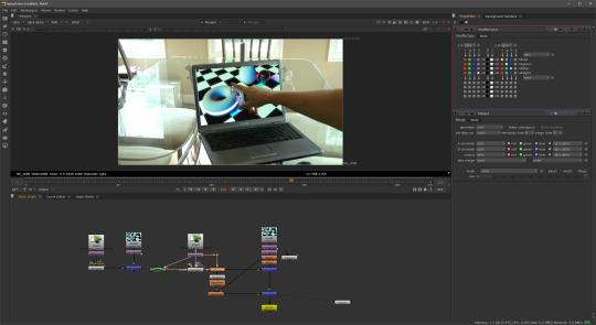
I decided to use a point track with this particular shot. So the first thing I did was to create a track node creating four trackers and placing them in each of the four corners of the screen. It is important to remember to place each one in the correct corner to save time later. Tracker 1 is positioned in the bottom left hand corner, tracker 2 in the bottom right hand corner, tracker 3 goes in the top right and tracker 4 goes to the top left corner.
After the track, you can apply the data to a corner pin node and plug that into the replacement image. At this point I could have simply merged them together and that could have been the final shot. In the case where nothing goes over the screen this is all that is required however because the hand moved in front of the screen, the screen had to be keyed which resulted in taking a lot of the colour out of the background. To fix this a shuffle copy is applied and then a merge followed by another merge. In between a colour corrections and light wrap can be applied to produce a realistic final composition.
Shot 3:Tears of Steel Green Screen Shot: The Old man
This shot was challenging but not because of the key but to orchestrate the background to move in the same way as the original shot because in the original the camera was moving back. I first separated each element of the man by rotoscoping his head, body, hand, legs and feet. I keyed each roto separately, managing to pull a good key although not perfect. I would have liked to spend more time learning how to achieve better keys on this shot.
I then colour corrected the man to match with a street background that I had found online but when I played the sequence back the man appeared to float away. One way to fix this is to motion track a point on his feet and apply that trackpoint to the background and then manually keyframe the scale. However this would be tedious and not so accurate. After experimenting for a while trying to work out the settings and configuration I came up with a solution.


The Solution was to track two different points close to the talent’s feet making sure that the translation rotation and scale was ticked on both trackers. This would save the data for the rotation and scale as well as the translation. This is exactly what I tried to achieve.
The first thing I attempted was to average track1 and track 2 to create a new tracker, then parent the averaged track to the background image with a transform node; this did not work at all. It did not apply the rotation or scale movement and it was the same as parenting just track 1. I then saw on the tracker node settings panel that you could export the tracking information in many ways. One of the ways was Transform (match-move), by creating the transform match move node I could plug it into the background image and it would move exactly how it should.
An issue that I found using this method was that being unable to reposition the green screen element. If I did change the position or scale then the man would not stick to the background. In the end the solution for this was not as good as I would have liked however the way I repositioned him was at the end of the node tree with a Translation node. This did not give me the flexibility I would have liked but I'm pleased with the key and the track and the outcome looks good.
Shot 4 : Tears of Steel Shot - Robot
Here I had to rotoscope the bridge handrail and add C-3PO. I had a lot of fun working on this shot it was probably my favourite part of the project. The first task was to rotoscope the bridge handrail so that the robot could appear behind, standing on the bridge like the stand in actor. This took a while as I rotoscoped more than necessary not realising the size of the robot.
After rotoscoping I used the same technique as the previous shot (the old man) with the tracking to make C-3PO stick to the background by using two trackers on the handrail. However when played back C-3PO looked unrealistic because he appeared too close to the handrail. In real life there will be some parallax between him and the foreground and background so I tracked the handrail in the background of the shot on the other side of the bridge and averaged all three tracks effectively pushing C-3PO back further away from the camera creating that parallax. The C-3PO motion now matched the other actor. I colour corrected C-3PO and applied and very subtle light rap to make it look like C-3PO was part of the scene.


So the shot was almost complete but for the girl standing behind C-3PO. In Photoshop I cloned stamped the girl out. It was not a great removal but I figured because C-3PO was covering most of the girl then it would not be noticed.
I attached the clean plate to the shot using the corner pin data that I had gathered from planar tracking the handrail. I did a basic rotoscope of the girl and then applied that to the clean plate so only the part where the girl is got painted out.
Shot 5 : Colour Correction - Car shot
This shot was fairly simple, however I did learn some important techniques whilst colour matching the car to the background. First of all I had to import the three elements provided: the background shot, the car element and the mask element for the windscreen. I merged the car and the background together and then applied the windscreen mask as a matte to the same merge so that the car would look like it was behind the snow on the windscreen.

I began matching the white and the black points with the snow scene, this was very easy and straightforward due to Nukes built in tools that allow you see the brightest and darkest points. I used a curve tool to analyse this but the most difficult part was matching the colours. Something that helped was to go into each different colour channel; red, green and blue, and try to match them by using the multiply, lift and gain sliders for each colour. The colours in the final shot matched and the final composition was believable.
So far with this module, learning visual effects, I have learnt a lot. Prior knowledge of Adobe After Effects and an awareness of basic visual effects terminology has helped me tackle this project with confidence. Having gained the fundamentals of each technique in the lectures my ability in Nuke has accelerated quite quickly as I experiment with new techniques, tools and nodes
After using After Effects for many years and becoming quite proficient, switching over to Nuke at first was difficult even though I fully appreciate how powerful it can be.
At first it was quite frustrating because I knew what I wanted to do and I knew how to do it in After Effects but once inside Nuke I had to learn where the tools were and how to get the same effect. Also using Nuke at first was quite frustrating because it seemed to over complicate some simple tasks. Now I have been converted and really enjoying its power compared to the limited and basic processes of After Effects. Whilst Nuke can be quite complicated at times it is superior to After Effects when it comes to compositing visual effects shots.
In conclusion I feel that I have progressed very well in this visual effects project and learnt a lot so far in this first module not just in Nuke but I have improved my problem solving skills as well as my learning skills.
References
Street: http://thepics.info/abandoned-street/
c3po : http://disney.wikia.com/wiki/File:RedArmC-3PO-Fathead.png
Snowy streethttps://maylanascloset.com/2014/01/
0 notes
Text
The saying photography originates from two Ancient greek phrases that roughly convert to "pulling with lighting". Taking photos doesn't just draw lighting. It attracts individuals together. A fantastic photo is a terrific way to talk about remembrances consequently making you sense a lot more connected to these near to you. Here are some ideas on the way to make these pictures much better.
Consider your photographs swiftly. The longer you think twice, the higher the opportunity that your issue will relocate apart, crack their cause, or come to be fatigued and stop smiling. Start taking shots as quickly as you may, and don't concern yourself with getting the digital camera perfect prior to the initial picture. The faster you shoot and also the far more photos you have, the better your chances are of getting a good one. Work with a tripod for maximum camera steadiness. For unique photographs of the youngsters or structures, some digicam shake isn't a major bargain, however, for once-in-a-life shots that basically make a difference, some video camera shake can wreck an ideal memory space. In case a tripod is just not available, try placing the digital camera on a toned work surface. Keep your images fairly easy. A good image must be straightforward and straightforward to interpret and enjoy. Taking photos is pretty simple to find out when you have access to the appropriate solutions, and you should not allow this to new thing overwhelm you. With the tips discussed from the report beneath, you can expect to with a little luck have got a much better idea of photography and also the achievable method for you to boost. is essential to consider meaningful pictures, but in most cases your images will say much more if you concentrate on a depth rather than come up with a complex composition which may not attack folks as much. Don't keep on the inside when the weather conditions are bad. Though it's all-natural to consider a sun-drenched working day is the greatest time and energy to grab the digital camera, overcast and stormy time offer a chance to get shots that might be challenging at some other time. These varying weather conditions can provide photos that might seem simple or cheery over a sun-drenched working day a darker and foreboding tone. Snap through the "golden time," particularly if you are shooting human being subject areas. Some time about dawn and dusk are known as "glowing several hours" because the color of the gentle helps make things appear like these are radiant. This lighting also matches human being pores and skin, producing human being subjects seem to appearance superior to they will in pictures used at in other cases of working day. That you can do much to modify the quality of your images by modifying the focus of the chance. What is Digital photography can be a special pastime because not only can you prefer it for its reason by taking pictures of landscapes, but you can also produce a job of it. Lots of people want somebody that can by way of photography conserve recollections. This short article will offer you suggestions to deliver your taking photos as much as par. ? This doesn't always need to be in the center of the photo. Obtaining your topic in the decrease right-hand or left hand area, for instance, can boost spectacular facets of your picture. Carry the digital camera appropriately. You ought to hold it using one area and employ your other hand to back up the zoom lens. Position your hands within the zoom lens as an alternative to around it. When you spot both your hands this way, you are supporting the camera instead of making use of tension, which could create your photos blurry. Most pictures are considered with all the video camera at or near the subject's vision level. Sound judgment claims this really is great, but get the "Whoa" component by shifting the perspective from which you take. Taking photos is pretty simple to find out for those who have accessibility right resources, and you should not let this new factor overwhelm you. With all the recommendations revealed in the write-up below, you can expect to with a little luck have got a better idea of photography and the possible method for you to enhance. shooting down in the subject from better up or get near to the soil and snap up. Remain continue to as you click the shutter. Don't even inhale and exhale. Also a hair's-breadth movement can ruin that perfect photo. Have a additional second, prior to showing up in the shutter key, to secure your breath and get a directly picture. Never ever stand up listed below your subject areas when shooting folks or pets. There may be absolutely nothing much more unflattering than searching for a person's nose inside a photograph, while the upward position also distorts other face functions. From the very least, remain parallel for your subject matter. Whenever possible, place your self in a a little raised height to obtain the greatest results. A great taking photos suggestion that will help you is to ensure your personal computer keep track of is calibrated. The last thing you desire would be to print an image only to realize that this colors are entirely away from. Calibrating your pc keep track of can save you a great deal of frustration and misery. Keep on your own some "Direct Area" or "Active Space" while confronting topics that move around in your photos. This is only generally some empty place sometimes before the topic or associated with the niche. This makes for the less-cluttered and much more attractive activity chance to the viewer to consider. Try out balancing white-colored amounts by hand whenever you snap photographs. This has really a direct impact on the picture's mood, and it also permits you to management what your picture may be like. You'll ought to learn what options look best for distinct situations, but when one does, you'll get more freedom for imagination. Digital photography could become so satisfying that numerous individuals who started off snapping pictures for entertainment, look to make it their job. To turn into a a lot more capable digital photographer, you must practice a whole lot, making several mistakes. In addition, you, must be nicely well-informed from the simple terminology and photo strategies.
0 notes
Text
Final Reflection
I am happy with what I have achieved over the three milestones, attempting to learn as much as I can and experimented with as many aspects of UE4. With each milestone I tried to do more than was expected for my own personal benefit, I always liked to broaden my knowledge and create something I couldn’t have done before starting the milestone. I look forward to learning even more and focusing on VFX in the next assignment.
1. Reflection of what you have achieved in Milestone 1A through to 1C
Milestone 1A
I was confident in my basic understanding of UE4 from the past semester however render passes were relatively new knowledge for me, therefore this was an area of research. I had some issues with compositing in AE, knowing what passes to use and for what purpose. After completing this milestone I was confident in my understanding of the depth pass and examples of implementation, achieving a dusty effect in the background. However I still need to research and gain an understanding of other render passes and their uses.
Milestone 1B
This milestone was the most frustrating of the three with almost every aspect of the pipeline causing an issue that took a considerable amount of time to resolve. I found most of these were due to using a Mac but luckily I also had a PC that I used for the MAYA animations. I really enjoyed using the ART plugin and found it very powerful for quickly creating and animating customised proxy characters. I would have liked to further explore the joint modules, however I was glad I could achieve the ponytail in UE4, realistically reacting to the movement of the character. After resolving the issues I found the whole pipeline pretty quick as I am quite confident with animating and using sequencer/camera in UE4.

Milestone 1C
I really learnt a lot about using UE4 cascade particle system during this milestone and was impressed at how easy it was to achieve visually interesting VFX. Finding I had some more time due to fixing the issues in my pipeline in the previous milestone I was able to experiment with sparks, dust particles, dust clouds and mesh emitters. This new basic knowledge of particles will help me for the assessment 2 where I plan on focusing on VFX. I was also pleased with the style of animation created, ‘breaking’ the rig and creating smear frames in order to create a snappy animation.
2. Examination of what new knowledge you have developed, and what knowledge you need to further develop in the pipeline of an animated shot
Starting the semester I had a strong basic knowledge of UE4 and a some extra knowledge about blueprints, but had never worked with animation, sequencer, render passes or cascade. The render passes were relatively knew knowledge, I never knew all the possibilities and how to effectively use the passes in post production (After Effects). This is an area I need to further develop my knowledge, both in the understanding of render passes and compositing in AE. I found the animation and sequencer easy to use as it was similar to other programs I was familiar with. I am glad that I took some extra time to learn and experiment with particles and cascade in UE4 and I feel confident in advancing this knowledge. VFX is an area I am interested in developing further and using this time as an opportunity to experiment will be beneficial when starting the next assignment.
3. Identification of your selected specialist stream for Assignment 2, including your areas of priority, chosen task and personal objectives
VFX is an area I would like to further expand my knowledge. However I would like to also combine some animation as this is the field I want to enter in the industry. But I chose not to focus on this as I feel like I have done a lot of animation over the past year and would like to use this opportunity to broaden my skills. As I would also like to include animation my personal objective is to have an animated character interact with a real world environment/people and including some VFX like dust/water in the scene.
4. Identification of one industry job/role OR one inspirational artist/studio relevant to your chosen stream and explanation of why
Compositor and Layout artists are examples of industry job roles relevant to the VFX stream. A compositor is responsible for combining all elements (background plates, special effects etc) and creating the final image. Compositors work at the very end of a production pipeline whereas Layout artists work a lot earlier in the process, responsible for interpreting 2D and 3D storyboards to block out the scenes and stage every shot. This particular role interested me as I have had a lot of previous experience with 3D modelling and animation and this VFX role would utilise this prior knowledge and interest.
I am inspired by the work of Iloura, an Australian based animation and visual effects studio. Particularly their work on one of my favourite films, Mad Max: Fury Road. This is what inspired me to choose and further explore the VFX stream. Research of the process showed areas of modelling and animation, combining my previous knowledge and confidence of modelling and animating and adding a new step/skill of VFX.
http://iloura.com.au


5. Identification of the knowledge and skills required for your selected stream, and a written understanding of these skills / responsibilities in your own words
VFX artists are responsible for interpreting and recreating effects like explosion, fire, smoke, debris etc often working at the very end of the production process. It also involves combining and constructing all the 2D and 3D elements seamlessly into the final shot as a compositor to complement the project style and maintain continuity. Thus an understanding of the process of 3D animation and ability to create well composed shots is important in this role.
It is imperative that VFX artist work and communicate well within a team environment, often working closely with render wranglers and lighters. Therefore, a technical understanding of physics (light, gravity and how objects interact with each other) is another important area of knowledge for VFX artist, in order to achieve realistic results. It is also important that one has a level of self-motivation and responsibility, able to independently complete projects and problem solve within strict time frames.
6. Identification of your current knowledge and skills in this stream as per #4, and what will need to be developed throughout the semester
My current knowledge of VFX is very limited, this is why I chose to focus on this stream for assignment 2. I believe I have a basic-intermediate knowledge of other areas (modelling, animation) as they were more of a focus for other units. However, VFX is never something I got a chance to focus on and it has always been an area of interest. That’s why I am using the opportunity of assignment 2 to explore and expand my knowledge to broaden my career perspectives. Throughout the semester I will need to develop my understanding of compositing in AE and render passes. Also looking at that physics of VFX and how to realistically create them in UE4 then composite into a scene in AE.
Starting resources:
My knowledge of VFX and compositing in After Effects is fairly limited, therefore this Lynda tutorial will provide an understanding of the process and how they are implemented
After Effects CC 2017: VFX Essential Training: https://www.lynda.com/After-Effects-tutorials/After-Effects-CC-2017-VFX-Essential-Training/504061-2.html?srchtrk=index%3a20%0alinktypeid%3a2%0aq%3aVFX%0apage%3a1%0as%3arelevance%0asa%3atrue%0aproducttypeid%3a2
This Youtube playlist focuses on aspects of UE4 cascade particle systems and the different effects that can be created. I have only watch a couple during the last milestone that gave me a basic understanding of the system.
Introduction to Cascade: https://www.youtube.com/playlist?list=PLZlv_N0_O1gYDLyB3LVfjYIcbBe8NqR8t
It’s important to know the aspects of the VFX pipeline and the order in which certain steps are done to ensure my own own pipeline is correct and efficient. This is particularly important when working with a team.
VFX pipeline: https://www.premiumbeat.com/blog/how-an-average-vfx-pipeline-works/
As discovered in research of industry roles and knowledge, an understanding of cinematography and lighting is important for VFX artists when compositing scenes.
Lighting the Environment (UE4): https://docs.unrealengine.com/latest/INT/Engine/Rendering/LightingAndShadows/
Cinematography techniques: https://www.oma.on.ca/en/contestpages/resources/free-report-cinematography.pdf
Time spent
Reflection - 1hr
0 notes