#blob column media
Explore tagged Tumblr posts
Visit Tumblr Blog
Explore Tumblr blogs with no restrictions, modern design and the best experience.
Last Seen Tumblr Blogs


Fun Fact
The Tumblr app for Google Glass was released on May 16, 2013.
Text
youtube
0 notes
Text

Day 2 | Prompt: Cold without mercy
Pairing: Tevildo (non-bestial form) x Tinúviel
Themes: Violence | Dark
Warnings: Mention of nudity | Blood | Weapons use | Physical violence | Loss of tongue | Torture | Thralldom
Word count: 600+ words
Summary: Tinúviel is brought to Tevildo. She tries to sing and win freedom for her and Beren.
Also available on AO3
Minors DNI | 🔞 | You are responsible for the media you consume

Her song, sweet and enchanting and potent, wove a spell of silence, of wonder, of indescribable sorrow and beauty. The walls around her shook as if in fear. The earth beneath her feet trembled. Tinúviel sang still, bold and unafraid, her gaze on Beren first, then Tevildo, then Beren, then Tevildo again.
His attendants yawned and closed their eyes. Others slumbered where they fell. Tevildo did not sleep. He rose to his feet and then rose again, this time changing, his bones cracking and transforming, his form taking the shape of a being as fair as the Blessed Ones, no less. Tinúviel hesitated. Her song faltered. Never before had she seen a lord in such a state of undress walking toward her, utterly entranced. Tevildo swayed, his eyes like glass. It is as if he is under her spell.
"Whatever you desire, mistress," he proposed, "I will gladly offer."
Tinúviel smiled and silently exulted in her victory. Beren would be free, and their nightmare would soon end.
If only she remembered her mother’s warning to never savor triumph until she had it firmly in her hand. Tevildo reached her, his feet bare against the floor. So lost was she in her singing and impending victory that she did not see the hand that rose and struck her without warning. The blow was swift and hard. It was as if Tevildo held nothing back. Tinúviel fell, struck dumb, her song silenced, her spell broken. A trickle of red tainted her fair skin. The others finally opened their eyes.
"Take her arms," Tevildo commanded. "And her tongue. This must seen to, and with great haste. We must not have her singing again."
Desperate and frightened, forced onto her knees, Tinúviel tried to speak and form new words for another melody. A clawed hand gripped her chin, talon-like nails cutting into her flesh. The pain is white-hot and silences her tongue. Something cold and sharp pulled at it. Tevildo still stood before her, smug and satisfied. He reached into his ears and drew out small blobs of wax.
"Did you truly believe I was ignorant of you and your gifts?" He burst into laughter and threw them to the floor.
Eyes as gray as a starlight sky flew wide. His own flashed, now red, now green, now red again. They were harsh and pitiless, cold without mercy. He accepted a shimmering blade. Tevildo studied it and toyed with it, flipping it and whirling it, prolonging her agony. He then looked over his shoulder.
Beren was by a column, on his knees, bound and shackled, his eyes bright with fear. "Do not do this, my lord!" He cried in anguish. "Please! I will make her leave. I will make her swear to never search for me again. Please!"
The pleas of the tormented cannot easily sway those who are dark of heart. Tevildo smiled and tightened his hold on the blade. He sets his eyes on the task at hand.
It did not take long; the blade was finely forged and effortlessly sliced through flesh. Rivulets of crimson splashed onto the stone floor. Tevildo stepped back, pleased with his work, and drunk on both the desperate screams that cut through the air and the bite of copper that filled him with every breath he took. Something small and pink and soft sat snugly in the palm of his free hand. He decided to keep it as a trophy, a grim reminder of his victory this night.
This will certainly stand out against the others, he thought, amused.
"Have the healers clean her and then garb her in something pretty." Dizzy with the abrupt sense of his triumph, he sat back on his haunches and inspected his conquest. "I will escort her to the master and present her to him. I hear he is seeking a new bedmate, and who better than one such as her?"
tags: @cilil @asianbutnotjapanese
#bookoflosttalesmonth#tevildo#dark! tevildo#tevildo imagine#beren#lúthien tinúviel#lúthien imagine#lúthien#the book of lost tales
3 notes
·
View notes
Text
(ARTS246) Ch. 4: The Typographic Grid & Project #1 Refined Poster Designs & Social Media Posts


This week, I spent most of my time finalizing and revising the poster designs for the music festival project. I also started working on the social media advertisements and merchandise design components. After considering the feedback from the previous week's class, I experimented with the color palettes. In the end, I came up with three different color palettes and themes for the three versions of my poster. I wanted to create a swamp-like look and feel for the first poster variation. I used shades of greens and browns from my original abstract image to achieve this. This helped me solve the issue of my previous poster design, which had a harsh and bold look that didn't match the fluid and organic look I wanted. In the second poster variation, I aimed to replicate the shapes of mushrooms. I used an image of mushrooms that I had taken while walking the Boardwalk Trail. I chose a mossy wood texture with subtle grayish-purple hues for the background. This poster design became my favorite among my peers and professor because of its bold and textured background image and the interesting movement created by the silhouette of the mushrooms. For the third poster variation, I continued to experiment with the color palette. However, I found that it was still too muted, and there wasn't enough contrast within the initial design. I may continue to experiment with different abstract imagery until I land on an image that better follows the project guidelines.
While working on the music festival project, I had to create an Instagram post in 1080 x 1080 pixels. This task was challenging for me as I had no prior experience designing social media or merchandise. However, I learned that the best way to overcome anxiety related to a new project is to start it without the fear of failure. This approach has helped me a lot with my personal projects in the past, and I plan to apply the same strategy while completing my projects in this course.
I aimed to utilize certain elements from my poster design projects and create a consistent look and feel for the music festival. To achieve this, I made the logotype the primary visual, followed by the date and location as the secondary visuals, and lastly, the hand-drawn abstract blobs as the third element.
I received feedback on my social media posts, and most of the responses were positive, indicating that I was on the right track. However, the color palette I used did not translate well from the poster to the social media post. Many people felt that my abstract blobs appeared too muted. I was also told that my first variation of the social media post reminded some people of a military uniform. To move away from this idea, I plan to experiment more with colors until I find something that matches the look and vibe I am aiming for.
In this week's readings, the textbook extensively discussed the use of typographic grids in design. The grids serve as a framework to a design, similar to the role of a skeleton in the human body. As I mentioned in last week's posts, I have always found it challenging to work with grids and felt restricted by them in the past. However, during the poster design process, I relearned the grid and gained a better understanding of how to create and use grids. I have started incorporating grids into my social media post design, which has been extremely helpful in keeping my information organized, clear, and legible. As I proceed in this course, my goal is to continue to improve my grid usage and experiment with different types of grids, such as modular grids and multi-column grids.
0 notes
Text
Blog Week 4
Reflection
This week we focused on a lot of experiencing immersive experiences ourselves and discovering what we valued in performances.
In Tuesday's class, I presented the progress presentation of my project. This allowed me to get valuable feedback including inspirations to look into, including past RMIT student Kit Webster and RMIT lecturer Brendan Harwood. I looked into some of his academic research in the academic area of my blog this week.
In Thursday's class, we continue with the rest of my classmate's presentations which were helpful to see what creative directions others around me were taking and hearing feedback on their progress presentation, with a lot of feedback I could carry into my own practice.
Research
Academic
I read Brendan Harwood’s Volumetric light sculptures: occupying the Space between the Apparatus and the image dissertation. Volumetric lighting was a new concept to me and this piece helped me to establish the importance of how it helped enhance a sense of space. The feeling of lighting and space working in unison that is discussed is a feeling I want to evoke within my project. The comment describing projection mapping as “display appears chameleon-like “ reminded me of why I wanted to projection mapping to assist with my adjective of exhilaration. I associate exhilaration with a feeling of excitement above a base level of excitement. That there has to be a level of adrenaline that does not occur day to day as it would every day. Projection mapping being a not as common art practice as regular cinematic or video screening shows how this could almost surprise and excite the viewer beyond ways they are familiar with. I also delved into Shota Murayama’s work *Development of Projection Mapping with Utility of Digital Signage which goes into more of the technical parts of projecting mapping specifically within Resolume. They specify that he projection “*needs empty space between the projector and the object”. This was an important point that was also brought up within my own presentation in class as I thought of the idea of having the audience sitting on stage to have them be more encapsulated by the projection mapping occurring. Although this was ruled out having the users on the stage would block out of the projection from reaching the screen, ruining the final result.
Creative Practice
Kit Webster's light sculptures were something I took major inspiration from this week. Their ability in some of their works to create seamless three-dimensional spaces within two-dimensional shapes through the use of light and video was magnificent. A lot of their work is able to utilise simple shapes such as squares or even organic 'blob' shapes and through the use of movement and space turn them into engaging images. Their work Enigmatica Mars creates these square shapes that grow within each other creating a three-dimensional atmosphere. Additionally to this, the squares turn grey and create white strobe-like white lines that light up parts of the squares. I was inspired by their sense of smooth movement within their pieces which engaged me thoroughly.
Technical
This week involved a technical shift within the software I will be using for my project. I shifted over from using Qlab to using Resolume as within the non-paid Qlab software I was not able to export media and utilise a lot of the projection mapping features. After this hurdle in the road, I look into other projection mapping software and decided on Resolume Arena. Additionally, I have been finding the layout of Arena easier to navigate than Qlab as you can visually see all the different videos imported in columns and also layer multiple video clips easily together. This week since I was switching over from Qlab I spent a lot of time watching youtube tutorials to familiarise myself with how to navigate and operate the software. I mostly watched videos from the Resolume VJ Software channel as they have a large resource of video projection mapping in Resolume.
It was important I could export the project as a compatible file that could be opened in the Capitol’s QLab so it could be synced up to the projector. Through discussions in class, it was discovered that if Resolume exports the project as an OSC file this could be opened in Qlab. I plan to try this transition between an OSC file and the two different platforms in the Capitol soon.
In terms of physical material for the constructed shape, I was leaning towards styrofoam originally as it was easily accessible, and soft making it easy to cut into the desired shape and not extremely expensive. The issue I found with this was that styrofoam can absorb light instead of reflecting it with the texture. My first solution to this was to put a paper of the top layer of the styrofoam facing the projector to create a ‘projection safe layer’. Although after feedback the material of Corfule was brought up. Cornflute provides all the positives of styrofoam I was looking for without absorbing light and being an even thinner and more malleable material
Cornflute at Bunnings is currently being sold for $19 for 1200 x 900mm. I am currently looking into cheaper options on gumtree, facebook market place and through art studios. I intend to get the material at quickly as possible so I can construct the desired shape before the midsemester break (25th August).
Progress
This week included my own personal presentation of the progress of my project while engaging in others’ presentations. The feedback from my presentation helped me gain further clarity on the steps I will need to take to create an effective project. The importance of sound once again was highlighted this week and cemented the goal that I will have to pick my music this next week to be on track for my final due date of the project. Viewing other workers and creative directions assisted in how different concepts and techniques I should consider while working on my own project.
Bibliography
Resolume VJ software (no date) YouTube. Available at: https://www.youtube.com/@ResolumeVJSoftware (Accessed: 9 August 2023).
Murayama, S., Torii, I. and Ishii, N., 2014, August. Development of projection mapping with utility of digital signage. In 2014 IIAI 3rd International Conference on Advanced Applied Informatics (pp. 895-900). IEEE. ( Accessed: 9 August 2023)
Projection mapping Melbourne Sydney Brisbane Australia building projections light art (no date) KIT WEBSTER. Available at: https://www.kitwebster.com/ (Accessed: 10 August 2023).
(No date) Researchrepository.rmit.edu.au. Available at: https://researchrepository.rmit.edu.au/esploro/outputs/doctoral/Volumetric-light-sculptures-occupying-the-space/9922107056701341#file-0 (Accessed: 10 August 2023).
0 notes
Text
Azure Data Fundamentals - Part1
Data is generated everywhere using different system, application and devices, in multiple structures and format
Data is a valuable asset , which provide useful information and help to take critical business decisions when analyzed properly
It is necessary to store, analyze and capture data since it has become a primary requirement for every company across the globe.
Finding out Different Data Formats
Data structure in which the data is organized represent entities, And each entity has one ore more attributes or characteristics.
Data can be classified into different formats -Structured -Unstructured -Semi-Structure
Structured This is fixed schema and has different fields and properties. Schema is organized in a tabular format in rows and columns. Rows represent each instance of a data entity and column represent attribute of the entity.
Semi-Structured This has some structure and allow variation between entity instances. One example of semi-structured data is JSON(JavaScript Object Notation)
Unstructured This has data without any structure. Example can be document, images, audio, video and binary files.
Various options to store data in files
Two broad categories of data store in common use
File store Storing the data on a hard disk or removable media such as USB drives or on central shared location in the cloud
File Format used to store data depends on a number of factors including
Type of the data being stored
Application that will need ro read/write and process data
Data files readable by human or optimized for efficient storage and processing
Common File Formats
Delimited text files Data is separated with field delimiters and row terminators. Most commonly used format is CSV Data
-JSON Data is represented in hierarchical document schema which is used define object that have multiple attributes.
Databases
-XML Data is represented using tags enclosed in angle brackets to define elements and attributes.
-BLOB Data is stored in binary format 0's and 1's.Common type of data stored as binary include images, audio, video and application specific documents.
-Optimized File Format Some specialized file formats that enable compression, indexing and efficient storage and processing have been developed.
Common optimized file format include Avro, Optimized Row Columnar Format(ORC) and Parquet.
Various options to store data in database
Two ways data are stored in database -Relational Database -Non-Relational Database
-Relational Database This is used to store and query structured data. Data stored in the represent entities. Each instance of an entity is assigned a primary key which uniquely identifies and these keys are used to reference the entity instance in another table. Table are managed and queried using SQL which is based on ANSI standard.
-Non-Relational Databases This is often referred as NOSQL Database. There are 4 common types of nonrelational database commonly used
KeyValue Database - Each record consist of a unique key and associated value
Document Database - Specific form of Key Value database
Column Family Database - Store tabular data in rows and columns
Graph Database - Which store entities as nodes with link to define relationship between them
Understand Transactional data processing solutions
A system records transaction that encapsulate specific events that the organization want to track. Transaction system are often high volume handling millions of transaction every day often referred as Online Transactional Processing OLTP. OLTP system support so called ACID semantics
Atomicity-Each transaction is a single unit which either fails or succeed completely. Consistency-Transaction can only take data in the database from valid state to another. Isolation- Concurrent transaction cannot interfere with each other. Durability-When a transaction is committed, it remains committed.
OLTP is often used for supporting Line of Business Application
Understand Analytical data processing solutions
Analytics can be based on a snapshot of the data at a given point in time or a series of snapshot. It uses read-only system that store vast volumes of historical data.
Analytic usually look like
Data file stored in central data lake for analysis
ETL process copies data from files and OLTP DB into a Datawarehouse. 3.Data in data warehouse is aggregated into OLAP(Online analytical processing) model. 4.Data in data lake, data warehouse and OLAP can be queried to produce reports, visualization and dashboards.
Different Types of user might perform data analytic work at different stages -Data Scientist might work directly with files in a a data lake to explore and model data -Data Analyst query table directly to produce reports and visualization -Business user consume aggregated data in the form of reports and dashboards.
Keep Learning! Keep Enjoying!
0 notes
Text
Britain exists in an imaginary state of crisis about immigration. Nothing soothes this anxiety – not facts, not real numbers of arrivals, not the distinction between migrants in general and asylum seekers in particular. In the past week alone, reports have emerged of illegally detained migrants at overcrowded centres falling ill, of underage sexual assault, and of others being dropped off in the middle of cities and promptly forgotten about. These appalling failures have occurred not because there are too many migrants, but because the government has broken its own asylum system.
This is a crisis by design, not of arrivals. The government is keen to stress the recent increase in Channel crossings, yet asylum applications are half what they were 20 years ago. The real and only cause of the debacle at Manston and other failing centres is this: the number of asylum applications processed within six months has fallen from almost 90% to about 4%. It’s not that more people are arriving than ever before, it’s that more of them aren’t being processed, and so are stuck in the asylum system for years. Efficiency has been dropping sharply since 2014, one year after Theresa May established the “hostile environment” and in the middle of George Osborne’s austerity programme. The intersection of those two forces created an underfunded, cruel Home Office, and with it Britain’s immigration “crisis”.
And it is a crisis that the government has every interest in maintaining, or at least no pressing interest in resolving. The Tories have finessed a narrative in which the country is under a migrant siege that the government is trying valiantly to rebuff, but is frustrated in its efforts by a string of culprits – “activist” lawyers, human rights law, tofu eaters, the Labour opposition. It is that tired fallback of failing rightwing government: plead helplessness in the face of a ubiquitous fifth column, an abstract leftwing blob that only last week the Sunday Telegraph editor, Allister Heath, promoted to the status of wielding “near total intellectual hegemony”.
This pretence is most fruitful with immigration. The government’s failure to maintain living standards and public infrastructure, from health to housing, can be disguised – with the help of the rightwing press – by presenting migrants as a constant drain on those resources. As a bonus, the fear of more of these imaginary parasites pushes voters to the only party that seems appropriately appalled by the threat. Immigrants provide such a valuable alibi for political dereliction that it makes no sense for the Conservative government to fix its broken immigration system. And so the state of emergency must be fostered and, if need be, escalated. In this country, there has never been an immigration crisis and there has always been an immigration crisis.
The illusion of deluge is more easily maintained at certain times than others, giving the false migrant crisis a rhythm that feels genuine as it ebbs and flows in and out of the political and media agenda. But that pulse hasn’t correlated with arrivals – indeed, concerns about immigration waned for a period after Brexit, even as the number of arrivals rose.
Sometimes it is a reflection of shifting patterns of migration. Covid made travel by road – in which migrants are less visible – more challenging, thereby increasing travel by sea. A landing on a shore is much more evocative of the “invasion” of a vast, impossible-to-police border than an unseen stowaway on a truck. At other times, all it takes is a particularly volatile or incompetent person at the top. The framework is so rickety that a loose cannon like Suella Braverman need make only one bad decision, such as failing to find alternative accommodation for those in overcrowded detention centres, for the entire structure to collapse.
But the other reason these landings are high on the government agenda, first under Priti Patel and now under the clumsier Braverman is, well, everything else. Brexit is spent, the economy is in shreds, the Tory party has imploded and there’s no one to blame. The government could never deliver the transformative Brexit it had promised, but what it could do was pretend it was being blocked from delivering it. With the end of EU free movement and the “taking back” of our borders, the Conservatives are exposed. They got what they wanted, and are now in the position of the dog who has caught the car. What use is all this new “control” if it means the government now has to take full responsibility for immigration? Enter Dover, a vast vulnerability.
Asylum seekers have become the government’s own refuge. In them, there is an evergreen problem for which a Tory crusade is the only solution. This is a valuable asset for a government that has run out of road, but can play on everything from fears of terrorism, sexual assault, economic drag and cultural overwhelm to extend its relevance. Like Donald Trump’s wall, or the windmill in Animal Farm, our borders will always be vulnerable and sabotaged by enemies, while our government fights like hell to build them back up.
The only way for progressives to dispel this mythology is to create a competing one. If Britain’s attitudes towards migration could be summoned in a word cloud, the phrases that loom largest would be negative – “hostile environment”, “invasion”, “swarm”, “legitimate concerns”, “illegal migrants”. Not to forgive xenophobia, but when you are constantly barraged by this sort of rhetoric from most of the press and the government, it’s unrealistic to expect any other outcome. The panic strengthens and recedes in line with public messaging and perceptions of how compromised our borders are.
These concerns are not logical. They are based not on the premise that numbers are too large but on the hysteria that when we have no control, no numbers are small enough. So Labour can try to win the immigration argument from the right and stick “Controls on Immigration” on crockery again, but unless the party is willing to crack down and go full-on fascist in its language and policies, the Tories will always be seen as the stronger party on a border that they have successfully painted as weak and porous. In this regard, as well as on patriotism and British identity, Labour has taken a defensive position and simply borrowed from the right rather than created its own distinct, ambitious imagining of a better country, a different border – its own word cloud.
British patriotism and values are not restricted to the flag, the anthem, the royal family, the military and abstract notions of hard work and fairness. They can be about compassion – about a place that we never hear about, one that is welcoming – not full up, but punching above its weight as a refuge and safe harbour. This country isn’t even an aspiration: it is already here, sketched out, waiting for the colours and details to be filled in. It is the same country that, when politicians and the press were cowed by circumstance and withheld their poison, turned up for people from Ukraine, Afghanistan and Hong Kong, whose numbers dwarf arrivals on the southern coast. Kindness has been so stigmatised, rebranded as “virtue signalling”, that people forget it’s out there.
Yes, the risks of openly challenging the immigration crisis myth are high in a political and media culture so utterly hooked on the lie’s benefits. But the result could be the disarming of the right’s most powerful, and, perhaps soon only, political weapon. With a payoff so huge and a lead in the polls, is it not worth a shot?
6 notes
·
View notes
Text
Alaskas Snow Crabs Have Vanished
Snow crab fishing season in Alaska’s Bering Sea has been canceled for the primary time in historical past. Bristol Bay’s crimson king crab fishery may even be closed, for the second 12 months in a row. Each choices comply with shellfish surveys that exposed startling inhabitants collapses. Between 2019 and 2021, snow crab numbers within the Bering Sea fell by about 90%. 2022 counts have dropped even additional, mentioned Miranda Westphal, a state Division of Fish and Sport (ADF&G) biologist, to Alaska Public Media. “In 2021 after they surveyed, we noticed the biggest decline we’ve ever seen within the snow crab inhabitants, which was very startling, I feel, for everybody,” Westphal advised the outlet. “Administration of Bering Sea snow crab should now give attention to conservation and rebuilding given the situation of the inventory,” mentioned the ADF&G in its announcement. “Efforts to advance our science and understanding of crab inhabitants dynamics are underway.” The state’s crab fishing trade, dramatized in Discovery Channel’s Deadliest Catch, is floundering consequently. “Persons are actually going to need to make some onerous calls right here, whether or not that’s…promoting their vessels [or] searching for different alternatives in different fishing sectors which is few and much between,” one fisherman, Gabriel Prout, advised Alaska Public Media. “Fishermen are actually going to be hurting the subsequent 12 months,” he added. One other fisher, Dean Gribble Sr., advised NBC Information that the cancelled season could be “life-changing, if not career-ending for individuals.” In 2020, NOAA valued Alaska’s snow crab harvest at greater than $101.7 million. This 12 months, it is going to be $0.00. The precise reason for the crab crash is at present unknown, and the state is investigating it. However Westphal and others suppose local weather change is more likely to blame. The Bering Sea has endured record-breaking, large marine warmth waves lately, with a very catastrophic one often known as “the blob” occurring between 2014-2016. Although that occasion handed, elements of the Bering Sea spent greater than half the time between September 2018 and January 2021, below some stage of formally acknowledged, anomalous heatwave, in keeping with a 2021 NOAA report. And, even when heatwaves weren’t occurring, ocean temperatures within the area remained slightly below the heatwave threshold, and considerably above common. Snow crabs and different sea life native to the waters round Alaska are tailored to icy chilly temperatures. When the warmth rises, they’ll’t cope. One of many greatest points is deoxygenation. Hotter water concurrently holds much less oxygen and results in animals needing extra oxygen, due to elevated metabolic demand. Additional, heat water is extra buoyant and fewer vulnerable to mixing, which might result in stratification of gases and vitamins within the water column, additional exacerbating the issue. Local weather change can also be recognized to drive marine wildlife illness outbreaks. As an example, the sea star losing sickness that’s led to calamitous Pacific Coast starfish losses has been linked to ocean warming. One other ADF&G scientist, Ben Daly, advised CBS Information that an infection or illness may very well be a attainable perpetrator behind the latest snow crab disappearance. Alaska is the quickest warming state, as polar areas are heating up faster below local weather change than elsewhere. Originally published at Irvine News HQ
0 notes
Text
Media Gray Goo
(This column is posted at www.StevenSavage.com and Steve's Tumblr. Find out more at my newsletter.)
Every now and then (OK, weekly), something Very Dumb happens involving a piece of mass culture media. People meltdown because of some casting. Someone gets fired because of saying something controversial like "hey, don't be a douche." Some new thing comes out that really just builds on something else, and we vaguely care.
How much of our minds get occupied by stuff like Marvel, DC, Star Wars, Doctor Who, Star Trek, and the like? How much of our culture involves these works? How many people hang on every new book, idea, episode, etc. Geek that I am, I'm starting to wonder if this has gone very, very bad.
Let's imagine how a healthy body works. Yes, it's a unified whole, but also it's got specific parts and is filled with checks, from antibodies to the ability to vomit bad food to neurons holding back other neurons from doing something terrible. A body is a single thing composed of parts that are both linked and independent in some ways (but not separate from the body).
A body that was one giant unified mass is basically an amoeba or The Blob.
Now let's ask about a healthy culture. Shouldn't it be the same way? There are dominant cultural elements, and many subcultures, specialized knowledge, and generalized knowledge. There will be conflict, but often in service of a larger whole - subcultures generating widespread ideas, widespread ideas passing their time and going to memory, etc.
A culture that is one giant unified mass is a gray goo of nothing, large but nothing to hold on to, nothing relevant to the individual.
I'm thinking our mass culture is becoming a mass of gray goo. Sure some of it may be great gray goo, but overall it seems to be samey even when good. I'm glad we can re-invent things (Like Jodie Whittaker's Doctor, who I loved), but why do we have to keep doing the same thing?
Worse, doing the same thing keeps giving power to the same group of people and companies (usually Disney these days). We're letting people own vast chunks of our culture, and the inevitable battles between "do it good and interesting" and "give me the gray goo I expect" are exhausting. Besides, we know in the end that the big companies are going to play it safe - and safe isn't always the best thing for the culture.
(Think of it as being like your brain overruling your body's warning signals to keep drinking and eating cheeseburgers.)
This is probably why some big companies like Netflix and Amazon caught on and are working on churning out different stuff. It's perhaps why we see authentically good media as well because some people got that there needs to be more. I can critique the hell out of them for many reasons, but I can acknowledge smart plays against gray culture goo.
So now I want to imagine a different media culture.
Imagine a media culture with few to no dominant media properties. Imagine things actually ending for a change, and excellent media being rerun or reread instead of being extended. Imagine not having cultural space taken up by gray goo, but more, smaller things.
Imagine if you do get into something that is a long-term media commitment, that it's a more intimate experience. That TV series going on for a decade and its spinoffs don't have to be forced into our consciousness. Imagine fandom as more interlinked preferences than A Big Thing.
Imagine more originality or at least new versions of the same old thing.
This is going to sit with me awhile. It makes me think about my own tastes, about what matters, and about what I'm writing.
Steven Savage
www.StevenSavage.com
www.InformoTron.com
3 notes
·
View notes
Text
It's literally that easy (I say easy relatively because it takes practice and time and you can lapse any time) but the difference between having a nice body and not is believing that you do. That doesn't mean you stop ignoring your insecurities, and by all means if you are able to change the thing you're insecure about easily and at little to no cost or effort, go ahead if it makes you happy, but loving yourself is ridiculously easy to do.
I am insecure about my belly (even though it's actually pretty tiny) so I started to consume media and aesthetic photography depicting bigger bellies and appreciating how gorgeous people can look even with a belly and eventually how gorgeous they look with and because of their belly, and after developing that appreciation I started looking in the mirror and seeing my belly and thinking it's cute, and looking down when wearing a tight shirt and low waist pants and poking it while thinking ADORABLE. I still don't think it's beautiful but it's adorable, and different, and cushy and that's enough for me.
My eyes used to annoy the hell out of me because they're dark brown (plain), big but not almond shaped, my lashes are sparse and short and my pupils Don't go very big. I legit used to think they're small because of these factors until one of my friends pointed out they're actually pretty big, and I attributed the fact that they didn't look like doe eyes to the fact that the lashes were so invisible and the shape was so off. But knowing that they're big eyes allowed me to see my eyes for what they are, cute. They're big, and unlike the rest of my face, pretty damn expressive. With a little mascara and expertly placed eyeliner and eye shadow my eyes are fucking gorgeous and the fact that they're brown no longer means plain to me. It means mysterious. Brown eyes have crazy cool patterns which you have to look really closely to see so when I get a partner they'll have an excuse to stare into my eyes soulfully.
I have wide hips with a hip dip and pretty big thighs which used to make me really insecure but in high school when I was still internalizing the nuclear family model I was comforted by the fact that wide hips meant easy childbearing. Now, after finding out I'm sex repulsed asexual and I don't want to physically bear children, which has been met with a lot of scrutiny might I add, I comfort myself In the fact that wide hips are crazy fucking sexy and bodycon dresses look so damn much better on me than on plank models. Hip dips are also a natural occurrence where your hip bone is a whole fucking lot higher than your hip joint and there's nothing you can do about it bar implants or bone surgery to bring them down, so you know if people criticize my hip dips I'm bringing that up and telling them that I didn't get implants so I'm al naturale (which I'm once again not criticizing, if you want to have cosmetic surgery, I have braces so I can't judge, just keep in mind the cost, monetary, emotional and physical, in comparison to the benefits, which are..... Appeasing patriarchal beauty standards and making some old rich white man richer) and that I'm happy with that so what they think doesn't really matter to me.
I'm not bodyshaming skinny people with the column shape they're fucking gorgeous but I am a firm believer of some clothes looks better on some body shapes, within limits, wear whatever the fuck you want but I know I look crazy hot with fitted clothes or a-line dresses or any flowy thing that cuts off above the knee, and column shape looks better with long flowy stuff that erase my shape and make me look like some shapeless blob hiding in human clothes and like I said, wear whatever you want but remember you're never fully dressed without a smile and confidence can make anything sexy but from an artistic and fashion enthusiast perspective wearing clothes that accentuate your silhouette looks fucking fly and looking fly makes you feel fly so brush up on some fashion rules before you break them.
I have a pretty androgynous and inexpressive face, which you wouldn't know was female if it wasn't for the eyebrows which, though thick, bushy and dark appear pretty feminine, the long hair, my really feminine body, and the thick, round lips. That used to make me extremely insecure, especially before I had hair longer than my chin, puberty body or makeup. People actually used to tell me that I look like a boy, which used to be very hurtful. I'm still doing things to appear more feminine like putting on makeup, some minimal contouring and highlighting included, growing out and dyeing my hair, waxing my eyebrows, but there's this hair stylist and youtuber Brad Mondo and I absolutely love watching his reaction videos of American next top model makeover episodes and the way he FREAKS OUT about androgynous faces, and the stylists and judges too, has really changed the way I feel about my face. I'm now totally okay and in love with both versions, the semi-feminine, makeup and styled hair version, and the bare face vaguely feminine androgynous face that would have, in the really olden days been really fucking useful to get me into duels and tournaments and jobs dressed as a man. I'm by no means non-binary, or gender fluid (though I respect, adore and support y'all) or agender, I identify as female asexual and romantic orientation questioning, but the thought that my face could've been useful as all fuck in the suffrage movement by pretending to be a dude, earning my fellow dudes' trust and respect, and revealing that I am, in fact, a boob and vagina carrier afterwards and getting murdered but making one of the dudebros question the reality of the female fragility image which would start the change of perceptions towards women and thus dying a martyr gives me a huge sense of power.
TL:DR reshaping your self-image to appreciate yourself is a long and weird process but it's not really that hard. I had multiple weird af ways to learn to appreciate the things I used to be insecure about, but I love myself to fuckimg hell and back and to be honest, it's fucking amazing. I'm hot as all hell because I believe I am.
how do you get a nice body without moving
2M notes
·
View notes
Text
youtube
0 notes
Text
Experiment #4 : Look Emitting Diodes
Experiment conducted 2021/03/16
I decided to have a look at the components provided in the kit and see which might be fun in combination. I saw the joystick and 8x8 led matrix display, and thought it might be fun to make something that moves around on the screen depending on the joystick input. As I made the screen display a face you can make look in different directions, I've dubbed them the "Look Emitting Diodes"!
Components Used
This experiment uses the Arduino UNO R3 Project Starter Kit.
1 x UNO R3 Controller Board (the Arduino)
1 x Breadboard
Breadboard jumper wires
1 x 8x8 LED Dot Matrix Display (MAX7219)
1 x Joystick
Part 1: Wiring the Display
The Wiring
I first connected the 8x8 matrix display as shown. n.b. TinkerCAD doesn't have an LED matrix or a joystick, so I created both in MS Paint.
To be able to control the display from the Arduino, I installed the LedControl library by Eberhard Fahle V1.0.6. I ran the example code from lesson 15 of the Elegoo starter kit PDF to verify that the display was working!
youtube
Can't see the video? Watch it on YouTube!
The Code
To see how I could write my own output to the display, I wrote a program that displayed the static outline of my eyeball, with intention to add the moving pupil next.
At the start of the program, we include the LedControl library and initialise an interface to our display.
#include "LedControl.h" // LedControl library by Eberhard Fahle V1.0.6. LedControl display = LedControl(12, 10, 11, 1); // Connect to DataIn, CS, and CLK respectively
Next, I create a constant array of bytes, which I essentially treat as an 8x8 2D array of bits. In C++, putting a B before a sequence of ones and zeros creates a byte literal, meaning the language will interpret the numbers as binary, and not base 10.
// An array of bytes, where each byte corresponds to a column, and each bit to an LED // The array is constant as it stores the static parts of the eyeball const byte eyeball[8] = { B00111100, B01000010, B10000001, B10000001, B10000001, B10000001, B01000010, B00111100, };
In the setup function, we prepare the display for showing our output. Most notably, we have to wake up the display from power saving mode.
void setup() { display.shutdown(0, false); // This "wakes-up" the display, which is in power saving mode by default display.setIntensity(0, 8); display.clearDisplay(0); }
In the loop function then, we literate over each byte in the array, and write it to the corresponding column in the display. Thankfully, the library handles the complexity of this for us!
void loop() { for (int col = 0; col < 8; col++) { display.setColumn(0, col, eyeball[col]); } delay(1000); // These delays are just in place for testing display.clearDisplay(0); delay(1000); }
You can view the complete code on GitHub.
Part 2: Completing the Eyeball
The Wiring
Next I wired the joystick, which was pretty straightforward. I didn't wire up the switch pin and I wasn't using it for this experiment, though I suppose I could have rigged it up to trigger a blink animation. Throughout the experiment I kept switching which wire I treated as the "x" input and which as the "y" as I kept holding the joystick at different angles.
The Code
To be able to read in from the joystick I updated my setup function.
void setup() { Serial.begin(9600); pinMode(A0, INPUT); // Read in the 10-bit analog signal from pin A0 (x signal) pinMode(A1, INPUT); // Read in the 10-bit analog signal from pin A1 (y signal) display.shutdown(0, false); // This "wakes-up" the display, which is in power saving mode by default display.setIntensity(0, 8); display.clearDisplay(0); }
The real magic of drawing the moving pupil then I do in the loop function, predominately through the use of bit operators.
void loop() { int x = 1023 - analogRead(A1); // Doing 1023 minus the singal inverts it, which I did to ensure the pupil's vertical movement is not inverted from that of the joystick's int y = analogRead(A0); // Downscale the input range to the width/height of the matrix // Bitshifting the 10 bit input 7 bits to the right causes it to be 3 bits, i.e. 0-7 x = x >> 7; y = y >> 7; // Draw the eyeball byte pupil = 3 << x; // 3 is 11 in binary. These bits are then shifted as far as they need to go for (int i = 0; i < 8; i++) { byte col = eyeball[i]; if (i == y || i == y - 1) { col = col | pupil; // | is the bitwise inclusive OR operator. Each bit of it's operator is the result of ORing the corresponding bits in it's inputs // In essence, this combines the outline of the eyeball with the pupil } display.setColumn(0, i, col); } display.clearDisplay(0); // Clear the display }
With the exception of some odd behaviour around the edges, it worked well!
You can view the complete code on GitHub.
youtube
Can't see the video? Watch it on YouTube!
Part 3: A New Face in Town
Now the experiment was working, I decided a single eyeball was a little creepy, and wanted to replace it with a face that had two eyes. This worked in largely the same way as before, but I added some additional logic to make the eyes move closer together as the user moves up against the edge of the display. As each eye is just a line, I do this by clamping the x position of each eye to be within certain bounds. Though, this code got a little messy as I tried to find ways to let the user reach the edge of the display without having to push the joystick absolutely as far as it could go.
When writing my new code, I also realised that I didn't need to clear the display on each loop. This is because when the library writes each byte, it still writes the zeros, essentially clearing anything that was there before.
This is the loop function of the new code.
void loop() { int x = analogRead(A1); int y = 1023 - analogRead(A0); // Doing 1023 minus the singal inverts it, which I did to ensure the pupil's movement is not inverted from that of the joystick's // Map the positions to the range of the display, and also clamp the positions x = map(x, 0, 1023, -3, 3 + 1); y = map(y, 0, 1023, -7, 1 + 1); x = min(x, 3); y = min(y, 1); // Determine the position of the eyes int top = 6 + y; int left = 2 + x; // (the x axis is 0 at the right side of the matrix from my perspective) int right = 5 + x; // Clamp the positions right = constrain(right, 2, 7); // These are likely muddled up! left = constrain(left, 0, 5); // Draw the eyes for (int i = 0; i < 8; i++) { byte row = 0; if (i == left || i == right) { row = B111 << top - 1; } display.setRow(0, i, row); // Now we are drawing rows, not columns, as that made the most sense for the new vertical lines for eyes } }
You can view the complete code on GitHub.
Hello World!
youtube
Can't see the video? Watch it on YouTube!
I think the end result is pretty charming! It was definitely an interesting application of binary bit manipulations and helped me practise my skills in using them. Though, the final code could definitely be un-muddled and improved. I definitely learned more about what to be thinking about when interpreting input signals from electronics in non-continuous ways - dealing with nuances such as ensuring the absolute maximum value of the input signal does not have it's own discrete output value.
0 notes
Text
Best Puzzle Games for Your PC

Puzzle games are fun (and probably addictive ‘cause you can’t stop playing it once you start), entertaining and popular. Check out our list of best puzzle games for PC. For those who prefer mobile games, here are some we consider interesting, and here are some suitable for your children!
Bookworm Adventures Deluxe
Developer: PopCap Games Publisher: PopCap Games If you like puzzle games like Dylan Loney’s Words For Evil, you must also like Bookworm Adventures and the game’s sequel Bookworm Adventures 2. In this game, the screen is split in two. The worm named Lex is at the top and grid of lettered tiles is at the bottom. You have to spell out words coming from those tiles. The most interesting part is that the attack is stronger if the word is longer. Where to buy it: Steam, Pogo https://www.youtube.com/watch?v=AjUNVIAWnyo
The Talos Principle
Developer: Croteam Publisher: Devolver Digital The main goal is to collect tetromino puzzle pieces. You do that as a robot placed in a creepy outdoor facility. If you collect enough puzzles, you get some new skills and advance in the game. Where to buy it: Steam
Scribblenauts Unlimited
Developer: 5th Cell Media Publisher: Warner Bros. Scribblenauts Unlimited is a superb video game! Imagine being a little cartoon boy Max who can make magic by writing words. Yeah, that’s right. He has a little notebook that transforms every written word into a live thing. That is absolutely fabulous. It has only one small downside. It may be a bugger when you find a word which game doesn’t recognize. I mean, I call it a negative aspect, but in spite of this, Scribblenauts Unlimited is a big pleasure to play. Where to buy it: Steam https://www.youtube.com/watch?v=xmfpXtEC_gc
10,000,000
Developer: EightyEightGames Publisher: EightyEightGames Simplicity, minimalism and just right amount of details are enough to make a good puzzle game. Your task is to move grid of tiles (in either columns or rows) in order to align three or more of the same icon. Of course, nothing comes easy, as you move that grid of tiles there are all kinds of creatures to make your task difficult. Where to buy it: Steam, Developer’s site https://www.youtube.com/watch?v=EurAl-MCX-8
Tetris
Developer: Alexey Pajitnov Publisher: Currently EA We all know Tetris, and we all played Tetris. Although it may be argued is Tetris really a puzzle game, its huge popularity and greatness cannot be be denied. Since 1984, Tetris is one of the most played and most popular games. That being said, there is no need for much talk about Tetris.
Puzzle Quest: Challenge Of The Warlords
Developer: Infinite Interactive Publisher: D3 Publisher What can you say about a game that combines role-playing with strategy and puzzle elements? Since 2008 when it is released, Puzzle Quest: Challenge Of The Warlords gained enormous popularity. It is definitely due to its quality. Combination of above mentioned elements makes this game super interesting and unique. Where to buy it: Steam https://www.youtube.com/watch?v=ZLeIyHrS-bw&list=PL5rNaVhdGfPp35he28B_VQ88QmqS1J_t-
World Of Goo
Developer: 2D BOY Publisher: 2D BOY This wonderful carton-like-designed game simply takes your breath away. You will fall in love minutes you start playing it. As you discover more, your addiction will grow. What is it about? Since it is a puzzle game, there are objects (blobs) placed next to each other that form constructions such as bridges, buildings, towers etc. Consequently with progression in playing, puzzles become more difficult to solve. Therefore, it is much more interesting to play. Where to buy it: Steam https://www.youtube.com/watch?v=5vbzjEFjnec Read the full article
0 notes
Text
Introducing 15 Best New Portfolios, November 2019

This month, the slow decline of minimalism continues, and color is everywhere. There’s some awesome type, and video-based maximalism seems to be gaining a foothold. Enjoy!
Another Colour
I adore Another Colour’s site. It takes incredible complexity to produce an effect this simple. The landing page is a looping rainbow gradient, and the gradient strip on the left takes you to the related point. Click a case study, and you’ll see tons of great UX detail. The masks being used to create contrasting type is a cool effect.

Superimpose
Superimpose goes for full visual overload. With repeat images, rapidly changing graphics, and videos in constant flux — the whole thing feels like the tour film for a French techno band. The menu is terribly hard to find, hidden behind the logo, but there’s not much there in any case, the focus of the site is the endless scroll on the landing page.

Plug & Play
Back in the realms of established user experience, the agency site for Plug & Play feels a lot less challenging. There’s the simple mission statement in large type that we’ve come to expect, and work overlapping the bottom edge encourages you to scroll. What I really like is is the way in which the site transitions from dark mode to light, as you scroll to the case studies. It’s a brilliant example of a simple transition that can be tied to a scroll.

Root
The video on the homepage of Root’s site made me snort coffee up my nose. An old British guy with a plummy accent, reads out a list of font names in a deadpan style. I don’t know if everyone would understand what the names refer to, but check out their client list and you’ll see that it’s working for them. I’m not a fan of the mobile-only approach though.

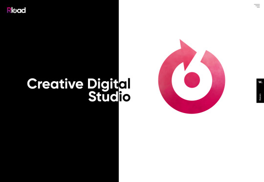
Rload
From a slightly anarchic British agency, to a highly-polished Spanish one. Rload hangs everything on its logo, with videos of smoke, and ink in water, behind a mask in order to add motion to the design. It’s a simple and effective way to present color and animation, without adding too much bloat. Their project page has embraced the brutalist trend, softened with a nice animated blob.
BuglerSmith
BuglerSmith is a creative agency, working on all kinds of media and interactive campaigns. Their site uses a very strong, very traditional 12-column grid to position thumbnails offset from each other, embracing the post-Brutalist trend. What really works is that some of the grid columns are highlighted with a fine line, which gives the scrolling page an incredible sense of depth. What’s more, it’s hard to dislike any agency that embraces neon pink.

Michele Smolensky
Speaking of neon pink, what could possibly beat neon pink, other than blackletter type set in neon pink. Michele Smolensky is a freelance designer and developer, from Austin Texas. Her site is simple, but the color combination of deep blue and neon pink really pops, and you’ve got to love any site that has the confidence to embrace blackletter, possibly the world’s most underused style of typeface.

Vivid Motion
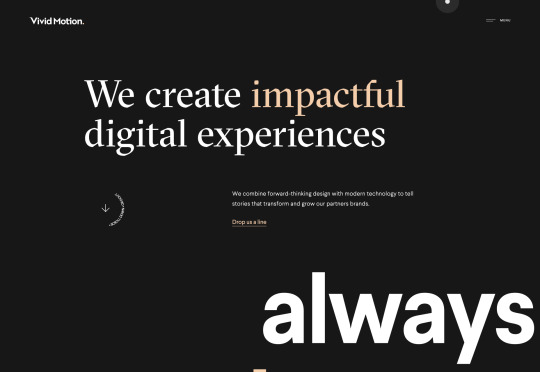
Vivid Motion is another site embracing beautiful typography. Vivid Motion relies on GT Spectra — a lovely serif font with tons of character thanks to those sharp cutaways. Scroll rapidly and the thumbnails sheer nicely to enhance the sense of motion. The dark background and simple grid feels like a lot of similar sites, but the considered typography really makes this site stand out.
One Media
I love the energy of One Media’s site. It’s more than just the rapid-cut video, the whole layout, the overlapping elements, and the interaction of the different blocks of text all contributes. It also makes use of a big design trend: menus that rely on overlays rather than background color, in order to stand out.

Elium
Elium is a Paris-based design studio specializing in product design. Their site features a slow-motion video that is effortlessly cool, and light-filled; precisely what I think of when I think of Paris. They’ve adopted a little of the spirit of brutalism with their offset images, but this site really longs for minimalism with the geometric sans-serif, and the subtle shifts in grey. I still can’t quite let go of this style.

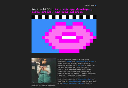
Jenn Schiffer
After a little visit to minimalism, we’re back to brutalism with a vengeance. Jenn Schiffer’s site might be my favourite this month, because it harks back to the early web, when we posted what we loved, not what had been analysed, measured, and approved. Describing herself as a web app developer, pixel artist, and tech satirist, this site is cool AF. And the fact that she’s included a dark mode option is hilariously awesome.
Berger & Föhr
Back to nice, sensible, orderly design. Berger & Föhr is a graphic design agency focused on brand ideas and identities. It’s a simple site that gives over all the attention to the actual portfolio. The work on show is highly accomplished, the identity for Hampton Architecture, Blackbelly, and Ello particularly stand out. If you had a healthy budget to rebrand your business, this is where you would spend it.

Fanny Luor
Fanny Luor is a freelance illustrator (and sometimes designer) whose site features some awesome work for clients like Dropbox and Intercom. Her very simple site is an exercise in self-restraint, which lets her work speak for itself. The illustration is both modern, and reminiscent of mid-late twentieth century illustration, with rich color blocks and simple shapes.

Huncwot
Huncwot’s site is a simple premise, executed brilliantly. It’s a split-screen design with company details on the left, and work on the right. As you scroll the logo, which straddles both, is overlapped by the design thumbnails to create a subtle sense of depth. There’s even some parallax scrolling (yikes!) thrown in for good measure.

Austin Mayer
Austin Mayer describes himself as an ‘Interactive Director’ and the fun particle-explody effect on his landing page is certainly attention grabbing. What I really love is the use of the blue gradient. It feels like forever since I’ve seen blue used this well, creating a sense of space and light, without relying on darkmode to do it. Did I mention he’s done work for Beyoncé? Yup!

Source from Webdesigner Depot https://ift.tt/2rQsljP from Blogger https://ift.tt/32WT0Z9
0 notes
Text
Top 10 Best Bluetooth Car Kits for sale
What happens when you want to relay your favorite tunes or media content to your car when driving?Or what happens when you want your phone calls to be broadcasted on the car audio system for a safe driving experience? Well, we highly recommend that you start with the Top 10 Best Bluetooth Car Kits for Sale as a unique investment for your needs.
These types of Bluetooth devices offer solid performance and impressive affordability that makes them ideal for most types of car settings. More so, they also allow users to relay their content without having to alter the original sound system design of the car, which can hamper the overall value of the vehicle.

Products from Amazon.com

TaoTronics Bluetooth Receiver/Car Kit, Portable Wireless Audio Adapter 3.5mm Aux Stereo Output (Bluetooth 4.2, A2DP, Built-in Microphone) for Home Audio Music Streaming Sound System
Price: $14.99

SoundBot SB360 Bluetooth 4.0 Car Kit Hands-Free Wireless Talking & Music Streaming Dongle w/ 10W Dual Port 2.1A USB Charger + Magnetic Mounts + Built-in 3.5mm Aux Cable
Price: $19.99

-45%
Kinivo BTC450 Bluetooth Car Kit (Hands-Free Adapter for Cars with 3.5mm Aux Input, Apt-X)
Price: $35.99
Was: $64.99

EIGELIU 3.5 mm Headphone Adapter for Adapter 3.5mm Jack Dongle Earphone Aux Audio & Music Compatible at The Same time Adaptor
Price: Out of stock

FM Transmitter, Woopower Wireless Radio Adapter Car Kit with 3.5mm Audio Plug and USB Car Charger (5V/ 2.4A) for and Any Smart Phones with 3.5mm Audio Plug, MP3, MP4, iPad, iPod and Etc
Price: Out of stock
Cablex Bluetooth 4.1 Receiver / Car Kit Portable Wireless Audio Adapter A2DP 3.5 mm Stereo Output with Built-in Microphone for Home Audio Music Streaming Sound System (2nd Generation)
Price: Out of stock
Car mp3 Bluetooth FM Transmitter Mini Wireless Radio Adaptor Handsfree Phone Calling Car Kit USB Charger for TF Card, Smart phones, IOS Series and Other Bluetooth Device
Price: Out of stock
‹ ›
jQuery(document).ready(function()
var CONSTANTS = productMinWidth : 185, productMargin : 20 ;
var $adUnits = jQuery('.aalb-product-carousel-unit'); $adUnits.each(function() var $adUnit = jQuery(this), $wrapper = $adUnit.find('.aalb-pc-wrapper'), $productContainer = $adUnit.find('.aalb-pc-product-container'), $btnNext = $adUnit.find('.aalb-pc-btn-next'), $btnPrev = $adUnit.find('.aalb-pc-btn-prev'), $productList = $productContainer.find('.aalb-pc-product-list'), $products = $productList.find('.aalb-pc-product'), productCount = $products.length;
if (!productCount) return true;
var rows = $adUnit.find('input[name=rows]').length && parseInt($adUnit.find('input[name=rows]').val(), 10); var columns = $adUnit.find('input[name=columns]').length && parseInt($adUnit.find('input[name=columns]').val(), 10);
if( columns ) var productContainerMinWidth = columns * (CONSTANTS.productMinWidth + CONSTANTS.productMargin) + 'px'; $adUnit.css( 'min-width', productContainerMinWidth ); $productContainer.css( 'min-width', productContainerMinWidth ); $products.filter( ':nth-child(' + columns + 'n + 1)' ).css( 'clear', 'both' );
if (rows && columns) var cutOffIndex = (rows * columns) - 1; $products.filter(':gt(' + cutOffIndex + ')').remove();
function updateLayout() possibleColumns actualColumns ) $btnNext.css( 'visibility', 'visible' ).removeClass( 'disabled' ).unbind( 'click' ); $btnPrev.css( 'visibility', 'visible' ).removeClass( 'disabled' ).unbind( 'click' ); $productContainer.jCarouselLite( btnNext : '#' + $adUnit.attr( 'id' ) + ' .aalb-pc-btn-next', btnPrev : '#' + $adUnit.attr( 'id' ) + ' .aalb-pc-btn-prev', visible : actualColumns, circular: false );
updateLayout(); jQuery(window).resize(updateLayout); ); );
/*! * jCarouselLite - v1.1 - 2014-09-28 * http://www.gmarwaha.com/jquery/jcarousellite/ * Copyright (c) 2014 Ganeshji Marwaha * Licensed MIT (https://github.com/ganeshmax/jcarousellite/blob/master/LICENSE) */
!function(a)a.jCarouselLite=version:"1.1",a.fn.jCarouselLite=function(b)),this.each(function()function c(a)l()),!1function d()if(n=!1,o=b.vertical?"top":"left",p=b.vertical?"height":"width",q=B.find(">ul"),r=q.find(">li"),x=r.size(),w=lt(x,b.visible)?x:b.visible,b.circular)var c=r.slice(x-w).clone(),d=r.slice(0,w).clone();q.prepend(c).append(d),b.start+=ws=a("li",q),y=s.size(),z=b.startfunction e()B.css("visibility","visible"),s.css(overflow:"hidden","float":b.vertical?"none":"left"),q.css(margin:"0",padding:"0",position:"relative","list-style":"none","z-index":"1"),B.css(overflow:"hidden",position:"relative","z-index":"2",left:"0px"),!b.circular&&b.btnPrev&&0==b.start&&a(b.btnPrev).addClass("disabled")function f()t=b.vertical?s.outerHeight(!0):s.outerWidth(!0),u=t*y,v=t*w,s.css(width:s.width(),height:s.height()),q.css(p,u+"px").css(o,-(z*t)),B.css(p,v+"px")function g()b.btnPrev&&a(b.btnPrev).click(function()return c(z-b.scroll)),b.btnNext&&a(b.btnNext).click(function()return c(z+b.scroll)),b.btnGo&&a.each(b.btnGo,function(d,e)a(e).click(function()return c(b.circular?w+d:d))),b.mouseWheel&&B.mousewheel&&B.mousewheel(function(a,d)return c(d>0?z-b.scroll:z+b.scroll)),b.auto&&h()function h()A=setTimeout(function()c(z+b.scroll),b.auto) function lt(a,b)return ab; function i()return s.slice(z).slice(0,w)function j(a)var c;a=y-w+1&&(c=a-x-b.scroll,q.css(o,-(c*t)+"px"),z=c+b.scroll)function k(a)0>a?z=0:a>y-w&&(z=y-w)function l()z+gt(b.scroll, y)-w&&b.btnNextfunction m(c)n=!0,q.animate("left"==o?left:-(z*t):top:-(z*t),a.extend(duration:b.speed,easing:b.easing,c))var n,o,p,q,r,s,t,u,v,w,x,y,z,A,B=a(this);d(),e(),f(),g()),a.fn.jCarouselLite.options=btnPrev:null,btnNext:null,btnGo:null,mouseWheel:!1,auto:null,speed:200,easing:null,vertical:!1,circular:!0,visible:3,start:0,scroll:1,beforeStart:null,afterEnd:null(jQuery);
10. Mpow Bluetooth Receiver, Steamboat Bluetooth Adapter & Hands-Free Car Kits

Detail On Amazon
Improve the functionality of your care with the Mpow Bluetooth receiver that comes with advanced CSR 4.0 Chip to provide high-quality audio sound that makes it better than most 3.0 versions. This MPOW Bluetooth kit also provides extra long playtime, and it comes with an inbuilt battery that can provide well over 10 hours of play and talk time. More so, the dual link connects can be used to connect two Bluetooth devices at the same time and can reach spaces of up to 30 feet.
09. Bluetooth Receiver / Car Kit, TaoTronics Portable Wireless Audio Adapter

Detail On Amazon
Experience the superior quality of the Taotronic portable wireless audio adaptor that provides broad compatibility and Bluetooth 4.0 that is compatible with a broad range of flagship Smartphones. It also comes with dual link functionality that allows users to connect two Bluetooth devices at the same time to enjoy music or perhaps to answer phone calls as well. Users can also control the Bluetooth by changing the volume or perhaps by skipping tracks with ease.
08. SoundBot SB360 Bluetooth 4.0 Car Kit Hands-Free Kit

Detail On Amazon
The Soundbite SB360 Bluetooth car kit provides 4.0 wireless technologies along with backward compatibility that is ideal for your A2DP profile and most Smartphones as well. It also comes with echo and noise reduction functionalities to allow for nonstop and definite call conversations and dynamic music streaming at all times. The inclusion of the onboard multi-function allows for easy access to the previous, next and intuitive control commands.
07. Kinivo BTC450 Bluetooth Hands-Free Car Kit

Detail On Amazon
Seamless stream your media content from any Bluetooth A2DP enable devices and your Smartphone by using the Kinivo BTC450 Bluetooth hands-free kit. It also comes with an inbuilt microphone and easy to use controls that provide additional user convenience. This unit also provides clear audio quality through the 3.5mm input in the car stereo, especially when playing music or when answering phone calls.
06. iClever Himbox HB01 Bluetooth 4.0 Hands-Free Car Kit

Detail On Amazon
The iClever Himbox HB01 Bluetooth hands-free kit provides multi-point access, and it came with an inbuilt microphone and built high-performance audio stereo for unrivaled quality. Furthermore, the Himbox HBO1 also comes with noise and echo canceling technology that provides superior quality call communications for the user each time. It also comes with a hands-free kit that provides a simple solution for answering and receiving phone calls at all times.
05. Mpow FM Transmitter, Wireless Bluetooth Hands-Free Car Kits

Detail On Amazon
Improve your media entertainment for the car with the MPOW FM transmitter that comes with an inbuilt mic that allows you to make hands-free calls when driving to allow for safe driving and entertainment as well. It also comes with clear voice capture technology that can echo cancellation and provide noise suppression to improve audio quality. It also provides excellent stable FM signal with the rapid PCBA optimize to ensure high fidelity sound at all times.
04. FM Transmitter, Woopower Wireless Radio Adapter Car Kit

Detail On Amazon
The woopower wireless Bluetooth kit comes with a versatile design that makes it ideal for answering calls and listening to your favorite music as well. Additionally, it also allows users to charge their phones and it relays superior sound quality to the car system at all times as well. This unit also features a high contrast and easy read display interface for various customization. The inbuilt USB power port provides sufficient charge for your handheld devices.
03. Cablex Bluetooth 4.1 Receiver / Car Kit Portable Wireless Audio Adapter

Detail On Amazon
Experience the superior quality of the Cablex Bluetooth receiver that is designed with advanced Bluetooth V4.1 + A2DP technology to ensure lossless data transmission to let you enjoy crisp and reliable call conversations each time. It also comes with a dual-link feature that allows users to connect two phones at the same time in up to 30ft of open space with an enhanced wireless signal, interference free connectivity, and stable experience.
02. Car mp3 Bluetooth FM Transmitter Mini Wireless Radio Adaptor

Detail On Amazon
Upgrade your car-entertainment regime with this Blissu Bluetooth car kit that allows the user to adjust the frequency, volume and play music just by using a TF card and mobile phone. It also allows for easy connection to Bluetooth devices and enhanced memory functionality as well. This unit also allows the user to answer, make and reject hands-free calls especially when driving on the highway. More so, it also comes with a well-positioned screen that allows for convenient customization of the features.
01. Bluetooth Car Kit, Esinkin® Hands-Free Car Kit with One Port USB Car Charger

Detail On Amazon
Improve the audio quality of your care with the Esinskin Handsfree kit that not only plays your entertainment media but also provides an excellent solution for receiving or answering your phone calls. It also provides clear sound and perfect acoustics for your unique needs. This Esinskin Bluetooth kit also comes with noise and echo cancellation technology to ensure unrivaled audio quality for your individual needs. It also supports pairing with Bluetooth enabled devices and long-range wireless range of 30ft as well.
Conclusion
All things considered, for those who want convenient media entertainment when driving the car, it might be the time to settle for a Bluetooth enabled handsfree kit. These things allow users to connect to their cars audio system just by using Bluetooth wireless capability. More so some of the Top 10 Best Bluetooth Car Kits for Sale also come with excellent auxiliary features that make them ideal for entertainment in the car.
–>
0 notes
Text
A Dark Mode Toggle with React and ThemeProvider
I like when websites have a dark mode option. Dark mode makes web pages easier for me to read and helps my eyes feel more relaxed. Many websites, including YouTube and Twitter, have implemented it already, and we’re starting to see it trickle onto many other sites as well.
In this tutorial, we’re going to build a toggle that allows users to switch between light and dark modes, using a <ThemeProvider wrapper from the styled-components library. We’ll create a useDarkMode custom hook, which supports the prefers-color-scheme media query to set the mode according to the user’s OS color scheme settings.
If that sounds hard, I promise it’s not! Let’s dig in and make it happen.
See the Pen Day/night mode switch toggle with React and ThemeProvider by Maks Akymenko (@maximakymenko) on CodePen.
Let’s set things up
We’ll use create-react-app to initiate a new project:
npx create-react-app my-app cd my-app yarn start
Next, open a separate terminal window and install styled-components:
yarn add styled-components
Next thing to do is create two files. The first is global.js, which will contain our base styling, and the second is theme.js, which will include variables for our dark and light themes:
// theme.js export const lightTheme = { body: '#E2E2E2', text: '#363537', toggleBorder: '#FFF', gradient: 'linear-gradient(#39598A, #79D7ED)', } export const darkTheme = { body: '#363537', text: '#FAFAFA', toggleBorder: '#6B8096', gradient: 'linear-gradient(#091236, #1E215D)', }
Feel free to customize variables any way you want, because this code is used just for demonstration purposes.
// global.js // Source: https://github.com/maximakymenko/react-day-night-toggle-app/blob/master/src/global.js#L23-L41 import { createGlobalStyle } from 'styled-components'; export const GlobalStyles = createGlobalStyle` *, *::after, *::before { box-sizing: border-box; } body { align-items: center; background: ${({ theme }) => theme.body}; color: ${({ theme }) => theme.text}; display: flex; flex-direction: column; justify-content: center; height: 100vh; margin: 0; padding: 0; font-family: BlinkMacSystemFont, -apple-system, 'Segoe UI', Roboto, Helvetica, Arial, sans-serif; transition: all 0.25s linear; }
Go to the App.js file. We’re going to delete everything in there and add the layout for our app. Here’s what I did:
import React from 'react'; import { ThemeProvider } from 'styled-components'; import { lightTheme, darkTheme } from './theme'; import { GlobalStyles } from './global'; function App() { return ( <ThemeProvider theme={lightTheme}> <> <GlobalStyles /> <button>Toggle theme</button> <h1>It's a light theme!</h1> <footer> </footer> </> </ThemeProvider> ); } export default App;
This imports our light and dark themes. The ThemeProvider component also gets imported and is passed the light theme (lightTheme) styles inside. We also import GlobalStyles to tighten everything up in one place.
Here’s roughly what we have so far:

Now, the toggling functionality
There is no magic switching between themes yet, so let’s implement toggling functionality. We are only going to need a couple lines of code to make it work.
First, import the useState hook from react:
// App.js import React, { useState } from 'react';
Next, use the hook to create a local state which will keep track of the current theme and add a function to switch between themes on click:
// App.js const [theme, setTheme] = useState('light'); // The function that toggles between themes const toggleTheme = () => { // if the theme is not light, then set it to dark if (theme === 'light') { setTheme('dark'); // otherwise, it should be light } else { setTheme('light'); } }
After that, all that’s left is to pass this function to our button element and conditionally change the theme. Take a look:
// App.js import React, { useState } from 'react'; import { ThemeProvider } from 'styled-components'; import { lightTheme, darkTheme } from './theme'; import { GlobalStyles } from './global'; // The function that toggles between themes function App() { const [theme, setTheme] = useState('light'); const toggleTheme = () => { if (theme === 'light') { setTheme('dark'); } else { setTheme('light'); } } // Return the layout based on the current theme return ( <ThemeProvider theme={theme === 'light' ? lightTheme : darkTheme}> <> <GlobalStyles /> // Pass the toggle functionality to the button <button onClick={toggleTheme}>Toggle theme</button> <h1>It's a light theme!</h1> <footer> </footer> </> </ThemeProvider> ); } export default App;

How does it work?
// global.js background: ${({ theme }) => theme.body}; color: ${({ theme }) => theme.text}; transition: all 0.25s linear;
Earlier in our GlobalStyles, we assigned background and color properties to values from the theme object, so now, every time we switch the toggle, values change depending on the darkTheme and lightTheme objects that we are passing to ThemeProvider. The transition property allows us to make this change a little more smoothly than working with keyframe animations.
Now we need the toggle component
We’re generally done here because you now know how to create toggling functionality. However, we can always do better, so let’s improve the app by creating a custom Toggle component and make our switch functionality reusable. That’s one of the key benefits to making this in React, right?
We’ll keep everything inside one file for simplicity’s sake,, so let’s create a new one called Toggle.js and add the following:
// Toggle.js import React from 'react' import { func, string } from 'prop-types'; import styled from 'styled-components'; // Import a couple of SVG files we'll use in the design: https://www.flaticon.com import { ReactComponent as MoonIcon } from 'icons/moon.svg'; import { ReactComponent as SunIcon } from 'icons/sun.svg'; const Toggle = ({ theme, toggleTheme }) => { const isLight = theme === 'light'; return ( <button onClick={toggleTheme} > <SunIcon /> <MoonIcon /> </button> ); }; Toggle.propTypes = { theme: string.isRequired, toggleTheme: func.isRequired, } export default Toggle;
You can download icons from here and here. Also, if we want to use icons as components, remember about importing them as React components.
We passed two props inside: the theme will provide the current theme (light or dark) and toggleTheme function will be used to switch between them. Below we created an isLight variable, which will return a boolean value depending on our current theme. We’ll pass it later to our styled component.
We’ve also imported a styled function from styled-components, so let’s use it. Feel free to add this on top your file after the imports or create a dedicated file for that (e.g. Toggle.styled.js) like I have below. Again, this is purely for presentation purposes, so you can style your component as you see fit.
// Toggle.styled.js const ToggleContainer = styled.button` background: ${({ theme }) => theme.gradient}; border: 2px solid ${({ theme }) => theme.toggleBorder}; border-radius: 30px; cursor: pointer; display: flex; font-size: 0.5rem; justify-content: space-between; margin: 0 auto; overflow: hidden; padding: 0.5rem; position: relative; width: 8rem; height: 4rem; svg { height: auto; width: 2.5rem; transition: all 0.3s linear; // sun icon &:first-child { transform: ${({ lightTheme }) => lightTheme ? 'translateY(0)' : 'translateY(100px)'}; } // moon icon &:nth-child(2) { transform: ${({ lightTheme }) => lightTheme ? 'translateY(-100px)' : 'translateY(0)'}; } } `;
Importing icons as components allows us to directly change the styles of the SVG icons. We’re checking if the lightTheme is an active one, and if so, we move the appropriate icon out of the visible area — sort of like the moon going away when it’s daytime and vice versa.
Don’t forget to replace the button with the ToggleContainer component in Toggle.js, regardless of whether you’re styling in separate file or directly in Toggle.js. Be sure to pass the isLight variable to it to specify the current theme. I called the prop lightTheme so it would clearly reflect its purpose.
The last thing to do is import our component inside App.js and pass required props to it. Also, to add a bit more interactivity, I’ve passed condition to toggle between "light" and “dark" in the heading when the theme changes:
// App.js <Toggle theme={theme} toggleTheme={toggleTheme} /> <h1>It's a {theme === 'light' ? 'light theme' : 'dark theme'}!</h1>
Don’t forget to credit the flaticon.com authors for the providing the icons.
// App.js <span>Credits:</span> <small><b>Sun</b> icon made by <a href="https://www.flaticon.com/authors/smalllikeart">smalllikeart</a> from <a href="https://www.flaticon.com">www.flaticon.com</a></small> <small><b>Moon</b> icon made by <a href="https://www.freepik.com/home">Freepik</a> from <a href="https://www.flaticon.com">www.flaticon.com</a></small>
Now that’s better:

The useDarkMode hook
While building an application, we should keep in mind that the app must be scalable, meaning, reusable, so we can use in it many places, or even different projects.
That is why it would be great if we move our toggle functionality to a separate place — so, why not to create a dedicated account hook for that?
Let’s create a new file called useDarkMode.js in the project src directory and move our logic into this file with some tweaks:
// useDarkMode.js import { useEffect, useState } from 'react'; export const useDarkMode = () => { const [theme, setTheme] = useState('light'); const toggleTheme = () => { if (theme === 'light') { window.localStorage.setItem('theme', 'dark') setTheme('dark') } else { window.localStorage.setItem('theme', 'light') setTheme('light') } }; useEffect(() => { const localTheme = window.localStorage.getItem('theme'); localTheme && setTheme(localTheme); }, []); return [theme, toggleTheme] };
We’ve added a couple of things here. We want our theme to persist between sessions in the browser, so if someone has chosen a dark theme, that’s what they’ll get on the next visit to the app. That’s a huge UX improvement. For this reasons we use localStorage.
We’ve also implemented the useEffect hook to check on component mounting. If the user has previously selected a theme, we will pass it to our setTheme function. In the end, we will return our theme, which contains the chosen theme and toggleTheme function to switch between modes.
Now, let’s implement the useDarkMode hook. Go into App.js, import the newly created hook, destructure our theme and toggleTheme properties from the hook, and, put them where they belong:
// App.js import React from 'react'; import { ThemeProvider } from 'styled-components'; import { useDarkMode } from './useDarkMode'; import { lightTheme, darkTheme } from './theme'; import { GlobalStyles } from './global'; import Toggle from './components/Toggle'; function App() { const [theme, toggleTheme] = useDarkMode(); const themeMode = theme === 'light' ? lightTheme : darkTheme; return ( <ThemeProvider theme={themeMode}> <> <GlobalStyles /> <Toggle theme={theme} toggleTheme={toggleTheme} /> <h1>It's a {theme === 'light' ? 'light theme' : 'dark theme'}!</h1> <footer> Credits: <small>Sun icon made by smalllikeart from www.flaticon.com</small> <small>Moon icon made by Freepik from www.flaticon.com</small> </footer> </> </ThemeProvider> ); } export default App;
This almost works almost perfectly, but there is one small thing we can do to make our experience better. Switch to dark theme and reload the page. Do you see that the sun icon loads before the moon icon for a brief moment?
That happens because our useState hook initiates the light theme initially. After that, useEffect runs, checks localStorage and only then sets the theme to dark.
So far, I found two solutions. The first is to check if there is a value in localStorage in our useState:
// useDarkMode.js const [theme, setTheme] = useState(window.localStorage.getItem('theme') || 'light');
However, I am not sure if it’s a good practice to do checks like that inside useState, so let me show you a second solution, that I’m using.
This one will be a bit more complicated. We will create another state and call it componentMounted. Then, inside the useEffect hook, where we check our localTheme, we’ll add an else statement, and if there is no theme in localStorage, we’ll add it. After that, we’ll set setComponentMounted to true. In the end, we add componentMounted to our return statement.
// useDarkMode.js import { useEffect, useState } from 'react'; export const useDarkMode = () => { const [theme, setTheme] = useState('light'); const [componentMounted, setComponentMounted] = useState(false); const toggleTheme = () => { if (theme === 'light') { window.localStorage.setItem('theme', 'dark'); setTheme('dark'); } else { window.localStorage.setItem('theme', 'light'); setTheme('light'); } }; useEffect(() => { const localTheme = window.localStorage.getItem('theme'); if (localTheme) { setTheme(localTheme); } else { setTheme('light') window.localStorage.setItem('theme', 'light') } setComponentMounted(true); }, []); return [theme, toggleTheme, componentMounted] };
You might have noticed that we’ve got some pieces of code that are repeated. We always try to follow the DRY principle while writing the code, and right here we’ve got a chance to use it. We can create a separate function that will set our state and pass theme to the localStorage. I believe, that the best name for it will be setTheme, but we’ve already used it, so let’s call it setMode:
// useDarkMode.js const setMode = mode => { window.localStorage.setItem('theme', mode) setTheme(mode) };
With this function in place, we can refactor our useDarkMode.js a little:
// useDarkMode.js import { useEffect, useState } from 'react'; export const useDarkMode = () => { const [theme, setTheme] = useState('light'); const [componentMounted, setComponentMounted] = useState(false); const setMode = mode => { window.localStorage.setItem('theme', mode) setTheme(mode) }; const toggleTheme = () => { if (theme === 'light') { setMode('dark'); } else { setMode('light'); } }; useEffect(() => { const localTheme = window.localStorage.getItem('theme'); if (localTheme) { setTheme(localTheme); } else { setMode('light'); } setComponentMounted(true); }, []); return [theme, toggleTheme, componentMounted] };
We’ve only changed code a little, but it looks so much better and is easier to read and understand!
Did the component mount?
Getting back to componentMounted property. We will use it to check if our component has mounted because this is what happens in useEffect hook.
If it hasn’t happened yet, we will render an empty div:
// App.js if (!componentMounted) { return <div /> };
Here is how complete code for the App.js:
// App.js import React from 'react'; import { ThemeProvider } from 'styled-components'; import { useDarkMode } from './useDarkMode'; import { lightTheme, darkTheme } from './theme'; import { GlobalStyles } from './global'; import Toggle from './components/Toggle'; function App() { const [theme, toggleTheme, componentMounted] = useDarkMode(); const themeMode = theme === 'light' ? lightTheme : darkTheme; if (!componentMounted) { return <div /> }; return ( <ThemeProvider theme={themeMode}> <> <GlobalStyles /> <Toggle theme={theme} toggleTheme={toggleTheme} /> <h1>It's a {theme === 'light' ? 'light theme' : 'dark theme'}!</h1> <footer> <span>Credits:</span> <small><b>Sun</b> icon made by <a href="https://www.flaticon.com/authors/smalllikeart">smalllikeart</a> from <a href="https://www.flaticon.com">www.flaticon.com</a></small> <small><b>Moon</b> icon made by <a href="https://www.freepik.com/home">Freepik</a> from <a href="https://www.flaticon.com">www.flaticon.com</a></small> </footer> </> </ThemeProvider> ); } export default App;
Using the user’s preferred color scheme
This part is not required, but it will let you achieve even better user experience. This media feature is used to detect if the user has requested the page to use a light or dark color theme based on the settings in their OS. For example, if a user’s default color scheme on a phone or laptop is set to dark, your website will change its color scheme accordingly to it. It’s worth noting that this media query is still a work in progress and is included in the Media Queries Level 5 specification, which is in Editor’s Draft.
This browser support data is from Caniuse, which has more detail. A number indicates that browser supports the feature at that version and up.
Desktop
ChromeOperaFirefoxIEEdgeSafari766267No7612.1
Mobile / Tablet
iOS SafariOpera MobileOpera MiniAndroidAndroid ChromeAndroid Firefox13NoNo76No68
The implementation is pretty straightforward. Because we’re working with a media query, we need to check if the browser supports it in the useEffect hook and set appropriate theme. To do that, we’ll use window.matchMedia to check if it exists and whether dark mode is supported. We also need to remember about the localTheme because, if it’s available, we don’t want to overwrite it with the dark value unless, of course, the value is set to light.
If all checks are passed, we will set the dark theme.
// useDarkMode.js useEffect(() => { if ( window.matchMedia && window.matchMedia('(prefers-color-scheme: dark)').matches && !localTheme ) { setTheme('dark') } })
As mentioned before, we need to remember about the existence of localTheme — that’s why we need to implement our previous logic where we’ve checked for it.
Here’s what we had from before:
// useDarkMode.js useEffect(() => { const localTheme = window.localStorage.getItem('theme'); if (localTheme) { setTheme(localTheme); } else { setMode('light'); } })
Let’s mix it up. I’ve replaced the if and else statements with ternary operators to make things a little more readable as well:
// useDarkMode.js useEffect(() => { const localTheme = window.localStorage.getItem('theme'); window.matchMedia && window.matchMedia('(prefers-color-scheme: dark)').matches && !localTheme ? setMode('dark') : localTheme ? setTheme(localTheme) : setMode('light');}) })
Here’s the userDarkMode.js file with the complete code:
// useDarkMode.js import { useEffect, useState } from 'react'; export const useDarkMode = () => { const [theme, setTheme] = useState('light'); const [componentMounted, setComponentMounted] = useState(false); const setMode = mode => { window.localStorage.setItem('theme', mode) setTheme(mode) }; const toggleTheme = () => { if (theme === 'light') { setMode('dark') } else { setMode('light') } }; useEffect(() => { const localTheme = window.localStorage.getItem('theme'); window.matchMedia && window.matchMedia('(prefers-color-scheme: dark)').matches && !localTheme ? setMode('dark') : localTheme ? setTheme(localTheme) : setMode('light'); setComponentMounted(true); }, []); return [theme, toggleTheme, componentMounted] };
Give it a try! It changes the mode, persists the theme in localStorage, and also sets the default theme accordingly to the OS color scheme if it’s available.
Congratulations, my friend! Great job! If you have any questions about implementation, feel free to send me a message!
The post A Dark Mode Toggle with React and ThemeProvider appeared first on CSS-Tricks.
A Dark Mode Toggle with React and ThemeProvider published first on https://deskbysnafu.tumblr.com/
0 notes
Text
CPT Reflection Questions
Revised Work: 1. I chose to improve upon my button project. When I looked at my end product I was not as happy with the outcome as I wanted to be. I felt it didn’t look cohesive and there wasn’t any colour scheme. I decided to revise it by adding red to all of the buttons. It also better matched the background that I made, and I think that it looks better afterwards. Portfolio: 2. I think the media in portfolio that’s the strongest is my gif project called Turnover. I got to use 3 elements that I liked. I got to used my own actual drawing skills to create the basis of the eyes. Next I used Adobe Capture to get that image and make it a png, where I then put that into Illustrator. In Illustrator I made each file where I made the moon/ sun placed in a different position, so I could create that illusion of movement. Afterwards, all of the single files were compiled in Photoshop, where each frame I made in Illustator became the gif. This project was a lot of work, but it is one of my favourite and I think my strongest. 3. I think the piece I created that was the weakest was for my project titled Retro Communication. At first I thought that the end product would look good, since usually the technique of using the paintbrush tool to create detail works for me. that wasn’t the case with this project. It ended up looking worse than amateur, and the composition was all over the place. If I could redo it and improve it, I would use a different technique and have a different idea, since this one turned out just badly. Personal Work: 1. My creative process included searching up the place I wanted to use, and the image I wanted to base it off to create the composition. I was drawing inspiration from some pictures I took, and old vector works that I have done. I wanted it to look quite “cartoonish” in the sense that there wasn’t a lot of values or depth perception. 2. The most successful thing about this piece to me is the actual palace itself. I loved how it turned out. I put a lot of detail into it, even though it may not be seen from far away. I tried to create subtle values in the center part of the building. 3. I particularly want people to notice the details in the piece. For example, the little statues on the sides, and the details with the windows, the posts, the rails, and more. I also want people to see how interesting this place is and realize that there is so much historical significance. That is what I wanted to portray anyway. 4. My goal was to put as much effort into it as I can with the most detail, without wasting time. As you can see the building is repetitive in the design on each side. It obviously wouldn’t make sense for me to actually create each column over and over again. I simply copied and pasted each side and flipped them so they would match. Making small adjustments before I continued each section and so on. 5. A problem that did occur was how I was going to do the trees. I knew I wanted them to have value, but I also did not want them to look like blobs, I wanted them to look like the actual trees. I decided to try out using the pen tool, somewhat rabidly, where I would move each position quickly to create a more realistic shape of a tree with twists, turns and curves. This technique actually worked out well for me. I also took the same tree piece I created, then copied and pasted it to be a darker colour, put it behind one another, and it gives the illusion of depth and shadows. 6. If I could go back in time something I would do differently would be the patches of what’s supposed to look like a mini garden. I tried to simplify it by creating some abstract shapes but it’s hard to tell what it is. They also aren’t perfectly symmetrical to each side, and I’m surprised I didn’t realize that before I submitted the end product. General Questions: 7. I am proud that I was able to learn and create work I wouldn’t normally do. I didn’t do a lot of creative process, because for me I like to go right into my idea try to make it happen, and change things if they need to. No matter what I always would draw inspiration from other things and I know that was beneficial to my thinking process. It was interesting to learn other programs that I never used before, and I did struggle with that. I was happy with about half of the works I did in this course, as it was probably my hardest time after doing this course 2 years prior. I was especially happy with my Heroine Hermione project. Obviously not the video portion but I loved how the portraits turned out, and I thought they looked really realistic and lifelike. Overall I was most happy with any of the vector pieces I have to do, and those are my proudest works from this semester. 8. I struggled in every project I did that included video. Realistically, I took Media Arts instead of Comm-Tech because I know video isn’t my strength and it's hard for me to do. Plus, I originally thought that media arts was only still work and vector type work, since that’s all I did in the past. I wasn’t happy with any of the video projects I created, and the process of learning a whole new adobe program on my own was not fun. I dealt with it at first by trying to figure it out on mu own, but afterwards I asked for guidance. 9. I learned what my strengths and weaknesses are. As I just mentioned I know that video is my weakness, and I probably will never do some on my own time. I know that my strength is vector art, and photography even though we didn’t do a unit on it. The valuable skills I learned otherwise was that, I have to have faith in my work and I have to be fully invested in my pieces for the best end products.
1 note
·
View note