#blue naeve
Text
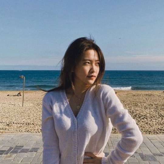

𖥨২ㅤ👴🏾 seⴅ espaço pαrα principiαntes oև corações sensíveis


#red velvet#red velvet moodboard#yeri messy packs#yeri long locs#yeri layouts#yeri icons#red velvet messy headers#blue naeve#blue messy moodboard#messy aesthetic#messy icons#hailey bieber#ggroups icons#icons kpop#moodboard kpop#moodboard#aesthetic moodboard#gg layouts#gg moodboard#gg packs#random moodboard#kpop moodboard
23 notes
·
View notes
Text


˖ ☒ ↷ 🪞 ♡
#naev-a#ning yizhuo#ningning#aespa#kpop#kpop moodboard#brown moodboard#clean moodboard#headers#bakery moodboard#moodboard#moodboard kpop#sanrio#neko atsume#red moodboard#orange moodboard#yellow moodboard#green moodboard#blue moodboard#purple moodboard#pink moodboard#black moodboard#karina#giselle#winter#gifs#gif#reqs : open !#🍈⛅🐾
221 notes
·
View notes
Text
Entry #4
It was somewhat easy to hunt the duskhounds and then we collect it's fangs and claws to use it in the future while we skinned it to sell their pelts to a merchant before going to see the village chief to earn our gold.
We split up our gold then look around the town before we sleep and resume travelling tomorrow, I went to the market and while looking at various wares. I bumped into someone and they look beautiful with his crystal blue eyes and a pretty face, I apologized for not looking where I was going and they smile and assured me that they was also distracted.
I introduced myself and he did the same, his name is Rathal Mirageiros and he lives here. He usually work at his home, making potions to sell to the clinic and merchants that sells it to travellers.
We parted ways and he resumes walking to his destination and I went to meet up with Naeve. I couldn't help but blush when I remember his smile and unfortunately, Naeve saw me and he immediately grab me in a headlock and ask what got me looking lovesick.
No way that I'm telling him so jab him with my elbow on his stomach and leave him on the groaning in pain as I walk away then I bumped into Rathal again but this time I fell and he reflexively grab me to stop me from falling and time just seems to stop, we both stare at each other before Naeve clears his throat and we snapped out of it as Rathal pulls me up so I can stand.
Naeve introduce himself to Rathal and he did the same while looking amused and also embarrassed at the same time then out of nowhere, Naeve asked him if he wants to join us travelling!
Rathal looks stunned before looking at me for approval and I dumbly nod in agreement and oh my gods, he smiled so brightly at me before promising to meet up at the gate, tomorrow morning then leaving to pack up his stuff.
Naeve looks at me smugly and I punch his shoulder then hug him as I told him that I'm gonna die from Rathal's smile. Naeve sighs softly and hug me back as he assured that he got my back if he tries to do anything which is funny because I'm pretty sure I'm more powerful than him but I'm forever grateful to him.
This next adventure will either be a blessing or a curse, I probably die from monsters or from his smiles

#original character#original roleplay#original fiction#original content#original writing#original story#original work#story time#storytelling#adventure#fiction#fantasy#not my art#i don't own these pictures#my ocs#oc#diary of k.a#daily diary#online diary#kell argenal#long reads#writing#writeblr#writerslife
2 notes
·
View notes
Photo

𝐀 𝐒𝐄𝐂𝐎𝐍𝐃 𝐀𝐖𝐀𝐊𝐄𝐍𝐈𝐍𝐆
Over 400 years ago
The Fae Realm
"Do not move." Sayge chuckled at the scold while sitting on the polished floor. "I will cut your eyelashes if you continue blinking, close your eyes." The features of her aunt faded into the darkness as she finally closed them the way she was told to. The sharp sound was all she focused on, the scissors chopping off the extra length that had bothered her for the last few weeks, poking her eyes every time and blocking her sight. Sayge would brush the annoyance to her temples, not bothered by the untidy look it added to her appearance. The steady hands of her aunt Jioka told a different story. The disorderly of the locks were unacceptable, she had to get rid of the chaos and bring the straight line above her niece's deep ponds she had for eyes. The hold of the elder's breath showed the importance of the matter.
"Have you heard? Neave brought shame to her clan after running away up to the mountains." The younger Fae hummed in agreement, not forgetting the past order given to her, and not a muscle moved. "Silly girl. Her mother cried for the shine of one full moon night, the next sunrise, Neave disappeared from their books. Her name, shall no one mention again." Sayge lips pursed slightly, and the mental reprimand prevented her from any other reaction.
The last piece of hair was cut, and the silver scissors withdrawn from her face. Jioka permitted her to open the eyes again, and Sayge kept them low. "Rise your gaze, child." The freshly cut fringe helping her to hide the secret her eyes could naively share and not give a chance to deny it after.
"I have said rise your eyes, Sayge." Jioka's voice went one tone higher. She was her father's younger sister, the second child, known for her neatness, her love for knives, and an impeccable perception, Jioka could read into anyone. Unsure, Sayge lifted her gaze but avoided Jioka's, this upsetting the latter. The loud noise of metal slammed against wood startled Sayge and the small birds drinking from the running water of her aunt's fountain. The Fae wished she could fly away with them. "Speak. Do you know something else about Neave's escape?" It felt like all air left Sayge's lungs at once, but a thin amount let her made a sound.
"I..."

Neave was the youngest child of her mother's third mate. The clan of Zasa. Born one season after Sayge, with a beautiful smile and the head lost in the clouds, with no real interest in cultivation and only using her magic for the simple reasons, a Fae who was closer to nature than anyone, or so she claimed to be. A child of the forest.
"Sayge! Here!" The younger Fae in the water waved her arm in the direction of where Sayge sat on the thick root of a tree. Not bothered to jump into the lake yet. The cool wind and the shade were enough to keep her from the heat of the spring day.
"I will swim when I wish to, not when commanded." She heard the loud laugh of the girl in response to her turn down. A splash of water made it rain over her. That afternoon Sayge had planned to cultivate with her cousins who were ahead of her in their magic. Her desire to unlock stages of her magic she still couldn't, pulled her from bed every morning. Little time she left for distractions, and when she did (more often than she liked to admit,) she would rather spend it with someone else, not with the loud girl.
"Sweetheart, the water is lovely. Who are you trying to trick? Uh? You cannot lie to me. You love water, just like fish do." Naeve smiled, the widest smile Sayge had seen in her life, even her back molars were visible to anyone who took a look.
"The one tricking the other here is you. You dragged me to the lake, wishing to share a secret with me, and all I have heard is nonsense. Quick, share now, or let me go back." She spoke in annoyance and laid back on the greenish trunk. Naeve's insistence that morning as early as the sky had a hint of light blue convinced Sayge to skip her cultivation for half a day.
"Oh dear, you have no idea! Not even a clue! I am in love." She let out her feelings and extended her arms to the sides, allowing the water to get a hold of her weight, her bright smile never leaving her innocent face. "I met him up the mountains the other day." Turning her head to Sayge, she gifted the other one more smile. "Love. You know about it, right? I know you do." Naeve pushed slightly further, waiting for a confirmation from her friend.
Sayge knew what Naeve was trying to hint into, and she rolled her eyes, admitting to it or not, would not take her back home sooner. "Up the mountains? That is so far away from here. Is he not from—?" In an instant, she came to the realization, and Sayge's mouth opened in disbelief. "Naeve, who is this creature you have fallen in love with?"
"He is a Harpy." She shared with a shy smile while still keeping her eyes up to the clouds. "I've been seeing him. He says he loves me too. We would get high up his Chichibu Birch tree to take off and fly to the sky. His Chichibu tree is the only remaining one in the realm, in all realms." She sighed in content, only to speak again. "He whispers sweet words to my ear, and the touch of his feathers makes me tickle." As if all the laughter shared so far was not enough, Naeve shared one more. She lifted her head from the water and looked up at Sayge, who looked at her with worry.
If her friend had got lost in the forest and mingled with other species, it was nothing of her business. Sayge thought she should give Naeve a word of reason, but she did not, to hear stories of love from others was not the way her clan expected her to grow. "Does the Harpy think this love is good for you?" She asked, not really interested in the answer, but if she said nothing and brushed it off, there was no way she could go back to her cousins.
"He said I should let nature speak to me. To allow the wind to talk and find an answer to our situation where I feel safe." Naeve shook her head, and her soak hair moved along. "So I wait, I wait until I see him again, and wait for the forest to give an answer to my plea."
Sayge sat up, her whole body facing the girl in the water, legs hanging from the elevated root, almost touching the lake with her toes. "An answer from the forest..." She repeated and took a long breath, air filling her chest and letting her mind concentrate. Hands holding tightly from the tree, she extended one of her legs, her foot touching the water, closing her eyes, and Sayge tried to deliver the way she was taught, but so far had not accomplished.
Eyes open, and everything was the same, the girl in the water and the one on the tree, nothing had changed. Sayge had the bitter aftertaste of failure in her mouth. She knew she should not be losing her time there instead of practicing with her clan. This one more proof of it.
"Oh, Sayge! Sayge!" The shouting of her name called her back to the lake, taking her away from her thoughts. "It's a leaf! From the Chichibu Birch!" Sayge looked down to her feet and saw it, the glistering magic coming from her. From the tip of her toes. She did it.
Synchronicity had bloomed in her. The way flowers bloom on the hottest day of spring.
"This is it! My path was revealed to me by the forest, by nature itself!" She girl swam her way to Sayge, who still sat perplexed in the root of the tree. She pulled of Sayge's leg and made her fall into the lake. Finally, in the water. "Come, my dear friend! I must go back home to prepare and then meet my Harpy." Sayge's arm was pulled, so harshly, it took her a moment to realize the water was up to her waist.
Naeve's words spoke about going back home, and Sayge heard no more. She had hoped to come back for the longest time, and the magic still warming up her body felt better than the sun hitting the crown of her head.

Jioka let go of a loud laugh, soon stopped by the back of her hand. "I do not know if to scold you or if to pat your cheek, child."
In between Sayge's eyebrows laid regret and accomplishment, and she had a hard time trying to choose which one to embrace. Her hard work paid off, but her first encounter with one of her clan's abilities was tainted with the fall of another.
"My wish was to..." She had no words. No excuses. She wanted to go back to her cultivation from the moment she saw the lake, and her hurry made synchronicity and bad luck to hold hands.
"Naeve took a decision. The leaf could have been any other, but she already had her mind fixed." Jioka picked up the scissors from the wooden table by them and stood up to walk away. "Beliefs create realities, my child." She said as her figure disappeared in the hall, leaving Sayge by herself, sitting on the floor with the trimmed hair of her bangs scattered on her lap.
Only a few days had passed, but Sayge already missed Naeve's laugh.
Synchronicity is defined as the occurrence of meaningful coincidences that seem to have no cause; that is, the coincidences are acausal. Explains a relationship between two events which could not be explained by cause and effect.
Sayge is the cause and effect, perceived by the other as meaningful coincidences. Mere luck.
#ko; task#ko; a second awakening#ko; more#ko; solo#I LOVE NAEVE SOME#young sayge touches my heart#this is late but it's here#A king is never late everyone else is simply early#as always
12 notes
·
View notes
Note
Pirate and princess (Os and Naev?)
The scarves usually hide her from a curious glance, especially back in Thavnair. But in Ul’dah, it turned a few heads when all they could see are the piercing, blue eyes, lined with kohl, not to mention the eccentric, colorful jewelry, that could be seen behind the gauzy material and along her wrists. She was alone, studying the map that had been given to her by one of the troupe members. The city itself felt like a maze, especially on her first day here. It reminds her of home, yet it was far from it.
Perhaps she wore the look of confusion easily, for she caught the attention of a man who stepped into her shadow and offered her a welcoming smile. “You’re not from here,” he states the obvious, which shatters her concentration. Memorizing the city in a day was tricky enough, without a distraction. But, she smiles behind her scarf and gives a slight nod. Her voice is not heard, but Oswyn notices the knitting of her brows, perhaps the hint of embarrassment.
When she spoke, it was quiet, and he leaned in close to hear, though felt a touch of heat to his cheeks when he realized how close to drew to her, for his face was at level with her chest. Relief came when she leans down to address him, and together they charted a quick route to the alchemist guild. He was kind and patient with her questions, unbeknownst to him that she was going to be utilizing this information for.. less than legal motives.
“You have been most helpful, thank you. I have nothing to repay kindness with,” her common speech was accented and forced, but he chuckles and begins to wave off her compliment until he felt the brush of her scarf against his cheek and the press of her lips. it was brief, and she pulled away suddenly, giving her back to him in order to vanish into the bustling crowd. He thought little of it, but brushed his cheek and looked past his shoulder, curiously, as she departed.
@fortress-and-flame
6 notes
·
View notes
Text
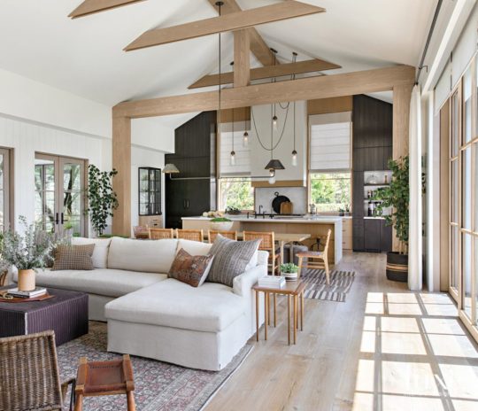
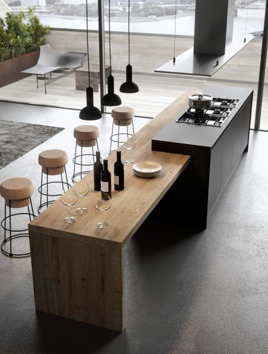
KITCHEN DESIGNS THAT BECOME YOUR INTERIOR DESIGN INSPIRATION!
Growing up in a massive prolonged family, gatherings were not unusual and they might all middle across the kitchen. Kitchens have always held a special area in my memories, so designing the equal needs unique attention! The designs we bring to you nowadays are kitchens equipped to address some thing that comes their way! Minimal, modern, colorful, and elegant, we are sure these kitchen designs that become your interior design inspiration will healthy your vibe and inspire you to create your happy space!
An open-plan kitchen is tough to merge with the relaxation of the residence whilst making it stand apart. This kitchen is a part of a house built by means of a high faculty sweetheart couple who have detailed their journey of designing their dream house on IG underneath the page @ahousewebuilt. The underlying theme for the duration of the interior is a aggregate of earthy tones with black highlights to create a focus. AERIN, Michael Aram, Ralph Lauren and Calvin Klein are the biggest interior brands in the world. They even give the interior design inspiration too.
interior design inspiration


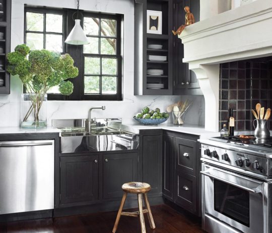


open-plan kitchen

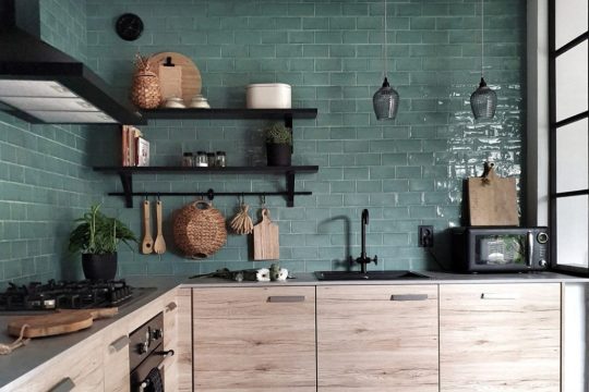
A mix of teal and black accessory furniture with light wooden cabinets offers this kitchen an intriguing blend of retro yet contemporary feels. Designed by Madeleine, this kitchen is best for those who need the first-class of each worlds!
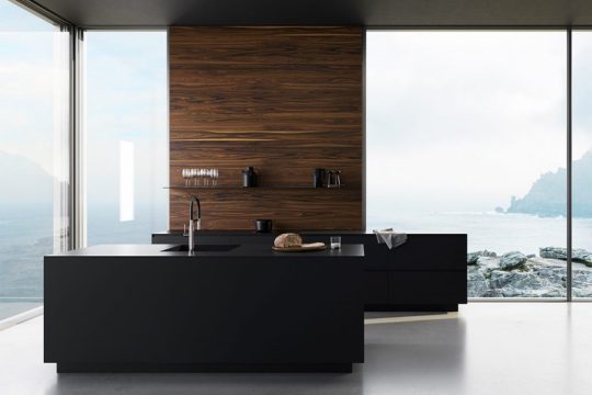
This present day kitchen design through Edvinas Skiestenis is best for our present day homes! Matte black countertops, shelves, and shelves control to add a graceful city feel.
Mysha of @remingtonavenue is an expert at the usage of a mixture of wood, metal, and also DIY-ing designs to create a harmonious layout! Each a part of her kitchen uses a combination of white and gold without making it brazenly female with using gold burnished steel lamps that balance the area.
cutting-edge chrome-end
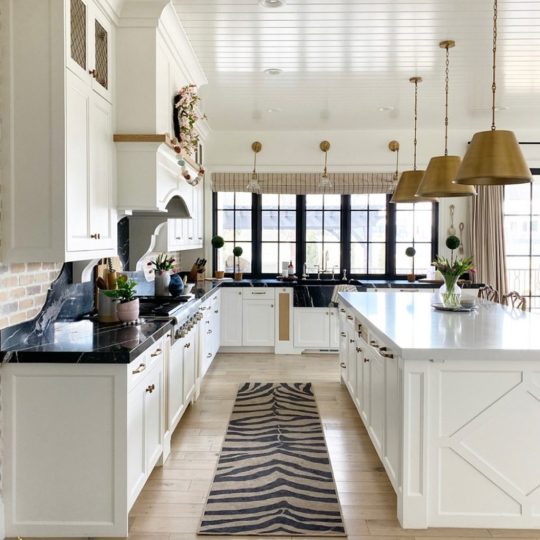
Dark but fresh, that is precisely how I might describe this contrast crammed kitchen layout through Margaret Naeve Parker. The dark kitchen cabinets make the cutting-edge chrome-end appliances stand out, giving this kitchen a current look.
I wouldn’t mind whipping up some breakfast in this beach-dealing with kitchen by means of Gicinque Cucine! Minimal cork stools and a timber kitchen counter are accompanied by using breathtaking views of the ocean.
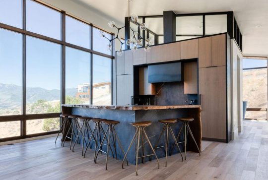
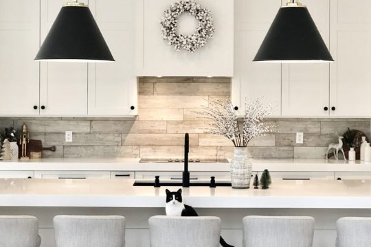
“We desired it to be open but connected,” the owner says. “We wanted residing to be downstairs and sound asleep to be upstairs.” Designer Eric Olsen designed a top notch room within the center connects to the kitchen, and a visitor suite wraps across the left side. And we can’t help however love the striking lamps that create a focus as well as a differentiation between the 2 spaces.
Lori Clarke Design
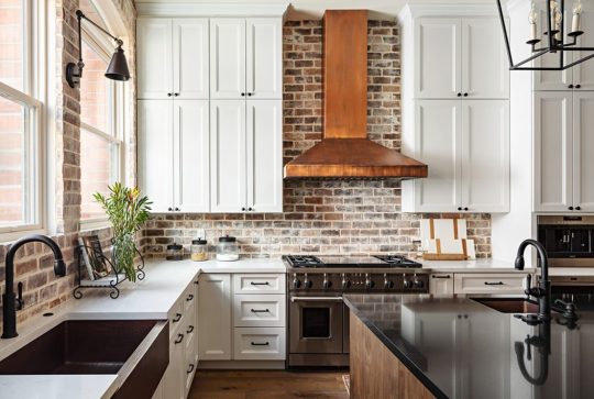
Man-cave meet kitchen! Leather, colors of copper, and heat accents replenish this kitchen design. That become the interior design inspiration through Lori Clarke Design. But the focus of this entire setup is the copper hood. That dominates the area while giving the modern kitchen a hint of the antique.
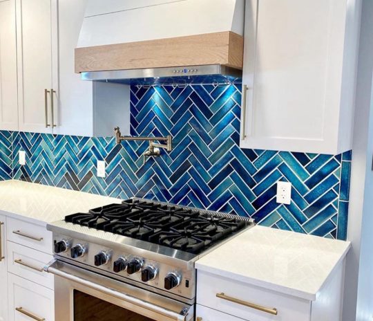
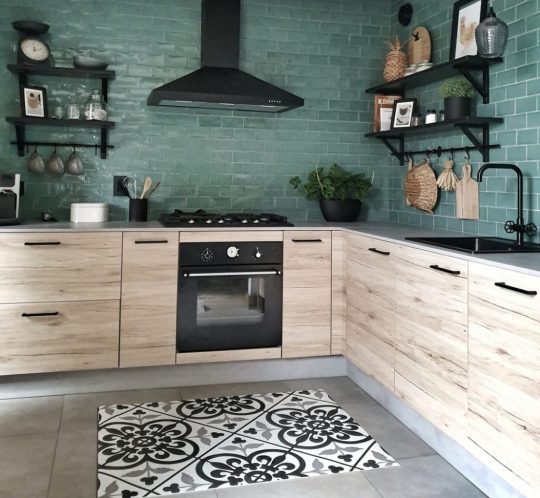
Do you dare to blue? This kitchen is virtually inspiring us to move bluer! Designed by way of Evan Ljunghag, Joshua Coffie of Vigeo Construction. The use of blue tiles within the backsplash to create a assessment that makes your kitchen stand aside with ease.
Sometimes we need to simply permit nature do the talking, or on this case. The beautiful wood countertop with its herbal curves should do the talking. PureHaven Homes designed this kitchen with a big timber platform. That acts as a separator in addition to a bar set up on this kitchen that feels best for any bachelor pad!
Need the ideal appliances in your newly stimulated kitchen? Check out our collection of modern appliances that will help you unleash your inner chef!
Read the full article
#interior#interiorandhome#interiorarchitecture#interiordecor#interiordecorating#interiordecoration#interiordesign#interiordesignideas#Interiordesigner#interiordesigners#interiordesigns#interiordesing#interiordetails#interiorforinspo#interiorforyou#interiorinspiration#interiorinspo#interiorismo#interiorlovers#interiorstyle#interiorstyling#interiorwarrior#interior123#interior125#interior2you#interior4all#interior4you#interior9508#interiores#interiors
0 notes
Video
youtube
Space is weird! | Naev EP.6
i know its out of the blue but there's my youtube!
1 note
·
View note
Text
12. Collaboration
Friday 23rd February 2018
The Unseen photoshoot with Naeve Richardson
Naeve contacted me with an idea of me doing my own makeup or doing makeup on a model. We discussed her idea of ‘The unseen’, looking into emotions and faking a smile. Like a Chelsea smile or someone pulling the persons mouth to force a smile. We also discussed the other two looks she was after, sending reference photographs back and forth until we were set on exactly what makeup I was doing. We also arranged when was best to use the photography studio, if I would be able to do 3 makeup looks in our time slot which we played by ear and if I needed to wear my hair a specific way or any particular clothes.
Chelsea Smile Makeup
Drew outline of smile
Applied thin layer of Liquid Latex above line
Applied cotton wool
Repeated this above and below the line on both sides
Let dry
Applied 2/3 more layers of Liquid Latex onto the wound to strengthen
Let dry
Heavily applied face powder to take away stickiness
Red face paint in slit
Red, Pink and Blue eyeshadow all over wound
Squirted fake blood into the slits as accurately as I could, allowing it to drip down my chin

Bruised Eyes Makeup
Red eyeshadow all over eyelids and under eyes randomly and fading into my natural skin
Purple in random places, mainly on eyelid
Small patches of Yellow under eye and inner brow bone
Navy only slightly on the darkest area of the Purple
Blended some areas out with light touch of Red eyeshadow
Face powder over the whole face to make bruise appear under the skin

Dripping Mascara Makeup
Applied thick, clumpy mascara and squeezed my eyes closed while still wet
Then used Black face paint to create drips coming from my eyes
Placed drips randomly
With the eater being uncontrollable, it made the tears more realistic due to them not being perfectly placed on my face

0 notes
Text


˖ ☒ ↷ 🎧 ♡
#naev-a#ulzzang#moodboard#clean moodboard#headers#bakery moodboard#moodboard kpop#sanrio#brown moodboard#kpop#kpop moodboard#red moodboard#orange moodboard#yellow moodboard#green moodboard#blue moodboard#purple moodboard#pink moodboard#black moodboard#🍈⛅🐾
176 notes
·
View notes
Text
The End of the Houston Look?
When I started writing the blog – and for many years afterwards – a number of designer utilized a decorative look which I termed “The Houston Look” (very original, I know!) But that term stuck. It referenced the linen slipcover/seagrass look that so many young couples used when decorating their houses.
Cote de Texas Design
As time has marched on – and I have now been writing Cote de Texas for ten years (!) – the Houston Look is evolving, which shouldn’t come as a surprise since decorative trends typically have a ten year shelf life and the Houston Look fits this 10 year time period perfectly.
This beautiful house above is typical of the Houston Look. It has all its elements: custom cut seagrass, textured blinds, linen curtains, French chairs, French candle chandelier, washed wood finishes, slipcovers, gathered pleats, mirrors, shutters, gilt accents, white walls or blue/gray walls.
Is this the end of an era? I hate to think that! I love the Houston Look. Slipcovers are so practical for families with children and dogs and seagrass is a miracle floor covering – it’s almost impossible to permanently stain it. The linen/taupe coloring is so soothing and calming – these rooms say “Welcome, relax” and at the same time they look luxe and decorated. It’s a wonderful look and I hate to think it’s over with.
Pamela Pierce, one of the inventors of the Houston Look. No one did slips like she did. NO ONE! She started a bigger slip trend than Rachel Ashwell.
While those who were here when the Houston Look was born still love it, the younger set, those 20 and 30 year olds with young children don’t. The millenniums are now decorating their first houses and they don’t want what they grew up with. They want either color and pattern or they want contemporary, all three things the Houston Look isn’t. But, relax. There are ways to incorporate the Houston Look for the millenniums. There are definitely ways to update that style for the younger set – and here is a PERFECT example:
Margaret Naeve of M. Naeve designed this Houston house in a contemporary manner that is reminiscent of the Houston Look but is totally updated. She used a contemporary rug mixed with classic linen curtains – yet her rods are contemporary. The color scheme is contemporary with bright white walls but she added touches of softly romantic and calming lilac. Naeve mixed modern shapes with antique pieces. Her sofa is slipcovered in white linen yet its lines are tailored and new. Antique Swedish chairs mix with contemporary slipper chairs. A gorgeous antique trumeau is the focal point, as are the antique vase/lamps – yet these pieces look zen, not old. It’s a beautifully sophisticated look and is a perfect example of how to update the Houston Look for today. I think if you saw this, you would think Houston, to me it still has that look. Go HERE to see more of this house, which is for sale.
I’ve thought about this topic for a while now and found two examples to show you how the Houston Look was adapted to a contemporary look.
House #1
Before and After are included. Enjoy!
2008. Built in 1935, the house is an increasingly rare original to the neighborhood. It has another rarity for Houston – it has a back loading garage on an alley! I wish all houses had alleys!! It makes the street so much prettier to not see garages everywhere. This house was added on to – it appears to have remodeled twice. At the back, where the garage is – there is an entire new wing with a master bedroom above. I screencapped an aerial photo so you could see the layout since it’s a little tricky. The house is large at 5,400+ sq. ft. with 4 bedrooms and 4.5 baths.
The house was recently sold twice – in 2008 & 2013.
Here is the aerial, showing the original house with the three dormers on the street side. The house is now in a U shape, built around a courtyard. There is the addition of a new wing at the side of the house with 3 more dormers and there is the second and latest addition of the new wing across the back alley with the 2 dormers, where the garage/master bedroom suite is. The two additions form a courtyard for the house since there is no back yard now. A builder once lived here and it was he who enlarged the house.
2013: The new owners updated the house and its exterior with new landscaping. The large palms are now gone.
2013: This shows the courtyard and the back wing with the balcony that overlooks the courtyard.
2017. The new owners took the “contemporization” of the house up a notch. It was painted a stark white – which is the “new” must look for Houston houses. The front door and side lights were removed and were replaced with a large steel framed glass door, along with new lanterns. The boxwood was tightly clipped as was the grass cover and the side gate was painted black. It is very obvious the house has now been extensively updated, just judging by the facade.
2008. The courtyard showing the side addition and the newer back wing. The arched patio includes an outdoor kitchen.
2013: A better view showing the back wing and side wing. Along the side wing with the French doors is the large family room.
2013: The back wing with the outdoor kitchen.
2013: Looking from the back wing to the front of the house.
2017: The courtyard has been totally redone. A new gravel terrace was added, along with new landscaping. And, along the side wing – the French doors were removed and replaced with trendy steel framed doors, which look FABULOUS!!!! And, all the orange brick was updated with a coat of white paint.
A larger view shows the new steel framed doors, painted black, along with the stark white painted brick. In the middle of the courtyard is the gravel terrace, accented with black boxes filled with plants. The difference is amazing – the white and black with purple accents is a hint of what is inside.
2008: The front door opens to the foyer with the living room on the left and the dining room on the right. Straight ahead is the family room.
2008: The living room at the left of the foyer. This is the original part of the 1935 house. I wonder if that mantel original – and the stained glass windows are from the 1935 house.
2008: To the right of the foyer is the dining room. This decor is typical of the 1990s in West University where this home is located. Back then, everyone decorated in a classic, traditional style.
2013. The new owners started the contemporization of the house which was finished with the new 2017 owners. Here, the walls were stripped of wallpaper and painted stark white. The floors were stained darker. Past the foyer is the large family room.
2013: Contemporary furniture was mixed with antique chairs. The fireplace mantel was painted white and the white marble was removed and replaced with black honed granite. They did leave the original leaded glass windows, which is so nice.
2013: The dining room is furnished in antiques with a Regency styled day bed acting as a banquette.
2017: The new facade and black steel framed doors announce the newly updated house. In the foyer, a large contemporary green rug, with urns sets the tone.
2017: The view leads back to the large family room. The floors were ebonized by the new owners. Hmm. I think the rug is a bit too large? But, don’t want it too small!!
2017: The living room.
2017: A larger view of the living room. The owners also kept the leaded windows. Instead of a sofa they added two matching contemporary chaises which is an inventive touch. Let’s face it – you wouldn’t use this room much except for entertaining and it would be nice during a party for a few people to sit on the chaise. White with black stripes silk curtains – which remain.
2017: I love the dining room. Painted green with white curtains – there’s an over long banquette in lilac velvet. Love this!
2008: Past the foyer (through the arch) is the large family room. This is part of the side addition. The stairs lead up to the second floor where the two original bedrooms/baths are. The kitchen is on the left. The French doors overlook the courtyard. Later this room is opened up to the kitchen to make this one large room. Red walls were very popular in the 80s and 90s in West University.
2008: Looking towards the back of the family room – to the addition along the back alley were the garage is. The brown paneled wall leads to the back stairs and the new back wing.
2008: Next to the family room is the kitchen. You can see the dining room through the double doors.
2013: A total change. With white walls and dark wood floors, the room is more up-to-date. The next owner will remove the French doors and put in the new steel framed doors.
2013: At the back of the large family room is the paneled room that leads to the back addition/wing/garage/master suite/guest room/laundry.
2013: The view towards the foyer and the stairs that lead to the second floor where the original two bedrooms/bathrooms are.
2013: The biggest change in 2013 was the wall between the kitchen and family room was removed, making it one large room.
2013: The new kitchen was enlarged – the breakfast room was now taken up by the kitchen.
2013: The view towards the family room. The new kitchen has first-grade appliances. The backsplash behind the range is mirror – which will be replaced by the new owners.
2017. The new owners! Done in black and white with purple accents. The sofas have modern lines, but are slipcovered, which is great for families and pets. The biggest change is the steel framed doors with the oversized panes. Gorgeous!! They chose a different layout – adding a breakfast table in the center of the room.
2017: Another view of the back sitting area. Another big change is there is now recessed lights instead of the ceiling fans and spots that were there before.
2017. They divided the large room with a breakfast table and a fixture over it. If this was me – I would have added a beautiful wood antique table or antique French chairs to create a bit of tension between the new and old. But don’t ask me, I’m not a decorator! LOL.
2017: The front part of the family room with the white and purple sofas. The curtains stay.
2017: The new owners added a bench instead of barstools, which I like. They changed the light fixture. AND – they added a contemporary white tiled backsplash by Walker Zanger.
2017: The view towards the family room with the new windows. They MAKE the house!
2017: Here you can see the new tile backsplash. Wonder why they didn’t go up to the ceiling with it? Oh well. I really need to stop criticizing because I love the house!
2008: Past the large, red painted family room and kitchen is the newer back addition that runs alongside the alley. There is a second stairway that leads up to the rooms above the wings.
2013: And the view in 2013.
2017: The new owners painted the tile floor black, along with the paneling and stairs. The bright yellow settee pops against the painted black. I think this is a great idea – and the black paint looks better from the family room than the stained brown wood.
2008: Above the back wing, up the back stairs is this paneled library.
2008: You can see the back stairs in the corner. The room is decorated in the Ralph Lauren style with leather wing chairs and oriental rugs – that was so popular in the 1990s. Through the door you can see the long “attic room” that is above the family room wing.
2008: The long attic room above the family room in the side addition. The windows are the dormers that overlook the courtyard. Striped dhurri rug and notice that rattan chair and ottoman from Pottery Barn!!!! I think EVERYONE in the U.S. bought that chair!! Pottery Barn must have sold a million of those!! EBay has a few of those “Malabar” rattan chairs at a starting bid of $300.
At the very end of the attic wing are the front stairs. Past those are the two bedrooms from the original part of the house.
2013: Here is the view from the previous owners. The back stairs lead up to the paneled library with the attic room to the left.
2013: The previous owners stained the floors and bought new fans. And look!!!! THAT CHAIR!!!!!!!!!!! I swear to you – I didn’t know the previous family also had that chair when I wrote about the Pottery Barn Malabar chair!!!! Do you think the first family left it at the house – or did the previous family just happen to have one too? I TOLD you everyone in the US and their brother had a Malabar chair!!! This is too funny.
I like the way they decorated this room – with the pool table. Very English.
2013: Another photo. The view towards the stairs and the attic room. Well – a white sofa without a slipcover is a recipe for disaster. No wonder they have a blanket covering the cushions. They need to have a slipcover made – it would be so nice, especially with the curves on the frame.
2013: And the Restoration Hardware TV easel.
2013: They turned this into a media room/playroom and a dance room for their daughter. There’s another TV area at the end of the room. This is such a great space!! You can tell this wing was added on first – then the back wing, with the library and master bedroom were added on later. If they had added this on first, I doubt they would have made the ceiling this low.
2017: The new owners!!! Wow! The paneling is painted black, just as it was downstairs. There is a desk now behind the sofa. No more ceiling fans. The new owners really hate ceiling fans too!! Not crazy about the black fixture. I think a shorter glass/brass Sputnik might have been less of a focal point. White curtains with green bands – the white breaks up all the black.
Very nice. The upholstery is slipcovered! Which is extra nice. You can barely even tell. Love the maps in the orange frames.
2017: Wow – love this!!! The attic room looks great!!! The striped rug makes the room look wider. Brilliant choice. Love the lime green and grey and the arc lamps. Would love to know who designed this house!
2008: Over the garage and back wing is the master bedroom with its own fireplace. The windows look out at the courtyard.
2008: The bathroom.
2013: The fireplace was updated with white marble and white paint.
2013: The bathroom wood was painted black. Notice there is a fireplace in the bathroom!!! Wow!!! The walls were painted white. It was a simple makeover.
2017: Located off the black library, with new steel framed doors that over look the courtyard, the master bedroom is done in cream and lilac. I like that they removed the shelves, it looks much prettier like this.
A view of the new doors overlooking the courtyard. Must be very pretty from up here.
2017: The bathroom was completely redone with new floor, slab marble walls, tub and vanity. AND the fireplace is gone! Wonder why? One day another remodeler will discover the old fireplace behind the sheetrock.
2017: A view of the shower. Not crazy about the black mirrors – they seem a bit harsh, but it’s personal. Nice marble floor and walls behind the tub.
2013: On the third floor above the master bedroom – the attic space is a little girl’s room. The new owners turned this into the master closet!
2013: The closet for the little girl’s room on the third floor.
2017: And here is the third floor bedroom – turned into a master closet. The dormers overlook the courtyard.
2008: On the first floor behind the family room by the back stairs is the 4th bedroom.
2017: And here is the new owners’s 4th bedroom off the black stairhall. Love the fixture.
2013: The utility room off the back stairhall.
2013: In the original part of the house – there are two upstairs bedrooms that are identical with a bathroom each.
2017: One of the new owners’ original bedrooms.
2017: And the second bedroom.
2017: One of the two bathrooms upstairs with a Toto toilet. Toto!!
This 1935 house was shown from its 1990s décor to the renovation in the 2010s to a total change in today.
The new owners used the “Houston Look” white slipcovers but in an updated way on modern shapes. Curtains also play an important part in the decorative scheme.
BUT, the main point is – this house while totally updated for today and it is what millenniums it really doesn’t have much of the old HOUSTON LOOK.
And then there was this house. This house incorporates more of the Houston Look – but in an updated, contemporary way.
Designed by the fabulous Renea Abbott of Shabby Slips HERE – the house is a perfect mix of contemporary and classic, modern and antique. I said “perfect” and I mean perfect. Renea was at the forefront of the Houston Look – her shop still continues to make absolutely gorgeous slipcovers. Today, her slipcovers are updated – they are tightly tailored and many of the shapes are modern with contemporary lines. Her tailors make the best slipcovers – nobody makes a better one.
These photographs come from both HAR and Shabby Slips’ website. The house is for sale.
Of course it’s white stucco. With black accents. And of course it has no flowers – just tightly clipped box. Of course. This is such a Houston Look – white facade with boxwoods. No flowers. Gas lanterns. Of course. This house has a *horrors* front loading garage, but you don’t even notice it. In fact, the garage adds to the geometric feel of the facade and is actually a plus. The two windows on the left are square and the window on the right and the garage door are rectangles. OK. I’m justifying a front loading garage, but honestly, I like this one!
The house was built in 2013 and has 4 bedrooms, 4.5 baths and is 4,627 sq. ft. There are no before photos since this is such a new house. Not only did Renea Abbott design the interiors, she also helped with the design of the house from the ground up.
The back yard has a swimming pool, spa, fountain, fireplace AND an outdoor shower! The landscaping was designed by Thompson Hanson.
It looks like the backyard has the newest trend – artificial turf. The deep green color of the turf is wonderful, but I think I would prefer natural gravel.
Another view of the pool and the outdoor fireplace. Yep. This is turf. This is gaining such popularity here. Not sure why but so many people are installing it instead of real grass.
Notice that ceiling fan!! Wow!! There is also an outdoor television by the table.
Let’s go inside.
The front door pivots open. This photo is from an earlier photoshoot by Shabby Ships, and it seems that the rug has now been removed.
The foyer has this ornate gilt console. Renea paired it with a contemporary piece of art which tones down the luxe. And there’s an antique Italian gilt lantern.
The living room is so nice. This is one of my favorite rooms! I love the mix of the antique furniture with modern club chairs and coffee table. The antique bench upholstered in zebra is just gorgeous!! The trim on the plain curtains frames the antique settee. Purple velvet pillows pop a bit of color.
From Shabby Slips – another, older view. You can see the gilt chandelier in this photo. And you can see the lines of the antique settee here – with the gilt wood frame.
From HAR. The photographer for the real estate company really took it up a notch. These are beautiful real estate photos!
The view back towards the foyer with the antique console. Notice the floors. They are custom stained brown/black with three layers of sealer for a high gloss effect. Beautiful!!!
The fireplace, simple with no mantel, divides the living room from the dining room. At the right is the wine room/cellar.
The wine room/cellar – is behind a glass door which allows the wine to become a work of art. It is behind the foyer and across from the dining room.
The dining room has a large round table and antique chairs upholstered in tiger velvet. Notice the mirror over the chest.
In this photograph, you can finally see the chandelier in the living room.
An earlier view from Shabby Slips. This was taken before the art work was acquired and notice, there is a different, smaller mirror here. It’s so interesting to see the changes that were made through the years.
Off the dining room is the kitchen and family room. Top of the linen appliances.
Against the back wall is a large marble slab. Right? Well, no. It’s not exactly marble! It’s porcelain!!! Calacatta Porcelain Tile Slabs by Casalinea HERE It is an amazing product that looks exactly like marble.
To the left of the kitchen you can see into the butler’s pantry. And the glass and iron staircase designed by Renea Abbott leads to the second floor with its four bedrooms. A large white slipcovered sofa and chairs overlook the back yard. Love the graphic pillows.
Love the area rug by Creative Flooring – all rugs in the house are from CF in Houston on Bissonnet (713) 522-1181. Against the back wall is an acrylic and gold console along with a gold bar cart. The curtains are linen lined with a graphic black tape. Just beautiful.
This room has actually undergone a rather big design change. See below:
From Shabby Slips. Originally there was a brown/deep gray velvet sofa that faced the TV. Not sure why this was changed. I do love the all white now, but this looks great too! Today there are new lamps on the console and there is a new, larger piece of art work over the bar cart. To the right of the room, is the view into the study.
Another earlier view with the brown velvet sofa. Or is it dark gray?!?
The butler’s panty – with the porcelain tile countertop and the wire cabinets.
This rooms doubles as a bar and buffet area while entertaining.
The office/library has Phillip Jeffries Rivets wallpaper and curtains with Greek Fret Key trim that frame the desk. Pretty area rug. The large window overlooks the back yard with the pool and fountains and fireplace.
An earlier view from Shabby Slips shows the chair in the corner. I wish we could see more of this room!!!
From Shabby Slips. The powder room. Not sure if this real marble or porcelain?!?! It has to be marble. Gorgeous mirror. Love the dark walls against the white/gray marble. Just gorgeous!
Upstairs are the four bedrooms.
The landing has a sitting area right off the master suite. Two slipcovered chairs with a dark gray wall.
The master bedroom with white curtains and wide graphic trim. Dark brown tufted velvet bed. The art work over the chaise is relatively new.
From Shabby Slips – an earlier view of the bedroom shows there are windows on both sides of the room, which is so pretty. Beidermeier chests - love the color of the wood here – it actually works as a pop of color. The former art work over the chaise. Wonderful sunburst mirror.
Renea’s aesthetic is seen throughout the house – white walls mixed with dark gray ones, glossy dark floors, white linen and dark velvet upholstery, sunburst mirrors, curtains with thick tape trim, tiger velvet, chandeliers and patterned area rugs – by using this decor through all the rooms, the house makes such a statement and it shows the strength of the designer.
The master bathroom.
Another view.
Here you can see the large slab of porcelain tile in the shower – amazing!
This guest room has dark walls, curtains with wide tape trim and a gold sunburst!
F. Schumacher wallpaper in this guest bathroom.
The second bedroom has dark curtains and white walls.
This is the workout room. To see the house go HERE.
The Houston Look? Not really, but Renea Abbott has such a strong design aesthetic that it is connected with Houston. She was one of the first do the Houston Look with her slipcovers so she is tied to the slipcover/seagrass look. Today her slips are barely noticeable, they are so tightly tailored to the frame.
Is the Houston Look dead? I don’t think so. It’s just changing – it’s becoming more modern, with less textures like baskets and wicker. There are still a lot of people who want the linen/slipcover look with seagrass.
I saw this one house for sale and I just went – ahh. That is so pretty. Really pretty. I don’t know the designer but it looks like one of my favorites if I had to guess. I would know this was Houston, no doubt. Here is a room from that house:
The large custom seagrass always makes such a beautiful design statement. The antiques. The white walls. This is so calming and quiet. It was on the market for just a couple of days before it went contract pending. No wonder. If all houses looked like this – everyone’s house would sell within just a few days. Long Live The Houston Look.
Next Story: Winners from the Aidan Gray #AGwithanedge Contest will be announced!! This will be online next week.
And….
Here are some items, mostly new items that are good for an updated Houston Look.
THIS BED IS REMARKABLY LIKE THE ONE IN THE MASTER BEDROOM IN THE FIRST HOUSE. IT COMES IN A VARIETY OF COLORS. HERE
DEAL OF THE YEAR – 29” INCH LAMPS TWO FOR $198.99 ASST. COLORS. I LIKE THE GRAY ONES!
AND
THE NAVY ONES HERE
RATTAN DAY BEDS ARE HOT. I LIKE THIS SHAPE WITH THE CLEAN LINES. IT WOULD BE GREAT IN A DEN, IN FRONT OF THE SOFA AND COFFEE TABLE. HERE.
THIS IS LIGHT IS CASUAL BUT SLIGHTLY CONTEMPORARY. RATTAN PENDANT HERE
THESE BASKET SETS COME IN ALL COLORS. LOVE! HERE
I LOVE THIS AIDAN GRAY CHANDY. IT’S ONE OF MY FAVORITES. NOTHING BEATS A DRESSY CHANDY! HERE
LOVE THIS SERENA AND LILY CHAIR!!! PERFECT FOR A FAMILY ROOM! HERE
THIS PENDANT IS A NEW LOOK FOR A KITCHEN, BUT ISN’T MODERN. NICE AND WARM LOOKING. HERE
I LOVE THIS LINE OF FURNITURE IN CHAIRS, STOOLS, BENCHES, HEADBOARDS, AND WHITE, NATURAL AND BLACK FINISHES. HERE
from COTE DE TEXAS http://cotedetexas.blogspot.com/2017/06/the-end-of-houston-look.html
0 notes
Text


˖ ☒ ↷ 🍈 ♡
#naev-a#han sohee#sohee#brown moodboard#clean moodboard#headers#bakery moodboard#moodboard#moodboard kpop#kpop#sanrio#kpop moodboard#alternative moodboard#🍈⛅🐾#girl moodboard#red moodboard#orange moodboard#yellow moodboard#green moodboard#blue moodboard#purple moodboard#black moon rising#kdrama#discord layouts#long locs
108 notes
·
View notes
Text
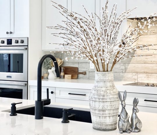
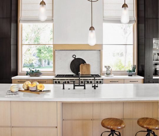
KITCHEN DESIGNS THAT BECOME YOUR INTERIOR DESIGN INSPIRATION!
Growing up in a massive prolonged family, gatherings were not unusual and they might all middle across the kitchen. Kitchens have always held a special area in my memories, so designing the equal needs unique attention! The designs we bring to you nowadays are kitchens equipped to address some thing that comes their way! Minimal, modern, colorful, and elegant, we are sure these kitchen designs that become your interior design inspiration will healthy your vibe and inspire you to create your happy space!
An open-plan kitchen is tough to merge with the relaxation of the residence whilst making it stand apart. This kitchen is a part of a house built by means of a high faculty sweetheart couple who have detailed their journey of designing their dream house on IG underneath the page @ahousewebuilt. The underlying theme for the duration of the interior is a aggregate of earthy tones with black highlights to create a focus. AERIN, Michael Aram, Ralph Lauren and Calvin Klein are the biggest interior brands in the world. They even give the interior design inspiration too.
interior design inspiration


open-plan kitchen


A mix of teal and black accessory furniture with light wooden cabinets offers this kitchen an intriguing blend of retro yet contemporary feels. Designed by Madeleine, this kitchen is best for those who need the first-class of each worlds!
This present day kitchen design through Edvinas Skiestenis is best for our present day homes! Matte black countertops, shelves, and shelves control to add a graceful city feel.
Mysha of @remingtonavenue is an expert at the usage of a mixture of wood, metal, and also DIY-ing designs to create a harmonious layout! Each a part of her kitchen uses a combination of white and gold without making it brazenly female with using gold burnished steel lamps that balance the area.
cutting-edge chrome-end
Dark but fresh, that is precisely how I might describe this contrast crammed kitchen layout through Margaret Naeve Parker. The dark kitchen cabinets make the cutting-edge chrome-end appliances stand out, giving this kitchen a current look.
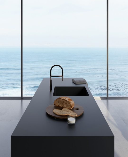
I wouldn’t mind whipping up some breakfast in this beach-dealing with kitchen by means of Gicinque Cucine! Minimal cork stools and a timber kitchen counter are accompanied by using breathtaking views of the ocean.
“We desired it to be open but connected,” the owner says. “We wanted residing to be downstairs and sound asleep to be upstairs.” Designer Eric Olsen designed a top notch room within the center connects to the kitchen, and a visitor suite wraps across the left side. And we can’t help however love the striking lamps that create a focus as well as a differentiation between the 2 spaces.
Lori Clarke Design
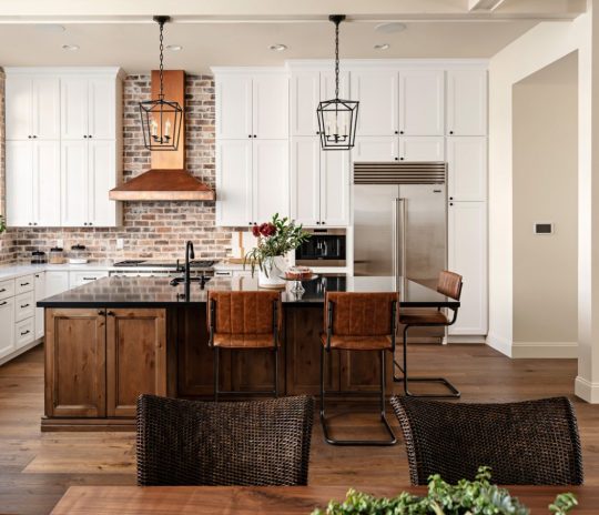
Man-cave meet kitchen! Leather, colors of copper, and heat accents replenish this kitchen design. That become the interior design inspiration through Lori Clarke Design. But the focus of this entire setup is the copper hood. That dominates the area while giving the modern kitchen a hint of the antique.
Do you dare to blue? This kitchen is virtually inspiring us to move bluer! Designed by way of Evan Ljunghag, Joshua Coffie of Vigeo Construction. The use of blue tiles within the backsplash to create a assessment that makes your kitchen stand aside with ease.
Sometimes we need to simply permit nature do the talking, or on this case. The beautiful wood countertop with its herbal curves should do the talking. PureHaven Homes designed this kitchen with a big timber platform. That acts as a separator in addition to a bar set up on this kitchen that feels best for any bachelor pad!
Need the ideal appliances in your newly stimulated kitchen? Check out our collection of modern appliances that will help you unleash your inner chef!
Read the full article
#interior#interiorandhome#interiorarchitecture#interiordecor#interiordecorating#interiordecoration#interiordesign#interiordesignideas#Interiordesigner#interiordesigners#interiordesigns#interiordesing#interiordetails#interiorforinspo#interiorforyou#interiorinspiration#interiorinspo#interiorismo#interiorlovers#interiorstyle#interiorstyling#interiorwarrior#interior123#interior125#interior2you#interior4all#interior4you#interior9508#interiores#interiors
0 notes
Text
KITCHEN DESIGNS THAT BECOME YOUR INTERIOR DESIGN INSPIRATION!
Growing up in a massive prolonged family, gatherings were not unusual and they might all middle across the kitchen. Kitchens have always held a special area in my memories, so designing the equal needs unique attention! The designs we bring to you nowadays are kitchens equipped to address some thing that comes their way! Minimal, modern, colorful, and elegant, we are sure these kitchen designs that become your interior design inspiration will healthy your vibe and inspire you to create your happy space!
An open-plan kitchen is tough to merge with the relaxation of the residence whilst making it stand apart. This kitchen is a part of a house built by means of a high faculty sweetheart couple who have detailed their journey of designing their dream house on IG underneath the page @ahousewebuilt. The underlying theme for the duration of the interior is a aggregate of earthy tones with black highlights to create a focus. AERIN, Michael Aram, Ralph Lauren and Calvin Klein are the biggest interior brands in the world. They even give the interior design inspiration too.
interior design inspiration


open-plan kitchen


A mix of teal and black accessory furniture with light wooden cabinets offers this kitchen an intriguing blend of retro yet contemporary feels. Designed by Madeleine, this kitchen is best for those who need the first-class of each worlds!
This present day kitchen design through Edvinas Skiestenis is best for our present day homes! Matte black countertops, shelves, and shelves control to add a graceful city feel.
Mysha of @remingtonavenue is an expert at the usage of a mixture of wood, metal, and also DIY-ing designs to create a harmonious layout! Each a part of her kitchen uses a combination of white and gold without making it brazenly female with using gold burnished steel lamps that balance the area.
cutting-edge chrome-end
Dark but fresh, that is precisely how I might describe this contrast crammed kitchen layout through Margaret Naeve Parker. The dark kitchen cabinets make the cutting-edge chrome-end appliances stand out, giving this kitchen a current look.
I wouldn’t mind whipping up some breakfast in this beach-dealing with kitchen by means of Gicinque Cucine! Minimal cork stools and a timber kitchen counter are accompanied by using breathtaking views of the ocean.
“We desired it to be open but connected,” the owner says. “We wanted residing to be downstairs and sound asleep to be upstairs.” Designer Eric Olsen designed a top notch room within the center connects to the kitchen, and a visitor suite wraps across the left side. And we can’t help however love the striking lamps that create a focus as well as a differentiation between the 2 spaces.
Lori Clarke Design
Man-cave meet kitchen! Leather, colors of copper, and heat accents replenish this kitchen design. That become the interior design inspiration through Lori Clarke Design. But the focus of this entire setup is the copper hood. That dominates the area while giving the modern kitchen a hint of the antique.
Do you dare to blue? This kitchen is virtually inspiring us to move bluer! Designed by way of Evan Ljunghag, Joshua Coffie of Vigeo Construction. The use of blue tiles within the backsplash to create a assessment that makes your kitchen stand aside with ease.
Sometimes we need to simply permit nature do the talking, or on this case. The beautiful wood countertop with its herbal curves should do the talking. PureHaven Homes designed this kitchen with a big timber platform. That acts as a separator in addition to a bar set up on this kitchen that feels best for any bachelor pad!
Need the ideal appliances in your newly stimulated kitchen? Check out our collection of modern appliances that will help you unleash your inner chef!
Read the full article
#interior#interiorandhome#interiorarchitecture#interiordecor#interiordecorating#interiordecoration#interiordesign#interiordesignideas#Interiordesigner#interiordesigners#interiordesigns#interiordesing#interiordetails#interiorforinspo#interiorforyou#interiorinspiration#interiorinspo#interiorismo#interiorlovers#interiorstyle#interiorstyling#interiorwarrior#interior123#interior125#interior2you#interior4all#interior4you#interior9508#interiores#interiors
0 notes
Last Seen Blogs

ambiiepandiie
Amber👑

sogerigoce
Untitled

my-kawaii--world
Just kawaii Things
varshajack
Varsha Jack

southpawbrave-blog
Southpaw | Newsfeed