#bureau borsche
Photo

Bureau Borsche / Charlotte De Witte / Overdrive EP / Album Cover / 2023
45 notes
·
View notes
Photo

https://the-brandidentity.com/project/bureau-mirko-borsche-rebrands-novembre-expressive-piece-custom-lettering
94 notes
·
View notes
Photo

Bureau Borsche / Bayerische Staatsoper / Ja, Mai / Printed... https://ift.tt/y0e47bS Telegram: https://t.me/gdesignbot
12 notes
·
View notes

Text
Football Rebrand Research
Monday 6th May:

Venezia FC is a club which aren’t very popular internationally and have a very strong small fanbase but whenever it comes to the time of year that clubs release their kits for the following season, they are always on everyone watchlist, simply because of how well designed the club is and how impressed everyone always is with their branding. The rebrand was performed by Bureau Borsche who also did the Inter Milan one. Being a smaller team, they haven’t gone through the design process of this rebrand on their website but it is clear through their use of imagery that so much thought was put into it. What I love about it is the website layout they created for them, on their website there is a short video showing a walkthrough of the design outcome of their website.
0 notes
Video
vimeo
Jonas Lindstroem for Zeit Magzin: Wo sind unsere Grenzen? from Bureau Borsche on Vimeo.
Regisseur: Jonas Lindstroem
Kamera: Nicolai Niermann
Styling: Klaus Stockhausen
Produktion: Iconoclast
Ausführender Produzent : Nils Schwemer
Produzent: Jannis Birsner
Casting-Direktoren: Affa Osman, Dominique Booker
Choreograf : Michael-John Harper
Co-Autorin : Eva Kelley
Make-up : Patrick Glatthaar
Musik: Silvio
Audio-Mastering: Rasmus Lauvring
Stimme: Eva Kelley
Schnitt : Jonas Lindstroem, Nicolai Niermann
Postproduktion : Studio Private
Postproduktions-Geschäftsführer: David Smith
Postproduzent: James Lowrey
Koloriererin : SAMANTHA DAY
Animation: Spellwork Pictures
BTS Photographer: Mark Othmer
Regie-Assistent : Maximilian Semlinger
Produktionsleiter: Justus Toussaint
Produktionskoordinator : Moritz Tibes
Produktionsassistent: Leyli Khatebzadeh
Gimbal Operator: Julian Hanschke
2. Kamera-Assistent: Sirinton Kaomanit
Licht-Assistenten: Raul Suciu, Mark Othmer
Make-up-Assistent : Patricia Heck
Styling-Assistenten: Annemarie Lahr-Eigen, Alexander Gabriel, Vincent Mank
Set-Runner: Bastian Faralisch, Assad Rajab
Models: Alexander Selzer, Amra Novak, Anton Wendel, Azama Bashir, Azza Bashir, Benny Opoku-Arthur, Christopher Cakmak, Christopher Rosenthal, Cissel Dubbick, Eliot Dupuis, Elvis Vos, Evans Yeboah, Ingo Rimpler, Joaquín Quintana, Jomkwan Emeli Phoonthong, Jörg Janzer, Julia Stöckemann, Julian Breuer, Justin Akitoye, Katrice Dustin, Leon Konrad Glitsch, Malik Bitko, Max Polaski, Michael-John Harper, Mirko Stübing, Nicolas Kowalski, Nisa-Maranda Jones, Paul Joyce Theresin, Philipp Rosenthal, Rayene Rezouani, Rhina Raths, Sophie Stöckemann, Stiven Nowak, Winnie Denis, Yeboah Evans
Besonderen Dank an:
UFO Filmgerät, ATR Motorsport, Reitclub am Olympiapark e. V., SoHo House – The Store, Stuntcrew Babelsberg, Sermed Darah
0 notes
Photo


I have looked through the book: on the road to variable to look for contemporary inspiration for both typefaces and promotional assets.
the first i have looked at is if you see something, write something poster, 2018 by jim kuhnel. this design grabbed my attention because the typeface used (canela) is interesting and something i might consider to be on brand for stella mccartney. what makes the typeface so interesting is the varied stroke widths in combination with the serifs which makes it feel sophisticated. the stems and cross bars change in stroke width which helps create a rhythm for the letters to create so the word reads smoothly as a whole. the triangular serifs at the terminals of the letters make the typeface feel angular, but some serifs are extended more outwards and longer than other serifs, like on the ‘e’ which allows there to be more space between the letters which helps with the keraning especially between similar shaped letters like ‘E’ and ‘T’. because the serifs are triangular, it lets the letters sit comfortably next to one another and helps the flow of the letters.
the next piece i looked at was “echo one” which is a poster by mateo broillet. I looked at this one because of the typeface, jantra, and because the overall aesthetic feels like it could be situated under stella mccartneys branding due to the use of black and white and the hint of blue to create a layered hierarchy, which has also been constructed through scale and a grid to assist placement of content. this typeface is similar to the first, but the change in stroke width is smaller and overall thinner with much more dramatic, angular serifs.
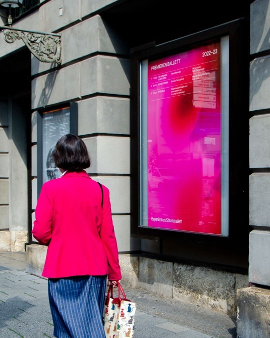
the final project i looked at was the visual identity for Bavarian state opera, designed by bureau borsche. the typeface used in this project is Scotch modern which also takes a similar form to the typefaces above. this typeface and they way it has been presented on the page was chosen to mimic movie introductions. as it is being used in combination with photography of the dancers it feels sophisticated and contemporary with an emphasis on colour and shape to feel refined and considered. Thus style of typography and poster is something which would suit the high end and luxurious aspect of stella mccartney and something i should consider in the design of the typeface and the promotional posters.
Twopoints.net (2019). On the road to variable : the flexible future of typography. Hong Kong: Viction:Ary.
0 notes
Video
undefined
tumblr
Footage of ReadyMag Editorial Visual Identity page.
Again, like the Illustration page I wanted there to be something a bit different involved in the title. Added the animation effect alongside a repeating pattern made up of the Visual Identity text/ font.
There are hyperlinks to Bureau Borsche’ website alongside an interview piece and commentary of their process working with Inter Milan before ending with the Brand video produced for YouTube.
0 notes
Photo
Bureau Borsche / Bayerische Staatsoper & Bayerisches Staatsballett / Gesänge von Krieg und Liebe / Poster / 2022
#bureau borsche#bayerische staatsoper#bayerisches staatsballett#gesänge von krieg und liebe#poster#2022#gradient#typography
67 notes
·
View notes
Photo

Bureau Borsche. (2021), Internazionale, https://www.highsnobiety.com/p/inter-milan-new-logo-bureau-borsche/
Visual Communication: Visual Identity
Mirko Borsche, the man behind Bureau Borsche, has rebranded one of the footballing world oldest giants. Alongside rebranding Inter Milan, Bureau Borsche are also behind establishing another Serie A club as a cult icon within the footballing world. Venezia FC had worked their way into the top tier of Italian football, bringing with them some first class branding, football kits and a design campaign to match.
What Bureau Borsche created with Venezia was impressive, quickly establishing their kit as a new cult classic whilst elevating the club to another level. However, rebranding a club of the size of Inter Milan is equally as impressive. It can be a daunting task, given the passion, history and size of the football club.
“It was important for us to convey Inter's strong history, social and cultural values while simultaneously communicating Inter as a contemporary global brand. Inter is a club known by many from different parts of the world. We wanted to create a look that would be accessible, sophisticated, relatable, and strong.”*
Working within branding and creating a visual identity, it is clear that history, cultural and social context and aesthetics are key to a successful campaign. Visual Communication lies at the heart of this, design plays a vital role in creating the visuals that campaigns are built on.
There’s a vast world of sport, with a market that is becoming more and more saturated with rebrands and reinventions of old visuals. Football kits in particular have now become fashion statements as much as visual representation of which team you support. Bureua Borsche have a wealth of knowledge when working with fashion brands, bringing this experience to a sporting franchise to create an elegant rebranding that changes a historical football clubs visual identity.
*https://www.highsnobiety.com/p/inter-milan-new-logo-bureau-borsche/
0 notes
Photo

Bureau Borsche / Bavarian State Opera / Gesänge von Krieg und... https://ift.tt/NYu01dr Telegram: https://t.me/gdesignbot
6 notes
·
View notes
Text
0 notes

Photo

Marcelo Burlon County of Milan
185 notes
·
View notes
Photo


George Rouy in Super Paper
3K notes
·
View notes
Last Seen Blogs

kittysmurf
kitty’s smurfs blog

shicom
Doodle Domain

tibozin
my name piko

laviaart
Laviaart

illiteratemiruku
sometimes translate sometimes treason