#but much of it will be redrawn first to add at least some quality
Text
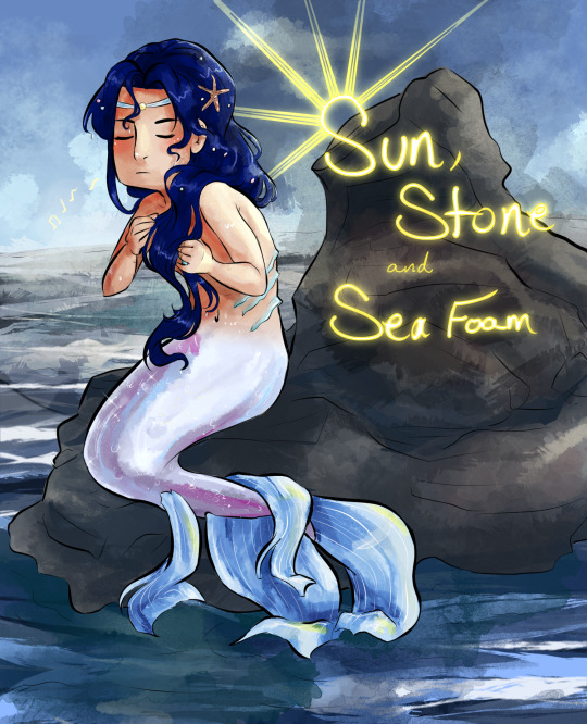
Welcome to Sun Stone and Sea Foam!
Lan Wangji is a merman that finds himself infatuated with a land-dweller. Even though speaking to a human is strictly forbidden, he can't seem to keep himself away.
Wei Wuxian lives in paradise by the pier. Spending his days, swimming, fishing, and causing a general raucous, one day he stumbles across an amazing sight.
Despite the odds, and even though they have not truly shared a single word with each other, the two find themselves falling in love.
But what happens when one day, Wei Wuxian disappears? How far will Lan Wangji go to find him again? And what will be the cost?
--------
There is no set update schedule at this time, but I hope to be able to post fairly regularly.
#Lan Wangji#Wei Wuxian#Mo Dao Zu Shi#MDZS#Wangxian#I decided I wanted to make a blog for this story just to make it easier to peruse.#Some art from bi-the-wei may be reposted here wholesale#but much of it will be redrawn first to add at least some quality#Some of those old ones were rough. haha
32 notes
·
View notes
Photo

It’s finally done. I’m... feeling a little emotional, honestly. All my D&D character references are now “recovered”, as in redrawn completely, from my broken SSD whose files were all lost.
I... I just want to sit back and put my head in my hands. [Cont’d]
This... It’s every character I have made for D&D since I started playing. The first two I designed - Miri Evenwood and Cecillia - down to the most recent two - Zarris and Joy - all together, all forms, all types, all everything, all at once. I’m just... This was so much work and effort.
When I lost the original file with all these guys in it, I thought that was it. Nothing. But I do post my art here and on Twitter, no? I saved what I could off here and there, and the quality of these guys was... bad. Like, really bad. Most of the pictures I downloaded looked like this:
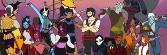
Fuzzy, illegible, and most details lost. Some were better quality, but...

...the image compression of being uploaded to Tumblr or Twitter was... difficult to contend with. I did have some I shared on Discord, however, those were a little more to work from.
I had some sketches, linearts, in-progress images, and some poor-quality finished works. All out of order, all wildly differing in quality. I sat back and had to think, what could I even do here? My character references, all lost to an SSD that Windows Recovery corrupted the data off of. That was probably the end of the story.
But I am stubborn.

I started to redraw them. Why did I start with Ezra, Axel, and Blaze? I don’t know why, but I’ve held these three close to me. And then I started making the basic line art for each other character, either completely by scratch (see Verda here) or with a crunchy, fuzzy, off-my-twitter-or-tumblr reference to work from.

With each new character I drew the lines for, with each finished reference, I felt like the task ahead of me was monumental - impossible at times. Work got stressful, life got in the way, and whenever I had a few minutes to myself, I was putting character after character through the redux machine and redrawing them by hand.

Some stayed incomplete for a while. Some were started and finished within a... week, reluctantly. I spent a lot of time looking at what I’d done so far, and then back at the ones I had yet to finish or start. At a certain point, I felt like I had given myself a task that I would never complete - a problem I could never solve. Maybe I would’ve given up after a certain point.

But then I didn’t. I refused to give up. I made notes for myself, I reviewed old notes saved to my old phone that barely worked that told me which of my unsaved list I had later dropped or redone. I kept drawing these characters, and about at this time I realized something.

I had been making D&D characters for almost a decade. Some of these guys are from that time - Miri and Cecillia, namely - and some had been in-progress for years before I actually ended up using them - Blaze and Axel came to mind - and here they were. Again. After I had initially lost them.

This was something that gradually made me better at drawing. This was history - my own personal brain’s history, at least - and I was doing everything I could to ensure I kept it. Not only was I determined to have at least one single full-body reference of each character I could ever use in D&D, I remembered my original goal when I was drawing these guys.
One of each race and class combination. Of course, a silly goal, but it allowed my creativity to flow and make some genuinely cool characters. I would always look back on these guys and smile, and now I can do that again - and add more.

And the satisfaction of lining them all up in a colour order was so good.
--
So yeah, from October to December. So much work, and the payoff was absolutely worth the effort and time that went into it. Through every burnt-out evening, from days I spent stuck on the couch unable to move through the pain to days I spent here and there and back again. Through each hour worked at my job, to each our I worked at home and doodled these guys. They’re here again, and they’ll see me through.
And I encourage you to design your own characters. I use D&D as inspiration for these, but I have others, after all...
But at least these references are more stuck towards their names than their full outfits, fuck’s sake. These were my May-August project of recovering files so... This year’s been certainly interesting.
#the disappointment speaks#drawings by me#OCs#D&D#the powerful stance I have rn is off the charts. look at these fuckin guys. so many of them#I challenge any AI artist to capture this feeling. spoiler: they cant! art is the combination of imagination and skill#and god. my skill is nothing in comparison to every other artist out there.#challenge yourself in the new year: become an artist. I don't mean like picasso or the group of seven artist. I mean draw something.#doodle a guy now and again. make some stick figures. have fun. get some cheap paints and printer painter and go ham. *make something*#one of these days you'll look back on those first drawings and smile. oh how far you've come.#that is the feeling I have.#the feeling of ''look at me now. look at my road and how far I've come. I could cry.''#and to be honest...?#I might. who knows.#<3 anyhow love everyone and be kind. peace out and catch you all later
3 notes
·
View notes
Text
Tech giants must open up about the coronavirus ‘infodemic’, say EU lawmakers
Platforms still aren’t doing enough to tackle disinformation related to the coronavirus crisis, the European Commission said today.
In a Communication it is pressing tech platforms to produce monthly reports about their efforts in this area, asking for more detailed data on actions being taken to promote authoritative content; improve users’ awareness; and limit coronavirus disinformation and advertising related to it.
It also wants to see increased cooperation from platforms towards researchers, and fact-checkers in all EU Members States (for all languages), along with increased transparency around the implementation of policies to inform users in instances where they interact with disinformation.
In recent years the Commission has pressed platforms for action to tackle misinformation — signing up tech giants and adtech players to a voluntary Code of Practice on disinformation focused on disrupting ad revenues and empowering reporting of fakes.
Since then, its assessment of platforms’ efforts to tackle malicious fakes has been lukewarm to say the least, with repeat calls for them to do more. It has also repeatedly called out a problematic ongoing lack of transparency related to these self regulatory efforts.
The coronavirus crisis has further amped up political pressure on platforms over their handling of online disinformation — and tech giants such as Google have responded with some measures aimed at pro-actively surfacing authoritative health information alongside coronavirus content (initially focused on the US, in its case).
Back in April, Facebook also said it would alert users who have interacted with certain types of coronavirus misinformation — displaying a debunking pop-up with messaging from the World Health Organization.
However the Commission said today that it wants to see more evidence that such measures are working.
EU lawmakers are also in the process of drafting new rules for digital services and platforms that could redrawn the line of liability and heap new responsibilities on tech businesses related to the content they host. A draft of this incoming Digital Services Act (DSA) is slated by the end of the year, after a public consultation kicked off last week.
“The coronavirus pandemic has been accompanied by a massive ‘infodemic’,” commissioner Josep Borrell said at a press briefing today. “We have witnessed a wave of false and misleading information, hoaxes and conspiracy theories, as well as targeted influence operations by foreign actors.”
Borrell gave examples of disinformation that risks public health which the Commission has seen spreading online in Europe such as bogus claims that drinking bleach can cure the coronavirus or that washing hands does not help.
He also pointed to vandalism of 5G infrastructure being fuelled by COVID-19 conspiracy theories.
“Some of this is aimed at harming the European Union and its Member States, trying to undermine our democracies, the credibility of the European Union and of national authorities,” he added. “What is more, disinformation in times of the coronavirus can kill. Misleading health information, consumer fraud, cyber crime or targeted disinformation campaigns by foreign actors pose several potential risks to our citizens, their health, to their trust in public institutions.”
Commenting in a statement, the Commission’s VP for values and transparency, Věra Jourová, added: “Disinformation waves have hit Europe during the Coronavirus pandemic. They originated from within as well as outside the EU. To fight disinformation, we need to mobilise all relevant players from online platforms to public authorities, and support independent fact checkers and media. While online platforms have taken positive steps during the pandemic, they need to step up their efforts. Our actions are strongly embedded in fundamental rights, in particular freedom of expression and information.”
“I believe that the fact that worked with the platforms and we designed with them the Code of Practice on disinformation helped to roll out new policies quicker,” she said, discussing coronavirus disinformation and what more platforms need to do, during a press briefing.
“Again platforms need to do more and our Code was just the first step. There is room for improvement. For instance we know only as much as platforms tell us — this is not good enough. They have to open up and offer more evidence that the measures they have taken are working well. They also have to enable the public to identify new threats independently. We invite them now to provide monthly reports with more granular information than ever before.”
Removing financial incentives for those who seek to benefit from disinformation is “crucial”, per Jourová, who said the Commission is taking steps to “gain a better understanding of the flow of advertising revenues linked to disinformation”.
“We need to ensure transparency and accountability,” she added. “Citizens need to know how information is reaching them and where it comes from.”
Jourová announced that TikTok has agreed to join its EU Code of Practice on disinformation — saying she expected it to conclude the formalities “very soon”.
She added that the Commission is also “negotiating” with Facebook -owned WhatsApp about signing up.
She emphasized that EU lawmakers are not asking platforms to take down general disinformation (with some exceptions related to COVID-19; such as where bogus products or advice might cause public harm) — but rather to surface quality, fact-checked information so users are able to get the facts for themselves.
Jourová lauded Twitter’s recent decision to add labels to some of US president Donald Trump’s tweets — citing it as the sort of action it’s looking for from platforms.
“Twitter is a very good example of what we support,” she said. “Twitter did not remove any declaration of president Trump they just added the facts. And this is what I call plurality and possibility of the competition of free speech. Because we should not rely on just one authoritative declaration when it’s possible to add some facts which might look at it from a different angle. So this is the competition of speeches.
“We never wanted the platforms to remove the content — unless, and here comes the COVID-related situation — unless it is manifestly and clearly harmful to the health of the people. Which is the case of many strange advices and dangerous advices were published through social media.”
During the press briefing the commissioners were pressed on how little resource the Commission has is putting in to disinformation task forces — with an annual strategic communication budget of only around €5M last year.
Jourová responded by saying that the system of collaboration it’s established to tackle the problem is fed by pooled resources from EU Member States, civic society and the platforms themselves.
“The platforms are investing a lot in creating the task forces, their special units to fulfil the commitments — what we expect from them to do also in this communication — we are engaging civil society and fact checkers, we are engaging the research sector. So you have to speak about much wider field and many other capacities which we are deploying to do that,” she said, adding also that in the COVID disinformation context the health sector is also being engaged to combat junk content.
“I have always said that the fight against disinformation is not about censorship — it’s not about removing the false claims and removing disinformation and misinformation. Those who are responsible for the subject has to proactively defend their facts, has to proactively bring trustworthy information,” she continued.
While disinformation is not generally considered illegal across the EU (with some exceptions in certain Member States), Jourová argued that fakes “can cause significant harm” — though she also suggestion the Commission will avoid laying down any hard legal lines here, as it works to update digital regulation.
“For the disinformation, our logic will be to look into how big the potential public harm might be,” she said, giving a hint of how it’s looking at the issue in relation to the forthcoming DSA. “I do not foresee that we will come with hard regulation on that. Because it is too sensitive to assess this information and have some rules — it is playing with the freedom of speech and I really want to come with a balanced proposal. So in DSA you will see the regulatory action very probably against illegal content — because what’s illegal offline must be clearly illegal online and the platforms have to proactively work in this direction. But for disinformation we will have to consider the efficient way how to decrease the harmful impact of disinformation.
“We will focus on its impact before elections, because we see that disinformation — well targeted and designed — can do harm to the free and fair elections. So these are very serious issues we will have to cover.”
Jourová warned that the next health-related disinformation battleground in Europe will be vaccination.
She also named China and Russia as foreign entities that the Commission has confirmed as being behind state-backed disinformation campaigns targeting the region.

from iraidajzsmmwtv https://ift.tt/3dPpqLD
via IFTTT
0 notes
Text
Tech giants must open up about the coronavirus ‘infodemic’, say EU lawmakers
Platforms still aren’t doing enough to tackle disinformation related to the coronavirus crisis, the European Commission said today.
In a Communication it is pressing tech platforms to produce monthly reports about their efforts in this area, asking for more detailed data on actions being taken to promote authoritative content; improve users’ awareness; and limit coronavirus disinformation and advertising related to it.
It also wants to see increased cooperation from platforms towards researchers, and fact-checkers in all EU Members States (for all languages), along with increased transparency around the implementation of policies to inform users in instances where they interact with disinformation.
In recent years the Commission has pressed platforms for action to tackle misinformation — signing up tech giants and adtech players to a voluntary Code of Practice on disinformation focused on disrupting ad revenues and empowering reporting of fakes.
Since then, its assessment of platforms’ efforts to tackle malicious fakes has been lukewarm to say the least, with repeat calls for them to do more. It has also repeatedly called out a problematic ongoing lack of transparency related to these self regulatory efforts.
The coronavirus crisis has further amped up political pressure on platforms over their handling of online disinformation — and tech giants such as Google have responded with some measures aimed at pro-actively surfacing authoritative health information alongside coronavirus content (initially focused on the US, in its case).
Back in April, Facebook also said it would alert users who have interacted with certain types of coronavirus misinformation — displaying a debunking pop-up with messaging from the World Health Organization.
However the Commission said today that it wants to see more evidence that such measures are working.
EU lawmakers are also in the process of drafting new rules for digital services and platforms that could redrawn the line of liability and heap new responsibilities on tech businesses related to the content they host. A draft of this incoming Digital Services Act (DSA) is slated by the end of the year, after a public consultation kicked off last week.
“The coronavirus pandemic has been accompanied by a massive ‘infodemic’,” commissioner Josep Borrell said at a press briefing today. “We have witnessed a wave of false and misleading information, hoaxes and conspiracy theories, as well as targeted influence operations by foreign actors.”
Borrell gave examples of disinformation that risks public health which the Commission has seen spreading online in Europe such as bogus claims that drinking bleach can cure the coronavirus or that washing hands does not help.
He also pointed to vandalism of 5G infrastructure being fuelled by COVID-19 conspiracy theories.
“Some of this is aimed at harming the European Union and its Member States, trying to undermine our democracies, the credibility of the European Union and of national authorities,” he added. “What is more, disinformation in times of the coronavirus can kill. Misleading health information, consumer fraud, cyber crime or targeted disinformation campaigns by foreign actors pose several potential risks to our citizens, their health, to their trust in public institutions.”
Commenting in a statement, the Commission’s VP for values and transparency, Věra Jourová, added: “Disinformation waves have hit Europe during the Coronavirus pandemic. They originated from within as well as outside the EU. To fight disinformation, we need to mobilise all relevant players from online platforms to public authorities, and support independent fact checkers and media. While online platforms have taken positive steps during the pandemic, they need to step up their efforts. Our actions are strongly embedded in fundamental rights, in particular freedom of expression and information.”
“I believe that the fact that worked with the platforms and we designed with them the Code of Practice on disinformation helped to roll out new policies quicker,” she said, discussing coronavirus disinformation and what more platforms need to do, during a press briefing.
“Again platforms need to do more and our Code was just the first step. There is room for improvement. For instance we know only as much as platforms tell us — this is not good enough. They have to open up and offer more evidence that the measures they have taken are working well. They also have to enable the public to identify new threats independently. We invite them now to provide monthly reports with more granular information than ever before.”
Removing financial incentives for those who seek to benefit from disinformation is “crucial”, per Jourová, who said the Commission is taking steps to “gain a better understanding of the flow of advertising revenues linked to disinformation”.
“We need to ensure transparency and accountability,” she added. “Citizens need to know how information is reaching them and where it comes from.”
Jourová announced that TikTok has agreed to join its EU Code of Practice on disinformation — saying she expected it to conclude the formalities “very soon”.
She added that the Commission is also “negotiating” with Facebook -owned WhatsApp about signing up.
She emphasized that EU lawmakers are not asking platforms to take down general disinformation (with some exceptions related to COVID-19; such as where bogus products or advice might cause public harm) — but rather to surface quality, fact-checked information so users are able to get the facts for themselves.
Jourová lauded Twitter’s recent decision to add labels to some of US president Donald Trump’s tweets — citing it as the sort of action it’s looking for from platforms.
“Twitter is a very good example of what we support,” she said. “Twitter did not remove any declaration of president Trump they just added the facts. And this is what I call plurality and possibility of the competition of free speech. Because we should not rely on just one authoritative declaration when it’s possible to add some facts which might look at it from a different angle. So this is the competition of speeches.
“We never wanted the platforms to remove the content — unless, and here comes the COVID-related situation — unless it is manifestly and clearly harmful to the health of the people. Which is the case of many strange advices and dangerous advices were published through social media.”
During the press briefing the commissioners were pressed on how little resource the Commission has is putting in to disinformation task forces — with an annual strategic communication budget of only around €5M last year.
Jourová responded by saying that the system of collaboration it’s established to tackle the problem is fed by pooled resources from EU Member States, civic society and the platforms themselves.
“The platforms are investing a lot in creating the task forces, their special units to fulfil the commitments — what we expect from them to do also in this communication — we are engaging civil society and fact checkers, we are engaging the research sector. So you have to speak about much wider field and many other capacities which we are deploying to do that,” she said, adding also that in the COVID disinformation context the health sector is also being engaged to combat junk content.
“I have always said that the fight against disinformation is not about censorship — it’s not about removing the false claims and removing disinformation and misinformation. Those who are responsible for the subject has to proactively defend their facts, has to proactively bring trustworthy information,” she continued.
While disinformation is not generally considered illegal across the EU (with some exceptions in certain Member States), Jourová argued that fakes “can cause significant harm” — though she also suggestion the Commission will avoid laying down any hard legal lines here, as it works to update digital regulation.
“For the disinformation, our logic will be to look into how big the potential public harm might be,” she said, giving a hint of how it’s looking at the issue in relation to the forthcoming DSA. “I do not foresee that we will come with hard regulation on that. Because it is too sensitive to assess this information and have some rules — it is playing with the freedom of speech and I really want to come with a balanced proposal. So in DSA you will see the regulatory action very probably against illegal content — because what’s illegal offline must be clearly illegal online and the platforms have to proactively work in this direction. But for disinformation we will have to consider the efficient way how to decrease the harmful impact of disinformation.
“We will focus on its impact before elections, because we see that disinformation — well targeted and designed — can do harm to the free and fair elections. So these are very serious issues we will have to cover.”
Jourová warned that the next health-related disinformation battleground in Europe will be vaccination.
She also named China and Russia as foreign entities that the Commission has confirmed as being behind state-backed disinformation campaigns targeting the region.

from RSSMix.com Mix ID 8204425 https://ift.tt/3dPpqLD
via IFTTT
0 notes
Text
MED1444- CW2 Walking Animations
The illusion of movement is essential in animation as form of media; without the movement, the ‘animation’ would just be no different from, say, a singular drawing or a still image of a highly rendered 3d model. Though stills and non-moving models like as mentioned can be considered art forms, animation gains part of its status as an art form through the use of movement. If art is a form of expression of emotions or portraying ideas then most of what makes animation an art form is through the use of movement, for that is one of the main ways that animation provides a sense of expression and emotion. An entire character can have their whole personality revealed to the world through their basic movements, it can show their intents or their emotions or a vast array of other cornerstones to what makes a character. Of all the ways a character can move with their actions, the simplest and most used form of movement by a character is the basic act of locomotion. Even this simple act of moving can give a sense of personality and identity.
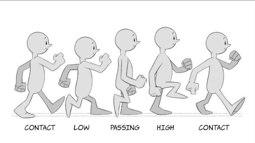
Basic walk cycles are greatly important in regards to movement. Though a character may appear without legs or may appear without arms or may differ in any way to a standard human-like body shape, the standard way a human walks is still one of the most commonly drawn upon resources animators use as a point of reference for bipedal characters. From the way a human moves there are several key points of focus that are essential to grasp before adjustments can be made to tailor the movement to a particular character better. The main points of a human walk in simple terms are contact > low > passing > high > contact. ‘Contact’ are the points of the walk where both feet have touched the ground, though the foot that was previously raised above ground is only contacting using the heel. ‘Low’ is the lowest point the whole body is in relation to the space around it, where the foot that newly made contact with the ground is now entirely making contact with the ground, the leg that foot belongs to is bending a bit, and the other foot is starting to raise off the ground. ‘Passing’ is the mid-point for walking where the now raised, bent leg is about equal level with the other leg. ‘High’ is the highest point the entire body is in relation to space, where the lifted leg is at its highest and the foot contacting the ground has the heel raised slightly in preparation for the next ‘contact’. During the leg movements, it is also important to make note of how the arms move, where the way the arms move is inverse to the motion to the legs, so for example if the left leg is the one currently moving forward it would be the left arm that is moving backwards. Despite this the arm movement and pacing isn’t too drastically different from the leg movement and pacing, where the contact movements are in fact the highest points of the arm movements but the passing movement is still around the mid-point where the arms are about level with each other like the legs are.
(Pictured above: a visual reference personally used during the production of the 2D walk cycle [Image source])
Though these key points of human movements are essential, once established they can be adjusted as necessary to change the way a character looks as they move. For example, if additional frames for movement are added post-contact but then quickly build up speed until next contact, it may give the character the appearance of being graceful or very careful with their movements. Alternatively, if more frames are added alongside that of the character getting lower to the ground during their ‘low’ point before they build up speed, it may instead cause the viewer to believe that the character is quite heavy and needs time to build speed with their movements.
2D (Harmony) Animation:
The first of the walk cycles created and completed was 2D hand drawn. This was created first as I felt it was a good introduction into how to create a proper walk cycle and to get a feel for the way the human body moves. Creating it was relatively straight forward. To begin with, before the walk cycle was even in a rough draft stage, a character had to be created to animate. The specifications for the character had to be that they had two arms, two legs, feet and a head. As the main focus of the project was the walk cycle itself, the character didn’t have to have too much thought into it, so I created a simple character for the animation that lacked any distinct features to note. Due to this design decision as well as the very non-realistic proportions or drawing style, a massive amount of time was saved when it came to animating it. This design was drawn in Photoshop and then imported to Harmony to use as a reference. The design drawing includes red segments for some areas to highlight the rough size of the joints, where the joints are and how the character should overall be drawn when sketching them.

Firstly for the animation I had to plan the basic features of a walk, so the points of contact, low, passing and high. These were used somewhat as keyframes; they helped with the initial plans and figuring out how to pace the walk correctly but were adjusted or redrawn as necessary as needed in order to ensure the animation retained a flow. Besides that the animation was done frame-by-frame, again with adjustments and frames added here and there to ensure that there was a flow. Moreover, the actual drawing process of the character was done piece-by-piece as opposed to drawing the entire character all at once, so the body, head and legs were drawn first, then the arms and hands, and then finally the feet. By separating the body parts it made editing the body to make the walk feel more natural a much easier process. A minor change took place at this point whereby I didn’t draw a neck as I did in the design plans, making the head float slightly above the body. This change was decided upon to both make the design mildly more interesting and to make the animating process slightly faster.
After the basic animation was complete additional changes were made to it. Notably, extra frames were added to the entire animation overall improve the pacing. This is especially true after the feet make contact with the ground as at that point in the animation the momentum in the leg is lost and has to be built up again so the additional frames creates the illusion of the leg moving slower. Moreover the additional frames were used to add some exaggeration, with squash and stretch and a more pronounced follow-through in parts of the character. As the character design was very unrealistic to begin with, it made squash and stretch all the easier to accomplish and more importantly fit the whole look of the animation a lot better. The final thing added to the animation was shading to the character. In the final uploaded walk cycle compilation there was also another version of the walk added where the character lacked feet, which was added mostly due to how the walk still works even without any distinguishable feet and shows how a walking animation can work well for a character even if they lack that body part.
Generally the 2D walk cycle was quite successful as the finished product had a mostly smooth pacing and, like many animations, any minor errors in the character being drawn that might have been produced aren’t immediately noticeable. The direction intended to go for the walk was one of being mostly basic, almost as basic as the character design itself. Interestingly enough however this may not have been entirely the end result achieved from the walk. The walk could be observed as carrying some sense of purpose in the character and the way that character has a bouncy quality to the walk that makes it appear to be feeling a positive emotion almost. The pacing of the walk also is what gives the character these qualities, and the fully upright gait. Interestingly enough it should still be noted that the character is still quite generic in appearance as is the walk despite all this, so the question could be asked if this is just a neutral walk and is just perceived as having some form of purpose through bias created through the actual animation style, and if so how much bias was created in this manner and how much of the perceived emotion is due to the actual gait the character has. It would be an interesting point to experiment with in future.
3D (Maya) Animation:
The main change between animating a walk cycle in 2D and one in 3D is the introduction of a 3D space as opposed to merely a 2D one. This poses some challenges and as well as some benefits: on one hand one must now display more attention to detail and animate more of the character due to the 3D format now presented, but it can be argued that it is much easier to use real life movement as a direct reference and one must not have to worry about how well one can draw or translate a 3D reference point to a 2D plane. Through the use of 3D one can merely import or create a 3D model and then only have to worry about the movement and posing aspect and not how accurate it looks to the design, because the design was only needed as reference for the model creation itself. Furthermore, like with many animation programs including Harmony, Maya has the option of calculating and auto-filling inbetween frames with movement based on keyframes. This is a process called inbetweening, or ‘tweening’, and through its use it can drastically cut the production time of an animation. While this was not used for the 2D walk cycle, it was heavily used for the 3D one, almost being used exclusively in fact.
The model used in Maya was one imported as opposed to one I personally created from scratch, so the sole focus was on the movement. Because it was not my design however it posed a limitation on what one could expect the personality to be as well as the movement style. In this instance the model was of a zombie so one could expect a sluggish, hunched over stance while moving, or at least that was what myself imagined and tried to capture. While one may think the fact the model was imported to be a massive drawback to what I could animate with it, how it was animated, ect. it might be considered a good form of practice especially if one imagines that much of the time animators are given designs to work with rather than design them themselves.
When it came to animating the model, as stated previously, it was mostly animated using tweening. An extremely important thing to note is that subtlety is key when using tweening and ensuring you calculate where and how much something is tweened. This is mostly due to the fact that because the in betweens are auto-generated you are at the mercy of how the program calculates the in betweens and it usually comes down to numbers and inputs in many cases. It’s important to get the numbers right and what frames you choose to use as keyrames otherwise movement can look stiff, robotic or unrealistic. In the case of Maya the animation itself was simple and easy enough. The keyframes used were mainly the moment a foot begins to leave the ground, the moment a foot touches the ground and the passing movement where the body (in relation to the ground) is at its highest. From there, the main issues faced were mostly figuring out how many frames were needed in-between keyframes to make the movement not feel too rushed, and maintaining an awareness that creating keyframes is based on particular joints selected rather than the positioning of the entire model meaning that several keyframes had to be created at around the same time in the animation for different joints. Besides that, after the animation was mostly complete, minor adjustments were made such as adding extra keyframes around the same points as previous keyframes where i manually moved parts of the body to ensure the pacing was correct enough to give a sense of the body slowing in and out of movements. The extra keyframes had to be created otherwise any changes would be overwritten by tweening. As with the 2D animation, the animation process was mostly segmented by body part again, where the legs and feet were first to be animated and then the rest of the body.
The finished result of the 3D animation came out quite well. Though the robotic look of the tweening was initially a concern in the early process of the animation, after adding the extra keyframes with my own adjustments it made the walk much more natural looking. As with working in a 3D space as opposed to 2D, all aspects of how the body moves from all different camera angles had to be given, which meant that I also had to pay more attention to detail when it came to looking at real life human movements for reference. The reference used wasn’t any source from the internet and instead was just looking at how the other people with me at the time walk and keeping in mind the key points of a walk cycle. One change for example was that I needed to place slight more focus on where weight was distributed on the body as the character walks, as such from a front point of view the body shifts slightly in the direction of whatever leg is remaining on the ground, so less weight is placed on the leg in the air. Although this detail typically may not be needed in a 2D animation it must be added to a 3D as a camera can be placed anywhere around a character model and highlight any details such as that that were missed out. Back to the point, despite tweening the movement appeared relatively organic, and as for the tweening itself it did greatly help with both the speed of producing the animation and being able to make the animation look smooth. However the movement of the arms I felt ended up being slightly stiff, which is due to wanting the arms to remain pointing as much to the floor to possible to add to the “slow and hunched over” look of the character but failing to look at reference to that, nor give any real sense of gravity or weight to the arms or anything of the sort. In this regard it was a bit of a novice mistake but at the same time one, I feel, would take a few hours of investment at least to finally be able to visualise and translate the movement to animation form correctly, but one which might very well stick with me. It might be worth looking at more reference material for how gravity works with dangling and suspended objects and how they move when moving in future.
Final thing to note with the 3D animation is that, after rendering, it was discovered that due to some settings applied to the character model I was not aware of the rendered model, does in fact, lack a torso. While this is unfortunate the legs, arms and head were still maintained which were the key points of movement in the model itself, so the walk cycle wasn’t too gravely affected. This goes back to the point again of importing a model and someone else’s design to animate with as opposed to making one, that by importing one you are also at the mercy of how one rigs a character model or what settings are placed upon it. Despite this using other’s character models is still an important part of being an animator so even with minor errors such as these using a character model that isn’t my own is still a valid option even if I have the option not to.
Stopmotion Animation:
Stop motion is quite similar to 3D in regards to having to animate on a 3D plane and (again) having to animate aspects of the body which might not even ever be seen in a direct way by the camera or brought to focus. However with stopmotion it could be argued that this aspect is even more crucial as at times not placing focus on the way an entire model is animated can either cause errors to arise that are extremely time consuming to fix or even cause the model your working with to be awkward to animate with. These aspects are all just par with the course with creating anything with stopmotion though, or anything with practical effects. In a way stopmotion can almost be considered a paradox with animating- animating itself has almost always had a focus on how it could be used to suspend disbelief (the only notable period that comes to mind where this was an exception was when it was first conceived and used for study purposes) and yet stopmotion itself has the quality of being limited to what can be done in real life terms. Models created for stopmotion, sets and props all have to abide by gravity for example or the laws of physics. Limitation isn’t necessarily a bad thing however: it breeds creativity. Any, or almost any, limitations imposed by stopmotion can be overcome or has been in the past, and nowadays any limitations that can’t be directly overcome practically can be overcome through external means such as video editing software. In some way someone might consider that stopmotion has in fact very few limitations at all, the only limitations are your knowledge on how to create practical effects, your knowledge with animation itself, creativity and patience.
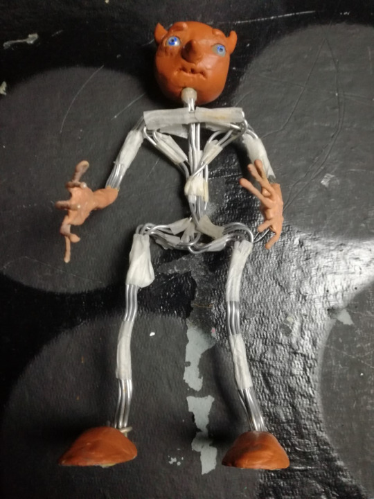
(Pictured: An image of the model used for the walk cycle)
In the case of the walk cycle animation I produced, a model that I created from a previous stop motion project was used. The model already filled the criteria needed for a character to animate walking, being bipedal and having two arms and a head, so it was quite convenient. Moreover, the model was constructed using flexible but sturdy wires and can stand on its own in a variety of positions unassisted making it all the better to animate with. Other traits the model included that made it more efficient to animate with included a fully rotating head, mobile eyes that can be adjusted as necessary and latex hands and forearms which add stability and strength to the hands, fingers and wrists. Though the character is a blank slate and has no personality immediately intended to be associated with them, the approach for the emotion and personality I wanted to give the movement was one of nervousness and fear. In this regard the default pose the model begins with has the arms up, getting closer to the chest as the animation progresses and knees bent a bit to give the impression of being physically small. As the animation progressed I also added the detail of having the head look around a bit, as if alert.
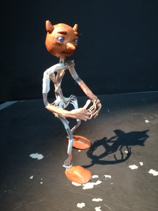
(Pictured: Model posing for first frame of the animation)
Regardless of however well the model may be made it was however still a model, a physical one. Going back to what was mentioned earlier about limitations in stop motion, gravity exists and the threat of the model toppling over mid-frame when attempting to pose it or take a picture was an unfortunate reality. To counteract this double-sided tape is added to the soles of the feet to try and ensure the model stays in place. This is only a temporary fix though as through use the tape becomes less sticky and must be replaced. As the entire model has to be picked up only to be repositioned again after reapplying the tape, the fact that tape has to constantly be reapplied is much less than ideal. It is more ideal than having the model fall over in comparison though as if that happens then there’s the likelihood of parts of the model moving on upon impact. Aside from this the amount of times the model toppled was thankfully not a large amount. As what was previously stated one must focus on many aspects of the way a character moves when it comes to working in a 3D environment, but due to this in regards to stopmotion if you position your character correctly (assuming you’re not attempting an awkward position) then gravity itself can be used as a form of guide in that the model should be able to mostly still stand on its own unassisted due to weight being evenly distributed on the character model. This was extremely helpful for me to acknowledge when repositioning the model from frame to frame and minimised the times that accidents like having the model fall occurred.
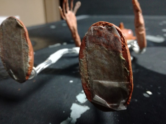
(Pictured: Soles of model with tape applied)
The general animation process was just like how it was with all previous walk cycles, getting a grasp on what a walk looks like on a biped. The addition of making the character look afraid wasn’t troubling to achieve either as if you can envision what someone might look like when afraid then translating that to reality is often only limited by your knowledge on how to animate and pose a model. The only notable faults that occurred both during and after production were that during the animation process, after the camera’s battery was replaced after running out, the exposure increased massively though this was only a minor hiccup that was easily fixed, and that after finally reviewing the walk cycle at the end it was found that character movement was notably but unintentionally jittery in places. The jitter was more than likely caused by mispositioning the model so parts of the model go back over a movement they just moved from, so almost like taking a step forward (metaphorically speaking) and then a step back then forward again. Repeated instances of this caused jittering though it was more notable in parts of the body than others. To fix this issue would be time consuming to say the least as it would require repositioning the model as much as possible to be like in a previous frame, then making the changes necessary and most probably animating the rest of the frames from there even if the other frames were already animated, and that’s assuming that the entire clip was not just scrapped and redone. Aside from the jittering the rest of the animation appears successful, with decent pacing, a clear emotion displayed and the walk appearing mostly natural.
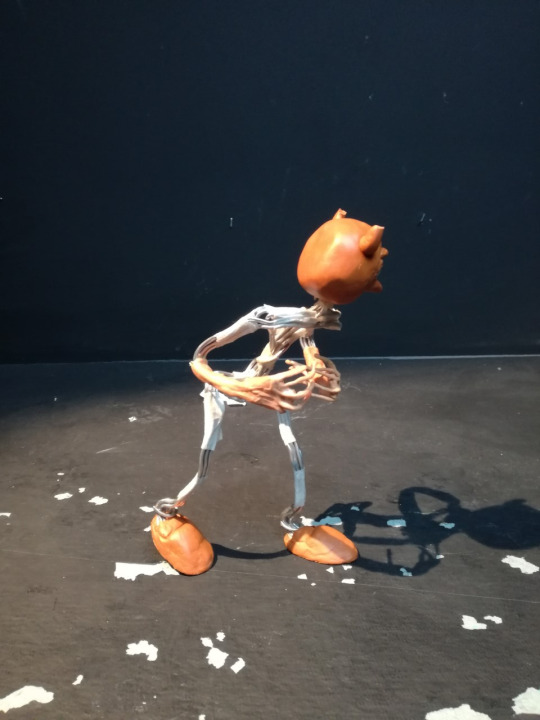
(Pictured: The model, posed in a frame nearing the end of the cycle)
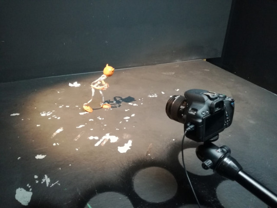
(Pictured: The set-up of the scene)
0 notes
Text
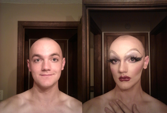
Homework Assignment #1: Transformation Photo Album - Critiques
Check out the students' work in their first assignment of TDR Charm School 4! For this assignment, the girls had to take a photo after each step of their makeup application process. Let’s see how they did! To view their transformation photo album, click their name!
Erica Strada
Analyse: Hi, Erica! First off, I just want to say that you were maybe the most thorough in talking to Letha and myself while you were painting, and I 100% think that elevated your submission, because you were able to get that live feedback. Keep doing that and working hard, and you'll see so much growth!
Brow coverage can be tricky, and it's something that just gets better with time. I think I've shared most of my brow coverage tips/crits in your sisters' critiques, so make sure you read those, but like I said, it's just something to practice and find out what process works best for you.
Looking at where you're placing your contour, I'd definitely suggest raising it up the face quite a bit. I know we talked about this in PM, but it caused you to run into the problem that your cheek contour was so low and angled down so much that it kind of collided with your jawline contour and it wasn't clear exactly what was going on. You went back in with your highlight cream to clean up that line, which helped to clarify the intent of everything, but I think that trying a higher placement will definitely help to avoid that problem.
I think for brows, this is a good start. I like the brow on the left side of the picture a lot more, and I know sometimes the brows just don't want to match. It happens, and you just roll with the punches, but I think the left side (your right, I guess?) brow is definitely a good starting point. You might also play with some different products. Pencils are good and creamy, and personally, I'm a big fan of a gel for brows. ELF has some good gel pots for like $3 that you can use and then set with a powder. My general brow technique is that I'll kind of sketch the shape light with a pencil (using the connect-the-dots technique where you put where you want the brow to start, arch, and end, and then you connect them in a smooth line), then I go in with a gel, and then set it with powders.
I like that blush, but I think you could go super over the top with it. You said that Mimi Bobeck was inspiration for this mug (and I still think she is such a great inspo! She's basically a drag queen already lol), and you look at pictured of Kathy Kinney in that role, and they were not afraid of slatheringggg blush on her. I'd love to see you try a big dramatic wing, and maybe look into a darker liner (either a marker or a gel, if you don't want to go liquid). Normally I would say something about not taking the color all the way up to the brow, but knowing that Mimi was an inspiration for this mug, I'm not mad at it. Just make sure when you're doing a look that isn't this, you leave some white between the brows and the shadows.
Bitch, I love this lip! It's such a fun color, works well with the eyes, and looks very clean. You might play with overdrawing the bottom a bit more, but I really have no complaints for this lip. Werq. Anyways, I think this is a great first submission! Something I think that will help you as we go on is just working on getting your time down. As somebody who also likes to take my time to paint (my record during CS3 was 6 hours), I know how stressful it can be, but as you do it more, eventually your time will go down. It can also be helpful (and weirdly fun) to practice and be like "ok, I'm gonna get this done in 2 hours," and it usually turns out better than expected. For now though, feel free to take your time and really find what works for you! Congrats, and I can't wait for your test!
Letha: Hey Erica! I want to start off by commending how communicative you were with us throughout your painting process. You talked to us and you really took your time, and doing that (along with practice) will really help you to improve! Now, on to da mug! Starting with the brow coverage, I think she started off covered pretty well (a few more coats and some smoothing/pressing might not be a bad idea though), but by blending the eyeshadow too roughly on top, it disturbed the glued-down hairs underneath, so be sure to be very gentle. Using shimmery eyeshadows, as those appear to be, also won’t serve you well in trying to hide underlying texture, so you will want to stay with more matte colors, at least when working over the brows. The eyeshadows could also have more POP, you said your inspiration was Mimi and her eyeshadow basically hit you over the face, and yours isn’t quite there yet With your redrawn brows, I like the overall shape, but they’re a bit muddy/patchy in texture. I think using a more pigmented product with a very small brush would be better, whether you go for an ombre brow, a brow with hair strokes, or even a solid shape. With regards to contour, I do agree with Ana that the cheeks got a bit low and correcting them was a good idea, so good on you for doing that. The blush is a pretty color, but could be more blended up so it’s not as stripey. The forehead contour is a nice shape but I think your powder made it look a bit patchy, so I would recomend going back through with a large powder brush and dusting off excess/blending edges. The nose contour started off a bit tilted but you were able to improve it, watch out with taking foundation off the nose though, you can go back and reapply if you take it off by accident. With your lashes, I personally think they could be bigger, as well as being closer to your real lashes. If I were you, I would practice placing them (without any glue) as close to your real lashes as possible, or at least the inner corner. Some more dramatic liner/tightlining could help to hide the lash band as well. That lip color is very well done and easily my favorite part of this paint, you have that part down pat for sure! Overall, you have some points to improve on, but your willingness to learn is showing!
Kushboo

Analyse: Hello, Kushboo! I'm just going to follow along in your album and give my crits step-by-step as I see things! Brow coverage looks pretty good (until the one comes up :\ ), so good job on that and on fixing the problem when it did happen. Something that will help with that is to think of anything on top of brow coverage more as dabbing and pressing motions than swiping or side-to-side motions. It might help to use a sponge for that part to apply the foundation on top of the brow coverage.
This blending on the contour already looks so much better than what we saw in your audition, so I'm so glad to see that you're already taking all these things into account. Keep this up and you'll have an entirely new mug by the end of CS4! ALSO, I LOVE THIS BLUSH. And I'm sure you might be one of the first times in Charm School that Letha doesn't say "more blush." You might want to play with laying down some blush at the forehead contour, too. It just helps to really liven up the forehead. I'm also a big fan of just a tiny little bit of blush on the chin, but that's a personal taste thing, but try it if you want.
I think this is such a pretty color on the eyes. As Charm School goes on, I'd recommend you just try out different eye makeup shapes and techniques, because right now (even though it is a pretty color), it does just all kind of scream that one color. Add interest to the eye with different colors to make it look more dimensional, and as with most makeup things, make sure it's blended. These brows are a good starting point, and honestly my biggest issue with them is that I think that they can taper more on the outside ends. Right now, they look kind of blocky, so a more tapered end will help to soften and feminize them.
I like this lip color! I think it was a smart choice to go with a more subdued color on the lip when you had such bold colors in the eye makeup and the blush, but it's still got an interesting metallic quality. Going forward, I would make sure you work on just having very defined lines. (Also, watch out in your pictures that you don't show off the line on the lip where the lipstick stops. Your second to last picture, I think you were going for a pouty kind of look, but that was the first thing my eye went to). Overall, I think this was a good submission and already such a great improvement from your audition! It's very clear you took what Letha said in the the video and put it to use. Keep that up and you'll do very well in this competition!
Letha: Heya Kushboo! So I know you had trouble with brow coverage, but I can see you have potential with keeping them down, so really make sure to flatten/press them down and be super delicate around them (applying your foundation to them in dabbing motions with a sponge might help, instead of rubbing with a pan stick). The contour is sitting pretty high on the cheeks, which can work, but it doesn’t give you as much blending room. Until you pile on ten pounds of BLUSH that is. Is that a lot of blush? Yes. Am I mad at it? Hell no. I think it helps to blend out your contour nicely. But if you’ll note, you blended the blush under the contour, which isn’t the best for restructuring the face. Where the bottom edge of your blush is, THAT’S where I would suggest drawing your contour (and blending up from there). The edges of the forehead could be a bit more blended as well. That eyeshadow color is gorgeous and matches the blush really well, but make sure to soften the edges, as they’re a bit harsh right now. Blending with a white, translucent, or even light flesh toned powder could help with those edges. The new brows aren’t bad, a bit high though, placing the front end a bit closer to your natural brow would help you get more of an arched shape. I usually do a smoky eye myself, so the Kajal on the lid isn’t a bad choice, just make sure it’s darkest right on the lid and blends into that green. I would really try getting some lashes, as they can elevate a look and add drama, as well as adjusting the exaggerated proportions that you created. That’s a gorgeous lip color, make sure your edges are crisp though (if it’s a pencil you can sketch small strokes in, if it’s a liquid lipstick, you have to really commit to the line/shape). All in all, I can already see improvement from where you started, and must say that I LOVE this color combo, so good job!
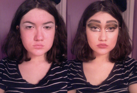
Luna
Analyse: I'm just going to kind of go through your album step-by-step and make any comments about anything I see along the way, but I want to start off by commending you for talking to me and Letha while you were working on your mug, because tbh it's so much better to get that live feedback. Not only does it help your submission look better, but it also helps you learn *how* to fix certain things and *where* they went wrong, so kudos to you for that.
Your brow coverage looks pretty good. It's a learning curve and it gets better with more practice, but my recommendation is to try different techniques and find out what works best for you and your process. Back when I had brows to cover, I was a big fan of the swirling method and then licking the glue stick to smooth them out. Some people use the back of a spoon to smooth it down. Ultimately, whatever works for you, go with that.
It's very clear that you have a good idea of where/how to lay your cheek contour, so keep doing that. We talked a little about brows in our PM, but just keep playing with shape and placement. Right now they read a little Angry Eyebrows™, but sometimes the look can call for that. For the eyes, just make sure that how blended out the shadows are is even between the eyes. You can see in your pictures that on one eye, the shadow is blended out a lot further than the other eye, and that's just a matter of going back in with a matte white and just kind of doing that back and forth until you find the right balance. Also, while we're up there on the face, be careful with your shimmery highlight placement, because putting that shimmery highlight there kind of undoes the restructuring of the face and makes your natural brow bone very prominent (and also draws attention to any texture left behind by the covered natural brow). That being said, I like the placement of your other highlights. The peach blush is very cute and reads very like, innocent natural woman to me. Letha will probably tell you more blush, and tbh I wouldn't be mad at that. Also, I'm a big fan of blush at the forehead contour too for the same reason that it adds some life back into the face. I can't really tell if you did that here which either means a) you didn't, or b) it could use some more.
Like your contour, you seem to have a good idea of what you like with your liner. As you said in your PM, you prefer a straight out dramatic liner, which is fine and can look great; just remember that Charm School is about growth and we want to see you learning and trying new things, so it might be worthwhile to step outside of your comfort zone. Your lips are a cute shape, and I like that you have multiple colors on there. Like, I recommended in PM, I think a lighter highlight shade in the middle of the lip would add more dimension (especially since you are going for a very pouty lip), because even with the cherry red, the lips do still read pretty dark.
I love that you've come up with this stippling sponge technique to do freckles, but I think the outcome of it falls a little flat for me. It kind of reads as like, maybe some fallout landed on your cheeks. I think if you want it to read more freckly, it could help to go in and make sure you have some more variation in sizes and maybe a few shades in the same range. If you look at natural freckles, they're not all the same shade and size. All in all, I think this is such a strong first submission, and I got super nitpicky with these critiques because it's clear that you already are comfortable with a lot of what you're doing makeup-wise. Congrats on a great first submission, and I look forward to your test!
Letha: Luna, this is such a cute look! Your brow coverage is pretty darn good, as well as you leaving out the front remnant to base your new brow off of, so props to ya on that. The eyeshadow on top is well blended, but does catch the light and draw some attention to hairs that are there by making them shine. Your contour placement is also overall pretty good, I would work on blending the top of the cheek contour a bit more, as well as the sides of your nose, as they read just a bit stripey at the moment. Blush is nice, as is highlight. Lashes are well placed, and I like the liner shape, it’s not a normal wing but it goes with the “cutesey” vibe you were angling toward. I would suggest putting a bit more mascara on the lower lashes, as they look pretty bare at the moment. Lastly, I’m not huge on the big freckle trend going on, but it can work depending on the look, and with the vibe you have going, it works here. Up close they’re very convincing freckles. From far away though, they look a little muddy and might just read as “texture” to someone in an audience. Just something to keep in mind. This is a well done look and you should be proud of yourself, Luna!
Marina Lumiere
Analyse: Hi, Marina! I'm just going to give my comments on your album kind of following your step-by-step process. Before that though, I just want to give you a shoutout for rolling with the punches after you lost your pictures from your first try at the homework. TBH, so much of being successful at Charm School and TDR (and drag and life, I guess) is being able to adjust and adapt, especially when things don't go as planned, so congrats on that. Now, onto makeup!
I don't know many queens that cover their brows with spirit gum, so you're braver than most. I'd be interested to know if you've experimented with other methods of covering them (like glue stick or Pros-Aide)? Either way, I think you'll be helped a lot by setting your adhesive with a powder! I think the color story you've chosen for the shadows is very nice. Be careful that you're not pulling up brow coverage when you're blending the eyeshadows. When you're going over your brow coverage, it's helpful to think more of dabbing with the brush than necessarily swiping, and that will help to not pull up that coverage and reveal the texture of your natural brows. I really like this graphic undereye, and it's very trendy. I'd just work on making it cleaner and really defining those lines. The brows are cute! You might try going in with a white underneath them to add that highlight there. It'll also really help in defining the shape of the brow.
Your contour sits very low on your face, so you might try placing that a bit higher next time. I'd also suggest you focus on blending the contour up more as well, just to really have that gradient from your contour shade to your foundation shade. You might also want to try contouring your jawline and forehead. Harper Valley talks a little about it in this makeup tutorial about faux queens not typically needing to contour the forehead as much as cismen drag queens do, but I think if you added that, it would help to make the face a more cohesive mug and make it draggier overall. Also on the topic of forehead, I would add some blush along the forehead contour if/when you do that, just to bring some life back to that part of the face as well.
I can't tell if the lips are a little fuzzy because of the picture or because of application, but just make sure that the definition of the lip shape is something you're keeping in mind. A darker liner might be something worth trying out next time. All in all, I see a lot of positive things going on here, and I'm excited to see your growth throughout Charm School!
Letha: Immediately what drew me in were the eyes, specifically the bottom lash line and the eyebrows. I think those were definitely your strongest elements here and really suit your face/style. I also like the colors on the eyes, but they got a bit muddy when mixed in with your brow coverage. To help cancel that out, I would suggest using a very pigmented concealer over top to cancel with a healthy dose of bright white powder (I sometimes even use a bit of my beard cover under all of that to help cancel out the tones). Same blending over covered brow tips apply here, and I would suggest going under your NEW brow and doing a stronger brow bone highlight, then blending down to make more of a gradient and having a better contrast in color. I like the bottom lashes but I think the top also needs a good dose of lash as well, as it would pull the eye together and be more balanced. Your cheek contour could be a bit higher, as it’s a bit low at the moment, but I like the blush color. I like your natural nose shape and I think it could work, especially in the context of this look, but a light dusting of contour on the nose helps to add some more dimension to the face and not appear as “mask-like”. The lips are an okay shape, but your lines could be cleaner, so be sure to take your time, and even try going for more dimension by adding some white to the middle of the lip or darkening the outer edges. All in all, I think you have a cool look here, and one you can really work with, so keep these notes in mind and keep up the good work!
Nikita Nox
Analyse: Hi, Nikita! I'm just gonna go through your album step-by-step and comment as I go. Brow coverage is definitely one of the things it's clear you've worked on. My only comment on that is that you can see the cooler tones of the hair a tiny little bit through the foundation. You might play with color correcting that until you can upgrade to a fuller coverage theatre-grade foundation.
I think it's great that you have ideas in your head of queens you want to emulate. As a baby queen, sometimes that can be a great way to learn certain skills. Just make sure you don't latch on to one idea of "this is what I want this to be," and give yourself the space to explore and work on other skills. For the white on the lids, I think it's great to prime to lids to make the colors pop more, but I don't quite see it in these pictures, so a different product might behoove that process. I love a good clown white. A lot of queens use the Ben Nye clown white, but I've become a disciple of the Kryolan Supracolor clown white since Gluttoni Sinn suggested it to me. It's just creamier and blends easier.
I think brow shape is definitely something you can play with. Adding a highlight underneath the brow can help to clean up the lines and make the brow look a lot sharper. You might also look into other products that will help give you a fuller brow look, because using shadows can cause them to be a bit patchy. A real cheap one is the ELF gel pots, and they have a few shades of brunettey colors. You can also look into pencils if that's more up your alley.
Wings can be so hard to do, let alone get them to match, so that's something that will just get better with time. An easy thing that I think will automatically bump up the polish of your mug is going over the liner with a black shadow. It'll make it look a lot darker and less patchy, which will add to the overall drama of the eye.
With the powder contour/blush/highlight, make sure you blend that out a little more so you don't rock that Neapolitan ice cream look. Good job cleaning up the bottom side of the contour with your cream highlight. That makes it look a lot crisper. The rounded bottom lip reads almost cartoony to me or maybe clown, and I think that's just a bit of a disconnect from the rest of the mug, so I think it's worth playing around with different shapes. I would also love to see some more dimension in the lip with more colors and highlight. For the most part though, this was a great first submission, and I look forward to seeing your growth in this competition!
Letha: Hi Nikita! So immeidately what I noticed while looking through your album is that your brow coverage/foundation game are pretty strong, and that you have a good base to work off of. The contour shapes are quite good, s far as placement goes, and the blending is pretty good too. Could diffuse a bit more, but it’s a great start. The blush/contour aren’t quite melding though, ad they look like very separate creatures. One of the best keys to blending, whether on the eyes or the cheeks, is overlapping. It helps to make a gradient of color and really sell the illusion. With the eyeshadow, the colors are pretty but it all runs a touch muddy on the eye, there could be more of a defined blend/gradient, and more contrast in your color choice could add dimension. I like the liner shape, but try setting the shape with a black shadow or something more pigmented to make the black more uniformed. Love the lashes, they’re a great shape, make sure to do some tight-lining and add mascara to blend your real lashes in more (same on bottom). For the lips, I don’t mind the color, but do find it a bit sloppy. Not necessarily the shape, but the lipstick being a fairly satin finish and it being the only product you used, the only dimension there is from the lipstick catching the light, which isn’t the best idea when overdrawing. I would go in more with a lighter color to highlight and a darker one on the edges for more dimension. This is still a very solid effort though, good job girl!
Ophelia Waters

Analyse: Oh, hello, Miss Waters! I'm just going to follow along your step-by-step and jot down any comments I have along the way. Right off the bat, I can see you are IN DETAIL with your descriptions, which I love, because it helps us help you more!
You already commented on it, but try to get as close a shave as possible. The smoother the surface to work on, the easier the application is going to be. Brow coverage and color correction look good and work for you. It looks like maybe a little later you had some brow popping issues (just a little bit), which happens.
A lot of the problems that I'm seeing, you've already addressed yourself with the same solutions I would give you (like the cakey-ness and maybe not pressing as much with the powders. You want her ~beat~ and *set*, but you don't want to dig the powders in so much that more sticks than is necessary. As for the muddiness, you can always go back in with more of whatever you need and clean it up in your "wet" stages before you set it all, and I think that would've helped here.
For the eyes, you said you're using clown white (I assume good ol' Ben Nye). That's already a cream (albeit pretty thick), so I don't think you need to be mixing that to make it more liquid. I know I've mentioned this in a couple other crits as well, but the Kryolan Supracolor clown white is quite a bit creamier, spreads like butter, and blends SO easily. I swear I'm not sponsored. I just love this product (especially compared with the Ben Nye, but like, the BN clown white has it's own merits, so, do with that what you will).
Next time you paint, I'd like to see you try doing your whole foundation/contour/highlight routine first before moving on to eyes. I think it'll just help to have some whole cohesion in the look. There are some queens who don't do any contouring of the cheekbone and just roll around in blush and call it a day, and if that's the look you're going for, I think there are some things you can do to move it in that direction, but I guess I see the cheek highlight and the blush and so I expect you to be going for a cheekbone contour, but then it's not there. That was basically just a long way of saying "make sure your intentions are clear," which is a huge part of what charm school is about, so I'm excited to see the direction your face takes!
I have similar critiques for brows and lips, and it's that they can be a bit cleaner and more defined. I'm a big fan of connect-the-dots brows, but make sure that when you're doing that, it's a smooth defined line. Next time, you might try going in and cleaning that up with a white cream, and for the lips, I would love to see you work on just making sure those lines are super defined.
Overall, I enjoyed this first submission from you! I look forward to seeing which direction your mug takes as you develop and refine your techniques!
Letha: Hello Ophelia! So what I first notice is the amount of product you’re using overall. It’s a lot. With makeup, even as much as we wear, you only want to use the MINIMUM amount to get the job done. This is most evident with your foundation. I would suggest dotting a little around the face, blending it in/out and adding more when you need it to get even coverage. It will make the setting process a lot easier too, as you will need less powder to set the wet foundation. The contour/highlight get a bit lost, so I would suggest amping them up next time you practice. I do see the blend though, it’s a good start. I see some blush, but it’s a bit low on the cheek. With the eye makeup, it’s very cartoony/dramatic, which I can get behind, but with that graphic style your lines/shapes need to be clean/graphic, so really take your time with a small detail brush to perfect those edges (and use less white, as too much will cause that cracking effect). Lashes and mascara are a must though, so remember them next time. The eyebrows have a good shape, just be sure to keep the shape crisper (small brush, confident brush strokes). The lips ran into some trouble, as well. I know you mentioned your shaving troubles, so work on that for next time, but also if that does happen, then paint with the grain of the hair so the stubble doesn’t mess up your line. The lips also got a bit cakey, so I would suggest taking some of that product off. Overall, you have an idea of what you want to do, but definitely keep the “less can be more” idea in mind for future paints. Keep it up!
Shillelagh

Analyse: Hey, girl! I'm just going to kind of critique along with your step-by-step, so that'll be how my thought (THOT) process is structured. As a real natural woman who use to have big ol' man brows, I understand your struggle. It's really just a trial and error game, figuring out what works for you. There are a million different techniques you can find on YouTube (and some I listed in Luna's crits). Just make sure you're getting them to lay as flat as possible and then getting powder in there to keep it that way. I've found that it's helpful to kind of go over the whole brow with a little bit of powder first and then you can really dig in with more on top of that and press it in so it's flattttt.
Set your foundation. Get that good Coty Airspun powder (there are a ton of other setting powders out there, too, but Coty is pretty readily available. Like, I get mine at Walgreen's). That will help to make the whole face look more matte and less shiny, it'll set the wet product, and will also help blending 1000%. (Also, back to brows for a hot second, if you're not pressing a powder onto the glue, that could be a HUGE contributor to why the brows are coming up). You've blended in your cream highlight pretty evenly. I would try with adding some highlight to the middle of the forehead. Contouring the forehead can definitely help with rounding it out and making it more feminine.
I know you ran into a problem with your brows popping and that kind of messes with the eye makeup, and so that will improve as you get better at covering your natural brows. Something you might want to try out is a white highlight under the brow you've painted on. It helps to define the new brow and restructure the face. I love a good wing, and I think it's cute with this look. Eyeliner is another thing that just gets better with time and practice.
The lips are a cute color! A single matte shade on the lips can be cute and can definitely be a good look, but I'd love to see you work on adding dimension and definition to the lips (especially since you're such a fierce lipsync artist and the lips are such a focal point of your performances). I understand that you run out of lash glue and stuff like that happens. In the future, it'll be helpful to do a check before you start painting to see if there's anything you might need, because nobody wants to make a 3am Walmart run with an unfinished beat. Congrats on your first submission, and I can't wait to see how you apply this feedback for your test!
Letha: Hey girl! SO, overall, you’ve got a good thing going. But it literally all comes down to one problem. SET YOUR FACE. You can’t blend powders, eyeshadows, much of ANYTHING over a wet face, except other creams. Once you set, a lot of things will be easier. Setting brow coverage will make shadows go over them a lot easier, so you shouldn’t have as much disturbed hairs. It makes drawing new brows a LOT easier, since you’re not drawing precise shapes on shifting sands. It makes the cheek contour easier to reinforce with powder (though I do love the cream shape you already did, but that will wipe right off easily). That being said, I really like your liner shape and it works well for you. Get some lashes/glue and thats a good start to an eye! The lip color is really prettyyyyyy, but the shape could be cleaner on the overdraw, and more dimension could be added. So, shopping list- setting powder, highlight powder, contour powder, lash glue, lashes. Add these and you could really be on your way, so keep it up and keep practicing!
#erica strada#kushboo#luna#marina lumiere#nikita nox#ophelia waters#shillelagh#tdr#tumblrs drag race#tdrcs4#charm school#drag#drag queen#baby queen
5 notes
·
View notes
Text
019 // Technical Notes, No.1: Lots to say about a map editor.
Part I: Introduction and Burncards
This week, I would like to take a moment and talk about my map editor.
Sorry it was a bit late but if you like essays, you should not be disappointed!
n.b.: There will be a lot of talking and visitors will be forgiven for skipping the text and just looking at the images.
When I started this project, I decided that I would like to try making maps in the old way, by creating a sequence of graphic tiles and arranging them into grids of numbers that corresponded to specific ones. Naturally, putting the tiles in sequence manually (in raw text) would be tedious, error-prone, extremely time-consuming, and, ultimately, a profoundly frustrating and dissatisfying ordeal, so I elected to create a map editor for this purpose instead. This editor has since become a tool that does considerably more than just place tiles in a grid and convert graphic references into numbers and back again.
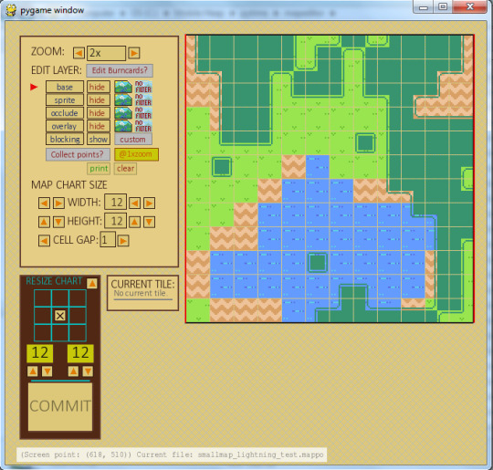
My editor, which has been under continuous development since 2013, displaying a very basic map used to test and edit new map features and effects. It operates mainly using the Pygame (interface) and ConfigParser (data handling) modules.
* Again, be forewarned that this is long! But there are pictures to reward you. Kind of.
When I began, I had very little idea of how complex each map was liable to become, and so I began work on the editor with the idea of keeping the software as flexible and extensible as possible. Unfortunately, when I began, I also had exactly no idea of how to create working software in Python, and the result was a kind of mash of functions and reinvented-wheels and features which could have been created in any number of better ways. For instance, as I mentioned in my post No.005, I only recently learned about, and how to use, the Tkinter module, and previously all of my prompts and inputs had been done using modules I made myself. I am very happy with these modules. But creating them took days I probably could have put into artwork or mapbuilding. Again, there is no disappointment, since I learned much about Pygame in the process, and my editor has a very personal, if slightly defective, character to it. Plus, it is easier to add new functions since I understand exactly mostly how it was made!
Probably the most elaborate element of the editor to work out was sorting out how to have it save and load data, but first I will bore you with a little background on the data itself..
The tile "chart" -- the sequence of numbers that describes where each tile goes -- was easy, but as you have seen, there is far more to each map than just the tiles. There are several types of special effect, there are blocking zones, there are interactable objects and sprites, there are moving background objects and objects whose appearance and behaviour changes depending on where you are on the map, and all of these elements have their own parameters and data that needs to be stored, and restored, during the editing process. To make matters more complicated, most of these object types have their own specific modules, and their age and quality changes a lot between the oldest ones (which include effects like blinking pixels and the sunbeam effects discussed in post No.016) and modules implemented as recently as last month (the simple animated sprites in post Nos.009 and 010). Although all of the modules work when I test them, the nomenclature they use-- the format of the data they use to generate and time effects-- is, if you will forgive the term, all over the map. (:y)
The data stored in a bland text file like this..
..becomes the lively (if somewhat strange-looking) foliage you see in here!
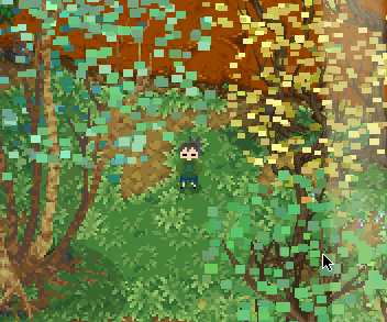
I have at many points been tempted to go back and revise the input structures of the oldest and least-comprehensible modules, but have every time decided not to, for two reasons: one is because they work and I find myself busy enough to leave well enough alone, and the other is because changing the data structure of these older modules would require that I go through every existing map that uses any updated module and revise the data it has recorded to reflect the new design. Which is super-de-duper tedious and exposes me to only a kabillion points of failure and only improves the look, rather than function, of the data as it is recorded in a file nobody besides myself is ever liable to see. And! There is a good chance that, later on in my planless, perhaps endless, development cycle, I will decide that the new format also sucks and that I want to change it again.
No, no, no.
"Do how do you keep your data organized, then, if everything is such a mess??"
I hear you shout.
Well, that is a good question for which I have two solutions: one is that I keep pretty okay comments in the modules themselves (some of the older ones, not so much) which allow me to simply open an effect's module and look up how to supply data for each argument, and in what format, and the other, which is a large, single text file that gives a sample for a specific module and lists off what each element in that sample is for. The sample is always functional, so I can copy and paste it into the map's data file and simply revise the values and delete the copied descriptions when everything is in place! (Another problem with revising old data structures is that I would have to update all of my documentation, as well, and although this is by far the least taxing element of the job compared to updating old data and subsequent debugging, it is just another time-consuming thing I would have to dedicate time to doing. And I would really rather work on content than play with argument sequences. <_<;)
Anyway, at the end of the day, all of the effects and sprite data for every map is stored as plain text in a regular text file where I can view it, alter and adjust it, and repair (and create) problems manually; the editor does not handle every element of map design and there are a few things I can only revise by intervening directly in the map file, and that is fine because I would rather not spend those additional hours creating elements in the editor just to modify an effect that I use only rarely. But I still need to load and save those values, and what makes this complicated is the way Python handles data. I use the native ConfigParser module to load text data into the editor, and the data, when it arrives, arrives entirely as text string objects. This is fine for data that I do not need or want to edit using the software editor-- these elements can be preserved as strings in a block of 'options' (the name of a data element saved in a ConfigParser 'section') and 'values' (the data itself), then saved out verbatim when the work is done, because the editor does not need to understand the content, it only needs to remember it. Editable values are much more sophisticated because they have to be converted from strings to whatever their intended format should be, then put into a place where the editor can access and revise it. For tiles, this is easy: all of the tiles are laid out in a 2D array (actually a list of lists) and changing it is as easy as looking up the correct coordinates, then changing the value(s) stored there. Things like sprites and effect zones and moving background images are considerably harder, since, unlike a tile, each object will have more than just a single number to describe it..
Consider the example of a map prop I call a "Burncard." The name comes from an older map element that the idea is derived from, a "Postcard." Postcards are simple moving background (and foreground) objects whose location varies independently of the map, usually varying with the location of the player (actually, the center of the player's view of the map). With Postcards, I can add parallax effects and background objects and collections of graphics like clouds and mountains (as seen in post No.017) without too much fuss. Postcards, though, are still fairly complex objects and require some processing power to maintain as long as they appear on screen (many are not rendered when the player "isn't looking," though, and that was not so easy to pull off), and if the Postcard is not intended to move independently from the map (it has no parallax-adjusted motion), then to use a Postcard would be wasteful.
Enter the Burncard: a Postcard which is 'burned' to the map during its initial rendering! Because tiles are all drawn to a single surface on load (the player then views a portion of this surface) rather than redrawn every single frame, I can simply throw these static props in on top of the tiles instead of redrawing them every frame! This way, the software has less to keep track of while the game is running, at the expense of an only trivially prolonged load-phase when the graphics are 'burnt' to the tile layers!
What makes Burncards more complicated is the fact that they have a number of attributes besides the address of their source files and coordinates for where they ought to be drawn on the map: they can have colour gels, they may be scaled or flipped, many are applied to different graphic layers, and they often have to be placed in a specific order when multiple Burncards overlaid atop eachother on the same layer. And all of that data has to be stored and manipulated, then converted to text data and pushed out into a file during save, and restored from that text data when editing resumes or the game parses the file for use. Burncards are pretty complex!
To handle all these different parameters, Burncards are edited as "objects," a sort of programmatic Rolodex card created from a template and put into a collection tracked by the editor. When I load, the text data is converted from strings into whatever data type they look most like to Python (I made a tool to help with this using ast.literal_eval and used it to extend SafeConfigParser, for those of you in-the-know) and puts them into their appropriate attribute slots in a Burncard object according to the sequence in which the parameters are listed or using specifically-named elements in the data, and puts all those objects into a dictionary I can flip through and edit as needed. When the work is done, the editor goes through that entire dictionary, object-by-object, and converts the attributes back into text strings according to their content, stacks them up in the correct sequences, and puts all that data into a long, carefully-formatted block of text that ConfigParser can save out to a file. It's really handy! But if a single character is mislaid, I have to rummage through it to see what went wrong...
The lamp post in this screen capture is a Burncard! So is the log, the tree trunk at left, the bramble at the base of the lamp and the sapling just to the right across the trail, and the grass clumps in the fore- and background. Let’s see what the lamp looks like in the editor..
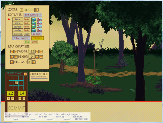
Here it is, ready to be changed! The background scenery is actually a Postcard, which the editor does not handle.
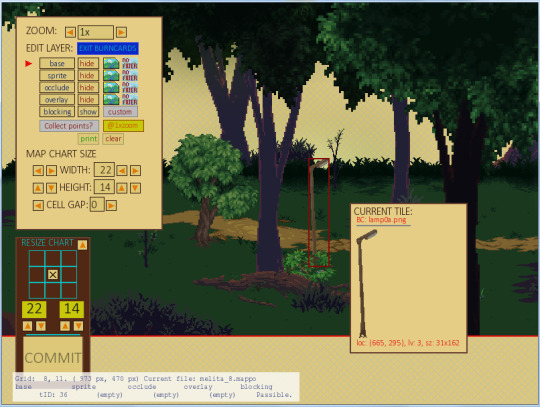
This is what it looks like to have the lamp selected, and if I click the "CURRENT TILE" sample..

..I come to this pane! Making this interface was a pain, let me tell you, and there are a few bits that do not quite function as they ought to, but I learned an awful lot in the attempt, and so far, it does everything I *need* it to..

..At the end of the day, the whole thing is saved out to a simple line of text. Here it is! (This line shows just the lamp. Notice how it appears twice on this map!)
For ever editable object, I have created some kind of small interface and data processing system, and although I would have certainly changed some things if I knew when I started what I know now, I am still content with how it has gone so far. Which is good because the damn this has probably taken longer to make than the game-proper. >:1
All said, this editor has delivered some really great effects and saved a lot of time, even if I have had to invest a lot of energy in it just to get this far, and even if there is still much work that yet awaits me.
It's a good editor, for something that I made myself without knowing at all what I was doing! It may not produce effects as complex as Unreal Editor but I happen to think it's much more elegant. (It also at least attempts to save my work when it crashes!)
Anyhow, this is all far too much text for a weekly post, so I will leave things there for now. Thank you for taking an interest in my editor, and for reading all the way to the end! :D
See you next week!
#longpost#inform#development#pygame#python#configparser#map editor#mappos#props#opark forest#assets#visual effects#game development
2 notes
·
View notes
Link
Platforms still aren’t doing enough to tackle disinformation related to the coronavirus crisis, the European Commission said today.
In a Communication it is pressing tech platforms to produce monthly reports about their efforts in this area, asking for more detailed data on actions being taken to promote authoritative content; improve users’ awareness; and limit coronavirus disinformation and advertising related to it.
It also wants to see increased cooperation from platforms towards researchers, and fact-checkers in all EU Members States (for all languages), along with increased transparency around the implementation of policies to inform users in instances where they interact with disinformation.
In recent years the Commission has pressed platforms for action to tackle misinformation — signing up tech giants and adtech players to a voluntary Code of Practice on disinformation focused on disrupting ad revenues and empowering reporting of fakes.
Since then, its assessment of platforms’ efforts to tackle malicious fakes has been lukewarm to say the least, with repeat calls for them to do more. It has also repeatedly called out a problematic ongoing lack of transparency related to these self regulatory efforts.
The coronavirus crisis has further amped up political pressure on platforms over their handling of online disinformation — and tech giants such as Google have responded with some measures aimed at pro-actively surfacing authoritative health information alongside coronavirus content (initially focused on the US, in its case).
Back in April, Facebook also said it would alert users who have interacted with certain types of coronavirus misinformation — displaying a debunking pop-up with messaging from the World Health Organization.
However the Commission said today that it wants to see more evidence that such measures are working.
EU lawmakers are also in the process of drafting new rules for digital services and platforms that could redrawn the line of liability and heap new responsibilities on tech businesses related to the content they host. A draft of this incoming Digital Services Act (DSA) is slated by the end of the year, after a public consultation kicked off last week.
“The coronavirus pandemic has been accompanied by a massive ‘infodemic’,” commissioner Josep Borrell said at a press briefing today. “We have witnessed a wave of false and misleading information, hoaxes and conspiracy theories, as well as targeted influence operations by foreign actors.”
Borrell gave examples of disinformation that risks public health which the Commission has seen spreading online in Europe such as bogus claims that drinking bleach can cure the coronavirus or that washing hands does not help.
He also pointed to vandalism of 5G infrastructure being fuelled by COVID-19 conspiracy theories.
“Some of this is aimed at harming the European Union and its Member States, trying to undermine our democracies, the credibility of the European Union and of national authorities,” he added. “What is more, disinformation in times of the coronavirus can kill. Misleading health information, consumer fraud, cyber crime or targeted disinformation campaigns by foreign actors pose several potential risks to our citizens, their health, to their trust in public institutions.”
Commenting in a statement, the Commission’s VP for values and transparency, Věra Jourová, added: “Disinformation waves have hit Europe during the Coronavirus pandemic. They originated from within as well as outside the EU. To fight disinformation, we need to mobilise all relevant players from online platforms to public authorities, and support independent fact checkers and media. While online platforms have taken positive steps during the pandemic, they need to step up their efforts. Our actions are strongly embedded in fundamental rights, in particular freedom of expression and information.”
“I believe that the fact that worked with the platforms and we designed with them the Code of Practice on disinformation helped to roll out new policies quicker,” she said, discussing coronavirus disinformation and what more platforms need to do, during a press briefing.
“Again platforms need to do more and our Code was just the first step. There is room for improvement. For instance we know only as much as platforms tell us — this is not good enough. They have to open up and offer more evidence that the measures they have taken are working well. They also have to enable the public to identify new threats independently. We invite them now to provide monthly reports with more granular information than ever before.”
Removing financial incentives for those who seek to benefit from disinformation is “crucial”, per Jourová, who said the Commission is taking steps to “gain a better understanding of the flow of advertising revenues linked to disinformation”.
“We need to ensure transparency and accountability,” she added. “Citizens need to know how information is reaching them and where it comes from.”
Jourová announced that TikTok has agreed to join its EU Code of Practice on disinformation — saying she expected it to conclude the formalities “very soon”.
She added that the Commission is also “negotiating” with Facebook-owned WhatsApp about signing up.
She emphasized that EU lawmakers are not asking platforms to take down general disinformation (with some exceptions related to COVID-19; such as where bogus products or advice might cause public harm) — but rather to surface quality, fact-checked information so users are able to get the facts for themselves.
Jourová lauded Twitter’s recent decision to add labels to some of US president Donald Trump’s tweets — citing it as the sort of action it’s looking for from platforms.
“Twitter is a very good example of what we support,” she said. “Twitter did not remove any declaration of president Trump they just added the facts. And this is what I call plurality and possibility of the competition of free speech. Because we should not rely on just one authoritative declaration when it’s possible to add some facts which might look at it from a different angle. So this is the competition of speeches.
“We never wanted the platforms to remove the content — unless, and here comes the COVID-related situation — unless it is manifestly and clearly harmful to the health of the people. Which is the case of many strange advices and dangerous advices were published through social media.”
During the press briefing the commissioners were pressed on how little resource the Commission has is putting in to disinformation task forces — with an annual strategic communication budget of only around €5M last year.
Jourová responded by saying that the system of collaboration it’s established to tackle the problem is fed by pooled resources from EU Member States, civic society and the platforms themselves.
“The platforms are investing a lot in creating the task forces, their special units to fulfil the commitments — what we expect from them to do also in this communication — we are engaging civil society and fact checkers, we are engaging the research sector. So you have to speak about much wider field and many other capacities which we are deploying to do that,” she said, adding also that in the COVID disinformation context the health sector is also being engaged to combat junk content.
“I have always said that the fight against disinformation is not about censorship — it’s not about removing the false claims and removing disinformation and misinformation. Those who are responsible for the subject has to proactively defend their facts, has to proactively bring trustworthy information,” she continued.
While disinformation is not generally considered illegal across the EU (with some exceptions in certain Member States), Jourová argued that fakes “can cause significant harm” — though she also suggestion the Commission will avoid laying down any hard legal lines here, as it works to update digital regulation.
“For the disinformation, our logic will be to look into how big the potential public harm might be,” she said, giving a hint of how it’s looking at the issue in relation to the forthcoming DSA. “I do not foresee that we will come with hard regulation on that. Because it is too sensitive to assess this information and have some rules — it is playing with the freedom of speech and I really want to come with a balanced proposal. So in DSA you will see the regulatory action very probably against illegal content — because what’s illegal offline must be clearly illegal online and the platforms have to proactively work in this direction. But for disinformation we will have to consider the efficient way how to decrease the harmful impact of disinformation.
“We will focus on its impact before elections, because we see that disinformation — well targeted and designed — can do harm to the free and fair elections. So these are very serious issues we will have to cover.”
Jourová warned that the next health-related disinformation battleground in Europe will be vaccination.
She also named China and Russia as foreign entities that the Commission has confirmed as being behind state-backed disinformation campaigns targeting the region.

from Social – TechCrunch https://ift.tt/3dPpqLD
Original Content From: https://techcrunch.com
0 notes
Last Seen Blogs

crxypxychotxc
Potato Blog

ralite973
The Best Free Software

emchospitals
EMC- Group of Hospitals

fisioshop
FisioShop

jeremy-death
I'm just the ghost king