#cit. me

Text
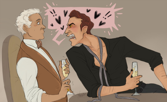
Yelling at you (affectionate) (with champagne 🥂)
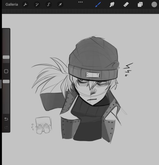
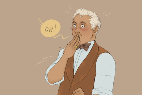
#while Aziraphale is looking (respectfully) at Crowley exposed chest 👀👀👀#crowley#good omens#aziraphale#ineffable husbands#aziracrow#go#good omens 2#quella camicia è troppo slacciata e troppo vicina a me ...cit aziraphale mentre suda#good omens art
3K notes
·
View notes
Text
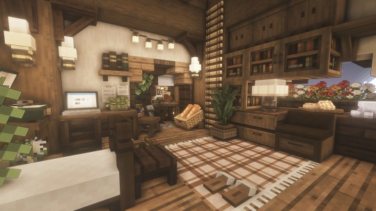
i put the cottage in cottage cheese
#it took me like 15 minutes to come up with that#minecraft#modded minecraft#minecraft mods#mods#mizunos cit#ghoulcraft#minecraft aesthetic#minecraft screenshots#minecraft cottagecore#minecraft cit#cit packs#mizuno 16 craft#mc
465 notes
·
View notes
Text

Jergal's champion meets an old friend.
(Khael stresses out A Lot about the life expectancy difference between him and Astarion, to the point when he gets older than the age when Astarion was born again, he seeks out a familiar face (god) and demands his boon for having done his bidding, even if unknowingly. He brings 200 gold coins, the price for a single soul )his own) and demands immortality. Lichdom doesn't sound too bad.)
#bg3#baldur's gate 3#bg3 shadowheart#bg3 spoilers#khael tav#disegna e bevi#otp: warding bond#(implied) (it's always implied)#(arch)lich khael is dearest to me#INVEST IN LICHDOM IMMEDIALTELY (cit)
341 notes
·
View notes
Text


Avere gli occhi lucidi. Vedere tutto sfocato. E nonostante questo voler andare sempre avanti. Forse è tutto qui il segreto.
91 notes
·
View notes
Text
Crisp those Lines!
Or: a small collection of suggestions for a crispy, neat lineart.
SO MANY OF YOU ASKED FOR THIS (it feels absurd to say, yes), so here you go.
A premise: there's no right or wrong way of inking, and some of the following tips entirely depend on the type of inking I do. Which is neat and clean, with no blacks, and moreover: digitally. More under the cut because it's gonna be long and full of explanatory pictures. Here's an example:
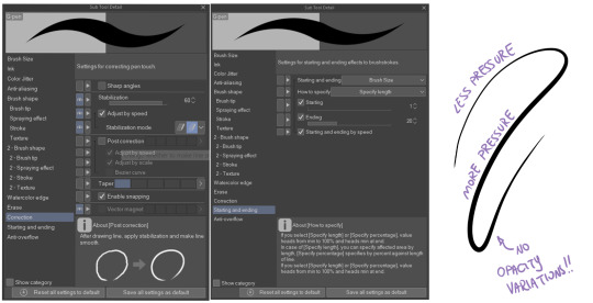
SOFTWARES AND BRUSHES:
Let's address the elephant in the room: Photoshop SUCKS for inking and linework. The stabilisation of the brush there is SHIT. Good for colouring and painting and doing photobashing, but for Lineart you want it to be precise. Do yourself a favour and don't use Photoshop.
I generally use Clip Studio Paint, but i have to say that the best program for it that I've tried keeps being Paint Tool SAI 2. It has few functions, it's true, and I use CSP because it has more instruments. But if you don't want to pay much, SAI is incredible as for brush rendition and stabilisation.
As for the brush: you don't need a fancy brush, anything in your software will go. What I use and what works best tho must have:
Tapered start and end.
High stabilisation (I go from 60 upward, lower it down for trees and grass or anything more natural that needs to be less neat and flowy)
Low tapering.
It must be set so that pressure controls only the dimension. The more you push on your pen, the bigger the line gets. No colour or opaciy variation!
On Clip Studio Paint, I use the G-Pen in the program. It's good as it is, but I think I did some variations as per here:
FILE DIMENSIONS:Better work larger and then resize down. Sizing files up digitally is possible, but it leads to unfocused images.
I generally work on files at 600dpi (300 is fine too, but don't go any lower. Particularly if that's something you want to print later on, any printing wants a minimum of 300dpi). in roughly an A3 format (bigger dimension is 43cm). Most pictures I upload here are 6000x5000 pixel.
A bigger file will give you more possibilities with brush sizes, and it'll be easier. Remember: digitally, sizing down is ok, sizing up is not something you should do.
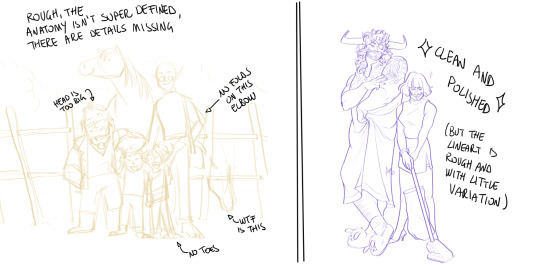
SKETCH:
This is the suggestion I should follow but never do.
Having a clean, polished sketch simplifies your life A LOT. This is because if you don't have to worry about drawing details and fixing the anatomy of your drawing during the lineart, and doing it so GOOD because it's the lineart... You'll go that much slower and your life will be more complicated (it's not impossible, my sketches usually are very rough. I am ok with it, the most I do drawing wise is during the lineart... But I'm lazy, don't do like me. A good sketch will help you out.)
Compare the two sketches below:
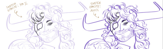
Another note about your sketch layer: you know those memes that complains that the sketch looks good but when you hide it the lineart is shitty? That's easily solvable.
When you're inking, lower the opacity of the sketch layer down, A LOT. I generally go for a 30 or 40% opacity (depending on the colour of the sketch. the yellow sketch will go around 40% because it's less visible, the purple one lower).
When you're inking, you MUST see clearly the lineart you're doing. If the sketch isn't contrasting enough, you won't see clearly what you're doing... It's like trying to sketch with a dim light, not seeing the paper clearly. See the difference:
BEFORE YOU START:
You probably have read it everywhere, but it bears repeating: warm up your hand.
You're using muscles and for more than five minutes. The warmer they are, the firmer your hand is, the easier it gets controlling your lines. It also prevents you from damaging your wrist. Stretching is also great, and grippers are nice to have. Keep your hand fit!
As for warming up: I usually do some calligraphy exercises, practicing on flowy cursives. You want to practice varying the pressure of your lines in a single trait, hence why calligraphy is good. But generally, what you can do is...

PRESSURE VARIATION AND LONG LINES:
So. My main tip and trick is to vary the pressure of your lines. In the same line, and between different details. This will help making the lineart more dynamic and interesting.
A note: this works for semi-realistic styles. If your goal is obtaining a Cartoon Network style: they have generally little to no variation and it works. My suggestion would be to study the kind of style and effect you want to obtain, different styles will work best with different linearts. If you're aiming at hyperrealistic painting, there's no point in spending time over a lineart, for example, I inked the same lineart, but with a brush that doesn't vary it's dimensions with pressure, and not changing the dimension of the brush.
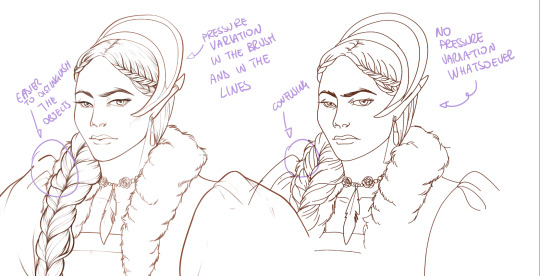
What makes my linearts look "flowy" and "neat" is the fact that I tend to draw less lines and longer, and pay attention when I stop, to start the line where I end it. This will give the impression of one continuous, single line, and make everything more fluid. See above in the french hood: on the right, I left the line rough on purpose, you can see where I stopped and started again. On the left, where I took care of it, you can't.
Generally speaking:
Thick, dark lines communicate that the object is close to the viewer (always keep the viewer in mind!) or in shadow. Lines should be thicker on the outside of your objects, to separate two planes, and in stuff closer to you.
Thin lines are delicate, they should be used in the background, for small details (see the hair, the lips, the small wrinkles around her eyes.)
As for line continuity: in both cases, the line of her face is one single line I drew. This can be obtained with a smooth result, particularly in curved lines, by getting the brush stabilisation on higher settings (80-100): sacrifice speed for accuracy.
MORE IS MORE, WHEN IT COMES TO LEVELS:
Particularly when there are two objects intersecating, or more characters interacting… Instead of inking all on the same level, I always do one level for each object, trace the WHOLE line as if there was nothing above, and then erase where it's not shown. This is a little thing, but pays off. Always in the drawing of above, the feather and the hem of the bodice were on separate layers, and then I erased the bodice under the feather. Take advantage of being inking digitally and not traditionally!

For many characters, here's an example of a vignette of a comic page before cleaning it up and erasing. Every single character and the weapons are on separate layers

For this it's very useful knowing your recurring mistakes. For example, I tend to draw heads bigger than they should. I know I do, so generally I keep the head on its own level, and the body on another, so it's easier to modify and size down just the head without getting crazy selecting only the lines you want with the lazo.
Again, you're inking digitally. It's not easier than traditionally necessarily, take full advantage of your instrument!
OTHER TIPS AND TRICKS:
High brush stabilisation sacrifices speed for accuracy. The line will lag a little from your cursor. Get used to watching the cursor and not the line, and trust that the line will follow.
GO SLOW.
Rotate and flip the canvas. Don't ask me why, but tracing long lines towards me is always easier than not the other way around.
Use the Free Transform, Warp, Distort etc etc and the Liquify to your heart's content if you notice the lineart has something wrong. The only cheating in art is using fucking AI generators (and AI pictures are not art, sorry not sorry)
References are your friends. Study how an artist you like does the lineart. Try and imitate them, and if you can and need to post them: tag them! (don't trace and sell it as your own)
Experiment with brushes, find one that you like for the effect you'd love. You do you, there's no right or wrong way of inking.
Remember to breathe when you trace those lines! (and to drink and do pauses and stretch, you don't want a tendonitis!)
Have fun. Lineart is not evil, lineart is your friend!
I hope this essay is exhaustive enough. I'm tagging ALL THE PEOPLE that requested it (and giving each of you a muffin).
@ndostairlyrium @narina-gnagno @salsedine @whimsyswastry @layalu @n7viper
If you have any questions, don't hesitate in asking!
#tutorials#lineart#inking#digital inking#digital art#tips and tricks#petrel explains#COME LO FECI (cit)#listen if we're mutuals and we chat... ask me to share my screen I don't mind the company when I work if it's not something I can't show#or if it's not too late at night for me#also I unironically like how Alyra inked without variation looks even angrier and more judgemental than normal LOL#also some spoilers for The Last Bacchae if you follow that#“Marmotta” means “Groundhog” in italian#art ref
126 notes
·
View notes
Text
e sono fermamente convinta di non meritarmelo, ma probabilmente, è quello che mi serve...e un giorno capirò a cosa.
z.
#frammentidicuore#ci credo#frasi#frasi di vita#riflessioni#frasi profonde#parole#amore#pensieri#vita#cit#non me lo merito#cattiveria#dolore#ferite#rabbia#frasi tumblr#frasi belle#frasi tristi#tristezza#citazioni#aforismi#cambiamento
26 notes
·
View notes
Text
Played trough 4/10 of P3 Reload
#end me#like just kill me please#my favorite characters are makoto and shinjiro#cit#fuck me ig#shinjiro aragaki#p3 shinjiro#persona 3#p3 reload#fellas is it gay to “fall asleep” in your frenemy arms#at least im safe now cause makoto is a protagonist
42 notes
·
View notes
Text
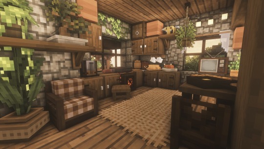
Gray Scale Gradient Cottage


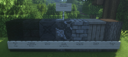
fun fact: I rebuilt this house 5 times because I didn't like the look and landed on "bastardized tudor" vibes
#I love & hate glazed terracotta#this gradient took me forever to figure out#mineblr#minecraft#minecraft mizunos#mizunos 16 craft#mizunos cit#minecraft builds#aesthetic minecraft#minecraft cit#minecraft bsl#bsl shaders#minecraft aesthetic#mc shaders#minecraft build#minecraft texture packs#minecraft 1.19
1K notes
·
View notes
Text
Touching...

26 notes
·
View notes
Text
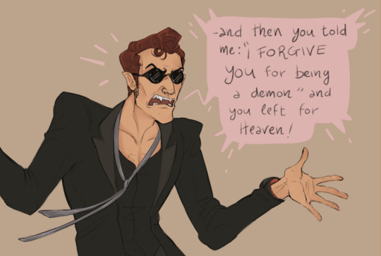

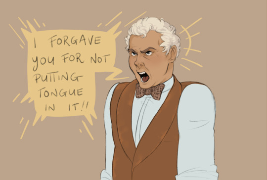

Steps required for a Proper Courtship (min. 6000 years) ; a guide by A.Z. Fell:
☑ A Cotillion Ball (already organized)
☐ Secret and passionate kissing in an orangerie (alt- a bookshop)
#good omens comic#Their rituals are so intricate#good omens#crowley#aziraphale#ineffable husbands#aziracrow#The actual I forgive you scene hurts too much let's just pretend that this is what he meant and call it a day ahah#6000 anni per un semplice bacio a stampo??!?!??! cit. Aziraphale “you go too fast for me Crowely”#(rinomato per voler tutta la porchetta dopo il primo assaggio)
992 notes
·
View notes
Text
I kinda love how Higuchi was so clearly written to be a hate sink for the audience but also a foil to show them how smart Light is by comparison, which results in him inadvertently (?) coming off as so cringefail that I ultimately can’t bring himself to hate him
#his swagless looks and cringe fail personality have captivated me (cit.)#on to my nth reread of the yotsuba arc#death note#kyosuke higuchi
106 notes
·
View notes
Text
WIP Wednesday
Tagged by @shivunin, thank you so much hun! <3
It's gonna be particularly unrelated to last week, but well.

1, 2. My nice brain was convinced that Artfight was in June and I couldn't come prepared. I signed in and IT'S IN JULY. So I'm getting ready some character sheets for the girls, starting with Lady Warden Commander whose complexion totally, definitely didn't become greyer and sicker for the Blight. No, it was drinking from the filthiest chalice in Thedas, it was disgusting, *she* cleans the cup between each Joining she's not a barbarian. Also clothes: I'm starting to headcanon that the embroideries were done by Merrill and making myself cry.
3. I realized I have few examples to show for my contribution in this raffle for Palestine, so... I'm doing one right now. Which is also Aisling's last piece of character design, I did something else for her but I think I'll just show you the finished things in some days.
4. ���✨🦄 It's pride month. 🌈✨🦄
Tagging! @salsedinepicta @ndostairlyrium @melisusthewee @dungeons-and-dragon-age @dreadfutures
@inquisimer @pinayelf @whimsyswastry @theluckywizard @pyritefes2
and YOU who are reading!
#wip wednesday#dragon age#warden mahariel#dao#alyra mahariel#greypetrel#whale au#“No I'll do a bried body ref and for the clothes it's a moodboard” cit me a clown#I'm keeping it to four#if/when I'll do more please come and throw stale eggs at me
29 notes
·
View notes
Text
Bisogna normalizzare i sabato sera a casa.
46 notes
·
View notes
Text
apologies for the extremely crass post i'm about to make but it's absolutely wild to me how the gomens fandom treats genitals and gay sex like even disregarding the weird ass "making an effort" thing, the fact that "one of them has a dick and the other has a pussy coz it makes sex easier/more convenient/whatever" is a take i see relatively often is ? fucking insane ?? like even just beyond the obvious extremely strange anti-sodomy homophobia of literally saying piv sex is better than anal sex it's like. do people just assume gay men have anal sex coz they wanna have piv sex but lack the hole for it so they have to make do ??????? like you guys realise gay men have anal sex coz they like being fucked in the ass right? you guys are aware of this right
#LIKE IT'S SO CRAZY ????? SORRY ??????????? LIKE HUH? WHAT♥#it's soooo . bonkers how homophobic this fandom is like ohhhhhhmy god#like mf. maybe examine why you think one thing's superior to the other😭😭😭 bruh#it's a thing i see in all fandoms but it's specifically weird in this one coz they make it Even Weirder#but in general when fandoms write/talk abt trans men and it's alwaayyyssssss p1v w them bottoming#like . i honestly don't even really have an argument like this feels so obvious idek what the hell to SAY#IT'S SO WEIRD. WHY DO YOU HATE GAY MEN SO MUCH...#good omens#gomens#ask to tag idk what to tag this i hate being expl cit or crass but this drives me crazy 😭
38 notes
·
View notes
Text
Blue Ombre Mushroom House


I think this looked better in my head but oh well, hope you like it ;u;
#minecraft#mineblr#minecraft mizunos#mizunos 16 craft#mizunos cit#aesthetic minecraft#minecraft aesthetic#ghoulcraft#hananacraft#minecraft builds#minecraft cit#you ever combine two ideas bc you're impatient?#yeah me neither
962 notes
·
View notes
Last Seen Blogs

vpadovani
I Love Dolomites
wabooe
hell is hot, don't be a thot

kizzy2loren
Kizzy Loren Burton-Flint
byler-com
obsessing over stupid stuff
