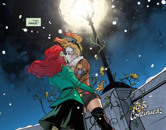
#clean version and typography
Photo
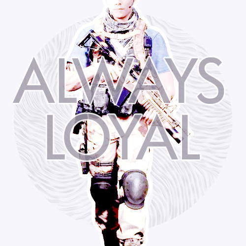
#jason kolchek#house of ashes#my edits#I spent a stupid amount of time on this#and I cant tell anymore if it looks good or not#Im just waffling#it looks wonky?#maybe?#clean version and typography#it's 500x500#and I think tumblr is mucking with it.#omg im tired#and sorry if it looks bad
23 notes
·
View notes
Text
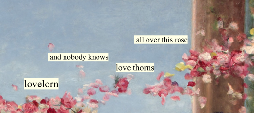
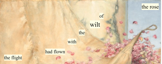
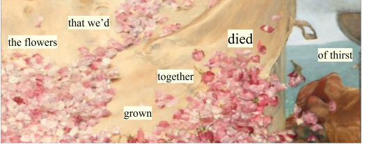
slut! // is it over now? // clean
#my edit#taylor swift#1989#1989 taylor's version#1989 tv#is it over now?#original painter: Sir Lawrence Alma-Tadema#clean#haylor#tswiftlyrics#lyric edit#taylor swift lyrics#tswiftedit#harry styles#typography#lyric parallels#taylor swift lyric parallels#1989 lyric parallels#The Roses of Heliogabalus#1888 - oil on canvas. — Sir Lawrence Alma-Tadema#Sir Lawrence Alma-Tadema#lawrence alma-tadema#art#paintings#sir lawrence alma-tadema#art details#classical art#oil painting#classic art#oil on canvas
613 notes
·
View notes
Text

#taylor swift#my edit#tsedit#tswiftedit#lyrics#typography#tseditors#1989#taylorswiftedit#taylors version#clean
398 notes
·
View notes
Photo
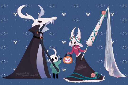

THE KNIGHT AND HORNET: THE HOLLOWEEN 2023 ILLUSTRATION
DO NOT REPOST / EDIT / TRACE / MONETIZE MY ART FROM OTHER SITES.
Art prompt version can be shared without credit only. Please link the artwork from the artist’s post for standalone illustration.
Author’s comment:
Hello! This is my illustration & typography work by @windowshark; for Hollow Knight’s Discord event for artists, HOLLOWEEN 2023 ART PROMPT. What is that? It’s an October daily art prompts based on Hollow Knight’s theme!
While it can be overwhelming to finish it at once in everyday work, doing it for one or few prompts you like is good enough! It can be anything with styles such as sketches, different mediums, and cleaning-up! I’m looking forward to see everyone’s amazing submissions for this year. Good luck and have fun!
Here’s the illustration depicted as The Knight’s wearing the miniature horned skull, sticking the staff with long coat to disguise as a ghostly visitor! Hornet is dressed as a scarlet phantom wedding gown, flower crown with roses and thorns and tulle needle! They came here to greet for trick or treat! Happy HOLLOWEEN EVERYBODY!!
Author’s note:
Do not start a roleplay/venting/fanfiction using replying / reblogging / DMs with my artworks.
Do not tag and marked as a kin/me/morally questionable content etc.
DO NOT claim my artworks belong to you, and removing / cropping my watermarks away.
Please DM me for inquiries such as commissioned work or reporting my artwork has been reposted or edited.
#missmapleart#msm2023#my art#myart#MSM-ARTPORTFOLIO#ART-PORTFOLIO#digital art#digital drawing#artist on tumblr#artists on tumblr#fanart#fan art#fanartwork#fan artwork#hollow knight#hollow knight silksong#silksong#hornet#the knight#team cherry
72 notes
·
View notes
Text
Not to go on about this again but like it does get a little frustrating sometimes when people incorrectly announce that something is 100% canon for real in the comics based solely on like a single panel they saw someone else post online, it’s mostly harmless because, yeah, they’re fictional comic books but yall should know by now people can make jpegs do anything they want so next time you see a panel with someone insisting that its contents are 100% canon for real:
Have you read the comic the panel came from? The panel could be taken out of context and have an entirely different meaning within the story itself or it could actually say something completely different all together
Did the OP provide a comic name and issue number? If OP doesn’t provide an issue number that’s a major sign that the panel could be edited, especially if the character is saying something particularly outlandish
Speaking of outlandish: is the text in the panel a reference to another piece of media or do you think it might be a reference to another piece of media? This could be a sign it’s taken from an incorrect quotes account and not an actual comic
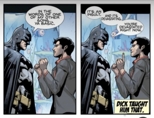
Does the text look weird? Is the text different sizes/fonts or weirdly spaced in the bubble? This one might be hard to notice if you’re not into graphic design or typography so no judgement if you don’t but things like letter/word spacing, text size, font, bubble shape, etc is something that’s taken very seriously, bubbles need to be easy to read, pleasing to the eye, and take up as little space as possible, that’s why lettering is a whole separate job in the comic book industry. For example, in these panels “sons…” would not be left on it’s own in one line, “ya basic” would be given more impact, and all the text in the bubbles on the second panel are way too squished together (notice how the words are basically touching the outside of the bubble and how “devastating” is squished and small)
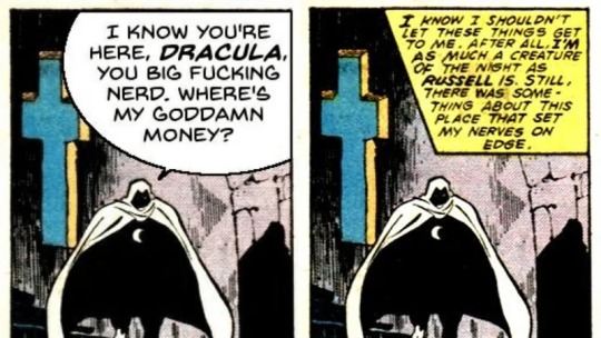
Similarly, is the text a higher quality than the rest of the image? In the infamous “I know you’re here Dracula, where’s my goddamn money?” Moon Knight image that a lot of people thought was real, for example, there’s a certain graininess to the image that doesn’t extend to the text bubble, which is notably clean-looking, in higher quality versions of the image you can even see the pixels of the text bubble that was slapped over the original text (which shouldn’t be possible considering the comic came out in the 80’s)
Did you look at OP’s page? Are they a fanartist? Some extremely talented fanartists dedicate a lot of time and effort to mimicking the comic book style, and they can be really good at it, though unfortunately these fanartists’ work are often reposted without credit which can lead others to believe they’re canon when they’re not, in this case remember: 1. look for an issue number, 2. reverse image search to see if you can find where the panel came from, and 3. keep in mind…
An A-list superhero being canonized as queer is a huge fucking deal, like mainstream news big deal, if an A-list character was confirmed as queer it would be absolutely goddamn everywhere, from IGN and comic book YouTubers to fucking Joe Rogan and late night talk shows, you wouldn’t be able to hear the end of it, so if you think “hey, shouldn’t this be a bigger deal?” stop and investigate further
And finally, the most annoying question: are you sure this is the right version of the character? Comics are filled with alternate timelines, parallel universes, clones, shapeshifters, and so on, are you absolutely positive that the panel you’ve found is the classic character from the main timeline? For example, people frequently used to use Harley and Ivy’s kiss in Bombshells as proof that their relationship was canon in the main DC timeline (it wasn’t, but it is now!), and people still use Logan and Hercules’s relationship in X-Treme X-Men #10 as proof that Wolverine is bisexual in the main 616 universe, which he is not, though it is kind of implied sometimes
I know a major part of this is me being an annoying, nit-picking comic book elitist and, yes, this is all mostly harmless BUT I also think this could be a really great way to exercise your media literacy skills as well as a good, harmless lesson in not taking everything you see online at face value and, hey, it might even get you to read some really great comic books in the process!
Improve your media literacy and critical thinking skills one edited comic book panel at a time! K thx, love you, bye!

#my post#marvel#mcu#dc#media literacy#long post#do I tag the main offenders of this I don’t wanna make people angry at me
8 notes
·
View notes
Text
7+ Best Art Portfolio Website WordPress Premium Theme

Art Portfolio Website WordPress Premium Theme
Creating an art portfolio website is essential for artists, designers, and creatives to showcase their work and attract potential clients. Let’s explore some of the best WordPress premium themes specifically designed for art portfolio websites:
1. Dabble – Creative Agency & Portfolio WordPress Theme:

A sophisticated and stylish theme with multiple menu layouts, sliders, and preset blog post styles.
Features a portfolio system using a custom post type, allowing you to display your projects effectively.
Available in both free and premium versions, with advanced controls in the premium version.
2. Rubrash – Personal Portfolio WordPress Theme:
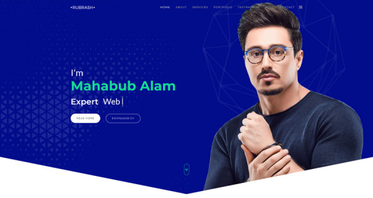
Known for its rock-solid coding and fantastic support.
Offers full-width portfolio layouts, including checkerboard style and carousel options.
Utilize the drag-and-drop Elementor Builder to create stunning pages for each portfolio entry.
3. Swipy – Creative Agency WordPress Theme:
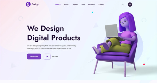
A flexible and feature-rich theme powered by the Elementor page builder plugin.
Suitable for various types of websites, including art portfolio website.
Explore its extensive library of over 300 templates for startups, freelancers, and personal sites.
4. Kulluu – Creative Agency WordPress Theme:
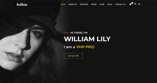
A minimalist freelancer and agency portfolio theme.
Ideal for showcasing your work with a clean and modern design.
5. Bionic- Personal Portfolio WordPress Theme:

Another portfolio WordPress theme that emphasizes simplicity.
Perfect for artists, photographers, and creative professionals.
6. Cretic – Creative Agency WordPress Theme:

A multi-concept artist and creative agency theme.
Offers versatility and a variety of options for different types of art portfolio website.
7. Mifo – Creative Minimal Portfolio WordPress Theme:
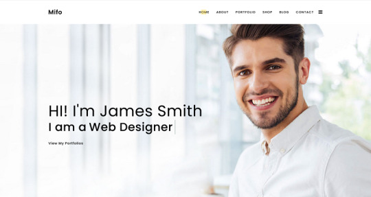
A clean and minimal multipurpose theme suitable for art portfolio website.
Focuses on elegant design and typography.
Remember to choose a theme that aligns with your artistic style, provides an excellent user experience, and effectively showcases your work. Happy creating! 🎨🖌️
For more options, you can explore other themes from ThemeForest. Each of these themes has unique features and customization options to suit your specific needs.
#premium wordpress themes#premium wordpress theme#app landing wordpress theme#wordpress premium themes#education wordpress theme#education & online course wordpress theme#paid wordpress themes#consulting business wordpress theme#online learning wordpress theme#wordpress plugins#art portfolio website#Art Portfolio Website WordPress Premium Theme#Creating an art portfolio website is essential for artists#designers#1. Dabble – Creative Agency & Portfolio WordPress Theme:#A sophisticated and stylish theme with multiple menu layouts#sliders#and preset blog post styles.#Features a portfolio system using a custom post type#allowing you to display your projects effectively.#Available in both free and premium versions#with advanced controls in the premium version.#2. Rubrash – Personal Portfolio WordPress Theme:#rubash#Known for its rock-solid coding and fantastic support.#Offers full-width portfolio layouts#including checkerboard style and carousel options.#Utilize the drag-and-drop Elementor Builder to create stunning pages for each portfolio entry.#3. Swipy – Creative Agency WordPress Theme:#swipy
4 notes
·
View notes
Text
Design a professional brochure for my business
"The Power of Print: Using Brochures to Boost Your Business"
Crafting a professional brochure is an essential aspect of attracting potential customers and establishing a robust brand image for your enterprise. In the first instance, discern your target audience and customize the design and content to their specific needs and preferences.
Strive for a clean, uncluttered layout that is consistent with your brand identity, employing high-quality graphics and images. Limit your use of fonts and ensure that the text is both legible and impactful, conveying your message with precision. Implement a compelling call to action to motivate your readers to take the desired course of action.
Finally, meticulously scrutinize the content and seek other opinions before printing the final version. By adhering to these guidelines, you can create a professional brochure that effectively showcases your business.
"Designing a Professional Brochures"
Creating professional brochures is a fundamental aspect of any business endeavoring to make a significant impression on potential customers.
A skillfully crafted brochure can effectively articulate a company's brand message while showcasing its products and services in a visually stimulating and informative manner. In the process of designing a brochure, it is imperative to be mindful of the target audience and personalize the content and design to their specific needs and inclinations.
The integration of high-quality images, typography, and color schemes can significantly augment the overall aesthetic appeal of the brochure, rendering it visually captivating. Furthermore, ensuring that the brochure is user-friendly and easy to comprehend can contribute to its efficacy in effectively conveying the desired message. Overall, a professionally designed brochure can establish a business's credibility and attract new customers, substantiating the significance of investing in a well-crafted brochure.
"What are the three different types of brochures?"
Brochures are an indispensable promotional tool that businesses can utilize to market their products or services. They come in three primary categories, namely informational, promotional, and product-specific.
Informational brochures are a great way for companies to provide a comprehensive overview of their history, mission, and values. Promotional brochures are tailored to market a specific product or service, highlighting its benefits and features to entice potential customers.
Product-specific brochures are designed to provide in-depth information on a particular product, including its features, specifications, and pricing. Depending on the target audience and marketing goals, companies can choose to use any or all of these brochure types to effectively communicate their message and generate new leads.
Our team of experts will work with you to create a business presentation that best represents your company and brand.
Get ahead of the competition and make a powerful statement with these sleek, professional consulting slides. Perfect for making presentations to prospective clients!
For more information on the topic, please visit - https://visualsculptors.com/project/business-and-consulting-presentation/
2 notes
·
View notes
Text
Hot Off the Press: New WordPress.com Themes for September 2024
Hot Off the Press: New WordPress.com Themes for September 2024
The WordPress.com team is always working on new design ideas to bring your website to life. Check out the latest themes in our library, including great options for brats, foodies, and beauty bloggers. Take a look below.
All WordPress.com Themes
Partygurl
Tap into your brat summer vibes all year round with our brand new Partygurl theme. Inspired by the now-iconic bright green and simple typography from Charli XCX’s Brat album, this styling will immediately identify you as someone who’s done with the “clean and polished” aesthetic of sameness that you see across the web.
Click here to view a demo of this theme.
RecipeBook
RecipeBook is a warm, vibrant theme made for foodie content creators who want their recipes to shine. Inspired by the charm of old-school cookbooks, RecipeBook pairs eye-catching colors with bold typography. The homepage invites discovery with a handy category list and flexible Query Loop block, making it easy to showcase your culinary creations. Whether you’re sharing recipes or creating food collections, RecipeBook offers a playful yet functional design to help you dish out your passion for cooking.
Click here to view a demo of this theme.
Goodskin
Goodskin is a great theme for beauty bloggers and skincare enthusiasts. With its light, calming aesthetic and clean layout, Goodskin provides an elegant space for sharing your routines, product reviews, and more. The theme includes thoughtful features like a sidebar for easy navigation and a product rating pattern to highlight your favorite finds. Available in three soothing color variations—Jojoba, Blush, and Eyeshadow—Goodskin offers a serene, sophisticated platform that allows your content to glow.
Click here to view a demo of this theme.
Luxus
Luxus is the perfect look for beauty salons wanting to make a sleek, no-fuss impression. Designed with simplicity in mind, Luxus gives the essentials—services, location, hours, and contact information—right away on the homepage, making it easy for clients to find what they need.
Optimized for mobile right out of the box with a clean, single-column layout, Luxus offers a seamless experience for your busy, on-the-go clientele. With the luxurious Ojuju font for headings and the classic Hanken Grotesk for body text, this theme exudes elegance while keeping the focus on what matters most.
Click here to view a demo of this theme.
To install any of the above themes, click the name of the theme you like, which brings you right to the installation page. Then click the “Activate this design” button. You can also click “Open live demo,” which brings up a clickable, scrollable version of the theme for you to preview.
Premium themes are available to use at no extra charge for customers on the Personal plan or above. Partner themes are third-party products that can be purchased for $99/year each on the Business plan and above.
You can explore all of our themes by navigating to the “Themes” page, which is found under “Appearance” in the left-side menu of your WordPress.com dashboard. Or you can click below:
All WordPress.com Themes
Tags and categories: Themes, WordPress, wordpress-com
via WordPress https://ift.tt/aNdh9G5
September 24, 2024 at 11:54AM
0 notes
Text
Web Design Istanbul: Creating a Digital Presence in Turkey’s Largest City
Web design Istanbul has become an essential tool for businesses wanting to stand out in Turkey's bustling economic and cultural hub. In a city with over 15 million people, the competition is fierce, and having a professional, well-designed website can be the difference between success and stagnation. Whether you're a startup, a local business, or a large enterprise, your website is often the first impression you make on potential clients. In this article, we’ll explore the importance of web design in Istanbul, what makes it unique, and how to create a site that truly stands out in this vibrant market.
Why Web Design Matters for Businesses in Istanbul
The Digital Shift
As Istanbul rapidly embraces digital transformation, more businesses are moving online. A well-designed website acts as your business's digital storefront and is crucial for attracting both local and international customers. Web design Istanbul is about more than just aesthetics—it’s about creating a seamless user experience that reflects your brand and appeals to your target audience.
First Impressions Are Key
Your website is often the first point of contact between your business and potential customers. In a city like Istanbul, where competition is high, a poorly designed website can drive customers away, while a visually appealing and functional site can help retain visitors and convert them into loyal clients.
Key Elements of Successful Web Design Istanbul
Mobile Responsiveness
With the high usage of smartphones in Istanbul, it’s essential to have a website that is mobile-friendly. A responsive design ensures that your website looks and performs well on all devices, from desktops to mobile phones. This improves user experience and keeps visitors engaged, regardless of the device they are using.
Local SEO Optimization
To reach your local audience effectively, your website needs to be optimized for search engines. Using local keywords like "web design Istanbul," integrating geo-targeted content, and making use of Google My Business can help your website rank higher in search results. This makes it easier for people in Istanbul to find your business online.
User Experience (UX) and User Interface (UI)
UX and UI are critical components of a successful website. In Istanbul’s competitive market, your site needs to offer more than just a good design—it must be easy to navigate, intuitive, and responsive. A well-structured UX keeps users engaged, while a visually pleasing UI makes the experience enjoyable.
Web Design Trends in Istanbul
Minimalist and Clean Designs
Many businesses in Istanbul are opting for minimalist web designs. These websites focus on clear, simple layouts with lots of white space, making it easier for users to focus on the content. Clean designs also load faster, which is crucial for user retention and SEO.
Bold Typography and Visual Storytelling
Using bold fonts and visually engaging elements like images or videos is a growing trend in Istanbul’s web design scene. Businesses are shifting towards storytelling through design, using striking visuals to convey their brand message and attract attention.
Dark Mode Options
Dark mode has become increasingly popular in web design worldwide, and Istanbul is no exception. Offering a dark mode version of your site can enhance user experience, especially for those who prefer lower brightness levels or are using their devices in dimly lit environments.
Local Culture and Web Design Istanbul
Incorporating Local Design Elements
Istanbul’s rich cultural heritage can be a significant asset when designing your website. Incorporating elements of the city’s architecture, colors, and history into your web design can create a sense of familiarity and connection with your local audience. Businesses that successfully blend modern design with cultural relevance can build stronger relationships with their customers.
Multilingual Options
Istanbul is a cosmopolitan city with a diverse population and a growing number of international visitors. Offering multilingual options on your website, such as Turkish, English, and Arabic, can expand your reach and make your site more accessible to a broader audience.
Hiring a Web Design Istanbul Agency
Why Choose a Local Agency?
Working with a local web design agency in Istanbul ensures that your website is designed with the city’s unique market in mind. A local agency understands the preferences, culture, and expectations of Istanbul’s audience and can tailor your site to meet those needs effectively.
What to Look For in a Web Design Agency
When selecting a web design agency in Istanbul, it's essential to consider their portfolio, industry experience, and client reviews. A reputable agency will have a diverse portfolio showcasing their ability to create professional, high-performing websites for businesses like yours.
DIY Web Design vs. Hiring a Professional
DIY Web Design: Pros and Cons
Many business owners may be tempted to design their own websites using platforms like WordPress or Wix. While these platforms offer easy-to-use tools, they may not provide the level of customization and SEO optimization needed to stand out in Istanbul's competitive market. DIY web design can also be time-consuming and may result in a less professional final product.
Benefits of Hiring a Professional
Hiring a professional web designer in Istanbul ensures that your website is customized, optimized for SEO, and built to the highest standards. A professional designer will handle all the technical aspects, including coding, speed optimization, and mobile responsiveness, allowing you to focus on running your business.
Conclusion
Web design Istanbul is a critical element in building a successful online presence in Turkey’s largest city. Whether you’re a local business or aiming to attract international clients, having a professionally designed website can significantly boost your credibility and help you stand out in a crowded market. By focusing on mobile responsiveness, SEO optimization, and user experience, and incorporating local culture into your design, you can create a website that not only looks great but also drives results.
FAQs
How much does web design cost in Istanbul?
The cost of web design in Istanbul can vary widely depending on the complexity of the project. On average, a professionally designed website can cost between 5,000 and 30,000 TL.
How long does it take to design a website?
A typical web design project in Istanbul can take between 4 to 12 weeks, depending on the scope and requirements.
What is mobile responsiveness, and why is it important?
Mobile responsiveness ensures that your website looks and functions well on smartphones and tablets. It's essential in a city like Istanbul, where mobile usage is high.
Can I design my own website?
Yes, you can use DIY platforms like Wix or WordPress. However, for a more professional and customized site, it’s advisable to hire a professional web designer.
What are some current web design trends in Istanbul?
Minimalist design, bold typography, visual storytelling, and dark mode are some of the popular web design trends in Istanbul right now.
0 notes
Text
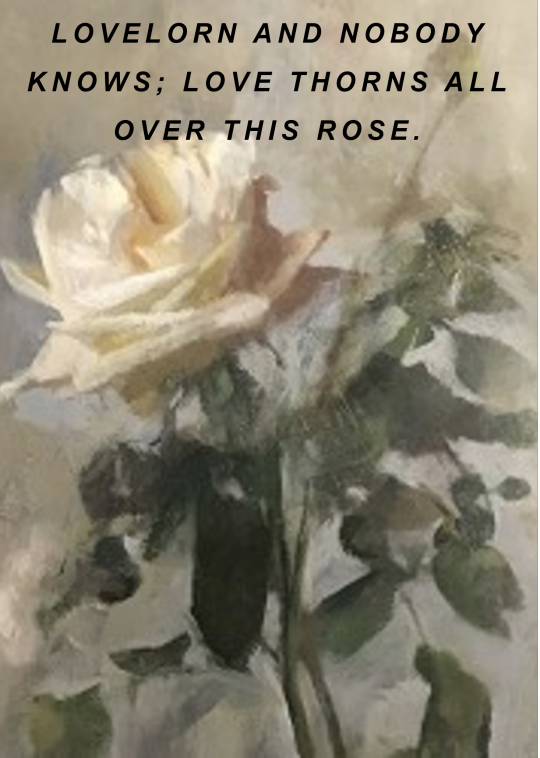

slut! // is it over now?
#im sorry i know i keep making variations of this parallel but i love it#my edit#taylor swift#1989#1989 taylor's version#1989 tv#is it over now?#clean#haylor#tswiftlyrics#lyric edit#taylor swift lyrics#tswiftedit#typography#lyric parallels#taylor swift lyric parallels#1989 lyric parallels#art#paintings#sir lawrence alma-tadema#art details#classical art#oil painting#classic art#oil on canvas
177 notes
·
View notes
Text
From Skeuomorphism to Flat Design: Tracing the Evolution of UI Aesthetics
The world of user interface (UI) design has undergone a dramatic transformation over the past few decades. From the early days of skeuomorphic design to the current trend of flat and minimalist interfaces, the evolution of UI aesthetics reflects not only technological advancements but also changing user expectations and design philosophies. In this blog post, we'll explore this fascinating journey, examining the key stages and factors that have shaped the UI landscape we see today.
The Era of Skeuomorphism
In the early days of graphical user interfaces, designers faced a significant challenge: how to make digital interfaces intuitive for users accustomed to physical, analog experiences. The solution they arrived at was skeuomorphism, a design approach that mimics real-world objects in digital interfaces.
Skeuomorphic design was characterized by:
Realistic textures and shadows
Detailed, 3D-like icons and buttons
Metaphors borrowed from physical objects (e.g., a trash can for deleted files)
Apple was a prominent advocate of skeuomorphic design, particularly under Steve Jobs' leadership. The original iPhone and early iOS versions featured interfaces that closely resembled their real-world counterparts. For example, the Notes app looked like a yellow legal pad, complete with lined paper and a leather-bound top.
The advantages of skeuomorphism were clear:
It provided familiar visual cues for users new to digital interfaces
It created a sense of depth and tangibility in the digital world
It often resulted in visually rich and detailed designs
However, as users became more accustomed to digital interfaces and mobile devices grew more prevalent, the limitations of skeuomorphism began to surface:
Skeuomorphic designs could be visually cluttered and distracting
They often consumed more system resources, affecting performance on less powerful devices
As screen sizes diversified, maintaining consistent skeuomorphic designs across devices became challenging
The Transition to Flat Design
Around 2010, a new design philosophy began to emerge: flat design. This approach stripped away the textures, shadows, and 3D effects of skeuomorphism in favor of simple, two-dimensional elements. Microsoft was an early adopter of this style with its Metro design language, later renamed to Microsoft Design Language.
Key characteristics of flat design include:
Minimalist, clean interfaces
Bright, bold colors
Simple icons and typography
Absence of drop shadows, gradients, and textures
The shift towards flat design was driven by several factors:
The proliferation of mobile devices with varying screen sizes
A growing user base familiar with digital interfaces, reducing the need for real-world metaphors
The desire for faster-loading, more efficient interfaces
A general trend towards minimalism in design across various fields
Apple, once the champion of skeuomorphism, made a dramatic shift with the introduction of iOS 7 in 2013. This update marked a decisive move towards flat design, shocking many users accustomed to the previous skeuomorphic style.
The benefits of flat design quickly became apparent:
Improved readability and clarity, especially on smaller screens
Faster load times and better performance
Easier scalability across different device sizes
A modern, clean aesthetic that many users found appealing
The Rise of Material Design
As flat design gained popularity, some designers and users began to criticize its sometimes stark and overly simplified nature. In response, Google introduced Material Design in 2014, which can be seen as a middle ground between skeuomorphism and pure flat design.
Material Design principles include:
The use of layers to create depth and hierarchy
Subtle shadows and lighting effects
Responsive animations and transitions
A consistent design system across platforms and devices
Material Design aimed to combine the best aspects of both skeuomorphic and flat design:
It maintained the simplicity and efficiency of flat design
It reintroduced some depth and tangibility reminiscent of skeuomorphism
It provided a comprehensive design language for creating cohesive experiences across different platforms and device types
The Current Landscape: Flat 2.0 and Beyond
Today's UI design landscape is diverse, with many designers adopting a style often referred to as "Flat 2.0" or "Semi-Flat." This approach builds upon the principles of flat design while incorporating subtle depths, shadows, and gradients to enhance usability and visual interest.
Key features of modern UI design include:
Minimalist layouts with ample white space
Bold typography and iconography
Subtle shadows and depth cues to improve hierarchy and interaction
Vibrant color palettes
Microinteractions and animations to enhance user engagement
The ongoing evolution of UI aesthetics is driven by several factors:
Advancements in display technology, allowing for more nuanced design elements
The rise of design systems that prioritize consistency and scalability
Increasing focus on accessibility and inclusive design
The influence of dark mode and other user-centric features
The Future of UI Aesthetics
As we look to the future, several trends are likely to shape the next evolution of UI aesthetics:
Neumorphism: A style that combines aspects of skeuomorphism and flat design, creating soft, extruded plastic-like interfaces.
Augmented Reality (AR) and Virtual Reality (VR): As these technologies become more prevalent, UI design will need to adapt to three-dimensional spaces and new interaction paradigms.
Voice and Gesture Interfaces: The growing importance of voice assistants and gesture controls may lead to more minimalist visual interfaces supplemented by other interaction methods.
Adaptive and Personalized Interfaces: AI-driven UIs that adapt to individual user preferences and behaviors may become more common.
Sustainability-Driven Design: With increasing awareness of digital carbon footprints, we may see a trend towards designs that prioritize energy efficiency and reduced data usage.
Conclusion:
The journey from skeuomorphism to flat design and beyond illustrates the dynamic nature of UI aesthetics. As technology evolves and user expectations change, design philosophies adapt to create more intuitive, efficient, and delightful user experiences. The future of UI design is likely to be as exciting and transformative as its past, continuing to shape how we interact with the digital world around us
The next big shift in UI aesthetics may be just around the corner, driven by advances in technology, changes in user behavior, or entirely new paradigms of human-computer interaction. Whatever form it takes, it will undoubtedly build upon the lessons learned from the great skeuomorphism-flat design debate, continuing the never-ending quest to create digital experiences that are both beautiful and effortlessly usable..
Devoq Design is a leading UI/UX design agency with a strong presence in both Mississippi and Missouri. As a premier UI/UX design agency in Mississippi, Devoq Design focuses on crafting visually stunning and user-friendly digital experiences that cater to the unique needs of local businesses. Similarly, as a top UI/UX design agency in Missouri, Devoq Design excels in delivering innovative design solutions that enhance user engagement and satisfaction. With a team of skilled designers, Devoq Design ensures that each project is customized to meet the specific requirements of their diverse clientele, driving growth and success in both states.
0 notes
Text
The Best Professional Letterhead: Key Elements for a Lasting Impression

Introduction
In the professional world, the letterhead serves as more than just a piece of stationery; it is a critical component of your company’s branding and identity. A well-designed professional letterhead not only communicates essential information but also reinforces your brand’s image and establishes credibility. Whether you’re sending out formal correspondence, invoices, or promotional materials, the letterhead plays a significant role in creating a lasting impression. In this comprehensive guide, we will explore the key elements of The best professional letterhead, focusing on design principles that ensure your letterhead stands out and reflects your business’s professionalism. At SparshMedia, we specialize in creating high-quality, customized letterheads that align with your brand’s identity. Let’s dive into the essential components that make up the best professional letterhead.
Logo Placement
1. Center vs. Corner: The placement of your logo can significantly impact the design of your letterhead. While the center placement can make your logo the focal point, a corner placement (typically the top left or right) often integrates well with traditional letterhead layouts. The choice depends on the desired emphasis and the overall design balance.
2. Alignment with Header/ Footer: Align your logo with the header or footer of the letterhead to create a unified and clean design. This alignment helps to maintain consistency and visual harmony throughout the document.
3. Margin Considerations: Ensure your logo is placed with appropriate margins from the edges of the letterhead. This prevents the logo from appearing cramped and allows it to breathe within the design. Adequate spacing around the logo enhances its visibility and impact.
4. Scalability: The logo should be designed to scale well in different sizes. Whether it’s used in a small digital format or a large print version, the logo should remain clear and recognizable. Avoid intricate details that may become blurry or unrecognizable when scaled down.
Typography
1. Font Hierarchy: Establish a clear hierarchy with different font sizes and styles. Use a larger, bold font for your company name or main headings, and a smaller, regular font for secondary details such as contact information. This hierarchy guides the reader’s eye and makes the information easy to digest.
2. Font Pairing: Choose font pairs that complement each other. Typically, a combination of a serif font (for a formal and traditional feel) and a sans-serif font (for a modern and clean look) works well. Ensure the fonts are not too similar to avoid a monotonous appearance.
3. Legibility and Readability: Prioritize legibility by selecting fonts that are easy to read at various sizes. For body text, use fonts that are simple and straightforward to ensure that all communication is clear.
4. Consistency: Maintain consistency in font usage throughout your letterhead. Stick to one or two fonts and use them consistently for similar types of information.
Color Scheme
1. Brand Colors: Integrate your brand’s primary colors into the letterhead design to ensure alignment with your overall branding strategy. Consistent use of brand colors reinforces brand identity and makes your letterhead instantly recognizable.
2. Accent Colors: Use accent colors to highlight important elements such as headings or contact information. These colors should complement the primary brand colors without overwhelming the design.
3. Color Psychology: Consider the psychological impact of colors. For instance, blue conveys trust and professionalism, while green symbolizes growth and harmony. Choose colors that align with the message and tone you wish to convey.
4. Printing Considerations: Be aware of how colors will appear when printed. Different paper types and printing processes can affect color accuracy. Request a proof from your printer to ensure colors match your expectations before finalizing your design.
Contact Information
1. Essential Details: Include all necessary contact details such as your company’s physical address, phone number, email address, and website URL. Ensure that this information is up-to-date and accurate.
2. Placement and Layout: Position contact information in a logical and accessible location, typically at the bottom of the letterhead. Ensure that it is easy to find and read, and avoid placing it too close to the edges or other elements.
3. Font Size and Style: Use a smaller font size for contact details compared to the main headings but ensure it remains legible. Avoid using overly stylized fonts for this information to maintain clarity.
4. Additional Information: If relevant, include additional details such as social media handles or office hours. Ensure that these additions do not clutter the design and that they are presented in a clear and organized manner.
White Space
1. Balanced Layout: White space, or negative space, is crucial for a balanced and visually appealing letterhead. It helps to separate different elements and create a clean, organized look. Avoid overcrowding your letterhead with too much text or graphics.
2. Focus Areas: Use white space strategically to draw attention to key elements such as the logo or main headings. Proper spacing around these elements helps to highlight their importance and improve the overall readability.
3. Margins and Padding: Ensure adequate margins around the edges of the letterhead and between different sections. This padding prevents the design from feeling cramped and enhances the overall aesthetic.
4. Visual Breathing Room: Allow for “breathing room” around text and graphics. This not only improves readability but also gives the design a more professional and polished appearance.
Design Trends for Professional Letterheads
1. Minimalist Design: Minimalism remains a strong trend in professional letterhead design. Focusing on simplicity, clean lines, and ample white space helps to create a sophisticated and modern look. A minimalist letterhead allows your key information and brand elements to stand out without unnecessary distractions.
2. Custom Typography: While traditional fonts are always reliable, custom typography can make your letterhead stand out. Tailoring fonts to match your brand’s unique voice and character adds a personalized touch that reinforces your brand identity.
3. Geometric Patterns: Subtle geometric patterns and shapes can add depth and interest to your letterhead design. These patterns can be used sparingly in the background or as part of the border to enhance the overall visual appeal without overwhelming the content.
4. Eco-Friendly Designs: With growing environmental awareness, many businesses are opting for eco-friendly letterhead designs. This includes using recycled paper, soy-based inks, and incorporating sustainability messages into the design. An eco-friendly letterhead reflects your commitment to corporate social responsibility.
Integration with Digital Media
1. Digital Consistency: Ensure that your letterhead design is consistent across both print and digital formats. The digital version of your letterhead should match the printed version in terms of design elements and brand colors to maintain a cohesive brand identity.
2. Interactive Elements: For digital letterheads, consider incorporating interactive elements like hyperlinks to your company’s website or social media profiles. This enhances functionality and allows recipients to easily connect with your business online.
3. Email Signatures: Integrate your letterhead design into your email signature for a seamless professional look. This consistency across all forms of communication helps reinforce your brand’s image and professionalism.
Design Considerations for Different Industries
1. Corporate Sector: For corporate environments, a classic and formal design with a focus on clean lines, professional fonts, and subdued colors works best.The best professional letterhead, allowing your key information and brand This approach emphasizes professionalism and reliability.
2. Creative Industries: Creative businesses, such as design agencies or marketing firms, can experiment with bold colors, unique fonts, and artistic elements. A more vibrant and innovative design can reflect the creativity and dynamism of your industry.
3. Legal and Financial Services: In sectors like legal and financial services, a conservative design with a focus on clarity and trustworthiness is crucial. Stick to traditional fonts, muted colors, and a structured layout to convey competence and stability.
4. Nonprofits: Nonprofit organizations can use their letterhead to highlight their mission and values. Incorporating elements that reflect the organization’s cause, such as relevant imagery or slogans, can strengthen the connection with supporters and stakeholders.
How to Avoid Common Mistakes
1. Overloading with Information: Avoid cluttering your letterhead with too much information. Focus on essential details such as your company name, logo, and contact information. An overloaded design can detract from the professionalism of the letterhead.
2. Poor Print Quality: Ensure that your letterhead is printed on high-quality paper with sharp, clear images. Poor print quality can make even the best design look unprofessional and diminish the impact of your communication.
3. Inconsistent Branding: Maintain consistency with your overall branding strategy. Using colors, fonts, and design elements that deviate from your other marketing materials can create confusion and weaken brand identity.
4. Ignoring Postal Requirements: When designing a letterhead, consider postal regulations to avoid issues with mailing. Ensure that your design doesn’t interfere with postage or addressing areas and complies with size and format guidelines.
Case Studies of Effective Letterhead Designs
1. Tech Startup: A tech startup might opt for a sleek, modern letterhead with bold typography and vibrant colors. This design effectively communicates innovation and creativity, appealing to a tech-savvy audience.
2. Law Firm: A law firm may use a classic letterhead design with a traditional serif font, understated color palette, and a prominent logo. This design exudes professionalism and reliability, crucial for building trust with clients.
3. Nonprofit Organization: A nonprofit organization’s letterhead might incorporate imagery related to its cause, along with a heartfelt message and vibrant colors. This design helps to engage supporters and convey the organization’s mission.
What are the latest design trends for professional letterheads?

The latest design trends for professional letterheads reflect a blend of modern aesthetics, functionality, and branding considerations. Here’s a look at some of the most current trends:
Minimalist Design:
Clean, minimalist letterhead designs are gaining popularity. This approach focuses on simplicity, with a limited color palette and uncluttered layouts. The use of ample white space, subtle typography, and minimalistic logos creates a sophisticated and professional appearance that emphasizes clarity and elegance. Minimalism is key to achieving the best professional letterhead, allowing your key information and brand elements to stand out without unnecessary distractions
2. Bold Typography:
Modern letterheads often feature bold, standout typography. Unique fonts or custom typefaces that reflect the brand’s personality are used to make a strong impression. Typography is used not only for text but also as a design element, contributing to the overall aesthetic of the best professional letterhead.
3. Custom Illustrations and Icons:
Custom illustrations or icons relevant to the business or industry can add a personalized touch to letterheads. These elements can enhance the visual appeal and make the best professional letterhead more memorable, providing a creative way to convey the brand’s identity.
4. Geometric and Abstract Patterns:
Geometric shapes and abstract patterns are becoming more common in letterhead designs. These elements can add visual interest and sophistication while maintaining a professional look. Patterns can be used as backgrounds or subtle accents to enhance the overall design of the best professional letterhead.
5. Integrated Branding Elements:
Letterheads are increasingly being designed to align closely with overall branding strategies. This includes the integration of brand colors, logos, and taglines in a way that reinforces the company’s identity. Consistency in branding across all corporate materials helps create a cohesive and recognizable brand image, making it essential for the best professional letterhead.
6. Vertical Layouts:
While traditional letterheads are typically horizontal, vertical layouts are gaining traction. A vertical design can create a modern and distinctive look, making The best professional letterhead stand out and offering a unique approach to traditional business correspondence.
7. Use of Color Gradients:
Color gradients and subtle color transitions are being incorporated into letterhead designs to add depth and visual interest. This trend allows for creative color usage while maintaining a professional appearance, contributing to the best professional letterhead.
8. High-Quality Printing Effects:
The use of special printing techniques such as embossing, foil stamping, or letterpress is becoming more popular. These effects add a tactile dimension and a sense of luxury to the best professional letterhead, making it feel more premium and impressive.
9. Eco-Friendly Materials:
There is a growing trend towards sustainability in design. Letterheads printed on recycled paper or using eco-friendly inks appeal to environmentally conscious businesses and clients. This trend reflects a commitment to corporate social responsibility and can enhance the brand’s image, aligning with the values of the best professional letterhead.
10. Interactive Elements:
Some letterhead designs incorporate interactive elements like QR codes. These codes can link to digital content such as websites, portfolios, or promotional materials, providing an innovative way to connect with the recipient beyond the physical letterhead.
Conclusion
The best professional letterhead is more than just a piece of paper; it’s a reflection of your brand’s identity and professionalism. By focusing on key elements such as logo placement, typography, color scheme, contact information, and white space, you can create a letterhead that effectively communicates your brand’s message and leaves a lasting impression. Incorporating current design trends, ensuring digital consistency, and tailoring your design to suit your industry are also crucial in crafting a standout letterhead.
At SparshMedia, we are committed to helping you design and print letterheads that align with your brand’s vision and meet your professional needs. With our expertise and high-quality printing services, you can be confident that your letterhead will make a powerful impact, whether in print or digital formats. Invest in a well-designed letterhead to enhance your business communications and reinforce your brand’s presence.
Frequently Asked Questions (FAQ)
1. What is the importance of logo placement on a professional letterhead?
Answer: Logo placement is crucial as it establishes your brand’s identity and ensures immediate recognition. A prominently placed logo reinforces brand visibility and makes your letterhead more memorable. It should be positioned where it catches the eye but does not overwhelm other elements of the design.
2. How do I choose the right typography for my letterhead?
Answer: Select typography that reflects your brand’s personality and ensures readability. Use a larger, bolder font for your company name or main headings and a smaller, simpler font for secondary details. Choose fonts that are legible and consistent with your overall branding, and avoid using too many different fonts to maintain a cohesive look.
3. What should be considered when selecting a color scheme for a letterhead?
Answer: Choose a color scheme that aligns with your brand’s colors and conveys the right message. Ensure that there is good contrast between the text and background colors for readability. Use brand colors consistently and consider color psychology to convey the appropriate tone and professionalism.
4. How can I effectively incorporate contact information into my letterhead?
Answer: Position your contact information in a clear and accessible location, typically at the bottom of the letterhead. Use a smaller but legible font size and ensure that the details are accurate and up-to-date. Organize the information in a clean layout to avoid clutter and enhance readability.
5. Why is white space important in letterhead design?
Answer: White space helps to create a balanced and organized design by separating different elements and avoiding clutter. It enhances readability, highlights important information, and contributes to a professional appearance. The best professional letterhead Effective use of white space ensures that the letterhead is visually appealing and easy to read.
6. What are some common mistakes to avoid in letterhead design?
Answer: Common mistakes include overcrowding the design with too much text or graphics, using poor-quality images or printing materials, and inconsistent branding elements. Avoid using overly decorative fonts or colors that detract from readability and ensure that your letterhead adheres to postal regulations and size requirements.
7. How can I ensure my letterhead design is effective in both print and digital formats?
Answer: Maintain consistency between your print and digital letterhead designs. Ensure that colors, fonts, and layout elements are aligned and that both versions convey the same professional appearance. For digital letterheads, consider adding interactive elements like hyperlinks and ensure that the design is optimized for different screen sizes.
8. What role does the paper quality play in the effectiveness of a letterhead?
Answer: The quality of the paper affects the overall impression of your letterhead. High-quality, durable paper enhances the tactile experience and gives a premium feel to your letterhead. It also ensures that colors and text appear crisp and professional, making a positive impact on recipients.
9. Are there specific design considerations for different industries?
Answer: Yes, design considerations can vary by industry. For example, corporate sectors may favor traditional and formal designs, while creative industries might opt for bold and innovative designs. Tailor your letterhead to reflect the values and expectations of your industry while maintaining a professional appearance.
10. How can special features like embossing or foil stamping enhance my letterhead design?
Answer: Special features such as embossing or foil stamping add texture and visual interest to your letterhead. These techniques can make your letterhead stand out and convey a sense of luxury and sophistication. Use these features sparingly to enhance key elements, such as the logo or company name, without overwhelming the overall design.
0 notes
Text

Upon reading the first chapter of 'Thinking with Type' I became very engaged in the origins of letter. I had never given its origins much thought before, but now I have a deeper appreciation for how typography has progressed over time. It was fascinating to discover that typefaces originated in the early 15th century as a way to curate mass productions. Art has gone through many distinctive eras across time and while typefaces have also evolved in many ways, it is clear that many of the first examples of type are still used in modern day. Even the practicalities of type have remained intact as it is a tool used to grab the attention of an audience, serve as a visual queue for branding, and be integrated into a variety of art forms. Type has been shown to be a universal feature across many cultures as they have all produced distinguished versions from serif, to gothic, and even variations of futura.
This weeks project has proven to be a bit of a headache. At first I was struggling to find the proper tools that were necessary to cut the squares, which led me to finally order them on amazon. It then took a few attempts to get a line drawing and high-contrast depiction that I was satisfied with. After many trips to the closest copy machine, it was finally time to cut out my high-contrast depiction from card stock. Despite having worked with an exacto blade numerous times before this project, I still found myself struggling to keep the blade on the line. After a few frustrating and failed attempts I learned a better alternative. Printing an inverse version of the copy onto the card stock has proven (so far) to be the best method for achieving a clean and accurate cut.
0 notes
Text
Blog post 1: Arts245
This week in the reading we learned about how type faces and letter forms have evolved! One thing I learned is that the history of typography reflects the opposition of the hand and the machine, the organic and the geometric and the human body and the abstract systems. I thought this was really interesting to learn and just think about these duality's and how these tensions birthed the printed letters we have today. Another thing that i found super interesting is that a lot of the font names we have today come from the names of the writers who created them in the 15th and 16th century. This cool to me because I feel like you always hear these font names I wonder what they come from and now I know! Another thing that I never thought about that makes sense is that italic lettering is supposed to be the messier and more natural version of fonts. Now that I know this it makes sense why and its cool that someone decided to choose a font characteristic that makes something look messier and less clean.
For class this past week I will say I started off very stressed and confused. My first two square attempts where not anywhere I wished they would be and just felt unsuccessful. I took a break from it for a day and came back to it and I feel like this really helped because I could tackle the project with fresh eyes and more relaxed. I went to McMaster to use a light table and completely redid square one and two. Im not gonna lie when I say that I don't love them, but i'm happier with what I have now and just proud of myself for persevering. Now i'm just stressed about starting the cut out portion but know that I will feel better when I get started and am in the grove and get the hang of it.
Here is my new ones:


These are my 1st attempts that I ended up redoing:

0 notes
Text
Ringing in Success: The Bell That Can’t Be Unseen in Taco Bell’s Logo

The Influence of Logos, in Branding
In the world of business that continues to evolve logos play a role in shaping a brands identity. A crafted logo acts as the face of a company encapsulating its values, mission and character in a visual representation. It goes beyond being visually appealing; it serves as a tool for building brand recognition and fostering customer loyalty.
Crafting a logo that resonates with your target audience can leave a lasting impact establishing your brand as memorable and trustworthy.
Taco Bell; A Distinctive Brand with an Iconic Logo

Taco Bell, a fast food chain known for its Mexican inspired dishes stands out as an example of branding with a logo. The bell symbol within its logo grabs attention while symbolizing the brands name and dedication to offering high quality food. This piece explores the background and design aspects of Taco Bells logo tracing its evolution over time and delving into the core principles that have contributed to its success. Furthermore we will touch upon the influence of intelligence, in graphic design practices.
Early Beginnings and Initial Logo Designs

Taco Bell was established in 1962 by Glen Bell with its first logo capturing the essence of that era with simplicity and charm. The initial design showcased a portrayal of a man resting under a sombrero accompanied by the prominent display of the name “Taco Bell.” This early logo exuded a fun and laid back vibe resonating well with the restaurants ambiance and budget friendly menu offerings.
Evolution of the Taco Bell Logo Over the Decades

Over the years as Taco Bell grew and transformed its logo underwent changes reflecting this evolution. The 1970s and 1980s witnessed developments, including the introduction of the bell symbol that would later become inseparable, from the brand identity. This bell emblem paid homage to the founders name while establishing a distinctive and memorable visual representation. Through iterations incorporating color palettes and design elements Taco Bell adapted its logo to stay current with evolving trends and consumer tastes.
Modernization and the Introduction of the Bell Icon

In the 1990s Taco Bell embraced a aesthetic by modernizing its logo. The updated design featured a bell with lines and sleek typography aiming to appeal to a younger demographic. This version epitomized the brands thinking and playful approach, to food.
The logo of Taco Bell stands out with its mix of pink and yellow colors instantly catching the eye.
Exploring Taco Bells Logo Design
The Symbolism Behind the Bell

The bell featured in Taco Bells logo holds meaning. Has become an integral part of the brands identity. It serves as a nod, to the founders name while also acting as a compelling symbol that resonates with customers. The bell conveys a sense of urgency inviting people to come and savor food. Its unique shape and vivid colors make it memorable and appealing.
Color Palette; Boldness and Attraction

A key factor in the success of Taco Bells logo is its color scheme. The blend of purple, pink and yellow sets it apart from fast food logos dominated by yellow hues. Purple conveys traits, like creativity and luxury helping differentiate Taco Bell from its competitors. The playful yet refined color choices cater to an audience reinforcing the brands contemporary and energetic image.
Typography; Impactful Font Selection

The current logo features a sans serif font that is easy to read reflecting the brandings contemporary and straightforward style. The clean lines and geometric shapes of the font convey a sense of trustworthiness and professionalism which’re important, for fostering customer trust and loyalty.
The Importance of a Memorable Logo in Brand Identity
Making a Strong First Impression; Why a Memorable Logo Matters
A logo serves as a connection point between a brand and its audience. It should be memorable and instantly recognizable to leave an impact. Taco Bells logo achieves this with its lively design that captures attention and stays in the minds of consumers. A memorable logo plays a role in defining brand identity and setting it apart from competitors.
Highlighting Contrast and Emphasis
Taco Bells logo demonstrates the importance of contrast in design. By using contrasting colors like purple against yellow and pink it creates a vibrant and engaging aesthetic. This contrast not makes the logo visually striking. Also emphasizes important elements such, as the bell symbol and brand name. Skillful use of contrast ensures that the logo remains easily identifiable at a distance.
Maintaining Visual Harmony through Proportion and Scale
Taco Bells logo strikes a balance, between the bell symbol and the text ensuring that neither element dominates the other. The proportions are meticulously crafted to look appealing at any size whether its displayed on a billboard or a small app icon. This adaptability is crucial for maintaining branding across platforms and mediums.
Capturing Taco Bells Logo Success

The logo of Taco Bell exemplifies the impact of design. Starting from its origins to its iconic stature the logo has transformed to mirror the brands identity and resonate with its intended audience. The strategic incorporation of the bell emblem dynamic color palette and contemporary typography all contribute to the logos triumph establishing it as memorable and instantly identifiable.
Reflections on AI Logo Generators and the Evolution of Graphic Design
The emergence of AI driven logo generators is reshaping the design landscape. These tools offer a plethora of advantages, such as speed, cost effectiveness and the capacity to produce polished designs. As technology progresses further AI will assume a role, in influencing design trends and expanding creative boundaries.
When businesses aim to establish a brand image using AI logo generators can make an impact. It allows them to create logos that connect well with their target customers in an effective manner.This blog is from Ailogomakerr.com
0 notes
Text
Direct Mail Postcard Designing Tips
Postcards are a popular and effective form of direct mail that can deliver a concise message with visual impact. Designing an eye-catching and effective postcard involves more than just slapping together a design. Here are some essential tips for creating impactful direct mail postcards:

1. Define Your Objective
Before starting your design, clearly define the objective of your postcard. Are you promoting a sale, announcing a new product, or inviting recipients to an event? Your objective will guide the design elements and messaging of the postcard.
2. Choose a Strong Visual
The visual aspect of your postcard is crucial for capturing attention. Use high-quality images or graphics that are relevant to your message and visually appealing. Avoid clutter and ensure that the visual elements enhance rather than overwhelm the message.
3. Keep the Design Simple and Focused
Postcards should convey a clear and concise message. Avoid overloading the design with too much information or too many visuals. Focus on one main message or offer and design around it. A clean, simple design is more likely to grab attention and be remembered.
4. Use Bold and Readable Fonts
Select fonts that are easy to read and visually appealing. Use bold typography to highlight key information, such as offers or calls-to-action. Ensure that the text is legible even at a quick glance. Avoid using too many different fonts or overly decorative styles.
5. Incorporate a Clear Call-to-Action (CTA)
Your postcard should have a clear and prominent call-to-action. Make it easy for recipients to understand what you want them to do next, whether it’s visiting a website, calling a phone number, or redeeming a coupon. The CTA should be visually distinct and compelling.
6. Utilize Effective Color Schemes
Colors play a significant role in postcard design. Choose a color scheme that aligns with your brand and grabs attention. Use contrasting colors to highlight important elements and ensure readability. Avoid using too many colors that can create visual confusion.
7. Include Contact Information
Make sure to include clear and accurate contact information on your postcard. This could be a phone number, website, or physical address. Ensure that this information is easily accessible and prominently displayed.
8. Design for Both Sides
While the front of the postcard typically contains the main message and visual elements, the back side should not be neglected. Use the back for additional information, such as details about the offer, a map, or a personalized message. Ensure that the back complements the front design.
9. Optimize for Direct Mail Requirements
Ensure that your postcard design adheres to postal regulations and requirements. This includes including space for postage and addressing, as well as any necessary postal barcodes. Check with your postal service for specific guidelines.
10. Test Your Design
Before finalizing your postcard design, consider creating a prototype or test version. Distribute it to a small segment of your target audience to gauge their response and gather feedback. Use this information to make any necessary adjustments.
11. Consider Personalization
Personalization can significantly enhance the effectiveness of your postcard. Use variable data printing to include the recipient’s name or other personalized details. This can create a more engaging and relevant experience for the recipient.
12. Proofread Carefully
Ensure that all text and information on the postcard are accurate and free of errors. Proofread the content thoroughly and have others review it as well. Mistakes can diminish the professionalism of your postcard and reduce its impact.
By applying these tips to your direct mail copywriting and postcard design, you can create compelling and effective marketing materials that capture attention, drive action, and achieve your campaign goals.
youtube
SITES WE SUPPORT
Send Physical Letters – Wix
0 notes
Last Seen Blogs

maxgrowth
MaxGrowth
random-yandere-fandom
Yandere
drowseroger
rogah taylah

audreykalman
This Mortal Coil
star-wars-multishippers
Star Wars Multishippers