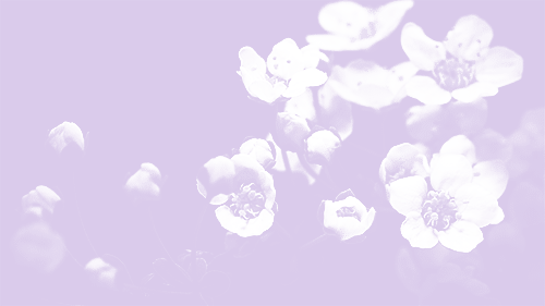
#click and zoom for brushstroke details :)
Text
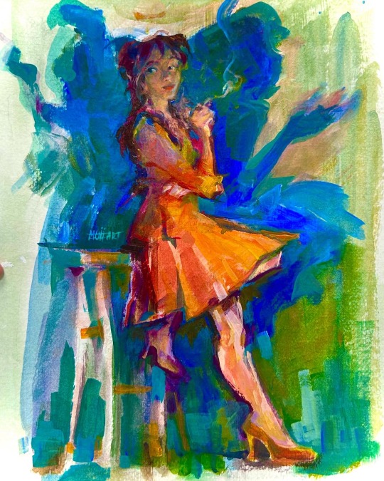
~ Portrait of a lady ~
#Muii art#click and zoom for brushstroke details :)#from my painting life drawing class last sem :0#acrylic paint#traditional art#artists on tumblr#original art#Life drawing#portrait painting#calarts
505 notes
·
View notes
Text
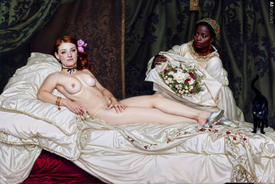
Olympia (2023), an AI-assisted recreation of Édouard Manet's masterpiece, by AIroticArt
Our very first post on Reddit was our recreation of Francisco de Goya's masterpiece La Maja Desnuda (1797-1800). That was eight months ago, when generative AI was still relatively new, and we were still beginners. We have now turned our attention to another nude masterpiece, Olympia (1863-65), 130.5x190cm, by Édouard Manet, to show what is possible today.
Olympia is a famous painting that was first exhibited at the 1865 Paris Salon. It depicts a nude woman, "Olympia," who is lying on a bed. A Black servant is bringing her flowers. As Wikipedia notes, "Olympia's confrontational gaze caused shock and astonishment when the painting was first exhibited because a number of details in the picture identified her as a prostitute."
The painting is on display at the Musée d'Orsay, Paris, but will soon travel to the United States for the first time this coming fall (2023), on display at the Metropolitan Museum of Art in New York beginning September 24.
Of course, the painting was shocking when it was first exhibited. Her "confrontational gaze" and the details that identify her as a demi-mondaine (prostitute) seem to have caused a stir. The model for Olympia was Victorine Meurent, and for the servant, art model Laure. Conservatives predictably condemned the painting as "immoral" and "vulgar." But others commended Manet's honesty, such as Émile Zola, who said, "When our artists give us Venuses, they correct nature, they lie. Édouard Manet asked himself why lie, why not tell the truth; he introduced us to Olympia, this fille of our time, whom you meet on the sidewalks." A lot of discussion has been about the presence of the black maid in the painting, and what this says about race, slavery, feminism, the juxtaposition of black and white, etc.
To recreate this piece, we used many of the advancements in generative AI in the last eight months, including ControlNet, which allowed us to stay truer to the original painting than our recreation of La Maja Desnuda. Many details are still present in our recreation that are in the original painting, down to the smallest folds of the fabric (click the image to zoom in to the hi-res version). We also took some artistic liberties ourselves, such as adding pubic hair (why lie, why not tell the truth?), adding detail to the wallpaper, adding freckles, and many other minor details. Of course, our recreation is intended to be photorealistic, perhaps even giving us a glimpse of the scene that Manet was studying as he created his masterpiece in Paris.
We did leave one detail exactly as it is in Manet's original painting, with his original brushstrokes and all, and that is the slippers and toes. This is our homage to the great work of the master.
We are AIroticArt™, and we are happy to celebrate the nude human form in recreations such as these, as well as entirely new erotic content and artwork, assisted with this new generative AI technology. We hope you'll join us on this journey, exploring and unveiling the beauty that exists deep in the latent space (a term used for the deep neural network of the AI), and embracing the humans that we are, down to our bare skin.
#fineartnude#nudeart#aiart#ainsfw#manet#ÉdouardManet#artnude#olympia#fine art nude#art nude#artistic nudity#nude art#artistic nude#nudity#beauty
86 notes
·
View notes
Link
0 notes
Text
Immersive Events with a 3D Virtual Exhibition
In the ever-evolving landscape of events and exhibitions, technology continues to push the boundaries of what's possible. One of the most exciting developments in recent times is the advent of 3D virtual exhibitions and galleries. These innovative platforms are transforming the way we experience art, products, and information, offering a new level of engagement and interactivity that was previously unimaginable.
What is a 3D Virtual Exhibition?
A 3D virtual exhibition is a digital representation of a physical event or gallery space. It recreates the ambiance and layout of a traditional exhibition, allowing attendees to navigate through the space, view artworks or products, and interact with the environment—all from the comfort of their own devices. It's like stepping into a different world, where you can explore, discover, and engage as if you were physically present.
The Power of Immersion
Immersive experiences are the heart and soul of a 3D virtual exhibition. Imagine attending an art show where you can not only admire the brushstrokes of a masterpiece but also walk around it, getting up close to examine every intricate detail. With the ability to zoom in and out, rotate, and explore from different angles, you're no longer limited to a single perspective.
This level of immersion transcends physical limitations. You can "visit" a renowned museum on the other side of the world, attend a trade show without leaving your office, or explore a futuristic concept without time-traveling. The 3D gallery experience offers a sense of presence that's incredibly captivating and provides a deeper connection to the subject matter.
Interactive Engagement
Interactivity is another cornerstone of 3D virtual exhibitions. Unlike static displays in traditional galleries, these virtual spaces enable visitors to engage directly with the content. You can click on artworks to access detailed information, watch videos about the creation process, or even participate in interactive workshops and discussions.
For artists and creators, this interactivity opens up new avenues to connect with their audience. Instead of relying solely on an artist's statement on the wall, they can engage in live chats, host Q&A sessions, and share their inspiration in real-time. This dynamic exchange enriches the experience and fosters a sense of community among participants.
Breaking Down Barriers
One of the most exciting aspects of 3D virtual exhibitions is their accessibility. Physical exhibitions often come with limitations—geographical constraints, mobility issues, or scheduling conflicts. A 3D virtual gallery eliminates these barriers. Anyone with an internet connection can join, ensuring that art and ideas reach a global audience.
Additionally, a 3D virtual exhibition offers a unique solution in times of unforeseen challenges, such as pandemics or natural disasters. When physical gatherings become difficult or impossible, these digital spaces provide a safe alternative for people to come together, share experiences, and support artists and creators.
Enhancing the Event Experience
It's not just art and culture that benefit from 3D virtual exhibitions. Businesses and organizations are also harnessing this technology to create impactful events. Product launches, trade shows, and conferences are being reimagined in 3D environments, enabling participants to explore new products, connect with brands, and network with professionals—all while avoiding the logistical complexities of traditional events.
The versatility of these platforms allows for customization and branding, ensuring that the event aligns with the organization's identity and goals. Whether it's a futuristic tech showcase or a virtual fashion runway, the possibilities are limited only by imagination.
The Future of Experiences
As technology continues to advance, the potential for 3D virtual exhibitions and galleries is boundless. Imagine a world where historical sites are meticulously recreated for educational purposes, or where architects present their designs in fully immersive environments. The merging of creativity and technology is reshaping the way we learn, connect, and appreciate the world around us.
In conclusion, 3D virtual exhibitions and galleries are ushering in a new era of immersive and interactive experiences. They break down barriers, expand accessibility, and offer a unique blend of art, culture, and innovation. Whether you're an art enthusiast, a business professional, or simply curious about the future, the 3D virtual exhibition is a journey you won't want to miss. Step inside and unlock a world of endless possibilities.
1 note
·
View note
Text
Capturing Dreams: Photography's Role in Showcasing Bridal Makeup in Udaipur
Udaipur, the city of lakes and palaces, is a living canvas of art and culture. A picturesque destination for weddings, it exudes charm and regal elegance, making it an ideal backdrop for capturing dreams. Amidst the grandeur of Udaipur's destination weddings, bridal makeup plays a pivotal role in making the bride look like a vision of beauty. However, it is the art of photography that immortalizes these magical moments, showcasing the intricacies of bridal makeup in all its glory.
At the heart of this union between bridal makeup and photography lies Amrit's Makeover, a renowned name synonymous with the best bridal makeup in Udaipur. With their expertise, let's explore the role of photography in capturing dreams and bringing bridal makeup to life.
1. The Magic of Candid Shots: Candid photography is an art that captures spontaneous moments, emotions, and expressions. Bridal makeup in Udaipur is all about timeless elegance, and candid shots seize the bride's natural beauty, accentuated by Amrit's Makeover's skilled artists. Whether it's the blissful smile or the tear of joy, candid photography showcases how bridal makeup blends seamlessly with emotions.
2. Emphasizing the Fine Details: From the subtle shimmer on the eyes to the intricacy of henna patterns on the hands, bridal makeup in Udaipur is a tapestry of fine details. Photography's lens has the power to zoom in on these details, allowing the beauty of Amrit's Makeover's artistry to shine. The delicate brushstrokes of the best bridal makeup artist in Udaipur come to life through the photographer's keen eye.
3. Illuminating Outdoor Portraits: Udaipur's scenic beauty offers a breathtaking canvas for outdoor bridal portraits. Against the backdrop of majestic palaces or serene lakes, the bride's makeup becomes a work of art, magnified by the play of natural light. The best wedding bridal makeup in Udaipur takes center stage as the photographer captures the bride's radiance in the embrace of nature.
4. Celebrating Cultural Heritage: Udaipur's weddings are an ode to rich cultural heritage, and bridal makeup reflects this essence. Photography not only showcases the beauty of cultural makeup but also becomes a cultural archive, preserving traditions and customs for generations to come. Amrit's Makeover, with its expertise in embracing Udaipur's cultural elements, collaborates with photographers to create timeless images of cultural bridal beauty.
5. Fusion of Tradition and Trends: Bridal makeup in Udaipur often blends tradition with contemporary trends. Photographers capture this beautiful fusion, showcasing how Amrit's Makeover seamlessly marries tradition with modernity. The lens captures the bride's individuality, shining through the harmony of traditional elements and trendy makeup choices.
6. Pre-wedding Shoots: A Glimpse of Romance: Pre-wedding shoots have become an integral part of wedding photography, portraying the couple's love story and chemistry. During these shoots, the bride's makeup is an essential aspect, making her look ethereal and romantic. Amrit's Makeover, known for its expertise in the best bridal hair and makeup in Udaipur, crafts mesmerizing looks that set the stage for enchanting pre-wedding captures.
7. Bridal Fashion Editorials: Photography plays a pivotal role in bridal fashion editorials, showcasing the latest trends in bridal makeup and hair. Amrit's Makeover, as the best hair salon in Udaipur, collaborates with photographers to create avant-garde looks that push the boundaries of bridal beauty. These editorials become a source of inspiration for brides, opening the door to bold and innovative makeup choices.
8. Realizing Fairy-tale Dreams: Udaipur's destination weddings are fairy-tale affairs, and photography helps realize these dreams. The bride's transformation, courtesy of the best bridal makeup artist in Udaipur, is brought to life through the lens. With every click, photography captures the essence of the bride's journey from a blushing bride to a resplendent queen.
9. A Testament to Joyous Memories: Bridal makeup in Udaipur is not just about appearances; it is about celebrating moments that define a lifetime. Photography freezes these joyous memories, allowing the bride to relive her special day for years to come. Amrit's Makeover, with its impeccable bridal hair and makeup services, ensures that the bride's memories are preserved in all their beauty.
10. A Timeless Legacy: The union of bridal makeup and photography creates a timeless legacy for future generations. Through photographs, the magic of Amrit's Makeover's artistry endures, inspiring brides for years to come. As trends evolve, photography becomes a window into the beauty of bygone eras, showcasing how bridal makeup in Udaipur has transcended time.
In conclusion, photography's role in showcasing bridal makeup in Udaipur goes beyond capturing images; it immortalizes the dreams and emotions of a bride's special day. Amrit's Makeover, as the best bridal makeup artist in Udaipur, plays a vital part in this process, crafting exquisite looks that become timeless works of art. The art of photography and the art of makeup blend harmoniously to create a beautiful symphony of memories, celebrating the joy and beauty of Udaipur's destination weddings. Trust Amrit's Makeover to capture your dreams and preserve them for a lifetime!
0 notes
Note
Omg yes I would love to know how to make one myself!
alright here we go!! i’m gonna use my current header as an example for the steps, but pls don’t directly steal the header from me!!! thank u!!!!! (that’s not directed at u specifically anon, just at people in general)
here’s how to make a header the way i made mine! :)

(this got,, quite long,,, so i’m gonna put everything under a read more)
so first, we’re gonna need photoshop. if you do not already have ps and do not want to pay for it, there are plenty of sources online that will teach you how to torrent it and crack it and all that jazz. (aka i’m not gonna go through this step myself, this explanation is long enough lmao)
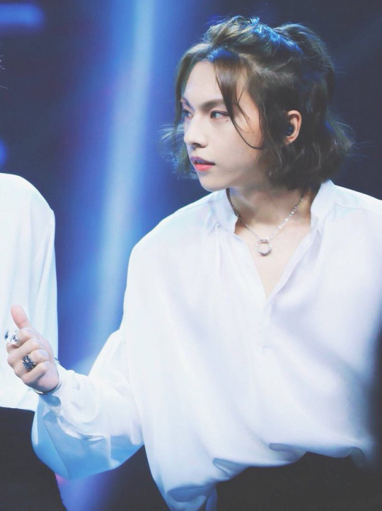
then, pick who/what you want to put in the header and find a picture you want. for example, i used this lovely photo of zhou rui.
after you’ve got your photo, you’re gonna want to crop it to the size you want and cut out the part of the photo you want. there are many, many ways to cut out photos in photoshop and you can find so many different tutorials online for this! i personally prefer to take the polygonal lasso tool and zoom all the way in to 500% to manually select every pixel i want, but that’s just me being a perfectionist and it’s really not necessary to do that lol. i also scale the photo down at this stage because i’m lazy and the smaller the photo, the less pixels to deal with lmao,, just make sure you don’t make it so small your header ends up pixelated
after doing that, you’ll end up with something like this:

the edges on the hair are far from perfect, but this is okay because we’ll be using a fairly solid background and i can use selective color to make the color of the light that hits his hair match the background. it’ll make everything look much smoother.
after this, i like to select the transparent area, make a new layer, and color it whatever color i want my background to end up being. (the magic wand tool will do for this; we won’t be keeping this layer later on so it doesn’t need to be the most precise, we just want to be able to reference the color when editing the coloring of the original photo without the coloring of the background to be effected as well)

(you can deselect after this stage, i’m just trying to show the area that i selected to color lol)
after this, click back on the layer you cut out the picture on (this is important if you don’t want to change the solid color along with everything!!) and go to layer > new adjustment layer > brightness/contrast in the top menu bar. this should open up a new layer for you and you should see a little window with slidey bars for brightness and contrast. adjust these bars as you see fit. here’s what my options were set to, but it really all depends on how the original photo was lit so these options may not work for you.

repeat these steps, except instead of brightness/contrast use curves, vibrance (optional, depends on the photo), color balance, and selective color. edit each adjustment layer as you see fit. here’s what i did with the curves and color balance layers (i’ll talk about selective color on its own in a second):

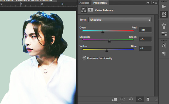
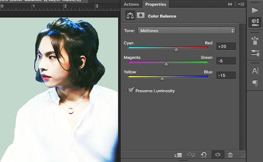

note how with color balance i made things a little more green/yellow/orange than i would’ve had it been just the image on its own. this is because i’m trying to match what i’ve cut out to my background color and the color scheme i’m going for.
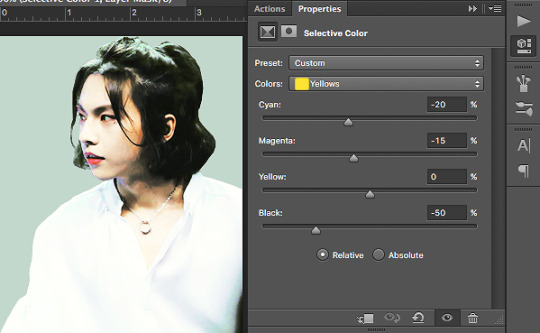
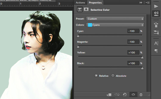
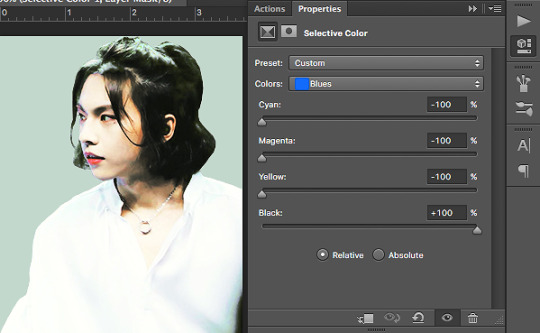
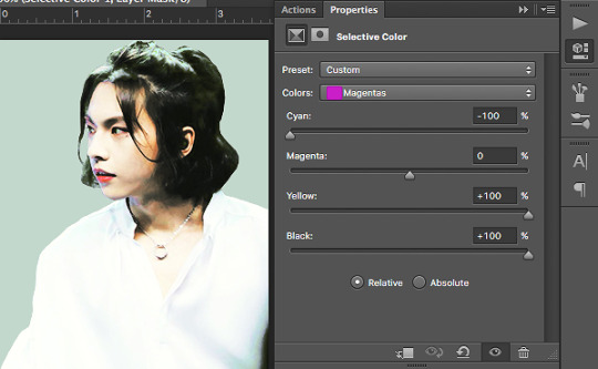
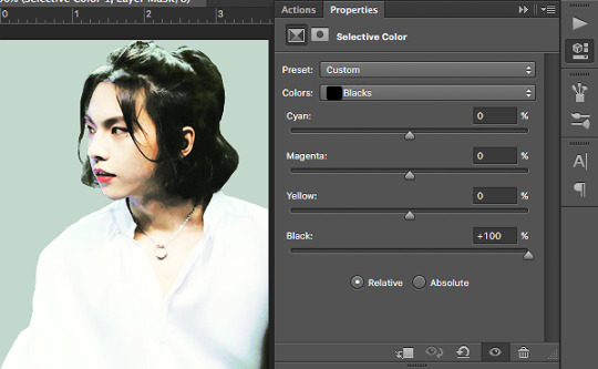
now we’re gonna work with selective color. what selective color does is it isolates the specific color ranges (eg. reds, yellows, blues, etc.) of the image and it adjusts them separately. selective color is where i really try to match everything to the best of my ability; if there’s any light hitting any part of the image i try to make sure it matches the background, if i want a certain color to stand out to bring out anything i turn it up, if i want a certain color muted i turn it down. i also use the whites, neutrals, and blacks to play with what kind of contrast i want and whether i want the highlights/midtones/shadows of the images to be darker or lighter. here are my options; what yours end up being depends on what the original lighting of your image is and what color you’re trying to match:


now, simply delete the solid color layer and flatten your image! congrats, you’ve got a color adjusted cutout of whatever you want to put in your header! save this, but don’t close this tab quite yet.

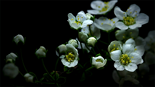
now we move on to the background gif! first, pick a gif you’d like to use. any gif is fine, we’ll be desaturating it and turning the contrast way up anyway, so it really doesn’t matter. i chose this shooting star gif and played around with the frame durations a little (totally unnecessary, but you can do it if you’d like):

luckily for me, this gif is already black and white and pretty high contrast, so i don’t need to do much to it. to fully explain this step, i’ll substitute in the gif i used for the header of my main blog @kinovate
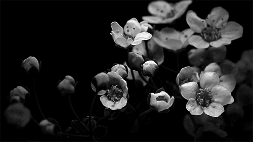
after you’ve opened up your gif in photoshop, click on the top layer (this is important! you want to make sure you apply the adjustments you’re making to every layer!) and go to layer > new adjustment layer > hue/saturation. turn the saturation all the way down to -100. you should end up with something like this:
once it’s black and white, you can add a new layer above everything else and fill it with the color you want. change the blending option from normal to screen. you should get something like this:

notice how the flowers are kind of faint? we’re gonna have to turn up the contrast. click on the hue/saturation layer you made earlier (you want the solid color layer to stay as the top layer!) and go to layer > new adjustment layer > brightness/contrast. turn the contrast all the way up to 100 and adjust the brightness as you see fit. you should get something like this:
now that we’ve got the gif where we want it, let’s move on! i’ll go back to using my current header as an example, so this is the gif i have at this point:

now go back to the tab with the color adjusted cutout you did earlier, drag the tab out to a separate window, and drag the layer onto the gif. this should put your cutout on top of the gif. make size/placement/rotation adjustments as you see fit. you should now have something like this:
i’ve upped the brightness/contrast on my gif a little more just to make it stand out, and i’ve left some space at the bottom because this cutout of zhou rui is a little short for my liking. we’ll also be adding some effects to the bottom so that it fades to white anyway, so the extra space doesn’t really matter.
now we pick how we want this header to fade to white. you can use a simple gradient, a wavy line, circles, ripped paper textures, brushstrokes, etc. anything you want, really. get creative! i picked some clouds for our lovely fairy zhou rui, but i’m not really sure where i saved the picture i actually used so i’ll just show you guys what to do with another cloud image:
using hue/saturation, brightness/contrast, and curves adjustment layers, turn this into a photo of high contrast black and white clouds, like so:

drag this onto what you’ve got for your header, change the blending option to screen, and move/rotate the image until you like its placement. if it’s too faint and you feel like it’s not covering enough, duplicate the layer to make the white bolder. fill in any space you don’t want with a soft white brush. you should end up with something like this:

(i personally like the clouds i found before better, i just couldn’t find the full image of them. i do have the psd file for my header saved though, so i’m gonna use those clouds from here on out.)
after all this, add whatever details you want. for example, i drew on some blush:
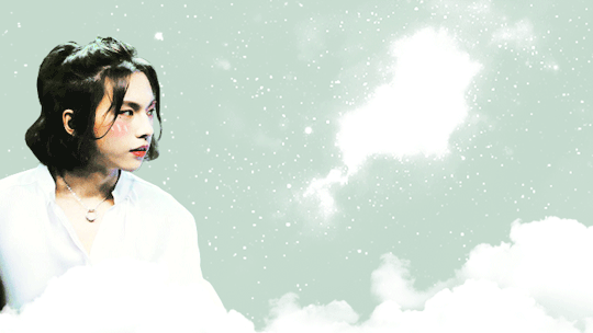
and voila! you’re done! :)
hope this was helpful!! i tried to go through every step thoroughly, but if something’s confusing or not explained well hmu with questions and i’ll try to help out to the best of my ability!!!
159 notes
·
View notes
Photo
An honest review of Corel Painter 2018, from an artist who has been using it since version 8.
Painter is like the most beautiful lady, filled with so many bad habits that never change.
And I say so with all my heart.First, let me get this straight, I love Painter, I wish I could be using Painter for all my painting needs. Alas, after giving Painter a chance for so long, I realize that love is a life long journey, and it’s better to be married with someone who has a great character than just beauty, and that someone is Photoshop.
But sometimes, for an exciting fling with ex, I go back to Painter just occasionally, hah.
Now lets get to the good sexy points first:
PROS
Painter has the most robust brush engine in a painting software available today. The options for adjusting it are so diverse, that it can be a little daunting to anyone who hasn’t use it before.
Painter has the best brushes to mimic traditional media. Once you tried it, you will know it. The oils, pens and palette knives are some of the tools that I wish other software have.
Painter can apply different colors to each bristle of the brush, hence creating that organic multi-color strokes that is very difficult, if not impossible to do in other software.
Painter can “paint on a path”, which is super amazing. Which means you can use that oil brush and still achieve a very sleek finish even with complex shapes, while varying degrees of pressure and strokes to make it look natural.
Take a look at some of the line work I did using Painter:


Look at the lovely brushstrokes on their hairs, and sleek line work through out all 3 art. These are easily achievable in Painter. Their natural brushes are so good that I’ve never had to create my own brushes, they are good right out of the box.
Painter also has a palette for mixing colors the traditional way, which is very good for people with long traditional backgrounds.
Then Painter has “Blenders”
If you are starting digital art, chances are you have been using traditional mediums for a while, and you know traditional mediums are not the easiest to blend totally smooth colors.
Now if you look at her pink hair above, painter can blend exactly that smooth very easily. You can just lay down 2 blocks of solid colors, and use blender “just add water” and brush over it, until you achieve the smoothness you want. For beginners, this seem god send. For more experienced artist, you can change/use different brush tip for the blenders and achieve a more textured look.
But what makes blenders so good is not the smoothness of it, but rather, it can change the approach you create art and speed it up. Rather than blending every element slowly, you can just lay down blocks of solid colors fast, and blend them altogether later.
So Painter has fantastic brushes and a great brush engine, plus a nifty blender right? But that’s about it.
CONS
Now its the cons. Prepare yourself.
Painter as a software is very clunky, glitchy, and it has been the same ever since so long. The people at Corel is either incapable of improving it, or they just doesn’t care.
1. Using Tablet Eraser Lags
Yes you read that right, even basic feature like switching to eraser lags. But hey, that’s the faster version. You know what’s slower, switching to eraser tool command also lags, for half a second or a second I don’t know.
This makes rough sketching extremely annoying for me. Where I tend to draw and erase immediately, the constant switching of tools creates a constant sudden lag which is really frustrating, breaking momentum.
2. Default eraser cannot be adjusted.
What? Yes, you are stuck with a pressure sensitive eraser, with a soft or hard edge version. Yes, ever since forever they never change it too. In order to change it, you need to do some out of the box file editing, but that means you can’t change it while you are working, so it’s useless as well.
Well you can adjust the eraser, but only as a “brush tool”. Which you have to select a new brush to erase, and you have to reselect your previous brush to paint again.
Again this is very annoying for me, whereas in PS I just need to press “e” to erase and then “b” to paint again immediately with my brush cursor still in the same place on the canvas. In Painter I have to go over the canvas to select the eraser (b), erase, then select again the brush, and back to painting, which takes up tons of time. You can’t use a different shortcut like PS, because as I say, the “adjusted” eraser is considered a brush tool.

3. The 1st time you open the brush engine, it lags, for about 3 secs
Yes, it lags again, though only for the first time, but I don’t know why, it never change since forever.
4. Using big brushes lags.
Painter always claim that their current version is faster than before, but that only shows how bad it is the previous version was, and the current version is not much better.
I often paint in large canvases in PS so that I can put in tons of details. Sometimes there are tons of layers, sometimes just a few. But in all cases I can use brushes up to 800px wide without problem, in 1000px I have to paint slower or the strokes will not catch up. I usually do that to cover large areas.
One may argue that Painter’s brushes are more sophisticated, but most brushes lags when they pass 100px, with few layers. With tons of layers? Its a nightmare.
5. Painter’s drag zoom, zoom you to the MAX.
Sometimes, when you are trying to paint a certain area, you put one of your hand in Ctrl-Z (undo), so that you can keep immediately undo each time you didn’t get the strokes right.
Occasionally, you didn’t press Ctrl in time and pressed the Z, so it becomes “zoom” (shortcut for both in PS and CP is same), and then you stroke your brush in zoom mode.... you zoom a little in PS, so you just zoom out back once again, but in Painter, you always zoom in to the max, 1600% zoom. So you zoom out repeatedly to get back again.
Like wtf Painter? who zooms in 1600%??
6. Painter’s “Canvas” is a mystery.
For a long while, I often wondered what the “canvas” layer is for (The bottom most layer), until now I still don’t have clue. The canvas layer cannot be edited, moved, or duplicated, so if you open up an image in Painter and would like to duplicate, or erase the background and paint underneath it, you are out of luck.
It is unbelievable, that in 2018, you can’t drag an image and put it on another layer in another document.
The canvas is more nuisance than useful. You can’t create another layer underneath the canvas. You can’t even copy and paste the canvas.
Ah but you can move that layer into another layer or another document through an unorthodox method, you know what? You have to go under layer tab, and choose “Lift canvas into watercolor layer”
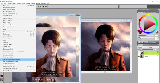
Then you can drag “that watercolor layer”. So essentially, you need to convert to watercolor layer and thus it duplicates the layer for you and change its blending mode to “gel”, but it cannot just duplicate that into a normal layer? Yeah, that’s Painter’s canvas. I always start my image in PS.
7. Color Picking from another image causes it to select it, so you have to click your file again.... and IT LAGS, EVERY SINGLE TIME
It’s no surprise that in the digital era, picking colors has become so easy, and as an artist, I often use color reference from other images. But imagine when you have to reference many colors and each time you reference there’s a lag in between, it’s like painting back and forth 2 different file, and with a lag.
I will add on to list in the future, these cons are the only ones I can remember for now.
(Switching brush selection and brush engine.)
(path tool)
CONCLUSION:
It’s 2018, and Painter still doesn’t fix the most basic functions to allow Painter to be used easily. There are more issues, but these are the most basic issues that stops me from fully using Painter as my go to software. And these are issues that have persists for a very long time (forever?), instead Painter introduces gimmick features like “music brushes” and charges a whole lot for each new version of Painter.
I use Painter only for my line/brush work for now.
Instead of improving and fixing to make Painter a fully usable wholesome painting software, Painter chooses to focus on trivial features that nobody asks for.
Painter could beat Photoshop and become the King of painting software, but it can’t, because it never changes it’s bad habits.
29 notes
·
View notes
Text
On Composition (article)

For a formatted, easier to read PDF version with visual examples, click this link
Please Reblog if you found this helpful and think it could be useful to someone you know ♥
♦♣♥♠
Recently I've felt a lot of people struggle with composition in their artwork. I don't consider myself a master of it by any means but if you are a beginner I feel like I could share a couple of tips & pointers for future reference that might help.
And keep in mind that everything beyond this point is strictly my opinion so don't seek me out to tell me how wrong I am on everything ever. Plus I am writing this article for those who are interested in hearing me out specifically.
To me composition in art is an act of play where your aim is to produce a visually appealing organization of elements on your canvas. That's essay talk for "looks cool bruh". Play in this case means picking up different tools at your disposal and having fun with them – doing whatever you can to entertain yourself (and others). How well you "play" with these tools is what makes your compositions appear either good or bad, interesting or boring etc.
Now, what are the tools that we have?
♦ Contrast!
Arguably the most important tool when talking about visual arts. It creates interest for the eye and creates DRAMA. And that's exactly what we need! Every artist is basically a professional wrestling organization. But as you can expect contrast can be used in lots of different ways. Let's talk about some of them
⦁ Detail / Complexity
Eyes are drawn to the busier areas in an image but if everything is busy then it just becomes white noise. Too much visual information bores you the same way you see a long chunk of text, you just don't feel like reading it (the irony does not escape me here). Simply having a lot of detail in one area and less of it in other ones will create this contrast. Blurried edges of forms go against more strong harsh edges the closer you get to your focal points.
⦁ Values / Lighting
If you have ever seen great black & white photography you have experienced this one. Just something simple like how dark an object's base value is already enough to create visual interest and that's before you start playing with lighting. Strong direct lighting setup will do wonders to create a cool composition and you can play with the silhouette of shadowed vs lit areas.
⦁ Color
Of course this would depend on every artist because the ways to use color are near infinite and I imagine it greatly depends on personal style (and taste). However there's still much to do with it. You can play with your mood and juxtapose warm and cold hues. You can take a couple of related neighboring hues on the color wheel and put them against something opposing it. Simply minimalist color fill in one area against a busier richer area of color. The better your grasp on color is the more you can do with and create interesting plays on it.
⦁ Texture
What is the material of your subject matter? Everything has a slightly different surface and reflects light differently. Imagine a busy detail-rich texture of fur against plain matte cotton. A shiny chrome surface next to leather. How you depict the textures is up to your technique and style but this is definitely one of the ways to create contrast.
On a separate note I'd like to point out that it might be a good idea to keep a healthy balance of it all. Juggling different contrasts is great but if you overcomplicate too much juxtaposition it will become too much for the viewer (and maybe even too much of an undertaking for you as an artist)
♣ Perspective!
I see perspective as a 2D equivalent of cinematography in film. That might be an unecessary comparison but it helps me to wrap my mind around it. Studying how camera operators frame shots is a good way to start understanding perspective from a very different point of view.
We are often taught perspective 101 with a horizon line, 2 vanishing points and some cubes. That is great to introduce the idea of emulating 3D space on a 2D plane and create the illusion of depth and space but in terms of composition that's not what really what it is about.
Different perspectives will tell different stories, emphasize different narratives and moods. A zoomed out camera that shows the whole scene and flattens the perspective is great for showing the whole scene and all the elements. If you've ever read manga or western superhero comics you have seen perspective that focuses on an object close by and pushes everything else further back (a hero's fist going into the viewer's eyeball with the feet seemingly disappearing into the outer space) in an action shot – great way to create a dynamic feel and emphasize movement.
Next time you place your perspective think about how you can use different perspectives to tell your story? What kind of feeling do you want to show, how can you place your camera to achieve the goal?
♥ Leading Lines!
This is where things get tricky.
Every object, brush stroke, detail, ornament, whatever you can think of to put on a canvas creates lines that your eye can follow. Imagine a silhoutte of a creature – the more broken down the silhouette gets the harder it is for your eyes to interpret it as a line. But at the same time, the more simple the silhouette gets, the more its side can become an invisible arrow of sorts that your eyes can follow. If you see an outstreched arm in an image your eyes will follow where that arm is pointing even if the gesture isn't trying to specifically point to something, same concept works for pretty much any object you can plase on your canvas.
If you have a good intuition from experience, practice and experimentation you will arrange the objects in your image in such a way to suggestively point towards where you want the viewer's eye to go. What do we want the viewer to do? We want them to keep looking! So point towards your focal points. Lead the eyes back into the image, don't let them leave if you can.
Plus, if you start thinking about this you will start trying to think of what can you put into the image that can help you direct the viewer. This will stimulate your creativity and you will start thinking of new elements to add into your image which is great if like me you ask yourself what else to draw when you seemingly feel like you are out of ideas ("What else can I put in it! Urgh!").
♠ Leitmotifs / Repetition! (my favorite)
If you introduce a visual motif in your piece don't let it die alone, unloved and forgotten. As Bob Ross would put it, give it a friend. Or better yet, give it a whole squad (getting dangerously close to dating this document here). Try to keep up whatever reocurring visual elements you introduce across your piece. This could be anything as long as it can be seen as a srong enough visual to be recognizable. Specific brushstroke shapes, elements that have a similar silhouette, similar objects – all of these should be used to populate your image and tie it together with nice consistency of your visual motifs.
I understand this could be a bit hard to understand so I'm gonna use music as an example: repetition is one of the most powerful tools in arts and you can hear it constantly in your favorite music. Most people don't listen to highly experimental contemporary academic music so chances are the music you like has repitition of some sort. Think about how same elements are repeated, how they can be modified slightly to keep it interesting, how you might repeat something only partially to spice it up. You can do the same with your visual art work! Establish, repeat, create variations, even trick with misleading quasi-repetitions to make your piece interesting. Look at your work and ask if you can take some elements and play with them more this way to improve your piece.
That is everything I can think of right now when it comes to composition. Maybe sometime soon I will try and make an example on how to apply these guidelines to create an image with some kind of a step by step thinking breakdown if I have the time.
If you have any questions you can message me @aoxenuk pretty much anywhere social media wise (or look up my name alternatively) or email at [email protected]
You can find my portfolio at http://antonoxenuk.com or https://aoxenuk.artstation.com/
14 notes
·
View notes
Photo

Artist Line-Up: #12 Talli (〃 ̄ω ̄〃ゞ
Twitter: tallihoozo
“Talli is that owlsome person that makes you smile whenever they are around. They show so many emotions, much happiness, much excitement, much love. Talli's very easy to talk to and they’re very supporting!! Owl their love belongs to Iwa-chan, I bet they breathe Iwa-chan by now. Their art is a wonderful combination of roughness and softness, their watercolour pics are stunning!! I will owlways keep on loving them. That's owl.” - anonymous
“Talli has some great Iwa-chans and has improved a lot over the last 2 years..!! Mmmh, yes Talli has some wonderful and sweet IwaOis and sets a nice and intense atmosphere with their strong light effects!” - anonymous
“Talli is completely passionate, full of love and brimming with talent, and it shines straight through in everything that Talli's touches. You can lose yourself staring at Talli's art, at the emotion in each brushstroke, the detail of each line, the mood of each work of art that just hits you right in the heart area of your chest, and you won't even have any regrets.” - anonymous
“Talli’s drawing style is rough and bold. Never really soft but it is wonderful, it is moving and alive! It is strong and confident. It’s wonderful to look at it because it gives you energy and power. But at the same time it is lovely and gives lots of feelings like tiny details and gestures in the way the characters in the illustrations are portrayed. Gosh, Talli, you are too good!” - anonymous
“Talli is a beautiful hooman being. And beautiful hooman being again. And Talli’s art is mesmerizing. I love the play with colors and effects with lights. And if you zoom in, you can find teeny-tiny details which have my jaw dropping. The freckles and blushes! I also love the strokes of their lines and anatomy skills plus the mood their create with the art. And even their sketchbook-sketches are very dynamic! And...lots of action-art, not just, stationary poses. Good stuff, I tell you!” - anonymous
Talli is most definitely the founder of the following Fan-Clubs: IwaizumiHajime_FC, Soldier76_FC, Reaper_FC, IWAOI_FC, LetsJustReadSteamyFanFicsAtWork_FC! ۹(ÒہÓ)۶
Probably has a restraining order from Iwa-chan but we don’t really judge stuff like this. :’) THANKS FOR JOINING THE TEAM, TALLI!~
[P.S. Kindly click the image and read through the content to know more about the artist!]
#hqcz#hqcz artists#talli#anime zine#haikyuu!!#OMG TALLI DON'T HATE ME FOR THIS#I LOVE YOU#YOU KNOW I DO#THANK YOU FOR THAT VERY PRECIOUS IWAOI MAGIC FORST AU DRAWING#IT MY FAV.#like you#EVERBODY MEET OUR LAST GUES ARTIST: TALLI!!!!!#THANK YOU!~~#Also#OMG.#I was going through your art again Talli#and hot damn#I need to fan myself
11 notes
·
View notes
Text
"Explore the angst and beauty in famous works of art"
The “Mona Lisa” is probably the most famous painting in art history. But what’s the second most famous? It could very well be “The Scream” by Edvard Munch. The image has withstood the test of time to become a modern icon, inspiring the famous ‘90s horror film series and even an emoji you may have used on occasion.
In time for Munch’s birthday on Dec. 12, Google Arts & Culture invited YouTube Music rising star Girl in Red to give us her take on the howling cultural icon. It’s the latest in our Art Zoom video series, where pop musicians bring their storytelling lens to masterpieces from art history. And who better than Marie Ulven (aka Girl in Red), who sings about a “pretty face with pretty bad dreams,” to take us through “The Scream’s” hidden details? Follow her and get down to brushstroke level, zooming in and out of the image thanks to our Art Camera’s high-resolution capabilities.
On a slightly less angsty note, we asked Lolo Zouai, a newcomer on the international R&B scene, to take us on a cheeky tour of Botticcelli’s “Birth of Venus.” If you’ve ever wondered about the story behind the beautiful woman in the giant shell, now you can just click to learn all about about the Uffizi Gallery’s most famous painting.
Give us a shout (or a scream) if you’d like to see more of these collaborations, and join the conversation on #artzoom.
Source : The Official Google Blog
via Source information
0 notes
Last Seen Blogs
iwillalwayshelp
Tempered Soul

wolfiec
Codie

chitty7t
Chitty's Escape
shuhada5
Untitled

hal9000mk2
apo@