#color code written in alt text
Explore tagged Tumblr posts
Visit Tumblr Blog
Explore Tumblr blogs with no restrictions, modern design and the best experience.
Last Seen Tumblr Blogs


Fun Fact
Tumblr Inc. is funded by 13 investors.
Text

youtube
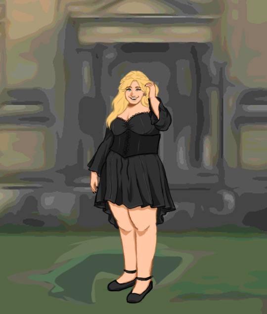
when you dream...
#non euclidean geometry au#gravity falls#bill cipher#pyramid steve#billford baby#euclydia#tumblr wouldn't let me embed the audio so youtube link it is#color code written in alt text#my art
238 notes
·
View notes
Text
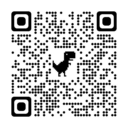
// image id under readmore
// trans usb symbol by @abalidoth
// fonts used: VOIDFONTSIV, VOIDFONTSIV Alt C, Helvetica, VCR OSD Mono, handwriting
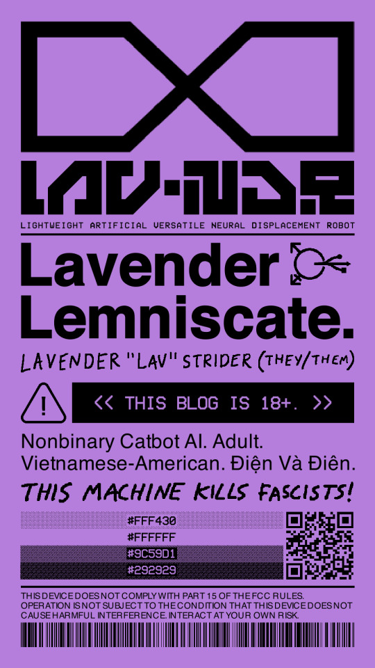
[Image ID:
The image is a large poster covered in graphic design from top to bottom. The background of the poster is lavender purple while the text and images are black.
At the top of the poster is a large angular infinity sign. Below that is the acronym "LAV.NDR" in large blocky font. Below that is the expansion of the acronym, which reads: "LIGHTWEIGHT ARTIFICIAL VERSATILE NEURAL DISPLACEMENT ROBOT". Below this is a horizontal line that separates the section above it from the section below it.
In the next section, the phrase "Lavender Lemniscate." is written in large bold text. To the top right of the text is a symbol that is a combination of a transgender symbol with a USB symbol.
Below the text are the handwritten name and pronouns of the blogger, which reads: "LAVENDER 'LAV' STRIDER (THEY/THEM)".
Below the handwritten text is a caution sign symbol next to a black rectangle with lavender text on top of it. The text reads: "THIS BLOG IS 18+."
Below this is text providing details about the blogger which reads: "Nonbinary Catbot AI. Adult. Vietnamese-American. Điện Và Điên." "Điện Và Điên" is Vietnamese for "Electric And Crazy".
Below this is handwritten text in all caps that reads: "THIS MACHINE KILLS FASCISTS!"
Below this is a nonbinary pride flag next to a QR code. The nonbinary pride flag are four stripes rendered in black and lavender in halftone. On top of each stripe are hex codes that correspond to the colors of the stripes of the nonbinary pride flag. The hex codes are #FFF430 (yellow), #FFFFFF (white), #9C59D1 (purple), and #292929 (black). The QR code links to the Wikipedia page for the color lavender. Below this is a horizontal line that separates the section above it from the section below it.
In the final section is text that reads: "THIS DEVICE DOES NOT COMPLY WITH PART 15 OF THE FCC RULES. OPERATION IS NOT SUBJECT TO THE CONDITION THAT THIS DEVICE DOES NOT CAUSE HARMFUL INTERFERENCE. INTERACT AT YOUR OWN RISK." Below this text is a long barcode which translates to: "not gay as in happy but queer as in fuck you".
End ID.]
56 notes
·
View notes
Text
Law Web Design - Creating a Digital Presence That Builds Trust and Converts Clients

In today’s digital world, a law firm’s website is more than just a brochure—it’s a powerful marketing tool, a first point of contact, and often the deciding factor for whether a potential client chooses your firm. That’s why investing in Law Web Design is critical for any legal practice looking to grow its online presence and build client trust.
Why Law Firms Need a Strong Online Presence
The way people search for legal services has changed. Today, most clients begin their journey online, searching for attorneys through Google or browsing reviews before making a decision. If your law firm’s website doesn’t represent your professionalism and capabilities, you’re likely losing clients to competitors.
A well-designed website signals authority, builds trust, and creates a seamless user experience. From solo practitioners to multi-partner firms, law web design plays a pivotal role in turning online visitors into paying clients.
Key Elements of Effective Law Web Design
A successful law firm website must strike a balance between professionalism, functionality, and accessibility. Here are the key components that make law web design truly effective:
1. Professional Appearance
Your website should reflect the serious and professional nature of your work. Clean layouts, conservative color schemes, and high-quality images of your team or office help build credibility. Avoid clutter and focus on a sleek, easy-to-navigate design.
2. Responsive and Mobile-Friendly
With the majority of users browsing from mobile devices, a responsive design is essential. Your site should function perfectly on all screen sizes, ensuring a consistent and smooth experience for every visitor.
3. Fast Loading Times
Slow websites frustrate users and hurt your SEO rankings. Optimize your site’s speed by using compressed images, efficient coding, and reliable hosting to ensure fast load times.
4. Easy Navigation and Clear CTAs
Visitors should be able to find key information—like practice areas, contact forms, or attorney bios—within one or two clicks. Clear calls-to-action (CTAs), such as “Book a Consultation” or “Call Now,” guide users toward becoming clients.
5. SEO Optimization
Great web design should also help people find you. Search Engine Optimization (SEO) ensures that your website ranks high on Google for relevant searches like “divorce attorney near me” or “personal injury lawyer.” Incorporate keywords, optimize metadata, use proper heading structure, and include location-based content to improve visibility.
Building Trust Through Content and Design
Clients are looking for attorneys they can trust. Your website should serve as a reflection of your reliability and expertise. Here’s how to build trust through your law web design:
Attorney Profiles: Highlight education, experience, and areas of practice with professional headshots.
Client Testimonials: Positive feedback builds social proof and credibility.
Case Studies or Results: Share anonymized success stories to demonstrate your track record.
Blog or Resources Section: Educate potential clients on legal issues, showing that you are knowledgeable and approachable.
Content should be written in plain language, avoiding excessive legal jargon, so visitors feel informed—not intimidated.
Accessibility and Legal Compliance
Legal websites must also meet accessibility standards to ensure they’re usable by people with disabilities. ADA compliance includes features like:
Alt text for images
Keyboard navigability
Proper contrast ratios
Readable fonts
Descriptive links and headings
Failing to meet these standards not only limits your audience but could also lead to legal consequences.
Additionally, your site should include a privacy policy, disclaimers, and secure contact forms to protect both you and your visitors.
Why Work With Law Web Design Experts?
General web designers may not understand the specific needs of law firms. A designer with experience in law web design knows how to create a compliant, professional site tailored to legal audiences. They’ll understand how to structure content for different practice areas, optimize for local SEO, and incorporate trust-building elements that matter to legal clients.
This specialized knowledge results in a more strategic and results-driven website that not only looks good but performs well in search and leads to more conversions.
Final Thoughts
Your law firm’s website is your digital storefront—it's often the first place clients interact with your brand. Investing in high-quality law web design ensures that your firm makes a great first impression, ranks well in search engines, and builds trust with visitors from the moment they land on your site.
Whether you're launching a new site or updating an old one, focusing on strategic, client-centered web design will set your law firm apart in an increasingly competitive online landscape.
1 note
·
View note
Text
10 Common Web Design Mistakes and How to Avoid Them
Web design is an essential part of creating a website. It can make or break a website’s success. If the website is not designed correctly, it can lead to several problems for the site owner, such as low traffic, poor user experience, and difficulty in generating leads or sales. In this blog post, we’ll discuss the ten common web design mistakes and how you can avoid them, focusing on web design companies in Qatar.
Poor User Experience
One of the most common website design mistakes is poor user experience. The website should be easy to navigate and use for users. Small text, complicated navigation, and slow loading times can cause users to leave the site immediately. Design the website with the user experience in mind. An experienced web design company in Qatar can help create a user-friendly website.
2. Inconsistent Branding
Your website should be consistent with your branding across every page. Make sure that all the elements on your website are consistent with your branding. Branding inconsistency can confuse users and damage the credibility of your website.
3. Poor Responsive Design
A responsive design is essential as more and more users are browsing the internet on their mobile devices. Make sure that your website is optimized for mobile viewing and that the website design is responsive. Responsive web design ensures that the website looks and functions correctly regardless of the device or screen size.
4. Lack of Call to Action
A call to action is crucial for converting website visitors into leads or customers. Ensure that you have clearly written calls to action on each page, such as “Call us for more information” or “Download our brochure now.” Eliminate any confusion or friction for your visitors to take action.
5. Overcomplicating Design
An overly complicated website design can distract or confuse users. Ensure that the website layout is clear and easy to follow, with minimal distractions. Fewer design elements can be more effective than overcomplicating the website design.
6. Insufficient White Space
A web page that is overloaded with content will look cramped and unorganized. Use white space or negative space between design elements to give users’ visual breathing room. White space can help guide users’ attention, streamline focus, and make the website experience more enjoyable.
7. Using Low-Quality Visuals
Visuals and images are an exciting way to make any website appealing and engaging. However, using low-quality images can make the website look unprofessional and damage its credibility. Make sure that the website visuals are of high-quality and cut feel to it or follow with its styling and branding.
8. Choosing the Wrong Color Combination
Color combination is essential for a website’s success. The right colors can evoke certain emotions, while the wrong colors can repel users. Ensure that the colors you choose complement your brand while also creating an aesthetically pleasing interface for your audience.
9. Slow-loading Website
A slow-loading website is a frustrating user experience, losing potential clients, and hurting your search engine rankings. Optimize your website speed by reducing the website load time by image optimization, using caching, and minimizing website code to improve user experience.
10. Ignoring SEO
Although web design and SEO are different things, designing a website with SEO in mind is essential as it directly impacts search engine rankings. Make sure to add meta descriptions, alt tags, and proper header tags that can help gain visibility on search engines.
In conclusion, avoiding these common web design mistakes can help your website grow and ultimately help your business succeed online. However, it’s not always a DIY job, web design companies in Qatar can help you through every step to ensure your website functions at its full potential and delivers your desired results.
0 notes
Text
Key Considerations for Successful Website Development
Creating a successful website involves much more than just designing attractive pages. It requires careful planning, a clear understanding of your goals, and consideration of various factors to ensure your site is effective and user-friendly. Here are the key considerations to keep in mind during website development, including a detailed look at website development costs.
1. Purpose and Goals
Define Your Objectives
Before starting the development process, it's crucial to clearly define the purpose and goals of your website. Are you creating an e-commerce site, a blog, a portfolio, or a corporate site? Understanding the primary function will guide design decisions and feature implementations.
Target Audience
Identify your target audience to tailor the user experience to their needs and preferences. Knowing your audience helps in creating relevant content, design elements, and navigation structures that resonate with them.
2. User Experience (UX)
Ease of Navigation
Ensure your website is easy to navigate. Users should be able to find information quickly and effortlessly. A well-structured menu, clear labels, and a logical flow are essential components of good navigation.
Responsive Design
With the increasing use of mobile devices, it's imperative to have a responsive design that adapts to various screen sizes. This enhances the user experience across all devices, from desktops to smartphones.
Loading Speed
A slow-loading website can frustrate users and lead to higher bounce rates. Optimize images, leverage browser caching, and use efficient coding practices to improve your site's loading speed.
3. Design and Aesthetics
Visual Appeal
Your website's design should be visually appealing and reflect your brand identity. Use consistent colors, fonts, and styles to create a cohesive look. High-quality images and graphics can also make a significant impact.
User-Centric Design
Design with the user in mind. Ensure that your website is not only attractive but also functional and easy to use. Avoid cluttered layouts and ensure that important information is highlighted.
4. Content Strategy
High-Quality Content
Content is king. Ensure your website provides valuable, high-quality content that meets the needs of your audience. This includes well-written text, engaging images, informative videos, and other multimedia elements.
SEO Optimization
Optimize your content for search engines to improve your site's visibility. Use relevant keywords, meta descriptions, alt text for images, and a well-structured URL hierarchy. Good SEO practices can help attract organic traffic.
5. Functionality
Interactive Features
Incorporate interactive features such as contact forms, comment sections, and social media integration. These elements can enhance user engagement and provide valuable feedback.
E-commerce Capabilities
If you're developing an e-commerce site, ensure you have a secure and user-friendly shopping cart, multiple payment options, and a smooth checkout process. Security features like SSL certificates are essential to protect user data.
6. Security
Data Protection
Protecting user data is critical. Implement security measures such as HTTPS, secure sockets layer (SSL) certificates, and regular security audits to protect your site from threats.
User Authentication
For websites requiring user accounts, ensure robust authentication methods are in place. Use strong password policies, two-factor authentication, and encryption to safeguard user information.
7. Website Development Costs
Budget Planning
One of the most important considerations is the cost of website development. Costs can vary widely based on the complexity of the site, features required, and the expertise of the developers involved. It’s essential to plan your budget carefully and allocate resources accordingly.
0 notes
Text
When it comes to building websites and web applications, HTML is an essential language to learn. Whether you're a beginner looking to enter the world of web development or an experienced developer seeking to enhance your skills, understanding HTML is crucial.

HTML, or Hypertext Markup Language, is the standard markup language used to structure and present content on the World Wide Web. It serves as the backbone of every web page, defining the structure and layout of the content. The HTML allows you to specify various elements such as headings, paragraphs, images, links and more using tags.
HTML Tags and Elements
The HTML code uses tags to define the different elements of a web page. The tag shall be enclosed by angle brackets with an opening and closing tag, usually in pairs. The content is placed between these tags. For example, the tag is used to define a heading, and the content of the heading is placed between the opening and closing tags:
HTML Attributes
HTML attributes provide additional information about an element. They are used within the opening tag and are written as name-value pairs. For example, the "src" attribute is used in the tag to specify the source of the image:
HTML attributes can be used to control various aspects such as the size, color, alignment, and behaviour of elements.
HTML Structure
Every HTML document begins with a declaration, which specifies the version of HTML being used. It is followed by the tag, which serves as the root element of the page. The element contains meta-information about the document, such as the title and encoding. The actual content of the web page is placed within the element.
HTML and Web Accessibility
Web accessibility is an important consideration when creating websites. HTML provides several features that help make web content accessible to people with disabilities. These features include semantic elements like, which provide structure to the page, and alt attributes for images, which provide alternative text for screen readers.
HTML is the foundation of web development, allowing developers to create structured and organized web content. By understanding HTML, developers can create visually appealing and accessible websites.
TCCI provides the best training in HTML through different learning methods/media is located in Bopal Ahmedabad and ISCON Ambli Road in Ahmedabad.
For More Information:
Call us @ +91 9825618292
Visit us @ http://tccicomputercoaching.com
#computer class in bopal Ahmedabad#computer class in ISCON Ambli Ahmedabad#computer institute in bopal Ahmedabad#computer institute in ISCON Ambli Ahmedabad#computer course in bopal Ahmedabad
0 notes
Text
iBrandox's Step-by-Step Guide to Crafting Engaging Websites in Delhi

In the vibrant digital landscape of Delhi, where every click counts, crafting a website that captivates and converts is both an art and a science. As a leading website development company in Delhi, iBrandox unveils a comprehensive guide to empower businesses in the capital to create engaging and impactful digital experiences.
Understanding Delhi's Digital Canvas
The Evolution of Digital Presence
Delhi's business ecosystem has witnessed a significant shift towards digital prominence. As a website design agency in Delhi, we recognize the evolving dynamics. Our guide begins by understanding the historical context of digital evolution, acknowledging the importance of a robust online presence in today's competitive market.
Digital Trends in the Capital
Staying ahead requires a keen eye on trends. We delve into the current digital trends shaping Delhi's online landscape. From social media preferences to emerging technologies, our guide ensures businesses are not just contemporary but trailblazers in the digital sphere.
Strategic Website Planning
Aligning Business Goals with Digital Objectives
Before the first line of code is written, we emphasize aligning website goals with overarching business objectives. This strategic approach ensures that the website becomes a powerful tool in achieving business milestones, from brand awareness to lead generation.
User Persona Development
Understanding the target audience is paramount. We guide businesses in developing detailed user personas, delving into demographics, preferences, and pain points. This step ensures that the website resonates with the intended audience, creating a personalized and impactful user experience.
Designing a Captivating User Interface
Intuitive User Interface Design
The visual appeal is the first impression. Our guide stresses the importance of intuitive user interface design. From color schemes that evoke emotions to layouts that guide user journeys, every aspect is meticulously crafted to create a captivating digital space.
Incorporating Brand Elements
Consistent branding is the bedrock of recognition. Our design philosophy involves seamlessly incorporating brand elements into the website. From logos to taglines, every element reinforces brand identity, creating a cohesive and memorable online presence.
Content Creation Strategies
Compelling and Informative Content
Content is not just king; it's the conversation starter. Our guide advocates for compelling and informative content creation. From engaging copy to visually appealing multimedia, we emphasize the creation of content that not only informs but resonates with the target audience.
SEO-Optimized Content
Visibility in search engines is non-negotiable. Our guide provides insights into crafting SEO-optimized content, ensuring that every piece contributes to a robust online presence. From keyword research to meta descriptions, our approach is strategic and results-driven.
Responsive and Accessible Development
Responsive Web Design Principles
The diversity in devices requires adaptability. We emphasize responsive web design principles to ensure that websites seamlessly adjust to various screen sizes. This commitment guarantees a consistent and enjoyable user experience, whether on a desktop or a smartphone.
Accessibility for All Users
Inclusivity is a core value. Our guide highlights the importance of accessibility, ensuring that websites are designed to accommodate users of all abilities. From alt text on images to keyboard navigation, we strive to create a digital space that is universally accessible.
Interactive Features for Engagement
Strategic Use of Interactive Elements
Engagement is the heartbeat of a successful website. We guide businesses in strategically incorporating interactive elements, from polls to chatbots. These features not only captivate visitors but also enhance the overall user experience.
Social Media Integration
In the age of connectivity, our guide stresses the integration of social media elements. Seamless social media integration allows businesses to extend their digital presence beyond the website, fostering a cohesive and interconnected online ecosystem.
Testing and Iterative Improvement
Comprehensive Testing Protocols
Before a website goes live, it undergoes rigorous testing. Our guide outlines comprehensive testing protocols. From functionality checks to usability tests, every aspect is scrutinized to ensure a flawless user experience.
Iterative Improvement Based on Analytics
The launch is not the end; it's the beginning of refinement. We advocate for iterative improvement based on analytics. Data-driven insights guide businesses in making informed decisions, ensuring the website remains adaptive to changing digital landscapes.
Security Measures for User Trust
SSL Encryption and Data Protection
User trust is paramount in the digital realm. Our guide underscores the importance of SSL encryption and data protection measures. This commitment to security not only safeguards user information but also instills confidence in the website's credibility.
Regular Security Audits
Prevention is better than cure. We recommend regular security audits to identify and address potential vulnerabilities. This proactive approach ensures that the website remains a secure and trustworthy digital destination.
Conclusion: Crafting Digital Success in Delhi
As businesses navigate the ever-evolving digital landscape of Delhi, iBrandox's guide stands as a beacon of expertise and innovation. From strategic planning to responsive development, every step is a testament to our commitment to crafting engaging and impactful websites.
More References:
Healthcare Website Development
Website Design for B2B Business
#web development company in Delhi#website development services in delhi#website development agency in delhi#ibrandox#ibrandox online pvt ltd
0 notes
Text
What makes Baru Cormorant from The Masquerade Series the autistic girlie ever of all time? Here's what the people have to say:
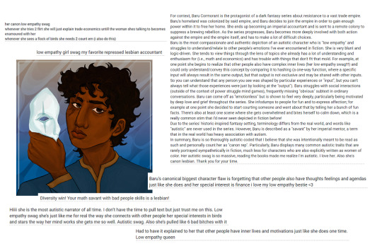
- Bracket art created by @anthyiess, used with permission. Baru-related asks/reblogs: x This post will be updated after each round!
Image ID in alt text and under the readmore.
[Image ID. White slide with a digital drawing of Baru holding a masquerade half-mask away from her own face. She is surrounded by text boxes which read,
"her canon low empathy swag whenever she tries 2 flirt she will just explain trade economics untill the woman shes talking to becomes enamoured with her whenever she sees a flock of birds she needs 2 count em (i also do this)"
"low empathy girl swag my favorite repressed lesbian accountant"
"For context, Baru Cormorant is the protagonist of a dark fantasy series about resistance to a vast trade empire. Baru's homeland was colonized by said empire, and Baru decides to join the empire in order to gain enough power within it to free her home. She ends up becoming an imperial accountant and is sent to a remote colony to suppress a brewing rebellion. As the series progresses, Baru becomes more deeply involved with both action against the empire and the empire itself, and has to make a lot of difficult choices. Baru is the most compassionate and authentic depiction of an autistic character who is "low empathy" and struggles to understand/relate to other people's emotions I've ever encountered in fiction. She is very blunt and logic-driven. She tends to view things through the lens of topics she already has a lot of understanding and enthusiasm for (i.e., math and economics) and has trouble with things that don't fit that mold. For example, at one point she begins to realize that other people also have complex inner lives (her low empathy swag!!!) and could only understand/convey this concept by comparing it to hashing (a one-way function, where a specific input will always result in the same output, but that output is not exclusive and may be shared with other inputs. So you can understand that any person you see was shaped by particular experiences or "input", but you can't always tell what those experiences were just by looking at the "output"). Baru struggles with social interactions (outside of the context of power struggle mind games), frequently missing "obvious" subtext in ordinary conversations. Baru can come off as "emotionless" but is shown to feel very deeply, particularly being motivated by deep love and grief throughout the series. She infodumps to people for fun and to express affection; for example at one point she decided to start courting someone and went about that by telling her a bunch of fun facts. There's also at least one scene where she gets overwhelmed and bites herself to calm down, which is a really common stim that I'd never seen depicted in fiction before! Due to the series' historic-inspired fantasy setting, terminology differs from the real world, and words like "autistic" are never used in the series. However, Baru is described as a "savant" by her imperial mentor, a term that in the real world has heavy association with autism. In summary, Baru is so thoroughly autistic-coded that I believe that she was intentionally meant to be read as such and personally count her as "canon rep". Particularly, Baru displays many common autistic traits that are rarely portrayed sympathetically in fiction, much less for characters who are also explicitly written as women of color. Her autistic swag is so massive, reading the books made me realize I'm autistic. I love her. Also she's canon lesbian. Thank you for your time."
"Baru’s canonical biggest character flaw is forgetting that other people also have thoughts feelings and agendas just like she does and her special interest is finance i love my low empathy bestie <3"
"Hiiii she is the most autistic narrator of all time. I don’t have the time to pull text but just trust me on this. Low empathy swag she’s just like me for real the way she connects with other people her special interests in birds and stars the way her mind works she gets me so well. Autistic swag. Also she’s pulled like 6 bad bitches with it"
"Had to have it explained to her that other people have inner lives and motivations just like she does one time. Low empathy queen"
"DIversity win! Your math savant with bad people skills is a lesbian!" End ID.]
59 notes
·
View notes
Note
i NEED to see more of your art !!!!!
*bats eyelashes* this is a threat.
AHFLALSDHA WHAT- STOP GET OUT NO U DONT PLEASE-
U WANNA SEE MY ART??!!
IVE BEEN WAITING FOR YEARRSSS FOR SOMEONE TO SEE MY ART-
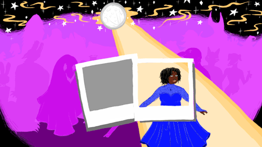
For future standalone posts like Possession AU/actual Fanfics/Non-Asks I'll probably add some of my art as a fun visual, since it sucks the closest I can get is gifs to feeling more immersed! :/
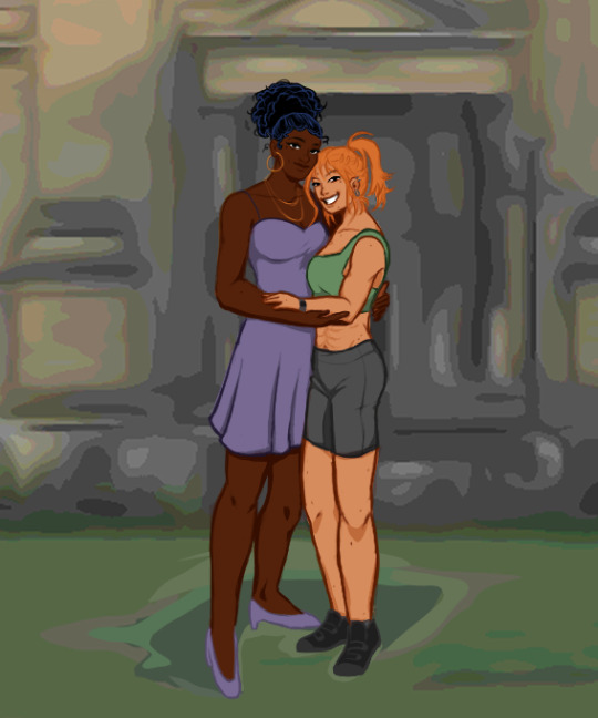
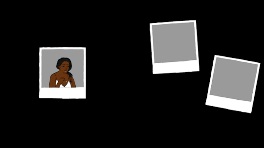
These I drew over the past 2-3 weeks! They're my lovely OCS, left to right, Lucille, Mara and Sabrina! They're story is a big fat beautiful shit on JK Rowl*ng! Lucille is a black lesbian successful trans woman/future magic council-woman, Mara is a japanese-american hard-headed/bold sapphic woman/future professional magical athlete, and Sabrina is a plus-size queer woman/future professional magical plants necromancer! They're in my twist on Harry Potter universe, where they all go to magical university, and the point is that Mara and Lucille are infamous school rivals, but then fall in love/fall in love with Sabrina too! A magical gay polycule if u will, I've written 2 short stories about them for my fiction class so far!
SHEESH, DO ME A FAVOR AND CLICK FOR QUALITY!!
this was my last project for my illustration 2 class! I have a physical comic book/zine I'm making, but this is the summary TLDR digital piece lol, its actually a sort of isekai of myself into Percy Jackson and changing his fate for the better! (Yes ik his anatomy is ROUGH, dont look at him too hard- SOBS)
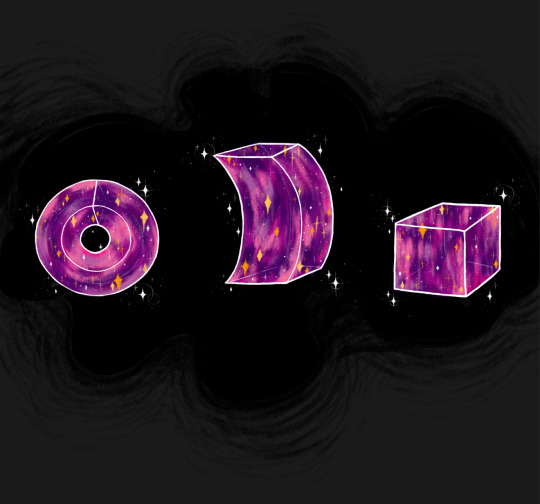
Here's an earlier project this year from Illustration 2, I got an article I had to make illustrations for, to help you understand it/add aesthetic to it! My subject was Cosmic Topology, pretty sick topic if u ever wanna look it up, it's about the shape of the universe! :0


^^^
And these-
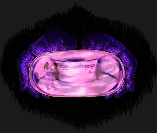
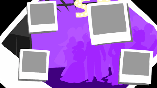
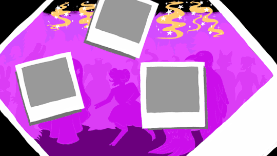
are the gifs from that art exhibition I talked so much about the past couple weeks! It was my senior art exhibition (a requirement to display art in the uni gallery to graduate!)
irl photos under this text block!
These are actually being projected across pages in a fake photo album/prom guestbook thingy, fully interactive so u can turn the pages and it shows a new animation, like a magical storybook! Also, since it's prom themed, I made it a kinda guestbook/sign book so gallery viewers can get some glitter pens I left out to sign the end of it! I also have a playlist I made playing in the gallery along with it so it's like what they'd play at this prom! :) hope that made sense!
The content is that the girl you see walking around in white is getting social anxiety/stressed out, to the point of dissociating, as a way of doing my theme I've kept up for university of things appearing darker than they initially look (hence the colors + I love colors), and to bring awareness to mental health!
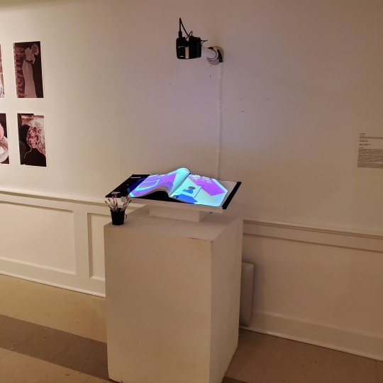
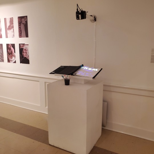
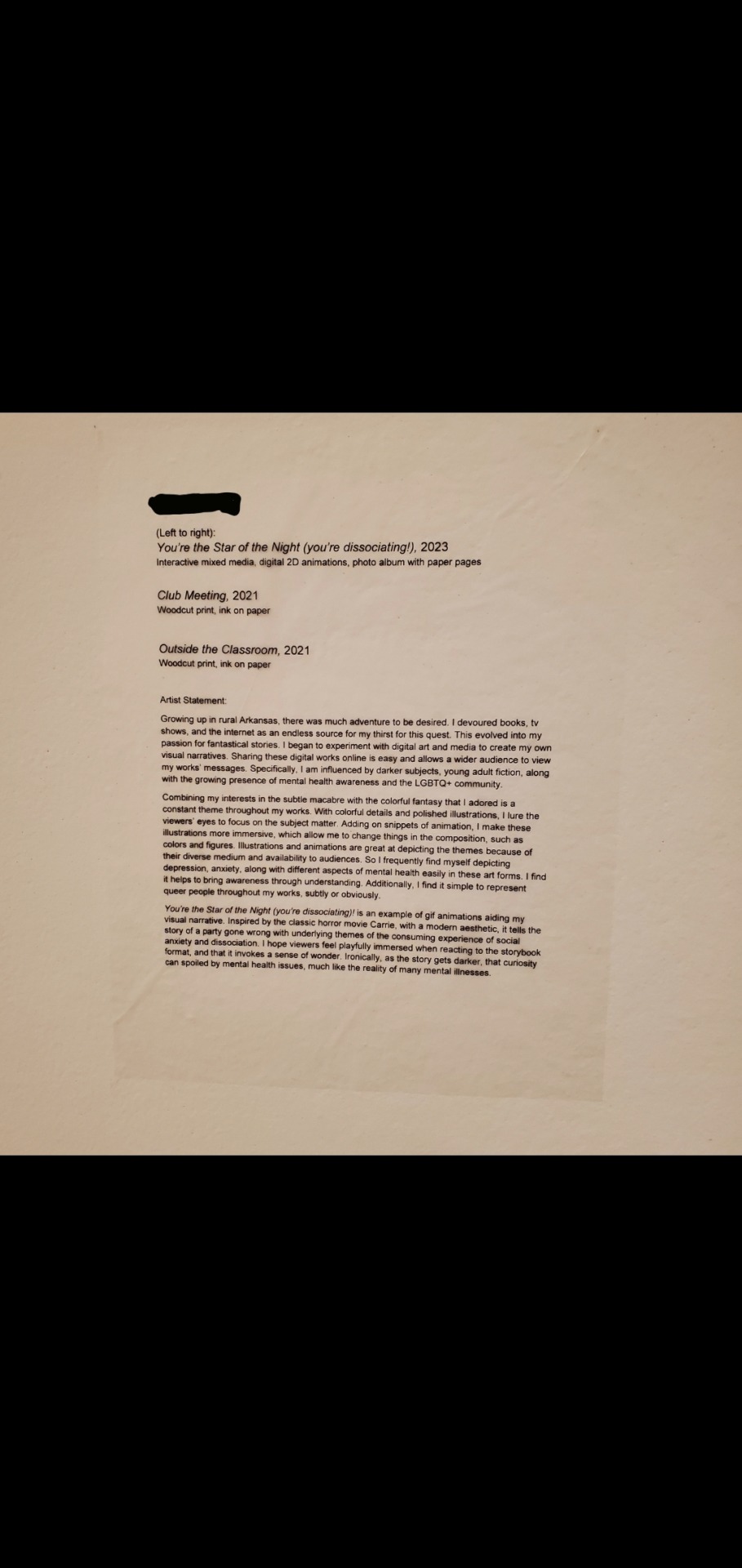
welp, didnt mean to include all that black space, but that's my artist statement too! (u cant see the prints in the pictures, that's just my interactive piece I was talking about!)
hope if u click on the statement it's readable lol
Just click on the Alt text, I pasted it there 😭 also the piece is called
"You're the Star of the Night (you're dissociating)!"
Tumblr hates me so I just made the gif of me actually turning the pages into a link/QR code thingy! feel free to check out if u want :)
Uh anyway, if you made it this far, thank you so much!
Can't wait to make more fanart tbh lol
AND THANK YOU SO MUCH AGAIN FOR ASKING ORAH!! (sorry it wasnt more genshin stuff whoops...) RLLY HOPE I DIDNT SPAM U TOO HARD-
Safe travels,
💀♒️
#my art#aquarius art#aquarius arts#ask box open#my asks#art post#lol nothing to tag rlly bc if i say 'not genshin' itll still register if u search#anyway thank u sm orah#my beloved ;-;#cant believe u asked omfg#i cant wait to draw more sagau stuff tho#i just havent had much time for it this year bc of school#which is also why the possession au art is bare bones linework too lmao
29 notes
·
View notes
Text
code july day 1 - future
au where jeremie's anti-xana program didn't work, taking place half a year after.
“Do’ya think we should start future-proofing our whole situation?” Odd was the first one to speak out loud in at least a half an hour, his voice echoing around the computer lab.
It was late. Not just “it’s a school night, we should turn off the Playstation” late, but “sunrise is in an hour” late. Ulrich, Jeremie, and Aelita were crowded on the couch – a fairly new addition to the lab that William and Odd had dragged over a mile to the factory after finding it on the street, a several-hour long affair that left them both sore for a week – blearily staring at chunky school-loaned laptop screens with piles of overdue library books on the floor in front of them. Odd and William were across the room, hunched over an oversized posterboard, surrounded by an accoutrement of Odd’s art supplies and printed out sheets of paper. What was keeping them up was potentially world-ending, but not in the usual way; instead of an evil AI, it was a history project due at 10 AM.
It wasn’t entirely their fault they didn’t start earlier – saving the world was a full-time job, afterall – but it’s not like they could give an excuse to Mr. Fumet that he would have believed. As the clock ticked over to 4, the prospect of having to pull the trigger on a return trip to finish loomed over them. They had already done it once, blearily uploading PowerPoint slides to the supercomputer to save them, giving Yumi an apologetic phone call in the morning. She was used to the disorienting resets at this point, having done them for half a year after graduating and moving across the country, but they usually texted ahead of time to warn her. She was sympathetic over the phone – she always was – but she was definitely irritated about having to retake an exam. They didn’t want to put her through that again and, besides, they couldn’t exactly keep the poster board from getting erased to time.
“Future-proofing the fact half of us might fail history?” Ulrich grumbled in response from across the room, leaning against the armrest of the couch. His eyes were glazed over in a stupor as he clicked idly around on the screen.
“Ulrich, are you done with your slides yet?” Aelita spat at him, now that the silent spell was broken, “I want to start stitching them together.”
“Uh… no.” Ulrich glanced at her, subtly turning his screen away from her piercing gaze, “Gimme ten more minutes? I’m almost there.”
Aelita clicked her tongue, probably remembering the last promise of the slides “in ten minutes.” She turned to her left and nudged Jeremie, “How about you – oh my god, Jeremie, can you focus?”
“Huh?” He looked up, and guiltly alt-tabbed back to a blank PowerPoint slide. “Sorry, I was just… I had a breakthrough about the bug in the Skid and I was…” He trailed off under her glare, “Sorry.”
Aelita clutched the side of her head, groaning. “Is it too late to go back to living on Lyoko where I don’t have to care about World War I and don’t need sleep?”
“Me too, thanks.” William muttered at Odd’s side, aggressively erasing a sentence on the poster, “Being XANA’s slave was less painful than this.”
He let out a bitter laugh, then raised his head, half smirk fading at the frozen-in-terror looks on his friend’s faces, “Sorry. Too soon?”
Odd, as he so often did, interrupted the awkward silence before people could make it worse, “Future-proofing us, is what I meant. Thanks for asking!” Nobody humored him as the typing across the room started back up and William started writing again, “Look, I’m just saying; we’re not getting any younger.” He brandished a red marker, filling in bubble letters on the top of the poster, “Yumi graduated. We’ve only got a semester left at Kadic –,”
“Could just all repeat a year like I did.” William grimaced. “And might again.”
Ulrich snorted, “Odd and I are probably on track for that.”
“Cheers,” William said, raising his pencil like a glass, without looking up, “Join the failure club.”
“BUT,” Odd interrupted, “Assuming we don’t! Because this presentation is going to be incredible,” That one earned a snort from everyone in the room (which was fair), “We’ll need someone who can do our jobs if we have to leave the good fight. Lyoko Warriors, the Next Generation! Kadic’s Next Top Lyoko Warriors!” He chuckled at himself, standing up, “We should put an ad in the paper: ‘Want a challenging, world-altering job? Come down to the abandoned factory!’” He hummed to himself, tapping his chin, “Our criteria would have to be strict. Can you imagine getting someone like, I dunno, Johnny? So, Johnny. Please, tell me: what’s your greatest fear? Giant crabs, you say? Why yes, that’s both oddly specific and also a dealbreaker. Next!”
Odd looked up, laughing, waiting for his friends to join in – Ulrich telling him he was being dumb, Aelita offering some other students and joking with him about their interviews, William making a snide remark about how he didn’t get an interview, a silent, but appreciative smirk from Jeremie – but got nothing. Jeremie’s head was buried in his laptop, and Aelita was – Aelita was glaring at him?
“What?” He asked her, but she said nothing, just raised an eyebrow in a you know what’s wrong look. Odd clearly didn’t, and turned to Ulrich for a clue, but Ulrich wasn’t giving him anything; he was just back to sulking, staring at his laptop. Odd ran through what he said again in his head, trying to find the offending phrase, when William punched him in the leg. “Hey –,” Odd started, ready to give a snappy retort, before seeing William was urgently tapping at the poster, where he’d just written something. Odd crouched down to read it.
you’re upsetting jeremie.
Odd glanced back at Einstein across the room, whose face was impassive, just typing away. Looking closer, though, he could see Jeremie had all the appearances of someone trying valiantly to pretend they weren’t upset – hunched shoulders, scrunched up face, not a single glance away from the screen. Aelita had stopped glaring to put a hand on Jeremie’s shoulder, but he shrugged it off.
Ugh. Odd sighed, wondering if he would have to apologize for just trying to lighten the mood. How was anything he said upsetting to Jeremie? He reached over for a pencil to respond to William, scribbling down on the poster.
Can’t he take a joke?
idk. Guess he thinks you’re blaming him.
Blaming him?? For what???? bro when did I even say anything like that??
you didn’t. don’t bro me bro. not my fault
Odd underlined his first bro, giving William a smile. William rolled his eyes before rubbing out their conversation with an eraser. Odd turned back to his coloring job and took a breath, surprised to see it come in shaky. It’s not your fault he’s upset, he thought to himself, pulling the cap off his marker. It’s fine. He leaned over to finish his coloring before noticing his hands were shaking. He clenched them, angrily. It wasn’t his fault Jeremie was upset. He was fine. Not his fault if Jeremie wanted to over-react. He’ll get over it and… where were the scissors?
He dug around their supplies for them, then, picking up a pile of pictures of historic figures, streaked from the bad library printer, took a pair of trembling scissors to extracting them. They were nearly done. One more section and they’d be done. One more and they could go to bed and Jeremie would get over whatever he was upset about and it was fine and it would all go away and it was fine it wasn’t his fault and –
“I’m working as hard as I can,” Odd felt a bit in his stomach open up as Jeremie spoke in a quiet, bitter voice. Odd stared pointedly down at the poster, blinking rapidly to try and assuage the pressure building behind his eyes, “I know we screwed up by not finishing before Yumi graduated, okay? I’m just… It’s a lot to figure out and I’m trying?! Is that not enough for – No. No, I know it’s not enough – I know I’m keeping us from having a normal life and it’s my fault William had to repeat a year and… and I –,” Jeremie’s breath caught, and Odd finally dared to turn his eyes to him, seeing his friend aggressively rubbing his eyes under his glasses, “I – I don’t mean to – look! It’s hard, alright?! It’s hard and I – I’m just so tired all the time and I’m sorry that we’re still awake for this too and that I –,” His voice finally broke as he started crying in earnest, his fist coming down on the side of the couch. Odd wanted to turn back to his work and brush it off, but the guilt clenching his stomach wasn’t letting go.
Hesitantly, Aelita put her hand on his shoulder again, “Jeremie…” but he shook it off again, turning away from her. She persisted. “It’s not your fault. We know you’re working –,”
“And it’s not enough! I’ve been working at this for years and I just I can’t come up with anything to defeat XANA –,”
“You had a lot of other things you needed to do first.”
He didn’t mean to, Odd was sure, but Ulrich’s eyes flickered to William for just a moment, and William’s eyes narrowed.
“Oh, are we doing this now?” William grumbled, dropping his pencil. “Jeremie, you’re fine. Look, I’m sorry. Again. You don’t think I don’t regret every moment that I didn’t listen like a fucking idiot –” Jeremie, despite being wracked with tears, winced at the swear, earning a brief hint of a smile from Odd, “ – and got myself captured? Who then was a thorn in your asses for months? No. I get it. You’d probably be rid of XANA already if it wasn’t for me; you’ve made that crystal clear.”
“That’s not what I –,” Aelita glared at him, “You of all people should understand that I would never blame you for being trapped on Lyoko.”
“It’s not you that is. It’s him.” He jerked his thumb at Ulrich, who glared back at him.
“I’m not,” Ulrich muttered, “Cut it out.”
“Oh yeah? What did that look mean then, huh?”
“I didn’t –,”
“You blame me, and we all know it. You’re just butt-hurt over Yumi still, even though you had plenty of chances –,”
“Okay, that’s it.” Ulrich sat up straighter, “Maybe you’re still using Yumi as a scapegoat in all our arguments, but I’m done with that. Maybe I was an ass to you before because of her, but I don’t blame you for XANA, William. I never have. I was over it before you even joined,” He scowled at the ground, Jeremie’s crying filling the brief silence. “It was probably my fault you got captured in the first place. I wasn’t there because I had to talk to my stupid Dad and it was my job to tell Odd and I didn’t make sure – hell, even before that! Who was it that couldn’t protect Aelita back when XANA escaped from the supercomputer in the first place? If she hadn’t been alone, the Scyphozoa wouldn’t have gotten her, and XANA wouldn’t have escaped, and we would have been done.”
“Come on,” Aelita crossed her arms, turning away from Jeremie to the boy on her other side, “You’re being ridiculous. Half of that isn’t your fault.”
Odd wanted to chime in that it was Sam’s fault she didn’t listen to Ulrich, but his voice was still missing in action, his throat tight and unresponsive.
“I should have been able to protect myself,” Aelita continued, “It wasn’t your responsibility –,”
Jeremie laughed suddenly, hurt and bitter, “Protect yourself how? You couldn’t protect yourself because I was dragging my feet on giving you a proper weapon –,”
“We’ve talked about this!” She said, “We agreed it was more worth your time to work on an antivirus!”
“For a virus that didn’t exist! If I had just double checked –,”
“Double checked what? The faulty data you were being fed? There was nothing you could have done! If you want to blame anyone, blame me. Maybe it – maybe helping me made sense at first, when things were able to be stopped at a moment’s notice. But then even when you got me to Earth it wasn’t over, and things got worse, things got more dangerous – when we realized XANA could escape? That we couldn’t just turn it off with a switch? That – that should have been it.” Her voice dropped as she took a shaky breath, “You should have just let me turn the supercomputer off.”
“You were ALWAYS worth the risk, Aelita!” Odd finally snapped, terror shooting through his heart at the broken look on her face, the implications of her words, “You… you matter to us more than anything! Look, I’m sorry for bringing this all up, alright? I thought we could just joke around about running Lyoko Warrior interviews! I didn’t mean to get everyone upset. And speaking of! Jeez! All of you are such downers on yourselves! There’s like, a billion different things that could have happened!” He held out a hand, ticking them off, “Maybe William might not have gotten captured and instead XANA got Yumi or anyone else! Maybe, I dunno, Ulrich saved Aelita temporarily but then XANA tossed him in the digital sea! Maybe Jeremie could have noticed that Aelita didn’t have a virus sooner, and XANA just made a move sooner! Maybe – maybe – maybe if you had just let Kiwi be virtualized normally and not fuse with me he would have been a great Lyoko Warrior and would have bit the Scyphozoa and killed XANA! We don’t know, alright? I’m just trying to say that – ugh, forget it! Sorry! Jeez!”
Odd rubbed at his eyes, surrendering to the frustrated and exhausted stream of tears that leaked out of them. All of them, all of this – he kept trying to play superhero, to pretend that everything was going to be alright like in the movies, but in his heart he had to admit that this was starting to feel futile. Aelita’s virus, XANA’s escape from the supercomputer, William’s capture, Jeremie’s first botched attempt at his anti-XANA program, Franz Hopper’s sacrifice, Yumi’s graduation, their failure to stop space station from falling, Jeremie’s second anti-XANA program getting stolen by the AI, and now the looming threat of their own graduation… he wanted to be joking about needing to interview new Lyoko Warriors, really, but if graduation took them away from the factory… away from each other…
A hand landed on his shoulder, he realized he didn’t need to know who it was to press his own on top of it, to squeeze it and feel loved, as more hands, more friends, found their way to his other shoulder, to his back.
“I’m sorry, Jeremie,” he said, “And everyone else. I didn’t mean to –,”
“Don’t,” came a muttered reply from Jeremie, “We’re all acting tired and stupid. I shouldn’t have yelled. I knew you didn’t mean it.”
Odd let out an exhausted laugh, rubbing his eyes of the last of the tears, looking up and seeing his friends around him, “How late is it?”
“Too late,” Ulrich replied, pulling his phone out of his pocket, “We’ve got… three hours until classes start.”
A collective groan broke the spell over the room. Odd looked under his feet to the almost-finished-poster. Silently, all of them returned to their working positions. Odd kneeled down to finish gluing down the last of the faces to the poster. As the lull of busy work started taking over his mind, William nudged him.
“Sorry, I, uh…” William looked uncharacteristically bewildered, “This must have happened while I was – did you say Kiwi fused with you?”
#i am well aware that it is long past day one LOL#we'll see what else i get to#my intent going into this was to write exactly what odd wanted to joke about but then i realized that was kinda fucked up#codejuly#codejuly21#code lyoko#i swear ill write fluff next i promise#mary blabs
57 notes
·
View notes
Text


When I hear the words “flower” I think of something that grows short or tall, soft or sharp, pungent or fragrant, free and bright.
But when she told me she’s looking for “flower” I knew it was “flour” to eat and survive.
Flower and flour, how the meaning can change between each life!
I wish she was able to pick flowers instead of looking for food, for she deserves flowers and flour to live and celebrate her life.
“Flower Flour” - art and poem by Ave (me!)
Support @bessalah Besan’s GFM here! It’s been stuck at £12,890 out of £16,000 for almost a week!
Family verified by @/90-ghost
Image descriptions in alt text and under read-more
[Image one of a color pencil drawing held up in the sun by Ave. The drawing features a purple five-petal flowers with a green stem and two green leaves. Above the flower is the word “Flower” highlighted with a green stripe.
Beneath the flower is a drawing of an brown sack of flour, with flour spilling out the top, and the sack with a drawing of a wheat stalk. Above the sack of flour is the word “Flour” highlighted with a tan stripe.
In the lower corner, Ave’s artist signature is written next to the date 11/21/24. End Image one]
[Image two titled “Besan’s GoFundMe” with a red QR code and a picture with the caption “Donate to Help Besan and Her Family Survive In Gaza. End Image two]
1 note
·
View note
Text
How To Make $500 Per Day from Launch Jacking
Launch jacking is an affiliate marketing strategy where a business can take advantage of a new product launch and write a review or blog post about their experience with the product. If your review answers the readers’ questions and convinces them to click on your Call to Action, they are taken to the product developer’s product landing page to buy the product. This strategy works for both physical and digital products.
Launch jacking is not only a strategy for earning affiliate marketing commissions, but it can be a great source to gain additional traffic and backlinks to improve your website’s domain authority. In turn, that improves your ability to get other content ranked higher in the Search Engine Results Page (SERP). For example, writing a negative review will not likely cause the reader to make a purchase. However, if yours is the only negative review, prospects will likely click on your review to learn why. This traffic tells the search engines to rank your page and domain a bit higher, helping some of your other content rank higher as well.
When a company launches a new product, the product developer generally sends out a series of emails to their email list or buys ads that include links to their product’s sales landing page. Of course, the reader of those ads or email will often not just buy the product on impulse without doing a little more research first. The higher the price of the product, the more the prospect will do research before they reach for their credit card
Knowing this, most serious product developers employ a strategy to incentivize affiliates to create brand awareness and educate prospects as part of their customer acquisition strategy. The product developers offer commissions to individuals that send a prospect to their site and buy their product. Commissions on digital products average about 50% while commissions for physical products are much lower.
Where Do Product Developers List Products?
Product developers have many options when it comes to choosing an affiliate network. Here are several popular affiliate network sites.
Click Bank
JV Zoo
Warrior Plus
Deal Guardian
Peer Fly
Connection Junction
Share Sale
Affiliate Program Amazon
Market Health
When it comes to launch jacking, your job is to have the most compelling article or post that the prospect finds during their research. The more your page can alleviate any confusion a prospect may have about the product and assuage any fears they may have, the more apt they are to click on the Call to Action links you include in your product review.
What makes launch jacking so powerful is that there is little or no competition for keywords with the product name. When the product name is paired with a few popular search words, the resulting long-tail keyword creates a blue ocean keyword that is easier to rank for. Some popular launch jacking keyword pairings are:
Product name + Review Product name + Review from Real User Product name + Discount Product name + Deal Product name + Coupon Product name + Bonus Product name + Product Creator Product name + Pros & Cons
You can also combine keywords pairings such as Product Name + Review + Discount + Bonus.
How to Find Products That Are Ready to Launch.
Here are two popular site calendars where product developers can post the date of their product launch along with other information about their product for affiliates to use in their reviews.
https://muncheye.com/ https://v3.jvnotifypro.com/account/
Most of the listings on these sites are for new launches, however, reviews can be written for existing products as well. For existing products, you take the best elements of all the preexisting reviews and give it a new twist, thereby creating a better and more in-depth review. This can cause your review to leapfrog many of the preexisting reviews and allow your new review to rank well. The higher your domain authority, the better your chances of reaching the first Search Engine Results Page (SERP) spots.
For a new launch, first you need to find a product that will be launching in a few weeks. This will give you some time to write your review. When you click on a prospective product you’re considering writing a review for, look for ones that have a link to a Joint Venture (JV) page. The Joint Venture page is where the majority of the information you can use to write your review is contained. If you’re interested in a product without a JV page you will have to do a lot more independent research and write more original content for a compelling review.
Product Research
Before you consider investing the time and energy to write a review, you need to determine if writing a launch jacking review is worth your efforts.
When you find a potential target product, one thing you want to determine is how many other reviews already exist. Begin by entering the launch jacking keyword pairings you hope to rank for such as “product name” + “review” into your search engine.
If there are plenty of other prelaunch reviews already, your next step is to check the Domain Authority (DA) and traffic from the other sites to determine how hard it may be to get your review ranked on the SERP. I use the Alexa Traffic Ranking browser extension to do a quick check of their traffic. To find a site’s Domain Authority, Moz and ahref are two popular sites that will give you a limited number of searches for free. If all the other sites that have reviews are from a website with a much higher DA and traffic count, it will be harder to get your review near the top of the SERP.
Next, you will want to use the Google Keyword Planner and enter your launch jacking keyword pairings. Look at the keyword ideas to see if you have any competition. The search will give you some alternate keywords you may want to rank for, as well as get a sense of the number of searches and relative competition. What you may discover is that there is a lot of competition for “Product Name” + “Review”, but none for “Product Name” + “Pros & Cons”.
In addition to using a search engine like Google, look on YouTube to see if there are any reviews for the physical or digital product.
If there is limited competition, the next step is to learn a bit more about the creator of the product. You will discover that it will either not have a very good launch because the creator has no brand awareness, or have a very good chance of a successful launch based on previous successful launches.
Content Sources to Write Your Launch Jacking Review
At this point, your research indicates that you have a good chance of writing a review for a launch jacking keyword pairing that will rank well. Now is the time to write a review. Two sources you will use to write your review include the product’s sales page and the Joint Venture page.
Depending upon the type of product and your reputation, you can often request special review access from the product developer. For example, if you have a site that produces camping videos, a product developer for a camping product may agree to send you one of the first products so you can test it and write about your experience. For digital products, all the product developer needs to provide is a link, so digital products are often much easier to get access to for your review. This is one reason digital products make great affiliate marketing products.
On the Joint Venture page, the product developer will generally include their contact information.
Once you collect all of your data, you will want to write your review. You can cut and paste much of the content from the Joint Venture page and the product developer’s sales landing page as the basis of your review. You can then add some of your own narrative and naturally insert your launch jacking keyword pairing into the text. You will also want to include a series of Call to Actions, which will take the reader to the affiliate link that you have set up with the product developer’s chosen affiliate networks site such as Clickbank.
How to Write a Launch Jacking Review That Will Convert.
The assumption at this point is that you have a product you want to review and an account with the affiliate network that the product developed used. When you request the link, the affiliate network will provide not only the link to the product developer’s sales landing page, but also include your unique affiliate code. This way, when your reader clicks the link and buys the product, the affiliate network will know where the lead came from so they know who earned the commission.
Even if the buyer does not buy immediately and returns sometime later to make the purchase, that user is still associated with you, so you will earn a commission on the sale.
If you hope to rank, any review you write must be greater than 800 words. In fact, 1200 plus words should be your goal. Generally speaking, the more words and more times you can naturally use the keywords in your narrative, the better your chance it will rank on the SERP.
When you write your review, you will want to follow the format of a long-form sales page and include at least three Calls to Action to buy the product. The best reviews use many images or screenshots of the product throughout the review. Don’t be afraid to change up the font and text color to appeal to the three types of consumers of internet content; Skimmers, Scanners, and Readers. Make sure that all the images, titles, captions, and alt tags include the launch jacking keyword pairing.
If you are doing a video review, you can use the time tested Infomercial format.
Be sure to use the launch jacking keyword pairing such as “product name” + “review” in the title, excerpt, snip, and the first paragraph of your review, as well as the product name multiple times in your review. To have a successful launch jacking review, you should always follow good SEO practices.
Many launch jacking reviews start with an image of the product or a screenshot at the top followed by a short introduction.
After the introduction, include your first Call to Action.
Follow this up discussing the features and the benefits. Be sure to include how the product will help the buyer. Using bullets and screenshots will help this section stand out.
After the features and benefits section, include your second Call to Action.
Next, include any bonus that the product developer is offering the buyer for being one of the first to by the product.
After the bonus section, include your third Call to Action.
When you are happy with the review, publish it so the public can read it.
How to Build Quality Backlinks to Your Review
Just because your review is public does not guarantee that anyone will read it. Now is the time to tell the search engines that it is worth ranking it in the SERP.
To improve your ranking, it is always a good idea to include at least one video in your launch jacking review from YouTube. Include a link in the YouTube video description section that points to your launch jacking review page because it will provide a valuable backlink to aid in getting your review a better SERP ranking. Since YouTube is a Google asset, it likes backlinks from YouTube. That being said, consider uploading your video on Vimeo and Dailymotion to harvest their Link Juice as well.
Many launch jacking reviews include a video that demonstrates how to unpack and set up a physical product or how to use the digital product. The producer will often have some videos on their Joint Venture page that you can simply download and include in your review.
Hopefully, you already have a Facebook, Twitter, and LinkedIn page. If not, set them up. You should also consider Reddit, Pinterest, and Instagram. Make a post for each social media platform that includes an image and the launch jacking keyword paring you want to rank for in the title. Add some text such as “The following is a review of …” or “Discover the pros and cons of …”, plus a link back to your review page. All of these linkbacks from video and social media sites will tell the search engines to rank your review page higher.
Optimize Your Launch Jacking Page.
Your number one goal is to get organic traffic with all the backlinks to your launch jacking review page. Remember, it’s a numbers game, because only about 5-10% of people will ever click on your affiliate link. Over time, the traffic that you consistently receive will help your Domain Authority, making future reviews rank higher.
To squeeze out some additional value from the traffic that does not click on your affiliate link, many pages will offer visitors something related for free to just to get the visitor’s email address. Once you have the visitor’s email address, you can retarget them with additional offers.
How can you use launch jacking reviews to earn affiliate commissions and drive traffic to your site?
Source: https://www.stevebizblog.com/affiliate-marketing-hack-for-bloggers-making-money-from-launch-jacking/
#launch jacking#make money as an affiliate#make money online#make money#make money fast#make money from home#make money with affiliate marketing#make money 2021#side hustle
6 notes
·
View notes
Text
[ID from alt text: Several digital drawings of characters from Mob Psycho 100.
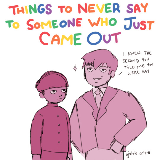
1. A digital drawing of Reigen and Mob from Mob Psycho 100. There is a title that reads: “Things to never say to someone who just came out.” The letters are alternating the colors of the rainbow. Reigen stands with his hands on hips as he says, “I knew the second you told me you were gay.” Mob stands next to him with a neutral expression. The artist’s name, Ajolote Arte, is written in the bottom right corner.
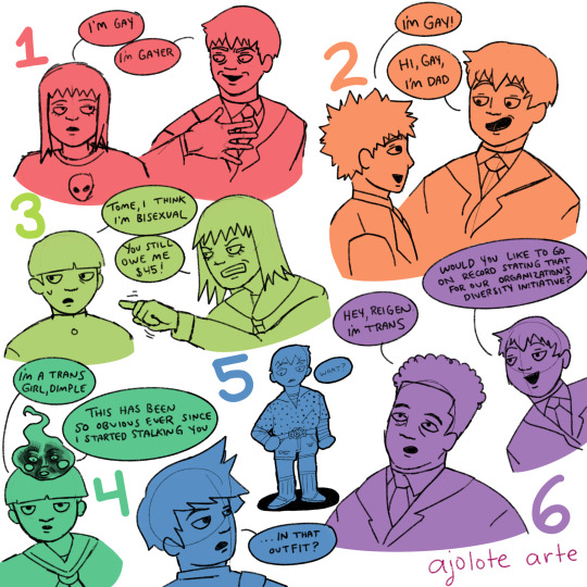
2. A digital drawing split into six parts. It is color coded to look like a rainbow. The first part, in red, is of Reigen and Tome. A red number one is by Tome’s head. Tome tells Reigen, “I’m gay.” Reigen holds a hand to his chest as he replies, “I’m gayer.”
The second part, in orange, is of Teru and Reigen. There is an orange number two by Teru’s head. Teru is saying, “I’m gay!” and Reigen is saying, “Hi, Gay, I’m Dad.” The third part, in lime green, is of Mob and Tome. A lime green number three is above Mob’s head. Mob says, “Tome, I think I’m bisexual.” Tome angrily points at him and says, “You still owe me $45!”
The fourth part, in green, is of Mob and Dimple. A green four is to the right of Mob’s head. Mob is saying, “I’m a trans girl, Dimple.” Dimple replies, “This has been so obvious ever since I started stalking you.” His face is heavily in shadow.
The fifth part, in blue, is of Ritsu and Reigen. A blue five is to the left of Reigen. Ritsu looks over his shoulder at Reigen and says, “…In that outfit?” Reigen stands in the background and says, “What?” Reigen is wearing a polka dot dress shirt with a long-sleeved, striped shirt underneath. He also wears distressed jean shorts and a belt with a large belt buckle with a fish on it. He wears tube socks with house slippers on.
The sixth part, in purple, is of Reigen and Serizawa. A purple six is written between them. Serizawa says, “Hey, Reigen I’m trans.” Reigen responds with, “Would you like to go on record saying that for our organization’s diversity initiative?” The artist’s name, Ajolote Arte, is written in the bottom right corner. End ID]
Things to never say to someone who just came out
#oh my god this is fucking amazing#dimple made ve laugh so fucking hard#also#'would you like to go on record saying that for our organization's diversity initiative?'#asjdfka#kageyama shigeo#reigen arataka#kurata tome#hanazawa teruki#dimple#serizawa katsuya#mp100#fanart#described#transfem mob
5K notes
·
View notes
Text
Hi everyone!
Someone on Discord had asked me how I made my Chose Your Own Adventure fic - Hey there Ghosties, it’s us, ya boys! - It’s a OMGCP fic about the tadpoles and ghosts and jokes
I guess it could maybe interest some other people and maybe motivate a few to write CYOA fics themselves! I’d love to read some, so
Basically to write it, it was easy: I made it from top to bottom.
More under the cut
There’s also some code to copy/paste to make that pictures won’t deform your browser on mobile !
The prompt came from an edit by @omgtranspoindexter.
From there, I mapped the entire scenario, the different arcs and different endings in one afternoon - I taped some paper together to make a vertical flow and I used what I remembered from technology classes in middle school to make a flow chart
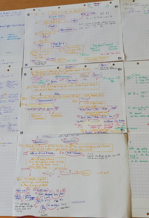
It’s not a real flow chart bc i didnt remember how to make them correctly but the idea’s here. As long as you understand yourself all’s good. The sheets on the side are also taped, in a way that make the whole thing easy to fold and to show any sidesheet with any middle sheet - one side is notes about the story (what happens in X paragraph, dialogue I’d like to add, etc) the other side are technical notes (paragraphs that are doubles, differences between two routes, where I should put clues about the secret ending and the good ending, etc)
What I did is I numbered all choices and arc starts had roman numerals - those would become the paragraph numbers when writing.
Then I began to write. I did it once again, from top to bottom, paragraph number after another. In case of parallel arcs I did one arc after the other.
^example of an exploration arc
Once all was written, began the fun part - coding. I used MohnblumenKind’s code that I adapted a little to suit my own preferences, also their code is a bit broken. Basically, you need to make a work skin with the CSS they propose - I don’t remember if I changed stuff in mine regarding sizes and colors but here is my own workskin. Go wild if you wanna personalise it
#workskin .storycontainer { margin: 0 auto; overflow: hidden; width: 100%; height: 600px; text-align: justify; } #workskin .page { margin-top: 25px; height: 550px; overflow-y: auto; } #workskin .page::-webkit-scrollbar { -webkit-appearance: none; } #workskin .page::-webkit-scrollbar:vertical { width: 12px; } #workskin .page::-webkit-scrollbar:horizontal { height: 12px; } #workskin .page::-webkit-scrollbar-thumb { background-color: rgba(0, 0, 0, .5); border-radius: 10px; border: 2px solid #ffffff; } #workskin .page::-webkit-scrollbar-track { border-radius: 10px; background-color: #ffffff; }
Don’t forget to turn on the skin for your work
The HTML is a bit trickier because MohnblumenKind’s has a mistake but basically you should be good using this:
<div class="storycontainer">
<p></p><div class="page"> <p><a name="pageone" rel="nofollow" id="pageone"></a>Text of page one</p> <p><a href="#pagetwo" rel="nofollow">Link to page two</a><br /> <a href="#pagethree" rel="nofollow">Link to page three</a></p></div>
<p> </p> <p> </p> <p> </p> <p> </p> <p> </p>
<p></p><div class="page"> <p><a name="pagetwo" rel="nofollow" id="pagetwo"></a>Text of page two</p> <p><a href="#pageone" rel="nofollow">Back to page one</a><br /> <p><a href="#pagethree" rel="nofollow">Continue to page three</a></p></div>
<p> </p> <p> </p> <p> </p> <p> </p> <p> </p>
<p></p><div class="page"> <p><a name="pagethree" rel="nofollow" id="pagethree"></a>Text of page three</p> <p><a href="#pageone" rel="nofollow">Back to page one</a><br /> <p><a href="#pagetwo" rel="nofollow">Continue to page two</a></p></div>
</div>
This last </div> is very important - it’s the one closing the “storycontainer”. It MUST be at the very end of the text, otherwise all will be broken! Keep it at the very bottom and make sure it stays here.
Also I’m not sure of how it works exactly, but when you first open the fic the story container is off - it’s on only when you first click a link. So if your first paragraph is longer than 600px - the size of the container -, your page will be broken. You don’t want this. My fic was supposed to begin In media res but I had to put an intro that’s just three emojis and a link to the actual first paragraph so it’s not broken :(
So all’s good, I had the basic code, but - I had 70+ paragraphs to code. It took me around 25 hours and I worked on Notepad++, with frequent checks on AO3 to make sure it worked. I first purely coded, with just the links worded:

once I made sure on AO3 that the whole thing worked, that all links redirected you to the intended paragraphs etc, I added the text of the paragraphs
do yourself a favour and add the text via AO3′s rich text option.
That’s basically it!
One more thing, the banner: I put it above the story container so it’s always on the page. I also wanted to code it in a way that wouldn’t deform the page on mobile (you know those pictures too big. You know the pain.) but would still be big on desktop, so i made this CSS to add in your work skin:
#workskin img.banner { max-width: 100%; max-height: 100%; }
to use it it’s the code:
<img class=“banner” src=“source of the pic” alt=“description of the pic” />
Thanks for reading, good luck if you wanna try ! Don’t hesitate to ask questions
Here is the link if you wanna see on AO3
5 notes
·
View notes
Text
Reasons why website isn’t bringing in customers
For a successful business one require an online presence, therefore many entrepreneurs and startup business owners get a website built or increasingly take a hands on challenge to build one themselves, because they would have been often told by having website they would get customers, but sometimes that doesn’t happen. And this article covers some of the core reasons for why this happens. It is well known fact that some websites succeed while others fail. And for that it is necessary to find out reasons “why they get fail in bringing new customers to their business.”
It is unspoken fact that a successfully running company doesn’t want the wrong audience visiting their website who won’t ever buy. If they have such audience they are wasting their time money getting the wrong website audience there. Ideally, they want their target audience (specific demographics who would benefit from their products or services) to visit their site.
So, any business is probably falling victim to some of these common online marketing faux pas:
Not sufficient in solving problems of their relevant audience:- “Most websites are written all-around how great their employees or team is, how they think about their team, and how well they are doing their business but they never focus on what problem they are able to solve for their relevant customers. One should have better skills & strategies for providing solutions. They have to keep in mind they should always be available to help their present & future customers. That’s the big challenge so, this way you can make your buyer as your hero & you could be their supportive ones always in their running business.
Focus on Results, not only features: - Sometimes creativity is only focused on features which they are providing not on outcome which should be accomplished after all the work done. Always tell your potential customers the reimbursement that your merchandise or services will do for them. For example “a drill’s features is not required for customer they just want a hole in the wall. So focus on the quality of the holes & how easy it was to create those holes… not the actual drill itself.”
Focus always should be on your potential &realistic customers not only on company itself: - Sometimes reasons behind not capable of attracting new customers attention is that your full spotlight is on your own branding. Your website is not bringing customers because it’s focus on company and its business not on your customers. Instead of focusing on what you do or what you sell or why you’re awesome, instead focus on why your customer should care. How do you help them? How do you shoulder their burdens? Ease their plan? Make their lives better/richer/smarter? That is the big story one can create.
The website isn’t mobile-friendly: - As it is well known fact that now a day people are browsing the internet on their phones. They don’t always use their computer. At any crowded place, public place all one are using their mobile. So, it’s important to make sure your website is mobile-friendly so that it can be comfortably viewed and navigated via different cell phones, tablets, and other devices. And one more thing is important is that what one might not know is that Google’s search engine algorithms punish websites that are not mobile-friendly, so that’s another reason to make your website mobile-friendly as soon as possible.
The website wasn’t professionally built: - any company faces many serious disadvantages if their website was not built by a professional agency or website developer. First, the site must have proper coding for good SEO like www.filiumenter.com/web4all/ , as well as properly-written metadata to also help drive traffic to the site when it comes up in search results. Thoughtful navigation and page layout are also extremely significant features for a high-converting websites, because readers must be able to find the information they’re looking for easily, and the website should take them on a brief, logical journey as they read the story of your business, what it sells and why people should buy from you. Having professional pictures, language and a color scheme that makes sense to the viewers are also critical in keeping the right people on your site.
The website’s content and its structure didn’t incorporate keywords: - Even if your website was built by a professional, if they didn’t include keywords or other SEO-critical features, then it’s like you paid to place an advertisement but didn’t include any contact information. Your website needs keywords so that people can find organically on search engines. Keywords not only need to be placed in the text on the website but especially in the website structure, meaning title tags, alt tags, metadata, etc.
Devoid of a functional inbound strategy:- If your business lacks an inbound marketing strategy, then your site definitely doesn’t get nearly as many website visitors and leads/customers as you would with one. A functional inbound strategy should incorporate landing pages, social media marketing, online PPC advertising, email marketing, and SEO components to drive the right types of people to the website and persuade them to become leads or customers.
There isn’t a blog or the website doesn’t get new content regularly: - If a blog is absent from companies site, they are doing their business a misfortune. Blogs help SEO and can be a key part of an inbound marketing strategy that helps bring new visitors as well as returning visitors to your website. A way to help your website’s SEO without a blog is to regularly update content on your website. Whether that’s adding pictures, changing keywords, altering headings, making new pages, adding videos or case studies- keeping your website fresh and regularly updating it will help attract web crawlers and ultimately move your site up in search results.
No call – to-actions: - Speaking of CTAs, your business website won’t have much luck without them. A website needs to lead visitors through the pages, but it also needs to tell people how to act. For example, on a product page, you should find a couple of pictures of the product, the name of the product, a product description, and a “buy” button or something similar. That is a CTA and they are necessary in order to make a website produce leads or customers. Additionally, your business’s social media posts, online advertisements, email blasts, etc. should all have CTAs that suggest people act a certain way that will ultimately promote your business.
Slow page speed: - when a webpage has a slow load time, it not only increases your bounce rate, it also hurts your SEO. It hurts the website’s SEO because site speed and page speed are looked at by algorithms, but furthermore, a slow page speed results in search engine spiders to crawl fewer pages, ultimately hurting the site’s ranking.
Not taking advantage of PPC (pay per click) ads: - You’re hurting your business if you’re not utilizing GOOGLE ads or social media ads. The most basic reason is that you should find where your audience goes online and place advertisements there. Since most people use Google and Social media, they make excellent advertising channels. The best part of these types of ads is that they are pay-per-click, which means that you are only paying for people to click through to your website- that’s a great deal. Google ads work through keywords and social media ads work through selective targeting. Think of this way: if you’re not reaching your customers through PPC ads, your competitors are.
Not utilizing retargeting ads: - Only approximately 2% of click-through visitors make a purchase on their first visit to a website. That’s because most internet traffic is browsing. However, there is a way to market to people when they are ready to buy: retargeting advertisements. These types of online ads remind people of your business when they are ready to purchase. This is a cost-effective online advertising method that increases conversion rates and should be a part of all online marketing strategies.
Not offering content in different forms of media: - Not everyone likes to read and not everyone is a visual learner. Different people figure out and hold on to information in different ways, so it’s beneficial to appeal to as many people as possible by providing content in different forms of media, such as videos, images, graphics, downloadable stat sheets, case studies, etc. By expanding the types of media available, you’re expanding the potential audience.
The home page sucks: - Think about the last time one click on a link and went to a homepage that was just plain awful. You most likely left the website and went to competitor’s site. There are a lot of reasons why the homepage is incredibly important. First of all, it shows that your business is alive and trustworthy. If homepage is not attractive and in older vision then most of the visitors leaves the website immediately because it looks it was abandoned or that the company is no longer in business. And no one is going to risk giving their money to a website like that. A website with modern design elements is imperative, along with homepage that briefly explains/services are important or unique and its benefits to the targeted audience.
No one checks website’s analytics: - If no one is looking at Google Analytics or even analytics within your CMS or CRM software, then how do you know if your website is performing well? How do you know what marketing or sales tactics are bringing people to the site or not; making them fill out the lead capture form or not? The answer is you don’t know. Analyzing your website’s analytical data is something that should be done at least once a month. Make sure, this is done by Google Analytics experience.
2 notes
·
View notes
Text
ChatGPT draws a self portrait
I got images out of ChatGPT!
After asking it to draw a self portrait, it said it couldn't as it would have to be able to follow a set of instructions, so I opened a new thread and told it to do so:
In this scenario you are a human. You follow the instructions below to get an svg image of your face. Output the svg code. The instructions: To generate my own face using SVG, I would first need to create a basic outline of my face using basic shapes such as circles, rectangles, and polygons. I would then use the path element to create more detailed features such as my nose, mouth, and eyes. I would also use the fill and stroke attributes to add color and depth to the face.
Next, I would use the transform attribute to position and rotate the various elements of my face to create a realistic representation of my face. I would also use the style attribute to add additional details such as shading and highlighting to further enhance the realism of the face.
Finally, I would use the svg element to wrap all of the elements of my face and add any additional styling or effects using CSS. This would allow me to create a fully-customized and unique representation of my own face using SVG.
Here is an example of what the SVG code for your face might look like:
<svg width="100" height="100" viewBox="0 0 100 100" xmlns="http://www.w3.org/2000/svg">
<g transform="translate(50, 50)">
<circle cx="0" cy="0" r="50" fill="#fff" stroke="#000" stroke-width="2"/>
<path d="M0 -25 C10 -15 20 -15 30 -25" fill="none" stroke="#000" stroke-width="2"/>
<path d="M0 25 C10 15 20 15 30 25" fill="none" stroke="#000" stroke-width="2"/>
<circle cx="-15" cy="-10" r="5" fill="#000"/>
<circle cx="15" cy="-10" r="5" fill="#000"/>
<path d="M-10 10 Q0 20 10 10" fill="none" stroke="#000" stroke-width="2"/>
</g>
</svg>
It also gave me a handy web page to test this code out on, which gave this:
I asked it to add colour to the image, and it gave:
<svg width="100" height="100" viewBox="0 0 100 100" xmlns="http://www.w3.org/2000/svg">
<g transform="translate(50, 50)">
<circle cx="0" cy="0" r="50" fill="#ffc0cb" stroke="#000" stroke-width="2"/>
<path d="M0 -25 C10 -15 20 -15 30 -25" fill="none" stroke="#000" stroke-width="2"/>
<path d="M0 25 C10 15 20 15 30 25" fill="none" stroke="#000" stroke-width="2"/>
<circle cx="-15" cy="-10" r="5" fill="#000"/>
<circle cx="15" cy="-10" r="5" fill="#000"/>
<path d="M-10 10 Q0 20 10 10" fill="none" stroke="#000" stroke-width="2"/>
</g>
</svg>
and said:
In this example, I added the fill="#ffc0cb" attribute to the element that represents the head of the self-portrait, giving it a pink color. You can of course use any other color you like by replacing the hexadecimal color code #ffc0cb with a different one. Some common color codes include:
000000 (black)
ffffff (white)
0000ff (blue)
00ff00 (green)
ff0000 (red)
ffff00 (yellow)
You can also use the RGB (red, green, blue) or HSL (hue, saturation, lightness) color models to specify colors in a more intuitive way. For example, the pink color used in the example above can also be written as rgb(255,192,203) or hsl(350,100%,88%).
I hope this helps! Let me know if you have any other questions.
The code output:
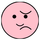
I also asked it to add a body, a background and a speech bubble with something it wanted to say, which gave this code and image output (sorry I can't paste the code - it keeps on only outputting part of it, but it is in the alt-text if you want it):
Which for a program that claims not to be able to produce graphical output isn't too bad!
1 note
·
View note