#coloridea
Photo

Read the Caption👇🏼. The Colors are the first connection your audience makes with your brand. And that’s why color psychology is very important in digital marketing. It helps you connect with your audience and how they feel about your brand and help you to grow in social media. . Think this way why did you click on my post? What color on this post brings you here? . This is going to be the same reason when you choose other companies. . What is your favorite Logo on this post? . Leave a comment and tell me. . Instagrams: @simplegrowmarketing 📌Website: Simplegrowmarketing.com . Hashtags: #simplegrowmarketing #colorspsychology #colortheorystudios #colorpsycho #psychologyofcolor #digitalmarketingstrategy2022 #colormarketing #colormarket #logocolors #socialmediastrategy101 #digitalmarketing101 #colorstrategy #colorstrategist #marketingstrategiesforsmallbusiness #marketingstrategy101 #bestdigitalmarketing #colorideas #coloridea #digitalmarketingstrategy #socialmediamarketing101 #digitalmarketingtips2022 #digitalmarketingtips (at United States) https://www.instagram.com/p/CkWd83ltZYY/?igshid=NGJjMDIxMWI=
#simplegrowmarketing#colorspsychology#colortheorystudios#colorpsycho#psychologyofcolor#digitalmarketingstrategy2022#colormarketing#colormarket#logocolors#socialmediastrategy101#digitalmarketing101#colorstrategy#colorstrategist#marketingstrategiesforsmallbusiness#marketingstrategy101#bestdigitalmarketing#colorideas#coloridea#digitalmarketingstrategy#socialmediamarketing101#digitalmarketingtips2022#digitalmarketingtips
0 notes
Text
Card Table Dimensions: Standard and Custom Sizes

Card tables come in various sizes: square (34 inches), circular (42-48 inches diameter), and rectangular (48x92 inches), with heights around 28-30 inches. Size variations accommodate different player numbers.
View more: https://www.arthitectural.com/card-table-dimensions/
0 notes
Photo

With all the new social media platforms coming on board which one is the best to use for your business? ‼️ We find that where the biggest audience is will give you the best bang for your buck. 💵 But one important thing to ask yourself is, where do most of your clients or target audience hang out? Not sure? Do a quick survey. Find out which platform they prefer and why. 📝 👉 This will give you some key insights into your audience and allow you to see where they hang out the most. 🔑 Once you find this out you can start your marketing plan and start posting to the actual place your audience hangs out. No more wasted time. 🚫 This marketing tip was brought to you by KG Website Designs. 📲 https://www.kgwebsitedesigns.com/ ...
#colortheory#brandtheme#brandcreation#colortheme#colortips#colorstrategy#colorideas#colorpalette#colortemplate#branding#brandgrowth#logocreation#colorpattern#newyork#chicago#losangeles#sandiego
0 notes
Photo
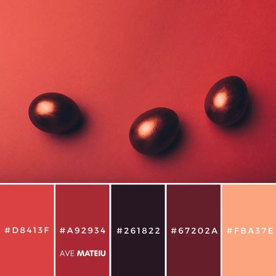
Looking for some festive and fun Easter colors to help celebrate spring? Check out our latest blog post: 10 Easter Color Palettes to Help You Celebrate Spring in Style. From pretty pastels to bright and bold hues, we've got all the colors of Easter covered. Plus, we've included some easy tips on how to decorate your home for Easter, as well as some cute craft ideas that the whole family can enjoy. • • • • • #avemateiucolors #avemateiu #colorinspiration #colorcombination #colorscheme #colorschemes #colorpalettes #spring #colorpaletteoftheday #hexcodes #springcolorpalettes #colourpalette #colourscheme #coloursplash #eastercolors #moodboard #graphicdesign #colorswatches #colorlove #colorselection #colourpalettes #colourschemes #colorideas #colourideas https://www.instagram.com/p/CpiwJmAjKi2/?igshid=NGJjMDIxMWI=
#avemateiucolors#avemateiu#colorinspiration#colorcombination#colorscheme#colorschemes#colorpalettes#spring#colorpaletteoftheday#hexcodes#springcolorpalettes#colourpalette#colourscheme#coloursplash#eastercolors#moodboard#graphicdesign#colorswatches#colorlove#colorselection#colourpalettes#colourschemes#colorideas#colourideas
1 note
·
View note
Photo
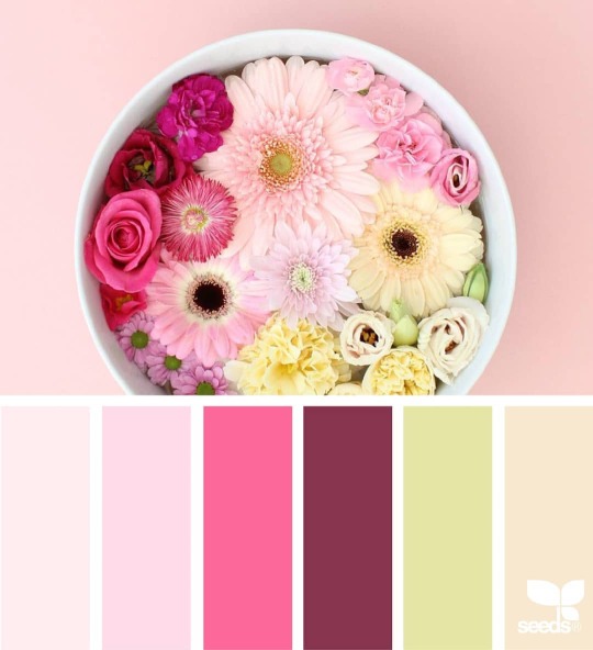
What a lovely #colorpalette ❤ #coloridea for #fluidart #color #acrylicpouring #abstractart #instaart Source: Design Seeds. https://byelisabethnl.blogspot.com/?m=1 https://www.instagram.com/p/B90BOOBHnpC/?igshid=160teqnytu8to
1 note
·
View note
Photo

THERMIC
Thermosensitive series enamel
Thermic products can be used both in interior contexts, such as switches, lighting technology, handles, seats, furniture, accessories, doors, tables, furnishing accessories, and in outdoor contexts, such as urban furniture, retail, public spaces. , hospitality (if protected with the appropriate protective outdoor). Thermic products are easy to use and guarantee high coverage and constant opacity.
Visit Our E-Commer
#interiorpaint#interiordesign#coloridea#interiorpainting#homesweethome#homedecoration#homedesign#kitchendecoration#kitcheninterior#kitchendesign#homeinterior#interioridea#architectdesign
0 notes
Text
Popular Colour Combinations For Home Interior Painting
Your house has invariably got an image of your choices and personality. The way you can organize each and every piece of furniture and design home color interior reflects your taste. Colour combinations are beautiful color related to our moods and minds. They can entirely reflect the vibes of your room. It is good to use various different shades of home paint color for different parts of your house as a different corner of the house is relevant for different purposes.
So, here is the home décor guide; we have shared the best colour ideas for your home interior.
Deep Blue & Neutrals Wall Colors
Celebrating the natural power of individuality is flawsome. Thus, with help of shades that range from blues and deep shades, purples to pastel greens and yellows; this color palette encourages to do Do-It-Yourself experiments with Pop of color that represent personal statements. So, if you can resonate with this theme, then be sure to get as creative as possible.
Blush Pink and Mahogany Wall Colour Combinations
It is an ideal shading blend for dividers assuming you need to add stalwart tints to the style. These shades normally spread a fiery and hopeful feel to the front room. However, both the Pink shade and Mahogany are proclamation tone. They effectively mix with old fashioned furnishings and help to make incredible emphasize dividers. Go for this lobby shading mix to upgrade your parlor mind-set.
Sober Pink and Grey Buck Wall Colours
Grey and pink Walls appear to be an odd mix, to some extent on paper. In any case, these shading together make a mix that is heartfelt. Calm pink dividers sets the heartfelt mind-set, and Gray Buck offers a steady base for the entire bundle. Sheer window hangings and regular light furniture will additionally improve the mind-set. Some light-hued highlight dividers will finish the look.
Brown and Cream
Brown is another shading that is unconventional with regards to the shading the room really dividers. Yet, when it is joined with the cream, it can loan a stylish, rich look to your room. In case you are utilizing brown, be the determination at the hour of picking the shade. Converse with specialists prior to utilizing it. Likewise, try to pick the right furniture in your room to supplement it.
Berry Blue and grey Wall Color Design
The major feature of the shading conjecture is the festival of varying backgrounds, with inspiring stories woven into every class. Purpassion is an ideal for the individuals who like to end their day in a quiet climate to sense of pride and select cool blue tones mixes like this one. Shades of blue wallpaper and dim can mean energy for the reason just as harmony.
Baby Blue and Royal Red Color inspiration
To go for this delicate Blue Wall shading blend, you need risk-appetite; as a little misstep can annihilate the vibe of your room. Furthermore, what occurs if everything goes right? This seems to be the jealousy of your guests! Attempt to utilize a portion of the gem tone to carry some splendor to your room and let the differentiating Aquarium Blue quiet your faculties following a feverish day! You can even go for this mix for your bedroom Wall Paint Colours combinations.
Magenta Wall Color
Add some vibrant color punch to the design trends and décor of the living area of your house with the home colours like magenta. This colourful designs will be going to add a dramatic effect to the environment around us. If you can couple this wall paint with some complementing decorative pieces and furniture, it will become an attractive area to spend some quality time.
Light Avocado Green
Your home is the safest place across the world. The dark velvety home colour like this avocado green color bring a warm and cozy essence every home buyer seeks in their homes. This color is rich in almost all the Colour Combinations the window has. So, you can easily decorate the surroundings with anything without even worrying about whether it will go with the wall paint.
Rouge and Cream
When it comes to colour combination ideas, beige, lighter shades of Bright White accent Color shades, and cream are often popular for good reason as they help make any space appear brighter and bigger. If you are going for a creamy interior, make your living room stand out by adding red details to the space.
Add crimson wallpaper accents like side chairs, textiles, pillows, and cushions. Try to finish off with some of the cool golden details, and your living room color scheme will look luxurious, bold, and elegant.
Lime Green and Yellow Colors
Yellow has consistently been a most loved emphasize shading with regards to the shading which you ought to decide for the dividers of your room or some other room. This tone can make your room look a lot more brilliant and extensive. In the event that you are searching for the best tone for the room dividers, you can go for the shading mix of lime green with yellow to bring a piece of spring inside your room. In the event that your room is excessively little, keep the roof white.
Peach and Black
Peach is a simple, warm neutrals, adaptable and dynamic tone to combine with practically any tone, however when you pick an intense and challenging shading like dark, the outcomes are astonishing. Dark more often than not immediately adds a dash of refinement to this exquisite peach room colors which makes the highlight divider stick out and add style to the room.
Lavender and off-white
Lavender, is a wonderful shading, and the scent are quieting and known to initiate a decent night’s rest. In case you are hoping to add tones to your room divider that are asserting and assist you with loosening up, then, at that point lavender and grayish are an extraordinary shading blend. This is additionally a famous divider shading mixes for some, front rooms as well.
Crimson and Iris Colour Combinations for Walls
The mixture of Iris and Crimson helps in creating a comfortable space. Furthermore, in other words, it adds a lively feel to the living room. You may choose these hall colours to create a relaxed and peaceful ambiance. It is an ideal combo to give an edge to the look of your living room.
Orange and Neutrals
This shading mix is exceptionally enlivened by the Kolam, a South Indian custom of drawing bright plans with powder; this shading range has a zonal impact. Also, it depicts rich reds and bursting dazzling orange example holding consistent with its motivation. Mix element is a subject conceptualized for the individuals who have confidence in regarding uniqueness in a gathering.
Bottom Line
The choice of painting Colour Combinations for walls makes a major difference. It can upgrade the magnificence of the lounge’s stylistic theme. You should are extra cautious when picking the corridor inside shading mix. Ensure the choice matches the decorations and topic. Settling on a divider paint shading mix for the lounge room is an overwhelming undertaking. Thus, don’t stop for a second to face challenges with the shading plan assuming you need to upgrade your lounge’s magnificence to the most ideal degree.
1 note
·
View note
Photo

How you ever drawn a picture and couldn’t decide how to color it? I’ve had this problem many times! For example, when I’m drawing hair, I don’t know if I should color it blonde, brown, red, black, or maybe even blue! There are so many beautiful colors to choose from, and it can be hard to decide! Well, let’s a take this small puppy and choose a color. I’ve colored him blonde, brown, grey, and tan. Out of all these colors, which one is your favorite? I like the tan since it brings out so many amazing patterns! You may think differently, but you see, sometimes there’s no such thing as a “correct” color, but first, make a list of colors you want to use, and then through some thought, make a decision that works best for you!
#art#artwork#artist#art of the day#kids activities#kids activity#kids art#kids artwork#how to draw#how to color#how to draw animals#kids art ideas#kids art class#childrens art#kids art tutorials#art for kids#color#coloring#colorideas#colortips#coloringtips#dog#puppy#design#follow the art tutorials#follow the art
1 note
·
View note
Link
Make your small bedroom according to your dream. Get the best 5 small bedroom color ideas for making your bed beautiful as heaven.
1 note
·
View note
Photo
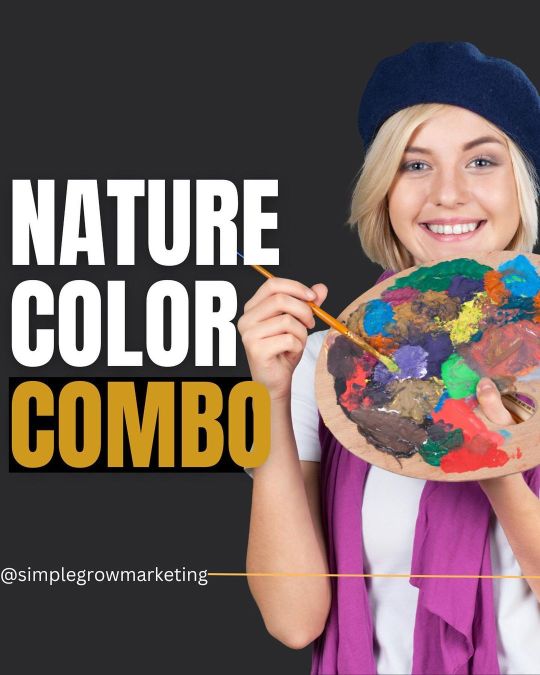
Read the caption👇🏼 . Are you struggling with colors? . The best place to find the right color for your niche is nature. Nature has a perfect combo; we can learn from it and use it for our project. And actually, it has a brand strategy idea behind it, too, because our mind is used to the color of nature; what is that mean? It means whatever we see is very close to the natural colors we will like it. Of course, those colors can help you with social media strategy too. You can use one of those combos and create a social media post from it, and you will see the results. . I use Canva to find these colors. . I hope you liked it. Don’t forget to save it to remember. . Instagram: @simplegrowmarketing . 📌Website: www.Simplegrowmarketing.com . . Hashtags: #simplegrowmarketing #socialmediacolor #colorcombooftheweek #colorsideas #colorcombos #colorstrategy #socialmediastrategy101 #socialmediastrategie #naturecolor #instagramstrategyguide #instagramcolor #coloridea #contentmarketingidea #contentcolor #combocolor #contentmarketing101 #marketingstrategy101 #marketingcolors #businesscolors #canvacolors #socialmediatipsforsmallbusiness #socialmediatipstricks #socialmediatipstofollow #socialmediathings #dailylearn #learnsocialmediamarketing #learnaboutcolors #learnmarketingskills #learnbranding (at United States) https://www.instagram.com/p/CkB-h9Ctp47/?igshid=NGJjMDIxMWI=
#simplegrowmarketing#socialmediacolor#colorcombooftheweek#colorsideas#colorcombos#colorstrategy#socialmediastrategy101#socialmediastrategie#naturecolor#instagramstrategyguide#instagramcolor#coloridea#contentmarketingidea#contentcolor#combocolor#contentmarketing101#marketingstrategy101#marketingcolors#businesscolors#canvacolors#socialmediatipsforsmallbusiness#socialmediatipstricks#socialmediatipstofollow#socialmediathings#dailylearn#learnsocialmediamarketing#learnaboutcolors#learnmarketingskills#learnbranding
0 notes
Text
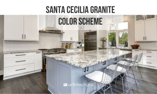
Santa Cecilia Granite Color Scheme (Countertop & Backsplash)
Composed primarily of quartz, feldspar, and mica, it’s exceptionally durable, which helps resist scratches, heat, and stains. Join us to discover how Santa Cecilia granite can transform your home’s ambiance!
View more: https://www.arthitectural.com/santa-cecilia-granite-color-scheme/
0 notes
Photo
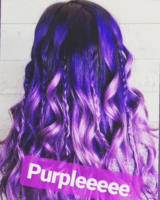
Would you consider purple hair extensions? 💖 #hair #hairstyles #hairideas #hairstylist #blond #brunette #hairextensionspecialist #hairstore #beforeandafter #blackhair #haircolorideas #colorideas #cool #wow https://www.instagram.com/p/BzymBMuCwFc/?igshid=eryeksl3as01
#hair#hairstyles#hairideas#hairstylist#blond#brunette#hairextensionspecialist#hairstore#beforeandafter#blackhair#haircolorideas#colorideas#cool#wow
1 note
·
View note
Text
[ad_1]
We once noted that certain colors look great on brunettes. Whether it be statement-making hot pink or pastel yellow, some shades really just pop on those with dark hair. But what about those of us with lighter locks? Don't worry—we've got you covered too with these great colors for blondes.There are a handful of colors that really make blondes look their best—hues that offset the brightness of your hair and highlight your skin tone. While we believe that everyone can pull off whatever color makes them feel confident, these tried-and-true hues are guaranteed to have you looking and feeling your best. In fact, we think it's worth keeping this particular palette in your wardrobe for days when you simply can't put together a head-to-toe look.Still skeptical? Allow some of the world's most stylish blondes to illustrate why. Keep scrolling to see (and shop) the five colors that really look incredible on blondes.
[ad_2]
Source link
#FASHIONSTUDIO#BEAUTY#COLORIDEAS#COLORTRENDS#HAIRCOLOR#NORDSTROM#OUTFITIDEAS#OUTFITINSPIRATION#PRODUCTROUNDUP#SHOPBOP#STOCK#SUMMEROUTFIT#WHOWHATWEAR
0 notes
Photo
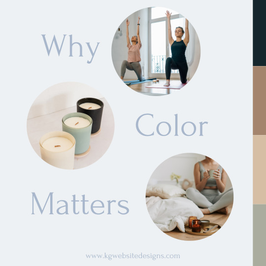
Why do colors matter? Colors convey a mood, and you want to ensure these colors convey what you want your brand to represent. For example: Are you a yoga instructor? Subtle blues, greens, and pinks convey peace, healing, and compassion. Are you a therapist? Yellow, orange, and white convey warmth, confidence, and honesty. So, before you start creating your brand or online branding think about the colors you use so that they align with your business. https://www.kgwebsitedesigns.com/ Want more info on colors and what they represent, check out this site: https://londonimageinstitute.com/how-to-empower-yourself-with-color-psychology/. ...
#colortheory#brandtheme#brandcreation#colortheme#colortips#colorstrategy#colorideas#colorpalette#colortemplate#branding#brandgrowth#logocreation#colorpattern
0 notes
Photo
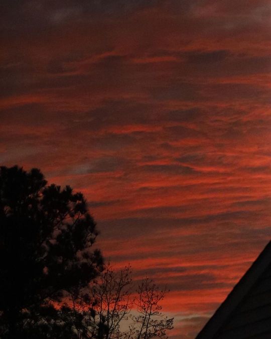
Just some clouds that were still peeking behind some houses when I was finishing up in the front yard. I like making them as gradients in PS. #clouds #colorconcept #colourconcept #colorideas #colourideas #digitalartideas #dimlight #earlyeveningsky #naturallighting #photography #outside (at USA) https://www.instagram.com/p/CZ7MURPlG1H/?utm_medium=tumblr
#clouds#colorconcept#colourconcept#colorideas#colourideas#digitalartideas#dimlight#earlyeveningsky#naturallighting#photography#outside
0 notes
Last Seen Blogs

rockl11
💵 💎

mingtinys
" i love my desire "

bubbbleguts
Aurelia Aurita

sasanya-dey
Shadey

wpww888888
OI OI OI