#how to color
Explore tagged Tumblr posts
Visit Tumblr Blog
Explore Tumblr blogs with no restrictions, modern design and the best experience.
Last Seen Tumblr Blogs


Fun Fact
Tumblr posted its first advertisements in May 2012 and subsequently earned $13M in revenue.
Text
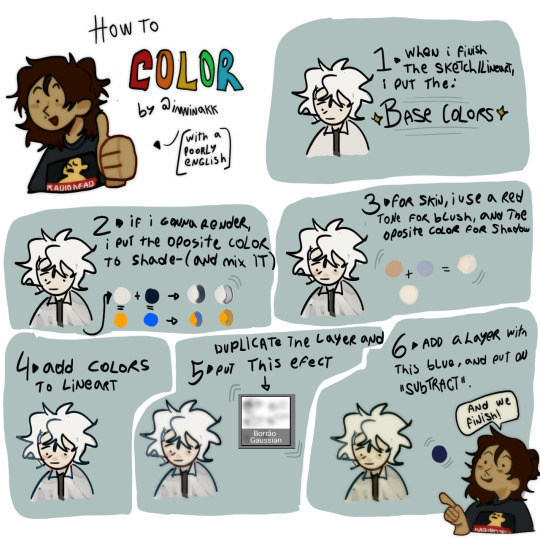
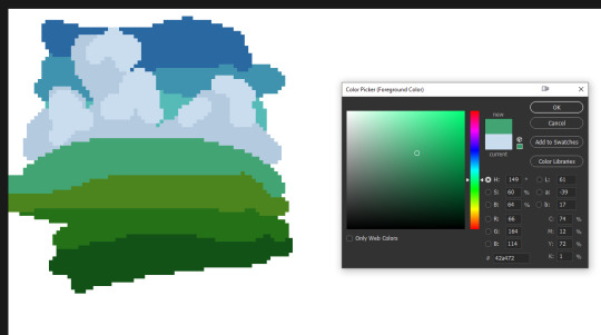
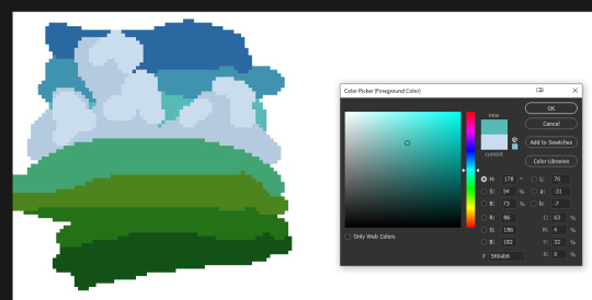
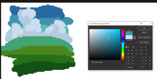
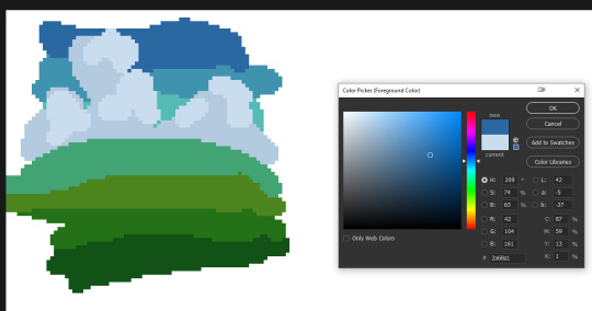
🎨color study note
18K notes
·
View notes
Text
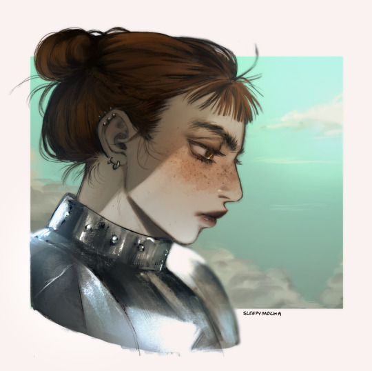
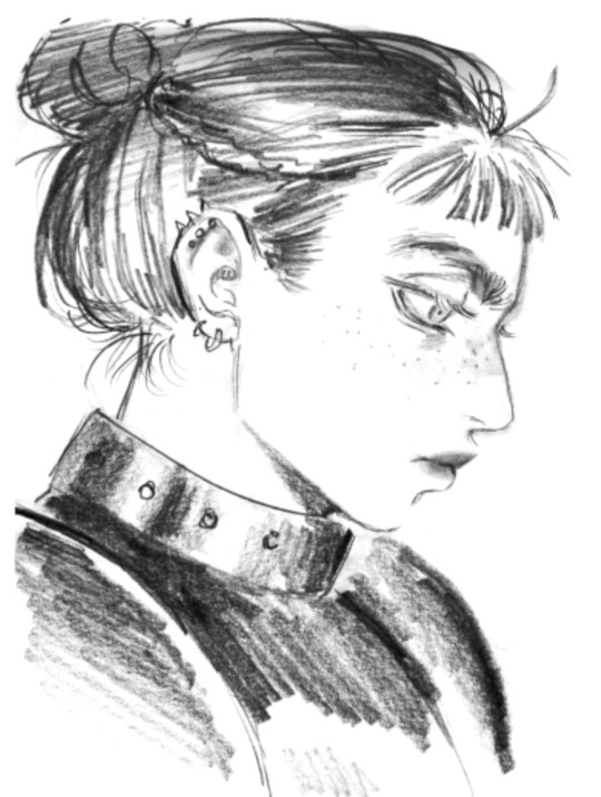
Posted the tutorial for this piece early on p4tr30n!!! 🧡 You can watch it now there, or wait til Christmas Day to see it on youtube for free!
I talked about how I colored and rendered this sketch from my october sketchbook pdf :3
#my art#knight#lady knight#knight lady#how to paint#how to render#tutorial#tutorials#how to color#tutorial video
262 notes
·
View notes
Text
My therapist cancelled on me and I'm sad and Booba helps so today I'm gonna teach you how to color booba for when you feel sad

Will I get flagged for this? 😿
#artists on tumblr#art#art tutorial#tutorial#digital art#guide#art guide#boobalicious#anatomy#human anatomy#booba#how to draw#how to paint#how to color#art on tumblr#art tumblr
87 notes
·
View notes
Note
i really like how you draw and color bodies. may i ask how do you color characters so well
AAHAHA AJQHXGWUWHJAS THANK U FOR THIS ASK I LOVE TALKING ABOUT THAT
My english its horrible, but i think you can understand <33
Note: it is very important to study color theory, I study real photos to learn about colors, so this can help: Look at a photo and try to guess the colors in it, and try to replicate that image without seeing what the colors are, taking from head really. Then you compare to see if you got it right.
(most shadows will be better with the opposite color of the base color, I learned this through discord- )
Kisses ( please send me more asks like that one, i love it )
86 notes
·
View notes
Note
You might have already been asked something like this before, and if so if you could point me in the direction of that post I would !!! very much enjoy that but !!
How do you get your color palettes/pick out all the colors you're gonna use for a piece? At first glance it looks so 'simplistic'/like you can pick out each individual color but the longer I look at your art the more I see a billion tiny details and i'm just curious as to how you keep all of that looking so tidy!!! :0
YOUR ART IS GORGEOUS BY THE WAY AS SOON AS I CAN I'M DEFINITELY GETTING PRINTS
this is a v sloppy how to i just did (it looks like a froog loool) but basically i just make gradients then blend the colors, based on the mood i want. starting out i used a looooot of references for inspiration/colors and did a ton of studies and that helped me learn! then usually i add 'striking' complimentary colors for oomph! i also usually saturate/color correct at the end as well. hope this helps and thank you so much~~
#pixel art#artist on tumblr#artist tutorial#color tutorial#pixel art tutorial#pixelart#8bit#8bitart#how to color#color palette#color palette meme
310 notes
·
View notes
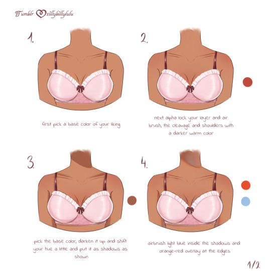
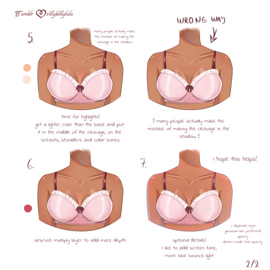
Text

Color picking skin color without considering the surrounding colors and overall tone/mood of the art work is never a good idea!
All those colors here are used as skin tones for the SAME character in various illustrations of mine.
128 notes
·
View notes
Text
youtube
I made a tutorial!
This was requested of me a while ago, so apologies for the wait! In this video I cover my entire process when it comes to coloring/drawing gold. I did my best to explain in-depth and detail how light, shadows, contrast, and color work together to create a polished gold look, applicable to any metal in art. Hopefully it's not too difficult to follow and I hope it helps!
-- ko-fi / patreon twitter / youtube
#jaskdraws#art tutorial#how to color#gold reference#how to gold#coloring gold#coloring metal#gold tutorial#metal tutorial#digital art tutorial#artist#coloring reference#Youtube
99 notes
·
View notes
Note
how do you determine your color palette...? color is something i have a lot of difficulty with and i really want to learn how to at least figure out a color palette 😅
i guess another way to phrase it is how did you go about learning color theory?
the number one most helpful thing i did for myself when teaching myself to color was to realize that every artist colors differently.
i already knew color theory in advance, i memorized every word i had been told throughout every highschool art class i had taken, but knowing the actual facts and knowing how to apply them are very different skills!
if you haven't learned the facts of color theory, i highly suggest these two videos (thing 1) (thing 2). <- the most important part of watching those videos is to hold them in your head as facts. if watching them doesn't make you necessarily understand how to apply them, that's okay! these videos are to give you the skills to be able to study color.
for a simple example, when it comes to picking colors based off the mood of your piece, pretty much everyone knows that blue will make an image feel more sad and emotional. yellow feels happy, red feels angry, pink feels affectionate.
a great way to teach yourself how to APPLY mood through color is to go back to a drawing you're already very proud of, and just mess around recoloring it. pick one thing you want to work on and try to use your color choices change the emotional effect of the piece.
it's incredibly helpful to use a piece that you have already colored, preferably one you're the most proud of. this is so that you aren't stressing yourself thinking about things like proportion or composition, and allows you to think solely about your color choices.
here's my example! for this example, my goal was to make this one feel far more bleak than my original finished piece.
i achieved this change by shifting the colors to all be more cold and desaturated, as well as making the blacks of his undershirt and tie look more washed out. most people associate cool colors with sadness, and dull colors with defeat. mixing those two makes the mood more bleak. color placement can also change a lot— for this version, i placed a lot of the blush color (which i desaturated significantly) higher up his face, which gives him a more horrified and thoughtful expression
once you've done exercises like this once or twice, a great way to decide how you want to color is to find out how other people pick their colors. one way to do this is color picking studies, and another is to watch youtube videos like this one where an artist explains their personal thought process while choosing colors.
if you'd like to know how i, personally, go about picking my colors, i would be happy to make a separate post outlining my process! it would take a pretty long time, though, because a lot of my process is to not leave things alone until i'm satisfied with how they look
the thing about being a self-taught artist is that everyone tells you that the way to get better is to "just practice," but that's not the whole story! art is a skill you have to build, and i've found the most effective ways to improve are to do studies, and to learn how to spot your mistakes and problem-solve until you can fix them.
i hope this was a good way to get you started on learning how to internalize and apply color theory! the more you study, and the more you learn, the better your results will be
youtube
#color theory#echolocating#art tutorial#art tips#artists on tumblr#digital artist#tma#the magnus archives#jonathan sims#how to color
49 notes
·
View notes
Text
Reverse 1999 OC!! [Sht this is old]
TypeWriter
"A rascal, a nuisance, a bother. There's a lot of synonyms to describe this woman's disastrous nature. Though despite that, she has proven herself to be capable."
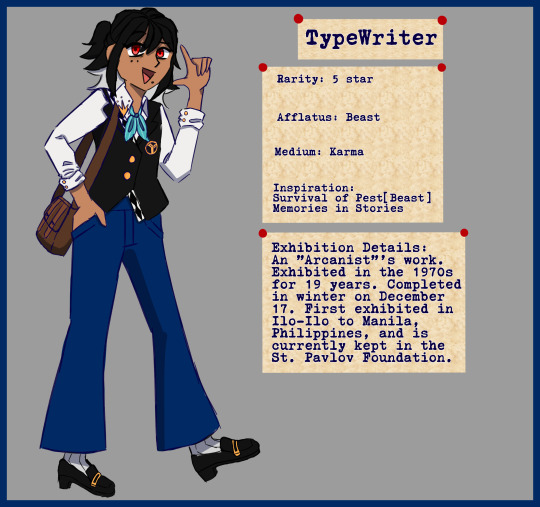
Her Arcane Skill allows her to materialize/summon ghost like creatures. Her most often summon are 3 rats.
Damage: Reality
Role: DPS / Nasty Wound / Burst Dmg
[I'll post on the Incantations someday.]
#reverse 1999 oc#reverse 1999#r1999#my art#digital art#Still struggling on digital#Lore in progress#How to color#Art Style keeps changing#Sleep? What is sleep
27 notes
·
View notes
Text
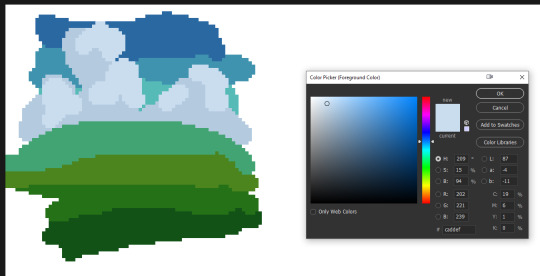
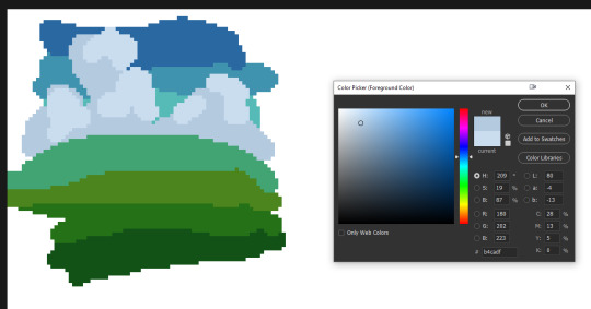
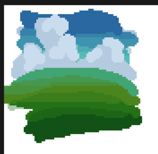
How I Choose Colors.
Choosing colors is one of my favorite parts of drawing. It can really pull a piece together and help portray a mood. There are so many different ways to go about color there is no way I would be able to go over them all. I can go over 2 of my favorites that I tend to use the most in my work though. This is going to be a longer post but I do hope that you stick around. I am not a professional artist so some of the terms I use may not be 100% accurate but I do hope that I can get my point across.
Muted Color schemes.
When trying to convey themes of sadness I will often go with cooler colors. Using muted tones can also help bring about a sort of calmness as they aren't as striking to the eyes.
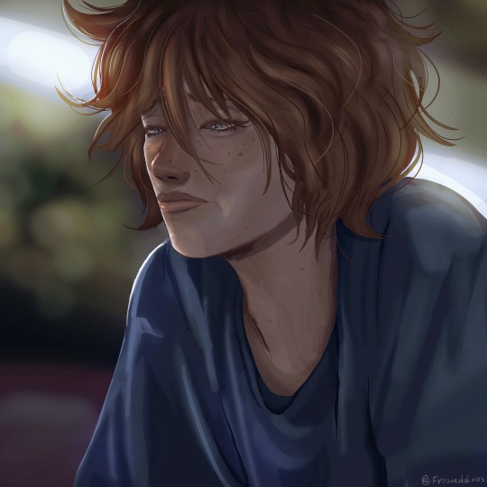

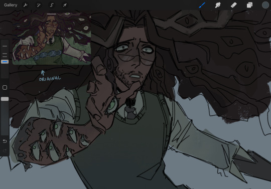
On the left, the colors are warmer, and while we can see on his face he is experiencing some sort of sadness, the overall color scheme of the image doesn't necessarily convey that. In my opinion, a warmer color scheme is much better for conveying happier moods. it shows more comfort and joy.
On the right, the colors are cooler and it makes the drawing look colder. It makes it feel a bit more like he is feeling isolated and his environment reflects his sadness.
Having a warm background and a cool character(or vice versa) may introduce an interesting contrast though. I haven't tried it myself much but now that I am thinking about it, I think it could work well to show how a character feels versus the way the world is around them.
RED.
A lot of the time when I use saturated reds in a drawing it's supposed to portray some sort of shock factor. I haven't used it much lately but I will show you an older piece I drew for someone that utilized a lot of red.
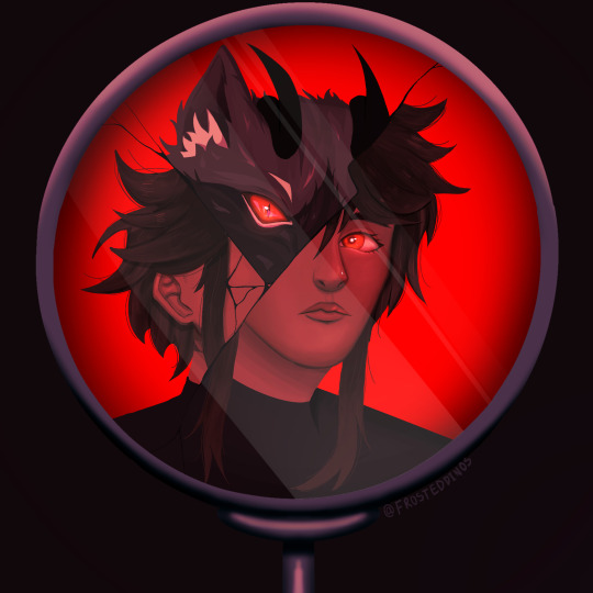
In this piece the shock is supposed to come from the fact that this character is not completely human. The red sort of aids in this as it introduces a certain air of danger. The cracked mirror portrays the shattering of a facade and that general Idea.
Red can also be used to aid in portraying one character being the one inducing fear or a character being angry. This color language can be used with other colors as well such as yellow showing joy and blue showing tranquility or peace.
Anyway, those are the top two ways I choose colors. I hope that this helped, even if just a little.
#art#drawing#art tutorial#beginner artist#color theory#how to color#digital art#digital illustration#artwork#artists on tumblr#tutorial#drawing tips#tips and tricks#art advice
8 notes
·
View notes
Text
#coloring#adult coloring#printable coloring pages#coloring for kids#coloring books#coloring art#coloring pages#digital coloring#coloring techniques#relaxing coloring#coloring tutorial#coloring time-lapse#coloring ideas#coloring inspiration#coloring therapy#creative coloring#coloring for stress relief#mandala coloring#art therapy#coloring designs#coloring videos#how to color#coloring tips#crayon coloring#marker coloring#pencil coloring
2 notes
·
View notes
Text
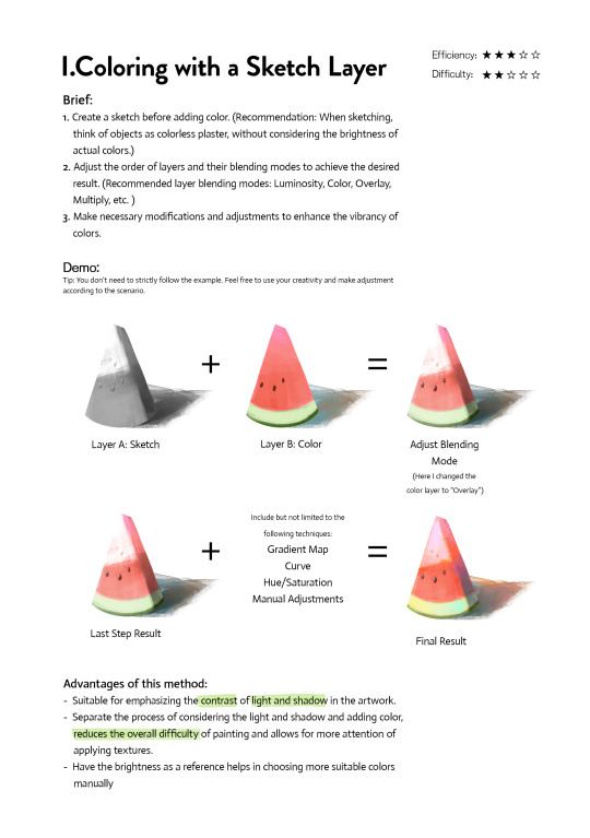
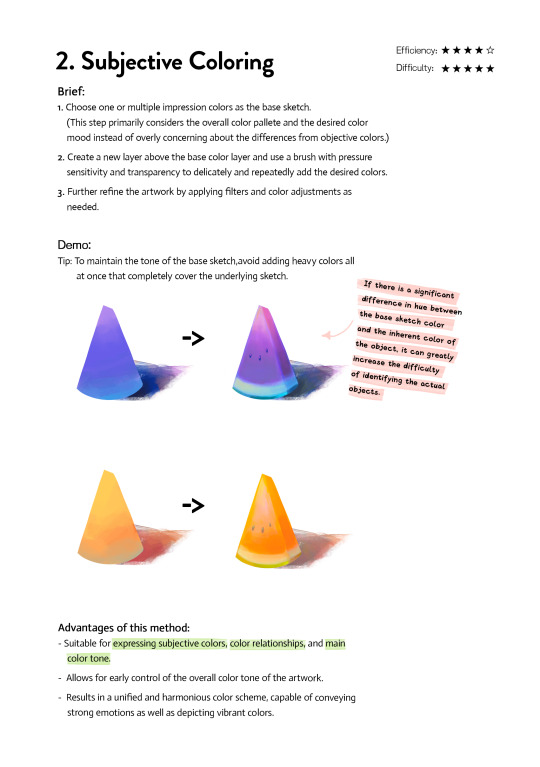
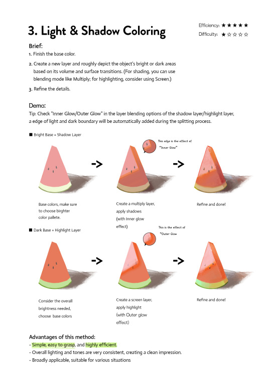
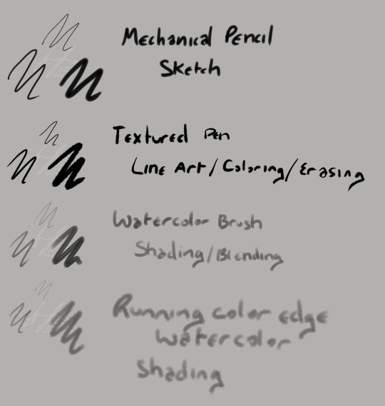
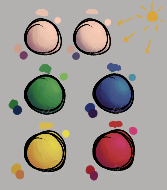
Art Tutorial| 3 coloring methods
If you're frustrated at coloring or don't know how to do the color, please check and try them. They may inspire you to find a new way. Any feedback and suggestions are welcome!
3K notes
·
View notes
Text
youtube
My first ever tutorial video !!!! Wah!! I hope some of you find it even a little bit useful :3
#video#art tutorial#how to render#how to color#how to paint#my art#video tutorials#ref#tutorials#Youtube
52 notes
·
View notes
Text
youtube
4 notes
·
View notes
Text
Someone messaged me asking me how I do stuff I use Clip Studio... But I always recommend Krita instead Literally... I don't use anything else with the exception of some pattern brushes (rarely)
#behold#my arsenal#I'm EXTREMELY professional with my four brushes#thank you very much#anyway this is what I use#and what I use them for#and also a very very basic#how to color#which#ive just taught myself within the last month or so#clearly im a professional#(I am not)#(I am completely self taught and have zero training)#except for high school#but what did high school ever really teach you about art#love you mr t but I did not do anything you asked lol#digital art
4 notes
·
View notes
Text

in all timelines in all possibilities only you can show me this
#artists on tumblr#Arcane#jayvik#Jayce Talis#Viktor#arcane spoilers#my art#I saw That Shot (you know the one) and my brain broke with how beautiful it was#and then I was like wait those colors... oh my god what if...#aaaand I've always wanted to draw the klimt kiss ref#looks like these two were the ones who got it in the end hah#but phew this tested me in so many ways with figuring things out
64K notes
·
View notes