#connected scatterplots
Explore tagged Tumblr posts
Visit Tumblr Blog
Explore Tumblr blogs with no restrictions, modern design and the best experience.
Last Seen Tumblr Blogs


Fun Fact
The KCSC sent more than 20K requests to delete posts related to prostitution and porn to Tumblr from January to June 2017.
Text
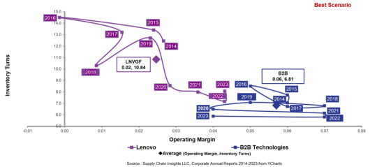
A Story of Supply Chain Excellence
Lora Cecere, the Supply Chain Shaman, is one of my favorite writers about supply chain issues. She’s always right on target with ideas and metrics that aid companies in the pursuit of supply chain improvements. And she’s the essence of simplicity; it’s never that complicated to do, though the ideas may embody complex interactions and reactions. This article is an example. Lora and her assistant,…
View On WordPress
#business dataset#connected scatterplots#Gartner Top 25 Supply Chains#industry standard#inventory turns#Logistics#operating margin#orbit charts#supply chain analysis#supply chain improvements#supply chain issues#supply chain metrics#supply chain performance#Supply Chain Shaman#supply chains
0 notes
Text
how are google sheets charts so bad oh my god. the system just doesnt have any flexibility besides the specific features they explicitly added
if i want to have a scatterplot with two different datasets, the only way to do that is to paste the second set's x-values beneath the first set's. what the hell
i also can't have one dataset be entirely points and and another with a connecting spline, even though that's such a basic and standard way to show a model fitted to measured data
literally who designed this?!!
and before you say 'use a better software lol' the whole point of this is i wanna get my students to do mathematical modeling, and i sure as hell don't expect them to have excel on their chromebooks or enough python knowledge to use matplotlib
monopoly power my beloathed,,,,,,,,,,,
3 notes
·
View notes
Text
this is an old example from decades ago but some data scientists threw machine learning on a data set of ... it was either people arrested or people convicted and I can't remember something about crime. and you have to understand AI aren't people what they do is find patterns but they can not find meaning between those connections, that has to be interpreted by a person. Anyways the pattern the AI picked up on wasn't anything useful related to crime, the pattern it picked up on was racial profiling. It started grouping criminality based on racial characteristics like skin color or something. The strongest pattern it found was that the justice system associates race with crime level.
Another example was from a university research project of mine where my group wrote simple AIs to analyze an aggregate dataset of ecological data from multiple scientists. We couldn't draw any conclusions and were only able to demonstrate proficiency with data science techniques. The professor said what the AI picked up on might have been the scientists themselves. In that each dataset had more in common with itself because of how the scientist collected the data than data points had in common across data sets.
Point is computer programs and AIs don't know anything. AI's aren't actually intellegent they're just probability models, the simplist AI is a linear regression line through a scatterplot like you made in 6th grade. Machine learning finds the strongest patterns but it cannot distinguish meaningful patterns from meaningless patterns (meaning in terms of the specified objective). AI's are not objective all knowing dispensers of truth, they amplify biases existing in the data actually.
I'm just saying, "We created a computer to make decisions for us, but it assimilated all of the bias that was implicit in the dataset and now makes incredibly racist decisions that we don't question because computers are logical and don't make mistakes" literally sounds like a planet-of-the-week morality play on the original Star Trek.
47K notes
·
View notes
Text
Visualize Your Career Growth: Why "Tableau For Data Science!!" Is a Game Changer

Imagine turning messy data into meaningful stories that speak louder than spreadsheets ever could. Whether you're a total beginner or someone who wants to take your analytical skills to the next level, mastering data visualization with Tableau could be your ticket to a thriving data science career.
In today’s data-driven world, it’s not just about collecting numbers—it’s about presenting them in ways that drive real decisions. That’s where Tableau comes in. And if you’ve been looking for a course that bridges the gap between raw data and powerful insight, then Tableau For Data Science!! is your perfect starting point.
Let’s explore how learning Tableau can open doors, enhance your skillset, and give your resume the kind of boost hiring managers are actively seeking.
What Makes Tableau a Must-Learn Skill in 2025?
Data is the new oil, and Tableau is your refinery. As companies lean harder on data to fuel decisions, they need people who can make sense of the numbers—and even more importantly, show others what the numbers are saying.
Here’s why Tableau stands out:
User-Friendly Interface: You don’t need to be a coder or a tech wizard. Drag-and-drop functionalities make data visualization smooth and intuitive.
Speed & Flexibility: Create dashboards in minutes. Modify them in seconds. Update them in real time.
Massive Industry Demand: Companies in tech, finance, healthcare, retail—you name it—are all looking for Tableau experts.
Bridging Data & Decisions: Tableau helps translate complex datasets into easy-to-understand visualizations, leading to smarter business moves.
That’s why enrolling in a course like Tableau For Data Science!! isn’t just a smart move—it’s practically essential if you’re serious about breaking into or growing in the field of data science.
Who Is This Course For?
The beauty of this course is that it’s made for everyone.
Beginners: Never opened Tableau before? No problem. This course starts from zero.
Excel Users: If you’ve dabbled in spreadsheets, you’ll find Tableau to be a powerful upgrade.
Aspiring Data Scientists: Visualization is an essential piece of the data science puzzle.
Marketers, Analysts & Entrepreneurs: Anyone who works with reports, trends, or performance metrics will benefit.
If your goal is to showcase data in a way that influences business decisions, this course is tailor-made for you.
What You’ll Learn Inside Tableau For Data Science!!
Now, let’s get into the juicy details of what you’ll gain from Tableau For Data Science!!:
✅ Master the Tableau Interface
You’ll get hands-on with Tableau’s environment—from connecting to data sources to building your very first dashboards.
✅ Create Interactive Dashboards
Learn to design dashboards that are not just functional but also interactive, responsive, and dynamic—perfect for real-time business updates.
✅ Visualize Like a Pro
Charts, graphs, maps, scatterplots—you’ll learn how to pick the right visualization for the right message.
✅ Understand Real-World Applications
This isn’t just theory. You’ll work with datasets from real industries—retail, finance, health—so that what you learn applies immediately.
✅ Build a Portfolio
By the end of the course, you’ll have projects you can showcase to future employers or clients. That’s not just learning—it’s career-building.
How This Course Gives You an Edge
There are hundreds of data courses out there. So why choose this one?
Because it’s not just about Tableau—it’s about learning Tableau in the context of Data Science.
Data Science is a huge umbrella: machine learning, big data, statistics. But every part of it requires effective communication. The better you can present your insights, the more value you bring to the table.
This course is focused on building that bridge.
Real-world datasets
Case-based learning
Hands-on projects
Step-by-step instructions
Taught by industry professionals
That’s the power combo that will make your learning stick—and your portfolio shine.
How Tableau Fits into the Bigger Data Science Picture
Tableau is not an isolated tool. It plays well with others.
Here’s how it connects with other pieces of your data science journey: ToolRoleIntegration with TableauExcelData cleaning & storageDirect import availablePythonData modelingOutput results for visualizationSQLData queryingTableau can connect directly to SQL databasesRAdvanced analyticsCombine R scripts with Tableau dashboards
Learning Tableau equips you to see the big picture—and then present it beautifully.
Why Hiring Managers Love Tableau Skills on Resumes
When recruiters scan for data roles, they look for two things:
Technical skill
Communication ability
Tableau shows both. It tells the employer: “I can work with data AND I can explain it to stakeholders.”
That makes you incredibly valuable.
Whether you’re applying for:
Data Analyst
Business Intelligence Specialist
Marketing Analyst
Product Manager
Operations Strategist
…showing Tableau on your resume immediately boosts your credibility.
Common Questions You Might Have (Answered!)
🟢 “Is Tableau hard to learn?” Not at all! Especially when you learn it through a well-structured course like Tableau For Data Science!!. The drag-and-drop interface is beginner-friendly.
🟢 “Do I need to know coding?” Nope. While you can integrate Tableau with coding languages like Python or R, it is not required.
🟢 “How fast can I get job-ready?” You’ll be surprised. With consistent effort, you can start creating stunning dashboards in just a few hours—and with this course, you’ll have real projects to show off by the end.
🟢 “Is certification included?” Yes! After completing the course, you’ll get a certificate—perfect for LinkedIn or resumes.
Real Student Reviews Say It All
Still wondering if the course delivers?
Here’s what learners are saying:
⭐⭐⭐⭐⭐ "The examples were practical, and I could apply them directly to my job the next day."
⭐⭐⭐⭐⭐ "I knew nothing about Tableau, and now I’m creating dashboards for my team. This course made it fun and easy."
⭐⭐⭐⭐⭐ "Helped me land my first data analyst internship. Worth every minute."
These aren’t just stars. These are results.
Learn By Doing – Not Just Watching
Too many online courses leave you watching endless videos with zero practice.
Not this one.
You’ll get:
Real projects
Quizzes to test your skills
Guided dashboard builds
Instant feedback
You’ll learn by actually building. That’s what makes this course stick.
Final Thoughts: Is This Course Worth It?
Let’s be honest. Data science is competitive. But it’s also one of the fastest-growing, highest-paying fields out there.
The one thing that can set you apart?
Being the person who not only understands data but can communicate its story.
And that’s exactly what Tableau For Data Science!! teaches you to do.
So, if you're ready to:
✅ Enhance your skillset ✅ Improve your portfolio ✅ Boost your confidence ✅ Break into the data world
Then this course is your launchpad.
0 notes
Text
Maximizing Efficiency with Microsoft Excel in Investment Banking

Investment bankers and financial analysts are often known for their number-crunching skills, advanced analytics, and expertise in financial mathematics. While these skills are not absolutely essential to work in the investment banking industry, they can undoubtedly give you a competitive edge. Although there are many tools and courses available to help improve these abilities, one tool stands out for its versatility and comprehensive features: Microsoft Excel.
With Excel, you can efficiently extract, analyze, and interpret crucial data using features like filters, pivot tables, and various built-in functions. You can also present your data in a more compelling and organized manner. By allowing Excel to handle much of the heavy lifting, you’ll be able to boost your productivity significantly through an Excel Course in Kolkata.
Here are some key benefits of Excel for investment bankers:
1. Save Time and Boost Efficiency
Investment banking is a demanding job that often requires long hours and a fast-paced environment. In such a high-pressure field, any tool that helps save time is invaluable.
It allows you to streamline complex calculations, automate repetitive tasks, and filter through data quickly for better analysis. By doing most of the routine work, you’ll have more time to focus on strategic tasks, which can improve your overall productivity. This will not only help you become more efficient in your daily tasks but will also enhance your career growth by making you a more organized and capable professional.
2. Create and Analyze Financial Models
Financial modeling is at the heart of investment banking, whether you’re working on mergers and acquisitions, IPOs, or capital raising activities. Excel can help you build these models, allowing you to project financials and perform valuations, including methods like Discounted Cash Flow (DCF) and Price-to-Earnings ratios.
Furthermore, it makes easier to visualize financial data through charts, pivot tables, and scatterplots. You can also use Excel to generate reports such as Profit and Loss (P&L) statements, directly extracting data for your financial analysis. This makes it easier for investment bankers to interpret data, draw conclusions, and explain insights clearly to clients.
For professionals looking to enhance their skills, Advanced Excel Training in Kolkata offers a great opportunity to master Excel functionalities. Whether you're building complex financial models or automating processes with VBA, this training will give you the tools to succeed in investment banking.
3. Master VBA for Automation
Visual Basic for Applications (VBA) is the programming language used in Excel, and it can take your Excel skills to a whole new level. Once you’ve mastered basic Excel functionalities, learning VBA allows you to automate nearly any task in finance. VBA can help you:
Automate complex financial calculations
Connect directly to databases
Build sophisticated financial models and charts
Design customized applications for financial analysis
Although learning VBA may take some time, it can significantly speed up your workflow and help you stand out in your career. Many bankers and analysts gain proficiency in VBA through online courses or self-study, and it is highly recommended if you want to enhance your technical skillset.
How to Become an Excel Pro
If you're looking to dive into Advanced Excel Classes in Kolkata, can join Advanced Excel Institute. There are numerous online courses that take you through the basics, intermediate, and advanced levels. These courses cover everything from inserting comments and tracking changes to building complex financial models and learning VBA.
A recommended starting point is a foundational Excel course that caters to investment banking needs. This will help you learn step by step, ensuring you gain the skills necessary to excel in your career. The only requirement is access to Microsoft Excel, and with dedication, you can become an Excel expert in no time.
By mastering Excel, you’ll gain a significant advantage in the world of investment banking, boosting your efficiency, accuracy, and ability to handle complex data analysis.
For more information, contact us at:
Call: 8750676576, 871076576
Email:[email protected]
Website:www.advancedexcel.net
#Excel Training in Kolkata#Advanced Excel Classes in Kolkata#Advanced Excel Training in Kolkata#Excel Classes in Kolkata#Excel Course in Kolkata
0 notes
Text
How to Choose the Best Graph for Your Data: A Complete Guide

Importance of Data Visualization in Extracting Insights
In a sea of data, insights are the valuable gems that drive innovation and progress. These insights are often hidden in complex data sets. This is where data visualization comes in handy. Visualization is more than just making data look good; it helps decode complex data and uncover patterns that guide decisions. It bridges the gap between raw data and human understanding, allowing data scientists and analysts to see actionable insights.
Understanding Different Data Types
Different data types require different visualization methods. Your dataset may include categorical, numeric, time series, and relational data types. Understanding these types is crucial because the right graph depends on the data type. This combination of data type and visualization method is key to effective communication.
Visualizing Categorical Data
Categorical data can be visualized using various options. Bar charts, pie charts, and categorical histograms are common tools. It’s not just about the tools, though; it’s about knowing when and why to use them.
Bar Charts
Bar charts are great for comparing quantities across different categories. For example, a marketing team analyzing customer preferences for different product categories might use a bar chart to show which product category is most popular, helping with inventory management.
Pie Charts
Pie charts are useful for showing proportions within a whole. For example, a pie chart could display the distribution of votes in an election, showing which party is leading. Make sure the proportions are clear and relevant to convey the message effectively.
Categorical Histograms
Categorical histograms are useful for showing frequency distributions or variations within each category. They can help understand survey responses or product ratings.
Numeric Data Visualization: Mapping Relationships
Numeric data is the foundation for quantitative analysis. It helps in various fields, from business strategies to weather forecasts. Numeric data visualization helps uncover relationships between data points, turning complex numbers into actionable insights.
Scatter Plots
Scatter plots show two variables and their correlations. For example, a scatter plot can illustrate the relationship between advertising spend and revenue, helping guide marketing strategies.
Line Charts
Line charts show trends over time, making them valuable for tracking changes and making predictions. For example, analyzing sales data over months can reveal seasonal trends, helping retailers adjust inventory accordingly.
Box Plots
Box plots provide a snapshot of data distribution, showing outliers and variations. They are useful in fields like finance and clinical research to understand data spread and skewness.
Time Series Visualizations: Revealing Temporal Trends with Precision
Time series data shows changes over time. Whether tracking stock prices, patient vitals, or climate changes, time series data provides a unique view of variable evolution. Spotting trends and seasonal cycles is essential for making informed decisions.
Time Series Plots
Time series plots show data points over time intervals, revealing trends and fluctuations. They are useful in fields like economics and epidemiology.
Seasonal Decomposition
Seasonal decomposition breaks down time series data into trend, seasonality, and residual components. This technique is important in industries like retail and finance, where understanding seasonal variations can guide strategic decisions.
Visualizing Data Relationships: Insights Beyond Numbers
Data is interconnected, forming a web of relationships. Correlation matrices, network graphs, and scatterplot matrices help unravel these connections. For example, a correlation matrix can examine relationships between variables like hours of study, exam scores, and sleep hours, providing a quick overview of positive, negative, or weak correlations.
Conclusion
In a data-driven world, the ability to visualize data effectively is a skill that crosses all industries. Choosing the right graph allows us to communicate complex ideas easily. Whether it’s understanding market trends, voting patterns, or user preferences, visualizing data turns numbers into actionable insights. As you explore your data, remember that every graph tells a story, and your choice of visualization brings that story to life. To know more, Please Explore our Website.
0 notes
Text
There's no way you could have seen the charts from around the world and concluded that masks have accomplished anything. I consider that impossible. Demographically identical populations living right next to each other with differing mask policies show zero difference in outcomes. Zero. Nothing. The Cochrane study put the nail in the coffin for masks. If your claim is that you just follow the experts no matter what they tell you, then you should definitely be following that study, which is indeed the gold standard. So we're obstructing human communication, which is largely nonverbal, and interrupting the normal development of children, who rely on facial expressions, for exactly zero benefit. No benefit at all, man. None. To go along with this in the face of all evidence to the contrary is very bad. It's not no big deal, as you say. It shows we have no dignity and no self-respect and no curiosity at all about how the world works. The lockdowns we were subjected to, which took countless lives and caused immeasurable collateral damage around the world, especially in developing countries, were an atrocity that can never be forgotten or forgiven. And again, if you look at the scatterplots, there is zero connection between lockdown stringency and health outcomes. None at all. Even if it looks like there is, correct for age and obesity and the apparent discrepancy disappears. Continuing to wear a mask after it's been the biggest public health failure in 100 years is to give your symbolic assent to what was done to us over the past three years in the name of pseudoscience and conformity. I personally have no desire to lend the slightest support to that regime, because I am capable of reading a chart, and because I have empathy for those countless human beings all over the world who suffered unnecessarily at the hands of policies that didn't save one single, solitary life. Tom Woods Wearing masks to prevent pathogenic infections defies the laws of physics. Only OSHA can legally mandate masks and then they have to be NIOSH certified and fit tested by OSHA personnel.
0 notes
Text
I have already made these points in some scatterplot fashion between my blogs and chat logs, but I feel like dumping all my thoughts into one place, and just say: the writers had a weird, weird favoritism issue with Pidge. Of course, I can dunk on the writers all I want, but they were moving on by season six, and I’m still caught up on this show years later. What I’m trying to say, though, is that the writers had a favoritism issue with Pidge that resulted in a warped sense of personal internal inconsistency as well as a warped sense of group internal inconsistency. And the thing is, this goes beyond a production casualty, because even with some of the most flubbed-up arcs, I can see what the writers were going for. They wanted Allura to break out of her father’s shadow, and to return own time as her as her own legend. They wanted Lotor to be tragic in his absolute devotion for a better future, yet knowing nothing beyond the infinite loop of abuse he had inherited from his broken parents. They wanted Lance to thrust himself into a serious relationship to feel more like a serious person, since he was reeling from Kuron’s undermining after Shiro had been the one to make him “the sharpshooter.” None of those marks really hit, but I can recognize the build-up that either got marred by rushed writing or halved seasons. I don’t like all of these ideas—scratch that, I just don’t like Allura erasing her to go return to her “own time”—but I can see a greater nuance was intended for all these characters and their big moments. Pidge got the cream of the crop, though. She has several of her own dedicated episodes—even one in which her plot line isn’t split up by b or c stories. Her arc is realized three seasons early, and she spends the rest of the show raking in even more golden moments. She is the last VLD character I should be griping as poorly written. But I will, because when I say the writers had a favoritism issue with Pidge, I mean that the writers gave her all the softest and strongest moments with zero development in-between. Pidge openly spites Allura by making lines such as, “You’re no princess of mine,” or, “But I’m going to get my father back,” and then, with zero friendly rapport established, she becomes a dutiful paladin who respects and even fears Allura. Or, at least, she is supposed to be a dutiful paladin, since in realizing how poorly she treats Hunk and Lance, she decides she can be a better friend to them by treating them the same way her father treats his team members—like a second family. Instead of running away to complete her own mission, she stays with Voltron for both her family and the families of the universe. Only, Pidge never really expands on that notion of family. To her, it’s just a point of relation through either blood or time. It’s always about her or people that remind her of herself (At least in terms of parallel situations) and never the universe at large. Sure, she learns that everybody is connected, but that lesson is meant to better connect her to her lion since she rejects its elemental alignment. Not to mention that, if this point was taken as Pidge expanding her understanding of family, then it gets devalued by the fact that Pidge starts to routinely leave on her own solo-missions—or, as her arc comes to a head, dragging the team directly into an obvious trap for the sake of her father—long after this epiphany. This is where the group internal inconsistencies start to leak in, since no one has anything to say about Pidge’s stunts here. They had plenty to say against Keith during his reconnaissance missions with the Blade of Mamora—when he was still contributing to coalition efforts—but nothing against Pidge leaving or endangering the team for her own personal gains. A similar issue comes up when Hunk goes against the Garrison to rescue his family from Sendak’s camp, and then gets talked and cowed down alike from everyone around him.
Apparently, Pidge only has to give 75%, while the rest of the team has to give 110%. And this is supposed to be fair. I mean, it’s not like Pidge ever faces any repercussions for her actions.
Of course, all of this leads into Pidge’s personal internal inconsistencies, because with all of her severe fluctuations from brat to, well, non-brat, it feels forced when she does anything for anyone besides herself or her own, narrow ideologies.
And the end result is that the found family between the team just feels fake. It’s a given thing that never develops beyond its dysfunctions; rather, it clutches onto them for dear life as if they’re the foundation for this group dynamic. Pidge gets to be hardest and the softest, and the rest of the team gets to suck it up, because she’s the baby. They have hell and high water to answer to for their own slip-ups, while Pidge gets to split off into her own, separate story with the ultimate pay-out.
#(ooc)#long post#long post cw;#long post tw;#trying to cover all my bases for the people that don't want to waste any more time on vld rants lmao#it's called centralization bbyssss
13 notes
·
View notes
Text
Top 10 best Statistical Analysis Software with price for 2020
Best Statistical Analysis Software
In this technological age, everyone in this universe uses a lot of software to make the job easier and faster. Just as you know that software makes the job easier, faster and more reliable, the software cannot be completely successful without business.
SAS is defined as a statistical analysis system or software. This SAS is used for simple or logical analysis of statistics. Statistical analysis software is used mainly for statistics and is used by most industrialists throughout their activities.
With this blog you'll surely learn about statistical analysis software, the amount of software, software capabilities, and more. On the other hand, you'll also know the price of each software that will help you choose a budget.
We'll give you the best tutorial for statistical analysis, but you'll need to learn or learn about SAS first. Let's start learning about it.
What is sas?
SAS, formerly called statistical analysis software, is a software package that performs many tasks such as business analytics, data management, forecast analysis, and advanced analytics. Enabled by the GI and SAS programming language, it allows users to perform tasks such as access to data in almost any format, including database files and SAS tables. You can also get SAS. You can also manage and manipulate existing data using this.
SAS is an analytical platform that allows you to manage data, store data, conduct business intelligence, predict, analyze text, conduct machine learning and visual analytics. It also has its own server and database. This allows companies to manage their data, create reports, create applications and BI models. Now it's also about machine learning and big data analytics and helping companies in all areas of data recovery.
This time, since it includes many programs that can perform many tasks and have many advantages in this area of statistics.
So all of this applies to SAS, since all the software is part of this SAS, so it's important to know about it. Now we'll tell you about the best software that's useful for SAS.
Top Most Statistical analysis softwares:
This minute's software provides a range of advanced and fairy numeric tools for analyzing data. Both scripted commands can be executed in this command and THE GI makes it accessible.
It helps to find the best regression eq by model reduction technique.
Minitab allows direct transfer of MS. Excel XLSX files to Minitab Express.
Price starts from $29 for six months and $49 for annually.
This tool does not require any programming, no coding, or typing to process data. Any professional wizard can easily start surveying or programming with the help of Mac. It has a simple GI To better understand the code structure and the predicted models make business preferences easier.
It can divine the outcomes from the one or more selected options.
Wizardmac gives you simple graphical results that help you to understand results effectively.
It makes particular predictions after generating predictive models by pop-up buttons and sliders.
You can use the Free trial version for some time. the price depends upon the package of software higher the package higher the price.
This tool is available for both Windows and other OS. Acastis is a statistical tool which is also available online and is very easy to use. It is much faster to work on this software than others. It easily adjusts the formats of labels, values, and controls that make it better. It also allows importing data from spreadsheets.
It is available for all OS and allows importing data from spreadsheets through copyand paste tools.
Formattes the asset value labels and variables or sets missing values and record variables.
It designs logistics regression, frequency table, OLS and descriptive figures.
Prices start at $9.99 and increase the facilities.
A large quantity of graphical and statistical data will be displayed on NCSS software. It also provides training online and you can arrange data in effective format. 24 * 7 email support features are available for users.
Easy to export and import data using data windows. Easy to achieve numeric results in a few steps with NCSS.
By filtering and editing, you can easily manage data.
You can easily select the best analysis process using the Pull and Drop option.
The final result obtained by NCSS can be used faster for further processing and is ready to see, cop, paste or preserve.
The annual charge is available from $239 and can be upgraded to $199 for more features.
For this software learning data, it is very easy to use a very vintage or very first tool or software in the category and easily available online. This software software code structure and features are very understandable and available at a reasonable price. Many steps are necessary to complete statistical analysis in single dialog b. You provide information about the empty project and maxstate will run and process the result equally by selecting the statistical tools related to the project. Maxstate is useful for both professionals and students.
It is very easy to understand and give results effectively. You can also learn the basics of statistics through the online tutorials and document through the online tutorials.
This tool helps non-professional statisticians by performing the operation easily as per the requirements. You only provide data and will automatically select the best tool.
It is very easy to understand the result of data. You do not need an expert to interpret the result in a scientific way.
The light version or licensed version of Maxstate costs professionals €79 for users and €39 for students. Additional facilities may increase costs.
Statwing is the perfect software to get the result quickly. The execution time is 5 times faster than the other tools. It comes with a simple interface with simple instructions which makes it easy for the execution of data. it also allows the new user to work on it.
Its simple interface enables new users to create insight from their data.
Statwing also takes into account outliers which allow analysts to be confident in their analysis/results.
It follows data structure in such a pleasant manner that it automatically generates different sets of charts such as histograms, scatterplots, bar charts, etc. which can be easily exported to PowerPoint or Excel spreadsheets.
You can use a 14 days free trail and after that upgraded by giving $25.
This software is the complete package needed to analyze the data. you just need a computer with great memory and software that allows you to create graphics without large amounts of data.
It provides many features of standard methods, such as tabs, and some advanced features such as tiered models.
There are also some advanced tools for processing functional data, such as survival data, time series data, etc.
This allows users to have complete control over the data. You can combine adjustable variables and compile data by group
The price starts at $179 a year. The free trial is also available online for users.
XLState comes with a package full of many features to meet the user's needs. Easy to use on both PCs and Macs. This software is connected to MS Excel to improve statistical tools.
More than 200 SAS users are ready to meet their demands.
Excel makes it easier to analyze data.
It provides you with testing, data mining, modeling, data testing, and faster implementation.
Starts at 5,275 per user per year. A free trial is also available.
The statistical package for social sciences is SPSS, which is widely used for data analysis in a statistical software package. It has the ability to easily collect parametric and non-parametric or descriptive statistics. It also has the option to create scenarios to automate analysis or perform more complex statistical processing.
Cloud Care has excellent features to identify models and courses in structured and unstructured data with a natural visual interface.
The quality of products and data is managed and maintained by asset analytics.
It has an easy-to-use interface. each user can analyze and deliver the expected results
It is available at an affordable price of $99 once per user.
This software has the world's best analytical and graphic allotment solutions and is designed for research. This helps you do a great job, simplify statistics, and describe your history with data.
There are countless ways to generate a graph in a good way.
You can easily reproduce your work by creating a template by duplicating a family or cloning a schedule, saving you hours to set up.
The main feature is that it exactly simplifies the fit curve, no other program will simplify it properly.
Prism's price will be $150 per year per user.
Conclusion:
This blog will help you to choose the best budgeted software for data analysis. Statistical analysis softwares has many species and all have different features. Similarly, data also have several species and different data choose different software according to their properties. So this Blog will find you out the best software. By this blog you also compare all the prices and features of different statistical analysis softwares which will be helpful for you while purchasing.
If you want Statistics Assignment Help and Statistics Homework Help or Do my Statistics Assignment. or SAS assignment help So, Our experts are available to provide you within a given deadline and definitely you will score good in your academics.
1 note
·
View note
Text
Transform Your Skills in 2025: Master Data Visualization with Tableau & Python (2 Courses in 1!)

When it comes to storytelling with data in 2025, two names continue to dominate the landscape: Tableau and Python. If you’re looking to build powerful dashboards, tell data-driven stories, and break into one of the most in-demand fields today, this is your chance.
But instead of bouncing between platforms and tutorials, what if you could master both tools in a single, streamlined journey?
That’s exactly what the 2025 Data Visualization in Tableau & Python (2 Courses in 1!) offers—an all-in-one course designed to take you from data novice to confident visual storyteller.
Let’s dive into why this course is creating buzz, how it’s structured, and why learning Tableau and Python together is a smart move in today’s data-first world.
Why Data Visualization Is a Must-Have Skill in 2025
We’re drowning in data—from social media metrics and customer feedback to financial reports and operational stats. But raw data means nothing unless you can make sense of it.
That’s where data visualization steps in. It’s not just about charts and graphs—it’s about revealing patterns, trends, and outliers that inform smarter decisions.
Whether you're working in marketing, finance, logistics, healthcare, or even education, communicating data clearly is no longer optional. It’s expected.
And if you can master both Tableau—a drag-and-drop analytics platform—and Python—a powerhouse for automation and advanced analysis—you’re giving yourself a massive career edge.
Meet the 2-in-1 Power Course: Tableau + Python
The 2025 Data Visualization in Tableau & Python (2 Courses in 1!) is exactly what it sounds like: a double-feature course that delivers hands-on training in two of the most important tools in data science today.
Instead of paying for two separate learning paths (which could cost you more time and money), you’ll:
Learn Tableau from scratch and create interactive dashboards
Dive into Python programming for data visualization
Understand how to tell compelling data stories using both tools
Build real-world projects that you can show off to employers or clients
All in one single course.
Who Should Take This Course?
This course is ideal for:
Beginners who want a solid foundation in both Tableau and Python
Data enthusiasts who want to transition into analytics roles
Marketing and business professionals who need to understand KPIs visually
Freelancers and consultants looking to offer data services
Students and job seekers trying to build a strong data portfolio
No prior coding or Tableau experience? No problem. Everything is taught step-by-step with real-world examples.
What You'll Learn: Inside the Course
Let’s break down what you’ll actually get inside this 2-in-1 course:
✅ Tableau Module Highlights:
Tableau installation and dashboard interface
Connecting to various data sources (Excel, CSV, SQL)
Creating bar charts, pie charts, line charts, maps, and more
Advanced dashboard design techniques
Parameters, filters, calculations, and forecasting
Publishing and sharing interactive dashboards
By the end of this section, you’ll be comfortable using Tableau to tell stories that executives understand and act on.
✅ Python Visualization Module Highlights:
Python basics: data types, loops, functions
Data analysis with Pandas and NumPy
Visualization libraries like Matplotlib and Seaborn
Building statistical plots, heatmaps, scatterplots, and histograms
Customizing charts with color, labels, legends, and annotations
Automating visual reports
Even if you’ve never coded before, you’ll walk away confident enough to build beautiful, programmatically-generated visualizations with Python.
The Real-World Value: Why This Course Stands Out
We all know there’s no shortage of online courses today. But what makes this one worth your time?
🌟 1. Two for the Price of One
Most courses focus on either Tableau or Python. This one merges the best of both worlds, giving you more for your time and money.
🌟 2. Hands-On Learning
You won’t just be watching slides or lectures—you’ll be working with real data sets, solving real problems, and building real projects.
🌟 3. Resume-Boosting Portfolio
From the Tableau dashboards to the Python charts, everything you build can be used to show potential employers what you’re capable of.
🌟 4. Taught by Experts
This course is created by instructors who understand both tools deeply and can explain things clearly—no confusing jargon, no filler.
🌟 5. Constantly Updated
As Tableau and Python evolve, so does this course. That means you’re always learning the latest and greatest features, not outdated content.
Why Learn Both Tableau and Python?
Some people ask, “Isn’t one enough?”
Here’s the thing: they serve different purposes, but together, they’re unstoppable.
Tableau is for quick, intuitive dashboarding.
Drag-and-drop interface
Ideal for business users
Great for presentations and client reporting
Python is for flexibility and scale.
You can clean, manipulate, and transform data
Build custom visuals not possible in Tableau
Automate workflows and scale up for big data
By learning both, you cover all your bases. You’re not limited to just visuals—you become a full-spectrum data storyteller.
Data Careers in 2025: What This Course Prepares You For
The demand for data professionals continues to skyrocket. Here’s how this course sets you up for success in various career paths: RoleHow This Course HelpsData AnalystBuild dashboards, analyze trends, present insightsBusiness Intelligence AnalystCombine data from multiple sources, visualize it for execsData Scientist (Junior)Analyze data with Python, visualize with TableauMarketing AnalystUse Tableau for campaign reporting, Python for A/B analysisFreelancer/ConsultantOffer complete data storytelling services to clients
This course can be a launchpad—whether you want to get hired, switch careers, or start your own analytics agency.
Real Projects = Real Confidence
What sets this course apart is the project-based learning approach. You'll create:
Sales dashboards
Market trend analysis charts
Customer segmentation visuals
Time-series forecasts
Custom visual stories using Python
Each project is more than just a tutorial—it mimics real-world scenarios you’ll face on the job.
Flexible, Affordable, and Beginner-Friendly
Best part? You can learn at your own pace. No deadlines, no pressure.
You don’t need to buy expensive software. Tableau Public is free, and Python tools like Jupyter, Pandas, and Matplotlib are open-source.
Plus, with lifetime access, you can revisit any lesson whenever you want—even years down the road.
And all of this is available at a price that’s far less than a bootcamp or university course.
Still Not Sure? Here's What Past Learners Say
“I had zero experience with Tableau or Python. After this course, I built my own dashboard and presented it to my team. They were blown away!” – Rajiv, Product Analyst
“Perfect combo of theory and practice. Python sections were especially helpful for automating reports I used to make manually.” – Sarah, Marketing Manager
“Loved how everything was explained so simply. Highly recommend to anyone trying to upskill in data.” – Alex, Freelancer
Final Thoughts: Your Data Career Starts Now
You don’t need to be a programmer or a math wizard to master data visualization. You just need the right guidance, a solid roadmap, and the willingness to practice.
With the 2025 Data Visualization in Tableau & Python (2 Courses in 1!), you’re getting all of that—and more.
This is your chance to stand out in a crowded job market, speak the language of data confidently, and unlock doors in tech, business, healthcare, finance, and beyond.
Don’t let the data wave pass you by—ride it with the skills that matter in 2025 and beyond.
0 notes
Text
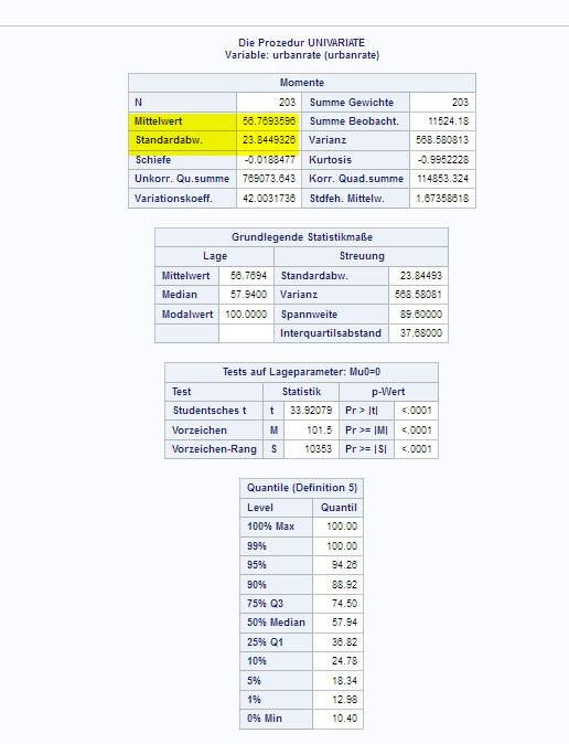
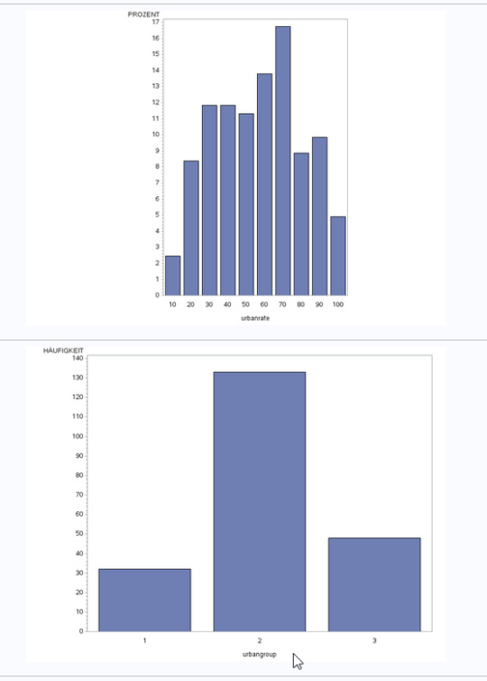
Assignment 4: Creating graphs for your data
To create graphs for my data, I choose a reasearch question with the gapminder dataset: Does alcohol consumption or urban rate influence the breast cancer rate ?
Therefore I had the three variables urbanrate, breastcancerper100TH and alcconsumption available.
All of them are quantatative variables, so I choose to group them into the percentage groups with new secondary variables created out of them to show a graph for categorical variables, too.
I than started by using the univariate function to examine the means and standard deviation for the values, made bar charts for the group and original variables as univariate graph, and at last I made a scatterplot for the corresponding variables breastcance100th and the two others, urbanrate and alcconsumption.
SAS Code:

By looking at the results of the univariate function, we see how the mean and standard deviation looks like. This way, the range of the observations can be examined, for example in the urbanrate:
The univariate graphs look the following, showing that all are unimodal, while the urbanrate peaks at around , breastcancerrate and alcohol consumption rate are both skewed right distributions.


For the scatterplots showing the connection between breast cancer rate and either alcohol consumtion or urbanrate, a small positive correlation/trend between the two variables could be observed.

So this visualizing of our data helped to understand the disctibution and to draw conclusions out of them.
0 notes
Text
Test Bank For Statistics: Unlocking the Power of Data, 3rd Edition Robin H. Lock

TABLE OF CONTENTS Preface xi Unit A: Data 1 Chapter 1. Collecting Data 2 1.1. The Structure of Data 4 1.2. Sampling from a Population 17 1.3. Experiments and Observational Studies 31 Chapter 2. Describing Data 52 2.1. Categorical Variables 54 2.2. One Quantitative Variable: Shape and Center 72 2.3. One Quantitative Variable: Measures of Spread 86 2.4. Boxplots and Quantitative/Categorical Relationships 103 2.5. Two Quantitative Variables: Scatterplot and Correlation 117 2.6. Two Quantitative Variables: Linear Regression 136 2.7. Data Visualization and Multiple Variables 152 Unit A: Essential Synthesis 177 Review Exercises 190 Projects Online Unit B: Understanding Inference 211 Chapter 3. Confidence Intervals 212 3.1. Sampling Distributions 214 3.2. Understanding and Interpreting Confidence Intervals 232 3.3. Constructing Bootstrap Confidence Intervals 248 3.4. Bootstrap Confidence Intervals Using Percentiles 263 Chapter 4. Hypothesis Tests 278 4.1. Introducing Hypothesis Tests 280 4.2. Measuring Evidence with P-values 295 4.3. Determining Statistical Significance 316 4.4. A Closer Look at Testing 333 4.5. Making Connections 349 Unit B: Essential Synthesis 371 Review Exercises 381 Projects Online Unit C: Inference with Normal and t-Distributions 399 Chapter 5. Approximating with a Distribution 400 5.1. Hypothesis Tests Using Normal Distributions 402 5.2. Confidence Intervals Using Normal Distributions 417 Chapter 6. Inference for Means and Proportions 430 6.1. Inference for a Proportion 6.1-D Distribution of a Proportion 432 6.1-CI Confidence Interval for a Proportion 435 6.1-HT Hypothesis Test for a Proportion 442 6.2. Inference for a Mean 6.2-D Distribution of a Mean 448 6.2-CI Confidence Interval for a Mean 454 6.2-HT Hypothesis Test for a Mean 463 6.3. Inference for a Difference in Proportions 6.3-D Distribution of a Difference in Proportions 469 6.3-CI Confidence Interval for a Difference in Proportions 472 6.3-HT Hypothesis Test for a Difference in Proportions 477 6.4. Inference for a Difference in Means 6.4-D Distribution of a Difference in Means 485 6.4-CI Confidence Interval for a Difference in Means 488 6.4-HT Hypothesis Test for a Difference in Means 494 6.5. Paired Difference in Means 502 Unit C: Essential Synthesis 513 Review Exercises 525 Projects Online Unit D: Inference for Multiple Parameters 543 Chapter 7. Chi-Square Tests for Categorical Variables 544 7.1. Testing Goodness-of-Fit for a Single Categorical Variable 546 7.2. Testing for an Association between Two Categorical Variables 562 Chapter 8. ANOVA to Compare Means 578 8.1. Analysis of Variance 580 8.2. Pairwise Comparisons and Inference after ANOVA 604 Chapter 9. Inference for Regression 614 9.1. Inference for Slope and Correlation 616 9.2. ANOVA for Regression 632 9.3. Confidence and Prediction Intervals 645 Chapter 10. Multiple Regression 652 10.1. Multiple Predictors 654 10.2. Checking Conditions for a Regression Model 670 10.3. Using Multiple Regression 679 Unit D: Essential Synthesis 693 Review Exercises 707 Projects Online The Big Picture: Essential Synthesis 715 Exercises for the Big Picture: Essential Synthesis 729 Chapter P. Probability Basics 734 P.1. Probability Rules 736 P.2. Tree Diagrams and Bayes’ Rule 748 P.3. Random Variables and Probability Functions 755 P.4. Binomial Probabilities 762 P.5. Density Curves and the Normal Distribution 770 Appendix A. Chapter Summaries 783 Appendix B. Selected Dataset Descriptions 795 Partial Answers 809 Index General Index 835 Data Index 838 Read the full article
0 notes
Text
Choosing the Right Scatterplot: Categorical vs. Numerical Variables
When it comes to data visualization, scatterplots are an invaluable tool for uncovering relationships and patterns within your data. However, one critical consideration often overlooked is whether to use a scatterplot for categorical or numerical variables. In this guide, we’ll explore the nuances of choosing the right scatterplot based on the nature of your variables. If you want to learn different types of data science courses in Edmonton, Canada please read our previous article.
Understanding Scatterplots
Before diving into the specifics of scatterplots for different types of variables, let’s establish a solid understanding of what scatterplots are and why they matter.
A scatterplot is a graphical representation of data points on a two-dimensional plane. It consists of points or markers, each representing an individual data observation.
The position of each point is determined by two variables: one on the horizontal axis (x-axis — years of experience) and the other on the vertical axis (y-axis — Salary) as shown in the below graph. Scatterplots are widely used in various fields, including statistics, data science, and research, for their ability to visually convey relationships between variables.
Now, let’s explore when and how to use scatterplots effectively for categorical and numerical variables.
Scatterplots for Numerical Variables
Numerical variables represent quantities and can take on a wide range of values. Examples include variables such as age, income, temperature, and height. Scatterplots are particularly well-suited for visualizing relationships between two numerical variables. Here’s why:
1. Visualizing Relationships: When you want to understand the relationship between two numerical variables, a scatterplot graph is your choice. For instance, if you’re exploring the connection between a person’s salary and their work experience, you can create a scatterplot with salary on the x-axis and years of experience on the y-axis. Each data point on the plot represents an individual, allowing you to quickly identify if there’s a correlation between salary and years of experience.

In the above graph, there is one data point at the top right far away from other data points; this is called an outlier. So scatter plot also helps us determine the outliers as well.
3. Talk about Distribution: Scatterplots also offer a means to gain an understanding of your data’s distribution. They enable you to assess whether data points are closely concentrated around a central line or if there is a notable dispersion, visually conveying valuable insights into the distribution of your numerical variables.
Scatterplots for Categorical Variables
Conversely, categorical variables represent well-defined categories or groups and lack inherent order. Illustrative examples encompass gender, colour, product type, and similar distinctions. Here’s how scatterplots can be effectively applied to categorical variables:
1. Creating Grouped Scatterplots: When working with categorical variables, an approach involves crafting grouped scatterplots to compare various categories. In this case, rather than employing a continuous scale on the x-axis, discrete categories are utilized. For instance, you could generate a scatterplot to assess the relationship between the heights and weights of individuals, with the x-axis categorically representing groups such as “Male” and “Female.”
2. Avoid Overplotting: Categorical scatterplots can become overcrowded if you have many categories. In such cases, it’s often more effective to use alternative types of plots, such as bar charts or box plots, to visualize your data without overcrowding the plot.
3. Combining with Numeric Data: Scatterplots can still be useful when you have a combination of categorical and numerical data. In this scenario, you might create a scatterplot with a categorical variable on one axis and a numerical variable on the other. For example, you could visualize the total revenue of different stores over time.
When to choose Scatter Plot?
The decision to use a scatterplot with categorical or numerical variables ultimately hinges on your research question and the nature of your data. Here are some guidelines to help you make the right choice:
1. Numerical-Numeral Scatterplots: Use scatterplots when both variables are numerical, and you want to visualize their relationship, identify outliers, or assess distribution.
2. Categorical-Categorical Scatterplots: Consider grouped scatterplots when you want to compare categories within two categorical variables.
3. Categorical-Numerical Scatterplots: If you have a mix of categorical and numerical data, scatterplots can still be useful for exploring relationships.
4. Large Categorical Data: Be cautious about overcrowding if you have numerous categories for a categorical variable, and explore alternative visualization methods when necessary.
Conclusion
Scatterplots serve as versatile tools for visualizing relationships between variables, and their suitability hinges on your data’s characteristics. Discerning when to employ scatterplots for categorical and numerical variables is pivotal for proficient data visualization and analysis. Hence, when embarking on your data exploration journey, exercise prudence in selecting the appropriate scatterplot.
In essence, the art of selecting the correct scatterplot holds paramount significance within the realm of data visualization. It can be the differentiating factor between unearthing profound insights and grappling with obscure visual representations. By adhering to the delineated principles provided herein, you’ll be better prepared to make an informed choice when it comes to the ideal scatterplot for your distinct data analysis requisites.
Keep in mind that data visualization extends beyond crafting aesthetically pleasing graphs; it is a means of crafting compelling narratives and extracting invaluable insights from your dataset. Hence, deliberate judiciously when making your scatterplot selection, allowing your data’s essence to radiate brightly.
If you’re looking for data science courses in Canada, please explore our offerings to start your journey into this exciting field.
0 notes
Text
What is Single Cell Spatial Transcriptomics? A Comprehensive Guide to Gene Expression
Introduction: What is Single Cell Spatial Transcriptomics?

Single Cell Spatial Transcriptomics is a technique that analyzes the transcriptome of a single cell. It is a new method for the study of gene expression and it provides insights into the spatial organization of cells.
Single Cell Spatial Transcriptomics is an emerging field that has been developed in recent years. It has already been used to study how cancer cells migrate, how neurons form connections, and how stem cells differentiate into different cell types.
Single Cell Spatial Transcriptomics is a new technique that has been developed by the University of California, Davis. It allows scientists to study individual cells and their spatial relationships with each other.
This technique is used in several different fields such as cancer research, developmental biology, and neuroscience.
How to Export a Single Cells Data from Bioinformatics Software into Excel

In the world of bioinformatics, it's always important to export data to an excel spreadsheet for sharing and analysis.
The most popular way is to use the "Save as" function in your software. Keep in mind that you need to save it as an Excel file type.
Or you can also copy and paste the cells from your software into an Excel spreadsheet, which will automatically convert everything into a table format.
Excel is a powerful data analysis tool. It can be used to analyze data from different sources, including the web and databases. One of the most common ways to export your data into Excel is to use a single cells export function in your bioinformatics software.
In this article, we will walk through how to export the data of a single cell from bioinformatics software into Excel using the R package.
The Process of Single-Cell Transcriptomics

The process of single-cell transcriptomics can be difficult to understand. This article will break down the process and provide an overview of how it works.
The process of single-cell Spatial Transcriptomics is a relatively new and emerging field of research that is being used to study the function and development of cells.
The technique involves extracting mRNA from a single cell, reverse transcribing the mRNA into cDNA, followed by polymerase chain reaction (PCR) amplification to produce many copies of the cDNA for sequencing.
The process of single-cell Spatial Transcriptomics is the process of analyzing an organism’s genome at a cellular level.
The first step in the process is to isolate a single cell from the organism. The next step is to extract RNA from the cell and then isolate DNA from that RNA. Next, one can use a technique like deep sequencing to detect all of the genes expressed in that cell. Choose the best biotech company Nanostring for the best service of all kinds of spatial transcriptomics.
Data Visualization in Single Cell Expression Analysis and Beyond…

The visualization of data is important. The more information that the viewer can glean from a graph, the more they will understand what is happening.
The use of scatterplot matrices and heat maps in single-cell expression analysis has been a breakthrough in the field. Data visualization enables researchers to see patterns that might not be apparent otherwise.
Data visualization is an important tool for understanding and interpreting data. This section will explore how data visualization can be used to understand single-cell expression analysis and beyond.
Data visualization has become an important part of many fields such as business, science, engineering, and medicine. This section will explore how data visualization can be used to understand single-cell expression analysis and beyond.
0 notes
Text
What is a 3D Scatter Plot Chart in Excel?
What is a 3D Scatter Plot Chart in Excel?
A 3D scatter plot chart is a two-dimensional chart in Excel that displays multiple series of data on the same chart. The data points are represented as individual dots and are plotted according to their x and y values. The x-axis represents time, while the y axis represents the value of the data point. When you create a 3D scatter plot chart, Excel creates a line for each series of data points and plots them on one graph. The lines can be plotted in three directions: across, down, or up (x-axis). The up and down lines represent positive and negative values, respectively. A 3D scatter plot chart is a type of chart that displays the relationship between two variables in three dimensions. It is called a scatter plot because it uses points to represent data. The x-axis represents one variable, while the y-axis represents another, and the z-axis represents the third variable. A 3D scatter plot chart allows you to see how two variables change across different levels of a third variable. This type of chart is useful for comparing how two variables are affected by different levels of one other factor. In this tutorial, we'll explain how to create a 3D scatter plot chart in Excel with step-by-step instructions and screenshots.

Where to Find the 3D Scatter Plot in Excel? A scatter plot is a type of graph used to visualize the relationship between two variables. It can be used to visualize trends and detect outliers. The more data you have, the better you can tell if there are any patterns in your data. A 3D scatter plot adds depth to your scatter plot by allowing you to visualize both independent variables on the x-axis and dependent variables on the y-axis as well as their relationship in a third dimension (z-axis). A scatter plot chart is one of the most common types of charts used in business intelligence reports. It displays data points by plotting them on a graph and connecting them with lines or curves. This type of chart is useful for identifying relationships between two variables. For example, say you want to see whether there is a relationship between age and height; a scatter plot would allow you to do so quickly and easily by displaying those two variables as numbers on axes next to each other. In order to create a scatterplot, you need to know how to use the Scatter Chart and 3D Scatter Chart functions in your Excel. The 3D scatter plot is a special kind of scatter chart. It allows you to present data in 3D space by using colour and size of markers, etc. There are two ways to create a scatterplot in Excel: 1) The first way is to use the Scatter Chart function; 2) The second way is to use the 3D Scatter Chart function; In order to create a 3D scatter plot in Excel, we will first need to understand how these functions work. How to Create 3D Scatter Plot in Excel? In this tutorial, we will learn how to create 3D scatter plot in Excel. The scatter plot is a chart that plots the values of two variables against each other. You can also display the third variable by adding it as an additional axis. Steps: 1. Select the data set that you want to plot on the chart. 2. Go to Insert tab > Charts group > select Scatter chart from the drop-down menu or click on the Insert button from Charts group, then select Scatter chart from the Insert dialog box. 3. In the Chart Tools Design tab > Layout group > select the 3D Format option under the Chart Layouts section and then choose any colour of your choice as the background colour for the chart (optional). 4. Now drag and drop one of the X-axis labels into the Values box under the Axes section so that it shows up on X-axis like “Years” in our example (optional). 5. Drag and drop one of the Y-axis labels into Legend Entries box under the Legend section so that it shows up on Y-axis like “Sales” in our example (optional). We have come to the end of our first post. We hope it helped you. You can read this article on the subject or you can read this article we found for you from another site. Read the full article
0 notes
Text
How To Use The Seaborn Python Library?
Seaborn is an open-source Python library based on top of matplotlib. It is utilized for information representation and exploratory information examination. Seaborn works effectively with dataframes and the Pandas library. The charts made can likewise be modified without any problem. The following are a couple of advantages of Data Visualization. Seaborn is one of the astonishing libraries for perception of the graphical measurable plotting in Python programming language. Seaborn gives many shading ranges and defaults lovely styles to make the evolution of numerous measurable plots in Python more alluring.
Objective Of Python Seaborn Library
Seaborn library expects to make a more appealing perception of the focal piece of comprehension and investigating information. It is based on the center of the matplotlib library and furthermore gives dataset-arranged APIs. Seaborn is additionally firmly coordinated with the Panda's information structures, and with this, we can without much of a stretch leap between the different distinctive visual portrayals for a given variable to more readily comprehend the given dataset. Charts can assist us with observing information drifts that are helpful in any AI or anticipating project. Charts make it simpler to disclose your information to non-specialized individuals. Outwardly alluring charts can make introductions and reports significantly more interesting to the peruser.
Categories Of Plots In Python’s Seaborn Library
Plots are by and large used to make representation of the connections between the given factors. These factors can either be a classification like a gathering, division, or class or can be totally mathematical factors. There are various classes of plots that we can make utilizing the seaborn library. In the seaborn library, the plot that we make is isolated into the accompanying different classes
Distribution Plots
This sort of plot is utilized for looking at the two kinds of dispersions, i.e., univariate and bivariate circulation.
Relational Plots
This kind of plot is utilized to comprehend the connection between the two given factors.
Regression Plots
Regression plots in the seaborn library are essentially planned to add an extra visual aide that will assist with underlying dataset designs during the investigation of exploratory information.
Categorical Plots
The clear cut plots are utilized to manage classes of factors and how we can imagine them.
Multi-Plot Grids
The multi-plot matrices are additionally a kind of plot that is a valuable methodology to draw various examples for similar plots with various subsets of a binary dataset.
Matrix Plots
The network plots are a sort of variety of the scatterplots. Here, we will figure out how we can introduce the seaborn library for Python. In the wake of introducing the seaborn library, we can bring it into our Python program and use it in Pytho,
Required Dependencies For The Seaborn Library
We must have,
Python with the latest version (3.6+).
Numpy must be with version 1.13.3 or higher.
SciPy must be with 1.0.1 or higher versions
Need a panda library with 0.22.0 or higher versions.
Need statsmodel library to be installed with version 0.8.0 or higher.
And should have matplotlib installed with 2.1.2 or higher versions.
Create Basic Plots Using Seaborn Library
Python3
# Importing libraries
import numpy as np
import seaborn as sns
# Selecting style as white,
# dark, whitegrid, darkgrid
# or ticks
sns.set( style = "white" )
# Generate a random univariate
# dataset
rs = np.random.RandomState( 10 )
d = rs.normal( size = 50 )
# Plot a simple histogram and kde
# with bin size determined automatically
sns.distplot(d, kde = True, color = "g")
Conclusions
To use the seaborn python library, it is necessary to have proper programming language as well as to develop machine learning model. For this, you can achieve the best certification of data science, best machine learning courses, and data science certificate online from online free platforms such as great learning, udemy, edx and coursera. There are also some paid courses here which will be available to you at a very reasonable cost, so that a better future can be started.
0 notes