#consumer consumption
Text
Excerpt from this story from the New York Times:
Here is an inconvenient truth. For all the noise made by activists, journalists, politicians and even celebrities about the clothing industry destroying the planet, shoppers aren’t listening.
The information is out there if they want it. Google can produce more than 88 million search results on why fashion is bad for the environment, but the world remains in a state of cognitive dissonance, fueled by its voracious appetite for disposable trends. Global apparel consumption, currently at 62 million tons per year, is by some estimates projected to reach 102 million tons annually by 2030.
One problem, say many industry observers, is that much of the messaging about fashion and sustainability can be too boring, too preachy and too easy to ignore. So is it possible to change the way we talk about it?
This week, the outdoor apparel brand Patagonia released a quirky new film that reflects the company’s efforts to reset the conversation. “The Shitthropocene,” a 45-minute documentary directed by David Garrett Byars, is a trippy mock anthropological view of humanity’s consumption habits from our cave-dwelling ancestors through the trendsetting aristocratic court of Louis XIV, creepy fairgrounds, fishing waders with leaky crotches, mindless digital advertising and pretty much everything in between. It will be shown in Patagonia stores across the United States in coming months.
Here's the link to The Shitthropocene. It's about 45 minutes long. Or if you want to watch it now, here you go:
youtube
25 notes
·
View notes
Text
The deeply moralist tone that a lot of discussions about media representation take on here are primarily neoliberal before they are anything else. Like the shouting matches people get into about “purity culture” “pro/anti” etc nonsense (even if I think it’s true that some people have a deeply christian worldview about what art ought to say and represent about the world) are downstream of the basic neoliberal assumption that we can and must educate the public by being consumers in a market. “Bad representation” is often framed as a writer’s/developer’s/director’s/etc’s failure to properly educate their audience, or to educate them the wrong way with bad information about the world (which will compel their audience to act, behave, internalise or otherwise believe these bad representations about some social issue). Likewise, to “consume” or give money to a piece of media with Bad Representation is to legitimate and make stronger these bad representations in the world, an act which will cause more people to believe or internalise bad things about themselves or other people. And at the heart of both of those claims is, again, the assumption that mass public education should be undertaken by artists in a private market, who are responsible for creating moral fables and political allegories that they will instil in their audiences by selling it to them. These conversations often become pure nonsense if you don’t accept that the moral and political education of the world should be directed by like, studio executives or tv actors or authors on twitter. There is no horizon of possibility being imagined beyond purchasing, as an individual consumer in a market, your way into good beliefs about the world, instilled in you by Media Product
#just saw a very stupid post. but I will endure#these discussions also remind me of anti-vaxxer discourse#which in North America for Covid is framed as simply wanting to make the best informed choice as a consumer in a market*#ideas about public goods or civic responsibility towards others are incompatible with this consumer-citizen view of the world#like legitimately the idea of the consumer as the base civic unit of north american society is catastrophic for public health#and produces these interminable discourses about ‘media consumption’#which itself is a neoliberal framing! I think ‘media’ as a catchall term is neoliberal because it links all art with the commonality of#being a good sold in a market#*outside of outright fascist anti-vax beliefs I should say. Although from my research so far these things seem to overlap heavily lol#which is not surprising but the distinction is worth teasing out#.txt
879 notes
·
View notes
Text
please do yourself a favor and read the labru cannibalism comic. here’s the link. do it. even if you think it won’t be your thing cause of the cannibalism like… no its so good please read it. like is it smut? yes? no? maybe?? is it cannibalism? yeah but no????? are there dungeon meshi spoilers???? yes but also not very obvious ones?????? just…. read it.
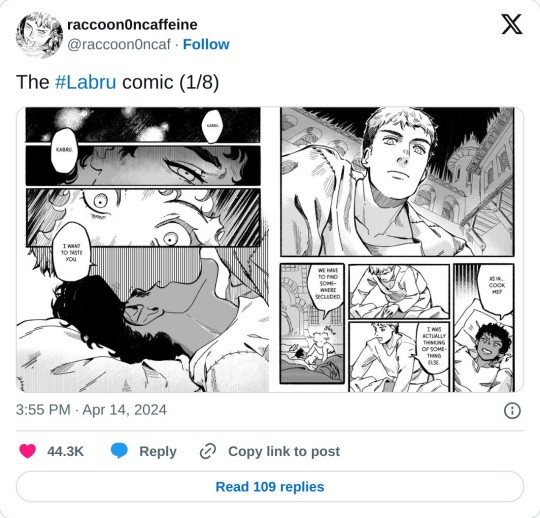
#I love it so much like its so fucking good and what for#like I know calling it the cannibalism comic isn’t great but its honestly not that bad or gory or gross like#its consuming as a form of love#its attempting to understand each other#its hunger and love and attraction and lust and consumption and devotion#and its also beautiful! like just gorgeous!\#laios touden#kabru#dungeon meshi#delicious in dungeon#labru#it does have some spoilers for later in the manga but nothing too obvious#and you should read the manga too#dungeon meshi manga spoilers#ALSO READ THE ARTISTS ORIGINAL COMIC LITTLE STARLING ITS BEAUTIFUL
798 notes
·
View notes
Text

Market based mistakes.
[First] Prev <–-> Next
#poorly drawn mdzs#mdzs#wei wuxian#wen chao#wen zhuliu#Apologies for how much I skipped in the last part of this episode.#I do love the scene of Jiang Cheng regaining his will to live and the ensuing scenes of Wei Wuxian seeing him off at the mountain base.#At the same time I very much want to keep pressing on with the story.#The notes I have are for scenes I did not draw:#I still think a lot about the symbolism of food in both consumption and giving - especially in regards to the Yunmeng Trio.#Prior to JC leaving we see WWX out buying food for him. Something that initially falls through as JC runs back to Lotus Pier.#But here it comes back full circle. WWX gives away a part of himself to be 'consumed' by Jiang Cheng.#It is about being led by desire (JC wanting revenge to losing his will to live to wanting his core back)#and about being bound by duty to do whatever it takes to see those desires through to the end.#JC can't eat until he has his desire to live back. WWX carves out his own ambitions to help another reach theirs.#And it isn't held up as noble! Not even once! He is routinely punished and criticized for this sacrifice.#Being thrown into the burial mounds really is just symbolism for how we can give away every scrap of ourselves to others-#-and find ourselves at rock bottom. Alone.#When you hollow yourself out it just leaves room for something else to fill it. Something worse.
881 notes
·
View notes
Text
anybody here who farms insects for human consumption and would be willing to participate in a interview for a (positive) article around insect farming? please dm me with your email and i’ll reach out!
#insect#insect farming#entomology#mealworms#cricket#not birds#This is an article about potential benefits to consumers and the environment#so if you aren’t farming insects for human consumption but you feel you might have an important take/valuable insight#please reach out as well
505 notes
·
View notes
Text
[neverafter episode 9 spoilers]
everything about ylfa's flashback scene made me feel fucking insane. the wolf is death and the ending of stories. the wolf ate ylfa's grandmother because it was time for her story to end. but for whatever reason it's not time for ylfa's end. for whatever reason the wolf wanted ylfa to live. the wolf ate the grandmother so that she could die, and ylfa ate the wolf so that she could live. the wolf wanted ylfa to live, and at the deepest core of herself she wants to live too. i'm scratching at the WALLS. LIKE "i met death and death wants me to live" EMILY SAID IT SO CASUALLY BUT LOWKEY THAT'S THE RAWEST SHIT I'VE EVER HEARD IN MY LIFE!
also though you need to eat to live and the consumption of stories to stay alive beyond the end of your own story... i am Thinking...
#sarah.txt#dimension 20#neverafter#neverafter spoilers#dimension 20 spoilers#d20#idk why eating/consumption as a theme has been making me feel so unhinged lately but they really got me with this one#god there was so much shit that happened in this episode that was METAL AS HELL#if i let myself talk about it i just won't go to bed tonight and like i'm sleepy skfnskdjfnsd but holy shit.#but also like... this consensual consumption in ylfa's story#like. the wolf let ylfa eat him. the wolf WANTED ylfa to eat him.#versus the stepmother erasing 'or perhaps consuming' her own story and everything inside of her trying to claw its way out. phew.#consumption gave them both power but in such different ways! godDAMN!#d20 meta#story meta
2K notes
·
View notes
Text
"it doesn't make any logical sense for julian to have hang-ups about being queer in the 2370s" is an objectively, factually correct take.
but I need julian bashir to have just bare minimum enough internalized homophobia for 'one of your girls' to be a garak pov garashir song
#ds9#garashir#one of your girls#like you guys are RIGHT that it doesnt make SENSE#i just NEED IT for the YEARNING#i need there to be just enough DISCOMFORT for it to be SPICY#yes i am working on a garak and/or garashir playlist no they are not ready for consumption yet it's a time consuming process
87 notes
·
View notes
Text
In some corners of the internet there is a readiness to call anything pretentious whenever it is complex, abstract or deliberately alienating. Some people are also eager to claim that artists are too self-serious, snooty and elitist whenever they create something that is not straightforwardly understood.
They pretend art has always existed to appeal to the greatest number of people and appeal in a way that is simple and explicable. If you look at the history of art that could not be further from the truth. Even art that was performed to an ‘illiterate’ public often maintained layers of meaning and ambiguity throughout long periods of history (just look at the global historical traditions of oral storytelling)
The simplification of art and the expectation that everything should appeal to a wide audience is the result of commodification not democratisation. Art has arguably never been less revered than now and still there are people who think it has further to fall in esteem. Just look at the AI movement’s desire to undermine artists while stealing their work.
I believe that the ‘it’s not that deep’ crowd who is eager to wield the accusation of pretentiousness whenever something doesn’t connect to them is part of an anti-artist, anti-intellectual movement to do away with mainstream non-consumerist (non-recuperable) art.
There has been a concerted effort by corporations and those purely interested in consumerism to erase the notion that art is primarily a human expression that is not necessarily made to pander to a wide audience. Every day we see more efforts in the social media & technological culture wars to devalue art and demonise artists who wish to create artistically fulfilling works rather than crowd-pleasing content.
I think we need to push back harder against this. The anti-complexity consumerist mindset is not only incurious and subservient to corporations, it’s also anti-intellectual, anti-cultural and insidiously reactionary.
#art#entertainment#culture#AI#over-analysing#it’s not that deep#commodification#commercialism#media consumption#consumer culture#culture wars#consumerism#pretentious#pretentiousness#artsy fartsy#discourse#fandom
93 notes
·
View notes
Text
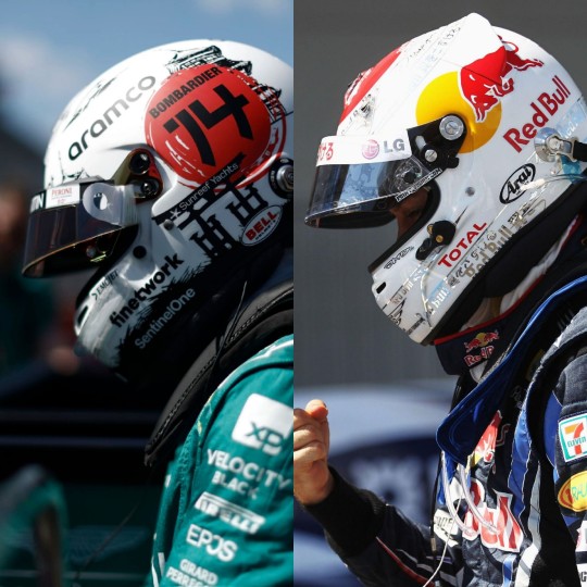
Vettonso x Similar Helmets
SV Germany 2012 x FA Monaco 2013: Gold & Dark Red
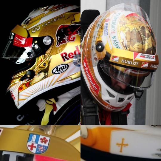
I think a lot about Vettonso and their mutual relationship witn gold. They're both golden boys, they're both seen lit gold by the sunshine on many podiums throughout the years, both have worn golden boots, and as you can see here: both have worn golden helmets. The parallels in these particular helmets makes me feel insane. Both are: gold with dark red accents, both have their birthplace's coat of arms(Bergstraße and Asturias), both have team animal motifs, and both have symbols to represent their two championships(You by now know the signifigance of the ones on Fernando's helmet, but I think the ones on Seb's are actually a callback to his Formula BMW days when he used to put the smiley stickers on his car for every win.)
And did you know both of these helmets were designed by the same helmet design company? Yep, both of these are JMD helmets. I know JMD helmets are/were pretty popular, but still, there's something to me about Fernando commissioning the same designer that Seb has been using since he was a literal child. Parallels, am I right?
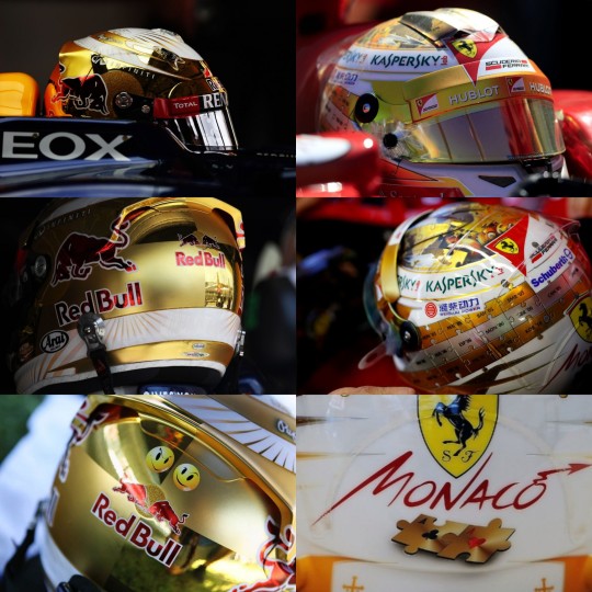
SV Japan 2010 x FA Japan 2023: White with Black & Red
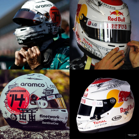
Haha I remember @protocolseben and I discussing this a bit back in September when Fernando's helmet dropped. I honestly think Seb is such an innovator and trailblazer in terms of helmet design, and you can see his influence in helmet design as recently as this past season. I'm not sure if he was the first ever driver to don a matte white helmet with red accents as a representation of the Japanese flag, but it certainly envoked him in my mind when I saw Fernando's!!
I think Fernando's is pretty similar to all of Seb's 2010-2012 Japan helmets but I like this one the most so! I think if Seb wasn't restrained by the Red Bull logo, he def wouldv'e put the red circle where Nando put his so I think Fernando did a really good job, even if unintentionally, at emulating Seb's sense of design.
SV Singapore 2012 x FA Singapore 2012: Sparkly!

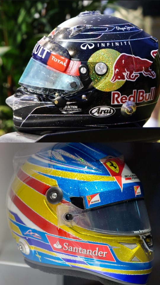
Like I said in the one above, it's crazy how much Seb influenced helmet design. He was pretty much the pioneer of sparkly helmets for Singapore, right? It drives me absolutely insane that there's actually pictures of them together in such similar designed helmets. It's kinda funny actually that even though they're pretty deep in the championship fight at this point, and Seb just got one up on Fernando; Fernando is wearing a helmet that is a direct influence from Seb!!! Is that not insane???
Also, Fernando trying to be camp with trying the now in vogue sparkly Singapore helmet, and Seb accidentally completely blew him out of the water with his outrageous light up LED constellation helmet. But god yeah....to have pics of them in matching helmets from this era particuarly makes me emotional ;;;
SV Hungary 2021 x FA 2022: Pink with Dark Blue

I really could've picked any of Seb's 2021 helmets, but I thought this one matched the best with Fernando's main 2021 helmet(with the color pallet.) Also one thing, it's crazy how much control BWT has as a sponsor, I don't think I've ever seen another sponsor go so hard at having a chokehold on individuality. I like that we got pink liveries and pink helmets, but I don't think they should have that much control.
I'm almost kinda sad there wasn't any Miami GP in 2021, because I think that was the only unique helmet Fernando had in 2022. But these match pretty well! Pretty in pink!! It's crazy that their parallels in the 2020s are ongoing even before Fernando actually takes over Seb's seat. Thanks BWT I guess?
SV Abu Dhabi 2022 x FA Abu Dhabi 2022: Fernando's Seb Tribute Helmet


AND HERE WE HAVE THE PIÈCE DE RÉSISTANCE!!! The ultimate conclusion, it literally couldn't get better than this!! This is still unbelievable, like how is this an actual thing that happened!? Fernando intentionally branding his helmet, the only symbol of individuality in F1, with his rival's flag colors, HIS FLAG!!!!! Not to mention the literal "Vettono Best Moments" collage he posted alongside it....and the hand-holding....and everything that happened with them at Abu Dhabi 2022....
But god, after years of incidentally making parallel helmet designs, Fernando decided to officially tie the knot of the red string of fate, and make a helmet directly referencing Seb's. I think it's funny because as I said with two of the previously mentioned ones, those Fernando designs are pretty much inspired by Seb's, and here he is openly making one directly inspired by Seb. I don't really have words for how this actually makes me feel because it's just. Yeah. The most open and clear declaration of love and respect and admiration one could ever make. TO ME.
#all of my posts subheading should be: 'its probably not that deep BUT-'#i can't believe ive made two deeply researched and beloved posts in a row one day after the other#posts sponsored by: 12 am red bull consumption. my all-consuming devotion and love for vettonso. and my unwillingness to do schoolwork#i mean i felt a lot of emotions and had fun making it but like. hey. could you put this effort into school?#anyways feeling deeply emotionally affected about helmets and their symbolism#i think in the entirety of f1 seb and fernando are two of the most dedicated and passionate about helmet designs and symbolism?#so this post is very special to me :] helmet fuckers unite <3#again: they say they aren't friends and don't share any hobbies and im just staring at them like YOU IDIOTS!!!#its just that spongebob meme of him pointing out the trashcans. like guys. be fr rn. you totally share hobbies#both like helmet design. paddel and pingpong. sustainability. cars. racing. european football. THE LIST GOES ON AND ON#well im glad they swapped helmets at some point(i think nando gave seb two pretty old ones as well. now thats dedication!)#if they werent cowards i bet they couldve also had a 5+ hour long discussion about helmet design ;;;;;;#thinking also about how fernando has one of seb's in his museum >:) but if only it were one of the ones on this list. sigh.#normal posts that catie normally makes in a normal fashion#well lmk if theres any other vettonso helmets you think are similar!!! im pretty blind to seb helmets that arent rbr era tbh#sebastian vettel#fernando alonso#f1#formula 1#vettonso#we do a little bit of f1
111 notes
·
View notes
Text
“SHEIN kills our planet & uses child/migrant labor” she types from her latest iPhone after finalizing her Amazon order & driving her gas powered vehicle to the mall for NIKES.
“Theyre evil and unethical!! THRIFT INSTEAD!!”
A Depop notification pings. Her $200 Kmart Jeans has arrived.
#there is no ethical consumption under capitalism#yall hate on SHEIN and log off to consume unethical items anyway#that or spend half your rent thrifting#because you’ve been guilted by social media to do so#people are either fake or ignorant in ethical consumerism discourse#but usually it’s both & it’s from young girls who watched ‘the true cost’ ONCE#shein#zara#ethical consumerism#queue are so beautiful to me
68 notes
·
View notes
Text
let's go lesbians
#dungeon meshi#delicious in dungeon#falin touden#marcille donato#dm fanart#dungeon meshi fanart#farcille#the cycle of consumption and being consumed in a dunge-#getting sent to jail for overthinking cute anime#weird place to say it but I really admire ryoko kui#i love. how much she puts into her world and the very well-thought out structure and reality of the dungeon it's cool
66 notes
·
View notes
Text
I had no patience for people policing other peoples ships before i went to library tech school and library tech school has make me a little bit pissy about the entire thing actually.
#its 1:47am i am not going to rant about it#but Jesus Christ on a cracker i hate how censorship has become common and almost mainstream if it’s ’for the right reasons’#fuck you and fuck your ‘right reasons’#there is no reason to deny someone the ability to create or access material that you don’t agree with#‘but-‘ i do not careeee about your arguement it is my job as a library worker to provide ACCESS TO INFORMATION FOR EVERYONE#‘but it has siblings that kiss!’ DONT CARE. BOOKS DO NOT DICTATE MORALS. MOVE ON.#‘but it has (insert other thing)’ DONT CARE. THE PATRON ASKED FOR THIS BOOK. THEY ARE GETTING THE BOOK. NEXT#‘but but but THE CHILDREN’ THE CHILDREN NEED ACCESS TO INFORMATION JUST LIKE THE REST OF US. I AM NOT PARENTING YOUR CHILD.#IF CONTENT MAKES YOUR CHILD UNCOMFORTABLE BECOME THE PERSON THEY GO TO TO TALK TO IT ABOUT#OR TELL THEM THAT ITS OKAY TO CLOSE THE BOOK AND PUT IT AWAY#IT IS NOT MY JOB TO MAKE SURE YOUR CHILD IS FOLLOWING WHATEVER RULES YOU HAVE ON MEDIA CONSUMPTION AT YOUR HOUSE#MY JOB IS TO PROVIDE THE BOOK.DVD.THING. THEY WANT#YOUR CHILD NEEDS TO LEARN HOW TO CONSUME MEDIA CRITCIALLY AND THAT SOMETIMES THAT INCLUDES#READING THINGS THAT MAKE THEM UNCOMFORTABLE AND THEN HAVING A SAFE ADULT TO TALK TO IT ABOUT#AND NEWSFLASH: IF YOU ARE NOT SEEN AS SOMEONE SAFE TO HAVE A CONVERSATION WITH YOUR CHILD WILL GO ELSEWHERE OR JUST#NEVER TELL YOU WHAT THEY ARE CHECKING OUT#anyway. turns out i did go on a rant. whoops.#moose rants
133 notes
·
View notes
Text
Horseshoe: gorgeous gorgeous glass pipe
Sandman: Delta 8 sour watermellon fart blast atomic mango vape
Donnie: dry herb vaporizer with a locally grown sativa
Benzedrine: a 2.5mg indica gummy
#my version of the suiteheartss choice of weed consumption#again they’re my fucked up weird versions#so it’s not Andy consuming it#Benzedrine face claim is a mix of azeraphale and Gary neuman lol#cw drugs#peace and love peace and love#I still need to rename the suitehearts and claim them as my own#you guys don’t worry I’m gonna listen to some more sparks and b52s and will draw more suitehearts
83 notes
·
View notes
Text
My brain: you like rendering fur
Me: I like rendering fur
My brain: let's render fur
Me: let's render fur
My brain: it'll look so good, so satisfyingly floofy and somft
Me, inspecting the result of 4h of work:

Me: This is satisfyingly floofy and smoft
Me, realising this is MAYBE 1/8th of JUST his coat and it already took 4 hours

#and this my friends#it why you usually only see sketches#cuz my damn ass dont finish shit#and if you do one day see something finished#know that if you think you know how long it too please triple it#art is not meant to be consumed#artwork as consumption entertainment is untennable and arguably unethical#your favourite creators are not content machines
27 notes
·
View notes
Text
tumblr’s understanding of boycotts is so ridiculous lol. wagging your finger at people on social media to not buy a product is not a boycott. If it’s not organised and centralised its not any more effective than random people yelling at service workers about how they just lost their patronage and will not be returning here again
#I feel like veganism has done a lot of damage to the understanding of how powerful individual consumer behaviour is#or actually no that’s not correct I think it’s just people buying into individualism and ‘vote with your wallet’ type sentiments#veganism is just a particularly mainstream example of that#to be clear I have no problem with people being vegans I think they just need to be very realistic about#the incredibly limited power of individually abstaining from certain consumptive behaviours#I think this is also reflected in broader media discourses online generally#about consuming the correct tv shows and so on#we laugh at the right for this behaviour and rightfully so!
86 notes
·
View notes
Text

throws sprite art of my epithet oc mori terabye at you and runs away
#pixell.art#LOOK AT HIM#BLORBO FROM MY BRAIN#MY LITTLE GUY#for those who haven't seen my other post#this is mori terabye (they/he) whose epithet is consumption!!#their epithet affects the user so it's basically like they have tuberculosis#other than that they can ''consume'' small objects with voids and then eat them before they disappear entirely#this was a really fun style exercise i highly recommend it#also recommend starting with a silhouette its very helpful#epithet erased#epithet#epithet erased fanart#epithet erased oc#art#illustration#oc art#oc#jelloapocalypse#mori terabye
72 notes
·
View notes
Last Seen Blogs

tampacom
Best Commercial Real Estate Mortgage Loans Tampa FL

clubpash
b rooke /. instagram: b.sta

art-den
Art Den Schweiz

kopuffz
Stylin' & Profilin'

angelshadowsinger
down so fucking bad