#correlogram
Explore tagged Tumblr posts
Visit Tumblr Blog
Explore Tumblr blogs with no restrictions, modern design and the best experience.
Last Seen Tumblr Blogs


Fun Fact
There are dozens of funny blogs to kill time on Tumblr.
Photo

Data visualization is a graphical representation of data. It involves producing images that communicate relationship among the represented data to viewers of the images. This communication is achieved through the use of systematic mapping between graphic marks and data values in the creation of the visualization. #datavisualization,#R,#programming,#visualization,#patterns,#visualcontext,#statistical,#Histogram,#BoxPlot,#Scatterplot,#heatmap,#mosaic,#Correlogram,#CRAN,#Datasets,#dataexploration,#Tableau,#python https://www.incegna.com/post/data-visualization-in-r Check our Info : www.incegna.com Reg Link for Programs : http://www.incegna.com/contact-us Follow us on Facebook : www.facebook.com/INCEGNA/? Follow us on Instagram : https://www.instagram.com/_incegna/ For Queries : [email protected] https://www.instagram.com/p/B7DAtYmABMQ/?igshid=1nl5496tchmyo
#datavisualization#r#programming#visualization#patterns#visualcontext#statistical#histogram#boxplot#scatterplot#heatmap#mosaic#correlogram#cran#datasets#dataexploration#tableau#python
0 notes
Text
Comment faire pour chercher efficacement de la nourriture, de l’eau, quand on est une minuscule fourmi et que le territoire à explorer est si vaste ? Un chercheur et une chercheuse trouvent la réponse
See on Scoop.it - EntomoNews
Les fourmis sont loin de déambuler au hasard. Deux scientifiques les ont observées attentivement et concluent que les insectes progressent selon une méthode très efficace et jamais analysée auparavant.
Les fourmis ne déambulent pas au hasard, elles avancent selon une méthode très efficace
Par Hervé Ratel le 30.01.2023
-------
NDÉ
L'étude
Ants combine systematic meandering and correlated random walks when searching for unknown resources - iScience, 30.01.2023 https://www.sciencedirect.com/science/article/pii/S2589004222021897
[Image] Ant meanders and fossil meanders are detectable through autocorrelation
Left column: Cosmorhaphe tremens (fossilized trace, from Sims et al.25), right column: Temnothorax rugatulus ants. Simulations are created by shuffling turn angles (see results: random walk simulations for details).
(A and B) Example tracks in black and one simulation of it in red.
(C and D) Correlograms of turn angle autocorrelations of the example tracks. An autocorrelation value toward 1 means that angles are always followed by very similar angles in the same direction, a value near −1 means turns in opposite directions, and a value of 0 means equal likelihood of turns in the same or the opposite direction. The x-axis represents the time lags between the two angles being correlated. In (D), there is a negative autocorrelation between 4 and 22 mm, indicating that successive turns into the opposite direction are approx. 4 to 22 mm apart. Phases of significant positive and negative autocorrelation should appear alternatingly at multiples of this timeframe. That this is not the case here is because of sufficient noise in length and amplitude of meanders.
(E and F) Turn angle distributions of the tracks. Distributions of empirical and simulated tracks overlap perfectly because turn angles of the empirical tracks are used to create the simulated tracks.
0 notes
Text
Prediction of Compaction Parameters of Soil using Support Vector Regression
Abstract
Compaction parameters determination in the laboratory require considerable time and effort that can be saved by using empirical correlations at the early stages. This paper introduces some efforts to predict the compaction properties of soils using the index test results. Apart from the experimental result, the result from other literature have also been considered in the analysis here. Different statistical investigation such as histogram, ACF, PACF, kernel function, correlogram and cross correlogram are used to find the relationship of liquid limit, plastic limit and plasticity index with optimum moisture content and maximum dry density. Regression analyses are done with support vector machine algorithm. The best R squared value found from the predicted equation is 0.86 for optimum moisture content and 0.91 for maximum dry density.
Keywords: Prediction; Optimum moisture content; Maximum dry density; Compaction parameters; Support vector regression
Read More about this article: https://irispublishers.com/ctcse/fulltext/prediction-of-compaction-parameters-of-soil-using-support-vector-regression.ID.000580.php
Read More about Iris Publishers Google scholar Articles: https://scholar.google.com/citations?view_op=view_citation&hl=en&user=LoZ6uCQAAAAJ&citation_for_view=LoZ6uCQAAAAJ:ZHo1McVdvXMC
1 note
·
View note
Quote
Data science certification
Free information Analytics Certification Course on-line
The reports and key findings drive deciding and facilitate firms stay high of business operations, development, competitors, strategy and far additional. The broad application of the info analysis role suggests that high demand for specialists in virtually each job market. A recent search on so.com listed over seven,000 open job positions for information analysts within the u. s..
Here, students got to use information analytics and applied mathematics analysis strategies to create sense of huge information sheets and report the results. the info Analyst Certificates Bundle may be a comprehensive five-part program that has coaching and sensible steering on the subject of information analytics. Apply core information analysis techniques like stand out, SQL, and visualisation on the duty. Work with typical databases, together with client Relationship Management applications, inventory management systems, dealings information, social media, selling sources and business systems. Develop your skills within the varied strategies wont to analyse massive information sets and build a career during this exciting space wherever your data and knowledge are in high demand.
Data science certification
After this course, you may simply distinguish between noise and real data. consistent with the newest massive information pay Report, out of varied domains, the demand for analytics profile is thirty two.2% in India. The report conjointly declared that Old Delhi alone offers up to twenty three,000 jobs within the field of information analysis. information Analyst may be a business analysis profile wherever you're accountable for analysing information and serving to the corporate take vital business choices. Since the role is thus central to business development, most of the corporations need an information analyst and job opportunities square measure terribly bright. information Analysis needs a decent quantity of information and knowledge within the field of information mining, hence, you may even be needed to possess three to four years of labor expertise for a few of the on top of courses .
Upon with success finishing this program, you’ll earn a Post Graduate Program in information Analytics and Machine Learning Certificate. This Certified Post Graduate Program in information Analytics and Machine Learning Course can add goodly price to your skilled credentials. whereas learning a course with Excelr, you’re assigned a fanatical Program Mentor United Nations agency not solely supports you academically, however conjointly guides you on the foremost appropriate career path. Throughout the course, your Program Mentor can encourage you to complete comes, interact in categories and acquire the foremost out of this PG in information Analytics and Machine Learning course.
Learners square measure shown the graphical capabilities of R from the attitude of information visualization; a way to build heat maps and scatter plots victimisation R; and the way to implement correlogram and build space charts victimisation R. Next, you may explore ggplot2 capabilities from the attitude of information visualization; find out how to create and customise graphs by victimisation ggplot2 in R; and the way to form heat maps, a illustration of information in style of a map or diagram. Finally, learn to form scatter plots and make space charts with R.
Visualizations play a serious role in massive organizations consistent with the categories of information been used. Following may be a conception on gradient Descent associate degree optimisation methodology to seek out target operate. It conjointly measures output Functions for Gradient with associate degree economical algorithmic program to map input and output victimisation predictor functions. Next covers operating with information Analysis once new information arrives engaged on business needs by purification the models. to look at a visible illustration of information making traditional bar graph is obligatory to method with a running example.
You can reach us at: ExcelR- Data Science, Data science course, Business Analytics Course Training Bangalore Address:49, 1st Cross, 27th Main, Behind Tata Motors, 1st Stage, BTM Layout, Bengaluru, Karnataka 560068 Phone: 096321 56744 Directions: Data science certification Email:[email protected]
0 notes
Text
Module 5 - Hypothesis Testing and Correlation Analysis
First Question:
The director of manufacturing at a cookies needs to determine whether a new machine is production a particular type of cookies according to the manufacturer's specifications, which indicate that cookies should have a mean of 70 and standard deviation of 3.5 pounds. A sample pf 49 of cookies reveals a sample mean breaking strength of 69.1 pounds.
A. State the null and alternative hypothesis: Null Hypothesis: μ = μ0 Alternative Hypothesis: μ <= μ0
B. Is there evidence that the machine is nor meeting the manufacturer's specifications for average strength? Use a 0.05 level of significance: p(0.04) < alpha(0.05); The evidence shows that the machine is not meeting the manufacturer's specification of 70 pounds.
C. Compute the p value and interpret its meaning p-value = 0.0359. This is the probability of a type-I error occurring. This value is less than alpha, so it suggests that the null hypothesis should be rejected.
D. What would be your answer in (B) if the standard deviation were specified as 1.75 pounds? p(0.0002) < alpha(0.05); The evidence shows that the machine is not meeting the manufacturer's specification of 70 pounds.
E. What would be your answer in (B) if the sample mean were 69 pounds and the standard deviation is 3.5 pounds? p(0.0228) < alpha(0.05); The evidence shows that the machine is not meeting the manufacturer's specification of 70 pounds.
Second Question:
If x̅ = 85, σ = standard deviation = 8, and n=64, set up 95% confidence interval estimate of the population mean μ.
95% CI for μ = (83.04, 86.96)
Third Question:
NOTE: THE PROVIDED DATA AND INSTRUCTIONS DID NOT MAKE SENSE. INSTEAD, I AM MAKING MY OWN CORRELATION BETWEEN THE TIME SPENT STUDYING FOR BOYS AND GIRLS (x) AND GRADES FOR BOYS AND GIRLS (y). THE DATA IS AS FOLLOWS:
x <- c(19, 22, 28, 18.9, 22.2, 27.8) # Time spent studying for boys and girls y <- c(49, 50, 69, 46.1, 54.2, 67.7) # Grades for boys and girls
a. Calculate the correlation coefficient for this data set Using the formula: (r) =[ nΣxy – (Σx)(Σy) / Sqrt([nΣx2 – (Σx)2][nΣy2 – (Σy)2])] (converted to R code): r = (6 * sum(x * y) - (sum(x) * sum(y))) / sqrt((6 * sum(x)*2 - sum(x)*2) * (6 * sum(y)*2 - sum(y)*2)),
r = 0.55
b. Pearson correlation coefficient Using cor(x, y, method=“pearson”) r = 0.98
c. Create plot of the correlation
Scatter plot-

correlogram - Pearson
correlogram - Spearman
0 notes
Video
Python Data Visualization Infographic: 9 Plots You need to Know by Erik M Via Flickr: This is an infographic containing the 9 data visualization techniques you need to know in Python. You are free to use this infographic in whatever publication you'd like. However, you need to add a link to www.marsja.se. The plots you will find in this infographic (data visualization in Python) are as follows: 1.) Scatter plot 2.) Histogram 3.) Bar plot 4.) Time series 5.) Box plot 6.) Heat map 7.) Correlogram 8.) Violin plot 9.) Raincloud plot All these plotting techniques can be carried out using Seaborn and Python except for the Raincloud plot. Note, that if you know most of them plotting bars may be redundant... ;-)
1 note
·
View note
Text
(i) Plot the data using Excel (insert, Chart, scatter, lines…) showing the trend
(i) Plot the data using Excel (insert, Chart, scatter, lines…) showing the trend
(i) Plot the data using Excel (insert, Chart, scatter, lines…) showing the trend line in the plot. Comment on the visible features in the plot. Does it have stationarity and/or Seasonality? Why or why not? (ii) Calculate the autocorrelation coefficients r1, r2, r3, r4, r5, r6, r7 and r8 for the above series and plot the “Correlogram” using Excel. What do the autocorrelation coefficients tell you…
View On WordPress
0 notes
Photo
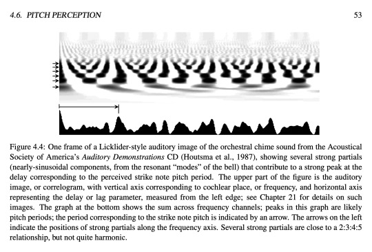
4.6. PITCH PERCEPTION 53
Figure 4.4: One frame of a Licklider-style auditory image of the orchestral chime sound from the Acoustical Society of America’s Auditory Demonstrations CD (Houtsma et al., 1987), showing several strong partials (nearly-sinusoidal components, from the resonant “modes” of the bell) that contribute to a strong peak at the delay corresponding to the perceived strike note pitch period. The upper part of the figure is the auditory image, or correlogram, with vertical axis corresponding to cochlear place, or frequency, and horizontal axis representing the delay or lag parameter, measured from the left edge; see Chapter 21 for details on such images. The graph at the bottom shows the sum across frequency channels; peaks in this graph are likely pitch periods; the period corresponding to the strike note pitch is indicated by an arrow. The arrows on the left indicate the positions of strong partials along the frequency axis. Several strong partials are close to a 2:3:4:5 relationship, but not quite harmonic.
0 notes
Text
Prediction of Compaction Parameters of Soil using Support Vector Regression-Iris Publishers
Authored by Arif Hasnat*
Compaction parameters determination in the laboratory require considerable time and effort that can be saved by using empirical correlations at the early stages. This paper introduces some efforts to predict the compaction properties of soils using the index test results. Apart from the experimental result, the result from other literature have also been considered in the analysis here. Different statistical investigation such as histogram, ACF, PACF, kernel function, correlogram and cross correlogram are used to find the relationship of liquid limit, plastic limit and plasticity index with optimum moisture content and maximum dry density. Regression analyses are done with support vector machine algorithm. The best R squared value found from the predicted equation is 0.86 for optimum moisture content and 0.91 for maximum dry density.
Read More...Full Text For More Articles in Current Trends in Civil & Structural Engineering please click on https://www.irispublishers.com/ctcse For More Open Access Journals in Iris Publishers please click on https://irispublishers.com/journals.php To Know indexing list of Iris Publishers please click on https://medium.com/@irispublishers/what-is-the-indexing-list-of-iris-publishers-4ace353e4eee To Know more information about Iris Publishers ISSN Number Please click on https://portal.issn.org/api/search?search[]=MUST=keyproper,keyqualinf,keytitle,notcanc,notinc,notissn,notissnl,unirsrc=irispublishers&search_id=1633309
0 notes
Link

Vitamin E acetate, an additive sometimes used in tetrahydrocannabinol (THC), may be to blame for recent cases of e-cigarette-related lung injuries. This is according to senior representatives of the US Centers for Disease Control and Prevention (CDC), CNN reports.
The CDC is now recommending "that people should not use e-cigarette, or vaping, products that contain THC." The CDC continues, "since the specific compound or ingredient causing lung injury are not yet known, the only way to assure that you are not at risk while the investigation continues is to consider refraining from use of all e-cigarette, or vaping, products."
In a commentary, titled: "CDC Started a Vaping Panic, Now It’s Admitting Vitamin E Acetate In Illegal Products Is to Blame," Reason Magazine claims that "Vitamin E acetate is not found in legal e-cigarettes. But it is often used by drug dealers to cut THC vape cartridges in an effort to increase their profits."
"Unfortunately, the CDC has been consistently ambiguous on the question of whether or not commercially available e-cigarettes containing nicotine are responsible for the outbreak," continues Reason. "It is clear they are not responsible."
Before this development, it seemed very likely that vaping products could be banned sooner or later in the US. This is, of course, still a possibility.
I have no doubt that the CDC regulators mean well. But, I think, they should realize that banning such products pushes manufacturing and distribution underground, thus exposing consumers to real danger. Also, were e-cigarettes banned, vapers would probably just go back to conventional cigarettes.
Functional Lungs Grown by Stem Cell Transplant
Researchers at Columbia University have grown fully functional lungs in mouse embryos using transplanted stem cells.
In a study published in Nature Medicine, the researchers report that the transplanted stem cells led to the formation of functional lungs that allowed the mice to live well into adulthood.
It may ultimately be possible, according to the researchers, to use this technique to grow human lungs in animals for patients who need transplants and to study new lung treatments.
New CRISPR Protein Improves Gene Edit Accuracy
Scientists at City University of Hong Kong and Karolinska Institutet have developed a new protein that can help increase the targeting accuracy in the CRISPR genome editing process.
SaCas9-HF is a CRISPR Cas9 variant that has high accuracy in genome-wide targeting in human cells. A research paper published in PNAS describes how the scientists have successfully engineered SaCas9-HF without compromising on-target efficiency.
According to the scientists, this would be useful in humans for future gene therapies that require high precision.
Machine Learning Model Could Map Neural Circuits
Researchers led by Kyoto University have developed a machine learning method that allows scientists to reconstruct neuronal circuitry by measuring signals from the neurons themselves.
The researchers devised an analytical method by applying a Generalized Linear Model to a Cross Correlogram, which records the firing correlation between neurons.
The method, described in a study published in Nature Communications, has the potential to elucidate the difference in neuronal computation in different brain regions.
Cheap Intelligent Meta-Material Could Improve MRI
Researchers at Boston University have developed a low-cost “intelligent” meta-material that could revolutionize magnetic resonance imaging (MRI). It could make the entire MRI process faster, safer, and more accessible to patients around the world.
The new magnetic meta-material is described in a paper published in Advanced Materials.
It is made of simple copper wiring and plastic. When placed beside the body part that is the target of a scan, the new material boosts the energy emitted by the patient's body, improving MRI imaging.
Nanoparticles Deliver Pain Drug to Nerve Cells
Scientists led by New York University have used nanoparticles to deliver a drug called Aprepitant into specific compartments of nerve cells. Aprepitant had previously failed in clinical trials for pain. The new delivery process dramatically increases the drug's ability to treat pain in mice and rats.
A research paper published in Nature Nanotechnology reports that nanoparticle-delivered Aprepitant treated pain in mice and rats more completely and for longer periods than did conventional therapies, including opioids. Moreover, nanoparticle delivery minimized the dose of medication needed to treat the pain, which could be useful in avoiding side effects.
Biologists Reprogram Viruses to Treat Infection
Researchers at ETH Zurich have used synthetic biology to reprogram bacterial viruses, commonly known as bacteriophages, to expand their natural host range.
The researchers, who reported their findings in Cell Reports, have genetically reprogrammed phages to produce synthetic phages that recognize and attack a broader range of bacterial strains beyond their natural host.
According to the researchers, this technology paves the way for the therapeutic use of standardized synthetic bacteriophages to treat bacterial infections.
Originally published at thrivous.com on November 11, 2019 at 07:51PM.
0 notes
Text
Neuron circuitry from brain signals
A research team has developed a machine learning model that allows scientists to reconstruct neuronal circuitry by measuring signals from the neurons themselves. The team constructed an analytical method by applying a Generalized Linear Model to a Cross Correlogram, that records the firing correlation between neurons. The model has the potential to elucidate the difference in neuronal computation in different brain regions. Neuron circuitry from brain signals syndicated from https://triviaqaweb.blogspot.com/
0 notes

Text
Neuron circuitry from brain signals
A research team has developed a machine learning model that allows scientists to reconstruct neuronal circuitry by measuring signals from the neurons themselves. The team constructed an analytical method by applying a Generalized Linear Model to a Cross Correlogram, that records the firing correlation between neurons. The model has the potential to elucidate the difference in neuronal computation in different brain regions. Latest Science News -- ScienceDaily https://www.sciencedaily.com/releases/2019/11/191106112102.htm
0 notes
Text
Data Visualization in R
R programming was developed in 1993 for making graphs and producing statistical results. There are many libraries in R language that can be used for making graphs and producing statistical data.
There are many steps that have to be taken into consideration for doing data analysis through this language. These steps are:
Programming
Transforming
Discovering
Modeling
Communicating
R programming is being used in many industries like academics, healthcare, government, insurance, retail, media, manufacturing, etc.
This data analysis can be done through programming in R language which comes with a number of packages having many inbuilt functions and this is the reason that developers do not have to program much. They just need to use those functions and carry out the analysis.
Why R Programming?
R Programming can be used to create statistics and graphs. The language has become very popular and people who want to make their career in this language can undergo R certification online through various institute who provide in-depth knowledge of R.
R certification when seen today can prove to be very useful for students and they can plan a good career after the certification which certainly gives an individual an upper edge over others.
Data Visualization in R
Many types of data visualizations can be created through the language and these are:
Histogram
Bar / Line Chart
Box plot
Scatter plot
Heat Map
Mosaic Map
Map Visualization
3D Graphs
Correlogram
These will be discussed one by one.
Histogram
A histogram can be created by using histdata package that has many small data sets to create the histogram. A histogram can be used to break data into bins and show their frequency. Here is the code in which histogram is created. Here is the code of creating a simple histogram.
hist(Temperature, main="Maximum daily temperature ", xlab="Temperature in degrees Fahrenheit", xlim=c(50,100), col="darkmagenta", freq=FALSE )
Image Source
While creating a histogram a developer can see that number of colors specified is more than the number of breaks. The colors are repeated if the number of colors is more.
Line Chart
A line chart shows an increase in the data for a given time period. Line charts are created to compare the changes between two organizations or between weather of two places or other comparisons. Line charts are also created to analyze the trends over a particular period.
x <- c(1:5); y <- x par(pch=22, col="red") par(mfrow=c(2,4)) opts = c("p","l","o","b","c","s","S","h") for(i in 1:length(opts)){ heading = paste("type=",opts[i]) plot(x, y, type="n", main=heading) lines(x, y, type=opts[i]) }
Image Source
Bar Chart
Bar chart is also created for comparing profits or weather report or other comparisons. The chart is displayed in the form of bars. Here is the code of creating a vertical bar chart.
counts <- table(mtbikes$gear) barplot(counts, main="Bike Distribution", xlab="Number of Gears")
Image Source
Here is an example of creating a horizontal bar chart.
counts <- table(mtbikes$gear) barplot(counts, main="Bike Distribution", horiz=TRUE, names.arg=c("3 Gears", "4 Gears", "5 Gears"))
Box Plot
It is created either for a single variable or a group of variables. The syntax of creating a box plot is as follows
boxplot(x,data=)
Here x is the formula and data= is the frame which provides the data. Here is an example of creating a box plot.
boxplot(mpg~cyl,data=mtbikes, Bike Milage Data", xlab="Number of Cylinders", ylab="Miles Per Gallon")
Image Source
Scatter Plot
Scatter plot can be created in many ways. The basic formula for creating the scatter plot is
plot(x, y)
Here is an example of creating a scatter plot.
attach(mtbikes) plot(wt, mpg, main="Scatterplot Example", xlab="Bike Weight ", ylab="Miles Per Gallon ", pch=19)
Heat Map
A heat map is displayed in the form of a table in which colors are displayed in place of numbers. All the columns can have either same or different colors. The dark color denotes highs while the light colors denote lows. Here is an example of creating a heat map.
> heatmap(as.matrix(mtcars))
Mosaic Map
Mosaic Map can be created by using VCD library which has an ample amount of functions to create the map. The syntax for creating a mosaic map is as follows:
mosaic(x, condvar=, data=)
Here x is the formula and codevar is an optional variable in which conditions can be defined. The example below shows the making of a mosaic map
library(vcd) mosaic(HairEyeColor, shade=TRUE, legend=TRUE)
3D Graphs
R programming can be used to create 3D graphs which are very impressive. The R commander package is used to create these graphs. In order to create the 3D graph R commander package has to be installed and then 3D plot option should be used in the graph.
Here is the code for creating the graph:
>data(iris, package="datasets") >scatter3d(Petal.Width~Petal.Length+Sepal.Length|Species, data=iris, fit="linear" >residuals=TRUE, parallel=FALSE, bg="black", axis.scales=TRUE, grid=TRUE, ellipsoid=FALSE)
Lattice package can also be used to create 3D graphs.
Here is an example
>attach(iris) >cloud(Sepal.Length~Sepal.Width*Petal.Length|Species, main="3D Scatterplot by Species") >xyplot(Sepal.Width ~ Sepal.Length, iris, groups = iris$Species, pch= 20)
Correlogram
Correlogram helps the users to view the data in the form of matrices. The syntax for creating a correlogram is given below.
corrgram(x, order = , panel=, lower.panel=, upper.panel=, text.panel=, diag.panel=)
Here
Order=TRUE will set the variables in proper order in relation to the correlation matrix.
Panel= refers to diagonal panels in which developers can use lower= and upper=. These options can be chosen below and above the diagonal. Text.panel and diag.panel are the references to main diagonal.
Here is an example of creating a correlogram.
library(corrgram) corrgram(mtbikes, order=TRUE, lower.panel=panel.shade, upper.panel=panel.pie, text.panel=panel.txt, main="Bike Milage Data in PC2/PC1 Order")
Map Visualization
This is the latest thing that has been put into the R programming. R can provide the map visualization through JavaScript libraries. The leaflet is open source through which JavaScript libraries can be used for creating interactive maps. In order to use the library, it should be installed.
library(magrittr) library(leaflet) m <- leaflet() %>% addTiles() %>% addMarkers(lng=77.2310, lat=28.6560, popup="The delicious food of India") m
Hexbin
Hexbin is a package, which helps to create multiple points This package can be used to create a bivariate histogram. Here is the code for the same.
>library(hexbin) >a=hexbin(diamonds$price,diamonds$carat,xbins=40) >library(RColorBrewer) >plot(a)
Final Verdict
It can be said that various kinds of graphs can be made from R language by writing few lines of code and embedding packages and functions, which have already been coded.
These charts can be used on the web as well as desktop applications and can help you for data visualization in R in a specific way.
The post Data Visualization in R appeared first on The Crazy Programmer.
0 notes