#cssgradient
Explore tagged Tumblr posts
Visit Tumblr Blog
Explore Tumblr blogs with no restrictions, modern design and the best experience.
Last Seen Tumblr Blogs


Fun Fact
25% of US internet users with an annual income of $80-100K use Tumblr.
Text
Create Mesmerizing Animated Gradient Backgrounds with CSS!
💻 Dive into the world of CSS animations and learn how to create stunning gradient backgrounds that seamlessly transition colors! Watch our short tutorial to discover the power of CSS keyframes and linear gradients for adding dynamic visual effects to your web projects.
#CSS#WebDesign#FrontEndDevelopment#TechTutorial#GradientBackground#CSSAnimation#Tutorial#WebDevelopment#CodeTutorial#ProgrammingTutorial#WebDesignTutorial#CSSGradient#CSSKeyframes#WebDevTutorial
1 note
·
View note
Video
tumblr
Ever wanted to know how to create buttons with a transitioning gradients with CSS? This week's tutorial shows how to code links with colour changing and transitioning gradients.
Watch here: https://youtu.be/-S21wVY07AY
#html#css#css3#cssgradient#webdev#webdevelopment#webdesign#ui#ux#coding#codingtutorial#coding tutorial
4 notes
·
View notes
Video
youtube
Types of Gradients In CSS | Pure CSS Tutorial
#cssgradient#css-tricks#css tutorial#css#gradient#html tutorial#csstips#webdesign#web development#website
0 notes
Photo
Ultimate CSS Gradient Generator https://webdevpuneet.com/ultimate-css-gradient-generator/
0 notes
Video
youtube
css gradient animation | web development tutorial | css tutorial for beg...
0 notes
Text

ʚĭɞ for the anon who asked how i find stuff/redo my themes !!

001: first i pick a colour scheme i like, i typically go for the same colours/aesthetic as i want my blog to be nice to look at as it motivates me to write and interact on here !!
some colour schemes i like right now are:
ʚ brown, green (sage), greys
ʚ pink (light) and green (sage)
ʚ blue (light navy) and greys
ʚ green (sage) and greys
ʚ greys and white
ʚ brown (toned down) and black
ʚ oranges, browns and green (sage)
ʚ white, light blue and black
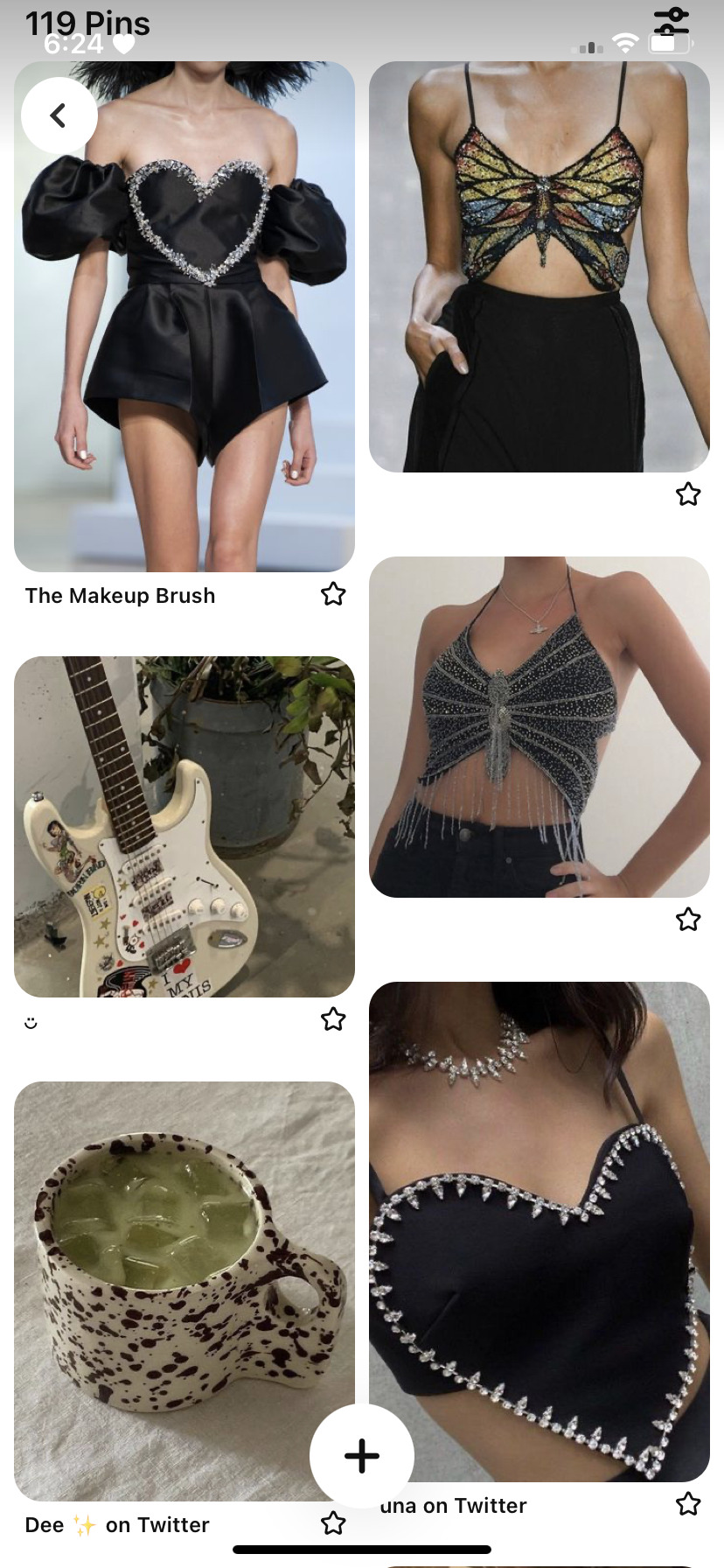
002: once i choose a colour scheme i like i use pinterest to look for photos that match those colour schemes to use for my headers/carrd and i’ll usually canva to use three images together OR i’ll search up [colour scheme] twitter header into pinterest and a ton with usually come up !! here’s an example of what my pinterest board for themes look like, some are in diff colour schemes but they can be matched up if i find the right combination to go with them

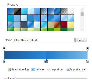
003: i use cssgradient to make the dividers for my works/navi and usually pick the central colour for my theme for these. you can also choose to make your dividers two or more colours with the gradient option which i’ve also done so in the past !! i then use imgcrop to crop the dividers and download them. i make sure the width is the whole width of my screen and then put the height at 2 before cropping and downloading !!
004: i’ve been into having a set theme when it comes to my blog and carrds, i’ve previously done an instagram, twitter, website, app store theme minimalist theme which would be a few images (usually three) at the top of my navi and themes where i’ve used bolder colours with three images at the top !! i also play around with using a header and having no pfp on display, or using only my pfp and no header and as for example now, having no header or pfp on display !! these actually make a big difference and can make your blog look cleaner or more put together !!
i hope that helps you !!
#i hope u see this anon#and i hope it’s clear enough :’)#but just make sure your blog looks good FOR YOU !!#it’s always good when your theme looks appealing to you because you’re the one spending time on it#and have fun with it !!
14 notes
·
View notes
Text
Colores de redes sociales para crear botones
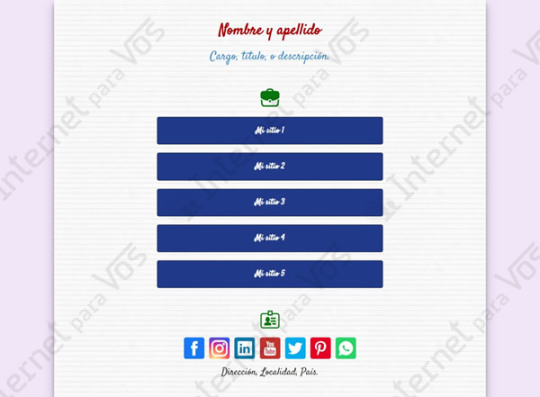
En estos días vamos a lanzar una plantilla de página de aterrizaje para Instagram, muy sencilla (imagen al pie) y al diseñar los íconos de redes sociales utilizamos varias aplicaciones on-line para seleccionar los colores.
Aquí publicamos el color principal de estas redes (en hexadecimal y RGB), en caso que alguno/a desee un compilado de colores oficiales al día de la fecha.
Para Messenger y WhatsApp utilizamos un gradiente generado con la herramienta on-line cssgradient (todo junto, extensión io), en base a los logos y sitios de paletas visitados. Y al final encontrarás un enlace a Codepen con un gradiente para Instagram.
-Facebook: #1877F2, RGB: 24,119,242.
-LinkedIn: #0077B5, RGB: 0,119,181.
-Pinterest: #E60023, RGB: 230,0,35.
-Reddit: #FF5700, RGB: 255, 86, 0.
-Scribd: #1E7B85, RGB: 30,123,133.
-Skype: #00AFF0, RGB: 0,175,240.
-Snapchat: #FFFC00, RGB: 255,252,0.
-Telegram: #0088CC, RGB: 0,136,204.
-Tumblr: #34465D, RGB: 52,70,93.
-Twitter: #1D9BF0, RGB: 29,155,240.
-Vimeo: #1AB7EA, RGB: 26,183,234.
-YouTube: #FF0000, RGB: 255,0,0.
Gradientes:
-Messenger: Colores: #0695FF, RGB: 6,149,255; #A334FA, RGB 163,52,250; #FF6968, RGB: 255,105,104.
Código CSS: background: rgb(6,149,255); background: -moz-linear-gradient(45deg, rgba(6,149,255,1) 0%, rgba(163,52,250,1) 51%, rgba(255,105,104,1) 100%); background: -webkit-linear-gradient(45deg, rgba(6,149,255,1) 0%, rgba(163,52,250,1) 51%, rgba(255,105,104,1) 100%); background: linear-gradient(45deg, rgba(6,149,255,1) 0%, rgba(163,52,250,1) 51%, rgba(255,105,104,1) 100%); filter: progid:DXImageTransform.Microsoft.gradient(startColorstr="#0695ff",endColorstr="#ff6968",GradientType=1);
-WhatsApp: Colores: #58D164, RGB 88,209,100 y #2BB641, RGB: 43,182,65.
background: rgb(88,209,100); background: -moz-linear-gradient(180deg, rgba(88,209,100,1) 0%, rgba(43,182,65,1) 100%); background: -webkit-linear-gradient(180deg, rgba(88,209,100,1) 0%, rgba(43,182,65,1) 100%); background: linear-gradient(180deg, rgba(88,209,100,1) 0%, rgba(43,182,65,1) 100%); filter: progid:DXImageTransform.Microsoft.gradient(startColorstr="#58d164",endColorstr="#2bb641",GradientType=1);
-Instagram: https://codepen.io/thomasrye/pen/VaRoYv
Nuestra plantilla para Instagram:
Más detalles aquí.
0 notes
Link
Many people know how to use CSS to style websites, but when it comes to CSS artwork, they get confused on how they are made.
So i thought it might be helpful if i share my humble experience with you, I am going to discuss some important CSS knowledge you will need to have, in order to make your own CSS art and enjoy it as i do, let’s start🚀
Useful CSS properties :
1. Gradient
We can declare gradient in both background or background-image properties, it can take as much colors as you want separated by a comma “ , ”.
We have two types of gradients:
-Linear Gradients: can be controlled by directions(left,top,right,bottom) or angles.
-Radial Gradients: can be controlled by giving each color a percentage, setting a shape(circle,ellipse).
• Great website to generate gradients: cssgradient
2. box-shadow
Give your element one or multiple shadows by separating them with a comma “ , ”.
I found that the “inset” property value is so much useful, it changes the shadow from an outer shadow to an inner shadow, this makes your element looks a little bit real.
• Great website to generate box-shadow: cssmatic
3. clip-path
Clip-path is a very useful property when it comes to CSS artwork, this property will make it easy to draw a path that probably will take you so much time to do in a different way.
This helps to draw circle, polygon and paths by specifying which region you want to show.
• Great website to generate clip-path: bennettfeely
Make your first CSS art
After we discussed these properties above, you are now ready to make your first CSS art.
This is the one we will make together 😍

This is the HTML :
<div class="coffee-cont"> <div class="coffee-cup"></div> <div class="coffee-hand"></div> <div class="coffee-tasse"></div> </div>
The first thing we will do is style our coffee container : we will give it position:relative and position:absolute to the other elements inside this div (except the coffee-cup div ) so that their positions will depend on their parent’s position.
.coffee-cont { width: 500px; height: 500px; margin: 0 auto; position: relative; }
let’s style our second div, the coffee cup : we will use the radial-gradient for the background to make the center a little bit brighter than the sides.
.coffee-cup { position: relative; width: 250px; height: 190px; margin: 0 auto; background: radial-gradient(circle,rgba(208, 208, 208, 1) 5%,rgba(189, 189, 189, 1) 51%); border-radius: 0 0 150px 150px; top: 50%; }

Again a radial-gradient to the element before the coffee-cup to generate our coffee's color. notice that we give it z-index:9 so that it goes over the cup.
.coffee-cup::before { content: ''; display: block; height: 30px; width: 230px; position: absolute; border-radius: 50%; background: radial-gradient(circle,rgba(132, 102, 76, 1) 5%,rgba(86, 44, 8, 1) 96%); top: -7px; left: 10px; z-index: 9; }

this code will generate the top of the cup:
.coffee-cup::after{ content: ''; display: block; height: 45px; width: 242px; position: absolute; border-radius: 50%; background: #cccccc; top: -25px; left: -1px; border: 5px solid #e6e6e6; }

Let’s add the coffee-hand div, we will give it z-index:-1, this way it goes behind the cup element
.coffee-hand{ width: 52px; height: 32px; position: absolute; background: #ffffff; border-radius: 32px; transform: rotate(-36deg); z-index: -1; border: 15px solid #dbdbdb; top: 56%; left: 66%; }

Now we take care of the element in the bottom, we will use a circular radial-gradient, the center will be brighter. we need a shadow to add a nice effect to this element, for this we will use the box-shadow property with a darker color.
.coffee-tasse{ width: 400px; top: 68%; left: 10%; height: 139px; background: radial-gradient(circle,rgba(69, 69, 69, 1) 13%,rgba(176, 176, 176, 1) 45%,rgba(143, 141, 141, 1) 96%); border-radius: 50%; position: absolute; z-index: -1; border: 2px solid #f0f0f0; box-shadow: 1px 3px 0px 1px #323232; }

I added this ::after selector to generate another blurry shadow which will be displayed at the very bottom of this element.
.coffee-tasse::after{ content: ''; display: block; width: 405px; top: 68%; border-radius: 50%; height: 145px; background: transparent; box-shadow: 2px 5px 8px 3px #bababa; }
That's it ☕. Congratulations on making your first CSS art 🎉, now it is your turn to use all the things you have learnt and make something fancier!��
0 notes
Text
リアルタイムに多彩なグラデーションCSSを生成できる「CSS Gradient Generator」
from http://web-marketing.zako.org/web-tools/css-gradient-generator.html
たまたまかもしれませんが、最近この手のツールも次々に良いものが出てくるなと感じています。つい先日も直感的なCSS3のグラデーションジェネレーター「GradPad」をご紹介させていただきましたが、今回のツールはさらに細やかなグラデーションの設定を、手軽におこなえるようになっています。
多彩なグラデーションCSSを手軽に生成できる「CSS Gradient Generator」
「CSS Gradient Generator」は、わかりやすいUIで多彩なグラデーションCSSのパターンを生成できるオンラインツール。
実際にサイトで使った場合の具体的なサンプルも見ることができたり、グラデーションのサンプル集からCSSを取得できたりするのもこのツールの良いポイントです。
リアルタイムにグラデーションCSSを生成
生成したグラデーションがそのままリアルタイムにCSSへ反映される。
グラデーションを生成する画面UIがわかりやすく、少し難易度の高い設定も手軽に行えるようになっているだけでなく、生成する度にCSSが発行されるので、気に入ったものができたところですぐにCSSで残しておくこともできます。
サンプルからもグラデーションCSSを取得可能
テーマを持ったグラデーションのサンプル集。
自分で1から作るだけでなく、各々テーマに基づいたグラデーションからグラデーションCSSをワンクリックで取得することも可能です。
CSS Gradient Swatches
サイトでの使用事例も見られる
StripeやInstagramなどでグラデーションがどのように使われているかという事例を見ることができる。
人気サイトにおいてグラデーションがどのように使われているか、という事例も紹介されています。
16 Super Fire CSS Gradient Examples
デザインをする際にこういったトレンドを意識することも重要ですが、そういったことが手落ちになってしまうことも多々あるので、このように教えてくれると助かりますね。
興味があるかたはCSS Gradient Generatorへどうぞ。
スポンサードリンク
この記事を読んだ方は以下の記事もご覧いただいています
http://web-marketing.zako.org/images/2018/03/cssgradient-io.png
0 notes
Text
CSSGdidients - Duyarlı CSS Gradyan Scripti
Kendine has kullanışlı CSS3 Gradient web sitenizi bugün tamamen duyarlı premium CSS gradient Scriptle başlatın. Projelerinizde kullanmak için her zaman inanılmaz renklere sahip olacaksınız.
CSSGdidients Özellikleri
11,000+ CSS3 Degradeleri Güzel, Mobil Duyarlı Tasarım CSS3 Animasyonları Yapılandırılabilir Tweet Mesajı Güzel Linearicons (59 $ değerinde) İyi belgelenmiş Çapraz Tarayıcı Desteği Sonsuz kaydırma Süper Destek Kolay kurulum
CSSGdidients - Duyarlı CSS Gradyan Komut Dosyası Önizleme
https://codecanyon.net/item/cssgradients-responsive-css-gradient-script/15245834
CSSGdidients - Duyarlı CSS Gradyan Komut Dosyası İndir
https://yadi.sk/d/ui6i8Fy8D3DO9Q Read the full article
#Cssgradyan#CSSGdidients#CSSGdidientsduyarlıcss#CSSGdidientsgradyan#CSSGdidientsnull#CSSGdidientsnulled#CSSGdidientsscript#Freescript#komutdosyası#nullscript#nulledscript#ÜcretsizScript
0 notes
Text
CSSGradients - Responsive CSS Gradient Script Script Développeur
New Post has been published on http://www.developpeur.ovh/371/
CSSGradients - Responsive CSS Gradient Script
démarrer votre site propre de CSS3 gradients pratique aujourd’hui avec notre script dégradé du CSS entièrement sensible prime. Vous ’ ll ont toujours des couleurs étonnantes à utiliser dans vos projets.
caractéristiques CSSGradients
11, 000 + CSS3 Gradients
Beautiful, Mobile Responsive Design
Animations CSS3
Configurable Tweet Message
Linearicons belle (d’une valeur de 59 $)
bien documentée
Cross Browser Support
défilement infini
superbe Support
Installation facile
et bien plus encore !
besoins simples
PHP 5 +
base de données MySQL
faites avec amour par NRGThemes
Voir sur Codecanyon
CSSGradients - Responsive CSS Gradient Script
0 notes
Text
CSSGdidients - Duyarlı CSS Gradyan Scripti
Kendine has kullanışlı CSS3 Gradient web sitenizi bugün tamamen duyarlı premium CSS gradient Scriptle başlatın. Projelerinizde kullanmak için her zaman inanılmaz renklere sahip olacaksınız.
CSSGdidients Özellikleri
11,000+ CSS3 Degradeleri Güzel, Mobil Duyarlı Tasarım CSS3 Animasyonları Yapılandırılabilir Tweet Mesajı Güzel Linearicons (59 $ değerinde) İyi belgelenmiş Çapraz Tarayıcı Desteği Sonsuz kaydırma Süper Destek Kolay kurulum
CSSGdidients - Duyarlı CSS Gradyan Komut Dosyası Önizleme
https://codecanyon.net/item/cssgradients-responsive-css-gradient-script/15245834
CSSGdidients - Duyarlı CSS Gradyan Komut Dosyası İndir
https://yadi.sk/d/ui6i8Fy8D3DO9Q Read the full article
#Cssgradyan#CSSGdidients#CSSGdidientsduyarlıcss#CSSGdidientsgradyan#CSSGdidientsnull#CSSGdidientsnulled#CSSGdidientsscript#Freescript#komutdosyası#nullscript#nulledscript#ÜcretsizScript
0 notes