#coding tutorial
Explore tagged Tumblr posts
Visit Tumblr Blog
Explore Tumblr blogs with no restrictions, modern design and the best experience.
Last Seen Tumblr Blogs


Fun Fact
70% of Tumblr users say the Dashboard is their favorite place to spend time online.
Text
here's a list of all the intermediate coding tutorials i've written so far!
git / github tutorial
npm (and node.js) tutorial (+ how to use the command line) (this one's a prerequisite for the following 2 tutorials)
webpack tutorial (a module builder for JavaScript and (S)CSS)
11ty (eleventy) tutorial (a super easy static site generator!)
if you have ideas/requests, feel free to contact me!
more beginner coding tutorials are coming VERY soon! meanwhile, check out my common questions and common mistakes pages!
#web development#coding#coding tutorials#neocities#git tutorial#npm tutorial#webpack tutorial#eleventy tutorial#static site generator#coding tutorial#git#github#npm#webpack#eleventy#11ty
21 notes
·
View notes
Text
Coding Tutorial - Permalinks, Tags and Notes
I found this helpful so I wanted to share
Source: https://themesbyeris.tumblr.com/tutorial07
I couldn't reblog so I'm reposting.
Permalink
We are going to start this part of the tutorial by adding in the permalink. If you don’t know what that is already, it is the thing you click to go to view a post on an individual page. Tumblr makes this really easy. All you need is the following piece of code:<a href="{Permalink}">Text</a>
You can replace the word “Text” from the example above with an image, a note count, the date, or anything else text-based. For example, if we wanted the permalink to be displayed in dd/mm/yyyy format, we would write:{block:Date}DayOfMonthWithZero}/{MonthNumberWithZero}/{Year}{/block:Date}
Tip: Always wrap the date in the “block:Date” tags otherwise the date will show up on ask/submit pages too.
Here are a few other formats:{MonthNumberWithZero}-{DayOfMonthWithZero}-{Year} = 04-10-2012 {DayOfWeek}, {DayOfMonth} {Month} {Year} = Tuesday, 10 April 2012 {ShortMonth} {DayOfMonth}{DayOfMonthSuffix}, '{ShortYear} = Apr 10th, '12 {12Hour}:{Minutes}{AmPm} = 3:00pm {12HourWithZero}.{Minutes}.{Seconds}{CapitalAmPm} = 03.00.00PM {24HourwithZero}{Minutes} = 1500 {TimeAgo} = 1 hour ago
[Click here for all the ways you can format the date]
I will be using the {TimeAgo} tag for this example. But I also want to include in the permalink the notecount. This one is easier because there’s only two options for it.{NoteCount} = 1,938 {NoteCountWithLabel} = 1,983 notes
Naturally, this is also wrapped in those pesky block tags. This time it’s “block:NoteCount”. So if we put both the date and notecount together with the word “with” between them, it will look like this:<a href="{Permalink}"> {block:Date}{lang:Posted TimeAgo}{/block:Date} {block:NoteCount} with {NoteCountWithLabel}{/block:NoteCount} </a>
What we’re going to do with this piece of code is wrap it in a div and call it “permalink”, then put that div right after our main content, inside the “block:Post” tags (this is important).{block:Posts} ... [All your post types here] ... <div id="permalink"> <a href="{Permalink}"> {block:Date}{lang:Posted TimeAgo}{/block:Date} {block:NoteCount} with {NoteCountWithLabel}{/block:NoteCount} </a> </div>
Now that it is wrapped up in a div, we can style it. We don’t need to do much for this theme, since we did a lot of the styling in the content tag. The only things we need to specify here is the size of the font, and use the margin property to make a space between the permalink and the post above it.#content #posts #permalink { font-size:9px; margin-top:10px; }
Tags
The basic code for tags is this:{block:Tags}<a href="{TagURL}">#{Tag}</a> {/block:Tags}
Tumblr also gives us an extra block tag called “block:HasTags” since not all posts have tags. If you add in a pretty box or image for tags, it is not a good idea to have it still display when there are no tags at all. In this case I will be adding a div with the label “tags”, and putting this inside the secondary block tags.{block:HasTags}<div id="tags"> {block:Tags} <a href="{TagURL}">#{Tag} </a> {/block:Tags} </div> {/block:HasTags}#content #posts #tags { font-size:9px; }
Now I am going to show you a little trick. At the moment we have formatted the tags so that they will show up like this:
#tag one #tag two #tag three
But what if I want them to show up like this?
tag one, tag two, tag three.
Do you see the problem there? The last tag ends with a fullstop instead of a comma. The following would not work:{block:Tags} <a href="{TagURL}">{Tag}</a>, {/block:Tags}.
(Take note of the full stop outside of the “block:Tags” tag.)
tag one, tag two, tag three,.
Here’s a little trick to get around that. Just copy this code:{block:Tags} <a href="{TagURL}">{Tag}</a><span class="comma">, </span> {/block:Tags}.#content #posts #tags .comma:last-child { display: none; }
It’s the “last-child” bit in the CSS that tells the browser not to display the comma if it’s the last one in the line. We also used “span” instead of “div” because if we’d used div, it would have made a line break, which we don’t want in this case.
tag one, tag two, tag three.
Note Container
The note container is the bit where it lists everyone that has liked or reblogged a post, along with their comments if they made any. Naturally it only shows up on the permalink pages.
This one is going to be done a little differently to the previous two, and be placed outside the “posts” div we created (but it still has to be inside the “block:Posts” tags).{block:Posts} <div id="posts"> ... [A lot of stuff in here.] ... [Permalink] [tags] </div> [<--closes the "posts" div] Note Container {/block:Posts}
Note that you don’t HAVE to put the note container outside the “posts” div, it can be inside if you want. This is just how we’re doing it for this theme. All this means is that it won’t be inside those white boxes we made for each post.
The HTML part for this is simple. Just some block tags, and {PostNotes}. I have wrapped this in a div so we can style it using CSS.{block:PostNotes} <div id="notecontainer">{PostNotes}</div> {/block:PostNotes}
Now since we took the note container outside of the “posts” div, we need to re-establish the width and margins. A font size also needs to be specified here since that isn’t specified in any parent tags.#content #notecontainer { margin: 20px auto; width: 500px; font-size: 11px; }
Now if you look at the theme, you will be able to click through to the permalink pages and see the notes as a list. If there are a lot of notes, they will be labelled 1-50, and number 51 will contain a “Show More Notes” link. Having it numbered is the tumblr default, but it doesn’t actually look nice. We are going to go ahead and access the list using a built in tag called “ol.notes” (ol = ordered list, numbered list), and apply a property called “list-style-type” to remove the number system. I am also going to get rid of the default margins and padding that comes with the list, but padding can be added if you prefer to have the lines more spaced out.#content #notecontainer ol.notes { list-style-type: none; margin: 0; padding: 0; }
Lastly I am going to edit the little avatar next to each note. At the moment there is no space between the avatar and the name of the blogger, so I’ll be adding in a 10px margin. Plus just to be on the safe size I will include the size of the images.#content #notecontainer img.avatar { margin-right: 10px; width: 16px; height: 16px; }
Click here to see the code so far, and here for the live-preview.
In the next tutorial we will be finishing up this basic theme with adding in pagination and infinite-scroll. Then I will move on to tricks to make things look pretty like transition-effects.
#themes#tutorial#theme code tutuorial#coding tutorial#tumblr theme tutorial#theme tutorial#tutorials#code tutorial
5 notes
·
View notes
Note
For those of us who are new to twine/find it daunting. What would be the easiest way to set side character genders? I know if statements will likely come into play I just find it so daunting. Any information would be helpful.
hi friend! apologies this took me several months to answer--askbox was on lockdown for a little bit, hope you're still curious.
i'm actually in the process of writing/scripting a couple new videos that I'm going to post next week (because a year later I don't really like how the old video looks) so--if it's easier, I'll cover it in video form for visual/audio learners there--but for now--this is what I'll say.
the best way to set genders for any character is to use variables, this is true across all different languages of twine, but i'm most familiar with sugarcube twine.
for example, in my game, larkin, i have two characters Ace and Hollis that the player can select the gender/pronouns of in the beginning of the game.
setting their genders is something as simple as creating links with <<set>> macros in them. you can do that a couple of ways. my favorite way is the bracket method, but I know there is like, annoying discourse in the coding community (because what other kind of coding discourse is there, if not annoying) over which method is better--so I'll show you both.
say I wanted to set Ace's gender at the beginning of the game. I'm going to first go into my StoryInit passage in twine--you won't have this when you first open your twine game, so you'll have to create it--by simply creating a new passage and labeling it 'StoryInit' exactly as written there, with the capital 'S' and the capital 'I' no spaces.
from there you're going to create a gender variable to keep track of your character's gender throughout the game. because ace's name starts with an 'a' i'm going to simply call my variable '$agender' it is important that a '$' or a dollar sign proceeds the title of your variable--in order for the game to keep track of the variables value throughout the game.
so basically, in StoryInit I'm going to create a set statement--this is done by typing out the following:
<<set $agender to "male">>
right now, i've set ace's gender to male. this doesn't really mean anything--I'm just using male as a default for right now--you can make it anything you want really, female, non-binary, or even just 'null' for the moment. but know that whatever you set their gender to now, if you type out $agender for it to print in the text of your game, it's going to say "male" or whatever else you've set their gender to.
this isn't really a necessary step but I've found that giving my variables some sort of value before I really set them has always helped me keep organized, and allow the game to run a little smoother.
now onto setting their genders.
if I want to give the player an option to select their gender choosing from the options male/female/non-binary, I'm going to set up my links either like this:
[[set ace's gender to male | 2.0][$agender to "male"]] [[set ace's gender to female | 2.0][$agender to "female"]] [[set ace's gender to non-binary | 2.0][$agender to "non-binary"]]
or like this:
<<link "set ace's gender to male" "2.0">><<set $agender to "male">><</link>> <<link "set ace's gender to female" "2.0">><<set $agender to "female">><</link>> <<link "set ace's gender to non-binary" "2.0">><<set $agender to "non-binary">><</link>>
both of these essentially accomplish the same thing: they create three links, all that lead to a passage entitled '2.0' and depending on the link selected, they set the gender of Ace to either male, female or non-binary.
To go a little deeper into explanation:
[[set ace's gender to male | 2.0][$agender to "male"]] <<;link "set ace's gender to male" "2.0">><<set $agender to "male">><</link>
the pink text is what the player will see in the text of the game, the blue text is the destination to which the passage is taking you, and the yellow text is the value that's being set. the purple, for context is just coding language that's necessary for the links in that format to function.
with that, you could have a sentence structured like this in the passage labeled '2.0' to demonstrate which gender you've selected for ace's character.
'Ace identifies as $agender'
$agender in this case will print with whatever you've selected for their gender.
as for pronouns, that's a simple as setting multiple variables in one link. in this case, I do find the <<link>> method much easier, as it's a lot less complicated to set multiple variables with this one--((to be strictly honest with you, i haven't found a good way to do that with the bracket method))
say you want a male identifiying ace to go by he/him pronouns and a non-binary Ace to go by they/them--all you have to do is make links that look like this:
<<link "set ace gender to male" "2.0">><<set $agender to "male">><<set $a_he to "he">><<set $a_him to "him">><</link>> <<link "set ace gender to non-binary" "2.0">><<set $agender to "non-binary">><<set $a_he to "they">><<set $a_him to "them">><</link>>
in this example I've got variables for each time I'd use the subject and possessive adjective pronouns for ace--again, he/him in the variable name are just because it's the simplest convention for me to remember--you can name your variables whatever you like. you can also add more variables for the different types of pronouns (ex. he/him/himself/his)
you can do a lot more with this, of course, setting multiple pronouns for the characters, for example would be something as simple as creating a variable like $secondarya_he so that your character could sometimes go by "he" and sometimes by "they" -- it's really up to what you want to do with your characters. also i should note, you could also create like separate links for pronouns and gender ((as gender doesn't automatically define your pronouns in the Real World))
as for how they present in the game, it's as simple as typing out the variable and including it in your text.
for example if I have this in my text, and Ace's gender is set to nonbinary it'd look like this on my end:
Ace was over there, $a_he sat at $a_his desk.
would come out looking like this in game:
Ace was over there, they sat at their desk.
now of course, this can sometimes be tricky with grammar, because there's going to be different cases in english where you'd use one word to proceed or follow he or she but a different word to proceed/follow they--this is a simple fix too--just use if statements.
if I wanted to say 'he was doing something' for the male version of ace, but I wanted to say, 'they were doing something' for the non-binary version--I'd simply set it up like this:
$a_he <<if $a_he is "he" or $a_he is "she">>was<<elseif $a_he is "they">>were<</if>> doing something.
and my text would be fixed according to the different pronouns!
all that said, I hope this helped--and if you or anyone else has any coding questions feel free to send them here--plus look out for the video component of this lesson coming next week.
50 notes
·
View notes
Note
Hello! I ran into your skin Fading echoes and was curious if you had any tips for coding a main forum that is hover/tabbed for the rp section like that? I've been searching everywhere for something similar, or even tips on how to start that style. I saw one waaaaaay back in the day and fell in love. I'm an amateur skinner with big dreams, so if you have any advice or sources that would help learn to make a main forum body like that, I'd love to have them!
Sure! I can't claim that the method I used for Fading Echoes was the most efficient, since it was my one of my first attempts actually getting tabbed forums to work - on a skin I planned to sell, no less - but hey. If it works, it works.
I would like to also mention in advance before I explain these convoluted methods that Niobe & FizzyElf have a script resource for tabbing forums and categories. I didn't come across this until MUCH later, after I'd already sold Fading Echoes, which may be a better and more efficient method than the ones I'm about to explain.
The "Style" of Skin
First things first: typically, when you're making a skin for a Jcink forum using HTML Templates, you're expected to only put one type of markup/structure per template and the system then repeats it for every instance where that structure is meant to occur - i.e. you only write a single forum row structure, and that structure is repeated for every forum, etc.
For example, we have my WIP "Kingdom of Calamity" skin, which has the same forum row style in every category, each of them identical to the last and the next:
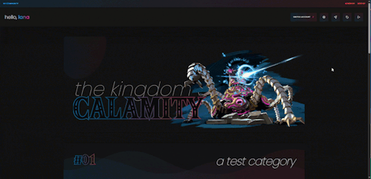
(Where you can see all the structures are identical when viewed from the index, and there's only one set of markup in the Forum Row template for the skin.)
When you mention skins "of that style" in your ask, I'm assuming that you mean skins with a highly customized index like Fading Echoes, where every category has a different layout for their forums. In these instances - a custom index where forums in certain categories are going to have a drastically different structures from one another, and isn't something manageable with CSS - I give each of them their own markup.
This means that you'll have multiple sets of markup for each different structure you want, for each different template. This is less important for the Category Headers, and more important for the Forum Rows.
As an example in this case, take my WIP "Garden of Dreams" skin: it has a different layout for its forums in each category, and even the layout of each forum per category wildly varies from one another-
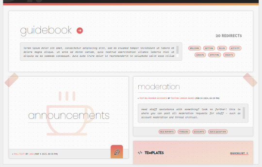
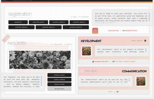
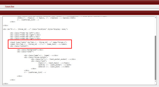
If you look under the hood of the skin inside of the HTML Templates - specifically, the Forum Rows - you'll see that I have a lot more markup here than a normal skin calls for:
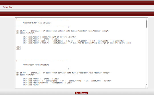
This is because for each different forum that's going to have a different structure or layout, I'm writing completely new markup for it.
That's the general "gist" behind skins with custom indexes or ones done in this style: we're not using a single markup style with hard-coded elements (though that can also be done) but customizing each category and each forum to its exact placement on the index and in the skin.
To do this, I do two things:
First, slap IDs on fucking everything, and I mean everything. You can see in my screenshot the first few forums (for "announcements" and "moderation" respectively) that the first attribute on those containers is an ID for "fr-(ID variable)". I also have IDs on the category for "cat-(ID variable)". I've started to make it a habit in my newer skins to put an ID variable on anything and everything I can get my grubby little raccoon mitts on in the skin, up to and including even the body element and anything within that such as categories, forums, post containers, profiles, etc.
That sets you up for the second thing, which is setting all forum/custom containers to "display: none" with a style attribute. I do this to prohibit any and all structures from displaying by default in every category, and potentially mucking stuff up when their styles, size, or formatting isn't compatible with the new/other/different category and surrounding forums.
These two steps, when combined, make it so you can selectively chokehold any elements on your index and wrestle them into submission with CSS - making sure they're visible where they need to be, and hidden where they don't need to be.
(And please, for God's sake, make sure your ID's are unique to only that container/element. That's a mistake I made often in my earlier skins that could have saved me a lot of grief: CLASSES are for repetition and grouping. ID's are not.)
Tabs on the Index
So, I can admit that I've never experimented with a hover on the forums before - mostly, because I still consider complex hovers and transitions to be my arch nemesis (although, it is on my list of things to eventually master) and I can't imagine that hovers are so different that the information provided above wouldn't be helpful in some manner. So, do as you will with that.
Tabs, however, can be accomplished in a variety of ways. In general, I consider there to be two separate ways to get tabs on something:
Using Javascript/jQuery/some type of script to trigger events for clicking.
Using radio button inputs and CSS to control display, also for a click or selection event.
They're both means to the same end, in some regard: you click on something, usually a button. That button controls what shows or hides. It's just the inside stuff that changes.
Funny enough, using a script of some sort is going to be what I consider the more "beginner friendly" option, and it's what I used for the tabs in Fading Echoes. In fact, I used this script in specific, which is a tutorial one from W3 Schools, and I just modified it to use the forum stuff instead of city names. It's important to keep in mind that for Fading Echoes, I also had unique Category Headers (new markup) for every single category, as well as unique Forum Rows like discussed above. I put the "tablinks" (the buttons/labels used as tabs) inside of the category markup, and I just created a new forum layout for the IC/RP forum containers as the "tabcontent". That make it so the tabs only displayed in that category, and specifically only worked for the forums with a corresponding ID number.
There are also other scripting methods of doing this, like Noire's script that I mentioned at the start of this. And that one, if memory serves, wouldn't force you to make multiple different category types like Fading Echoes did.
The method of radio buttons/inputs is also possible to use, though it does require you to have a good working understanding of using radio buttons for toggles - because if you don't understand what's going on with :checked attributes, you may not understand how to write your CSS in order to select the correct forum to display. I've done this method only once, on my vaguely "House of Night" themed skin that I'm still working on, and while it's a little buggy in some regards, it's also very much functional!
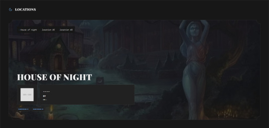
Here, I just made a second forum row structure (the other forums all use the same type of structure) and put the input/radio button inside of the forum, along with it's label, and corresponding elements for the forum. Then, the toggle - or which forum is displayed when you click on the tab - is controlled via CSS, as is the case with most input-based tabs like this.
Full disclaimer, the "little buggy" part I mentioned is that I had to use jQuery to get the correct tab to select when the page first loads, before a user clicks on any tabs. Otherwise, it was trying to select the first radio button/label combo on the page, which was technically in another category for a forum that had that "display: none" property set on it. (Remember, each forum structure you put in your "Forum Rows" HTML Template will get used for every forum being displayed. By putting IDs on them, we're just hiding them from showing with CSS, but they still very much exist on the page.)
If you've never worked with CSS tabs before, I have a few versions on my portfolio site that are considered "base" templates you can play around with:
Basic HTML & CSS Tabs
Basic HTML & CSS Accordion
Basic HTML & CSS Checkbox Toggle
I'd highly recommend getting used to them as a template for a post, to make sure you're really grasping how they work and the CSS selectors at play, before you try putting them into a skin.
I hope that helps, and as always, I'm willing to answer any coding questions people might have - not just stuff related to my work, but also general "how does [X] work" or "how do you do [Y]" - provided that I know the answer. I'll be the first to admit that I'm very much self-taught, and not a professional. I don't know everything, but I'm a Google search away from learning at least one new thing.
6 notes
·
View notes
Text
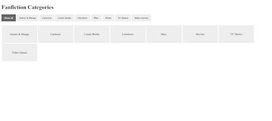
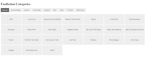
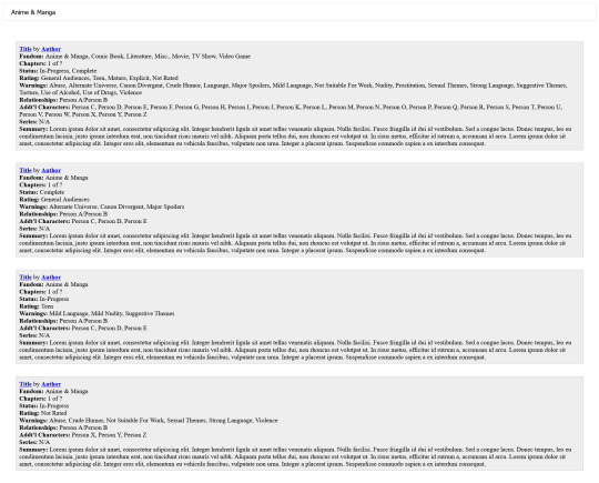
As someone who writes fanfics for a wide variety of fandoms, I needed to find some sort of way to be able to help people with being able to simplify what fandom they are wanting to read fanfics for on my website. And with the help of W3schools and their beautiful tutorial on How To Filter Elements, I can now officially do so.
I uploaded the HTML (+ Script) Code and CSS Code onto Pastebin for anyone who wants to use it for one reason or another. Not credit or anything is required and you can edit/change it all to your heart's content. It's also mobile/tablet, so that is definitely a bonus!
#pvposeur's tutorials#pvposeur's tutorial#pvposeur's how to#pvposeur's how tos#pvposeur's tips#pvposeur's tip#tutorials#tutorial#how to#how tos#tips#tip#w3schools#how to filter elements#filter elements#coding tutorials#coding tutorial#fanfiction#fanfics#fanfic#neocities#free to reboig
2 notes
·
View notes
Text

Zac to Basics is OUT on Itch.io! Play the game and follow along the tutorial to learn how to make your own RenPy game!
#indie dev#indie game#game dev#vn#visual novel#game development#vndev#vn development#renpy#renpy visual novel#renpy game#tutorial#coding tutorial
9 notes
·
View notes
Text
🎮 HEY I WANNA MAKE A GAME! 🎮
Yeah I getcha. I was once like you. Pure and naive. Great news. I AM STILL PURE AND NAIVE, GAME DEV IS FUN! But where to start?
To start, here are a couple of entry level softwares you can use! source: I just made a game called In Stars and Time and people are asking me how to start making vidy gaems. Now, without further ado:
SOFTWARES AND ENGINES FOR PEOPLE WHO DON'T KNOW HOW TO CODE!!!
Ren'py (and also a link to it if you click here do it): THE visual novel software. Comic artists, look no further ✨Pros: It's free! It's simple! It has great documentation! It has a bunch of plugins and UI stuff and assets for you to buy! It can be used even if you have LITERALLY no programming experience! (You'll just need to read the doc a bunch) You can also port your game to a BUNCH of consoles! ✨Cons: None really <3 Some games to look at: Doki Doki Literature Club, Bad End Theater, Butterfly Soup
Twine: Great for text-based games! GREAT FOR WRITERS WHO DONT WANNA DRAW!!!!!!!!! (but you can draw if you want) ✨Pros: It's free! It's simple! It's versatile! It has great documentation! It can be used even if you have LITERALLY no programming experience! (You'll just need to read the doc a bunch) ✨Cons: You can add pictures, but it's a pain. Some games to look at: The Uncle Who Works For Nintendo, Queers In love At The End of The World, Escape Velocity

Bitsy: Little topdown games! ✨Pros: It's free! It's simple! It's (somewhat) intuitive! It has great documentation! It can be used even if you have LITERALLY no programming experience! You can make everything in it, from text to sprites to code! Those games sure are small! ✨Cons: Those games sure are small. This is to make THE simplest game. Barely any animation for your sprites, can barely fit a line of text in there. But honestly, the restrictions are refreshing! Some games to look at: honestly I haven't played that many bitsy games because i am a fake gamer. The picture above is from Under A Star Called Sun though and that looks so pretty
RPGMaker: To make RPGs! LIKE ME!!!!! NOTE: I recommend getting the latest version if you can, but all have their pros and cons. You can get a better idea by looking at this post. ✨Pros: Literally everything you need to make an RPG. Has a tutorial inside the software itself that will teach you the basics. Pretty simple to understand, even if you have no coding experience! Also I made a post helping you out with RPGMaker right here! ✨Cons: Some stuff can be hard to figure out. Also, the latest version is expensive. Get it on sale! Some games to look at: Yume Nikki, Hylics, In Stars and Time (hehe. I made it)
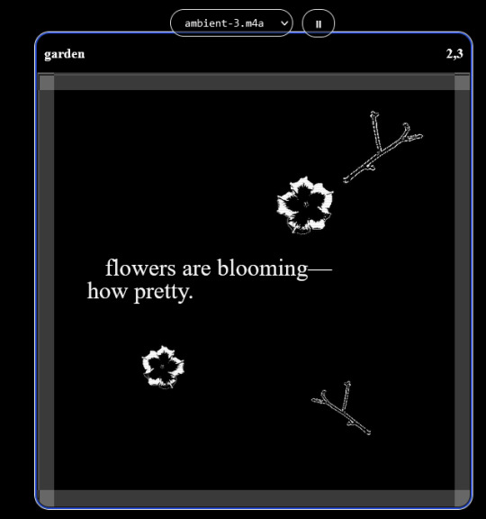
engine.lol: collage worlds! it is relatively new so I don't know much about it, but it seems fascinating. picture is from Garden! NOTE: There's a bunch of smaller engines to find out there. Just yesterday I found out there's an Idle Game Maker made by the Cookie Clicker creator. Isn't life wonderful?
✨more advice under the cut. this is Long ok✨
ENGINES I KNOW NOTHING ABOUT AND THEY SEEM HARD BUT ALSO GIVE IT A TRY I GUESS!!!! :
Unity and Unreal: I don't know anything about those! That looks hard to learn! But indie devs use them! It seems expensive! Follow your dreams though! Don't ask me how!
GameMaker: Wuh I just don't know anything about it either! I just know it's now free if your game is non-commercial (aka, you're not selling it), and Undertale was made on it! It seems good! You probably need some coding experience though!!!
Godot: Man I know even less about this one. Heard good things though!
BUNCHA RANDOM ADVICE!!!!
-Make something small first! Try making simple: a character is in a room, and exits the room. The character can look around, decide to take an item with them, can leave, and maybe the door is locked and you have to find the key. Figuring out how to code something like that, whether it is as a fully text-based game or as an RPGMaker map, should be a good start to figure out how your software of choice works!
-After that, if you have an idea, try first to make the simplest version of that idea. For my timeloop RPG, my simplest version was two rooms: first room you can walk in, second room with the King, where a cutscene automatically plays and the battle starts, you immediately die, and loop back to the first room, with the text from this point on reflecting this change. I think I also added a loop counter. This helped me figure out the most important thing: Can This Game Be Made? After that, the rest is just fun stuff. So if you want to make a dating sim, try and figure out how to add choices, and how to have affection points go up and down depending on your choices! If you want to make a platformer, figure out how to make your character move and jump and how to create a simple level! If you just want to make a kinetic visual novel with no choices, figure out how to add text, and how to add portraits! You'll be surprised at how powerful you'll feel after having figured even those simple things out.
-If you have a programming problem or just get confused, never underestimate the power of asking Google! You most likely won't be the only person asking this question, and you will learn some useful tips! If you are powerful enough, you can even… Ask people??? On forums??? Not me though.
-Yeah I know you probably want to make Your Big Idea RIGHT NOW but please. Make a smaller prototype first. You need to get that experience. Trust me.
-If you are not a womanthing of many skills like me, you might realize you need help. Maybe you need an artist, or a programmer. So! Game jams on itch.io are a great way to get to work and meet other game devs that have different strengths! Or ask around! Maybe your artist friend secretly always wanted to draw for a game. Ask! Collaborate! Have fun!!!
I hope that was useful! If it was. Maybe. You'd like to buy me a coffee. Or maybe you could check out my comics and games. Or just my new critically acclaimed game In Stars and Time. If you want. Ok bye
#reference#gamedev#indie dev#game dev#tutorial#video game#ACTUAL GAME DEVS DO NOT INTERACT!!!1!!!!!#this is for people who are afraid of coding. do not come at me and say 'actually godot is easy if you just--' I JUST WILL NOT.#long post
36K notes
·
View notes
Text
youtube
Insights Sequential and Concurrent Statements - No More Confusion [Beginner’s Guide] - Part ii
Subscribe to "Learn And Grow Community"
YouTube : https://www.youtube.com/@LearnAndGrowCommunity
LinkedIn Group : https://www.linkedin.com/groups/7478922/
Blog : https://LearnAndGrowCommunity.blogspot.com/
Facebook : https://www.facebook.com/JoinLearnAndGrowCommunity/
Twitter Handle : https://twitter.com/LNG_Community
DailyMotion : https://www.dailymotion.com/LearnAndGrowCommunity
Instagram Handle : https://www.instagram.com/LearnAndGrowCommunity/
Follow #LearnAndGrowCommunity
This is the Part ii of last Video "VHDL Basics : Insights Sequential and Concurrent Statements - No More Confusion [Beginner’s Guide]", for deeper understanding, and it is very important to have deeper insights on Sequential and Concurrent statement, if you are designing anything in VHDL or Verilog HDL. In this comprehensive tutorial, we will cover everything you need to know about VHDL sequential and concurrent statements. Sequential statements allow us to execute code in a step-by-step manner, while concurrent statements offer a more parallel execution approach. Welcome to this beginner's guide on VHDL basics, where we will dive into the concepts of sequential and concurrent statements in VHDL. If you've ever been confused about these fundamental aspects of VHDL programming, this video is perfect for you. We will start by explaining the differences between sequential and concurrent statements, providing clear examples and illustrations to eliminate any confusion. By the end of this video, you will have a solid understanding of how to effectively utilize sequential and concurrent statements in your VHDL designs. This guide is suitable for beginners who have some basic knowledge of VHDL. We will go step-by-step and explain each concept thoroughly, ensuring that you grasp the fundamentals before moving on to more advanced topics. Make sure to subscribe to our channel for more informative videos on VHDL programming and digital design. Don't forget to hit the notification bell to stay updated with our latest uploads. If you have any questions or suggestions, feel free to leave them in the comments section below.
#VHDL basics#VHDL programming#VHDL tutorial#VHDL sequential statements#VHDL concurrent statements#VHDL beginner's guide#VHDL programming guide#VHDL insights#VHDL concepts#VHDL design#digital design#beginner's tutorial#coding tutorial#VHDL for beginners#VHDL learning#VHDL syntax#VHDL examples#VHDL video tutorial#VHDL step-by-step#VHDL Examples#VHDL Coding#VHDL Course#VHDL#Xilinx ISE#FPGA#Altera#Xilinx Vivado#VHDL Simulation#VHDL Synthesis#Youtube
1 note
·
View note
Note
can u do a tut for sizing borders bc im rlly bad at coding in rentry


This is the code that I usually start out with, and it works most of the time without tweaking much. The thing I still tweak the most though is the CONTAINER_BORDER_IMAGE_OUTSET. I usually set it anywhere from 10px to 20px, and sometimes I will set two values to it if I want the outset to be diff for top+bottom and left+right
I prefer a more like bigger(?) Look to how my border are cut, so I do that by making the slice smaller (15% to 20%) or I make the width bigger (25px to 30px)
There are a lot of ways to playe around with the coding though like down below I set slice to 30% which I think I see a lot of people do idk. But to keep the bigger cut look I like I make the width 30px. I like to keep my widths at 20px to 25px though because of how much my outset is. My outset sometimes clips under the edit button when you save the code and view it normally, so I keep the width a bit smaller and use a smaller or equal slice. But there are a lot of ways to play around with this because it depends a lot on your rentry and what border you're using becuase there are out(?) Borders and in(?) Borders. Basically just play around with CONTAINER_BORDER_IMAGE_SLICE + CONTAINER_BORDER_IMAGE_WIDTH You can also have fun with the repeat options (round, repeat, space, and stretch iirc). I'll leave my code and examples below. I hope this helps Anon! I'm not sure if it's comprehensible or if I'm just yapping BS..


Above big slice big width, below big slice small width


Down below are what I call 'In borders' cause they're facing inwards. I usually have the outset on these a little bigger


CONTAINER_MAX_WIDTH = 300px
CONTAINER_BORDER_IMAGE = Your border image
CONTAINER_BORDER_IMAGE_SLICE = 20%
CONTAINER_BORDER_IMAGE_WIDTH = 25px
CONTAINER_BORDER_IMAGE_OUTSET = 10px
CONTAINER_BORDER_IMAGE_REPEAT = round
#rentry#rentry stuff#rentry decor#rentry inspo#rentry resources#rentry graphics#rentry pixels#sntry#stelluar#aesthetic#rentry tutorial#rentry metadata#metadata#tutorial#rentry border#borders#metadata border#rentry code#code#rentry help
780 notes
·
View notes
Text
programmed my oc into a game for the aesthetic
#i hope this gives off the vibe of an old game#2 days of modeling#1 day of following a coding tutorial#i felt so happy to draw the little gifs on the screen again#im so sick of 3d (i will do it again)#oc#oc animation#oc art
693 notes
·
View notes
Text
Sparkle cursor tutorial
Just paste the following code right before the part of your HTML under the customize section in Tumblr
https://www.snazzyspace.com/tumblr/mouse-sparkles.php
#tutorial#theme code tutuorial#coding tutorial#tumblr theme tutorial#theme tutorial#tutorials#code tutorial
3 notes
·
View notes
Text

#I CRACKED THE CODE#JESUS CHRIST#DRAW THE GUAR#the elder scrolls#the trash talks#trash art tutorial#please reblog with your results. Please
229 notes
·
View notes
Text
Dank farrik 🙈 I tried to make a face by template concepting video à la Eobe and it turned out fun chaos so I have to show it! 😂🙏✨
I picked Crosshair, because he‘s got the most uncommon clone face shape in my opinion and because he got to few friendly attention from my side in the last time (only fun attention, poor kitty Croissant actually not sorry) AND OF COURSE he jinxed it 🖤💀
While drawing I collected my thoughts, fails and drawing frustrations and I drew little funny extras so that it‘s possible to read decipher the notes despite the rush of the timelapse 😀 And I already thought yeah, this is getting a messy thing… 👀
… AND THEN my screen bugged and crashed my brush!! 😱😂 Aaahh sweet chaos! But great, I go for it, let’s look how far I get before my drawing device starts burning or something 🤷🏽♀️
Is making ‚Fun drawing process à la Eobe‘ a thing? 👀 I giggled and definitely had fun like a child playing and hope you have fun with my weird and quite ADHD coded timelapse too! 😂 And also I hope besides fun, it’s maybe a bit inspiring to try out (what was the original intention before I noticed that it’s getting chaotic 😅)
The result is super messy speedy hatched Crosshair! And I kind of like it! It’s hiv vibe 🤷🏽♀️ So have a look:

The finished colored Crosshair get‘s his own posting, grumpy sniper deserves it and a hug 🖤✨I think he wrote the ALT text
Vod, vor entye for giving me the push to do this and sharing @wings-and-beskargam 💙✨🫶 This is the way!
Nix, here it is, have a ☕️ to that dry 🥐✨ @crosshairs-dumb-pimp-gf
Taglist: @eclec-tech @lonewolflupe @bixlasagna @returnofthepineapple @sunshinesdaydream @covert1ntrovert @general-ida-raven @vrycurious @dystopicjumpsuit @chaicilatte @groguandthebadbatch @justanotherdikutsimp @ladylucksrogue @spaceyjessa @morerandombullshit
#procreate timelapse#fun drawing process à la eobe#face drawing#fun drawing#à la eobe#drawing template#star wars#the bad batch#tbb crosshair#clint eastwood#he is it#snarky sniper#crispy croissant#crosscat#tbb#tcw#the clone wars#clones#star wars sniper#sw tbb fanart#star wars fanart#art#drawing tutorial#sketchy#adhd coded#creative chaos#artists on tumblr#my art#eobe
142 notes
·
View notes
Text
This is kinda sorta a Part 2 of a previous post I've made.
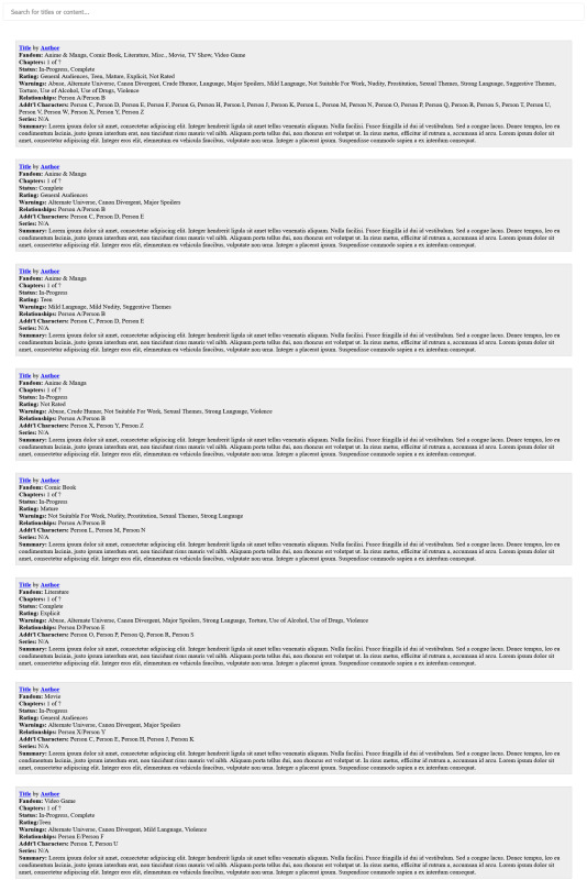
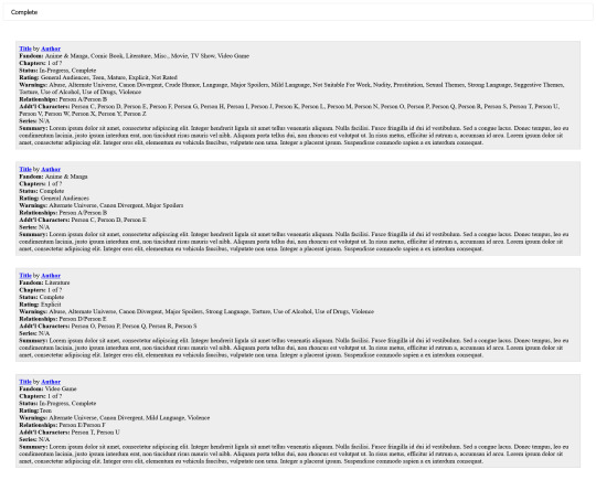
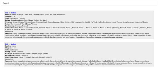
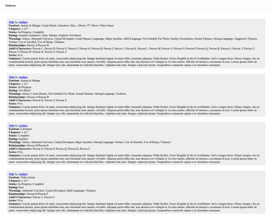
Can't remember the name of that one fanfic you enjoy reading but remember the ship? Or how about wanting to read a specific Rating? Maybe you want to read Completed works? Well, with the help of how AO3 has their fanfics structured and W3schools with their beautiful tutorial on How To Filter Lists with JS, I can now officially do so.
I uploaded the HTML (+ Script) Code and CSS Code onto Pastebin for anyone who wants to use it for one reason or another. No credit or anything is required and you can edit/change it all to your heart's content. It's also mobile/tablet, so that is definitely a bonus!
#pvposeur's tutorials#pvposeur's tutorial#pvposeur's how to#pvposeur's how tos#pvposeur's tips#pvposeur's tip#tutorials#tutorial#how to#how tos#tips#tip#w3schools#how to filter elements#filter elements#coding tutorials#coding tutorial#fanfiction#fanfics#fanfic#neocities#how to search elements#search elements#search#filter#filters#free to reboig
0 notes
Text
How I added "instant translation" to the non-english text on my fic: a very easy 3 step guide
Hello!
I recently posted a Wolfstar fanfic called Instance of Happenstance and received a lot of compliments on a small piece of code I used. Both @marigold-hills and @leavesthatarebrown suggested I share how I did it, so here I am, finally explaining it in a Tumblr post!
Before diving into the details, I want to clarify that I didn't write this code myself.
Initially, I tried following this tutorial, but I stumbled upon a better solution in the comments of that post. The code on the tutorial itself does work, but a) it's harder to use and b) it doesn't work as well if you're planing to have multiple paragraphs that you need to show the translation on the same fic.
The solution someone presented on the comments, however, is very simple and easy to use for as many paragraphs as you need, but the explanation there wasn’t too clear, so I decided to expand on it to make it easier for others to implement.
All credit to Ao3 users La_Temperaza (who wrote the orginal post) and Nikkie2571 (who posted this code on the comments).
What Does This Code Do?
This code adds an interactive feature to your fanfic, allowing readers to hover over a specific paragraph (or tap on it if they’re on mobile) to instantly change the text to something else — also set by you.
While this can be used for various purposes, I think it's particularly useful to display instant translations of non-English dialogue/text directly in the story. The code offers a much smoother alternative to the clunky “see end notes for translation” thing—which, let's be honest, can be a pain for readers, especially in long chapters.
For example, in instance of happenstance, Sirius discovers an old journal written entirely in French. I wanted to maintain the sense of mystery and intrigue that would be lost if I simply said the journal was in French, but wrote the text in English.
This solution let me keep the best of both worlds—retaining the authenticity and the immersion of the French, while still making the story easy to follow for the readers.
Now, I know this sounds complicated, but I assure you, it's not!
Down bellow is a quick, 3 steps tutorial on how to do it. I hope this is helpful! (:
(I'm doing this on the computer, if you're doing it on mobile, the layout of the website might be different from my printscreens)
Step 1 - Create The Work Skin
I'm gonna go right to the point here, but if you want to know about Work Skins in detail, I suggest this Ao3 Article.
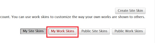
On your Ao3 Dashboard, click on the fourth link on the sidebar, which is "Skins".
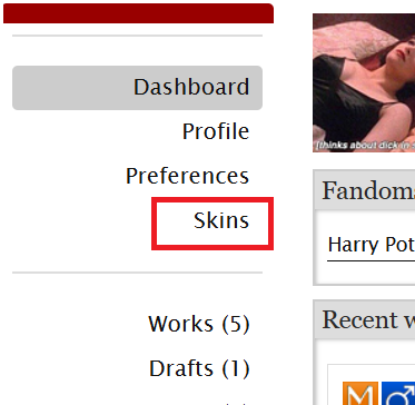
Then, on the page that opens up, click on "My Work Skins"
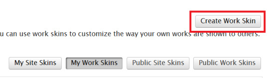
Then, on the top of the page, select "Create Work Skin"
Now, you'll see the form to create your skin, which looks like this:
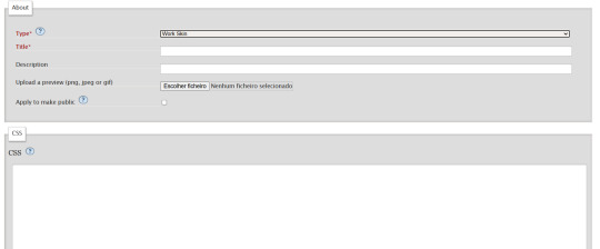
Leave the "Type" as "Work Skin". On the Title, you can give any name you want to your skin, but I suggest you choose the same title as your fic or something like "instant translation", so you'll know what it's about later.
You don't have to worry about any of the other fields, except for the CSS one, where you should copy and paste exactly what I'll put bellow:
#workskin .change_on_hover:not(:hover) .on, #workskin .change_on_hover:hover .off { display: none; }
So, now, you'll have something like this...
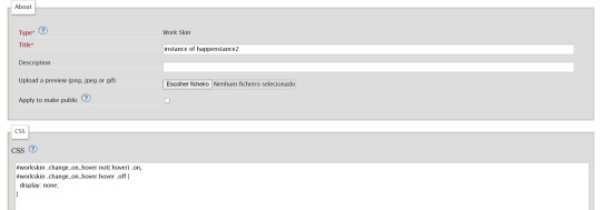
... and you just have to click "save" on the bottom of the page, and this step is done.
Step 2 - Apply the Skin you created to your fic
For a new work, click on "New Work" as usual. If it's a fic you're already posting, you can add this as well, just click the "Edit" button.
Now, on the form of your fic, on the "Associations" tab, right under the menu where you select the language of your fic, you'll see a "select a work skin" option.
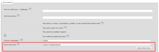
On this field, you should select the workskin you just created on the previous step, searching by the name you gave it on the "Title" field.
Step 3 - Insert the text
The code we're gonna use is this one:
<p class="change_on_hover"> <span class="off"> paragraph in foreing language </span> <span class="on"> paragraph in english </span> </p>
If you have no idea what this means, hold my hand, we're gonna get through it together!
First, copy your fic’s text into the AO3 text box as you normally would. Then, switch the text box to HTML mode so you can see the underlying code.
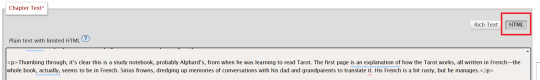
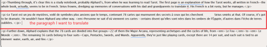
Now, scroll down until you find the paragraph you want to translate. After pasting, it will likely look something like this:
Note how each paragraph in HTML starts with <p> and ends with </p>. These tags indicate where a paragraph begins and ends.
Our goal is to modify that first <p> tag so it tells the browser, “Hey, this paragraph is different from those other ones. It should change when hovered over or clicked.”
To do this, we’ll change <p> to <p class="change_on_hover">. This marks the paragraph as special—one that should switch text when interacted with.
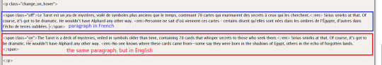
Now note how instead of having a single paragraph, we need two versions of the text:
In blue, the original (non-English) text, which will be shown by default.
In red, the translated (English) text, which will appear when the reader hovers over or clicks on it.
For the original text, wrap it inside a <span class="off"> tag, ending with </span> like this:
<span class="off"> insert here the whole text of the paragraph in the foreign language </span>
For the translated text, wrap it inside a <span class="on"> tag, also ending with </span>. This will replace the original text when hovered over or clicked:
<span class="off"> insert here the whole text of the paragraph in english </span>
And don't forget to end the whole thing again with </p>
Again, here's how it looks on my fic:
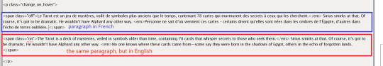
With the paragraphs that come before and after the translated text, just leave them as they are. They should still start with <p> and end with </p>. No changes needed!
You can use this method for as many paragraphs as you want, whether in the same chapter or across different chapters. As long as the Work Skin is active, the effect will work seamlessly throughout your fic.
#fanfiction#ao3#ao3 work skins#work skins#translation on text#ao3 fanfic#ao3 coding#tutorial#step by step#fanfic#wolfstar#marauders
82 notes
·
View notes