#daniel berkeley updike
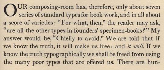
Text


trattner’s angel
john ryder in A suite of Fleurons [charles t. branford, boston, 1957, pp49-50] devotes a section to an ornament he calls trattner’s angel. he tells us: «Johann Thomas Trattner, in his Vienna specimen of 1760 gives two varieties of angels’ heads, Röslein 11 and a smaller, simpler version with hair in solid black & crudely cut wings, whose tips do not project as No. 11. [2nd illustration] … The angel’s head with wings (cherub), in one form or another, has been commonly used in woodcut borders and on binding designs throughout the sixteenth century.» ryder enumerates 18th c. foundries that copied the cruder cut, including an oblique recutting by bodoni [3rd illustration]; but, it is interesting to note, the more handsome cut, no.11, was not recut until the 20th c by monotype., & no. 11 was very probably the exemplar for monotype’s version [english monotype 1029]. [✓]
2nd illustration: 11 & 12 on trattner’s page of ornaments (röslein) [daniel berkeley updike, Printing Types, vol. 1, oup, 1937, fig. 96].
3rd illustration: bodoni’s alternate oblique cut of no. 12: no. 328 in his specimen book of 1771, Frege e Majuscole [facsimile: harvard college library, 1982].
1 note
·
View note
Photo

Literary history that happened on 24 February
#february 24#literary history#literary#history#literature#on this date#august derleth#daniel berkeley updike#george moore#oscar wilde#richard brinsley sheridan#wilhelm grimm
132 notes
·
View notes
Photo

Draw a Picture of a Bird Day!
April 8 is Draw a Picture of a Bird Day! Above are a couple of drawings by the English poet Thomas Gray as reproduced in The Poet Gray as a Naturalist by Charles Eliot Norton, printed in 1903 by Daniel Berkeley Updike in a limited edition of 500 copies on handmade paper at The Merrymount Press for the Boston bookseller Charles E. Goodspeed.
Here is a link to an archive of almost every bird image we have ever posted.
Draw a picture of a bird today!!!
#Draw a Picture of a Bird Day#holidays#Thomas Gray#The Poet Gray as a Naturalist#Charles Eliot Norton#Daniel Berkeley Updike#D.B. Updike#Merrymount Press#Charles E. Goodspeed#drawings#birds#birbs!
41 notes
·
View notes
Photo

Merrymount Press
The Merrymount Press was a printing company, both scholarly and craftsmanlike, founded and run by Daniel Berkeley Updike in Boston, Massachusetts, and extant during the years 1893–1941.
0 notes
Link
A book by Daniel Berkeley Updike (Harvard University Press, 1922)
0 notes
Photo

b&r no.1
d.b. updike’s advice on acquisition of material for a printing office: «A third type (which originated with Binny & Ronaldson of Philadelphia over a hundred years ago) is in design transitional between old style and modern face. For books where the old-fashioned air of Caslon would be to obtrusive, and yet which call for a letter more interesting in design than the somewhat bald Scotch face, there is nothing better. I should not advise the purchase of this transitional series at the expense of the first two types chosen, but it will frequently do the work of either. … It is called ‘Oxford’ by the American Type Founders Company, from whom it may be had. I have used it for this book [first illustration]. It seems to me a type of real distinction.» [Printing Types, 2nd ed., vol ii, oup, 1937, p231].
a.f. johnson confirms: «The roman which Updike used for the text of his Printing Types, called ‘Oxford’ and originally cut by Binny and Ronaldson of Philadelphia, seems to have some affinity with Austin’s¹.» [Type Designs, grafton & co., london, 1959, p74].
in the same year as the 1892 merger that constituted the american type founders company [atf], joseph warren phinney, atf vice-president & former partner in one of atf’s original constituents, the dickinson foundry of boston, advocated revival of the b&r no.1: repaired & augmented with additional sorts, b&r no.1 was reissued as atf «oxford» (but what has this face to do with oxford—presumably the university? ² ). «oxford» is not shown in atf specimen books of 1897 or 1923 (nor do i find b&r no.1 material in the huge mackellar, smiths & jordan book of 1892 ), but was available for special order into the 1960s. the atf oxford matrices (what of binny’s punches? [✓]) now repose in the smithsonian institution.
in 1946, in order to provide historically allusive faces for planned publication of The Papers of Thomas Jefferson [princeton unversity press, 1950], p.j. conkwright, then art director of the princeton university press, advocated adaptation of atf oxford for the linotype; c.h. griffith, then a vp at mergenthaler linotype, designed a b&r no.1 revival: linotype monticello, named in reference to the publication of its first showing. in 2003 linotype issued a digital version of monticello, based not upon the earlier linotype revival but on matthew carter’s redrawing, afresh from the atf oxford material [cf. ‹Monticello Typeface›]. for an allusive composition set in monticello vide ‹perdita›.
1st illustration: excerpted from Printing Types [updike, op. cit., p241]; oxford types.
2nd illustration [iphone photo]: showing of long primer no.1 roman & italic [Specimen of Printing Type, from the Letter Foundry of James Ronaldson, successor to Binny & Ronaldson. | Cedar, between Ninth and Tenth streets, | Philadelphia. | 1822. [Am 1822 Ron 17455.O.1]. for the largest size of no.1, long primer, binny cut a variant, more cursive, italic p; & note the dollar sign—binny was the first to engrave this famous symbol.
with thanks to the library company of philadelphia for permitting my examination of their extremely rare binny & ronaldson material.
⎯⎯⎯⎯⎯⎯
¹ johnson refers to the types cut by richard austin of london for london publishing pioneer john bell—vide ‹the letters of john bell›. the roman also shares affinity with baskerville’s—e.g. unclosed loop or bowl of g. updike affirms bell��s type but has no knowledge of bell: «The two upper sections in our plate (fig. 367) are set in a transitional font, which is, both in roman and italic, a fine and workable letter.» [updike, op. cit., p.243].
² latterly i discovered, harry carter posed the same question in his review of The Specimen Books of Binny and Ronaldson, 1809-1812, in facsimile [introduction c. p. rollins, the columbiad club, connecticut, 1936] in The Library [volume s4-xviii, issue 1, june 1937, p118].
#typography#binny & ronaldson#american type founders#daniel berkeley updike#theodore low de vinne#linotype#c.h. griffith#p.j. conkwright
4 notes
·
View notes
Photo


It’s Fine Press Friday!
This week we present selected pages from In the Dawn of the World, with 25 original wood engravings illustrating a portion of the Book of Genesis by British artist and designer Edward Burne-Jones (1833-1898), and printed in 1903 by D. B. Updike in an edition of 185 copies on handmade Alton Mill paper at the Merrymount Press in Boston for Charles E, Goodspeed, with a note on the designs by Burne-Jones’s son Philip. The type used here is the font designed for Updike by Bertram Grosvenor Goodhue, based on Nicolas Jenson’s type of 1470, for the first Merrymount Press productions beginning in 1894.
The designs for the illustrations were originally produced as part of a large Bible project to be produced by the Kelmscott Press, but the death of William Morris in 1896 put an end to the undertaking. Burne-Jones had completed a number of drawings in pencil, but after Morris’s death they were laid aside, and Burne-Jones himself died two years later. In 1901, Burne-Jones’s widow Georgiana Macdonald decided to publish a selection of 25 of the drawings and commissioned Burne-Jones’s wood engraver Robert Catterson-Smith to complete the project. The results were printed here for the first time in America. Philip Burne-Jones describes the working process of his father and Catterson-Smith:
The design was first made roughly in pencil, and afterwards elaborated and carefully completed in the same medium. A photograph of the finished drawing was then taken, laid down upon cardboard, and gone over with ink, under my father’s supervision. The strong black outline thus secured was again photographed on the wood block, which was then cut. During his long apprenticeship to this work under my father’s eye, Mr. Catterson Smith gained much skill and experience. . . .Had my father seen these reproductions he would have been well satisfied.
Our copy of In the Dawn of the World is another gift from our friend Jerry Buff.
View other work by Edward Burne-Jones.
View more Fine Press Friday posts.
#Fine Press Fridays#Fine Press Friday#edward burne-jones#In the Dawn of the World#D. B. Updike#Daniel Berkeley Updike#Merrymount Press#Alton Paper Mill#Philip Burne-Jones#Georgiana Macdonald#Bertram Grosvenor Goodhue#Robert Catterson-Smith#Merrymount type#fine press books#illustrated books#wood engravings#wood engravers#Arts and Crafts#Bible#Genesis#Jerry Buff
158 notes
·
View notes
Photo


Science Saturday
This past #Feathursday we featured a page spread from the 6th edition of the Systema Naturæ of Carl Linnaeus, published in Stockholm in 1748. The English poet and Cambridge University scholar Thomas Gray (1716-1771) was also a great fan of the Swedish taxonomist, and produced an extra-illustrated copy of the important 10th edition of Systema Naturæ, published in Stockholm in 1758, with Gray’s own drawings and extensive notes. This 3-volume set (the original edition was in two volumes, but with Gray’s many additions, it had to be rebound in three) was eventually acquired by the Harvard scholar and art historian Charles Eliot Norton (1827-1908).
Today we present a few facsimiles of Gray’s illustrations from Norton’s The Poet Gray as a Naturalist, printed in 1903 by Daniel Berkeley Updike in a limited edition of 500 copies on handmade paper at The Merrymount Press for the Boston bookseller Charles E. Goodspeed. Norton’s edition features an introductory essay and thirteen photogravure reproductions of a few of Gray’s notes and sketches. Today we show Gray’s illustrations and notes from the Insecta portion of Systema Naturæ. Our copy of The Poet Gray as a Naturalist is another gift of our friend and benefactor Jerry Buff and also bears the bookplate of the noted book collector Brian Douglas Stilwell.
View other Science Saturday posts.
#Science Saturday#Thomas Gray#Carl Linnaeus#Systema Naturæ#Charles Eliot Norton#The Poet Gray as a Naturalist#Daniel Berkeley Updike#Merrymount Press#Charles E. Goodspeed#Brian Douglas Stilwell#Jerry Buff#extra-illustrations#scientific illustrations#Linnaean taxonomy#taxonomy#facsimiles#insects#Science Satruday
23 notes
·
View notes
Photo


updike’s ornament [?]
dust jacket from the 2nd edition of Printing Types by daniel berkeley updike [vol. ii, harvard university press, 1937]—bibliographers’ & typographers’ go-to reference. during recent recourse, the sole 18-point ornament of display caught my eye reminding me in effect of typographical enthusiasms’ avatar. how different this tiny engraving appears magnified (2nd illustration)! holly leaves & berries? very probably a border unit; but with which foundry did it originate? —not shown in any on-hand atf or monotype specimen.
book design: d.b. updike. letterpress: the merrymount press, boston.
5 notes
·
View notes
Photo


Daniel Berkeley Updike: Birthday Anniversary
On February 24, 1860, Daniel Berkeley Updike was born in Providence, Rhode Island. He was an only child who supplemented his private school education by visiting libraries. Due to financial constraints, he was unable to attend college but instead went to work at Houghton, Mifflin & Company. He went from errand boy to having substantial responsibilities within the company over the course of twelve years. During this time, he absorbed the details of fine printing.
In 1893, after spending a couple of years at the Riverside Press in Cambridge, Massachusetts, Updike started his own printing business and in 1896 began to publish under the name Merrymount Press.
In the Fleuron No. 3 published in London 1924, there is a piece written by W. A. Dwiggins titled “D. B. Updike and the Merrymount Press.��� In this essay Dwiggins talks about his first encounter with Updike at a dinner of the Society of Printers of Boston in 1905.
“He made his enterprise after a pattern of his own. He came into the game unhampered by any great knowledge of how it should be played.”
Updike had, it seems, from the start an inherent knowledge of what good printing and typography were. He would not compromise the work he did. No matter if it was a book, pamphlet, or a label he sought to “do common work well.”
“To be either artist or man of business is not particularly difficult. To be both at one time is complicated. Updike is both.”
The output from Merrymount Press was substantial; however Updike kept the business small.
“It has been kept small with the purpose that all of it should be directly under the eye of one person.”
The period of the early 20th century saw changes occurring in the world of print. Updike sometimes had to steer clients away from the “artistic atrocity” of flourishes and scrolls toward more simple designs. One can recognize good typography and good press work without knowing about the process or the art. The work of Merrymount Press exemplifies this aesthetic. It just looks right.
Dwiggins sums up Daniel Berkeley Updike like this
“A connoisseur of life, a good judge of men, a wit, a retailer of anecdotes, a social creature. An accomplished performer in that lost art, conversation; but timid withal, when forced to speak formally before an audience. A man of no school, graduate of no major academy; but a finished scholar, with an adequate technique of research and criticism… Citizen of that vivid world of scholars and gentlemen that we call the Renaissance; citizen not quite so easily, perhaps, of this world of machines and wrecked idealisms; quite willing citizen of all the country that stretches between. Citizen of the world, in any event.”
Updike’s work on the history of print and typography continue to be studied. We celebrate the man and his work today with images from his collaboration with Dwiggins The Poetical Works of John Milton: With a Life of the Author and Illustrations published by R. H. Hinkley Company in Boston in 1908. It was printed by D. B. Updike and designed by W. A. Dwiggins. The image of the portrait is from The Work of the Merrymount Press and its Founder, Daniel Berkeley Updike (1860-1941) an Exhibition Prepared by Gregg Anderson published by the Huntington Library in 1942.
#Daniel Berkeley Updike#D.B. Updike#Updike#uwm special collections#special collections#birthdays#february#Typography#printing#merrymount press#boston#W. A. Dwiggins#Dwiggins#Fleuron#1900s#1920s#houghton mifflin and company#Riverside Press#r. h. hinkley company#huntington library#alison newman#Jerry Buff
24 notes
·
View notes
Photo

the arts have no real enemies except the ignorant
this unattributed quotation with which daniel berkeley updike concludes the introduction in his seminal Printing Types [2nd ed., oup, london, 1937, p.xi] may be a latin proverb of antiquity; but, if so, the source eludes my discovery. however, it may be abstracted from the latin aphorism in the postscript to an obscure essay by jonathan swift, «The Wonderful Wonder of Wonders»: ars enim non habet inimicum, nisi ignorantem.
the illustrated text is taken from The Works of Jonathan Swift, D.D. [vol ii, part ii, ptrinted for c. bathurst, in fleet street, london, 1755, p55], which was composed entirely from caslon foundry types: pica roman no.1, pica italic no.1, & two lines pica small caps for the heading [cp. A Specimen of Printing Types, william caslon letter founder, london, 1766]. here reset in digital facsimile using adobe caslon pro—regularized & distilled-of-charm digital revival, but sufficiently well appointed to attain period compositional practice.
2 notes
·
View notes
Photo


Typography Tuesday
SPIRAL / EMERSON TYPE
German-American printer-publisher Joseph Blumenthal established his Spiral Press in 1926. His major design influences were Bruce Rogers, Francis Meynell, and Daniel Berkeley Updike, and to a certain extent William Edwin Rudge. His most significant influence, however, was Willy Weigand and his Munich-based Bremer Presse. This can be seen in their typeface designs. They may be compared in the full-page examples above (Spiral, left , 1933; Bremer, right, 1929) and in the details (Spiral, top; Bremer, bottom).
As American type designer and printer Jerry Kelly observes, “Both are set in only one size of type; both use hand-lettered initials and titles,” and both typefaces “were cast at the Bauer Type foundry in Frankfurt, and indeed all were cut by the same punchcutter, Louis Hoell.” Kelly also notes, however, that the Spiral type is much less calligraphic than Bremer type. To us, the Spiral type is also much lighter than the weighty denseness of the Bremer type. Blumenthal first used his proprietary Spiral type in 1931 for an edition of Ralph Waldo Emerson’s Nature.
Subsequently, British typographer Stanley Morrison, chief consultant for the British branch of the Monotype Corporation, suggested that the Spiral type be offered commercially in the Monotype system. For this, Blumenthal designed complementary italic and small capital fonts. Monotype appropriately named the new type Emerson, after the first appearance of the Bauer-founded type, producing the type family between 1935 and 1939. The Spiral and Emerson types may be compared in the top image. Emerson became one of the few contemporary, non-historical typefaces to be issued by Monotype (others included Eric Gill’s Perpetua and Jan van Krimpen’s Lutetia).
When Blumental finally closed his shop in 1971, he had his now well-worn, Bauer-produced Spiral type melted down, and the punches and matrices donated to the Cary Collection at the Rochester Institute of Technology. The Emerson typeface lives on however, and a new digital font was recently issued by Nonpareil Type. Many contemporary fine-press printers have used and continue to use Monotype Emerson, including Jerry Kelly. Emerson was the second type (after Bembo) installed at his Kelly/Winterton Press. Kelly writes, “We selected it for the same reasons I suspect other fine presses find it particularly suitable: Emerson is an elegant, classic book face that is contemporary, not an imitation of an earlier type.” Kelly’s own homage to Blumenthal (last image above) is appropriately set in Emerson for an edition of Emerson’s essay on Friendship.
Click on the images for details.
View our other Typography Tuesday posts.
#Typography Tuesday#typetuesday#Joseph Blumenthal#Spiral Type#Emerson Type#Willy Weigand#Bremer Presse#Jerry Kelly#Louis Hoell#Monotype Corporation#type design#type designers#Kelly/Winterton Press#Jerry Buff#20th century
43 notes
·
View notes
Photo


Typography Tuesday
On this first #TypographyTuesday of the New Year, we present The Plimpton Press Year Book, produced in 1911 by the Plimpton Press in Norwood, Massachusetts, as a promotional publication and a manual of style. The Plimpton Press was originally established in Boston, Mass., in 1882 by
Herbert M. Plimpton, and moved to Norwood, Mass., in 1897. Book and typeface designer William Dana Orcutt (1870-1953), who wrote the essay on “The Quest of the Book Beautiful” for this volume, joined the press in 1910 transforming it into a major commercial venture while maintaining a design aesthetic strongly influenced by William Morris and the Arts and Crafts movement. That aesthetic is clearly displayed in this yearbook. Along with several other important New England designers and printers such as Daniel Berkeley Updike and Bruce Rogers, Orcutt helped found the Arts and Crafts-influenced Boston Society of Printers in 1905. Known today simply as The Society of Printers, its members have included such typographic and printing luminaries as W. A. Dwiggins, Dorothy Abbe, Hermann Zapf, Leonard Baskin, Matthew Carter, Roderick Stinehour, and Barry Moser.
View our other Typography Tuesday posts.
#Typography Tuesday#typetuesday#Plimpton Press#William Dana Orcutt#Herbert M. Plimpton#design annuals#The Society of Printers#type display book#book design#20th century
104 notes
·
View notes
Last Seen Blogs

song-reccommendations
song recommendations

linkingnightvale
Linking Together Night Vale

seiden-spinner
that one silkworm

asteroic
SAY YES TO NEW ADVENTURES

priyangaraj
Desi Girl and Her Dreams