#dash replicates itself with the same 5 posts
Explore tagged Tumblr posts
Visit Tumblr Blog
Explore Tumblr blogs with no restrictions, modern design and the best experience.
Last Seen Tumblr Blogs


Fun Fact
Tumblr has been providing a Korean-language service since 2013.
Text
My thoughts and feelings on the Danganronpa S Swimsuit Designs.
Recently the designs for everyone’s swimsuit sprites in Danganronpa S were leaked on a preorder website here: https://ebten.jp/spchun/p/7015021110403
There’s a lot I have to say about each of these designs, so I figured I’d make a decently long post ranking each of them.
These are all my opinions and my thoughts and feelings may be a little biased, but please hear me out and respect my opinions. Also, sorry for low quality images, since that was the most clear cut I could make them by zooming in on the sheets.

7/10:
It’s a fairly plain design, but honestly, I think that’s quite befitting of the first games plucky protagonist. One of Makoto’s main traits is that he’s nothing remotely that special, so his swimsuit shouldn’t really be anything major. I do like however, that it’s colours replicate the brighter aspects of his original design.

6/10:
Of all the characters in the game who could have been stuck with the speedo look, I’m glad it was Taka. Unfortunately, this also means that his design, other than the very befitting whistle around his neck, isn’t anything major.

8/10:
This is a really good look for Byakuya. It’s really fitting with his personality and status and he wears it well.

5/10:
Unfortunately, Mondo’s outfit is exactly what I expected it to be. It’s unfortunate because I was hoping the game would do more, given how extra his 10th anniversary do was, but I was left a little disappointed with this one. It’s not bad though and it does work with him.

6/10:
It’s a pretty plain and simple design with no real outstanding aspects, but it really fits Leon’s character and he does well with it.

7/10:
This is honestly hilarious, because this wasn’t what I expected from Hifumi. I was expecting him to have a shirt or something, but I’m glad he doesn’t because that can be considered fat-shaming in my eyes. The Pretty Pudgy Princess image on his shorts was, for whatever reason, NOT what I was expecting though, and I think it looks great.

8/10:
I’ve had my differences with Hiro, but I have to admit that this design really does suit him and his character. I really love the little alien pattern on his shorts.

10/10:
This has got to be my favourite design in the entire selection of these characters! The main reason is because it really suits Chihiro’s character. He’s sporting both some very boy-like shorts but also a very girl-like crop top. The design doesn’t prioritize masculinity or femininity, but instead creates a well done balance of the two. This was probably the best that they could have done for Chihiro and I’m so glad he got his justice in this game.

10/10:
I feel like Sayaka is so underappreciated and so berated that we fail to recognize just how beautiful she is. I mean LOOK at this! She’s so fucking gorgeous!

10/10:
Kyoko is among, if not the top of, the characters in this that can sport a really plain and slightly bare bones design, but look absolutely beautiful while doing it. The dark swimsuit clashing with her bright hair, and also not sporting anything too outstanding, just like her original design, makes her look absolutely ravishing.

10/10:
I know it seems like I’m just dishing out 10’s at this point, but the DR1 girls are just THAT amazing looking with their designs, and Hina in particular is really good. One of the things that I love about some of these swimsuit designs is the subversion of the colors that I’m used to the characters sporting. Hina for instance is usually associated with red or blue, but here she is wearing a deep yellow bikini and my god does she look amazing in it. Also, it’s hard to see, but she does have some slight abs, which is something I wish to see on most of these girls.

9/10:
We have to talk about these two at once because they kind of have the same swimsuit with just one difference, in that Toko wears the skirt, while Genocide Jill does not. This makes sense and it’s pretty clever in design, since Toko has usually always worn long dresses/skirts in her previous designs, to cover up the tally marks Jill engraved in her legs from her kills. Jill obviously wouldn’t care about that, so she feels no need to wear the skirt, and given that Jill is slightly more outgoing and sociable than Toko, she wouldn’t have as much of a problem showing off more skin. It really does make a lot of sense and the design itself is overall very solid.

6/10:
I wouldn’t go so far as to say this is bad, but this style and colour is not what I expected or would have liked to see on Sakura. She’s still pretty, but I just think there’s more potential here.

8/10:
In a sense, this is a very clever design of swimsuit, since it’s almost as if Celeste’s original dress was turned into a bikini, and it’s incredibly fitting as a result. Still, it’s not out of any expectation.

10/10:
This is probably the most ingenious design out of every swimsuit in this game, so hear me out. One of the things Junko is the most well known for in Danganronpa’s world is she always defies expectations, most of the time in ways that leave people dissatisfied or unhappy. What could be more dissatisfying to a regular hormonal teenager (which most of the DR cast are) on a summer trip than a busty beauty arriving to the beach wearing a cheap, one-piece school swimsuit with nothing remarkable about it. It’s so clever and such a smart move on the designers part that perfectly encapsulates Junko’s character.

9/10:
I love this swimsuit design, and I think Mukuro looks wonderful in it, but I still stand by my complaint that she deserves to be her own person in this game and not disguised as Junko.

5/10:
Monokuma looks less like a lifeguard in this design and more like a McDonald’s drive thru employee. Still, I didn’t expect Monokuma to get a swimsuit at all, and this does fit his character, so whatever.

9/10:
Like Makoto, this outfit is fairly simple. Unlike Makoto however, it doesn’t really replicate the coloration of the original design and instead provides Hajime with something more vibrant and original, and I think it looks pretty good on him.

10/10:
I just in general think this is a really solid look for Nagito. It’s a nice diversion from his original style, while also keeping some of the things that made his original design unique, namely the pattern on his hoodie is transitioned over, but in a new, quite dashing colour. I also like how he and Hajime have a contrasting blue/red dynamic with their designs.

7/10:
I mean, it obviously has to be the same as Byakuya’s design, but the colours of the hoodie are inverted. It makes sense, but I do believe the original Togami does it better in this case.

4/10:
Is this REALLY the best you could give Gundham? This is such a simple design for someone with Gundham’s personality, he deserves something far more impressive. Yeah, I get that Makoto has the same thing, shorts of a single colour with his symbol on it, but that makes sense for Makoto given that he’s naturally quite bare bones, whereas Gundham is much the opposite. Honestly, this is kind of a letdown.

8/10:
Can Kazuichi just naturally pull off any vibrant colour? First, in DR2, his outfit was a vibrant yellow, and then in DR3, he had a deep blue outfit. Now he’s sporting this Neon Green and it looks so good on him. Please tell me I’m not the only one who thinks that this is a really good way of transitioning his original design while also adding some originality?

7/10:
I don’t think it’s anything great, but I like the rose patterns and the clash of the dark shirt with the bright shorts. Honestly, this is a pretty good outfit sporting Teruteru’s moniker.

6/10:
Again, I kind of expected Nekomaru to wear the speedo, and I like the fact that he kept the chain on, but overall, the outfit doesn’t have an awful lot of uniqueness.

8/10:
There’s really not an awful lot to this design, but I think white shorts and a gold chain are a real good look for Fuyuhiko. He doesn’t really need anything more than this to look super good on the beach.

7/10:
We did see this outfit in DR2, but it was a CG and not a sprite, and at least she’s not covered in blood this time. The colours and patterns are a little plain for Akane, but she still looks pretty good in this outfit.

10/10:
This swimsuit already has a CG and sprites in the original DR2, but now we get to see more of them. And just as well because this plain white swimming outfit looks wonderful on Chiaki. She’s just super adorable like this and I can’t ask for anything more.

10/10:
I have to give Sonia the score she deserves here. While I am surprised she isn’t showing off nearly as much leg skin as I thought she would, I have no complaints to this. The colour is a good colour alongside her hair and the swimsuit itself looks splendid on her.

9/10:
I never thought in a million years that Hiyoko would look good in green, but I’ve never been more happy to be wrong. I’m also glad, and I can’t speak for everyone here, that she’s wearing a two-piece and not a school swimsuit like Junko, because she deserves more than that.

10/10:
I’m so tempted to sing the Bryan Highland song but change the yellow in the lyrics to blue. Words cannot describe just how much I love this simple patterns design on my all time best girl. Mahiru looks absolutely angelic with this outfit, and I’ve basically fallen for her all over again.

8/10:
All things considered, I’m really satisfied with this outfit. We all know what Spike Chunsoft and DR’s writers like to do to Mikan, so I was very concerned that whatever swimsuit she got, it was going to turn out to be really skimpy and barely cover anything. I am glad that this is a lot more modest than I thought it would be, and I thank the creators for giving her something more normal. However, it is still a string piece that has a likely chance of coming undone, so I am expecting a few wardrobe malfunctions in the game. Other than that, my only other real complaint is that I kind of want more than just a plain white design. I think a deep purple or even a deep red would work very well on her as opposed to this.

10/10:
This is the design I expected for Ibuki, and it works really well for her, so while my expectations weren’t defied, this is still among the better designs out of the selection we have.

10/10:
We all need to take a minute to appreciate just how gorgeous Peko looks in a plain black two-piece, because this lady looks absolutely exquisite. Even the most simple designs can bring out the best in characters, and while we did see this in DR2, we never got the sprite we needed. She just looks great like this, that’s all I can say.

5/10:
Izuru has a different swimsuit to Hajime for some reason, but I guess it does make sense since a bright, vibrant swimsuit like the one Hajime has wouldn’t work with him. Hajime’s is still better in my book though.


5/10:
Usami and Monomi have always had the adult/child dynamic in their designs. For example, in the regular designs, Usami has a skirt while Monomi wears a diaper, and that dynamic carries over in these designs too, which I really appreciate. Still, the outfits themselves aren’t anything outstanding.

10/10:
Is it just me, or is Komaru ever so slightly chubby in this? It’s the first time Komaru’s midriff has ever been shown in a sprite, so it’s the first time we’ve ever seen her bare belly like this. It’s not a complaint, if anything, I’ve been wanting to see some chub on the girls. Regardless, this is another example of a plain design pulled off extraordinarily well, since the plain yellow outfit makes Komaru look delightful.

6/10:
About what I expected from Masaru. Like Nagito, I like how he carries patterns from his og design into this one, but he doesn’t really do it as well. His design is kind of basic.

8/10:
I like this transition. The outfit and hoodie has originality, but it still bases itself off Jataro’s original design and I like how they do it.

10/10:
She’s just way too cute! This design is just super adorable and Kotoko pulls it off wonderfully. She was honestly one who I expected to wear a one-piece, so showing off this much skin is surprising given her backstory. It really does fit her though, and I wouldn’t think of changing it.

5/10:
Honestly, there’s not much to this. The colour and pattern fits Nagisa, totally, but I do wish there was a little bit more than just whatever this is. Nagisa’s a much deeper character than this outfit gives him credit for.

8/10:
It’s a really simple design with nothing outstanding besides the skirt, but Monaca looks really cute wearing this, and I think that that alone is enough. Besides, Junko had a fairly basic design too, so Monaca having one isn’t out of the question.

3/10:
I’ve always believed, as much as I really don’t like him and wish he wasn’t in this game, that Kurokuma has always had one of the best designs out of all the Monokuma’s. But as much as I believe that, and as much as I love the addition of the water gun in this design, this is honestly kind of lazy. The gun and the glasses don’t count as part of the swimsuit, they’re just accessories. In summary, literally all they did was give him orange trunks.

1/10:
THIS however is somehow even worse, because this straight up is NOT a swimsuit! Shirokuma is literally just wearing a hat and a floatie. This is probably my least favourite of all the designs in this.

9/10:
I have to add here that I’m rather disappointed that based on the scans, it seems unlikely that Yuta and Taichi from UDG are getting in the game, since I believe they both deserve some spotlight that they’re now giving Hiroko. I also don’t consider myself to be attracting to older women, but I am forced to admit that like with Mikan, I did expect something worse with Hiroko’s swimsuit, and this was a pleasant subversion of my expectations because I think she looks great.

10/10:
Maybe I’m being a but biased with my scoring here, but had Shuichi not been wearing the hoodie, I would have been a bit disappointed. Also, am I the only one who thinks that this is a surprisingly good look for Shuichi given that the colours aren’t his typical dark, emo style? I never thought Shuichi could rock a white hoodie and dark blue shorts, but here I am being proved wrong.

6/10:
Honestly, I did expect this of Kaito’s outfit, and I am a little let down that this is it really. Sure, it does look good, as he has the space pattern that he usually has on the inside of his coat, but speaking of his coat, one thing that I was expecting was that he, like Shuichi or Nagito, would have a hoodie in his design that he hung loosely around his shoulders like he does in his original design. C’est la vie…

7/10:
He literally looks like a tiny sailor! Like they straight up ripped him out of a Popeye cartoon or something! It looks really funny for some reason.

9/10:
Call me crazy, but I actually seriously love the colour of Rantaro’s shorts. The pink/red rose colour is a wonderful clash with his avocado green hair, and while the design is kind of simple, Rantaro has never been known to have the most over the top appearance. He’s kind of just a casual guy, so he deserves a casual attire.

4/10:
Oh Gonta, there’s nothing wrong with your swimsuit, but is this really the most justice they could do you? It looks so…I dunno…plain?

5/10:
Where’s his white coat go? Like, I love the shorts pattern, but is this really it? This is all we get out our clown prince of lies? It’s not totally disappointing like Gundham’s was, and thank god he doesn’t have abs anymore, but even still, is this the best they could do for Kokichi?

10/10:
Fuck yes! Why put Kiyo in shorts like the rest of them when we could give him this extremely fitting wetsuit! Like, seriously, how come I didn’t think this was a good idea? This is quite literally the perfect direction you could have gone in for Kiyo especially.

9/10:
Fucking…Keebo oh my god…Why did I expect any differently?

9/10:
Kirumi, Kyoko and Peko have exactly the same reason for getting their scores, and Peko and Kyoko only slightly pull it off better. My only complaint I have with Kirumi sporting this is that she doesn’t appear to have the spider pattern that she had on her dress before, which was one of her most notable features in her original design. Maybe it is there and I just can’t see it due to low res, but I’m fairly sure that this is all you need to make Kirumi look damn sexy during summertime.

6/10:
I know for a fact that Himiko doesn’t like the ocean, so maybe there’s a reason her swimwear looks like this. I don’t hate it, but I think Himiko might look better in a one piece, and maybe I’d like a bit more context as to why it looks like this of all things.

10/10:
Maki is so attractive in this outfit. It’s the perfect shade of red, and it’s everything she deserves. Honestly, while a lot of these girls look stunning in colours that I’m not used to seeing them in, had Maki had anything else than this red, I think I would have been a little disappointed.

7/10:
Pink was not what I expected on Tenko. I was honestly expecting something similar to Ibuki, but with light blue and green instea of blue and pink, and I’m honestly a little upset we didn’t get that. On top of that, she’s showing an awful lot of skin, maybe even more than Mikan, since that swimsuit looks like it doesn’t fit her, which I didn’t expect from her. Still, you won’t be hearing any major issues on my behalf, since I still like this design somewhat.

10/10:
Yes, yes, and more YES! I ADORE the yellow swimsuit with Tsumugi’s dark blue hair. I was expecting something plain and white like what Mikan got with Tsumugi, and I’m so glad we didn’t. Not even Team DR are willing to take their jokes that far. She looks so god damn sublime.

6/10:
I’m fairly sure that all they did for Angie’s appearance was take off her coat. I mean, she does kind of wear swimwear all the time, so I think that even though there’s no real uniqueness or originality to this one, it was the obvious direction to go in, so I have no real comment on it.

9/10:
Ok, this was a good one. I was really hoping that Miu in particular would fit her character to a tee, and if it didn’t I think I would have been rather let down. This is definitely satisfactory though, since leopard print absolutely works for her. Overall I think she looks superb.

10/10:
KAEDE PLEASE MARRY ME! She looks so fucking pulchritudinous! That’s not a word anyone knows, but that’s the extent of how enticing, foxy and sublime she looks! The sky blue is SO good on her, words can barely describe it! Kaede was one in particular who I set high expectations for, and I can gladly say that they were exceeded above and beyond!
#danganronpa survivor#danganronpa#danganronpa 1#dr1#danganronpa 2#dr2#danganronpa another episode#danganronpa ultra despair girls#drudg#drae#danganronpa v3#drv3#danganronpa s: ultimate summer camp#danganronpa s#drs
33 notes
·
View notes
Text
Nampō Roku, Book 5: an Introduction to the Fifth Book of the Nampō Roku, Daisu [臺子] ; and an Apologia that Explains the Way this Book Will Be Interpreted.

I. The historical -- and modern-day -- importance of the daisu.
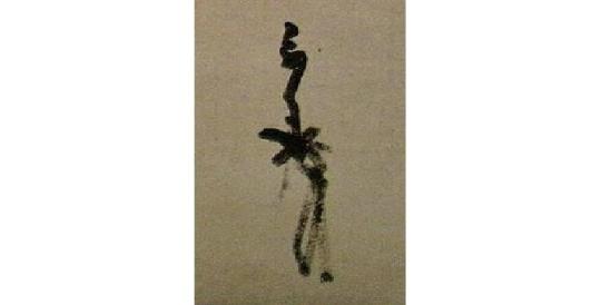
At the beginning of the densho known as the Tenshō ku-nen ki-mei densho [天正九年記銘傳書]¹, Rikyū wrote: “with respect to chanoyu, the daisu is its root. When the daisu is abbreviated, [it becomes] chanoyu with the furo. When the furo is abbreviated, it becomes [chanoyu with] the irori. If the ‘shin’ [眞] of the daisu is not understood, then [the correct way to use] the furo is difficult to do successfully; [and] if one can not discern [what is meant by] the ‘gyō’ [行] of the furo, then the ‘sō’ [草] of the irori is also impossible to bring forth, so you must understand. It should be like the flower, which blooms [upward] from its root².”
[Rikyū’s original manuscript of the passage that has been quoted in the text. ]
Rikyū, here, declares the essential nature of the daisu, not only from a historical perspective, but also with respect to its impact on the everyday temae. The “daisu” to which he refers means the collection of classical temae handed down from ancient times, that have been preserved in this book³, and to the idea of kane-wari [カネワリ]⁴ that was derived from them.
II. The format of Book Five.
The contents of Book Five of the Nampō Roku largely consist of a series of sketches (each drawn on a separate sheet of paper), that apparently were given to Nambō Sōkei by Jōō⁵; with kaki-ire added to many of them at a later date⁶. Each entry (several of which extend across two, or even three, double pages) closes with a title, followed by Rikyū’s “Sōeki kaō” [花押]⁷, and then Nambō Sōkei’s name (“Nambō” seems to have been Rikyū’s nickname for Sōkei)⁸, as seen in the example shown below.

[The double page showing the first sketch, from the Enkaku-ji manuscript. The components are explained in the text.]
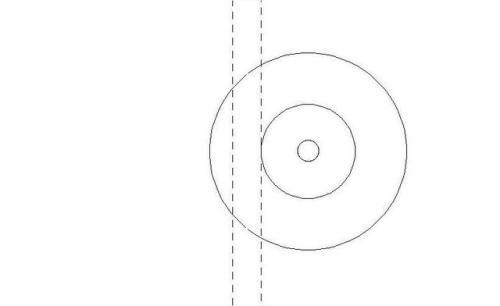
Many of the sketches are marked to indicate the relationship of the various objects to their kane, as may be seen in the example below. A single line means that the utensil in question is associated with a kane, but is not centered on it; three lines, however, indicate a mine-sure [峰摺り], where the object is carefully centered on the kane⁹.

[A detail of the san-shu gokushin (三種極眞) arrangement, showing the way that the mine-suri (峰摺り) are indicated.]
In this translation, all of the pages related to a single topic will be covered together in the same post. As will several other arrangements that have been lost from the Enkaku-ji manuscript, in their appropriate places (relative to Jitsuzan’s original version of the material).
The final 15 text entries will be segregated into several groups, based on their content.
III. An apologia regarding the shiki-shi [敷き紙], and the interpretation of kane-wari that will be used in this translation.
As I have mentioned before, Book Five really lays the foundation for kane-wari. Yet, if someone is ignorant of the shiki-shi, then the conclusions that they will draw are, put simply, wrong.


[The shiki-shi (敷き紙): one side is gilded, while the other is silvered. The fully opened shiki-shi determined the temae-za in front of the daisu (top), while the half-opened shiki-shi determined the temae-za in the small room (middle). The fully folded shiki-shi (bottom) measures 6-sun by 5-sun, which is a convenient size to be inserted into the futokoro.]
A textually unidentified sketch of the shiki-shi is included in Book Five, as entry 48. This is followed by two sketches showing the shelves of the daisu divided by the kane -- first (entry 49) the small daisu, which is divided by seven kane, and then the large daisu (entry 50), divided by the eleven kane (five yang-kane, interspersed with six yin-kane). While the sketches in entries 49 and 50 are clearly proportional to the dimensions of the ten- and ji-ita of the daisu in question¹⁰, that of entry 48 (which I suggest is the shiki-shi) is obviously not. Below is Jitsuzan’s sketch, on the left, and the modified sketch from Shibayama Fugen’s commentary (Fugen deliberately stretched this sketch horizontally, so that it conforms with the dimensions of the daisu). The five marks were added to the upper edge later -- whether by Jitsuzan, or by one of the other scholars affiliated with the Enkaku-ji, once it was decided that (contrary to the visual evidence¹¹) this was a sketch of the subdivision of the ten- or ji-ita of the daisu.
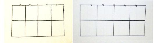
[On the left is the sketch from Tachibana Jitsuzan’s manuscript, while on the right is Shibayama Fugen’s version -- which he modified to conform with the dimensions of the ten- and ji-ita of the shin-daisu.]
Here the shiki-shi is shown arranged in front of the large shin-daisu, on a kyōma tatami.
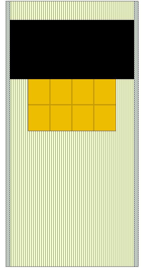
[This sketch carefully replicates the shiki-shi arranged in front of the shin-daisu on a kyōma tatami.]
The kyōma tatami (which measures 6-shaku 3-sun by 3-shaku 1-sun 5-bu) has a fraction more than 61-me between the heri (the width of the space between the heri is determined by the width of the shin-daisu, which is 2-shaku 9-sun 5-bu; the heri are always 1-sun wide), with the heri aligned with the edge of the first me on the side of the mat towards the guests’ seats -- in this case, on the right. Note that on that side the shiki-shi exactly matches the edge of the me, and that there are 9-me between the shiki-shi and the heri. Though the spacing is the same on the left, because the me do not exactly match the width of the mat, the left edge of the shiki-shi does not match the edge of the me on that side¹².
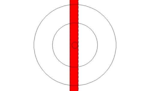
Because of the folds, the temae-za (which is determined by the shiki-shi) extends onto the two heri, as shown below, so that the uncovered spaces on the left and the right are equal to the panels of the shiki-shi itself.
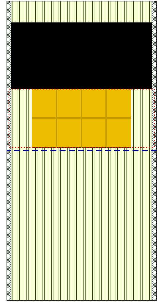
[The temae-za is outlined with the dashed red line; the middle of the mat is shown by the dashed blue line.)
Meanwhile, the space between the front of the daisu and the middle of the mat was determined by the largest of the six meibutsu trays (which measures 1-shaku 3-sun in diameter). The space on the far side of the daisu is simply what remains, without any special reason.
Further discussion of these points will be put off until the commentary appended to the entries with which it is relevant (since Tumblr’s new format appears to be limiting the length of posts once again).
This introduction will be followed by an Appendix, wherein I will review Rikyū‘s own teachings on the use and arrangement of the daisu, from his densho.
_________________________
¹The person to whom this document was presented is unknown. It is believed that this version of the text was retrieved from Rikyū's personal archives, since similar densho (addressed to specific individuals) are known. It would appear that writing in Japanese was difficult for him, on account of his language dyslexia. Thus he wrote out a master copy of his densho, which he kept among his papers, making copies of them for presentation* (with situation-specific modifications) whenever these were needed.
Tenshō ku-nen [天正九年] was 1581. Consequently this densho was written at a time when Rikyū was moving in the higher circles of society, but before he was inducted into an official position within the government. __________ *One such surviving example of this particular densho was addressed to Nomura Sōkaku [野村宗覺; his dates of birth and death are not known], a machi-shū chajin from Sakai. His version of this densho was also dated 1581 in Rikyū's dedication.
²Hitotsu, chanoyu ha daisu nemoto nari, daisu wo ryakushite furo no chanoyu, furo wo ryakushite irori ni narashi, shin no daisu wo fu-chi ha gyō no furo mo nari-gataki nari, gyō no furo wo mo wakimaezu-shite ha, sō no irori mo nasu-bekarazu to shiru-beshi, nemoto ni hana no zakitaru gotoku nari ha shiru-beshi [一、茶湯ハ臺須根本也、臺子ヲ略しテ風呂ノ茶湯、風炉ヲ略しテイロリニナラシ、眞ノ臺子ヲ不知ハ行のふろも成可たき也、行のふろをもワキマヘスしテハ、草のいろ里も成ヘ可ら須と知るへし、根本ニ花の咲たるコとく成ハ知るへし].
The orthography of this passage is discussed in the post entitled Rikyū Densho — the Private Writings of Sen no Rikyū: IIIa. The Tenshō Ku-nen Densho (A. The Daisu is the Root of Chanoyu).
The URl for that post is:https://chanoyu-to-wa.tumblr.com/post/83456005982/riky%C5%AB-densho-the-private-writings-of-sen-no
³Though several of the arrangements illustrated in Book Five of the Nampō Roku have been appropriated by the modern schools, it must be understood that the original temae were very different from anything that the modern schools have conceived, or teach.
The classical temae was always essentially the same*. The way to fold the fukusa† -- which is one of the defining elements of the secret aspects of the modern “higher temae” (including those that employ the daisu), did not exist in ancient times: Rikyū was the first to fold the fukusa in the room, at the very beginning of the temae and before the eyes of the guests, and he did this in the most perfunctory manner possible. Prior to that, the fukusa was folded in the katte, at a time that the host deemed appropriate, and kept in the futokoro of his kimono. The fukusa was taken out for use, and then returned to the futokoro. It was never refolded, and discarded into the left sleeve at the end of the temae. __________ *There were two possible formats, depending on whether the host removed the shifuku from the chaire first, or whether he did this while the chawan was being warmed with hot water prior to the chasen-tōshi.
The decision turned on the importance (i.e., social rank) of the shōkyaku.
†The so-called shi-hō-sabaki / yo-hō-sabaki [四方捌き] ultimately derived from Sōtan's peculiar way of doing things, though in this case it was an attempt to discourage the government's interest by feigning incompetence: traditionally the fukusa was held with the wa-sa [輪差], the folded edge, on the right, before folding it diagonally into a triangle; Sōtan pretended that he could not even find the wa-sa, fumbling with the fukusa before “folding” it. His sons later “refined” this action into the shi-hō-sabaki. Consequently, any temae that features the shi-hō-sabaki -- or, indeed, includes the folding of the fukusa in the tearoom, in front of the guests -- could not be earlier than the chajin who initiated these practices.
⁴Kane-wari [カネワリ = 矩割り or 曲尺割り] is the system of subdividing the spaces used for chanoyu with five “lines.” While the original purpose was apparently intended as an aid to reproducing the arrangements elsewhere, this idea was also associated with balancing the “energy” of the system, so as to enhance the beneficial properties of the tea* that was prepared during the temae. __________ *According to the usual interpretation of the passage in the Medicine King Chapterᵃ of the Lotus Sūtra on which the idea of chanoyu was originally based, drinking tea cures the person who drinks it from the disease of saṃsāraᵇ.
As chanoyu came to be understood as an exercise in motion-meditationᶜ, furthermore, the impact of the environment will either enhance or impede the attainment and prolongation of samadhi, hence the energy generated by the arrangement of objects was considered to be of critical importance. __________ ᵃThis is usually chapter 22 or 23 in this sūtra, depending on how it has been subdivided.
ᵇThe relevant passage was translated and discussed in the post entitled Some Random Thoughts on the Practice of Chanoyu (3): the Origin of the Use of Tea as a Pious Device is Said to be Based on the Saddharmapuṇḍarīka Sūtra [the Lotus Sūtra].
The URL for that post is:
http://chanoyu-to-wa.tumblr.com/post/126804725203/some-random-thoughts-on-the-practice-of-chanoyu
ᶜThere was probably a certain degree of temporal separation between the association of tea with the “medicine with a beautiful color, wonderful aroma, and delicious flavor” of the Lotus Sūtra (this seems to have been the farthest the evolution progressed in China), and the recognition that the ritualistic method of preparation could, itself, be utilized as a pious device that would aid in the cultivation of samadhi (which appears to have arisen in Korea, possibly at the Ssang-gye-sa [雙溪寺] or one of the other temples standing near the site of the first tea fields, at Hadong).
⁵The sketches, on kiri-kami [切紙] (individual pieces of paper, rather than drawn on a long scroll of paper, or in a notebook), are executed in the same style, and observe the same conventions, as those found at the end of Book Three and Book Four.
The fact that Rikyū verified the contents of each sketch with his signature clearly indicates that (contrary to the assertion of certain scholars) the sketches did not originate with him.
Nor is there any reason to suppose that Nambō Sōkei was responsible for them, since Sōkei was a collector of antique teachings, rather than an innovator or creator of arrangements.
⁶The fact that the sketches document usages that were employed up to a century before Jōō‘s birth* shows that these arrangements could not have been created by Jōō. Rather, it would appear that he collected them from various sources, and passed the collection on to Nambō Sōkei, perhaps during his final illness.
Furthermore, since a number of the kaki-ire [書���]† were written over the original sketches indicates that they must post-date both the original sketches, and Jitsuzan’s copies (since if this material had been present when he produced his copies, he would surely have allowed sufficient space for the comments).

This example shows the extent to which the kaki-ire occasionally obscure the sketches themselves, as well as being added in an odd way (the kaki-ire above the chaire and dai-temmoku was written with the paper turned sideways).
The above example is also important for another reason: this sketch (like several others) is not found in the Enkaku-ji manuscript of the Nampō Roku. Kanshū o-shō sama explained to me that, unfortunately, it seems certain people tore out pages as “souvenirs” in the past‡. The absence of these drawings in the Tankōsha edition of the Nampō Roku indicates that this was done prior to the 1950s, when the Sadō Ko-ten Zen-shu [茶道古典全集] was originally published. (It is interesting that Kanshū left me alone with the books on several occasions.) ___________ *The earliest datable of the sketches is the one illustrating the setup for the san-shu gokushin [三種極眞] temae, which (according to Book Six) was first performed publicly (in Japan) on the 18th day of the Sixth Month of Ōei 10 [應永 十年] (July 7, 1403). The performance shocked and awed the onlookers, who were members of the shōgunal court (as well as anyone who was able to peep in from outside), who had never seen anything of the like (which indicates that chanoyu was completely imported, rather than a locally evolved practice). What is also interesting is that the san-shu gokushin was a modified version of the gokushin temae (devised to allow for the use of a special celadon mizusashi), suggesting that the original of the original form was created much earlier (in Korea -- the appearance of chanoyu in Japan occurred shortly after the assassination of the last Koryeo king earlier the same year, following his forced abdication during the previous year).
†The language used in the kaki-ire in Book Five is identical to that used in the kaki-ire that were added to the sketches in Book Four -- which, Tanaka Senshō noted, his sources (among the group of scholars who gathered in the Enkaku-ji to study this document) revealed were known to have been added to the sketches during the second half of the Edo period, after Jitsuzan presented his manuscript to the Enkaku-ji. As a result, to then argue that the kaki-ire found in Book Five were approved by Rikyū is nonsense.
This is an important point, because many of the assertions bandied about regarding the teachings of the Nampō Roku -- and what they supposedly “reveal” about Rikyū’s “secret teachings” -- derive from these kaki-ire. (This is significant because some of these assertions directly contradict things found in Rikyū‘s own densho -- and this constitutes the “proof“ that the densho are spurious! In fact, what some of these kaki-ire actually reveal is that the group of scholars did not have a clue, and simply put their own speculations into Rikyū’s mouth.)
‡There was a certain vogue for mounting such fragments as kakemono during the nineteenth and twentieth centuries.
One of the maru-bon midare-kazari [丸盆亂飾] sketches still survives as a torn page. Alas, the remaining fragment is too small to enable us to reconstruct the missing content.
⁷A kaō [花押] is a stylized signature, added to a document as a seal. In this case, Rikyū’s kao certifies that he had reviewed the document, and supposedly verified its contents. A copy of Rikyū’s actual kaō is shown below.
Naturally, since the Nampō Roku consists of Tachibana Jitsuzan’s copies of the original documents, he chose to simply write “Sōeki” [宗易]*, rather than forge the actual kaō.
The appearance of this kaō -- and the reason for its appearance -- is problematic, because it appears to sanction the kaki-ire (which, of course, would have been impossible, since these were all added during the Edo period). This is one reason for much of the confusion that surrounds the contents of this book. ___________ *Sōeki [宗易] was the name that Rikyū was given when he “graduated” from his period of training (something in which most of the male population of Sakai participated during that period). He used this as his professional name thereafter (another common convention of the period).
⁸Nambō was apparently intended to indicate the recipient, in the same way that a letter concluded with the name of the person to whom it was addressed.
It is impossible to know when Rikyū reviewed documents (since the entries are undated). However, the introduction to the Nambō-ate no densho [南坊宛の傳書] mentions a previous correspondence between Rikyū and Sōkei, and it is entirely possible that Sōkei had submitted these sketches to Rikyū for his comments, and Rikyū’s reply sufficiently impressed Sōkei that he submitted additional questions that were answered in the above-mentioned densho.
Subsequent to the Nambō-ate no densho, Rikyū addressed two further documents of the sort to Sōkei. Though undated, the first of those (which may be referred to as the Tsuri-dana no densho [釣棚の傳書] -- both are usually included in modern versions of the Nambō-ate no densho without comment) must have been presented in 1582 or 1583 (since the tsuri-dana was created in the summer of 1582), while the second (Shin no dai temmoku, onaji daisu no koto no densho [眞の臺天目、同臺子の事の傳書]) was written around 1586, perhaps just prior to Hideyoshi’s prohibition on the unauthorized dissemination of information related to the gokushin temae. The text of the latter will be appended to this post, since it will give the reader a better idea of Rikyū’s teachings on the subject of the gokushin daisu temae.
⁹The different kinds of associations with the kane were discussed in an appendix to the post entitled Nampō Roku, Book 3 (18.5): Arrangements for a Meibutsu Futaoki, and for a Karamono Chaire.
Put simply, ordinary objects are associated with their kane by placing them so that their foot is immediately to one side of the kane. This is shown, in the Nampō Roku, by the kane located to one side of the object.
Important objects (usually meibutsu pieces) are aligned so that their center is located within the 3-bu wide space of one of the inner three kane (this 3-bu wide space is a consequence of the shiki-shi). This is shown in the Nampō Roku by the object being centered on a single line.
Mine-suri [峰摺り] objects, pieces of the highest rank (usually when being used to serve tea to an extremely important -- high ranking -- shōkyaku) are exactly centered on the 3-bu wide space. This is indicated by the object resting on three lines (the outer two indicate the edges of the 3-bu wide space, while the inner line shows the object aligned with the center of that space).
For additional information, please consult the post mentioned above. The URL is:
https://chanoyu-to-wa.tumblr.com/post/187172815712/namp%C5%8D-roku-book-3-185-arrangements-for-a
¹⁰In the Enkaku-ji version of the Nampō Roku, the quality of Jitsuzan's drafsmanship cannot be surpassed. Everything is drawn so carefully, that the intentions of each arrangement can be understood at a glance. Unfortunately, this is not true with any of the published editions, which use either re-drawn sketches, or sketches that were not reproduced carefully (so that they are usually more confusing than helpful).
The dimensions of the sketch of the shiki-shi in the Enkaku-ji manuscript exactly matches the actual shiki-shi; while the other two exactly match the two daisu. Consequently, it is impossible to conclude that the first was intended to show a daisu -- though Jitsuzan himself may not have been aware of this (he seems to have made careful copies of everything -- even when he did not understand what he was drawing).
¹¹This argument is really indefensible: in addition to the anomalous dimensions of the sketch, nowhere else in the Nampō Roku is this division of the daisu into eight sectors mentioned, and it adds another (and irrelevant) note of confusion into the subject of kane-wari.
Precisely why the scholars in question could not trust their eyes is at least partly a consequence of a sort of mentality that developed during the Edo period, as a consequence of “artistic purity” being held out as a goal. Because the shiki-shi was used by practitioners of incense, it could not possibly have any connection with chanoyu. Even though there is no other object that conforms to the sketches the way the shiki-shi does.
We must remember that, even in Rikyū's period (as well as in the decades before), none of these arts were truly distinct, the way they became in the Edo period. Rikyū practiced chanoyu, certainly, but he was also a skilled floral artist. And also well versed in incense. Jōō was as much a classically trained poet as he was a devotee of incense, and, only later, one of chanoyu. This sort of mindset was hardly unique to Japan. Indeed, it appears that this was also exactly the case on the continent, and describes the environment in which all of these arts evolved -- together.
How I came to identify the shiki-shi from the sketch is the result of circumstances to which I was exposed long before I ever went to Japan. A friend of mine had spent a year in Japan with her husband and children; and because her husband was a famous researcher, when they returned to the USA they were showered with all sorts of presents. One of the things that she was gifted was an antique shiki-shi (one that could never be used for chanoyu, since it had delicate watercolor paintings on both sides that would have dissolved at the slightest trace of water -- indeed, there is no evidence that the shiki-shi was ever used for chanoyu in Japan). One day she put her shiki-shi in front of the naga-ita on which her tea utensils were arranged, as a decoration (her level of chanoyu training was sub-basic -- at that point she could not even do the ryaku-bon temae -- and she had had only one experience of participating in an incense gathering; still she had seen the shiki-shi spread out in front of the kō-dana [香棚], and decided to do that in her own home.) This, and the unique shape of the object, stuck in the back of my mind somewhere; and when I first saw the sketch that is entry 48 in the Nampō Roku, the shiki-shi immediately came to mind (this was before I was able to read the text at all).
Serendipitous, perhaps. But I have found no other way to explain kane-wari -- especially the difference between this apparent system, and what Rikyū taught: while the shiki-shi seems to form the basis of the daisu arrangements (when objects are placed on the large trays, the trays always align the objects with the position they would have occupied on the shiki-shi), Rikyū's system reduced the three inner kane to simple lines, thus pulling the temae-za inward from the heri, so that it ends at the heri, rather than rising onto them on either side. And, as if to prove this true, when the large trays are moved inward, the objects placed on them then correspond with Rikyū's system.
More will be said about this later, in the commentary appended to the individual arrangements.
¹²To create the illustration, the dimensions of each of the elements were fixed separately, and then they were simply super-imposed on top of each other. Nothing was adjusted to fit afterward. In the absence of an actual kyōma tatami, this was the best evidence that I could give for the credibility of the assertion that kane-wari is based on the shiki-shi.
In a setting where the guests are seated on the host’s left, the orientation of the utensil mat will be reversed -- as shown below.
To understand this, the reader should look carefully at the me.
2 notes
·
View notes
Photo


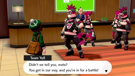
Whelp, started playing pokemon sword. Have complained quite a bit here about dexit & related issues, and honestly I would have skipped at least the initial versions of these games entirely, or at least held off on purchasing them until we could see just how egregious pokemon home will be. But my brother got shield, and my problems with sword and shield are not so severe that I’m going to refuse to play a game with family.
Thoughts so far? Setting dexit entirely aside it’s... another pokemon game, for better and worse. Largely for the better. The new monsters, at least those I’ve encountered so far, are fun and good. Music is nice. Tone is bright and cheerful. I love my team, and my protagonist. It’s been nice.
As expected going to a more powerful console, it looks better, but it’s not a huge jump from the 3ds games, not least because lot of the visuals of this game are ported over directly from those games, and the stuff that is new has been made so as to not clash aesthetically with the older stuff. If you’ve seen mods of usum that display the games at higher res and without the black outlines, it’s very much like that. Closer to that even than to the let’s go games in ways that I find difficult to articulate. In and of itself that’s not a complaint, really, the game looks plenty good enough for a pokemon tame. It’s just not a major leap forward in presentation like the leap from gen 5 to gen 6 was.
Gameplay is mostly what you might expect. Tall grass battles are an interesting mix of pokemon you can see on the field and engage or avoid as you wish and random battles that appear in the grass. The random fights appear as a rustling in the grass that again can be pursued or avoided, you just can’t tell what they’ll be before you bump into them. Finding rarer pokemon in a route is often a matter of sneaking or dashing between the new pokemon to get to the random fight, then crossing your fingers and hoping for the pokemon you want. I’m not sure if there’s deeper levels to it, like chaining or whatever. At the surface level it’s engaging enough.
The new pokemon are great so far. There’s a bunch early on that you won’t have seen if you avoided leaks, and that was really excited. I went into gen 7 knowing every new pokemon and with a particular desired team all worked out in advance. This time around I’ve avoided spoilers, and gamefreaks official previews have kept a lot more hidden, so it’s been really fun to meet a lot of cool new faces early on.
The game does let you skip some early tutorials, but still frustrates to no end by stopping you every three seconds for another unnecessary explanation or detour, so it’s still pokemon in that unfortunate regard. Routes are, if anything, more linear than ever before, at least early on, with the exception of an early expedition through the wild area which... I’ll talk about later.
Experience share is always on and cannot be turned off. It scales shared xp based on the level of the pokemon, with lower level pokemon getting a higher portion, but not by enough so it’s still a pain to keep everything in the same level range, and you’ll still probably be wildly over leveled from very early on with nary a challenge to be seen even if you try to avoid grinding.
You can access the box from anywhere, which can be used to help overcome both the maintaining-a-level-range and over leveling problems of the experience share, but it’s a hassle to do, and wouldn’t be necessary if you could just toggle off shared exp in the options menu. And on another level it makes the game even easier, since attrition is much less of a problem when you can swap in fresh pokemon whenever you feel like.
The online functionality is... kind of bad. Maybe it’s just my internet, but being online in the wild area causes all sorts of slowdown. Worse, there’s no equivalent to the pss functionality from gen 6. No way to just see which of your switch friends are online and directly offer to trade or battle with them. No instead you have to contact them *outside of the game* to share a 4 digit password, and then hope that nobody else happens to be using the same password as you when you try to connect with each other. Raid battles are neat, but infuriatingly use the same password hassle. You can’t just have easy friend-only raids from within the game itself.
It’s marginally better then gen 7′s festival plaza, but it remains miles and miles behind gen 6′s pss system that was simple and intuitive, and just centuries ahead of anything that came before or after.
Apart from raid battles, the wild area is... interesting? Not all that different from having just a really big route with subareas of various level ranges. Not bad, but not as big a departure as I had made it out to be in my head. An idea with some potential that future games might expand into something great but that, knowing this series, will just be dropped after a single generation instead. I’m still pretty early in the game, so my opinion on it might change after returning to it later.
The biggest frustration of the wild area, and something that brings it down tremendously, is that while you can encounter, and with some effort defeat, pokemon there, you cannot catch them at all if they’re above an arbitrary level range set by your number of gym badges. This runs so completely counter to everything almost good about the wild area that I basically swore the whole thing off until I get to the end of the game, and frankly they might as well have just made it a post game area at that rate.
It’s extra frustrating because the problem of a player getting access to a pokemon too strong for the game too early on is one that the pokemon games already solved infinitely more elegantly all the way back in gen 1! Just make pokemon that you acquire at too high a level uncontrollable, exactly like traded pokemon, so you can catch that over leveled onyx or whatever, but can’t use it until you’ve progressed far enough in the game for it not to be over leveled anymore. How hard is that? And who cares if a player gets an over powered pokemon early and steam rolls the game? If that’s how the player wants to play, why is it a problem? It’s not like the main game is challenging to begin with, thanks to always on exp share its almost impossible not to have over leveled pokemon anyway, what does it matter if it’s because you caught them that way or because they just outleveled the game curve? A better exp scaling system would fix all those problems anyway.
Pokemon games not only failing to progress and solve problems that return game after game, but also repeatedly forgetting solutions that the series has already implemented is the longest running and most frustrating and most justified complaint to level at the entire series. Of course, in the past pokemon as a series always had one core feature that none of the other - often more innovative - monster hunting games that sprang up in its shadow could replicate. Backwards compatibility, the ability to maintain your collection in full going forward from generation to generation in a chain unbroken since gen 3 on game boy advance. And that’s where dexit puts a sour note on the whole business.
The last several pokemon generations have failed to significantly improve on the core gameplay of a nearly two decade old franchise, but for many that has been largely forgiven because each new generation could easily be viewed not as stand alone games but rather as major expansions to the same existing game. Dexit breaks from that, and forces the new games to be viewed as stand alone games and... well they aren’t pad at all. They’re still cute. I’m having fun so far. Sword and Shield is no Anthem, no Fallout 76, no singular disaster to turn an otherwise largely positive track record on its head, and the extreme negativity directed against the game has been way overstated, even probably by myself. In particular any vitriol directed at the devs is almost certainly unwarranted, the problems that have been growing in the pokemon series generation after generation almost certainly come down to corporate decisionmaking way above the heads of anyone who actually *worked* on the game.
Still, now that gamefreak’s pattern of cutting progressively more and more corners has reached the point of cutting actual pokemon, it’s shouldn’t be surprising that a lot of people who had been giving all those issues a pass suddenly aren’t anymore.
And while pokemon sword and shield isn’t a bad game, it’s hard to compare it to something like oras or usum and say it’s worth 50% more up front cost AND an added monthly subscription to access features like GTS that used to be just part of the game to begin with.
The dex cuts would have been more forgivable if the games had been a major leap forward, whether in graphics or gameplay. Monster Hunter World, for instance, had /dramatically/ less content in terms of sheer quantity than the games that came right before it, but it also completely overhauled the visuals, heavily revised and updated the core gameplay, and completely changed how the area maps worked.
Alternatively, I think all the people currently complaining about models and trees and balance would have been fine with ‘just another pokemon game’ if it had maintained the backwards compatibility, just as they’ve been alright with ‘just another pokemon game’ for game after game after game until now. Imagine if gamefreak had announced sword and shield as the last main line games to maintain all previous pokemon instead of the first games not to. Then at least everybody’s personal faves would have had the chance to see play on a home system, and sword and shield could advertise themselves as the biggest pokemon games ever and actually mean it, and players would have time to adjust to what was coming.
I’m reminded of a scene from the Gravity Falls Halloween episode in season one. Mabel & Dipper had always trick or treated together, but this year dipper decided to ditch mabel to try and go to a teen party, arguing that they were getting too old for trick or treating. To which Mabel says something along the lines of “I knew some Halloween would be our last, but I didn’t realize it had already happened.”
And that’s the feeling I have with pokemon right now, the wet blanket draped over all the bright colors and fun new characters and monsters in sword and shield. I knew eventually pokemon games wouldn’t be able to keep supporting all the pokemon, I knew eventually my collection would be left behind. But I didn’t think it had already happened. And to find out that gen 7 of all games was the last ‘complete’ pokemon? That’s just kind of sad to realize. And while I am on balance enjoying sword and shield, it’s a realization that keeps coming back uninvited to sour the experience.
#pokemon#swsh#non spoiler thoughts#mixed feelings#still early in the game#time yet to win me over or drive me away#some dexit griping#Only two gyms in yet#still avoiding spoilers myself#still miss pss#honestly so far that's an even bigger complaint then dexit#though that's likely to change once I get to postgame#or subsequent playthroughs
3 notes
·
View notes
Text
Silvally Breaks Free!

Reasoning:
-Gen 7 rep (I had this idea before the Incineroar reveal but I really wanted to share it)
-Important to the SM/USUM story
-Would do a great job representing the Pokémon series as a whole (see Moveset)
-No Spirit present in-game
-Gladion can appear in victory animations and such, like an emo Doc Louis
Moveset:
Here’s where the representing the whole series comes in. Every Smash character has 17 attacks. Add grabs as one move to make 18 moves. Silvally’s main selling point as a Pokémon is its RKS System Ability, which lets it switch between all 18 types. In short, Silvally has one move from each type in its moveset. Silvally doesn’t necessarily learn all of these moves, but it’s the types themselves that count here. Also, the protrusions from the fin on its head glow the corresponding type’s color with each attack. Yellow for Electric, purple for Poison, green for Grass, etc. If you think this moveset feels like an artificial combination of attributes from other characters without much originality, you’re absolutely right. That’s exactly what Silvally is in-canon.
-Jab: Fury Swipes (Normal). Two quick claw swipes in succession. Get-Up Attacks would also be Fury Swipes.
-Side Tilt: X-Scissor (Bug). Slashes forward with two claws at the same time. Works like Wolf’s Side Tilt.
-Up Tilt: Zen Headbutt (Psychic). Silvally swings its head in the air while it’s surrounded by psychic energy.
-Down Tilt: Poison Fang (Poison). A low bite with venomous teeth.
-Dash Attack: Ice Ball (Ice). Silvally rolls up into a ball, freezes, and rolls forward for a bit.
-Side Smash: Play Rough (Fairy). A rapid flurry of various forward attacks. Perhaps the comical dust cloud from the games could appear so they don’t have to be animated.
-Up Smash: Eruption (Fire). Two pillars of lava shoot up on either side of it. Works like Squirtle’s Up Smash.
-Down Smash: Bulldoze (Ground). Silvally leaps up and slams the ground, causing shockwaves nearby. Works like Incineroar/Ridley/King K. Rool’s Down Smash.
-Neutral Air: Shock Wave (Electric). An electric field around Silvally. Works like Pikachu/Mewtwo’s Neutral Air.
-Forward Air: Shadow Claw (Ghost). A slash forward with a ghostly claw. Works like Bowser/Wolf’s Forward Air.
-Back Air: Double Kick (Fighting). Two quick back leg kicks. Works like Link/ Young Link’s Back Air.
-Up Air: Iron Head (Steel). A strong upwards swing of a metallic head.
-Down Air: Smack Down (Rock). Silvally spits a small rock downwards. Like in the Pokémon series, anything hit by the rock crashes straight to the ground (or bottom blast zone). Works like Megaman’s Down Air.
-Neutral Special: Seed Bomb (Grass). Silvally spits an explosive seed forward. This attack is relatively slow, but hits hard and can be angled and shot at an arc.
-Side Special: Sky Drop (Flying). Silvally grabs its opponent, leaps into the air, and slams them back down. Works like Bowser’s Side Special.
-Up Special: Dragon Rush (Dragon). Silvally surrounds itself in blue energy as it floats in place for a bit, then lunges in any direction as the energy around takes the shape of a dragon. Works like Fox/Falco’s Up Special.
-Down Special: Sucker Punch (Dark). A hooking swing with a front leg. In Pokémon, this move is fails unless the target chose an attack that turn. In SSB, this would work as a counter.
Grab: Whirlpool (Water). Silvally surrounds its opponent with a small water vortex. The pummel just has the whirlpool swirl around the target faster, and the throws would have Silvally use the Water-Type version of Multi Attack (Silvally’s signature move, which appears as a claw swipe) to hit the foe in the chosen direction.
Final Smash: Ultra Wormhole. A wormhole drags an opponent into Ultra Space, and Silvally chases them through it an attacks them.
Alts:
-Gold head and neck (Shiny Silvally)
-Brown head and neck (Type: Null, it’s pre-evolution)
-Red leg hexagons, yellow head fin (Gladion, the first trainer to use Silvally)
-Yellow front legs, hexagons, and butt fin (Arceus, the legendary Pokémon who can change its type at will, an ability that Silvally was made to replicate)
-Purple head and neck, teal front legs and butt fin (Crobat, the only other Pokémon Gladion has in all Gen 7 games (except Lucario, who’s in Smash already) and who evolves by high friendship, just like Silvally.)
-Black head and neck, red head fin, white front legs (Both the Weavile Gladion has in SM and the Zoroark that replaces it in USUM)
Classic Mode: Beast Killer, Activate!
(Every fight is based on one or two Ultra Beasts, which Silvally was created to counter.)
Round 1: White Zelda (Nihilego)
Round 2: Red and Black Incineroar (Buzzwole) and White Zero Suit Samus (Pheromosa)
Round 3: Robin (Xurkitree)
Round 4: Galleom (Celesteela)
Round 5: Giant Black Kirby (Guzzlord)
Round 6: Black King K. Rool (Stakataka)
Boss: Giant Ridley (Naganadel)
SSB Idea Master Post
#nintendo switch#super smash bros ultimate#pokemon#ssbu#ultra sun and ultra moon#gladion#silvally#ultra beast
22 notes
·
View notes
Text
The Munchkin Nein - Condor Widogast Part 2
Welcome back everyone, to tonight’s episode of how to murder hobo, by our resident hobo wizard, Caleb Widogast. We last left off having reviewed his FIREpower and now, onto the greater subtleties of magic that showcase the versatility of the wizard, and how well it can sync up with the rest of the Mighty Nein.
And off we go again, my labels for each spell in square brackets [buff, debuff etc]
Maximilian’s Earthen Grasp (level 2, concentration 1 minute)
[Crowd control]
Target must make a STR save or suffer 2d6 bludgeoning DMG and is restrained.
A crowd favourite that came in clutch against the gelatinous cube in ep15.
It is the only source of non-magical damage in Caleb’s arsenal, aside from physically fighting. Restrained is a powerful condition, reducing speed to absolute zero regardless of modifiers. It also gives DISAV (disadvantage) to the target’s attack rolls, as well as ADV (advantage) to ALL attack rolls on the target. Finally, the target has DISAD on DEX saves. While Caleb can use an action to force a separate STR save on subsequent turns to deal 2d6 bludgeoning DMG, it’s probably not very efficient. The firebolt cantrip does 2d10, with advantage due to restrained (so roll that nat 20). Burning hands does 3d6 or more, and the target’s DEX save gets DISAD
On the downsides, it only has 30 feet of range, takes an action and requires concentration. The target can use its action to have another go at the STR save, which frees it if passed. However, even if the target breaks free, at the cost of Caleb’s action, that cat’s paw can still try to restrain the target again if they remain within 5 feet of it. Alternatively, it can re-position itself within a 30 foot radius of Caleb.
Enlarge (level 2, concentration, 1 minute)
[Buff]
Another crowd favourite, especially given the targets Caleb has not very subtly chosen (Caleb is most definitely a Beauyasha shipper). Mechanically, the doubling in size gives ADV on STR checks and saves. If the target is holding weapons, they deal d4 extra DMG.
So, a straight up damage boost, especially helpful for characters with multiple attacks (Beau can go up to 5 attacks, with Sentinel reaction and flurry of blows, Molly and Yasha tie at 3 for 2nd place). And the improvement on the STR checks help with things like grappling or shoving which Beau has shown to be rather fond of (0 STR mod, but proficiency in athletics), and the STR save is good for getting out of said situations.
Once again, its a spell that needs concentration, reinforcing the need for Caleb to hang back, which he has been doing so far. Of note is that the target and everything it bears multiplies by 8 in weight, which might cause some floors to give way. I recommend watching out for potential environmental hazards.
Reduce (level 2 transmutation, concentration, 1 minute)
[Debuff]
The flip side of the coin with Enlarge, its actually in the same spell entry, which is an advantage since Caleb can prepare both without being 2 spells (which will be increasingly important as Caleb can only prep 10 spells a day + 1 for every new level, but learns at least 2 more every new level aside from copying spells). If used on an unwilling creature, it must make a CON save, or else it gets DISAD on STR checks and saves, and gets a 1d4 DMG penalty to its weapon attacks, though it cannot reduce the DMG below 1.
So pretty much the flipped application of enlarge, making foes vulnerable and weaker. In this case the reduction in weight might be helpful in setting off less traps, not that anyone seems particularly weighty in the Nein atm.
Haste (level 3, concentration, 30 feet, 1 minute)
[Buff]
Gotta go fast! Double speed, +2 AC, ADV on DEX saves, and an additional option: one weapon attack, dash, disengage, hide, or use an object.
Highly versatile spell for positioning, defense and offence. Double speed benefits characters with high base speed (Beau, Yasha at 40 ft) more so than others. +2 AC and ADV to DEX saves makes the target a slick dodgy fellow in combat, as well as the additional movement options. And finally, the extra attack is a simple boost while the additional interaction is up to roleplay ingenuity.
Slow (level 3, concentration, 120 feet, 1 minute)
[Debuff]
The sister spell to Haste, but mechanically somewhat different. AoE 40 foot cube, affects up to 6 creatures. The target must make a WIS save or suffer the following effects: half speed, -2 AC, DISAD on DEX saves, cannot take reactions. Only action OR bonus action. Limited to one attack. Also, if casting a spell that costs 1 action, it has a 50% chance of being unable to complete the spell this turn and must use its action the following turn to do so. If unable to, the spell is wasted.
As we can see, its a pretty nasty debuff to the capacity of the poor targets to achieve much on its turns. Also makes it less dodgy and more sitting ducky.
Mage Armor (level 1, 1 action, 8 hours)
[Buff]
Rather straight forward AC buff on unarmored targets: 13 + DEX mod.
This gives Caleb AC 14, which is a +3 compare to his default AC 11. Alternatively, it can give Nott AC 17 which is a +1. Or Yasha AC 15, which is also +1. The other characters at the moment will not benefit or are worse off.
Arguably it is a viable buff for Yasha who is more likely to use that AC in melee, but we have definitely seen that the encounters have a tendency to target the fire spitting wizard. Also, that 8 hour duration allows it to be cast before combat is all but certain.
Shield (reaction, until start of character’s next turn)
[Buff]
A temporary increase to Caleb’s AC by 5. Can come in very clutch as we saw in the Victory Pit. Negates magic missile as mentioned in the previous post. Arguably, mage armor isn’t as necessary with this around, but having AC 19 as a squishy wizard feels delicious.
Blur (level 2 illusion, concentration, 1 minute)
[Debuff technically]
We actually haven’t seen this, but it’s listed on critrolestats. Gives any attack rolls on Caleb DISAD, unless the attacker doesn’t rely on sight or sees through illusions.
Another spell for Caleb to evasion tank, but I don’t really foresee Caleb liking to be the center of focus fire, unless for RP reasons, in which case, yep its totally going to be effective.
Sleep (level 1 enchantment, 1 minute, 90 feet range, 20 feet radius from point)
[Crowd Control]
This entry is missing from critrole stats as of posting, but we definitely saw this in the Victory Pit. Complicated spell, which is why i saved it for nearly the last.
To begin, roll 5d8 and addtional 2d8 for each spell level above 1. (So 22.5 is the mean, +7 each additional spell level). In the affected 20 foot radius sphere, rank the creatures from lowest HP to highest. Starting from the lowest, if their current HP is less than the rolled number, they fall asleep. Subtract the HP of the affected creature and move to the next lowest HP. If a creature’s HP is greater than the remaining pool of HP rolled, it is unaffected and the spell stops propagating.
Once again, we’ve seen this spell do some work. Although its mechanics seem to favour putting multiple weaker creatures to sleep to avoid being overwhelmed. Also, Caleb has been mindful that it doesn’t discriminate between friendly and hostiles, which also means he could actually replicate Modern Literature without overt friendly fire.
Finally I’ll list some non-combat spells for completion, since these do not have direct damage, unikely to have straightforward effects on hostile creatures or are too unwieldy to cast in combat. They do of course open up a whole vista of opportunity for creative roleplay and ingenuity with sufficient planning.
Dancing Lights
Simple light sources could be crucial in setting ambushes on dark vision incapable foes, sadly, Caleb himself would be one of them. Also, it can be debated if Matt allows the combination of the light to blind foes (most likely Drow?)
Find Familiar
Good old Frumpkin everyone’s favourite therapy animal. Sick of getting kicked. Or eaten by cubes. Or poofed. Also can’t see in the dark. However, can serve as a conduit for touch based spells, extending them by a range of up to 100 feet. Can also interact with objects (as much as a cat is able to). Matt has allowed Frumpkin to make an attack, but that’s really more for roleplay. Has lots of fun potential.
Unseen servant
Schimdt has proven pretty useful as a scroll case opener. In combat, he acts as an extra interaction with objects, at the cost of a bonus action. So theoretically, he could trigger traps that the Mighty Nein set for their enemies that require remote activation (up to 60 feet)
Friends
Generally used to avoid combat, but one could easily disguise as your enemy and then use the spell, possibly gaining an ally. Idk, once again, imagination is the limit.
And there my friends, is Caleb Widogast in combat. Pasting my work onto Word, holy crap 3 pages worth of text? Where was this loquaciousness when I was rushing my assignment on the deadline? Thank you all for reading this far if you’ve made it. Short summary and wrapping thoughts below.
A solid roster of spells, with a lovely amount of variation. Let it never be said that the Mighty Nein cannot work together; this wizard is able to support his newfound friends, lay on the pain to those who would hurt them and prevent that from happening to begin with. To do so to the utmost, they just need to have a bird brain or two *hrroo hrroo sneak attack*
If I had to nitpick, all these spells take up an action (aside from Shield being reaction). So only one, of all the above effects in this part and the previous, will be available for casting each turn. Spells with persistence ameliorate this to a certain extent, but in most such cases, there are opportunities for foes to counter the spell. Which of course, adds to the fun and challenge. If I had to make a recommendation, I would suggest something that makes use of only a bonus action (like Unseen Servant), to expand the capabilities of this dirty wizard. For the sake of demonstration, Melf’s Minute Meteor’s allows you to throw 2x 2d6 fire DMG meteors, subject to DEX saves (which a target has been restrained by Earthen Grasp has disadvantage on). But this is purely an indulgence on my part for theorycrafting possibilities that do not exist.
I will be looking into the combinations with other characters shy of straight buffs. Because we need good RP reasons to get the characters to use them, cos this is Critical Role. Send me your headcannons on what scenarios could utilize the capabilities of Caleb in conjunction with the others, which I will be writing at length on in the coming days.
“I was so sure, until I wasn’t”
- Caleb Widogast
Also me trying to find good RP reasons for Caleb to act optimally To be fair, Caleb isn’t my character so I wouldn’t know the slightest thing about his internal thoughts, nor should I pretend to, since that’s Liam O’Brien’s job, and he does it so fucking well (except when he almost killed Beau with Caleb by accident in ep 21) But that’s a whole other can of worms that I am so not opening. Yet.
It’s almost Tuesday, FAN ARTISTS AND GIF MAKERS remember to SUBMIT!
#critical role#cr2#cr2 spoilers#kinda not really#caleb widogast#mathhammer#theorycraft#power of roleplay#the munchkin nein#submit#mine
7 notes
·
View notes
Text
NFL Mock Draft 2019: Denver Broncos bolster defense
The Broncos are in an interesting spot here. They are fresh off of a year that had some cause for optimism, yet left much to be desired. The Silver Lining: they add some impressive pieces (starting with 1st round pick Bradley Chubb) to a defense that was ranked 1 st and 10th in overall defensive DVOA the past two years (respectively), and wind up improving their overall defensive DVOA to 5th in the NFL. They also found some promising offensive weapons in rookies Cortland Sutton and Phillip Lindsay. Then the Not So Bright: They pay Case Keenum $36 million over two years to bring them over the hump after leading the Vikings to an NFC Championship berth (thanks for the memories Case #SuperBowlChampions), and he rewards them with an 18/15 TD/INT ratio only toget traded to the LolSkins for a swap of 6th and 7th round picks. All of this is happening while the Chiefs and Chargers take the leap to serious Championship contenders for theforeseeable future and the Raiders … well at least they have three 1 st round draft picks.
So let’s use those facts and our logic to address the elephant in the room: it’s got to be a quarterback at 10 right?? Well, unfortunately for this mock there are no trades, meaning that the Broncos cannot trade up for the top options this year in Murray or Haskins (then again, neither are 6’7 so who knows if John Elway would even consider them). They are left with options consisting of Drew Lock, Daniel Jones, and Ryan Finley. I honestly can’t say any of those guys move the needle as a top 10 pick, even in a shallow positional draft class such as this. Do the Broncos eschew the fact that none of these QBs are worth the 10th overall pick and just go with it? Do they make the same mistakes under Elway and draft players just because they are at this position of weakness? (see: Paxton Lynch).
I don’t think so, especially since Elway can use the Joe Flacco trade as his “kick it another year down the road” cop-out and wait for what looks on the surface to be a QB class as deep as any in recent memory in 2020. What we cannot discount is that Elway’s new HC Vic Fangio is a defensive guru. Akin to McVay being a “QB Whisperer”, Vic Fangio is his equal as a “LB Whisperer”. The Broncos just lost Brandon Marshall and are left with Todd Davis and Josey Jewell (sorry, WHO?!?!) to quarterback their defense.Everywhere that Fangio has coached in his professional career there has been a stud LB calling the shots in the middle of his defense, with the likes of Danny Trevathan, Roquan Smith, Patrick Willis, Ray Lewis, Navarro Bowman, Sam Mills, and Rickey Jackson. With that being said, let’s sprint to the podium and select the player that self-models his game after Patrick Willis as your newest Bronco – DEVIN WHITE (LB, LSU).
College Overview
College Career: 3 years at LSU, 2 year starter. 286 total tackles with 114 solo tackles, 28.5 tackles for loss, 8.5 sacks, 1 interception, 9 passes defended, 3fumble recoveries and 4 forced fumbles.
Freshman Season: SEC All-Freshman squad.
Sophomore Season: MVP award, First-Team All-SEC and Second-Team USA Today All-American.
Junior Season: First-Team All-SEC and Associated Press All-American, culminated his college career by winning the Butkus Award (Top Linebacker in the Country).
His talent speaks for itself. The man posted some video game stats with 256 total tackles (99 solo tackles), 25.5 tackles for loss, 7.5 sacks, 1 interception, 9 passes defended, 2 fumble recoveries and 3 forced fumbles in the last 2 years alone. When watching the tape, it feels like he was in on just about every tackle for LSUover that time period. You would be hard pressed to find a linebacker with that kind of production in college, let alone in their only 2 seasons as a starter. It speaks not only to the quality of his play but his leadership that he was team captain for both of these years, his true sophomore and junior seasons; a high accomplishment considering the talent on the LSU defense year in and year out.
On top of his college production, White showed up at the NFL Combine in Indianapolis:
Height - 6’0 Weight - 237lbs Wingspan - 32 1/8” Hands - 9 3/4”
40 Yard Dash - 4.42 20 Yard Shuttle - 4.17 Bench Press - 22 Bench Vertical - 39.5 Vert Broad Jump - 9.83’
*via MockDraftable
Ahh yes, the spider-graph. Catnip to BGN readers. It is a little skewed as his physical measurements may not jump off the page to you, but I believe that the conversation of “it is all about measurements in the NFL” is a little over-blown. Playmakers are going to get their shot. More specifically, a similar player that hails from his alma mater Deion Jones is not too far off from White’s (6’2,222lbs). I think it is safe to say Jones has over-exceeded the Falcons expectations early on in his career, and if White could replicate that production from the start of his own NFL career then it would be a slam-dunk pick. But looking at his sheer athleticism (4.42 40 with a 4.17 shuttle) and coupling thatwith his eye-popping college production, I think White has a chance to outshine his former teammate and bring the Broncos defense to even greater heights.Let’s get into the tape to find a little more out about the Broncos 2019 first rounder.
STRENGTHS
Devin White is as close to a complete linebacker as you are going to find in college. He is a physical freak with the football intelligence to match. White’s strengths fit best into the following categories: Processing, Pass Rush, Range and Coverage.
Processing
In today’s NFL, the most elite offenses have one thing in common: an effective balance of pass/run, with pressure on the quarterback alleviated by RPO. In the following clip,White shows his ability in zone to read and react to the quarterback faking the handoff to hit the short slant for a sizeable gain on first down.
That quick recovery step to reset his feet and make a pass deflection is something that White will have to do on a regular basis in an NFL scheme that often rotates between zone and man. In the following clip, White shows that same football intelligence in the run game:
While the rest of his team flows with the line, White stays home and watches the running back cut back to a large hole for what would have been a sizeable gain. He sets his feet, sees the RB cut, and takes the appropriate angle to finish with a great tackle for only a 2-yard gain. When he couples his athleticism with a high football intelligence and split-second reactions, he shows his true ability as a player that can take the air out of an offense on any drive.
Pass Rush/Attack the Line
White has the ability to be a difference maker in the pass rush as well. I should clarify, by pass rush I mean his ability to shoot the gap and attack the line. He is as effective against the running game as the passing game, where either situation would reward a player that can target their gap and shoot through it before a lineman is able to fill. In the following clip, White’s athleticism and timing are on display against a stout Auburn front:
(Click here)
While he does not make the tackle here, he is able to generate enough havoc that forces the running back to disrupt his momentum with a side-step and allow his fellow defenders to get into the backfield with Auburn’s heels on their own goal line. He shows this same kind of timing and burst in the passing game as well:
Although he does not finish the sack, his ability to get through a gap untouched on a delayed blitz, giving the quarterback 2 seconds to find his receiver is eye popping each time you see this highlight (and yes, it happens regularly with White). His skill set in finding the right gap in the split-second before the ball is snapped is instinctual and that sets the difference between an effective linebacker and a defense-changing player.
Range
White’s draft-day chops are most likely to start and end with his unbelievable ability to play the entire field. Not many defenders can truly consider themselves “sideline-to-sideline”, but White has proven that ability time and time again in college. In their game against Auburn, White flashed this skill multiple times, starting with this play with theTigers in their own end zone:
(Click here)
White is able to assess the change in direction of the play and make an outstanding show of pursuit from the middle of the field to run Auburn’s QB out of bounds, mitigating what could have been a first down.In the following clip (from the same game), Auburn decides to run an end-around that fools almost the entire LSU defense:
(Click here)
White initially converges on the line of scrimmage to get in on the would-be tackle of the running back, realizes his and his teammates mistake, and sprints helter-skelter to the boundary. He uses that same athleticism to break down on a dime, size the slot receiver up, and make a great open-field tackle that saves a potential home run play for Auburn. When it comes to his ability to play all over the field and make drive-stalling plays throughout the course of the game, White is the cream of the crop in this Draft.
Coverage
White had responsibilities in coverage for both man and zone during his time at LSU and showed excellent ability at both, with the athletic fluidity and straight-line speed to handle the talent he’ll face at RB and TE in the NFL. The following clip shows White’s coverage in a zone front:
White is tasked to have a deep middle zone, almost like a Tampa 2 MLB with his heels on the first down marker keeping everything in front of him. The wide received breaks on a 5-yard dig with no one around him. White takes a reset step to flow straight to the ball, and regardless of the fact the receiver bobbles the catch White is right there for a tackle of no additional gain. Many linebackers find themselves lost in even zone coverage, focusing on the players rather than the assignment. White knows his drop back, surveys the offensive players around him, and puts himself in a situation to attack the pass as it is being thrown.
Here he is lined up on a shifting TE, something he will be tasked with regularly next year. He plays the route, a short-out, and once the TE breaks towards the sideline he uses his impeccable closing speed to narrow the distance as the ball is coming in. He doesn’t look for the ball, knowing that the angle of the pass/route combo will mean he could miss the tackle for a big gain. He wraps the TE up immediately and drops him behind the first down marker for the stop. These kinds of routes are going to be commonplace for his assignments next year, and if White is able to man-up to make plays on the sidelines then he will be able to expedite his transition to Sunday football. White graded out as the 4th overall coverage linebacker in college football last season (91.5 overall grade) for good reason, which leads me to believe he can continue to improve with an NFL coaching staff.
WEAKNESSES
As with any 21 year-old fresh out of college, White has some areas that need proper polishing and refinement if he is to be a star at the next level, which he will get in spades from an NFL coaching staff. His few weaknesses include his Block Shedding and Contact Balance.
Block Shedding
The thing about White’s ability to shed blocks while getting into traffic is simple: he shows flashes of being able to handle linemen but needs to improve his technique. He works to undercut blocks or swim over the top, but he can choose the wrong move to get through and be swallowed up by a pulling lineman in the process. Bursting through an open gap, he does show impressively stout ability in dropping his hips and exploding through the contact to set the ground against forward-momentum. At the same time, for him to be able to reset ground and still get the tackle at the next level, especially behind the line of scrimmage, he will have to improve his aggressiveness with his hands to stack and shed. Going up against NFL-caliber linemen week-to-week in the SEC has given him a taste of what it will be like on Sundays, and there is a lot of potential that he can round this part of his game out.
Contact Balance
When watching White’s tape, the first thing that stands out is just how fast he is. He is an aggressive pursuer of the football and has an urgency to his run defense. This can work against him, however, when he is attempting to go for the KO-hit and forgets to fully wrap up. That is not to say that in his pursuit across the field he is unable to wrap up, but at times his willingness to lay the wood on a running back without a good form tackle can allow a shiftier back to cut back on him. He tends to forget to square up before the point of contact when running downhill, which leads to a lack of consistency throughout a game. He is the classic violent finisher as a linebacker, which can lead to high contact like his game against Texas A&M below:
Although this was a controversial call and received a lot of press, it still shows his inconsistency to be technique-oriented when flying downfield. He will need to work on the ability to become more consistent in wrapping up and coming to balance against a higher class of ball-carriers, but with his athleticism and willingness to get his hands dirty Vic Fangio should be able to turn him into his new stud defensive QB.
BOTTOM LINE
Effective linebackers are the key component of the Fangio system, and elite athletes at the position make everything easier. Based off of the list of studs that Fangio has coached in his professional career, you can see the effectiveness of the entire defense when he can play through that star linebacker. Fangio uses linebackers as Swiss Army knives, which is why this position is so critical: they will blitz, cover running backs and tight-ends in man,and have zone priorities sideline-to-sideline, but they need to be able to shred anything that makes it to them. Having this caliber of player in the middle of Fangio’s defense is required to be able to keep up with high-profile offenses like the Chiefs and the Chargers.
On First Take and NFL Live this past Tuesday, White was told that he speaks like a quarterback, and watching his interviews it is apparent he is an extremely cerebral individual. His response to being posed the question of how it feels when he is drafted by a “bad team” and what that means to him, is that he believes that he can be a spark plug coming in to help revitalize a defense and compete to be the QB of a defense for a long time. He takes nothing for granted and his roots in a small-town background provide for a poise beyond his years.His humbleness is infectious: he attributes everything to his mom’s tough love and the commitment he has received from his coaches at every level for hissuccess. He stays off of social media and is not distracted by the media or outside noise. His hobbies include raising and riding horses. In an NFL increasingly plagued by diva personalities that make themselves bigger than the team, this is the kind of franchise-altering player you spend a Top 10 pick on to build your defense around. The maturity he shows off the field, his lunch-pail mentality and his dedication to earning his place in the NFL lead me to believe that he can be the face of a defense for the next 10-13 years.
And if you have read this entire write-up (thank you, by the way) and still doubt this being the right pick, do take a minute to see his full highlight tape from last season. It will leave you wishing the Eagles had a chance to plug him in the middle of Jim Schwartz’s scheme.
Poll
Do you approve of this pick?
80%
Yes
(193 votes)
19%
No
(47 votes)
240 votes total Vote Now
2019 BGN Mock Draft Order
1) Cardinals (Philliesandthebees): Kyler Murray
2) 49ers (SakPrescott): Nick Bosa
3) Jets (thealien2696): Quinnen Williams
4) Raiders (SisyphusNoMore): Josh Allen
5) Buccaneers (EAGLESBSU): Montez Sweat
6) Giants (ablesser88): Dwayne Haskins
7) Jaguars (20Safety_Hazards): Jawaan Taylor
8) Lions (89Tremaine): Ed Oliver
9) Bills (drc242): Jonah Williams
10) Broncos (ItownBallers22): Devin White
11) Bengals (Phoenix X Maximus):
12) Packers (Palaniappan K M)
13) Bengals (wildcatlh):
14) Falcons (Happy24):
15) Washington (roberticus0):
16) Panthers (Triumph McCloud):
17) Giants (KevinDont):
18) Vikings (Eagles701):
19) Titans (Big Schmoopie):
20) Steelers (J. Wil):
21) Seahawks (NickfoleonDynamite):
22) Ravens (GMinTraining):
23) Texans (EaglesRock94)
24) Raiders (SummersInVA):
25) Eagles (I Need a Username):
26) Colts (Nolo0oo):
27) Raiders (SLC Eagle):
28) Chargers (LBCeaglesFan!):
29) Chiefs (Boxer Madness):
30) Packers (Kephas):
31) Rams (Matthieuck):
32) Patriots (Zett_66):
Now it’s time for you to vote for who YOU think the Broncos should pick in the 2019 BGN Community Consensus Mock Draft.
Poll
Who should the Denver Broncos draft at No. 10 overall?
52%
Devin White
(98 votes)
21%
Drew Lock
(39 votes)
9%
T.J. Hockenson
(17 votes)
6%
Devin Bush
(12 votes)
3%
Garrett Bradbury
(7 votes)
6%
Andre Dillard
(12 votes)
185 votes total Vote Now
2019 BGN Community Consensus Mock Draft
1) Cardinals: Kyler Murray
2) 49ers: Nick Bosa
3) Jets: Quinnen Williams
4) Raiders: Josh Allen
5) Buccaneers: Montez Sweat
6) Giants: Dwayne Haskins
7) Jaguars: Jawaan Taylor
8) Lions: Ed Oliver
9) Bills: Jonah Williams
10) Broncos:
Source: https://www.bleedinggreennation.com/2019/4/5/18297422/nfl-mock-draft-2019-denver-broncos-bolster-defense-devin-white-lsu-linebacker-footballl-vic-fangio
0 notes
Text
1973 Ford Pinto: Gapp & Roush’s Fast Little Pro Stock Pony
In many respects, the domestic automotive scene in the early- to mid-1970s was a growingly dismal situation. The end of the muscle-car era arrived, compression ratios plummeted, 5-mph bumpers debuted, the oil embargo hit, and subcompact economy cars began to sell in volume. While doom and gloom dominated dealer showrooms, all was not lost in the world of high performance. Production-based race cars were running faster than ever, and those new subcompacts that were so underwhelming in factory form, were solidly embraced in Pro Stock. Pintos, Vegas, Gremlins, and Colts were quickly becoming the standard-bearer in the top door-slammer class, and few found more success in the early 1970s than the Ford team of Wayne Gapp and Jack Roush.
While not sponsored by Ford itself (Ford ended motorsports support at the end of 1970), Gapp and Roush had a long history with the Blue Oval. Both Gapp and Roush were engine engineers for Ford, and Gapp was a longtime drag racer. To say the least, Ford connections ran deep for the duo who first paired up in 1971 with a Pro Stock Boss 429 Maverick, which was soon followed by a Pro Stock Pinto in 1972.
The car you see here is believed to be the second Pinto campaigned by G&R, this one’s chassis being built by Tom Smith of Wolverine Chassis. It was one of two G&R Pintos the team campaigned for 1973, with the other being destroyed at a race in St. Louis. NHRA Pro Stock rules at the time awarded the season championship to the winner of the World Finals, no matter their performance at the six previous races. Jack Roush offered an interesting 1973 World Finals story to us when we discussed the Pinto with him recently. “We ended up running Bill Jenkins in the final, and ‘Grumpy’ had been running about half a tenth faster than us all weekend. I’d been doing some evaluation of parasitic losses due to lubricating oils and figured we could pick up a bit if we ran less oil. I put the Pinto on jackstands and got under the car with a 5-gallon bucket. We were pitted next to Jenkins, and he just stood there and watched. I drained a third of the engine oil, half the dif oil, and all of the transmission oil out of the car. In the final, Wayne picked up one- to two-tenths, and we won the race.” And with that, Gapp and Roush had secured the 1973 Pro Stock Championship. As an aside, Gapp won two races and was runner-up in two more, a combination that no other Pro Stock driver achieved in 1973.
We can date this photo to 1974; the 1 Pro stickers on the window indicate the prior year’s championship. Here, Wayne Gapp is his typical wheels-up while Jack Roush observes from behind.
G&R debuted their famous Tijuana Taxi four-door Maverick during 1974, at which point the Pinto wasn’t the team’s featured vehicle moving forward. However, it did continue to race through the 1975 season and was then sold in Spring 1976 to privateer Tim Goodner of Minnesota. In an interview with Pro Stock photographer Dan Williams, Goodner explained that he purchased the Pinto for $6,000 sans engine, and Gapp himself gave him one particularly sage tip: “Don’t mess with the suspension.” Goodner proceeded to race the car as “Genesis” in C/G and C/MP with a Boss 302, primarily in Division 5. He eventually concluded that just qualifying for the Pro Stock field was a better payout than winning a Sportsman class outright, so Goodner returned the Pinto to the Pro Stock ranks. In 1978, he updated the car to appear as a ’76, fitting a new grille and bigger bumpers (among other things) to comply with NHRA rules that mandated Pro Stock cars to appear within five years of manufacture. Goodner stopped racing after the 1982 season, as the debut of 500-inch engines effectively ended the competitiveness of his Genesis operation. His best run in the 1981/1982 era is said to have been an 8.89 e.t.
This photo is circa 1978, after second-owner Tim Goodner updated the car to 1976 appearance specs with big bumpers and egg-crate grille. The NHRA required Pro Stock cars to appear within five years of manufacture.
It’s at the end of the Goodner era that the trail of the 1973 Championship Pinto goes a bit cold. Goodner says he sold the car at the end of 1982 to a racer in New Orleans and heard that it was sold again by the late-1980s to someone in Ohio. About the same time, fellow Pinto racer Jim Evanuik was turned on to an ex-G&R Pinto being sold in Kentucky, believed to be the same car, and alerted his friend Bob Sharp. Sharp ended up purchasing the Pinto and enthusiastically bracket-raced it for a decade or so around the Northeast, now lettered as the “Gambler.” Evanuik built a 400M-derived engine for the car and paired it with a Powerglide for “easy 9.40s.”
When Sharp put the Pinto up for sale in National Dragster in 2000, Rob Holzman noticed the G&R lineage and mentioned it to Ford collector Brent Hajek of Ames, Oklahoma. Says Hajek, “Rob and I went out to buy the car, and right away took it to the track to have some fun. We probably made 25 passes one weekend, and I turned it over to Rob for some freshening and a return to its Gapp & Roush appearance.”
Besides a fresh paintjob, Holzman’s main task was to get a period drivetrain back in the car. He did just that by using a former Bob Glidden 351C that Hajek had acquired through former Tasca mechanic John Healy. Holzman also fitted a period-correct Lenco four-speed. You’ll note that much of the interior is well-used, and Rob believes the carpet, seats, door panels, and more are per original G&R days. Other items are not to original spec, but acknowledge several decades of evolution and history. As an example, the mods that make the car appear as a ’76 were actually never seen with Gapp & Roush livery—rather, this was done during the car’s Genesis era.
Speaking of the Genesis era, then-owner Goodner reportedly showed up to try and qualify the Pinto in Pro Stock, perhaps for the first time under his ownership, at the 1977 NHRA Springnationals. During tech, Goodner was disqualified for having a rollcage that was made of “too-thin” material. When he asked how the same ’cage passed when it was being raced by Gapp & Roush, he was told that inspectors figured it had been built in a legal manner since it was done by one of the leading teams. Go figure! The DQ required Goodner to have the ’cage rebuilt, and upon returning to Minnesota, he turned to Don Ness for the necessary work. Clearly, it wasn’t the first modification ever made to this historic Pinto, and it certainly wouldn’t be the last!
Tech Notes Who: Brent Hajek What: 1973 Ford Pinto Pro Stock Where: Ames, OK
Engine: Ford’s 351 Cleveland was beginning to become a favorite powerplant for the Ford camp by 1973, with Gapp & Roush leading the charge. Hajek’s current engine came in a roundabout way after Bob Glidden sold off his Cleveland parts to John Healy when Glidden switched to Boss 429s. The block is a rare furnace-brazed Boss 351 casting with markings that indicate a Roush origin. G&R engines typically used an internally balanced Boss crank, Brooks aluminum rods and pistons, and a General Kinetics valvetrain and roller cam (period article mentions specs of 321/330 degrees duration and 0.721/0.700-inch lift). Much-modified Boss 351 cylinder heads feature raised-exhaust port plates to straighten the exhaust port (again, these heads once being in the Glidden inventory). A modified Edelbrock tunnel-ram mounted twin Holley Dominators. Sounds simple, but the truth was infinitely more complicated!
Exhaust: Custom JR headers.
Transmission: Rob Holzman performed the mechanical restoration of the Pinto in 2000 and reinstalled a Lenco four-speed, per original. Remarked Holzman, “Even though it had a Powerglide in it when Brent bought it, the original mounts and holes for the Lenco were still there and were used when we reinstalled the trans.”
Rearend: Ford 9-inch with 5.68 gears, a spool, and Strange axles.
Chassis/Suspension: Gapp and Roush had Tom Smith’s Wolverine Chassis build the chassis for this car, one of many Pintos Wolverine did in the era. The front suspension was a production-based double A-arm arrangement with Koni coilovers, while the rear suspension featured Koni coilovers, a Watts link, and adjustable ladder bars.
Brakes: Strange 4-wheel discs.
Wheels/Tires: Period photos during the 1973 season generally show the Pinto running Motor Wheel Flys up front and Spyders in the rear. The 1975 images show Flys all around by the end of the G&R era, and that’s the way the Pinto appears today. Appearances can be deceiving, however, because the current wheels were actually custom-made by Bogart to strongly resemble Flys. The 15×3.5/15×12-inch rims are shod with Moroso frontrunners and Firestone 14.5/32.0-15 slicks.
Interior: The interior is pretty much as found in 2000, which is to say that it’s circa 1973 with various revisions through the years. Holzman tells us he believes the carpet, dash, seats, and door panels to be original, and likely other bits and pieces as well.
Exterior: Roush tells us that the G&R Pinto was so fresh when it arrived at the 1973 Winternats in Pomona, that it had yet to be painted: “Pomona ended up getting postponed for a week due to rain, so we took it to a nearby shop and had it painted in the interim.” A period article in Super Stock credited Tom Stratton for that paint job with multi-color accents, which was replicated in 2000. Fiberglass panels were used for the hood, hatch, fenders, and dash.
The post 1973 Ford Pinto: Gapp & Roush’s Fast Little Pro Stock Pony appeared first on Hot Rod Network.
from Hot Rod Network https://www.hotrod.com/articles/1973-ford-pinto-gapp-roushs-fast-little-pro-stock-pony/ via IFTTT
0 notes
Text
Grid Vs Flexbox: Which Should You Choose?
CSS Grid and CSS Flexbox are complimentary web layout technologies that have been hotly anticipated for years. However, despite some superficial similarities they are actually used for very different tasks; they each solve a very different set of problems.
In an ideal scenario, you may find that you employ both for different layout tasks. In this post we’ll look at their differences, look at how they solve various layout problems, and help you choose which (if either) is the right solution for your problem.
Grid is Container-Based, Flexbox is Content-Based
In flexbox layout, the size of a cell (flex-item) is defined inside the flex-item itself, and in the grid layout, the size of a cell (grid-item) is defined inside the grid-container.
Confusing?
Let’s look at an example, here’s the HTML to create a row of elements:
1
2
3
4
And we style this using flexbox like so:
.row { margin: 20px auto; max-width: 300px; display: flex; } .row > div { border: 1px dashed gray; flex: 1 1 auto; /* Size of items defined inside items */ text-align: center; padding: 12px; }
We defined the size of the cells inside the flex-item by setting flex: 1 1 auto;. The flex property is shorthand to set flex-grow, flex-shrink, and flex-basis properties in one statement; its default value is 0 1 auto. Notice the “row” div is the flex-container, and we don’t set the size of the items there. We set the size inside the flex-item.
When previewed in a browser we get a row of boxes, as you would expect:
Now let’s see how we can generate the same output using grid:
.row { margin: 20px auto; max-width: 300px; display: grid; grid-template-columns: 1fr 1fr 1fr 1fr; /* Size of items defined inside container */ } .row div { border: 1px dashed gray; text-align: center; padding: 12px; }
Above code will give us exactly the same output.
Notice, now we are defining the cell’s size using grid-template-columns inside the grid-container (.row), not the grid-item.
This is an important difference. It shows that the flexbox layout is calculated after its content is loaded whereas the grid layout is calculated regardless of the content inside it. So, if possible, avoid using flexbox to build the overall layout of your website.
Grid Has a “Gap” Property, Flexbox Doesn’t
You can argue that a major difference between flexbox and grid is that in the latter we can create gutters between grid-items using grid-column-gap, like so:
In order to achieve the same result in flexbox we would have to use padding and nested containers, or increase the width of the flex-container and use the justify-content property to spread the flex-items.
We have to take a circuitous route in flexbox because it doesn’t have a gap property. However, it is on the way; the CSS Box Alignment Module 3 contains CSS features relating to alignment of boxes in all layout modes: block layout, table layout, flex layout, and grid layout. The Box Alignment module collects properties from flexbox, grid, and multi-column which can be used consistently across all the layout models. Eventually we’ll be able to add gaps with row-gap and column-gap properties, but not yet.
Flexbox is One Dimensional, Grid is Two Dimensional
We’ve been arranging elements as rows and columns on the web since we used tables for layout. Both flexbox and grid are based on this concept. Flexbox is best for arranging elements in either a single row, or a single column. Grid is best for arranging elements in multiple rows and columns.
In other words, Flexbox is one dimensional, and Grid is two dimensional. Let’s look at a commonly used one dimensional layout – the social share buttons:
All the elements are in a single row. We can implement this using Flexbox like this:
.social-icons { display: flex; list-style: none; justify-content: space-around; }
The justify-content property determines how the extra space of the flex-container is distributed to the flex-items. The space-around value distributes the space in such a way that the flex-items get placed evenly with equal amount of space around them.
Next, let’s take a look at a commonly used 2-dimensional layout:
We can’t implement this layout with a single row or a single column, we need multiple rows and columns to do that, and that’s where we use CSS Grids. Let’s make it using CSS Grid:
Header
Main
Aside
Footer
and the CSS:
.container { max-width: 800px; margin: 2em auto; display: grid; grid-template-columns: 3fr 1fr; grid-template-rows: repeat(3,auto); grid-gap: 1rem; } .container header { grid-area: 1/1/2/3; } .container main { grid-area: 2/1/3/2; } .container aside { grid-area: 2/2/3/3; } .container footer { grid-area: 3/1/4/3; } .container > * { background-color: #ddd; padding: 1rem; }
We are creating two columns using the grid-template-columns property, and three rows using grid-template-rows property. The repeat() function creates 3 rows with auto height.
Then, inside the grid-items (header, main, aside, and footer) we define how much area those grid-items will cover using the grid-area property.
Flexbox Wraps vs Grid Wraps
When the total width of items inside the container is greater than the width of the container, in that case both the layout models have the option to wrap the items to a new row. However, the way both handle wrapping is different.
Let’s look at that difference by building an sample layout. Create two rows and place 6 divs inside each row:
Flexbox
1 2 3 4 5 6 7 8 9 0
2
3
4
5
6
Grid
1 2 3 4 5 6 7 8 9 0
2
3
4
5
6
Now, we will use Flexbox to layout the first row and Grid for second:
/* Flexbox row styles */ .row-flex { margin: 40px auto; max-width: 600px; display: flex; flex-wrap: wrap; } .row-flex div { border: 1px dashed gray; flex: 1 1 100px; text-align: center; padding: 12px; } /* Grid row styles */ .row-grid { margin: 40px auto; max-width: 600px; display: grid; grid-template-columns: repeat(auto-fill, minmax(100px, 1fr)); } .row-grid div { border: 1px dashed gray; text-align: center; padding: 12px; }
For the first row, we are using flex: 1 1 100px to give the flex-items a base width of 100px and allow it to grow and shrink.
We are also enabling wrapping of flex-items inside the flex-container by setting the flex-wrap property to wrap, its default value is nowrap.
For the second row, we are using the grid-template-columns property to create columns with minimum width 100px set by the minmax() function. We are using repeat() function to create columns repeatedly.
You can see the beauty of Grid and Flexbox lies in the ability to stretch and squeeze the items based on the amount of space available. Flexbox achieves this using flex-grow and flex-shrink properties, and Grid achieves this using a combination of minmax and auto-fill functions inside the grid-template-columns property.
However, look carefully at the cell 5 and cell 6 as they are pushed down. In the case of Flexbox, the cell 5 and 6 are not the same size as other cells when pushed down. While in case of Grid, they retain the same size as all other cells in the grid.
This happens because when a flex-item is wrapped and pushed in a new row, the Flexbox layout algorithm treats it as a part of a different flex-container. Hence the pushed item loses its context.
This behavior could be used in some use cases, for example, an email subscriber form:
Let’s build this subscriber form:
and give it some styles in our CSS:
.subscriber-form-container { max-width: 650px; margin: 40px auto; border: 1px dashed gray; box-sizing: border-box; } .subscriber-form-container form { display: flex; flex-wrap: wrap; } .subscriber-form-container form input { margin: 6px; padding: 0.4rem; box-sizing: border-box; } .subscriber-form-container form input{ flex: 1 1 150px; } .subscriber-form-container form input[type="email"] { flex: 2 1 300px; }
The flex property is the shorthand for three properties: flex-grow, flex-shrink, and flex-basis. We want the width of the “email” field to be double the width of other two input elements, and we achieve this by using its “flex-grow” and “flex-basis”.
The “flex-grow” property of input elements is set to “1”, but that of email input element is set to 2. So, when there is extra space available, the email input element will grow twice compared to other input elements.
Flexbox outperforms Grid in this use case. Yes, you could use some hack to get CSS Grid replicate this behavior using minmax() function, but Flexbox is well-suited for this kind of single dimensional layouts.
However, if you want a multi-dimensional layout with the wrapped elements maintaining their widths, for example, an image gallery, then Grid is the best choice:
One more thing, did you notice we are not using any media queries here. That’s because Flexbox and Grid layouts are built on concept of responsiveness and hence reduce the use of Media Queries.
Will CSS Grid make Flexbox Obsolete in the Future?
Absolutely not.
In fact, that’s what this article was about. CSS grid and Flexbox, both are designed to solve a different set of problems.
Currently, CSS Grid doesn’t have enough support across the browsers to make production ready websites. The general rule of thumb I use is that a feature must cover more than 95% of global usage. Only then I use that feature in real websites. Currently, Flexbox covers 95% of global usage, and Grid covers 87% of global usage.
Soon Grid will also get good support among the browsers, and we will use a mix of Grids and Flexboxes to make amazing website layouts that previously weren’t possible.
Featured image via DepositPhotos.
Add Realistic Chalk and Sketch Lettering Effects with Sketch’it – only $5!
Source p img {display:inline-block; margin-right:10px;} .alignleft {float:left;} p.showcase {clear:both;} body#browserfriendly p, body#podcast p, div#emailbody p{margin:0;}
https://www.webdesignerdepot.com
The post Grid Vs Flexbox: Which Should You Choose? appeared first on Unix Commerce.
from WordPress https://ift.tt/2OcMlqw via IFTTT
0 notes
Text
Grid Vs Flexbox: Which Should You Choose?
CSS Grid and CSS Flexbox are complimentary web layout technologies that have been hotly anticipated for years. However, despite some superficial similarities they are actually used for very different tasks; they each solve a very different set of problems.
In an ideal scenario, you may find that you employ both for different layout tasks. In this post we’ll look at their differences, look at how they solve various layout problems, and help you choose which (if either) is the right solution for your problem.
Grid is Container-Based, Flexbox is Content-Based
In flexbox layout, the size of a cell (flex-item) is defined inside the flex-item itself, and in the grid layout, the size of a cell (grid-item) is defined inside the grid-container.
Confusing?
Let’s look at an example, here’s the HTML to create a row of elements:
<div class="row"> <div>1</div> <div>2</div> <div>3</div> <div>4</div> </div>
And we style this using flexbox like so:
.row { margin: 20px auto; max-width: 300px; display: flex; } .row > div { border: 1px dashed gray; flex: 1 1 auto; /* Size of items defined inside items */ text-align: center; padding: 12px; }
We defined the size of the cells inside the flex-item by setting flex: 1 1 auto;. The flex property is shorthand to set flex-grow, flex-shrink, and flex-basis properties in one statement; its default value is 0 1 auto. Notice the “row” div is the flex-container, and we don’t set the size of the items there. We set the size inside the flex-item.
When previewed in a browser we get a row of boxes, as you would expect:
Now let’s see how we can generate the same output using grid:
.row { margin: 20px auto; max-width: 300px; display: grid; grid-template-columns: 1fr 1fr 1fr 1fr; /* Size of items defined inside container */ } .row div { border: 1px dashed gray; text-align: center; padding: 12px; }
Above code will give us exactly the same output.
Notice, now we are defining the cell’s size using grid-template-columns inside the grid-container (.row), not the grid-item.
This is an important difference. It shows that the flexbox layout is calculated after its content is loaded whereas the grid layout is calculated regardless of the content inside it. So, if possible, avoid using flexbox to build the overall layout of your website.
Grid Has a “Gap” Property, Flexbox Doesn’t
You can argue that a major difference between flexbox and grid is that in the latter we can create gutters between grid-items using grid-column-gap, like so:
In order to achieve the same result in flexbox we would have to use padding and nested containers, or increase the width of the flex-container and use the justify-content property to spread the flex-items.
We have to take a circuitous route in flexbox because it doesn’t have a gap property. However, it is on the way; the CSS Box Alignment Module 3 contains CSS features relating to alignment of boxes in all layout modes: block layout, table layout, flex layout, and grid layout. The Box Alignment module collects properties from flexbox, grid, and multi-column which can be used consistently across all the layout models. Eventually we’ll be able to add gaps with row-gap and column-gap properties, but not yet.
Flexbox is One Dimensional, Grid is Two Dimensional
We’ve been arranging elements as rows and columns on the web since we used tables for layout. Both flexbox and grid are based on this concept. Flexbox is best for arranging elements in either a single row, or a single column. Grid is best for arranging elements in multiple rows and columns.
In other words, Flexbox is one dimensional, and Grid is two dimensional. Let’s look at a commonly used one dimensional layout – the social share buttons:
All the elements are in a single row. We can implement this using Flexbox like this:
<ul class="social-icons"> <li><a href="#"><i class="fab fa-facebook-f"></i></a></li> <li><a href="#"><i class="fab fa-twitter"></i></a></li> <li><a href="#"><i class="fab fa-instagram"></i></a></li> <li><a href="#"><i class="fab fa-github"></i></a></li> <li><a href="#"><i class="fas fa-envelope"></i></a></li> <li><a href="#"><i class="fas fa-rss"></i></a></li> </ul> .social-icons { display: flex; list-style: none; justify-content: space-around; }
The justify-content property determines how the extra space of the flex-container is distributed to the flex-items. The space-around value distributes the space in such a way that the flex-items get placed evenly with equal amount of space around them.
Next, let’s take a look at a commonly used 2-dimensional layout:
We can’t implement this layout with a single row or a single column, we need multiple rows and columns to do that, and that’s where we use CSS Grids. Let’s make it using CSS Grid:
<div class="container"> <header>Header</header> <main>Main</main> <aside>Aside</aside> <footer>Footer</footer> </div>
and the CSS:
.container { max-width: 800px; margin: 2em auto; display: grid; grid-template-columns: 3fr 1fr; grid-template-rows: repeat(3,auto); grid-gap: 1rem; } .container header { grid-area: 1/1/2/3; } .container main { grid-area: 2/1/3/2; } .container aside { grid-area: 2/2/3/3; } .container footer { grid-area: 3/1/4/3; } .container > * { background-color: #ddd; padding: 1rem; }
We are creating two columns using the grid-template-columns property, and three rows using grid-template-rows property. The repeat() function creates 3 rows with auto height.
Then, inside the grid-items (header, main, aside, and footer) we define how much area those grid-items will cover using the grid-area property.
Flexbox Wraps vs Grid Wraps
When the total width of items inside the container is greater than the width of the container, in that case both the layout models have the option to wrap the items to a new row. However, the way both handle wrapping is different.
Let’s look at that difference by building an sample layout. Create two rows and place 6 divs inside each row:
<h2>Flexbox</h2> <div class="row-flex"> <div>1 2 3 4 5 6 7 8 9 0</div> <div>2</div> <div>3</div> <div>4</div> <div>5</div> <div>6</div> </div> <h2>Grid</h2> <div class="row-grid"> <div>1 2 3 4 5 6 7 8 9 0</div> <div>2</div> <div>3</div> <div>4</div> <div>5</div> <div>6</div> </div>
Now, we will use Flexbox to layout the first row and Grid for second:
/* Flexbox row styles */ .row-flex { margin: 40px auto; max-width: 600px; display: flex; flex-wrap: wrap; } .row-flex div { border: 1px dashed gray; flex: 1 1 100px; text-align: center; padding: 12px; } /* Grid row styles */ .row-grid { margin: 40px auto; max-width: 600px; display: grid; grid-template-columns: repeat(auto-fill, minmax(100px, 1fr)); } .row-grid div { border: 1px dashed gray; text-align: center; padding: 12px; }
For the first row, we are using flex: 1 1 100px to give the flex-items a base width of 100px and allow it to grow and shrink.
We are also enabling wrapping of flex-items inside the flex-container by setting the flex-wrap property to wrap, its default value is nowrap.
For the second row, we are using the grid-template-columns property to create columns with minimum width 100px set by the minmax() function. We are using repeat() function to create columns repeatedly.
You can see the beauty of Grid and Flexbox lies in the ability to stretch and squeeze the items based on the amount of space available. Flexbox achieves this using flex-grow and flex-shrink properties, and Grid achieves this using a combination of minmax and auto-fill functions inside the grid-template-columns property.
However, look carefully at the cell 5 and cell 6 as they are pushed down. In the case of Flexbox, the cell 5 and 6 are not the same size as other cells when pushed down. While in case of Grid, they retain the same size as all other cells in the grid.
This happens because when a flex-item is wrapped and pushed in a new row, the Flexbox layout algorithm treats it as a part of a different flex-container. Hence the pushed item loses its context.
This behavior could be used in some use cases, for example, an email subscriber form:
Let’s build this subscriber form:
<div class="subscriber-form-container"> <form> <input type="email" placeholder="Email Address"> <input type="text" placeholder="Name"> <input type="submit" value="Subscribe"> </form> </div>
and give it some styles in our CSS:
.subscriber-form-container { max-width: 650px; margin: 40px auto; border: 1px dashed gray; box-sizing: border-box; } .subscriber-form-container form { display: flex; flex-wrap: wrap; } .subscriber-form-container form input { margin: 6px; padding: 0.4rem; box-sizing: border-box; } .subscriber-form-container form input{ flex: 1 1 150px; } .subscriber-form-container form input[type="email"] { flex: 2 1 300px; }
The flex property is the shorthand for three properties: flex-grow, flex-shrink, and flex-basis. We want the width of the “email” field to be double the width of other two input elements, and we achieve this by using its “flex-grow” and “flex-basis”.
The “flex-grow” property of input elements is set to “1”, but that of email input element is set to 2. So, when there is extra space available, the email input element will grow twice compared to other input elements.
Flexbox outperforms Grid in this use case. Yes, you could use some hack to get CSS Grid replicate this behavior using minmax() function, but Flexbox is well-suited for this kind of single dimensional layouts.
However, if you want a multi-dimensional layout with the wrapped elements maintaining their widths, for example, an image gallery, then Grid is the best choice:
One more thing, did you notice we are not using any media queries here. That’s because Flexbox and Grid layouts are built on concept of responsiveness and hence reduce the use of Media Queries.
Will CSS Grid make Flexbox Obsolete in the Future?
Absolutely not.
In fact, that’s what this article was about. CSS grid and Flexbox, both are designed to solve a different set of problems.
Currently, CSS Grid doesn’t have enough support across the browsers to make production ready websites. The general rule of thumb I use is that a feature must cover more than 95% of global usage. Only then I use that feature in real websites. Currently, Flexbox covers 95% of global usage, and Grid covers 87% of global usage.
Soon Grid will also get good support among the browsers, and we will use a mix of Grids and Flexboxes to make amazing website layouts that previously weren’t possible.
Featured image via DepositPhotos.
Add Realistic Chalk and Sketch Lettering Effects with Sketch’it – only $5!
Source p img {display:inline-block; margin-right:10px;} .alignleft {float:left;} p.showcase {clear:both;} body#browserfriendly p, body#podcast p, div#emailbody p{margin:0;} Grid Vs Flexbox: Which Should You Choose? published first on https://medium.com/@koresol
0 notes