#designprinciple
Explore tagged Tumblr posts
Visit Tumblr Blog
Explore Tumblr blogs with no restrictions, modern design and the best experience.
Last Seen Tumblr Blogs


Fun Fact
Mobile Tumblr US users spend an average of 4.04 minutes per session on the app.
Text
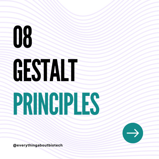
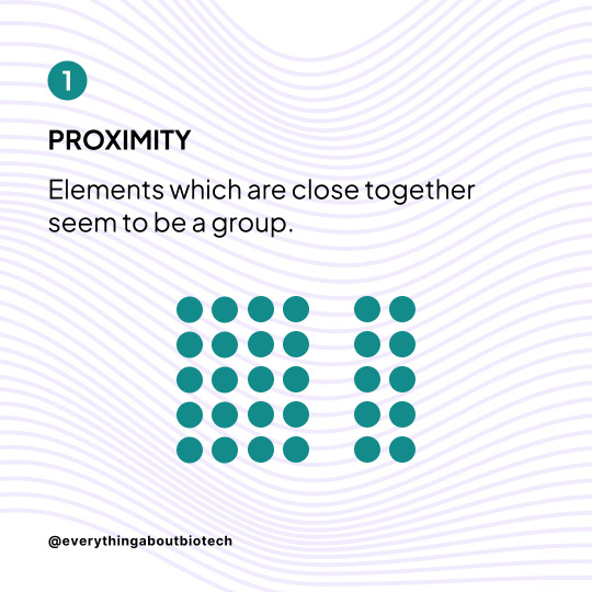
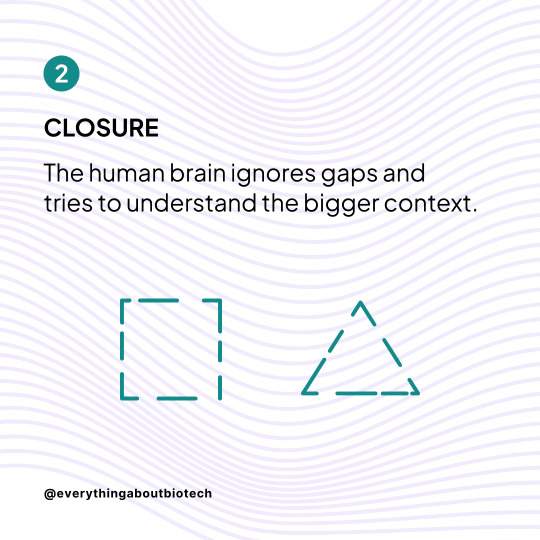

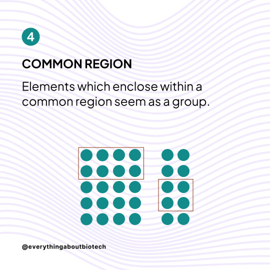
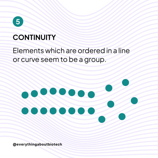
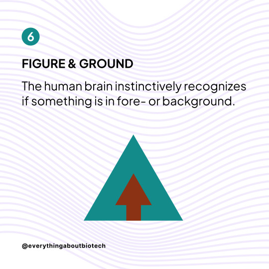
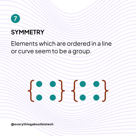
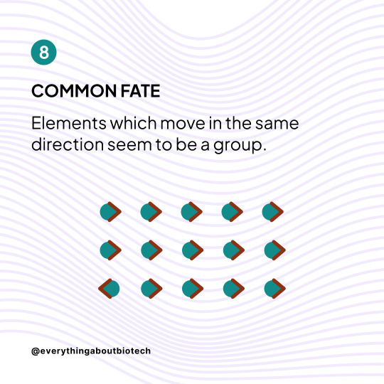

Learn how to use the 8 Gestalt Principles to improve your designs
These Principles determine how people naturally perceive visual elements. If you understand them, you understand how to create better designs.
Follow @everythingaboutbiotech for more useful posts.
#GestaltPsychology#VisualDesign#DesignPrinciples#ClosureInDesign#ProximityPrinciple#SimilarityInDesign#ContinuityDesign#SymmetryBalance#FigureGroundRelationship#GestaltTheory#GroupingPrinciples#VisualOrganization#FormInDesign#DesignHarmony#AestheticsPrinciples#UXDesign#GraphicDesignFundamentals#WebsiteLayout#UserExperience#DesignPsychology
10 notes
·
View notes
Text
12 Essential Design Principles Explained: Your Comprehensive Manual
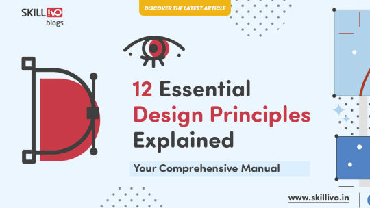
✨ Want to create more impactful designs? Dive into this detailed guide, "12 Essential Design Principles Explained: Your Comprehensive Manual." These principles are crucial, whether you're an experienced designer or just starting your journey.
#DesignPrinciples#GraphicDesign#DesignInspiration#CreativeDesign#DesignGuide#DesignersJourney#DesignTips#LearnDesign#Skillivo#DesignEssentials#WebDeveloper#Designtutorial#SkillivoBlogs
2 notes
·
View notes
Text

Proper Modeling and Material Setup
The starting point for architectural visualization work is modeling and material setup. Using 3D Max, you need to accurately model the building and its surrounding environment and precisely configure the properties of each surface using V-Ray's material editor. In particular, the materials and lighting settings of the building have a significant impact on the final result.
Lighting and Camera Setup
V-Ray allows you to create lighting effects that resemble the real world. Configure natural light, interior lighting, shadows, and other elements precisely to bring realism to your visualization. Also, adjust camera settings to achieve your desired perspective and angles. Consider the camera's focal length and lens type to enhance the visual effects.
Rendering and Post-Processing
During the rendering phase, use V-Ray to generate high-quality images. Rendering time directly affects the quality, so you need to optimize your computer's performance and rendering settings. In the post-processing stage, use software like Photoshop or other image editing tools to fine-tune the image and add necessary effects.
Continuous Practice and Learning
Finally, architectural visualization work requires ongoing practice and learning. Stay updated on new technologies and tools, analyze the work of other artists, and improve your skills. Developing artistic sensibility is essential, and understanding design principles and color theory can be helpful.
Creating architectural visualizations using 3D Max and V-Ray demands effort and practice, but the results can be astonishingly realistic and beautiful. I encourage you to use these software tools to create your own creative works. Thank you.
#Architecture#3DModeling#Visualization#Design#Rendering#Vray#3DMax#Materials#Lighting#Camera#ArchitecturalRendering#Building#NaturalLight#InteriorDesign#Photoshop#PostProcessing#Creativity#Art#DesignPrinciples#ColorTheory#Realism#VirtualReality#VisualEffects#DigitalArt#FineArt#Architect#VisualDesign#Space#Modernism#ArchitecturalDesign
2 notes
·
View notes
Text
UI/UX Design Principles: Crafting User-Friendly Experiences

In an era dominated by digitalization, an application or a website is more than just functionality; it is an experience. The way a user interacts with the digital product affects its success. Do they find it intuitive, amusing, and efficient? Well, UI/UX Design Principles are meant to answer these questions. Learning the principles of UI and UX design is essential for designing interfaces that not only feel right to the eye but are also genuinely user-friendly experiences that keep users going back.
User Interface design is concerned with the visual elements with which users interact (buttons, icons, typography, color schemes), whereas User Experience design covers the entire path a user takes with a product, making sure it is reasonable, fast, and pleasurable to go through. While they are separate disciplines, UI and UX are two sides to the same coin, and a healthy dose of core design principles ensures that the two frameworks blend seamlessly into one.
Why UI/UX Design Principles Are Non-Negotiable
When fundamental design principles are ignored, users are faced with frustratingly hostile experiences. These include:
High Bounce Rate: Users leave quickly when they cannot find what they want.
Less Conversion: Bad conversion leads the users to not do what they are prompted to (like buying or signing for something).
Negative Brand Perception: A stiff interface hammers a brand's online
High Support Costs: Disoriented users will flood the help desk with queries.
On the contrary, strong UI/UX principles suppose higher user satisfaction, enhanced user engagement, and ultimately a successful business.
Core UI/UX Design Principles for User-Friendly Experiences:
1. Consistency:
Principle: Elements, actions, and terminology should remain consistent throughout the entire product.
Why it works: Reduces cognitive load. Users learn how things work in one part of the application and expect the same behavior elsewhere, leading to familiarity and efficiency. Consistent navigation, iconography, and button styles are key.
2. Feedback & Responses:
Principle: Anytime anything happens in the system, users should get the proper feedback within a reasonable time.
Why it works: Users want to know their actions were processed. Visual indicators like loading spinners, success messages, pressed button appearance, and informative error messages convey that the system is responding to their input and keep confusion away.
3. Learnability & Discoverability:
Principle: The design should be easy for the user to learn to operate and to remember how to use, and the functions should be easily discoverable.
Why it works: New users will quickly find out how to operate a product; the returning ones would be able to recall how to perform an action. Clear labeling, intuitive navigation, and progressive disclosure (showing complexity step-by-step) form these bases.
4. Efficiency & Flexibility (Aesthetics & Minimalist Design):
Principle: Good design is aesthetically pleasing and avoids clutter. It provides shortcuts for experienced users and caters to various levels of proficiency.
Why it works: A clean, uncluttered interface is more inviting and less intimidating. Shortcuts empower power users to achieve tasks faster, while clear pathways benefit novices. "Every extra unit of information in an interface competes with the relevant units of information and diminishes their relative visibility." (Nielsen)
5. Error Prevention & Recovery:
Principle: Design systems that prevent errors from occurring in the first place, and if errors do occur, allow users to easily recover.
Why it works: Proactive design (e.g., confirmation prompts for destructive actions, real-time input validation) saves users frustration. Clear, actionable error messages help users understand and fix mistakes.
6. Accessibility:
Principle: Design products that can be used by people of diverse abilities and disabilities.
Why it works: Ensures your product is usable by the widest possible audience, including those with visual, auditory, cognitive, or motor impairments. This includes proper color contrast, keyboard navigation, and screen reader compatibility.
7. User Control & Freedom:
Principle: Users should feel in control of the interface, with clear "exits" and options to undo or redo actions.
Why it works: Empowers users, reduces anxiety, and encourages exploration. Features like "undo," "cancel," and clearly marked back buttons are vital.
Crafting Experiences That Resonate:
Applying these UI/UX design principles is not about beautifying the things; rather, it is about the deep understanding of user psychology and behavior. It is about creating digital products that are functional and enjoyable to use. When designers focus on consistency, clear feedback, learnability, efficiency, error prevention, accessibility, and user control, they are well placed to offer unique and intuitive experiences that will engage people and foster business success in the fulfillment stage in the digital world.
Contact us
Location: Bopal & Iskcon-Ambli in Ahmedabad, Gujarat
Call now on +91 9825618292
Visit Our Website: http://tccicomputercoaching.com/
0 notes
Text
How Everyday Design is Present in Our Lives

Design is problem-solving, and that demands a solid understanding of design.
Throughout a designer's career, their eye tends to become more refined, their process becomes more effective, and this helps them identify the notorious "technical adjustments," popularly known as "gambiarras" (workarounds/kludges).
Are designers really that good at analysis? Well, I tell you that the vast majority can identify a "gambiarras" almost instantly. You must know some designer who likes packaging and criticizes logos when walking down the street, in shopping malls, and when reading menus.
While reading Rick Rubin's book "The Creative Act," I usually jot down some ideas in my notepad so that I can later refine them in Notion. I use this as a kind of backlog so as not to lose sight of any idea or provocation for future study. I was struck by a thought about how people receive creative inputs, how they perceive design, and how this affects their lives. The book makes me think about how sensitive we are to external stimuli, how these stimuli affect us, and how we transform this into baggage for creations, turning these often disconnected threads into something solid. As a designer and curious person, I like to test new experiences and put myself in uncomfortable situations; this, in turn, helps me evolve as a creative.
“Knowledge makes everything simpler.” (Maeda, John)
In an ideal world, everyone should have a minimum understanding of design principles. After learning the basics, everyone could think about the causes and possible corrections for inadequate design, which would help them better appreciate design. Below, I briefly describe the main fundamental design topics that everyone should know, even if superficially.
Unity and Harmony
Relates to the complete design having a sense of oneness and things fitting together, making the design appear unique and consistent in various forms. It can be achieved through perspective, similarity, continuity, repetition, rhythm, and balancing of sides. When well done, one feels it is right, even without understanding why.
Balance
Refers to balancing the composition. It can be achieved through symmetry, asymmetry, radial balance (arranged around a central element), and even mosaic-like structures. An unbalanced design is not visually pleasing.
Hierarchy
One of the most important principles, it guides the user's eye through the elements in order of their importance. More important elements generally have greater visual weight, size, or a different appearance.
Scale and Proportion
The use of the relative size of elements to draw attention to a focal point. Increasing the scale of an element increases its value in terms of hierarchy, while decreasing it reduces its value in the composition. It is linked to contrast.
Consistency
Considered one of the most important principles, it involves the uniformity of sizes, typography, spacing, colors, and layouts. It brings a sense of familiarity from everything seen and makes the artifact, application, or system more consistent.
Contrast
Identifies the difference between opposites. It is used to create scale and proportion, consistency, hierarchy, and to direct the eye. It can be created by colors, sizes, position, spaces, textures (including opacity and depth), density, and structure.
“Try to understand how faulty design happened: try to determine how it could have been done differently.” (Norman, Don)
These principles are considered natural guides for the development of any quality design, as well as intention and purpose. Everyday design is based on how we perceive the world to make the artifacts we use comprehensible, functional, enjoyable, and how it aligns with the form of human perception, helping us identify structures and patterns.
0 notes
Text

👉Read our Daily News📑
📚What are the principals of Graphic Design?🚀
🔗https://dotnetinstitute.com/principles-of-graphic-design/
👨🎓DOTNET Institute
🤙Call us: 011-40040815☎ | 9555871895📱 | 987187640
#GraphicDesign
#DesignPrinciples
#GraphicDesignTips
1 note
·
View note
Text
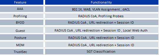

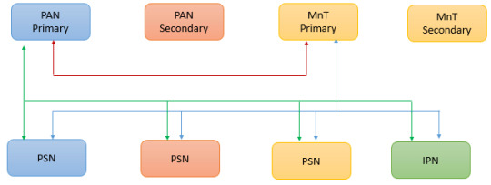
Explore Cisco ISE building blocks and design considerations for robust network security and access management. https://www.dclessons.com/ise-building-blocks-design
0 notes
Text
🎯 Want a Layout That Just Works? Here’s the Secret...
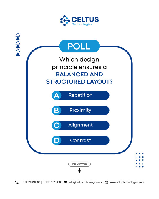
Design isn't just about making things pretty—it’s about making them make sense.
✨ A structured layout speaks louder than flashy graphics.
Let’s play a quick game to see if you know the key! 👇
📌 Poll Time!
Which design principle creates a layout that feels clean, balanced, and easy on the eye?
A) Repetition
B) Proximity
C) Alignment
D) Contrast
💡 When everything lines up just right, your audience feels it—
✅ Clean navigation
✅ Effortless reading flow
✅ Strong brand vibe
✅ Instant trust boost
🎨 Great design isn’t random—it’s intentional.
And alignment? That’s your silent hero. 🙌
👇 Drop your answer in the comments and let’s see who’s got that design eye!
Let’s level up your layouts together! 💬
👉 Visit Our Website: www.celtustechnologies.com
📧 Email: [email protected]
#Design#DesignPrinciples#DesignChallenge#Designer#UserExperienceDesign#GraphicDesignTips#DesignInspiration#BrandDesignStrategy#InstagramPolls#PollTime#CeltusTechnologies#Structured#Repetition#Proximity#Alignment#AlignmentMatters#CreativeMindset#Contrast#Layout
1 note
·
View note
Text
Blog Post #6 - Elements and Principles of Design Scavenger Hunt
https://new.express.adobe.com/publishedV2/urn:aaid:sc:VA6C2:2d695334-bfaa-49d7-9080-20154f80b3e7?promoid=Y69SGM5H&mv=other
0 notes
Text
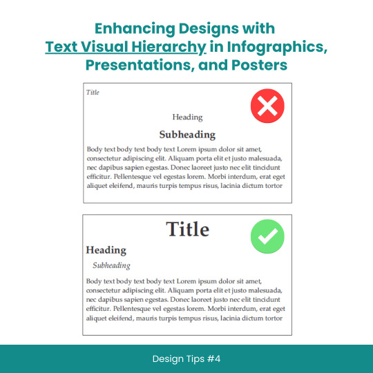
Enhancing Designs with Text Visual Hierarchy in Infographics, Presentations, and Posters
#scicomm#sciencecommunication#VisualHierarchy#TextHierarchy#Typography#InfographicDesign#PresentationDesign#PosterDesign#Layouts#Fonts#Contrast#Alignment#DesignTips#DesignPrinciples#GraphicDesign#WebDesign#PrintDesign#CreativeProcess#DesignInspiration#DesignCommunity#DesignThinking#GoodDesign#EffectiveDesign#DesignMatters
8 notes
·
View notes
Text
WOII: Week 1 - Phenomenology
Today's session explored phenomenology through shadows and time, focusing on how perception is shaped by lived experience. Using photography and drawing, I examined how light and shadow are not just visual elements, but also emotional and embodied experiences.
Phenomenology emphasizes how we experience the world through perception, highlighting subjective experience over objective truths. In design, this is critical, as it deepens engagement with how users interpret visual elements. Shadows, for example, carry emotional weight beyond their visual form, shaped by time and memory. In my photographic work, I noticed how shadows shift throughout the day, reflecting time's fluidity. This aligns with Merleau-Ponty’s idea of embodied perception, suggesting that our experience is always mediated by consciousness (Merleau-Ponty 213). Kandinsky’s theories on abstraction also show how visual elements transcend their physical form to evoke emotions (Kandinsky 89), a key understanding for designers.
The drawing exercise connected these ideas to design practice. By representing literal shadows, I revealed deeper meanings absence, identity, and the passage of time concepts designers can use to communicate beyond the surface. Paula Scher’s typography demonstrates how form and layout influence perception, much like shadows shape space (Scher 45). Giorgio de Chirico’s surrealist works use exaggerated shadows to create a dreamlike atmosphere, emphasizing the storytelling power of light and form (de Chirico 102). Phenomenology teaches that design is not just about aesthetics but also about the emotional and experiential responses it evokes.
Total word count: 253 Words


------------------------------------------------------------------------------
Works Cited
de Chirico, Giorgio. The Enigma of Arrival and the Afternoon. Thames & Hudson, 1995.
Husserl, Edmund. The Phenomenology of Internal Time-Consciousness. Translated by James S. Churchill, Indiana University Press, 1964.
Kandinsky, Wassily. Point and Line to Plane. Translated by Howard Dearstyne and Hilla Rebay, Dover Publications, 1979.
Merleau-Ponty, Maurice. Phenomenology of Perception. Translated by Donald A. Landes, Routledge, 2013.
Scher, Paula. Make It Bigger. Princeton Architectural Press, 2005.
------------------------------------------------------------------------------
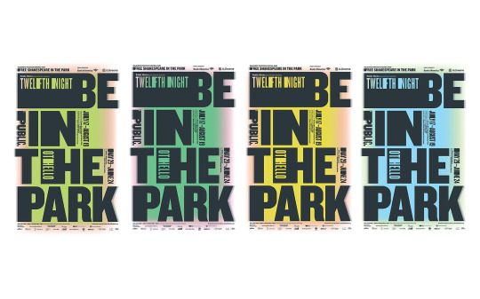
Paula Scher – "Shakespeare in the Park" Poster Series

Giorgio de Chirico – "The Enigma of the Arrival and the Afternoon"
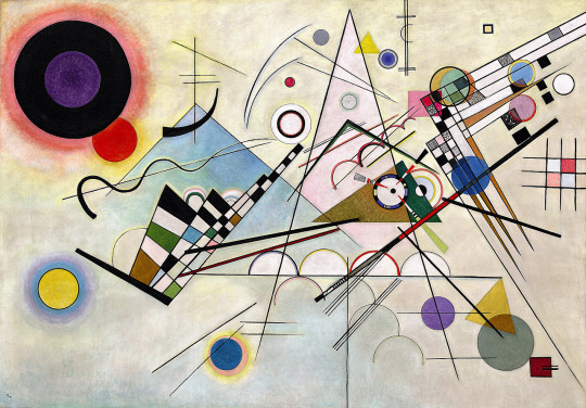
Kandinsky – "Composition VIII"
#Phenomenology#ShadowsAndTime#EmotionalDesign#TypographyDesign#AbstractArt#Kandinsky#CompositionVIII#Surrealism#DeChirico#TheEnigmaOfArrival#PaulaScher#ShakespeareInThePark#DesignAndPerception#EmbodiedExperience#DesignPrinciples#LightAndShadow#VisualCommunication#CulturalMeaning#ArtAndDesign#InterpretationInDesign#EmotionalResponse#SubjectiveExperience#PerceptionInArt#TypographicExpression#ArtisticPerception#FormAndMeaning#DesignForEmotion#SpaceAndPerception#MemoryInDesign#TimeAndDesign
0 notes
Text
Learn Visual Design Terms - Infographic
Visual design principles enhance aesthetics and usability. Contrast creates distinction, repetition reinforces consistency, proximity groups related elements, scale emphasises importance, hierarchy guides attention, balance ensures stability, symmetry provides harmony, alignment organises, and white space improves readability.
In this blog post, we will investigate the key visual design terms used by edit video editors, graphic designers and web designers.

Download Infographic
In this infographic post, we’ll have a closer look at common visual design terms so you get a better understanding of how to layout content for website design and print design.
01. Contrast

Contrast enhances visual interest by making elements stand out. It improves readability, creates hierarchy, guides attention, and adds depth. Strong contrast ensures clarity, making designs more engaging, accessible, and aesthetically appealing.
02. Repetition

Repetition reinforces consistency by using recurring elements like colours, fonts, and patterns. It enhances brand identity, strengthens visual cohesion, improves user experience, and creates a sense of unity in design.
03. Proximity

Proximity groups related elements together, improving organisation and readability. It enhances visual hierarchy, reduces clutter, strengthens relationships between elements, and guides users’ focus, creating a cleaner, more intuitive, and effective design.
04. Scale

Scale enhances visual hierarchy by adjusting element sizes to indicate importance. It guides attention, creates emphasis, adds depth, and improves readability, making designs more dynamic, engaging, and easy to navigate.
05. Hierarchy

Hierarchy organises design elements to guide the viewer’s attention. It improves readability, prioritises information, enhances user experience, and ensures a clear visual flow, making content easier to understand and navigate effectively.
06. Balance

Balance creates visual stability by distributing elements evenly. It enhances aesthetics, improves readability, ensures harmony, and provides a structured layout, making designs feel more organised, professional, and visually appealing.
07. Symmetry

Symmetry creates harmony by evenly distributing elements around a central axis. It enhances balance, improves aesthetics, provides a sense of order, and makes designs feel more stable, professional, and visually pleasing.
08. Alignment

Alignment ensures visual organisation by positioning elements correctly. It enhances readability, creates a structured layout, improves consistency, strengthens relationships between elements, and makes designs look clean, professional, and aesthetically cohesive.
09. White Space

White space enhances readability by giving elements room to breathe. It improves focus, creates a clean layout, reduces visual clutter, strengthens hierarchy, and makes designs feel more elegant, professional, and visually appealing.
Did you find it helpful?

Conclusion
Mastering visual design principles is essential for creating compelling and effective designs. By applying contrast, repetition, proximity, scale, hierarchy, balance, symmetry, alignment, and white space, graphic and web designers can enhance aesthetics, improve usability, and guide user interaction.
These elements work together to create visually appealing, structured, and engaging designs that communicate messages clearly. Whether designing for print or digital platforms, understanding and implementing these principles will lead to more professional and impactful results.
First published: https://dcpweb.co.uk/blog/learn-visual-design-terms
0 notes
Text
Master the art of logo design with this step-by-step beginner’s guide. Learn the essential principles behind creating a memorable logo, from conceptualizing ideas to final execution. This guide covers the key elements of design, including color theory, typography, and shapes, while providing practical tips on using design software. Whether you're starting your design career or refining your skills, this guide will help you craft professional logos that stand out.
#LogoDesign#GraphicDesign#DesignGuide#LogoCreation#Typography#DesignPrinciples#Branding#DesignSoftware#CreativeDesign#BeginnerGuide
0 notes
Text
5 Interesting Steps to Build a Successful Website
Building a successful website involves more than just putting together a few pages and hitting publish. It requires thoughtful planning, strategic execution, and ongoing optimization. Whether you’re creating a site for your business or personal use, here are five interesting and essential steps to guide you through the process, with a special mention of how Jalip Solutions can help you achieve your goals.
1. Define Clear Objectives and Audience
Before diving into design and development, it’s crucial to define what you want to achieve with your website and understand who your target audience is.
Why It Matters:
Purposeful Design: Knowing your objectives helps you design a site that aligns with your goals, whether it’s generating leads, showcasing a portfolio, or selling products.
Tailored Content: Understanding your audience allows you to create content that resonates with them, increasing engagement and effectiveness.
How to Do It:
Set Specific Goals: Are you looking to increase sales, build brand awareness, or provide information? Clearly outline these goals.
Identify Your Audience: Create user personas representing your ideal visitors. Consider their needs, preferences, and behaviors.
Example: For a website developed by Jalip Solutions, if you’re launching an e-commerce site, you might focus on goals like enhancing user experience and increasing conversion rates.
2. Craft a User-Centric Design
Designing with the user in mind is critical for creating a site that is both visually appealing and functional.
Why It Matters:
Enhanced Usability: A well-designed site improves navigation and user experience, making it easier for visitors to find what they need.
Increased Engagement: A visually attractive site can capture users’ attention and encourage them to stay longer.
How to Do It:
Follow Design Principles: Use principles like hierarchy, contrast, and alignment to guide users’ attention.
Implement Responsive Design: Ensure your website looks great and functions well on all devices, from desktops to smartphones.
Example: At Jalip Solutions, we focus on creating responsive designs that adapt seamlessly to any device, ensuring your website delivers a consistent experience across all platforms.
3. Optimize for Performance and Speed
A slow-loading website can frustrate users and hurt your search engine rankings. Performance optimization is key to maintaining a smooth user experience.
Why It Matters:
User Retention: Fast load times help keep visitors on your site, reducing bounce rates and improving user satisfaction.
SEO Benefits: Search engines like Google factor page speed into their rankings, so faster sites have a better chance of ranking higher.
How to Do It:
Compress Images: Use tools to reduce image sizes without sacrificing quality.
Minimize Code: Optimize your HTML, CSS, and JavaScript to reduce file sizes and improve load times.
Use Caching: Implement caching strategies to speed up load times for returning visitors.
Example: Jalip Solutions employs various optimization techniques to ensure your website not only looks great but performs efficiently, providing an excellent experience for your visitors.

4. Implement Effective SEO Strategies
Search Engine Optimization (SEO) is essential for driving organic traffic to your site. Effective SEO helps improve your visibility in search engine results.
Why It Matters:
Increased Traffic: Higher search engine rankings lead to more visibility and potential visitors.
Better User Experience: SEO practices often enhance the overall user experience, such as improving site navigation and content quality.
How to Do It:
Conduct Keyword Research: Identify relevant keywords and integrate them naturally into your content.
Optimize On-Page Elements: Ensure meta titles, descriptions, headers, and alt texts are optimized for your target keywords.
Build Quality Backlinks: Earn backlinks from reputable sites to improve your domain authority.
Example: Jalip Solutions offers comprehensive SEO services to help boost your site’s ranking and attract more traffic, ensuring your site reaches the right audience.

5. Monitor and Analyze Performance
Ongoing monitoring and analysis are crucial for understanding how your website performs and making data-driven improvements.
Why It Matters:
Continuous Improvement: Regular analysis helps you identify areas for improvement and adapt to changing user needs or trends.
Informed Decisions: Data-driven insights allow you to make informed decisions about content, design, and marketing strategies.
How to Do It:
Use Analytics Tools: Implement tools like Google Analytics to track visitor behavior, traffic sources, and conversion rates.
Gather User Feedback: Collect feedback through surveys or usability tests to gain insights into user experiences.
Monitor Key Metrics: Keep an eye on metrics like bounce rate, average session duration, and conversion rates to assess your site’s performance.
Example: Jalip Solutions uses advanced analytics to monitor and optimize your website’s performance, helping you make informed decisions and continuously improve your site.
By following these steps—defining clear objectives, crafting a user-centric design, optimizing for performance, implementing SEO strategies, and monitoring performance—you’ll be well on your way to building a successful and effective website. Each step plays a vital role in ensuring that your site not only attracts visitors but also meets their needs and achieves your goals. For tailored solutions and expert guidance, Jalip Solutions is here to help you every step of the way.
#WebsiteGoals#TargetAudience#UserPersona#BusinessObjectives#WebDesignStrategy#UserExperience#WebsiteDesign#ResponsiveDesign#WebUsability#DesignPrinciples#WebsiteSpeed#PerformanceOptimization#PageLoadTime#ImageCompression#WebPerformance#SearchEngineOptimization#SEO#KeywordResearch#OnPageSEO#BacklinkStrategy#WebsiteAnalytics#PerformanceTracking#UserFeedback#DataDrivenDecisions#SiteMetrics#WebDevelopment#DigitalMarketing#JalipSolutions#SuccessfulWebsite#WebDesignTips
1 note
·
View note
Text
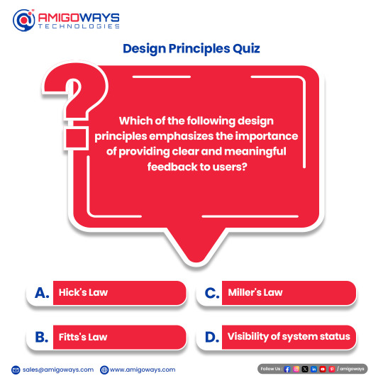
Which of the following design principles emphasizes the importance of providing clear and meaningful feedback to users?
a) Hick's Law b) Fitts's Law c) Miller's Law d) Visibility of system status
#DesignPrinciples#DesignPrinciplesQuiz#followme#followforfollow#instadaily#follow4follow#like4like#letsconnect#amigowayspoll#amigoways#UserExperience#FeedbackMatters#UXDesign#InteractiveDesign#SystemStatus#DigitalDesign#UXPrinciples#DesignThinking#UIUX
1 note
·
View note
Text
Scope Computers
Graphic Design
(JOIN NOW)
Contact us: 8560000535

"Unlock Your Creativity: Graphic Design Training"
Embark on an exciting journey into the realm of graphic design with our comprehensive training program. Whether you're a beginner looking to explore your creative potential or an experienced designer aiming to refine your skills, our course offers something for everyone.
Through a series of engaging modules, you'll learn the fundamental principles of graphic design, including typography, color theory, layout design, and image manipulation. Our expert instructors will guide you through hands-on projects and practical exercises, providing valuable feedback to help you grow and improve.
By the end of the program, you'll have gained the knowledge and confidence to tackle real-world design challenges with ease. Whether you're interested in pursuing a career in graphic design or simply want to enhance your skills for personal projects, our training will empower you to bring your creative visions to life.
Key topics covered in our training include:
- Understanding design principles and elements
- Mastering design software such as Adobe Photoshop, Illustrator, and InDesign
- Creating compelling compositions through effective layout design
- Exploring the use of color and typography to convey messages
- Developing proficiency in photo editing and manipulation techniques
- Building a professional portfolio to showcase your work
Join us and unleash your creativity as you dive into the exciting world of graphic design!
#GraphicDesignTraining#DesignSkills#CreativeJourney#DesignPrinciples#AdobeSoftware#LayoutDesign#ColorTheory#Typography#PhotoEditing#CreativePortfolio#DesignEducation#VisualCommunication#CreativeSkills#DesignWorkshops#DigitalDesign#ArtisticDevelopment#GraphicDesigners#CreativeCommunity#DesignInspiration
0 notes