#flexbox form
Explore tagged Tumblr posts
Visit Tumblr Blog
Explore Tumblr blogs with no restrictions, modern design and the best experience.
Last Seen Tumblr Blogs


Fun Fact
Average visit duration of Tumblr.com is 10 mins and 25 secs.
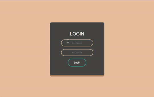
Text

CSS Flexbox Responsive Login Form
#html css form#responsive form#css flexbox layout#css flexbox examples#responsive form design#flexbox form#flexbox layout#learn to code#html css#code#frontenddevelopment#divinectorweb#webdesign
1 note
·
View note
Text
i would like to formally inform the developers of html/css: i hate you forever and ever and ever and ever and you are NOT invited to my birthday party. i hope your pet rock dies
#cs50web why... why would you do this to me...#i was but a little fawn and you set me out to die in the stalking woods when i had barely learned to stand on my own flimsy legs...#<-he has to make a google.com clone for his project 0 in cs50web and is Struggling to Center The Damn Divs Relative To Each Other#🌙rambling#wait. why don't i just put the stupid heading inside of the div that contains the form#allow me one moment#will report#// update: no.#// update: i love flexbox
22 notes
·
View notes
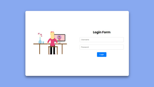
Text
Revamp Old Webpages | #2
Tuesday 17th October 2023
Continuing from yesterday's post on the project, I've working on old website #2 which is called 'Beta-Peach-Brown-Login-Form' or 'Beta' for short! There wasn't too much to change on her (yes all of my projects are girls) visually but just sorted some code structuring! Again, didn't want to change the visuals of the old projects too much as it's lowkey nostalgic to me~!
Also want to highlight what @indigotech mentioned that it is important to go over old projects so see how far we've come. That's why it's important to build as many projects as we can!
Link to project: live page | github repo ♡

🛠️ Issues
✘ switched the positioning method to the flex method to center the form in the middle of the page ✘ click the login button and error appears - attributes to the form tag
🏆 Fixes
✔ Added flexbox in ✔ Added required to the input elements ✔ Responsive on other devices ✔ Added the colours in a :root so no repeat of colour codes

⤷ ♡ my shop ○ my mini website ○ pinned ○ navigation ♡
#xc: project logs#revamp old websites project#codeblr#coding#progblr#programming#studyblr#studying#computer science#tech#dev logs#comp sci#programmer#devlogs
17 notes
·
View notes
Text
Learn HTML and CSS: A Comprehensive Guide for Beginners
Introduction to HTML and CSS
HTML (HyperText Markup Language) and CSS (Cascading Style Sheets) are the core technologies for creating web pages. HTML provides the structure of the page, while CSS defines its style and layout. This guide aims to equip beginners with the essential knowledge to start building and designing web pages.
Why Learn HTML and CSS?
HTML and CSS are fundamental skills for web development. Whether you're looking to create personal websites, start a career in web development, or enhance your current skill set, understanding these technologies is crucial. They form the basis for more advanced languages and frameworks like JavaScript, React, and Angular.
Getting Started with HTML and CSS
To get started, you need a text editor and a web browser. Popular text editors include Visual Studio Code, Sublime Text, and Atom. Browsers like Google Chrome, Firefox, and Safari are excellent for viewing and testing your web pages.
Basic HTML Structure
HTML documents have a basic structure composed of various elements and tags. Here’s a simple example:
html
Copy code
<!DOCTYPE html>
<html>
<head>
<title>My First Web Page</title>
<link rel="stylesheet" type="text/css" href="styles.css">
</head>
<body>
<h1>Welcome to My Web Page</h1>
<p>This is a paragraph of text on my web page.</p>
</body>
</html>
: Declares the document type and HTML version.
: The root element of an HTML page.
: Contains meta-information about the document.
: Connects the HTML to an external CSS file.
: Contains the content of the web page.
Essential HTML Tags
HTML uses various tags to define different parts of a web page:
to : Headings of different levels.
: Paragraph of text.
: Anchor tag for hyperlinks.
: Embeds images.
: Defines divisions or sections.
: Inline container for text.
Creating Your First HTML Page
Follow these steps to create a simple HTML page:
Open your text editor.
Write the basic HTML structure as shown above.
Add a heading with the tag.
Add a paragraph with the tag.
Save the file with a .html extension (e.g., index.html).
Open the file in your web browser to view your web page.
Introduction to CSS
CSS is used to style and layout HTML elements. It can be included within the HTML file using the <style> tag or in a separate .css file linked with the <link> tag.
Basic CSS Syntax
CSS consists of selectors and declarations. Here’s an example:
css
Copy code
h1 {
color: blue;
font-size: 24px;
}
Selector (h1): Specifies the HTML element to be styled.
Declaration Block: Contains one or more declarations, each consisting of a property and a value.
Styling HTML with CSS
To style your HTML elements, you can use different selectors:
Element Selector: Styles all instances of an element.
Class Selector: Styles elements with a specific class.
ID Selector: Styles a single element with a specific ID.
Example:
html
Copy code
<!DOCTYPE html>
<html>
<head>
<title>Styled Page</title>
<link rel="stylesheet" type="text/css" href="styles.css">
</head>
<body>
<h1 class="main-heading">Hello, World!</h1>
<p id="intro">This is an introduction paragraph.</p>
</body>
</html>
In the styles.css file:
css
Copy code
.main-heading {
color: green;
text-align: center;
}
#intro {
font-size: 18px;
color: grey;
}
CSS Layout Techniques
CSS provides several layout techniques to design complex web pages:
Box Model: Defines the structure of an element’s content, padding, border, and margin.
Flexbox: A layout model for arranging items within a container, making it easier to design flexible responsive layouts.
Grid Layout: A two-dimensional layout system for more complex layouts.
Example of Flexbox:
css
Copy code
.container {
display: flex;
justify-content: space-around;
}
.item {
width: 100px;
height: 100px;
background-color: lightblue;
}
Best Practices for Writing HTML and CSS
Semantic HTML: Use HTML tags that describe their meaning clearly (e.g., , , ).
Clean Code: Indent nested elements and use comments for better readability.
Validation: Use tools like the W3C Markup Validation Service to ensure your HTML and CSS are error-free and standards-compliant.
Accessibility: Make sure your website is accessible to all users, including those with disabilities, by using proper HTML tags and attributes.
Free Resources to Learn HTML and CSS
W3Schools: Comprehensive tutorials and references.
MDN Web Docs: Detailed documentation and guides for HTML, CSS, and JavaScript.
Codecademy: Interactive courses on web development.
FreeCodeCamp: Extensive curriculum covering HTML, CSS, and more.
Khan Academy: Lessons on computer programming and web development.
FAQs about Learning HTML and CSS
Q: What is HTML and CSS? A: HTML (HyperText Markup Language) structures web pages, while CSS (Cascading Style Sheets) styles and layouts the web pages.
Q: Why should I learn HTML and CSS? A: Learning HTML and CSS is essential for creating websites, understanding web development frameworks, and progressing to more advanced programming languages.
Q: Do I need prior experience to learn HTML and CSS? A: No prior experience is required. HTML and CSS are beginner-friendly and easy to learn.
Q: How long does it take to learn HTML and CSS? A: The time varies depending on your learning pace. With consistent practice, you can grasp the basics in a few weeks.
Q: Can I create a website using only HTML and CSS? A: Yes, you can create a basic website. For more complex functionality, you'll need to learn JavaScript.
Q: What tools do I need to start learning HTML and CSS? A: You need a text editor (e.g., Visual Studio Code, Sublime Text) and a web browser (e.g., Google Chrome, Firefox).
Q: Are there free resources available to learn HTML and CSS? A: Yes, there are many free resources available online, including W3Schools, MDN Web Docs, Codecademy, FreeCodeCamp, and Khan Academy.
#how to learn html and css#html & css course#html & css tutorial#html and css#html course#html css tutorial#html learn#html learn website#learn html#learn html and css#html and css course#html and css full course#html and css online course#how to learn html and css for beginners
3 notes
·
View notes
Text
At the stage of unemployment where I'm seeing if I can build our whole wedding website from scratch just to feel useful, even though free wedding websites are like a whole streamlined industry now. But also my ability to build forms and fuck around with flexbox is roughly at the level of the worst theknot dot com templates, lol
4 notes
·
View notes
Text

📰 CSS Landscape 2024 #5: Fresh updates from Firefox 124 & Chrome 123 focusing on new CSS properties. Dive into articles, tutorials & videos on accessible forms, text emphasis, color preferences, animations & flexbox. Stay tuned! → https://freefrontend.com/css-landscape-2024-04-12/
5 notes
·
View notes
Text
Choosing Between Flexbox and Grid for Your Basic Layout Structure

Introduction
Beyond the aesthetics of web design, the choice of layout structure forms the backbone of a project's responsiveness and adaptability. At the heart of this decision lie two powerful CSS tools: Flexbox and Grid. These elements are more than mere design choices; they dictate how a webpage responds to different screen sizes and user interactions, impacting usability and visual appeal.
Understanding the Basics

Flexbox: Flexbox is a one-dimensional layout model best suited for organizing items within a container, offering flexibility in managing space distribution, alignment, and order. Its strength lies in its ability to handle complex layouts while maintaining simplicity in code structure. Grid: Grid is a two-dimensional layout system that creates a grid-based design, allowing precise placement and alignment of elements in rows and columns. Its advantages include fine control over both the rows and columns, making it ideal for overall page structure and layout alignment. Both Flexbox and Grid can be effectively utilized for basic layouts by structuring a header, main content area, and footer with distinct approaches tailored to their strengths.
Comparative Analysis

Flexbox Pros: - Efficient for arranging elements in a single direction, vertically or horizontally. - Great for small-scale layouts like navigation menus or individual components within a page. - Simplified syntax and intuitive approach make it easier to learn and use. Cons: - Complex layouts might require nested flex containers, leading to potential complications. - Challenges in controlling the alignment of both rows and columns simultaneously. Suitable Scenarios: Ideal for smaller, simpler layouts or for organizing elements in one direction, such as in menus or single-axis content layouts. Grid Pros: - Perfect for managing both rows and columns simultaneously, enabling more precise layouts. - Best for complex and multi-dimensional layouts, especially entire page structures. - Offers fine control over placement, making it suitable for responsive designs. Cons: - Complexity in understanding and implementing for beginners due to its comprehensive grid structure. - Not as effective for single-axis layouts compared to Flexbox. Suitable Scenarios: Best suited for larger-scale layouts or designs that demand strict control over both rows and columns, like entire webpage structures or responsive grid systems.
Usage Scenarios

Flexbox Scenarios Where Flexbox Shines: - Small-Scale Components: Flexbox excels in organizing smaller elements within a webpage, like menus, buttons, or individual sections. - Single-Direction Layouts: It's perfect for arranging elements in a single direction, simplifying the structure for one-dimensional layouts. - Mobile-First Designs: Ideal for mobile-responsive designs where content needs to adapt to smaller screens with straightforward layout adjustments. Grid Scenarios Distinct Advantages of Grid: - Full-Page Layouts: Grid is optimal for structuring entire pages, managing complex alignments in multiple directions (rows and columns). - Multi-Dimensional Layouts: Perfect for designs that require precision in both row and column placement, ensuring a cohesive and responsive layout. - Responsive Grid Systems: Offers extensive control for building responsive grid systems that adapt seamlessly across various screen sizes.
Responsiveness and Adaptability
Flexbox and Responsiveness Catering to Responsive Design: Flexbox simplifies responsiveness by allowing elements to adjust based on available space and container size. It facilitates flexible resizing of components within a single direction, aiding in responsive designs. Adaptability in Viewport Sizes: Flexbox is particularly suitable for smaller devices where elements need to flexibly adjust in a single axis, making it easier to adapt content to varying viewport sizes. Grid and Responsiveness Catering to Responsive Design: Grid systems provide a more comprehensive approach to responsiveness by allowing precise control over both rows and columns, enabling intricate adjustments for various screen sizes. Adaptability in Viewport Sizes: Grid excels in handling complex layouts across different viewport sizes, ensuring elements maintain their specified placement and alignment in both axes, enhancing adaptability in various screen sizes.
Best Practices and Recommendations
Choosing Between Flexbox and Grid When to Choose Flexbox: Opt for Flexbox when dealing with simpler, single-direction layouts or smaller components within a webpage. It's ideal for basic layouts requiring flexibility in one axis. When to Choose Grid: Prefer Grid for more complex, multi-dimensional layouts or when structuring entire pages. Choose it when precise control over both rows and columns is necessary. Combining Flexbox and Grid Effective Combination: Consider using Flexbox within specific sections or components within a grid-based layout. For instance, employing Flexbox to organize elements within grid-defined areas can harness the strengths of both techniques. Hybrid Approach: Experiment with combining both Flexbox and Grid to achieve optimal results. For instance, using Flexbox for header and footer elements while implementing Grid for the main content area can leverage the strengths of each method within a single layout.
Real-world Application
Flexbox in Real Projects Project Example: Portfolio Website In a portfolio website, Flexbox was utilized to arrange sections within the main content area. Each project section was organized in a single direction, allowing for easy adaptation to various screen sizes. This choice enhanced responsiveness, especially for mobile devices, providing a seamless browsing experience. Grid in Real Projects Project Example: E-commerce Platform An e-commerce platform used Grid to structure its product listings and category sections. The complex layout demanded precise alignment in both rows and columns, ensuring scalability across different viewport sizes. This choice significantly improved the scalability and responsiveness of the platform, offering a consistent and visually appealing layout.
Conclusion
Flexbox and Grid stand as powerful tools in the realm of web design, each offering distinct advantages based on the nature of the layout and design requirements. Distinguishing Factors: Flexbox excels in simpler, single-direction layouts and smaller components, offering flexibility and ease of use. On the other hand, Grid shines in complex, multi-dimensional layouts, providing precise control over both rows and columns. Significance of Choosing the Right Layout: The choice of layout structure forms the foundation of a project's scalability and responsiveness. A well-thought-out decision between Flexbox and Grid, or a strategic combination of both, is pivotal in ensuring a website's adaptability across various devices and screen sizes. Read the full article
2 notes
·
View notes
Text
Tried Every Major AI Model for Frontend Coding Only One Truly Delivered.
Let’s face it. As web developers, we’re all chasing the dream of faster, smarter, and more efficient coding. After all, the clock’s ticking, and there’s always more to build. Enter AI. You’ve probably heard all the buzz—AI tools that promise to help us write code faster, debug smarter, and even suggest better practices.
So, I did what any curious developer would do: I tested every major AI model for frontend coding. The verdict? Only one truly delivered. Spoiler alert: it wasn’t the one you might expect.

Let’s break it down.
The AI Hustle: The Tools I Tested GitHub Copilot – The AI-powered sidekick that lives inside Visual Studio Code, claiming to write code for you based on context.
ChatGPT – The famous conversational AI that answers all your questions and generates code snippets on demand.
Tabnine – The autocomplete tool that promises to help you code faster by suggesting relevant code as you type.
Kite – More of a Python fan favorite, but I thought I’d give it a shot for frontend tasks.
IntelliCode (Visual Studio) – Microsoft’s answer to AI code suggestions, integrated right into Visual Studio.
GitHub Copilot: Feels Like Magic—Until It’s Not At first, GitHub Copilot felt like something straight out of a developer’s dreams. You start typing, and bam—there it is: a perfectly crafted function, just like you wanted. For straightforward tasks like creating forms, loops, or boilerplate code? Copilot is on fire.
But… here’s the kicker:
The Caveat: When things got more complex—like building dynamic React components, handling state, or trying to integrate with APIs—Copilot just couldn’t keep up. It would suggest solutions that didn’t align with my project’s unique needs.
Code Quality: While the code worked, I often found myself rewriting it. It wasn’t exactly best practice material.
Don’t get me wrong—if you're cranking out basic pages or static HTML, Copilot is your friend. But for anything more nuanced? Not so much.
ChatGPT: Close, But Missing the Magic Touch I was honestly pretty pumped to try ChatGPT for frontend coding. It could explain things, generate code snippets, and even walk me through complex concepts. Plus, it was fast. But… as much as I loved it for learning and brainstorming, there were some glaring problems:
The “Old-School” Problem: Sometimes, ChatGPT would suggest outdated methods or libraries that were no longer considered best practice. So while it was fast, it wasn’t always on the cutting edge.
Context? What’s That?: ChatGPT is fantastic at answering questions, but it’s like that friend who has one really good idea and sticks to it. If you’re trying to build something specific, like a responsive navbar with flexbox and media queries, it often needed a bit of extra clarification from me.
Here’s the thing: ChatGPT can absolutely help with quick fixes or answering questions about web development. But when I needed it to generate more complex, customized code? It wasn’t perfect.
Tabnine: Fast, But Feels Like Auto-Pilot Tabnine was the next tool I dove into. It’s designed to speed up your workflow by predicting what you want to write and giving you the perfect code snippet. When it worked, it was like a breath of fresh air.
The Speed Factor: For simple functions or repetitive CSS rules, Tabnine sped up my workflow dramatically.
The Problem: But the minute I started getting into custom JavaScript components or more involved frontend logic, Tabnine became… well, a bit too generic. It felt like I was getting the same suggestions over and over. The more unique or specific the task, the more irrelevant the suggestions became.
So yeah, Tabnine is great when you’re doing basic stuff. But when you need it to adapt to your project’s unique context? Not so much.
Kite: More Python, Less Frontend Now, Kite is a popular AI assistant for Python developers. But hey, why not try it for frontend, right?
Turns out, that was a bad idea.
Wrong Fit for the Job: Kite’s suggestions were often off-track when it came to JavaScript, React, or even CSS. It’s not that it was a bad tool; it’s just not built for the frontend world.
Learning Curve: The lack of deep web development intelligence meant that Kite often gave me Python-flavored suggestions that weren’t very helpful.
If you're coding in Python, Kite’s your jam. But for frontend tasks? It felt like I was trying to put a square peg in a round hole.
IntelliCode (Visual Studio): A Little Too C#-Centric IntelliCode is another tool that’s integrated into Visual Studio. It’s solid—if you’re a C# developer. But I was working with JavaScript and React. Here’s how it went down:
Solid, But Static: IntelliCode tried to help, but it mostly focused on C# coding patterns. When it did suggest something for JavaScript, it felt like it was trying to adapt to a framework it didn’t really understand.
Not Frontend-Friendly: The AI behind IntelliCode just didn’t seem to “get” the way frontend development works, especially with React or complex HTML/CSS layouts.
If you’re in the Microsoft ecosystem, IntelliCode will help, but it won’t make you a frontend wizard.
And the Winner Is… ChatGPT (With a Twist) Here’s the plot twist: ChatGPT came out on top.
But before you roll your eyes, let me explain.
Here’s Why ChatGPT Works:
It’s Flexible: ChatGPT adapts to your needs. Whether I needed help with React state management, CSS animations, or even troubleshooting a weird bug, ChatGPT could jump in and help.
It Explains, Don’t Just Autocomplete: The real beauty of ChatGPT is that it doesn’t just give you code—it explains it. I could ask it to explain the difference between useEffect and useLayoutEffect, and it would break it down for me.
Context-Aware: While it still has room to improve, ChatGPT is surprisingly good at understanding your project’s flow, especially if you’re clear about what you need.
Pro Tip: Don’t rely on ChatGPT to write your code from start to finish. Treat it like a coding assistant—ask for help when you’re stuck or need a quick answer, then tweak the code to make it your own.
Final Thoughts: AI Isn’t Here to Replace Developers (Yet) It’s clear that AI tools aren’t perfect—yet. GitHub Copilot speeds up basic coding, Tabnine is great for fast suggestions, and IntelliCode can help if you’re in the Microsoft world. But for frontend development, ChatGPT emerged as the true game-changer.
The secret? ChatGPT is not just a code generator—it’s a powerful assistant that can teach you, help you troubleshoot, and give you contextual advice. It can’t replace your creativity or problem-solving skills, but it can certainly amplify them.
So, what’s the takeaway here? If you’re serious about AI tools for frontend development, ChatGPT is your best bet. Embrace it, and let it be the sidekick you always wished for.
0 notes
Text
Gemrud AI - Landing Page
Live Demo | Buy Now
A modern, responsive landing page for Gemrud AI - showcasing advanced artificial intelligence solutions for business

Features
Modern Design: Clean, professional interface with gradient accents
Dark/Light Mode: Toggle between themes with smooth transitions
Responsive Layout: Optimized for all device sizes
Interactive Elements: Smooth animations and hover effects
Modal System: Sign-in and sign-up modals with form validation
AI-Themed Visuals: Animated grid showcasing AI technologies

Technologies Used
HTML5: Semantic markup structure
CSS3: Modern styling with CSS Grid, Flexbox, and custom properties
JavaScript (ES6+): Interactive functionality and animations
Font Awesome: Icon library for UI elements
Google Fonts: Poppins and Montserrat typography

Interactive Elements
Smooth hover transitions
Animated loading states
Ripple click effects
Floating animations on AI grid
Theme Management
Dark/Light mode toggle
Theme preference persistence

Responsive Breakpoints
Desktop: 1200px and above
Tablet: 768px - 1199px
Mobile: Below 768px
Live Demo | Buy Now
#css#html#html css#htmlcoding#js#landing page#landing page builder#landing page design#landing pages#panel
0 notes
Text
The Future of Front-End Development: Technologies, Trends, and Services in 2025
Front-end development plays a crucial role in how users interact with websites and applications. The user experience (UX), speed, and responsiveness of a website all depend on how well the front end is developed. As technology evolves, businesses need to stay ahead by adopting modern front end development technologies and ensuring seamless experiences across devices.
With growing competition in the digital space, companies are also investing in front end development services to create high-performing, visually appealing, and user-friendly applications. This article explores the latest technologies, trends, and services shaping the future of front-end development.
1. What is Front-End Development?
Front-end development focuses on the visual and interactive aspects of a website or web application. It includes everything a user sees and interacts with, such as navigation menus, buttons, animations, and layout structures.
Key Responsibilities of Front-End Developers:
Writing clean, efficient, and responsive code.
Ensuring seamless cross-browser compatibility.
Optimizing websites for faster load times and better performance.
Creating accessible and user-friendly interfaces.
Integrating with backend APIs for smooth data retrieval.
To build fast and engaging user interfaces, developers rely on modern front end development technologies that simplify coding, enhance performance, and improve scalability.
2. Latest Front-End Development Technologies in 2025
With new frameworks, libraries, and tools emerging, front-end development is continuously evolving. Here are some of the best technologies shaping the front end in 2025.
A) Front-End Programming Languages
1. JavaScript (JS)
JavaScript remains the dominant language for front-end development, powering interactive and dynamic web applications. With the rise of frameworks like React, Vue, and Angular, JavaScript continues to be at the core of modern web development.
2. TypeScript
TypeScript, a strongly-typed superset of JavaScript, is becoming increasingly popular due to its ability to reduce errors and improve code maintainability. More developers are adopting TypeScript for large-scale applications.
3. WebAssembly (WASM)
WebAssembly allows developers to run high-performance applications in web browsers using languages like C++ and Rust. It is revolutionizing front-end development by enabling faster execution of complex applications.
B) Best Front-End Frameworks and Libraries
4. React.js
Developed by Meta, React remains one of the most widely used front-end libraries. Its component-based architecture, virtual DOM, and support for server-side rendering (SSR) make it ideal for building fast and scalable web applications.
5. Vue.js
Vue is a lightweight yet powerful framework known for its ease of use and flexibility. With Vue 4 expected to launch soon, its improvements in performance and modularity make it a great choice for progressive web applications (PWAs).
6. Angular
Maintained by Google, Angular is a feature-rich front-end framework best suited for enterprise-grade applications. It offers built-in solutions for routing, form validation, and dependency injection, making it ideal for complex projects.
7. Svelte
Svelte is gaining popularity due to its lightweight approach — it compiles components at build time, eliminating the need for a virtual DOM and resulting in faster execution and reduced file sizes.
C) UI/UX and Styling Technologies
8. Tailwind CSS
Tailwind CSS is a utility-first CSS framework that simplifies custom styling. It allows developers to build beautiful interfaces without writing large CSS files, making it a preferred choice for modern UI development.
9. Material UI (MUI)
Based on Google’s Material Design, MUI provides a collection of pre-built, customizable components that improve the speed and consistency of UI development.
10. CSS Grid and Flexbox
These layout techniques offer powerful tools for designing responsive web pages, allowing developers to create dynamic and adaptive designs with minimal effort.
3. Front-End Development Services: What Businesses Need
Building a successful digital product requires more than just coding. Companies offering front end development services help businesses create user-friendly interfaces, optimize performance, and ensure compatibility across devices. The services are explained in detail below -
UI/UX Design and Development
A well-structured user interface (UI) and user experience (UX) ensure smooth navigation and engagement. Front-end developers work closely with designers to implement:
Intuitive layouts for easy navigation.
Accessibility improvements for all users.
Mobile-first designs for seamless performance across devices.
Progressive Web App (PWA) Development
PWAs provide an app-like experience on web browsers. They load faster, work offline, and improve engagement. Businesses investing in PWA development benefit from:
Better mobile performance without requiring an app download.
Improved search engine visibility.
Increased user retention due to smooth interactivity.
Single Page Application (SPA) Development
SPAs dynamically update content without reloading the page, making them faster and more responsive. React, Vue, and Angular are commonly used for building SPAs.
Cross-Browser and Device Compatibility Testing
Ensuring a website functions smoothly across all browsers and devices is crucial. Developers optimize front-end code to prevent issues related to:
Browser inconsistencies (Chrome, Firefox, Safari, Edge).
Mobile responsiveness across various screen sizes.
Performance Optimization
A slow-loading website leads to poor user experience and lower rankings on search engines. Front-end developers focus on:
Reducing page load times by optimizing images and scripts.
Implementing lazy loading for improved speed.
Minimizing HTTP requests and using content delivery networks (CDNs).
4. Future Trends in Front-End Development
With technology advancing rapidly, front-end development is embracing new innovations. Here are some trends shaping the future:
Artificial Intelligence (AI) in UI/UX
AI is being integrated into front-end development for personalized user experiences, automated testing, and smart UI components.
Voice-Activated Interfaces
More websites are incorporating voice navigation, allowing users to interact hands-free.
Augmented Reality (AR) and Virtual Reality (VR)
AR/VR-based front-end development is growing in e-commerce, real estate, and education, offering immersive experiences.
No-Code and Low-Code Development
Platforms like Webflow and Bubble enable faster front-end development without extensive coding knowledge.
Front-end development is evolving rapidly, with new technologies and services transforming how businesses build digital experiences. Choosing the right front end development technologies ensures websites and applications remain fast, responsive, and engaging.
Businesses investing in front end development services gain access to expert developers, optimized UI/UX design, and scalable digital solutions that improve customer satisfaction. As we move into 2025, staying ahead with the latest tools, frameworks, and trends will be key to creating successful web applications. Whether you’re a startup or an enterprise, prioritizing front-end development will set your business apart in an increasingly digital world.
0 notes
Text
Flexbox Responsive Login Form
#neumorphism login form#login form design#html css#learn to code#code#frontenddevelopment#divinector#css#css3#html#flexbox layout#webdesign#flexbox#flexbox form
1 note
·
View note
Text
Best Courses for Front End Development: Build Skills That Bring Designs to Life

When you land on a sleek, fast-loading website or interact with a cool web app, you’re experiencing the work of a front-end developer. These are the people who bridge the gap between design and functionality—translating visuals into code that works on browsers, phones, and every screen in between.
If you’re interested in building user interfaces that not only look great but also function smoothly, learning front end development is a smart move. And in 2025, there’s no shortage of online programs to get you started.
Let’s explore the best courses for front end development, how to choose the right one for your goals, and where to find the front end developer best courses online.
What Is Front End Development?
Front end development focuses on the “client side” of web applications. This means anything users interact with directly:
Layouts, typography, and navigation
Buttons, forms, animations, and transitions
Mobile responsiveness and performance
Accessibility and browser compatibility
A front end developer typically works with:
HTML/CSS – the foundation of any web page
JavaScript – to add interactivity and dynamic features
Frameworks – like React, Vue.js, or Angular
Tools – Git, Webpack, VS Code, Chrome DevTools
Why Become a Front End Developer?
High demand – Every business needs a fast, functional, responsive website Remote-friendly – Freelance or full-time from anywhere Creative meets technical – A great career for people who like visual problem-solving Fast-growing career path – Junior to Senior Developer, UI Engineer, or even Full Stack
Skills You'll Gain from the Best Courses for Front End Development
A strong front end course should help you master:
HTML5 and CSS3 fundamentals
Responsive design with Flexbox and Grid
Advanced JavaScript and ES6+ syntax
DOM manipulation and event handling
Front end frameworks (React is most popular in 2025)
REST APIs and async programming
Git, GitHub, and version control basics
Performance optimization and accessibility
Top Online Front End Developer Courses in 2025
1. NIIT Digital – Full Stack Product Engineering (Front End-Focused Track)
Though it’s a full stack course, the front end module is exceptionally strong.
Live mentor-led sessions + interactive labs
Covers HTML, CSS, JavaScript, React, Git, APIs
Includes capstone projects and GitHub-ready portfolio
Certification + career services included
Best for: Beginners to intermediates looking to become job-ready fast.
2. Coursera – Meta Front-End Developer Professional Certificate
Offered by Meta, this course has a structured path.
Beginner-friendly, self-paced
Strong focus on React and UI design principles
Taught by experienced engineers
Includes certification
3. Udemy – Front-End Web Development Bootcamp
This is a popular choice for beginners.
Budget-friendly, with lifetime access
Covers everything from HTML/CSS to React
Tons of hands-on exercises
Taught by experienced developers
Best for: Self-motivated learners who like learning at their own pace.
How to Pick the Front End Developer Best Course for You
Use this checklist before enrolling:
1. Is the course beginner-friendly? If you're starting from scratch, look for courses that explain both the theory and hands-on parts.
2. Are there projects included? Employers love to see portfolios. Your course should help you build one.
3. Does it cover React or modern frameworks? React is the most widely used library in 2025. Knowing it can land you jobs faster.
4. Is there mentor or peer support? Sometimes, a little guidance goes a long way—especially if you're learning solo.
5. What’s the career support like? NIIT Digital, for instance, not only teaches but also helps you prep for interviews.
Career Opportunities After Learning Front End Development
Once trained, here are some job roles you can explore:
Front End Developer
UI Developer
JavaScript Developer
Web Designer with Dev Skills
Junior React Developer
Freelance Web Developer
You can also use your skills to launch side projects, freelance websites, or even your own startup.
Conclusion
Front end development is an exciting, creative, and fast-paced career with tons of flexibility and growth. But to thrive, you need the right foundation—and that starts with the best courses for front end development.
Look for programs that balance code with creativity, include lots of practice, and help you build real-world projects. Whether it’s through a comprehensive course like NIIT Digital or a self-paced bootcamp online, what matters most is consistency and hands-on learning.
So, if you’ve got a flair for design, an eye for detail, and a desire to code, front end development could be your path to a rewarding tech career.
0 notes
Text
What Is Cross-Browser Testing? A Complete Guide for Seamless Web Experiences

In today’s fast-evolving digital landscape, users access websites from a wide array of devices, operating systems, and browsers. From Chrome and Firefox to Safari and Edge—each browser interprets your website code slightly differently. This is where Cross Browser Testing becomes essential.
This blog dives deep into what cross browser testing is, why it matters, what features it covers, and how to do it effectively—ensuring your website delivers a consistent, bug-free experience across all platforms.
What is Cross Browser Testing?
Cross Browser Testing is a type of non-functional testing that verifies whether a web application functions and appears correctly across different web browsers, browser versions, and devices.
It helps developers and QA engineers ensure that:
The UI renders consistently
Core functionalities work correctly
There are no browser-specific bugs or issues
Cross browser testing is not just about aesthetics—it’s about ensuring usability, performance, and accessibility for all users, regardless of how they access your website.
Why is Cross Browser Testing Important?
If you’re only testing your website on Chrome, you’re missing the bigger picture.
Here’s why cross browser testing is crucial:
1. Diverse User Base
Your users might be on Chrome, Safari, Firefox, Edge, or Opera, and using different devices like desktops, tablets, or smartphones. Testing across these ensures everyone has a uniform experience.
2. Browser Rendering Engines Differ
Browsers like Chrome (Blink), Safari (WebKit), and Firefox (Gecko) interpret HTML, CSS, and JavaScript differently. Even a small deviation in rendering can lead to layout breakages or functionality issues.
3. Prevent Loss of Traffic and Conversions
A buggy checkout page on Safari or broken navigation on Firefox can significantly hurt conversion rates and user trust.
4. SEO and Accessibility
Search engines value user experience. Broken layouts or slow load times on certain browsers can negatively affect SEO performance and bounce rates.
What Features are Analyzed in a Cross Browser Test?
Here are the key features and areas evaluated during cross browser testing:
✅ 1. Layout and Design Consistency
CSS rendering
Font sizes, spacing, padding
Media queries and responsiveness
Grid and flex layouts
✅ 2. JavaScript Functionality
Form validation
Dynamic content rendering (DOM updates)
Event handling
Navigation toggles
✅ 3. HTML5 and CSS3 Compatibility
Audio/video elements
Animations
Flexbox, grid, shadows, gradients
✅ 4. Third-Party Integrations
Plugins (chatbots, tracking tools)
Embedded maps or videos
Social sharing buttons
✅ 5. Performance and Speed
Load times across browsers
JavaScript execution speed
Rendering behavior
✅ 6. Security and Cookie Behavior
HTTPS redirection
Local storage and session cookies handling
How is Cross Browser Testing Done?
Cross browser testing can be performed manually or via automation tools. Here's a step-by-step guide:
Step 1: Define Your Browser Coverage
Choose browsers based on:
Your website’s Google Analytics browser report
Global browser usage statistics
Market demographics (e.g., Safari for iOS users)
Example Browser Matrix:

Read also: How Playwright Enhances Cross-Browser Testing Efficiency
Step 2: Set Up Your Test Environment
You can use:
Real Devices: For high accuracy
Emulators/Simulators: Quick tests for layout
Cloud Testing Platforms like:
BrowserStack
Sauce Labs
LambdaTest
CrossBrowserTesting.com
Step 3: Run Tests (Manual or Automated)
🔹 Manual Testing
Test scenarios using real devices and browsers, inspecting UI and performing tasks manually.
🔹 Automated Testing
Use frameworks like:
Selenium
Playwright
Cypress
TestCafe
Automation helps:
Reduce testing time
Run tests in parallel
Integrate with CI/CD pipelines
Step 4: Log and Fix Issues
Document browser-specific bugs, prioritize them, and retest after fixes.
Step 5: Continuous Cross Browser Testing
Use CI tools (Jenkins, GitHub Actions, GitLab CI) to schedule tests automatically on every build or code change.
Best Practices for Cross Browser Testing
✅ Always test on real user data (Google Analytics insights)
✅ Prioritize critical user flows first
✅ Automate repetitive tests, but don’t skip manual exploratory testing
✅ Regularly update browser versions in your testing matrix
✅ Perform regression testing after any major frontend update
Conclusion
Cross Browser Testing is not optional—it’s a necessity in today’s fragmented web ecosystem. Ensuring that your application works flawlessly across all major browsers not only boosts user experience and trust but also strengthens your brand’s credibility
As a leading Web application testing company, at Testrig Technologies, we specialize in comprehensive Cross Browser Testing Services that guarantee flawless digital experiences on any browser, device, or OS. Whether you're launching a new site or scaling an existing one, our QA experts are here to help.
0 notes
Text
Frontend Development: Shaping the User Experience on the Web
Every modern website or application you visit — whether it's a social media platform, e-commerce store, or personal blog — owes its visual appeal and user interactivity to frontend development. As users demand faster, more engaging, and intuitive digital experiences, frontend development has become one of the most essential disciplines in web and software development.
What is Frontend Development?
Frontend development is the practice of building the client-side of web applications — the part that users interact with directly in their browsers. It focuses on designing and developing the structure, design, behavior, and animation of everything you see on a webpage.
Frontend developers work closely with UI/UX designers to bring static mockups to life, ensuring websites are not only functional but also visually engaging and responsive.
Core Technologies in Frontend Development
Frontend development is primarily built upon three foundational technologies:
1. HTML (HyperText Markup Language)
Defines the structure and layout of web pages. Think of it as the skeleton of a website.
2. CSS (Cascading Style Sheets)
Handles the styling — colors, fonts, layout, and overall visual appeal. CSS makes websites look polished and professional.
3. JavaScript
Brings interactivity to web pages. Whether it’s a dropdown menu, slideshow, or form validation, JavaScript makes it dynamic.
Modern Frontend Frameworks and Libraries
To streamline and enhance frontend development, developers often use powerful tools like:
React – A JavaScript library by Facebook for building user interfaces with reusable components.
Vue.js – A progressive framework for building UIs and single-page applications.
Angular – A robust front-end framework by Google that’s great for complex, large-scale applications.
Tailwind CSS – A utility-first CSS framework that simplifies styling by using predefined classes.
Key Responsibilities of a Frontend Developer
A frontend developer is responsible for:
Translating UI/UX designs into functional web interfaces.
Ensuring cross-browser and cross-device compatibility.
Optimizing performance for faster load times.
Integrating with backend services via APIs.
Maintaining code quality using modern development practices.
Responsive Design and Mobile-First Approach
With mobile users making up a significant portion of web traffic, responsive design is a top priority. Frontend developers use tools like:
Media Queries
CSS Flexbox and Grid
Frameworks like Bootstrap or Tailwind
These techniques ensure that websites look and function perfectly on screens of all sizes — from phones to desktops.
Frontend Development Tools
To improve productivity and collaboration, frontend developers use:
Version Control: Git, GitHub
Package Managers: npm, Yarn
Build Tools: Webpack, Vite, Parcel
Code Editors: Visual Studio Code, Sublime Text
Testing Tools: Jest, Cypress
The Importance of Frontend Development
First Impressions Matter: Users often form opinions within seconds of visiting a site. Good frontend design builds trust.
User Experience (UX): A seamless, fast, and interactive frontend keeps users engaged and reduces bounce rates.
Accessibility: Inclusive design ensures all users, including those with disabilities, can interact with the site.
Future Trends in Frontend Development
Frontend development continues to evolve rapidly. Upcoming trends include:
WebAssembly for high-performance apps
Progressive Web Apps (PWAs) that work offline
Motion UI and Microinteractions
AI-powered UI personalization
Headless CMS and JAMstack architectures
Conclusion
Frontend development is more than just writing code — it's about creating meaningful, beautiful, and intuitive digital experiences. As the digital world continues to grow, so does the demand for skilled frontend developers who can turn complex ideas into accessible and engaging interfaces.
Whether you're a beginner exploring web development or a business owner looking to improve your online presence, understanding frontend development is the first step toward building better digital experiences.
Location : https://g.co/kgs/H5YVuuF
0 notes
Text
Difference Between HTML and CSS
In the realm of web development, two foundational technologies form the backbone of nearly every website: HTML (HyperText Markup Language) and CSS (Cascading Style Sheets). While they often work closely together to build and style web pages, they serve fundamentally different purposes. Understanding the differences between HTML and CSS is essential for anyone interested in web design or development.
Introduction to HTML
What is HTML?
HTML stands for HyperText Markup Language, and it is the standard language used to create the structure of web pages. Developed by Tim Berners-Lee in 1991, HTML has evolved into a robust language that helps define the layout and content of a website.
Purpose of HTML
HTML is primarily used to:
Define the structure of web documents
Insert and format text
Add images, videos, and other multimedia
Create hyperlinks
Form interactive elements such as buttons and forms
HTML Tags and Elements
HTML uses "tags" enclosed in angle brackets (< >). Each tag has a specific function. For example:
<h1>This is a heading</h1>
<p>This is a paragraph.</p>
<a href="https://www.example.com">Visit Example</a>
In this code:
defines a main heading
defines a paragraph
defines a hyperlink
HTML follows a nested structure. Tags are often paired with closing tags (</tag>) to wrap content.
Introduction to CSS
What is CSS?
CSS stands for Cascading Style Sheets, a language used for describing the presentation and design of HTML documents. Introduced in 1996 by the W3C (World Wide Web Consortium), CSS allows developers to apply styles like colors, fonts, spacing, and layouts to HTML elements.
Purpose of CSS
CSS is used to:
Style text (color, font, size)
Manage layout (grid, flexbox, margins, padding)
Control visibility and positioning
Apply responsive design
Animate HTML elements
CSS Syntax and Example
CSS rules are usually written in a separate file (e.g., style.css) or within a <style> tag. A CSS rule consists of a selector and declaration block:
p {
color: blue;
font-size: 16px;
}
This rule selects all <p> elements and applies a blue font color and a font size of 16 pixels.
Key Differences Between HTML and CSS
Feature
HTML
CSS
Purpose
Structure of a webpage
Styling of a webpage
Language Type
Markup language
Style sheet language
File Extension
.html or .htm
.css
Usage
Adds elements like text, images, forms
Adds color, layout, fonts, and visual effects
Integration
Must be present for any webpage
Optional, but improves user experience
Position in Web Development
Backbone/structure
Design layer/presentation
Role in Web Development
HTML’s Role
Without HTML, there would be no content to style. HTML:
Provides the blueprint for web pages
Organizes content in a logical structure
Serves as a framework for CSS and JavaScript to enhance
HTML is essential for SEO (Search Engine Optimization), accessibility, and content hierarchy.
CSS’s Role
CSS enhances the user experience by:
Making content visually appealing
Ensuring the layout adapts to different screen sizes (responsive design)
Keeping style rules separate from structure, promoting clean code and reusability
Working Together: HTML + CSS
HTML and CSS are complementary. HTML provides the "what," and CSS provides the "how it looks." Here's an example of them working together:
HTML File (index.html):
<!DOCTYPE html>
<html>
<head>
<link rel="stylesheet" href="styles.css">
</head>
<body>
<h1>Welcome to My Website</h1>
<p>This is a simple paragraph.</p>
</body>
</html>
CSS File (styles.css):
h1 {
color: darkgreen;
font-family: Arial, sans-serif;
}
p {
font-size: 18px;
color: gray;
}
In this example:
HTML sets the content: a heading and a paragraph
CSS styles the content: changing colors and fonts
Inline, Internal, and External CSS
CSS can be included in three ways:
Inline CSS: Defined within an HTML tag using the style attribute. <p style="color: red;">This is red text.</p>
Internal CSS: Written within a <style> tag in the <head> section of the HTML. <style>
p { color: blue; }
</style>
External CSS: Linked via a separate .css file. <link rel="stylesheet" href="style.css">
External CSS is the most scalable and recommended method for larger websites.
Advantages and Disadvantages
Advantages of HTML
Easy to learn and use
Supported by all browsers
Crucial for webpage structure
SEO-friendly
Disadvantages of HTML
Limited to content and structure
Requires CSS for styling
Not dynamic on its own (needs JavaScript for interaction)
Advantages of CSS
Separates design from content
Enables responsive design
Allows for consistent styling across pages
Reduces redundancy and improves maintainability
Disadvantages of CSS
Can become complex for large projects
Browser compatibility issues may arise
Changes in structure can require rework in styles
Best Practices for Using HTML and CSS
Use semantic HTML (e.g., , , ) to improve accessibility and SEO
Keep structure and style separate by using external CSS
Use classes and IDs effectively for targeted styling
Test your pages on multiple browsers and devices
Keep your code clean, readable, and well-commented
Real-World Analogy
Think of building a website like constructing a house:
HTML is the framework — the walls, roof, and foundation.
CSS is the interior design — the paint, furniture, and layout.
Without HTML, there’s no house. Without CSS, the house is plain and undecorated.
Conclusion
In summary, HTML and CSS are two essential technologies for creating and designing web pages. HTML defines the structure and content, while CSS is responsible for the visual style and layout. They operate in tandem to deliver functional, attractive, and user-friendly websites.
Understanding the differences between HTML and CSS is the first step toward mastering web development. While HTML answers "What is on the page?", CSS answers "How does it look?" Together, they empower developers to build rich, engaging digital experiences.
0 notes
Text
Responsive Web Design: The Key to Modern Website Success
In an era where users access the internet through a wide range of devices—smartphones, tablets, laptops, and desktops—having a flexible, user-friendly website is crucial. Responsive Web Design (RWD) has become a standard practice in web development, ensuring that websites automatically adapt to various screen sizes and deliver an optimal user experience.
What is Responsive Web Design?
Responsive web design is an approach that allows web content to dynamically adjust based on the screen size, orientation, and resolution of the user’s device. Instead of building multiple versions of a website, developers create one flexible design that works seamlessly across all platforms.
Core Elements of Responsive Web Design
Flexible Grid Layouts: CSS flexbox and grid systems enable fluid and proportionate designs.
Media Queries: CSS rules that apply different styles based on device features such as width and resolution.
Fluid Media: Images and videos scale appropriately to fit the screen.
Mobile-First Design: Begins with mobile usability in mind and scales up for larger screens.
Consistent User Interface: Ensures easy navigation and a cohesive experience across devices.
Why Responsive Web Design is Crucial
1. Boosts User Experience
A responsive site offers a seamless browsing experience, encouraging users to stay longer and interact more. A consistent layout and intuitive navigation improve satisfaction and engagement.
2. Improves SEO Performance
Google prioritizes mobile-friendly websites in its search algorithm. A responsive design enhances search engine rankings, reduces bounce rates, and boosts page load speeds, all of which are critical SEO factors.
3. Increases Mobile Traffic
With over half of web traffic now coming from mobile devices, responsive design is essential. It ensures accessibility and usability for the growing mobile audience.
4. Reduces Maintenance and Costs
Rather than maintaining separate desktop and mobile sites, a single responsive website streamlines updates and reduces overall costs.
5. Faster Loading Speeds
Responsive websites are often better optimized for speed. Faster sites improve retention and help with search engine optimization (SEO) efforts.
6. Higher Conversion Rates
When users can browse, shop, or fill forms easily on any device, it increases trust and drives conversions—critical for e-commerce and lead generation.
7. Future-Proof and Scalable
Responsive design adapts to new devices and screen types, making your website more sustainable and scalable for the future.
How Responsive Web Design Works
Flexible Layouts: Grids and CSS frameworks like Bootstrap create adaptable layouts.
Media Queries: Tailor visual elements and styling to different screen properties.
Optimized Assets: Compress and resize images using modern formats like WebP to maintain performance.
Common Challenges of Responsive Web Design
Complex Development: Building for all devices requires detailed planning and testing.
Browser Compatibility: Ensuring older browsers support modern features can be difficult.
Performance Issues: Unoptimized images and scripts can hinder load times.
Best Practices for Responsive Web Design
Adopt a Mobile-First Strategy
Use Scalable Fonts and Buttons
Optimize Images and Media Files
Test Across Multiple Devices and Browsers
Apply Lazy Loading and Browser Caching
Conclusion
Responsive web design is not just an option—it’s a necessity for any business that wants to succeed in the digital space. It boosts SEO, enhances user experience, increases conversions, and ensures your website remains competitive across all devices.
Investing in a responsive website is investing in your brand's online visibility, credibility, and growth. Whether launching a new site or updating an existing one, adopting responsive web design is a smart, future-proof decision.
0 notes