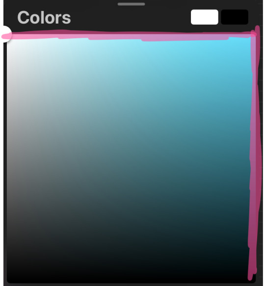
#for clean gradients and generic bright colors.
Text
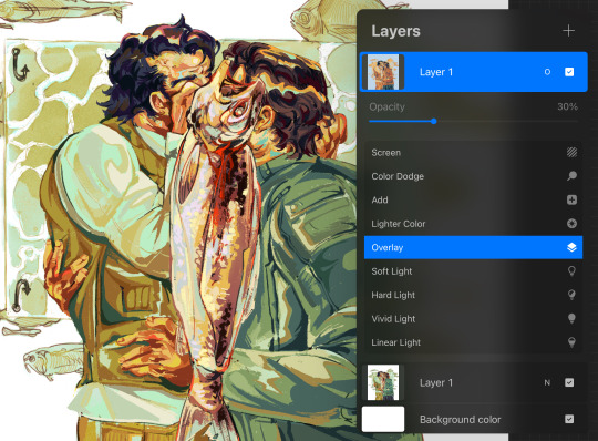
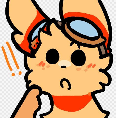
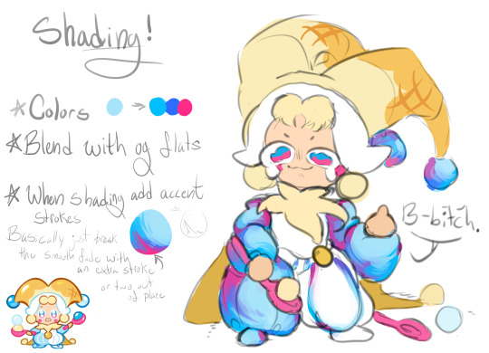
Mewtwo's cloning machine colored became my most popular post so I'm making a tutorial with it.
I know I only colored it but I did use some pretty important techniques when doing original art too so I'm hoping it helps.
Okay so let's say you have a sketch, or in my case an image you want to color. Rule of thumb, you don't want to leave that in grayscale.


If you have a color scheme in mind you'll want your starting point to reflect that. Most art programs have ways for you to do tonal correction.

I like using levels for cleaning up the brightness and making lines sharper, and color balance for adding colors. Gradient map works nicely too. Generally you want to pick contrasting colors for light vs shadow. I did yellow for lighting and blue for shadow because I wanted to catch that oceanic underwater feel. But you CAN do cool lights with warm shadows!
2. If you want to color under your image or sketch, set it to multiply. Lower the opacity to help you see better if you want to do linework over it, or leave it as is if you just want to color your sketch.
3. Block in your colors to get a feel for the lighting. You'll want to make sure you have a CLEAR sense of foreground/middleground/background. Which means you need to pick colors that are bright/medium/dark shades and assign them accordingly.
In this case my foreground is darkest, I chose to make middleground (the machine) my light source, so it is brightest, and background is my medium shade. You don't have to do it in that order, but just keep those rules of three in mind. Foreground, middleground, background. Light, medium, dark. Assign accordingly as your piece needs.


A great way to test your composition is to set your image to greyscale, or even remove your sketch. If you still have a clear impression of depth and where everything is, you're on the right track.
4. What's your focal point? What's the main subject of your piece? What do you want to draw the viewer's eye, to stand out, to be the whole point of what you're drawing? Because that's the part you're going to focus on rendering now.
For me it was the shell.


This was three different layers on different blending modes where I just played with textures, colors and brushes until I got an effect that I liked. In fact I liked it so much that these layers are actually above the base image, so that the texture is untouched by the manga scan texture and the yellow-tinted multiply effect.
5. By this point, if you're applying these steps to any art piece you're working on, you should have a pretty good basis. You should have your colors mapped, your composition, and your focal point for your work. You can continue to render the details, but try to stick to your composition.


None of these steps are particularly complicated. It's just a matter of coloring within the lines, staying true to your chosen color scheme, and remembering where the light source is.
6. If you have a secondary focal point, (in my case, Team Rocket) you can give it a little bit of special treatment to help it not get lost in the image.


I went as far as to copy and paste them, adjust their levels separately from the rest of the work so they looked sharper and cleaner, gave them their own colors separate from the scheme of the main peace, and only tied them into it with their shadows. I painted some rim-lighting around them true to their colors (like Jessie and James's hair) just to help them pop. They're not the main focus of the image, but they're somewhere that they aren't supposed to be, so they need to stand out a little in their own right.
7. Add some finishing touches.


This can be things like adding soft glows to your light sources (I keep mine simple, just a few strokes with a watercolor brush set to the add blending mode) and some shines to shiny objects.
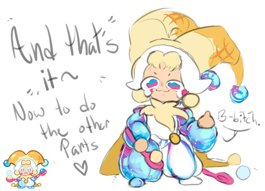
And that was about it.

Coloring this piece was just an excuse for me to play with color composition and textures without having to worry about my own line work for once. But I still used some pretty important principles in illustration to catch what I saw in my head while looking at the original uncolored page. (Especially step 3!! Try that in your next work!)
14 notes
·
View notes
Note
saw your last fanart (16 of january) and it's so good
it beats me how this kind of colouring/painting is done though. how do you pick the right colours? the right places? the value of colour and it's warmth?
i always have trouble with colouring because i have a very strict basic knowledge of shadows and colours and no visual imagination
sorry for such a long ask
hi anon!! no need to apologize this is such a kind ask and i still really struggle with this sometimes. i didnt start experimenting with color in my art until around summer of 2022 and before that it was so frustrating to color that i almost didnt produce any colored work.
i also have complete aphantasia so my visual imagination is very limited! this leads to a lot of trial and error in my work because i cant tell what looks good until i simply try it lol
i will try to answer about my process as thoroughly as possible! but a lot of it is seriously just vibes, and playing around. a lot of what helped me was studying how artists i liked used color in THEIR work and trying to work it into my style.
a lot of the vibrancy and harmony in my work comes from my base layer, which i put under the sketch like im “priming” the canvas. when im coloring later on i let this base layer inform my choices and also let it show through in places for unification of the colors. its a lot like doing an underpainting except i dont go crazy on the range of values

the hardest part for me is doing the base colors over this layer. i dont have a lot of guidance for this because i kind of just pick colors to start with and then edit them bit by bit until it looks satisfying to me/matching the intended mood and harmonizing with the base layer. i edit the colors mostly by using gradient maps and layer modes until i find a version i like and merge it to just create a normal layer with the colors i want. i keep this base layer underneath my sketch
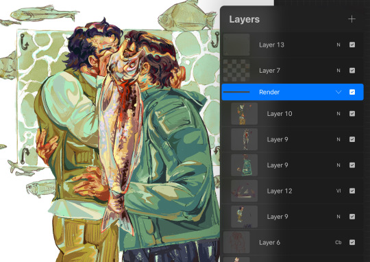
i render on top of my sketch/lineart always so i can better define the shapes and have smoother edges. this is the part where i really go crazier with my colors - some conscious decisions i make:
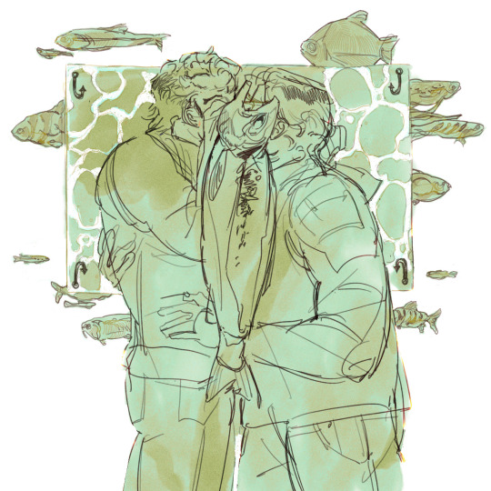
- where can i make my highlights and shadows stand out more? i accomplish this by choosing warm colors on the cool base or cool colors on the warm base. theres blue in the flesh tones of the face and orange in the blue tones of the coat.
- where does the rendering need to be more “clean”? someone viewing an art piece will gravitate to places in the drawing with finer detail, so i put a lot more work into the shapes and colors of the faces and the fish, because this is where i want someone to look the longest
another thing i usually do is pick one really saturated color and place it throughout the drawing. for thos one its that bright red, around the eye, blood, and outline of the fish as well as the characters’ hands.
this part of my process takes me the longest and can be seriously frustrating at times! something i always force myself to do is to keep working on it. whenever im like ok its done! i go back and render for another half hour and it ends up looking a lot better

gradient mapping the final drawing! for further unification i have a gradient map i made that works for most of my warm pieces

and i put it on top with an overlay layer mode and then adjust the opacity
it makes a big difference in the warmth and unification of the final drawing!! so honestly i cheat a little with my colors :P
i hope this helped a little bit with your question! my general advice is to also do some color studies of movies or pictures you like it really helped me get a feel for harmonizing color (and not being afraid to use really vibrant colors!!) again thank you for such an ask and good luck to you!!
25 notes
·
View notes
Note
Teach me the ways of the dragu art
yeah I'll use what I'm currently drawing for this hold on
really long tutorial on how I draw below
step one: sketch

my sketches usually start with a circle for the head and I build from there! generally I just use the circle if I'm familiar with the character and the pose, but it is always good to use more shapes for the rest of the body!
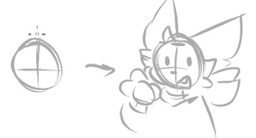
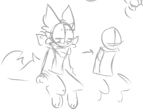
sketches are also a good phase to play around with proportions, the nice part of digital art is that it's really easy to erase or select and stretch/move parts that look funky. play around till it looks right, don't be afraid to use references
step 2: lineart
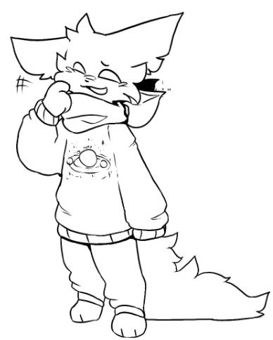
linearts my worst enemy sometimes, so occasionally I just resort to cleaning up the switch or just making the lineart really sketchy and messy
here though I just follow the sketch to the best of my ability, i don't always do it but I shade in shadows sometimes
also on spots that are like folds or something, I make the lines gradually thinner the farther away from the edge they get. if that makes sense
step 3: color (which is incomplete rn my bad)

I unno what to really say for this one uh
easy trick to coloring everything fast, and if your art program lets you, make a giant square that covers everything behind the lineart, erase or fill any openings in the lineart, select the outside part of the colored square with the wand tool or wtv, and erase/delete. then boom you got a filled color base to go off of, go you!


otherwise if the wand tool doesn't exist, I just draw around the insides of the lineart and fill
step 4: shading
im not planning to shade this drawing so i have to scrounge up old stuff now ouh
shading ! is fun sometimes
i start by picking a bright color that fits nicely with the rest of the art, n choose any spots that would be blocked from the light (i cannot explain this m sorry)

then i put the blending setting on the layer to multiply, set the opacity down until it looks fine

and congrats you've shaded

sometimes i also add a slight blur or like every so slightly softening lines which i do not have an example of right now. i just do this on the ends of the shadows because i think it looks nice
the rest of the art is up to you, color the lines, add a gradient over everything, go crazy.
the best way to get 'better' is practice! doodle whenever ya can, i doodle on homework and notes all the time. find your own little strategies and tidbits to add to your art! just have fun with it in the end!
also when in doubt: add more fluff /j
(my old nightcat design compared to the new)
35 notes
·
View notes
Text
General Morphin Grid HCs
-Grid energy has several variants, there's basic grid energy which most rangers use to morph and power their weapons and zords, primal grid energy which functions similarly to basic grid energy but more potent and wild but also deadly to rangers that have had their grid energy tainted (as in being turned evil, but this energy can be purified by becoming a different color on a different team), ala tainted grid energy, which is corrupted from normal grid energy.
-The Morphin Masters aren't actually that powerful, in the grid's hierarchy they're just above rangers in authority. think of Morphin Masters like Archangels or something idk.
-Grid energy keeps rangers in peak physical condition until they either are unable to morph or completely cut off from the grid.
-Inside the Morphin Grid is gridspace, a sort of weird realm where normal laws of physics are basically thrown out the door, but at the center of gridspace is the Plegmata, a sort of trench where the true morphin grid is, there are crystals that connect to each ranger team, the closer the crystal is to the center crystal, the Grid's Prime Prism, the harder it is to cut that ranger team from the grid.
-Prime Prisms are the only way to access Primal Grid Energy and the heart of the Morphin Grid.
-There is a Prime Prism on every planet with sophont life, said Prime Prisms are usually guarded by three or more nanozords that were born via primal grid energy.
-The Morphin Grid exists outside of time, so it would still be the same time you left after you went back from Gridspace.
-Primal Grid energy is usually white with all other colors of the grid sprinkled throughout, Basic Grid Energy has a gradient from lime green to aquamarine, and Tainted Grid Energy is the same as Basic Grid Energy but with blackish purple streaks going throughout it.
-the grid is in fact not sentient, but rather a sort of modeling clay used by it's guardian, Gridheart.
-Gridheart is a very kindred spirit, though they have never been seen in full.
-Gridheart is at the top of the Morphin Grid's hierarchy.
-Gridheart created the Gridlets, mainly purple colored pterosaur-like beings that are very small and divided into three divisions, harvester, culler, and trackers.
-Tracker Gridlets track possible rangers and can become invisible, and blue is their accent color. they resemble anurognathids.
-Culler Gridlets are designed to tear through armies of monsters, as the usual five to six ranger team can't just tear through hundreds of monsters at a time. Red is their accent color. they resemble dimorphodontids.
-Harvester Gridlets harvest dangerous substances and other items to help ensure the Prime Prisms all remain bright as bad things happen when Prime Prism Light fades. Their accent color is green and they resemble Ctenochasmatid pterosaurs.
-each division of Gridlet is led by a commander, which Gridheart names the commanders after her favorite rangers.
-Invisible gridlets can only be seen by rangers in tune with primal grid energy.
-When Primal Grid Energy and Tainted Grid Energy make contact, it causes combustion. a lot of combustion. Like a crap ton of combustion. like mini atomic explosions.
-Gridheart is so tired of having to clean up after the Morphin Masters' mess ups of not putting freaking safe locks on ranger powers. they are still mad that their lessons are not sticking with them.
-Zords can be formed naturally, usually through massive amounts of either primal or basic grid energy coming into contact with an organism.
-Grid Energy can substitute as sediments in fossilization, as such, the Corona Aurora's crystals are crystallized dinosaur teeth.
#hesploro here!#power rangers#mmpr#mighty morphin power rangers#power rangers headcanon#gridlets#gridheart#prpg#power rangers primal gems#primal gems
12 notes
·
View notes
Text
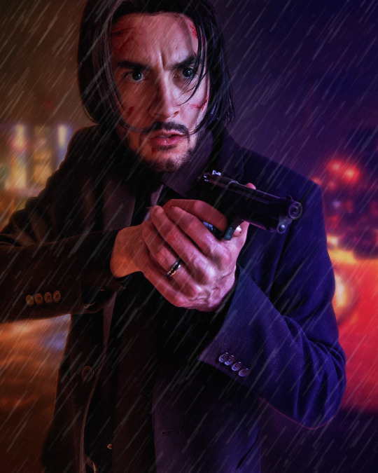
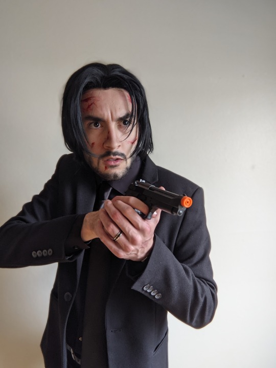
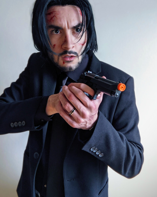
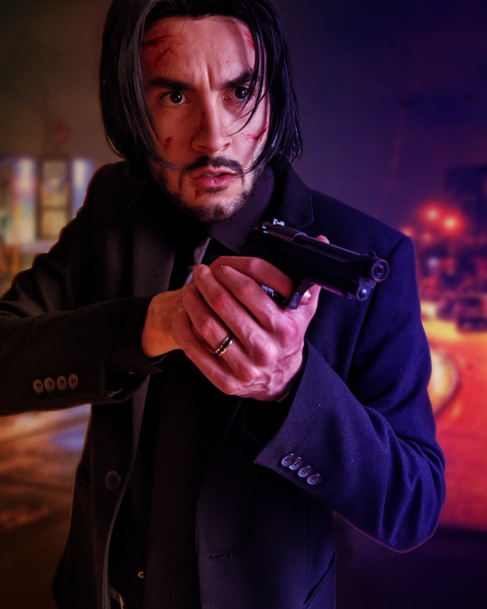
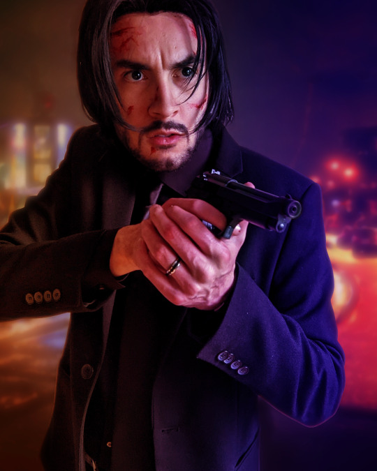
Photo editing step-by-step semi-tutorial
Trying something new here on the blog... I don't do much tutorial writing but wanted to share a little behind-the-scenes on how I typically edit my cosplay photos. A lot of this is cobbled together from various tutorials or trial-and-error over time but I think the results are pretty nice. I use Photoshop but a lot of these tips are generalized enough you might could use them in your editor of choice.
Let me know if this is helpful or cool, if you'd like to see more of this sort of thing!
First off I just use the default photo editing tools to clean things up a bit. Tighten the crop and adjust the levels and white balance... mostly just "eyeballing" it. Notably I already like the pose, lighting, and composition - anything you can take care of in-camera rather than post is preferable!
Then I gotta black out the gun tip - select the tip, tint orange toward blue, lower the saturation way down, then tweak the levels. Of course it still looks like a cap is on the tip, but the focus of the photo is kind of off the gun barrel anyway so who cares.

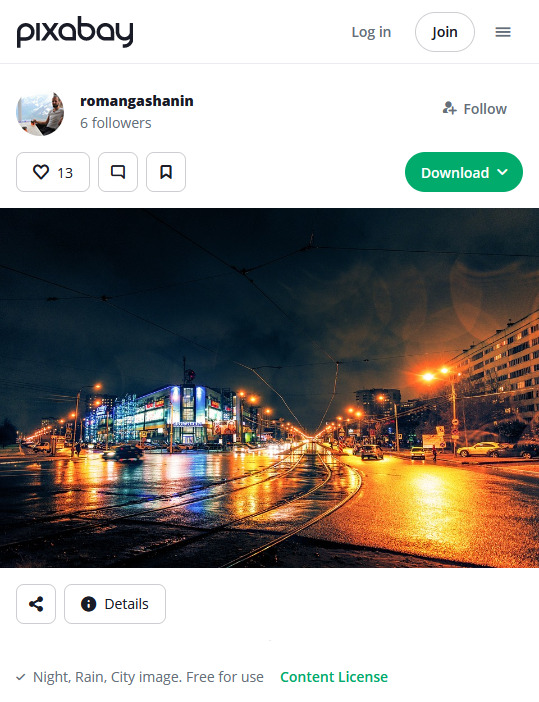
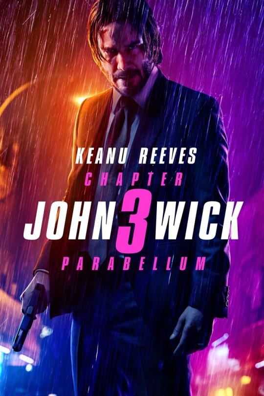
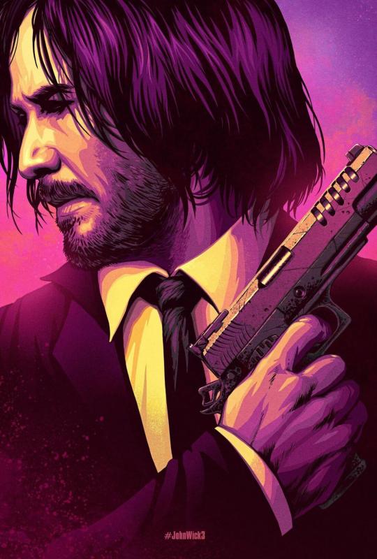
Next up we're going to swap out the background. In this case I want it to feel kind of indistinct - not a "scene" Wick is actively interacting with but more just scenery he's in front of. Wet nighttime streets are pretty prominent in the opening of Chapter 2 so I selected this photo.
I try to use sites like Pixabay that offer free-use photos rather than just pulling whatever from Google Images.

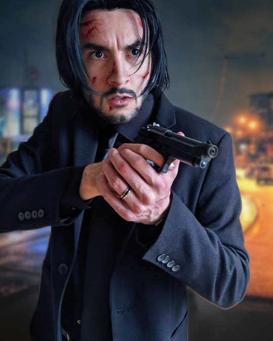
Once I have the photo, I crop it to where the horizon line looks good, add a Gaussian blur to imply depth, and mask it in the background. Photoshop's auto-select has gotten pretty robust, I tweak the cutout just a bit for clarity and to add some light leaks around the outline
In this case I set the transparency to 92% to get it a little lighter. In any case, I then add an Exposure layer to darken it for mood lighting.

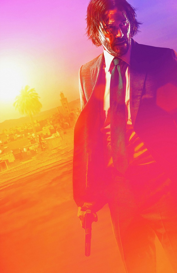
Next bit is color correction. In this case I wanted to evoke the look of Chapter 3 promo art... pulled a few reference images and took note of the orange/purple contrast and gradient they use:
I don't recall if I used the eyedropper tool but I created a similar gradient, set to split on my face so the two halves of the background ended up as different colors. Set the layer to "Soft Light" (in this case I actually duplicated it and set that duplicate to 25%), and I masked out some parts where the light is hitting particularly hard (left of face, hands, edge of gun) to keep a more natural look.
Since it's raining, I added a subtle "fog" look to the background. Created a single-layer duplicate of everything so far, masked the background, Gaussian blur - then set that layer to "Lighter Color". You can see it in the building lights, mostly - brings back some brightness after the multiple darkening we've done.

Finally bringing in some rain, again referencing the poster above.
To make the rain layers, I first make a solid black layer then "Add Noise" (monochromatic). Tweak the "Levels" so you get pockets of pure white against black (with a couple mid-grays layered in), then resize the layer so the dots are bigger than single pixels (it's fine if they get blurry). Finally, apply a motion blur to get the "falling" motion.
I do this twice to get a sense of depth. First layer is set to "Overlay" at low opacity (~25%), which also slightly darkens the image.
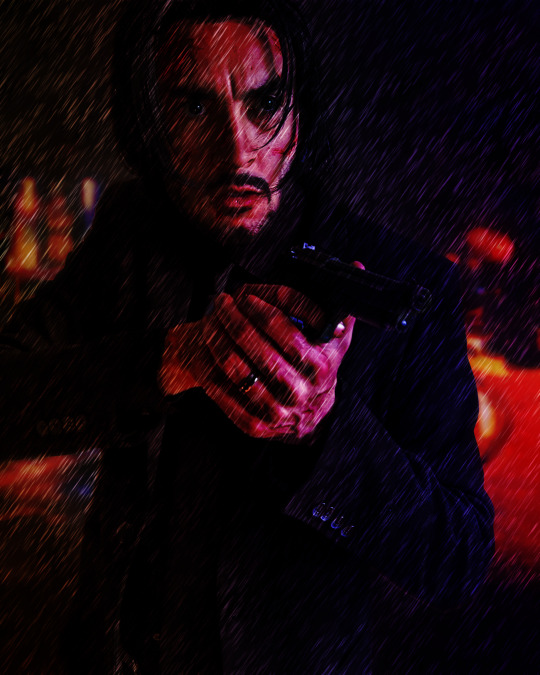

The second layer is set to "Screen", again at low opacity (~20%). Combined, it gives the effect of rain in front and behind throughout the scene.
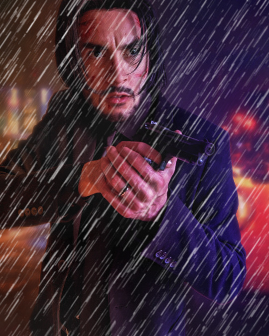

Finally I add a cooling "Photo Filter" layer, masked out to points like my face and hands, to add a little contrast. Sometimes I'll do a final pass with "Levels" or "Exposure", "Add Noise", or use some subtle Instagram filters to make sure it looks good on the small screen, but not really in this case.
All said and done, I usually spend less than an hour per image. Despite ending up with 10+ layers it's not too complex and I find the results quite satisfying!
17 notes
·
View notes
Text
From Skeuomorphism to Flat Design: Tracing the Evolution of UI Aesthetics
The world of user interface (UI) design has undergone a dramatic transformation over the past few decades. From the early days of skeuomorphic design to the current trend of flat and minimalist interfaces, the evolution of UI aesthetics reflects not only technological advancements but also changing user expectations and design philosophies. In this blog post, we'll explore this fascinating journey, examining the key stages and factors that have shaped the UI landscape we see today.
The Era of Skeuomorphism
In the early days of graphical user interfaces, designers faced a significant challenge: how to make digital interfaces intuitive for users accustomed to physical, analog experiences. The solution they arrived at was skeuomorphism, a design approach that mimics real-world objects in digital interfaces.
Skeuomorphic design was characterized by:
Realistic textures and shadows
Detailed, 3D-like icons and buttons
Metaphors borrowed from physical objects (e.g., a trash can for deleted files)
Apple was a prominent advocate of skeuomorphic design, particularly under Steve Jobs' leadership. The original iPhone and early iOS versions featured interfaces that closely resembled their real-world counterparts. For example, the Notes app looked like a yellow legal pad, complete with lined paper and a leather-bound top.
The advantages of skeuomorphism were clear:
It provided familiar visual cues for users new to digital interfaces
It created a sense of depth and tangibility in the digital world
It often resulted in visually rich and detailed designs
However, as users became more accustomed to digital interfaces and mobile devices grew more prevalent, the limitations of skeuomorphism began to surface:
Skeuomorphic designs could be visually cluttered and distracting
They often consumed more system resources, affecting performance on less powerful devices
As screen sizes diversified, maintaining consistent skeuomorphic designs across devices became challenging
The Transition to Flat Design
Around 2010, a new design philosophy began to emerge: flat design. This approach stripped away the textures, shadows, and 3D effects of skeuomorphism in favor of simple, two-dimensional elements. Microsoft was an early adopter of this style with its Metro design language, later renamed to Microsoft Design Language.
Key characteristics of flat design include:
Minimalist, clean interfaces
Bright, bold colors
Simple icons and typography
Absence of drop shadows, gradients, and textures
The shift towards flat design was driven by several factors:
The proliferation of mobile devices with varying screen sizes
A growing user base familiar with digital interfaces, reducing the need for real-world metaphors
The desire for faster-loading, more efficient interfaces
A general trend towards minimalism in design across various fields
Apple, once the champion of skeuomorphism, made a dramatic shift with the introduction of iOS 7 in 2013. This update marked a decisive move towards flat design, shocking many users accustomed to the previous skeuomorphic style.
The benefits of flat design quickly became apparent:
Improved readability and clarity, especially on smaller screens
Faster load times and better performance
Easier scalability across different device sizes
A modern, clean aesthetic that many users found appealing
The Rise of Material Design
As flat design gained popularity, some designers and users began to criticize its sometimes stark and overly simplified nature. In response, Google introduced Material Design in 2014, which can be seen as a middle ground between skeuomorphism and pure flat design.
Material Design principles include:
The use of layers to create depth and hierarchy
Subtle shadows and lighting effects
Responsive animations and transitions
A consistent design system across platforms and devices
Material Design aimed to combine the best aspects of both skeuomorphic and flat design:
It maintained the simplicity and efficiency of flat design
It reintroduced some depth and tangibility reminiscent of skeuomorphism
It provided a comprehensive design language for creating cohesive experiences across different platforms and device types
The Current Landscape: Flat 2.0 and Beyond
Today's UI design landscape is diverse, with many designers adopting a style often referred to as "Flat 2.0" or "Semi-Flat." This approach builds upon the principles of flat design while incorporating subtle depths, shadows, and gradients to enhance usability and visual interest.
Key features of modern UI design include:
Minimalist layouts with ample white space
Bold typography and iconography
Subtle shadows and depth cues to improve hierarchy and interaction
Vibrant color palettes
Microinteractions and animations to enhance user engagement
The ongoing evolution of UI aesthetics is driven by several factors:
Advancements in display technology, allowing for more nuanced design elements
The rise of design systems that prioritize consistency and scalability
Increasing focus on accessibility and inclusive design
The influence of dark mode and other user-centric features
The Future of UI Aesthetics
As we look to the future, several trends are likely to shape the next evolution of UI aesthetics:
Neumorphism: A style that combines aspects of skeuomorphism and flat design, creating soft, extruded plastic-like interfaces.
Augmented Reality (AR) and Virtual Reality (VR): As these technologies become more prevalent, UI design will need to adapt to three-dimensional spaces and new interaction paradigms.
Voice and Gesture Interfaces: The growing importance of voice assistants and gesture controls may lead to more minimalist visual interfaces supplemented by other interaction methods.
Adaptive and Personalized Interfaces: AI-driven UIs that adapt to individual user preferences and behaviors may become more common.
Sustainability-Driven Design: With increasing awareness of digital carbon footprints, we may see a trend towards designs that prioritize energy efficiency and reduced data usage.
Conclusion:
The journey from skeuomorphism to flat design and beyond illustrates the dynamic nature of UI aesthetics. As technology evolves and user expectations change, design philosophies adapt to create more intuitive, efficient, and delightful user experiences. The future of UI design is likely to be as exciting and transformative as its past, continuing to shape how we interact with the digital world around us
The next big shift in UI aesthetics may be just around the corner, driven by advances in technology, changes in user behavior, or entirely new paradigms of human-computer interaction. Whatever form it takes, it will undoubtedly build upon the lessons learned from the great skeuomorphism-flat design debate, continuing the never-ending quest to create digital experiences that are both beautiful and effortlessly usable..
Devoq Design is a leading UI/UX design agency with a strong presence in both Mississippi and Missouri. As a premier UI/UX design agency in Mississippi, Devoq Design focuses on crafting visually stunning and user-friendly digital experiences that cater to the unique needs of local businesses. Similarly, as a top UI/UX design agency in Missouri, Devoq Design excels in delivering innovative design solutions that enhance user engagement and satisfaction. With a team of skilled designers, Devoq Design ensures that each project is customized to meet the specific requirements of their diverse clientele, driving growth and success in both states.
0 notes
Text
Check Out The Miracles Of Korean Salon In California

Have you ever pondered why Korean salon in CA have been actually acquiring recognition at an exceptional cost of 15% every year? Enter the world of Korean hairstyling skills and find out an arena where heritage satisfies technology, creating a distinct and engaging expertise for customers. From trademark techniques to advanced trends, these salons keep the key to uncovering an entire new degree of type as well as elegance. Discover the combination of cultures and also techniques that make Korean salons in CA a must-visit location for any person finding a clean take on hairstyling.
Fusion of Heritage and Technology
Korean hair salons in California masterfully mix standard hairstyling methods with impressive trends, generating an one-of-a-kind blend that sets all of them apart in the appeal sector. One trend that flawlessly exhibits this blend is actually the Korean guys's wavy perm. AllthaThairoc Hair Salon, known for its expertise within this design, combines the traditional Korean perm procedure along with a modern twist, resulting in very easily trendy and also textured surges that are preferred amongst fashion-forward individuals.
The strict interest to particular in producing these wavy body waves showcases the smooth integration of custom and innovation. Through accepting both the culture of Korean hairstyling and also the innovative trends of the field, Korean hair salons in California carry on to spellbind customers with their specific as well as eye-catching technique to hair care.
Trademark Korean Hair Approaches
Explore the world of Peekaboo hair salon in CA, and also you'll rapidly uncover a gold mine of trademark strategies that boost the craft of hairstyling to a whole brand-new amount. One standout approach is actually the 'Soo-Jung Cut,' an approach that develops natural-looking coatings and also movement, ideal for those seeking simple and easy luxury.
Korean salons are actually also renowned for their Korean women's perm, which utilize innovative technology to make durable swirls or surges that appear extremely natural. Yet another well-known procedure is the 'Glass Hair Procedure,' a process that leads to ultra-smooth, bright, as well as straight hair that shows illumination like glass. These procedures showcase the preciseness and development that Korean hair salons offer the table, setting all of them apart on earth of hairstyling.
CA Cool Fulfills Korean Experience
When it relates to hairstyling as well as charm services, the fusion of California's laid-back cool along with Korean competence produces an unique and in-demand expertise in local salons. You'll find that California's unwinded feelings blend effortlessly along with the preciseness and advancement of Peekaboo hair salon professionals, causing a best balance of simple and easy elegant as well as advanced type.
Korean hair salons in CA are known for their interest to detail, whether it's creating natural beachy waves or vibrant K-pop inspired appearances. Count on a mix of cool and trendy methods like glass hair or even gradient color, all tailored to suit your personal design. The atmosphere in these salons is frequently vivid and also welcoming, mirroring the diverse influences that make up California's beauty scene.
Knowledge the Korean Hair Magic
youtube
Step right into the globe of Korean hair magic as well as prep to become astonished due to the transformative knowledge awaiting you at these distinguished salons. Korean salon in CA provide a distinct experience that blends groundbreaking strategies with a flair of K-beauty style.
From precision hairstyles that wonderfully design your skin to lively hair colours that help make a claim, these Korean hair salon master producing personalized appears that satisfy your style. Pamper yourself with lavish hair procedures that leave your hairs sleek smooth and well-balanced.
If you're searching for an understated modification or a bold change, Korean salon possess the capabilities and also innovation to take your hair dreams to lifestyle. Receive ready to experience the miracle of Korean hair styling firsthand and also march along with a face-lift that amazes.
Conclusion
Once you have actually discovered the magic of Korean hair salons in CA, it's time to schedule your appointment and also experience the makeover on your own. Embrace the fusion of tradition and also innovation, pamper in signature Korean techniques, as well as remain before the most recent charm trends. With California trendy meeting Korean proficiency, you're sure to leave behind feeling like a million money. So do not postpone, get on the trend train as well as allow these reputable salons operate their magic on your locks.
0 notes
Text
daily notes 1/22/24
Ethan
he/him
Pencil lead case
Feels precise
Tommy
he/they
Core water bottle
Funky bottle shape + cup shaped cap
Gradient w/ transparency
Reminded of spray paint can - industrial?
Fuoa
Pocky
Proliferation - easy opening
Mini maximalist - shows inside with extra
Color of box matches flavor
Kevin
Cough drops: walgreens generic
Boring
Left aligned text
Large empty space
Visually less money
Jordan
Orbit mint gum case
Winter mint - cool colors
Circles and large branding
Katie
she/they
Blick glue stick
Blocky colors (3)
Generic brand esque
Ella
she/her
Notebook
Pink with noodles, chopsticks, peppers, etc
Soft cover
Brand on back + important text
Prioritized design over brand
Ethan
he/him
Gatorade fierce bottle
Tiger scratches on bottle
Bright orange lid - recognizable
Iva
she/her
Colectivo coffee cup (cold)
Pattern surrounding cup
Logo is small
Emily
she/her
Hemps hand lotion
Silver on pale pink
3 different type faces
Cap matches bottle
Nina
she/her
Tylenol (travel)
Red cap - easily visible
Warnings are very small
Childproof lid
Maya
Lotion
Natural (way too expensive)
Lavender scented - purple everywhere w flower
Gold brand name
Alexa
she/her
Dnd dice, Shaped like d20
Lid doesn’t stay on
Basic warnings on bottom
Silver on clear plastic - only visible from certain angles
If you dont know what it is, it's not for you
Chue
germ-X
Colors signify clean/hospital
Red on logo
Drug facts peel off via flap
Brooke
she/her
Vaseline jar
Jar shaped like logo - everywhere
Consistent around all sizes
Label color based on ingredients
GENDERED PACKAGING
deodorant
shampoo
clothing
AGE BASED PACKAGING
Juul
Song of the Day:
Sherlock (Clue + Note) - SHINee
0 notes
Text
Introducing Feeder Guppies: More Than Just Pretty
When it comes to aquarium fish, the Feeder Guppy is a species that is often forgotten but is very important to aquatic ecosystems and has its own unique charm. People often think of these fish as humble "feeder fish," but they are actually very beautiful and have their own unique traits. Take a look into the interesting world of Feeder Guppies:
Looks and traits: Feeder Guppies have a reputation for not being very pretty, but they are actually quite pretty. They often have a wide range of colors on their smooth bodies, from shimmering silver to soft pastels. These are two well-known examples: the "Sunrise Guppy" and the "Aurora Guppy." The "Sunrise Guppy" has a soft gradient of orange and yellow colors that makes it look like a peaceful dawn. But the "Aurora Guppy" has a color scheme of pinks and purples that make you think of the beautiful colors of the aurora borealis.

Information in general
Feeder Guppies, whose scientific name is Poecilia reticulata, come from the slow-moving waters of South America, especially parts of Venezuela and Trinidad.
Size: Feeder Guppies usually get to be about 1.5 to 2.5 inches (4 to 6 cm) long, which makes them good for aquariums that aren't too big.
Lifespan: Feeder Guppies can live for two to three years if they get the right care. This makes them a long-lasting addition to aquariums.
Temperament: These guppies are known for being calm and friendly. Because they aren't aggressive, they make great pets for community aquariums.
How they look: Feeder Guppies have long bodies that come in many different colors. Their tails can be fan-shaped or lyre-shaped, which makes them look more interesting.
Differences and Colors: There are many different kinds of feeder guppy. The "Blue Sky" has calm shades of blue and green, while the "Tropical Sunset" is bright red and orange.
Needs for Habitat and Tank
Natural Habitat: In their native environments, live in slow-moving streams, shallow rivers, and even water that doesn't move at all. This kind of environment has warm, tropical temperatures and lots of lush plants.
Size of Tank: A tank that can hold at least 10 gallons (38 liters) of water is recommended for Feeder Guppies to live in comfort. Larger tanks give the fish more room to swim and give them a chance to mark their territory.
Things about water: The water should be kept between 82°F and 72°F (22°C and 28°C) and the pH level should be between 6.5 and 7.5. Testing and changing the water on a regular basis is necessary to keep things running smoothly.
Set up the tank: Add real or fake plants to the aquarium to make it look like the animals' natural environment. Give them fine-grain substrate and places to hide. Filtration and aeration must be done correctly to keep water quality high.
Being fed
Food: Feeder Guppies eat everything and have different food needs. They mostly eat high-quality guppy pellets or flakes, which are full of nutrients they need. To get more protein, you can add live or frozen foods like bloodworms, brine shrimp, and daphnia to their diet.
Feeding: These guppies love to eat and will happily take food from the surface of the water. Feed them small meals often to keep the water clean and stop them from eating too much.
Foods that Feeder Guppies can eat:
Guppy pellets or flakes of good quality
Darphnia, live or frozen
Shrimp in salt water
Worms that give blood
Spirulina flakes to make the color stronger
Having babies
Feeder for reproduction It is well known that guppies have a lot of babies. They are different from species that lay eggs because they reproduce by internal fertilization and have live fry.
Needs for breeding: To get fish to breed, keep the aquarium well-planted and make sure there are about 1:2 or 1:3 males to females to keep the females from getting stressed. Adult guppies may eat fry that aren't properly protected, so make sure they have lots of places to hide.
How the eggs are laid: Every four to six weeks, females usually have a brood of fry. It takes about 26 to 31 days to get pregnant. Fry are born fully formed and able to take care of themselves, so they can swim and eat right away.
Problems with Health
Common Health Problems: Feeder Guppies are usually very hardy, but they can get fungal infections, parasites, and diseases like guppy mouth rot, which are common in guppy fish. If the water quality and nutrition aren't good, they may also have problems with swimming bladders, constipation, and fin rot.
Ways to avoid problems: To keep your Feeder Guppies healthy, make sure the water is always clean by filtering and changing the water often. Put new fish in quarantine to stop the spread of disease, and feed them a balanced diet full of nutrients they need.
Special Things to Think About
Compatible with: Feeder Guppies are calm and do well in aquariums with other fish. Peaceful fish like neon tetras, platies, and Corydoras catfish live together with them without any problems. Do not put them in a tank with fish that are aggressive or that nip at fins.
Special Care Instructions: Giving these guppies a diet high in spirulina flakes may make them look better in terms of color and health. Make sure they can hide and that they have good tank mates to help them feel less stressed.
Limitations set by law: Check your local laws about owning and breeding fish as pets. Some places may have specific rules about the trade and care of ornamental fish.
Varieties that go well together for an aquatic orchestra
When choosing tankmates for Feeder Guppies, think about other fish that are calm and about the same size, like
Tetras that glow in the dark
Fish with flat bodies
The Corydoras catfish
Small gouramis
Rosas harlequins
Endler's bearers of life
Shrimp cherry
What's the Difference Between Male and Female Feeder Guppies?
Male and female feeder guppies are different in a number of ways, such as:
Size: Males tend to be smaller and slimmer, while females tend to be bigger and rounder.
Color: To attract females, males often show off more vivid and varied colors, especially on their tails and fins.
Fins: Guppies males have a gonopodium, which is a modified anal fin used for mating. Females, on the other hand, have a normal anal fin.
Behavior: When males are courting females, they are more active and often do complicated dance moves to get their attention.
Things that Feeder Guppies and Other Guppies have in common:
Poecilia reticulata is the name of the species that feeder guppies and other types of guppies, like fancy guppies, are from.
Size: Adult feeder guppies and other guppies are usually about 1 to 2 inches long, which is about the same size range.
Lifespan: They both have about the same amount of time to live, about two to three years on average if they get the right care and live in the right conditions.
Behavior during reproduction: Feeder guppies and other types of guppy are very good at reproducing. They have live babies (fry) instead of eggs.
Food Sources: All guppies, including feeder guppies, are omnivorous, which means they eat both plants and small aquatic animals.
What makes Feeder Guppies different from other guppies:
Purpose: The main difference is what they are meant to do. Feeder guppies are usually bred to be live food for bigger fish that eat other fish. Other guppies, like fancy guppies, are bred for their pretty looks and are kept as pets.
Color and Fin Differences: Fancy guppies are bred to have bright colors and different-shaped fins, which gives them a lot of different looks. But feeder guppies don't usually have the bright colors and fancy fins of fancy guppies. They tend to be more plain.
Prices: Fancy guppies are more expensive and in higher demand in the aquarium trade because they look nice, but feeder guppies are cheaper and easier to find as live food.
Criteria for Selection: When breeding fancy guppies, traits are carefully chosen to get better. Most of the time, feeder guppies are bred for quantity rather than specific traits.
Tankmates: Guppies of both types can live together with peaceful tankmates. However, feeder guppies are sometimes kept in predator tanks with other guppies that could be eaten.
Feeder Guppies, which are often overshadowed by their more fancy relatives, have special qualities that make them great additions to aquariums. They are a great choice for both new and experienced aquarists because they are calm, have bright colors, and are easy to take care of. By knowing what they need and giving them the right care, you can enjoy the subtle beauty of these quiet aquatic friends while also helping to keep the ecosystem balanced and beautiful.
0 notes
Text
Bright pink hot pink nails

#BRIGHT PINK HOT PINK NAILS FREE#
In case of long nails, they look more gorgeous and sometimes dark bright pink nails 2022 with glisters and rhinestones may look vulgar. In case of short nails every shade of pink looks more natural and gentle. Generally pink looks quite different on short and long nails. Light pink nails 2022 will suit short nails perfectly. They will give a beautiful look to your nails. You may also get pink nails 2022 with flower prints. To get a more luxurious effect, use glisters, draw ornaments and pictures.Ĭhoose pictures or ornaments that you are fond of and won’t get tired of them easily. The mixture of pink and white colors in case of lunar French will be a perfect match and will look gentle on your nails. Top it off with top coat, et voila a beautiful French-inspired DIY. Use a small sponge to pick up the paint and dab it onto your clean nails, picking up new paint for each nail. You may use different techniques of nail design, such as French, lunar French, ombre, gradient, metallic effects to get an original nail style. To create the look yourself, add a drop of pale pink polish next to slightly darker nail polish on a platemaking sure that the edges are touching. Lighter shades can also be used for summer if you want to look fresh.
#BRIGHT PINK HOT PINK NAILS FREE#
1.In case of lighter shades, like grey and white, you may get an autumn nail design. Buy Hot Pink Nail Polish in Gel Nail Polish and get the best deals at the lowest prices on eBay Great Savings & Free Delivery / Collection on many items. We’ve got 45+ of the best pink nail ideas for this year to give you artistic inspiration for your next nail polish idea. File them to a sharp point to remove any mention of “sweet” or “girly” from the pink vocabulary. They give a bolder but still subtle look.Long pointed nails with a pop of glitter or nail are a weekend or nightlife look. They’re less precious and more grown-up they scream you’ve got all your business together. Long, square nails help a neutral pink design pop. Fading from a peachy pink to a deep violet, this set of pink nail designs is. Keeping pink nail designs short lends them an innocent and polished look, especially if you keep the nails a soft square or gentle oval. Enhance your nail game, and dazzle the crowds with this wavy light grey and. Use a bold rainbow or gold glitter for a nightlife designer nails look.įinally, should you go short or long? Nail lengths can sweeten up or brazen up a pink nail design. Use hot pink glitter for an awesome, summertime pink glitter nails look. Features: Non-toxic Virtually Odorless Water-based formula Fun, vibrant colors Dries to a hard. Use silver glitter for a fun pop, but you can still take to work or your boyfriend’s parents’ brunch. Nothing pairs better with a sweet pink nail color than different kinds of glitter. Get pink gel nails for a long-lasting nail art design. It’ll look great with your jeans and t-shirt weekend look or that tailored suit for your presentation. Instead of warmed over oatmeal or whatever flesh color suits you, choose a soft semi-translucent pink to stand in for your neutral. Sometimes a neutral design means a boring flesh color nail polish. Find high-quality stock photos that you wont find anywhere else. It transitions well from a trendy neutral to fun and bold pink glitter nails. Search from Bright Pink Nail Polish stock photos, pictures and royalty-free images from iStock. Pink nail designs can be a game changer if you combine the right nail art elements for your manicure types. 45+ of the Best Pink Nail Designs You’ll Flip For
0 notes
Text
Adobe cs6 download completo

#Adobe cs6 download completo for mac
#Adobe cs6 download completo full version
#Adobe cs6 download completo mac os
#Adobe cs6 download completo software
Specially designed for the graphics and logo designers.
Allows the users to create vector designs.
#Adobe cs6 download completo for mac
Features of Adobe Illustrator CS6 for Mac Manage layers to focus on each component individually, all in all, it is a reliable application for editing photos and creating vector graphic designs. Projection in perspective feature makes the images look more attractive. Moreover, it comes up with advanced typography features and color selection features. Powerful selection tools are there as well as image background adjustments provide support for accurate selection. The application comes with numerous vectors designing tools that can generate lossless quality images. Customize colors and make use of different types of tools to edit the photos. An intuitive user interface is there to improve the designing process. The application provides support for creating Flash animations, images and other vector designs with minimum efforts. Illustrator is one of the most popular applications for designing vectors and creating high-resolution graphics. Adobe Illustrator CS6 for Mac is a powerful application to create and design vectors and generate high-quality content for web and mobile devices.
#Adobe cs6 download completo full version
Quickly find what you need in a more efficient Control panel, now with consistency across options, anchor point controls, clipping masks, envelope distortions, and more.Download Adobe Illustrator CS6 for Mac free latest full version offline setup. Achieve consistency across your work areas and maintain layout changes until you actively reset them. Move fluidly from workspace to workspace with support for rooms. Dock tools horizontally or vertically for a more efficient workspace. Tear off and dock previously hidden tools, such as the Shape and Pen tools. Glyphs for caps, superscripts, and more can now be accessed in one place - from the Character panel. Use arrow keys to change fonts in context for selected text. Quickly access the popular Scale Strokes and Effects option, thanks to its new availability in the Transform panel. And now, copy and paste hex values into other applications more quickly. Sample colors faster and more precisely using an expandable color spectrum in the Color panel. To improve accuracy, preview directly on the artboard rather than in a dialog box. See that Gaussian Blur and effects such as Drop Shadows and Glows are applied significantly faster than before. Enjoy inline editing of layer names, precise color sampling, and UI brightness that's smoothly adjustable to match other Adobe tools.Īpply gradients to your strokes - along the length, across the width, or within the stroke itself - all with complete control over gradient placement and opacity.Įfficiently edit names in layers, swatches, brushes, artboards, and other panels directly in the panels themselves without using intermediate dialog boxes. Take fewer steps to accomplish daily tasks in a new, streamlined interface. Get clean lines, accurate fitting, and reliable results without using complex controls. Experiment freely with different types of repeating patterns that can be edited at any time for maximum design flexibility.Ĭonvert raster images to editable vectors with a completely new tracing engine. Just about everything feels faster and more responsive.Įasily create seamlessly tiled vector patterns.
#Adobe cs6 download completo mac os
With native 64-bit support on Mac OS and Windows® you can access all the RAM on your computer to easily open, save, and export large files and preview demanding designs. Work with precision, speed, and rock-solid stability on large, complex files thanks to a new performance system that powers Illustrator CS6. Enjoy a new tracing engine, quickly design seamless patterns, and apply gradients to strokes. A newly modern interface streamlines daily tasks.
#Adobe cs6 download completo software
Work with precision, speed, and rock-solid stability on large, complex files in Adobe® Illustrator® CS6 software - powered by the Adobe Mercury Performance System. Advanced creative tools enable you to capture your vision better than ever. A modern, updated interface streamlines daily tasks. Adobe® Illustrator® CS6 software is powered by the new Adobe Mercury Performance System so you can work with speed and stability on large, complex files.
0 notes
Text

So i grew up with this painting hanging in my room, which was painted by my grandmother. I've loved this combination of bright colors and victorian architectural elements. And i've wanted to convert this to a cross stitch pattern. I'm only done with the first panel so far and as i only work on this project in a blue moon, i don't know when i'll post updates but i wanted to share the process.
Step 1: convert image to a cross stitch pattern using MacStitch

I chose the size of the pattern so each of the three panels would be around 7'' x 9'' when stitched on 14 count fabric and i could make the three panels into three different decorative pillows eventually. I also told the program to use as many colors as it thought were necessary. In a lot of my other projects where i've started with a computer generated image (like the pokemon gameboy covers and the card i made for a friend which was a stitched portrait) i limited the number of colors for the program to use so that when i decided to do gradients of around 4 DMC threads in each color story i wouldn't have to edit the computer generated gradients that much, just choose which threads actually looked good in real life. Now this isn't perfect, i had to design my friend's ear from scratch because it was just a muddy mess in the generated image. But here the painting doesn't really have gradients of color. so i told the program to use as many colors as needed so i could get all the details and differentiation as possible for when i went back through and cleaned up the image.
Step 2: clean up the computer generated image

while the computer generated image really helps with layout, it does not help with details especially since i restricted the size of this pattern to about 1/2 of the size of the painting. i had to figure out how to convert a lot of the details found here by hand as somethings that work when painting don't really work when you are working with pixel art.
Step 4: choose colors that look good in real life
i'm not there yet. This will be the last step of the process that will most likely overlap my time actually stitching this. I'm not planning on choosing colors until i've finished the next two panels and i really know how many colors i need. My pallet still says i'm using 109 colors, and i really hope to cut that down.
I don't think this will be one of the patterns i give away, as my grandmother has passed and i can't ask her how she'd feel about that. I'm mostly doing this to work on my pattern making ability but also to really get a sense of how my grandmother painted. i've had this painting hanging in my bedroom for i think over 25 years but as i've been converting it i've found details in shading and painting technique that i've never noticed. Anyways i couldn't think of a new pattern to share this week so i figured i share this project i've been tinkering with for over a year. maybe sharing this will actually help motivate me to finishing the other panels.
87 notes
·
View notes
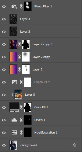
Photo

Okay so I generally have two styles for doing shaded stuff
Painted and then my “holographic sticker” style with the dots and that one swishy dotty gradient pen. This is for my painted style!!! Long story short here’s a tutorial on how I do that for some friends on discord hehe.

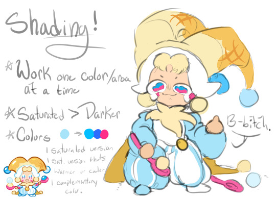


AND TADAAAAAA THATS HOW I DO IT~~
cant read my absolutely ADDHORENT handwriting? No worries!!!! Captions/Transcript + some extra notes below !!!
TRANSCRIPT!
Step 1: Lay down your flat colors! I always color drop everything to make sure its as close as possible. The only time I don’t color drop is if I’m adjusting a red to a more pinkish color!
Step 2: Shading time! The first step is to choose what color you want to work with!! Remember that when you’re shading that SATURATED IS BETTER. Don’t darken the color unless you really need to. Just make it more saturated and/or cooler. Cooler colors are darker than warm tones. So if you need to adjust go saturated - cooler - and then lastly darker if needed!!
For the sake of the tutorial make 3 colors.
The first one a saturated color / A DARKER saturated color / a complimentary or contrasting color. This is our lightest to darkest scale!
To start off take your first color and cell shade ONE FLAT COLOR or SECTION with it!!!! Do NOT use this for the ENTIRE drawing!! Work in pieces!!!
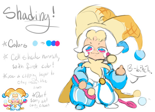
Step 3: Add a gradient to that cell shade~~ So you just used 1/3 colors to cell shade with. Now take your other two colors and create a gradient with it!!! You’ll want a blendable brush for this. I like CSP’s oil flat brush! Make sure your contrasting color is in the darkest spots!
Step 4: Blend with the flat color bordering your cell shade!! AKA just make the border that meets the cell shade softer.
Honestly, dont worry about making it clean. Really all you need to do is take a few strokes of the flat color and put it into the cell shade a little and youre good to go. I like doing little dashes. Also when you do this feel free to take that yummy contrasting color and make it bleed up towards the lighter color!! It’s not accurate with like how shading works or whatever, but it looks super fucking cool.
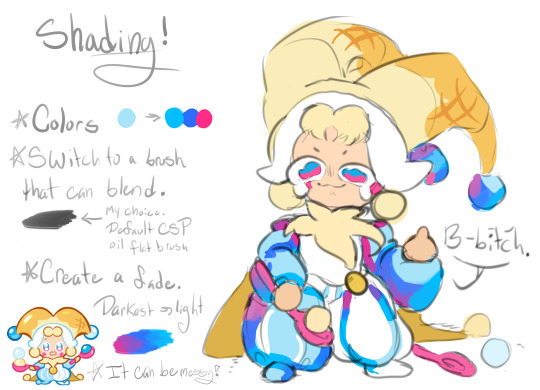
Step 5: Highlights!! Its time to add some highlights!! Basic rule for highlights.
Warm flat color = cool toned highlight!
Cool flat color = warm toned highlight!
Literally just put this color anywhere you want a shine and then take that color and OUTLINE the cell shade like riiiiiight up against the lineart. Trace your lineart with this color where its darkest basically. This counts as your “backlighting” and all that nonsense, but more importantly it just looks cool. If your highlight is too bright for the shadows you can also outline with your flat color!!
Step 6: Details!! Add sparkles and shit. I also like little lines. Draw diamonds, fish, stars, planets, flowers, etc etc. Whatever the fuck you want! I use the highlight color or I use a slightly lighter version of it to do this
Aaaaand youre done!!!!!
I don’t do all of these in this order obviously, usually I wait until I do EVERYTHING with cell shading before I add my highlights and details, but for the sake of doing one section of the tutorial I figured it would be easier to see how its done. If you wanna try drawing this way just know that with time you dont need to plan out your colors and eventually youll just know what to do as you go along and you’ll probably jump around a bunch.
My tips are make it messy, have fun with it, dont worry about all the little details until the very END (i.e lines or patterns on the clothes. You’ll just cover it up otherwise), and feel free to fuck with your glorified cell shade as much as you want!!!
Dont over think it either~ Its literally just a cell shade with a gradient + highlights that outline the lineart where its darkest. Thats alllll it is~
Hope this helped and have fun drawing guyssssss
#im actually shit at drawing tutorials#but i hope this explained some of it lmfao#if this made even a little sense ill be happy#art tutorial#shading#my art#cookie run#lmao tagging that anyways
161 notes
·
View notes
Note
would you ever consider making a post that’s like a step-by-step breakdown of your art process? i really admire the way you choose color palettes and add lots of cool details, but i never know where in my own art process i would fit that kind of stuff in! if you read this: thank you! if you end up doing this: double thank you all the way across the sky!!!!!!
SURE ok so first im super super flattered u wanna see my process... SECOND i am super inconsistent and stuff but ill try to be specific abt my general process!! for context im drawing twishy but their designs are based on how fluttershy and twilight look in my miitopia game LOL... here we goooo!
1. sketch! usually super messy, can be done with like ANY brush, sometimes i use a different color for accessories to make them easier to see
2. color time!! i use the sketch as a guideline, but sometimes i deviate from it if i want to change it. i make the colors a bit more neat than the sketch, but its fine that theyre kinda messy cause im gonna clean them up later. usually i do all the colors on one layer but in this case im using gradients so i had to use multiple pinned layers. i only use colors on the very top or right side of the palette, unless im doing grey or brown. that way i get nice bright colors! i dunno anything about color theory or whatever so i just choose colors that look good to me

3. start lining! i usually just do the lining on the same layer as the colors. i start by colorpicking from different parts of the piece and using those colors to line. for example, here im using twilights back hoof color to line her hair, and fluttershys lower hair color to line her upper hair!

4. finish lines and add shine! usually i just use more saturated versions of existing colors to finish off the lines. for shiny parts, i tend to use lighter, yellower colors of the base color. im adding lots of squiggles and swirls here! also the hair shinies are on a different layer
5. set the hair shine layer to overlay! i just keep it at 100% opacity

6. use a bright pinned layer to unify the colors! usually i do hot pink but sometimes i do bright yellow or turquoise. just depends on how u want it to look in the end

7. ok done! i set the bright pink layer to overlay (i think lol i kinda forgot) and turned down the opacity, and then added a blurred white layer for that fun glowy background or whatever!

so ya thats my general process! i dunno how helpful this is but i hope u enjoyed ^___^
#SORRY ITS SO LONG idk how to add a divider thingy on mobile#also sorry thr drawing is kinda messy my hands r shaky im SO HUNGRY. i want paaaaancakes (but i cant right now bc it is 12 am)#(and i cant break routine bc. idk autism)
59 notes
·
View notes
Note
Your art has such a moebius like quality that i always struggle to replicate. Do you have any tips you could share?
Hey thanks for the question! I’m a complete amateur and Moebius is, in my estimation, one of the most skilled visual artists of the last century so please take everything I have to say with a grain of salt while I answer your question. This all comes from my own experience and I am still learning.
First of all my main piece of advice for anybody drawing anything: if you want to get good, assume that you know nothing, start from the beginning, practice fundamentals, and draw every day, even if it’s just for like 15 minutes. No amount of art advice is worth anything if you don’t draw.
Now to address your question about how to replicate a ‘Moebius-like Quality,’ I would say what you need to do is study him very carefully.
When I first started drawing seriously and getting super into Moebius and all that I made the mistake of thinking “Okay, this is just simple lines and bright, mostly flat colors underneath. Not too hard to replicate.” Which couldn’t be further from the truth. Moebius’ art has this thing about it where it can often appear really simple but you try to recreate it and you find yourself hitting a wall. Let’s look at an example:
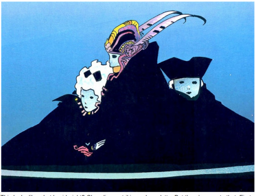
This looks like what I said, right? Clean lines, striking color palette. But there’s more to that. First of all, the fact that the gigantic flat black shape at the bottom of the piece conveys simultaneously the impression of the girl on the left leaning against the chest of the central figure and the boy on right fading into the back of composition while not containing any detail itself should clue you in to how much of a master good o’l Gir is and how much thought and knowledge had to go into designing this piece. There’s more.

If we zoom in on the head we can learn a bit. This is the focal point of the piece and, as such, this is where all the detail is. Where lines are used sparingly throughout the rest of the comp, here they provide an abundance of detail for the central figure’s elaborate headdress with contour lines defining the shape of the yellow crest and other lines throughout intimating textile patterns. The colors are striking but they’re not just random bright colors.

There’s the light blue of the background, a smattering of desaturated purple/red colors in the headdress, and the yellow of the crest. Let’s look at a color wheel:
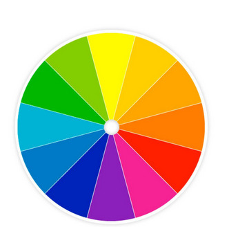
You should notice that yellow is on the opposite side of the wheel from the entire blue-purple section. Yellow contrasts with blues and purples. Thus, just that tiny bit of yellow is enough to make it totally pop out from the rest of the more desaturated blues and purples in the piece. So, not just some random bright colors, but some carefully thought out areas of low and high color contrast.
Let’s look at another example:
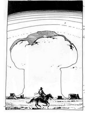
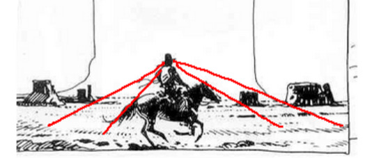
A small piece but so effective. Notice how in the top, the horizontal lines begin super tightly packed and spread to create a gradient from pack to white. Notice how the line weight increases between the shadowed and light sides of the mushroom cloud to brilliantly indicate a core shadow. Notice how the horse and rider are mostly just black shapes- but they’re composed in such a way that your mind knows exactly what they represent. Notice how the hatching that creates the ground texture also points towards the cowboy’s head as a focal point.
Another one:

Look at the linework on this. The way he varies the lineweights to indicate changes in value. The way each line describes the form of the figure and his clothes. How the lines create texture. No line here was put down by chance- each one has a purpose and Moebius knew the purpose of every mark he put on a paper.
So, I guess part one of my answer is you gotta really put the work into being a good artist and use Moebius as your guide. Get good with pens, be able to vary your lineweights, be confident with all different kinds of hatching styles, etc. Read up on color theory and see how Giraud applied it. Every new thing you learn, take that knowledge and use it to study your favorite artists and see how they applied it. That’s how you learn.
There’s a little more though and this applies to the content of Moebius’ art.
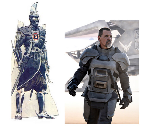
Here’s a side-by-side comparison of the Moebius’ concept art for the unmade 1970’s Dune movie with a screenshot from the new Dune movie. What makes them different? As bizarre as the Moebius design is, it feels a hundred times more real to me than the armor pictured on the right. There’s a specificity to it. Where the Moebius design feels like the result of generations of tradition and culture resulting in an outfit as elaborate, unconventional, and distinctive as that of an Ottoman Janissary, a Landsknecht, or a Samurai, the image on the right looks like a generic assemblage of armor plates with no history behind them.
As fantastic as Moebius’ work is, it definitely has a basis in the real world. I mean, he spent years illustrating a gritty, down-to-earth cowboy comic. All his designs feel distinct and specific and I would venture to say that a lot of that comes from taking an interest in real world cultures and traditions.


I think this is true of all real good science fiction and fantasy artists. They know how to take something from the real world and twist it to their own ends.
I hope this answers your question and helps you find joy in creating art. That’s what it’s all about.
For more reading, here’s a William Stout article on the subject: https://www.williamstout.com/news/journal/?p=3806
As a postscript, I’ll include some other artists that I think anyone who is a fan of Moebius should check out.
Sergio Toppi:

Katsuya Terada:

Katsuhiro Otomo:

Mark Schultz:

326 notes
·
View notes
Text
Casual Outfits Discussed

@themarchinghare Ok >:3c
These hot takes analyses and opinions are based entirely on the concept art of the demon brothers’ casual outfits. So any in-game features not present in the concept art aren’t discussed. We’re looking at the outfit as a whole, but occasionally we do talk about individual features.
Also please don’t take this seriously, we just had a lot of fun shitting on the Seven Power Avatars of Sin, Rulers of Hell Itself™’s questionable fashion sense. I would still die for these boys, terrible taste in shoes or not.
Participants in the discussion were
Jo ( @jodaneko ), my roommate and an art major with storyboarding and character design experience
Justin ( @justinlester0629 ), my go-to fashion expert for at least a decade and very possibly a future male model
Noodle (Me), untrained eye and resident fashion decade disregarder
With the exception of a few choice quotes, our thoughts and conclusions are all mixed in with each other. Quotes are mildly paraphrased.
Lucifer:

The colors are good; the blacks and grays are all in the blue-gray family, and there’s a pop of color with the gold belt and red vest.
But he paired a black suit with brown shoes???? SIN
“You should always match your belt with your shoes and those shoes are not gold.” —Justin
Justin on the coat: “I love it, the pattern of the inner lining is throwing me off but it’s not bad, and the fur is perfect because it’s associated with power.”
Me on the coat: “I don’t know about you but I bet that coat looks dumb as shit if you put your sleeves through it.”
WITHOUT the coat though his cuffs scream “I am dealing for blackjack and rolling craps.” Lucifer looks like he could walk into and out of a casino whenever he pleases and everyone would assume he works there.
“Dress shirts don’t work like that. He got a size too big.” —Jo
The belt isn’t doing anything functionally, but it’s very important because it balances things out from being too top-heavy.
Out of the belt, shirt cuffs, and coat cuffs, two of them should have matched.
We’re nitpicking because in general it’s a good design. Lucifer has no taste in shoes but that aside is capable of dressing himself.
Mammon:
“That’s western Danny Phantom if I’ve ever seen it.” —Justin
Very nice coat 10/10 would wear.
The colors are odd, he mixes black and brown too, but the other colors mixed in makes it work in a cute way.
“The only things that clash are the shirt and jeans, he could replace the gray shirt with either a black one or a lighter one to match the boots.” —Justin
He’s got a cat toy on his belt. I admire his preparedness for feline encounters.
The cat toy also balances out his rings nicely, since the toy is on his left hip and the rings are on his right hand.
The yellows in the shades, belt, and cat toy are placed very nicely and are the best part of the outfit.
Honestly except for the shirt color and the fact that fur-lined boots are out of style we don’t have much bad to say about his design. Mammon’s casual outfit lives up to his model career.
Leviathan:
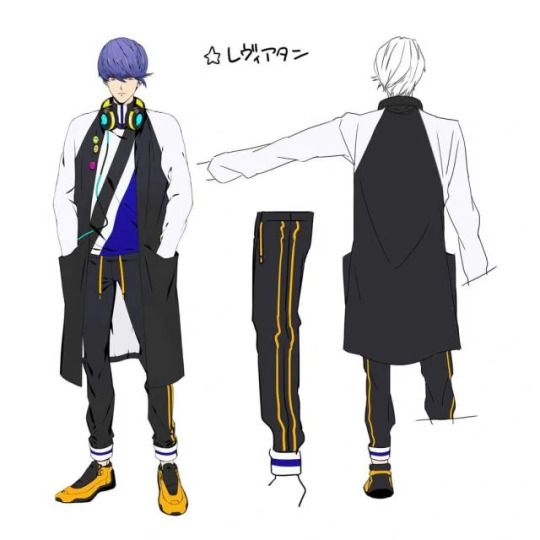
“Ugh, god.” —Justin
The headphones don’t match with anything, and ever color he’s wearing is so bright they REALLY don’t match.
Headphones aside he chose ok colors to supersaturate, but also like, supersaturation is very very loud.
It kind of looks like he bought two different tracksuits and forgot they were two different outfits.
The pants don’t match themselves.
“He color coordinated his pant cuffs and his shirt and thinks it makes it ok.” —Jo
The jacket itself is nice, the pins are really good and I appreciate that they’re opposite the stripes in his shirt.
Justin hates the gray stripe though because it looks like either part of the jacket or a girl scout sash.
“That shirt should not be collared.” —Jo
“The shoes look like what Kanye West would design but if they were sold on Wish.” —Justin
It’s kind of just… he took the RGB color wheel and went with it. It’s just loud. If he just changed some colors he’d be fine. Leviathan please I have hope for you.
Satan:

“He looks like a gay prep school person.” —Justin
Satan wore 100 shades of green and said “yes this is peak fashion.” And you know what, it objectively sucks but I’m kind of living for it?
Rip off jeans that can’t actually be ripped off because of the VERY stylish belt? Iconic.
Green deep v-neck sweater over a gradient t-shirt and a jacket with the sleeves too short, this man only shops at Goodwill.
The one-shoulder jacket look gives the outfit some personality and I’m really glad he isn’t wearing it properly because looking at it alone I wouldn’t be caught dead in that jacket.
“While good for the design, it’s a mix between business and athletic and I’m not sure how I feel about that.” —Jo
(Jo also said some jackets are designed with sleeves like that but with the color choices it’s just… not good. Justin pointed out that the sweater and jacket do match though.)
The chocolate loafer-style shoes take away from the rest of the outfit.
“Any other shade of green besides Crayola green would have been better for his nails.” —Justin
Listen it’s so bad it’s good, Satan’s fashion sense is “blue-green.” We basically ripped into it the whole time but I’m pretty sure it was the universal favorite.
Asmodeus:
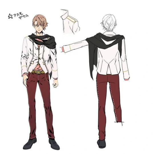
“Just from the back he looks like a cool dude and then the front of him screams douche.” —Jo
Asmo’s outfit is actually ok, but he has one fatal flaw: If he takes off his jacket it’s way too plain, but with the jacket it’s kind of too much.
It’s also kind of confusing, because it looks both casual and formal from different angles. “I’m not sure I like the cut in the front with the t-shirt showing underneath.” —Justin
The shirt is nice but a color that contrasted his skin more would have been nice.
The pants are killer, and the white stitching matches the jacket really well.
The gold accents on the jacket are also good and would match the belt really nicely if the belt wasn’t some ugly mustard color.
This boy is wearing mustard belt and ketchup pants.
Inoffensive shoes which is really the best I can ask for with these boys.
“The scarf. I like it, but I’m not sure how I feel about it because there’s just so much going on with both it and the jacket.” —Justin
“That’s not a scarf, it’s too long. It’s like. A really long strip of cloth.” —Jo
Anyway all in all there’s a little much going on in the front but it’s one of the better looks, good job Asmo.
Beelzebub:

Justin looked at the picture and immediately put his phone down.
“First impression is he looks like Naruto if he got his head lodged in Doritos.” —Justin
“He looks like he’s the carpet of the arcade portion of a skating rink.” —Jo
“He shouldn’t be wearing orange tones.” —Justin
Legitimately we were at a loss for words for a considerable time. We just kept staring at it.
To start he’s got a lot going on but it feels like he looked in the mirror before leaving his room. Not saying he did the best job but at least he looked at himself.
The jacket alone is great, but why is it fur-lined? It throws off the urban design.
But finally some good fucking shirt. We have mixed opinions on the triangles (I like them, Justin doesn’t but appreciates that the pattern continues on the back) but all like the cut.
Living for the necklace-bracelet combo.
Jo says the biggest problem is that there’s color-matching but in weird places and not enough of it.
Jo hates the pink belt and Justin hates the green suspenders; we concluded that one of them should have been excluded.
His choice in sneakers is not as bad as Levi’s but still not very good. The laces shouldn’t be green.
This sounds like a lot of complaining but if he cleaned up the belts and ditched the fur it’d be a fine look.
Belphegor:
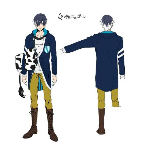
“Oh shit oh god.” —Justin
“The top half is for sleeping and the bottom half is for riding.” —Jo
Absolutely disgusting, mustard yellow pants tucked into brown lace-up combat boots? Disgusting.
The shoes alone are nice but the mustard pants don’t work at all. There’s no cutoff between blue and mustard.
Also he has really broad shoulders, just noticed that looking at this. That has nothing to do with this but it does affect how his cardigan sits on him.
I personally would wear that cardigan, a hooded cardigan? Everything I’ve ever wanted.
Justin pointed out that the button lining is weird, and the inside is a weird contrast with the pocket. He’s right, but I think it’s an endearing mess.
Why do I look at him and feel like he needs to do laundry? I think it’s the t-shirt. It would have been better as a collared shirt, taking the hood off the cardigan in return.
You can’t convince me the avatar of sloth laces those boots every day, he sleeps with his shoes on and that’s a worse sin than sloth.
“The pillow’s not part of the outfit? Oh thank god.” —Justin
Jo said we were being too mean and that it’s not the worst outfit out there, and from the waist up they’re right.
But damn Belphegor the condiment war called and they want the bottom half of their uniform back.
#obey me#obey me one master to rule them all#obey me shall we date#shall we date obey me#obey me swd#swd obey me#obey me!#obey me lucifer#obey me mammon#obey me leviathan#obey me satan#obey me asmodeus#obey me beelzebub#obey me belphegor#obey me outfit analysis#image
1K notes
·
View notes
Last Seen Blogs