#glassmorphism form design
Explore tagged Tumblr posts
Visit Tumblr Blog
Explore Tumblr blogs with no restrictions, modern design and the best experience.
Last Seen Tumblr Blogs


Fun Fact
12.7% of mobile users access Tumblr.
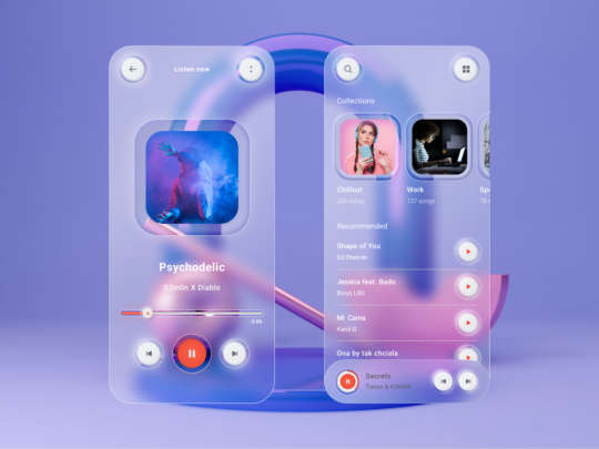
Text
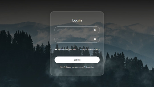
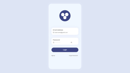
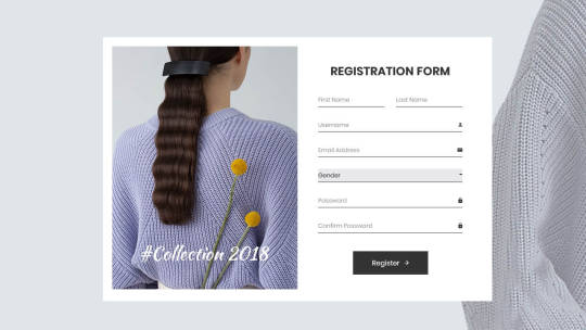
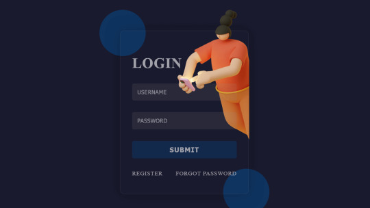
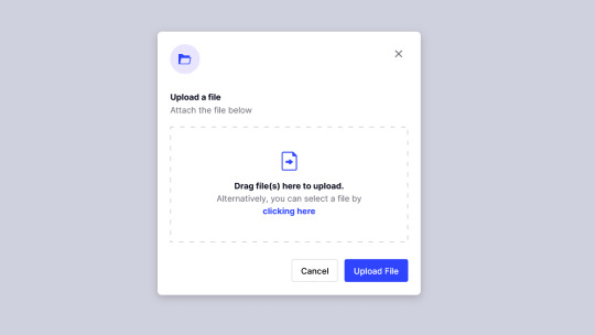
Login Form Design in HTML & CSS
#login form design#html css form#css form#glassmorphism#html css#divinector#css#frontenddevelopment#webdesign#html#css3#form html css#form html#learn to code#html5 css3
5 notes
·
View notes
Text
The History and Meaning of Frutiger Aero
[This is written by me! It's mainly just a re-phrasing of the Frutiger Aero aesthetics wiki- but I had a lot of fun writing it!]
Hello you silly goobers! I am your aesthetic teacher, Kitty! In todays lesson, we're going to be learning all about "Frutiger Aero"! Lets start! [Google slide of moodboards/images of the aesthetics/subgenres: https://docs.google.com/presentation/d/1-Y2IDxaHEcLh0h0uXLEv_-NlgwlX48vh2B2HySMTRBs/edit?usp=sharing ] [Not all aesthetics/subgenres will have a slide, not all of them will have a moodboard]
First of all- what the heck is frutiger aero?! Frutiger Aero is an aesthetic first popularized in the mid 2000s, Frutiger aero is also sometimes called "Web 2.0 Gloss" It's a design style that was often prevalent in advertising, media, stock imagery and technology from around 2004 to 2013. Frutiger Aero uses glossy textures, cloudy skies, tropical fish, water, glass, bubbles, lens flare, and vibrant colors [usually blue and green]. [all images are in the google slide provided]
HOW IT GOT IT'S NAME Now what about that name? Frutiger Aero is quite a funny name isn't it? Well during the aesthetics peak, it didn't really have a name! It wasn't until more recently that the aesthetic was given a proper name. The name "Frutiger Aero" was coined in 2017 by Sofi Lee! The name comes from "Adrian Frutiger", who was the creator of the Frutiger fonts often used in the aesthetic. And Windows Aero, which was the UI theme for the Windows Vista/7.
THE HISTORY AND THE DEATH OF FRUTIGER AERO According to the Aesthetics Wiki "The earliest signs of Frutiger Aero appeared in 2001 with the releases of Microsoft's Windows XP and Apple's Mac OS X 10.0" But Frutiger Aero was at it's true prime during 2007-2012, it was being used in most advertising, media, stock imagery and technology released during this time. But the aesthetics popularity would soon start to decline in the upcoming years. 2012 would be the death of the Frutiger Aero aesthetic, with the Wii U being the last to fully embrace the Frutiger Aero look. But the Wii U was a complete commercial failure, only selling 13.56 million units, which would spell the end for the Frutiger Aero aesthetic...
THE REVIVAL Around late 2022, the aesthetic had seemed to be making a comeback via TikTok videos in the form of nostalgia, with the #frutigeraero being used over 30 million times. In August 2023, a TikTok post about the aesthetic was posted to the official Windows TikTok account. And some people believe Windows 11 is related to Frutiger Aero or contains a successor aesthetic [Glassmorphism], as seen in promotional material.
SUBGENRES Frutiger Aero has many "subgenres", here are some of them [all of them link to their aesthetic wiki page]:
Helvetica Aqua Aero [https://aesthetics.fandom.com/wiki/Helvetica_Aqua_Aero]
Frutiger Aurora [https://aesthetics.fandom.com/wiki/Frutiger_Aurora]
Dark Aero [https://aesthetics.fandom.com/wiki/Dark_Aero]
Technozen [https://aesthetics.fandom.com/wiki/Technozen]
Four Colors [https://aesthetics.fandom.com/wiki/Four_Colors]
Vectorgarden [https://aesthetics.fandom.com/wiki/Vectorflourish#Vectorgarden]
Bright Tertiaries [https://aesthetics.fandom.com/wiki/Bright_Tertiaries]
Frutiger Metro [https://aesthetics.fandom.com/wiki/Frutiger_Metro]
CONCLUSION So in conclusion, Frutiger Aero is an aesthetic loved by many, and has a very interesting history! Thank you so much for joining me on this wonderful journey! I am very passionate about this aesthetic and really enjoyed sharing it with you all! Please check out the Aesthetics Wiki! I got all of my info from there!
#frutiger aero#frutiger metro#technozen#Bright Tertiaries#vectorgarden#writing#history#internet history#frutiger aqua#dark aero
9 notes
·
View notes
Text
Exploring the “Neumorphism” Design Trend
Welcome back to our design trend series! On Day 6, we're peeling back the layers—literally—with a style that quietly snuck onto the design scene, brought softness back to interfaces, and divided the design community faster than you can say "drop shadow." Say hello to Neumorphism, or as some like to call it, Soft UI.
Let’s dive into the dreamy, pillowy world of Neumorphism and see why it became such a visual sensation (and UX debate starter).
What is Neumorphism?
Neumorphism is short for “New Skeuomorphism.” It reimagines the shadows and highlights used in the old days of real-world mimicry (like a calculator app that looked like a real calculator), but with a modern, minimal twist.
Imagine this: a soft, monochromatic background where buttons and cards look like they're being gently pushed in or popped out of the surface—like clay impressions. Neumorphism focuses on subtle depth, low contrast, and a visual language that feels incredibly tactile.
It's clean, futuristic, and soothing... unless you’re trying to design a highly accessible interface (more on that soon).
A Bit of Background: Where Did Neumorphism Come From?
The term gained traction around late 2019 to early 2020 when designer Alexander Plyuto shared some concept UI work on Dribbble that quickly went viral. People were fascinated by how “real” everything looked without using any photos or textures—just light, shadow, and elegant shapes.
Soon after, designers started experimenting with this style across UI kits, dashboards, login forms, and mobile apps. It became the darling of Behance and Dribbble portfolios for a while. But, like every fashion trend, the honeymoon phase didn’t last forever.
Key Features of Neumorphic Design
Let’s break it down into its signature components:
Soft Shadows (Both Light & Dark): Elements have shadows going in two directions—light shadow from one side and a dark shadow from the other—creating an embossed or debossed effect.
Monochrome or Subtle Gradients: Usually based on a single pastel or neutral tone (grey, beige, soft blue).
Minimal Color Contrast: The elements blend into the background rather than stand out sharply.
Rounded Corners & Smooth Edges: Giving the UI a friendly, modern, and very “huggable” look.
3D-Like Visuals: Without any actual 3D rendering, everything feels tangible.
Flat Meets Realism: It’s like flat design with just a little extra oomph.
Pros of Neumorphism
Despite its criticisms, Neumorphism did bring a few lovely things to the design table:
Aesthetic Appeal – There’s no denying it: Neumorphism looks modern, stylish, and clean when done well.
Freshness – It offered a fresh alternative to flat design, which had been dominating for years.
Great for Minimal Interfaces – Neumorphism shines in environments where visual complexity isn’t needed, like smart home apps or digital dashboards.
The Downsides (Let’s Be Real)
Alright, time for the roast.
Accessibility Issues: With such low contrast, buttons can be invisible to users with vision impairments or in poor lighting.
Overuse of Shadows: If you're not careful, it can become a soft, fluffy mess with no visual hierarchy.
Lack of Flexibility: Neumorphism doesn't work well with colorful or dynamic content—it thrives in static, monotone systems.
Hard to Scale: Try designing a full-fledged e-commerce site in pure Neumorphism. Good luck making those CTA buttons stand out.
This is why most Neumorphism implementations are either concept-only or used in small, contained components.
Where Neumorphism is Used Today
Despite the drawbacks, Neumorphism hasn’t vanished. It’s evolved—often being blended with other styles like minimalism, glassmorphism, or even flat design to create hybrid interfaces.
Popular uses include:
Smart home controls
Music player apps
Portfolio websites
Finance dashboards
Designers often use neumorphic elements sparingly—one or two soft cards within a more robust design system.
Design Tip: How to Use Neumorphism Effectively
If you want to add a touch of Neumorphism without making your whole interface feel like it’s floating in a marshmallow pit, try this:
Use it for non-critical UI elements: cards, stats, avatars, etc.
Always check your contrast ratios. WCAG standards exist for a reason!
Combine it with flat UI styles to keep things readable and interactive.
Don’t rely on Neumorphism for buttons unless you provide backup visual cues.
Fun Fact of the Day
Neumorphism became so popular so fast that Figma, Adobe XD, and even CSS generators were flooded with “neumorphic” UI kits within weeks of its rise. Some of them were downloaded over 100,000 times—proving once again that design trends are the fastest-moving fashion statements of the internet.
Neumorphism may not have taken over the world, but it left a soft, pillowy footprint on the design landscape. And in the right hands, it still feels fresh and modern today.
https://letterhanna.com/exploring-the-neumorphism-design-trend/
0 notes
Text
2024 UX/UI Design Trends: Pioneering the Future of User Experience
In 2024, the worlds of UX and UI design continue to evolve based on the progress that technology brings along with it as well as the increasing knowledge of the needs of the user. This has moved the focus more toward making experiences inclusive, personalized, and sustainable. Let’s dive into some of the key trends shaping UX/UI design this year.
1. Embracing Inclusivity in Design
Inclusive design considers the notion of creating digital products to be accessible by a very diverse audience. It means considering age, ability, and cultural background, with everyone being able to get around the interface without problems. Designers are putting more features in place to make this possible, like changing text size, using voice navigation, and generally using simple, intuitive layouts.
Why It Matters: Through this strategy, brands create an accessible environment, enabling them to touch the lives of more customers and increase the loyalty level among users, ultimately leading to a more equitable digital landscape.
2. Tailored Experiences Through Personalization
It will be an era of 2024, and the heart of UX design is to be personalized, taking this to the next level of artificial intelligence and machine learning. A designer, from users’ behavior and preference, can craft something which is unique to his need, like customizing the dashboards and giving some personalized content suggestions.
Why It Matters: Personalized experiences increase the level of user satisfaction and engagement at a high level as they make people feel valued and understood.
3. Immersive Interactions with VR and AR
Virtual Reality and Augmented Reality are becoming more prominent in the field other than entertainment. Such applications are seen in retail, education, and training. The technology is fun, interactive, and immerses users in an experience with a lifelike view of the product being experienced.
Why It Matters: An immersive experience makes the interaction of users with the interface memorable, making the whole experience rich.
4. The Power of Micro-Interactions
Small micro-interactions are little things such as animation or any other visual feedback element within a system while users are interacting. Subtle animations such as the changing of a color on the press of a button, like on clicking it or notification bubbles, give an easier flow to an experience.
Why It Matters: Micro-interactions are crucial because they make user experience not just friendly but more usable and pleasurable by making an interface seem almost alive.
5. The Aesthetic Appeal of Glassmorphism
Glassmorphism is that trend of giving UI elements a frosted glass effect for depth and layering. It is an almost entirely modern way of putting forth information in a tastefully beautiful yet clear and focused manner.
Why it Matters: Because it has combined aesthetics with functionality, glassmorphism may potentially make interfaces more interesting without overburdening the user.
6. Commitment to Sustainable Design
Sustainability is becoming a crucial concern in UX/UI designing. Sustainable design is how digital product development can lower the environmental impact of its product through efficient coding, reduced server load, and making use of eco-friendly hosting solutions.
Why It Matters: Brands that focus more on sustainability will be highly rated by consumers who go green and will attract lots of loyal users.
7. Bold Typography for Impact
Typography plays a great role in the overall user experience. This year, designers have started switching to using bold, all-cap fonts, as well as fonts that are retro-style inspired but can get attention with reflecting the personality of the brand. That way, such typographic choices develop a visually impressive appearance to general communication.
Why It Matters: Well-chosen typography can potentially make communication easier to read and will form a more enjoyable brand identity.
8. Intelligent Assistance with AI Chatbots
AI-powered chatbots have changed the way customer services operate. This tool provides answers to users’ questions on an instant basis and takes their preferences into consideration while formulating a response.
Why It matters: Such a response time and customization generate tremendous user satisfaction and process optimization within support services.
9. Strengthening Security with Blockchain
In a digital landscape fraught with privacy concerns, blockchain is emerging as a reliable answer to the need for safety enhancement. Blockchain increases the level of trust and transparency of user transactions by decentralizing storage.
Why It matters: The use of blockchain is a method to alleviate some security concerns that make people feel safer while interacting with digital products.
10. The Visual Depth of 3D Layouts
The use of 3D elements in UX/UI design gives the effect of depth and realism. The layers and 3D effects help designers create more interactive interfaces to guide users on their digital journey.
Why It Matters: 3D layouts capture attention and encourage exploration, leading to a richer user experience.
11. Mastering the Use of White Space
White space, or negative space, is a very critical element of design that cleans up the layout and adds an air of organization to it. With the addition of strategic white space, designers are able to promote readability, draw attention from the user, and really enhance the overall aesthetic value of an interface.
Why It Matters: Properly used white space creates the feeling of balance and clarity, resulting in a nicer and more efficient user experience.
Conclusion
The 2024 UX/UI design landscape is all about inclusivity, personalization, and sustainability. These trends are going to help designers make digital experiences useful and meaningful to users. Moving ahead into the future of digital design, these trends are equally important to be tracked and adhered to in order to come up with outstanding user experiences.
Whether you are a designer, developer, or just curious about the world of digital interactions, these trends offer great opportunities to elevate user experiences and build lasting connections in an ever-evolving digital world.
0 notes
Text
Innovative Design Ideas
In the ever-evolving realm of digital aesthetics, crafting a website that is both visually arresting and functionally intuitive is paramount. Herein, we delve into a compendium of avant-garde design ideologies to inspire your next digital masterpiece.
Minimalistic Elegance
Simplicity is the ultimate sophistication. Embrace a minimalistic approach by utilizing ample white space, monochromatic color palettes, and sleek typography. This design philosophy not only enhances readability but also fosters a sense of tranquility and focus. Each element should serve a purpose, eschewing superfluous components that detract from the core message.
Dynamic Interactivity
Transform static browsing into an engaging experience through dynamic interactivity. Integrate animations, hover effects, and micro-interactions to captivate users. These subtle yet impactful elements can guide navigation, provide feedback, and enhance user engagement, making the journey through your site both memorable and enjoyable.
Immersive Multimedia
Harness the power of multimedia to create an immersive experience. High-definition images, videos, and audio can convey stories more effectively than text alone. Ensure these elements are seamlessly integrated, enhancing the narrative without overwhelming the user. Balance is key to maintaining an elegant and professional appearance.
Responsive Fluidity
In an era dominated by diverse devices, responsive design is non-negotiable. Ensure your website adapts fluidly to various screen sizes and resolutions. This responsiveness not only improves usability but also boosts SEO rankings, as search engines prioritize mobile-friendly sites. Employ flexible grids and scalable images to achieve this adaptability.
Asymmetrical Layouts
Break free from conventional grid structures with asymmetrical layouts. This design technique injects energy and intrigue into your website, drawing users' attention and encouraging exploration. Strategically placed elements create a harmonious balance that guides the eye naturally through the content, making the browsing experience both intuitive and engaging.
Vibrant Gradients and Bold Colors
Inject vibrancy into your design with bold color schemes and gradients. These elements can evoke emotions and create a memorable visual identity. Experiment with contrasting colors to highlight important sections and guide user behavior. However, exercise restraint to avoid overwhelming the senses, ensuring a harmonious and professional aesthetic.
Seamless Navigation
Intuitive navigation is the cornerstone of user experience. Design a clear, logical structure that allows users to find information effortlessly. Employ breadcrumb trails, sticky headers, and well-organized menus to enhance discoverability. The goal is to create a frictionless journey that keeps users engaged and encourages them to explore further.
Typographic Artistry
Typography is more than just choosing a font; it is an art form that can elevate your website's design. Pair contrasting typefaces to create visual interest, and utilize varying weights and sizes to establish hierarchy. Pay attention to line spacing and alignment to ensure readability and aesthetic appeal.
Integrative Accessibility
Incorporate accessibility into your design from the outset. This inclusivity ensures that your website is usable by everyone, including individuals with disabilities. Utilize alt text for images, ensure sufficient color contrast, and provide keyboard navigation options. An accessible website not only broadens your audience but also demonstrates social responsibility.
Cutting-Edge Trends
Stay abreast of the latest design trends to keep your website fresh and contemporary. From dark mode and glassmorphism to 3D elements and voice-activated interfaces, incorporating cutting-edge techniques can set your website apart. However, always prioritize user experience over fleeting trends to maintain a timeless appeal.
Also, have a look at the package design ideas
1 note
·
View note
Text
Explore 35+ CSS Login Forms

In the dynamic realm of online interactions, the login form serves as the gateway to user engagement, making its design crucial for leaving a lasting impression. At CSS Monster, we recognize the significance of an effective and visually appealing login form on your website or application. To empower your digital journey, we've meticulously curated a collection of over 35 stylish and highly functional CSS login forms sourced from esteemed platforms like CodePen, GitHub, and other reputable resources. As we embrace the future of web design, our latest update in June 2023 introduces eight new items to our collection. Each addition is a testament to our commitment to continually elevate your website's user experience and streamline the login process. In a landscape where digital interactions reign supreme, the importance of a well-designed login form cannot be overstated. It serves as the initial point of contact between users and your platform, influencing their decision to engage or move on. A user-friendly login form must embody qualities of intuitiveness, responsiveness, and visual appeal, while upholding the paramount principles of security. Within this collection, we invite you to explore a showcase of the finest pure CSS login forms available for free on the web. Each entry not only captivates with its visual aesthetics but is also meticulously crafted with functionality and user experience at the forefront. From imaginative animations to thoughtful error handling, these login forms offer a spectrum of features and benefits that redefine the login experience. Embark on a journey through our collection, experiment with the diverse designs, and witness your login forms ascend to new heights. Your users will undoubtedly appreciate the seamless and visually engaging login experience you create. Dive into the world of CSS login forms at CSS Monster—where every login is an invitation to an exceptional user experience. Happy coding!
Author ApexCoder June 10, 2023 Links Just Get The Demo Link How To Download - Article How To Download - Video Made with HTML / CSS About a code HACKER LOGIN FORM Compatible browsers:Chrome, Edge, Firefox, Opera, Safari Responsive:no Dependencies:-
Author Sowjanya October 28, 2021 Links Just Get The Demo Link How To Download - Article How To Download - Video Made with HTML (Pug) / CSS (SCSS) About a code FINANCE MOBILE APPLICATION-UX/UI DESIGN SCREEN ONE Compatible browsers:Chrome, Edge, Firefox, Opera, Safari Responsive:no Dependencies:ionicons.js
Author Mohithpoojary September 21, 2021 Links Just Get The Demo Link How To Download - Article How To Download - Video Made with HTML / CSS About a code LOGIN FORM Compatible browsers:Chrome, Edge, Firefox, Opera, Safari Responsive:no Dependencies:font-awesome.css
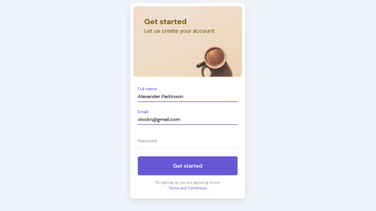
Author Foolish Developer September 13, 2021 Links Just Get The Demo Link How To Download - Article How To Download - Video Made with HTML / CSS About a code GLASSMORPHISM LOGIN FORM Compatible browsers:Chrome, Edge, Firefox, Opera, Safari Responsive:no Dependencies:font-awesome.css Author slimen mami September 13, 2021 Links Just Get The Demo Link How To Download - Article How To Download - Video Made with HTML / CSS About a code SIGN UP / LOGIN FORM Compatible browsers:Chrome, Edge, Firefox, Opera, Safari Responsive:yes Dependencies:-
Author Rok Krivec April 2, 2021 Links Just Get The Demo Link How To Download - Article How To Download - Video Made with HTML / CSS About a code CREATIVE AND CUSTOMIZABLE REGISTRATION FORM Compatible browsers:Chrome, Edge, Firefox, Opera, Safari Responsive:yes Dependencies:material-design-iconic-font.css
Author Rok Krivec April 1, 2021 Links Just Get The Demo Link How To Download - Article How To Download - Video Made with HTML / CSS About a code ECOMMERCE REGISTRAION FORM Compatible browsers:Chrome, Edge, Firefox, Opera, Safari Responsive:yes Dependencies:material-design-iconic-font.css
Author Rok Krivec April 1, 2021 Links Just Get The Demo Link How To Download - Article How To Download - Video Made with HTML / CSS About a code REGISTRATION FORM #18 Compatible browsers:Chrome, Edge, Firefox, Opera, Safari Responsive:yes Dependencies:material-design-iconic-font.css
Author Rok Krivec April 1, 2021 Links Just Get The Demo Link How To Download - Article How To Download - Video Made with HTML / CSS About a code SIGN UP FORM #26 Compatible browsers:Chrome, Edge, Firefox, Opera, Safari Responsive:yes Dependencies:-
Author Rok Krivec April 1, 2021 Links Just Get The Demo Link How To Download - Article How To Download - Video Made with HTML / CSS About a code SIGN UP FORM #7 Compatible browsers:Chrome, Edge, Firefox, Opera, Safari Responsive:yes Dependencies:material-design-iconic-font.css
Author HiCoders January 25, 2021 Links Just Get The Demo Link How To Download - Article How To Download - Video Made with HTML / CSS About a code GLASSMORPHISM LOGIN FORM Compatible browsers:Chrome, Edge, Firefox, Opera, Safari Responsive:no Dependencies:- Author Larissa Rabello April 22, 2019 Links Just Get The Demo Link How To Download - Article How To Download - Video Made with HTML / CSS About a code SIGN UP MODAL Compatible browsers:Chrome, Edge, Firefox, Opera, Safari Responsive:no Dependencies:bootstrap.css, jquery.js, bootstrap.js, popper.js Author Florin Pop March 4, 2019 Links Just Get The Demo Link How To Download - Article How To Download - Video Made with HTML / CSS / JS About a code DOUBLE SLIDER SIGN IN/UP FORM Compatible browsers:Chrome, Edge, Firefox, Opera, Safari Responsive:no Dependencies:font-awesome.css Author Tony Banik October 24, 2018 Links Just Get The Demo Link How To Download - Article How To Download - Video Made with HTML (Pug) / CSS (SCSS) About a code LOGIN FORM Compatible browsers:Chrome, Edge, Firefox, Opera, Safari Responsive:no Dependencies:- Author bertdida October 17, 2018 Links Just Get The Demo Link How To Download - Article How To Download - Video Made with HTML / CSS (SCSS) About a code SIMPLE REGISTRATION FORM Compatible browsers:Chrome, Firefox, Opera, Safari Responsive:no Dependencies:- Author Mert Cukuren October 1, 2018 Links Just Get The Demo Link How To Download - Article How To Download - Video Made with HTML / CSS (SCSS) / JS (Babel) About a code LOGIN MODAL FORM Compatible browsers:Chrome, Edge, Firefox, Opera, Safari Responsive:yes Dependencies:-
Author Marko October 3, 2018 Links Just Get The Demo Link How To Download - Article How To Download - Video Made with HTML (Haml) / CSS (SCSS) About a code CUBE LOGIN FORM Compatible browsers:Chrome, Edge, Firefox, Opera, Safari Dependencies:-
Author Pablo Eugenio Lujambio Martinez May 23, 2018 Links Just Get The Demo Link How To Download - Article How To Download - Video Made with HTML / CSS (SCSS) Read the full article
0 notes
Photo

Form Design with Glassmorphism Effect
#form design#form design html css#css form#css form design#css glassmorphism#css glassmorphism effect#glassmorphism form design#glass morphism#glass morphism effect#html css#css tricks#codenewbies#frontenddevelopment#webdesign#frontend
0 notes
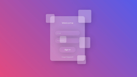
Text

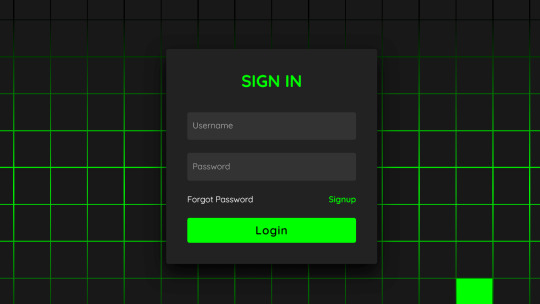
Glassmorphism login form UI
#frosted glass effect#glassmorphism#login form design#html css#divinectorweb#css#frontenddevelopment#webdesign#html#css3#login form ui#html css form#css form#transparent login form
1 note
·
View note
Text
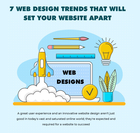
7 Web Design Trends That Will Set Your website Apart
Consider some of the websites you’ve visited in the previous several months. You definitely noticed a few that stood out due to their user-friendly web design and beautiful style. The same is true for websites with poor user experience: they remain with you and may even make you dislike the company.
We began to see commonalities after gathering samples of current websites and doing our own UX research. A great user experience and an innovative website design aren’t just good in today’s vast and saturated online world; they’re expected and required for a website to succeed.
Retro styles are making a comeback in terms of visual appeal. Many designers are abandoning photograph-heavy layouts in favor of experimenting with text, grids, and lines. We’re giving you a head start on what’s coming up next with this article. Here are 7 web design trends that will set your website apart:
Micro Animations:
Micro animations are little animations that play on their own or in response to human engagement. They improve the aesthetic appeal and can be used as navigational aids on your website. Micro animations on hero photos give a splash of color, while micro interactivity on symbols demonstrates attention to detail and improves online accessibility.
Micro animations are used by certain eCommerce companies to present things from various angles on their product pages. It allows retailers to show how clothes fit the body while the user is moving.
Typographic Hero Images:
Many websites are using Free Vector Icons and hero photos that are dominated by typography. Some designers use no imagery at all to allow the text to speak on its own, while others use basic photographs or graphics. This design is striking and draws consumers’ attention. In a typography hero image, you need a readable font type that stands out against a bright background. Solid color backgrounds provide the best contrast, but a high-quality photo can still be used with a suitable text arrangement.
Glassmorphism:
Glassmorphism is a web design trend in which items on a page take on the appearance of frosted glass. When paired with minor motions to create a 3D illusion, it’s wow power is amplified. Transparency, blur, and shadows are used to create glassmorphism. Blurring the backdrop provides depth and gives the impression that the object is floating. A light border adds a finishing touch, simulating a glass edge and letting it stand out.
Memphis Design:
In the 1980s, one of the most popular trends was Memphis design. The trend was all on colorful forms and lines, as well as unconventional patterns that defied simplicity. It’s easy to see why Memphis designs are resurfacing on today’s websites. While simple interfaces are straightforward, they don’t help with branding because everything looks the same.
Collage Illustration:
Collage-style graphics let you play around with various shapes, patterns, and pictures to give your website a more personal, approachable feel. This style has a poor name for being excessively cluttered or disjointed, yet competent web designers know how to make use of this.
Animated Scrolling
Scroll-triggered animations are another approach to attract people’s attention. When an item is visible within the viewport, the most popular scrolling animations are meant to move. Vibrating, changing color, sliding, and so on are all options for page components.
Scrolling effects that are well-designed can encourage consumers to convert. They stimulate active interaction and emphasize crucial portions of your site, in addition to providing an aesthetically appealing atmosphere.
Visible Borders:
After completing a wireframe, nothing is more fulfilling than deleting grids. In 2022, though, leaving obvious borders is a plus. Visible borders are a great way to round off a classic look, but they also make web content simpler to digest. Clear demarcations allow users to concentrate on one piece at a time, eliminating the need to guess where they should move next.
0 notes
Text
Top 12 Best UI/UX Design Trends In 2021
We know that competition in the market is fierce and user attention has reached the highest level ever. Each factor is important when designing to attract more organic traffic. All businesses need more web or application visitors to attract their website.
research shows that design is the first impression of web and mobile users. Visual appeal and user efficiency play a prominent role in the interaction between visitors and digital products. It is expected that the work of a web designer will have an excellent online image and help achieve user goals. Sometimes people want to know what UI UX design is.
What is UI UX design?
UX design introduces the terms user experience design and UI stands for user interface design. These factors are critical to the product, and they all work at the same time. Although he has an expert relationship, he plays different roles and is involved in various forms of the product design process. UI UX designers know how to use them in their design projects and attract more customers.
Let’s Check The Latest Trends In UI Design
Illustrations and Animation
There is a trend for custom 2D or 3D illustrations or figures or design factors, drawn by hand. It appears in free form, misaligned factors, projects, and huge asymmetric forms, and also creates a familiar and attractive environment to give users a better experience. All businesses expect the website to be able to perfectly display their image online, which is why these illustrations come with a variety of proposal designs.
Helps to attract the attention of the user and reveal the content provided by the company on the first site. A lovely illustration is customized for the website or mobile app to make it more interesting.
moving factors and amazing animations make users curious, scroll further to see what information is available. The UI UX design uses these attractive solutions and analyzes the industry represented by the website.
Scroll-Activated Animation
The ability to tell stories about digital activities will continue to be the best trend. Typography creates a dynamic visual hierarchy and becomes a core element of user interface design. It plays an important role in shaping a great user experience.
copywriting becomes one of the most important factors for the best user experience. His style attracts the attention of users and is related to a brand.
When you need to switch, you need to consider the conversion rate. UI designers use a simple style with 3D illustrations, and the service website looks professional and keeps up with the times.
Artificial Intelligence
AI is built into all products, making work easier and easier. You can quickly create manual connections, even digital photos, on-demand, without worrying about copyright, distribution rights, infringement claims, or royalties. The product understands users based on user behavior and creates a personalized user experience. When designing many guide screens, will eventually lead to a higher conversion rate and provide a smoother experience.
Augmented Reality
Web design trends require thinking according to the latest trends. There is a need to show interactions that take place in the real-world environment.
We know technical giants like Google & Apple already introduced their AR development platforms. AR UI design comes with various approaches that help UI designers to create innovative designs.
Most UI UX designers develop their knowledge with the upcoming AR UI kits. The capability to produce augmented reality interfaces and 3D factors will become a useful technique in the upcoming years.
Virtual Reality & Meetings
Virtual reality becomes popular in 2020 and provides users with more Internet experiences. It also brings more excitement to the game audience. It presents an important opportunity to improve communication between various departments during power outages.
UX designers create virtual spaces for their clients and help create designs with virtual factors. Today, due to the pandemic, there is also a trend towards virtual meetings.
virtual intelligent tools made a breakthrough, further analysis from the design point of view. There are many possibilities in this area, and a cleaner and lighter version has been designed for those who have experienced slow Internet access.
People work from home all the time, so they need to make simple online video calls. Now, UI designers use the latest virtual meeting features to create sites or applications.
Usability
Usability has become the "UI" trend of various UI UX layouts. Google includes three new user experience metrics to cover website loading speed, interactivity, and visual stability. We call it Core Web Vitals. User experience auditing is the best practice to identify product usability flaws and improve its online performance.
We can perform usability tests on real users to learn more about their needs. Shift the focus of the user interface to a more common and user-friendly layout. User experience design can easily attract the attention of visitors to your website or app.
You need to understand the website there. Sometimes the UI design structure of the client communicated advertising portfolio website is abnormal and the animation is heavy, which does not mean it is used for commercial websites.
Glassmorphism
UI designers have brought a new kind of excitement called the glass shape. It comes from the blur effect or blurred background, which brings a new impression to the user. It seems they saw it from the glass.
Glassmorphic elements are becoming more and more popular because people do not like to use new morphological elements due to their poor accessibility.
These glassy transparent components provide clearly defined permissions on the interface. We can do this by simulating the depth that encourages users to distinguish given factors.
3D Designs
We live in a generation of rapid development of technological endeavors and performance, such as software optimization. People tend to use animated details, such as logos, illustrations, and text. It grows on the web and provides users with different parts that they can interact with.
design tools (such as Adobe XD) have determined the next 3D details in the design. An additional feature called 3D conversion has been introduced to add an extra look to upcoming designs.
The user interface design can be considered beyond the traditional X and Y axes to generate concepts. Now UI UX design can help designers to get AR or VR experience
Similar Icons
Advanced trends are accompanied by flat geometric designs or vibrant gradients, and we use these logos as icons. We use these icons for various purposes and get a cool and similar look so it's easy to tell them apart.
It is a powerful tool for visual communication with customers. We analyze simple icons to turn them into powerful user experience trends.
Ink Trap Fonts
The latest trends in the use of ink trap fonts related to typography indicate that various font characteristics are arranged for small size printing. We raised the corners or details of the glyphs, and if there were no ink traps, the extreme ink would come out and destroy the edges.
When we create an ink trap to print small dots on newsprint. Large, bold versions of these fonts appear on the website, adding more personality and charm to the typeface.
Retro Aesthetic
There are a variety of colors, and large and bold fonts are used in the design. UI designers accept the qualities of the modernist art movement by understanding the purpose of the website.
The designer realized the need to determine the appropriate font for the website, product, or application. Users will always associate selective fonts related to a great brand. The Internet giant created the Roboto front and showed it to the world.
UX designers using fonts to search have become one of the major trends in user interface design. Web designers use various sources to display relevant information and communicate it to clients. We create most websites based entirely on typography, and they look fresh and interesting.
No-code Platforms
The coding software is not growing, and these platforms include low code (low code) or (no code) programming skills.
Many online visual publishers allow users to build their websites and start. An experienced designer uses WebFlow to develop new products. Using the same template on a variety of websites, it helps create a unique page.
The designs of the user interface must handle creativity and innovation. According to the project, it is necessary to promote the latest trends and adaptation technology.
We can use the latest trends of our design project, so it may be more user experience. The design of UI UX has many other new trends. The IU designers can be easily used in several projects using all advanced trends in their projects. It helps you design sites and applications in an attractive way.
Our Model
UIUX Studio working design team uses the latest technology and utilizes the latest trends in design projects. Our team has experts who know how to use the latest trends in projects.
We have been in the design field since 2009, handling many projects around the world. Our design team has the experience to use the latest features according to your projects.
Therefore, the trend in 2021 is mixed, with designers using simplified UX, soft colors, 3D animation, or visual effects, or typographic fonts.
Our team of UX designers has created a fresh and attractive user interface that connects various trends.
Final Thoughts
We firmly believe that the primary goal of UI / UX design is to help users manage their goals. Our design team tracks the latest UI and UX trends that help create attractive websites or apps.
Take your business to new heights with our team of UI UX designers. Call us for details or chat with us on Skype.
0 notes
Text
What I envision versus reality
What I envisioned

Reality below

Upon redesigning elements based on my feedback from Siobhan, I realised something inconsistent with Principle and how importing components with glassmorphism doesn’t really blur the background. This is quite frustrating as it helps provide the user with a clearer visibility of the content/menu and options.
My way of fixing this is to change the colour of the base colour in order to provide a clearer visibility and readability - a darker base colour.

I have added the pre-linked credit card info into the design and user pathway towards ordering a meal. As stated previously in my formative feedback, while analyzing the feedback and thinking over what is needed I have designed around the concept of a prelinked credit card scenario which the user have attached their card to the seat they sit in from when they order their flight ticket. This is so that there’s no privacy breaches from sitting next to a stranger and having the need to input your credit card info.
0 notes
Text
18 Glassmorphism Style MS Office App Icons
18 Glassmorphism Style MS Office App Icons
This is a set of 18 beautiful, Glassmorphism style (Frosted Glass) Microsoft Office app icons for your next design project. Available in PNG and Figma formats. Icons Included: Access Excel Forms Office OneDriver OneNote Outlook Powerpoint Project Publisher Sharepoint Skype Stream Sway Teams Visio Word Yammer Preview: Download Information: The Glassy Office Icons Freebie is created by Vladimir…

View On WordPress
0 notes
Photo

Top 10 UI/UX Design Trends 2021: You Should Know
What is UI Design
Firstly, in UI/UX Design, User Interface or UI is an interface through which machines and software such as computers, home appliances, mobile devices and other electronic devices can be self-designed.
The main purpose of the UI/UX Design is to maximize usability and user experience as well as to improve the design.
For example, if you want to change the design of your personal computer or mobile, you can do this with the help of user interface ie UI/UX Design.
A good user interface design helps to finish the work without any hassle. For this you do not even need to learn any special programming language.
Graphic design and typography are used to improve a UI design. Both these software ensure that how a user interacts with the computer and what commands are given to the computer.
The design process in the UI should become a system that not only balances technical functionality and visual elements, but is also useful and adaptable to users.
Use of UI/UX Design
The UI design is being used in computer systems, from cars to commercial aircraft, and many other areas.
In all these areas, people make very large designs very easily using very few computers.
The UI is mainly used to improve the design of devices in any field.
If we go to this definition of UI, we can use it in almost every field.
3D Elements in UI/UX Design

3D Elements are receiving great love..! This integration in the UI will be the hottest trend of 2021. 3D is also being widely used in full screen animations as the main key visuals.
Among the hot UI/UX Design trends of the year, 3D graphics are rocketing on top of creative experiments. No doubt, integration of various 3D graphics into mobile and web interfaces is quite a challenge that requires specific skills and artistic eye to be crafted well. What’s more, it’s time-consuming. However, the benefits are really worth considering:
it is definitely eye-catching and users will never pass by.
The 3D renders often look photorealistic, which is a big advantage for user interface design: graphics of that kind may save the game in cases when photo content you need is impossible to get or highly expensive.
If you need to set futuristic vibes, nothing can help better.
Glassmorphism in UI/UX Design
Like Neuomorphism last year, Glassmorphism is the new craze this year. It is basically the "through the glass” effect. The premise of this style isn’t new in itself…! It has been used in Windows VISTA, IOS 7 before.
There is a new style on the block right now and it’s growing in popularity. While Neumorphism is imitating an extruded, plastic surface (but still looking like one layer), this new trend goes a bit more vertical. Its most defining characteristics are:
Transparency (frosted-glass effect using a Background Blur)
Multi-layered approach with objects floating in space
Vivid colors to highlight blurred transparency
A subtle, light border on the translucent objects.
Dark Mode
Dark mode will again be one of the hottest trends of 2021. Big Grands like Facebook, Instagram, Apple and Android offer Dark Mode as alternative themes in their Products. It looks modern, allows design elements to pop, and reduces eye strain.
Dark UI designs are seen far and wide, from mobile screens to massive TVs. A dark theme can express power, luxury, sophistication, and elegance. However, designing for dark UIs presents multiple challenges and won’t meet expectations if implemented poorly. Before diving into the “dark side,” designers should look before they leap.
Digital products with dark UIs—associated with power, elegance, and mystery—are a formidable trend. While it’s often said that dark mode can reduce eye strain, there is no evidence that this is true. Under certain circumstances, it’s also supposed to save battery life. Still, more often than not, dark themes are an aesthetic choice.
Colorless UI

The use of vivid and vibrant colors can be seen a lot in the UI in 2021. Colorless UO with thin lines and black and white(or subtle color) illustrations are quite popular too.
The combination of black and white offers the maximum contrast possible because they come from opposite ends of the color spectrum. Black and white websites are classical, strong and powerful, but most of all this color combination is the epitome of elegance. Black and white is a timeless combination, it always works and never goes out of fashion.
Bauhaus Style

The style of Bauhaus is commonly characterized as a combination of arts and crafts movement with modernism. Bauhaus' designs feature little ornamentation and a focus on balanced forms and abstract shapes.
Here’s what stood out for the field of UX:
Simplicity — the constant need for reinterpretation, renegotiation, and defense of this foundational principle of accessible design.
Gesamtkunstwerk — making responsible use of our growing ability to design for all senses across many surfaces in digital product creation.
Staying connected to practice — finding ways of staying engaged in the creative process across levels and functions, e.g. via design sprints
Creative collaboration — deep empathy and partnership not just with our users but also with our co-creators, the engineers, managers, marketers
Personal bonds — the importance of making room for playful interactions and forming lasting bonds beyond ‘professional networking’
Social good — not losing sight of our motivation to create products that benefit the people that use them, and society at large.
Colors on White Surface

Colors are the most important visual elements which can highlight your content and brand’s style. But it should help the UI elements and surface to be easily distinguished from one another.
There are 3 important things about color that you should know: Hue, Value & Saturation.
Hue is the color in natural state. For example blue, green-yellow, yellow, red, etc. Without any variation of light and darkness.
In UI (User Interface) the value plays an important role, because when we use it well, we can get a good contrast and also different surfaces in our interface.
saturation is the intensity of the color, when we saturate a color, we have more intense and vivid color. When we desaturate color, we have a dull color, an example of this is when we completely desaturate a color, we have a gray color.
Animated illustration in UI

UI/UX Designers are incorporating more and more animated illustrations these days in UI. Animations captivate a user’s emotions, help understand more complex procedures and concepts, and reflect a brand's personality.
Digital illustrations applied on websites, landing pages, mobile screens, and emails present the booming trend this year. Custom graphic design is also widely used for promo and explainer videos.
Moreover, we find animated illustrations in web and mobile interfaces: images in motion catch our attention and add life to the pages. Benefits of this approach are well-checked: digital artworks support the original and stylish look of the product, quickly transfer the needed message, and add emotional appeal.
Aesthetic Minimalism

The minimalist aesthetic focuses on the visual aspect of minimalism and expresses a clean and fresh style in design. You don’t always need a fancy UI, or “wow effects” for your product to look absolutely astounding, there’s nothing more aesthetically pleasing than a simple, minimal and readable UI/UX Design.
Main features of minimalism often mentioned by designers include:
Simplicity
Clarity
Expressive visual hierarchy
High attention to proportions and composition
Functionality of every element
Big amount of spare space
High attention ratio to core details
Typography as a significant design element
Eliminating non-functional decorative elements
Big/Bold Typography in UI/UX Design

Big/Bold and chaotic typography was hot in 2020 and it will continue to grow in 2021 also. Some websites/apps are entirely based on typography and result in very interesting.
Regardless of how or if the other design techniques are used, bold type is almost always present.
It’s no surprise that big, bold lettering is often used in minimalist designs. It’s the perfect contrast to the stark nature of the design and provides visual interest and helps get users into the content.
But what makes typography bold? It can be a number of things; the key to finding the perfect level of boldness is often to look at how much lettering contrasts with the rest of the design.
Further, Bold type is lettering that stands out from its surroundings and demands to be read. But it has to be an integral (and integrated) part of the overall aesthetic. Bold typography should have purpose and meaning.
Immersive Interface

Integrating functions and scenes into the design, users can generate more experience in the process of using the product. This can be seen a lot in 2021.
In Conclusion, this is the top 10 UI/UX Design trends that you should know. So by commenting us, you must tell that which trend you liked more.
#Stepphase #technologies #technology #tech #technews #techworld #techtrends #smartphone #apple #techupdates #futuretechnology #newtech #techgeek #technologynews #technologythesedays #smarttechnology #technologylover #technologytrends #technologyblog #gadgets #smartphone #gadget #marketing #digital #india #technologyisawesome #amazing #repost
0 notes
Text
Explore 95+ CSS Forms

At CSS Monster, we recognize the pivotal role that forms play in shaping the user experience of a website. In our ongoing commitment to supporting designers and developers, we are excited to unveil our extensive collection of CSS forms. This curated compilation comprises a diverse array of free HTML and CSS form code examples meticulously sourced from reputable platforms such as CodePen, GitHub, and various other trusted resources. As of June 2023, our collection has undergone a significant expansion, welcoming seven new and innovative additions. These latest arrivals encapsulate the forefront of web form design, presenting you with cutting-edge trends and creative solutions. Why the emphasis on forms, you may wonder? Forms are the interactive gateway connecting your website and its users, facilitating communication, data collection, and engagement. A well-crafted form can be the linchpin in retaining user interest and fostering a positive interaction. It represents an opportunity to offer a seamless, intuitive, and visually pleasing experience for your audience. Within our updated collection, a rich tapestry of form designs awaits exploration. Whether you're drawn to sleek minimalism, crave a touch of playful creativity, or seek something entirely unique, our CSS form examples are poised to spark inspiration. Regardless of whether you're a web designer seeking fresh ideas or a developer eager to enhance project functionality, our collection stands as your comprehensive resource. Delve into the world of CSS forms, adapt these designs to your needs, and witness the transformative impact on your web creations. The realm of web forms brims with possibilities, and we're here to assist you in unlocking them. Explore, adapt, and elevate your web design endeavors with CSS Monster. Happy coding! Author Kevin Canlas July 13, 2021 Links Just Get The Demo Link How To Download - Article How To Download - Video Made with HTML / CSS (SCSS) About a code CSS-ONLY FLOATING LABELS Compatible browsers:Chrome, Edge, Firefox, Opera, Safari Responsive:yes Dependencies:- Author Metty June 8, 2021 Links Just Get The Demo Link How To Download - Article How To Download - Video Made with HTML / CSS About a code CONTACT US FORM Compatible browsers:Chrome, Edge, Firefox, Opera, Safari Responsive:yes Dependencies:- Author Thomas May 25, 2021 Links Just Get The Demo Link How To Download - Article How To Download - Video Made with HTML / CSS (SCSS) About a code BOOTSTRAP 5 LOGIN FORM Compatible browsers:Chrome, Edge, Firefox, Opera, Safari Responsive:yes Dependencies:bootstrap.css

Author Niels Voogt March 9, 2021 Links Just Get The Demo Link How To Download - Article How To Download - Video Made with HTML / CSS (SCSS) About a code NICE FORMS IN CSS Compatible browsers:Chrome, Edge, Firefox, Opera, Safari Responsive:yes Dependencies:- Author Stack Findover January 2, 2021 Links Just Get The Demo Link How To Download - Article How To Download - Video Made with HTML / CSS About a code ANIMATED LOGIN FORM Compatible browsers:Chrome, Edge, Firefox, Opera, Safari Responsive:yes Dependencies:-

Author Pratham January 2, 2021 Links Just Get The Demo Link How To Download - Article How To Download - Video Made with HTML / CSS About a code NEUMORPHIC FORM Compatible browsers:Chrome, Edge, Firefox, Opera, Safari Responsive:yes Dependencies:-
Author Shounak Das December 10, 2020 Links Just Get The Demo Link How To Download - Article How To Download - Video Made with HTML / CSS (SCSS) / JS About a code GLASSMORPHIC SIGN IN FORM Compatible browsers:Chrome, Edge, Firefox, Opera, Safari Responsive:no Dependencies:- Author Mikael Ainalem November 12, 2020 Links Just Get The Demo Link How To Download - Article How To Download - Video Made with HTML / CSS About a code PLACEHOLDERS Compatible browsers:Chrome, Edge, Firefox, Opera, Safari Responsive:yes Dependencies:-
Author Dicky AL Fattah October 2, 2020 Links Just Get The Demo Link How To Download - Article How To Download - Video Made with HTML / CSS (SCSS) About a code SLICING DESIGN SUBCRIBE MODAL Compatible browsers:Chrome, Edge, Firefox, Opera, Safari Responsive:no Dependencies:- Author Bilal.Rizwaan October 1, 2020 Links Just Get The Demo Link How To Download - Article How To Download - Video Made with HTML / CSS About a code CSS NEWSLETTER WITH ANIMATED FLOATING INPUT LABELS Compatible browsers:Chrome, Edge, Firefox, Opera, Safari Responsive:no Dependencies:- Author @BrawadaCom October 1, 2020 Links Just Get The Demo Link How To Download - Article How To Download - Video Made with HTML / CSS (Sass) About a code LOGIN FORM Compatible browsers:Chrome, Edge, Firefox, Opera, Safari Responsive:yes Dependencies:-

Author Arefeh hatami September 30, 2020 Links Just Get The Demo Link How To Download - Article How To Download - Video Made with HTML (Pug) / CSS About a code FORM Compatible browsers:Chrome, Edge, Firefox, Opera, Safari Responsive:yes Dependencies:font-awesome.css
Author Håvard Brynjulfsen September 27, 2020 Links Just Get The Demo Link How To Download - Article How To Download - Video Made with HTML / CSS (SCSS) About a code FILE UPLOAD Compatible browsers:Chrome, Edge, Firefox, Opera, Safari Responsive:yes Dependencies:-
Author Håvard Brynjulfsen July 17, 2020 Links Just Get The Demo Link How To Download - Article How To Download - Video Made with HTML / CSS (SCSS) About a code CARD COMPONENT WITH FLOATING LABELS Compatible browsers:Chrome, Edge, Firefox, Opera, Safari Responsive:yes Dependencies:- Author Ivan Grozdic July 4, 2020 Links Just Get The Demo Link How To Download - Article How To Download - Video Made with HTML / CSS About a code LOG IN / SIGN UP Compatible browsers:Chrome, Edge, Firefox, Opera, Safari Responsive:yes Dependencies:bootstrap.css, unicons.css Author Soufiane Khalfaoui HaSsani April 8, 2020 Links Just Get The Demo Link How To Download - Article How To Download - Video Made with HTML / CSS About a code LOGIN FORM Compatible browsers:Chrome, Edge, Firefox, Opera, Safari Responsive:no Dependencies:-
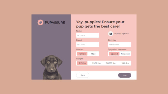
Author Ricky Eckhardt March 3, 2020 Links Just Get The Demo Link How To Download - Article How To Download - Video Made with HTML (Haml) / CSS (SCSS) About a code PUPASSURE SIGN UP FORM Compatible browsers:Chrome, Edge, Firefox, Opera, Safari Responsive:no Dependencies:font-awesome.css

Author Ricky Eckhardt March 1, 2020 Links Just Get The Demo Link How To Download - Article How To Download - Video Made with HTML (Slim) / CSS (Sass) About a code ABSTRACT SIGN UP FORM Compatible browsers:Chrome, Edge, Firefox, Opera, Safari Responsive:no Dependencies:-
Author Swapnil January 28, 2020 Links Just Get The Demo Link How To Download - Article How To Download - Video Made with HTML / CSS (SCSS) About a code NEOMORPHIC FORM Compatible browsers:Chrome, Edge, Firefox, Opera, Safari Responsive:no Dependencies:ionicons.css Read the full article
0 notes
Text
Final Reflection - Project 2
To sum up, myself and Siobhan’s experiences with project 2 - a music player app were overall really good. There were some hard parts where we fell behind due to feeling the need to overhaul our design system but that’s all part of the process anyways and i’m glad we did so. Our main app concept idea did shift a little bit, initially we were set on just doing a lyrics app, then we decided to also add the translation feature, then formative came around and we sort of realised that others had also implemented lyrics as well as of their main feature, so we opted to focus on doing it better by providing a better use experience whilst also adding the “Singstar” inspired tone tracking bubbles which were implemented to allow the user to sing along easier/better.
Visually, our app and design system changed a lot. Whilst the blue version 1 of Anthem was nice, it felt heavy and people got lost when using it, meaning it provided a bad user experience. We thought about how to fix this and decided that revamping and overhauling it entirely would be the easiest option to do so. It ended up not being easy as we struggled initially learning how to mimic the glassmorphism style which includes a new way to think about positioning of assets and hierarchy from our old version and overall we just couldn’t seem to get it to click. Fast forward through the development process and we finally put together something i’m really proud of. We could’ve settled on version 1 of Anthem and improved a few minor things here and there but instead we wanted to tailor our app to provide a much better user experience and weren’t going to settle for less. Our final product, whilst could obviously use more detail here and there with more time, has really taken a lot of thought and consideration of our target audience/users and designing specifically to making their experience the least problematic and most enjoyable. Even minor implementations such as back buttons here and there and visual cues to interactions took long thought out developments.
And overall, I improved a lot on my technical (figma, miro, etc) and psychological skills (considering the user experience) and will take these into our next project.
0 notes
Photo

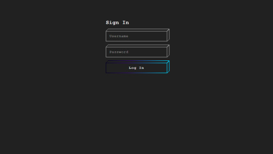
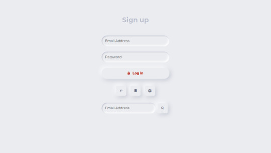
Login Form Design With Glassmorphism & Tilt Animation
#neumorphism login form#login form design#transparent login form#glass morphism ui#css glassmorphism#Login Form#tilt animation#jquery plugins#jquery plugin tutorial#divinector
1 note
·
View note