#css form design
Explore tagged Tumblr posts
Visit Tumblr Blog
Explore Tumblr blogs with no restrictions, modern design and the best experience.
Last Seen Tumblr Blogs


Fun Fact
Forty percent of Tumblr users are between the ages of 18 to 25.
Text
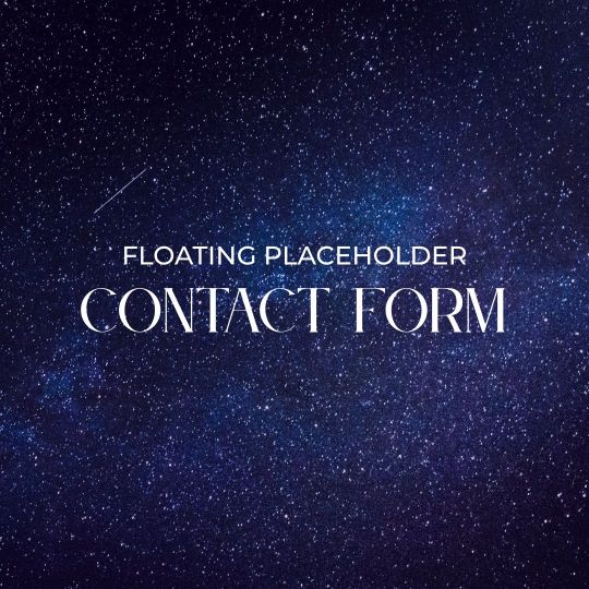
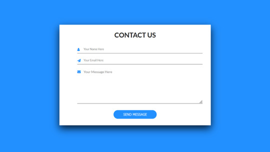
Contact Form with Floating Level
#contact form html css#contact form design#contact form with floating level#animation#html5 css3#frontend#codingflicks#css3#frontenddevelopment#html css form#css forms
2 notes
·
View notes
Text

Bootstrap 5 Contact form
#bootstrap 5 contact form#form design bootstrap#bootstrap snippets#html css#divinectorweb#css#html#css3#code#learn to code#form design#html css form#frontenddevelopment
2 notes
·
View notes
Text
goal!
0 notes
Text
Grouping Selection List Items Together With CSS Grid
New Post has been published on https://thedigitalinsider.com/grouping-selection-list-items-together-with-css-grid/
Grouping Selection List Items Together With CSS Grid

Grouping selected items is a design choice often employed to help users quickly grasp which items are selected and unselected. For instance, checked-off items move up the list in to-do lists, allowing users to focus on the remaining tasks when they revisit the list.
We’ll design a UI that follows a similar grouping pattern. Instead of simply rearranging the list of selected items, we’ll also lay them out horizontally using CSS Grid. This further distinguishes between the selected and unselected items.
We’ll explore two approaches for this. One involves using auto-fill, which is suitable when the selected items don’t exceed the grid container’s boundaries, ensuring a stable layout. In contrast, CSS Grid’s span keyword provides another approach that offers greater flexibility.
The HTML is the same for both methods:
<ul> <li> <label> <input type="checkbox" /> <div class=icon>🍱</div> <div class=text>Bento</div> </label> </li> <li> <label> <input type="checkbox" /> <div class=icon>🍡</div> <div class=text>Dangos</div> </label> </li> <!-- more list items --> </ul>
The markup consists of an unordered list (<ul>). However, we don’t necessarily have to use <ul> and <li> elements since the layout of the items will be determined by the CSS grid properties. Note that I am using an implicit <label> around the <input> elements mostly as a way to avoid needing an extra wrapper around things, but that explicit labels are generally better supported by assistive technologies.
Method 1: Using auto-fill
ul width: 250px; display: grid; gap: 14px 10px; grid-template-columns: repeat(auto-fill, 40px); justify-content: center; /* etc. */
The <ul> element, which contains the items, has a display: grid style rule, turning it into a grid container. It also has gaps of 14px and 10px between its grid rows and columns. The grid content is justified (inline alignment) to center.
The grid-template-columns property specifies how column tracks will be sized in the grid. Initially, all items will be in a single column. However, when items are selected, they will be moved to the first row, and each selected item will be in its own column. The key part of this declaration is the auto-fill value.
The auto-fill value is added where the repeat count goes in the repeat() function. This ensures the columns repeat, with each column’s track sizing being the given size in repeat() (40px in our example), that will fit inside the grid container’s boundaries.
For now, let’s make sure that the list items are positioned in a single column:
li width: inherit; grid-column: 1; /* Equivalent to: grid-column-start: 1; grid-column-end: auto; */ /* etc. */
When an item is checked, that is when an <li> element :has() a :checked checkbox, we’re selecting that. And when we do, the <li> is given a grid-area that puts it in the first row, and its column will be auto-placed within the grid in the first row as per the value of the grid-template-columns property of the grid container (<ul>). This causes the selected items to group at the top of the list and be arranged horizontally:
li width: inherit; grid-column: 1; /* etc. */ &:has(:checked) grid-area: 1; /* Equivalent to: grid-row-start: 1; grid-column-start: auto; grid-row-end: auto; grid-column-end: auto; */ width: 40px; /* etc. */ /* etc. */
And that gives us our final result! Let’s compare that with the second method I want to show you.
Method 2: Using the span keyword
We won’t be needing the grid-template-columns property now. Here’s the new <ul> style ruleset:
ul width: 250px; display: grid; gap: 14px 10px; justify-content: center; justify-items: center; /* etc. */
The inclusion of justify-items will help with the alignment of grid items as we’ll see in a moment. Here are the updated styles for the <li> element:
li width: inherit; grid-column: 1 / span 6; /* Equivalent to: grid-column-start: 1; grid-column-end: span 6; */ /* etc. */
As before, each item is placed in the first column, but now they also span six column tracks (since there are six items). This ensures that when multiple columns appear in the grid, as items are selected, the following unselected items remain in a single column under the selected items — now the unselected items span across multiple column tracks. The justify-items: center declaration will keep the items aligned to the center.
li width: inherit; grid-column: 1 / span 6; /* etc. */ &:has(:checked) grid-area: 1; width: 120px; /* etc. */ /* etc. */
The width of the selected items has been increased from the previous example, so the layout of the selection UI can be viewed for when the selected items overflow the container.
Selection order
The order of selected and unselected items will remain the same as the source order. If the on-screen order needs to match the user’s selection, dynamically assign an incremental order value to the items as they are selected.
onload = ()=> let i=1; document.querySelectorAll('input').forEach((input)=> input.addEventListener("click", () => input.parentElement.parentElement.style.order = input.checked ? i++ : (i--, 0); ); );
Wrapping up
CSS Grid helps make both approaches very flexible without a ton of configuration. By using auto-fill to place items on either axis (rows or columns), the selected items can be easily grouped within the grid container without disturbing the layout of the unselected items in the same container, for as long as the selected items don’t overflow the container.
If they do overflow the container, using the span approach helps maintain the layout irrespective of how long the group of selected items gets in a given axis. Some design alternatives for the UI are grouping the selected items at the end of the list, or swapping the horizontal and vertical structure.
#amp#approach#Articles#columns#container#content#CSS#CSS Grid#css-tricks#Design#digitalocean#display#employed#focus#Forms#gap#grid#grid-template-columns#how#how to#HTML#inclusion#it#labels#layout#list#lists#Method#Moment#One
0 notes
Text
AI Writer Services HTML Landing Page Template
Are you ready to revolutionize your AI writing services? Look no further than "Writey" - the ultimate AI Writer Services HTML Landing Page Template that combines stunning design with powerful functionality. Whether you're a content creator, or copywriter, or run an AI writing service, Writey has got you covered.
Buy Now:
#html#ai writer#landing page#template#clean design#responsive#RTL support#PHP contact form#dark theme#light theme#animations#testimonials#FAQ section#sliders#W3C validation#cross-browser compatibility#updates#accessibility#SEO optimized#fast loading#social media buttons#SCSS files#back-to-top button#coding#landingpage#css
1 note
·
View note
Text
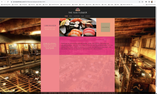
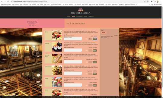
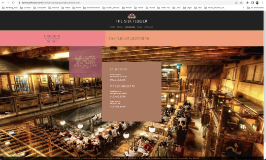
Desktop users add and delete items from an order, enter special instructions, total selections, and contact.
#javascript#frontend#coding#forms#html5 css3#html css#html#html5#htmlcoding#css#code#css3#xhtml#web designers#website#websites#web development#web design#ui ux development services#ui#ui ux design#uidesign#ux#user interface#design#Lynn Stanikmas
1 note
·
View note
Text
Easy Em Website Template
Role: I built an improved and easy to use JavaScript menu for everyone Project goal: A lot of small businesses and other site owners don’t need much more than static web pages, a contact form, and a well-functioning menu system where they can easily add and remove items. Many people have learned some HTML and CSS but not advanced into JavaScript or PHP. When I needed to expand my menu to beyond…
View On WordPress
#Contact Form#CSS#CSS3#Easy Em#eCommerce#FormSpree#Freelancing#Github#HTML#HTML5#JavaScript#Save the Oxygen#Shopify#Upwork#Web Design
0 notes
Text
インターフェースのガイドライン記事。 いわゆるルール決めのもの。
一つ一つを比較して定義しているので非常にわかりやすいのと説明が的確で、何が必要なのかをしっかりとわかるように書いてある。これをしっかりと見たらUIデザインできそうなくらい。
素晴らしいです。私も参考にさせてもらいます。
忘れたときのためにメモしておく。
0 notes
Text
Terror Camp is hiring!
We are looking to expand our volunteer staff for this year’s conference.
We have two job listings based on our current needs, but if we receive a lot of great applicants there is the possibility we’ll split up these responsibilities into 3 or even 4 separate positions.
Terror Camp is a fully volunteer, remote, asynchronous workplace (with occasional sync meetings as schedules permit). We communicate over Discord and organize our documentation over Notion and Google Drive.
We are looking for people who can devote up to a few hours a week, depending on the time of year. Commitment increases around the times of Submission Opening (June 1), Submission Closing/Acceptances (September 1-Oct 1) and the conference itself (early December).
Terror Camp looks great on your resume. You can say that you volunteer for a successful community-led online history & heritage conference with an audience in the thousands!
You don’t need to match the job descriptions perfectly in order to apply. If your experience doesn’t match up but you think you’d still be good at the job, please apply anyway!
Here are the positions we're looking to fill:
🎨 Designer 🎨
Terror Camp is seeking a dedicated Designer who will:
Ideate and deliver a new evergreen brand identity for TC that can be revamped and reused each year
Including logo, logotype, color scheme, font families, and other brand assets for use on web, social media, and printed merch
Be an proactive team member with strong communication skills, able to quickly and regularly deliver new graphics for promotional use on social media and in email marketing
Help design an evergreen/permanent collection of merchandise as well as a limited-edition collection for this year’s conference
Assist our Webmaster in revising our website & email marketing templates to fully match new brand identity and meet best practices for UX
Potentially work on print layout for a Terror Camp book or zine (TBD)
This job would be a good fit if you:
Work or have worked professionally or semi-professionally as a graphic designer; or are a hobbyist designer with a standout portfolio
Have experience working with both digital and print assets
Have a working knowledge of web design best practices and HTML/CSS
Have experience with Photoshop, Illustrator, InDesign, Canva (but not ONLY Canva, sorry) and Wix or similar WYSIWYG ESP/site builder
The Designer will report to our Assistant Director/Webmaster, & will also collaborate closely with our Marketing Lead on graphic assets for social media and with our Merch Lead on preparing designs for print.
To apply, please fill out this form.
💬 Communications Coordinator 💬
Terror Camp is seeking an enthusiastic Communications Coordinator who will:
Own Terror Camp’s main email inbox and oversee all direct communication with attendees and interested parties
Respond promptly to inquiries including:
Requests for past recordings
Requests to join the Discord
Questions about schedule, programming, submissions, guests, and other conference topics
Catch inbounds to social media inboxes (Tumblr, X, Bluesky, Insta) & answer or redirect to email as appropriate
Act as coordinator/assistant for Marketing Lead, with responsibilities including:
Scheduling pre-written content
Assisting with ideating and drafting content, proposing content ideas
Cross-posting content to multiple platforms
Consistently and frequently engaging with social audiences (finding content to repost, replying to people, etc)
This job would be a good fit if you:
Work or have worked in any digital customer-facing environment; have experience with support tickets and/or ongoing user communications; have run social media for brands or institutions; are an efficient and clear writer able to work creatively within brand voice guidelines
Have successfully and sustainably moderated Discord servers, Tumblr communities, social media for other fandom projects like fests, zines, and charity events
Can spare the time and attention to respond to inquiries and turn around new social media posts in a timely manner
Are prepared to represent the Terror Camp brand professionally and maturely in digital public spaces
The Communications Coordinator will report directly to our Marketing Lead.
To apply, please fill out this form.
If you have any questions about these positions, please email us at command [at] terror [dot] camp!
117 notes
·
View notes
Text
ever wonder why spotify/discord/teams desktop apps kind of suck?
i don't do a lot of long form posts but. I realized that so many people aren't aware that a lot of the enshittification of using computers in the past decade or so has a lot to do with embedded webapps becoming so frequently used instead of creating native programs. and boy do i have some thoughts about this.
for those who are not blessed/cursed with computers knowledge Basically most (graphical) programs used to be native programs (ever since we started widely using a graphical interface instead of just a text-based terminal). these are apps that feel like when you open up the settings on your computer, and one of the factors that make windows and mac programs look different (bc they use a different design language!) this was the standard for a long long time - your emails were served to you in a special email application like thunderbird or outlook, your documents were processed in something like microsoft word (again. On your own computer!). same goes for calendars, calculators, spreadsheets, and a whole bunch more - crucially, your computer didn't depend on the internet to do basic things, but being connected to the web was very much an appreciated luxury!
that leads us to the eventual rise of webapps that we are all so painfully familiar with today - gmail dot com/outlook, google docs, google/microsoft calendar, and so on. as html/css/js technology grew beyond just displaying text images and such, it became clear that it could be a lot more convenient to just run programs on some server somewhere, and serve the front end on a web interface for anyone to use. this is really very convenient!!!! it Also means a huge concentration of power (notice how suddenly google is one company providing you the SERVICE) - you're renting instead of owning. which means google is your landlord - the services you use every day are first and foremost means of hitting the year over year profit quota. its a pretty sweet deal to have a free email account in exchange for ads! email accounts used to be paid (simply because the provider had to store your emails somewhere. which takes up storage space which is physical hard drives), but now the standard as of hotmail/yahoo/gmail is to just provide a free service and shove ads in as much as you need to.
webapps can do a lot of things, but they didn't immediately replace software like skype or code editors or music players - software that requires more heavy system interaction or snappy audio/visual responses. in 2013, the electron framework came out - a way of packaging up a bundle of html/css/js into a neat little crossplatform application that could be downloaded and run like any other native application. there were significant upsides to this - web developers could suddenly use their webapp skills to build desktop applications that ran on any computer as long as it could support chrome*! the first applications to be built on electron were the late code editor atom (rest in peace), but soon a whole lot of companies took note! some notable contemporary applications that use electron, or a similar webapp-embedded-in-a-little-chrome as a base are:
microsoft teams
notion
vscode
discord
spotify
anyone! who has paid even a little bit of attention to their computer - especially when using older/budget computers - know just how much having chrome open can slow down your computer (firefox as well to a lesser extent. because its just built better <3)
whenever you have one of these programs open on your computer, it's running in a one-tab chrome browser. there is a whole extra chrome open just to run your discord. if you have discord, spotify, and notion open all at once, along with chrome itself, that's four chromes. needless to say, this uses a LOT of resources to deliver applications that are often much less polished and less integrated with the rest of the operating system. it also means that if you have no internet connection, sometimes the apps straight up do not work, since much of them rely heavily on being connected to their servers, where the heavy lifting is done.
taking this idea to the very furthest is the concept of chromebooks - dinky little laptops that were created to only run a web browser and webapps - simply a vessel to access the google dot com mothership. they have gotten better at running offline android/linux applications, but often the $200 chromebooks that are bought in bulk have almost no processing power of their own - why would you even need it? you have everything you could possibly need in the warm embrace of google!
all in all the average person in the modern age, using computers in the mainstream way, owns very little of their means of computing.
i started this post as a rant about the electron/webapp framework because i think that it sucks and it displaces proper programs. and now ive swiveled into getting pissed off at software services which is in honestly the core issue. and i think things can be better!!!!!!!!!!! but to think about better computing culture one has to imagine living outside of capitalism.
i'm not the one to try to explain permacomputing specifically because there's already wonderful literature ^ but if anything here interested you, read this!!!!!!!!!! there is a beautiful world where computers live for decades and do less but do it well. and you just own it. come frolic with me Okay ? :]
*when i say chrome i technically mean chromium. but functionally it's same thing
461 notes
·
View notes
Text
Web designer in Jodhpur
Creative Web Design
We are a web designing company that has a team of skilled and experienced web designers and developers who can create stunning and functional websites for any type of business or domain. We offer a variety of web designing services, such as custom web design, web development, web hosting, SEO, and maintenance. We also provide you with a free web design consultation, where we can discuss your goals, needs, and preferences, and provide you with a web design proposal that suits your requirements and expectations.
What we do in Web Design
Our web designing services are the services that provide web designing solutions for clients who want to create or improve their online presence. It involves the use of various elements such as colours, fonts, images, graphics, animations, and interactions to convey the message and purpose of the website to visitors. Web designing services can help clients with various aspects of web designing, such as Consultation: Our web designing services can help clients understand their goals, needs, and preferences, and provide them with expert advice and guidance on how to achieve them . Strategy: Our services can help clients develop a clear and effective web design strategy that aligns with their brand identity, target audience, and business objectives.Design: We help clients create a unique and attractive web design that reflects their vision and personality, and that engages and impresses their visitors.Launch: Our services can help clients launch their website to the public, and provide them with web hosting, domain registration, and security services.
Our Design Technology
At Web Farm House, we understand that web design is not just about making a website look good. It is also about making it work well, communicate effectively, and provide value to the users. That is why we use the latest web design technology to create websites that are:
Visually appealing: We use web graphic design to create stunning and consistent visual elements for your website, such as colours, fonts, images, icons, and animations.
Easy to use: We use user interface design to create intuitive and interactive elements for your website, such as buttons, menus, forms, and navigation.
Functional and reliable: We use web development to code and program your website, using languages such as HTML, CSS, JavaScript, PHP, and others. We follow the principles of web standards, web accessibility, web performance, and web security, to ensure the quality and reliability of your website.
Our Work Process
At Web Farm House, we follow a systematic and collaborative work process to create your website. Our work process consists of four main phases: Discovery, Design, Development, and Delivery:
Discovery: This is the phase where we get to know you and your project. We will ask you some questions about your goals, needs, preferences, budget, and timeline. We will also conduct some research on your industry, competitors, and target audience. Based on the information we gather, we will create a project proposal and a contract for you to review and approve.
Design: This is the phase where we create the visual and interactive elements of your website. We will start by creating a sitemap and a wireframe, which are the blueprints of your website’s structure and layout. We will then create a mockup, which is a prototype of your website’s appearance and functionality. We will present the mockup to you and ask for your feedback and approval. We will make any revisions as needed until you are satisfied with the design.
Development: This is the phase where we code and program your website. We will use the latest web development technology to create a website that is functional, reliable, and compatible with different devices and browsers. We will also test and debug your website to ensure its quality and performance. We will show you the progress of the development and ask for your feedback and approval.
Delivery: This is the final phase where we launch and maintain your website. We will upload your website to your chosen hosting service and domain name. We will also provide you with a user manual and a training session on how to use and update your website. We will also offer you ongoing support and maintenance services to keep your website running smoothly and securely.
We will also listen to your feedback and suggestions and make any changes as needed. We will work with you as a partner and a friend, not just as a client and a vendor. we value your input and satisfaction throughout the work process. We will communicate with you regularly and keep you updated on the status of your project.
Our Web Designing Services
Our is provides web design services for clients who want to create or improve their online presence. We help clients with various aspects of web designing, such as consultation, strategy, design, development, testing, launch, and maintenance:
Static web design
Liquid web design.
Adaptive web design.
Dynamic web design.
Responsive web design.
Single-page web design.
Why Choose Us?
We are a One-Stop Solution for delivering the best web design and development services. We render customized and affordable web design facilities to suit your requirements. Choose the best plans for building a responsive web design according to your needs:
Excellent technical support
Core PHP &Codeigniter + MySQL.
Secure and Reliable coding.
Satisfactory Customer Support.
SEO-friendly web development.
33 notes
·
View notes
Text
Contact Form Design
#contact form design#html css#frontend#css#html#frontenddevelopment#learn to code#css3#webdesign#html css form#css form#html5 css3 form#html5#login form design
3 notes
·
View notes
Text
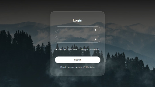
Login Form Design in HTML & CSS
#login form design#html css form#css form#glassmorphism#html css#divinector#css#frontenddevelopment#webdesign#html#css3#form html css#form html#learn to code#html5 css3
5 notes
·
View notes
Text

🧡 Tuesday Tips #3 🧡
Your website is more than just a collection of pages—it’s your digital home. It should reflect you, your interests, and your personality. But with so many sites out there, how do you make yours stand out?
Here are 25 ways to make your website feel more personal, unique, and personalized to you!
........................................................................................................
🎨 Design & Aesthetics
1. Custom Color Palette – Pick colors that resonate with your personality and aesthetic.
2. Unique Typography Choices – Use a mix of fonts that match your vibe.
3. Handwritten or Doodle Elements – Add personal sketches or notes.
4. Custom Cursor – Let visitors use a fun, themed cursor on your site.
5. Personalized Favicon – A tiny but powerful detail that makes your site feel complete.
6. Themed Layouts for Different Pages �� Make each page visually distinct but cohesive.
7. Custom Backgrounds – Textures, gradients, or even a personal photograph.
8. Retro or Experimental CSS Styles – Go wild with unique styles that make your site stand out.
9. Create a Custom Hand-Drawn Logo – Instead of a standard logo, try sketching one yourself for a unique touch.
10. Add Subtle Animations – Small hover effects, background animations, or cursor trails can bring your site to life.
11. Play With Layering Elements – Overlap images, text, and shapes for a more dynamic look.
12. Design a Personalized Loading Screen – A custom loading animation or message adds a fun detail visitors will remember.
13. Add Your Own Handwriting as a Font – Convert your handwriting into a web font for a truly personal touch.
14. Design a Seasonal Theme Switcher – Let visitors toggle between different seasonal or mood-based color palettes.
........................................................................................................
📜 Content & Personality
15. Create a Behind-the-Scenes Page – Show how your website was built, share your thought process, or include fun bloopers.
16. Add a "The Making Of" Section – Share drafts, sketches, or early concepts behind your creative works.
17. Include a Personal Dictionary of Words You Love – A list of favorite words, phrases, or slang you frequently use.
18. Design a "Things That Make Me Happy" Page – A simple, uplifting page filled with personal joys.
19. Show Your Progress on a Learning Goal – Track and share your journey in learning a new skill, language, or hobby.
........................................................................................................
💾 Interactivity & Engagement
20. Add a Clickable Mood Indicator – Let visitors see your current mood with an emoji or phrase that changes over time.
21. Create a Dynamic Banner That Updates Automatically – Display different messages depending on the time of day or special occasions.
22. Add a "What I'm Listening To" Widget – A live-updating display of your current favorite song or playlist.
23. Embed a Poll or Voting Feature – Let visitors vote on fun topics or help you make creative decisions.
24. Introduce a Mini Personality Quiz – Something quirky like “Which of my favorite books/movies are you?”
25. Make an "Ask Me Anything" Page – An interactive page where visitors can submit questions for you to answer.
Closing: Make It Yours!
Your website should be you in digital form—fun, unique, and engaging. Whether you add just one or all 25 ideas, the most important thing is to have fun and make it your own.
If you try any of these ideas, let me know—I’d love to see what you create!
-----------------------------------------------------------------
Want to help the Small Web movement grow?
Join us on other platforms. ♥
FB Page & Group:
facebook.com/thesmallweb
facebook.com/groups/thesmallweb
Twitter/X:
x.com/smallweblove
Tumblr Community:
tumblr.com/communities/thesmallweb
Mastodon:
indieweb.social/@thesmallweb
#small web#indie web#web revival#old web#blog#neocities#2000s web#decentralized social media#decentralizedfuture#old internet#decentralization
17 notes
·
View notes
Text
Organizing Design System Component Patterns With CSS Cascade Layers
New Post has been published on https://thedigitalinsider.com/organizing-design-system-component-patterns-with-css-cascade-layers/
Organizing Design System Component Patterns With CSS Cascade Layers
I’m trying to come up with ways to make components more customizable, more efficient, and easier to use and understand, and I want to describe a pattern I’ve been leaning into using CSS Cascade Layers.
I enjoy organizing code and find cascade layers a fantastic way to organize code explicitly as the cascade looks at it. The neat part is, that as much as it helps with “top-level” organization, cascade layers can be nested, which allows us to author more precise styles based on the cascade.
The only downside here is your imagination, nothing stops us from over-engineering CSS. And to be clear, you may very well consider what I’m about to show you as a form of over-engineering. I think I’ve found a balance though, keeping things simple yet organized, and I’d like to share my findings.
The anatomy of a CSS component pattern
Let’s explore a pattern for writing components in CSS using a button as an example. Buttons are one of the more popular components found in just about every component library. There’s good reason for that popularity because buttons can be used for a variety of use cases, including:
performing actions, like opening a drawer,
navigating to different sections of the UI, and
holding some form of state, such as focus or hover.
And buttons come in several different flavors of markup, like <button>, input[type="button"], and <a class="button">. There are even more ways to make buttons than that, if you can believe it.
On top of that, different buttons perform different functions and are often styled accordingly so that a button for one type of action is distinguished from another. Buttons also respond to state changes, such as when they are hovered, active, and focused. If you have ever written CSS with the BEM syntax, we can sort of think along those lines within the context of cascade layers.
.button .button-primary .button-secondary .button-warning /* etc. */
Okay, now, let’s write some code. Specifically, let’s create a few different types of buttons. We’ll start with a .button class that we can set on any element that we want to be styled as, well, a button! We already know that buttons come in different flavors of markup, so a generic .button class is the most reusable and extensible way to select one or all of them.
.button /* Styles common to all buttons */
Using a cascade layer
This is where we can insert our very first cascade layer! Remember, the reason we want a cascade layer in the first place is that it allows us to set the CSS Cascade’s reading order when evaluating our styles. We can tell CSS to evaluate one layer first, followed by another layer, then another — all according to the order we want. This is an incredible feature that grants us superpower control over which styles “win” when applied by the browser.
We’ll call this layer components because, well, buttons are a type of component. What I like about this naming is that it is generic enough to support other components in the future as we decide to expand our design system. It scales with us while maintaining a nice separation of concerns with other styles we write down the road that maybe aren’t specific to components.
/* Components top-level layer */ @layer components .button /* Styles common to all buttons */
Nesting cascade layers
Here is where things get a little weird. Did you know you can nest cascade layers inside classes? That’s totally a thing. So, check this out, we can introduce a new layer inside the .button class that’s already inside its own layer. Here’s what I mean:
/* Components top-level layer */ @layer components .button /* Component elements layer */ @layer elements /* Styles */
This is how the browser interprets that layer within a layer at the end of the day:
@layer components @layer elements .button /* button styles... */
This isn’t a post just on nesting styles, so I’ll just say that your mileage may vary when you do it. Check out Andy Bell’s recent article about using caution with nested styles.
Structuring styles
So far, we’ve established a .button class inside of a cascade layer that’s designed to hold any type of component in our design system. Inside that .button is another cascade layer, this one for selecting the different types of buttons we might encounter in the markup. We talked earlier about buttons being <button>, <input>, or <a> and this is how we can individually select style each type.
We can use the :is() pseudo-selector function as that is akin to saying, “If this .button is an <a> element, then apply these styles.”
/* Components top-level layer */ @layer components .button /* Component elements layer */ @layer elements /* styles common to all buttons */ &:is(a) /* <a> specific styles */ &:is(button) /* <button> specific styles */ /* etc. */
Defining default button styles
I’m going to fill in our code with the common styles that apply to all buttons. These styles sit at the top of the elements layer so that they are applied to any and all buttons, regardless of the markup. Consider them default button styles, so to speak.
/* Components top-level layer */ @layer components .button /* Component elements layer */ @layer elements background-color: darkslateblue; border: 0; color: white; cursor: pointer; display: grid; font-size: 1rem; font-family: inherit; line-height: 1; margin: 0; padding-block: 0.65rem; padding-inline: 1rem; place-content: center; width: fit-content;
Defining button state styles
What should our default buttons do when they are hovered, clicked, or in focus? These are the different states that the button might take when the user interacts with them, and we need to style those accordingly.
I’m going to create a new cascade sub-layer directly under the elements sub-layer called, creatively, states:
/* Components top-level layer */ @layer components .button /* Component elements layer */ @layer elements /* Styles common to all buttons */ /* Component states layer */ @layer states /* Styles for specific button states */
Pause and reflect here. What states should we target? What do we want to change for each of these states?
Some states may share similar property changes, such as :hover and :focus having the same background color. Luckily, CSS gives us the tools we need to tackle such problems, using the :where() function to group property changes based on the state. Why :where() instead of :is()? :where() comes with zero specificity, meaning it’s a lot easier to override than :is(), which takes the specificity of the element with the highest specificity score in its arguments. Maintaining low specificity is a virtue when it comes to writing scalable, maintainable CSS.
/* Component states layer */ @layer states &:where(:hover, :focus-visible) /* button hover and focus state styles */
But how do we update the button’s styles in a meaningful way? What I mean by that is how do we make sure that the button looks like it’s hovered or in focus? We could just slap a new background color on it, but ideally, the color should be related to the background-color set in the elements layer.
So, let’s refactor things a bit. Earlier, I set the .button element’s background-color to darkslateblue. I want to reuse that color, so it behooves us to make that into a CSS variable so we can update it once and have it apply everywhere. Relying on variables is yet another virtue of writing scalable and maintainable CSS.
I’ll create a new variable called --button-background-color that is initially set to darkslateblue and then set it on the default button styles:
/* Component elements layer */ @layer elements --button-background-color: darkslateblue; background-color: var(--button-background-color); border: 0; color: white; cursor: pointer; display: grid; font-size: 1rem; font-family: inherit; line-height: 1; margin: 0; padding-block: 0.65rem; padding-inline: 1rem; place-content: center; width: fit-content;
Now that we have a color stored in a variable, we can set that same variable on the button’s hovered and focused states in our other layer, using the relatively new color-mix() function to convert darkslateblue to a lighter color when the button is hovered or in focus.
Back to our states layer! We’ll first mix the color in a new CSS variable called --state-background-color:
/* Component states layer */ @layer states &:where(:hover, :focus-visible) /* custom property only used in state */ --state-background-color: color-mix( in srgb, var(--button-background-color), white 10% );
We can then apply that color as the background color by updating the background-color property.
/* Component states layer */ @layer states &:where(:hover, :focus-visible) /* custom property only used in state */ --state-background-color: color-mix( in srgb, var(--button-background-color), white 10% ); /* applying the state background-color */ background-color: var(--state-background-color);
Defining modified button styles
Along with elements and states layers, you may be looking for some sort of variation in your components, such as modifiers. That’s because not all buttons are going to look like your default button. You might want one with a green background color for the user to confirm a decision. Or perhaps you want a red one to indicate danger when clicked. So, we can take our existing default button styles and modify them for those specific use cases
If we think about the order of the cascade — always flowing from top to bottom — we don’t want the modified styles to affect the styles in the states layer we just made. So, let’s add a new modifiers layer in between elements and states:
/* Components top-level layer */ @layer components { .button /* Component elements layer */ @layer elements /* etc. */ /* Component modifiers layer */ @layer modifiers /* new layer! */ /* Component states layer */ @layer states /* etc. */
Similar to how we handled states, we can now update the --button-background-color variable for each button modifier. We could modify the styles further, of course, but we’re keeping things fairly straightforward to demonstrate how this system works.
We’ll create a new class that modifies the background-color of the default button from darkslateblue to darkgreen. Again, we can rely on the :is() selector because we want the added specificity in this case. That way, we override the default button style with the modifier class. We’ll call this class .success (green is a “successful” color) and feed it to :is():
/* Component modifiers layer */ @layer modifiers &:is(.success) --button-background-color: darkgreen;
If we add the .success class to one of our buttons, it becomes darkgreen instead darkslateblue which is exactly what we want. And since we already do some color-mix()-ing in the states layer, we’ll automatically inherit those hover and focus styles, meaning darkgreen is lightened in those states.
/* Components top-level layer */ @layer components { .button /* Component elements layer */ @layer elements --button-background-color: darkslateblue; background-color: var(--button-background-color); /* etc. */ /* Component modifiers layer */ @layer modifiers &:is(.success) --button-background-color: darkgreen; /* Component states layer */ @layer states &:where(:hover, :focus) --state-background-color: color-mix( in srgb, var(--button-background-color), white 10% ); background-color: var(--state-background-color);
Putting it all together
We can refactor any CSS property we need to modify into a CSS custom property, which gives us a lot of room for customization.
/* Components top-level layer */ @layer components .button /* Component elements layer */ @layer elements --button-background-color: darkslateblue; --button-border-width: 1px; --button-border-style: solid; --button-border-color: transparent; --button-border-radius: 0.65rem; --button-text-color: white; --button-padding-inline: 1rem; --button-padding-block: 0.65rem; background-color: var(--button-background-color); border: var(--button-border-width) var(--button-border-style) var(--button-border-color); border-radius: var(--button-border-radius); color: var(--button-text-color); cursor: pointer; display: grid; font-size: 1rem; font-family: inherit; line-height: 1; margin: 0; padding-block: var(--button-padding-block); padding-inline: var(--button-padding-inline); place-content: center; width: fit-content; /* Component modifiers layer */ @layer modifiers &:is(.success) --button-background-color: darkgreen; &:is(.ghost) --button-background-color: transparent; --button-text-color: black; --button-border-color: darkslategray; --button-border-width: 3px; /* Component states layer */ @layer states &:where(:hover, :focus) --state-background-color: color-mix( in srgb, var(--button-background-color), white 10% ); background-color: var(--state-background-color);
P.S. Look closer at that demo and check out how I’m adjusting the button’s background using light-dark() — then go read Sara Joy’s “Come to the light-dark() Side” for a thorough rundown of how that works!
What do you think? Is this something you would use to organize your styles? I can see how creating a system of cascade layers could be overkill for a small project with few components. But even a little toe-dipping into things like we just did illustrates how much power we have when it comes to managing — and even taming — the CSS Cascade. Buttons are deceptively complex but we saw how few styles it takes to handle everything from the default styles to writing the styles for their states and modified versions.
#ADD#amp#Anatomy#Article#Articles#author#background#bem#border-radius#browser#buttons#cascade#cascade layers#change#classes#code#Color#content#course#CSS#Dark#Design#design systems#display#engineering#focus#form#functions#Future#Grants
1 note
·
View note
Text

the tl;dr
IRON CROWN as a free comic is now off of wordpress and can be viewed by a neat, robust HTML/CSS/JS comic template called rarebit! effectively nothing has changed for the reader, beyond expecting a little more reliability of uptime over the years.
all comic pages and previously paywalled patreon posts can also be downloaded in this art dump for free, as mentioned in the new author's notes.
the long story:
When talking shop about site/platform moves under this handle, I think it's useful to realize that us (taboo) kink artists live in an actively adversarial internet now, compared to five years ago.
meaning that we have to live with an expectation that 99% of platforms (including registrars and hosting, let alone sns sites) will ban/kick us without warning. this might explain the overly cautious/defensive way we discuss technologies - weighing how likely (and easily) the tool can be used against us vs the perks.
for example: has a harassment mob bullied the platform owners into quietly dropping lolisho artists? trans artists? does the platform/technology have a clear, no-bullshit policy on drawn kink art (specifically third rail kinks like noncon)? does the platform have a long history of hosting r18 doujin artists/hentai publishers with no issue? does the company operate in a nation unfriendly to specific kinks (eg fashkink artists fundamentally incompatible with companies based in germany, when other kinks might be OK?). i talk with a few different groups of artists daily about the above.
but that gets tiring after a while! frankly, the only path that's becoming optimal long-term is (a) putting kink art on your personal site, and if possible, (b) self hosting the whole thing entirely, while (c) complementing your site with physical merch since it's much harder to destroy in one go.
with that said - I've been slowly re-designing all of my pages/sub-domains as compact 'bug out bags'. lean, efficiently packed with the essentials, and very easy to save and re-upload to a new host/registrar near instantly (and eventually, be friendly to self-hosting bandwidth costs since that's now a distant goal).
how does this look in theory, you ask?
zero dependencies. the whole IRON CROWN comic subdomain is three JS files, a few HTML files, one CSS file, and images. that's it.
no updates that can be trojan horse'd. I'm not even talking about malware though that's included; I'm talking about wordpress (owned by the same owners as tumblr cough) slipping in AI opt-outs in a plug-in that's turned on by default. I used to think wordpress was safe from these shenanigans because wordpress-as-a-CMS could be separate from wordpress-as-a-domain; I was wrong. they'll get you through updates.
robust reliability through the KISS principle. keep it simple stupid. malware/DDOS'ing has an infinitively harder time affecting something that doesn't have a login page/interactive forms. You can't be affected by an open source platform suddenly folding, because your "starter" template is contained files saved on your desktop (and hopefully multiple backups...). etc.
so how does this look in practice?
To be fair, you're often trading convenient new shiny UI/tools for a clunkier back-end experience. but i think it's a mistake to think your art site has to look like a MIT professor's page from 1999.
with IRON CROWN, I've effectively replicated it from a (quite good) comic template in wordpress to 98% of the same layout in pure HTML/CSS/JS via rarebit. Should rarebit's website go "poof", I've got the initial zip download of the template to re-use for other sites.
I frankly have a hard time recommending rarebit for an actively updating webcomic since you personally might be trading too many advantages like SEO tools, RSS feeds, etc away - but for a finished webcomic that you want to put in "cold storage" - it's amazing. and exactly what I needed here.
45 notes
·
View notes