#god. functioning website
Explore tagged Tumblr posts
Visit Tumblr Blog
Explore Tumblr blogs with no restrictions, modern design and the best experience.
Last Seen Tumblr Blogs


Fun Fact
Tumblr is available in 18 languages.
Text
i love having three separate extensions running on tumblr just to make it a pleasant experience to use lmao
#thanks to a combination of x-kit rewritten stylus and tampermonkey#i now have the old dash layout With x-kit improvements and the old font still#god. functioning website#hanbles
3 notes
·
View notes
Text


THE BIZZYBOYS BLOCK YOUR PATH!
(link to the other part of these!)
got an ask about their fight in a continuation of the OFF-styled ones i did before, and i'd been procrastinating these for a while, so i finally got around to finishing them!! boss fight thoughts below the cut! :-]
this might be a little rambly so apologies in advance!!!
so to start with, i feel like it would be shortly before the Inspekta fight as sort of a miniboss - none of the bizzyboys on their own have a ton of health, but its a 6v1, so the difficulty comes in from that! with direction from Capochin, they're more organized, and if he's defeated, they're able to do more specialized attacks, but they're more scattered in turn order/lacking the previous flow to the fight, making it more clear which ones need to be defeated sooner than others
here's some ideas for each bizzy on their own:
Capochin (Bizzy Captain): potentially able to use a "rally" attack to bring back fallen bizzyboys, uses his turns when they're all up to make one of them do an extra attack - doesn't do all that much attacking, himself, but you'd wanna get rid of him first to keep the bizzyboys that you've already defeated down
Grujaja (Bizzy Brute): with Capochin still active, he's got a moderate attack recharge, and deals some pretty heavy damage, inflicting Palsied as a sort of "knockback" from each hit / when Capochin goes down, he still deals as much damage, but takes a significantly longer time to charge attacks, and has lower accuracy
Patty (Bizzy Defective): "defective" in the sense that she doesn't want to fight you and, when Capochin goes down, the fast but light-damage-dealing attacks almost entirely stop, save for reactive attacks when she's dealt damage
Bananathaniel (Bizzy Chatterbox): STATUS EFFECTS FOREVER!!! he's sort of the support of the two "casters" of sorts, boosting bizzyboy stats and giving them Hasty, while rarely doing anything to the enemies directly (if there's no other bizzyboys, he might have a low-damage attack, but i'm not certain on that one)
Alexei (Bizzy Glutton): moderate to heavy damage, occasionally healing himself from a snack-break turn! when Capochin goes down, he'll do a lot less attacking and a lot more healing, which makes him hard to take down, but easy to avoid damage from
Vibiano (Bizzy Couturier): the other "caster" of the group, but specializing in afflicting the enemy with status effects - Blinded, Madness, Poisoned, and Asleep are the main ones among those! similarly to Bananathaniel, when there's no other bizzyboys left, he has an attack, which is just slightly higher damage than Ban's, but a fair bit slower to use
ANYWAYS that's all i got!! i might find some excuses to do more art for this (idk if it qualifies as an AU at this point, i haven't thought about how it'd go plot-wise!), but thank you again for asking, anon, i love thinking about this stuff!!
#my art#great god grove#ggg#bizzyboys#off game#cw eyestrain#TUMBLR ARE WE GONNA BE NICE TO THIS POST NOW? PLS?#usually when the formatting gets a little goofed i just leave it but good lird it even put my readmore in the wrong spot. it was rough#functional website i love it ANYWAYS#i might do hector next or maybe the theatre performers?? idk! if anyone has any others of these they wanna see let me know :D
381 notes
·
View notes
Text
HEY TUMBLR SHOW ME WHAT PART OF THIS IS NSFW CHALLENGE
Who flagged this post as nsfw. Who. Show yourself, I just wanna talk >:[
- Ghoul ☢️

#not a poll#mod post#mod ghoul#fuckign. this website is2g#simultaneously the most functional and least functional social media platform honest 2 fuckin god
50 notes
·
View notes
Text
I had to man up and deal with my insurance today. And I really didn't want to. But I was like, what would wolverine do?
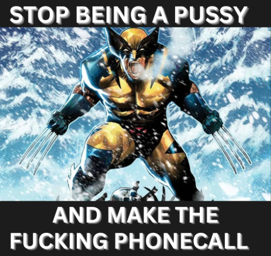
Thanks bub, that did kind of help actually.
#didn't actually have to make a phone call thank god#just went on their website and it worked this time miraculously#phone calls are evil#executive function#what would wolverine do#Logan howlett#wolverine
27 notes
·
View notes
Note
Hiii, do you have any tips for drafting out embroidery patterns? I've got one in mind, but drafting it out and color picking is so nerve-wracking!!
[Hi!!!! this got kinda really long so I'm gonna crop it under a read more. And I honestly don't have any real training/instruction in fiber arts so this is just how I do things, and probably others do them very differently!]
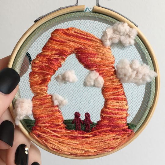
Haha so my fandom embroideries are VERY different from my non-fandom personal pieces in this respect. For non-fandom things i just kind of throw myself in like WAHOO FREEFORM LETS GO and go for a kind of messy colorful approach that ends up as things like this:
Versus my fandom stuff is way more structured and designed to fill space, be very precise, etc. So for those I do go in with a digital mock up of the design I make in photoshop, that I then color in, and then as my last step translate to thread colors.
For my Dragon Age series. this has been because I'm specifically trying to mimic the stained-glass style of art you see in parts of the game like the dialogue wheels, some icons, windows, etc. The icons in particular were really easy to copy into embroidery because they already come in handy circles:

This is mostly because I have desperately wanted to pick up stained glass work as a hobby for like 6 years now. As in once every 3-6 months I put everything I'd need to start doing it into an online shopping cart and look at the price total and then sadly close the window because I just don't actually have any space I could do it in (I live in a 2bed apartment so i have no garage or yard or anywhere it wouldn't make everything else a mess or be a hazard). The day after one of those events I impulse bought and completed a floral embroidery kit from the craft store and kinda was like... ok, well, I did this once how hard can it be to use this medium to mimic the hobby I wish I could be doing? Plus, it's only like 60 cents per color! I can afford that! So I took the first design I wanted to do, the romance icon, and basically redrew it sloppily in photoshop, then freehand-copied the design onto fabric and stitched it the next day:

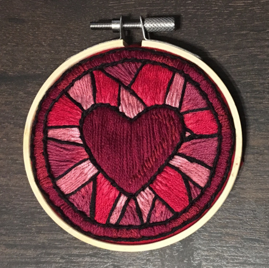
I learned a lot from this piece and changed my approach a little. Here you can see I tried shading in the parallel direction to my thread, which looked messy and added texture, so now I shade horizontally to my thread direction instead.
But it gave me a basic approach for turning the Tarot cards or DA Keep tiles (or any other art!) into embroidery patterns, which I couldn't copy as directly into this really smooth stained-glass style. There's a basic process I follow when doing these conversions that generally follows the same order, which I'll go through below.
STEP 1: SHAPES
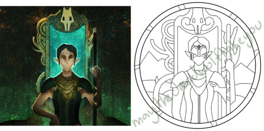
The first thing I do is pick the shape of my display frame which is usually a circle, but could be an oval or rectangle too, since I hang the finished pieces on my wall to have nice way to show them off. I like to fill the whole space so knowing the size and shape of what I want the finished project to look like is a good goal for me. Since I am doing fandom pieces I want to be recognizable, I do stick pretty close to the "original" character design/art, but you can absolutely change as much as you want and freehand draw your own interpretation instead. If you're doing original art just substitute the below composition notes with "sketch out roughly what you want it to look like". I personally do my pattern drafting digitally as I find it easier, but you can do this part by hand too.
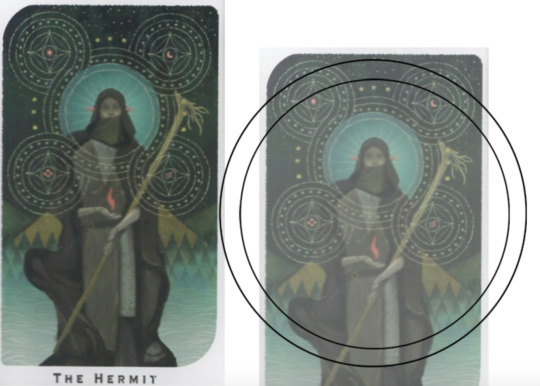
First, I keep the reference image I'm working off of open next to me while I work, and draw in the shape of my frame (here, a circle). If I'm adding in the little border to be fancy, I add a second inner circle. I keep these as their own top layer so I always know I'm working within the final "frame" and don't spend time designing any section that will fall outside it. Then I will take copies of the reference image and knock the layers down to 25-50% opacity, and start moving them around underneath the 'frame' layer until I like the way their positioning looks as a composition. Sometimes elements of a card I want to include don't all fit in, so I'll chop the section out and add an additional layer to throw in (like the background circle things in the Hermit design below). Or I'll just freehand things like adding much bigger diamonds behind Solas in my Hierophant design because I did NOT want to do 1000 tiny ones. Then once I'm satisfied with the general composition, I'll use the plain ol circular brush tool to trace out the major shapes of each element. I try to keep in mind that I can't go too small, and curvy lines are more difficult to fill in than straight ones. I usually do a rough messy version first, make it mostly transparent, and then a cleaner and more precise one over that.


(you can see parts of the rough one on the left and the fully 'cleaned up' on the right for the Hierophant design)
Now: depending on what you are doing next with the pattern, this might be where you stop and start coloring. If you are planning to freehand your design or just trace it onto fabric (or even print it onto fabric here), there's no need to do more than this kind of lineart! However, if you are working digitally and want to create a scalable vector so you can print it at different sizes, you can use the pen tool in photoshop to trace your design and make a "work path" of the lineart. However, another note: THIS PART IS VERY FRUSTRATING AND TEDIOUS BECAUSE THE PEN TOOL WAS CREATED BY THE DEVIL TO TORMENT US. It is so so so easy to accidentally delete a line or even the whole path and not notice later on. Ask me how I know 😭 Anyway I'm not going to include a pen tool tutorial because I don't even know how to use it well and have to google or watch videos every other time I try to use it. But if you can muddle through it gets you some really clean lines that eventually look like this:

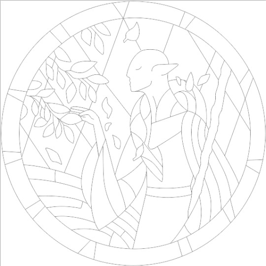
With the work path selected, you can select the brush tool/size/color and use the "stroke path" option to create lineart of the vector. Then you can save this as a transparent png file for use at different sizes and for printing and it looks so nice and clean! one of the big benefits to this is that you get really fine lines that are easier to be precise with stitching on. This is extra perfect if you are printing the design directly onto your fabric (which you can do with an at-home inkjet printer for designs under 8inches wide, as long as you stick a piece of stabilizer on the back of your fabric and cut it down to printer sheet size--this is what I do and can make another post about that process if people want haha), or if you are printing onto transfer paper like you can buy at craft stores.
This is where I end the lineart for my designs. After I have this, I move on to the next phase, which is...
STEP 2: COLOR
For interpreting my designs into thread, I start by thinking of it as flat colors first. You can't "shade" as easily with threads as you can with things like paint or brushes in digital art (though you can A Little, which I will get into), so to start color planning I pick the "main" color each section will be in the piece.

For the existing icons this was simple--I kept the same sections as the original designs, so for each I just color picked or eyeballed the color in photoshop and colored it in (but you could do this on paper with pencils, markers, whatever as well--they don't need to match your threads exactly and usually won't, it's just to give you an easy reference to follow as you go). For the tarot cards which were more complicated in coloration, I just did my best and went with what looked good next to each other, even if it was a little off the original art. It will be off more later anyway when you have to pick threads so don't stress it too much honestly. I will often make layers with different color options and turn them on/off for direct comparison to try to determine what I think looks best as well, like below where I was debating between more blue/desaturated for the background or brighter colors.

I do wanna note I have regrets about the color selection, shapes, or shading in EVERY SINGLE ONE of my finished pieces. But no one else ever comments or probably even notices! One aspect of this hobby is just learning to be satisfied with what you've made and using what you learned to get closer to your preferences next time. I'm only going back and redoing some of my designs' colors because I want to make it easier for others to choose on the patterns I sell, more than I care for just for myself. Also since I'm doing this lineart/stained glass looking approach where I go over the distinct shapes with black thread at the end, it means I get these clear delineations between sections you might not necessarily have in your own pieces, and that's ok.
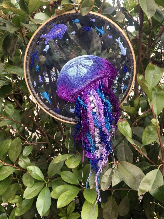
Ok right. Now while shading/coloring in detail is hard with thread, you CAN make whats essentially dithered gradients. "Dithering" in the concept of art means using 2 (or more) colors to give the impression of a third color, or to gently scale between the existing binary rather than a hard line. Think of it like blocky pixel art or gameboy game images. If you're doing needlepainting, you use really small stitches close together to get this effect, which translates to "smaller pixes"--if you look at the jellyfish in my first photos that's a very messy casual version of that. If you want a better example, I recommend looking at @ammocharis 's pieces like these in her pinned post, which are truly amazing! I simply do not have the patience myself 😂 For my stained glass style, I work only in very long straight stitches, so I can only shade in one direction and have to be a little more precise with it.
So for shading, I think about in each section which direction my threads might go. Then perpendicular to that direction I pick which side will be the light one and which the darker one. Sometimes I color this in on my pattern mockup, but sometimes I don't! Or I'll only do it for certain sections to make sure I don't forget. Like for my Tower design I only colored it as flats, and waited until I selected threads to decide how the shading would go. I am currently working on a smaller, simplified version of my Hierophant design and I did add shading digitally for that one just for fun. But it's not as important as having the flat color version you can use to quick-reference how you want your design to go while you're stitching. You might also notice I don't actually color my gold--I just throw in a stock image of gold foil for that layer so I can't confuse it with any of my yellow thread sections.

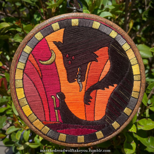

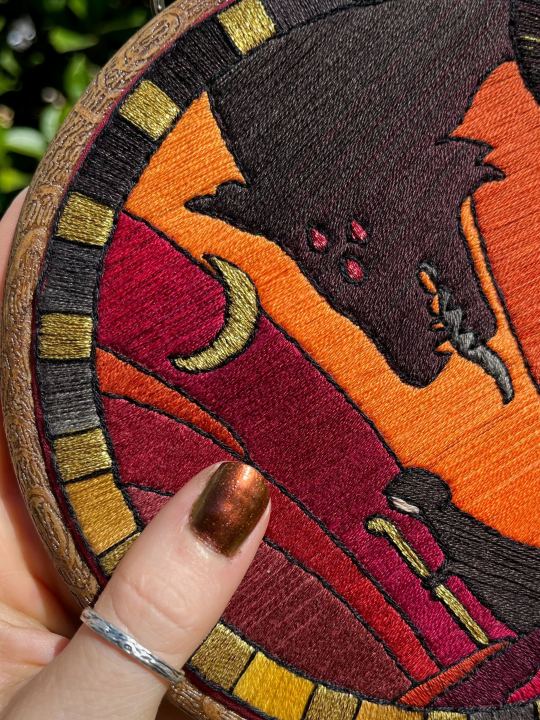
Here's a close up where you can kind of see what I mean by the "dithered" effect between colors--some are more obvious (like the red on the far left or middle orange) and others pretty subtle (dark grey to dark red on the wolf face):
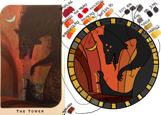
Now, while I use single layers of satin stitches for this, and just alternate thread colors increasing/decreasing as I go, you can accomplish the same thing with short overlapping stitches like with needlepainting, or with clusters of french knots, or whatever else. But in GENERAL you are going to be able to trick people into seeing gradients out of dithering best when you are using the same type of stitch for that whole area. So if I was using multiple stitch types like having french knots, daisy chains, ladder stitching or whatever else for some sections, I would keep those to contrasting areas/colors. A fantastic example of using different layered types of stitching to create more intricate color/texture in an embroidery would be these incredible tarot card depictions by @hattedhedgehog, which I like even better than my own embroideries. Here's his take on the Tower card as well for comparison to mine (I'm so in love with it!!!).
But anyway, at this phase, your design is actually still digital--the above is just to explain how it translates later in the process. The next step is...
STEP 3: THREAD SELECTION
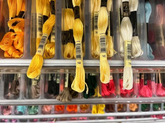
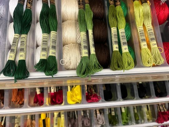
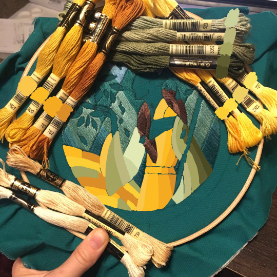
I will admit here I am not great at this part. I am constantly second guessing my thread colors, and can spend over an entire hour in the thread aisle at the craft store agonizing over choices. Really, I think this is just one of those things that takes practice and you get better at it over time. What I have had the best luck with is actually printing out a reference photo of my design/the original artwork and taking it with me. If you already have threads you can do this part at home too, but DMC alone has over 500 colors and I definitely don't even own half that so I like to torture myself by looking at them all together on the thread racks. Plus Anchor and Artiste and whatever other brands there are out there. One approach is to just sit there and pick out what you want for each section and line it all up together on top of your printout. Or in the case of my Tower I laid a bunch of options out on top of my template in the hoop to guess how they'd look in the frame.
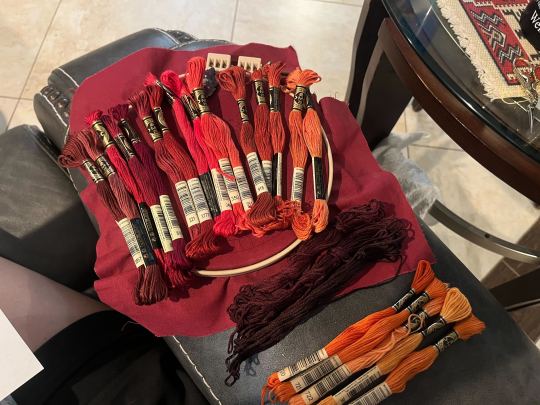
For me since I am also doing this dither shading thing, I also need 2-3 colors per sections depending on its size. Sometimes it's easy and the threads have a color just a little darker or lighter right next to them in the numerical lineup! Other times, there is no good match, or it looks too far away to shade nicely, or I want one to be a warmer or cooler tone than the other... which means a lot of standing and fretting to myself over it. I actually take a lot of photos at this stage because it can be easier to see how they will look in the end from a photo than in person to me? Idk why. Plus then after they get scrambled in my bag I remember wtf order I meant for them to go in later. But as long as you're not preventing other customers from shopping themselves, you can spend as long as you want staring at thread in the embroidery aisle and they won't kick you out unless it's closing time, so take your time.
Now, IN THEORY, you can sort of combine steps 2 and 3 by color-selecting from your threads and using that to color in the design. However I have tried this and it led to mixed success because the photoshop eyedropper brush simply isn't actually that exact (in my experience, it desaturates compared to what we actually see). And because then you have to have the threads on hand while you're coloring... which means you might buy ones you don't end up using if you don't like them. So I prefer to just use this as a refinement step where I pick threads based on the design colors, then will re-color the design a second time to match those threads more closely to be sure I like the effect.
I've even used this as a tool when I needed to adjust my color choices mid-project, by digitally coloring over over my WIP:
Or here's a design (but I haven't posted the finished piece yet bc it's a gift so shhh) I made with certain color tones initially, but after buying thread I re-did the color mockup to be more vibrant, because I liked those threads better in the store:


Once you have your thread, you can make yourself a little reference chart with the colors you intend noted on the sections you want them, like below:
(note: i didn't end up sticking to these colors because I ended up dying my own thread for several sections. And then forgot I made this entirely and picked new ones because I put the project down for a year between design and stitching. Sigh).
Or for my Solas pattern I did this in a really detailed way, which i am sorry but i have redacted because... i have it for sale now and don't wanna just give that away haha. But if you buy the pattern from my shop this is one of the files you'd get with it, for ease of reference. I do also include a text-only list of them as well.

Now I don't go to this much trouble for all my designs, just the ones I put up for sale (or plan to). You can also just make a text list of your color plans if you want. Though for fun I also have been using my scrap thread to make these little "color palette" keyrings for my finished pieces, so if I ever remake them or update their patterns I will know what the original colors were, plus I can compare what i used to other threads if I wanna change part of the design up. This step is absolutely not necessary and I'm just doing it because I'm selling the patterns now, but they are kinda fun to look at.
And don't forget.. if you start a section in a certain color and decide you don't like it, you can just cut the threads and pull them out! I did that with my original hierophant piece actually. I had an entirely different color for one row of diamonds i thought just clashed way too much with the others, so I used photoshop to paint over it with some alternate options until I found one I liked better. Then I cut away all the old threads and put in the new color. It can be a little harder to fill a piece the second time since the fabric will have stretched out a little, but as long as you're using a good stabilizer it usually doesn't move too much.
You can also just make test swatches on spare fabric to test before you add them to your real piece. I wish I'd done this for some color transitions that didn't end up looking the way I wanted, but I am simply too lazy most of the time. My exception is usually for metallic, satin, or sparkly threads, because I want to know how they feel while embroidering. But if you're really worried about a certain color or shade it's a good thing to remember you can just do.
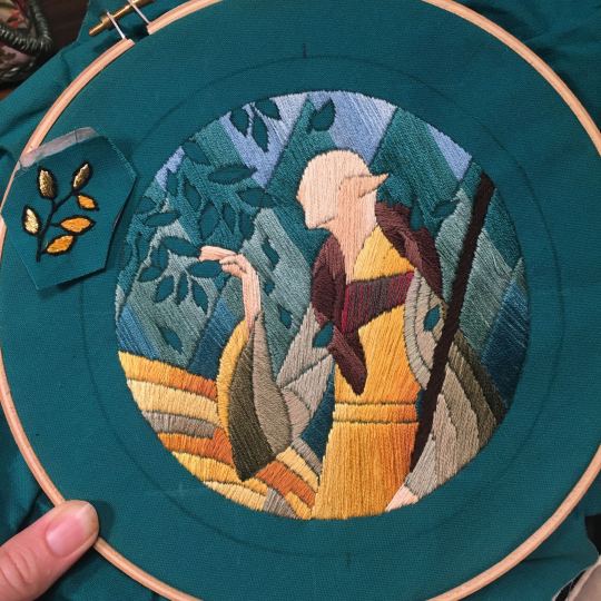
SO yep, that's my general process for drafting patterns. I start with the shapes/design, then do my flat color version, then I pick my threads. Makes it sound easy and short when phrased like that :) But I can honestly spend 8-10 hours just on making the lineart and coloring it in. If I was better at art, probably this would be less, but I'm working with what I've got (not much) 😂 I think all aspects of this are also something that gets easier over time, but it will probably never look as bad as you worry when you start out. I think all my pieces look awkward and rough right up until I do the finishing steps and move them to the display frame sometimes.
I hope this was helpful and answered your questions!! Feel free to post/share your WIPs to ask for feedback or advice ever too :) I've only ever had people in the embroidery community on tumblr be encouraging and helpful to me, and I'm happy to answer any questions myself when I can or if parts of this were confusing
#ramblings#my stuff#my embroidery#embroidery#dragon age embroidery#calicostorms#oh god tumblr changed the alignment of all my images so theyre all huge now great#WELL I keep tryign to rearrage them to be on the same line and it is NOT working so. thats how they will look i geuss#this is gonna annoy me all night... thats what i get for expectign a Functional Website though#embroidery chatter
31 notes
·
View notes
Text
Working on my javascript for my web page. Turns out I have the perfect kind of setup to accomplish some of the project requirements, specifically with even handlers and user interactions
My website, conceptually, will load a different employee details page depending on what employee name is clicked on. But I need to load it dynamically (instead of hard-coding it) so that the user can add or delete employees & it'll be able to still load the relevant shit.
So! Only one employee details page, but depending on how it's loaded, it'll load a different employee's information. Still working on getting down Exactly how to do it (I'm thinking using URL parameters that'll read a different object depending on what ID is used)
It's entirely doable. In fact, it's probably extremely common to do in web pages. No one wants to hard-code information for every new object. Of course not. And thus the usefulness of dynamic javascript stuff.
I can do this. I can very much do this.
#speculation nation#i wasnt very good when i got home and i read fanfic for a while#then took a nap. and now im up again and Getting To Work.#i dont have to have this 100% perfect for final submission just yet. bc final submission isnt today.#but i need to have my final presentation over my thing done by noon (11 hours from now)#and im presenting TODAY. and part of that will be giving a live demo of my project website#so. i need to have all of the core functionality of my website down at the Very Least#might not be perfect yet. but by god if im gonna show up to my presentation with my website not working.#i need to have the employee list lead to employee details with personalized information displayed per employee#i need to create an add employee field that will Actually add an employee. using a form.#and that employee will need to show up on the list and have a new id and everything. the works.#need to set it up so that employees can be deleted. shouldnt be too much extra.#and it would be . interesting. to give an actual 'login' pop-up when someone clicks on the login button#with some kind of basic info as the login parameters. this cant be that hard to code.#the project requirements are: implement 5 distinct user interactions using javascript. at least 3 different eventhandlers#at least 5 different elements with which interaction will trigger an event handler. page modification & addition of new elements to pages#3 different ways of selecting elements. one selection returning collection of html elements with customized operations on each...#hm. customized operations on each... the example given is a todo list with different styles based on if an item is overdue or not#i wonder if my personalized detail page loading would count for this... i also have some extra info displayed for each#but i specifically want the employees to be displayed in the list uniformly. that's kinda like. The Thing.#actually im poking around on my web pages i made previously and i do quite enjoy what i set up before.#need to modify the CSS for the statistics page and employee details to make it in line with what i actually wanted for it#maybe put a background behind the footer text... i tried it before & it was iffy in how it displayed...#but it looks weird when it overlaps with a page's content. idk that's just me being particular again.#theres also data interchange as a requirement. but that should be easy if i set an initial employee list as a json file#good god im going to have to think of so much extra bullshit for these 10 made up employees#wah. this is going to be a lot of work. but. im going to do it. i just wont get very much sleep tonight.#that's ok tho. ive presented under worse conditions (cough my all nighter when i read 3gun vol 10 and cried my eyes out)#and this is going to be the last night like this of my schooling career. the very last one.#just gotta stay strong for one more night 💪💪💪
6 notes
·
View notes
Text
Another day, another Alexander Prime for roulettes meaning I rapidly slam the screenshot button for those good good freezes.
This time featuring Tataru (Combat Mode).
#ff14#ffxiv#final fantasy xiv#final fantasy 14#arashi washi#alexander#alexander raids#always gotta try and get a good screenshot when the time freeze hits#though i know i'm always gonna be chasing the high of that one perfect shot years ago#also special fuck you to tumblr for logging me out as i was typing the post up because ???#and then also deciding not to tell me it had done so leaving me to wonder why my pictures weren't loading#functional website right here#god i miss cohost
12 notes
·
View notes
Text
TOO MUCH TO CATCH UP ON RIPPING MY HAIR OUT!!!! I’ll get to most of the posts in the morning wauughhh. anyway hi guys, ive been working a lot on my neocities PDBC site these past few days and I have a question: when it comes to the site, it’ll mostly be lore-dumps and character bios like I’ve been posting here (along w my minicomics obvs), and I’ve been fooling around with a bunch of different ideas for the writing style of the lore dumps and I want to know which seems best to you:
1. Objective, such as I normally do with my lore dumps (e.g. no personal biases, all info laid out rather plainly)
2. Written in the style of an “official” fincg island website (e.g. written in the pov of finch describing his Amazing Super Cool island and stuff)
3. Written by Domitone post-main story (e.g. something akin to a historical document explaining The Horrors of fincg island after the fact)
#pdbc#HI GUYS HIIIIII ERMMM ive gotten zero progress done on my minicomic but I HAVE done a bit with the site I’m sorta proud of#like not proud of in the sense of ‘wow this is really good’ more so in the sense of ‘Oh Thank God It Is Sort Of Functional’#I honestly can’t decide they all sound fun to write wauughhh#I don’t really have to worry about it immediately cause I still have a lotta basic things to get done but I’m Getting There#I’m writing out more objective information first like the trigger warnings and holy shit there’s a lot#like it sounds like I’m writing a horror novel or somethin. ‘CANNIBALISM TERRORISM VIOLENCE MULTIPLE DEATHS’#I’m leaning more towards option 1 or 3 but 2 sounds so goofy….probably wouldn’t work well though#for a few sections it could be fun but it wouldn’t make sense for him to know a lot of crucial information yknow?#like he knows a Lot because he is incredibly nosy but he probably doesn’t know things like precise addresses or anything lmao#just casually doxxing people in his website is totally something he’d do though don’t get me wrong#‘yeah guys this is my awful no good friend Bellona. she’s annoying as hell but she’s not too bad. her home address is—‘
6 notes
·
View notes
Text
sometimes against my better judgement i try to join a discord and then i immediately realise my folly
#eloise talks#god i hate discord#awful app why are we trying to make it replace forums and websites. it barely functions as a communication tool like its meant to be
11 notes
·
View notes
Text

Is anyone else having this fun thing where you try and search tags on your blog on the mobile app and it proceeds to act like it’s a keysmash you asked for instead of a frequently used tag that definitely exists on your blog? Because this has been happening for about a week for me
#Status Update#before anyone asks I DID submit a report#but I won’t hold my fucking breath because god knows the videos are more important than a functioning website
2 notes
·
View notes
Text
Can tumblr stop deleting my fucking alt text I'm going to go ape shit. But of course this buggy piece of shit website can't even handle it's accessibility tools correctly. This is just pathetic.
#I mean why would this website make sure that its accessiblity tools work correctly#they're a bit busy making sure trans women feel unwelcome and unsafe#so they just don't got the bandwith to ensure basic functionality#you simply must understand#god I hate this fucking website I'm glad I have a Bluesky that actually fucking works like intended
5 notes
·
View notes
Note
Proud to see another tumbler who is not afraid of the block button. I’ve once blocked someone who said that Sam doesn’t deserve to win the seikai taikai and someone who said that Sam didn’t have a reason to start back doing karate. I gets down I don’t play. The button is there for a reason.
YEPPPP exactly! I'm 100% a proponent of curating your own experience. Blocking is just me saying “Hey, I don’t want to see your content”—and that could be because of any number of things. But most often, it's probably just because I came across an opinion/series of posts of theirs that I don't like and don't want to see. It's as simple as that. Who cares what someone else thinks of you blocking them? You don’t know them, they don’t know you. It doesn’t matter. Don't let someone else ruin your day just because you don’t want to seem like "the bad guy", that’s ludicrous.
#it also helps when people are stirring shit in your post or even just in a reply to you on someone else's post#on any website that has the block function...just block and they can no longer engage in their bs#(at least not to your face lol they can scream and cry like a child elsewhere but that says more about them than you)#this is why i've always wished youtube had an actual block function#because my god...i could get so much use out of it there#esp bc youtube commenters are a particular kind of rude that just transcends human comprehension
3 notes
·
View notes
Text
Worst thing about having taken business classes is that I see people complain about bullshit companies are pulling and a part of my brain goes "Oh, that's an effective tactic for cost reduction" or something around those lines. And then the part of my brain that is Not a wannabe businessman is just like "Bro."
#speculation nation#or anything on data management or anything like that. bfkshfmsbd#been learning about company perspectives and what have you. unfortunately i understand businesses more than i ever planned to.#such is the IT major at my school </3 i did already finish my business classes already#but im in data governance class now which deals a lot with the ways companies handle their data.#learning about policies and harm reduction tactics and data lifecycles and what have you#looking at the scaffolding of a company's data system and recognizing just how fragile it all is.#a side effect of all this is me feeling less angry about websites trying to make money.#advertisements and subscription services are aggravating. but hosting a website is *expensive*.#if they cant at least break even then the website is a resource drain and isnt sustainable in the long run.#not unless it's a damned passion project of a bigger conglomerate. and you'll find those are exceedingly rare.#so im annoyed by advertisements as much as the next person. but if theyre kept relatively unobtrusive then i dont mind them too much.#now ads that pop up to cover the whole screen. or god forbid youtube's unskippable 30+ second ads#THOSE are so obnoxious. the youtube ads especially.#had a few of those some weeks back when prepping my presentation that had me wanting to tear my hair out.#30+ seconds and NO SOUND EITHER. literally ridiculous.#anyways im definitely not a business sympathizer Especially when it comes to predatory practices#but for those more daily functions kinds of things... idk man sometimes these things just gotta happen.
3 notes
·
View notes
Text
i might do a real writeup on my thoughts on shuffles in a few months if i still use it. it's like 80% of the way to being a functional editing software which is crazy for an app
#this is what i wanted out of pinboards on sheezy#shuffles is only a few years old i think so i have hopes it will improve#pinterest constantly annoys me with ads but my god they're 10x better at being a functional website/app then most places these days
3 notes
·
View notes
Text
i love websites that contain text-based information
#'is this not every website?' well maybe. if you're deep enough into cheese prices i guess the grocery store website is allowed to count#and there are interesting things about youtube without watching the videos etc etc. anything is information#but you know what i mean. i mean wikipedia#but i also mean the few and far between parts of the internet where stand alone websites are still being maintained by someone#who is passionate enough to start a whole website for the thing in the first place#i'm thinking about some of the websites about flags i visited a while back. websites about airplanes. i love you websites about airplanes#i am also VERY specifically thinking about thai-language.com#an incredibly comprehensive online thai dictionary with transcriptions marked with tone and MANY audio clips#with context notes and long long loooong lists of example uses in both compound words/phrases and actual sentences#AND their search is actually functional and the website is incredibly helpfully set up and easy to navigate from word to word?#and it's FREE???#literally truly genuinely. makes me feel the way looking at ao3 does. i'm overwhelmed with love#also in the way that i can easily lose a few hours there though. in that way too#*#wait i just noticed they have a typing game!!! this is opening up a new world for me and my thai keyboard stickers#'Objective: Prevent Mars from being invaded by Thai orthography.' fjdkf GOD i fucking love the internet
4 notes
·
View notes