#calicostorms
Note
Hiii, do you have any tips for drafting out embroidery patterns? I've got one in mind, but drafting it out and color picking is so nerve-wracking!!
[Hi!!!! this got kinda really long so I'm gonna crop it under a read more. And I honestly don't have any real training/instruction in fiber arts so this is just how I do things, and probably others do them very differently!]
Haha so my fandom embroideries are VERY different from my non-fandom personal pieces in this respect. For non-fandom things i just kind of throw myself in like WAHOO FREEFORM LETS GO and go for a kind of messy colorful approach that ends up as things like this:
Versus my fandom stuff is way more structured and designed to fill space, be very precise, etc. So for those I do go in with a digital mock up of the design I make in photoshop, that I then color in, and then as my last step translate to thread colors.
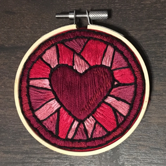
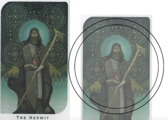
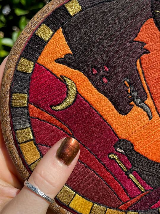
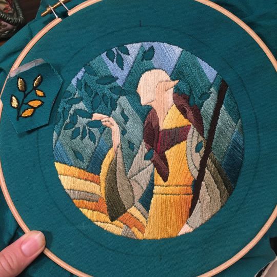
For my Dragon Age series. this has been because I'm specifically trying to mimic the stained-glass style of art you see in parts of the game like the dialogue wheels, some icons, windows, etc. The icons in particular were really easy to copy into embroidery because they already come in handy circles:

This is mostly because I have desperately wanted to pick up stained glass work as a hobby for like 6 years now. As in once every 3-6 months I put everything I'd need to start doing it into an online shopping cart and look at the price total and then sadly close the window because I just don't actually have any space I could do it in (I live in a 2bed apartment so i have no garage or yard or anywhere it wouldn't make everything else a mess or be a hazard). The day after one of those events I impulse bought and completed a floral embroidery kit from the craft store and kinda was like... ok, well, I did this once how hard can it be to use this medium to mimic the hobby I wish I could be doing? Plus, it's only like 60 cents per color! I can afford that! So I took the first design I wanted to do, the romance icon, and basically redrew it sloppily in photoshop, then freehand-copied the design onto fabric and stitched it the next day:

I learned a lot from this piece and changed my approach a little. Here you can see I tried shading in the parallel direction to my thread, which looked messy and added texture, so now I shade horizontally to my thread direction instead.
But it gave me a basic approach for turning the Tarot cards or DA Keep tiles (or any other art!) into embroidery patterns, which I couldn't copy as directly into this really smooth stained-glass style. There's a basic process I follow when doing these conversions that generally follows the same order, which I'll go through below.
STEP 1: SHAPES
The first thing I do is pick the shape of my display frame which is usually a circle, but could be an oval or rectangle too, since I hang the finished pieces on my wall to have nice way to show them off. I like to fill the whole space so knowing the size and shape of what I want the finished project to look like is a good goal for me. Since I am doing fandom pieces I want to be recognizable, I do stick pretty close to the "original" character design/art, but you can absolutely change as much as you want and freehand draw your own interpretation instead. If you're doing original art just substitute the below composition notes with "sketch out roughly what you want it to look like". I personally do my pattern drafting digitally as I find it easier, but you can do this part by hand too.
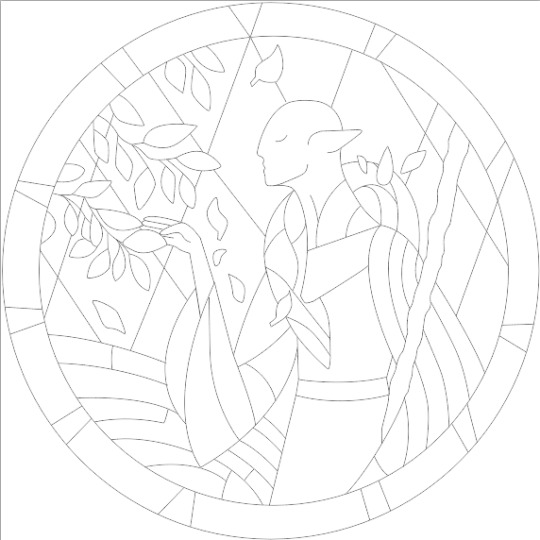
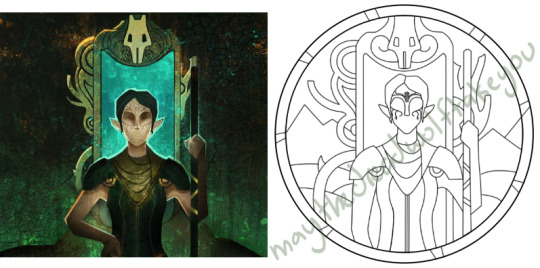
First, I keep the reference image I'm working off of open next to me while I work, and draw in the shape of my frame (here, a circle). If I'm adding in the little border to be fancy, I add a second inner circle. I keep these as their own top layer so I always know I'm working within the final "frame" and don't spend time designing any section that will fall outside it. Then I will take copies of the reference image and knock the layers down to 25-50% opacity, and start moving them around underneath the 'frame' layer until I like the way their positioning looks as a composition. Sometimes elements of a card I want to include don't all fit in, so I'll chop the section out and add an additional layer to throw in (like the background circle things in the Hermit design below). Or I'll just freehand things like adding much bigger diamonds behind Solas in my Hierophant design because I did NOT want to do 1000 tiny ones. Then once I'm satisfied with the general composition, I'll use the plain ol circular brush tool to trace out the major shapes of each element. I try to keep in mind that I can't go too small, and curvy lines are more difficult to fill in than straight ones. I usually do a rough messy version first, make it mostly transparent, and then a cleaner and more precise one over that.


(you can see parts of the rough one on the left and the fully 'cleaned up' on the right for the Hierophant design)
Now: depending on what you are doing next with the pattern, this might be where you stop and start coloring. If you are planning to freehand your design or just trace it onto fabric (or even print it onto fabric here), there's no need to do more than this kind of lineart! However, if you are working digitally and want to create a scalable vector so you can print it at different sizes, you can use the pen tool in photoshop to trace your design and make a "work path" of the lineart. However, another note: THIS PART IS VERY FRUSTRATING AND TEDIOUS BECAUSE THE PEN TOOL WAS CREATED BY THE DEVIL TO TORMENT US. It is so so so easy to accidentally delete a line or even the whole path and not notice later on. Ask me how I know 😭 Anyway I'm not going to include a pen tool tutorial because I don't even know how to use it well and have to google or watch videos every other time I try to use it. But if you can muddle through it gets you some really clean lines that eventually look like this:

With the work path selected, you can select the brush tool/size/color and use the "stroke path" option to create lineart of the vector. Then you can save this as a transparent png file for use at different sizes and for printing and it looks so nice and clean! one of the big benefits to this is that you get really fine lines that are easier to be precise with stitching on. This is extra perfect if you are printing the design directly onto your fabric (which you can do with an at-home inkjet printer for designs under 8inches wide, as long as you stick a piece of stabilizer on the back of your fabric and cut it down to printer sheet size--this is what I do and can make another post about that process if people want haha), or if you are printing onto transfer paper like you can buy at craft stores.
This is where I end the lineart for my designs. After I have this, I move on to the next phase, which is...
STEP 2: COLOR
For interpreting my designs into thread, I start by thinking of it as flat colors first. You can't "shade" as easily with threads as you can with things like paint or brushes in digital art (though you can A Little, which I will get into), so to start color planning I pick the "main" color each section will be in the piece.

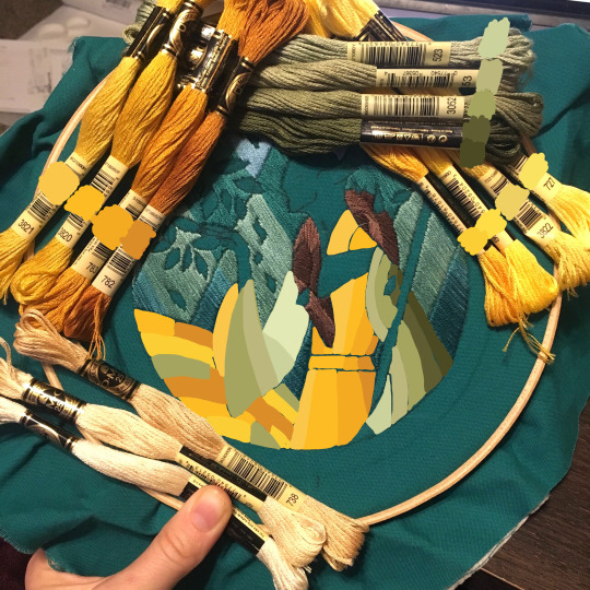
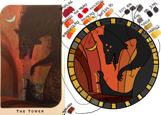
For the existing icons this was simple--I kept the same sections as the original designs, so for each I just color picked or eyeballed the color in photoshop and colored it in (but you could do this on paper with pencils, markers, whatever as well--they don't need to match your threads exactly and usually won't, it's just to give you an easy reference to follow as you go). For the tarot cards which were more complicated in coloration, I just did my best and went with what looked good next to each other, even if it was a little off the original art. It will be off more later anyway when you have to pick threads so don't stress it too much honestly. I will often make layers with different color options and turn them on/off for direct comparison to try to determine what I think looks best as well, like below where I was debating between more blue/desaturated for the background or brighter colors.

I do wanna note I have regrets about the color selection, shapes, or shading in EVERY SINGLE ONE of my finished pieces. But no one else ever comments or probably even notices! One aspect of this hobby is just learning to be satisfied with what you've made and using what you learned to get closer to your preferences next time. I'm only going back and redoing some of my designs' colors because I want to make it easier for others to choose on the patterns I sell, more than I care for just for myself. Also since I'm doing this lineart/stained glass looking approach where I go over the distinct shapes with black thread at the end, it means I get these clear delineations between sections you might not necessarily have in your own pieces, and that's ok.
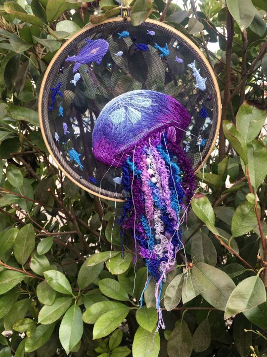
Ok right. Now while shading/coloring in detail is hard with thread, you CAN make whats essentially dithered gradients. "Dithering" in the concept of art means using 2 (or more) colors to give the impression of a third color, or to gently scale between the existing binary rather than a hard line. Think of it like blocky pixel art or gameboy game images. If you're doing needlepainting, you use really small stitches close together to get this effect, which translates to "smaller pixes"--if you look at the jellyfish in my first photos that's a very messy casual version of that. If you want a better example, I recommend looking at @ammocharis 's pieces like these in her pinned post, which are truly amazing! I simply do not have the patience myself 😂 For my stained glass style, I work only in very long straight stitches, so I can only shade in one direction and have to be a little more precise with it.
So for shading, I think about in each section which direction my threads might go. Then perpendicular to that direction I pick which side will be the light one and which the darker one. Sometimes I color this in on my pattern mockup, but sometimes I don't! Or I'll only do it for certain sections to make sure I don't forget. Like for my Tower design I only colored it as flats, and waited until I selected threads to decide how the shading would go. I am currently working on a smaller, simplified version of my Hierophant design and I did add shading digitally for that one just for fun. But it's not as important as having the flat color version you can use to quick-reference how you want your design to go while you're stitching. You might also notice I don't actually color my gold--I just throw in a stock image of gold foil for that layer so I can't confuse it with any of my yellow thread sections.

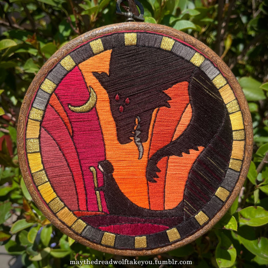

Here's a close up where you can kind of see what I mean by the "dithered" effect between colors--some are more obvious (like the red on the far left or middle orange) and others pretty subtle (dark grey to dark red on the wolf face):
Now, while I use single layers of satin stitches for this, and just alternate thread colors increasing/decreasing as I go, you can accomplish the same thing with short overlapping stitches like with needlepainting, or with clusters of french knots, or whatever else. But in GENERAL you are going to be able to trick people into seeing gradients out of dithering best when you are using the same type of stitch for that whole area. So if I was using multiple stitch types like having french knots, daisy chains, ladder stitching or whatever else for some sections, I would keep those to contrasting areas/colors. A fantastic example of using different layered types of stitching to create more intricate color/texture in an embroidery would be these incredible tarot card depictions by @hattedhedgehog, which I like even better than my own embroideries. Here's his take on the Tower card as well for comparison to mine (I'm so in love with it!!!).
But anyway, at this phase, your design is actually still digital--the above is just to explain how it translates later in the process. The next step is...
STEP 3: THREAD SELECTION
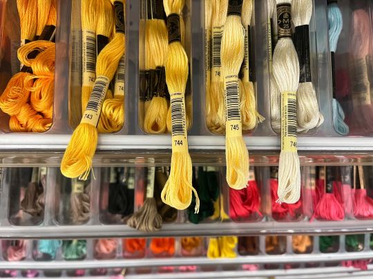
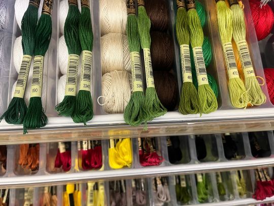
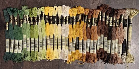
I will admit here I am not great at this part. I am constantly second guessing my thread colors, and can spend over an entire hour in the thread aisle at the craft store agonizing over choices. Really, I think this is just one of those things that takes practice and you get better at it over time. What I have had the best luck with is actually printing out a reference photo of my design/the original artwork and taking it with me. If you already have threads you can do this part at home too, but DMC alone has over 500 colors and I definitely don't even own half that so I like to torture myself by looking at them all together on the thread racks. Plus Anchor and Artiste and whatever other brands there are out there. One approach is to just sit there and pick out what you want for each section and line it all up together on top of your printout. Or in the case of my Tower I laid a bunch of options out on top of my template in the hoop to guess how they'd look in the frame.
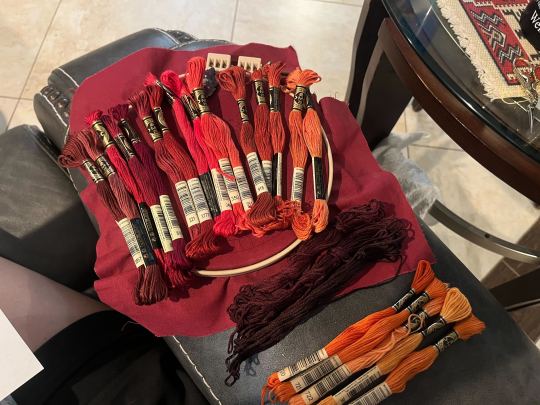
For me since I am also doing this dither shading thing, I also need 2-3 colors per sections depending on its size. Sometimes it's easy and the threads have a color just a little darker or lighter right next to them in the numerical lineup! Other times, there is no good match, or it looks too far away to shade nicely, or I want one to be a warmer or cooler tone than the other... which means a lot of standing and fretting to myself over it. I actually take a lot of photos at this stage because it can be easier to see how they will look in the end from a photo than in person to me? Idk why. Plus then after they get scrambled in my bag I remember wtf order I meant for them to go in later. But as long as you're not preventing other customers from shopping themselves, you can spend as long as you want staring at thread in the embroidery aisle and they won't kick you out unless it's closing time, so take your time.
Now, IN THEORY, you can sort of combine steps 2 and 3 by color-selecting from your threads and using that to color in the design. However I have tried this and it led to mixed success because the photoshop eyedropper brush simply isn't actually that exact (in my experience, it desaturates compared to what we actually see). And because then you have to have the threads on hand while you're coloring... which means you might buy ones you don't end up using if you don't like them. So I prefer to just use this as a refinement step where I pick threads based on the design colors, then will re-color the design a second time to match those threads more closely to be sure I like the effect.
I've even used this as a tool when I needed to adjust my color choices mid-project, by digitally coloring over over my WIP:
Or here's a design (but I haven't posted the finished piece yet bc it's a gift so shhh) I made with certain color tones initially, but after buying thread I re-did the color mockup to be more vibrant, because I liked those threads better in the store:


Once you have your thread, you can make yourself a little reference chart with the colors you intend noted on the sections you want them, like below:
(note: i didn't end up sticking to these colors because I ended up dying my own thread for several sections. And then forgot I made this entirely and picked new ones because I put the project down for a year between design and stitching. Sigh).
Or for my Solas pattern I did this in a really detailed way, which i am sorry but i have redacted because... i have it for sale now and don't wanna just give that away haha. But if you buy the pattern from my shop this is one of the files you'd get with it, for ease of reference. I do also include a text-only list of them as well.

Now I don't go to this much trouble for all my designs, just the ones I put up for sale (or plan to). You can also just make a text list of your color plans if you want. Though for fun I also have been using my scrap thread to make these little "color palette" keyrings for my finished pieces, so if I ever remake them or update their patterns I will know what the original colors were, plus I can compare what i used to other threads if I wanna change part of the design up. This step is absolutely not necessary and I'm just doing it because I'm selling the patterns now, but they are kinda fun to look at.
And don't forget.. if you start a section in a certain color and decide you don't like it, you can just cut the threads and pull them out! I did that with my original hierophant piece actually. I had an entirely different color for one row of diamonds i thought just clashed way too much with the others, so I used photoshop to paint over it with some alternate options until I found one I liked better. Then I cut away all the old threads and put in the new color. It can be a little harder to fill a piece the second time since the fabric will have stretched out a little, but as long as you're using a good stabilizer it usually doesn't move too much.
You can also just make test swatches on spare fabric to test before you add them to your real piece. I wish I'd done this for some color transitions that didn't end up looking the way I wanted, but I am simply too lazy most of the time. My exception is usually for metallic, satin, or sparkly threads, because I want to know how they feel while embroidering. But if you're really worried about a certain color or shade it's a good thing to remember you can just do.
SO yep, that's my general process for drafting patterns. I start with the shapes/design, then do my flat color version, then I pick my threads. Makes it sound easy and short when phrased like that :) But I can honestly spend 8-10 hours just on making the lineart and coloring it in. If I was better at art, probably this would be less, but I'm working with what I've got (not much) 😂 I think all aspects of this are also something that gets easier over time, but it will probably never look as bad as you worry when you start out. I think all my pieces look awkward and rough right up until I do the finishing steps and move them to the display frame sometimes.
I hope this was helpful and answered your questions!! Feel free to post/share your WIPs to ask for feedback or advice ever too :) I've only ever had people in the embroidery community on tumblr be encouraging and helpful to me, and I'm happy to answer any questions myself when I can or if parts of this were confusing
#ramblings#my stuff#my embroidery#embroidery#dragon age embroidery#calicostorms#oh god tumblr changed the alignment of all my images so theyre all huge now great#WELL I keep tryign to rearrage them to be on the same line and it is NOT working so. thats how they will look i geuss#this is gonna annoy me all night... thats what i get for expectign a Functional Website though
27 notes
·
View notes
Note
PLS tell me abt the silly jail wip
me when people send me asks when I ask for asks:

hi calico dearest <3 you and ej asked about the same wip so I gave some different things about it when I responded to her ask here
this one must go below a cut, as with many of my ideas
nsfw, guy/honey are getting freaky, bondage, humiliation, degradation, heavy d/s, gags, impact play, edging, cbt, some intense kink but also light-hearted?
This one is a DOOZY. But the very basic gist is that Guy thought it was hilarious one (1) time to say when Honey tied him up, they were putting him in silly jail and somehow it stuck. He made a sign that says silly jail and it's like a jester in a stockade or something.
This fic would be a (pre-negotiated, practice kink safely, etc) scene where Guy bothers Honey while they're trying to work and in retaliation, Honey trusses Guy up in very beautiful and intricate shibari and suspends him from their bedroom ceiling and leaves him there with a gag while Honey continues working. There will probably be some impact play and edging and maybe even CBT in there and Guy is 100% into it. Something something battle bots, snap me like a twig, right? Anyway, my intended tone is for the build up and aftercare to be really lighthearted and fun with Guy being sassy and cute but for the actual scene to be humiliation/degradation with Guy crying and snot running down his face. I think Honey should be mean to him as a treat (for me).
#god help me. this fic is gonna be nasty. the nastiest of bone spiders even#calicostorms#speed run#redacted audio#redactedasmr#redacted asmr#redacted#redactedverse#asks.#redacted guy#redacted honey#guy/honey#writing tag
12 notes
·
View notes
Note
[Starts shaking at a speed which could shatter glass] hi hi hi PLEASE. Tell me about The Branches Bear Fruit Until They Bow To The Ground
(I say, as if one of the guys in it isn't one of my own ocs)
babe, you keep asking me about fics you already know all the information for 😭 i promise i am not keeping any extra info from you
for those who don't know, this fic takes place prior to In Hushed Whispers and features calico's oc Fen'an. he and his sister have come to join the inquisition and yuo gets him into his bed immediately. it is another fic that is mostly smut. fen'an makes a cameo in the main fic where he has a threesome with yuo and dorian
#you are literally the first to learn about any updates i prommy#answers#calicostorms#fic: the branches bear fruit#my fic
8 notes
·
View notes
Note
Mac hi hi!! I also have brain damage (dygenesis of corpus callosum), it causes me chronic pain with symptoms similar to MS (have been checked for it and I don't have it), memory issues, balance problems, poor motor coordination etc. I've also been feeling a bit alone with mine so seeing your posting about it a bit of a balm sometimes :]
hiii calico!!! i have in broad concept sorta the opposite situation in that my brain damage is almost certainly caused by my chronic pain (lupus). my stuff might be demyelinating, i’m not able to get more specific tests & research is kinda like “well probably but we don’t have a specific name for this” as far as i can tell.
i really appreciated seeing your tags on one of my previous brain damage posts!! made me feel a lot less alone :)
tbh i’m still super overwhelmed even though i’ve had these symptoms for 5-8 months (5 months today for the involuntary movements, woo!) & i’m having a hard time finding like. anything about adapting etc that isn’t geared towards caregivers of people with dementia & super ableist. like do i just write everything down forever orrrr lol
anyway i would love to talk more & hopefully help us both feel less lonely <333
12 notes
·
View notes
Note
re: the daI:multiplayer post
I am your guy for dai:mp chitchatting bc I play it a lot (yes its so mid but. cool characters in there)
No judgement for playing mid games (I love me: andromeda lol I have no room to judge)
But fr all those characters sound awesome and the only one I've ever even heard of is the bard, and I don't remember knowing he was a mage! That's so COOL why can't we do that stuff in the main story 🙄
So yeah please tell me about the cool multiplayer people!
#ask#calicostorms#i imagine/write my main hawke as a mage with rogue weapons and tactics for apostate reasons#and now you're telling me canon supports rogue mages but won't let me play it?
3 notes
·
View notes
Note
I love your Vega sooo much !!!
Aw, thank you! I really enjoy drawing him
I decided a while ago that astral forms in Aria are basically sapient nebulae, hence the 'astral' bit and names based on stars or constellations. I also figure that Vega, seeing as he rarely shows himself to humans and seems to genuinely dislike appearing or acting human, would probably keep his form in Elegy as reminiscent of home as possible
Vega is a star in the constellation Lyra, which is also home to the Ring Nebula. I sampled colors from a photo of it for Vega's palette:

I also kind of see the patterns as constantly shifting, which I attempted to animate way back
Biggest downside? I absolutely cannot imagine what kind of clothes he wears. Though, some people might not see that as much of a downside ¯\_(ツ)_/¯
#it's so fun I designed an astral form for my warden#and tried to do so for avior and gavin but I'm not sure how much I liked those ones#redacted vega#redacted audio#redacted asmr#redacteverse#asks#calicostorms
12 notes
·
View notes
Text
Wip WednesdAYYYYYY
*tiredly pompoms* tagged by @just-call-me-angel ! I have been making slow progress on my pavellan fic but struggling a bit with getting Dorian's voice to feel right. Anyways here's a snippet from my pavellan fic
Dorian took the bracelet, running his fingertips over it. He seemed impressed; Nydha practically bounced in his seat, overexcited.
“Well, this certainly is better than that wine from last time,” Dorian started, still fixated on the bracelet. “It's beautiful, Nydha. Did you make this?”
The redhead grinned, holding Dorian's arm still to clasp it around his wrist. The craftsmanship was distinctly Dalish, though the design wasn't like anything Nydha's father taught him to make. Usually it was leaf patterns or arrows, not dragon scales.
“I started it ages ago, back in Haven. It was in my pocket when—” a heavy, uncomfortable pause, then he picked up again, “—well. When Healer Orrick was helping me, he put it aside. I think he knew it was important, like his Dalish bracelet. Ghilan’nain must have kept it with me through everything for a reason.”
Tagging uuuhhhhhh. @championsofthejust @merrybandofmurderers @mrs-theirin @floralprintshark @blarrghe n anyone else who'd like to!
#note: this is calicostorms' writing blog. apologies for the jumpscare its just me tho!#calico speaks#oc: nydha lavellan#pavellan#wip wednesday
10 notes
·
View notes
Text
Welcome back to
The SkySide Redacted Awards! [Rec List Edition]
(Once more, there's a few NSFW mentions here so mdni, please and thank you)
This segment was titeled The Exhibition of Admiration! The main rule was that your submission couldn't be something you made, and we had quite the collection of submissions! So, without further ado, let's go!
Category: Shaw Pack
They Broke The Mould When They Made You // Written by BlueWhispers
Moments That Flash By // Written by @bratty-telepath
House Call // Written by @romirola
Bedroom with a View // Written by @/romirola
At Your Altar // Written by @angelicaether
An Unexpectedly Good Night // Written by LiveRandom
This lovely art of David by @sincerelywhistler
And this lovely art of Milo by @hotmcrodz
Category: DAMN Crew
Stress Relief // Written by @calicostorms
honey, baby, love // Written by @/calicostorms
Secret OP Dominant Side // Written by CatArsenal
Formidable // Written by @lovelylonerliterature
This art of Gavin and FL by @ryoko-san
And this oh so scrumptious art of Gavin by @/sincerelywhistler (Wes, you're in here a lot, fair warning /lh)
Category: Carpe Deus + Sovereign State
V1309 Scorpii // Written by @/calicostorms
And That's Why We Broke Up // Written by @dominimoonbeam
resist and elongate // Written by @gingerbreadmonsters
easy pickings // Written by @/gingerbreadmonsters
This DIVINE art of Vega by @yoteako
And this lovely art of Hush by @nortyourself
Category: The Imperium
All (For Nothing At All) // Written by @agentplutonium
the devil's threesome // Written by @ejunkiet
Weighted Blanket // Written by @teafairywithabook
Two pieces of art, both from @/nortyourself! One of Imp!Damien and one of Imp!Vincent
Category: Contemporary/Unempowered Stories
Oh, Baby, Baby // Written by @/lovelylonerliterature
Nine to Five // Written by @bicyclepainting
This oh so fun art of Aaron/Smartass by @thefablefoxart
And this funky fun art of Guy by @slushiepizza
Category: House of Solaire
Get Me Out Of Here // Written by @/dominimoonbeam
五二零 // Written by @/gingerbreadmonsters
This tasty art of Porter by @pycth
And this cozy art of by @sri-rachaa
Category: Sadism's Hold (+ Yandere Friends)
alone with you (does that make sense?) // Written by @/nortyourself
Still Here // Written by Anonymous
No One Is Coming To Save You // Written by LoveRun
This chilling art of Regulus by @/sincerelywhistler
And this bonus Regulus art by @dyswarpia
Category: The Balance
Face to Face, Miles Away // Written by troubadour_main
motion capture // Written by @/gingerbreadmonsters
This nostalgic art of Blake and Bestie by @androgynouspenguinexpert
This DELICIOUS (sorry my demons) art of Blake by @/sincerelywhistler
And this lovely art of Brachium also by @/sincerelywhistler
Category: Project Meridian
you touched me (and suddenly I was a lilac sky) // Written by @autisticempathydaemon
Canon reminiscent art of Michael (Yes, Angel's ex) as an ETS worker by @/pycth
And this moody art of James and Asset by @itsdaifuku
Thank you all for submitting all of these works! Go check out everything here for yourselves!
#redacted audio#mdni#I'm super excited to read a few of these#*Especially* the Lasko/Vincent fic like HELLO? /pos#Also it's funny and fun how some of y'all got a ton of recommendations /pos#Just goes to show how top tier some of y'all are /pos
115 notes
·
View notes
Text
Stealthnotized: A 3+1 Fic (Chapter 2 of 4)
Because this fic is rated E for my brand of soft-smut explicit material, the AO3 link to the update is under the cut. 18+ only, please!
Thanks for reading! Any and all feedback is welcome and cherished.
Read the second chapter of Stealthnotized on AO3!
Summary: A series of four separate scenes featuring Milo and Sweetheart exploring the variety of ways hypnosis can enhance an already strong, safe, intimate, inventive, playful, passionate, and above all, loving relationship. Or, three times Sweetheart hypnotizes Milo and one time Milo hypnotizes Sweetheart: the first time, the sweet time, the spicy time, and the one time.
Want more info? Check out the AO3 link, this post, or ask me!
Taglist: @glassbearclock, @calicostorms (Want to be tagged when I update this fic? Please reach out and I'll be happy to add you!)
#redacted asmr#redacted audio#redactedverse#redacted fanfiction#redacted sweetheart#redacted milo#milo greer
39 notes
·
View notes
Text


Here's all the headshots I drew so far! So many amazing Tavs and Durges <3
Quick rundown:
Zeth belongs to @fivekoboldsinacoat
Majexatli belongs to @the-eldritch-it-gay
Leda belongs to @orlesianapologist
Eonan belongs to @calicostorms and
Malvolio belongs to @aymayzing
#I fell deeply in love with every single one of them#bg3 commissions#flash commissions#beesart#I used to resent larian for their choice of using head presets in the cc instead of sliders but I have to take that back#I have yet to see two tavs who look the same
97 notes
·
View notes
Text


Wip Wednesday!
Thanks to @plisuu and @greypetrel for the tags! Lately I am posessed by visions of a guy just hanging out.
Also some portraits? of Taren at different ages/stages of the Inquisition, maybe? They make me feel something.
Anyway check out that cableknit, ow.
not sure who has done this already, but some wip wednesday tags: @midmorninggrey @calicostorms @theluckywizard and anyone else! if you want!
30 notes
·
View notes
Text
@curiouslavellan tagged me to pit my five favorite characters against each other so please vote below
tagging
@formerlyknownas-delight @void-whisper @chimney-begins @livingchancy @jadeandquartzes
@grasslandgirl @teacupsinspace and @calicostorms
22 notes
·
View notes
Note
A company of herosssss. Any Freckles the horse updates 👀👀👀
alas i have no freckles updates 😔
for those who don't know, A Company of Heroes is my fic about sutherland's company written in epistolary style via letters to his father. it follows his adventures from joining the inquisition, recruiting his companions, and taking missions up until magekiller. it also features a polyamorous romance between sutherland, voth, and shayd
6 notes
·
View notes
Note
When you get this, publish 5 songs you like to listen to, then send it to ten mutuals!!
Thank you aether! Courtesy of my on repeat playlist:
Jericho by Sleep Token
TGIF by GloRilla
Code Mistake by Corpse and Bring Me the Horizon
DDLG by ppcocaine
I Never Told You What I Do for a Living by My Chemical Romance
Welcome to the depths of my mind. It makes no sense.
Tagging beloved moots: @autisticempathydaemon @mr-laveau @horrorscoupes @calicostorms @bicyclepainting @ejunkiet @frenchiefitzhere @batch-of-pengwings @gingerbreadmonsters @agentplutonium (no pressure!)
17 notes
·
View notes
Text
Rules: Make a poll of your favourite female characters (no limits - as many or as little as you want) and see which your followers like the most!
I was tagged by @layalu
I'm tagging: @herearedragons, @cactusnymph, @calicostorms, @veilkeeper, @arainayeet, and @general-sleepy, no pressure tho!
#elly.txt#tag games#featuring at least one character Ive been told is 'elly coded'#expecting merrill to dominate tbf#edit: immediately saw a d20 post and realized I forgot all my d20 girls lmao
5 notes
·
View notes
Text
wip wed
so instead of all the dragon age fics i have in progress (or other fics that have been on the backburner for years) my brain decided what i Need to write is tentacle porn for an indie horror game. i'm not posting that on my dragon age blog so y'all get it. (no actual smut in this part)
Specimen C4R-10N writhes back from the electrified spikes, cornered. It just needs to slip away, retreat to a nest, reassemble. But this battle has reduced it, depleted all its energy that could be used for a veil, and webs are useless against—
The shield glitches, de-pixelates, and the White Skin behind it crumples to the floor. Its spoiled, mechanized blood seeps out from its wound, pooling against C4R-10N’s appendages. It saps the oily liquid up, feeling a faint jolt of energy. Better than nothing.
Standing before it now is one of the yellow-skinned four-limbs, but its brain cell is uncovered, like a Thin Skin. It is holding a gun, which C4R-10N has not seen from a Yellow Skin before. Its measly pair of eyes are wide as it stares down at the body at its feet.
Despite the gun, C4R-10N expects it to run and helps itself to the nearest Thin Skin corpse. It will catch up easily enough once it has regrown some mass.
The Yellow Skin does not run. The inaction takes a moment to register, and C4R-10N twitches, uncertainty stalling it. But the gun in the Yellow Skin’s hands is pointed at the ground. Its eyes are on C4R-10N now. They are a weak, watery blue. “Are you okay?”
C4R-10N understands that collection of sounds. It has heard them passed between the four-limbs but never directed at it.
For a second, C4R-10N thinks it is talking to another four-limb, but there’s no other thrum of life in the room. Stupid of it, not to run. There are many carcasses for C4R-10N to gorge on, but fresh blood is always the best.
@calicostorms, @mrs-theirin, @fade-and-loathing-in-thedas, @secretly-seraph1m, @solarthermals, @maleficarmage, @ringneckedpheasant
#if you're wondering what random stranger is tagging u in their tentacle porn. its me. merrybandofmurderers. hi#carrion#games#carrion game#mine
8 notes
·
View notes
Last Seen Blogs

oblio-k
Everyone in Star Trek is HoH actually

essidata-blog
ESSIDATA

that-one-demiaroace-puddle
basement lurker

chey1995
Fandomfreak

hotguysandhardgays
Hot Guys & Hard Gays