#gouache comparison
Explore tagged Tumblr posts
Visit Tumblr Blog
Explore Tumblr blogs with no restrictions, modern design and the best experience.
Last Seen Tumblr Blogs


Fun Fact
25% of US internet users with an annual income of $80-100K use Tumblr.
Text
Artist Loft vs Himi Jelly Gouache
Out of curiosity, I decided to try the Artist Loft jelly gouache set. (My boyfriend took me to michaels to buy some art supplies to entertain myself during game night because i had a slightly stressful day and didn't feel like playing games lmao, so i just kind of stumbled across it and said, wth why not XD)
Here are my opinions on the set. I purchased the 24 set that comes with the brushes. It retails for about $24-$25. I had a couple coupons ($5 off $15+ and a 20% off) I purchased other things, but had I only purchased that, the set would have cost somewhere around $18 after tax i believe.
On amazon, the Himi gouache 24 set costs about $25-$26 and I think it also comes with brushes. So the sets are pretty comparable.
I have the 18 set of Himi gouache, that does not include brushes (tbh I cannot remember what I paid for it I bought it a couple years ago).
Having used both, I would say that the paints perform similarly and act as gouache should. (I could not find any information on the artist loft set about archival quality, but I scan most of my finished pieces, so it isn't a huge concern for me tbh.
The packaging is identical, the only real difference I noticed packaging wise is that the foil sealing the cups was incredibly difficult to remove from the artist loft set. I literally spent a collective 6 hours over 3 days peeling the foils off because they were stuck (and it would have taken longer had my dad not offered to help).
Content wise, the biggest issue with the set compared to himi was the quantity. Himi gouache cups contain 30ml of paint and the artist loft cups only contain 27ml i believe it is (which is not disclosed on the external packaging like it is with himi). They also seem to stain a bit more than the himi gouache, but probably not much more really. The artist loft set is also a bit more temperamental when it comes to adding water. Just a touch too much water, and the paint became extremely thin and streaky. I mostly got by with just the water left on my brush from rinsing and used that the thin the paint enough to use properly. The himi gouache was a bit more forgiving with the water, though it also gets streaky if you add too much.
Pigmentation was fine and each color acted as I expected it to. I did notice that the gouache skinned over rather quickly (within about an hour of use, the top layer already skinned, which the himi gouache did not skin so quickly when I first got it.) Overall, I think for a house brand, it did quite well and the price was well enough in line with the competitors to make it a solid choice if that is what is available to you (especially if you have coupons and vouchers).
HOWEVER, the fact that I had to spend hours (my fingers are still a little sore btw lol) peeling foils off of the cups before I could even dive into the paints was enough to make me low-key regret buying it. Now that its open and I've used it, I very much enjoy the set, and having 24 colors is great for people that want some variety and dont want to mix their colors. (I default to color mixing all the time though, so I could literally get by with the main 4 paints if i needed to haha, I just like options).
Do I recommend Artist Loft Jelly gouache?
Yes I do. However, I only recommend it if you can get a discount on it. Otherwise, I think you would do just as well getting the himi gouache unless you don't want to wait for it to ship and Artist Loft is in stock at the store. (remember, opening the artist loft cups is a literal nightmare and himi peeled off much easier).
2 notes
·
View notes
Text

2022 vs 2024 (and, shockingly, not a single gouache painting between the two)
I based the second one stylistically on the first, but it's very cool to see how my skills have improved over the years! Whilst I've not painted much in gouache, there's definitely a lot of transferable skills from my watercolour practice.
311 notes
·
View notes
Note
In case this makes a difference, for those who worry they might have to set aside a good chunk of time to enjoy either of these--
Runtime for "The Aggressives": 1 hour and 15 minutes, or 75 minutes
Runtime for "Beyond the Aggressives: 25 Years Later": 1 hour and 20 minutes, or 80 minutes
If your laundry is like mine and it takes a half-hour to wash & an hour to dry, you would not even have finished a load of laundry by the time either documentary ended.
the documentary "the aggressives" about poc butches is on streaming and can be bought idk if that's useful or anything but i just watched it and thought it fit in here
It's totally useful, thanks for reaching out!! I've not had time to watch this one myself yet but it's high on the list for ... whenever I get a moment. I've heard really good things and all, and--oh shit it's free on Tubi ... HMMM. Okay. Well. I know what I have to see later lol. xD
But yes, anon is right--for those interested in seeing more butches of color, or just butches in general, please take a look at "The Aggressives"!
"The Aggressives" on Wikipedia. "The Aggressives" (free to watch!) on Tubi.
#i don't think i could finish an embroidery hoop in that time y'all#although i say that as a person who just got into embroidery and am taking it at an exploratory baby's pace lol#but still#i'd say i definitely couldn't finish a drawing in that time but that's not a fair comparison because when i draw/paint/color/whatever#i literally take hours#i've accidentally pulled many an all nighter working on a piece#and then only sometimes being finished lol#i like the paintings i did the last time i pulled an allnighter though#they were both in gouache and the veneer went on so smoothly afterwards#i love sealing paintings 😭😭😭😭#okay anyways i need to finish bio homework#the aggressives#beyond the aggressives: 25 years later
842 notes
·
View notes
Text

It's been I while since I've painted any landscapes or used gouache in a while so here's a few studies I did today!
Top was about an hour and a half or two I think, and the bottom two were both 45ish minutes each. (I wasn't really timing so that's mostly an estimate lol)
References are under the cut for comparison, I got them off of pinterest so idk who or where they're really from 😔


21 notes
·
View notes
Text


Joseph Cornell (American, 1903-1971)
yellow sand fountain variations:
Untitled (Yellow Sand Fountain) (two views) - early 1950s
Sand Fountain (front & verso views) - wood box construction with sand, glass, paint, collage and cardboard - 12¼''x 8''x 4'' - c. 1950
Untitled (Yellow Sand Fountain) - 1959
Sand Fountain (front & verso views) - 1948
Untitled (Yellow Sand Fountain) - gouache, sand and printed paper collage - 1955
In a dairy entry of September 1945, Cornell wrote, “one of the finest boxes (objects) ever made was worked out this day (completed or almost). The box of a white chamber effect with a ‘fountain‘ of green sand running. Shell, broken stem glass for receptacle” (Cornell 1993, p. 124).
The Sand Fountain Boxes are perhaps the most difficult of Cornell‘s works to appreciate in reproduction, for the pleasure of looking is ideally complemented by the pleasure of handling the boxes and watching the changes of shape in the pouring sand. In Untitled (Yellow Sand Fountain), when the box is turned upside down, the yellow sand collects within the hollow, triangular birdhouse. As the box is righted, it then pours from the entrance hole onto the broken glass, cascading from the glass’s irregular edges onto the floor of the box. This work thus combines the symbolic resonance of the hourglass, whose sands measure the passage of time, with the idle fascination of watching something (like waves) in unpredictable but repetitive motion. The comparison with an hourglass is interesting from a formal point of view as well: in the latter the movement of the sand is regulated by passing through the instrument‘s narrow waist; here, the space between the upper and lower containers is open; the glass, rather than containing and enclosing the sand, allows it to spill out, its broken and irregular edge causing the sand to flow unequally.
56 notes
·
View notes
Text


comparison


(in addition to the previous post)
It's a lot of fun for me to make things like this. And to show others! to understand better my view at the characters
Ok, starting with ToneKai. They are my light,,, And they're so colorful and bright, aren't they! I like to think of all those fluff memories they make together. Tonegawa and Kaiji are the first characters who I paint a lot using gouache and I always try to make my drawings with them as colourful and vivid as possible
and I can't say the same about LawDo,,, even though I sometimes also enjoy thinking of them as a sweet couple they both aren't... They're angsty. Harsh.
I usually do not paint them but If I do, the paintings aren't colourful at all. Most of them are dull and gloomy.
So I really like them to be b/w and that's the main reason why almost every my lawdo picture is drawn using a simple pencil. But! As probably you can see Law's list is a lot more cooler than Doffy's. It's pretty obvious and cliched, that Law is cold and Doffy is hot but still. I like this difference between them. So I usually edit my photos to match this headcanon
#my art#fkmt#kaiji#kaiji itou#tonegawa yukio#tonekai#one piece#trafalgar law#donquixote doflamingo#and obviously#lawdo#doflalaw#doflaw#soot talking#more and more each day#i just really like sharing stuff about guys
32 notes
·
View notes
Note
🧠 What is a drawing tool you can't live without?
🥦 Can you share an old piece of work next to a newer piece and say what you've learned?
🧠 Digitally or traditionally, i really can't live without watercolors (brush presets or real paint, both are amazing) 😭😭😭 what would i do without them!!? Use gouache??? (okay I could but it's just not the same😭) 🥲🥲 Watercolors really make me go "wow so pretty✨✨✨" whenever I use them, it just tickles the brain (〃ω〃)
🥦 i was excited about this one 👀✨✨✨


(//٭°̧̧̧ω°̧̧̧٭//) !! waah look at that
I think Im slowly learning how to make things more interesting to look at? And in turn it's more fun for me to draw! It just feels more lively to me now and that makes me so happy!! 😭😭💕💫💕💫✨💕💫 On the technical side I think Ive gotten a lot better with colors, and my lines are a lot less rigid and clunky, here are some more comparisons:


(new Jin wip sneak peak 👀)
There was definitely a bit of a perfectionist streak that ran its course in how i wanted everything to look mostly neat back then (even my sketches were neat like what the heck...(ToT) ) so overall i think i learned how to have more fun with it again and the energy reflects ✨
YE━(。・`ω´・。)ゞ ━S!!
#asks game#thanks for the ask!#atla#my art#wips#wip asylum#azula#zuko#atla jet#atla jin#atla fanart#artist ask game#p.o box 💌
32 notes
·
View notes
Text
✨Star Wars stuff I got in Japan!! ✨


Was hoping to find more considering that Star Wars celebration is happening in Tokyo in just a couple months but what I did find was awesome! The banners are my favorite, the millennium falcon one is in my living room, fits perfectly! And the boba one I gave to my brother.
The droid was from a gatcha at a ski resort of all places 😆 thought it would be a fun painting project.
Sadly I only had time to go to Akihabara to shop since it was close to where I was staying. In hindsight I wish I took the time to travel farther to the more western themed collectible stores. Probably a good thing I didn’t though because I absolutely would’ve come home with a $300 hot toys figure or statue.


Also scored some extremely nice craft supplies for a crazy good price. Especially the paints, which I needed cuz my gouache is all dried up.
The clothing was less reasonably priced in comparison to hard goods but I scored this shirt and hat from a local workwear brand in the small town where I stayed in Hokkaido. The logo was too cute and I always need more snap backs. The bunny hat is from DisneySea i was feeling really left out not wearing a character hat there.
And the YARN!! Should’ve gotten more but didn’t want to be greedy. The yarn was such a good price, even the hand spun ones from a tiny shop in a department store. I LOVE Noro yarn so much but it’s like $18 a skein where I live and it was like $8 there 🥲


Obligatory food pics
15 notes
·
View notes
Text


Acrylic markers with limited colour pallet and no ability to mix. Very fun little colour theory challenge.
Tried out acrylic paint markers recently on these tiny cue cards (3.5" x 2"). A bunch of fun little experiments from a few different themes: landscapes, pets, Outer Wilds, Bo Burnham's "Inside."
Edi (the dog) courtesy of @edi_the_english_mastiff on instagram
Tesla is one of my cats; stay tuned for when I draw Ion eventually.
I have a set of 24 colours. I usually work in gouache so switching to #acrylic is interesting for the relative lack of blendability on the page, and since they are #paintmarkers, I can't pre-blend them either. So I had to get really creative with trying to express the colours I wanted. The dog, Edi, with her tan base coat and "light black" (reads as black but not as black as the blackest shadows!) muzzle and ears was such a fun colour-theory challenge. If you scroll to the right, I included some detail shots of Edi so you can see the lavender-purple, pink, and ice-blue I used for highlighting, as well as a size comparison against my hand.
#outer wilds#outer wilds art#outer wilds fanart#outer wilds hearthian#outer wilds proto-hearthian#spoilers#outer wilds spoilers#videogame fanart#original fanart#original art#acrylic paint markers#acrylic paint#acrylic markers#markers#dog portrait#pet portrait#pet art#dog art#dog drawing#bo burnham portrait#bo burham art#inside#cat art#cat portrait#cloud art#cloud painting#cloud drawing#landscape#landscape art
14 notes
·
View notes
Text
Artist of the Week!
So last weekend, I announced that I'd like to feature an artist every weekend for both new fandom joinees who might not have seen some of this art and older fans who like the nostalgia. This week's artist is Ash @aha-my-villainous-thoughts 💖 who also, wonderful that they are, agreed to answer a few questions for me!
Which App Do You Use To Draw When I’m at my big set up I use Clip Studio Paint, I love it so much. It’s very straight forward to dip straight in, has all of the bells and whistles you need from an elite drawing program, and the community elements where you can see assets and brushes is a lot of fun - although I still to this day have no idea how to earn coins to buy assets?! I use a XPPen Artist 15.6 Pro Graphics Tablet to draw into the program, although my best tip with graphics tablets is to get a screen protector, mine got covered in marks before I noticed. Recently I also got an iPad 10.9 to use as a digital sketchbook I can carry around, and while I am enjoying Procreate, I think CSP is a better art program overall.
Fave Brushes? On iPad I stick to the technical pen, studio pen and the soft airbrush, along with the textures and the light pen. I don’t think Procreate has great ‘painting’ brushes, whereas on CSP I would marry the Gouache brushes, I love how they blend and texture as you work.
Your favourite piece you’ve drawn? I’m a super self indulgent artist, I try to draw the kind of stuff I like to look at, so it’s a lot of colour, a lot of fabric and details. My fave piece for detail is the one I did for the OFMD RBB last year - Crescente Devotione, there’s a blushing sentient stool in it! For colour I’m in love with this sleepy time Ed in a lil negligee and a Holly Golightly eyemask, he's my lock screen because I'm trash.
Who harder to draw: Ed or Stede? Oh for sure Stede. I love Rhys Darby, but the man has like no lips. I stand by this meltdown.
One essential tip for beginner artists? Comparison is the thief of joy, don’t measure yourself against others - particularly when you’re finding your groove. Be self indulgent af. Also get a screen protector for whatever digital screen you draw on, and BACK. THINGS. UP. Whether in an online account, or on an external harddrive - or both?! BACK THAT SHIT UP.
Why OFMD? I’ve been in a few fandoms in the past, always as a pretty passive enjoyer, little fanart here or there, little fanfic sprinkled around, but there’s just something about the way this fandom feels? It feels like a group of friends who’ve got their own lives and their goals, but they still exist in each other's orbit, it’s like this feeling of returning home to somewhere you’re always welcome. There’s so many good moments in the show for both comedy and some gut wrenching pathos. Sign up for the hot guy in leather and get got by this beautiful delicate little love story. It’s something about queer joy of thriving, not just surviving. Something about finding love and romance no matter your age or what’s past before. Something about found family, and unlikely friendships, and community and silliness. I was already a goner when Taika put on the wig, but then when he teared up in a blanket fort while trying not to die? Excuse me sir, I did not need feelings that powerful. It was literally waking me up at night thinking about his last shot weeping in the nook - like are you kidding me?! I’m supposed to finish watching and be normal after that??
#artist of the week#everyone go follow ash and gear up for all the amazing art that would now be posted heheh
36 notes
·
View notes
Text
Made Another Moomin

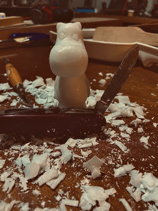


I wasn’t planning on doing any more Tove Jansson characters this week, but then michaels didn’t have supplies for woodblock carving. When the blocks of soap/wax I impulse-bought instead turned out to make very poor stamps, a moomin was born from the leftovers.
Picture of failed pomegranate stamp and moomin/block comparison below:


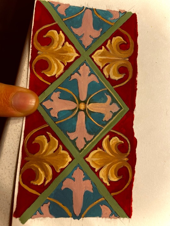
^also tonight’s (unfinished) artwork foray: weird blend of Scandinavian Rosemaling colors / more generic European border embellishment patterns (don’t know the name of the other styles yet). Done with gouache paint.
Generally trying to get better at doing embellishments and the beautiful, intricate, precise, and very tedious details that you see in beautiful old scrollwork carvings and Illuminated manuscripts.
53 notes
·
View notes
Note
hellooooo it's me again ^_^ how have you been?
-🕊️🍖
hello!!!!! I’m sorry for answering so late!!!!
i hope You have been doing well too! i went to a con today with some friends, it was a blast! i missed seeing them a lot, and given it was a smaller, not corporate con i found so much good stuff!! we ate sandwiches we made right there in a park, chatted a lot, i missed them a lot
in general i’ve been a little better? Though right now I’m going through a rather rough pass with myself and my art, just insulting myself a lot and being particularly frustrated at my lack of finished artworks so far this year. I’ve opened sketch comms and I’ve been able to get myself some leisure stuff but I’m also hating my art a lot lately. maybe it’s time for me to start painting traditionally with watercolor and gouache again, just to break the pace, or take a break from art if that doesn’t work out. i’m still too scared to create what i genuinely do want to create and I’m still struggling with wanting to harm myself for not being good enough at art though (notably an episode this week where i had to be talked down on my way home while thinking again and again as to the specifics of how and why and how it’d “make me feel better” and shit). it’s not great, it’s really painful and often enough i feel like an absolute clown for wanting to make my art traditionally and not just digitally just because of how contrived traditional art is in comparison.
on a more positive note, I’m going to start seeing therapists more often now, after a while of keeping it in and struggling to not talk about it. it’s reassuring! I’ve also started defining what i want to buy in priority and how to do it, how to save up without struggling with impulsive spending, allat
all in all, not great but we’re doing a little better!!
2 notes
·
View notes
Text
Hello I’m new to color theory. So quick question for the art community,
I’m doing a painting of the photo above 👆.
What color would I use for the background of this photo to make it pop? I’m trying to do it kind of realistic but not too realistic. It’s going to be a little more colorful in comparison to the reference photo.
I’m trying out a few different painting methods to see what I like. For example Acrylic, Gouache, Watercolor, and Pastels.
Thank you in advance, your feedback is greatly appreciated.
#Art#art question#art community#reference art#food#food art#pop art#watercolourpainting#watercolour art#watercolor#acrylic#acrylart#gouache art#gouache#pastel#pastel art#feedback#realistic#artists on tumblr#illustration#art illustration#food painting
9 notes
·
View notes
Text

Relationship Landscape - sumi ink, white gouache and gesso 24x54”
with feet for size comparison
7 notes
·
View notes
Text
GAotSi200y Chapter 1: Disruptor (2/2)


As you can see, I totally forewent the use of screentones and instead opted to use the technique of using a more textured brush and a blender. The issue that popped up however is that I tended to forget what brush I would use as a blender, which is why the shading occasionally becomes too smooth in comparison to previous pages. That is my bad...
Anyway, something interesting to note about the ideation of this comic is that I had first had the idea for this sequel to chapter 0 in 2022, except from the perspective of Hermes. I even began writing the outline (though I somehow lost my original draft in a transfer of files ;_:) and when I considered doing an annual comic this year, it was assuredly in Hermes' perspective.
Oda would've been a more ominous character and Hermes' aggression and suspicion (as shown in the last page) would be shown amping up. There would also be a scene where Hermes and Fuu are conversing in their dressing room right as Oda knocks and that would be where the chapter ends. I'm not exactly sure why I had this shift of perspective, but one thing I can retrospectively say is that having it follow Oda's perspective made it a) that there wouldn't have to be as much explanation (in the Hermes' version, Fuu would have to explain that they met in the bar prior, which lessens the impact of the meeting itself) and b) wouldn't depict Oda as a sort of scary and foreboding presence, which I don't really intend her to come across that way. In actuality, I feel Hermes is more appropriate for being foreboding (though I don't think she's foreboding, more pathetic).
It also helps that I've developed a love for drawing Oda that I didn't have previously. I don't really know what it is, I think I leaned more into her muscularity and welcoming character which made me like drawing her more. Now that this comic is finished, I hope to draw her more with Ayako. I also must be honest and say I like drawing her muscles.
With this comic done, I hope to focus more on doing compilation posts of fanart as well as individual posts for characters (a way to trick myself into drawing more characters). For now, here is a "reference" page of Fuu done in gouache.

2 notes
·
View notes
Text
stargazer, stargazer, what do you see?
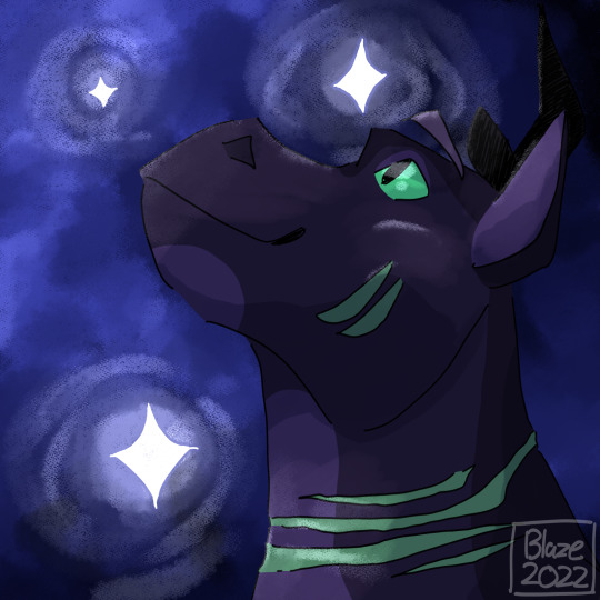
another one of the pictures intended for spotify playlists. this time, quino! who was surprisingly easy to do in comparison to the other ones i have lying around. i really like how the stars and sky came out, they look really glowy in comparison to other stuff ive drawn. i think this was around the time i discovered the gouache brush on csp lmao
hope you enjoy!
#art#artwork#drawing#digital artwork#digital art#digital drawing#dragon#dragon drawing#dragon art#dragon artwork#OC#oc art#oc artwork#oc drawing#oc illustration#quino
2 notes
·
View notes