#hiroshi nagai art style
Text


#vaporwave#vaporwaver#vaporwave aesthetic#ai generated art#art#vaporwave art#hiroshi nagai art style
0 notes
Photo


(via Hiroshi Nagai T-shirts, Mugs, Stickers, and More - Celebrate the Greatness of One of Japan's Greatest Artists Poster by Teesummer75)
#findyourthing#redbubble#hiroshi nagai#hiroshi#nagai#hiroshi nagai art#hiroshi nagai beach#hiroshi nagai artist#hiroshi nagai buy#hiroshi nagai city pop#hiroshi nagai art style
1 note
·
View note
Text

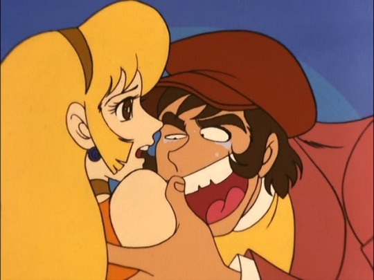
my piece for the @lupiniiirecipezine!! :^D
an illustration for Squid's "Multi-Fruit Tart" recipe! try it with blueberries, apples, peaches, and more! 🎉🎉🎉
#lupin iii#lupin's gourmet world#fanart#zine#MY VERY FIRST ZINE..... ART PRINTED........ SO EXCITING!!!#after receiving the book i actually got to bake this blueberry tart myself and it was delicious HEHEHE#long story short i wanted to try something different for this piece and i'm super happy with how it came out!!!!! :^]]#(LINELESS IS WILD HOW DO YOU PEOPLE DO IT 😭)#scrapped ideas included eating on the hood of the fiat.... summer roadtrip picnic with fiat.....#tart display with hiroshi nagai-style poolside and fiat in the back.....#........eventually realized my priorities may have been slightly off LKJGLKJFGF
72 notes
·
View notes
Text
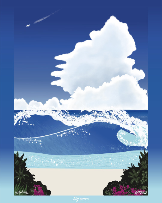


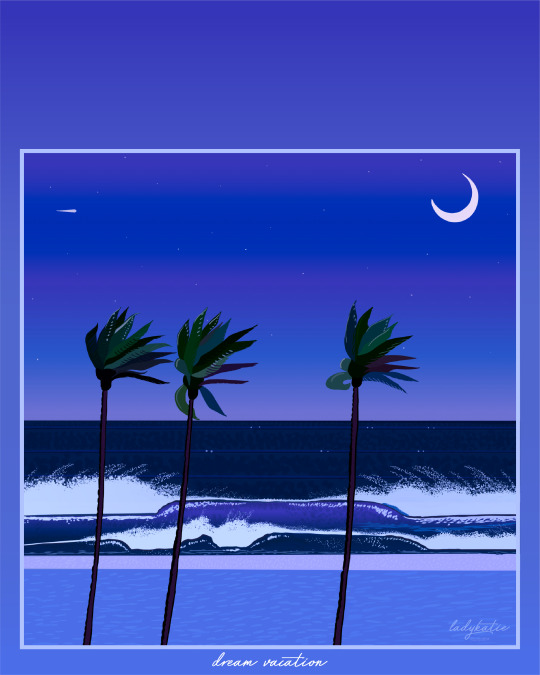
(order of pieces: first piece -> to latest piece)
it’s been almost 2 years and 8 pieces later since i started studying hiroshi nagai’s and the city pop/pop art style and i have learned so much!!!
this art style makes me so happy and it truly is so much fun to study. 🏝️✨✈️☀️
check out my instagram: (x)
and my twitter: (x)
redbubble: (x)
my commissions are still open!! DM me or email me @ [email protected]
#city pop#city pop art#city pop music#シティポップ#art pop#pop art#80s pop art#retrowave#80s#japan#retrowave aesthetic#retrowave art#retrowave artist#80s pop artist#future funk#hiroshi nagai#hiroshi nagai art#永井 博#eizin suzuki#鈴木英人事務所#david hockney#art#beach#city#graphic design#commissions open#freelance#freelancer#artist#designer
112 notes
·
View notes
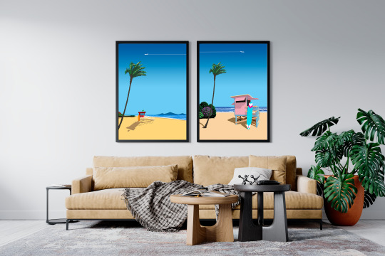
Text

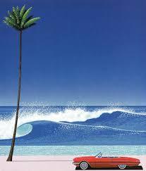
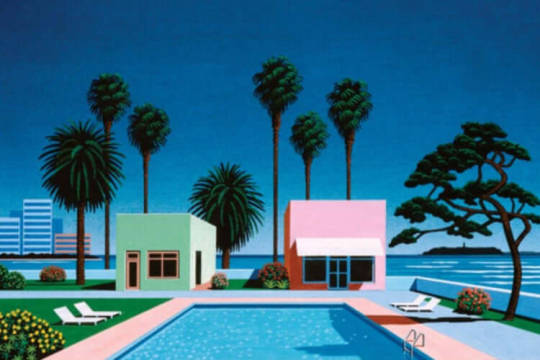

A selection of some of Hiroshi Nagai's work, I love his style which is a mix between pop art and early vaporwave movement. A lot of his work are in a square format as these are used quite a lot as album covers.
33 notes
·
View notes
Text
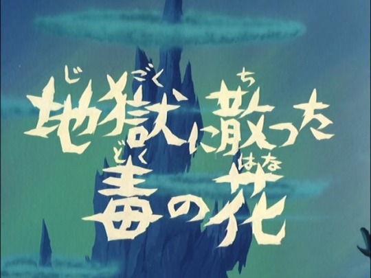
Let's conclude our Cutie Honey 50th anniversary trivia with the final episode: “A Poison Flower Scatters in Hell.”
Screenwriter: Masaki Tsuji
Art Director: Urata Mataharu
Animation Director: Satoshi Jingu
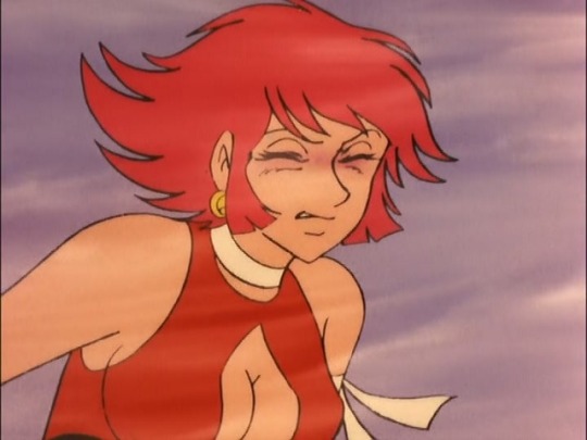
Director: Osamu Kasai
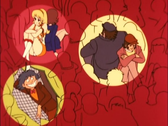
With the exception of Junpei’s girlfriend Mami and the nameless Panther Claw subordinates, all of the (living) characters in the series appear for the final episode.
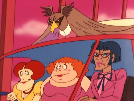
The suspenseful drumming that plays before Eagle Panther attacks the truck was lifted from Go Misawa’s soundtrack for Devilman.
Honey has always lovingly addressed her father as “papa”, but in this episode she refers to him as the more formal otousama or “father.” This was probably done to demonstrate to the audience how much she has grown from her battle with Panther Claw.
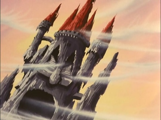
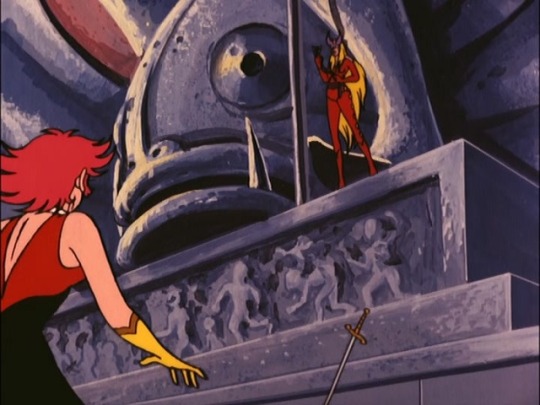
In the original manga, Sister Jill’s headquarters was called maboroshi jyou or “Castle of Illusion.” The name was probably changed to avoid confusion with Cutter Claw’s “Castle of Illusion” from episode 10.
Jill’s headquarters in the manga looks like a traditional European style castle, while the anime version evokes more of a haunted house.
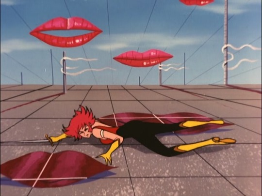
The dreamlike landscape Honey falls into is modeled after the surrealist works of Salvador Dali, specifically one of his most famous works, The Persistence of Memory, which depicts melting pocket watches. The floating lips could possibly be based on Man Ray’s Observatory Time: The Lovers, a painting featuring a giant pair of lush red lips in the sky.
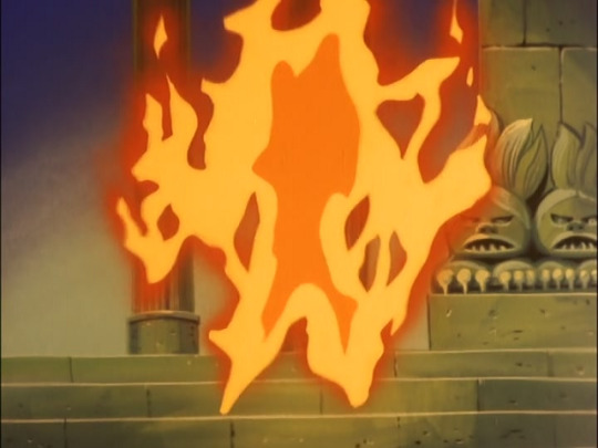
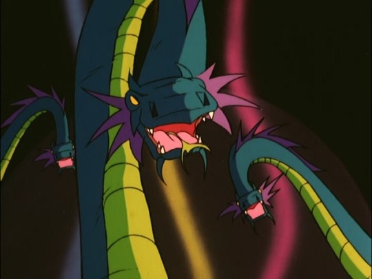
The second half of the episode features a few references to one of Toei Animation’s earlier films, The Little Prince and the Eight-Headed Dragon.
Released in 1963, the film tells the story of Susanoo, the youngest son of the gods who created the Earth, and his journey in finding his mother. The stylized film featured the talents of animation veterans such as Yasuo Otsuka, Yoichi Kotabe, Isao Takahata, and Kimio Yabuki.
References to The Little Prince and the Eight-Headed Dragon:
The human shaped fire that attacks Honey is animated almost exactly like the Fire God that Susanoo faces.
The phantom serpents are a dead-ringer for the eight-headed dragon. The only difference is the coloring. In the film their colors are similar to Maleficent's dragon form from Walt Disney’s Sleeping Beauty. It’s worth mentioning in the original storyboard the illusions were meant to look like generic snakes.
After the Panther Chateau crumbles, the gloomy skies clear up and Honey finds herself in a flowerbed under a blue sky. This is similar to the end of the film, in which the defeated dragon turns into a field of flowers and the dark skies become bright and sunny.
The bone-chilling organ music that plays during Honey and Jill’s confrontation is Fugue in D Major, BWV 580 by Johann Sebastian Bach. The rendition featured in this episode was performed by French organist Marie-Claire Alain.
While the animation director for the finale is Satoshi Jingu of Anime Room, the key animation for the second half of the episode was handled primarily by Yoshinori Kanada. While he was relatively unknown at the time, he would go on to be a very influential figure in the animation world, working on titles such as Dino Mech Gaiking, Birth, Princess Mononoke and others.
Kanada’s style is particularly noticeable during the “Honey Special” sequence and Honey's reunion with the Hayami family. It’s very possible Kanada had worked on the other episodes animated by Anime Room (episodes 6, 13, 16, and 24) but he only received credit for this one.
Supposedly, the final episode was originally going to be handled by Shingo Araki and Hiroshi Shitara, but both men were too busy working on Majokko Megu-chan.
Despite getting pretty good ratings, Cutie Honey was canceled due to concerns over salacious content. According to Go Nagai’s autobiographical manga, Gekiman! Cutie Honey Hen, nearly everyone involved was blindsided by the cancellation. Toshio Katsuta in particular was quite surprised, since Honey made better ratings than its predecessor, Microid S. Katsuta was actually quite confident Honey would last three or four seasons.
Because of the series' abrupt cancellation, Katsuta and Nagai both agreed to have Honey defeat Jill at the end of the series, while leaving Panther Zora’s fate being left to the interpretation of the fans.
In an interview printed in the 1981 Cutey Honey Roman Album, Go Nagai talks a little bit about what Honey and Zora were up to after the finale. He says Zora began harvesting animals from the Amazon and transforming them into androids, probably in preparation for a battle against Honey. He also says Honey is destined to only fight Panther Claw, so she'd probably ignore any unrelated criminal activity. I guess we can assume Honey got a little downtime after her victory against Sister Jill?
And that's all our trivia for Cutie Honey! I hope you enjoyed all the interesting tidbits I've collected over the years. Maybe someday I'll do this for the other series...
Special Thanks:
@brickme
Ayumi Shinozaki
Josh M.
Charlie from Skaro Hunting Society
Phix Cabral
Jonathan Castleman
11 notes
·
View notes
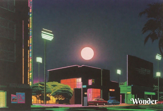
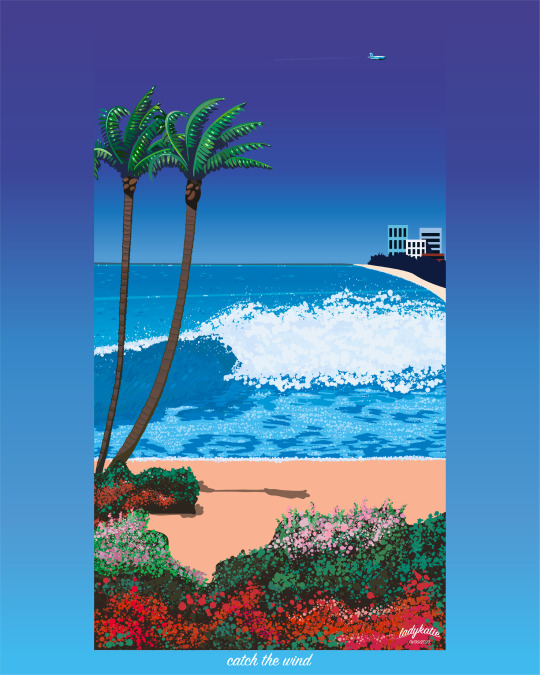
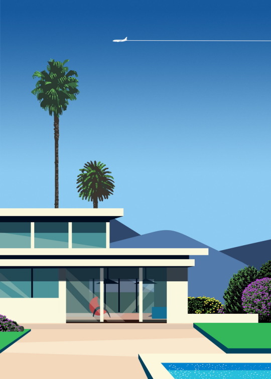
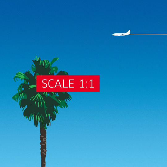
Text
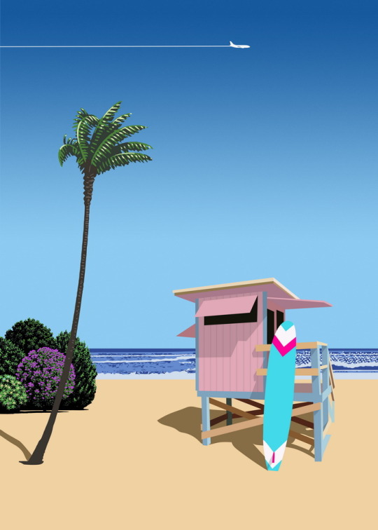

California, USA. Surf beach - our city-pop poster
And last poster of the collection of CityPop posters: California, USA. Surf beach.
This is original art created in the style of Hiroshi Nagai.
For @etsy available here — https://retropostershopprint.etsy.com
#CityPop#CityPopArt#CityPopArtist#CityPopPoster#japanart#Japaneseart#HiroshiNagai#HiroshiNagaiStyle#NagaiStyle#vaporwave#retrowave#EtsyShop#EtsyStore#EtsyArtist#urbanlandscape#retrowaveposter#TravelPoster#TravelArt#SeaPoster#MediterraneanPoster#VectorArt#SummerPoster#Summer#Beach#BeachPoster#California#SurfingPoster#SurfingArt#CaliforniaPoster
3 notes
·
View notes
Note
What is your opinion on Return to Wherever
Opinion on Return to Wherever? I've got opinions for sure. I'll try to keep it short.
Solid album. I'd recommend it as a good first for new listeners. Definitely one of my top favourite albums of TWRP's
Here is a bit more ↓
I also feel like Return to Wherever was a turning point for TWRP's sound overall. It feels much brighter in comparison to earlier works. Of course they started the change back with Ladyworld and continued it in Together Through Time, but for me they really solidified that new feeling they were putting into their music. Note: I believe Doctor Sung mentioned on stream that RtW was written around the time they relocated to Los Angeles, and it had an effect on their music writing at the time. I'll try to check the vods to cite this, because I don't want to say that he said something without source (thats a lot of hour to go through, so it may be a while, but I did check the years they announced they were moving and it does match up)
I'd also like to talk about the cover art.
Lazerhorse definitely does a good job at emulating styles from the different artists he takes inspiration from, and Hiroshi Nagai is no exception. The beach is lovely, the clouds are fluffy, and the horizon calls back to Ladyworld with those otherworldly crystals. Then there is the rendering style of the boys themselves. It reminds me of that one retro airline poster that Daft Punk used.
Theres also the name stripe that holds the album name, band name, and track list. Its the perfect shade of pink and no one can tell me otherwise. It goes very well with the blue used for the sky and water, and was a good choice to make the text stand out from the artwork. Also, the vinyl release with the pink and blue colouration to match was a great choice as well.
tldr: good album.
#suave asks#suave answered#I talked about the art more than the actual music but for good reason#while i was writing i kept having thoughts like “oh! i should talking about the french horn!” or “oo! that one part in All Night Forever-”#there are nine tracks and i could talk about each one#i needed to stop myself berfore i wrote a whole essay or some sort of thesis statment#unless someone asks for that#ANYWAY i'm glad someone actually sent an ask. like. the ask box is always open#was very excited to get to talk about this album#or just enthuse about Twrp in general#also if anyone remembers the stream i'm thinking of where sung was asked about RtW please let me know.#i can't remember what game he was playing. its going to take forever to search for.
3 notes
·
View notes
Text
Shadow of the Ninja Reborn delayed to summer, ‘Comparison’ trailer
Gematsu Source

Publishers Natsume Atari and ININ Games, and developer Tengo Project have delayed Shadow of the Ninja Reborn from its previously planned spring release window to summer, the companies announced. It will be available for PlayStation 5, Xbox Series, PlayStation 4, Switch, and PC via Steam with English, Japanese, French, Italian, German, Spanish, Korean, Simplified Chinese, and Traditional Chinese language support.
In the west, Shadow of the Ninja Reborn will be available both physically and digitally for PlayStation 5 and Switch, and digitally for all other platforms. The console versions will retail for $29.99 / €29.99, and the PC version for $19.99 / €19.99. Retailer listings will soon be available on ININ Games’ website.
In Japan, Shadow of the Ninja Reborn will be available both physically and digitally for PlayStation 5, PlayStation 4, and Switch, and digitally for all other platforms. It will be priced at 4,440 yen.
Here is an overview of the game, via ININ Games:
Developed by the Original Team, Carefully Remastered after 33 Years
KAGE Shadow of the Ninja is a ninja-themed side-scrolling action game released by the Japanese game developer Natsume on August 10, 1990, for the Nintendo Entertainment System (NES). At that time, the game received high praise from players and the industry for its excellent controls, innovative hanging and climbing actions, well-designed levels, and adrenaline-pumping background music, especially in the action game genre and cooperative gameplay. Now, after 33 years, this game, considered a classic by many players, is being remastered once again by the original team. Even though the average age of the team members is now 55, their passion for game development remains strong.
Exquisite Pixel Art and Refreshed Visuals
While maintaining the 16-bit retro art style, this remake utilizes new technologies to enhance the visuals with finer details and richer content. The two ninja protagonists, Hayate and Kaede, have been completely redesigned, and all the level scenes and enemies have been redrawn. It is believed that these carefully crafted characters and scenes will provide players with a visually stunning experience.
Diverse Combat Options with a Variety of Weapons and Ninja Tools
In addition to the usual weapons like ninja swords and chains for direct attacks, this remastered version adds new throwing ninja tools such as the gunpowder gun, cannonball, and shurikens for long-range assaults, as well as powerful weapons like the giant club and machete for close combat, and auxiliary tools like iron caltrops and healing rice balls. Players can make full use of these weapons and ninja tools to engage in battles.
Cooperative Gameplay: Rediscover the Joy of Playing Together
As a brand-new remastered work based on KAGE Shadow of the Ninja, this game continues the classic cooperative mode. Of course, you can also choose to play solo with one of the two characters or team up with a friend to face the challenges and defeat formidable enemies.
Reviving Classic Melodies: Enhanced Music Experience
Regarding the music production, in addition to the contributions of Tengo Project’s Hiroshi Iwatsuki, the renowned composer Iku Mizutani, who has created many excellent music tracks for KAGE Shadow of the Ninja and various classic NES games, once again participates in creating the game’s music. The re-arranged classic melodies will be presented in a more modern way, providing players with a more immersive and adrenaline-pumping experience.
As with the original version, Dynamic Pro handled the illustrations!
The key visuals/character illustrations are also by Dynamic Productions, as was the case with the first version in 1990.
Dynamic Production – Since its establishment in 1969, Dynamic Productions has been engaged in the management of manga artists, novelists and manga authors, including Go Nagai, as well as producing newly drawn manga, planning various events and managing the copyrights of its artists.
Mikio Tachibana – Born 11 May 1976 in Saitama Prefecture. After working as an assistant to Go Nagai, he made his debut in 2004 and has since published serialized works such as Mazinger Otome and Mazinger Otome Taisen. He continues to publish short manga, newly drawn manga and illustrated works in all genres.
Watch a new trailer below. View a new set of screenshots at the gallery.
Comparison Trailer
youtube
#Shadow of the Ninja Reborn#Shadow of the Ninja#KAGE Shadow of the Ninja#Natsume Atari#Tengo Project#ININ Games#action game#Gematsu#Youtube
0 notes
Text
The past few days I've been trying in vain to figure out how to find a style of some 1980s art/advertisement art I half remember seeing at some point.
Like, what I can faintly recall is it was kinda like Hiroshi Nagai's paintings, only more zoomed in/interior view-ish. Palm leaves, white stucco walls, pools, long shadows, glimpses of a lady's legs or hands but mostly pretty stark and devoid of people.
The main term I see used for Nagai's work is "citypop" but searching for "citypop art" only brings up a mix of Nagai's paintings and a bunch of variations on the sunset palm-tree logo. :B
Maybe what I need to search for is "1980s magazine ads" or something...
0 notes
Text
Personal Specialist Field: Today’s Illustration Specialists [Task 1]
08.03.19
Every artist has a work flow and process, researching the practices of artists of today is a very good way of aiding one’s own experimental and illustrative work. If you follow the process of a particular artist that you admire, you can implement some of their techniques into your own work to gain a similar outcome, albeit maybe not of the same level of skill. Just some of the specialists in this field today that I admire are Hiroshi Nagai, who paints beautiful 80s inspired scenes, Asano Inio, a highly skilled mangaka (someone who illustrates manga), and Wlop, who has a very realistic but also ethereal kind of style.
What kind of work flow and process is followed by these specialists to achieve creative outcomes?
Wlop
Wlop follows probably the most widely-practiced digital painting and illustrating process. They start by drawing the rough linework, then they start to go over it a little bit more so that they have nice outlines that they like and can work with more easily. They use Photoshop, so they have a lot of access to specialist tools that can do exactly what they need. For example, they can use the selection tool to select areas that they might want to move around. They have a video uploaded to their Instagram profile that shows this process. I think that it is really interesting to compare the process of Wlop, and their modern day process, with the process of someone like Thomas Phillips, a portrait and subject painter, born 18 October 1770. These artists are/were both highly skilled and have a great understanding of lighting, anatomy and composition, yet both of their processes have a stark difference in terms of the modernity and complexity of both, respectively. Anyway, after moving around and rotating parts of the line work, Wlop begins painting the block colours in various parts. They have to be aware of the lighting that they have set up in order to correctly adhere to it, and get the right shadows and highlights if necessary. The rest of the process is essentially them painting the main parts and details for the following hours (I would assume).
“Guard”, by Wlop
Asano Inio
When it comes to Asano Inio the mangaka, he has a different approach to illustration. When it comes to the story of his manga, he only spends around 30 minutes coming up with the framework, and he takes around an hour to write out a rough outline of the story for one volume. The next part is the rough draft, which is sort of the manga equivalent of a storyboard, where you would divide it into panels and start writing out the dialogue. The time it takes to get to this part only counts for around ten to twenty percent of the total time it takes to produce a single chapter, which means that the rest of the time is spent drawing, and it takes him around ten days to draw a full chapter. He does all the digital work himself, as well as scanning backgrounds and integrating images together. Though, he does have assistants who draw backgrounds based on photographs.
When it comes to his drawing process, he first starts to sketch things out with a mechanical pencil in light blue before drawing in ink. The reason for light blue is because it doesn’t show up when scanned later. When drawing, he states that he uses reference material a lot, so if he needed to draw some kind of technological device he doesn’t already have in his room, he would visit an electronics store to get a catalog and bring it back to his room, which I find really interesting. I also use a lot of references, and have one of those miniature wooden mannequins to get human poses right, though I haven’t used it a whole lot. Something that he does which I knew about was that he goes out, about once every half a year or so, to take hundreds of photographs using his digital camera. He takes pictures of the outsides of houses, insides, people, everything. When drawing, he also uses a lightbox, which is something that lets him see through the pictures, a very useful tool for an artist using traditional means. I’d imagine that this would translate to simply lowering the opacity if it were through digital means using a program.
“Dead Dead Demon’s DeDeDeDe Destruction”, manga by Asano Inio

Interview Source: Wordpresscom. 2015. Manga brog. [Online]. [29 March 2019]. Available from: https://mangabrog.wordpress.com/2015/08/17/a-tour-through-inio-asanos-workspace/
Hiroshi Nagai
When it comes to Hiroshi Nagai, I don’t know too much about the work flow and process that he practices, but I understand that his work is inspired by American pop art, and without it, he says he would not have started painting the way he did, and the experience of travelling to the United States in 1973 made him start painting his summer skies a deep blue from then onward. Surrealism and hyper-realism were also big influences within his work. The summer scenes that he paints are inspired by America and especially Hawaii, and he finds it easy to paint once the summer comes along, but can still paint like he does regardless of setting, which I think is really interesting, since it means that he can paint a summer scene even in other seasons, which is important for artists, who I believe should ultimately learn to paint and illustrate without a reference. Also, some of his earlier inspirations were Rene Magritte, and Salvador Dali.

Interview Source: Kaput-magcom. 2019. Kaput Mag. [Online]. [29 March 2019]. Available from: https://kaput-mag.com/stories_en/hiroshi-nagai/
What can you learn from research into these specialists and what can you implement into your own working practice?
After researching further into these artists, I learned much more about them and their processes and work flow and gained an insight into the thoughts behind their choices, which was evident from reading those interviews. The interview on Asano Inio was a really interesting and entertaining read, as I am a huge fan of his work, so to read all this about him was very useful in fact, and allowed me to gain a few certain tips that I could even incorporate into my own illustrative work. Taking hundreds of photographs in order to base drawings on them is a very good idea. I can see it being useful for drawing things that you otherwise wouldn’t be able to draw from looking at references online. Of course, you wouldn’t be able to draw things from outside of your town/country by taking photos, unless you’re able to travel abroad. One point that I found to be very applicable to myself was the way that he draws in light blue so that it will not be picked up when being scanned. While I enjoy drawing digitally most of the time, right now I find myself better at drawing traditionally with pencils and pens, so if I ever want to, I can scan these drawings digitally. It was something that I knew about, but never really attempted.
Through watching Wlop’s digital painting process, I realised that adding lighting to your drawing as early as once you are finished with the line work, you can keep on painting to this lighting, which helps with shadows and shading more so, as if you are to add lighting at the end, it can look incorrect. Also, I shouldn’t be afraid to move my line work and outlines around using the selection tool more often, as most likely, it will be more beneficial then simply sticking with the original lines. From Nagai’s interview that I read through, and what I also got from Asano, is that you shouldn’t always use a reference that you find online, but rather, go out and take photographs or go to a store for a catalog to draw what you need, and if you desire something that you don’t have access to, sure, use a reference from online, but also try and imagine what it is that you’re trying to draw, and piece together something that may look sort of similar to it.
Anyway, I will stop there, since I wrote a lot more than I planned to. It was a lot of interesting research, so I wanted to convey my thoughts clearly.
0 notes
Text

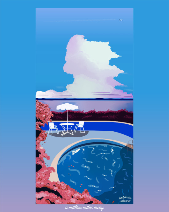
but i'm a million miles away, from you.
here's my 6th study in the city pop/pop art style!
i love how dreamy the colors turned out in this one.
the colors are very different from my other studies.
of course this piece was inspired by artist hiroshi nagai!!!!
if you like this piece you can grab it on my redbubble!
#city pop#citypop#art pop#artpop#art#graphic design#hiroshi nagai#永井博#シティポップ#retro#retrowave#vaporwave#vaporwave aesthetic#retrowave aesthetic#japan#80's#80's aesthetic#80's inspired#retrowave art#synthwave#synthwave art#outrun#outrun art#beach#pool#ocean#procreate#illustrator#adobe suits#adobe illustrator
155 notes
·
View notes
Text
I got tagged in a tag game! Tagged by @internet-schvitzinq ! :)
Name: Aidan
Pronouns: He/Him
Height: 5′7″
Nationality: I live in the United States.
Fave Band: Oh god this is a tough one. Uh, gun to my head I’d probably have to say The Front Bottoms.
Fave Artist: (Assuming this means visual art) Hiroshi Nagai
When Blog Was Created: July 2016, according to my archive.
Last Thing I Googled: “garbage disposal stopped working”
Lucky Numbers: I never really thought about this to be honest. Tempted to be a memelord and say the funny meme numbers but. I will restrain myself.
Other Blogs:
@fvtvrefvnk - kind of inactive futurefunk/vaporwave aesthetic sideblog (but I post so much of that on my main blog anyway that it kinda feels redundant sometimes haha)
@aidanimalcrossing - my Animal Crossing sideblog
(I also have some sideblogs for my writing and to keep track of some mental health stuff that uh... I guess DM me if you’d want those URLs cause they’re a little embarrassing to post completely publicly. :/)
Reason For Choosing URL: I pretty much always use “prince” and some reference to fire in all my online handles, this was the best I could come up with at the time.
How Many I’m Following: 1416
How Many Followers I have: 130
Average # Hours of Sleep: 4-6 hours a night
Instruments: None. :(
Currently Wearing: A black hoodie, grey boxers, black socks, and black and white house sandals. Oh and my glasses.
Dream Trip: Some kind of tropical place where I can just be lazy and like, read and listen to music on the beach all day and drink juice and beer and nap and not have to do anything in particular at any specific time, but maybe during an off season/colder weather so I don’t die in the heat. Also camping in literally any mountain range.
Fave Food: Hm... Anything banana flavored, sushi with fatty tuna, or a big American style breakfast.
Fave Song: Oh man this is a tough question. I could give you like, a top 100 list. Okay, uh, putting my 'favorites' playlist on shuffle and putting the first thing that pops up - ‘No Fun’ by Joji.
I’m gonna tag @error-404-fuck-not-found @knightofbreath @graveyardrabbit And anyone else who wants to do this you should jump in too :) (And if the people I tagged don’t wanna do this obviously please don’t feel obligated to :P)
1 note
·
View note
Text
Beats and Flow: Discover the Hip Hop Groove in Anime!
When hip hop and rap come to mind, you might think of classic songs, clothing styles, and dances from singers like Public Enemy, Beastie Boys, KRS-One, or Run DMC. What may not be your first thought, though, is anime! However, anime and hip hop have a pretty long-standing relationship, reflecting the popularity and growth of hip hop and rap in Japan over time. Hip hop first appeared in Japan in the 80s, credited to the time Hiroshi Fujiwara spent in the United States before bringing records back with him and becoming the first DJ in Japan. From there, hip hop and rap spread throughout Japan’s music and cultural circles, influencing music, clothing, art, and, of course, anime!
The relationship between the two is not as strange as it might sound, because anime is an audio-visual medium where creators are regularly trying to find new and exciting ways to engage their audiences, or mixing various musical styles with animated styles to find the perfect combination between aesthetics, much like mixing flavors together to find just the right blend for a pleasing bite.
Probably one of the most classic examples of this relationship is the soundtrack to Shinichiro Watanabe’s Samurai Champloo. Champloo followed Cowboy Bebop as an exciting mixture of genres. But where Bebop pushed jazz, Westerns, and sci-fi together, Samurai Champloo mixed hip hop and Edo-era samurai films. Watanabe is quoted as saying: “When I first come up with the idea of what I am going to create, quite often the music appears at the same time. So, with Samurai Champloo it wasn’t that I had the story in mind and then added hip hop to it. When I came up with the character of Mugen I heard hip hop at the same time, and I thought he was going to be a rapper samurai.”
That type of direction in thematics with music helped Watanabe enlist the help of hip hop artists Tsutchie and Force of Nature to create one soundtrack, and late hip hop artist Nujabes to produce two more records for Champloo. While Bebop didn’t lack for action, Champloo’s focus on swordplay and singular combat let various types of musical styles play out over the series, from R&B ballads to banging rhymes and beats. Many fans will still likely remember the beats to the opening and ending of Champloo, helped along by their extremely memorable music tracks and vocal mixture, with the ending song, “Shiki no Uta,” being particularly memorable!
Champloo wouldn’t be the last Watanabe series to mix visual aesthetics with audio tunes, as his next work Space Dandy regularly smashed genres and styles together in its attempts to send Dandy and co. on numerous crazy adventures. mabanua’s “I Want to Know” from episode 5 helped build the relationship established between Dandy and the wayward Adélie, as well as giving viewers a peek into the personality of Dandy beneath all of the bluster (a side that up to that point hadn’t really been explored yet). The soft vocals over the hip hop beat worked to establish the song as memorable, and its use in the episode was a key to making the episode itself shine!
And if you're thinking the name mabanua sounds familiar, you might be following MEGALOBOX! Moving up from guest appearances, mabanua is in charge of music for the series, the title track “MEGALOBOX” and the “Intermission” track creating an iconic atmospheric sense of identity around the show. They're rough, hard-hitting beats that really connect with the main themes of the series and its gritty take on futuristic boxing and fighting to survive.
Thematically, hip hop has featured in episode 7, “The Road to Death,” and episode 11, “A Deadmarch,” as important set pieces. Episode 7’s rap from an unnamed kid from the slums plays over the montage of Joe’s rise to popularity as an “everyman” contender, while episode 11’s rap from Sachio serves as the rallying cry for Team Nowhere to overcome their doubts and break free from the control of others over their fates. As MEGALOBOX moves toward its conclusion, it seems likely that hip hop will continue to serve as an important aural factor in setting the scenes! The MEGALOBOX Original Soundtrack, by the way, drops on June 27th and it features a whopping 47 tracks full of musical goodness. Don't miss out on mabanua's latest work!
For many, however, hip hop is more than just music. The somewhat contentious debate over the difference between hip hop and rap usually boils down to a question of culture, and in that regard, hip hop in anime tends to blend into the style of the shows it infuses. As mentioned above, Samurai Champloo’s fluid mixture of styles relies on hip hop music to act as a lynchpin; Space Dandy, a show made up of constant references, pastiches, and homages, similarly selects music appropriate to the animation style and content befitting the episode best.
But beyond visual aesthetics of animation, sometimes the clothing, grooming, and aesthetic styles of hip hop and rap culture are just as important as the music, such as in Santa Inoue’s Tokyo Tribe series! Although never released in America, Inoue’s hip hop-infused works blend references and parodies of hip hop personas and lifestyle into stories of rival gangs and dramatic action.
And Inoue’s manga and anime are just the tip of the iceberg in his hip hop empire; his brand of clothing, Santastic!, draws heavily from hip hop stylings, and he’s even helped create album art for numerous records. In a somewhat obscure note, his art was featured in an episode of ABC’s old home remodeling show Extreme Makeover: Home Edition! And in 2014, Tokyo Tribes was adapted into a live-action rap musical, if you’re interested in checking out some manga to anime to live action hip hop gangster action!
Not to be left out, Devilman Crybaby features its own intriguing hip hop mixture. While the show is an updated retelling of Go Nagai’s classic tragedy action series, one of the more compelling changes to the series was the introduction of rap to Wamu’s gang. Between scenes featuring Akira, Ryo, and Miki, these freestyle rap segments featured the talents of Ken 390 and Young Dais, with beatboxer AFRA, serving as a type of narration of events and issues going on in the series, particularly things happening to everyday people behind the scenes.
Of note is that all three of these performers have been involved with anime and hip hop in the past: Ken 390 performed on the single for Cyborg 009 Call of Justice, Young Dais has a starring role in Tokyo Tribes live action film, and AFRA is the beatboxing Shinpachi from Samurai Champloo!
As time goes on, there will likely be many more hip hop and anime collaborations to come; Lotus Juice’s iconic mixes from the Persona series have found their way into their animated counterparts, and the reciprocal nature of hip hop and anime’s cultural growth and exchanges are sure to continue as both expand and evolve with the times. Afro Samurai already paved the way for Western hip hop artists to work with anime production, with the Wu-Tang Clan’s RZA producing the music for the mash-up anime and movie series, so there’s no telling where the future of hip hop and anime collaborative pairings could go!
Have any favorite hip hop and rap songs from your favorite anime? Or know of any other hip hop influenced anime? Let us know in the comments!
----
Nicole is a features and a social video script writer for Crunchyroll. Known to profess her love of otome games over at her blog, Figuratively Speaking. When she has the time, she also streams some games. Follow her on Twitter: @ellyberries
0 notes
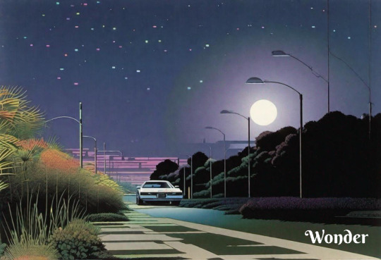
Text
New CityPop posters: Florida, USA. Villa with pool
New collection CityPop posters: Florida, USA. Villa with pool. This is original art created in the style of Hiroshi Nagai.
Poster for @etsy here — link.
#CityPop#CityPopArt#CityPopArtist#CityPopPoster#japanart#Japaneseart#HiroshiNagai#HiroshiNagaiStyle#NagaiStyle#vaporwave#retrowave#EtsyShop#EtsyStore#EtsyArtist#urbanlandscape#retrowaveposter#FloridaPoster#USAPoster#TravelPoster#TravelArt
4 notes
·
View notes
Text
Personal Portfolio Project
10-Page Sketchbook Work
21/05/18
Our new assignment was a very personal project, and by the end, we will need to have created a digital/graphic design or animation, which could be a poster, illustration, character design, concept art, logo branding etc. For the first task, we had to fill 10 pages of our sketchbooks with notes and sketches of initial ideas we had for our piece.
Pages 1-2
I decided to dedicate a mind map to my first page, noting all of my initial ideas and thought of what I could potentially do. So, the first idea I noted was animation. I am already working on an animation elsewhere, so I decided against it, since it will be really time consuming. I also just didn’t want to do an animation anyway. Although, if I were to do one, it might be an action or fight scene probably subconsciously influenced by anime in some way or another. Anyway, the next idea I addressed was some logo design. I thought this would be pretty boring compared to all of the other ideas which I will get into. However, if I were to do a logo, I would probably come up with my own clothing/food/gaming brand etc. On to landscape, I thought it could be cool if I were to create some kind of landscape or cityscape scene. These could be made from shapes in Adobe Illustrator, or I could even import traditional line-work into Photoshop or Illustrator. This sub-category isn’t limited to landscape only though, I could do a structure or building or something, maybe a futuristic building design, I’m quite interested in futuristic/city architecture. The next one would be to create a poster, not sure what I would put on it, but either way, a poster is a pretty flexible piece of design, which you can do a lot of things with, such as promote or advertise something, whether that be a game, movie, or whatever else. I could do something with glitch art, some kind of design utilizing this as its main factor, along with some other heavy effects in Photoshop. An album cover is something which really appeals to me, as they can look really unique and abstract, or they could be really simple and minimalistic. I believe that album covers really are one of the best mediums with which an artist can express and portray their ideas and I especially like the fact that album covers are squared, which offers a lot of experimentation with the rule of thirds. The final idea that I had was to simply do an illustration. Now this illustration would most likely be me, but I could do one of someone I admire/like etc. I thought I would take the title of the assignment literally and make it especially personal, drawing myself. I do hope that I don’t come off as conceited. I thought that merely doing an illustration was too simple for a month’s project, and also didn’t really demonstrate what I’d learned over the past half a year with Photoshop/Illustrator techniques, so I had the idea to draw the illustration, and create a background - probably in Illustrator, since it offers much more support for shapes and vectors. But, as I mentioned when I was talking about landscapes, I could also draw it traditionally, and import it, although, I don’t think I will do this. The background will most likely be some interesting landscape or just some cityscape, and after I create it in Illustrator, I’ll edit it in Photoshop and add some effective effects. As for the illustration, I will probably do it in a program called Paint Tool Sai, a drawing program, since this offers many useful tools and such. However, if this proves difficult to move around as an image, then I may have to consider drawing it in Photoshop, though I’m not particularly too used to drawing there. I predict that my final piece will probably include the sky, as I’m really fond of it, as well as utilizing line techniques somewhere.
Anyway, on to the sketches. This page includes some sketches and notes which I thought were interesting. For this project, I’ll probably be using Photoshop, and incorporate some digital illustration also. I will also probably do some image manipulation somewhere. The first design (top) was a rather weird start to my sketches, and it looks like some kind of album cover, despite it looking like an A4 sized document. Anyway, the notes on the right hand side just talk about what types of design I could be inspired by, such as but not limited to: apocalyptic, cyberpunk, Japanese-esque, oriental and futuristic. Whilst researching futuristic designs, I remembered an artist by the name of Beeple, who creates incredibly well-made 3-dimensional designs. I could be inspired by him, though there’s no way I could create something of a similar caliber to his work in a month. I could take inspiration from a brand called Superdry. I really like the Superdry logotype design, with the Japanese and English combination. I could include some Japanese in my work, along with some English, maybe keep it simple and make it my name. The bottom left design was just a simple drawing in manga/anime style, I added a shadow over his head, which implies a strong lighting, maybe the sunlight during midday. The next design was just a random experiment, as was the one next to it.

Pages 3-4
The next page includes a big design including my initials where I experimented with hatching and lines, and I really like using black and white checkers. It looks like graffiti, which isn’t what I want to do at all. The top right design is just a simple landscape design including some trees and hills etc. Something similar could end up being in the background of my final design. The design underneath it is just another illustration (there’ll be a lot of these). The illustration is kind of supposed to resemble me, but there are some differences, such as with the hair. The bottom illustration remains one of my favourites throughout my sketchbook, as for starters, I like how the sketch turned out, and it is when I introduced having a cityscape background. I may or may not keep my name on the front.
On to page 4. Personally, I think that this page has some weak designs but also some good designs that I like. I don’t like the top design very much, and it was drawn when I decided to research album covers. As I said before, I love the sky, so I tried to incorporate it into this design. I looked up some Japanese album covers, as I thought that they’d be quite unique, and I could find some interesting designs. I did come across an album cover which I believe to be this, although I guess it doesn’t actually look like an album cover. It features an illustration which really appealed to me, the artist’s name is Hiroshi Nagai, and all of his illustrations are incredible. I think he has become one of my new favourite artists. Again, the middle left design isn’t great in my opinion, but I was just experimenting. It’s just some clouds (and a sun?) with my name on the front, maybe it could be an Illustrator thing. The design next to it is quite odd, but I like the kind of abstract 80′s aesthetic. Especially the Japanese text which I used, (ジョージスミス) which simply translates to my name. Anyway, I really like how the Japanese characters look, so I thought I would try utilizing them. I also like the background, it’s just lines which have been distorted to look wavy, which would be an easy job in Photoshop. The bottom design is very similar, except I added 2018 for some reason, and also a checkered background, which I like.
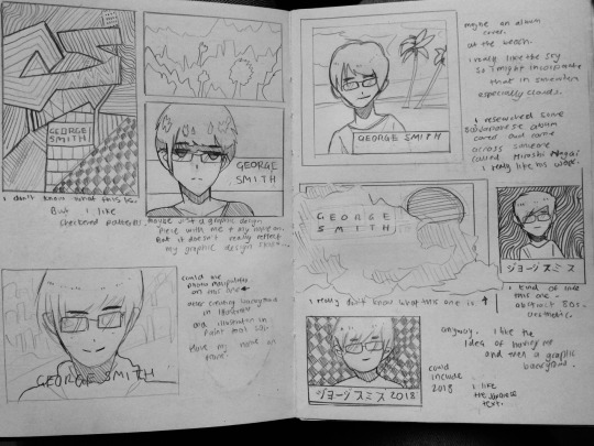
Pages 5-6
Page 5 features some of my least favourite designs, along with pages 7-8. But anyway, the top design - it’s just an illustration from a side angle, and a strange background with circles. The border looks like some rotated Polaroid or something, which could actually be an interesting idea. The design next to it is just an experiment of a composition featuring lines, nothing particularly important. The one below it features a city thing with that same background from the previous page - I kind of like it, but it’s nothing special. The left one, another composition featuring me(?) again with a cityscape background, and a moon most likely. There’s a space for text, but I wasn’t sure what to write there, and you can see this again on the next page. I dislike the bottom one, as those hands are in no way well-drawn, so I definitely need to work on hands. It was a strange idea for me, I don’t usually have limbs as the primary focus in my drawings.
Moving on to page 6. This page has some strong designs, I think. The top left design is something which could potentially turn out to be my final design, as I like how it turned out, bar the head. The background is pretty cool - I think that the black and the white clouds look good together, as well as the full moon/sun in the middle. I like the composition a lot - with the illustration in the middle, poking out of the border, and the text box(?) at the bottom could have my name in or something, I’m not sure. The clothes are what I was wearing the day I drew it, this blue jacket thing and a stripy t-shirt. Whilst I was drawing the t-shirt, I had an interesting idea, I thought that I could draw the whole illustration, and then add the stripes in Photoshop afterwards, and manipulate them to look wavy, like with the backgrounds that I have in some previous sketches. Overall, a solid design in my opinion. The one next to it is also pretty good, once again, I like the sun/moon mixed with the clouds and the black sky. I may or may not keep the head in at the bottom if I do go with this design. The bottom left one is a change, I was thinking of animals that I like, and went with a raven, so there’s that. I think it could be a potential final design. The one on the right is me(?) in some kind of trench coat for some reason, I don’t know but it looks cool.

Pages 7-8
Now, as I mentioned, easily my least favourite pages, but nonetheless, I could still take something from them. Starting with the top left, we have me(?) with a city background and my name in Japanese again. I experimented with lighting on the face and body, is what I would like to say although I just got frustrated with the face because I kept on messing it up, so I just shaded it in to make it look like the light was coming from the bright city. It actually looks OK, and maybe I’ll do something like it in my final design. I don’t really know what was going through my head when I did the one on the right, but I guess it was an experiment of an almost-full body sketch with a background. The middle is roughly where I began running out ideas, and I thought that getting to 10 pages was futile, but I kept on going, and created some kind of tropical scene with palm trees with me looking up at the sky. Perhaps I could develop it later on. The bottom design is pretty cool now that I think about it - it’s just someone viewing the city from afar/high up.
The next page is completely random, the first design is just some random cube things that I drew, maybe it could serve as a pattern in a background. The moon design is not bad, maybe I could use it in a background again. I’m not sure why I drew a skeleton, probably because I saw a cool design which used one, so I tried to do something with one. There’s also a raven, but a close-up this time, and then another illustration of me(?).

Pages 9-10
I think here’s where it picked up in quality. Also, the pages are blue because of the lighting which I took these photos in, and all of the other pages didn’t have colour, so I put a black and white filter over them. Anyway, I’m quite happy with how the first drawing turned out, albeit not resembling me very much, but I guess that’s the case with most of these illustrations. I like my use of lines, and I really like the background this time, as I tried to be precise with it. I think the whole thing just works, and could be a potential final design. The one next to it was kind of an experiment - it was a sketch of me(?) and I went over all of the lines with different coloured pencils to make it look like it had some kind of stereoscopic anaglyph effect. I think it actually worked, although it looks lot better in real life. The bottom left design is the worst one on the page, and it’s just some strange landscape thing that looks like it could easily be made in Illustrator. I think it is just filler to be honest. The one next to it looks pretty cool I think - it utilizes those coloured pencils again, and I tried to make it look kind of abstract. I think that if I do an illustration for my final design, then I will try to keep the colours interesting and unique.
The next page starts with an illustration of an eraser. I quite like the idea of doing a digital painting/illustration of an object from life, and then put it onto a poster or album cover. I think that could look pretty good (eraser drawing took 5 minutes - not bad considering it was done with a mechanical pencil also). The one next to it was an interesting experiment, I could create a pixel art piece, of me or a landscape or something. I have experience with pixel art, so I think I could come up with something decent. The bottom left one was another line background experiment thing, I think it looks pretty decent, along with the illustration. The final illustration on this page is of me(?) again, this time made to look like it was created in Illustrator out of a bunch of vectors and shapes. It looks quite abstract, I’m not sure if I particularly like the idea personally.

Pages 11-12
So much for not being able to reach 10 pages huh. I continued with the pixel art idea with the top left design - I thought it could be cool to have half pixel art, half illustration drawn in Paint Tool Sai. The background would also adhere to this. This aside, I’m not fond of the example that I drew, but perhaps I’ll experiment after I most likely do an actual illustration soon. For the next one, I decided to draw a landscape, with a character looking all cool and edgy. I was actually inspired by an anime by the name of Bakemonogatari - with this scene in particular - the scenes in the anime look like they were created in Illustrator (although probably not) and I like the simplicity of the scenes and characters (at times). They also use those black cinematic bars on occasion, so I thought I would try using them to give it some cool effect, which I think worked (it was a pain drawing them, I did them in a charcoal pencil and had to put nail varnish over the top so that it wouldn’t ruin the next page when closed). The bottom left was another filler-like random design, just featuring a guy with a circle in the background, nothing too great. Then came the last illustration on this page - I was surprised that I had not thought of this any sooner; to create a book/manga cover (character isn’t supposed to resemble me this time). I really like how the sketch turned out actually, and it’s definitely a potential idea for my final design. Finally, the last page - I thought I would do this one and just call it there, as I’d pretty much ran out of ideas of mediums in which I could create my final design for, as well as the design itself, as everything on these pages is of a character. Anyway, as far as the illustration goes, I really like how it turned out, and it probably looks like me the most among these twelve pages - except for maybe the chin, it looks a little too pointed to be me - anyway, I’ve learned that I need to work on getting illustrations to look more like how they should, whilst still retaining my own style. The background of this illustration has a mix of cityscape and landscape, on their respective sides. This could be a potential final design.

Overall, I think that this task of creating 10 pages of sketchbook work was interesting, it helped me to realize that I need to work on a lot of aspects in my drawings, and also served to help me roughly come up with a final design for this project.
0 notes
Last Seen Blogs
cozycrimesolving
(Usually) Cozy Crime-Solving Corner

bouncedlight
Bounced Light
venomchicago
VENOM 🕷 CHICAGO
lalesath-blog
album sanguinem