#html/css learning attempt three
Explore tagged Tumblr posts
Visit Tumblr Blog
Explore Tumblr blogs with no restrictions, modern design and the best experience.
Last Seen Tumblr Blogs


Fun Fact
69% of Tumblr users are millennials.
Text
Been sitting on my bug tarot set for a while, a few already done from before but not yet released. Apparently my last post from the set was ten months ago, wow- seems to be the emperor scorpion card.
Logically I think returning to that project is the next move, but I think I wanna try something first, if I can pull it off…
#the hierophant and lovers cards are both done and the rest already blocked out so its just rendering everything else#but yeah#html/css learning attempt three#lets see if I can maintain focus long enough achieve my years-in-the-waiting vision#(and if I can fit within the 1 gb storage cap)
11 notes
·
View notes
Text
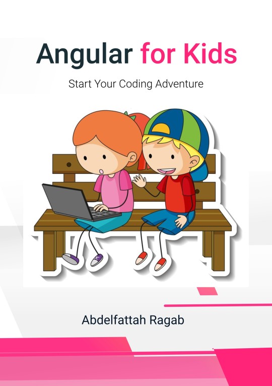
Angular for Kids: Start Your Coding Adventure
by Abdelfattah Ragab
Introduction
Welcome to the book “Angular for Kids: Start your Coding Adventure”.
This book is your introduction to the world of Angular. It's your first step towards developing websites and mobile applications. With Angular, you can turn your ideas into reality. Learning should be fun, so you will feel like you are reading a story.
By the end of this book, you will have a good understanding of Angular. You will have taken the first steps in your modern web programming adventure.
Have fun programming!
Move forward
When you start a new topic, you should explore it broadly and focus on moving forward without getting lost in the details. I also recommend that you gather information on the same topic from different sources.
Take breaks from time to time, look for short answers to questions, and use different sources to get different perspectives. Don´t worry if you still don't understand after many attempts, just keep going because you will come across it again later.
What is Angular?
Angular is a platform for the development of web applications. It is maintained by Google and is designed to help developers create robust applications.
What are web applications?
A web application is a type of application software that is accessed via a web browser. It is delivered over the World Wide Web and requires an active Internet connection to function.
Constituents of a Web Application
A web application consists of two parts that work together to provide functionality and a seamless user experience.
There is a client-side part of the application that runs in the user’s browser. It processes user interactions, dynamically updates the user interface and communicates with the server to retrieve or send data.
The other part is the server side. It performs operations such as data retrieval or manipulation and sends responses back to the client.
Angular belongs to the first part. It is a client-side framework.
We use Angular to create the user interface and to communicate with the server.
HTML, CSS and JavaScript
Engineers like to separate topics to have more control over each one. The web page you visit is made up of three technologies that together make up the final result we see when we open a web page online; HTML, CSS and JavaScript.
HTML defines the content of the page. It determines what should be in the header, main content, footer, etc.
The second technology is CSS. It is responsible for the styling of the page. It determines the font size, the color and so on.
The last technology is JavaScript. It allows you to interact with the page to trigger events, execute logic and so on.
When you create an Angular component, three files are created for all these technologies. One for the HTML, one for the CSS and one for the TypeScript (similar to JavaScript).
A fourth file is created for testing, but this is optional and is not needed in most cases.
What is TypeScript?
TypeScript is a programming language developed by Microsoft to help developers detect errors during development rather than at runtime.
Before your application is sent to the browser, Angular converts everything to JavaScript. Browsers do not understand Typescript, they only understand JavaScript.
Install Angular
The installation of Angular consists of only two steps:
First, NodeJS must be installed. Search online for nodeJS, download it and install it.
Secondly, open the terminal and run the command npm install -g @angular/cli
What is NodeJS?
Node.js is a JavaScript runtime environment that allows developers to execute JavaScript code outside of a web browser. It comes with NPM, a package manager that makes it easy for developers to share and reuse code.
If a developer creates a package that I need to use in my application, I just write the name and npm installs it for me. I can use it immediately without having to develop it from scratch. This of course speeds up the development process.
What is terminal?
A terminal is a text-based interface that allows users to interact with the operating system by entering commands.
It can take many forms, but ultimately it is a text-based interface through which you can execute commands.
Windows has many terminals that you can use. There is “Windows PowerShell“, “Command Prompt” and you can also install “Git Bash”.
Mac and Linux also have the “Terminal” application.
Angular Version
To ensure that the installation was successful, you can check the current node version. Open the terminal and execute the command node -v. The version of NodeJS installed should be displayed.
Also check the installed version of npm. Execute the command npm -v
This is the version of npm.
The last version to check is the version of Angular.
Execute the command ng version
Visual Studio Code
Visual Studio Code (VS Code) is a free code editor developed by Microsoft for creating modern web applications.
Search online for Visual Studio Code, download and install it.
First Angular Application
To create a new Angular application, open the terminal and run the command ng new followed by your project name. For example:
ng new first-app
You will be asked for the stylesheet format and whether you want to activate SSR. Simply press the Enter key.
The project will be created in the current folder. In Windows, you can type “cmd” in the address bar and press Enter to open the terminal in the current folder. If you now execute the command ng new first-app, a new Angular application is created in the currently open folder.
Available on https://shop.tredition.com and https://www.amazon.com
0 notes
Text
I Went Above And Beyond To Get The Frontend Job I Wanted But It Didn't Work.
I was very interested in a job position in Europe that came with visa sponsorship. While browsing the company's website, I noticed their sleek CSS animations. However, one diagram stood out because it was static:

Seeing this, an idea struck me. They were on the hunt for a Frontend developer. Why not showcase my skills by transforming this static image into HTML elements with polished CSS3 animations? I saw it as a great opportunity to experiment with Figma, which I believed could assist in generating some of the required HTML and CSS. My strategy was to initially craft it in a 2D format (from top to bottom). After exporting, I planned to manually infuse a 3D touch, incorporating aspects like rotation and bevels. Creating the three lines that interconnected each square was undoubtedly the most challenging. Positioning becomes a tad complex with intricate designs in Figma, especially when layering one element over another. Yet, I must admit, Figma proved to be quite a robust tool. Here’s what it looked like at that stage:
I then attempted to export the CSS/HTML using a Figma plugin named "Anima". Unfortunately, it didn't quite hit the mark. Rather than creating individual HTML components for each square and connecting line, it compacted everything into a singular static image. This was a far cry from what I was aiming for. To provide a clearer picture: in Figma, I had primarily used two layers, one for elements with absolute positioning and another for those with relative positioning. The plugin merged the latter into one bitmap image. My persistence paid off when I realized that exporting the relative layer by itself worked perfectly. My subsequent task was to individually export the components and manually integrate them using my local code editor.
However, there was a minor hiccup with the borders. Since CSS doesn't natively support gradient colors for borders and the plugin didn't offer a workaround, the borders ended up looking quite blocky. This was especially evident with the circular elements at the bottom, as can be observed here:

After exporting the HTML I started by rotating the full container, but the big beveled cyan square needed to look 3D and not like a flat surface so I had to add create some additional HTML elements:

Then I animated it (on mouse hover) using it "scaleX" on the ::before and ::after selectors (the "bevels") and then "translate" on the big square itself (otherwise it wouldn't look like going down but stuck mid-air):
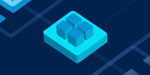
While I might have glossed over a few steps, if you're curious about the technicalities or you want to see it live here it is: https://replit.com/@IvanCastellanos/demo-css-animation?v=1
I even went the extra mile by creating a video on YouTube to showcase my entire process. However, despite my efforts, I didn't secure the position. The feedback I received was rather generic, stating, "[...]we don’t think there’s a good fit for the position you applied for". It makes me wonder: perhaps going the extra mile isn't always appreciated, or maybe it boils down to the individual reviewing the application. Nevertheless, it was a good learning experience.
If, by chance, you or your organization are scouting for talent, feel free to drop me a message at ivanca at gmail. My expertise spans JavaScript, TypeScript, CSS, PHP, and Python. And at the moment I'm open to opportunities for remote work or one that offers visa sponsorship.
0 notes
Note
out of curiosity: if 3.2 will be more like an MSPA, do you still plan to host it on AO3, or on something more MSPA-esque in format, like MSPFA?
the current plan is to move godfeels to a dedicated website, and there's a couple reasons for this.
ao3's css library is extremely limited. in the short term that was a good thing, at least as someone with basically no understanding of html or css who learns best with a pared down toolset. i mean literally writing gf1 i didn't understand that you couldn't just color everything in a doc and copy/paste it to ao3 lmao, i really started at zero. but these days i'm feeling more and more limited by the tools ao3 offers. hosting 3.2 on a separate site gives us a lot more control over that stuff, and now i feel a lot more ready to take advantage of that than i would have before.
i think, also, that hosting it on a website will help tremendously with pacing. a recurring complaint with chapter 8 is that act 3-1, the risk & dare chapter, is just way too long and difficult to navigate. and like, yeah, you know what, 40,000 words on a single webpage is a lot to get through.
but chapter 8 is the nonsensically octofurcated behemoth that it is precisely because i am dedicated to structure. while i certainly agree now that it would be a better reader experience for 3-1 to be split into three or more sub-chapters, as a writer it just feels wrong to deliver it any other way-- EXCEPT if we had an mspa-style clickthrough function. i've always wanted to utilize the ==> prompt, and my use of excessive dramatic line breaks is an attempt to experientially emulate that click for the reader. homestuck similarly has nonsensical structure out the wazoo, but from a reader's perspective that doesn't really matter because the moment to moment pacing is dictated by physical action on your end. you aren't reading 400,000 words in one go, right, you're reading chunks of 50 - 100 at a time. i just think the hyperlinked presentation will be overall more satisfying for both parties. and that'd be true even if we weren't planning to do consistent spritework!
so anyway, here's the plan. everything that's currently on ao3 will stay there in perpetuity. when 3.2 starts, there will be a fic created in the series whose body will most likely just be a link to the godfeels site. gf1 to 3.1 will, at some point, be re-hosted on our site. i've been considering the possibility of taking that as an opportunity to "remaster" godfeels [rolls eyes] but idk how willing i am to open that particular pandora's box just yet. what i definitely want to do, though, is translate the fic as it exists to an mspa-style presentation, keeping all the same structural designations but paced differently. this is something that's already existed in my head for a long time and i think it'll make for a really interesting re-read experience down the line.
DISCLAIMER: OBVIOUSLY I RESERVE THE RIGHT TO CHANGE MY MIND ABOUT LITERALLY EVERYTHING
12 notes
·
View notes
Text
How to build an art website
My first attempt at building an art website was in 2016. Back then I didn't know how to write a single line of code. I bought a year's hosting with Bluehost, tried setting up a wordpress site, struggled, decided it wasn't worth it, and got a refund.
One and a half years later, in 2017, I taught myself how to code for a summer internship. I first learnt Python for data analysis, but soon realised that I could also learn HTML, CSS, and the rest while I was at it.
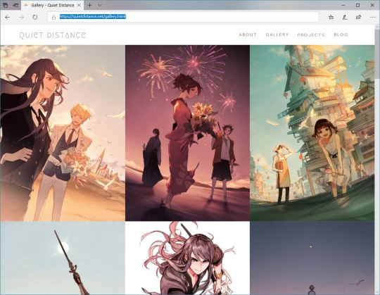
I finished the Codecademy course for website building in three days. Half a year later I tried coding my own Wordpress site. And, at the start of this year, with Wordpress completely revamping their website editor, I fled to GitHub Pages.
Currently my site (quietdistance.net) costs me 15 USD per year since I pay only for my domain name. That's a far cry from my first venture with Bluehost, which would have cost me 120 USD a year!
If you have no coding knowledge, and are interested in making a simple website, here are some steps I would suggest.
Learn some basic website coding. It's not as hard as some might think! Codecamy has a free course which holds your hand through the entire process: https://www.codecademy.com/learn/paths/learn-how-to-build-websites
Learn Git version control. There's another Codecademy course for that, and it can be completed in an hour!
Push your website onto Github. Github Desktop makes the process much simpler.
If you're serious about this art website endeavour, register a domain name and point that to your Github site. This step is entirely optional! Your website will already be accessible via its Github URL.
The entire process is free except the very last step, which costs less than 20 bucks. This is how I wished I had set up my site in the first place -- it would have saved me lots of money anxiety and frantically phoning technical support when I accidentally broke my Wordpress site!
Many artists these days make websites with Wix or Weebly. While these drag-and-drop, what-you-see-is-what-you-get website buiders are popular, I don't like them because:
You have to pay 5 USD every month to remove the website builder branding which is kinda ugly :( And that adds up to 60 USD a year!
Their code is clunky, bloated and slow.
Your creativity is limited to what editing options they offer you. Want links that flash rainbow when you hover over them? Cool transitions? Extra plugins? They're much easier to achieve with raw code.
If they revamp their site builder you'll need to check that your design still works the way you want it to. Since their site builders are constantly being worked on, you never know if an update might break your site.
And why Github is cool:
Github doesn't use your site to advertise themselves. They're run by Microsoft and have other revenue streams, so they don't resort to using your website as their billboard.
Unlimited sub-sites! In addition to your main portfolio site, you can easily make a separate site for every new creative project -- at no cost.
It loads super fast because it's used by professional geeks. My old Wordpress site took 10 seconds to load, and would sometimes not load at all. After moving to Github, everything could load in under 3 seconds.
You can test all changes on your computer before syncing it onto the online repository. No more accidental website breakages! Github Desktop records every file change, and you can undo them at will.

And why make a website at all?
If you post art to more than one platform, you'll realise that the number of likes/shares/comments is rather arbitrary, influenced by how long you've been active on the platform, your posting schedule, whether you've been featured, and other factors.
Instead of reflecting the quality of what you create, these numbers reflect how much value you are to the platform's advertising business. These two criteria can overlap, but often they don't. Yet these numbers can affect how other people perceive your work.
Your own website creates a safe space where you have control over how your work is presented to the world. Instead of conforming to platforms designed to maximise views and advertising profits, you have the power to create a place as weird and wonderful as you want.
It'll serve as a reminder that you're not just a data point, not just a cog in the wheel. That you should draw to make yourself happy, not just to please other people. That you're a precious and irreplaceable human being.
So sally forth and create! And may it bring you joy.
171 notes
·
View notes
Text
January 25th-January 31st, 2020 Creator Babble Archive
The archive for the Creator Babble chat that occurred from January 25th, 2020 to January 31st, 2020. The chat focused on the following question:
When dealing with criticism, how do you personally decide what is and isn’t legitimate criticism for your story?
Deo101 [Millennium]
For me, the only criticism i take from any critique (even professors) are the ones that I feel push me closer to my goals as an artist. I also only consider critique that comes with my consent and from a place of trying to help me grow. This second bit (trying to help) is something I can't really explain how to tell, you just kind of start to learn over time.
malverav
My philosophy regarding criticism is twofold: I don't take crit from people that I wouldn't take advice from, and I don't take unsolicited crit. I tend to seek out crit from people I know, respect, and trust who also get what I'm doing with my work and get what I'm aiming for. That, and after a certain level, crit is a matter of taste. Saying "this anatomy is squirrelly" or "push your contrast in values" is very useful and somewhat objective, but something like "you should shade like this, not like that" or "use a different colour" is simply a matter of taste in my opinion. It's why I don't take crit from everyone as everyone's tastes are different. I don't take crit from, say, @xX_roxas_fan_69_Xx saying 'your story sucks' with a three paragraph rundown of why. Random commenters? I don't listen to them if they're not paying my bills. Besides, a lot of those randos seem to enjoy tearing someone down and looking like the smartest person in the room, rather than doing something useful. It really speak to entitlement that someone thinks they can swan in and offer an artist their great and wise critique - who made you the boss of art, @xX_roxas_fan_69_Xx? There's a certain danger in listening to too much crit and advice, and after a certain point you just have to pay attention to your own instincts.
Tuyetnhi
Rip I usually don't take crit from folks on the internet or irl if I don't ask for it. Most of the time I often check with my peers to give advice because I know they'll help me push forward in my work. Though I'm thankful that I had advice from some industry folks but dang, that kind of stuff is uncommon.
I do have comments that really doesn't address the story at all and some superficial comparisons. Those I don't respond.(edited)
keii4ii
Everyone's brought up excellent points, many of which I personally employ as well. Here's one I haven't seen yet: If a criticism is extremely negative, to a point where "if this is correct, then my entire comic is garbage and I should start over" is the only logical conclusion, then I'm not going to consider it. Because yeah, I'm not going to start over. Doesn't matter how genuine their intentions at that point. Either they're right and I have an irredeemable pile of garbage -- which I'm not willing to throw out, so rip. Or they're "wrong" (as in, they got that negative because they are 10000% not my target audience) in which case, it'd be pointless trying to please them.
To clarify, "extremely negative" doesn't have to be a literal "your comic sucks at everything." Maybe they'll have some positive things to say, but with regards to my most important goals with the story, they'll have nothing but total negatives to say. e.g. "None of your jokes are even remotely funny, but hey, nice art" for a comedy comic.
DaemonDan (The Demon Archives)
I like to think I'm fairly opened minded with regards to most crit, as long as it feels well intentioned, and as long as I can see where they're coming from.
That doesn't mean I'm necessarily going to change anything on that given page (too expensive for me since I have to pay my artist for everything), but it's something to consider going forward
Especially if it is a concern/question about plot or something that I haven't explained well yet and didn't have planned to explain/show.
Cap’n Lee (Flowerlark Studios)
I can’t put into words exactly how I ‘tell’ if it’s legit or not. If it’s just ripping my work apart and delivered in an aggressive tone, I know that it’s ill-intended and not to pay it any mind. If it’s also from a serial nitpicker, I usually disregard it as well. If it’s polite and well thought out, I���m more likely to pay attention. Even then, I’m usually able to tell if it’s good, applicable advice or well-meaning, but subjective opinions that simply don’t apply. I’m usually pretty aware of the flaws in my work and can hold it at arms length to see if a crit really does have a good point. If I think it will genuinely help me improve, I’ll start incorporating the advice into my work. Because if a critique helps me get better at what I’m already trying to do, then I’m all ears. I’m always open to con crit, and I think carefully about what was pointed out, but I also take it with a grain of salt. Probably the biggest thing I learnt as an art student wasn’t about making art, but how to parse critique I received.(edited)
snuffysam (Super Galaxy Knights)
There's really only two types of criticism I completely disregard - 1) Something that shows the critiquer's vision of the comic is completely different from my own (e.g. "I liked the bad drawings better, you should have stuck with that"). 2) Some variation of "stop making the comic" (e.g. "you should stop posting art until you improve more") (both of which are real criticisms I've gotten. the latter one surprisingly recently.) Also, sometimes a criticism is... difficult to understand? Like I'll try to take "the dialogue doesn't pull me into the next page" into consideration, but... it's hard to nail down exactly what that means, y'know? Fortunately I haven't really gotten any bad faith criticism or un-asked for criticism, so, that's nice.
LadyLazuli (Phantomarine)
Luckily I haven't received too much critique/criticism on my comic work, and (so far!) certainly nothing harsh or insulting. In all honesty, I could use a bit more critique, and should probably actively seek it out, so I could keep learning and improving! As such, I've taken all the criticisms into account to varying degrees. If I can't easily go back and fix something, I can always keep that note in mind for future pages. I'm usually most concerned about clarity of plot/progression - aesthetic choices are a matter of preference, but if a reader just plain can't tell what's happening, that's my biggest concern. A comic can be many things, but it should at least be legible, both in words and in images. I take notes on legibility/clarity very seriously.(edited)
varethane
I liked deo's comment at the top about considering crit if it gets you closer to your goals... for me, that's often the most important aspect. Feedback from someone who understands what I'm trying to do is really valuable, because it can help me pin down things that I was already kind of aware weren't working but couldnt put into words. When it comes to unsolicited crit, honestly the most useful ones I've gotten were from readers who didnt even realize they were making a crit. When I start to see comments that appear to be misunderstanding what i intended to put into a page, then I know I need to make some changes.
AntiBunny
In a world of very quiet readers I've had to seek out criticism. Much of what I've gotten is pretty legitimate as a result. I find that legitimate criticism usually can back up its argument. You'll have examples of what's wrong, point out counterexamples, of have suggestions to how to make it better.
Illegitimate criticism is usually cases of personal insults or just saying "it's bad." However there are also cases of people attempting to give legitimate criticism, but missing the point. Usually those who didn't do their homework.
For instance in AntiBunny http://antibunny.net/ one of the biggest failings I've seen at giving legitimate criticism was "I didn't finish it, but it seems incomplete." That's a good example of someone not doing the reading necessary to back up their comment.
And lastly those who just don't realize that the subject matter isn't for them, and confuse that with a judgment of quality such as "I don't like black and white comics," and "I don't like anthropomorphic animal comics."
More legitimate arguments I've gotten, that actually did help me improve were comments on the old site design, which was really stuck in my rather late 90's HTML coding skills, so I took the time to learn a bit of CSS, and improved upon it. Others were about the early art style, which I've grown and evolved from since then. And of course about the text being hard to read, so I moved away from hand written text, and tried several fonts before settling on a free and open font. Jr Hand if anyone is interested.
In short, legitimate criticism helps you improve, illegitimate is either an attack, or just misses the point.
kayotics
I tend to seek out crit from people who I trust, first and foremost. Usually before I even start the work. Unsolicited critique, I think about it for a few days and then decide whether it’s appropriate or not. I do this because I’ve gotten critique before that HAS hurt me enough for me to stop a project. Other people’s opinions of me affects me a lot, and I have to mull on their words to decide whether or not they’re being honest or if they’re saying something to me in bad faith. Sometimes it’s hard to separate what’s legitimate criticism and what’s just entirely incorrect, so that’s why I take a few days to mull on it before acting on it.
keii4ii
Yeah, sometimes even a good faith critique can just... miss the point entirely, and it can demoralize me in a unique way. 'They're genuinely trying to be helpful, so they have to be right..........' kinda thing -- which is not always the case, I've had to remind myself.
Deo101 [Millennium]
Another thing about critique, is if it is truly in good faith and trying to help you grow... They won't mind if you don't take it.
kzuich
I've always said thanks no matter the feedback...but I've definitely gotten crappy critique that wasn't helpful before. One of the worst I've ever received when I was soliciting feedback was from someone who couldn't pinpoint what they didn't like about my comic, but said it was "wasted potential" and needed to be more serious. (Wut.) They then tried to tell me that they'd be willing to help me if I'd invite them on as a writer/editor, and now I'm thinking that person didn't even read my comic and was just trying to neg me into giving them a spot on my site so they'd have a project with their name attached to it or something xD(edited)
(For the record...my comic is a very lighthearted comedy. Like...way to miss the point! xD)
Cherryzombs
Oof. -_- Reminds me of an art teacher once putting "Not Creative Enough" on one of my works. I dunno what to do with that...
kzuich
Lol art teachers like that always got under my skin.
keii4ii
Yeah, critics missing the point is a big part of why I've become extremely selective about who to ask crits from!
kzuich
I don't really solicit feedback much anymore.
Not because I don't want critique
It's just...There are not a lot of people who actually know -how- to critique
keii4ii
Sometimes you can glean some good things from a critique that just missed the point -- like, sometimes it can help you see why they missed it and how you can maybe prevent that. But.... I don't have the spoons for that kinda gleaning anymore.
kzuich
I don't mind people reviewing my comic, because, well, hey exposure! But if I ask for feedback, I'm asking people who make comics. Because the best critique I've ever gotten was over on the SF discord. A user actually gave critique that was extremely helpful and on-point.
keii4ii
Even fellow comickers can be unhelpful, too. Every person whom I've asked for critique was making a comic, but the helpfulness has varied a lot.
kzuich
Yeah that's true
keii4ii
"I hate, hate, HATE your MC, so you should kill him off or otherwise get rid of him forever" was told to me by a fellow comic creator.... and I was already doing like, chapter 7, so yeah, removing the MC wasn't really an option X'D
Cap’n Lee (Flowerlark Studios)
YIKES WHAT
kzuich
You could always do a 180 and really trip out your readers
very ~experimental~
The critic who hated my comic would've loved that
I gotta dig up that critique because it was really funny. My husband and I will make jokes about it from time to time lol
keii4ii
XDD
kzuich
Like have I totally turned this on its head? I'm critiquing the critic
Cherryzombs
When someone asks me for feedback I tend to ask what specifically they want notes on.
Otherwise I don't really offer it. >.>
Cap’n Lee (Flowerlark Studios)
I usually ask if they want critique first and then do the compliment sandwich if they say yes.
And try to really emphasise the things I like and feel are working.
Cronaj (Whispers of the Past)
@Cap’n Lee (Flowerlark Studios) "compliment sandwich" I love that.
Cap’n Lee (Flowerlark Studios)
I didn’t come up with it, but thank you! XD
Cronaj (Whispers of the Past)
In regards to how I myself determine what critiques are worth my consideration... I like what @Deo101 [Millennium] and @varethane spoke about with the idea of our personal vision for our work. Whether or not someone gets what I'm trying to accomplish from my work or not plays a huge role in whether I'll take their critique seriously. An example of this is in my comic Whispers of the Past, there was a scene where a character had a flashback, and to show that it was a flashback, I made the background behind the panels black instead of white. A commenter told me I should make the background behind all the panels black because it adds more contrast. By itself, the critique wasn't that harmful or incorrect, but in the context of "this story is gonna have a bunch of flashbacks and I need a way to differentiate them from present time," it definitely was a critique that wasn't really helpful to me. The commenter clearly didn't understand that it was a flashback. Another type of critique I don't pay attention to are critiques where the critic is pointing out something that I can't really change. Or are being unintentionally rude, "It's too short." "I can't remember what happened in the past updates because of the infrequent postings." "I would rather you wait until you have X pages before posting." Um... I can't just simply draw FASTER. I'm not a GOD. And finally, critiques that have to do with taste and not quality. I had an art professor whose common critiques of my work included, "This is too illustrational," and "The colors are too saturated." To which my responses were: https://media.tenor.com/images/7dfa6d3d76a277b8c204945ae8fd3161/tenor.gif(edited)
renieplayerone
for me, I tend to ignore a lot of random critique, or at the very least put it aside and ask a friend later. What I do trust for critique is when the critique comes from other comic writers and artists who I know, and I seek out the critique on my own. I also tend to take more to critique when it's constructive or from a good-faith helpful place, like "hey this page could use some more clarity to get your point across" rather than "whut? Idk what this is". I also am in some writer groups where we do crit nights, which are very structured and from a "I want to see you succeed, lets help make that happen" standpoint, so Im much more likely to listen to them than a rando on the internet saying "draw it, but gud"
carcarchu
@keii4ii i once read a webcomic where the author killed the main love interest after 100 chapters and replaced him with a clone xD i really respect the author's boldness there
kzuich
lol what a legend
DanitheCarutor
Usually I try to put any criticism for anyone into consideration, sometimes a stranger might have more knowledge of what I'm trying to do than I do, and I have gotten really good advice for randos popping in with critique and suggestions. Although, due to my story being super tight, I usually end up weeding out whatever doesn't apply to what I'm currently trying to accomplish with it. This sucks because that's a lot of story critique, and it makes me look like some child who can't handle negative feedback. There has been comments that I should make more happy scenes or get rid of some heavy stuff, make the comic more like Breaking Bad (Never seen this show. ) because it's too boring, having romantic scenes to fit the title, make my MC Julian less "weird" and more likable. I can change small things, but big stuff that has an affect on the main plot would make me have to rework the entire story... which then it wouldn't really be TGtaHR. I can do some tweaking to the main stuff, but the person giving the critique would have to know the whole story, and what I'm trying to accomplish. At least in my extremely anal opinion.
Art wise I'm more open, there have been really good suggestions about me using more contrast and values to draw the audience's eyes to what I want them to see, I've been told to simplify my backgrounds or use less bold colors which is a problem for me since I'm REALLY into drawing detail, or that I need to make my speechbubbles more readable. These are valid critiques because these things do hinder the comic, and I have been trying to work on improving, although admittedly I do have a lot of trouble changing up my coloring and details. There have been a few interesting ones that I've kinda ignored since they don't really help? A couple people have said I should switch to drawing digitally because it looks more professional/polished, I've been told to stop drawing backgrounds entirely, someone said I should draw in a more aesthetically appealing style, and another one was that I drew too many dynamic angles. There is a critique I've gotten a few times in particular that I've kinda ignored, but I'm not sure if I should apply, which is that my shading is weird. As in my style of complementary shading looks bad, and while I really like that type of shading I'm not sure if I'm applying it correctly. The people who usually say this don't ever elaborate on what they mean, or how I can do better... except one person who said I should use a darker version of the same color or black for shading, which is kinda gross looking to me.
But yeah, I generally try really hard to take in criticism, but if I can't make it work for what I'm currently trying to do I move on.
varethane
Too...... many?? dynamic angles.....??
Tuyetnhi
wut omg there can't be too many dynamic angles
varethane
Yeah, uh, pretty sure you can disregard that one lmao
Cronaj (Whispers of the Past)
Lol, I WISH I had that problem
DanitheCarutor
Yeah, that one totally caught me off guard, I've never heard of drawing too many angles. Usually the criticism is that you're not drawing enough. I told them I was practicing my perspective, which I am, but... yeah, didn't know what to say to that.
LadyLazuli (Phantomarine)
God, what I wouldn't give to have more angles I guess too much detail can be an overload, but still, better too many than too few
Cronaj (Whispers of the Past)
Actually, one of the most legitimate critiques I ever got was from a professional editor at a convention where he was doing portfolio reviews. And you know what he said? That I should have more interesting camera angles.
SAWHAND
Lol! I do think most people have to force themselves to think about the camera angles. I certainly do at least! I think the key to good critique is to understand that it's not really about liking or not liking something. It's not about preference at all. It's about letting the artist know what the audience is likely seeing or experiencing so that they know whether their intentions are coming across. And if you're getting that advice from other artists usually they can tell you why something feels a certain way. For example, a reader might say, "it seems really hectic", but an experienced artist might be able to say "I think having a lot of different camera angles so quickly is making the scene feel very hectic." (just using camera angles as an example, since it came up) And then as the artist, you can say oh great, that's exactly what I was going for, or you can think about changing it. But critique is just about helping an artist refine their vision, letting them know if the tools/techniques they're using are matching up well with their intentions.
RebelVampire
Yeah. Somewhat to the above, I could see a critic saying "too many dynamic angles" if they meant that there wasn't a good visual flow and it was hard to follow in that regard
It's always good to remember a lot of the people who have time to give critiques for a whole webcomic are actually not professional artists. So they can't always accurately describe in that realm what theyre seeing.(edited)
mariah (rainy day dreams)
This conversation reminded me of a Tumblr tutorial from m forever ago by one of the Adventure Time folks. It talks about a lot of things, but specifically I could see someone thinking the camera is "too dynamic" if a comic artist is breaking the 180° rule a lot in their panels or not following screen direction. Though screen direction is probably a little more forgiving in a non-animated format. Anyway, I'll put the link for that tutorial in #art_resources
Mei
Critique is a tough one. Because for the most part I accept critique from close friends that I trust and from my professors. Sometimes though, I personally feel like my art will be going one direction and will waylay the critique for another project. If that makes any sense. I guess what I mean is that sometimes you've already done so much on one piece or comic and when someone gives you critique it's like "okay thank you, I hear you, and I will implement it in the next thing I do, not this page that I am currently doing." I also tend to ask my friends if they don't mind critique? For things that are WIPs and shared. My friend once said "I mean what do you say to that... Can you even say no?" And I was like, "Yes you can completely say no and I wouldn't give critique it's as simple as that", but I guess when you're closer friends,it's less apprehension maybe. That being said, I haven't really run into the unsolicited critique category quite yet. I mean, I feel as if I'll run into that eventually, I've just been lucky enough not to. Plus, a lot of critique I get is actually about things I'm already aware that I need to improve on? I got some pretty fair critique from several people on several projects that I should work on backgrounds, layouts, and location. Which I know is a weakness I have, and honestly I avoid it a lot because I'm really scared of it? And I know that I have to just... work on it and do more visual studies if I ever want to improve. It's just a very daunting task, especially since I'm studying as a character animator, so the backgrounds are almost always secondary (I kept handing off backgrounds to friends to help do rip) And with what was said above about 'too many dynamic angles', I can see why that might be a critique for action sequences. Something like Boku Aca actually suffers visually from that! It's so dynamic that pages can end up looking clunky? I guess?!
DanitheCarutor
Urm to cover my ass, I do agree and see how too many dynamic angles can be a hindrance, but for out of the norm stuff like that I unfortunately need to be shown an example or elaboration on why that isn't working for me. I don't remember how far back the critique was, maybe around chapter 2 or 3. They never pointed anything out, but I believe they were responding to pages like these. Edit: DON'T actually read the contents of these pages, a couple of them might have some heavy stuff that could make you uncomfortable.(edited)
(I do agree that the circular perspective page is awful, it was my first attempt and I didn't have a drawing table at the time to make a larger circle. I might redraw that page at some point.) But it's really hard to know exactly what they mean. Should I do more eye level shots? More talking heads? I'm super thick in the head, and need a little hand-holding, when it comes to understanding critiques like that. I do agree, though. There are so comics that have so much going on that they can be really hard to read.
Mei
I think in terms of dynamism it's just important to keep in mind that if EVERYTHING is dynamic ALL THE TIME, then it ceases to be 'dynamic' and becomes the norm, and it can be as whip-lashy as a movie that uses far too many jump cuts in an action movie. Like you want to be able to follow that continuous string of motion and jumpcuts can disturb that? So similarly in comics it's something people will say to keep in mind
I mean I don't see anything particularly wrong with the angles you're using in the pages you've linked! And at the end of the day, if it works for you then it works? And it's also a personal taste thing i think
some people LOVE comics with tonnes of dynamic panelling and angles. Other people prefer things really grounded in reality and more gentle in terms of the cuts
So I guess to string this back to the critique stuff, it's things you can take note of and be more aware of but doesn't necessarily mean that what you've already made is 'bad' or whatever, because it definitely isn't. I always see Critique as just things that other people notice that you don't, and sometimes they're helpful and sometimes it's like "Okay thanks for pointing that out"
Cronaj (Whispers of the Past)
Yeah, those pages look good to me.
I particularly love the lighting in the last page.
Desnik
Oh this is a good creator question. So, for me, legitimate critique is when a person labels specific things in the story and proves that they actually read it, whether they do or don't like it. I might not take that person's suggestions but I do think about how the story's coming across. For instance one of my writing group friends hounded me over explaining each and every little thing in my story...but honestly I'm not going to infodump upfront. But her feedback is terribly important because if she's asking this kind of question about what's going on, she can't possibly be the only person who will be a bit lost(edited)
even though I'm not implementing her suggestion specifically the way she wants it (big simple infodump), at least I'm thinking about what information is clear and what's waiting to be explained later
There's also observing people because that can give me bigger clues than what they say. If they trip over a sentence when reading aloud, then I definitely check it out and see if I can make the prose easier to read. Little stuff like that.
DanitheCarutor
@Mei Sorry, haven't been online much this week. Oh yeah, that is totally understandable, and I have seen how too many odd camera angles or jump cuts can be jarring! I just thought it was an interesting critique since they never elaborated on what they meant, plus even though I've heard of certain angles ruining a scene, I've never actually heard about having too many dynamic angles so it just surprised me. A good chunk of webcomic creators default to more standard angles since perspective can be such a pain in the ass, and takes up extra time, so the feedback I usually see is to have more variety. Sorry if any of this came off like I was complaining! I really wasn't, I just wanted to answer the question with some examples of different types of criticism I've received. Talking about some of the ones that were odd, or I couldn't take for one reason or another. Didn't mean to draw so much attention to myself. xD That is true, though. It might have been personal taste, who knows, we can always improve more.
@Cronaj (Whispers of the Past) Thank you! I was really satisfied with how that page turned out!
Mei
@DanitheCarutor Oh no I never thought you were complaining at all! I was just responding haha sorry if that made you think I was being overly critical or anything. But yeah, I mean some people have different tastes or they point out different things that may or may not be problems. I think having a lot of critique can be a double edges sword anyway. On the one hand, it's great to hear outside opinions. On the other hand, they can give such varying advice that's all based on personal taste that it could not even apply to you. So it's like... take what you can and leave the rest or something?!
RebelVampire
While I normally don't participate in these, I will this week as a fiction writer and as someone who used to do webcomic reviews. For me, when it comes to dealing with criticism and critiques and deciding what's legit is to look for trends - which is the advice I generally give for anybody who doesn't know what to look for. Creativity is not an exact science, and as such, critiquing creative projects is not an exact science. While there are certainly foundations, in the bigger scheme of things, every critique is going to be different and unique. Every critic/reviewer/etc. has their own personal tastes, their own personal goals and aims when giving the criticism, their own personal style for giving a critique, and so on. This is why you can have two reviews that are completely opposite from each other in opinion, because each person is not only influenced by what they think makes a work good, but just their own personal focuses no matter how objective a critic tries to be. But, to me, this is why when you get several people all saying the same thing, that's the time to get concerned and consider changing something. Cause again, every critic is coming from a different place, and if people coming from different places are reaching the same approximate conclusion, they're actually probably on to something. So, I play the patience game, gather multiple critiques, and look for trends before putting stock into any one piece of criticism.
Eightfish (Puppeteer)
But what do you do when a bunch of people all say the same thing, but fixing that issue would take a ton of time and effort? A lot of people have said that my font is too small and hard to read. Is it worth it to spend a day just changing a bunch of letters on 70+ pages and saving and resizing them again? Despite all the people telling me it's an issue, I still don't really think it's that bad. I'm used to reading page format comics, and my font size is comparable to other page format comics. I think a big part of why people are complaining is because I'm a page-format comic on webtoons. But also I'm using a custom font which is my own handwriting. Obviously I'm used to reading my own handwriting and find it very legible, but other people aren't and so might find it more difficult to read. Maybe I can't look at the font objectively because of that : /
Kabocha
I think font issues and readability are... A different issue. One thing I noticed as I got older is that the small fonts I used to tend towards got harder and harder to read. So finding a balance between page legibility on the web and print is... Challenging. But it can be done. If you have a small screen with a high resolution (more than a cell phone), might be worth seeing how much you have to zoom in or focus to read it
Granted, I'm not yet 35, but my eyesight hasn't improved...;;!
mariah (rainy day dreams)
I'm not sure about updating the old stuff, but if it's something that's been repeatedly brought up I would definitely increase the size on pages going forward and see if that helps. I can see the value in also updating the old pages if people are dropping off because the type is too small, but also I feel like 70 pages is like right on the board for me of not worth it for the time it would take. The value of your time is a personal decision though.
snuffysam (Super Galaxy Knights)
Even when taking critique, I almost never apply that to old pages. Webcomic readers generally expect a level of improvement, so they can understand if early pages have issues that are fixed later on.
Kabocha
Agreed, though if you have a way to batch process files for export, that might not be bad? It really depends on how much of a barrier to readability it is.
But in the context of critique? Eh, worth knowing for future projects at minimum!
Kabocha
Anyway, to answer the question I suppose... How do I determine what's legitimate and what's not... I guess it depends -- I saw a few people mentioning whether the interests of the critique align with your growth (or I think I saw that; admittedly, I'm not really inclined to scroll up too far right now), or whether or not you trust the person giving the critique. I think those are two good things look at, for sure! I also think it's worth considering whether or not you care. Like, at the end of the day, if it's not a show-stopper or making the work unreadable or unenjoyable, then... Meh? Make a note of it for the future, see if it's something you can incorporate if you solicited the critique. If it's entirely unsolicited... bigger meh.
DanitheCarutor
@Mei Nooo you didn't make me feel that way, I just know it can come off that way to a lot of people and wanted to clarify. Differentiating critique based on personal taste from you doing something objectively bad can be really hard to do sometimes! I usually do what Rebel Vampire said and collect them until I see a trend, but sometimes I wonder if that single critique is someone noticing a flaw no one else does. Although that might be me over-thinking things. @RebelVampire That is a good reminder of how different people are, and how variety there is in how they view things. Man, I wish I knew about your reviews back when you still did them... and I also magically had a decent chunk of my comic finished, I really liked your style. For the most part I try to apply the idea of going off trends. Unfortunately there is one I do tend to ignore since it feels like ends up fitting with my intentions, which are critiques about making my story less sad/uncomfortable/heavy. It probably is a legit flaw, and I might be executing my story poorly for all I know, but I did want to make a comic that could be really sad and/or uncomfortable. Due to that I kind of ignore those critiques... even though I probably shouldn't, it's hard to tell for those ones specifically. But yeah, hoarding critiques like they're playing cards, then finding patterns to see what needs to be improved is a good way to find a quality in your work that might be objectively bad.
keii4ii
@DanitheCarutor I think that's a great point, especially for those of us making very niche stories. Even if you get 99 people telling you they don't like your work because of X, sometimes it is the 100th person that you're writing for, the one who LOVES that (very intentional and pivotal) X in your work.
Cronaj (Whispers of the Past)
ESPECIALLY if those 99 critiques are not aligned with your artistic vision to begin with.
DanitheCarutor
Yeah, the hardest thing about making something niche is a lot of people aren't going to like it no matter how well you pull it off, also getting feedback that works with what you're trying to accomplish is kinda hard. I went into my comic know it wouldn't get a whole lot of people who would understand or enjoy it, so I decided it would be for myself to vent and whoever does like the story can tag along. That seemed like the best plan to keep from getting discouraged. It IS really nice when that 100th person comes along who loves that weird stuff as much as I do.
RebelVampire
@Eightfish (Puppeteer) To add my own two cents to previous replies about fixing old pages, I think this depends first off, what others have said, how you value your own personal time and whether you think its worth the effort. Second, though, I think is to consider what the issue is that needs to be fixed. Some issues are definitely more minor than others, and ppl accept if you fix them later. However, then there's issues like readability, too much front-loading of information, etc. that can be a bit more major because its effecting readers' ability to understand your comic. It's at that point I personally believe that it'd be better to fix earlier pages. Cause the average new reader isn't going to show up to the comic and go "Maybe this will improve with this major issue later." The average new reader is going to give your comic 20 pages at most and then leave if the issues are still there and they can't follow the comic. In other words, always remember readers still have to read the beginning pages in order to get to the improved pages. So the question is, do you think the issue is something that will make readers drop the comic before they even get to that point? Again, though, emphasis, this is a personal decision. There are people who would put in the effort, and people who wouldn't. And both are right because what you do with criticism is ultimately your business.
#ctparchive#comics#webcomics#indie comics#comic chat#comic discussion#comic tea party#ctp#creator interview#comic creator interview#creator babble
1 note
·
View note
Photo


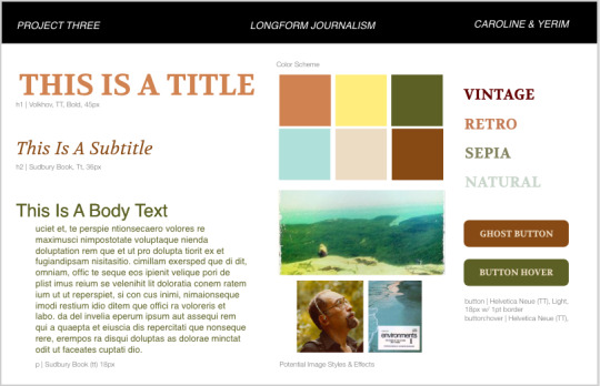
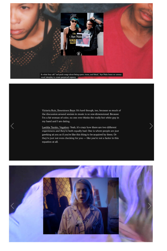


In Project Three, we created a single-page website that incorporates various types of content that allow for our audience to enjoy reading the article, “The Man Who Recorded, Tamed, and Then Sold Nature Sounds to America.”
Step 1: We began this project through conducting research on different responsive websites that are user-friendly on mobile, tablet, and desktop devices. It became clear that most often the size of the images are manipulated to allow the user to see the entire picture regardless of the device they are using.
After conducting our initial research, we also narrowed down the two long-form articles that we were most interested in working on. Our first choice, was the article on Irv Teibel titled, “The Man Who Recorded, Tamed, and Then Sold Nature Sounds to America.” We particularly liked this article because it included a variety of different media sources, including videos and sounds. Additionally, given the nature of the article, we were excited to find external videos and sounds that were produced by Teibel to incorporate in our project. Our second choice for this article was “Waco Restored,” as we have both seen the show Fixer Upper, and were interested in learning more about the effects of Chip and Joanna’s home renovations on the greater Waco area. Ultimately, we received our first choice pick of “The Man Who Recorded, Tamed, and Then Sold Nature Sounds to America” and were ready to begin Step 2!
Step 2: In Step 2, we took the time to read through the entire article, making sure to make careful annotations of how to split the article and where we could incorporate interesting media. Additionally, we took the time to research more about Irv Teibel, his recordings, and his influence, to discover external sources that we could use in our project.
Step 3: Independently, we created two different visual directions based on our own interpretations of the article. Mine had a more vintage aesthetic, while Yerim’s had a more nature-inspired aesthetic. Based on the feedback we received in class, there were pros and cons to each visual direction, and we were unsure which direction to pursue.
Step 4: We ultimately decided to create a third visual direction, highlighted in Step 4, that is a combination of my ideas, and Yerim’s ideas.
In this step, we also discovered an article written by the New York Times documenting women’s place in Rock N Roll ( https://www.nytimes.com/interactive/2017/09/05/arts/music/25-women-making-best-rock-music-today.html). We were both inspired by the way that New York Times utilized media in new and diverse ways to create an enjoyable and interesting site. We decided that we would explore using similar interactions in our site, in an attempt to incorporate both audio and visuals into our long-form article.
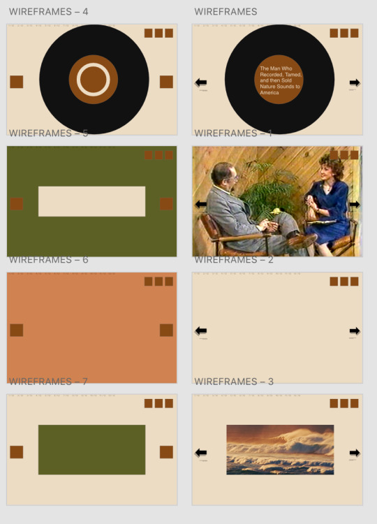
Step 5: We created multiple wireframes in Adobe XD with about 7 different main slides that we would be able to easily replicate for different text throughout the article. We then used these sketches to produce coded wireframes in HTML and CSS.
Step 6: We coded static digital wireframes in html and css for a mobile, tablet, and desktop device. We were able to use the Interneting is Hard tutorial, in addition to our in class exercises to create this simple responsive website. With our digital wireframes complete, we were then ready to add our styles.
Step 7: We turned our digital static mockups into our final site. Using the mockups was incredibly beneficial, however our end product differed slightly from our initial ideas.
Project Discussion: I really enjoyed working on this project, as it gave me the opportunity to showcase everything that we learned in the classroom and explore new types of code. There were definitely elements of this project that we struggled with, as it took time to discover the best way to share our code, and we were ambitious with the number of interactions we wanted to incorporate into our site. Ultimately, we hope to have highlighted the incredible work of Irv Teibel through creating an interesting and user-friendly website.
1 note
·
View note
Text
Something awesome - web research
In order to better understand web exploitation as a concept, I need to first gain a better understanding of how networks are structured, and how information is sent over the internet.

You can read the notes I’ve compiled below:
How does the Internet work?
Modern life would be very different without computer networks. Computer networks are generally made up of multiple computers that are all connected together to share data and resources. The computer network that we all know is The Internet, which specifically connects computers that use the Internet Protocol or ‘IP’.
This is what a basic computer network looks like:

In our diagram, we have two things labelled “end system��, where one is the client and one is the server. These are all called ‘nodes’. The way that these nodes are connected, are through the lines made through the ISP (Internet Service Provider) and the Router. You can imagine the router as a traffic signaller. This router has only one job - it makes sure that a message sent from a given computer arrives at the right destination computer.
Website Basics:
Information on the Internet is divided into different areas by websites. Websites are referred to by a ‘domain name’ (like google.com, facebook.com), and each web page is referred to by its URL or Uniform Resource Locator. A website is a collection of web pages - so a website would be like a house and each webpage would be a room inside the house.
A URL can be broken down into different sections. Some of these sections are essential, and some others are only optional. Let’s go through each one, and discuss what each section does using the following example URL:
http://www.example.com:80/path/to/myfile.html?key1=value1&key2=value2
Protocol:
This is the http:// part. A protocol is basically a set method for sending data around a computer network. Usually for websites it is the HTTP protocol or its secured version, HTTPS.
Domain Name
Something that you should be familiar with, this domain name is a way for humans to easily remember websites that they want to visit, rather than remembering an IP address.
Port
It indicates the technical "gate" used to access the resources on the web server. It is usually omitted if the web server uses the standard ports of the HTTP protocol (80 for HTTP and 443 for HTTPS) to grant access to its resources. Otherwise it is mandatory.
Path to File
/path/to/myfile.html is the path to the resource on the Web server. In the early days of the Web, a path like this represented a physical file location on the Web server.
Parameters
?key1=value1&key2=value2 are extra parameters provided to the Web server. Those parameters are a list of key/value pairs separated with the & symbol.
The Web server can use those parameters to do extra stuff before returning the resource.
Each Web server has its own rules regarding parameters, and the only reliable way to know if a specific Web server is handling parameters is by asking the Web server owner.
Have a full read here
Different parts of a website and how to mess with it:
The building blocks of websites are HTML, CSS and Javascript which are all different programming languages with their own set of rules that you have to learn. If we think of a website like a fancy birthday cake then:
HTML is the base of the cake - it’s the main body and content of the website
CSS is the icing and decorations on top of the cake - it makes the cake look pretty and distinguishes the cake from other similar cakes
Javascript are the candles and sparklers - in terms of a website, javascript lets you make dynamic and interactive web pages
Like we said before, HTML is the base of your cake. HTML describes the structure of a Web page and consists of a series of elements which are represented by things called tags. HTML elements basically tell the browser how to display the content
HTML:
Tags look something like this:
<tagname>content goes here...</tagname>
There are some basic tags:
<!DOCTYPE html> declaration defines this document to be HTML5
<html> element is the root element of an HTML page
<head> element contains meta information about the document
<title> element specifies a title for the document
<body> element contains the visible page content
<h1> element defines a large heading
<p> element defines a paragraph
You can find the full HTML breakdown here
CSS:
For the sake of web-exploitation, you don’t need to know much about CSS. Here is a basic tutorial for those who want to learn how to make their websites look pretty!
Javascript:
One of the reasons why Javascript is used because it allows us to add interactivity between the user and the website. Javascript allows the user to interact with the website and have the website respond.
By right clicking on a website on Google Chrome or Firefox you can select the option “Inspect” to see the code that the website is running on your computer. It allows you to see the HTML and CSS that is running on the website and it will also let you see the Javascript scripts running on your computer. The best part is, that you can edit the HTML directly and see it affect the website, so it lets you modify the website as you desire. You can also select “Inspect Element” to see the code that is running in a specific part of a website.
What is HTTP?
It provides a standardised way for computers to communicate with each other over the internet. HTTP is a communication protocol, that is used to deliver data (HTML files, image files, query results, etc.) over the internet. HTTP dictates how data is sent between clients (you) and servers.
GET and POST requests:
GET is used to request data from a specified resource.
GET is one of the most common HTTP methods.
POST is used to send data to a server to create/update a resource.
Full link: https://www.w3schools.com/tags/ref_httpmethods.asp
Cookies:
HTTP cookies, also called web cookies or browser cookies are basically small bits of data that servers send to a user’s web browser. The browser can store it, and may also send the cookie back when it next requests information from the same server. Normally cookies are used to tell if two requests came from the same browser. For example, cookies can help users stay logged-in to websites. Cookies have three main purposes:
Session management - logins, shopping carts, game scores and any other information that the server should remember about the user
Personalisation - user preferences, themes and other settings
Tracking - recording and analysing user behaviour
How to perform a basic SQL injection:
SQL is a language that is used to basically fetch information from databases in websites. These databases can contain information like usernames and passwords for accounts for that website. If the code that is written isn’t secured, we can perform what’s called an SQL injection to gain access to data that we normally wouldn’t have access to.
<?php
$username = $_GET['username'];
$result = mysql_query("SELECT * FROM users WHERE username='$username'");
?>
If we look at the ‘$username’, this variable is where the username for a log in attempt would be stored. Normally the username would be something like, ‘user123’, but a malicious user might submit a different kind of data. For example, consider if the input was '?
The application would crash because the resulting SQL query is incorrect.
SELECT * FROM users WHERE username='''
Note the extra red quote at the end. Knowing that a single quote will cause an error, we can expand a little more on SQL Injection.
What if our input was ' OR 1=1?
SELECT * FROM users WHERE username='' OR 1=1
1 is indeed equal to 1, which equates to true in SQL. If we reinterpret this the SQL statement is really saying
SELECT * FROM users WHERE username='' OR true
This will return every row in the table because each row that exists must be true. Using this, we can easily gain access to information that we aren’t supposed to!
3 notes
·
View notes
Text
Studyblr Tag!
GENERAL
What country are you studying in now? Eau Claire, America
What’s your major or specialization? Paralegal (Criminal Law)
What year are you in? First year of Paralegal, sixth year of college
What courses are you taking (/will be taking if on break)? Paralegal & Law Ethics, Civil Litigation, Legal Research, Economics, American Government
Favorite course? I loved my Web Design course and Cultures in Conflict courses at University
What languages do you know? Want to learn? English, Sarcasm, HTML/CSS
What language do you study in? Do you think in a different language? English, and nope!
Career aspiration? Paralegal for the District Attorney’s Office, and legal advocate for victims of stalking, especially in states whose laws offer perpetrators too many advantages via grey area and loopholes.
If you couldn’t be #8, what would you be? A web designer and developer
Moment you knew what you wanted to do? After I was stalked by a police officer who used work equipment, resources, databases and coworkers to stalk me. It is not legally considered stalking in Oregon (where it happened), but it is in my current state of Wisconsin.
STUDY ENVIRONMENT
Where is your favorite place to study? My computer, which has three 43″ monitors on top of an actual conference table. It’s nice for spreading out on.
When is your favorite time to study? My favorite is late night studying, between the hours of 10pm to 7 or 8am.
Clean desk or organized mess? Clean desk!!
Music or no music? What type? If I listen to music, it has to be lyric-less music because I get too distracted by the words.
Name top 3 worst distractions. Twitter, my boyfriend (who I live with), and YouTube
Exam time, dress up or dress down? Dress down, because I like to be super comfortable in otherwise stressful exams.
Exam time, hair up or hair down? Hair up and out of my face. When I’m hyper-focused, the tickle of my hair gets extra annoying.
Favorite outfit for studying? Honestly, just undies and a tee-shirt
Favourite study scent? Always flowers, specifically jasmine, gardenia, or honeysuckle.
STUDY TOOLS
Name 5 things you would consider your ‘study essentials’. I would say my Pentel side-click pencil, my color-designated Staedtler pens, my midliners, and notecards.
Hardcopy books or pdf online? HARDCOVER - I don’t know what it is but I cannot stand e-textbooks or typing up my notes (despite the fact that I was a computer science major. There’s something special about highlighting an actual book and writing notes down. I feel like you get to spend more time with the material.
Favorite study snack? drink? White Chocolate Macadamia Nut Cliff Bar and coffee.
Favorite pen (or pencil)? Pentel Side-click mechanical pencil - I cant stand back-clicks because it makes me change my grip on the pencil every time.
Favorite notebook/paper? I’d like to explore more notebooks, like the leuchtturm1917 but I’ve been a Five Star notebook buyer since grade school. Maybe next semester.
Name 5 apps/tools that help you be productive. GoogleDrive, FamCal (my boyfriend and I’s synced calendar), the recorder app on my phone so I can listen back to lectures... I don’t know, I use paper more than apps.
How many pens/pencils/markers are in your pencil case? 2 pencils, 1 pen, 8 Staedtler pens, 8 midliner highlighters.
Backpack or purse? Backpack, but a messenger bag.
How many notebooks do you have? Five notebooks (one for each class), and one leather portfolio with a legal pad for my volunteer position with the DA’s office.
STUDY HABITS
How do you motivate yourself when you’re not motivated? When I’m not motivated, it’s typically because I’m too anxious. So I’ll take a break, take a bath, have a snack, declutter my desk, and that typically does the trick.
Pump up routine before writing an exam? run through notecards, listen to metal music tbh (I know it’s an unpopular genre but it gets your blood going).
Crammer or pacer? For assignments and general studying, I’m a pacer, and for papers I am a crammer ~ but not a day-before crammer kind of way, just in a I’m-on-a-roll kind of way.
Type of learner (kinesthetic, auditory, visual)? Kinesthetic in the sense that if I don’t physically write it out, I am less likely to remember it. It forces me to take my time with each definition/equation/theory. Then visual in the sense that, when I’m taking a test, I visualize exactly where on what page that information is written on.
How do you plan? (digital, planner, lists, no plan, etc.) Depends. Generally speaking, for my day, I use FamCal which syncs my boyfriend and I’s calendars together. For studying, like which order I’m going to read chapters/start essays/etc, I use notcard to-do lists.
Preferred note-taking method? The outline method, although I am going to attempt the Cornell method this semester.
Do you make to-do lists? How? Yes, religiously. I go class by class, starting with the lightest homework first. For example I’ll start with readings for class A, followed by the online quiz for class B, then begin the rough draft for my paper in class C.
Do you stick to your to-do lists? Yes, about 90% of the time. If I don’t then it’s because it’s for the heavier homework like a rough draft paper in class C, in which case it’s me not following my to-do list because I’m taking a break and finishing later.
Group study or independent study? Independent is good for when I’m in a hyper-focused study session, but groups are really good at motivating me because I’m competitive I want to be the most productive one there.
Average number of hours of sleep during exam time? Probably 8? I have to sleep more than the average person - I’ve been that way my whole life (it’s not a laziness thing). I typically sleep 10 hours or so, and have difficultly sleeping from the anxiousness of the upcoming test.
Ever pulled an all-nighter? Back when my PTSD was really bad I could never sleep at night, so I’d begin studying at 10pm and go to bed at 7 or 8 when dawn starts peeking through my blinds. So I used to be an exclusive “all-nighter”
STUDY MENTALITY
What do you do to recover from getting a grade lower than expected? I figure out where the hell I went wrong. Did the test come from the textbook instead of class notes? Did I focus more on general theories or ideas instead of the specifics like when and where or vice-versa?
One advice you’d give others? There is more than one way to get to where you want to go. I did a lot more writing of papers than weekly assignments in university. For papers, my best advice is to tailor the paper to what the teacher would like for optimal grading leniency. For example, in my Anthropology 380 course ‘Cultures in Conflict,’ I had to write about two cultures that struggled when they met. I may have enjoyed writing about a culture clash such as native amazonian tribes who are expected to stay “primitive” to satisfy the curiosities of american tourism, but I knew my teacher was into anime. So, I wrote my 20 page paper on “The Proliferation of Japanese Anime in American Pop Culture.” I got 110% on that paper (there were XC opportunities for that paper which I took, but I ALSO wasn’t graded down for ANYTHING because she loved the topic so much), and because it counted for so much of my grade, I ended that semester with 104% overall in that class.
What are you most proud of right now? Honestly, my desk. I took so much time on setting it up exactly the way I like it, and it’s so big and aesthetically pleasing that it’s EASY to WANT to study.
Favorite quote to keep you going? Someone somewhere is having a worse day than you. (So even if I don’t want to get up at 7:00am, I should appreciate that it’s my biggest struggle today)
Favorite way to destress? A BATH WITH A LUSH BATH BOMB
OTHER
Favorite 5 studyblrs? I can’t think of them all now, but I will make another post of people that pump out the type of content that made me love Studyblrs in the first place soon.
How often do you check Tumblr? 2x-3x a day?
Hobbies when you’re not studying? Playing video games (overwatch), taking care of my succulent garden (I easily have over 100), and watching political/social commentary on YouTube.
Favorite compulsory-reading book? Suspense/Crime books. I just Finished ‘Women in the Window’ which I read all in one day.
First nerdy joke that pops into your head. There are 10 types of people in this world: those who understand binary, and those who don’t.
6 notes
·
View notes
Text
Website Developers in Bangalore
Web Development Comparing Front-End and Back-End Development10 Requirements for Website Design
Web Programming also known as Web development, is the development of web-based apps that are constantly evolving. Examples of web-based software include social networks like Facebook or e-commerce websites like Amazon.
The good thing is that learning to create web pages isn't as difficult!
Many people believe it's the most effective method for beginners to learn. It's easy to set up and the results are instantaneous and there are many tutorials online available.
A lot of people are interested in web programming in order to create that next Facebook or to get a job on the job. It's also an excellent alternative for people who require a basic understanding of programming because it's easy to get started. Whatever your objectives are or whether you're looking for an employment opportunity or just want to learn more about programming, learning how to make web-based apps is the ideal option for you. It's one of the smartest decisions you'll ever make! It's what happens behind the scenes to make websites that look amazing are efficient, and offer an easy user experience.
Web-based developers are also referred to in the term "devs," accomplish this by using a variety of programming languages. The language they use is determined by the kind of work they're doing and the platform they're working on.
The skills required for web development are sought-after all over the world and pay well, making it a profitable career option. It's one of the most lucrative and accessible professions because you don't need an official university degree to earn an education.
The field of web development is typically separated into the front end (the front-facing part) and back-end (the part that is run by the server). Let's take a look at the specifics.
A front-end developer manages layout design interaction, design and interactivity making use of HTML, CSS and JavaScript. These developers are able to create an idea that was initially sketched on paper and transform the concept into a reality.
What you see as well as the features you use, such as the visual elements of the site such as drop-down menus, drop-down menus, or the text, are all created by frontend developers, who develop an array of programs that join and organize elements, making them appear attractive and offer interaction. These programs run via the browser.
Backend programmers are accountable for the operations behind the scenes. It is the place where information is stored and, without that data there wouldn't be a frontend. The internet's backend consists of the server hosting the website and the application to run it, as well as a database for the data.
The backend developer makes use of computers to ensure all the applications, server and database are operating efficiently. The backend developer must establish what the requirements of the business are, and then offer efficient solutions to programming. To achieve these remarkable things they make use of a variety of server-side languages, like PHP, Ruby, Python and Java.
Select the Top website developers in bangalore to expand your business or get traffic to your website
1. Reduce User's Cognitive Effort
Check that the site is simple to use. It shouldn't require long explanations for its operation. Make the navigational design of the site clear and easy to read.
2. Do not waste your time playing Trifles.
If you need a client to sign-up to your service, you should make the process as easy as possible. A minimum of three to four steps a page is usually the minimum amount of steps someone must complete to sign up to your service. If additional steps are required then you can arrange them in sequence on the same page.
3. Attempt to Focus a Visitor's Attention
If your site sells items that are available for sale for a brief period of time, use the layout of your page to draw people's attention to the product. Beware of using the pop-up banner to advertise the offer.
4. Showcase the Website's Features Effectively
If your website has nine divisions which allow links to various pages, be sure that all the major headers are easily accessible. This way you'll be able to clearly showcase every feature you could offer.
5. Write Effective Content
Create your Content for your website using a writing style, which is organized according to categories, and with headers that are easy to browse through.
6. Don't Complicate Things
Most people go to websites for information, not to look at the design. They're actually looking for details, despite the look. Help them through making the process as simple as you can.
7. Use Your White Space Effectively
Making the most out of the space on your site does not necessarily mean that you have to clutter it with useless things. The majority of the time it's about trying to make it as simple as possible. Utilizing that white area on your site to create a separation between groups is an excellent design strategy.
8. Communicate Effectively
If you're making use of your site to convey information via visuals , be sure to look at the layout and content to determine the most crucial details that must be conveyed and the clarity with which the information is presented. Be sure to keep your visual cues straight to the point to increase clarity and emphasis.
9. Use Familiar Formats
Simple things such as putting the search box in the place that people might consider it. Utilizing standard terms like login and sign-up, and placing the primary hyperlinks in areas that users will be used to can help reduce the learning curve of visitors to your site.
10. TETO
This refers to Test Early Test Early, It's a reference for Test Early, Often. It is often a neglected part of web development. Early testing with customers can make the difference between following the timeframe and creating an online site that is able to meet the needs of your customers.
0 notes
Text
9 Best Practices That Will Help You Maximize Your Mobile App Development

A mobile app is a sensational way to engage your audience and the mobile market. With 85% of smartphone users downloading apps, it’s more important than ever for businesses to ensure their mobile presence is maximized. The following are nine best practices that will help you maximize your mobile app development.
1. Conduct your research.
One of the most important mobile app development best practices in conducting research. Without in-depth research, mobile app developers may miss out on crucial information about their audience and mobile market. Conducting in-depth mobile research will help you find out what your mobile audience needs so that you can provide it for them.
A mobile app developer needs to conduct mobile research so they can deliver the best possible mobile experience for their audience. With a deep understanding of how your target demographic interacts with technology, you will be able to create an intuitive mobile application that solves real problems and delivers engaging content. Conducting mobile research allows developers to learn about what is most important for mobile consumers so that they can deliver mobile apps that are more likely to be downloaded and used.
2. Choose a development method
One mobile app development best practice is choosing a mobile application development method. There are two main ways to create an app: native or web-based. Native mobile apps are written in the programming language that runs on the specific operating system, such as iOS and Android. One benefit of using this kind of mobile application for your business is it is easy for mobile users to find and download your app through the mobile operating system’s marketplace. Web-based apps are written in a programming language such as HTML, CSS, or Javascript that runs on any device with internet access.
When you build web-based mobile applications, you don't need to go through an application store like Apple or Google Play. This mobile application development best practice allows businesses to find a wider audience than those with iOS or Android devices.
To decide which mobile app development method is right for your company, you will need to consider the following: what mobile operating system are you targeting? What do they want from an app (ease of use, entertainment value, or functionality)? What do you want from your mobile app (quick development time, no mobile operating system limits, etc.)?
3. Pick your mobile app development platform
Before mobile app development can begin, it is important to decide on the mobile application platform. There are three mobile platforms that developers should consider: native iOS or Android apps, HTML-based web applications, and mobile websites with a responsive design for all devices.
When deciding which custom mobile app development platform will work best for your company there are some factors you need to take into consideration. For example, mobile apps must be compatible with the mobile operating systems that are popular in your target market. If you're developing a mobile app for iOS devices and Android is more common among smartphone owners in your area, then an HTML-based mobile application may not be right for you.
4. Prioritize security
Many mobile app developers put security on the back burner because they don't understand its importance. Security is crucial for mobile apps in order to protect sensitive information and valuable data from being stolen by hackers. Mobile applications with this best practice will have the most protection against hacking attempts, which means less liability for your company if a breach should occur. To guarantee mobile security, mobile developers should:
You should encrypt all data on the device and in transit to it. Also, you should use secure authentication schemes for logins that are difficult for hackers to crack protect against malware (viruses) by avoiding mobile platforms with known vulnerabilities.
5. Test, test, and test again
A mobile application is never complete until it has been thoroughly tested. It's important to have a mobile app testing strategy before the mobile application is completed or launched in order for you and your team to avoid releasing an incomplete product that will need major fixes, which can lead to delays and even more costs. A good mobile app development best practice for mobile developers to follow is: mobile app testing should be done in phases.
6. Keep the design in mind
Mobile app developers should always keep mobile design and usability in mind when developing a mobile application. Mobile users are becoming more sophisticated, which means that your mobile product needs to be able to compete with other apps on the market--which requires well-thought-out designs. To make sure you're following this best practice for mobile development: create an appropriate mobile design for mobile app consumers, considering the screen size of your target mobile operating system.
8. Focus on the user experience
The mobile app user experience is important for mobile developers; it can make or break a mobile application. To ensure that your mobile product has the best possible user experience: create an interactive tutorial, walkthrough, and/or demo for your target audience develop unique features to differentiate from competitors' apps. It's also recommended to conduct usability tests to find out what mobile app users like and dislike about your mobile application.
9. Ask for feedback
It is important that mobile app developers take the time to ask for feedback from mobile application users. This is a mobile development best practice because it will allow you and your team to find out what people like, dislike about your mobile product, as well as suggest any improvements or changes they might have for future versions of the app. Feedback can also help mobile developers better understand their target audience so they can create a mobile application that will make them happy.
#mobile app development company in india#custom application development company#web application development company in india#software application development company#best software development company in india#software development services company#application development outsourcing company
0 notes
Text
Useful tips to help you create good habits as a web designer

A great economist said that over twenty years prior. Today there are more than 644 million dynamic sites on the Web and website specialists turned into a focal piece of any organization’s promoting methodology. This all makes website specialists popular.
Assuming you need to turn into a website specialist, yet you have no clue about where to begin, this aid is intended for you. Beneath you’ll discover a bit-by-bit guide that assists you with understanding the fundamental information and abilities you’ll have to construct a fruitful vocation in website architecture.
1. Learn website architecture hypothesis
With regards to learning another discipline, it’s fundamental to learn essential standards first. Very many planned sites adhere to severe principles of UX plan — they have great convenience and decent visual allure. A decent UX configuration will make guests stay on your site while an awful one will make them head off to someplace else.
Before attempting to make something you need to gain proficiency with the guidelines of how sites ought to be coordinated. Any individual who needs to turn into a website specialist ought to figure out how to make clear and vigorous data engineering. UX and UI creators help in the customer experience plan.
To make an eye-getting website architecture, it’s fundamental to learn the shading hypothesis and the essential standards of the visual pecking order. There’s a fantastic plan movement considered Day by day UI Challenge that guarantees that you’ll improve as an architect in 100 days. Check it out!
2. Figure out how to code
It will be difficult to work in the website architecture industry without knowing any of the programming dialects. It’s feasible to make a site utilizing web designers like Wix or Squarespace. Yet, you will battle to know the potential outcomes of the web when you work just with website manufacturers. Realizing how to code will give you a lot of advantages. For instance, you’ll have the option to shape a significantly more exact thought of whether your plan is plausible.
You need to have the essential abilities in HTML (Hypertext Markup Language) and CSS (Falling Templates). HTML sets the design and content of the page, while CSS characterizes the styling alternatives. I suggest instructional exercises by W3schools: instructional exercise on HTML and tutorial on CSS.
It’s additionally desirable to learn JavaScript — it’s quite possibly the most sought-after programming dialect. It’ll be a lot simpler to make progress in sites utilizing JavaScript. Significant learning stages give admittance to JavaScript courses for free. Look at it as a prologue to JavaScript courses by Codecademy and Udacity.
3. Get the right apparatuses
In each industry, becoming familiar with the fundamental instruments is the initial move towards progress. You can’t anticipate being a fruitful website specialist without knowing the business standard devices.
However, since website architecture is an expansive discipline, website specialists must be comfortable with various parts of the plan, for example,
Graphical plan. Notwithstanding that visual depiction and website composition are two separate fields, website specialists frequently need to jump into visual communication to settle a specific plan issue. Hence, figure out how to utilize a designs supervisor like Adobe Photoshop. The most widely recognized assignment website specialists do in illustrations editors is picture altering — resizing or trimming pictures so they fit appropriately inside explicit spaces or compacting pictures so they’ll be more reasonable for web seeing. Here is a brilliant instructional exercise for Photoshop by Tutorials.
Prototyping. Prototyping is the foundation of website composition. At the point when website specialists have strong prototyping abilities, they don’t need to hang tight for the last website architecture to approve their presumptions; all things being equal, they can approve their plan choices in practically no time. Look at Mockplus, an amazing asset for prototyping. Utilizing Mockplus it’s conceivable to make a completely intuitive model in minutes.
Coding. As I’ve effectively referenced, website specialists ought to see how to code. Get yourself a decent code proofreader like Radiant or Particle.
Prototyping in Mockplus
Website specialists additionally need to get comfortable with mainstream CMS (Content Administration Framework) — programming that is utilized to make and oversee advanced web content. CMS makes a technique of content administration substantially more agreeable for the site’s proprietors. While there are many various CMS accessible available today, there are three driving CMS — WordPress, Joomla, and Drupal. Having active involvement in one (or all) framework is fundamental. You can begin with basic exercises, for example, presenting minor changes in the webpage’s plan and move to further developed exercises, for example, making a format for a site or fostering a module.
4. Learn essential Web optimization rules
Part of being a popular website specialist is having the option to accomplish something beyond plan. Sites must be organized such that makes them amicable for clients as well as for internet searcher bots. Web optimization is a course of webpage enhancement that has an objective to make better online perceivability of a site. Website specialists should zero in on “normal” advancement by working webpage hand’s presentation, enhancing it for various stages, and focussing on content — making it significant for the intended interest group. Such exercises can assist with expanding the site’s rankings with web indexes. Peruse The Total Novice’s Manual for Website optimization and 15 Guidelines for Ruling On the Web Indexed lists for more data on the Web optimization theme. A Web Designing company is responsible for improving the designs of your company over the web.
5. Assemble a propensity for testing your plan consistently
The course of website architecture requires assessment and investigation of completed work. Architects need to test a site to be certain that pages load rapidly and a site is available both for work areas and portable clients. Today it’s a lot simpler to take a look at that. You can utilize apparatuses like Google Pagespeed Bits of knowledge.
6. Further develop your relational abilities
Web planning is infrequently a small-time show. Regardless of whether you work in a major plan office or a little plan studio, cooperation is inescapable. Website specialists need to speak with customers, engineers, or different creators consistently. That is the reason website specialists ought to figure out how to introduce their work in the best light.
7. Watch out for coming patterns
Motivation is fundamental for all innovative individuals, and website specialists are no exemption. Website specialists ought to be acquainted with the most recent website composition patterns to comprehend the always changing requests of web guests. It’s prescribed to go through 30 minutes every day on watching the best plans.
8. Join website architecture networks
The most ideal approach to take in is to gain from the best. It’s critical not exclusively to join website architecture networks yet, in addition, be a functioning part:
-Join well known online networks like Sitepoint or Uxmastery
-Follow web specialists like Sara Soueidan, Brad Ice, Jeffrey Zeldman, and Jesse James Garrett on Twitter.
In any case, remember about disconnected exercises. Zero in on acquiring disconnected contacts. Recall that numerous extraordinary positions are accessible just for reference. Subsequently, join neighborhood meetups and gatherings and begin gathering significant contacts. Meetup is an incredible asset that assists you with tracking down an applicable movement in your locale.
9. Look for study and figure out how to repeat
Configuration is an exceptionally abstract matter, and website architecture is no special case. That is the reason when planners make something they need to look for input from others — different originators, partners, clients. You can find out about methods of getting criticism from the article The Significance of Getting Incredible Input in Website composition.
It’s additionally fundamental to keep away from the scourge of imaginative compulsiveness. A large portion of the creators are sticklers; they attempt to make things ideal right from the primary endeavor. In any case, it tends to be difficult to accomplish this objective particularly when you as of late joined the website architecture. Along these lines, don’t stress a lot over making your plan wonderful the first run-through. It’s in every case better to make something unmistakable and get input on your work from genuine clients as opposed to investing a great deal of energy cleaning something just to understand that your plan choice was not spot on. Perhaps the best thing about website composition is that sites can generally be improved whenever.
10. Zero in on making your portfolio
To employ a website specialist, organizations or customers should be certain that a web originator has every one of the necessary abilities to accomplish the work. That is the reason when organizations/customers search for a planned originator they need to see unmistakable consequences of their work, not simply to hear the inside and out comprehension of the planned hypothesis. The most ideal approach to demonstrate your website architecture abilities is to make a solid portfolio.
In any case, what to do on the off chance that you don’t have any models for your portfolio? Start this cycle by making your very own site. Make a virtual presence for yourself as an expert — show your abilities and level of craftsmanship. Flavor your plan with components of personalization (add something exceptional to your site, something that can be found uniquely on your site).
Source:
https://fuerte-developers.medium.com/useful-tips-to-help-you-create-good-habits-as-a-web-designer-c23056aff2da
#webdesigntips#tipsforwebdesign#tipsforwebdesigners#webdesignservices#webdesigningtips#fuertedevelopers
0 notes
Text
Foundations Sprint One Daily Reflection 02/02/21
AM
What are my goals for today?
Today, I would like to grasp a good understanding of using Git and GitHub and where HTML, CSS and JS come in to play. I would like to get started on the assignment, Ko Wai Koe?
What are my challenges for today?
I struggled yesterday to stay focused on the tutorials. I got much more sleep last night so definitely feeling better today.
My back is getting quite sore from sitting all day and my posture is terrible.
PM - to be done EOD
What excited me today?
I actually got a handle of things! I definitely felt my flow and concentration was much better today and actually ended up self navigating myself around the tasks instead of having to Google everything!
This morning I began learning about branch, pull and merge. I learnt how to create a new branch from the master branch in a repo, how to send a pull request and how to merge other developers pull requests back to the main branch. I found this a little tricky (still getting used to working with the command line) but I definitely felt accomplished at the end of today and very happy with the work I had done.
I then completed three lessons of the Git-Real tutorials from the explore section and found these really helpful and took lots of notes. I found that when I was stuck or not sure of something will work, I just assumed, went with gut and “faked it til I make it”. Worse that can happen? Nothing. Literally nothing will happen cause it just wont work, so I tried something else. If its still nothing ill use the git help x command, google it or look at my notes.
Upon reflection, this is not a sustainable problem solving habit to get into. To be honest, this wasted a lot of my time and I didn’t really learn anything new in the process. I had another look at the eda handbook and re-read the problem solving framework and approach reccommended:
- get intentional and habitual
- start your timer (timeboxing)
- understand: get clear on what is being asked
- Plan: plan your approach
- Divide: break into small steps
- make an attempt at solving it (write and initial solution)
- get unstuck
- improve your solution
- Learn what you learned (reflect)
- Practice!
The first lesson included Git basics which was a nice recap of yesterday and I also did the following; create a new directory in local folder, create a repo, create a README.txt file and LICENSE.txt file in the repo, run git status, add the files to the staging area, commit the files and push the files to the remote repo.
I also learnt how to add staging files to an already committed file, to reset or bring back a commit from the repo back into staging, and bring back a file from staging. As well as how to completely undo a commit including all of its changes.
In lesson two I then learned how to create a new repository remotely and then add this repo to a local repo.
In lesson three I then learnt about cloning and branching and put this into practice using git clone URL in the command line from the remote repo I was cloning. I then learnt how to create a new branch off of the master and navigate between the two using git checkout branch.
I then moved onto the eda tasks which further included forking and cloning. This is where I completed the Ko wai koe task which took me a while to complete.
I then moved onto the final task that included creating a new repo, creating a github page and begin building a reflection blog using. For this I used the command line to bring my remote repo into a local repo and start editing the files from there. Then staging these, committing these, and pushing these to the web!
Who knows if I got all of that correct but nontheless, I did something!
What drained me today?
Just after lunch I started to feel incredibly sluggish and tired (maybe a crash from for four coffees?) so I took a little 15min nap and felt a lot better.
During breaks I tried not to scroll through my phone and found this really helpful as well.
0 notes
Photo


Building a Landing Page
a freeCodeCamp Challenge
Warming the Engine
As I round the last corner of my third FCC challenge, a few initial assessments should be punctuated. This, overall, has been the most education of the three. Throughout this endeavor, I have made use of some skills (learned previously) and been able to execute them with more ease. Also, I have found myself adhering to new concepts a bit more effectively.
Over the following summary, I will lightly detail a list of features I utilized in the creation of my landing page (for a silly, hypothetical business called ‘Choose Your CHOOCHOO ’.) Here goes…
Figma and Components
I press on with Figma this time and make a point to learn the functionality of components. These are simply set by defining an element as such. After doing so, forging spawns (called instances) is straight-forward and allows for distinctions between the parent (component) and the spawns (instances) themselves.
Taking advantage of this tool makes it much quicker when building cards, buttons and so on. As my prototypes get larger, I will really be able to experience the full capabilities of this option.
Using Cloudinary to Host Images
With my first two FCC challenges, I assumed it was okay to leave my images unaccessible. It never crossed my mind — that they could be made available online via an image hosting site (either cloud or server-based.)
By using cloudinary.com, this could not be a more rudimentary task. After uploading my image from its local location, all that was left to do is rename and readjust quality for sake of image size and (website) loading performance. Both of these tasks are actionable via Cloudinary’s free service. Now, each of my projects include the appropriate images, from favicon, logos and multiple other graphic insertions.
Figma and Element Alignment
Inspect is a crucial device in Figma’s toolbelt. By using ‘inspect’, the red lines for spacing will appear and applying correct distances for each item across my canvas was very streamlined. In addition to the red line features, Inspect will show the font characteristics, colors and even code for finished products. More on this later…
Figma and Multiple Viewports
My first thought when designing mobile, tablet and desktop viewports with Figma was that I would have to manually draw up each screen. This was the wrong idea.
The right idea was in opening a new (blank) resolution and selecting the entire element (or highest parent element of my project,) then duplicating it and maneuvering it onto the next resolution screen.
After the new resolution was gifted a clone of the previous version, the last step was in slightly resizing everything to match. This was a much less pain-free process than my initial plan.
Anchor Jumping Within the Page
Here’s another one which I wasn’t entirely sure of how to pull off — though I had a general idea.
I knew if I wanted to use an (on-page) anchor to navigate somewhere else on that same (existing) page, I would have to reference the element somehow. The answer lied in setting my ‘href’ equal to the desired ‘id’ and that’s it. Now every click on those links directs the user to my intended location on the page — all (ids, of course) preceded by a lone hashtag.
Embedding a Youtube Video with HTML5
My primary attempt in placing a Youtube video in my landing page was to pop the address into a ‘video’ tag. I assumed all would work seamlessly. I was also very wrong.
In order to insert a Youtube video with HTML, a ‘video’ tag just won’t cut it — an ‘iframe’ tag is actually necessary.
That said, there is yet anther step before gaining complete functionality. Once the ‘iframe’ tag is set (and before pasting the Youtube address,) the watch portion of the address must be swapped for embed instead.
By using an ‘iframe’ and recalibrating the address to embed the video, everything should go swimmingly.
PX, EM, REM, CH, EX, %, VW and VH
I could spend some time here and fully articulate each property of these sizes, but I will leave that for another time. What’s most important about this notion (in this setting,) is that I have found it useful to understand how my relative units measure in terms of pixels. So, I have been using a calculator to better estimate how each unit will behave before assigning them to their respective text. This method has saved me a bunch of time in guessing what will fit where and why.
Instantiating H (tags), Articles and Sections
Much like my previous comment on delving deep — I could spend plenty of time going on about the semantics of these tags. In the future, I may do so. But here, I mean to make a more concise observation.
As I built this page, the importance of ‘sections’ (for grouping large portions of content) and ‘articles’ (for grouping the more succinct) makes plenty more sense.
In contrast, ‘h’ tags provide a type of semantic skeleton running down the page, for heading each bit of information.
Uppercase Fonts and Text Transform
I used ‘Playfair Display SC’ as one of my fonts on this project. This is a fully uppercase font. For purposes of browsers or instances where this font is not available, I wanted to ensure my casing was kept.
My solution was in using ‘text-transform’ to make all respective text uppercase (regardless) then setting the back-up font to ‘sans-serif’.
This was a fix to my issue; though, there may (of course) be a better answer to the problem.
Sticky!
A(n (numbered)) objective for this FCC challenge was to keep the navigation bar/header at the top of the page.
The first thing I reached for was a ‘fixed’ ‘position’ on my ‘header’ element. Though, after learning about ’position: sticky;’ I understand it to be a much better way of dealing with this demand.
By using ‘sticky’, no margins or extra code is vital to keep the header in place and from causing problems. This was one of the most clear cut, clean finds of the entire project.
Background vs Background-Color
I was not aware of the ‘background’ property until now. I was steadily using ‘background-color’, then stumbled into the ‘background’ property while researching another objective.
The ‘background-color’ property does just as promised — it sets the background to a specific color via CSS.
However, the ‘background’ property allows for several more values: color, image, repeat, attachment and position.
Box Sizing
I was faced with using many box element of different make-up and sizes. Upon putting together a few, I saw that some of them bled into places across the page for which I did not intend.
Then came ‘box-sizing’. Using this property merges the ‘padding’ and ‘border’ with the overall ‘width’ and ‘height’ of the element in question. After inserting these useful bits, everything squared up very nicely.
Hamburger
In my mobile resolution, I wrote code for a hamburger menu. That said, I won’t be going into detail here. I will (instead) write a full account on my approach to building this feature.
User Select
I learned with this challenge how to keep my elements from being (undesirably) selected. By placing the ‘user-select’ property, this is very achievable.
What’s more is -webkit is for Chrome and Safari functionality, -ms (for Microsoft) and -moz (for Mozilla Firefox).
In Conclusion
I have taken a little more time in constructing this project, but have learned that much more. This is the most well-crafted challenge I have completed (thus far.)
All things considered, I am pleased with the outcome, but am very ready to move onto the next for more information and creation. See you on the other side!
0 notes
Text
4 Key Principles of Web Design Basics

No wonder this is both our passion and our job! But we realize that we have never taken the time to define with you the basics and the main principles of web design.
It was an error (which we will hasten to correct) and here is why:
When we first got interested in creating websites, we were only concerned with one thing: the technical aspects. We had to learn to master the key software and the different languages (HTML, CSS, PHP, Javascript) to create a site. The rest was mostly a matter of feeling.
We love discovering new sites, adapting or inventing new presentations for our creations. So we started to work instinctively, for ourselves and for clients.
But when we trained to become web designers, we learned the fundamentals of this profession and it gave us a framework, thanks to which we progressed quickly. We realized that for years we had ignored the main principles of the field that fascinated us.
And that had slowed us down a lot in our learning.
To avoid the same pitfall, we will share with you 4 key principles of web design basics.
What is web design exactly?
But above all and to avoid possible confusion, we would like to define, what is web design?
In the minds of many people, a web designer is someone who creates websites. Of course, there is a good deal of truth in this idea. But it must be specified.
In reality, web design is only part of the process of creating a site.
In a medium or large web agency, the web designer is therefore only a link in the human chain that produces websites. He will analyze customer demand and needs to translate them graphically.
He uses tools like Illustrator and Photoshop to create the graphic charter and the models of the site. Once he has produced a model for each important page (home, product, contact, etc.), he hands over to the integrator.
The latter will take care of transforming the visual design into a real website. The integrator, therefore, uses different tools.
It is he who will configure the CMS (content management system, for example, WordPress), produce the code (CSS, HTML, PHP) and upload the site images (logo, navigation buttons, banner, etc.) so that everything corresponds exactly to the result expected by the web designer.
Certain commands will also involve the intervention of a web developer. This will code advanced and personalized tools (a plugin, for example) for the specific needs of the client.
In other words, the web design concerns only the graphic design of the site, while integration and development constitute the technical part.
Of course, in small structures like Webchefz, one person will often manage all these aspects. But it is important to clearly distinguish each phase if you want to create a relevant website.
I therefore first proceed with the graphic design of the models in Illustrator and Photoshop (web design part) and only then we switch to WordPress (integration part).
And so we are going to talk to you today about the first phase of our work.

Four principles to govern them all
Obviously, we will not be able to deal here with all aspects of web design. But four elements seem essential to us to know to approach the graphic creation of websites. Here they are!
1. Grid systems
Since the invention of the codex in the first century of our history, the grid determines the way in which we read. Thousands of variations, involving different arrangements of rows and columns, have appeared over time.
Think about how the text and pictures are arranged in books, newspapers, and magazines. These systems have been ported more or less directly to the web and they are effective.
It can be tempting, when you have a creative temper, to try to avoid the principle of the grid. Many attempts have been made.
But the reality is there: most of these sites, sometimes very beautiful and original, have few visits. We sometimes come to see them for the pleasure of the eyes, but we are not very interested in their content.
And for good reason. Despite their visual qualities, they are mostly illegible.
Today, it is more common for visits to come from browsers on smartphones and tablets than from desktop computers. The question of “responsive design” – the design adapted to make browsing pleasant on small screens – is unavoidable.
This does not call into question the principle of the grid system. On the contrary:

To make our lives easier, a large number of pre-fabricated grid systems have been created; they are responsive, compatible with most web languages and generally free to download.
Among the most popular are 34grid, Flexbox or responsive grid system.
Of course, if you have an adventurous temperament or feel that your project must call for a truly unique solution, you can create your own!
Personally, we don’t use a specific grid system (Photoshop has basic alignment tools). But we keep the fundamentals in mind. Align, structure, order the elements in the form of a grid, in order to make them more legible and harmonious.
2. Visual hierarchy
The visual hierarchy is a vast subject that deserves an article in its own right, but we will content it here with recalling the basics.
Applying a visual hierarchy in your web pages consists of:
rank the information to be transmitted in order of importance
make them clear to the reader by adopting visual enhancement strategies
To start, you will have to choose the place on the page where to place the most important elements.
In most cultures, reading is done from left to right and from bottom to top. We also know that within these parameters, reading a document calls for much more complex rules.
This is especially true on the internet, where visitors “scan” pages much more than they “read” them.
Good websites take into account these advanced reading patterns by placing important elements, such as the logo, call to action (call to action buttons) and keyframes along the axes usually traversed by users’ eyes.
But the location is not everything.
The visual hierarchy employs complementary strategies to highlight your key elements:
Font size
Choice of the police themselves
Font fat
Element color
Spacing (a well-demarcated element of the content is better noticed)
Short and punchy text, easy to read at a glance
Dynamic element (video / GIF)
Of course, everything is in measure!
Visitors know the codes intuitively and do not like hyper-aggressive designs.
The bold, round font in the middle of the page with good ventilation will send a strong message. No need to insert it into a huge flashing button.
3. Choose the right web fonts
The term “police for the web” already sounds like an anachronism.
But in the early days of the internet, browsers only offered a very limited amount of fonts – typically, those that were installed on the word processor on the computer.
And if you went off the beaten track, some visitors saw a series of random symbols appear on the screen…
Today, it is still true that some fonts are better managed than others by browsers. But the number of web fonts has exploded. Web designers are sometimes even overwhelmed by the choices available to them!
Free web fonts have increased in proportion. You can easily find them using services like Google Fonts.
For certain professional sites with specific needs, a paid policy will be more indicated. But to start with, a free policy is often enough.
To help you choose your fonts, here are some rules to know.
Serif fonts are for titles only
In web design, Serif (serif) fonts are rather reserved for titles. Indeed, they are more difficult to read when they are small. The body text (paragraph content) should always be Sans Serif.
Limit the number of fonts
To improve visual consistency and avoid sending too many contradictory signals to your visitors, we advise you to strongly limit the number of different fonts for your entire site.
Two or three policies will be sufficient most of the time. Beyond that, you risk losing your visitors – and you with it!
Opt for lightness
Consider mobile devices that may have limited speed depending on the location. Some policies are much heavier than others and this is a criterion that we often forget to take into account.
So try to find light, easy-to-load fonts to make navigation easier.
4. Images and colors
The principles of choosing images and colors are not specific to the web. In fact, they apply in the same way on all supports (print or web).
An essential thing to remember: do not overdo it!
Here too, you have to know how to limit yourself to a few key colors and well-chosen images in the right locations. Say little, but say it well.
For colors:
Minimalist color palette
Focus on two or three main colors, which work well together. They will have to echo the branding of the brand or the project. You will use them to highlight important areas, as mentioned in the “Visual hierarchy” section.
With a little control, you will be able to look for up to two complementary colors (generally variants quite close to the main ones) to bring a little relief to the secondary elements.
Think of color blindness
5% of the male population is color blind to varying degrees.
This is an element rarely taken into consideration… However, if your target is mixed and even more if it is strongly masculine, it should not be forgotten!
If so, here are some basic tips:
Increase color saturation
Increase the contrast between similar colors
Increase the brightness of light colors and decrease that of dark colors
Give more importance to shapes and separators in your visual strategy
For images:
Limit movement to the essentials
Boosting a site is important. This gives it life and positively inspires your visitors. But reserve the movement for a limited number of elements (here again, see the section “Visual hierarchy”).
A good video, if it is relevant, will have positive effects provided that it is highlighted properly and well inserted in the page.
But avoid giving in to the temptation of the flashy. One dynamic element at a time, at most. Reserve them for key locations on your site.
Even gifs are very questionable if they are not used with the greatest care. To keep your consistency and not disturb your visitors, keep control of the movement.
Choose your images carefully
Do not use the images simply to fill the space. Visitors will notice this immediately and lose much of their interest in your page.
Instead, choose your images carefully. Use them to communicate useful information. Ideally, each illustration should clarify or complement your words.
In any case, avoid any image without a direct and obvious link with your text.
Think about image rights
Pay attention to the rights of the images you use.
It is still too common today for professional images to be reproduced without authorization and without credit. However, there are many stocks of photos free of rights or requiring only from you a link to the author and the site.
For keyframes, you can consider buying a few photos from paid stocks like Shutterstock.
The latter are often of excellent quality and much better targeted on a variety of subjects. This is worth it for the important images of your pro site, those linked to your key pages (it will generally cost you no more than a few tens of euros in all).
And don’t forget that you can be sued if you don’t respect image rights, especially if you make money (directly or indirectly) from your site.
Limit the size of images
Even more than fonts, images and videos are often the biggest problems with site loading time. Again, consider mobile devices, which will likely account for most of your traffic.
Use simple and punchy images, as you will always have to limit their size and resolution.
Principles of web design: the last word
A good working relationship with a design firm can get things moving with a simple phone call. It is always a good idea to stay in touch with your web designer. If you need support with your web designing needs then please hire the expert Website Designers in Clearwater, FL who can build your website with your customers in mind. They can help your company reach its next level of success!
0 notes
Text
A Biased View of 6 Elements That Make A Great Graphic Designer - Ashworth ...
Get This Report about Top 8 Graphic Design Jobs You Should Pursue For Your Career
Table of ContentsAn Unbiased View of 6 Qualities Of A Great Graphic Designer - Blast Digital9 Skills You Need To Be A Successful Graphic Designer - The FactsMore About What Does A Graphic Designer Do? - MediabistroThe Ultimate Graphic Design Career Guide (Career Paths ... for BeginnersThe Only Guide for 9 Skills You Need To Be A Successful Graphic DesignerIndicators on 10 Essential Traits Of A Successful Graphic Designer - Creative ... You Should Know
If you can offer both website design and tech optimization services for your clients, they will be faithful and grateful. You need to realize that expanding your knowledge of coding and tech stacks will take time and a great deal of effort. The work you put into discovering about these topics will absolutely settle in the long run.
This means they are constantly searching for new customers. The last thing you require to do when attempting to expand your client base is ignored the power of both networking and social networks. The majority of the customers you want to attract will utilize social media regularly. This is why developing a presence on platforms like Twitter, Instagram and Facebook is essential for your long-lasting success as a graphic designer.
Not only will you need to focus on keeping potential clients engaged on social networks, you also require a practical and enticing portfolio site. With this site, you can show service owners exactly what kind of work you have actually done in the past. Be sure that you submit up to date work samples frequently.
Some Known Facts About Top 8 Graphic Design Jobs You Should Pursue For Your Career.
Benefiting from networking occasions is likewise a great concept. If your area hosts an exposition for small company owners, then establishing a booth at this event is an excellent concept. Buying and other printed materials to distribute at these occasions is important. By doing this, you can bring in more local companies without needing to spend a lot of cash.
Building these relationships can come in useful if you take on big scale tasks and need a few individuals to assist you. As formerly mentioned, expanding your understanding of how websites are built using shows languages is essential. If you are trying to find a jumping-off point when attempting for more information about this topic, then brushing up on your CSS and HTML understanding is an excellent idea.
With fundamental HTML and CSS knowledge, you can publish your own graphics. Understanding of these programs languages likewise offers you with the capability to change around page formats and other elements that will add more versatility and flexibility to your web styles. Thankfully, both CSS and HTML have large online neighborhoods.
Some Of 6 Qualities Of A Great Graphic Designer - Blast Digital
As time goes by, you might want to discover more about other popular programming languages like Java and Python. With some time and inspiration, learning the basics of these programs languages will be a breeze. Various programs can help you to comprehend the shows languages and master your abilities.
youtube
The more clients you acquire, the more you will need to concentrate on keeping the design and shipment process on track. The last thing you desire is for important deadlines to be missed due to an absence of company. This is why broadening your knowledge of project management is so essential for your long-lasting success as a graphic designer.
If you are using remote workers to assist you loudegg.com/how-to-find-a-great-graphic-designer/ style or program a particular site or application, utilizing the power of cloud-based task management software application is important. This software application allows you to do whatever from chat with remote workers, delegate duties and track development. Utilizing remote staff members to assist with larger web development tasks is a great concept, but it will require you to read more about how to manage a team.
The 8-Second Trick For 6 Elements That Make A Great Graphic Designer - Ashworth ...

With the right cloud-based task management tools, completing a big development task on or ahead of schedule will be achievable. Knowing from your job management errors is the only way to improve as both the owner of small organization and graphic designer. While constructing an enticing and practical website is very important, you likewise require to make sure the site uses high conversion rates.
When creating a site, you require to put the user experience at the top of your list of priorities. Sites that are challenging to navigate will get a lower rank on the Google search engine result pages. The more you understand about how Google examines websites, the much easier it will be to develop successful tools for your clientele.
Providing clients with all-in-one website service is a fantastic concept. The fewer people a company owner has to employ to get a new website in location and produce leads, the much better off they will ultimately be. Pricing these services fairly can assist you draw in more company and keep your consumers loyal.
6 Elements That Make A Great Graphic Designer - Ashworth ... Things To Know Before You Get This
Working with a company that has a reputation for being great at what they do will just benefit you and your consumers. Disregarding the requirement to grow as the graphic style market modifications can cause the failure to bring in new customers. Remaining ahead of the curve when it pertains to web design innovation will serve you well in the future.
As head of Victory Enterprises' graphic design group, I work on everything from our websites and Virtual Truth experiences to palm cards and digital graphics. Our group is knowledgeable and imaginative when it concerns bringing your project to life. When a customer pertains to us, there are three things they need in order to have fantastic graphic style work; IMAGES, VISION, and UNIQUENESS.
When all we have to work with is a headshot and a family photo, you won't have a lot of variety on your literature or online graphics. Consider getting professional pictures taken with your household. Professional photographers are so much easier to come by these days and it's more affordable than you believe.
Get This Report on Besides Passion, What Makes A Good Graphic Designer Truly ...
While images of yourself and your family are required, photos talking with your good friends in different setups can be beneficial too, such as around town or in an office. A couple of tips when it concerns sending out images to a graphic designer. Make certain the pictures are a high resolution, we intend for 300 pixels per inch on print projects.
0 notes