
Building projects. Growing into a Front End Developer.
Don't wanna be here? Send us removal request.
Statistics
We looked inside some of the posts by resetpermalik and here's what we found interesting.
Average Info
Notes Per Post
10
Likes Per Post
7
Reblog Per Post
3
Reply Per Post
0
Time Between Posts
6 days
Number of Posts By Type
Text
4
Photo
9
Last Seen Tumblr Blogs


Fun Fact
The KCSC sent more than 20K requests to delete posts related to prostitution and porn to Tumblr from January to June 2017.
Text
Crafting a Technical Documentation Page
A freeCodeCamp Challenge

Very Little to Report
The goal this project was to build a page of technical information. The request was simple and the construction followed that same notion. I didn’t acquire a huge set of new tools or skills in this process, so this summary will be rather brief.
One Note
As I set out to complete this project, I was initially under the impression that it would come together fairly easily. While I could have added a surplus of functionality (simply for the sake of a tougher challenge,) instead I took advantage of the lacking learning curve; this way, I could get a solid repetition in with all of the methods and processes I have learned until now.

Over the course of this build, I was confident in working with Git basics locally and individually. I still need to better understand branching and countless other features. But, I now know precisely how to navigate my project through Git while maintaining the integrity of my workflow. So, that’s a big plus.

Outside of Git, I am getting much more comfortable with commenting code and keeping my documents in VS Code tidy and sensible. I am beginning to get better at taking a step back and understanding how I need to nest and place my elements in order for them to make more sense going forward.
Conclusion
This was a nice experiment in testing my knowledge until now. But, I will need to continue to challenge myself in order to learn at a higher rate. Onto the next..
https://permalik.github.io/FCC-Technical-Documentation-Page/
1 note
·
View note
Text
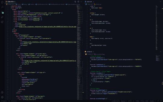
Recreating the Google Search Results Page
An Odin Project Challenge

From The Outset
I knew this would be a tedious process. It turns out, I was correct. While working on this challenge, I hammered out plenty of nesting and styling fundamentals. But, of more importance, throughout this build I got the opportunity to coast with the demands of HTML and CSS (meaning: I was simply reinforcing prior lessons learned.) This tempo of structuring and styling allowed me to think more freely about the behavior of certain elements — I was finally able to begin integrating JavaScript to create solutions. The subsequent paragraphs will administer some brief detail.
CSS: A Molehill and Mountain
When a Google Search Results page is produced (these days,) there are supplemental elements involved which aid any given search (by way of: ‘People also search for/ask’.) Each of these lists suggest multiple topics, websites and companies which may better address the initial query.
Typically, these references are housed by a border surrounding all sides. This border brings me to my first obstacle. And while solving this problem was quick and straightforward, I believe the answer I found will regularly come in handy down the road.
My issue presented as a parent element with a border which had gaps in the corners. And I intended there only to be a solid, continuous border.
When nesting siblings within a bordered-parent-element, the borders of the children need also be taken into account. Put simply: if there is styling for rounded border radius around all children — and those children have standard squared border radius — then the border corners of the outer children will create visual gaps (interrupting the integrity of the parent border.)
So this was an easy tweak. I altered the border radius of my outer children elements, such as to make both parent and child borders uniform. Then, my problem was resolved.
The second new CSS maneuver I utilized cured a great deal of stress. Attempting to clone the Google Search Results page means placing a waffle-menu icon paired with a sign-in button in the top right of the page.
I was under the assumption that by using a relatively-positioned parent and absolutely-positioned descendent, that my work would be done. I was very wrong.
See, by following this procedure, my coupling of elements in the top-right corner continued to stay fixed to the viewport edge. Problematic, for sure. The rest of the page moved together (when resizing the screen) while the waffle and sign-in kept glued to the side of the screen, leading to overlapping and clashing with all the other elements.
This was the most frustrating encounter during the whole project. I really didn’t understand what my mistake was (at first.) Admittedly, I kept shuffling the nesting of all navigation elements; thinking surely I just need to figure out the particular wrapper which will allow me to adjust positioning. It wasn’t the proper perspective. At all.
Eventually I realized how to frame my question and set off, thumbing through page after page of Google results. The answer was nauseatingly apparent when I stumbled into the concept of setting a minimal width for my containing div.
That was it! A minimal width would keep my elements from bleeding into my other elements at a lower viewport size, while allowing them to stretch with the screen as it grew. And so it was.
Toggling with JavaScript
One of the aforementioned sections (‘People also ask’) bears an X in the upper right corner, as a way for the user to collapse and remove the element from the flow of the page.
I first placed a button and span (housing the X) inside a div, wrapped by the parent element. This let me use CSS to position the X in its appropriate corner with the button stacked over top.
The button was then assigned an onmousedown event with a called function (closeBox); this would trigger my function when the mouse was actively pressed atop the button and perceivably on the underlying X.
In my JavaScript file, I defined the (closeBox) function and created an instance for my element id. By doing so, my html element in question could be manipulated by way of pressing down a mouse over the button.
Lastly, I used an if else statement to make the section display none when the button was pressed onmousedown.
In the remaining two sections of suggestions, each topic listed extends with a type of card which supplies more information. These topic headings are fit with their own chevrons, so as to invert and point up/down (respectively) determined by whether the card of info is actively being shown or not.
I knew the behavior needed to occur when each topic heading was clicked. So in my HTML file, I called a function (arrowOneTogg) with the onclick event attribute.
Using CSS, I created a class to transform and rotate my chevrons 180deg, ultimately making them point from down to up (and toggle back and forth with every click.)
Back in my JavaScript file, I defined the function. After which, I used const to create an instance for all of my individual spans (the spans which allowed me to add the initial chevrons).
I then wrote statements so as to refer to each variable and target classList, toggling the (rotateChev) class in order to rotate the specific chevrons onclick.
Conclusion
That’s that. I certainly didn’t want to spend much time on this HTML and CSS, but I did. However, as I press on, my chops get a bit more sharpened and the obvious pitfalls are more effectively avoided.
All things considered, I am pleased to have built my first solo JavaScript functions. The confidence is undeniable in comparison to having absolutely zero experience in this practice. Now, enough talking and onto the next project.
https://permalik.github.io/google-search-results-page
0 notes
Photo

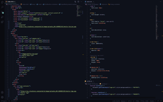
Recreating the Google Homepage
An Odin Project Challenge
Diversifying Education
Until recently, I have focused solely on building projects for freeCodeCamp. While these experiences are certainly valuable, I wanted to extend the reach of my education (while also teaching myself how to multitask with separate goals in mind.) This intention brought me to the Odin Project. Here, I have learned a bit of Git and have now completed a Google Webpage clone. The following will detail some lessons absorbed from this experience.
Git Basics(, very basically)
My knowledge of Git is still very minuscule. At this point, I am capable of cloning remote repositories to my local repository with ‘git clone ([email protected]:username/example.git)’.
Once the desired repository is within my target directory (and any adjustments have been made), ‘git add (file.ext)’ [track specific file] | ‘git add -A’ [track all changes] | ‘git add .’ [track new files and modifications without deletions] | ‘git add -u’ [track modifications and deletions without new files])’ will appropriately stage new, deleted or modified elements. This indicates a move from ‘working tree’ to ’staging area.’
After all of my intended files and folders are safely moved to the staging area, I am then prepared to commit to my local repository. This can be achieved by using the command ‘git commit -m “-insert-message-here-”’ [each message will document progress].
Intermittently, I am able to use ‘git status’ to ensure I know the current state of my elements within the working tree, staging area and local repository.
Lastly, when my information has been modified, moved from ‘working tree’ to ‘staging area’ and from ‘staging area’ to ‘local repo’… I then have the option of pushing all material to a remote repository (Git Hub) by way of ‘git push origin main’. This final command will tell Git (DVCS) to push the elements in question onward to the pre-set location (origin: declared previously with the cloned SSH key) and to do so on the (main) branch.
Finally, ‘git log’ will display pertinent info (in regard) to each of my commits. These distinctions are: unique commit hashes, author, date and messages.
I have integrated a few more Git tools into my workflow. I will quickly state those, but wait until I have a more balanced comprehension of Git before going into depth about functionality. They are as follows: ‘git fetch’ [retrieves references/objects only] | ‘git pull’ [retrieves references/objects and merges] | ‘git reset - -soft HEAD~1’ [undo last commit without altering recent modifications of current branch HEAD] | ‘git reset - -hard HEAD~1’ [undo last commit and recent modifications of current branch HEAD].
Any time I updated my ‘README.md’ file during this project, I used ‘vi’ (screen-oriented visual editor). The editor can be opened with the command: ‘vi file.ext’. In command mode: ‘i’ will allow insertion of text, ‘:w’ saves modifications, ‘:q’ exits the editor, ‘:wq’ concatenates both previous commands and ‘esc’ shifts from ‘edit’ back to ‘command mode’.
In addition, ‘touch (file.ext)’ [create a new file within the current directory] | ‘echo “-insert-string-here-” >/>> file.ext [replaces all text with new string/adds string onto next line in a file]’ | ‘sed ’s/find/replace/’ file.ext’ [find and replace certain characters/strings]’ | ‘sed -i -e ’s/-insert-string-here-//g’ [edit/remove certain characters/strings in-place]’ | ‘> file.ext then ^C’ [clear all text from file] | ‘(dquote) resolved with !’.
Coding the Webpage
The Google homepage is relatively simple to recreate (after having already demonstrating many requisite techniques in previous projects.) That said, I will share some new processes and maneuvers I learned over the course of this challenge which helped me deploy a more polished final result.
As I created my files for HTML, CSS and JavaScript, I added a ‘reset.css’ file with ‘Meyer CSS reset v2’. This removed all default browser styles and allowed for full control of any CSS I would later add.
Using pseudo-class selectors (hover and focus,) my anchors and buttons became more customizable. The instances where I used these allowed me to better dial into the signature Google-page-experience.
Two JavaScript events (onmousedown | onmouseup) enabled me to call functions which let me achieve the click behavior of my ‘sign-in’ button.
As a bonus to the development of this project, I learned how to better create textual images with Photoshop. With attention to anti-aliasing, image size (width | height) and pixel density, I now understand how to implement smoother edges in these cases.

Conclusion
After completing this webpage, I am comfortable executing all I have learned until now. Of course, this is a small fraction of what is yet to come. However, I sense noticeable momentum and confidence after finishing this challenge. Now, onward to the next assignment.
1 note
·
View note
Photo


Building a Landing Page
a freeCodeCamp Challenge
Warming the Engine
As I round the last corner of my third FCC challenge, a few initial assessments should be punctuated. This, overall, has been the most education of the three. Throughout this endeavor, I have made use of some skills (learned previously) and been able to execute them with more ease. Also, I have found myself adhering to new concepts a bit more effectively.
Over the following summary, I will lightly detail a list of features I utilized in the creation of my landing page (for a silly, hypothetical business called ‘Choose Your CHOOCHOO ’.) Here goes…
Figma and Components
I press on with Figma this time and make a point to learn the functionality of components. These are simply set by defining an element as such. After doing so, forging spawns (called instances) is straight-forward and allows for distinctions between the parent (component) and the spawns (instances) themselves.
Taking advantage of this tool makes it much quicker when building cards, buttons and so on. As my prototypes get larger, I will really be able to experience the full capabilities of this option.
Using Cloudinary to Host Images
With my first two FCC challenges, I assumed it was okay to leave my images unaccessible. It never crossed my mind — that they could be made available online via an image hosting site (either cloud or server-based.)
By using cloudinary.com, this could not be a more rudimentary task. After uploading my image from its local location, all that was left to do is rename and readjust quality for sake of image size and (website) loading performance. Both of these tasks are actionable via Cloudinary’s free service. Now, each of my projects include the appropriate images, from favicon, logos and multiple other graphic insertions.
Figma and Element Alignment
Inspect is a crucial device in Figma’s toolbelt. By using ‘inspect’, the red lines for spacing will appear and applying correct distances for each item across my canvas was very streamlined. In addition to the red line features, Inspect will show the font characteristics, colors and even code for finished products. More on this later…
Figma and Multiple Viewports
My first thought when designing mobile, tablet and desktop viewports with Figma was that I would have to manually draw up each screen. This was the wrong idea.
The right idea was in opening a new (blank) resolution and selecting the entire element (or highest parent element of my project,) then duplicating it and maneuvering it onto the next resolution screen.
After the new resolution was gifted a clone of the previous version, the last step was in slightly resizing everything to match. This was a much less pain-free process than my initial plan.
Anchor Jumping Within the Page
Here’s another one which I wasn’t entirely sure of how to pull off — though I had a general idea.
I knew if I wanted to use an (on-page) anchor to navigate somewhere else on that same (existing) page, I would have to reference the element somehow. The answer lied in setting my ‘href’ equal to the desired ‘id’ and that’s it. Now every click on those links directs the user to my intended location on the page — all (ids, of course) preceded by a lone hashtag.
Embedding a Youtube Video with HTML5
My primary attempt in placing a Youtube video in my landing page was to pop the address into a ‘video’ tag. I assumed all would work seamlessly. I was also very wrong.
In order to insert a Youtube video with HTML, a ‘video’ tag just won’t cut it — an ‘iframe’ tag is actually necessary.
That said, there is yet anther step before gaining complete functionality. Once the ‘iframe’ tag is set (and before pasting the Youtube address,) the watch portion of the address must be swapped for embed instead.
By using an ‘iframe’ and recalibrating the address to embed the video, everything should go swimmingly.
PX, EM, REM, CH, EX, %, VW and VH
I could spend some time here and fully articulate each property of these sizes, but I will leave that for another time. What’s most important about this notion (in this setting,) is that I have found it useful to understand how my relative units measure in terms of pixels. So, I have been using a calculator to better estimate how each unit will behave before assigning them to their respective text. This method has saved me a bunch of time in guessing what will fit where and why.
Instantiating H (tags), Articles and Sections
Much like my previous comment on delving deep — I could spend plenty of time going on about the semantics of these tags. In the future, I may do so. But here, I mean to make a more concise observation.
As I built this page, the importance of ‘sections’ (for grouping large portions of content) and ‘articles’ (for grouping the more succinct) makes plenty more sense.
In contrast, ‘h’ tags provide a type of semantic skeleton running down the page, for heading each bit of information.
Uppercase Fonts and Text Transform
I used ‘Playfair Display SC’ as one of my fonts on this project. This is a fully uppercase font. For purposes of browsers or instances where this font is not available, I wanted to ensure my casing was kept.
My solution was in using ‘text-transform’ to make all respective text uppercase (regardless) then setting the back-up font to ‘sans-serif’.
This was a fix to my issue; though, there may (of course) be a better answer to the problem.
Sticky!
A(n (numbered)) objective for this FCC challenge was to keep the navigation bar/header at the top of the page.
The first thing I reached for was a ‘fixed’ ‘position’ on my ‘header’ element. Though, after learning about ’position: sticky;’ I understand it to be a much better way of dealing with this demand.
By using ‘sticky’, no margins or extra code is vital to keep the header in place and from causing problems. This was one of the most clear cut, clean finds of the entire project.
Background vs Background-Color
I was not aware of the ‘background’ property until now. I was steadily using ‘background-color’, then stumbled into the ‘background’ property while researching another objective.
The ‘background-color’ property does just as promised — it sets the background to a specific color via CSS.
However, the ‘background’ property allows for several more values: color, image, repeat, attachment and position.
Box Sizing
I was faced with using many box element of different make-up and sizes. Upon putting together a few, I saw that some of them bled into places across the page for which I did not intend.
Then came ‘box-sizing’. Using this property merges the ‘padding’ and ‘border’ with the overall ‘width’ and ‘height’ of the element in question. After inserting these useful bits, everything squared up very nicely.
Hamburger
In my mobile resolution, I wrote code for a hamburger menu. That said, I won’t be going into detail here. I will (instead) write a full account on my approach to building this feature.
User Select
I learned with this challenge how to keep my elements from being (undesirably) selected. By placing the ‘user-select’ property, this is very achievable.
What’s more is -webkit is for Chrome and Safari functionality, -ms (for Microsoft) and -moz (for Mozilla Firefox).
In Conclusion
I have taken a little more time in constructing this project, but have learned that much more. This is the most well-crafted challenge I have completed (thus far.)
All things considered, I am pleased with the outcome, but am very ready to move onto the next for more information and creation. See you on the other side!
0 notes
Photo
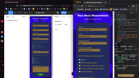
Mass Music Measurements Survey Form
A freeCodeCampChallenge
Gaining Speed
This marks my second freeCodeCamp challenge. As I mentioned in my after action report from the first FCC challenge (tribute page), it took some time to finally gain traction and fully complete that project. That was a problem with (one) unnecessary complexity of design and (two) a lack of planning (before I began to code.) It was my assumption that if I laced the project with many working parts, I would learn much, much faster; also, that by getting right to the code, I could pick up the syntax, semantics and general knack for writing (code) in less time. And wow, I was very incorrect in thinking so.
As a response to my previous poor start (with my tribute page,) this time I was better able to address some lessons which had only occurred to me when halfway through the last project. So this time, I really dialed in the importance of streamlining my initial paperwork designs, learning how to more proficiently use Figma and some of its tools, how to better approach icon design with Photoshop and vastly improve my entire workflow. This provided (not only) an easier build, but also a more efficient angle by which I was empowered to catch more lessons along the way.
In the next few paragraphs, I will detail just which specific advantages I picked up in terms of HTML5, CSS3 and JavaScript capability. In addition, I will move through some of the tactics I employed to help me finish this challenge with much more confidence than the last.
Planning Stages
When I set out to hand-write the marked goals (set down by FCC’s challenge,) I do find it tedious. The thing is, I am copying (in my own words) precisely what the challenge is demanding of me. Let me elaborate…
With every line, I am telling myself that I really do not need to do this. I mean, I can pretty easily peer over at the other browser window (when necessary) and see exactly what my marching orders are. Though albeit true, there are a couple of key differences in (one) reading from FCC and (two) writing/reading my own notes.
As I write out every expected step of my project, I can build an image immediately for how I would like my creation to take shape. This falls in line with the visual aspects and design, the color scheme, the functionality of each element and the code itself. It is a powerful method to which I will pay better respect going forward. (I already have plenty of ideas on how to implement more potent procedures — like larger drafting paper, (which will allow for a greater landscape on my pages, maybe using a tablet for notation and perhaps a few voice recordings along the way)). Now, I may be getting ahead of myself! Back to the plans..
And so writing out the objectives is terrific for lots of reasons, but moving to the drawn design itself — this may be the most crucial bit yet. Here’s the deal. When I physically drew the (expected) survey form, I may have well completed the whole project. So what does that mean?
I took so much liberty in imagining what the design should resemble. More specifically, I let my mind wander and allowed thoughts to spill out onto the legal pad before me. This (in combination with my understanding of how everything needed be expressed in code) let me structure my rough draft with such a degree that the next step made the actual coding like an exercise in copy and paste. I’ll expound…
I was drawing parts which were effectively elements of HTML. This was followed by some (more precise) markings of pseudo-code (which amounted to about all of the HTML I required to code for the whole challenge.) So, when I say the planning has proved to be useful, this would be an undestatement. This attention to planning has made it possible for me to avoid the ‘nuts and bolts’ in my code editor. Now, this advancement is massive, because the saved time and effort was a testement to why I was then able to better learn more intricate detail when coding. And now let’s get to those lessons and the code at large.
Within Earshot of Paper and Pencil
My goal is not to elaborate on the use of specific technologies, but more-so the process itself. however, I will briefly touch on Figma and Photoshop…
Using Figma helped me focus on each element and understand how they more literally fit together in the puzzle. I was able to name every piece such that it would show me what my HTML element should be in code and how each need be named. Also, I took those separate entities and grouped them such that I could postion everything exactly as I wished. My next goal with Figma will be to utilize the ‘component’ feature and truly unroll some strong functionality of the software.
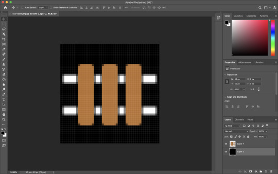
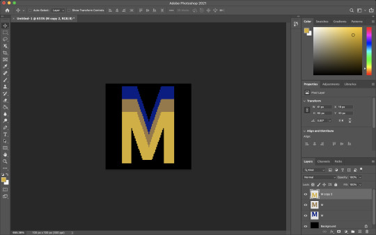
Regarding Photoshop, I made a logo for my survey and spun it into a favicon with relative ease. In an attempt to create animations and advertisements for my affiliate site, I have better come to understand Photoshop’s effectiveness. Thereby, building my icon was fairly straightforward. I simply pieced it together with a couple of layers and exported the PNG. I still want to be able to employ SVGs for this application; but until now, I haven’t perfected the craft. I will leave that for the coming FCC challenge. Onward!
Coding the Beast
The first topic to address here is quite obvious for me… SUITE TESTING.
When I began coding this project, I wrote my HTML boilerplate and immediately tied in the FCC testing script so I could begin verifying my code at every turn. I’ll elaborate…
I ran into a few issues with debugging throughout my last project; those were problems which resulted in code errors piling up on me simultaneously. And, while an error (for which you don’t know the remedy) is frustrating…several of those errors (all at once) becomes infuriating. Luckily, I ran into a great solution. Unit testing.
By instantiating the FCC test suite before I began coding the bulk of my project, I was then gifted the opportunity of verifying each of the sixteen goal posts.
In more detail, nearly no problems snuck up on me while coding the breadth of this project because I was adamant on addressing them in real time (as they appeared). What a true life-saver...
Input Text (element, attribute)
I found it repetitive and annoying at first, when the 10th goal of this challenge asked me to give both the input and label elements their own respective and corresponding ids. This was because I (very simply) did not understand the request. Along with that, I definitely didn’t understand why it was being asked (to begin with.)
That said, I now realize that the goal was to identify the label for the text field, in addition to the field itself. In understanding this distinction, I have now been able to find value in this very feature.
By giving ids to both my labels and input texts, I was then able to style each distinctly and find them with more ease (while peering though my HTML.) Now here’s real solid tip which I will not soon forget.
Don’t Pick More Than One Option!
So, I was writing the code for my radio buttons and what happened next is certainly a rookie mistake. When I navigated to my browser (in order to test the options,) I found that EVERY one of my buttons was clickable. And this, for obvious reasons, is not ideal.
This solution was super easy. All I needed to do was unify (or make each value the same for) the input-radio buttons. After I placed cloned values for each radio button, only one option could then be chosen. Success!
Nitpick the Name and Ids
This is something which should possibly be glossed over. But, when working with various input fields, I was asked to employ many names and ids for each.
While I’m not entirely certain (even now) whether there is a standard for which comes first, I have come to realize that name attributes should possibly supercede id attributes.
Using Visual Studio Code, it seems to like placing names before ids. And in a real life estimation, using name over id seems to be old-fashioned, but admirable.
More seriously, I understand in code, name will be less subjective (while more actionable) and ids will more far more particular and prone to alteration.
Dropdown
I was in a position to use dropdown boxes twice in this project. The problem I came across was that my options continued to begin with the default option as selectable. While I learned the solution quickly and with ease, I believe it should be recorded as vital.
When inserting a placeholder option in a dropdown box, in order to keep it from being a clickable entity, you have to style it as such.
I called the id of the option in my CSS sheet and set its display as none. That easy.
Pseudo Class and Element Selectors
Very little of my experience with this challenge dealt with pseudo class or pseudo element selectors. But, I will cover (in short) what I did learn (with these topics in mind.)
Using a pseudo element selector is the best (or maybe only) way to call an attribute from an HTML element and style with CSS.
This is how I was able to change the appearance of my placeholder text in each input-text.
I know pseudo class selectors are the way to alter elements (in a certain state) like ‘hover’ or ‘before’, but I haven’t used them enough to expand this monologue. That said, I’ll press on…
Attribute Selectors
In confluence with my previous words, I may have provided a misnomer to exactly what was being modified with pseudo-elements. But, I digress (and hopefully you see what I mean).
Using attribute selectors is quite different from other selectors, because you will be placing true brackets in as your selector which house your attribute, followed by an equal sign and a set of quotations (housing your value.)
Looks like this [attribute=“value”]. And that’s that!
Media Queries
While I employed media queries for this project, I have yet to fully grasp exactly how to use them (in reference to appropriation and context.) Therefore, I will not go into detail; but, only mention that I used them to alter my CTA button across pixel-widths. Also, I realized that setting a new media query works better when starting with the immediate values from your last screen size.
A Bit of JavaScript
The big task I pushed for in this project was this: change the client-side font family for a text area as the user types. And by big, I mean, it took me about as long as the rest of the whole challenge to learn this functionality with JavaScript. That said, I now understand much better how JS semantics are employed. And, that’s pretty priceless…
For this goal, I inserted a script with an event listener. First, I started with DOMContentLoaded, which allows for firing without the images or styling need be loaded.
The next bit lets my document be called by its (element) id.
Then, it states that my id will be triggered by any input (via an eventListener) and will force my later instantiated function.
The function declared will let the charCode number equal a string which will be console.log(ed) out as my target.value (of Nunito, sans-serif) with proper style.fontFamily.
Conclusion
Attempting to wrap this project up in a nice bow is difficult, as I have onboarded a great deal of information (from one simple survey page.) After completing this task, I am left with a split-brain. While I have learned so much from something, seemingly straightforward, now I am thrilled to make it to the next project and take on those new expectations.
I suppose my takeaway is that I should fine-tune my HTML and CSS understanding and seriously crack open all that is JavaScript. All which, can wait until tomorrow. Cheers!
7 notes
·
View notes
Photo

Building a Tribute Page
A freeCodeCamp Challenge
A Rough Start
My first attempt at this challenge left me puzzled for weeks on end. Initially, I made everything far too difficult on myself. Using Adobe Xd, I designed a page which simply asked too much in the way of responsive design (for a total beginner.)
And so, on my second attempt, I decided to strictly follow the parameters set forth by FCC’s challenge. By focusing on the individual goals, I was able to formulate a more precise attack plan and complete the challenge within hours; rather, weeks of frustration (which seemed only to end in one failure after the next.)
Redemption
The new plan was this: hand-write every (FCC) expectation, hand-draw a design with some pseudo-code marked, use Figma to create a proper prototype and write HTML and CSS with Visual Studio Code.
This new plan would allow me to fully realize my project (step-by-step) before I even considered writing code. While at first this seemed like overkill, it allowed me to fully visualize what my page should look like in shape and code (simply from a legal pad.) Progress was surely being made on this run…
Step By Step
The outline for the Tribute Challenge was as follows:
(1) An element with a corresponding id=“main” (containing all other elements.)
I used a body element to house all of my content (outside of the head). Immediately within the body went a main tag. The main tag was the element labeled id=“main”. I used main to follow semantic procedure.
(2) An element with a corresponding id=“title” (containing a string which describes the subject of the tribute page — Frank Lloyd Wright.)
In stating the title of my page, I thought it prudent to use an h1 tag (for semantic purposes.) So, in the h1 went (labeled as id=“title”.)
My title was a child of three other elements. In closest relation was a div to bind my logo (via flexbox.) The next wrapper up was a nav element to group the title, logo and (“tribute-link”) button (this gave me the opportunity to build a from-scratch navigation bar and learn how to make it responsive). Lastly (and highest up) I used a header element to again, provide semantic context. Onward!
(3) A div element with a corresponding id=“img-div”.
This portion of the goal set was fairly straightforward. From Unsplash, I sourced a black and white image of Frank Lloyd Wright. I then used an img tag to place it into the HTML document, supplying an alt attribute (“frank lloyd wright”) for accessibility purposes. And to finish building the img element, an (4) id=“image” was set. This last id fulfilled the fourth parameter of FCC’s rule set.
(5) Within the img-div element should be a corresponding id=“img-caption” which contains textual content describing the image shown in img-div.
My caption was constructed (in entirety) with two div elements, both containing two h2 tags and two p tags (respectively.) This allowed me to deposit the ‘Birth’ and ‘Death’ information for Wright, along with the details (time and location) for both of those separate events.
For semantic posterity, again, I enacted the h2 tags within the img-caption.
(7) An a element with a corresponding id=“tribute-link”, which links to an outside site that contains additional information about the subject of the tribute page. Secondarily, give the element an attribute of target=“_blank” in order for the link to open in a new tab.
As detailed previously, the aforementioned a element with the id=“tribute-link” was placed within the header and nav tags to form a navigation bar atop the page. In the following paragraphs, I will discuss some of the CSS styling used to achieve this responsive ‘Learn More’ button.
(8) The img element should responsively resize, relative to the width of its parent element, without exceeding its original size.
(9) The img element should be centered within its parent element.
CSS Styling for Frank Lloyd Wright - A Tribute
A distinction should be made: this page was styled ‘mobile-first’. I begin with a 375px screen-width and stretched it to 1300px, while setting a few media queries at 1600px and 2400px (just in case.) As it were, my monitor currently only reaches 1300px, so I did not have the luxury of fine-tuning beyond those resolutions…
Selecting a color palette for my page was first on the list. For this project, I used three complementary shades of grey, white and a contrasting red (with the ‘Learn More’ button being a separate light blue — for visual hierarchy.)
With the body selector, I set the background-color (as mid-grey), color (of the text (to white)), the global font-family to ‘Spectral’, serif and the initial margin to 0 (zero).
Once my global page settings were in place, I needed to focus on making my navigation bar look good. As previously mentioned, I nested my title, logo and button within multiple tags to make this a reality. The title and ‘Learn More’ button were then set to font-family: ‘Montserrat’;.
I was able to use flex to then justify-content, space-between and flex-end the grouped (title and logo) elements as well as the id=“tribute-link” button (respectively). This allowed me to position the grouped elements and button on opposite sides the page, where I then set the margins to provide white space on either sides.
In styling my button, I removed the standard underline of the link with text-decoration: none;. In order to center the text within the light blue background-color, I used the text-align property. Then, border-radius allowed me to round the edges to create a more sleek look.
As a way of achieving goal (8), I used display: block; to maintain full width of the page, while also staying within the parent (img-div) element. By using the block value, I was also able to maintain my height and width of the image itself.
Much like my navigation bar, I used flex and its various related properties/values to achieve the preferred structure and responsiveness of my image captions. In addition, however, I was able to select multiple children of my parent elements with >* (where I could then alter values for several elements simultaneously.)
The last goal I needed to meet for a responsive page was accomplished with @media queries. With several media queries, I was successful in adjusting the size of my button (in the nav bar), altering the shape of some text in my footer (by hiding elements using display: none;) and realigning the footer text itself with more flex and some updated margin.
Conclusion
While I have learned many things through forging this tribute page, some highlights will surely shape my progress in web development and programming.
As I continue down this path of design, creation, coding and problem-solving, I will outline my steps well before I consider taking my first. Although this seems rather obvious to me now, the experience of both methods (blind vs. planned) has taught me how truly valuable it is to understand the fully realized goal before setting off into the woods, with proverbial guns blazing.
In combination with the planning, is the research. Much of the reason I enjoy these processes is because of how spectacularly limitless this world is (in terms of both information and possibility.) As I have built this tribute page, I better understand how valuable it is for me to attain all the knowledge I can on these subjects to further my ability and grow a rapidly evolving community.
github.com/permalik codepen.io/permalik
0 notes
Photo


Creating an Animation with Photoshop
Navi from Zelda
Getting Started
So, you need an image. But, the one you’re looking for is either under copyright or only exists in your mind. This leaves a few options: search tirelessly among the internet for an adequate option, pay another entity to make one on your behalf or make it of your own accord. Choices, choices…
There is certainly a chance that a viable option exists on the interweb — somewhere. But, is it worth your valuable time to flip rocks over all day? Maybe, maybe not.
Hunting down a novice or even a professional to execute the task for you is always a sure-fire way to provide a finished and possibly-well-polished product. Though, in many cases, you must pay for this service (especially as you slide up the scale of quality.) Or you may simply want an animation for a personal project. In this case, finding free animators on freelance websites is within the realm of possibilities. If this last one is you, best of luck. If not, let’s press on.
The final option is to piece together the project yourself. And that’s the route I have taken for my latest endeavor. Using Photoshop, I made a basic animation of Navi (the flying blue companion of Link’s — from Zelda (: specifically, Ocarina of Time.) A great game, I know!
The following will shed some light instruction on how I went about building my animation, along with some tools available in the very powerful application — Photoshop.
Setting Layers
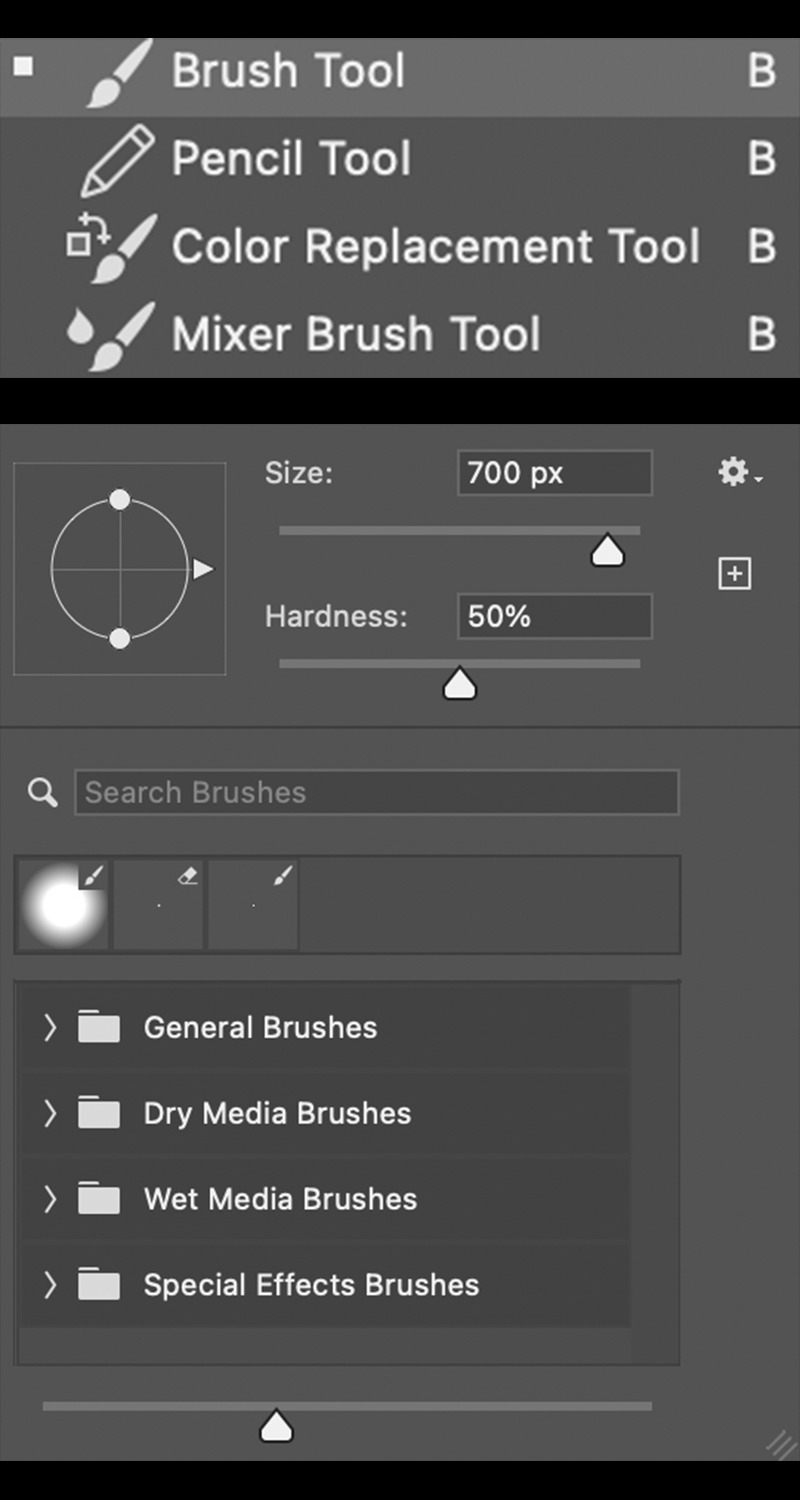
Before any magical talking fairies can be forged, we first must supply a canvas on which we will place them. The first step is to open your Photoshop app. This project was enacted using Photoshop 2021.
Upon opening your app, the splash page should appear. This page will welcome you, the user. Along with a warm greeting from the Adobe team, you will find the sidebar on your left houses a button to create a new project or open a file. Click ‘create new’. Then choose the size appropriate for your means. Moving on…
So you have opened your new project, our first objective is one of painting a background on which our animation will be born. Any color will suffice, though a color which allows for contrast will be useful — at least until after our work is finished. Your first layer will be preselected and may be verified at the bottom-right of your screen. To color your background, use your ‘paint bucket tool’ (with your chosen color appended) to click and cover your first layer. This should shift the whole layer to your particular hue.
Once successful, create a new layer with the plus sign in the tiny toolbar (underneath your layer tab, in the bottom-right.) After the new layer is opened, ensure ‘layer 2’ is stationed above your first, freshly painted layer. Also, you will do well to commit this layer function to memory — as it will be used several more times when adding the wings for Navi…or other pieces to your specific project. Now, we should have one layer on bottom with a certain background color applied. Placed over that should be a fresh layer — ready for the body of our fairy friend.
Navi’s Blue-ish Body
Building the body for Navi is straight-forward. This calls for a series of orbs (three: one darker blue, a lighter blue and white-blue) stacked atop each other. To place these orbs, grab your ‘brush tool’ from the dedicated sidebar on your left. The paintbrush is what you’re looking for. Select that and continue to adjust the hardness (how strict or spotted the edges are — like a sharpie vs. a can of spray paint.) Also, choose the appropriate size for your Navi body. This process will be repeated for a total of three times; in accordance to the aforementioned color scheme and from the largest orb to the smaller and smallest, centered orbs. I hope this makes sense. If not, the images supplied should be of help. Onward!
Pin Your Wings
Next we need those two iconic sets of wings which keep Navi floating around Link’s head — chattering “Listen!” for every step of the epic legend of Ocarina of Time. For wings, we shall chose our ‘line tool’. This may be located in the same left-hand sidebar.
After equipping the ‘line tool’, some settings for it must also be adjusted. Those will include (but are not limited to): pixel width, stroke type (solid, dashed or dotted), stroke fill color and so on. Calibrate your ‘line tool’ and we can start drawing those wings.
Exactly how your wings look is up to you. The wings I drew are all visible in the images posted, but feel free to use your imagination. I’m sure you either already know how Navi looks — or can simply scrape the internet for some images. Regardless, draw your first line. Then we can move onto the intermediary ‘warp’ technique. Exciting, right?
If you were successful with constructing your first line (of the first wing,) then head to ‘edit’ (while still selecting the respective line) at the top of your screen. We need to ‘transform’ your line with the ‘warp’ transformation, so rather than a flat, straight line — you will be able to manipulate the line into a curve for your wings. Again, select your line. Then ‘edit’. ‘Transform’. ‘Warp.’ If you follow, let’s push forward…
Warping Wings and Such
Warping your elements will take a slight learning curve. Really, only slight. You will just have to accomodate yourself to the functions of warping. This feature will be used consistently throughout the construction of each wing. Really, just try to watch how your lines move in relation to the dots as you maneuver and you will be just fine! As for the color of the wings, I chose grey. So long as yours look the way you want, any shade is perfect. Onto some added markings…
Now that each of your wings have be brought to life, let’s place in some wing-like lines to add a bit of character. Again, like the wings, I used the line tool for this portion. The only difference which should be mentioned is the color. For the veins in each wing, I set the lines to a slightly darker grey. But, as with the wing color themselves, choose as you wish.
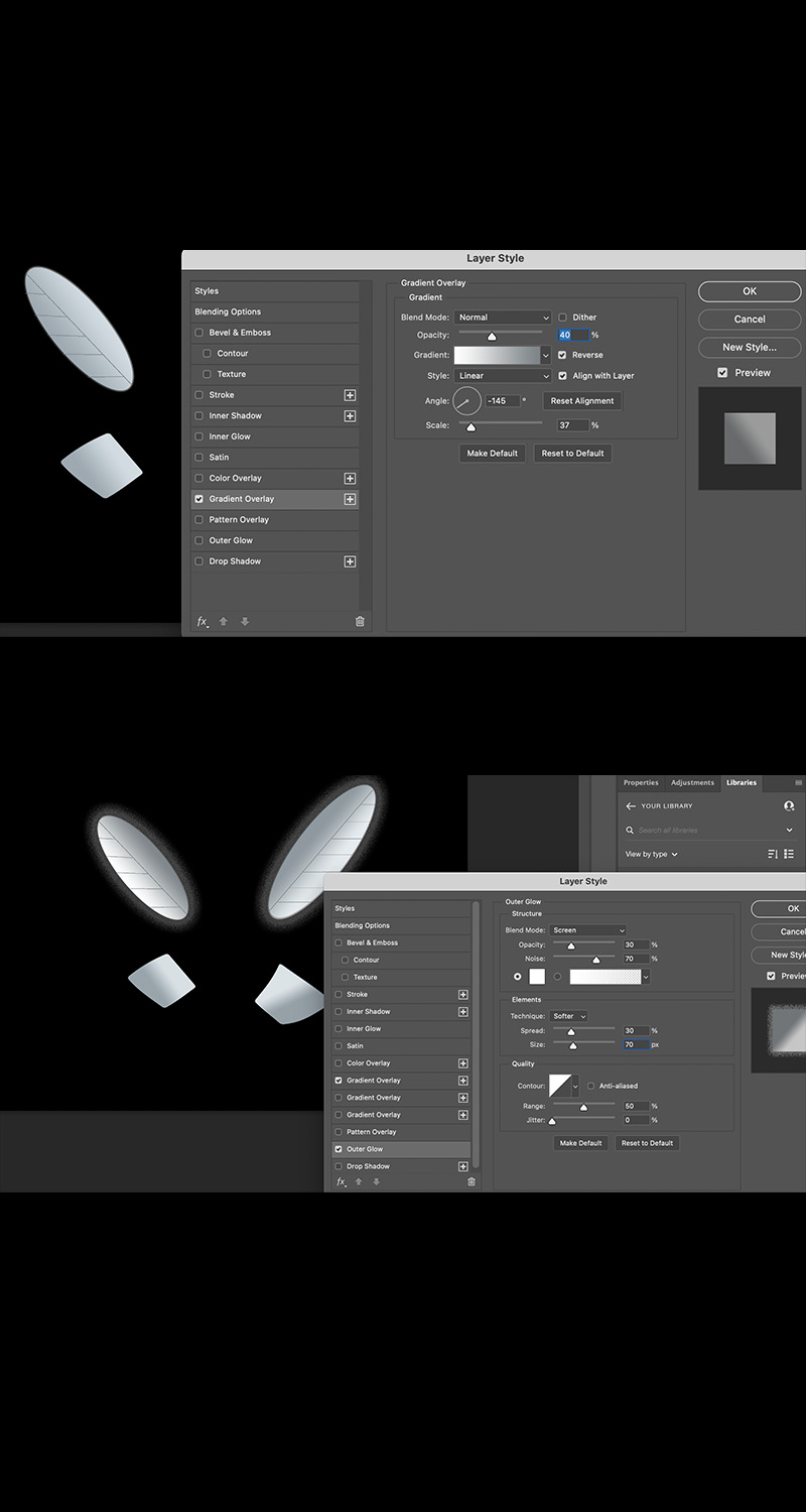
With the physical structures of each wing built, the last few steps are only finishing the wings and bringing them (in a sense) to life. To do so, we will add a ’gradient’ and ’outer glow’ to each. Both features can be added by right clicking the respective layer and selecting ‘blending options.’ Next, I will briefly cover each option…
Gradient to Add Perspective
For your gradient, you may adjust many dials, sliders and otherwise to get things tuned just right. Under the devoted (‘gradient’) tab you will see: style (linear, radial, angle, reflected or diamond), opacity, reverse, scale and so forth. Set each one just so and you will achieve the best angle for perceived lighting over Navi.
Outer Glow for Emphasis
As far as your ‘outer glow’ settings, follow the same procedure to access them… ‘layer’, right-click, ’blending options’, ‘outer glow’. This will deposit you into a very similar tab. Tune your glow’s opacity, noise, spread, size, range and so on. After this step, Navi should be ready for action!
Conclusion
As discussed originally, there are many ways to allocate animations for any project you come across. That said, building your own personal image and/or character from scratch is a great time and brings to rise plenty of new skills which truly are not too difficult to onboard.
Maybe you have no interest in building Navi, but hopefully this instructional article gave some tips and hints on how to better utilize the Photoshop application in your workflow.
1 note
·
View note
Photo


Creating an Overlay for your Image
Using Photoshop
What is an overlay and why use one?
There are many edits which can be performed on an image, such as: resizing, cropping, color balancing, white/black/shadow adjustments, contrasting and more.
But you may need to place some text or a separate image over your original. In this case, none of the previously mentioned options are ideal solutions. If the goal is to superimpose one image atop another, some visual hierarchy is vital. So what does this really mean?
Well, as one image is set over the other, each of them may begin competing for the viewer’s attention. And if the objective is to emphasize the top layered image, this may prove difficult without a little work to guide the watching eyes. This is where our tool (the ‘overlay’) comes into use.
An overlay is a method available when editing or crafting multiple layered images. This technique can be used for a variety of effects: (such as) dimming the lower layers, creating texture or adding subtle tints to your image. So, how is this executed?
Creating your Overlay
When you enter photoshop, the splash page will welcome you and give you several options. Navigate to the left sidebar or to ‘File’. Now, open a preexisting document or create a brand new project.
Now you have your image before you or will need to create one with your photoshop tools. Either way, if you check the bottom right-hand portion of the screen, you can find a layer housing your image listed under the ‘layers’ tab. The layer in question will be shown as a banner with a thumbnail, the layer name and an eye to select or deselect it. If everything checks out so far, we can safely move on…
Navigate to below your ‘layers’ tab. Here, you will come across a discreet tool bar. The options presented are: linking layers, effects, masking, fill/adjustment layers, new group, new layer and the trash bin for deleting layers. We are after the ‘new layer’ tool. So, give that click.
Immediately after clicking the ‘new layer’ icon, you should see a second layer banner appear above your original. If you only began with one layer (initially,) then this new layer should be named ‘layer 2’ (with the same ‘thumbnail’ and ‘eye’ features as the rest.) Moving forward!
Although you have added a new layer over your first, your project should look exactly the same; this is because your new layer has no content. So, you can imagine the second layer existing over your first; however it is currently transparent. Let’s change that…
Before we get around to adding color to the new layer itself, we need first to choose a color of which we will use. For this task, check the bottom left of the screen (underneath the selection of tool icons.) Here you will find two sets of one square overlapping another. We’re after the larger set of squares. These two squares are both your ‘foreground’ and ‘background’ color selectors. Click the foreground (or left/top-most square.) You will be presented with a color picker — this is where you will choose what color you wish to fill your new layer. There will be several options in the color picker for how to specify which one you want. But, for our purposes, you can simply use your mouse to click and choose in the rainbow gradient before you. Onward!
Head to the left sidebar and find your ‘fill’ tool. The icon for the fill tool is a tipping paint bucket with a handle and a single drop leaving the rim. Beware, if you are having a bit of trouble locating this icon (as I did previously), there are multiple options paired with the fill tool. So, the icon housing the fill tool may be currently shown as the ‘gradient tool’ or ‘3D material drop tool’. Also, it should be made clear… in the 2021 version of Photoshop, the ‘fill’ tool is actually listed as ’paint bucket tool’. If you are having absolutely no luck in locating the fill tool, there is hope yet!Find the magnifying glass in the top right of your screen and click that. After selecting the ‘magnifying glass’, you will be presented with a ‘discover’ pop-up. This new screen will show a search bar where you may then search either ‘fill’ or ‘paint bucket tool’ — both should enable you to then click and begin using the fill tool.
So, you have now chosen a foreground color and are equipped with the ‘paint bucket/fill tool’. This next step is very straightforward. While ‘layer 2’ is selected in our ‘layers’ tab, single click your image with the fill tool and your new layer should take on your chosen color. It’s that easy…
And now that your second layer has taken on a new hue, we’re almost finished. Now we need to take that freshly painted layer and turn it into an overlay which no longer completely covers your first image, but instead enhances it. So, move back over to your (bottom-right) ‘layers’ tab.
Find your ‘opacity’ adjuster (while ‘layer 2’ is still selected.) You may now manually type a number percentage into the box next to opacity or click the drop down box (via the downward-facing arrow) to reveal a slider. Either will serve the same purpose, though the sliding bar may be a bit easier to use if you aren’t quite sure what specific value you want (right away.)
As you move away from 100%, your second layer will become more transparent (and, of course, vice-versa) — revealing your original image beneath. And that’s that. Fine tune it to your liking and continue to build further (or leave it as is and add a bit of texture to the layer if you simply want to create some character for the first layer itself.)
Conclusion
Adding an overlay is a great way to maintain effective layers, when stacked in multiples. It isn’t too difficult to learn this skill and then zero in on what will offer the best results. Just like with much of Photoshop, after you learn the basics and perform the task a few times, you should become fairly adept and make your projects that much more enjoyable and potent.
0 notes
Text
Using CSS3 Background
Placing values with the Background property
Adding a background property
Using CSS3, you can select an HTML5 element and add features with the background property. There are a multitude of values which can be attached to this property: -color, -image, -position, -size, -repeat, -origin, -clip, -attachment, initial or inherit.
First, you will name your HTML element with a unique class or id. This will make it possible to then call the respective element (in CSS) with a selector using a corresponding ‘.’ (for class) or ‘#’ (for id.)
By now, you have called your element’s class/id. And now you can open a set of curly braces. Here you will type in your background property (very simply as ‘background: ’.)
After ‘background’ , you may place in any of the previously mentioned values. So, let’s go over those in a little more detail.
-color
Color as a background property is fairly self-explanatory. You’re result here will be one of making the background of your element the respective color which you name in the value of the (background) property itself.
-image
Using image to designate the type background of your element can be done in a couple of ways. Simply insert the ‘background-image: ‘ property with a url following (“example.example”) or give multiple images to render by separating them by a single comma.
-position
This distinction is determinate upon the value you instantiate. That said, you can choose from the following: left top, left center, left bottom, right top, right center, right bottom, center top, center center, center bottom, x%/y% values, xpos/ypos values, initial or inherit values.
To explain these concepts, let’s start with the first bunch…
All of the directional values will place your background as such; they will be positioned in some combination of left, bottom, right, center or top.
Your x and y values with the % signs will set both the horizontal (x) and the vertical (y) values. As a default, the values are 0% and 0%. Specifying one value sets the other value to 50%. And for reference, the top left corner is always 0%, 0%. The bottom right corner is 100%, 100%.
Xpos and ypos are virtually the same as the % values. So, the first is horizontal and the second vertical. Your top left corner will be 0, 0 and the bottom right will be the largest units available (being px, em, rem, vh and so on,) respective to ‘x’ and ‘y’. Much like the percentage values, specifying one value will leave the other as 50%. Also, interestingly enough, you may also mix ‘%’ and ‘pos’.
-size
You will find five separate syntaxes possible to declare with this property: keyword syntax (‘auto’, ‘cover’ and ‘contain’), one-value (length and height) where if only one value is set… the other is set to ‘auto’, multiple background (which uses particular units or percentages set in a coupling), initial or inherit.
Auto as a value will set the background to an image displayed in its original size.
Cover does just as it implies. The entire container will then be covered, regardless whether it must stretch or cut the image to do so.
Contain will make certain the image is fully visible, possibly leaving some space to ensure full continuity of the placed image.
Length and height will do just that and specify a width first then a height for the image. Again, if only one unit is set, the other will maintain an ‘auto’ setting.
Percentage will position the image within the parent element with a percent relative to the element itself. Also, first being width and second reserved for height. This functions the same as ‘length and height’ where if only one value is set, the other will be ‘auto’.
Then, initial and inherit follow the rules set below…
initial
Much like any other use of initial, this will set the background to the values of the original browser settings.
inherit
This will designate your background characteristics to that of the parent containing element’s.
Conclusion
This article was written as a response to a need for responsive background images. For that specific task, I was able to utilize the ‘background property’ with ‘contain’ to maintain responsive design throughout the resizing of my webpage.
0 notes
Photo

Hyperlinks in Wordpress
Using Standard Editor and Elementor
Explaining Hyperlinks
Hyperlinks allow flow between web pages. An inserted hyperlink will enable the client-side user to first click the link, then navigate to the given address (embedded within the link’s text.)
Using these bridges between pages allows for connectivity with content and further functions placed by the developer and/or host of the particular site.
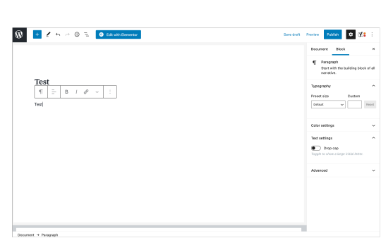
Adding Hyperlinks with Wordpress Editor
Creating a hyperlink with the Wordpress-specific editor is fairly straight-forward. From the text editor, a toolbar will appear immediately without prompting. Within the bar itself, several options are presented: change block type/style, alignment, bold, italic and more.
Then, of course, is the hyperlink creator. The symbol for this tool is shown as a single chain link (more specifically, a dash closed in by two c-shaped pieces).
By pressing this Hyperlink Creator, you will be prompted with an empty text box with the placeholder — ‘Search or type url’.
Here you may either search your preexisting urls (inside your Wordpress page) or proceed to type a certain address for insertion.
In addition to the text box, options for link behavior will present. Here you can opt to open the url in a new tab, force search engines to ignore the link entirely and/or choose a ’sponsored or advert’ designation for your hyperlink.
Adding a Hyperlink with Elementor
Using Elementor to create hyperlinks is also fairly simple, with some alternate functionality. That said, depending on which version update used, some options and presentation may differ.
The hyperlink tool will appear either inline text boxes or in a dedicated portion of the lefthand sidebar. These distinctions will rely on the type of element being manipulated.
Like the Wordpress Editor, an empty text box will lay waiting for your hyperlink. In Elementor, however, you may see several different placeholders: https://your-link.com, Paste URL or type or Paste URL or type to search. The first of these three placeholders will appear for images, the second for captions and the third for inline text boxes.
Unique to Elementor, are some extra options for customization. These can include two checkboxes for opening in new window, add nofollow or custom attributes to add more functionality or behavior (such as sponsored status or downloadable PDFs.)
Caution: some hyperlink creators will show a firm (rather than a faded) hashtag behind as a placeholder. The issue with this type of formatting is pesky, as you will need first to manually remove the hashtag before inserting your URL or web address. If not removed, the hashtag will remain part of your link and disallow the user to navigate properly to the given site.
Conclusion
No matter which route used to place hyperlinks, Wordpress makes it all pretty easy. In no time, you will be able to provide direction to your individual pages without headache.
That said, if you come across any outstanding issues, the wordpress.org support forum is extremely helpful in solving bugs via a tight-knit community.
0 notes
Photo

Gimp Wallpaper. Custom with a rendered bi-color image. See Guide for Instruction: resetpermalik.tumblr.com #design #diy #customwallpaper #gimp #gimpphotoeditor #buildingblocks https://www.instagram.com/p/CG5dWBjHwrk/?igshid=1jjk5vyr61kqc
0 notes
Photo

Gimp: Making a Wallpaper
Finished product followed by a mid-project image.
0 notes
Text
Gimp: Making a Wallpaper
Introductory Bits:
In the midst of opening this very (Tumblr) account -- the one from which I am posting -- I found myself in need of an image (for my profile) to place behind my face.
A wallpaper of sorts. I needed something less than complex, quick and also new/educational.
Putting together a quick background-style image with Gimp was the move.
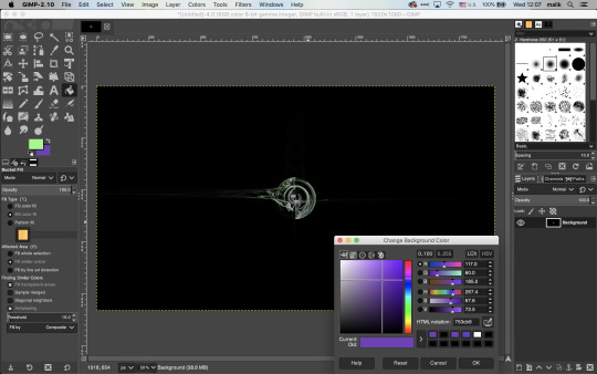
Step One: Open Gimp
(If you are not aware, Gimp is a free image editing software. If you do not have Gimp, you will need to download it. Then, try the first step again.) :)
Gimp has been opened. Now, click ‘File’ in the top-left of the screen and then click ‘New’.
Step Two: Open a New Project
The ‘Create A New Image’ box will appear.
Here you will place your expected dimensions (in width and height) for your finished product (along with your preferred units of measurement). I chose 1920x1080 px (width x height in pixels).
After clicking ‘OK’, you will see your new blank canvas or art board before you, center-screen (between the rulers.) Exciting!
Step Three: Apply a Background Color
After deciding on a background color for your wallpaper image, you may then select it by clicking the background option from the ‘Foreground/Background’ tools on the left of the screen (the icon is two overlapping rectangles).
Once the ‘Change Background Color’ box appears, you may choose from many tools to select the right color for you. These include: the Gimp color selector, CYMK, Watercolor, Wheel and Palette.
[Some more-in-depth options: Variation of color value -- either 0-100 or 0-255, LCh (Lightness, Chroma and Hue), HSV (Hue, Saturation and Value), RGB (Red, Green and Blue) controls, HTML code specification, color history and comparing swatches which indicate your current/old color preferences.]
I used black as my background color.
When you choose your background color, you will see your new color next to the ‘Current:’ indicator -- about mid-screen. Then click ok to complete the selection process.
Now, onto actually painting your background. For this task, find and click the paint bucket in the toolbox on the left. With the paint option enabled, click your art board to successfully recolor your image background. Half-way there!
Step Four: Choose Colors for your Image (to-be-rendered)
For the next step, we need to go back to the ‘Foreground/Background’ tools and decide on which colors we want to appear as our image. After making this choice, follow the previous steps to choose new ‘Foreground’ and ‘Background’ colors.
...
With a freshly painted background, we can now render our image to place over it.
With two new colors chosen, my ‘Foreground’ will produce a green with light saturation and my ‘Background’ will be a darker purple.
Onward!
Step Five: Render an Image
The last step is pretty straightforward. Head to the ‘Filters’ tab at the top of your screen. Click it and find the ‘Render’ tab. Then click ‘Fractals’ and then ‘Flame’.
The ‘Flame’ box will open and we’re almost home...
Ensure that ‘Custom Gradient’ is selected from the ‘Colormap:’ drop-down-box. This establishes your rendering as your pre-selected ‘Foreground/Background’ colors. Then click ‘Edit’ at the top of the box.
The ‘Edit Flame’ box will provide you with some-thirty types of mathematical renderings which will produce your overlaid image. Each variation will be unique, with adjustment for speed as well.
My image was a ‘disc’ variation at the default speed.
Clicking ‘OK’ will place your rendering over your previously selected background color.
Step Six: Save and Finish
You are now free to save your newly created image as a .xcf (gimp-native) file or export it as another file format of your choice.
I hope this helped you in creating a new, unique and free wallpaper for your purposes. Maybe you understand a little better how to operate with Gimp. And hopefully, you’re that much further in successfully completing your project.
Best of Luck,
Malik
0 notes