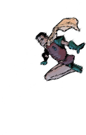
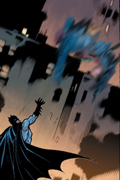
#i also just liked the lineart of this one but note to self shading is the devil
Photo
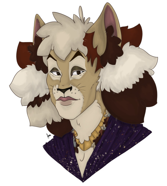

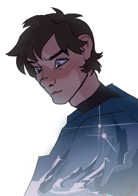
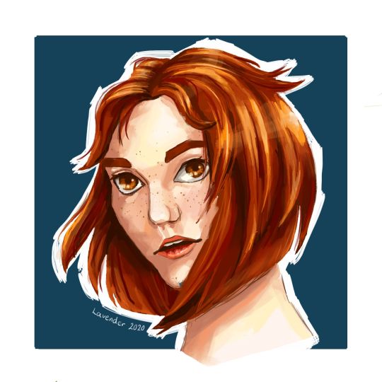
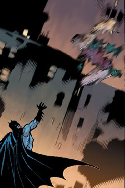
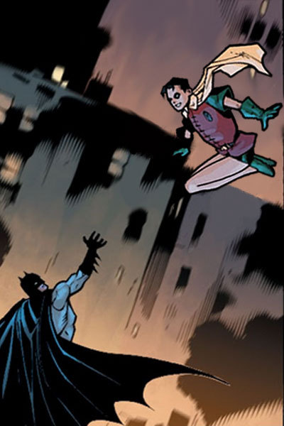
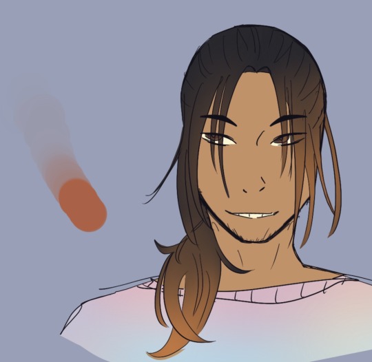
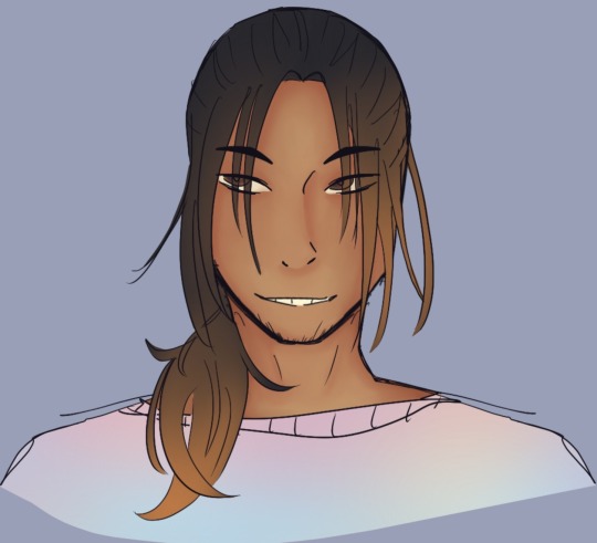
Finally, after far too long, the Third OC request for @theimpossiblescheme’s OC Andromeda! I’m sorry it took me so long, Amie!
And because I’m me, a second picture featuring her and the theatre’s biggest critic, her eldest son Asparagus <3
#i tried to make her look mostly like jelly but with touches of asparagus in there#also i think andromeda deserves a shawl because she's special <3#CATS OC#Asparagus#fanart#my art#the first is more andromea a little older before she passed and the second is her a little younger with maybe asparagus around five-ish?#i also just liked the lineart of this one but note to self shading is the devil#i hate it and i make it too hard#and then i get lazy XP#i like to think andromeda would watch and think certain things and asparagus would think those same things and then say them outloud#and when she tells him to mind his manners he just innocently would say 'but that's what you said'#again i am so sorry this took so long amie - but i am going to make it up to you i promise ;)
20 notes
·
View notes
Text
An open love letter to the entire Faith the unholy trinity fandom off sorts. I present to you.....
John in the style of 9 different artist!

(Keep in mind this is a style study. And although the whole thing was drawn by me, please please PLEASE check out the artists whose style I tried out. Thank you!)
This was SUCH a fun experience! I honestly love our fandom, and I adore how unique everyone's style and perception of John is. Says a lot about society or smth.
And even though I probably didn't do justice to all the art styles, I really hope they are recognizable.
Also, you might've noticed an empty spot in the end. Well, it's for you! Naturally, I wasn't able to include every artist, but I hope you will be interested in taking a spin at this yourself. Thank you and good luck!!!
A closer look, links and notes under the cut

@trashprinceward
I adore how soft this version of John looks, he seems so trustworthy and kind, gah. The shading style is surprisingly difficult, but I hope I managed to pull it off:) I also adore Prince's AUs hehehe
@rokiro99
A very unique colouring style!! I've seen a few versions of how this artist draws John, but decided to stop on this one. His face is so adorableeeee. I also LOVE the use of liturgical clothing and themes!!

@karamielo
Eeeeep I love how they use colours in their works and how well they use composition??? Like omg. Such such pretty works, I hope they create even more art
@justcommander
I lovvve how game-adjacent this artist's style is. I also love the way they (I'm so sorry, I'm not sure about the pronouns) draw hands and use body language. Also, the father and children AU??? Muah.

@shu-bullshit
I'm not even pretending I managed to pull this one off, I bit so much more than I could chew. But I couldn't not try, I almost every time I see their use of coloured pencils and watercolours, I just can't. Love love love

@zzoupz
So. As far as I can tell, Zoup doesn't use this style TOO often, but it wasn't leaving my head, I had to try. The artist did so much for the fandom, the Gary ask blog is such a treat. Yum
@genesissaturna
Hee hee he's so shapes. The legs. Beautiful. I wasn't sure about the colouring style since I only saw lineart done by this artist, so I decided to use the in-game ones. I hope they do more art, it's so unique and makes me happy!:)

@hammy-art
Wet cat John. Silly. A little pathetic, but in a nice way. I feel like I didn't make the lineart the way he does, it is usually more gentle, but I still hope it will suffice. Also my God he does amazing backgrounds, which I sadly can't portray here. (A personal thank you for giving me the courage for doing self-inserts)
Annnd that's it! I thank you for everything and I hope this whole thing will somehow inspire you. Keep doing art, let the world see your vision! Also go draw a pathetic blue priest /j
#i really should've asked for permission#but i really wanted it to be a surprise#i love you alllllll#faith the unholy trinity#john ward#clerk art#faith the game#ftut#faith#trashprinceward#rokiro99#karamielo#justcommander#shu-bullshit#zzoupz#genesissaturna#hammy-art
157 notes
·
View notes
Text
Doubt
AO3 / Commissions / Links /
Ryan Gosling!Ken x Gender neural reader
Warnings: fluff, angst, emotional hurt/comfort, feeling excluded, sobbing, not beta read
Summary: you always loved Ken, his silly, all so excited personality, wondering over every tiny thing. But recently you noticed something strange. He started to get nervous, fidgety and sad (?) around you.
a/n: lineart is mine🧡 / It was inspired by this quote from Sense and Sensibility-- “Do not let the behavior of others destroy your inner peace. “
tags my beloveds: @ken-dom (let me know if you would like to be tagged:) )
It’s impossible to describe,
How much you adored this Sunshine,
He is the sneaky little Smile,
That bless your face,
During the cold and boring weekdays.
He is loud, jumpy and silly,
Excitement and wonder are part of his personality,
There is not a single day,
That goes without him discovering everyday things,
However he does it with such delight,
It bewitches your heart every time.
Yet recently,
You noticed something unnerving,
His whole demeanor changed,
Self-forgetting disappeared,
And anxious guarded took it’s place,
He become reserved and fidgety,
Not in the way you loved him to be,
His beautiful eyes became glossy,
And sadness was clouding their vision.
You didn’t understand,
What caused this distress,
So one day in Baribeland,
After a 3 days long suspense,
You decided to put an end,
To this gloominess,
“Ken, what’s been going on?”
“B-been going on?— n-noting! Haha..”
“Ken.. “
— you sighed,
While looking at him,
Questions in your eyes.
It was a dreamy day in Barbieland,
Just like every other beforehand,
The sun was throwing his warmth,
The mermaids were singing to its charm,
The beach was hot and comfy,
Kens and Barbies were playing gleely,
Alan was standing alone and cheering,
Even Weird Barbie was joining,
There was nothing out of the ordinary,
So what caused his misery?
You two were sitting under a palm tree,
Away from the loud team.
You glanced at him again,
He looked nervous and uncertain,
He was staring at the other Kens,
With eyes filled with fear and tears.
Yes, you had no idea what's happened,
But how would you?
He hid this knowledge deep,
Sealed with secrecy,
Sooner or later you will see it too,
And you will realise,
How pathetic I am compared to the others,
He thought,
Rocking back and forth.
It was an other perfect morning,
As he was ‘beaching’ on the beach,
Looking perfect and sun-kissed,
While he was drawing something for you,
Lost in concentration,
To make it perfect for you.
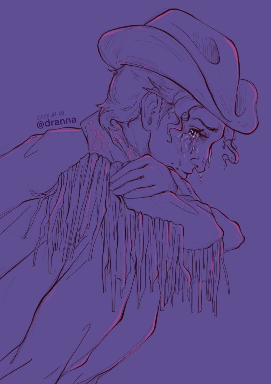
He was a cowboy today,
Wearing his black jacket and pink scarf,
Decorated with the most magnificent hat,
And a rope lasso at the belt.
“I have no idea what They see in Him!
He is such a loser at everything”
— Ken heard the voice of his ‘archenemy’,
The Other Ken,
While he was sunbathing.
He was surrounded with other Kens,
Listening to him intensely,
“What do you mean?”
“Haven’t you noticed?!
It doesn’t matter what he tries,
He fails miserably every time.
Also,
Y/N is so beautiful and confident,
Lovely and intelligent,
I have no idea what they see,
In such a loser as him.
He is always jumping around,
Being the loudest—“
“It’s not nice to talk about someone,
Behind their backs like that!”
“Yes, you shouldn’t say such meannes!”
— Joined the others,
So this conversation lines ceased,
But Ken froze in place,
Only heard the Other Ken’s words.
He gazed down the drawing,
He was working on,
So endlessly and proudly before,
But the warmth escaped from his heart,
Leaving icy marks.
“ … Ken ? Ken??”
— Your worried voice pulled him back,
Into the sunny present,
You two were still sitting under the shade,
Covered by anxious silence.
“Ken, please talk to me.”
He looked at you with huge tear filled eyes,
Streams flowing down both sides,
“I-I’m n-nothing-g.”
— His voice was so quiet and broken,
If you didn’t see him in front of you on the sand,
You wouldn’t believe it was him.
“What is it about?
What do you mean?!”
“I-I’m a loser aren’t I?!
I’m a failure in every task,
I’m always the one in the back,
Who the others laughing at,
Doesn’t matter what I try,
I’m just never enough—..
S-so I understand,
If you decide,
I-if yo-u w-want to leave me b-beh-inde.”
“How can you say that,
It’s not true!
I don’t understand where it is coming from?”
“Yes it is!”
—At this point he was sobbing hard,
An ocean forming in his eyes,
Hugging his knees to tight,
His hands went white,
You couldn’t bare to see him like that,
So you gently touched,
His shaking shoulders,
“Who told you these things love?
“H-hear-d it from t-the O-other Ken.”
— At the word ‘love’,
His head shot up,
Silent pleading in those blue eyes.
“You.. you still want..us to be,
Boyfriend and girlfriend..?”
“Of course I do!”
“B-but..”
“I love you silly!”
— With these words,
You pulled him close,
Holding his shaking form.
“Whatever you heard it's not true,
I adore you,
I love your enthusiasm, your awe,
Your never ending shiny self,
Your astonishment of tiny things,
And the babbling facts coming from within,
I love you the way you are,
Please never change,
And question my heart."
– Taking off his hat you held his face,
Hinting it with kisses,
Which bloomed in teras,
“And what if you fail?
Do you know what's more important?”
“What?”
–Suffocating pain was replaced,
With soft tenderness,
In his voice.
He looked at you,
Like you hanged the Moon on that perfect sky,
Admiring you beauty in the dark,
“You stand up,
Holding your head high,
Smiling to the sky,
It doesn't break your spirit,
In fact,
You try again!
– You placed a kiss on his forehead,
“And again”
– Now a smooch on his pretty nose,
“And again.”
– And kisses on his cheeks,
Which were now burning red.
You two sat there,
In your quiet spot,
Holding each other close.
The sun started to set,
Yet you stayed,
Whispering sweet truths in his ear,
His sobs started to stop then disappear,
Leaving behind dried up rivers,
Which you pet better.
Doting started to bloom,
In his plastic heart,
With a newfound passion and warmth.
He shuffled closer,
If that's possible,
Gently hugging you more,
“I was making something for you,
When I heard them speak..”
– You heard them whisper quietly,
You looked down to see worry rising,
So with a gentle tap,
You encouraged him to continue.
After a little shuffling and careful moves,
He took out a paper from his clothes,
Then gently placed it in your palm,
Nervously waiting for your reply.
You glanced down to see,
A drawing of a happy horsie,
It looked like a child drawing,
But you can't help but smile,
At the thought of him drawing this.
“I like it so much!
I–”
“Really?!”
–Instead of a reply,
You just pulled him close,
Praising every tiny detail of it.
The glow worms' light were in sync,
With the music of yours heartstrings,
From Ken’s mind,
Disappeared everything blue,
His chest was filled with comfort and heat,
With the lovely words,
From your pretty lips,
The night dragged on,
But your pair didn't mind,
Your soul were set in a feeling so sublime.
.
Probably his drawing would look something like that:

#barbie art#barbie fanart#barbie 2023#ken x y/n#ken x you#ken x reader#ken fic#ken fluff#ken fanart#ken barbie#ken art#ryan gosling ken#ryan gosling ken x reader#ryan gosling#ryan gosling fanart#ryan gosling fanfic#barbie fic#poem#poem fic#poems on tumblr
77 notes
·
View notes
Text
Found my old art hehe, thought it might be fun to do a little retrospective.
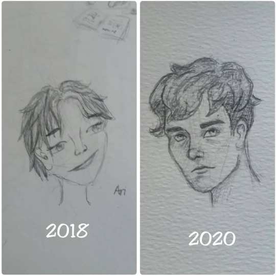
2018-2023 pencil drawings :P
Retrospective: the first two really aren't a fair comparison. The first one I was going for a cartoon style, the second one I got scared and fell back on realism because I thought realism was "better" (and still couldn't stylise for shit).
For some fairer comparisons... (long, extremely self-indulgent post that's mostly just art you've already seen below)
^ same character, attempting stylisation in both. 2020-2022
or this:
bird photo studies, 2021-2023, worth noting that the second one was done in way less time and on a new tablet. Also in the notes app.

Or here's a good one! Comfort bird art (well, griffin). 2021-today. Think I actually used the same lineart brush.


Even this is a pretty fair comparison, I think - similar style in mind, similar time input. (2020-2021-2023). Also all photo studies to an extent (final one was based on a pic I took of my own arms).
Interesting to look back on my high-effort pieces... you can see exactly where I went in for harsh geometric shading (2021) and how I got looser with it and started exaggerating colours. Hit a peak w/ the John art where I was like "whoa, may have gone too far" lmao.
I'm proud of where I've come, it's got much easier to be stylised and expressive in a way that looks natural (I hope), and that's something I've been aiming for since long before 2018.
Final piece that's not a comparison, just something old I'm still proud of :]
#art progress#art improvement#if I do say so myself#these are the more tolerable picks... I've DEFINITELY improved from the bottom-of-the-barrel failpieces#vibes art#'what did you do in 2022?' the international baccalaureate diploma programme
7 notes
·
View notes
Note
do you have a guide to making your animated comic edits?
i don't, actually! in part because i'm relatively new to these parts and no one has asked for one, and in part because every gif i do is kind of a unique little adventure into teaching myself a new skill, so there isn't just one approach. but! i'm delighted that you want to know! so i'll try and walk you through a couple of them.
we'll start with this guy, because he's a favorite of mine and showcases a lot of the steps that i usually have to do:

tools you'll need: photoshop CS6; digital versions of the comics you'd like to edit.
(i assume you can use any version of photoshop or any editor capable of creating gifs, but CS6 is my preference. photopea is a fantastic free alternative, but figuring out timing and transitions is a lot harder there and requires more effort.)
step one: find your panels and elements
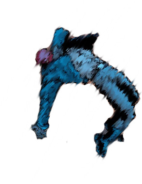
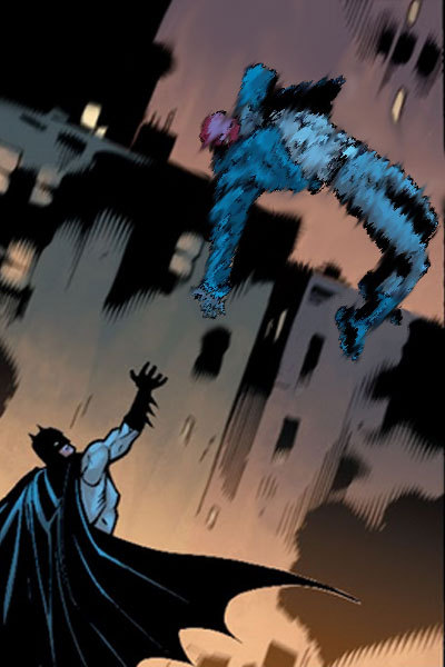
it's worth noting here that i cannot - and i mean this - cannot draw. at all. a lot of my life would be easier if i could, but here we stand. as such, nearly every element of these gifs is pulled from the comics themselves.
for this particular gif, which is admittedly on the simpler side, i needed two things: the initial panel, of jason leaping into the air, and a still image of jason as robin. preferably from the same run with the same artist, because that way, the art matches. i found these:

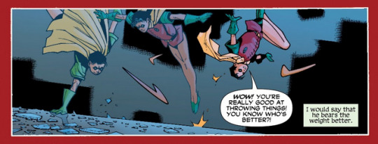
and that's all i needed for this one. sometimes i need to pull several panels for the vibe i want, or for specific things -- leaves to drift through the frame, magical elements, text and sound effects, speech bubbles, etc -- but adding those in follows pretty much the same processes either way.
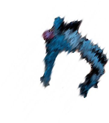
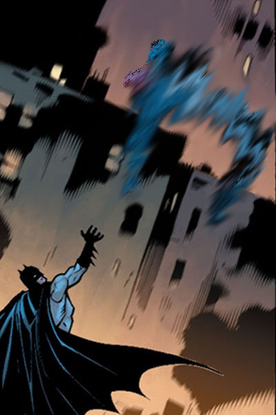
step two: prep them!
easier said than done, really. what i needed to do here was make myself a blank canvas around the elements that i would be messing with. this varies from project to project, but for this one, it goes as follows: remove the narration box and jason from the first panel; create an isolated version of jason that can be pasted back in; create an isolated version of robin that can be pasted in the same place at a similar angle.
this is a lengthy process, because i work off my laptop and have a touchpad and no artistic skills. here, it requires drawing in a lot of building and making a successfully blurry, ombre sky. and, because robin!jason's toes are cut off, i have to draw those in and try to match the shading.
(there's also some work here with color balance and photo filters to match coloration; i had to add some highlighting and change the colors on robin!jason a bit to match the background lighting of the overall image, but not by much. sometimes, this step is more involved.)
after some fiddling, i usually end up with things i'm happy with. for this gif, those are as follows:


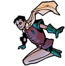
(this is done through the blur tool, the magic wand selection tool, refining the edges of a selection, or -- in many cases, because comic lineart is my enemy - erasing every pixel of the background or character by hand. yes, there are easier ways to do this, but i like my time-consuming methodologies. they're soothing to me.)
and now we're ready for the fun parts.
part three: assembly!
so we take that background we just made and we paste hood!jason back on it on a new layer. silly that we have to, but yknow. it's fine. he's in there. and now the goal is to find a way to successfully transition from hood!jason to robin!jason in a way that's satisfactory.
i follow a lot of standard gifmaking practices, i feel like? but i'm also self-taught, so i actually don't know how true that is. i create a timeline in photoshop and set it to have a delay of about 0.2 seconds to start with, just to see how the transitions go. i usually start with 10 frames, and then add or remove depending on what seems right.
(the variations here can be broad, by the way. i have a green arrow gif with 140 frames with no delay and a wonder woman gif with six frames on a one-second delay, for example, but those are for another time. starting with 0.2 seconds' delay across 10 frames is just a comfortable starting place for me, is my point.)
this is what the timeline looks like for this project:
(it's that bar at the bottom. you can see the settings and all that as they appear in the final product: 0.1 second delay over 12 frames, so not too far off from my default. nice.)
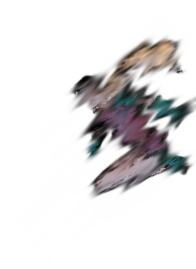
operating within that 10-12 frame range, i mess around with photo filters and the blur tool to both make hood!jason disappear and make robin!jason appear. this involved a heavy use of the "accented strokes" setting in the filter gallery and smudging and blurring until they looked how i wanted them to, which is to say, rather silly.
here's red hood vanishing:


and here's robin appearing:

there are a few additional versions of these, but i think you get the idea. these are all the bits and bobs, and i just have to lay them out in the timeline in order to get the transition as i'd like it to be.
so i start with jason as hood, and then i move through the timeline and click and unclick the little eye to view them. this is also a heavy process; this gif has about twenty layers, and i'm revealing/hiding each one individually. that is actually not as bad as it could be; one of the poison ivy gifs i've published has about 600 layers that i did that with, and i have a green arrow gif with about 800 layers and 70 frames that i didn't even end up publishing because i wasn't happy with it. c'est la vie.
the end product should look something like this:


which, when played at 0.1 second delay and looped, looks like this:
part four: in conclusion...
i recognize this "guide" is messy and skips over quite a bit, but that's because every gif really is its own beast. i am very familiar with trial and error, and with trashing things that don't end up working out. each gifset takes me about 10-12 hours, depending on complexity, without even counting the time to track down panels or read the comics themselves.
if you want to start with something simple, i suggest animating text bubbles. all you have to do for those is erase them from the background and then drop them back in over the top for about 0.5 or 01 seconds apiece for readability. this gif of mia, for example, was just isolating her from her background, creating a new background from a different panel, and then flipping the text on and off. it's got five frames on a 0.5-second delay.
basically... fuck around and find out. a lot. once you know how the gif timeline works and how to hide/reveal layers, the world is your oyster, because that's all this is.
again, i know this is messy and all over the place, but i hope it helps! have a little fun with it, and don't be afraid to mess up. it's fun either way. <3
#tbanimations#how to#ask.tb#elioherondale#i am always down to talk about how these got made so if there's a more specific one you had in mind...#feel free to ask about it#i am an open book i like discussing the things i make
9 notes
·
View notes
Text
I've been super quiet here on Tumblr and to just reassure whoever reads this I am fine and actually very good.
To sum up what I've been up to is this:
I have just been falling very, very, VERY deep into the Vtuber hole for a long time now and I just finished watching the new outfit reveals for Luxiem and I just have to get all my fangirl excitement out of my system for a bit lol.
I've been following Ninisanji JP/EN, some Vshojo, Indie Vtubers, and starting to look at some Hololivers- I'm just, REALLY into the community and all the Vtubers themselves are just so amazing all in their own unique ways, they are very fun to watch and interact with and they are also very inspiring.
I do miss interacting more on Tumblr again bc I've made and met so many wonderful people and friends on here and I wish to interact with them again bc I really miss them and tbh I feel bad bc I feel like I've been kinda neglectful.
Also, another thing, I have been trying to improve my drawing skills. I've been getting into the habit of using way bigger canvas sizes, playing with brush settings for lineart, and ESPECIALLY looking up/experimenting on different coloring and shading techniques to further improve my art. I am getting the drive to improve and evolve my style to however far I can take it to feel more and more satisfied with the end results- to a point where I can finish a piece and look at it and say "I'm proud of this."
BECAUSE of this, though, I have been thinking of cutting back on what drawings I'd wanna post here on Tumblr. I am still down with drawing some fanart and self ship art here and there from time to time, but I am also wanting to sort of rebrand myself on other platforms so any bigger works, like full on illustrations and such I will only post on my new brand platform elsewhere.
On one last note- specifically on this rebranding I mentioned, I will be going to change my username later on at some point to kinda separate so I can signy works with my new brand name instead and not my username here anymore. Idk when exactly bc I am still thinking of what to change it to, but worry not to whoever has already known me I will still keep my bio the exact same so you can still just call me by my nickname! (If anything I'll just change the username to probably something simple)
Anyways, I'm not gonna be gone for too long now, after I work out some final things I will be back to being more active here on Tumblr while working on all my new stuff on other places.
See y'all soon! ❤️
#i speak#vtubers#my thoughts#This is hole I can honestly say I couldn't have been happier to have fallen into#I am literally having the best time of my life watching all these guys and I don't wanna stop anytime soon#I've been having these ideas and inspiration for a while now too#so doing these changes feels so great for me#like I'm finally having something to drive to#to fullfill just for myself bc it's what I really want to accomplish#I'm excited but also a tad nervous as I hope I can reach my goals#but I don't plan on leaving this site anytime soon#if at all#I do genuinely love it here#and all the wonderful people I'veet and befriended
5 notes
·
View notes
Note
How do you do your shading/lighting? It's really pretty!
First: I lay out my flat colors!

Second: I choose what the shadows will be! I lean towards the red-orange shades, never choose straight black or grays for shadows on anything! (Unless your drawing is just black in white).
Third: The brush I use is called “Hard Brush” Under the Airbrush section on procreate! Even if you don’t have procreate, many programs have brushes that allow the same pen pressure and effect! As shown below, the more pressure I put the darker the color will be. If for some reason your program can’t do that then lowering the opacity of your brush can also have the same effect!
Fourth: I begin to put in the shadows where I think they’ll be, the fun part is I have no idea where the shadows will go. This is just for funzies~ But if you want to be accurate, look at references and mark where your light source(s) will be before adding shadows and/or lighting!
(don’t mind the middle image I used the selection tool which is why it has those line eUgH)
Fifth: I begin to blend everything using the smudge tool! If you do not have a smudge tool then an airbrush could work as well! It will just take a while longer <:3
Sixth: After smudging, it should look like this! Well that is if you want to shade like me, the ending product is whatever you feel happy with! <3

Lighting Time! Okay First: Pick the original skin tone, and choose a lighter color of it as shown here!

Second: Do exactly like with the shadows and add it wherever you want! I added it on the forehead, nose, above the lips and in the chin! Mainly because those areas tend to stick out more from the face so they’re out of the shadows. You may not see a difference at first from all the mixing and smudging but turn the layer on and off and you’ll see there is definitely a difference!
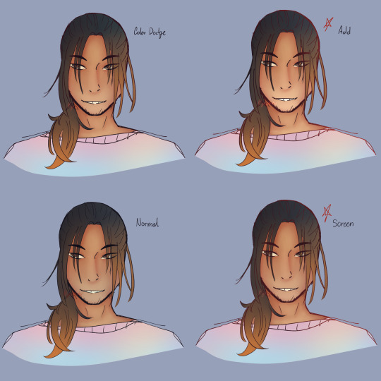
Final step: Merge all the colored layers together and use the airbrush tool to add a bit of spice to the drawing. I normally do this when the character/object is outside or not in a dark room. Since the characters face and hair has a lot of warm colors I’ll add a contrast like blue (cool colors) to make it pop more!
I’ve added my favorite modes to use; Color Dodge, Add, and Screen! I use them for lighting or special effects. I added the normal as well for you guys to see the difference. My personal favorites are Add and Screen, they show more.
Now the final step for everything is the lineart! Add another layer and set it to clipping mask, use the airbrush tool and with whatever mode you want and whatever color you want (I personally love red) just go crazy and airbrush areas you think would make the drawing pop more!~ These last steps are my favorite part Hehe </3
Important Notes:
- When coloring make sure to divide the areas in different layers!! So example: Have skin color on one layer, hair color on a separate layer, clothing color on another layer, etc. It makes it easier for your future self to shade each area without having it all be on one layer and you struggling to only render the face and hair without it smudging the base colors!
- Never be afraid to shade darker or add a more lighter color!! In fact never be afraid when coloring or drawing (digitally that is) you could always just double tap the problem away if you don’t like it! Always experiment and remember it’s all about trusting the process and being patient!
- If you want more contrast on colors, normally, I follow the warm and cool color rule. Like I mentioned before; Red, Orange and Yellow are warm colors while Blue, Purple and Green are cool colors. So if you were to have a painting/drawing with a lot of warm colors add some cool colors as lighting or as background elements! It goes both ways.
- If this is your first time rendering in this style, then please know that it may not come out exactly right the first time. It took me a lot of practice with this style to get it right, I’m still learning and adapting new things! Be patient with yourself and keep practicing! You got this✨
#phew!#3:55 AM#worth it#i wish I had this when I first started learning#it’d make my life easier#if there is still something here you don’t understand#be it the modes or maybe a step you need more clarification on then PLEASE let me know!!#tutorials are so much fun hehe-#Also this is the ‘prototype’ for the human version of Honey Comb#lmao how does he look?#is he dilf enough-#man looking finer than a mother fucker#tutorials#gess box of cookies#honey comb#gess box of arts
11 notes
·
View notes
Text


Ahoy, Me Hearties! Welcome to Harlowe Hearse's "Cove-tober," art challenge! Proceed only if ye dare.
This is just a fun art challenge I've had in mind for a while, and wanted to throw out there for the Candle Cove community to join in on during the spooky month of October if they please!
Rules:
If you're familiar with the popular yearly art challenge "Ink-tober," it'll be a lot like that. For every day of the October month there will be a prompt, and based on it you can make a piece of art.
However, unlike Ink-tober, you're free to make any type of art of your choosing, whether it be drawing, sculpting, writing, etc! Absolutely anything as long as it uses the initial prompt as inspo.
The only thing I ask is if you post your pieces, you tag them with "covetober." This is just to make them easier to find and see.
If your piece does include:
NSFW, Heavy Gore, or any topics that you think may be triggering for anyone at all or that minors shouldn't see
Please put it under a "read more link" (click the squiggly icon that is next to the "add link" option in the set of icons that pop up when editing posts) so as to keep this a safe and fun experience for!
The Art Prompts:
Static
Bravery Cave
Favorite Crew
Abyssian
Captain
You Have To Go Inside
High Tides
Siren
Horrible
To Grind Your Skin
Wimp!
Childhood
Favorite Pirate
Laughingstock
Screams
Shipwrecked
Cutlass Islands
Nightmare
Come, Come, RIP
Calliope Music
Favorite Villain
An AU (if you don’t have one, free day!)
Tartar
Birthday Present
Marionettes
A Crossover
Favorite Background Character
Porcelain
Lost
An OC (if you don’t have one, free day!)
Free day!
Prizes:
Ohhhhh yeah. There's some loot involved!
At the end of the month when the challenge is finished, the ten posts with the most notes will be put in a public poll where people can go and vote for their favorite 3 (I trust given the chance people will have the decency to not vote for their own posts. We're pirates, not jerks people).
The prize for the three winners: I'll be taking character(s) illustration requests:
1st Place Winner: Will receive a full color + shaded illustration.
2nd Place Winner: Will receive full lineart.
3rd Place Winner: Will receive a cleaned up sketch.
I won't be giving notes to any posts for the challenge until it's all over just to keep things fair. I might also post some of my own art for some of the prompts throughout the month, but for obvious reasons they won't be a part of the challenge or considered for the poll.
If your posts include NSFW or any of the other elements listed earlier as cause for using the "read more" link, they will not be considered for the poll.
Request Rules:
I'll only draw at most 2 characters per request
The requested characters must either be candle cove related, or oc's/ self inserts.
You can make specifications about the request (what the character(s) are wearing, what they're doing, a specific color palette, a specific version of the character, etc.) as long as it isn't tooooo complex.
I won't be drawing any NSFW, SUPER heavy gore, fetish art, or anything I end up being uncomfortable with
The Cove-tober Art Challenge will begin on October 1st! May you have fair winds and following seas me maties!
(September 16, 2022)
4 notes
·
View notes
Text
Notes to self in terms of art practice. (Reposted from NewGrounds)
Don't delete old drawings and scribbles.
Use reference.
Sometimes use your arm when your wrist isn't enough in some areas.
Depending on character color palletes, make the lineart/sketches at first have an "outlier" color (Example: When drawing Bonka, i used some green sketchy lines underneath because it's not a color part of her main design).
When i can't use real numbers or better measurements for characters, might as well get creative even when measuring stuff by heads isn't enough (Like using some object like a Mario question mark block as reference and use it to measure a full character or head because why not).
Maybe use some transparency for your brush, specially for sketchy lines underneath the character; Nearly every artists does this, digitally and traditionally.
Dynamic brushes in general matter, even if your real life tablet/pen are limited and prevent you to explore Krita's potential in this area.
More scribbles and lines is probably a good thing if it helps me to choose the main lineart or at least add more details
Maybe portray lighting as "tubes" as the same size as an object, along with shading to add dimension and a "back wall" to recieve a shadow or something.
Use shading/lightning in general, even if it's basic, to make drawings less flat.
A good way to add shading is to imagine "prespective" from light: If light cannot see a thing/if it's behind something else, there's a shadow.
A way to add dynamism is to imagine/draw arrows pointing the "direction" of the shapes.
A shading technique i could take from some comics is have black lines tied to line art COMBINED with color value/saturation changing, to include 2 types of shading at once.
If certain characters have BLACK/WHITE as colors in their designs, use specific shades to differentiate from lineart and parts of shading.
In some occasions, remove lines from the main lineart layer, in case certain things look better without lines and are just 2 colors complementing each other.
Rotate the canvas and mainly use a horizontal one.
Try using a bigger canvas and stop worrying about scale or else that's how you end up with drawings too small for their own goods; It's why you had that face/body seperation idea in the first place and your faces look off because they don't have enough space to be "fixed".
Look up tutorials, both video and images, because i realized some Twitter accounts started deleting previous tweets so thank God i saved up some images myself.
Try to nail a balance between pratical and analytical.
Just draw more in general, even for small practice.
Use thinner lines.
When it comes to hair or pipes, maybe i could use thick strokes/lines in a specific layer then trace thinner lives above it.
If you have trouble with curvy lines, maybe go for straight/blocky lines at times.
Speaking of drawing squares/lines before circles/curves, how about drawing 3d shapes like cubes or prisms (hexagonal, heptagonal, octagonal etc) instead of cylinders? Specially if i twist these shapes.
Maybe make the pencil transparent and keep drawing the same shape before it gets more solid.
Close ups too.
Look up what the programs you use can do, can't believe it took me so long to learn about Krita's measurement tool, the freehand selection stuff and the quick clipping group thingy.
Also, mirror/simetry stuff and maybe the multibrush tool.
Use more "construction" methods because "building blocks" are an essential art thing.
Tracing is bad but at least use it to "deconstruct" certain images by drawing shapes over them, just to try and guess how other artists drew certain images; Basically, just to explore an image and not trace it for an actual piece because that's just thievery, will impare actual learning and anyone will catch me for it (In general, maybe go with photos of real objects and people instead of other people's art? I dunno, getting kinda desperate here).
Consider a gravity/mass/weight line and lines of action/movement to make poses less stiff.
Pose thing: Add circles to mark someone's feet for both ankles and toes.
When drawing circles for heads, i could draw a cross and turn it around and then add circles around the cross' lines to inspire prespective/angle stuff (Inspired by Akihito Yoshitomi).
When it comes to head shapes, maybe do the Bruce Timm thing where most males have a flat/linear chin while girls have a pointy one; Meanwhile, smaller/kid characters could be more chibi/anime-like in comparison.
Add more detail and shapes to "models" and anatomy before drawing the character in above layers.
Layer order could be: Lines/basic shapes > volumetric forms > maybe some grid map thing > sketches > colors > shading > main lineart
Maybe use better references like 3D models, i mean i got MakeHuman so better make use of it.
While at it, practice Blender.
Might as well draw as the first thing done when turning on the computer because i've been slacking.
Ask for some help.
Maybe try and setting up smaller goals, so opposites can happen and you end up doing bigger stuff (Because overpromising and ambitious goals can lead to little or nothing, so be better at selecting steps at least)
Maybe a way to do character concept art is to draw a "full body" piece where the face isn't there and then the "full head" with the actual face details.
I guess listening to music helps.
Need traditional drawing too, but i need to buy a sketch book and other assets first.
For the above, i could use a scanner or at least a phone app to digitize traditional drawings,
Maybe open up more to people about your ideas, if you want help in general instead of waiting for a big surprise that may not come.
Might as well lie to people and say "I'm gonna draw this" and make that manipulate me enough that i end up drawing "that" and it's no longer a lie (Something to do with how writing goals and telling them to others affects the probability of it being done or how you communicate the stuff)
"Why do i don't draw as often?"
It can be other reasons besides just lazyness, distraction, procrastiation etc:
I have to put my HUION tablet on top of my keyboard (And sometimes, i borrow it to other people if they need it).
My house was always a mess that my current room was built as a kitchen first.
I live in a small village where the electricity can be out sometimes due to construction outside.
Outside noises like church bells and animals (Ear plugs aren't enough).
My internet can be pretty bad, specially because of the USB thing my PC is connected to.
Most of my internet activities are private and i just don't feel like explaining people some of the things i do.
Speaking of real life, i could also be busy with jobs/work too, since i always expected that for better or worse, i'd have a second job for money reasons.
There's a lot of reasons why i not only want more money but to even move to a better house and place.
I just hope most of my ambitious and goals don't turn out to be regrettable and i become much more less like people who make "relatable artist memes" about how they don't draw and how quirky that is.
Better not let myself caught up by small inconveniences.
Any help about overcoming art blocks is appreciated.
1 note
·
View note
Text
Art Block tips that helped me
I’ve recently experienced art block after 3 or so months of overcoming my last one. Thankfully this block only lasted a few days thanks to some things I’ve observed and noted down from the previous time. So I’m sharing these few tips in hopes that it might help someone get unstuck :D!
First and foremost if you’re tired, sad or anxious don’t be surprised that you can’t make art, go and take care of yourself by treating yourself with kindness and patience, the sketchbooks and canvases will wait for you :)
The tips are under here:
Separate art studies from the creative time: When you do art studies you’re there to focus on specific things, learn and understand how things work so you can apply them later in your art. Studies take a lot of energy and focus and are the opposite of the creative "flow” of making your own pieces. If you combine the two the results are either unfocused studies or stiff drawings. When you sit down at your desk ask yourself “Do I want to learn something new or do I want to create something of my own?”
When you have an idea don’t be afraid of being messy: Let’s say you want to make a picture of several cats kolo dancing in the moonlight. How do you go about doing this? Well since you came up with the idea you already have a vague image in your mind, sketch it out with simple shapes, stick figures, circle and spheres etc Don’t worry about cat anatomy, or the dancer’s moves, sketch out the essence of it. This method removes the need to be perfect or accurate.
Ok after the messy sketch then what? Well now that you have sketched out the essence of your idea (and hopefully had fun doing so) now you go on to look for references! You put the creative process on pause and you can do a few brief studies if you need to: anatomy, color schemes, values, poses. Pick out a few of your favorites but don't obsess over them, they are a guide, a tool.
You know much more than you think. You’ve probably been drawing for a few years now. You’ve probably done some studies and drawn more than one type of subject. Then you have already internalized some of that information. I used to be obsessed with capturing the minute detail of the subject, and not be able to draw ANYTHING without reference. Instead of a useful tool, references became another obstacle to my creativity. That’s perfectionism my friend, and that’s no good. Here is an exercise a good friend of mine offered: Draw a few characters, animals and objects from imagination. Make sure that the subjects have no personal value to you (no ocs for example) so that if you make a mistake you won’t feel bad about it. Make the process relaxed and comfortable, pour a nice cup of joe, listen to your favorite music ... You will notice that you do indeed know how to draw some things without reference, and it’ll help with your confidence.
The more you do studies the more you understand This seems evident but the more you understand your subject the freer you can be and the easier it’ll be to draw it from imagination in the future. If you really struggle with something to the point of frustration (as in you can’t get it right even with reference) It means you have to study it. Have a study list, for example: hands, perspective, color theory etc. And one of those days you want to study pick something from the list, and look for videos on youtube or useful sites like line of action etc. Only study one thing at the time. You can go from studying hands to studying arms since they’re more immediately connected, but you can’t study hands and then jump to learning perspective right after. Trust me you can learn perfectly fine with the resources online, and I’m sure you’re clever enough to do it :D
Mistakes don’t mean you “suck” I’ve noticed that the two most common causes for art block are perfectionism and lack of self-confidence. The two can often go in tandem which is worse :’D But let me remind you of something, you can fix your piece along the whole process. Use erasers, lasso tools, liquify , select, paint it all over etc If something looks off to you then you also know deep inside how to fix it. Useful ways to see what clunks: flip canvas horizontally (helps with placement, proportions), turn the image to grayscale (helps to check values and where your eye tends to look), look at your image in thumbnail size and ask yourself if it’s clear, see the pose’s silhouette and ask yourself if you can tell what the character is doing etc. Don’t fret, everything can always be fixed :)
Perfectionism, sometimes it stops you before you begin Perfectionism causes you to overwork a piece, it makes you draw less, it makes art stressful, it brings insecurity. Let’s remove it with a simple exercise. It can be combined with the “draw things from imagination” once you’ve drawn something you like: dont do line art, don’t shade it, keep it as simple and crude as possible and then...post it. Yes, post it. You’re not at your best? You’re only human, this will help you embrace that very human side of you. You make mistakes. So what? The more mistakes you make the more you know what you need to study and the better at art you become. Mistakes are there to show us what we need to learn. See them as another tool and not a sign of failure.
Make the process as enjoyable as possible: You like art. You love drawing. Never forget this. Otherwise why are you drawing if you don’t enjoy it? It’s easy to fall prey to the mentality of those relatable memes that “art= suffering” or “I can’t even draw the other eye”. No no no my friends, these messages are fueling your insecurities instead of overcoming them. Let me tell you what, art is fun. It is. Art is fun, because I decided to make it fun again. And you should decide on that too. Personally I adore lineart but my hand-eye coordination is lacking to do it digitally, so....I just skipped it. Yes. I skipped it. I do the sketch, I clean it up a bit and then jump onto color which I adore. It allowed me to draw more and more freely. When I draw I listen to music, make strokes with the rhythm, I take breaks often and I drink my favorite iced teas. If you don’t like coloring do it in grayscale, if you love lineart then do that etc It doesn’t mean you won’t learn your weak points in the future with studies and practice, but you won’t let your weaknesses prevent you from drawing at all. No no, you won’t let them. You draw because you want to, despite of them.
Don’t wait for inspiration, provoke it Inspiration is not a divine and capricious muse. You make inspiration. It’s easy just collect all the things you like, music, artists, objects, characters, animals, patterns, plants etc Make boards on pinterest or similar sites, combine things you like. You like suits? You like birds? You can draw a bird in a suit, or a bird-inspired suit design, there is frankly a lot of ideas that can spring up from little things like these.
When a project stops being enjoyable either pause it for now or move on to the next thing. Pieces aren’t precious. They’re not “the one time I got x right” they are one of many. This advice goes mainly to hobbyists who can afford the luxury of passing to a new project. I have a WIP of a character who is overly complicated (I enjoy a challenge from time to time) sitting for half a month. I sometimes come back to it and add something... but as soon as it starts to create discomfort and insecurity instead of enjoyment I move onto something else. In the meantime I created 3 or 4 new pieces. If I had waited on finishing that piece I would have been severely creatively and physically exhausted. The art comes from you, not inspiration. The more art you make the better you become.
That’s about it :D I know it’s long but I prefer to be thorough and cover all the possibilities. If you have read of this: Thank you so much I hope this helps you at least a bit, if it helps only 1 other person I’d still be very happy. Have a nice one, and kick art block’s butt!
#art block#art block tips#art block advice#art advice#art help#BloggityDiary#art reference#I hope this will help someone out#This will also help me remember my own advice sksksk
200 notes
·
View notes
Text
First week of Inktober Reflection!
These kinds of challenges are exhausting. It's always good- every sevenish days of the challenge to go through and self review and reflect. I encourage a lot of artists to do this. BuT! Do not use it to only spout negativity. You've done seven days of awesome work!

Day one: your oc. Hazel 🦇🖤
I am really happy with the shading. I am not pleased with the background. I should not have crosshatched because it feels like she gets lost in all the shading. Additionally- if I was to scan this, it be a pain in the fucking ass to colorize. I love the composition- shading is a bit messy.
Day 2: Brujah

Much cleaner lineart!! Still can get sharper with the lines- lost a lot in the hands. Still want to do less crosshatching. Face looks much cleaner. Awesome improvement!

Day 3: Haven
An aggressive reminder to myself that I have a scenic design degree. And this house looks dope. I'm very proud of this one.

Day four: Lasombra
Idk what happened but I'm not happy with this one. The foreshortening is off. The eyes are always a bit crossed. I guess that's what happens when you stare into the abyss. Additionally, my concept kept changing as I drew ...usually I have it fairly concrete when I start. Positives: the movement in the background and directional lineart. V good. I should keep trying to utilize directional linework.

Day 5: sire and childe
I fucking howled with laughter when my partner said "draw Lucia next to the hole she buried Hazel in." I decided to draw just a random sabbat- I think Lucia is supposed to be blonde...whatever. I opened tim Bradstreet's book and learned that he doesn't really crosshatch. He uses shadow blocking- where he draws the shadow shapes and filled them in. So I started with that. And brought in a grey marker to help with the midtones. Just need to make sure I'm watching my light source- the shovel lighting is off. I'm very happy with how this turned out.

Day 6: okay this one was dope. I focused on the directional crosshatching and shadow shapes to create a more unique style. It worked beautifully. I got so many compliments on this one on insta. Additionally I rediscovered my love of freehand lettering. I should do it more.

Day 7: Elysium
Had to break out the watercolors for this one. In Elysium, there's so much going on it's hard to pinpoint on one thing- whether your the storyteller or player. So I wanted this piece to tell a story- and boy does it. I need to make sure I sketch out my perspective lines a little bit cleaner- so when I paint them they are as crisp as the crunch of autumn leaves.
Reflection: pretty happy with how these turn out. I am also using this to make sure I get out of bed and draw first thing in the morning. It helps me focus and get ready to get stuff done.
I want to clean up my lineart a little more and start finding more ref images with harsher lighting. That way I can really use bradstreet's inking techniques without a midtones marker or crosshatching. I think I need to be careful of how heavy my hand gets (a constant note for myself) and work on my foreshortening and perspective drawings some more.
51 notes
·
View notes
Text
Lava’s Art Masterpost
Hey, all! Welcome to my art masterpost! I have no idea if this is a thing that is done typically for art, but oh well, I like organizing things, so here we are! What you’ll find here is mostly Dragon Age, with a few non-DA pieces in there, and there’s a range of styles I like to use, depending on my mood. But a lot of what you’ll see will most likely combine lineart with some other form of coloring/shading.
Feel free to browse at your leisure, and I hope anyone who stumbles upon this enjoys what they find! :D And thank you to anyone who sees this and likes, or reblogs, or even just stops by to peruse a bit!
All that said, away we go!
Digital Portraits:
1. Portrait of Nameless Woman, 2020 - This one is just an experiment with a watercolor brush that I did. It’s not anatomically perfect, but I enjoyed playing around with shading.
2. Sketch of Aja Amell, 2020 - This one is basically sketch practice with my Amell~ Not really the most expressive pictures, but it’s a start toward drawing her more expressively. Full disclosure: Aja is one of those OCs of mine that I have had trouble with deciding on a definitive appearance for several pictures, and I really want to work on upping my level of consistency when drawing her.
3. Long-Haired Fenris, 2020 - Exactly what it sounds like; this was for practice drawing Fenris’s features (I love how distinct they are), but with long hair because I am weak for it. This one was a fun piece to shade, and mixing the stylized lineart that I normally use with a greyscale shading spectrum was really enjoyable.
4. Portrait of Ilorin Lavellan, 2016 - This is an oldie. Basically practicing expressions, and it is technically a WIP, but I’m still very happy with how the shading turned out, especially because this is actually (aside from the unfinished hair) one of the more minimal pieces I’ve done in terms of lineart It’s still there, and it still shapes the flow of the picture in some ways, but it also ends up flowing with the shading instead of standing out next to it, which I like. (Both styles are good, though, and I love seeing other artists try both too.)
5. Old Portrait of Aja Amell, 2016 - Much older picture I did of Aja; she... honestly looks very little like the newer one, I think, and that consistency is something I’m still working on, but this one was the first picture of Aja with that particular hairstyle I drew. What I like about this picture is how young she looks; it fits with her image as a fresh and sheltered Circle mage who’s only about 20 years old at the time of DAO.
6. Old Portrait of Trilyn, 2016 - They very first piece of art I posted to tumblr~ It’s not exactly how I envision Trilyn anymore, but it was still very fun to draw, and helped me get a feel for drawing him in the future.
Dynamic Movement Pictures/”Moment’s in Time”:
1. Tabris in Arl’s Estate, 2020 - TW: blood. I am super proud of this one. My ultimate goal is to draw all of my Warden DAO OCs, and I could not believe I’ve never drawn my Tabris, and so here she is. This was, in large part, practicing expressions because I absolutely love art that depicts characters in motion, or capturing some kind of expression.
2. Velyn in the Rain, 2017 - This one was actually based on some art that I saw in a Teen Wolf fic! It was an experiment with a more expressive style (and one of the first pieces I did without lineart left in the finished version) and it was a huge step out of my comfort zone. But overall, I am extremely happy with how it turned out.
3. Jem Nocking an Arrow, 2016 - And here is the lineart version. This was entirely an excuse to draw my DAI baby, Jem, and to do a cool archer pose because archers are my fav, and I love characters in motion.
4. Solas Teaching Trilyn Fade Magic, 2016 - This one was a painterly picture that was also (like the Velyn picture) something which I tried to keep lineart out of. Overall, I am proud of a lot of parts of the pic, but I think I would definitely go back over it and change a few things now if I had the patience.
5. Trilyn Closeup WIP, 2016 - TW: injury, blood, mention of abuse in the author’s note. A lot of early pictures I have are of my OC, Trilyn, and this is one of my absolute favorites. His entire upper body is technically in the picture, but I hadn’t finished rendering it yet, so this was what I posted. And it was an experiment with a cross-hatching style with the pencil tool for some texture, with air brush shading and a blurring tool. It’s a style I had fun playing around with!
6. Trilyn Blood Ritual, 2016 - TW: blood, injury (the slight cut used to supply the ritual with blood). This one was definitely a sort of “captured moment” from a backstory I gave Trilyn, and I think what I was really going for was an atmospheric piece that could fit with any potential fic I wanted to write for Trilyn. And then it ended up being practice for extreme lighting/shading techniques, and drawing the blood and the gross mass of demon ichor (or whatever the heck that is) turned out to be highlights of making the piece for me.
Art + Text:
1. Freedom and Control, 2020 - TW: scars, but very difficult to see. This one was ambitious for me! It started originally just as Solas and my Tal-Vashoth OC, Saara, facing each other, because I love the dynamic I’ve built for them in my head, but then it turned into an attempt at a tarot-esque background, and just sorta grew from there... Overall, I’m happy with how it turned out, especially with how Solas and Saara themselves turned out. The version you can actually see a larger view is here.
2. Marianna and Delia Codex and Art, Pt. 1, 2020 - I love writing my own codex entries, first off, and I love combining art with text to create a (hopefully) seamless work. This work was an attempt to flesh out these OCs of mine with both art (because unique facial structures are hard for me to get down, but so important regardless) and text (because writing~). I think it turned out well overall, but there are elements of the portraits that I might at some point touch up a bit.
3. Marianna and Delia Codex and Art, Pt. 2, 2020 - Part 2, with what I refer to as a “DAI Outfit Change” because I have always loved seeing fans show their own OCs as they look in DAO, DA2, and then finally DAI. So I absolutely wanted to jump on that bandwagon myself. The skin tones are a little off (and I’m sorry about that!) because I was playing with the watercolor brush at that point, and it dilutes the colors I use. Still working to figure that out, but I was very happy with the overall lineart and structures of the faces.
4. Alistair/Aja Amell Picture with a Blurb, 2017 - Ooooold, old, old, old, OLD! I still love the art, and I’m soooo happy with how the interaction between Alistair and Aja turned out (drawing kisses is extremely difficult for me; I always end up creating a distorted weird lip-creature, instead of realistically puckered lips...). I’m not as happy with the blurb that went with it? At that point, I was still very much figuring out my own DAO worldstate, and the characterization for everyone, so, eh. Take it with a grain of salt!
Unfinished Costume Designs:
1. Ancient Elvhen Armor with Dwarven Influence, 2018 - People who do costume design work are amazing and mystical beings, and I wish I could do what they do. This was an attempt at merging the Keeper robes from DAI with a more dwarven armor aesthetic, solely because I created an ancient elvhen character, Ceda, who was taken in by the Cad’halash dwarves mentioned in the Witch Hunt dlc, and I wanted this character to have a mix of the elven style of armor and the dwarven style. I’m overall decently happy with it, but there’s still that persistent level of self-criticism present.
2. Herald of Andraste Outfit WIP, 2016 - This was a very old picture, not one I showed around a lot, but the idea for this was entirely born of my intense interest in how fashion and outfit designs could be used to create a symbolic image for the Herald of Andraste. In general, I love the combination of ceremonial armor with long and flowing cloth, so that was what I went for here. I’m still actually very proud of how this came out, and headcanon something similar for my Herald in my canon DAI worldstate.
Pencil Sketches:
1. Quick Saara Sketch, 2019 - TW: saarebas mouth scars. Exactly what it says; very quick sketch of Saara I did in a small notebook I carry around with me. This was basically a test for myself to see if I could manage to draw Saara with the features and facial structure I envisioned for her without needing to use a lot of references.
2. Mass Effect Character Sketch; Jesse, 2018 - Similar reason for drawing this one as the above Saara sketch! With these characters, I love sometimes the way they can turn out with the specific character creator used for them, and when I draw them, I enjoy trying to create a definitive look for them using what I get from the CC, and my own knowledge of Hooman Faces.
3. Saara Sketch, 2017 - TW: saarebas mouth scars. A more detailed sketch of Saara than the one above, and one I definitely put more time into overall. It’s currently the profile picture I’m using for ao3, and is the definitive go-to reference picture I use whenever imagining Saara in a fic, or for other Saara pics I make. I am extremely proud of this picture, and feel like I should work in graphite more often. It’s such fun, and the texture is so nice to look at.
4. Sketch of Nameless Alamarri Woman, 2017 - This was a sketch I did of what I envisioned some Alamarri tribes to look like; I used artistic depictions of Gaul tribes and hairstyles for inspiration, and have used this as a go-to reference for my version of Alamarri tribes. Nothing super notable about this one, but I really liked the way the shape of her face turned out.
Events and Gifts:
1. Another Scar, 2020 - TW: blood, injuries, gore. The most recent piece of art on the list, and a gift for @cartadwarfwithaheartofgold; featuring sisterly love between Rica and fem!Brosca, which was her requested prompt. This was a tough piece for me because of the difficulty with the lighting I dealt with. For some reason, that one particular element of it gave me so much trouble. Overall, I’m very happy with how it turned out, though, especially the skin tones of the sisters; Brosca I always sort of like as having this greyish, more gaunt look to her, while Rica I like seeing with a darker, richer, and warmer tone to her.
2. A Very Cousland Christmas!, 2019 - This was for a holiday exchange for a server, and I drew a friend’s Cousland (Elissa, the girl on the left) with my Cousland (Gazza, the girl on the right). I love kid-fic, and I love kid-art, and so I decided... baby Cousland art! Drawing kid proportions was the toughest part, I recall, and I thiiiink it turned out well, and I’m still quite proud of it overall. Elissa’s design came entirely from my friend, but I added the holly~
3. Exchange Gift with Dis Brosca and Mabari, 2018 - This was an exchange gift for @fanfoolishness, using her lovely Dis Brosca, and was my first real attempt at backgrounds... I struggled with the coherence of the foreground and background a bit, but I’m still very proud of how it turned out, especially with the colors I had to work with. What I also really enjoyed working with was the lighting and the expression on Dis’s face. Backlit subjects are always fun to play around with!
4. Inktober Picture, “Deep”, 2017 - TW: scars, injury, mentions of abuse in the author’s note/attached dialogue snippets. This was for an Inktober prompt (the only one I’ve ever done, sadly... because I am bad with deadlines...), and again features Trilyn. Trilyn’s backstory has him a former slave in Tevinter, and a lot of the early works I do for him are sort of deep-dives into his life there. It’s all meant to be an exploration of the things he endures, and then those moments when he overcomes it all and takes back his own autonomy and self. This art is definitely provocative, and I can understand if not everyone likes it, but to me, I just wanted to show just what he faces (without glorifying it) before showing the moment of his own triumph.
5. Christmas Holiday Picture with my Brosca and a Friend’s Amell, 2017 - This was a piece of art drawn first by a friend of mine, @nanahuatli~ She drew the Amell, the background, the mistletoe, etc. All I did was add my Brosca to the mix to finish the image. It was a lot of fun to do, 1) because it was fun trying to match her style so that the picture looked cohesive, 2) because I love doing collabs with friends, and 3) because it was just such a fun thing to imagine my surly short Brosca, looking at this weird plant/fungus/thing dangling over some puckering human! It was an absolute joy to do this collab with her!
6. OC Kiss Week Pic of Jem and Saara, 2017 - TW: saarebas mouth scars. A spur-of-the-moment thing meant to demonstrate just what kind of dynamic my OC, Jem, has with my other OC, Saara (both of whom are members of Leliana’s network in DAI). This was a very quick picture (deadlines...) and was mostly just to have fun drawing these two characters interacting, and to see if I could make them look like themselves. I think I did a decent job with it overall, especially with Jem’s kissy-face! (Again... drawing kisses are the bane of my existence, although hands and feet take a close second.)
11 notes
·
View notes
Note
Hia! I love your AU you made! I wanted to draw some fanart but I'm not good at wings. Any tips as to how you draw your wings so amazingly?
I will probably do a longer tutorial later if people want me to, but here’s the quick version!

Use lots of references! Each type of bird has unique wings and it’s fun to play around with shapes and sizes! You can also see how the wings are devided into different parts (like the primaries, secondaries, coverts etc.) I used this swallow’s wing as a reference for this one.

Start out with really simple shapes! Nothing too detailed, just so you know where each part of the wing is.

Time to add the feathers! Don’t be afraid to use irregular shapes. I like to make the wings fluffy! Also important note is that the feathers cross over each other a bit!

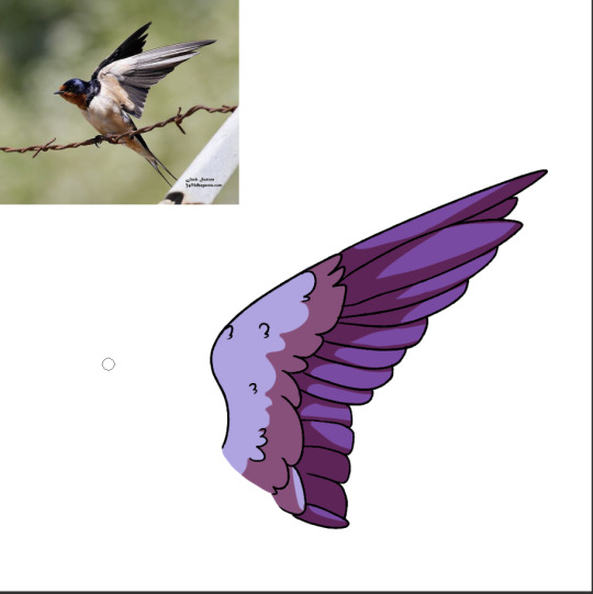
And now color and shading! This one is pretty self explanatory! I like to add more layers of feathers with the shading, even though it’s not showed in the lineart.
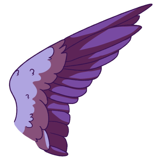
Now the last thing is to color the lineart and you’re done! I hope that helped at least a bit, i’m not the best at explaining things haha.
Thank you for your question!
276 notes
·
View notes
Photo
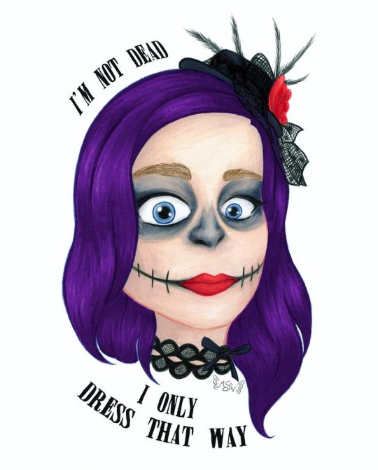
I’m Not Dead
I'm not laughin', You're not jokin'
I'm not dead I only dress that way
Out nowhere take me out there
Far away and save me from my
Self-destruction, hopeless for you
Sing a song for California
--My Chemical Romance, "Boy Division"
____
Have you heard?? Have you heard the news?? Well if not, I'm gonna tell ya: MY CHEMICAL ROMANCE IS BACK, BABY!!! :D
On Halloween, we got the announcement that they will be playing a show in Los Angeles, California on December 20th. And just a few days ago we got the news that they're also going to New Zealand, Australia, and Japan which basically confirms to me they're doing so sort of tour, whether they actually call it that or not.
There's still a lot we don't know for sure; whether this is just a one-time reunion tour or their official comeback tour, if we'll be getting new original music both at the shows and available for download/purchase or if they're just going to redo their existing music and covers, if it's only going to be the main four that were there at the end or if there will be some of the other members that were in and out over the years rejoining them...Where all they're going to go on this tour...the list goes on. But! The important thing, at least to me, is that they came back at all.
Six years. Six years we've waited and hoped and prayed, been let down by false rumors and speculation...And now it's actually happening. I just...
Hence why I had to make an art piece celebrating the occasion and as an excuse to talk about it. (I figure if I'm going to dump my opinions on the internet I might as well make some art to go with them. Sue me. )
Originally, I was planning on making something more along the lines of true fan art, as this is more pseudo fan art here, but I just couldn't settle on one good idea that I felt really comfortable pursuing. Although I am still considering doing an updated (or at least colored in) version of my Killjoys, Make Some Noise! (lineart) I did a couple of years ago...we'll see.
Anyway. Since we did get the news on Halloween, it's worth noting that originally I'd been debating if I wanted to do any makeup this year at all or just slide on a mask since my only plans were going to Krispy Kreme, who was offering a free donut if you showed up in costume. But after the news broke, my decision was made for me. I had to. MCR isn't strictly associated with skeletons/skulls, as has become my preferred Halloween costume, but The Black Parade, their second album, does have a little skeleton as the leader of the marching band, and the band members did wear skeleton/skull inspired makeup during that time.
Admittedly this year's makeup wasn't nearly as involved or elaborate as what I've done in years' past, but it beats last year's absolutely nothing.
I ended up taking a few pictures to preserve the look, as I always do even though I rarely take photos of myself, and I would decide to draw one of them where I was trying to do this face that Gerard (the frontman and lead singer of the band) has made on a several occasions; this wide-eyed intense stare. Partly because this, I'm sure, is very close to my actual face when I heard the news that they're back, the makeup was inspired by them anyway, and also because it pairs very well with one of my favorite lines from my favorite song by them.
Said line being, obviously, "I'm not dead I only dress that way," from Boy Division, as cited at the top of the description.
If I'm being completely truthful, I can't even really put my finger on what it is about Boy Division specifically that makes it my favorite, as I've yet to hear an MCR song I truly do not like, but I think there's something in the lyrics of the full song that just sells it for me in combination with the high-energy music. But whatever the case, it is my favorite nonetheless. Beyond that though, it's really hard to place the rest of them in any coherent order because, at least to my ears, they're all really great.
Anyway. So I went about drawing my face, erring slightly more on the realistic side than usually (but obviously not too much) in hopes of capturing the facial expression. Which, it's pretty good, but I do think it could've been a little better. I think my biggest problem was getting the eyebrows a mouth right, and I'm still not sure they're quite there since my real eyebrows are pretty translucent and the mouth was hard to balance between looking logical and more neutral than sad/angry. And I think maybe the proper expression was a little more apparent in the sketch, but it's pretty normal to lose some feeling between the sketch and the final product so that I won't discount too much.
After that, I had to take a break from the drawing to think about how to color it in any style it and everything. I ended up transferring the sketch to Mixed Media paper after deciding I wanted to use alcohol markers as a base but not knowing if I'd need to adjust it with colored pencil and/or other mediums on top or not, and I did the lines with my Faber Castell Polychromos once I felt like just black lines would be too harsh and thinking colored lines would be better. Plus, the Polychromos are very non-reactive to water, so if I really wanted to I could add watercolor or something water-activated without having to worry about the lines getting messed up.
I did not consider how the Polychromos would react to the alcohol markers, but other than one or two spots where the top layer of pencil kinda dissolved after some heavy layering (which was easily fixed by just going back over the lines in that area again really quickly), fortunately, it worked out okay. Although sweet sparkles I swear it took at least twice as long to actually do the lines as opposed to normal between having to apply enough pressure to get the right amount of color down and working on the differences inline weight.
Anyway. I was a little worried about some of the shading/effects I'd be doing with the markers, but I think I did alright with it. This mixed media paper (Strathmore 400 series for anyone who cares) is nice and thick, so I had plenty of room to layer up and blend as I needed to get the look I was going for. This came in especially handy around the eyes and on the nose when I told myself to at least try and get the colors like the photo before cheesing it and just using straight (or nearly) black. The only area that I think came out a little rough is really the skin, mainly the forehead. But that has more to do with 1. There isn't much contrast on the face in the photo so I didn't want to take it too far in the drawing and 2. I think I may have started slightly too dark for skin this pale. I realize that's a weird thing to say, but when you're pale as a ghost like I am, you'd be surprised how easy that is to do. And to be fair, I probably could've tried to adjust that with colored pencils, and my original plan was to add some white pencil on top in the areas of the face where a highlight would naturally hit (forehead, bridge of the nose, cheekbones, etc.) But by the time I got done with the markers, I honestly felt like it was nice enough without any additional pencil that I thought it might be best to just leave it alone.
Since I still have the original drawing, my thoughts may change on that and I could update this eventually, but for now, my decision stands.
On the other hand, I was actually pretty pleased with how the hair turned out once it was colored.
That is until I scanned it in.
I don't know why, but the darkest shadows in the hair were too dark and too bluish on the scan, despite everything else looking fairly color-accurate. I fiddled with the scanner settings for a few minutes to try and fix it, but it became quickly apparent there wasn't much to be done about it at the level. Which meant I had to try making the adjustments in Photoshop.
Now, I've done my fair share of scan-fixing, photo editing, and just color adjustments on digital art, but for the life of me I could not get things to work the way I wanted them to here. It became to the point I'm starting to suspect if the actual true-to-life shades of purple of the drawing are just really hard or even impossible for computers to capture and/or create accurately. Fluorescent colors fall in that category, surely they're not the only ones.
In the end, after more time than I bothered to document messing around with settings and adjustments, and firmly decided I was not going to essentially manually re-color/shade the hair digitally, I tried the only other thing I could think to do.
I took the hair, as I had been for all my adjustments since the rest of the colors were fine, on a separate layer and took all the saturation out so I was left with just the gray values. And I noted while I was at that point that it didn't seem to be an issue of the contrast between the shadows and the rest of the hair. The transition looked perfectly acceptable in grayscale. Then, I added a color layer on top of that one, clipped it to only show up on the hair, and changed it to an "overlay" layer so that I would get the values from the gray layer, but colored purple.
It did take a couple of tries to get the right shade of purple for the color layer, and I'm sure it's still not 100% accurate to the IRL drawing, but it's a heck of a lot closer than it was.
And this gets even weirder when you consider that just a few days before I made this drawing, I made a different one for a friend where I used the exact same marker colors for the hair, blended in almost exactly the same manner, on the same paper, and it didn't have this problem when I scanned that one in. I have never in my life.
Anyway. The accessories actually didn't give me much trouble in drawing or coloring. Admittedly, I did tone down how many feathers and stuff are actually on the tiny hat for my own sanity's sake, and while I did my best with the lace on the choker, I don't have a ton of practice with drawing lace like this so I'm sure it could be improved.
Although I did decide to color both of those areas (what I didn't draw/fill in with the pencils at the line stage) with a super dark blue-violet instead of a gray or straight black for the purpose of not totally hiding the linework I'd put in and to make it just slightly more dynamic. Which I think was a good call as it seems to tie in pretty nicely with the grayish tones on the face.
Other than that though, I did try to stay fairly accurate with my color choices, and I think I did pretty well with that, all things considered. (Despite having a much larger selection than I did just a few months ago, I do still need a wider selection of alcohol markers in some areas just for the sake of color accuracy and smooth transitions.)
Once my face was done, then came the text.
I searched for a while, hoping to find an MCR appropriate font that I could hopefully add by hand, but my search came up empty. I did find one I really liked the look of though, called "Miserable."
So I scanned the drawing in and after the aforementioned hair struggles, I got to play with the placement and structure of the words. I knew I kinda wanted something that just has that "I'm a logo/t-shirt emblem" kind of feel, and in the end, I think I got that. But I do think I could've planned out the drawing itself a little bit better in terms of the space left to fit the words into. I really didn't do myself a lot of favors on that one.
It has its problems, but I'm still really actually kind of proud of how this turned out...and that's really all I have to say about it.
Eh, maybe I'm just really happy because I know why I made it in the first place.
Now if MCR can just come within 1-2 hours of my location so I can actually go see them...please...
____
Artwork © me, MysticSparkleWings
____
Where to find me & my artwork:
My Website | Commission Info + Prices | Ko-Fi | dA Print Shop | RedBubble | Twitter | Tumblr | Instagram
#my chemical romance#mcr#boy division#dead#conventional weapons#return#the black parade#skullmakeup#art#fan art#self portrait#i’m not okay#killjoys make some noise
2 notes
·
View notes
Text
Tonal Clash
Tim: After spending so long on context, metaphor and meaning last issue, I wanted to take a closer look at craft with this one, and thankfully Team WicDiv gave me ample opportunity to. Issue #37 was a particularly great one for colourist Matt Wilson, so I’m going to turn my (distinctly amateur) eye to how he uses colour to complement the book’s pacing.

It’s an overstated truism that colouring in comic books helps establish the tone of any given page, but an issue like #37 really makes you slow down and appreciate the Eisner Award-winning work of Matt Wilson. This issue is a tour de force when it comes to using shifting, sometimes clashing, palettes to emphasise the conflict on the page.
This issue is obviously dominated by the clash between the Morrigan and Baphomet, but by going through the issue a scene at a time, we can see how the colours help sell the impact of that fight when it arrives.

Our first, short scene with Minerva in Egypt, 3127BC, is a mix of the warm light of the torches, heavy shadows and the pink-purple of the ritual energies. Those energies stay relatively ethereal, not dominating the tone of the page until the final panel, when we get a brief shock of power that ratchets up to WicDiv’s trademark level of pop-art distortion. It’s a well-executed shock, but it’s over as soon as we turn the page.

Then, of course, we have 10 pages of darkness, a slow march through the void of non-existence that also serves as a pretty effective palette cleanser, resetting our eye after the burn of the ritual. When Minerva once again awakens in Crete, 3037BC, it is to the soft, golden-hour glow of a beach at dawn, and while the red of her self-inflicted injuries stands out, the palette is mostly muted. It’s an odd choice of tone coming after a long stretch of existential horror, but it helps to take us a literal lifetime away from the burn of that final image, and the calm atmosphere helps sell her isolation.

Our journey down into Highbury & Islington tube station is the most 'realistic' colouring of the issue, but look how carefully Wilson controls what that means – muted colours that avoid bold primaries, harsh whites or dominating blacks. Everyone is wearing pastel or earth tones, and even the grey of the station’s walls is tempered with a slightly warmer shade upstairs, and, as we descend, a cooler one below.

The sections spent in The Underground (as opposed to just the underground) mix the standard Hollywood lighting trick of colouring everything slightly turquoise with the deep, all-consuming blacks that comics can provide. In a book that spends so much time in the dark, it goes without saying that Wilson is an expert at conveying colour even when the hues are tempered by heavy shade, whether it’s Persephone’s make-up, Babd’s shock of red hair or Baphomet’s shining pearly whites.

Our short interlude in Minerva’s ritual space evokes the first page without directly copying it. Again, we have the warm glow of open flames and some inky darkness, but with Mini still one head shy of a full set and unwilling to risk another 90 years of oblivion, there’s none of the unnatural pink of the ritual energy – just the white glow of a smartphone.
It’s a different palette, a different energy, but consistent enough that it doesn’t break the flow, and instead builds the rhythm of the issue. Minor details, like the abundance of shadows and Mini’s blue hoodie, not a million miles from the turquoise shades of The Underground, help anchor the moment and maintain the mood as we return to Baphomet and Persephone.

And then all hell breaks loose, and Matt Wilson’s paintbox with it. The most obvious story told by the colours here is the ghostly green of The Morrigan’s crows against Baphomet’s fire. Remove the words and the lineart, and you could still read the flow of their battle simply by following how each combatant’s signature colour dominates the panel.
But that’s not the only work the colour is doing. We also have the stony purplish-grey of Badb’s war-form, especially unnatural here. It isn’t rendered like the flowing energy of the fire or the misty green ravens – it’s hard-lined, physical, a solid manifestation of The Morrigan at her most monstrous. And as we move onto the fourth and fifth pages of the fight, we see more of the environment, the dull grey of steel and concrete taking up visual territory.

This isn’t just a sign of the fight coming to a close, as the two gods tire, or pause to reflect on their actions, but also helps the reality hit home. Colours from our initial journey down into the station return, but cast in supernatural lighting. This isn’t just a swirl of energy. It’s real, with shattering glass and broken tiles. It has impact.
Finally, there are the flashback panels, if we can call them that. Told in faded monochrome, like it’s etched into stone, we see Marian and Cameron’s first meeting. The colour tells us that this was long ago, far away, but the way the page is formatted, with the present-day images laid over the flashback in jagged-edged red, tells us that these two are closely linked (by the way, see how those edges shift from ravens to fire as fight progresses, and note where it flatlines). The flashback is both the idealised past that causes Baphomet to hesitate, and the same story that plays out in the present, the same destructive cycle. Attraction, rejection, passion, intimacy.

Then, in the final burst of violence, the two colours mix. The Morrigan’s green curdles into a sickly yellow, and Baphomet’s fire becomes the red of blood as he is torn asunder. And in the aftermath, the cyan tones of The Underground spill out into the real world, colouring everything a slightly otherworldly, mournful blue.
One final shift in colour remains: to a background of pure light green, a shade we rarely see, for a miracle with a heavy cost. We return briefly to haunting blue, and finally, back to that all-consuming black for the title page, another skull added to the tally.

Like what we do, and want to help us make more of it? Visit patreon.com/timplusalex and pledge to gain access to exclusive blogs, ebooks, mixtapes and more.
24 notes
·
View notes
Text
A (Very Rough & Ready) Guide to Alex’s Tattoos
I’ve been putting this off for a LONG time because I like to be meticulous especially with character visuals but with the amount of tattoos Alex has, especially on his expansive canvas of a 6 foot body, trying to find a pictoral example for EVERY bit of ink is... YEAH lmfao.
* As a guiding note, the indicating ‘left’ & ‘right’ etc. is from HIS left and right. All heart designs are typical cartoon shape unless stated as (anatomical).
NECK //
Underneath his ear lobe, on the left side of his neck is a hand holding a needle -- designed to look as if it’s pierced through his skin. At the top of the needle is a red thread which curves semi-loosely around the back of his neck and wraps around a red heart below his right earlobe.This can only be seen if you lift (or pull) up his hair since he never, if rarely ever, ties it back high enough.
LEFT ARM //
FINGERS: Simplified red rose gradually blooming from little to index finger, from bud to full bloom. This is just below the top of his knuckles, below them (closer to his nails) on each finger is a stem with thorns.
HAND: Bull face, directed towards viewer -- lineart with minimal black shading.
FOREARM: Basically a flash tattoo / pork-chop sheet mixture (see here & here -- middle pic). Omitting anything explicitly religious (apart from a cross or two) and culturally appropriative. Includes a range of panthers, snakes, skulls, hummingbird with beak in flower, handcuffs, full figure Betty Boop, inkwell and heart wrapped in barbed wire. All interspersed with Felix the Cat faces and little stars to fill blank spaces. Very clear linework and simple shading, only using bright colours: red, green, blue and yellow. Some of these are done by Alex himself, his first tattoo on his own body being an ouroboros snake.
UPPER ARM: Much of the same as above, except with the addition of a Sailor Jerry style pin-up with blonde hair in a corset and heels. Also a chain band just below his shoulder.
SHOULDER: Lucifer from Bosch’s Garden of Earthly Delights. First tattoo with complex colour-shading, done by his first employer in London who he worked with as apprentice.
RIGHT ARM //
FINGERS: Skeleton anatomy on the full-length of his middle finger and knuckles, the rest of his fingers (near nails) and his thumb are blocked with plain black.
HAND: Continues with skeleton anatomy. Entire design is clearly inked style shading (as in nothing that looks anatomically realistic) like this.
FOREARM: Contemporary & post-modern designs. Inner forearm is covered with praying mule from And the Ass Saw the Angel book cover. Outer forearm is design pictured on the left here, picture was taken at an exhibition which I have the guide to and artist credit but .. whoever edited it helpfully didn’t align credit with the picture so I need to manually look up each artist listed to HOPEFULLY find the one who did it.
UPPER ARM / SHOULDER: Literally cannot describe but is piece by Jef Palumbo. Due to technique being incredibly skilled, I am taking full advantage of fictionality and tattooist with these mad skillz existing in early nineties for Alex’s sake... let him have this ..
CHEST / TORSO //
The largest / most expansive singular piece on his body. His chest and torso are fully covered with a design I lifted off a Jean Paul Gaultier add and tried editing onto his bawdy for promo graphic a while ago -- unlike graphic, the tattoo would still be in the same colour as Gaultier ad, but yellow of skull would be red instead -- less tribal texture and more lined mark-making like the skull featured in me blog background to the left of Alex’s head (I can’t find the pic in my folder..)
BACK //
UPPER BACK: This is where a little imagination is required as I’ll just be listing a bunch of images but they’re all collaged in a cohesive/overlapping way like Duncan X’s back -- pic taken by Liam Sparkes. So; Saint Sebastian by Myles Karr down Alex’s spine. On the left: text from this photo by Tish Murtha complete with exposed brick effect -- in black and white. On the right: text from this, including a stencilised Pauline Boty rendered in Lichtenstein-ish comic print style, with matching Lichtenstein bright colour scheme. These three images together and with a certain scaling form an arc shape across his upper back, and the thread mentioned earlier on the back of his neck hangs an inch above the Saint Sebastian’s hands. Spaces in between filled by Jemma Jones style flash tattoos.
LOWER BACK: I’m getting lazy so again, just imagine in style of Sparkes tattoos summat like this mixed with this on the left and again more flash tattoos imposed between and over blank spaces.
HIPS //
Handprints on each harr harr.
ASS //
🙊 Only his partners know ... unless you attend classes where he poses for life drawing
LEFT LEG //
THIGH (FRONT): Entire leg is surrealist/dadaist themed. Whole front of thigh is coverd by this collage by Otto D’Ambra.
THIGH (BACK): Under his butt: Eliott Lane. Under that, another Otto D’Ambra. Around them, these (1, 2) by Caleb Kilby, and top middle illustration by Kathryn Kirk.
KNEE: Left eye of Siouxsie Sioux, (right eye on his right knee). I’m imagining these are also embellished around the edges by a circular labyrinth symbol pattern to fit the shape of his knee joint.
SHIN: Fish-head man by Kerry-Anne Richardson, black and white.
CALF: Hannah Hoch collage, but in black and white -- rendered much like D’Ambra tattoo on the front of his thigh (semi-realistic pointilism shading for woman’s face, simplified basic outline for images surrounding it).
ANKLE: Smoking bunny by Sarah Whitehouse.
* Spaces between these main pieces are filled by flash tattoos in style of Liam Sparkes. Entire leg is only black ink.
RIGHT LEG //
THIGH (FRONT): Entire leg mirrors left arm in a mixture of classic tattoo designs/styles with pop-culture & illustrative character leanings. Multi-eyed devil (??) piece by Kerry-Anne Richardson. Full colour. Fishnet leggies by Just Jen on inside of thigh.
THIGH (BACK): Skull emerging from chrysanthemum by Ben Shaw, underneath that: crescent moon by Kerry-Anne Richardson.
KNEE: Aforementioned Siouxsie Sioux eye in labyrinth.
SHIN: Wolf in sheep’s clothing by Iain Sellar.
CALF: THIS!!!!!!!! by Charissa Gregson. He hasn’t got a name yet.. suggestions welcome. Below him, more Iain Sellar stuff.
ANKLE: Peachy-keen, piece by Holly Ashby.
* Spaces in between main pieces on thigh are filled by Dennis the Menace & Peanuts panel. Out of sheer self-indulgence I’m adding this lady. Every other blank space refers back to Sparkes and Jemma Jones flash tattoos.
He doesn’t have any on his feet because he’s ticklish there..
#▏▪ HEADCANON.#(THIS IS AS MUCH as i can muster now#will reblog when his legs are decided on#FOR NOW HAVE THIS !!!!!!!!!!!!!!#only visual descrip of tattoos. . meaning isn't elaborated on#squints and looks askance#EDIT: HAVE Added legs. . ideal#will probs add to this in future since .. amount of tattoos ppl can have is !! a lot !!#especially since alex prefers nothing that covers a whole limb .. apart from torso . .
8 notes
·
View notes
Last Seen Blogs

cutepsycco
ALL HAIL STARSCREAM

grandfather-of-sin
h0eny Time

jordynshuen400spatial
Jordyn Shuen
vacio-existencial
Vacio Existencial
cremsie
Mama Lion