#i like realistic-cartoony blended together if that makes any sense
Note
holy shit Pico looks so freaking nice there! Though I have to say that I had a friggin double-take when I saw you mention that he's like in his 20s there. I'm just "wtf I thought he was a bit older here, not friggin younger" lmao
That life-style stress doesn't do him favors, but he's in his maybe late twenties there. I'll admit my art style's in a weird phase right now where I'm struggling with how I want my faces to look (realistic shaped, simple eyes? The rounded cartoony cheeks? Which one?? How do I make it look good???) I'm still in "art puberty" as you can see lmfao, so that's probably why he looked older augh
#art struggles#any tips? or idek what im doing here tbh#im just sketching away#wanna do digital too but been pretty tired to lately#after the whole holiday stress washes out i'll get to it hopefully#and maybe try to fix up my drawing issues lol#i like realistic-cartoony blended together if that makes any sense#head shapes be an ass for me though#i like how his head came out on that one#its not too cartoony but not completely realistic either#asks
4 notes
·
View notes
Note
I know you've said before that you think Caine and Drake are pretty one-dimensional (and I agree completely). I was wondering if there were any other villains that you wish had been explored more instead of giving those two more page time in later books. Or if there were any characters that you thought could have had villainous potential that were unexplored??
wow, interesting question! i think my main problem with caine and drake is that they’re just kind of blandly evil, one-dimensional like you said. i think, ideally, villains should feel like real people.
funnily enough, i think zil probably comes closest to embodying that in this series. he’s mean-spirited from the beginning, but it’s only under lance’s influence (from what i remember) that he becomes a real threat due to his gaining confidence. i think it would have been nice to see more of him in the series—he’s insecure in his role as leader of the human crew, which makes him fallible. he’s also kind of unnerved by lance’s neo-nazism. he’s arguably the most intelligent out of the crew aside from lance. he’s not sympathetic, per se, but he is compelling.
i would’ve liked to see him interact more directly with the protagonists—especially astrid, because i think she should get a chance to one-up him in some way after he was thinking creepy thoughts about her in hunger. also, i think astrid, being the smartie she is, would probably be most likely to try to persuade him to turn over a new leaf—she’s a normal, and a white, aryan-looking (gag) normal at that, which would probably satisfy lance, and she still has distinct power in the fayz. though zil could probably poke a hole in her argument by pointing out that she only really has that power because she’s sam’s girlfriend, which is true. anyway, they could have words about it.
i think zil is compelling because he has the potential to be redeemed. it’s a slight potential, because he’s already done some pretty evil things, but he’s not totally evil—he has to justify the violence he commits in order to accept it, which is more than caine or drake does. we never forget that, at the end of the day, he’s still an insecure, blustering twelve-year-old. he’s an anti-moof bigot, but he could change. i think lance, more than zil, represents total irredeemable evil. he represents what zil could descend into being. he’s the devil on his shoulder (astrid could potentially be the angel if she maybe switched tactics from lawful punishment to direct emotional manipulation).
i’m a sucker for human villains and natural disasters being the principal antagonists, which i think is why the first four books work so well? i think fear and light suffer from the gaiaphage taking control of the narrative, villain-wise, when i think it worked best when used sparingly. gaia is pure evil, nothing more. she’s fun to read about in her own way because she’s so villainously campy, but that’s kind of it. she’s not really interesting, imo.
i think the reason why i harp so much on the insufficient “humanity” of antagonists like caine and drake is because that’s the principal strength of books (lord of the flies, battle royale) in the “kids trapped in place and forced to survive” genre: what do the actions of the characters say about human nature? about society? about morality? in lord of the flies, the message conveyed is ultimately a bleak one: the kids all descend into savagery in one way or another, with the purest one of them all, simon (the jesus figure) being driven insane, and the intellectual (piggy) being murdered. the story is all about “the darkness in the human heart,” to paraphrase the last line of the book.
in battle royale, on the contrary, the message is ultimately one of hope. despite the characters living in a dystopian fascist society that sacrifices one class of students to a killing game, the main character shuya clings to the idea that he and his classmates can figure out an alternate way to survive the titular battle royale aside from murdering each other. his compassionate view of humanity is validated by the pov vignettes given to all his classmates. all of them are given distinct personalities; some are kind, like shuya and his allies noriko and shogo, and some are drake-esque sadists, while the majority fall somewhere in between (my personal favorite characters are the girls that team up with one another in order to protect themselves from possible sexual violence from the boys. they hole up in a lighthouse!). but all are tragic in the sense that they’re children thrust into an unfair and cruel situation. even then, though, the nobility of certain characters shines through.
for instance, there are two girls at the beginning of the game who are best friends and don’t want to kill anyone. they (foolishly or bravely) use a megaphone to call out to the other kids in hiding, asking if they can all band together. shuya and several other characters are tempted, but sadly the girls are both fatally shot soon after their announcement. they die in each other’s arms after affirming their friendship, tears in their eyes. shuya and several other kids are devastated by the girls’ deaths. while some more callous characters deride them as being stupid and naïve, the reader is ultimately meant to mourn their deaths and the lost potential of a class-wide alliance. they know that their enemy isn’t their classmates, but rather the fascist government that makes them kill each other in the first place.
anyway—tangent aside—i think those two aforementioned novels are really solid examples of the genre gone is in. gone has more of superhero vibe to it, given the focus on powers and mutations and paper-thin evil villains, but i almost think the way that’s executed almost detracts against the aforementioned “kids surviving, etc.” genre? like, that’s all about the messiness of morality and human nature and whatnot, and while superhero comics can weave that into their narratives (watchmen, the brat pack) those are usually deconstructions of the genre than straightforward examples of it. the superhero genre is usually morally black-and-white and really action-focused. this is why i think we get the strange tonal mixture of kids reacting realistically to the trauma of starving versus reacting fairly unrealistically when faced with brutal superpowered violence, such as when brianna decapitates drake like it’s nbd. or anything brianna does, really.
there’s a shift from the realistic to the unrealistic that’s fun, but tonally dissonant from each other. so there’s this sort of disconnect, at least for me. i sympathize greatly for astrid when she’s slapped by drake and forced to call little pete a slur, for instance, but how many times does drake or caine murder a kid in cold blood? at some point it gets...idk, old? as the violence gets more cartoony the less it interests me aside from morbid fascination, and there’s just so much of it. it gets desensitizing after a while. i think that’s why, even though i think it’s handled fairly believably in gone, i had a lot more trouble with the monster trilogy’s blend of absurdism (the animorphs-style mutations like dekka turning into a cat woman with medusa hair and another character turning into a praying mantis with super speed, etc.) vs. grimdark realism (ICE forcibly deports a character’s father, terrorist violence is a common theme, the san francisco bridge is destroyed, a baby boy is mutated into a giant fuzzy caterpillar and then gets blown up by the military—like this is budding dystopia-level dark and the narrative doesn’t seem to realize it). it just feels too heavy and too light at the same time. the contrast of tones does a disservice to both of them. idk what i’m saying let’s get back to your actual question lol
as for characters with villainous potential...hmmm. tbh i think astrid has villainous potential? i mean, i like the idea of her moral righteousness escalating in a way that makes her more morally gray. she’d have to probably latch onto more powerful kids in order to have any leverage over sam and the gang, given her powerlessness. maybe she could manipulate orc into being her bodyguard while she plots to usurp sam or something asgjsjk. i think she could be a powerful threat if she wanted to be! it’s fun to ponder. i heard of an au where she joins the human crew that i thought was sort of interesting!
what do you think, @goneseriesanalysis? any villains you wish had been dived into more, and/or characters with villainous potential you think would have been cool to explore?
24 notes
·
View notes
Text
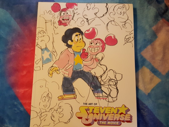
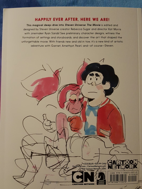
The Art of Steven Universe the Movie: Outline & Review
The Art of Steven Universe The Movie was released March 3, 2020. It's a wonderful journey through the concept art, character development, and experience of fashioning these ideas into the movie we all love.
Nuts and bolts: The book is published by Dark Horse, and it was designed by Ryan Sands (a zine specialist), with commentary by Takafumi Hori, Kat Morris, and Rebecca Sugar. It includes art by Rebecca Sugar, Kat Morris, Takafumi Hori, Alonso Ramirez Ramos, Angie Wang, Ashley Fisher, Becky Dreistadt, Chromosphere, Danny Cragg, Elle Michalka, Hilary Florido, Ian Jones-Quartey, Jasmin Lai, Jeff Liu, Joe Johnston, Julian De Perio, Katie Mitroff, Leonard Hung, Miki Brewster, Patrick Bryson, and Paul Villeco.
Full review below with low-quality images.
[SU Book and Comic Reviews]
An introduction explains the same origin story that Rebecca Sugar told us in the movie DVD's commentary: that she accidentally restored her phone to factory settings and lost years of important stuff, and she ended up applying that devastating premise to her movie. That combined with the concept of "breaking" the main premise of a TV show to make a movie was how she got started developing the story.
The opening of the movie styled like a storybook is blocked out with some great drawings and breakdowns of which narration would go to what storybook pages. This is combined with some partial sheet music for "The Tale of Steven." Rebecca writes about how she felt having to wrap pre-production on Season 5 only to take on this even bigger movie challenge. The biggest challenge was writing all these songs in such a short time--six weeks--and having to deal with the stress, being crushed under all that pressure while still wanting to do this story so badly, and it was humbling to still have to work so hard to sell the idea. The feeling of relief to finally be done that Steven expresses in "Happily Ever After" is very similar to what Rebecca went through feeling like she wanted to be finally done but still knowing what she had to do to climb an even bigger mountain.
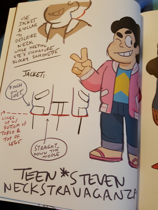
Some very cute Steven-at-age-16 and Connie in Space Camp clothes follow. Notes indicate that Steven and Connie are the same height now, but his poofy hair is just slightly higher than her head.


Notes from 2017 also give us the "Neckstravaganza": design notes on Steven's new form, with a neck and a jacket. It's very cool.
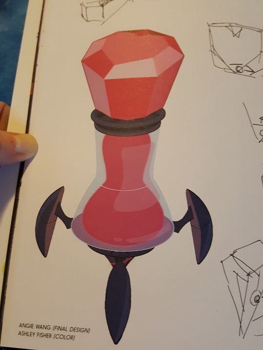
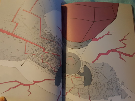
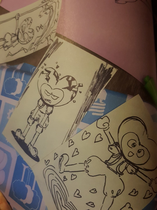
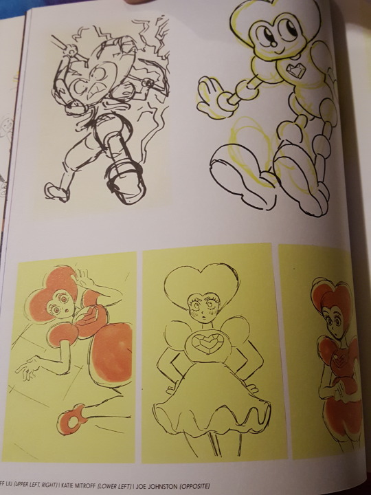
Some beautiful Joe Johnston boards follow, with sequences from the "Happily Ever After" song. We also get Angie Wang's final design (with Ashley Fisher's color) of the injector, including some sketchy concept art for it from Rebecca Sugar and Hilary Florido. In the rough concept notes, they call this the "Mega Injector," with notes for Takafumi Hori to use for scale. It looks beyond huge in a Leonard Hung drawing.

Spinel concepts are next. Some notes explain that aivi & surasshu (the usual composers) were involved very early since it was a musical, and Rebecca included them when pitching the story to the Crew so they could organically develop the sound. The heart shape was central to Spinel from the beginning, and early versions of her had an entire heart shape to her head.
(There's a doodle of what looks like a cartoon dog in the pile of drawings shown in this section. It's not clear what that was.)
Spinel was given the heart imagery partly because Rebecca had learned early on about the importance of symbols, and when it came time to assign one to Steven, the star was chosen because it's so positive and is read as gender-neutral. Rebecca still hadn't used hearts for anything, so it was time. They also incorporated really old, dated character design ideas to make Spinel feel like an outdated cartoon from the rubber hose era.

The aspect of her design with the running mascara versus cute eyelashes predated the rotation of her Gem. Rebecca likes to start with more realistic sketches when she's figuring out a character, and then she'll move to making it more cartoony. A quote from Miki Brewster is shared: "Spinel can do anything, as long as it's entertaining!" Her "best friend" form is described as "a doll for friendship fun & games! Of a different era--hokey, charming, weird...super gullible and trusting. Incredibly loyal, constant entertainment machine!"
When it comes to developing her "worst enemy" form, Rebecca explains a bit that she has a really complicated relationship with old cartoons because nostalgia is not compelling to her--the animation from the 1930s is so neat, but considering the social limits and the way the industry was at the time, Rebecca doesn't think she could have participated. Especially considering nowadays she even had to struggle to be allowed to tell the stories she needed to tell and it would have been impossible five years ago. The norms of the time aren't entirely extricable from the art itself.
Takafumi Hori weighs in with commentary on how fun it was to animate a scary but fun character on top of Miki Brewster's boards for the "Other Friends" fight sequence.
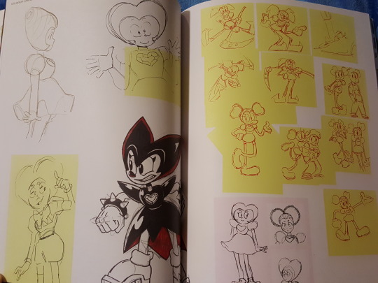
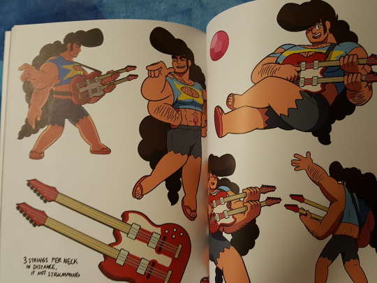
Next, moving on from the central new character, they also spend some time discussing Steg. Rebecca first explains "Steg Multiverse" as a character so uplifting he can make you fly, combining Greg's unending support and Steven's positive power. She makes reference to the early "stegosaurus" concepts they had for his look, but they didn't want to lose the opportunity to have his hair flow. Rebecca confirms that the pompadour idea was established in "Steven and the Stevens" so they wanted to give it to Steg, and she credits Paul Villeco for really finalizing his design and bringing him to life.
And of course the poofy hair from Steven and the double-necked guitar was essential for Steg.
Next, the book gives us a whole page of handwritten notes about "Drift Away." Kat Morris explains the intentional duality of the scene--how Spinel should be shown seeing her own past with new perspective, being embarrassed, blending together who she was with who she is. The partial lyrics to the song and some sketchy boards are offered.
Rebecca shares her personal connection with the subject matter--how she once left a stuffed animal in her garden and the side facing the sun faded. It really made a mark on her as a child that things changed without her, because of her actions, and that she'd left this treasured toy alone without thinking about it all that time, letting it be affected by the elements without her interference. She wrote "Everything Stays" for Adventure Time based on that plushie, and realized that she was writing about it again for the Steven Universe movie.
Many beautiful miniature boards are shown in this section.
Partial sheet music for "Drift Away" is also offered here. It's credited to Rebecca Sugar and Aimee Mann. The music sheet is followed by some lovely images of the garden by Julian De Perio, Patrick Bryson, and Leonard Hung.

Takafumi Hori returns for a discussion of the final fight sequence during "Change," which he animated from Jeff Liu's boards. He discusses trying to keep the fight feeling dramatic and serious even though Spinel's fighting style is funny. He wanted to keep her tension. Hori-san throws in a word of thanks for being allowed to work on his favorite show again, praises Jeff and Miki, and compliments Rebecca Sugar's demos. He hoped we'd get a soundtrack album. (Of course, we did.)

Some final boards by Rebecca Sugar and Becky Dreistadt of the characters in their show gear descending the steps close out the book. There are also some cute little doodles at the end on the credits page, like a head of lettuce with caption "lettuce adore you" and Spinel in a drifting go-kart laughing, captioned "drift away."
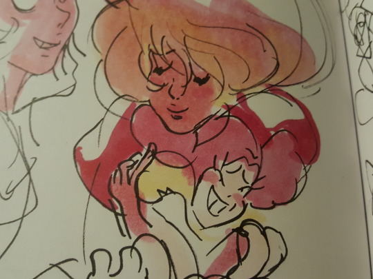
The back cover pictures Steven with his arm around a heartbroken Spinel, comforting her.
Overall, the book is wonderful--the accompanying information is generally not new to anyone who watched the DVD's documentary and commentary, and many of the sketches have been released one way or another directly by the artists through Instagram, Twitter, or Tumblr blogs. There was still plenty of wonderful new concept art that wasn't already out there, and looking at some of the iterations Spinel and Steg went through was particularly captivating.
There was no new insight into the development of the plot beyond the premise and the Spinel-related conflict, though; nothing about how they decided to focus the Garnet storyline, the Pearl storyline, and the Amethyst storyline for how they would each get their memories back, and there was no spotlight on their movie versions--modern Cotton Candy Garnet, copycat baby Amethyst, and factory settings uncustomized Pearl. I was hoping especially for some Amethyst stuff because the movie was the first place we got to see her with the simple default outfit and segmented limbs.
It was primarily an art book with commentary on some of the most definitive movie aspects--it didn't reach the depth that Art and Origins gave us. It has a start-to-finish feeling in a sense, but it's mostly just splashes of information that are fun to know. It's a great companion and definitely should not be missed by any fan of the movie. I recommend it heartily!
[SU Book and Comic Reviews]
#steven universe#steven universe the movie#the art of steven universe the movie#movie art book#myblog
140 notes
·
View notes
Text
Artists Research
Ingen:
https://twitter.com/zmei23
Ingen uses the simplicity of voxel art and creates extremely complicated works of art that show an incredible amount of detail in the smallest aspects of the world they are creating. like the cranes in the image below have tons of little details from machinery wires and decals which allow you to immerse yourself in the art for hours trying to find all the little details that make the art so good to look at. His artstyle has a very big sense of realism as nothing in this looks fantastical or not real. everything in the art looks real even though its all made up of tiny little blocks. the colour has a sort of theme to it, all of it just blends and works well together so radical selection of colours. everything is nice and tidy and has purpose in the art. and even when it does its done on purpose like the lava in the image. This is a definitely an artstyle that i would be interested in if i was making a different more serious type of game but due to my more cartoony platformer a simpler artstyle is just fits that kind of game and world better, if a platformer was this overdetailed then the player would be confused on what to focus on and personally I just don’t think it would work that well.

Antoine Lendrevie:
https://twitter.com/Sir_carma
Antoine Arts is a bit more simplistic then Ingen’s with its shapes featuring more blocky architecture but where this artists really shines in is the texturing and immense detail in every little thing, half the time you can’t actually tell that its voxel art. The Artists also pays attention to how light and other effects will effect the art so it allows the art to work in any sort of environment and still look good. the way they use colour is also very uniform, creating very realistic textures that i didn’t really except in voxel art. This kind of artstyle would fit into like a life or farming simulator game like stardew valley but for a platformer its a bit too complex for it. but i really do like the lighting effects that work in the art and i would really like to have something like that in my game. it would really add to night levels making them more tense and atmospheric. this sort of lighting would also work in other levels like moving vehicle levels or a warehouse where the lighting can be really strong yet poor in range. I'm mostly interested in Antoine’s use of lighting in his work cause it just works so well.

John Kearney:
https://twitter.com/HuntingFluff
Unlike the other two artists John actually makes art that actually looks like its made out of voxels and personally i prefer it when you can tell it looks like what its made out of and not trying to look realistic all the time. John uses to limiations and the actually style of voxels to create something that still looks amazing. Even though John’s art looks more like voxels its still has that realistic texturing and shading that adds to the immersion of the work. The gritty use of voxels creates an dystopian downtrodden atmosphere that i haven’t really seen in voxels as most people use voxels to create cute and cartoony looking art. The colour selection is also really good the nice blend between the urban grey to the contrast of blue and orange all over the art is really imaginative and adds to the dystopian gritty art. This is more something i would like in my art an artstyle that is clearly voxel yet is still quite detailed in nice to look at. though the colour palette fits this sort of theme for my game i would have more colourful colours that have a more positive vibe then this sort of colours.

0 notes
Text
Nathan’s Favorite Movies/TV Shows of 2016
First, the usual disclaimers: There was a LOT of great stuff last year that I haven’t seen (yet), and this list/ranking is not meant to be indicative of objective quality, but rather of my own personal enjoyment with the viewing experiences I had in 2016.
So, without further ado:
1. San Junipero
I’m already cheating a bit, as this is only a single episode of Netflix’s sci-fi anthology series Black Mirror, but the anthology format encourages each episode to be judged on its own merits, and San Junipero packs more ideas and emotion into a single hour than most feature films manage in twice as much time. I’m mixed on Black Mirror in general due to its predominantly misanthropic view of humanity, but this gorgeous, science fiction-infused LGBT romance twists the show’s formula in a delightfully optimistic way, injecting both Black Mirror and the year 2016 with a much-needed dose of heartfelt, romantic positivity. The worst I can say about it is that the short runtime makes a couple major character beats feel rushed, but it more than makes up for such nitpicks with the sheer amount of heart on display. Visually sumptuous, wonderfully acted, and tightly-constructed, San Junipero was my favorite viewing experience of the year, and like the characters, I think I’ll be making a lot of return visits to this idyllic seaside paradise.
2. Arrival
This mid-November sci-fi surprise turned out to have the perfect moral of the moment for the penultimate weeks of a divisive year marked by rising xenophobic nationalism. Arrival puts a pacifistic twist on the alien invasion genre, emphasizing the importance of communicating despite language barriers and humanity working together across borders, united by a common concern, at a moment where the prospects of humanity being able to do any of those things the real world seem at an all-time low. Outside of the fresh approach to its genre, Arrival features stark, lovely cinematography, a haunting, memorable score, and a star-making lead performance from Amy Adams. Few films have so perfectly captured the sense of ominous awe and wonder that would surely accompany first contact with an alien race. And best of all, the film never forgets to ground its extraordinary circumstances with a deeply human core. By the time the masterfully-crafted script circles back around to its inevitable climax, Arrival will have your heartstrings firmly in hand, making it the perfect sci-fi mixture of emotionally and intellectually stimulating.
3. Stranger Things
They say that there’s nothing new under the sun, and it certainly feels that way in the media landscape sometimes, deluged as it is with sequels, spin-offs, reboots and adaptations. So its ironic that the best new pop culture IP of 2016 achieved its success by mining the past. Stranger Things exemplifies the phrase “everything old is new again,” blending its myriad 80s movie influences and familiar genre tropes into an enchanting, propulsive cocktail of imagination. No single element is unique, but together they form a show that feels like a singular, distinctive creative vision, aided by impeccable production design, a top-notch cast (it can’t be overstated how much the show lives and dies on the performances of its child actors, and how well they rise to the occasion), and a perfectly-paced 8-episode season. With or without a personal nostalgic connection to the 80s trappings, Stranger Things is must-see television.
4. 10 Cloverfield Lane
Slipped into theaters a mere two months after its formal announcement, and sparsely marketed with a few enigmatic trailers, 10 Cloverfield Lane may have suffered a bit from producer JJ Abrams’ love of the “mystery box” approach to storytelling. Here, the mystery is outside of the box, but its the drama within that confined space that proves more interesting than the secrets that await outside. When the mysteries are finally revealed, the climax feels almost bolted on, like a sharp turn into a wholly different movie. Still, it’s a testament to the strength of the rest of the film that a weak climax doesn’t kill the whole endeavor; for most of its runtime, 10 Cloverfield Lane is a remarkably effective, claustrophobic slow-burn thriller that starts with a fantastic premise and then patiently dials up the intrigue and suspense notch by notch. Grounding the twists and turns is a stellar performance by Mary Elizabeth Winstead as one of the year’s most resourceful heroines. The attempt by Abrams to launch an anthology franchise of original, loosely connected sci-fi films is an interesting (if yet unproven) experiment, but it’s the small-scale, almost theatrical setup and the strength of the lead performances that 10 Cloverfield Lane will be remembered for.
5. Kubo and the Two Strings
Despite being just as narratively and technically impressive as any of Disney or Pixar’s offerings, LAIKA Studio’s films have never gotten the box office recognition they deserve. For the sake of the studio’s future, I hope that changes soon, because LAIKA are doing great work keeping the art of stop-motion animation alive, and telling unique, emotionally-intelligent stories that play well for all ages in the bargain. Kubo might just be their finest work yet; adventurous, touching, visually rich, tragically overlooked, and a clear winner for this year’s “Too Beautiful To Live” award.
6. Captain America: Civil War
It’s sometimes difficult to remember a time when Marvel Studio’s continuity-heavy shared universe was a unique and risky strategy, and yet the deeper and more expansive that continuity gets, the more audiences prove they’re willing to turn up in droves. Featuring a huge cast of characters new and old, and functioning as a direct sequel to at least two prior films (and an indirect sequel to several more), it was easy to peg Civil War as the point where the whole enterprise might begin to collapse under its own weight. And yet, the film succeeds with a dense but well-balanced script that smartly mixes up the series’ established formula by going smaller, trading in grandiose, world-threatening villains and city-destroying showdowns for a more intimate, character-driven story where the conflicts are built on ideological differences and personal betrayals, and the only thing at stake are the relationships between the characters audiences have come to be so familiar with over the years. Although the downsides to Marvel’s episodic storytelling approach are on full display here (the feeling that we’re being served up a chapter in an ongoing tale rather than a self-contained story with a definitive, satisfying ending has never been stronger), so too are the upsides; this story simply couldn’t have been told so successfully without years of previous character-building to cash in on. That it also organically weaves in introductions to two major, scene-stealing MCU newcomers in the form of Black Panther and Spider-Man is icing on the sweet superhero cake.
HONORABLE MENTIONS:
Ghostbusters
Set aside the ridiculous, wholly sexist “controversy” that dogged this film throughout its production, and what you’re left with is a fun, inoffensive comedy with endearing characters and a lighthearted tone that never stoops to the sort of meanspiritedness that characterized its detractors. It didn’t exactly light up the box office, but it justified its own existence as more than a nostalgia cash-grab by putting a clever spin on an established premise, changing the playing field without too drastically altering the game. It’s a great example of how to do a franchise reboot with originality.
The Jungle Book
A visual effects marvel that makes an old, time-honored story feel new again by blending to great effect the cartoony, musical Disney approach with the darker, more realistic spirit of the source material. Plus, Idris Elba as an evil, talking tiger. Who hasn’t wanted to see that?
#yes I know it's a bit late to be doing Best Of lists in February I've just been putting this off for way too long#stranger things#arrival#captain america civil war#black mirror#etc#long post#my reviews
5 notes
·
View notes
Text
Unit 70
Pre-Production
Inspiration

I looked at my Mood-Board that I had created for Unit 79. I decided to look into those games I mentioned and create a mood board focusing on their game environments.


I found a lot of stuff from these games which I liked. I really like the low-poly rocks and trees that animal crossing and LittleBigPlanet use. They’re also assets which can be made quickly and in large amounts so you can create a nice variety to populate the game world with. In Splatoon I like the bright billboards and signs which decorate the city. I’ll be creating an urban section to so I’ll look into how they’ve created various buildings.
Urban Environment Board

Nature Environment Board

My plan is for the player to start in the nature environment. They’ll be sent to retrieve a key from the bottom of a mine so they can enter the city. The city will be located on the higher portion of the map.
Landscape
Sculpting
I created a basic flat landscape and began using the sculpt tool to create a higher area. I then used the smooth tool to smooth the cliff side so the textures weren’t as stretched.

I also used the flatten tool which upon use makes anything you brush over the same height as what you started on. This is great for having flat ground at different heights.

I then used the ramp tool to place two points. I moved the bottom point a little closer to the cliff and adjusted the width of the lines to give the cliff a thicker walkway.

This is a great tool for creating natural ramps between two different levels in the environment. It’s a lot quicker than manually sculpting, smoothing and flattening a ramp myself.

By holding shift I can invert the brush and create crevices in my landscape. I used this to create a pond which I’ll later fill with water. I made use of the hydro-erosion and smooth tool to get a realistic slope into the pond rather then it being too sharp.
It’s important to think about how the different sections of the landscape would have different materials (when I later paint the landscape)
When creating a landscape you can also choose to use height maps which automatically generate and sculpt your landscape according the a height map image. This is great for creating huge landscapes where manually sculpting every mountain and crevice would be too time consuming. For my project however I decided to simply sculpt it myself as I’m only creating a small compact environment. A downside of this however is I’ll have to make use of fog, lighting and assets to hide the edge of the world from the player character. This becomes much harder as they reach higher areas. I wouldn’t have this problem if I had decided to the an interior of a building. I’m happy with my choice however as I’m enjoying the landscaping tools and learning a lot about UE4 which will help me in the future.
After the painting processs I went back and sculpted hills around the edge of the area to act as a natural barrier to contain the player.


Painting
To start the process of painting my landscape I first had to create materials for the different layers such as grass, dirt and sand.
I found a few images of grass and edited them together in photoshop.

I added small dots to stick to the stylised feel that I’m going for. For the dirt and sand I simply found some JPEGs from online that suited this style. I then imported the textures into UE4 and began working in the material editor to create a landscape material.
I created a layer blend with different sections for each material.

I did the same for the normal maps which I also created in photoshop.
An issue I had with the materials is that they were tiling and it didn’t look good when placed on the landscape. To reduce this I used ‘texture bombing’

The texturing bombing lets me add some variety to the texture tiling. I also did the same with the normal maps so they line up correctly. The normal maps are great for giving the illusion of depth to the grass. I used similar techniques when adding my other materials.

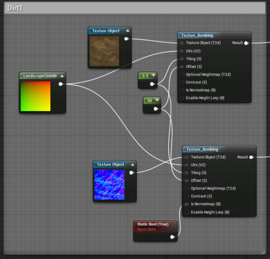
Another issue I had with some of the dirt was I didn’t like the colour. I simply used a colour parameter to add an orange hue. This also makes the dirt work nicely with the rock assets I created.

I mentioned how it’s important to stick to a colour palette so the world looks coherent.

All the textures then connect to the layer blend which then connect to the base colour and normals. I also added a 0.5 constant to the roughness which makes the landscape reflect light a little less. I could of set it to 1 to be more realistic but I like the small shine and I’m not going for complete realism.

Painting in UE4 is really simple! You simply select the layer (after creating a landscape layer weight) and use the brush to paint directly onto your landscape. You can edit the brush size and strength to get your desired affect. I started my covering the entire area in grass then covering a pond area in sand. I blended in the two different types of dirt along the cliffside (with a low strength) to create a semi-realistic cliff-face.


I’m happy with my first attempt. I’ll make use of my dirt textures to create pathways to guide the player through the natural segment of the project. I’ll also use assets such as rocks, fences and trees to populate the landscape (and help guide the player character).
I really like how I can go back and repaint the landscape at any time. As I place assets I can change the landscape to suit the needs of the level instead of being stuck with what I’ve created at this moment.
I end up going back and editing my grass texture in Photoshop. I made it more stylised and bright.

Environmental Assets
Rocks
I began creating more environmental assets to populate my game world. I started off simple by creating stylised rocks.

Here’s the base material. I then created two material instances and made the colour a parameter. I have a dark and light one to have a difference between the sides and tops of the rock formations. I wanted a cartoony and colourful environment like I described in other units.

I created my models in Maya using tools I’ve used before such as extrude and multi-cut. I then imported them into UE4 and applied the textures to preview them.


I made sure to set the collision as ‘complex as simple’ which means the character can walk along the mesh accurately.
I’m really happy with the textures at the moment. They fit the simple stylised world I want to create. I made the top edges a little brighter as I like the contrast.


I also created normal maps in Photoshop which give the illusion of depth to the material. It’s especially noticeable when the material is reacting to light.

Trees
I experimented with different trees in Maya and settled on a smooth flat top design. This will be useful for if the player needs to jump across the tree tops to reach higher points.

I did the UVs for the tree and the trunk. It was difficult finding a good place for the seam on the tree head.

I then created the material for the tree. I began with the tree head. I used two different spot patterns to create a fun material.


For the trunk I used a wood texture and changed the base colour to be darker. I also used the panner tool so the material slowly rotates.

After playing around on the materials I placed the asset into the world and placed a few to see how it looked.

I’ll create a few more variants and use different sizes and placements to avoid too much repetition. I also want to go back and tweak the landscape materials as they’re a little too realistic compared to the cartoony assets I’m creating.

I decided I wasn’t happy with the original tree texture and went back to create better normal maps which will help improve the quality. I find when thinking of ideas in my head they don’t always look how I thought when placed in the project especially when comparing them to the game world I’m creating. It’s great that it’s so easy to go back into UE4 and make changes to textures and also go back into Maya and make changes to the UVs if necessary. I don’t feel like I’m stuck when I find something I don’t like about my models because I can always edit them.

I’m a lot happier with the appearance of the trees and I’ll continue to stick to this style as I create more.
Foliage
I need to create grass to populate my landscape to give it more depth.
I began by finding a grass PNG that suited the style I was going for.

I then created a material instance and applied it to a blueprint class of four panes (double sided).

I made sure to remove collision as the player needs to be able to walk through the grass. I went into the material editor and made some changes.

Here’s the blueprint that gives the grass movement. I can change the intensity and speed the grass moves in the wind. I also used a Linear Gradient node to ensure only the top ends of the grass sway in the wind. This movement gives the scene more life.
An issue I came across was the gaps between the panes were too dark and looked weird. To remedy this I created two more PNGS and blended them together into the emissive input.

This means the texture ignores some of the light and doesn’t cast large shadows. Here’s a before and after. Notice how the gaps between the grass are now a darker green and not completely black.


I liked the grass however it was bland just having the same thing repeated across the level. I went back and looked at other foliage that would make sense to have in a forest area near a pond.

I went into maya and created some toadstool mushrooms and also some oyster mushroom clusters. The clusters can be placed on walls of rock, or trees. The toadstools can be scattered across the ground and also large ones can be used as platforms by the player. The lily-pads will be platforms for the player to jump across the pond. They’ll sink however if the player stands on them for too long!

I placed my Lilypad across the lake to see how they looked and created the texture in UE4.

Mine Entrance
I created a simple plank in Maya and exported to Unreal. I then used the landscaping tools to build a hill and carve a hole into it. I then placed my plank and rocks to create a mine entrance. I want to keep the entrance to the mine dark as it’ll teleport the player to a different area (I’m planning it to be a boss battle room) however I do want light on the outside to show off the models.


I needed to place a light at the mine entrance but didn’t have a source for the light with my assets so I went into Maya and created a lantern model which will act as this source.


I then decided to create a minecart which I can reuse for the outside and inside of the mine. I obviously only needed to create one wheel and can simply duplicate it.


I placed a couple of carts around. In different levels of disrepair. I’m really excited because I made sure to make them hollow so I can place other assets inside them of have enemies use them for cover. I can also place useful items inside which will train the player to search them and eventually let me trick them by hiding a trap/enemy in one.
Crystals/Ore
I want to create colourful crystals/ore to populate my rocky mine area. I’ve always found them really eye catching when used in other games. I created a simple cylinder in Maya and played with the attributes such as subdivision axis and height.

I can create more crystals of different sizes and shapes with this method. I’ll then create the textures in Unreal.

I made use of the Fresnel node. I’m a big fan of how it pushes out the colour. I inverted the Fresnel so unlike the holograms I made which has a coloured centre and white outline the crystals have a white centre and coloured edge. I made the yellow a parameter that can also be changed. The great thing about using material instances is that it’s the quickest rendering and is generally less demanding on the system.
I placed a couple of the crystals in the level of different colours. I also went back and created a small smooth rock to have some jutting out of.


I created some mine tracks to make it obvious to the player that the area is an old mine and also adds something interesting to the ground which is very flat and bland at the moment.


I created three different sets which I can easily extend to make longer ones. I also made bent ones for corners and some that had an incline.
Dust Clouds
I made use of the particle system to create some dust clouds to give the impression of the dusty dry area that the mines would be like.


I set the colour, hardness and extinction of the dust clouds as parameters so they can be changed on the fly.

I created a thin and wide cylinder emitter and set the particles lifespan to a constant.


Here you can see I’ve placed a couple of the emittors around the scene. I focused on shrouding the entrance to the mine as it’ll teleport the player upon entering them to an interior scene.
Lake area
I placed a simple space plane and resized it to fill the lake area. I then turned off it’s collision so the player character can move through it.


I then added a custom material that I created to the plane.
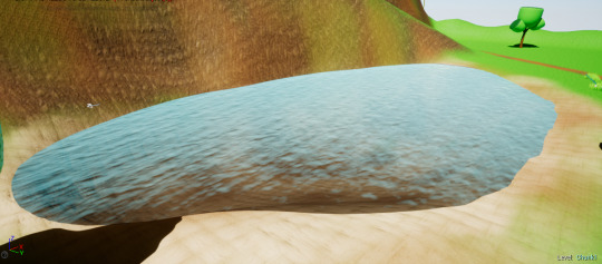

I also placed a post processing volume inside the lake which blurs and changes the tint of the screen to blue. I made it so the transition is instantaneous as the player character falls into the water.


Here’s the material that I made. The parameters can be changed in the editor which is great to easily preview how it will look. With the panner nodes I can change the speed which the water moves. I’m really happy with how my lake turned out as it’s the first time I created water. I’ll decorate the rest of the lake and great a fishing pier. I’ll also create collision boxes to change how the player character moves when inside the water.
Urban Assets
Buildings

I created a handful of small simple buildings in Maya. These can be placed together to create different buildings and give more variety. I also made sure to have sections where different materials can be assigned such as glowing sections or windows.
I placed simple placeholder textures on them to see how it looked. I used these assets for my small scene in a previous unit.

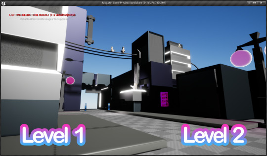
Clutter
I also created clutter such as signs, wires and lamp posts. These help populate the urban environment and make it more interesting.

This clutter can be used in lots of different ways. For example wires can hang across the street like powerlines which make the scene more interesting but also give a place for birds to sit. The same wires could instead be used to plug into a mechanical asset and give an explanation for how it’s powered. Lamp posts not only fill the street but also provide the level with a source of light which will be very useful for any night scenes I might create.
0 notes
Last Seen Blogs

nanicasoloja
Untitled

majestic-lion2
Untitled

lillavenderprincess
daddys princess bean

the-deathdrive
antimidas
the-deathdrive
antimidas