#i love pink colour schemes but oh my god the character design
Text
Idate (WATGBS AU) Doodle WIPs


We are cooking!!!
This is our WATGBS AU’s version of Idate, a buff DILF dad. He wears blue eyeliner and earrings, has scars, and orca markings/patterns more realistic to actual IRL orcas.
Oh yeah, I wanted him to have a big coat cape jacket that hangs off his shoulders (like some of my faves, Douman, Hibari, and Xanxus)
How I draw Idate is what I imagine him to look like in our AU ^^
(Though I’ll fix the orca markings whenever I refine the sketch, since it’s still a rough sketch right now)
I made Idate themed after the black sun in our AU, and Tatsu is themed after the moon. And Tatsu has pink/red eyeliner and star and moon earrings. So after he meets Tatsu, he starts wearing blue eyeliner and star and black sun earrings to match with her <3 🖤🤍❤️
I quickly scribbled the earrings, but I think it’s also neat if Idate’s black sun earrings also look like a vortex... A void/abyss. I’m not sure what colour to make the earrings... It’s ok as yellow, but I’m also wondering if I should limit the amount of colours used in his colour palette. Silver or white could also work
Me and my black sun faves!!! ☀️🖤🐈⬛️
(Points at Douman, Judar, Idate)
If you ask, “Did you guys seriously make an entire ass fantasy world based off a character that shows up a grand total of 3 times in the OG WATGBS as short cameos, and the rest of your sea creatura faves”
Answer: Yes!
In the OG WATGBS, Funa-verse Idate is a violent orca that goes around on strolls, acting solely for his own pleasure to entertainment himself, based off the orca-like behaviour of playing with food by tormenting other sea creatures.
In our WATGBS AU, Idate is the Lord of the Underworld. His character theme is “Void/Emptiness.” He has Void powers and can create voids. He’s the evil protag of our AU. We created a whole story for him and the other WATGBS AU charas. (99% of our WATGBS AU is just lore that my friends and I made up <3)
And it’s so fun to write for an evil meow meow mf protag 🤭
Friend: Sen's Idate is so fucking hot 😳🖤
Me: Waaaah thank you!!! My only [art] goal in life is to be able to make my faves look hot
I strive to make my cat cots look hot!!! If my cats look simpable in my art style, then my job is a success
My masc faves are all my cat sons to me, so for me, “hot” is “Omg SO pretty” as aesthetic attractions
As usual, some rambles are under the cut


I did a colour edit last year of Idate’s OG art to match closer to what I imagined for our WATGBS AU’s Idate, and balanced the colours for my own drawings. When I do colour edits, I pick the colours based on what I think looks good. They help serve as colour guides for future drawings.
I love using cool colours like cool blue (teal is really nice for colouring black hair) and cool purple to colour black/monochrome colour schemes ^^
Friend 2: Oml, seriously thank you for fixing the colours and skin tones on Funa's designs, among tons of other things
It always bothered me, why the fuck are her charas all pale like paper bro??? LIKE THEY'RE LITERALLY PAPER
Me: Yeah the colours are so bland and dull in Funa’s version bruhh and Idate’s orca tail markings (flank patch and saddle patch) being missing in his design bothered me so much wtf

Source: Emma Luck, marine biologist
Cats and orcas are my fave animals <3 Orcas because of this god forsaken AU LMAO /pos /endearing
I love our AU with all my heart
So I love looking into orcas as a hobbyist, and made changes to Idate’s design accordingly
And yeah, Idate is one of the only charas where the white skin still “works” since he’s descended from a demon and has a black/white monochrome colour scheme, but it’s so weird, it makes the charas look like paper
Like if only a few charas had it, ok fine but IT’S LITERALLY EVERYONE ADSKLSDKLLDSKL
0 notes
Note
A couple of disjointed notes on jjk designs
Along with female characters having you know personalities, motivations and arcs they also have very nice and non sexualized designs. Like its been so long since i saw so many female characters non of which felt like they were dressed up a certain way for the audiences sake. Like we got so many! We got five known girls out of just students so far and they all have varied designs in the way they wear their uniform and all of them seem to speak more about their personal sense of style and aesthetics rather than being made with horny teenage boy in mind. Like Maki has the shortest dress but she never once feels sexualized in it, its really great.
N like i didnt fully expect this because i remember watching the first ep and seeing yujis classmate get groped by a curse n sitting there like ah :) anime. But i think this was something that was on its way out of geges artstyle even then (with exception of meimeis brand new almost tit shot but meimei already makes me uber uncomfy so thats not out of line considering we barely see anything). Like in the prequel we also see a woman get groped by a curse n maki isnt wearing her hhh whats the english word stockings? So her legs are more bare but even then we dont ever see like anything we arent supposed to even tho she like does splits n stuff, mad impressive. So that leaves to me an impression that even back then Gege was hhh about this sort of stuff n maybe did it here or there cuz 'this is how shonen is done' but fortunatly decided to completely drop it by the time Nobara joined the team n honestly mad props cuz its rare that a manga makes me feel so comfortable about liking female characters, like off the top of my head id name nozaki kun n ouran and have beastars balance on that line sorta, its just so rare, especially in anime. N as a woman its so much easier to relate and love the female cast when they arent constantly being presented as blow up sex dolls. Its just really refreshing n really good n god bless geges soul for putting miwa in a suit to joy of every lesbian ever bls give her a scythe next BLS.
On a slightly different note, Momos anime design....YIKES. Like i think the anime so far did a p good job with colors, as far as im aware they changed toges color scheme p much entierly n he looks great, yuji has this dusty pink that looks real nice n maki has this dark green that looks very good. Miwa is sitting on a line for me tbh like she looks ok but i do think her hair color should have been idk like a little less pure blue? Little less saturated? Idk art lingo, but for me shes sitting on a line of 'she looks ok but ciuld have been better'. Like its weird in the op she looks nicer, the lighting gives her hair this silver-whitey feel that works very well for her but then in the anime her hair is just a tad bit too bright blue for me, still digestible tho.
Momo in my humble opinion looks like a disaster n im not just saying that cuz for some reason i thought her hair was sorta dusty pink like yujis. Like her hair is just so...bright. its this weird lemoney yellow that is such an eyesore n distracts me whenever i see a group photo, likw my eyes immidietly fly to her she sticks out like a sore thumb between everyone else with more natural looking/ better made unnstural colors. Like maybe if they went with a darker or more natural looking blonde??? Idk. Her hair is very bright n her face is the sort of pinkish pale n the two colors together seem to at the same time clash n melt into each other where at the same time the outline between her face n hair doesnt seem clear n they both just scream at you. Ill probably get used to it as the anime goes on but rn the prevailing feeling is '...is it too late to fix that?'
Oh also gojos eyes have been bothering me less so i think i got used to them after all, but mad props to both gege n the mappa (it botheres me more in anime cuz also color) to be able to convey a feeling of an ultimate top of the chain predator through eyes alone like SKILL. i think they also bother me cuz without his blindfold gojo just looks like a completely different character to me like if you showed me the two pics of him before i watched/read jjk i would probs say those are brothers not the same person. In conclusion im basically like a baby who starts crying when her dad shaves off his beared cuz she cant recognize him anymore.
That ends my notes on design for now
XD Lucy, I’m so glad you’ve fallen in love with JJK like I have.
It’s a really interesting manga and I can’t wait for the anime to animate everying we’ve seen from the manga so far (it’ll hurt so good T-T). I especially love the girls designs because they just feel so much more... natural, then most female designs you get in anime. They feel like girls (also, can I just say how much I love how excited Nobara was to get a tracksuit of all things. It’s not something you really see in manga/anime and yet a girl that gets excited over comfy clothes is so much real to me XD).
I have similar feelings about Miwa’s hair. It’s way too bright in comparison to the rest of the anime designs, they should have dimmed it or something, she just stands out in a way that she shouldn’t have (though I do admit that I like the colour of blue... I’m so conflicted). And I don’t really mind Momo’s hair too much though I do think it could have been better colour of blonde (JJK using bright colours even though it’s such a heart-breaking anime T-T).
Gege and Mappa really did do a great job though T-T
3 notes
·
View notes
Text
Contests Part 2/2
6. Loser Jessie

Screechy harpie Jessay has even more of a raw deal than Mavis and Dawn of the Dead.
From the outset I knew she'd never be champion, but she ought to rise above the tiresome berks clogging up procedure.
Sufficient popularity at Pokémon Towers ensured the girls were allotted coverage of all their award ceremonies. They had a moment in the sun.
What has Jessie in comparison?
I can't recall Hoenn, but I don't expect it was much.
Sinnoh however carried naught but a single paltry episode.
This for a main character.
This for someone there from the beginning.
This for an ardent fan favourite.
This for a wench who, should we include all her various mutations, has featured in more installments than either of 'em.
But no, treat Jesseee as worthless, even lower than Dawn's groupies. It's not like anyone watches it for her.
Looking back, it's obvious what they were intending to do come Unova.
What's the score then?
• One paltry Contest on screen.
• A couple happen elsewhere, marked by a few seconds per mention when the script oh-so generously moves away from the thrilling main plot.
It's gotta be the small-town concerns for Jessuhleenuh, nothing major. She deserves no better.
• One won by James, so not hers. Press her inadequacy upon us!
• One obtained as a gesture of pity from Kate Middleton.
And how did that work? What's the good of allowing 'Dawn' entry again?
She'd already qualified. If winning here, that gives her six, therefore there aren't enough Co-ordinators for the culmination.
And when Jessie showed up with a Ribbon recorded as belonging to Dawn, how was she taken as fulfilling the quota?
The slapdash way these Contests are run!
God forbid Jess should be shown as excelling at anything. It must be scraping into the final undeservedly.
Bitch gotta know her place.
7. Bumpkin Jessie

...
Ain't no description I can give that don't rhyme with 'hit', or variations of the theme.
You thought the shafting Jessica got coverage wise was bad enough? Yer ain't heard the 'alf of it.
Sinnoh was a period of peak Moron Team Rocket, where the one surprise was how stupid they could be.
You may remember an early episode when James designed her clothes for the catwalk. She thought it'd complement his work by applying lipstick all across her mug.
Obviously Jessie would do that, clueless as to how make-up functions.
Come on kids, she's thick!
Even at that numskull nadir it's difficult to comprehend anyone choosing this get up without severe duress.
Picture the scene: you debut on stage, before an audience of thousands and television cameras, in an event preoccupied with superficiality.
What do you wear?
• Giant, oversized glasses out of fashion since the Seventies.
• Bootlace tie last worn in the nineteenth century Wild West by a barman serving sarsaparillas.
• Colour scheme of brown and orange, the nation's favourite hues.
• A man's old shirt fraying at the cuffs.
• Voluminous apron dress.
• Massive yellow bows last seen decorating an Easter Egg. Always a winner.
• Heavy, clod-hopping boots.
• PIGTAILS!!!
Even the name is unattractive.
Ah yes, very common for those under six. Unheard of later.
You have reached puberty haven't yer Jessie? I can't tell anymore.
They couldn't get enough of that combination in Cosmo, which is why it's no longer in print.
Not only is Jessie denied success, she's deprived of the chance to be pretty in a realm where nothing but that carries weight.
Worse, given how her face disintegrated, this is the best she's been for five generations.
Yeah, because the inbred milkmaid style is such a good look, eh?
SEXAY!!!
8. So Long, Tsundere

Remember tsunderes? What happened to 'em?
The curse of Pokémon was draining the well of inspiration too quickly, throwing away interesting characters as mere guests.
This is particularly noticeable regarding the ladies. Back then, we got Misty, Jessie, Jessibelle, Cassidy, Aya, Giselle, Tyra, Sabrina, assorted crones Brutella, Nastina and Lacy, plus Joy, Jenny and Dame Ketchum provided parental authority.
How did a series that began with ball-breaking birds like that end up with insipid, glassy-eyed dullards like Zuhreena, Banana Lana, Marsh Mallow and Lilliput?
Ooh, Zuhreena is a pwincess!
Ooh, Banana Lana bwows big bwubbles!
Ooh, Marsh Mallow wuvs phallic waddishes!
Ooh, Lilliput won't pwet wanimals bwecause of Secwet Pain!
Can you imagine such weak specimens finding any place in the anarchic atmosphere of the classics?
It's SO boring!
Where's the punch? Where's the human spirit?
Where's the entertainment gone?
This squishy attitude began in Hoenn. Misty left, Jessie's hair symbolically changed from volcanic red to pink, and Contests introduced a cuddly theme where glitter glue and sequins are top priority.
Every sharp corner, every jagged point has been filed smooth. Now its substance hasn't the hardness to even develop edges, not when it's all cushions and candyfloss, where catching Pokémon rests on them deigning to grant permission, rather than 'avin it out.
Tsunderes, exuding untamed charisma and independence, besides a soupçon of danger, simply don't fit the cardboard box we habit now.
Nor do yanderes, kuuderes, tsuntsuns, or even derederes. It's just nothing but smiley-smiley creeps.
I wouldn't mind any of these tropes as long as there was some sign of colour to be had.
9. The Sacrifice of Misty
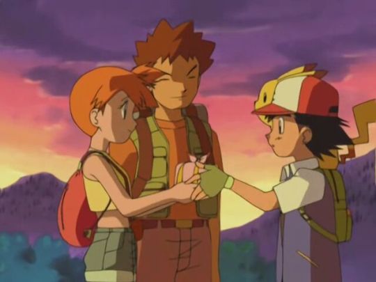
Misty bid farewell under the feeble justification that the lack of a longterm goal made her vulnerable to sacking.
Such a line uttered as if her own choice, being beyond them as writers to invent a purpose.
This implied her replacement would have an exciting quest aiming for excellence, something just beyond Misty's capabilities.
What did we get?
Dressing up and collecting Ribbons!
Is that...is that it? Is that the great idea? Is that all the girls are worth?
I lost Misty for THIS?!
Perhaps it makes no difference. By Hoenn they'd rendered her a leaden blandness sucked dry of all that made her special.
Going by the greasy-toothed bastardisation that swanned up in Alola, Misty was simply too wild for the safe, stifling atmosphere of today.
Her departure ensued she remains frozen as a funny, beloved presence, unlike those she left behind.
Now there was a lucky escape, as once the fanny-flapping starts, the bints have it on the brain.
May had Max to beat on the side, but Dawn developed monomania.
Hardly an episode went by without some reference to Contests, or how today's plot spurred her on to the next opportunity.
Yer need help, love!
Rather than Ash's new friend being a fascinating person who so happened to enter vanity projects, the competition defined them to the exclusion of life.
It is but moths drawn to the candle flame waiting to engulf them.
Contests are this world's version of Tom Riddle's diary: they promise sympathy and validation, but they eat your soul.
Like Tumblr.
10. Completely Unoriginal

Seems to me it wasn't so much Misty had no goal, it was more that Contests were the supposedly hot concept wedged into an existing property.
If earlier aspects failed to accommodate the invader, the onus certainly wasn't on the new kid to change. Oh no, stuff it in and chop off whatever gets in the way.
In the eyes of the post-Shudo regime, Misty was too volatile to last, and so had to go.
What idiots.
She's a tsundere. The softer, more feminine side is a defining component.
Would it really have been so problematic to retain her as an entrant? If Jessie can, why not?
Even if failing to fit, so what? Since when was established characterisation a barrier?
Isn't twisting likeable folk into unrecognisable pods the modus operandi of the writers?
That canon is immaterial, and must always give in to whatever fancy they currently have?
Well then, what's the big deal in infantilising Misty to promote it rather than pensioning her off?
Viewers will be more invested in the challenges awaiting a familiar face rather than a stranger.
What reduces the above to the risible is the original Misty and Jessie both participated in the Princess Festival.
All Contests are is that very scenario on repeat and robbed of all meaning.
Think about it:
• Beauty round
• Battle round
• Jessie loses
Same bloody thing.
Not only have I got to suffer this draining spectacle, it's got the nerve to possess not one iota of fresh ideas!
Contests are a low rent rip-off. The Princess Festival had a worthy reward in the shape of one-of-a-kind Dolls.
It'd already been revealed that ordinary Princess Dolls were ruinously expensive, therefore the special Pokémon edition have to be priceless.
What d'yer get for the trouble of a Contest but a bit of plastic tat taped to bargain basement frippery?
And they demand you get five of 'em!
Contests themselves were then resurrected as Showcases, although mercifully slimmed down to only three, with the emptiness ramped up in compensation.
Perhaps ironically, Princess Versus Princess is one of my favourite episodes. I love its critique of female avarice and accurate portrayal of clothing sales as reminiscent of the zombie apocalypse.
I don't mind the Festival as a single adventure, but I may have felt less favourable had it been a constant presence.
Except it isn't the competition at stake. This is a framework to explore Jessie and Misty as people.
Through its device we learn their history and therefore how they came to develop as the girls we know.
The setting serves as an opportunity for both to confront the misery and isolation of their childhoods, with the promise of overcoming that old torment with the balm of victory.
In the final, they aren't so much battling an opponent as fighting to be free of the past.
The tragedy is only one can be granted that reprieve. The other must remain unhappy in the ruins of memory.
It matters, unlike vapid Contests, where posturing is king. What depth can they provide in comparison?
Despite identical content, they are inverse counterparts, with the Festival presented as merely a light affair concealing a rather dark tale of neglect.
Contests however are paraded as this worthy nourishment for body and mind, a major point in one's journey towards enlightenment, when all they really amount to is an organ grinder and his monkey arsing about for the slack-gobbed plebs.
Bread and circuses.
Best of all, Misty won, not some side twat, as it should be.
Note how Jessie dressed: in delicate, vivid robes and golden decoration. The boys thought her beautiful.
Not as a gormless dweeb you'd cross the street to avoid!
And why the need to disguise herself anyway?
The Twerps had no issue with Jessie of Team Rocket joining the fun back then, so what happened?
At least she received the consolation of gaining Lickitung as a friend, with James and Meowth desperate to comfort her.
What do Contests bring? Sod all!
5 notes
·
View notes
Text
S/S 2020 Fashion Month: A Basic, Uneducated Fashion Heaux’s A-Z of Everything Noteworthy (Part 2/3)
Hi to anyone reading,
Back at it again with the giving my unsolicited opinion on 2020′s spring/summer offering, I’m gonna hop straight into part 2 of my fashion month review!
Sorry to start with an underwhelming few but my compulsive tendencies are making it really hard to break out of this alphabetical structure (cry laughs whilst thinking about how long it took me to face up at my retail job last night because it would give me vaguely homicidal urges and make my fingers tingle every time a customer moved something slightly out of line), so I’m gonna whizz through a handful of collections. First up, Halpern:
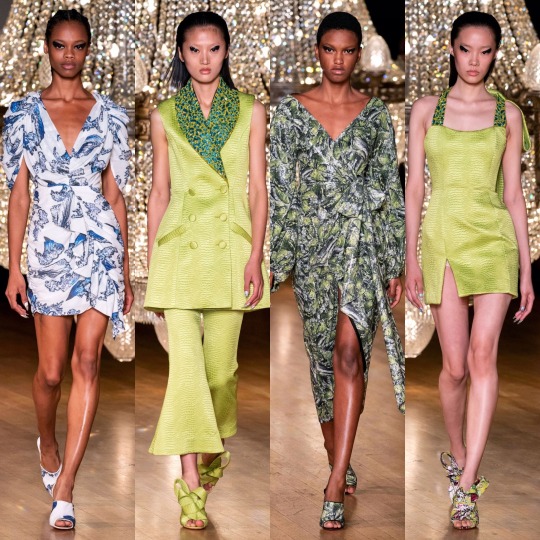
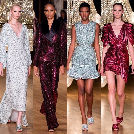
Not much to say but I’m envious of the heavy liner (my hooded eyes could never) and I like the colour scheme. As for the 80s style metallic pink dress?

Helmut Lang:

And Hermes:


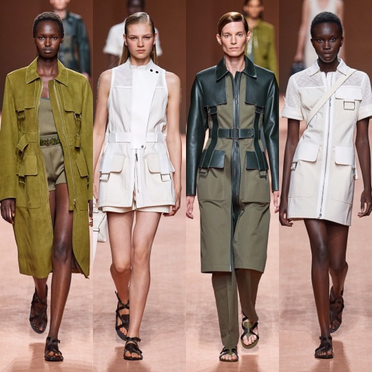
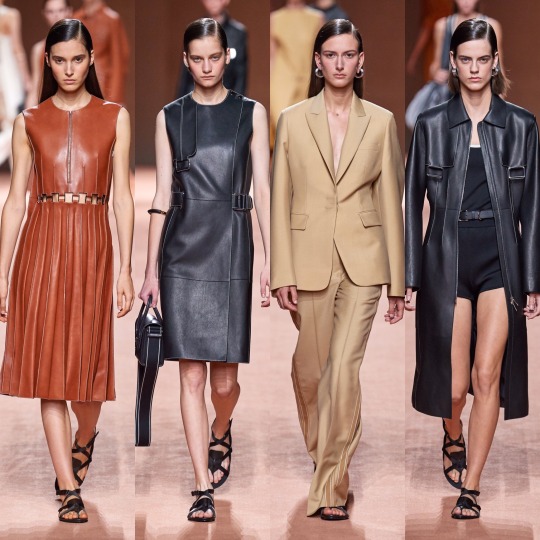
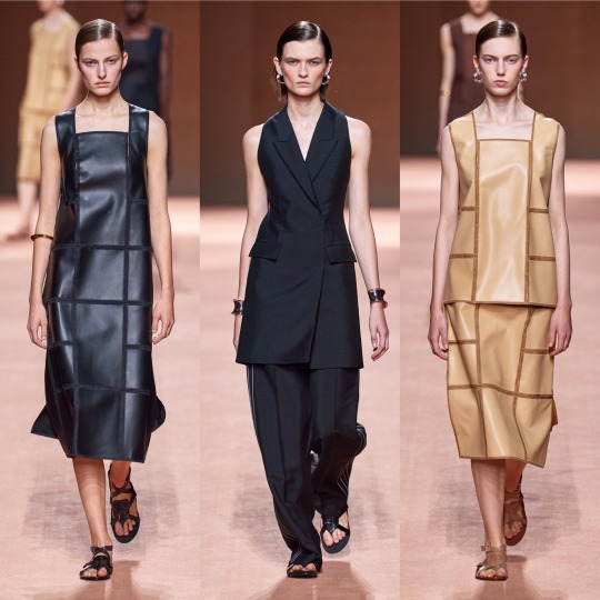
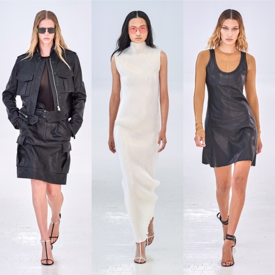
Of these 3 collections, Hermes is definitely the most interesting. I like the colour scheme and the utilitarian shapes and the tan coloured jackets are an absolute shoot. This is how you make safari look fresh, D&G take note.


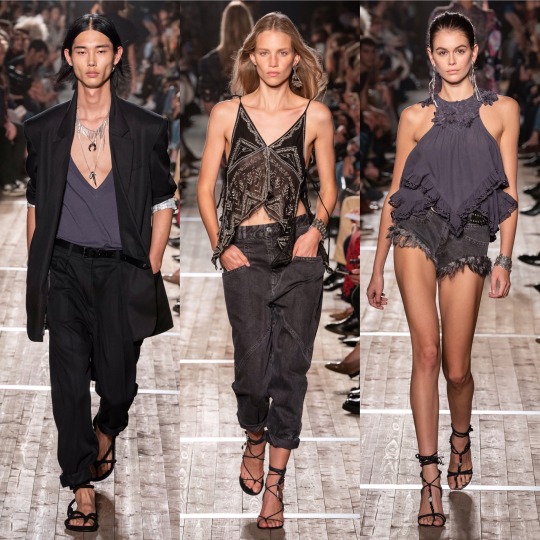
Isabel Marant was okay. It’s cute, sure, reminds me of something Mary-Kate and Ashley would’ve come out with/worn in the 2000s, and there’s definitely some things I would wear, but I wouldn’t say it looks all that luxury. Pricey, sure, but like, Free People pricey, not designer pricey. As a collection, it’s not all that conceptual, unless the concept is L.A girl does a Starbucks run after her bikram yoga class. What I will say though is that some of the S/S 2020 commercial trends are becoming clear: white cheesecloth pieces, peasant blouses, cowboy boots, scrappy sandals, neutral tones, and bandana print.
Now onto the darling of high fashion Twitter: Jacquemus.
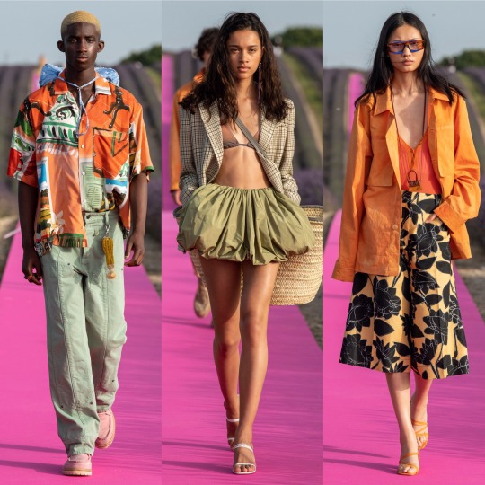

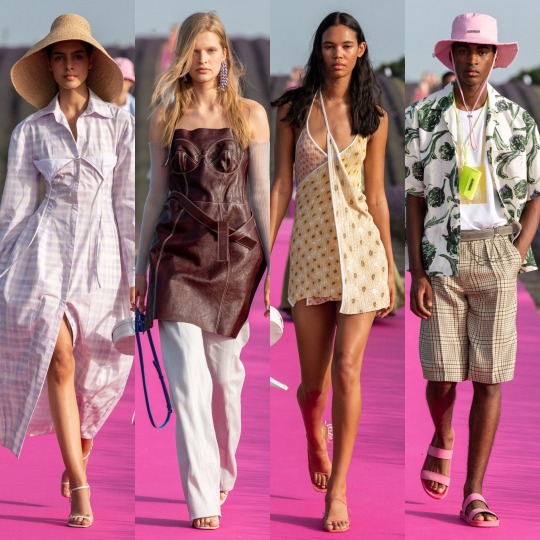
As far as presentation goes, this has to be one of my favourite set-ups of the season; a hot pink runway running through a lavender meadow is as canny and serene as those who sing the praises of Simon Porte Jacquemus would have you expect, and the clothes were easy, breezy and beautiful, even if there is an element of getting dressed in the dark going on with the styling which put me off including a few otherwise gorgeous pieces. It might not be 100% my style but you can tell this is a brand of the future which is only going to go from strength to strength.


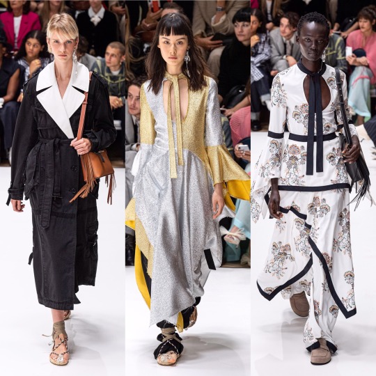
And everything was beautifully and purposefully crafted on the runway with J.W Anderson this year. The pieces are graceful and timeless whilst still easy to envision as something a modern woman would throw on to (very fashionably) run some errands in the city. This was also one of the handful of shows (IIRC! This might be a case of extreme deja-vu!) where we saw the sandal straps tied over the trousers, I’m guessing to accentuate the ankles, and...I’m surprisingly here for it? Though in a sense it kinda resembles when I accidentally get my work trousers tucked into my slipper socks, it’s an interesting touch and adds a bit of a shape to otherwise billowing bottom halves.
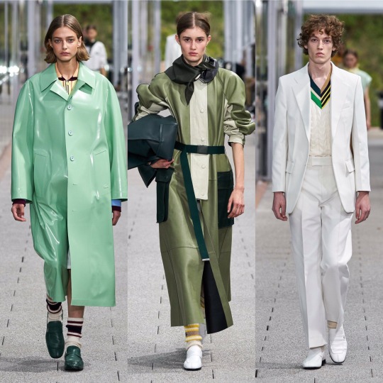

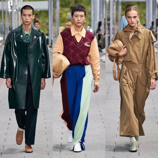
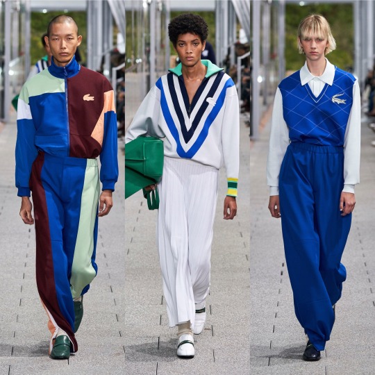

Following Jacquemus’ lead (or vice versa, I’m way too deep into this fashion month haze to work out who went first at this point), Lacoste also put on a co-ed show. Otherwise crisp and preppy as per, the neckerchiefs (even if seeing them all next to one another does give off a bit of a Disneyland Main Street barbershop quartet vibe) and vinyl/wet-look/PVC/I’m still not sure what differentiates the 3 coats were an out of the box touch for them and I really liked it. It’s athleisure, but more like something Hayley Bieber would’ve worn as part of her Princess Diana inspired shoot than anything I’d wear to the gym.
LMAO, as if I go the gym. But you get my point. Next, Loewe:
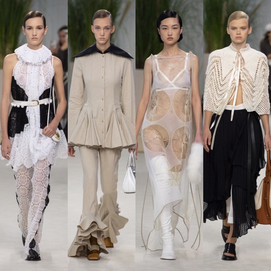
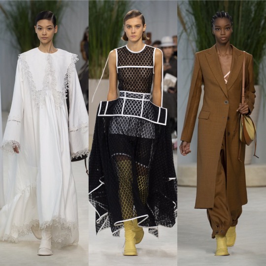
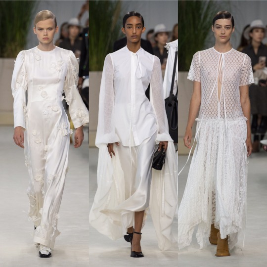

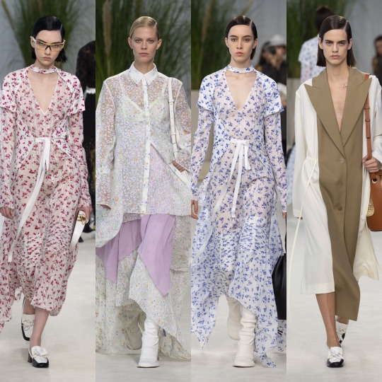
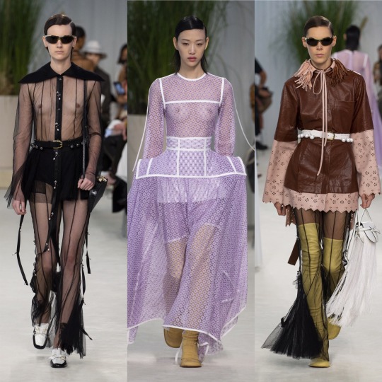
Delicate, feminine and all around delightful, the S/S 2020 Loewe collection is up there with Chloe and Brock when it comes to most spring appropriate. More chiffon, lace and doily-like detailing, please, the old woman in me lives for this kinda thing made fashionable. Like with J.W Anderson, you can tell the design team wanted to do something different without just throwing shit onto their pieces for the sake of being wacky, and so we end up with these dramatic, slightly geometric waistlines and almost angelic Victorian nightgown inspired dresses that kinda make me wished that 1). ghosts existed and that 2). I lived back in that era so I could die some tragic death wearing any one of the dresses on the left in the top 3 rows and then haunt the shit out of everyone. That would really be an iconic fashion moment. Also wonderful, imo, was Louis Vuitton:
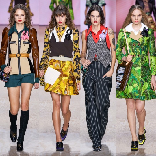
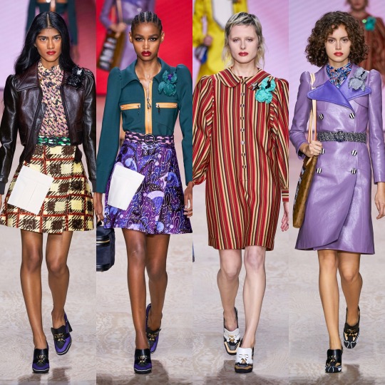

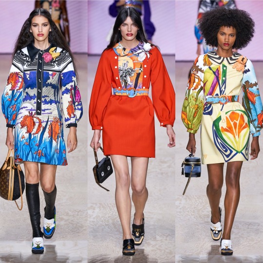

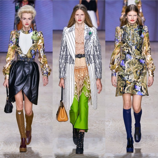
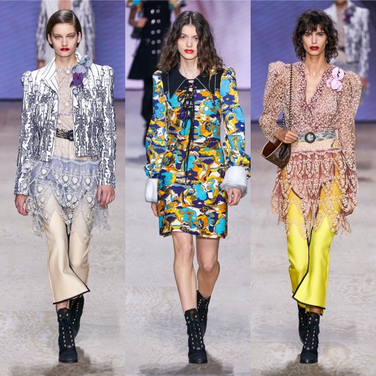
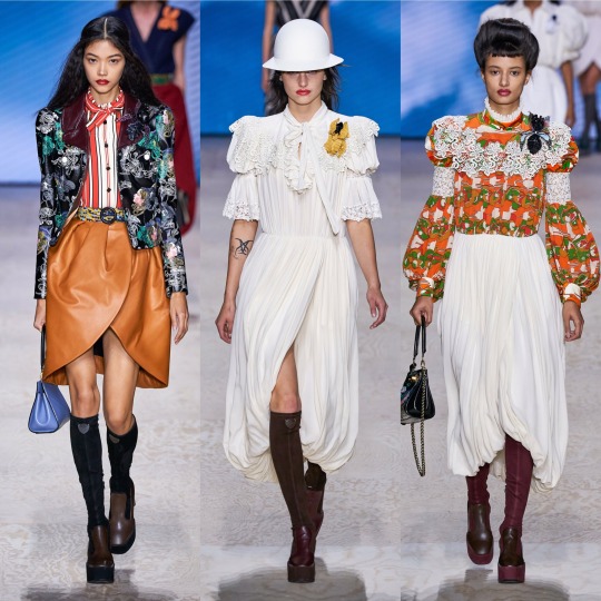
The mix between 60s and Edwardian I never knew I needed, as opposed to Gucci’s forward thinking take on the former decade, Louis Vuitton takes it back even further and throws in late 19th/early 20th century structures and references. I adore the what seems to be a mix between brocade and paisley print and the exaggerated collars are a very cute touch. The jacket on the top left is a highlight, a more neutral version of the similar catsuit seen at the Longchamp show (I couldn’t personally pick enough highlights from that to include it), and I now more than ever really want to try and pull off a sweater vest. The shoes might not be the most exciting thing ever but they’re also a personal favourite, from the knee high boots to the loafers with the LV moniker.


Maison Margiela was very cool and again, I’m in love with the shoes and just the accessories in general, ESPECIALLY those hats. I don’t know if I’m way off base here but this show is almost a modernised, fashionable version of a 1940s period drama about WW2 pilots and evacuees. Yes, maybe I am just getting that solely from the trench coats and the naval influences and the exaggerated collars but I think with that list I made quite a case for that perspective, right? Right.


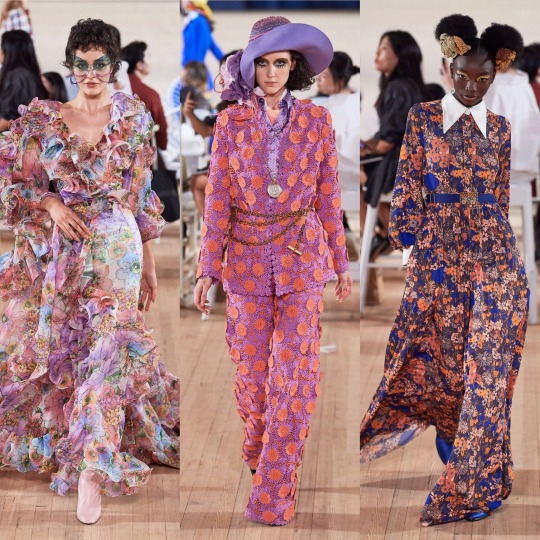


And completing this holy trinity (appropriating the term I usually reserve for Emma Watson, Emma Stone and Emma Roberts is not without careful consideration) is Marc Jacobs. One of my ultimate favourites of this season, this collection is absolutely EVERYTHING: kitschy, dream-like, whimsical, over-the-top, and totally appropriate for your slightly eccentric aunt who always drinks too much wine and talks a lot of shit every time she comes over for dinner. I really feel like I walked into wonderland looking at this collection, and in the best way possible, it gives me a female Russell Brand in the 2000s’ wardrobe on crack. On the one hand we have these insanely beautiful and ethereal chiffon floral dresses but then we also have fricken top hats. Basically, it’s everything I love about fashion and I don’t know if anything can top it. Periodt (and I type that with a totally straight face).
Next, onto another personal fave, Marchesa:
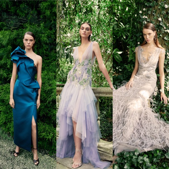
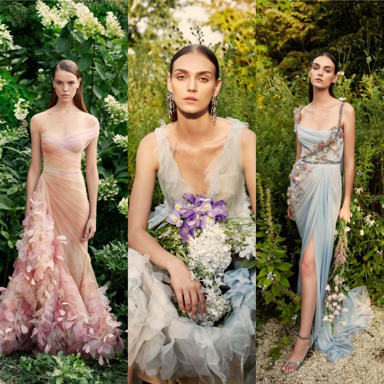
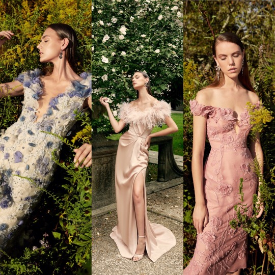
Which is as always, beautiful. I was going to write that if Disney princesses came to life and lived in the modern world (so, in other words, Elle Fanning), they would be wearing Marchesa and then I remembered that the film Enchanted exists and had a lightbulb moment and thought OH MY GOD IF THEY REMADE THAT IN 2019, THE DRESS ON THE RIGHT IN THE MIDDLE ROW WOULD BE A PERFECT LEVELLING UP OF THE CURTAIN DRESS.
Anyways, favourites of the favourites are the bottom row; I would die for that feather trim.
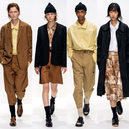
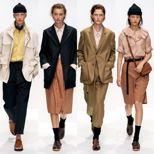

BUT where Marchesa is everything opulent, overly ornate and err-ing on “fussy”, Margaret Howell’s S/S 2020 collection is completely stripped back and just as effective, if not as to my taste. Very cool, very current, and altogether effortless (in a good way!), with this show Margaret Howell made mid-20th century utilitarianism relevant. I never thought I’d be praising the combination of bermuda shorts, crew socks and a beanie and yet here I am. Character development.
Next is Marine Serre:


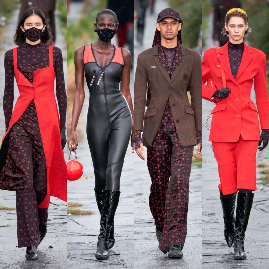
Which I really like! The bottom row isn’t really to my personal taste but I can acknowledge that if I saw somebody wearing any one of those outfits I’d think they looked sick, and as for the first two rows, those mesh tops and the slightly chintzy florals are right up my alley.
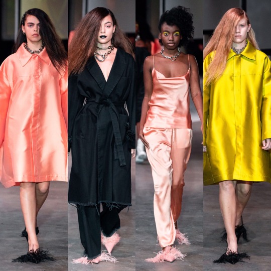

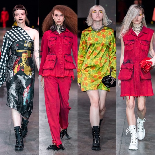
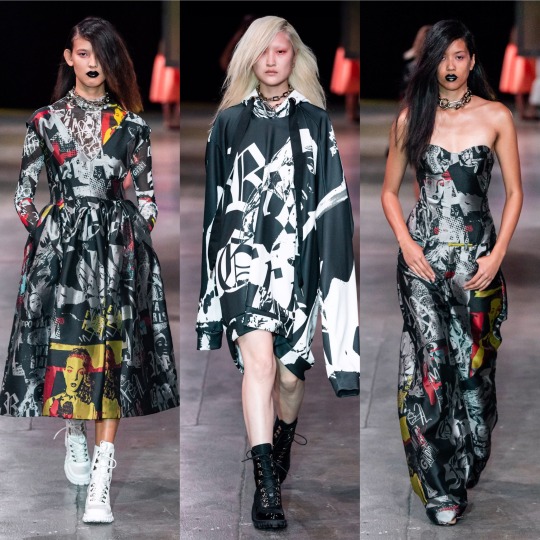
Marques Almeida put out a really strong collection, imo. The blending of luxurious silhouettes and fabrics with street wear inspired prints and styling is a really interesting and unique contrast and if Billie Eilish ever decided to stop wearing those tweenie clothes and wanted to actually seduce somebody’s dad (I LOVE BILLIE EILISH AND I KNOW WHY SHE DRESSES THE WAY SHE DOES, IT’S A JOKE, PLS DON’T HATE ME), I’d love to see her wearing something like this. It’s a blend of punk, urban, and 2019 e-girl and has the kind of edge that Topshop has lost over the past couple of years that used to make it so aspirational to my 13 year old self. Of all the shows, it also probably has the most personally wearable accessories, and a shit tonne of cool make up looks I’d love to try if it weren’t for my lack of visible eyelid, lol.
Make up looks were a highlight of the Max Mara show too, for me anyway.
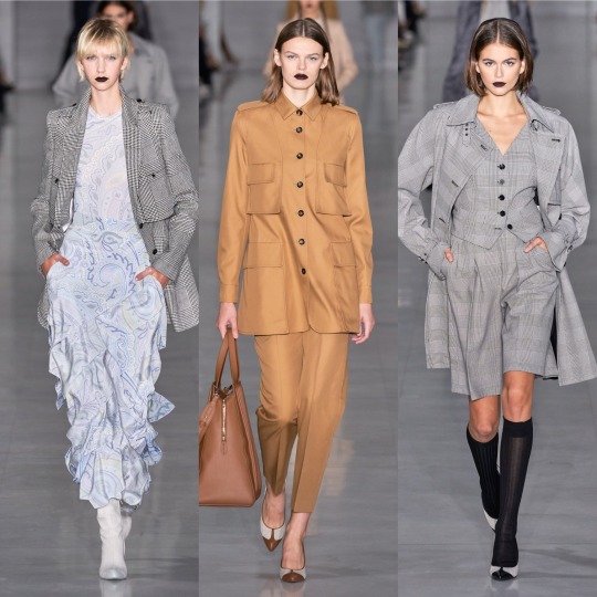

I otherwise wasn’t hugely keen on the collection, it being a little too matronly/Miss.Trunchbull-esque for my liking (wild card fashion inspiration of 2019, apparently?). The light paisley print dresses are very dreamy, though, and I can never resist a good suit.

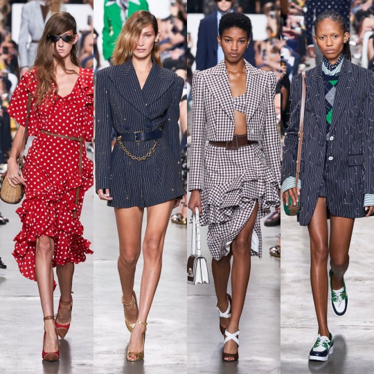
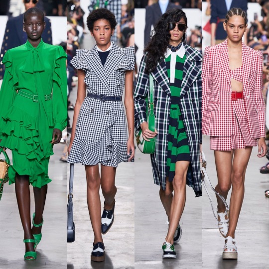
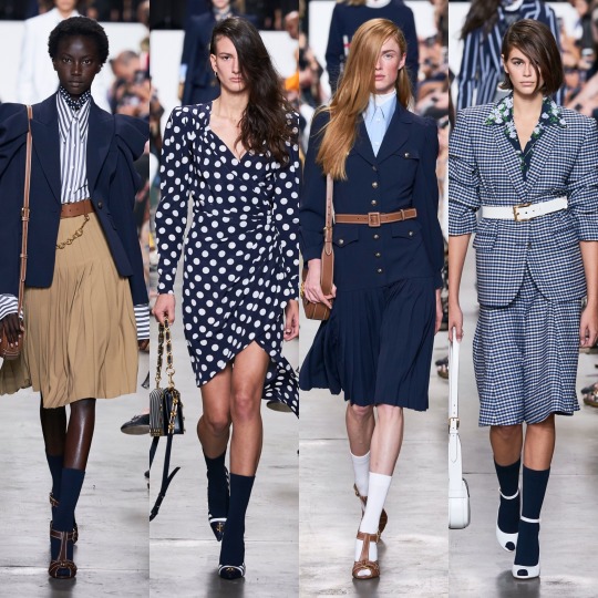

As for Michael Kors, dare I say it, but the basic bitch in me loved it. I know as a designer he’s not held in very high regard by the fashion community and I'm not saying it’s at all original but it did what it set out to do well; I mean, it’s quite fitting that he cameo-d in an episode of Gossip Girl because every outfit would be perfect for the Constance attending incarnation of Blair Waldorf, which is probably why I like the collection. Like yeah, it’s a bit of a Polo Ralph Lauren/Lacoste rip off but it’s daintier and more feminine and so I’m not gonna lie, I’m on board with it.
Next, Miu Miu.
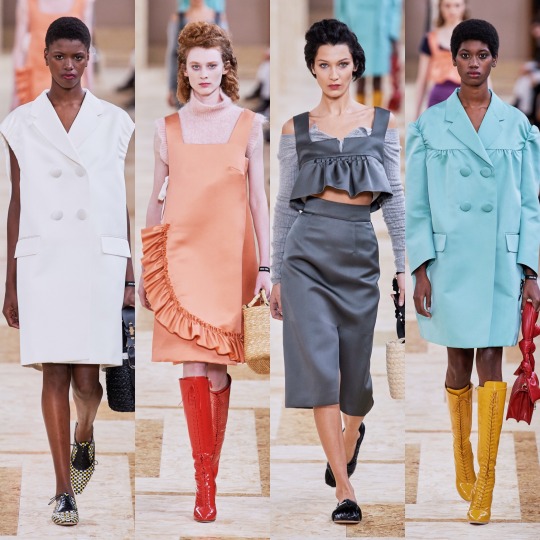
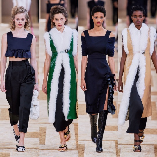
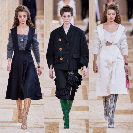


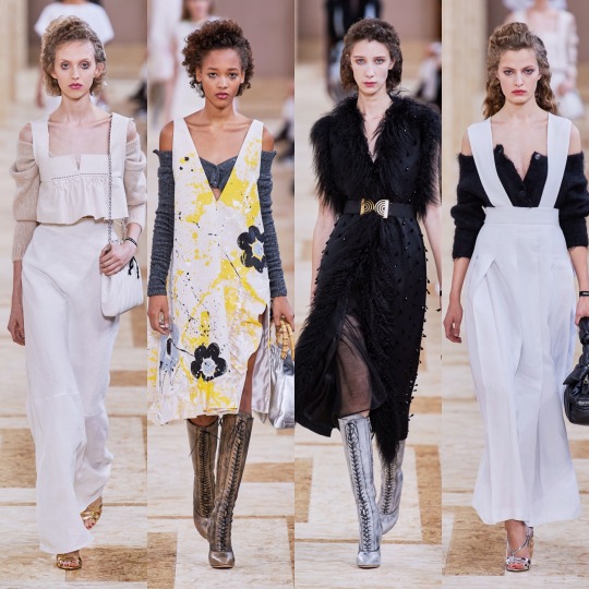

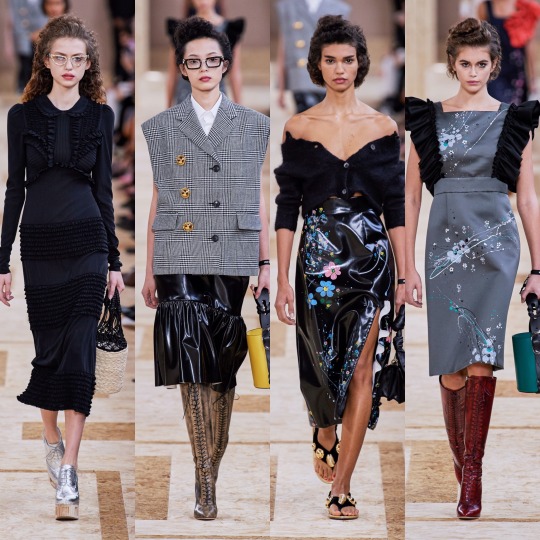

One of the collections I was most excited for, I was a little disappointed. Don’t get me wrong, I really like the collection, but I have never once disliked anything Miu Miu and I usually love it. There are things I love about this line too: the cream, floral lace-up boots, the off-the-shoulder cardigans, the houndstooth oversized coats and of course the fur-lined gilets. My mum used to buy me similar ones when I was a little girl and so they give me childhood nostalgia in the best way possible. I mean, the collection is as girly and eccentric as ever. I think it’s just a little too on the primary school librarian side for me, this time round. Sorry Miu Miu xoxo
Now I’m just gonna speed through a couple, starting with MM6 Maison Margiela, the younger sister to the more expensive regular Maison Margiela line:


And Monique Lhuillier:

So that I can get to one of my other ultimate favourite collections for S/S 2020: Moschino.
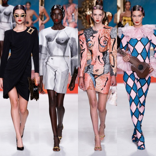
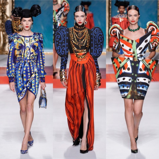
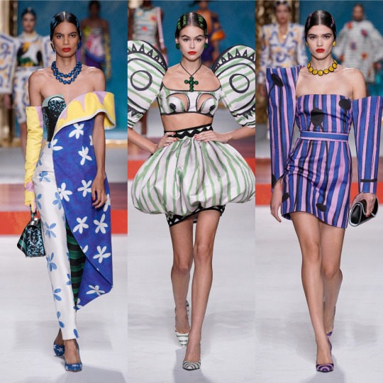
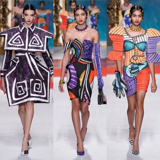

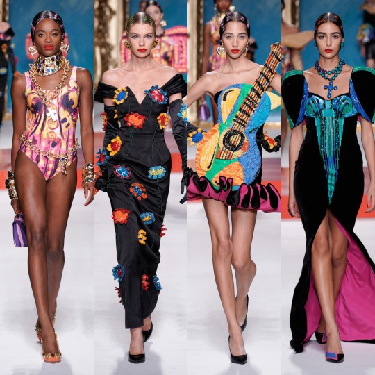
Oh my god, where to even start. Firstly, I might be reaching, but if this show is even remotely to thank for art nouveau mesh tops showing up in the Urban Outfitters new in section, then a very sarcastic thank you to Jeremy Scott. You just made ethical shopping a lot harder. HOW am I supposed to not buy an Alphonse Mucha top? HOW!? I mean, I’m sure I’ll manage (I’m on month 3 without a shopping spree I can’t actually afford now and yes, I am very much patting myself on the back), but HOW!?
But on a serious level, if renaissance was the print of 2019, which I’m still very much into BTW, bring on modern art as its 2020 replacement. The Pablo Picasso inspired show not only livened up a generally pretty predictable fashion month but it’s also got me searching up other times art has met fashion on the runway and thrown me down a particularly aesthetically pleasing wormhole I’m not sure I ever want to escape from (https://frontrowmagazine.ca/art-inspired-looks-were-all-over-the-runways-of-fashion-week-a74e8bc7ff0d and https://www.vogue.com/article/spring-2017-ready-to-wear-fine-arts-trends are good starting points!).
Mugler was also up there with the best of them, imo:
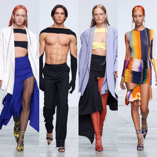
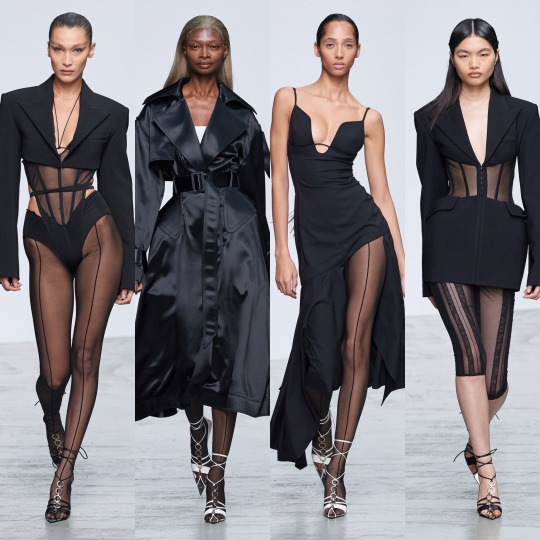
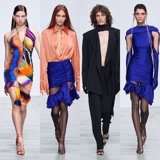
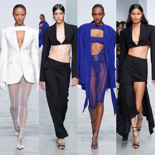
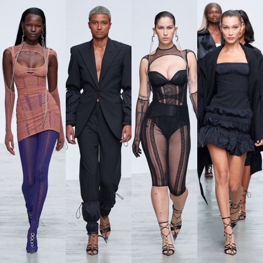

See, if the Moschino collection was all about dabbling in art class, Mugler’s S/S 2020 collection is its more mathematically inclined sister, all about sharp lines and deconstructed silhouettes and symmetry all whilst looking hot as fuck. So very Mugler, basically.
Now, this reference might be slightly off because I haven’t actually SEEN Ex-Machina yet but I imagine if Kim Kardashian were to channel that movie for a costume party she’d end up wearing something from this collection. That sounds like a roast because Kim has worn some questionable outfits but I blame Kanye for most of that and I’m referring to her on a good fashion day, alright!?
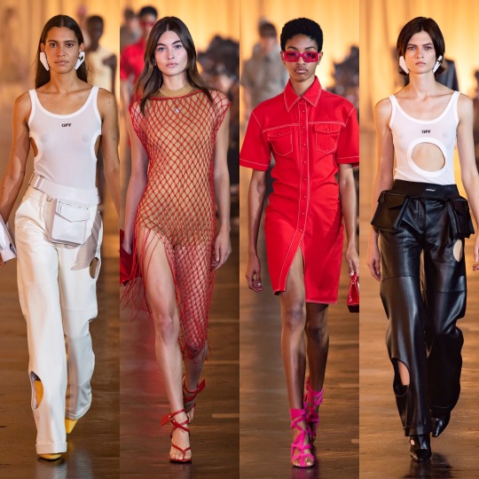
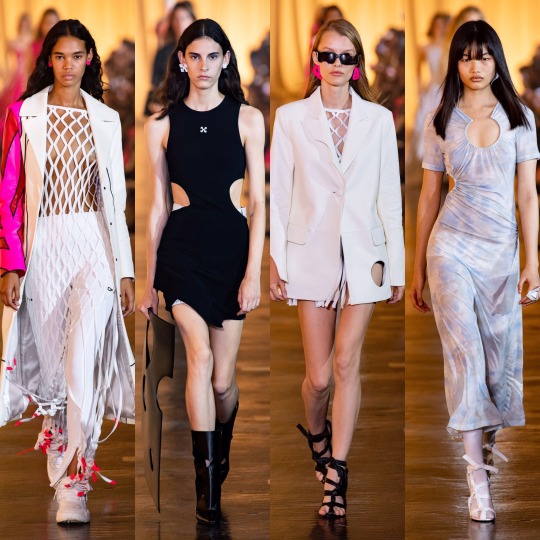

As for Off-White, it’s obviously a lot more commercial than most of the lines I’ve reviewed so far. Like, I can see a lot of these outfits on a mannequin in Urban Outfitters (no, I am not being paid to namedrop them, about 3 people in total read this Tumblr so any kind of sponsorship money would be severely wasted on me). That’s not necessarily a bad thing, and I love all of these looks; it just seems unfair to compare them to the the Mugler or Moschino collections, for example.
The stand outs for me are all on the bottom row: I would buy the utility vest, leather blazer and the all mesh turtleneck under washed-out tie-dye on the spot if I saw them in a high street store. Unfortunately, I feel like that’s kinda where they belong. You just expect collections to be a bit more conceptual, and this one is a little watered down, as much as it’s my style.


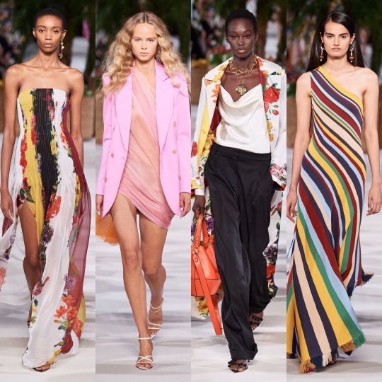

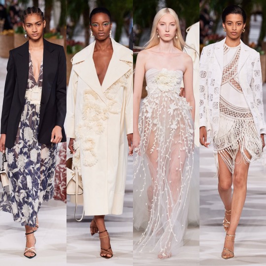
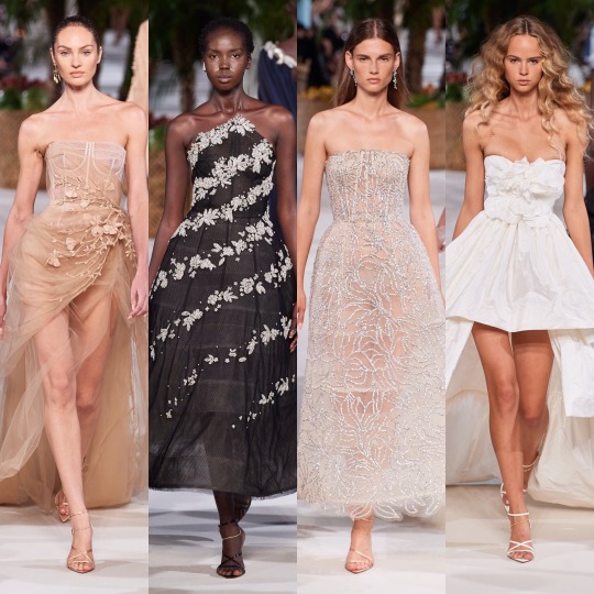
Oscar de la Renta was beautiful, of course. Not like I’m shook by how beautiful it is but kinda just what you’d expect from a brand with a name as poetic and fun to say as Oscar de la Renta. The silhouettes are dreamy and the details are as fit for a fairy princess (lmao) as ever. Plus can I just say how happy I am to see butterflies on dresses for adult women again!? And dresses worn by Blanca Padilla nonetheless!? Very here for it.
Next up is another on one of my fashion month highlights: Paco Rabanne.

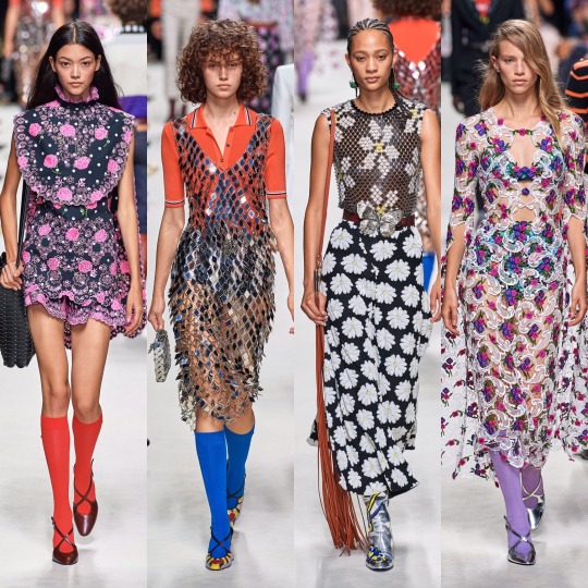


LOOK AT THIS SHIT!
I mean, don’t get me wrong, something about this collection (I’m pretty sure it’s the knee high coloured socks) is giving me primary school teacher vibes, but I'm not mad about it. It’d be the kind of teacher who’s actually really good at their job and has loads of cool hobbies and a really hot boyfriend or girlfriend or wife or husband who you secretly want to be then you grow up/and or have a huge crush on.
Like with Marc Jacobs, there’s obvious flower child elements here, and whilst on the whole the former took my breath away slightly more, this is a lot more wearable. My favourites are the paisley print dress and cape on the left in the very bottom row and all the chainmail pieces (which remind me of the dress Naomi Smalls wore in that whole club ninety-sixxxxx skit on drag race), plus that floral cut out dress with the trailing flute sleeves, which is absolute PERFECTION.
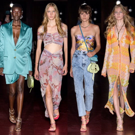
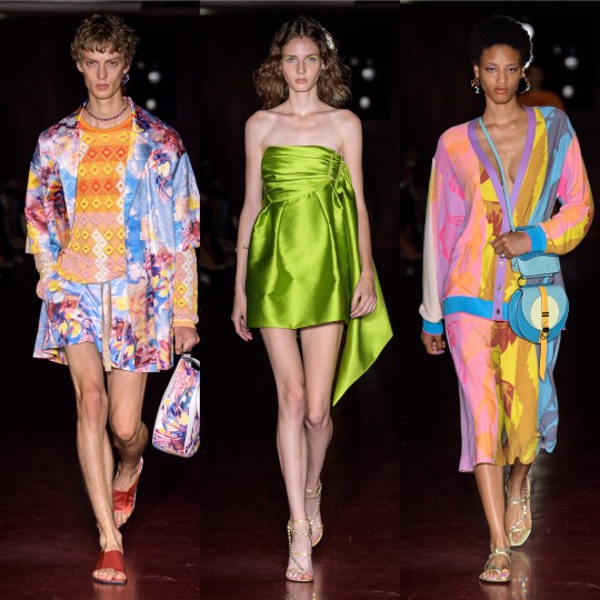
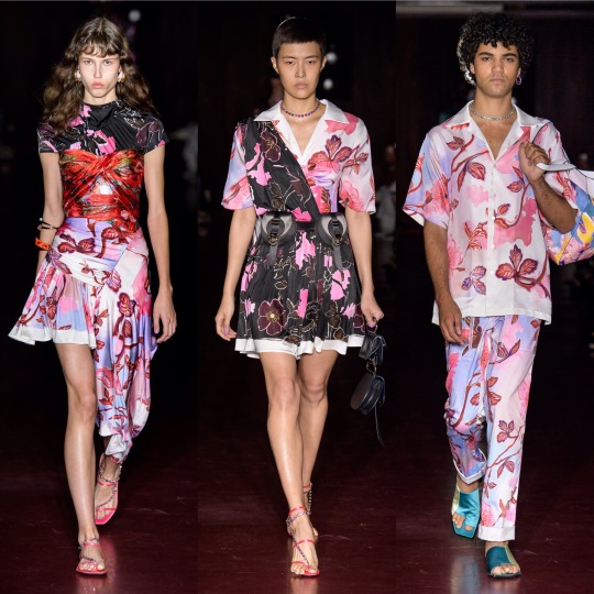

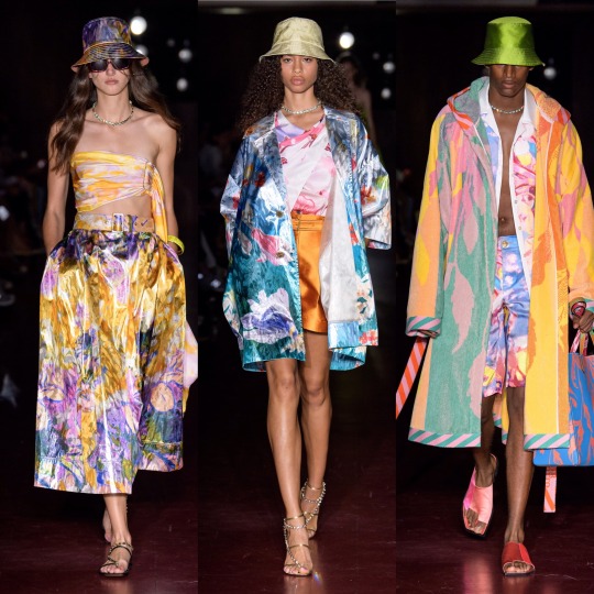
The 70s influence was clear in Peter Pilotto’s S/S 2020 collection too from the abundance of tie-dye to the knit v-neck dress, zany colour and print being the very on-brand focus. That being said, this is definitely more of a street-style inspired collection than usual and whilst the floral suits and dresses on the 3rd row down are very typical Peter Pilotto, the tie-dye corset and combat trousers on the far right, second row from the bottom, are very Jaded London. As for the reoccurrence of the bucket hat, I’ve remained steadfastly against them for several years now (even when our Lord and Saviour Miss Robyn Rihanna Fenty started wearing them) but the way they’re done in this collection even I could definitely get behind; all in all, the show surpassed my expectations.
The same goes for Ports 1961, which was a lot more eccentric than I gathered is the norm from a few google searches. Honestly, I hadn’t really heard of the brand which, upon reading up on it, I feel very dumb for considering it has been around since (in the shock twist of the century) 1961.
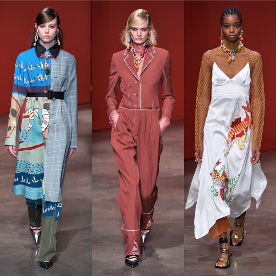

Yes, I know how that sounds! But forgive me, I’m still learning:)
Anyway, the fishnet detailing alone pretty much sold the looks I picked out. Seriously, I got a pair of those bloody tights, like, 2 years ago when they became a thing again and now any outfit where I have my legs out feels incomplete without them.
Next is Prabal Gurung, which, as far as presentation goes, was fucking STUNNING:
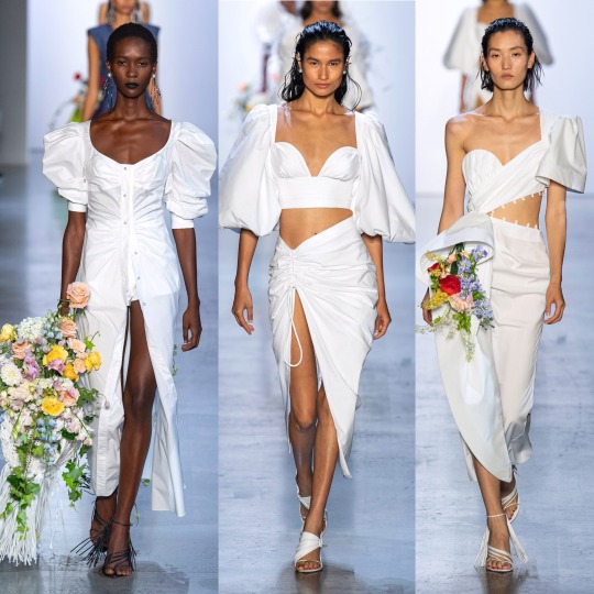


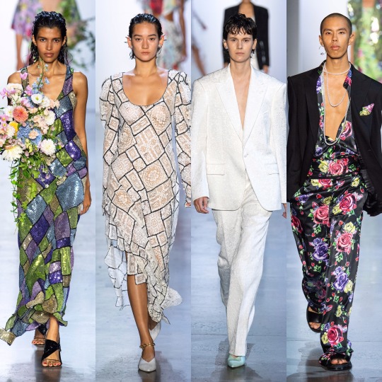
I mean, you could say that I’m easily impressed and that the presence of the bouquets won me over (and you’d definitely have a point there), but it’s also this year’s Givenchy haute couture-esque feathers, the trailing pearl necklaces, the exaggerated shoulders, the dreamy colouring, the everything looking like it could’ve grown off a very fashionably-inclined tree. Like, there’s a lot to love here, from the naturalistic elements, to the context behind the show, an ode to American fashion history and those cast out of it (and the notion of “being American” in general) for so long.
Going from a high to a (personal) low, however, next we have Prada:
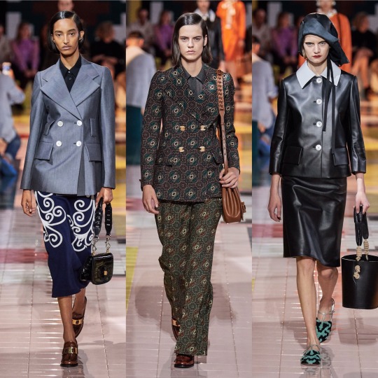

I don’t know, I get that it’s supposed to be simple and stripped back and dignified and whatever and I like the looks I picked but it’s just a bit blah for me. The bonnets that kept cropping up just didn’t do it for me and almost ruined what is an otherwise nice skirt suit (top right). Nonetheless, I like the silhouette of the sheer black dress and the the brocade print suit is really luxurious looking, even if the pattern is a *little* Wetherspoons carpet.
Anyways, here’s a quick overview of Rag and Bone:
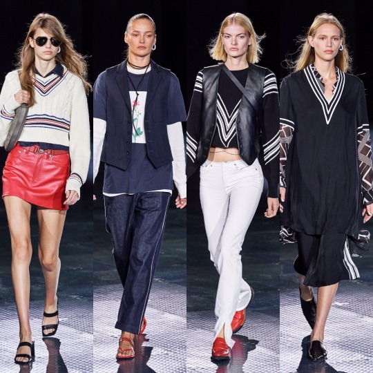
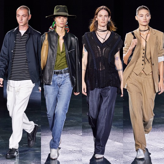
So that I can stop moaning and get onto a collection I REALLY liked:


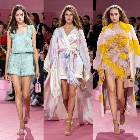

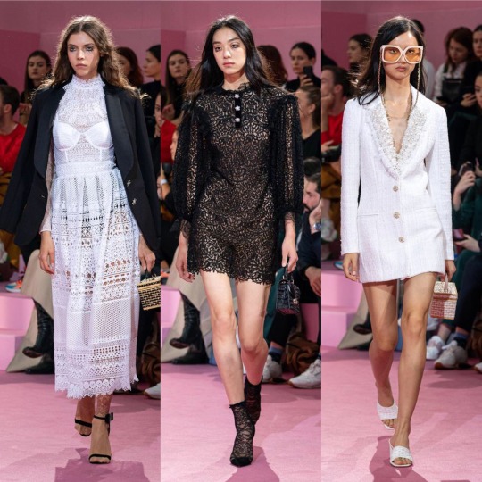
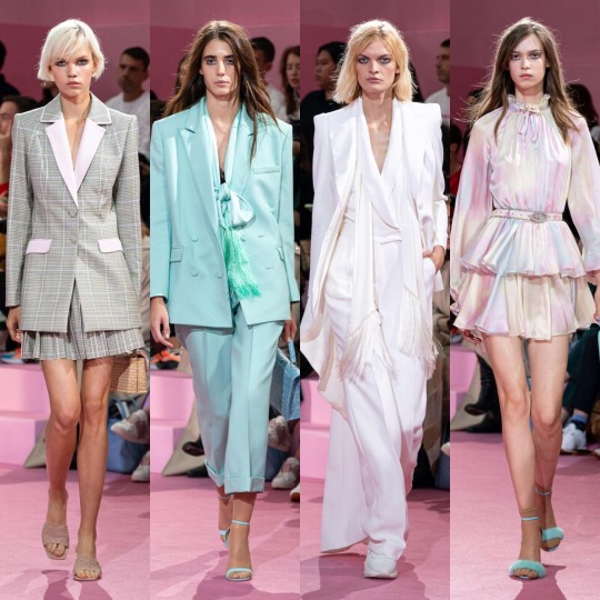

I am of course talking about Ralph and Russo. See, this is kinda what I expected from, like, Chanel and yet it’s Ralph and Russo that delivered. Also, it gives me Alessandra Rich vibes which is very much a compliment considering how much I love her designs. I mean, if Valley of the Dolls were to get another film remake in 2019, this is exactly what I’d like to see the female leads wearing, from the pastel suits to the satin kaftan style dresses. The yellow feather trimmed dress is practically a copy of something Marchesa has already done but it’s cute all the same. In my top 10 collections of the season, for sure.

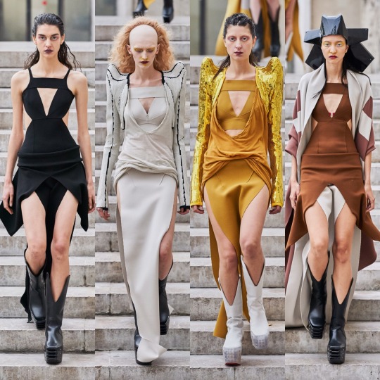
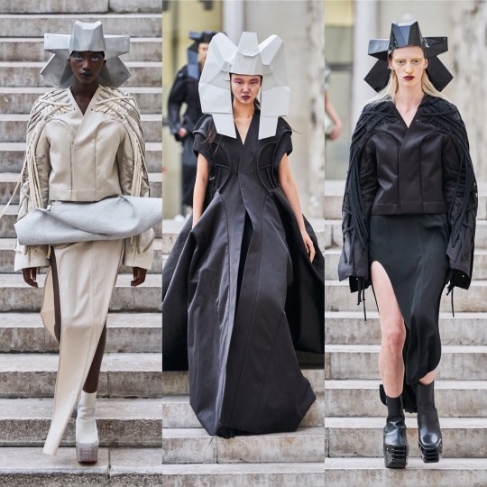
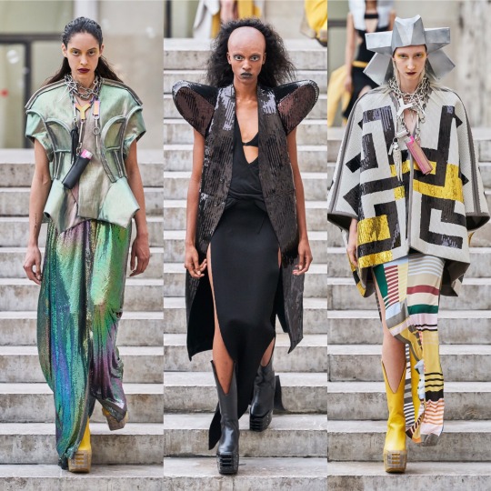
Rick Owens was another strong collection; it goes without saying that it’s not the most wearable but that’s not really what Rick Owens is known for, so I wouldn’t expect anything else. If you want fashion on an alien planet, or something Lady Gaga would’ve worn in 2010, he's your man.
Next, Rodarte:
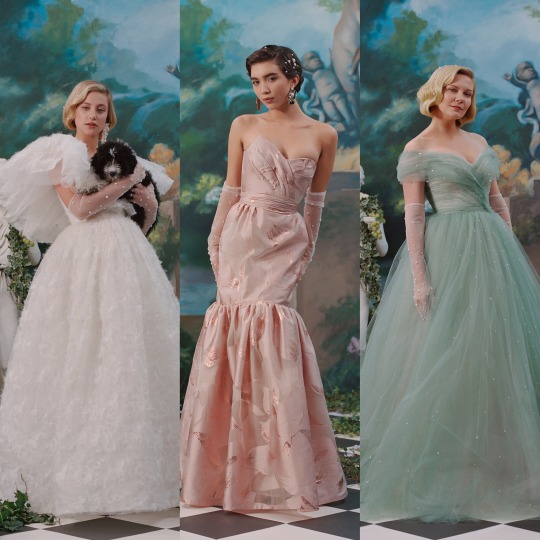
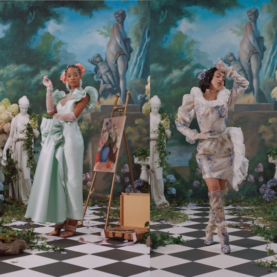
Obviously the dresses are beautiful and the set is magnificent, BUT...I’m really not a fan of the whole celebrities filling in for high fashion models thing. I like Lili Reinhart and I adore Kirsten Dunst, she’s been in a load of my favourite films, but in a similar vein to Dolce and Gabbana’s influencer show, it’s just distracting from the actual garments, if even worse because I don’t WANT to be distracted here (the same can’t be said for the D&G show, lol). If anybody has read this far, let me know your thoughts!
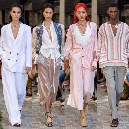
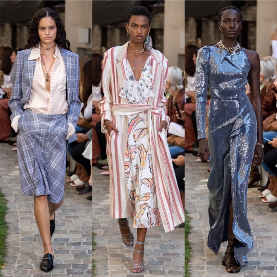


Roland Mouret was nice, and I always like a coed show, especially when a designer isn’t afraid to blur the lines of masculine and feminine. It’s fresh, lightweight and luxurious looking, Cannes film festival street style eat your heart out, and I love the colour palette.
Similarly, colour was my favourite thing about Sally LaPointe’s S/S 2020 collection.

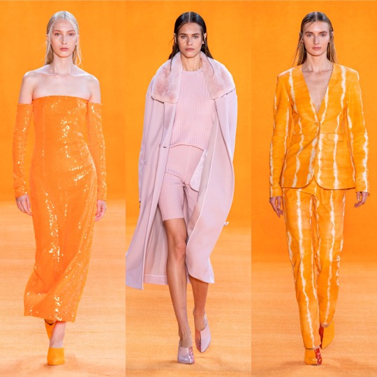
I would never think that teal and burnt orange would work together, let alone in some kind of faux leather, and yet here we are. Orange is in itself always an interesting colour choice, perfect for the summer with a tan, and I really love monochrome outfits, even though they’re something that ends up being quite pricey to put together; slight differences in tone are okay but if you just randomly throw together a few things and they’re too off, it really doesn’t work and you’d have been better off wearing contrasting colours. For that reason, I’m just gonna admire that all-pink outfit from a distance.


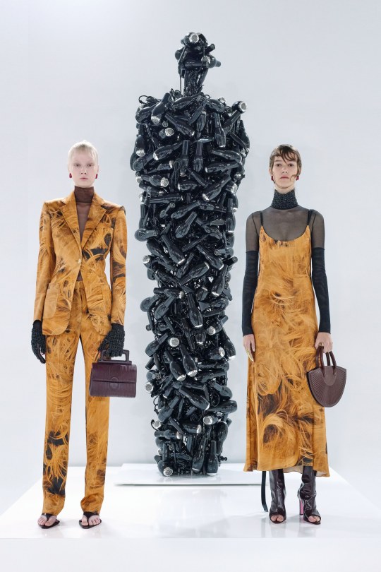
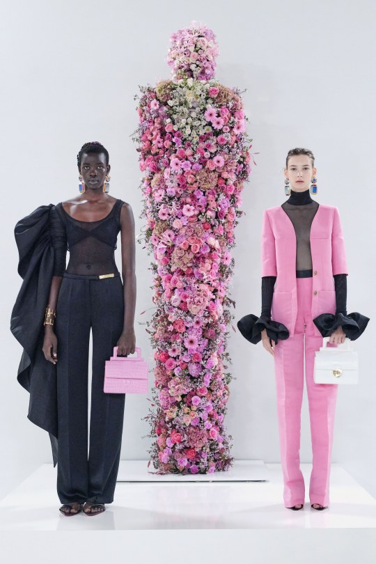
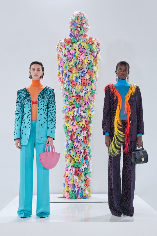
As for Schiaparelli, it’s one I always look forwards to for the sheer weirdness. RTW isn’t quite as kooky as haute couture but still, the interesting choices are still there; what at first glance appears to be flame print is actually coils of hair, and paired with a water print suit is a sequinned jacket emblazoned with a paradisiacal mirage. Ornament-like facial decorations as seen in the over-exaggerated glasses worn with the pony hair suit are also one of my favourite new things to happen in the high fashion scene in the past couple of months and I can’t wait to see how they get watered down to become more approachable for us...regular, non-structurally blessed folks who can’t pull off anything and everything.
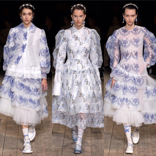
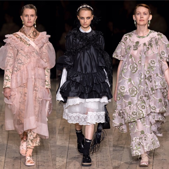
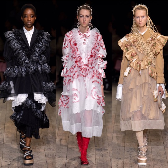
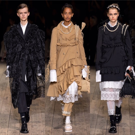
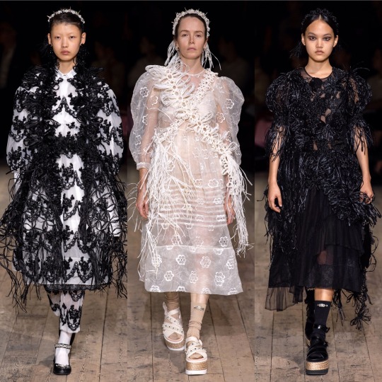
Simone Rocha was STUNNING. Romantic and ethereal, it’s druid goddess crossed with upper class Victorian woman of leisure, equal parts delicate and grungy, like a modern, fashion version of Lady Gaga’s Scathach in the Roanoke season of American Horror Story. You know, in the flashbacks, not in present day when she was all gross and like...scalping people and shit. Each dress is so ornate and has such an interesting structure, and the fabric choices give off an organic kinda vibe that create a handmade feel; the collection is, imo, really worthy of being shown under a haute couture heading. When it comes to my favourite element of the show, I’m torn between the petticoats and the hair accessories. I’m just gonna give a cop-out answer and say both.
Stella McCartney on the other hand, is very much a clear ready-to-wear collection.
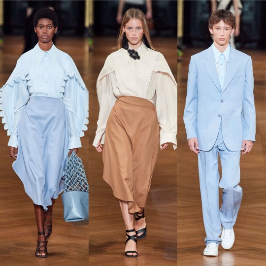

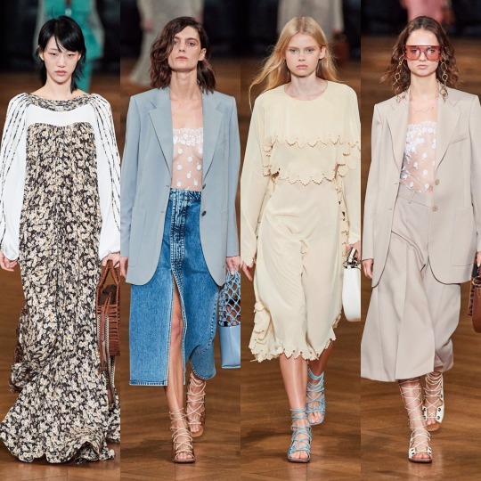

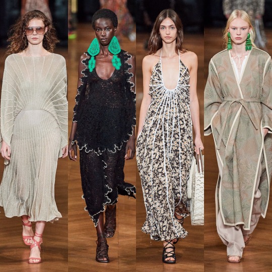
It’s pretty, for sure. The pastel blazers paired with delicate white mesh tops underneath are a gorgeous combination for spring and I like the reoccurrence of the chain glasses (Gucci, right?). But I mean, when you go from Simone Rocha to this, it’s a bit anticlimactic. Plus, if I’m honest, kaftans are always going to remind me of Honey Mahogany from season 5 of Drag Race. Don’t get me wrong, I’m sure she’s a lovely person but her runway looks aren’t really ones I look back fondly on, and you’re lying if you say you enjoyed them for anything other than meme purposes.
Temperley is equally meh, though the return of the Erdem-style boating hats is getting me excited that high street retailers might actually pick up on the trend and bring out some cheap ones for me to embarrass myself by wearing.
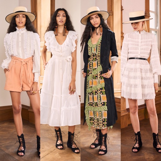
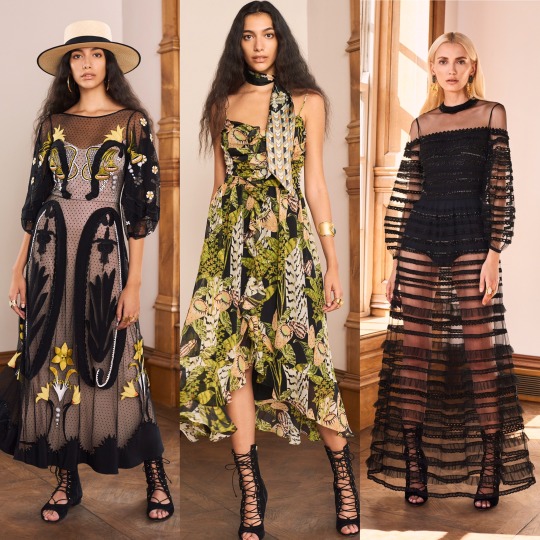
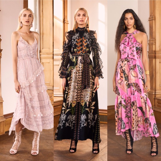

I also love a good 70s suit, the neckerchiefs are cute and there are some really delightful prints here that are a more unique approach to florals for spring.

Coming towards the end now, next is Thom Browne:
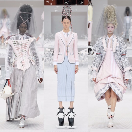


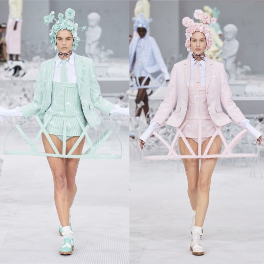
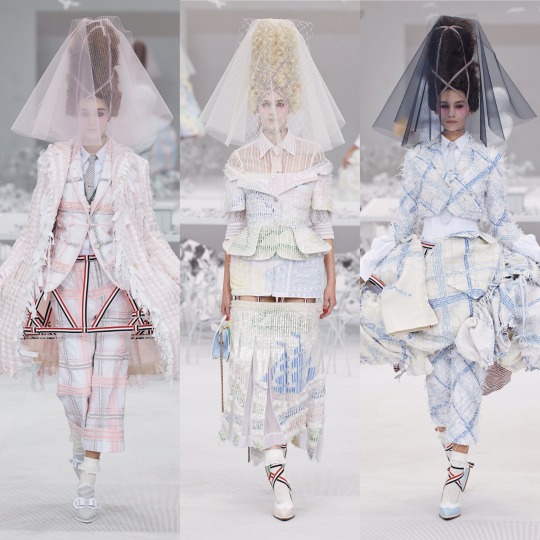
I LOVE this. Like, don’t get me wrong Rick Owens was cool but I adore how on the nose the concept is here; time to bring back all the Marie Antoinette puns I didn’t get to use in my Versailles Instagram post. I don’t know if it’s the history buff in me or the Sofia Coppola Stan but I will always be willing to sign any kind of treaty for anything related to the excesses of the 18th century French monarchy, and this is that turned up to 1000 infused with a dash of the Teletubbies, which sounds like a nightmarish concept, I know, but as high fashion it WORKS.

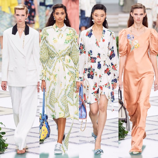
Tory Burch was very commercial, seemingly half inspired by Monterey yoga moms and the other half by Hamptons socialites.
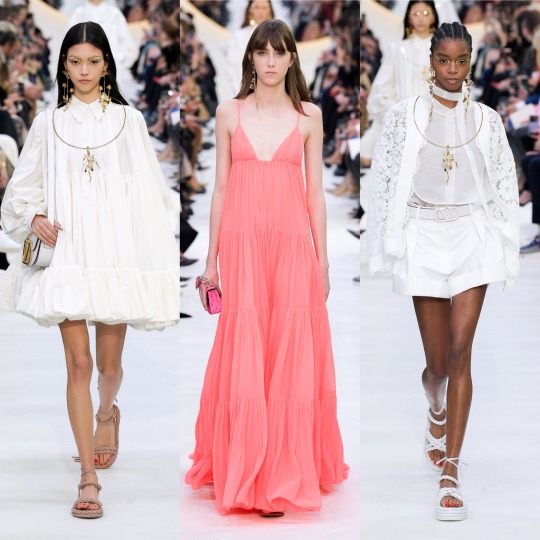
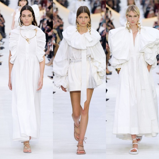
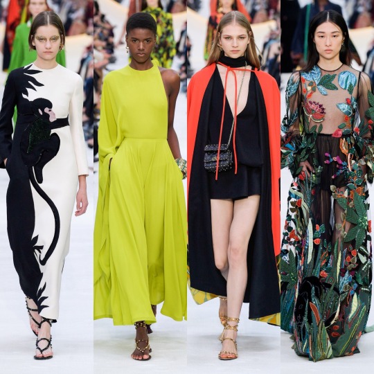

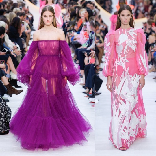

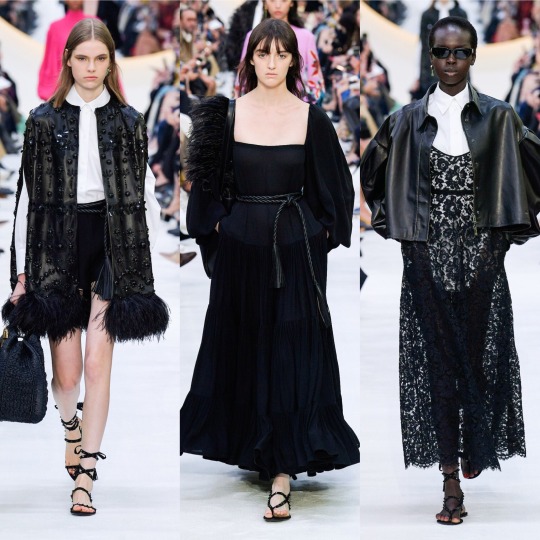
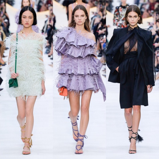
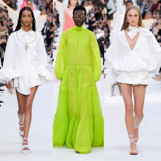

And then there was Valentino, which was fucking exquisite, imo. LIKE, CALLING DOCLE & GABBANA: THIS IS HOW YOU MAKE TROPICAL PRINT INTERESTING. YOU MAKE THE VELVET MONKEY’S ARM THE FRICKEN WAISTBAND.
Seriously, though, I am enamoured with this colour palette; all the whites and golds are angelic and fr, I didn’t know until now that you could make neons this elegant. I’m also getting an almost clerical feel from a lot of these looks, with the plaited waistband on the black dress that’s 7th row down in the middle, the stunning red cape and the multitude of exaggerated neck ruffs. I think I’ve mentioned before but I always love religious references in clothing-I don’t think I’ll ever get over the 2018 Met Gala-and so whether I’m reading too much into it or not, this collection really did it for me.
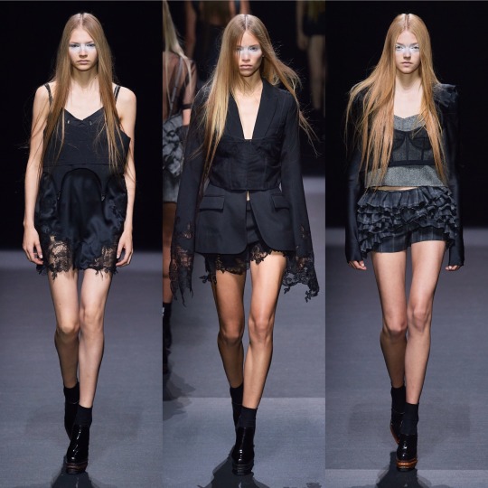


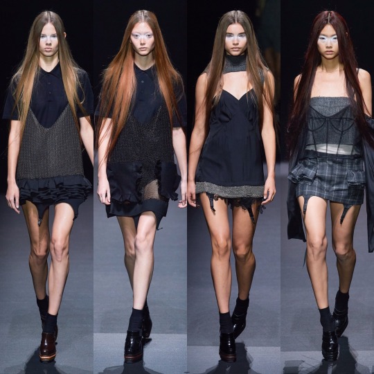
Whilst it’s probably as far removed a collection from Valentino’s S/S 2020 contribution you can get, I also loved Vera Wang this season. It might purely (I PROMISE THIS IS MY LAST GOSSIP GIRL REFERENCE) be because it gives me Jenny Humphrey vibes and *controversial* she did have my favourite style of any of the main characters, but sue me, this is just the right amount of late 90s/early 2000s grunge. Deconstructed trashy goth it girl is an interesting concept to see on the runway and I completely support it.
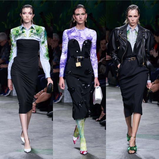
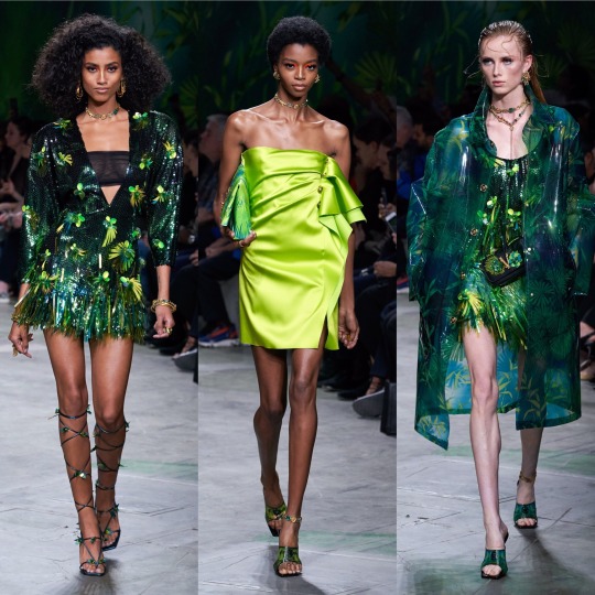

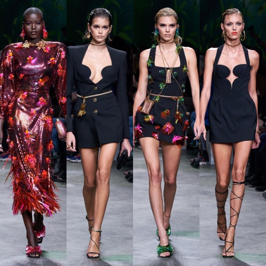
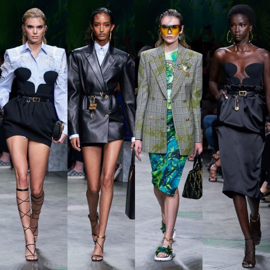
Versace on the other hand was very hit or miss. The looks I picked out I really loved but ultimately, for one of the household name brands, a lot of the actual garments were a bit pedestrian. I will say though that for me, it’s a case of the whole being greater than the sum of its parts. The slicked back mermaid hair and the pops of colour in the makeup and the interesting necklines meant that when it was good, it was GOOD. However, overall, still a bit too 80s Miami businesswoman, and please GOD, can we leave that hideous J-Lo dress in the past, it should really not be the climax of the show in 20-fucking-19!


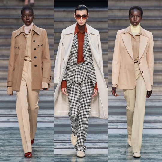
As for Victoria Beckham, I liked it, but it’s a bit of a Gucci copy, no? And no way near as interesting?
And on that note, I’m gonna have to cut this off. Super annoying but with only 5 collections left that I want to talk about, Tumblr is being a little bitch and will not let me add anything more to this post. So, see you in 5 for the final post!
Lauren x
#valentino#ss20#fashionmonth#nyfw#pfw#lfw#mfw#versace#rickowens#rick owens#simone rocha#schiaparelli#moschino#mugler#style#fashion#runway#details#trend#ralph&russo#off-white#oscar de la renta
12 notes
·
View notes
Text
STEVEN UNIVERSE: THE MOVIE - Personal Commentary
I wrote this to send to a friend, but I decided I might as well post it on here. I did a large portion of this while I was watching the movie, but I did go back and improve on some parts after I was finished, so forgive the inconsistent tenses. I apologise for the length as well, which is a result of me getting completely carried away and analysing a lot of the movie (I bet my English teachers are cheering). Nonetheless, I hope you enjoy my personal thoughts on the Steven Universe movie. (Also, spoilers if you haven’t already watched it.)
- The opening....wow. Not only is it pretty but it's just so dramatic. It reminds me quite a bit of old fashioned Disney musicals (I’m guessing that was their intention). Even the layout of the credits are giving me that vibe. But especially the music. Very fairytale-esque.
- 16 year old Steven, yeah booiii! Now he’s only a few years younger than me. I do like his older voice and design. Bet Zach Callison is relieved that he doesn't have to pitch his voice up high anymore. And I personally really love the pan flag colour scheme of his new outfit. I wonder if they’ll keep it for the season(s) following the movie.
- Aww, the Diamonds are learning. Sort of. They’re maybe just a tad clingy, but that's still improvement. I really love how Steven Universe never makes the 'villians' completely evil, only misguided, and that everyone is capable of changing their ways. Such a great message. (Edit: Ooohh, I unintentionally called what I'd say is the moral of the movie. Noice.)
- Naaww, Steven and Connie are so cute. Steven's happy little grin after the kiss was just adorable.
- Oooh, I like the 'Here We Are in the Future' (Edit: 'Happily Ever After') song. It just shows how much they've all grown over the course of the series. And it’s a great way to recap the journeys of each of the original Crystal Gems to the audience.
- "PEW PEW" Yeesss. I love their handshake. And oh my god, he really is so tall compared to Amethyst now.
- Oh my god, they're reenacting the running sequence from the opening. Love me a parallel. Just shows how far they’ve all come.
-Okay, why do the 'bad' guys in musicals always get such cool songs? Spinel's song was so catchy. Now I'm super curious about her relation to Pink Diamond. Oh cool! A scythe. That's awesome.....AH! Okay, nevermind. Nooo.
- 'Losing your powers' angst. I love it (yes, I know, I'm terrible).
- Greg: "Holy shhhhhheee really got everybody" Me: 😏 I see what you did there.
- Steven: "I have no idea what's going on." Greg: "Well now you know how I feel most of the time." Greg is so relatable sometimes. Kindly stop being my spirit animal, sir.
- AHHH! They've all been reset. Craaappp! And I was just going on about growth and everything! But I'm excited to see what happens because I love angst, god damn it. It always helps to make the happy ending all the more satisfying. (And...admittedly, the amnesia narrative device has always been a guilty pleasure of mine. I’ve always enjoyed how it allows you to so clearly see how a character has evolved over time and how much their experiences have defined their identity.)
- "Something is clearly wrong," Pearl sings happily and bug-eyed. Excellent and relatable. That's how I react to most things in life, honestly.
- "I could have lost all of my character development." Ha! Never subtle, are you Peridot? But also nooooo, not Peridot. Don't you dare touch her. She's grown so much and I love her dearly (and also Lapis' top notch dark humour. Perfect.)
- Sad song reprise is sad. I totally understand what Steven is feeling too. Things you’ve gotten so used to (hell, maybe even become dependent on for your emotional welbeing) can disappear so quickly that it can be quite a whiplash to have it gone, so it's completely normal to struggle to accept it, and to yearn for what you had not so long ago.
- Bismuth saying “We are the Crystal Gems” has watered my crops and cleared my skin. And I love her singing voice; the roughness in some parts suits her character so well.
- Rupphire Rupphire RUPPHIRE GAAAARRRNNNEEETTT, yiissss! Wow the fusion animation is really awesome. It's like a behind-the-scenes on how it works from their perspective. But I love how the two of them fusing together doesn't fix Garnet's memories or make her exactly how she was before losing them. Garnet isn't just an experience; she's also a product of her experiences.
- Lil' trumpet salute! Naww, Pearl, that's adorable.
- ....is Onion....immortal? He still looks exactly the same. 😟 I'm unnerved by that child and whatever power he had.
- Oooh, tap dancing. I love tap dancing! Even if Steven is wearing sandals while doing it. Oh boy, I love the friendship between Amethyst and Steven. It's always been one of my favourite things in the show. It's kind of like the sibling interaction I've always wished to have myself: supportive and wholesome. And I also love how their fusion shows that platonic and familial love is just as powerful as romantic love. Oh, YAY Amethyst is back! Like I said, friendship is a powerful thing.
- Oh my god, Steven and Greg are going to fuse. Ahhhh! Oh wow, it's basically Elvis with a six pack! Hehehe, so weird. But not bad either. And, oh wow, what a great song! Individuality is my kink.
- The ANGST is making me feel emotions. Steven looks so ragged, and the high pitched whining in his ears definitely added to that. And having felt that terrible myself a few times, I know how much it frigging sucks. And just like him I brushed other people's concerns off, so I'd be a hypocrite to tell him to take care of himself. (But I am a hypocrite. Take care of yourself, Steven!)
- Yep, here's the tragic backstory to make me sad about Spinel. Hit me where it hurts why don't you. Gosh, Pink Diamond really did some messed up things when she was younger (but thankfully she evolved from that and changed to become Steven). Leaving someone behind without giving them closure or even a reason would mess someone up for sure. You'd feel completely worthless. And unfortunately, being noticed for any reason—good or bad—is generally a way to cope with that feeling. Spinel is doing what she can to deal with what Pink did to her, and that unfortunately involves lashing out and hurting others.
- The 'True Kinda Love' song! Knew it'd turn up at one point. Knowing the context makes it so much better too. And hell yeah, Garnet is back!
- Blood? On this Christian Server? It's more likely than you think.
- “This is the story of my life.” Ahh! Steven's just a kid, and he's gone through so much. But, I gotta say, he is absolute proof that having a rough childhood and being a flawed person in the past (*cough* Pink Diamond *cough*) doesn't condemn you to being a wicked person forever. Anyone, regardless of their circumstances and experiences, can be a good person. Your early years don't define your identity or what will become of your future.
- Spinel: “When you change, you change for the better. When I change, I change for the worse. I used to be just not good, just not good enough for Pink. Now I'm not good at all!” Damn. That's powerful. Trauma can be such a difficult thing to overcome, and some people lose their way in their attempt to leave it behind. Sometimes, though, growing doesn't mean changing yourself and erasing the past; sometimes it means accepting the parts of your past that made you who you are now. Showing the importance of past experiences through the Crystal Gem's recovery of their identities is such a smart way of showing this concept to the audience. Such a great analogy. Now, let's hope Spinel can accept that though she has been changed as a result of her trauma, that doesn't make her ‘bad’ or unworthy of love (because that’s just not true!)
- “There's no such thing as happily ever after”. Sad but true. And also turning the whole Disney vibe the movie began with in on its head. Very smart.
- Steven: “I'll always have more work to do”. Then, Spinel: “I've got work to do. Friendship isn't going to be easy for me. I'm gonna have to work at it”. Exactly. That's how it is. ‘Happily ever after’ is a stagnant concept, and staying the same person for the rest of your life isn't healthy. And deciding to work towards improving yourself can sometimes be the hardest step to take when it comes to overcoming trauma. But change can be good; you should always keep working on improving yourself, no matter how comfortable you are with who you are and where you're at. Evolution is a part of living.
- Ooooh, White Diamond got sassy. She even has the hand gestures down. She’s making up for all the years she spent T-posing.Good for her.
- Oh my gosh, the focus on the Diamond's hands! Instead of destroying, their holding a hand out in a gesture of friendship. Seriously, that's frigging growth. That's such a cool parallel too. Rebecca Sugar and her crew are just brilliant.
- I'm so glad the Diamonds got someone to love and help them through their grief, and Spinel got someone to love her unconditionally, regardless of the flaws she thinks she has. They all got someone to help them heal. That’s wonderful.
- “I can make a change.” 👏Yes👏you👏can! That's your superpower.
Damn, that was so wonderful! I've always loved the message of personal growth, and the movie did it so well. In my opinion, Steven Universe has always been great at analogies to explain real life things (ie. Malachite being a metaphor for toxic relationships) so I really like how they used to amnesia narrative device to show not only how much someone can change and grow over time, but also to show it's our experiences, good and bad, that shape us as a person. Lots of people have traumatic experiences in their life that can inadvertantly shape a lot of their personality, and it can be hard to leave that behind, especially if so much of your identity is dependent on those experiences. Sometimes they can lead us to becoming ‘bad’ people, but they can also help make us good people too. Just look at Steven! He was able to accept his past traumas and use them so as to help others heal their own.
Trauma isn't something you can erase without erasing a large part of your identity. It can be tough to live with, nonetheless. Sometimes, like Spinel, you just need a helping hand in accepting the scars life has given you; to help you grow beyond it and maybe even eventually be able to help others who are going/have gone through similar experiences.
And there's no shame in trying to be better and failing over and over again. At least you are trying. Because trying to be good against all odds, against the whole world doing its best to destroy you, shows just how strong you really are.
-----------
Sorry for getting flowery (and maybe just a tad projective). As you can see I just really like the moral of the movie, as well as pretty much every other aspect. I'm sure there's a lot of little intricacies I missed, but this is what I took from my first viewing of it. And these are just my opinions; you might have got a whole different vibe from the movie. You are completely welcome to add you own thoughts and improve upon mine (because I am by no means an expert).
So, to summarise my own thoughts on the movie, I’m just going to say: Personal growth for the win!
#steven universe#su#su spoilers#steven universe: the movie#steven universe: the movie spoilers#commentary#personal#opinion#positive#garnet#pearl#amethyst#pink diamond#white diamond#lapis lazuli#peridot#greg universe#tw: trauma#discussion of trauma#analysis#postive#i use the word 'just' way too much and start a lot of sentences with conjunctions and for that I apologise#any mistakes are my own
8 notes
·
View notes