#i might try doing more drawings with this style of coloring it is very neat
Text

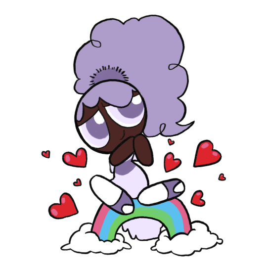
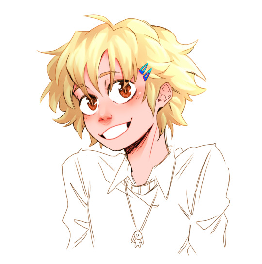
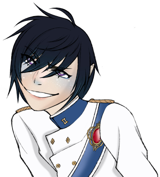
bliss redesign based off one I made in my teens
thought process + various other bits and bobs under the cut
I was 15 and annoyed by everything that moved when this character first came out, so in my own head I was very much making a Point with this redesign. Hence, I made very minimal changes. I wanted to work with what was already there and basically just make the existing design more thought-through. Little breakdown ahead (keeping in mind i myself am very much An Amateur who doesn’t know shit and am just ranting about my opinions and i also haven’t seen a single second of the 2016 reboot so i don’t know much about Bliss to begin with)
1. one of my Biggest pet peeves with Bliss is that the powerpuff girls each have bangs that are simple, memorable, and iconic while also being unique from each other and being reminiscent of irl little girls hairstyles. It’s very neat and clever and I like it a lot
and then Bliss has this confusing jumble of shapes that looks like it changes in style halfway across her forehead
i have absolutely no idea what the intent is here. My only guess is maybe it’s meant to look weird on purpose like she was trying to cut it herself or something (I suspect it’s something like that since she seems to have normal looking bangs as a little kid from what I can see) but it doesn’t really come off that way if that’s the case. It just looks like baby’s first PPG OC where you Understand that it’s meant to be hair and that it is made out of shapes but have 0 understanding of hairstyle or character design in general. Heck I might have put this exact hairline on a character in the past at the age of like 8
So in my redesign she’s got 5 even notches across her bangs, not thee most exciting change but it does the job I think. It is pretty reminiscent of Blossom but they look different enough from each other that I wasn’t too worried about it
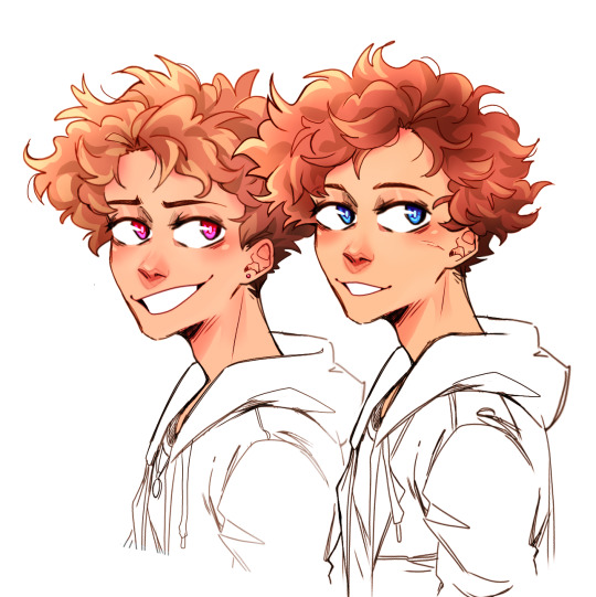
2. low-hanging fruit time, Bliss’s hair color is horrible on the eyes. I’m bewildered at the decision to do this, especially since there is just so much of it, I struggle to think of how she could exist in any scene without hogging all the viewer’s attention constantly. That said, I understand they wanted her to have an unnatural hair color to really signal that she is a Fresh new Teen character from the late 2010’s, which is. Whatever, that’s fine, so she gets purple hair now. I kept the streak for the same reason, especially since she’s got a lot of hair, so no harm in a little extra interest in there.
I also learned recently that her hair glows sometimes? which i did Not know when first drawing her but well i think the darker color helps anyway. It adds some contrast for when she’s normal vs when she’s glowing and makes the latter appear more,, idk threatening or powerful or whatever the mood generally is when she’s doing that.
I did re-add that toothpaste blue to her eyelids though. I like to think it’s also the color of her lasers. It’s a cute color, just not as like 70% of this character’s palette
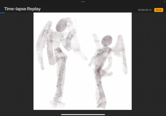
3. real talk I was drawing this from memory and didn’t mean to change the way her hair flares out from her head. realistically I think the original is fine, maybe just a little boring but fine, so that part of the redesign was an accident. Only thing is, it’s in the exact same position in every screenshot I’ve seen? It doesn’t seem to whip around when she’s flying or anything which looks weird and probably looks weirder in motion, especially since it takes up so much space onscreen. Idk it’s a strange decision, esp since the original show liked to use the ppg’s hair to emphasize their movement, so I’d just bring more movement into her hair. I mean if nothing else it’d make her look cooler.
very very rough little visual of what I mean
I also ended up making it shorter in my redesign—again, not really intentional, but I think it’s better that it eats up a little less of her silhouette
4. Her headband is largely the same, I didn’t hate the idea of her having an accessory, so I just toned down the colors. I’m not personally a fan of the powder blue and that pink heart is very bright and just doesn’t go with the rest of her (once again the color of her hair is doing it no favors). I also moved the heart over. Not necessarily needed I think, but I feel like it reads quicker as a headband and not a weird crown that way+introduces some asymmetry into her design that I think is nice.
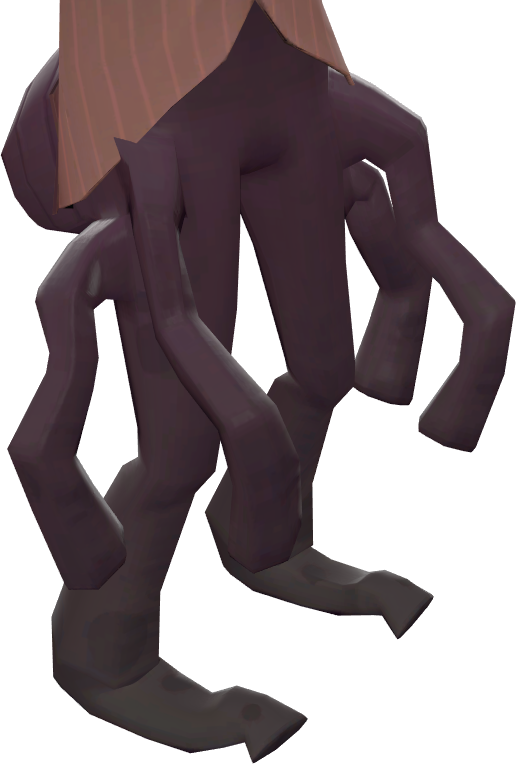
5. my biggest gripe other than her bangs are her hips. I’m not against adding anatomy to this character design to make her read visually as older than the girls, but it’s so awkwardly done and distracting. I feel like it even interferes with her line of action more often than not (which is not helped by her unmoving hair).
Part of the issue is she still has the teeny tiny torso, just… with those square-ish hips slapped on, which makes her legs look all gangly and stretched out. I tried to balance out the proportions more in my redesign, as well as change the hips to a flared skirt. I think it helps differentiate her from the girls and still implies hips underneath, it just also functions as a less clunky transition from her torso to her legs.
Lengthening her torso also allows the stripe to look more like a belt above the skirt, which I think helps to sell her as “similar, but not the same” from the ppg
6. Her leggings(? Idk Im not a fashion person) aren’t a bad idea I think. like a more mature version of the girls’ stockings, but I think the white makes them look really distracting. It would help to make them a darker color I think, but since I wanted to keep them reminiscent of the girls’ socks I kept them white and just shortened them.
7. Not really sure what Bliss is wearing on her feet. I think they’re Mary Janes, but they’re drawn a bit different from the girls’ and I honestly think it’s too babyish a shoe for her to wear. I’m not sure what she’s actually wearing in my redesign either honestly, but the goal was just to make them look like the girls’ Mary Janes while clearly being something different.
8. Uh her signature color is something I’ve contemplated changing a lot but to be real I think it’s fine. I feel it was a very bad idea from a marketing standpoint because people were hype about Bunny and would obviously be mad they didn’t get her once the character actually dropped (and in the long-run she would just end up being overshadowed by the character everyone has already assigned that color to) but I’m personally not bugged by her being purple beyond that. If I were to draw them together though I think Bunny would have a more pinky shade of purple and Bliss leans more blue.
Loosely on the same topic, because of Bliss I’ve had a running headcanon that “only child” types of powerpuffs tend to come out purple. Kind of like how trios tend to have a red, blue, and green. It’s a fun little piece of fake lore to rotate around in my brain
Anyway with all that out of the way, here’s some redesigns I decided to have some fun with. Wasn’t being too precious about recognizability or simplicity or anything like that, but I did run out of steam partway through. There’s also one based off Whoopass Bell bc idk, why not

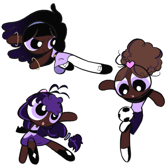
Finally, here’s some OCs I only ever drew once before out of a desire to give Bliss her own teen girl archetypes to form a team with. This is Bee and Beetle, who I’ll probably definitely forget about again immediately after posting this

#ppg Bliss#the powerpuff girls#my art#powerpuff oc#under the cut anyway#trying to do an interesting background#i got bit by a drawing bug and felt the strong need to finish this post today#i’ve been meaning to put together some art and a little ramble about bliss for a while#largely because idk if or when i’ll ever actually talk about her again#i also skimmed through this post once or twice so sorry if it’s incoherent#anyway this took a long ass time i need to take a nap or something
75 notes
·
View notes
Text
I might start doing something different with my finished art moving forward?? Not quite sure yet, I'll have to see how it looks when I actually test it out, but-
I really enjoy drawing out original sketches for my pieces of art, and some of the things I'm most proud of drawing are traditional pieces of art that I just conjure up.


I started as a traditional artist who almost never did line art, line art isn't my particularly favorite method, but I very much enjoy doing penciling and widdling away at going from light to dark lines.
BILLY LOOKS FUCKING SICK

My work has always been gritty with repetitive linework, and I find it really cool. It's always been my style to draw with more lines than necessary, never really erase my guidelines, AND IT WAS FUN.
While working on the last update for the first chapter of Issue One, I was so frustrated and just wanted to be done that I don't exactly have a sit back and admire my work moment for those pages. I think I need to stop concerning myself with "making things professional" and trying to fit myself into being an artist that has neat and perfect lineart, solid coloring, and generally, make myself avoid drawing because it's not enjoyable.
PLUS my comics would be made so fast if I just... draw in the way I'm most comfortable. They'd look cooler, it would come out more efficiently, I'd enjoy it past the sketch stage, and it would give me a lot more time to mess around and experiment and LEARN for Christ's sake.
So, in summary:
Gonna do more of this


Just gotta get my pen pressure right on Clip Studio...
32 notes
·
View notes
Note
hiii so. i really really admire you because of the depth of research you put into your art (even as someone who tends to fall down deep research holes i'm in Awe) but also because of the art itself - and i wanted to ask if you had any recommendations for someone who wants to get better at drawing? (books to read, things to do?) especially for figure drawing as you have (to my untrained eye) one of the best balances of style realism and naturalness and in general just overall make some of the best art i've ever seen methinks
this is really high praise, thank you so much!
as for art advice and recommendations for getting better at drawing, I 100% believe in carrying around a sketchbook wherever you go. if the pressure of having nice pages is something that bothers you, get a stack of sticky notes because you can cover up mistakes and re draw over it immediately, and squares of color will add some fun to a page later when you flip through everything.
ideally, I think there's a balance to skill building and having a good time, and I tend to split my own sketchbooks between life drawing (frequently I'll draw windows I think look neat or my morning coffee) and doodling shit for fun. I try out a lot of different styles and draw a lot of nonsense just because it felt like a good time. I do a lot of edward gorey type stuff because the line work process is comfy.
one way to go about doing this is to pick a direction (so to speak) that seems interesting, and build along side it! when I first decided I wanted to take art more seriously, I started looking up pictures of renaissance statues and drawing those. trying to draw those. it took a long time to get my art to look anything like a bernini statue, but I had a lot of fun learning that I really enjoyed drawing hands! comics are another good one, naoki urasawa's work is fucking genius level to me, I regularly revisit monster and do studies off of literally everything he does.
(I also keep a separate sketchbook for figure studies. this is mostly because I really enjoy drawing the human figure, this is very relaxing for me personally: I rotate between doing gesture drawings, contour drawings, and longer anatomy studies)
finally, I have found reading books on art history to be critical in my own process. so much about art history will tell you how to convey a million words into a singular composition. idk how much of that will be of interest or help to you, but I personally found it helpful, especially in understanding how to read things visually, which in turn helped me figure out how I wanted to tackle drawing something
and! two books I've found invaluable for anatomy were george bridgman's constructive anatomy and michael d. mattesi's force: drawing human anatomy, although I might recommend morpho's books above them now, like oh my god morpho is so good.
OH the other thing. this is something I picked up from when I was taking an animation class in art school, but sometimes I'll put on a movie or show I really like and do thumbnail studies of the frames while I watch. there's a lot to learn in a frame! shapes are important. god I love shapes.
61 notes
·
View notes
Text
Kiss Kiss Fall into another old hyperfixation
Anyway, I randomly wanted to redesign the main cast of Ouran in my style/ with headcanons and my own embellishments
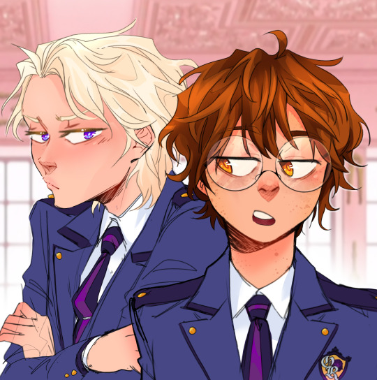
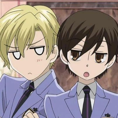
Here's a screenshot redraw, I'll put all the redesigns below the break bc I did all the main characters & wanna talk about the choices I made. Also I made up that uniform redesign on the spot bc I when I was doing the characters I just put them in casual clothes lmao
(I might do some others later, like Renge, Kasanoda, Yasuchika, Benibara, etc.)
Going in order of my least favorite to top favorite. And dont mind that I didn't color the clothes, that's not whats important here lmao
Mori is only at the bottom because I don't like the drawing that much, I still think the design is pretty good. Though, like right when I finished coloring, I decided a bun/top-knot would look better so it's a bit disappointing there. In my head, Mori is kind of struggling to figure out who he is & what he wants to do, which is why he follows Honey around and doesn't talk much. He does genuinely like being around the other hosts though.
Also, the undercut because A) he has the reputation for being the scary one & it kinda suits that, B) uh do I even have to say it? ...its hot He does lowkey look like Sokka from Avatar tho, especially with the blue accents
(edit: I accidentally deleted Mori's file so now this is the only copy so 😭)
Honey is next because again I think the drawing itself is a little off and the design is pretty close to Basil from Omori, which i didn't notice until it was too late lmao. One of the main things I didn't like about his character in the show was obviously how childlike he was & how girls still flirted with him even though he looked and acted 6; So now he still acts a bit childish but doesn't play it up as much & definitely has a more normal voice, not a fckn child's.
Haruhi! I definitely had to keep her glasses cuz they were really cute and kinda sold the whole 'commoner' thing in a way. But other than that I mainly wanted to balance out her femininity and masculinity to make her more androgynous/nonbinary/gender-fluid since she definitely has some of that going on in the show as is. I also gave her dark circles under her eyes to kinda show that she worked really hard to get into Ouran with low status.
Next up is Tamaki of course, getting into the characters I'm most happy with the designs of. One small thing I tried to do for each of them was give them varying hair tones; so even though Honey and Tamaki are both blond, I went very platinum-blond with him. When I started drawing him, my only real thought was "he has to be a pretty boy" so I dont have much to say about my choices, but i do think I succeeded. Don't mind the modern mullet thing, I can't stop it
Kyouya is definitely one of my favorite characters as is, seeing as he has one of the more fleshed out & heart-wrenching backstories in the show. I think the only thing I really wanted to change was getting rid of the Anime Bangs, so I just gave him this kinda sleek, kinda messy pushed-back look with a blue tint. Even though it's simple, I really struggled to come up with anything, until I found a page from the author saying smth like "I don't like the idea of him wearing neat clothes" with a picture of him in like a track suit so I did kinda the same outfit
My absolute #1 favorites, Hikaru & Kauru. They're honestly the ones that started it all because Kauru has been my favorite since I first saw the halloween episode (iykyk).
I don't know why, but I wanted their hair to be fluffier/curly and more of a natural(?) ginger color. I knew I wanted Kauru's to be redder and Hikaru's a bit lighter/blonder, but only subtly. I also gave Kauru a scar on his cheek from that time in Karuizawa, but most notably, I gave them blue and pink eyes as their signature colors. Lastly, their expressions are slightly different, because no matter how much they are in sync and try to match each other perfectly, Kauru's a much gentler soul than Hikaru, so I made Hikaru's smile a bit more snarky while Kauru's is soft.
Thank you for looking at my art/ reading my thoughts, here's an extra little design edit & comparison

(lol, I think they're mimicking Kyouya in this panel idek) (Also here you can see I tried the bun hairstyle w Mori, I think it looks good, but this is a really simple drawing so.)
#ouran high school host club#ouran hshc#haruhi fujioka#tamaki suoh#kyouya ootori#mitskuni haninozuka#takashi morinozuka#hikaru hitachiin#Kauru hitachiin#character redesign#my fanart#my art#screenshot redraw#im hyperfixating again#ouran redesigns#33xhausted art
73 notes
·
View notes
Note
Have you looked at the dragons from the Wings of Fire book series? I think the wing designs mostly get rid of the issue of lacking wing membrane along with generally just having some unique takes on different types of dragons. They even go as far as adding some bug dragons in the third series which is pretty neat.
Granted they all still have that 4 leg western dragon style design to all of them but all things considered they have some unique designs overall, especially for a kids book series. It definitely has had its influence on artists I think given that people try to draw up hybrids and their own tribe designs. My only complaint is that when people draw hybrids it's just smashing two of them together instead of really thinking about the different body parts they have.
yes, I've had a few previous asks about specific dragon types in Wings of Fire. I have never read the series. from what I can gather, it is a perfectly fine series and the designs seem to be stylized with a younger audience in mind, using visual tropes that make the different dragon types' narrative roles very clear.
I do think the designs are oddly inconsistent about the wings, because some of the dragon groups do have a patagium but others don't, and there is also an inconsistent addition of the elbow strut, which is a pet peeve of mine.
overall, the designs are fine. they do what they're made for and they're visually appealing and very well suited to the type of fandom that wants to make a lot of uniquely colored ocs with interesting features. I'm sure if I went on deviantart to look for Wings of Fire art, I would find a thriving community of young artists making dozens of dragon ocs with all sorts of color combinations and hybrid features.
I don't think there's a problem with letting people make their hybrids in ways that are a bit shallow and not well thought out. most of those artists are likely young teens who have just found their artistic passion! and mashing designs together is a classic fandom oc tradition, it happens all the time. sonic ocs? pokemon hybrids? sparkledogs? if the original Wings of Fire creators were being sloppy and thoughtless with hybrid designs I might have some critique there because they're professional artists working with a detailed world that has its own rules and they ought to be able to do something more interesting and thoughtful with their own hybrid designs. but for the fans? I'm not gonna step on the creative energy there, people can have their fun.
10 notes
·
View notes
Note
I LOVE Pyrrha! I just adore your drawings. Do you have any Pyrrha hcs?
Thank you!! ❤️❤️
Here’s a few modern day hcs I have for her: (There’s A LOT so I’m putting it under the cut)
- I like to think that Pyrrha started exploring gender expression quite young, wearing skirts and dresses when she was like 6 or 7, realizing that she’s comfortable in both ‘girly’ clothes and ‘boy’ clothes, painting her nails, etc. and I like to think that Thetis and Peleus were very supportive parents, always asking her what she wants to wear for the day, protecting her from bigots whenever they go out, asking her what she wants to be called when, etc.
- She picked out her name from a magazine when she was like 9, I have the cute image in my head of her flipping through one of Thetis’ magazines and seeing an ad for let’s say a jewelry company called Pyrrha and she’s like !!! just completely falls in love with the name and adopts it for herself. Thetis and Peleus are very supportive when she tells them of it and hype her up about it ofc, saying it’s very pretty and fits her well etc.
- In modern days, I see her and Pat being friends at a young age too, but I think it takes her a while to actually tell him about her gender identity and it’s hard to hide it. It’s just something very personal and I think she’s just nervous of what he might think. Anyways, she probably tells him she’s genderfluid when she’s around 13 and he’s 14, explaining what it all means and how she feels, her pronouns and her name and ofc it’s scary but Pat thinks it’s pretty neat and accepts her without a doubt, it doesn’t change anything between them if anything it makes them grow closer.
- I think really after high school, she starts experimenting with her style and what kind of makeup she likes
- On that note, I think her style evolves over time and by the time they’re like in their late twenties, Pyrrha wears nothing but classy, luxury brands. I hc that she’s got an easy office job at her dad’s company so trust me she rocks the HELL out of a pencil skirt and $1200 blouse like it’s no one’s business.
- Her favorite colors to wear are earth tones, particularly dark greens.
- She loves to do her make up, I can totally see her at her vanity with a lighted scented candle and a chill playlist just taking her time with her make up, it’s like a relaxing thing for her. But she hates cleaning her makeup brushes so Patroclus sometimes does it for her bc he’s a sweetheart
- Loves loves loves it when Patroclus refers to her as “my wife” in front of other people.
- She loves jewelry, particularly necklaces and has a huge expensive jewelry box (like the ones that have multiple pull out compartments) to keep everything in. Bonus, she always asks Pat to help her with her necklace even though she could easily clip the clasp herself. She just finds something about it really romantic
- I also think it’d be funny if she had a huge collection of sunglasses, like just pairs and pairs of really pretty sunglasses, dark ones, rose gold ones, ones with patterns on the frame, circle ones, etc. She needs a pair for every day of the summer even though she only wears them on top of her head (she argued with Patroclus that it ‘completes the outfit’.
- Would it surprise you if I said she also has a huge shoe collection (Patroclus loves it)
- Spends more on lingerie than she probably should but Patroclus never complains about their credit card bill bc how can he when their money’s being spent on something so important lmao
- She’s a pumpkin spice girlie and is always trying to get her husband to like it too
- She doesn’t know how to drive, she’s a passenger princess (but that’s fine bc she loves it when Patroclus puts his hand on her thigh while he’s driving)
- She likes to wear her hair up most of the time and has tons of pretty scrunchies that always have to match with whatever she’s wearing.
BONUS:
For the au where she has Pyrrhus I have a few hcs too:
- Okay Pyrrhus is the result of a one night stand, so I like to think that while in Achilles’ apartment at the time, Deidameia saw Pyrrha’s name probably written on a paper put down somewhere and thought it was a nice name so when she had their kid, she changed it around to Pyrrhus for a boy. (Pyrrha actually loves that Deidameia named him that even if it was unknowingly)
- She is very honest and open with Pyrrhus about her gender identity as well and he doesn’t think much of it just like, “oh, okay.” Like it’s not a big deal, you know how kids are lmao
- Three words; soccer mom Pyrrha. The type of mom who out cheers all the other moms in the bleachers, brings in the best healthy snacks (take THAT Susan). + She looks good in her soccer mom outfits
- Pyrrhus insists on getting her a Mother’s Day gift too and she finds it to be the sweetest thing in the world
- The first time Pyrrhus called her mama she nearly cried lol
31 notes
·
View notes
Note
do you have any general art tips??
YES! OMGGJJF IM SORRY I DIDNT GET TO THIS SOONER i had this saved in my drafts for a while D: BUT! without further ado, get ready for me to bestow them upon you 😈
- whenever i do full-body character refs / dynamic stuff? i like to start off with the shape of the art first before getting to the guidelines.
following the shapes and making a rough doodle of the dynamics helps me better structure the body language without worrying about the anatomy early on. anatomy is my weakest point when it comes to character designs, so for me, i find it better to start with some random shapes THEN working my way to more complex details.


(some good examples of that :])
- this is just a general preference? but when it comes to art and you hate refining the lineart, making things neat, AND it takes a really long time to finish art (and it bothers you), might i suggest trying a looser approach to art?
heres a prime example of that! in 2020, i used to be very keen on making my art super neat. i even tried making the guidelines as neat as possible which? tbh didnt work out for me a lot. i would find myself constantly redoing the guidelines, then trying my VERY best to make the lines as neat as possible. it took a few weeks to finish these kind of drawings, and it didnt help when i liked the sketch MORE than the lineart. (some art would take up to 15 hours)

over time, i started making my lines looser. i shifted away from making refined lineart and started making the sketches themselves the lineart. my lineart started becoming messier, but i liked how it gave it that more “authentic” look. i stopped worrying about trying to accurately translate the feeling of my sketches to my lineart, and drawing became a lot more quicker. although its a bit more tedious to color (i have to do it manually now), i still like this process a bit more. :]

you could just faintly see the guidelines in my recent art :] sometimes i include the guidelines, sometimes i make the guidelines a different layer. it really depends on how i feel, but i loved doing looser art more. the quackity art took 4 hours, the simpbur-argbur art took 2 hours. :D
- lastly, dont be afraid to take inspo from others’ art!! when i developed my art, i always took small bits of others’ art and incorporated them into mine. as artists, we always copy each other.
not in the way where we’re outright duplicating entire artworks as our own, but in the way where we’re like “oh cool, you do eyelashes like that? i wanna do my eyelashes like that too!” kinda?
for my art, i was always super inspired by how people make super warm art and had this kinda, white background to them. i tried incorporating that into my art style and started loving it :]
pinterest with their photos too? sometimes photos of people wearing cool outfits or random backgrounds help inspire my artstyle. take as much inspo as you’d like from others, don’t be hesitant to be inspired! of course, you’re welcome to give credit whenever.


hopefully some of these help :] feel free to ask questions and ask to elaborate! i just woke up and typed this out while still waking up HAGSHHA!
28 notes
·
View notes
Text
IDW'S SONIC THE HEDGEHOG, SPRING BROKEN SPECIAL - THOUGHTS

A while back, it became pretty clear that the abundant specials IDW has been releasing for the past year have had a certain... "commonality" about them. Endless Summer, A Very Chaotix Halloween, Winter Jam - the Four Seasons theming read loud and clear. Now, up until a couple months ago, I'd assumed the 900th Adventure Special was meant to be the stand-in for Spring in this lineup, so I was a bit surprised when Spring Broken was announced to round the seasonal specials off. I was interested to see what kind of send-off they'd give this little gaggle of stories.
This time around, we have pencils by Adam Bryce Thomas and colors by Leonardo Ito. These two are a really great combo, as I think Ito's emphasis on simple, soft color palettes compliments the very manga-esque style Adam brings to the table. This style, however, leaves me a little confused as to why he, of all artists, was the one pulled for this story.
ABT tends to be at his best when working on big, over-the-top action sequences. His work really sells the sense of adrenaline the series is trying to convey in its tensest moments. That being said, the story here is... fairly mundane? The characters spend a day at the fair and solve a mystery about flowers. Heck, the entire last couple pages are entirely dedicated to showing the characters enjoying the attractions once all is said and done.

There's not really a ton here in the way of high-stakes plot that would really give Adam a chance to shine.
That being said, there's still enough here that you can see his art style noticably developing a bit in a manner akin to Evan Stanley's. Namely in the way he draws Sonic himself.

It might just be my imagination, here, but I could swear Sonic's quills are longer and come to a more distinct point than the way Adam usually draws them. We know Evan has been taking strides to incorporate elements of official 2D Sonic art into her artstyle, perhaps this is a sign that Adam has been doing the same. Beyond that, I think I'm noticing some more fun and stretchy facial expressions on some of these characters, too. When it comes to the way faces are drawn, I've always found that ABT has a tendency to stay pretty on-model, but here I'm seeing a bit more expressive warping of the facial proportions than I'd expect out of Adam.
Where Adam really knocks it out of the park here, though, is with the background character designs.

Adam's always good at drawing up unique OCs, and there are tons of 'em here. Having so many characters with so many looks and still having a consistent style to them all goes a long way toward helping the world feel just a little more lived in. Another cool bit of background work he contributed is this central figure that pops up in a few places around the festival.

Also I just noticed that Cream and Vanilla are here. Neato.
When asked about this figure on Twitter, ABT said that she's intended to be a sort of Nature Spirit, and that the festival pays reverence to her. She's never mentioned in the story, but it's a neat little detail to see the more spiritual side of this world's cultures.
As I said before, the story, written by Josh Trujillo, is not too incredibly exciting. The majority of the plot centers around the mystery behind the annual Flower Contest, which itself is really three mysteries, all of which are wrapped up pretty quickly. Really, it seems to be less about the mystery, and more about how these characters spend their free time in a sort of slice-of-life fashion. This is fine, and it shows us some neat character interactions we don't normally get to see, like Jewel and Espio or Amy and Nite, but it's also something we've been getting a lot of lately.
It almost makes me wonder, with the amount of miniseries and specials they've been putting out there recently, if it wouldn't be possible, and maybe a better use of resources, to just run a dedicated sister series devoted to telling side stories like Sonic Universe did for Archie.
I'm not the first person to make this point, but perhaps then we could get more big, exciting plots full of stakes and gravitas in the main book. Who knows.
All in all, Spring Broken didn't particularly blow me away. I'd say it's a nice break from the norm but... it's not. It's exactly the kind of story we've frankly been getting in surplus as of late. I'm ready for things to move again, ready for the non-stop, blood-pumping action of Sonic the Hedgehog! There are some cute moments here and there that I do appreciate, but I just wish they could have come at a different time.
Issue #70 drops in about 22 hours for me, so with any luck, that will scratch my itch for more exciting Sonic stories for a bit.
'Til then, thanks for reading!
5 notes
·
View notes
Text
Console Design- Can I have my cake and eat it too?
Recently I spilled the beans that I have a little hobby project slowly brewing away where I am designing a new game console. I'm still not ready to really properly pitch the whole thing, but between sharing that, explaining computer architecture, and seeing people's feedback, it keeps pushing itself towards the front burners over more practical projects I SHOULD be giving my focus to, and while people are paying attention, I might as well try to crowdsource answers to some questions I'm getting hung up on.
So... a lot of what I'm doing here is, I'll be honest, rooted in nostalgia for 16-bit consoles. There's a certain retro appeal to the look, speed, and general immediacy of 8-bit games, and more than plenty of support for making games that evoke that feel, and even recently made free dev tools for people to just make new games for older systems, and as I'm writing this, there is this massive renaissance going on with indie devs restricting them to the constraints of early polygonal-graphics-focused consoles, but we mostly skipped right past that 16-bit period, and all its hallmarks:
youtube
2D graphics with more color-depth than people really knew what to do with. All sorts of hardware-level flashy effects like transparency, resolution changes, neat little raster effects. A soundscape of crunchy FM synth and sparingly used sampling with distortion effects. Just a little taste of support for polygonal graphics. Not enough to go all-in, but enough to make a nice spice here and there. A general push to show off with fancy jointed paper doll sprites, 3D effects from sprite-scaling, just... clear ambitions all over to make low res 2D eye candy. Plus everything was cartridge based, allowing people to add extra custom chips for things they really wanted that they didn't quite have the power for.
youtube
So that's basically what I want to deliver here. A platform where you have more toys and tricks than you know what to do with if you're coming from 8-bit style stuff, but a real tricky set of restrictions to work around from a more modern approach, hopefully with its own look and sound. To that end I've been doing a ton of research into how some of those work... and a lot of it involves fun little tricks between scanlines. In particular, if you look at that mode 7 video above, right around 7:50, we've got this real eye-popping barrel distortion background. What's going on here, on a hardware level, is we have the ability to, essentially, apply one single image as a texture to a single parallelogram, which in this case is just taking a rectangular background and squishing it in towards the center then out towards its regular dimensions... but where doing that squishing and stretching between individual scan lines as we send the video out to the screen. Several changes to the shape before we've even finished rendering out one frame of the video, and tada, weird barrel.
Being able to support tricks like THAT, specifically, is a must-have feature for what I'm working on, and I'm pretty confident I can design the hardware with that exact capability... but the original hardware doing that was, to my understanding, very much working with the peculiarities of how a CRT worked and the exact number of operations it could get done while the beam was swiping back to the left to draw the next line, and I legitimately have no idea if tricks like this are even really possible if I slap together a similar chipset and send video out an HDMI cord to a modern display.
Like, I know I can fake that. I've got a Retron 5 hooked to a cheap flat panel TV with Castlevania 4 plugged in, but my understanding is that's actually emulating an SNES in software on some very-much-overkill for this sort of thing modern processor. What I would LIKE to do is build this with a chipset you really can push to its limits, hooked to modern display, and get this sort of effect. Because while I realize a big chunk of the audience for this sort of thing totally have nice well-maintained CRTs, I don't want to be married to hardware people no longer manufacture. And I'd rather not have some way more capable sub-processor wedged in here just to get the video output of whatever cheap fast legit 16-bit chipset I use otherwise to play nice with HDMI standards.
I'm still sort of in the dark about HDMI and modern display options, to be clear. And you know in a perfect world I'd like to have support built into this if you want to hook it to a CRT, but at the end of the day I need to pick an aspect ratio, and it's probably gonna be 16:9.
A similar fork in the road I may need to pick a lane for before I can really get going is looking at ASIC chips. What I'd really love is to be able to just point people at a design files for the casing and PCBs, and a warehouse of old mass-produced chips that sell for pennies, make the whole thing a neat little home electronics kit where the total price of everything is like, maybe $10 or $20 or something, you get out a soldering iron, and assemble it all yourself. But, I might need to custom design a chip or two in the end, and there's a chance it ends up being cheaper to just build literally the whole system on one chip. Simpler, easier to make a portable version of the whole thing, but it loses that DIY feel.
And of course there's also the risk that the overall architecture and chipset I'm looking at isn't going to have the oomph to do what I want it to do at a nice steady 60 FPS (maybe 120?) I'm just kind of assuming once I commit to a path I'll be able to find a dirt cheap chipset covering all the bases I need it to that'll hold up at a faster clock speed than consoles really ran at in the mid-90s. I want people to be able to do things smoothly that historically really had some slowdown, and you know, I AM planning to have a higher base resolution than the systems I'm taking inspiration from (maybe the same height but clearly more width).
And of course the real pain is going to be prototyping all this since none of it's going to work without hooking display AND something popped into a cartridge slot. I'm at least saving myself some headache starting with a controller I can at least test in other things, but wow there's gonna be so many different potential failure points to worry about at one step in here.
5 notes
·
View notes
Note
sbi ib au w wilbur as mary is a concept i cannot stop thinking abt, like i haven’t touched ib in years and i was more into smaller dynamics in sbi than sbi as a whole, but it makes me so insane. you’re a genius and i adore that au concept. techno as gary is also so much fun, i rlly liked the whole thing. also the art was SO nice, your style is very neat. if you have any more thoughts abt the au as a whole i’d love to hear them, but if not, just know i love the concept so much
WOOO i hear u, my favorite dynamics within sbi are crimeboys and bedrock bros (it really shows in this au) because i am a huge sucker for sibling dynamics. the remake for ib came out for switch recently so the childhood hyperfixation reawakened like a beast
i have so many thoughts in my brain let me drop these bad boys. infodump time.
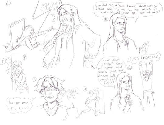
my idea of a first meeting between techno and tommy! rather than having his rose stolen like garrys, its tommy stumbling in on techno getting cornered by one of the lady paintings. techno probably wouldve gotten out just fine eventually, maybe lost a few petals but tommy distracts the painting so he can escape unharmed! then theyre like 🤝 team up time
please ignore the shitty ooc dialogue everywhere ive just been getting ideas jotted down in my free time hehe. i imagine the dynamic between techno and wilbur in this au being pretty tense! techno is IMMEDIATELY suspicious/wary of wilbur & wilbur wants to leave with tommy, taking technos place. techno doesnt wanna be too protective of tommy because a) this is some kid he just met what does he care b) he doesnt really have any reason to be suspicious about wilbur because hes done literally nothing wrong so far hes just off so techno doesnt trust him
also philza as guertena means he doesnt show up like at all BUT i really liked the theory from a few years ago that part of marys dislike for garry stemmed from garry resembling guertena and her feeling like she’d been abandoned since i cant really imagine she can grasp the complete concept and weight of death. so i did have techno resemble philza a bit here (eg. emerald and stubble that i keep forgetting to draw-) which will probably be unmentioned in stuff i draw for this au because again philza wont show up much. so yeah ooh possible idea that wilbur might resent techno for that a little bit or just be like kind of annoyed by it. idk man im just sitting here.

i also did the three main endings! promise of reunion and together forever were kinda quick because i did not have time to properly draw and color them :,] but i found a neat brush and wanted to draw the forgotten portrait painting because ow. in my original drawings of this au tommy didnt have a green bandana but i decided to give him one as a stand in for the hankerchief ib carries! after all this ill probably do some redraws of moments from the game or try to reimagine the toy box since wilbur is notably not a child like mary is!
yeah hey that was probably like way more information about this au than anyone couldve wanted but B] if you have any thoughts about this au that differ from mine or if you just have thoughts in general id love to hear em! my brain is rotting. thanks for coming to my ted talk (and thank you for the ask, i am new to tumblr so this is my first ask yippee!!)
#dsmp#dream smp#my artwork#sbi ib au#my asks#dsmp fanart#crime boys#bedrock bros#sleepy boys inc#asks
12 notes
·
View notes
Note
la squadra go to an at school!!! what do they do and how well????
Ehehe nice! We'll give them a big budget this time, and I think I will start with what would be most up their alley just so I can follow up with something that would be challenging to them :D
Risotto: He would have welding in the bag if he was allowed to use Metallica, but hiding behind a respirator would be a great excuse not to engage with others. It would be more exciting for him to do something like improvisational theater, which might force him to deal with the emotions of others and his own as the situation demands it. He's stiff and rather slow, but he's evidently putting a great deal of thought into his actions, so there's that.
Formaggio: Photography and especially macro photography would be delightfully easy with Little Feet's help and produce fast and colorful results just as his upbeat temper likes it, whereas something like figure drawing would be far slower to make and require far more patience and effort. He would definitely enjoy the models and talk at them far more than he should, distracting others too, but he is trying, and the result is surprisingly neat, if not very realistic.
Prosciutto: I could see him gravitating towards theater with his voice and delivery, but this is too "clean" a hobby; the challenge would be to get his hands dirty. I would love to have him take a pottery class and allow himself to get caked with clay to produce something tangible. Imagine him trying to make a life-size bust, and papping the face as he was shaping it. It's no masterpiece, but all the detail suggests he has a lot of promise if he can bear to continue.
Pesci: He would be at an advantage with almost anything that uses your hands and power of observation, such as drawing, so you would have to engage more of his senses to really push him. What if he took an interpretive dancing class where he would have to use his entire body and push his imagination to its limits to create a meaningful choreography for himself? His figures and gestures feel a little too cliché, but his footwork is solid.
Ghiaccio: Something he could immediately pick up would be sculpting of any sort because he could be rough and forceful in places to reduce the material to the right shapes, but again, we all need a challenge, so I'll give him knitting, which would be teaching him patience and delicate handling of his yarn in exchange for a wide variety of applications and nice clean lines. He would probably hate bigger pieces, but small ones would turn out very well.
Melone: If easy mode would be to take up a creative writing class, where he would be the fastest typist with a wide range of knowledge to draw on, then hard mode might be having to manually calculate, create, and apply everything, so what about painting? He would have to learn how to mix primary colors to get the shades he needs, and be very deliberate about where he places brush strokes. His style is very bizarre, but he does have a great eye for mixing colors!
Illuso: I feel like he would be happy with something like making jewelry or objects from beads - he would love all the different kinds and the glittery results... but I want to kick him out of his comfort zone same as the rest, so how about something a bit more risky and labor intensive like glass blowing? He'd be on edge about handling molten glass, but if he can get past his anxieties and the first lopsided pieces he made, he could make something unique!
Sorbet: With him, a reasonable thing might be crochet, since you need very few materials to start out and you can literally undo your entire work at any stage to just make a new thing without waste. To really push him, he needs to engage with something that seems really "wasteful" and cannot be undone. Felting might be interesting for that very reason, and though the results are shabby, his use of darker colors does make things more presentable.
Gelato: It's hard to give him just one easy hobby because this mad lad will thrive on anything where precision is not vital to success; literally all of the above are within his reach except maybe knitting. Now something like patchwork might be more of a challenge because it requires him to measure and align things manually, and there are set patterns he has to adhere to, so unless he's making it for Sorbet, he might not even get halfway with the work...
BONUS: I just remembered this from my Twitter...
#jjba#la squadra#risotto nero#formaggio#prosciutto#pesci#ghiaccio#melone#illuso#sorbet#gelato#squadrah headcanons#squadrah original
18 notes
·
View notes
Note
Really sorry if you have gotten this ask a million times, but i'm a nee follower. Your coloring style is pretty much exactly what i aspire to. Do you happen to have any tutorials or anything that you've posted of yourself or used to learn from?
It’s okay! I haven’t been asked too many times! Even if I had, I’d still answer!
the lame response is, practice and trail and error. I’ve been drawing for many many years, and was in school for also many years, so it’s kind of congealed in my brain into one mass.
This got longer than I expected, so more under the cut
a slightly better response is; I’ve always struggled with unifying my colors. One thing I was taught was using layer effects is bad, and can make the art look bad. I use both photoshop and clip studio paint, though I know a lot of drawing programs have similar functions.
layer effects are a lot like salt. If you do too much, someone might like it! But it can really put a damper on piece, and the reverse is true, only having a little might not make a difference at all.
Because I struggle with unifying colors, a real traditional painting way is to either have a very opaque wash, or even mixing the main color of the piece into some of the other colors.
I’m an OKAY traditional artist. I still struggle with color, which is why all my work is digital. I have better practice, and I’m just better at it.
so with the power of photoshop, I “cheat” a little bit. I could try to hand mix the colors digitally, but photoshop sucks for that and, well, I’m lazy. Work smarter, not harder.
My party trick? I add a light pink layer over a lot of my work, set it to overlay and lower the opacity on that layer so it’s not as strong.
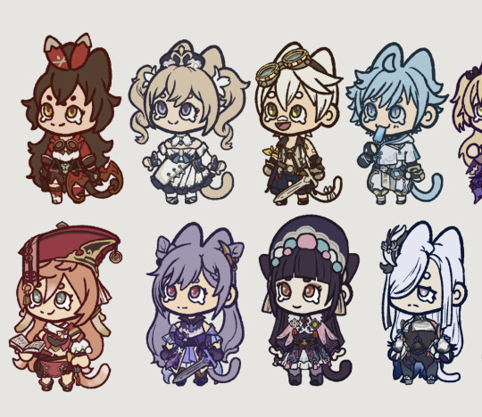
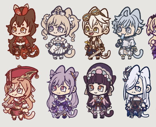
for example, the drawings on the left, the colors are fine, they could just ~pop- a little more. I throw on the overlay layer, move it to 46% and, viola! Colors are more unified and it’s got a distinct look to it.
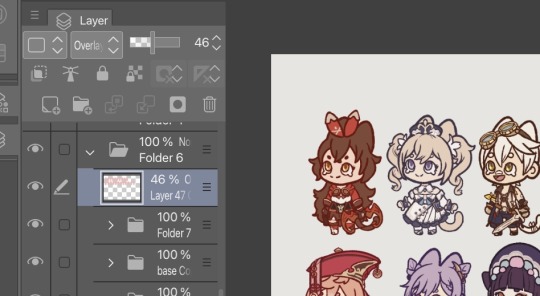
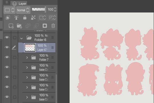
I’ve been doing this for a few years now, and usually what ends up happening is, sometimes I’ll just merge the overlayed layer and just start color picking from those merged colors.
those genshin chibi’s I did are just color picked from their character models, and maybe lightened slightly so it’s not too dark, but really not much changing. So putting the overlay really gets everything together.
Another layer option I tend to use is Exclusion, and usually a lighter brown with the layer opacity set to like, 15 or 20%. It helps a) unify everything, and b) helps tone down some of the brighter colors, to make it a bit more muted so it fits with the art nouveau style I like to draw in.
and again, just lots of color picking from the merged images to help keep everything together.
this turned out longer than expected! TLDR experiment! Try limiting your color pallets! Use layer effects, it’s okay if you don’t know what they do, I honestly don’t quite know myself ( I can give it a good guess, but, eh lol )
also avoid using true black if you can! When doing shades, darks get more rich, while lights get more washed out ( this is how I use colors, the cool thing about art, is you can do whatever! )
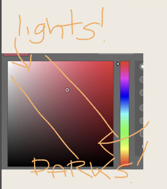
When I’m doing “blacks” in my piece, usually use a blue, or a red or purple, cuz it’s more vibrant and there are lots of tones of black. Ever try wearing a full black outfit with different clothes from different stores? They’re all different. So I always try to mix up the blacks and also try to keep the same color of black separate. That way stuff doesn’t start to blend.
And uhhhhh yeah! That’s more or less how I go about coloring. Sometimes you just gotta color pick from a neat photo and use those colors! See a cool rock? Color pick that bitch. Reference is king!
4 notes
·
View notes
Text
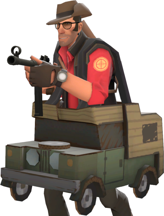
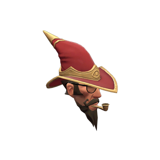
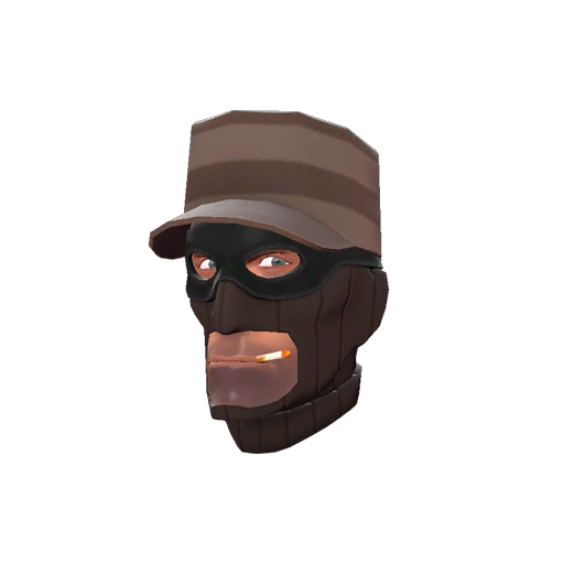
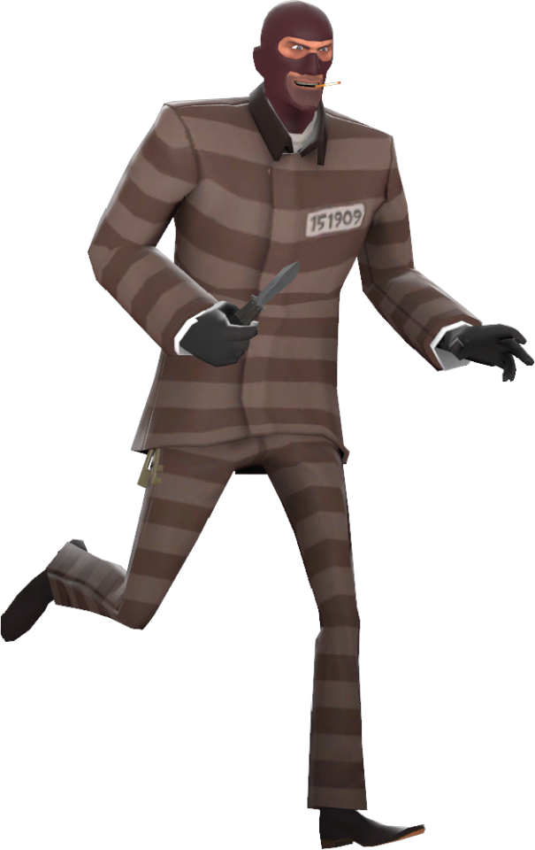
Rating the 2023 Scream Fortress cosmetics cause why not
Previous rating
The scale
0 Absolute Garbage 5 Average 10 Must Have
Jumping Jester
...eh. I wish I had more to say than 'eh' but I don't hate it and I don't like it
4/10
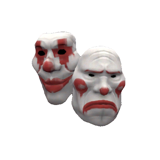
Last Laugh
I'm not sure if its just because I like jester characters in media or what, but this mask appeals to me. I...I like this.
7.75/10
Shortness Of Breath
A cool name, a helmeted style, and a generally nice looking cosmetic.
7.75/10
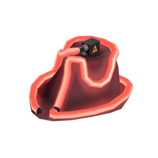
Warlock's Warcloak

A spooky cape for soldier, I can see this working well with the right outfit.
5/10
Dead Heat
To me, this is a cooler version of the PY-40 Incinibot head morph (which I already think is neat, 7/10)
8/10
Fiercesome Fluorescence
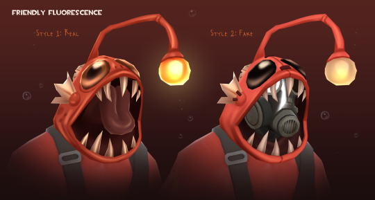
This is a factually better version of sniper's Glow From Below, a hat I have and have been meaning to giftapult it with it renamed "Giftapult This". At this point I might not even do it due to the history I have with it, and don't want it going to a bot. Anyways, this is decent head morph/hat
7.5/10
Splitting Headache
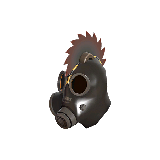
An animated saw splitting pyro's head in two; In my personal opinion the weakest of pyro's new hats
3.5/10
Blastphomet

Yet again the bonus cosmetics are some of the best in the crate; I love the wordplay and the fact that the left eye is closed to be inline with demo's missing eye.
8.25/10
Mad Lad

Another Mad Max-esque outfit; Again, haven't watched Mad Max, so I'm indifferent to this.
5/10
Stunt Suit
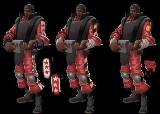
The three styles make this very versatile, which normally I praise, but this doesn't appeal to me
4/10
Thunder Dome
This is a worse version of this year's Blast Bowl, a cosmetic that I actually liked. It even has a version that makes it look like a sticky jumper grenade, like the Blast Bowl.
5/10
Bare Bear Bones
Ugh, I don't like this one. It just feels...kinda lazy? Not trying to diss the creator, they likely worked hard on this. I will say having the paints be a claw mark elevates this hat

Yeah, paint definitely required for this one.
Unpainted 3/10 Painted 4.75/10
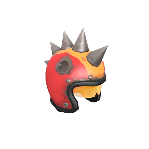
Make Ogre

Yeah, heavy's cosmetics kinda suck this time around. Though I do appreciate the wordplay
4/10
Constructor's Cover

*struggles to find anything to say but eh*
4/10
Dell Dynamic
A neat little superhero hat for engi, would even pair well with the above cosmetic (probably 'cause they're in the same set)
6/10
Main Cast
Love the title, but that's it. Alternate styles remove the blood and/or foot cast if you want that
4/10
Medical Mummy

No. I hate the style with the band-aids (shown above). Its just so redundant and not in a amusing way. The other style removes it. I don't like this.
3/10
Power Spike
Now THIS is a cool piece of headgear; The team colored glowing hair and eyes is just *chef's kiss*. It also comes in a non-glowy version if that's your jam.
9/10
Carry-Van
Lots of word play in this particular crate, I like it. Anyways, this one's not bad. The scribbley drawings really gives this cardboard car some personality and the more I look, the more it grows on me.
7.5/10
Sharpshooter Shroud

...It's a solid five
5/10
Sightseer
This on the other hand, is a nice hat. The grizzled wizard looks speaks to me. The no beard style also gives it a little versatility
8.5/10
Classic Criminal
It alright. It has styles that removes the hat and both the hat and balaclava for some sweet, sweet versatility.
5/10
Concealed Convict
Again, its alright. I think my issue with this is the suit colors are too dull and washed out compared to spy's other suits. It comes with a non striped pants version if you desire.
4.75
Six-Eyed Specs

This is a pretty neat hat, I think what sells it for me is the ridges on the top of the head, its adds a bit of needed detail.
7/10
Spyder
This is a bit of a wacky piece that kinda like, a of course its a bonus cosmetic. *sigh*
7.5/10
Clown's Cover-Up
This is the 'has a different design for each class' multi class item that I typically like. Honestly, I can't look at this without thinking of the Payday heisters. Not saying that's a bad thing, mind you.
5.5/10
Demonic Dome
*sigh* Ehh
3.75/10
Ludicrously Lunatic Lunon Fedora
I imagine this thing would get very hot after awhile. Other than that, I don't have much to say about this crummy thing.
3.75/10
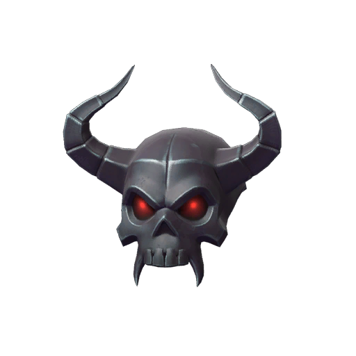
Mean Captain
This is the worst hat in the crate. Its just a hat with horns and a skull. There's nothing interesting here, no quirks that would make me want this. I'm sorry to the creator, but this feels really lazy.
2/10
1 note
·
View note
Photo
made a pfp of my trafficsona for twitter. he is like a chicken flavored goodtimeswithscar. that is ok with me
#i might try doing more drawings with this style of coloring it is very neat#i set a purple layer and then colored it in with a semitransparent brush#was a little weird to shade light -> dark but i know thats a way to go about things
6 notes
·
View notes
Note
Hii, I'm absolutely enamoured of your art! The style is so neat and expressive, the colours a delight and overall aaah, you're amazing, looking forward to see your future works :D
I have this question (I hope it doesn't bother you, feel free to ignore in case), have you attended any art school/academy or are you self taught? Because I'd love to learn how to draw, and I know that practice is the key, but I feel so lost thinking about what I should practice exactly. I think that a course would help, but at the same time I think it wouldn't since art is mostly yours to develop and vibe with yanno. Hope you're having a nice (insert moment of the day here)!
hi! first, thank you sm! I know it doesn’t seem like much but compliments regarding the funky way I draw make my day :). And for the second thing- nope! I attended public school that had a basic art class that you drew maybe a still life in and moved on in 8 weeks to do other extracurriculars like gym. Later on I did get the chance to learn some digital/photoshop stuff and paints for more serious courses but yea! mostly self taught :)
Next bit is LONG so we’re breaking it up:
aaaa ok so now when I heard of the “I’d love to learn how to draw, but I feel lost” I resonated with that BIG time. “Starting art” or in your case stating how you wanted to learn how to draw is a personal process that i wholly believe will be different for everyone. For me I started by drawing on rocks I found in the backyard as a kid and grew from there. To jump into drawing (for my personal method!) draw what your interested in or what you enjoy, and then mix that with some studies. Maybe an OC one day, and the next you’ll practice hands/ something from life you don’t really wanna draw. But! by doing this you build skills and grow- then when you redraw that OC maybe their anatomy is better or you drew a nice background with it. Once you learn the basics of some elements of art then you can stylize them!
“Well what do I study?” Anatomy, color theory, composition tricks, fundamentals of art, etc. are all pretty broad things to focus on! I would try to divy it up, maybe you practice shoes, or plant studies one day instead of the whole human figure and a forest painting. Keep it simple and fun, you’re learning and sketches aren’t meant to be perfect! There’s no “order” on what you should study first. As for taking courses vs going with flow with art/more self taught, I would say that if you have the opportunity to learn from masters- take it take it take it. I would never consider learning or taking inspiration from artists cheating. Of course I wouldn’t recommend copying an artists work (and CERTAINLY not positing it online) but maybe as a study draw a work that is based from them/their style and learn from it. I look at the way I draw noses for certain characters and they remind me of they way “x” person drew them, yeah? bits and pieces of inspiration and other artists work helped me create my own art that is personal to me :).
WHOOO okay finally last thing- going back to the no “order” bit. Establish goals! lets say you wanna draw characters first, then I would recommend looking up videos of drawing body types or tutorials online. Maybe clothes next, or you wanna learn to draw trees and do a whole week on that. Some people practice everyday, others do it like once a week- and that’s ok! Art shouldn’t be super stressful methinks. If you think taking an art course is good for your artistic journey, then do it. If you think practicing everyday but more self-taught (still use references, im the biggest hypocrite when it comes to this but they’re so so important), then do it! Yeah I might be throwing in what I personally do as an artist (but I’m still VERY much learning too!) however it is your choice to decide what path is best for you as a creator. Hopefully some of this helped! it seemed like a very genuine ask that I appreciated and wanted to give my input to the best of my ability :)
#OWOOOUUUUUUGH#long post#nyx! thank you for the ask! hopefully this is helpful in some way#but I’ll put the disclaimer again: I’m not an expert cause I am very much still learning too-these are just the things that have helped me#still it was super sweet- I saw your other message and I must’ve missed it sorry about that one dude!#also another quick thing I know studies sound like this big scary or exhausting word#but in art they don’t have to be- I learned to draw formal wear and clothing wrinkles from drawing my favorite character in a show#sucker wore a suit and I learned from that#appa asks
52 notes
·
View notes
Text
Art Dump #1
I have some time on my hands today so I decided to compile a small post with some drawings/sketches that I've made but never officially posted on my blog! Some are pieces made for friends and others are just drawings I made for no reason lmao
I decided to do this to feed yall some content but also so I can appreciate my art a bit more because right now I'm not all that happy with it kawjshdg
Anyways here we go! (imma also explain some of them cuz I wanna)
so this was a drawing i tried doing of an overblot!Ace design made by my very lovely mutual @ai-0uch !!
I had this whole idea of what I wanted to do but then I realized something- I did his design wrong aKWEJHGRH. He has a flower over one of his eyes and I didn't realize it until After I started coloring. Not to mention the fact that for some reason this drawing is too intense for my laptop to handle??? Every time I try opening it to work on it it just closes the app. So I'm physically unable to work on it
Still love how I did his hair though. And I may actually redo this since I'm still so in love with this design
Punk Ruggie!! This was a sketch that was inspired by the Punk!Ruggie design created by my lovely mutual @minccinoocappuccino !!! I loved how scrunkly he looked and just Knew I had to sketch him
This sketch is actually what made me adopt and more sketcher style! My "sketches" are usually always filled with clean and neat lines which kinda defeats the whole purpose. So this little doodle was great because I got to have fun with it and make it as wild as I wanted
And I really like how it came out!! His nose and smile are my favorite part of this one
This is a little fan art I did for another one of my mutuals, @twisted-lusty !! I remembered seeing his post about this guy n went "oh he's horrible. I must draw him" and this was the result
I actually don't hate it??? There is def a lot I could fix about this but I liked the eyes a lot!! I had such a fun time that coloring this in was very enjoyable. And that's hella important to me because coloring in my drawings is my favorite part!!!
Usually, during my drawing process, i color in the eyes mid-sketch so I don't get bored. And I take so much time coloring since it's very relaxing for me to do
oh this fucker
Okay, this is just a silly little doodle that I made for an ask but I still love how it came out??? His face shape, the perfect head-to-neck ratio, his smile??? mwah mwah
It might not seem all that important but unfortunately, I have the terrible habit of pointing out every flaw in a drawing after I finish it and it usually makes me dislike what I made. I'm working on not doing that dw, but I actually like this one. Not to mention, the lineless look of his hair??? Woah that's new
ok so this is getting long so I will be making a second part soon
#ruin nonsense#art#twisted wonderland art#mutuals#just silly little moments#trey looking Much better than his first sketch of him that I did#thank god#twisted wonderland
40 notes
·
View notes
Last Seen Blogs
classicrants
Classic Rants

griefdriiven-blog
SOCIALITE

ashleonthings
Ash 🌻 León
optimusprimeswinging-metalballs
love and robots
wakethedevils
scully holy fuck