#i need to overhaul graphics here too...
Explore tagged Tumblr posts
Visit Tumblr Blog
Explore Tumblr blogs with no restrictions, modern design and the best experience.
Last Seen Tumblr Blogs


Fun Fact
Tumblr is available in 18 languages.
Text
updated my muse list! please bear with the google doc for now ksjdbcs one day i'll have the time / energy / willpower to make a giant carrd for all my non-primary muses 😭 it's gonna be a huge personal project, but, later, because i can't renew my carrd plan rn LMAO
anyway i removed a bunch of muses off my muse list, mostly, but if i ever get an itch for things, i'll add more.
i don't feel like reformatting it rn but consider jude duarte from the folk of the air series on the list as well.
0 notes
Note
I'm not sure when I'll get to play DAO, but if you don't mind sharing your mod list, I would love to save it for when I get to play 🥹
And THANK YOU for the detailed instructions!!
Of course!!
For those catching up, I posted a quick guide to how to fix DAO so that it is playable on PC (it crashes otherwise). If you need a detailed explanation for how to mod on DAO, then I have a doc here that goes into detail, since modding in DAO is confusing and no one explains it well.
My DAO modlist is below the cut!
Essentials
4GB LAA patch compatible DAorigins.exe - Unencrypted .exe file (for the 4GB patch)
4GB Patch - to fix the game
Make CONSOLE commands visible - makes console commands visible
DAO-Modmanager - mod manager that I mostly use if I'm not using override mods
CharGenMorph Compiler - compiler tool for appearance mods (see my guide for how this works)
Bug Fixes/QoL Stuff
Qwinn's Ultimate DAO Fixpack v3.52 - massive bug fix overhaul
Dain's Fixes - caveat, I only use some of these fixes, since some class with Qwinn's pack and others I just don't care about
FtG UI Mod - More Readable Fonts and UI - this plus the next mod helps for when your fancy not-2009-era resolution makes the UI unreasonably small
Nathanael's 4K Resolution Mod - fixes the UI to be bigger
FtG Quickbar - Center and Multi Rows - allows you to customize the UI a little more
Clear Dreams - no blur in the Fade - This plus the next mod if the Fade swirly effects triggers headache/migraine stuff like it does for me (totally optional though, it doesn't bother most people)
Fade Away (Fade Colour Curves) - cuts down on more Fade swirly
No Helmet Hack 1_6 - all and I mean ALL of the hats and helmets in DAO are ugly or annoying, so hide them with this mod
Bug Fixes for Awakening DLC (Optional)
DLC Transfer To Awakening Patch (UPDATED) - fixes the game so that DLC items like weapons transfer into the Awakening DLC
Awakening Silverite Mines Bugfix - fixes a pretty big game-breaking bug in the Awakening DLC
Awakening Blackblade Armor Dragon Drop Fix - super minor Awakening bug fix
Awakening endgame cutscene fixes - another minor Awakening bug fix
Awakening Riot Scene Persuade Fix - another minor Awakening bug fix (someone should bundle these)
Updated Textures/Graphics
Environment Overhaul - cannot recommend enough, it's my favorite texture overhaul
Dragon Age Origins Unofficial Remaster - Updates a lot of items and textures to use DA2 and DAI assets, as a longtime player I love it
Fine Dwarven Craftsmanship - Adds better dwarven textures that the other two mods don't necessarily add
Ultra HD Reshade for Dragon Age... - The reshade/recolors I like (your mileage may vary)
Armors/Clothes
Grey Wardens of Ferelden - dresses all Warden characters in updated warden armor, lets you spawn updated Warden armor
Grey Wardens of Ferelden Retexture - retexture of the Warden armors if you want them
Goblet De-Gobbler - a Joining chalice fix and more - fixes the goblet glitching out if you are wearing modded clothes during your Joining ceremony
Surana Circle Mage Robe - the mage robe I love so much
Surana Mage Robe Retexture - Updates the texture of the Surana mage robe I love
Crow Assassin's Armor for Zevran - cool Crow armor for Zevran
Crow Assassin's Armor Retexture - better textures for the crow armor!
Practical Morrigan Robe - An outfit for Morrigan I really like
Morrigan's Robes Collection - retextures for the Morrigan outfit
Leliana Item Pack - New clothes for Leliana
Leliana Item Pack Fixes - fixes/retextures for those clothes
Loincloth Fashion - more clothes if you want them
RLs Swan Song - Even more clothes (pick and choose individual files, there are WAY too many in here)
Noble Dress Overhaul - If you want the NPC dresses to look nicer (or you get a dress yourself that you want to wear)
Female Noble Clothing Overhaul - totally different NPC dress overhaul
Female Noble Clothing and Noble Dress Overhaul Compatibility Patch - patches the last two mods into one overhaul (it basically reassigns who wears what lmao)
Wynne's Aequitarian Robes - Unique mage robes for Wynne, if you're into that
Male Circle Robe Replacers ( Robes of the void ) - updated mage robes! Guys-only tho
Female Circle Robe Replacers (Bethany Robe Replacer) - updated mage robes, girls only
Hair (So Many Hairs)
DAO - Anto Hairstyles - various hairs
HAIRSTYLE DAY - more various hairs
HAIRSTYLE DAY VOL.2 - even more various hairs
Hairald of Andraste Hairs - individual hairs that you have to add via chargenmorph (I explain how to do this in my mod guide)
Companion/Player/NPC Retextures
Unique Face Textures for Companions DAO Edition - probably my favorite retexture set, but I'll admit, I mess with companion textures myself in the Toolset soooo you may find others you like
Sten of the Beresaad - fave Sten retexture, makes Sten look like a mix of his DAO texture and an updated DA2 texture
Sten - no clothes - if you want a shirtless Sten (goes with the Sten of the Beresaad mod specifically)
Pineappletree s Vibrant Colors - more eye colors for you
Alternative Default Eyes - my favorite eye texture
Lovely Tints - adds more hair colors
Natural Freckle Tattoos and Tints - more skin tones/hair colors plus freckles, but I think you can only use them in the Toolset
Sun's Tints - more eye colors and such!
Mabari Recolours - Origins - recolors your mabari dog!
Tranquil Brand 2.0 - Adds Tranquil brands to Tranquil NPCs
Fun Additions
***Not Recommended for First Playthrough!
Skip the Fade - ***let's you skip a quest that many find annoying
Extra Dog Slot - Let's you summon your dog as a fourth companion
Improved Atmosphere - DO NOT use the whole mod as it will break your game/mess with too much. I only use ONE file and that is the More Party Barks (party_barks.dlg) since it adds more location-specific banter
The Rescue at Ishal - ***adds a cutscene to an early quest, but I only recommend it after finishing the game once since it can be spoilery to later game events
CHANGE YOUR HERO HAIR AND FACE ANYWHERE IN THE GAME - let's you update your warden appearance but, warning, it's kinda a complicated process
Universal Voices - lets any race have any voice
ZevranASAP - ***makes it so that Zevran's encounter with the Warden happens way sooner
Fare ye well Duncan - ***a little minor cutscene added early in the game
DahliaLynn's Sleep Until Dawn - Let's you go to sleep in camp for RP reasons
Alistair's Dark Ritual - ***replaces a late-game cutscene with a new cutscene, Alistair-Romance specific, don't recommend for a first playthrough
DahliaLynn's - Alistair's Nightmare - ***adds a little cutscene to the game, totally extra content
DahliaLynn's - Alistair's First Night Love Scene - ***swaps Alistair's canon romance cutscene for a modded one (your mileage may vary on how much you might like it lol)
Alistair Romance Eavesdropping - ***adds a bench to camp where if you sit on it, you can "overhear" companion banters that are turned into full cutscenes now (it's very cute I won't lie)
I haven't yet dived into Zevran romance mods lol there are some though! And there's plenty more where this comes from, this just happens to be the mod list I use as someone who has played the game a ton and wanted a sort of "overhaul-but-still-true-to-the-heart-of-the-game" modded game.
Anyways enjoy all you modders out there <3
102 notes
·
View notes
Note
Does it seem like Infinity Nikki is building on the lore in the previous games, or is it doing its own thing? It's been a few years since I played Love Nikki Dress-up queen, and all of the proper nouns seem to be different than I remember.
Okay let's talk about Nikki lore!!!
if you've come straight from Love Nikki, Infinity Nikki probably feels strikingly different and yet eerily familiar. It presents itself as a clean slate for new players and a straight reboot for returning players, with Nikki and Momo encountering a magical outfit and being pulled into Miraland where they learn a whole new set of terms and mechanics for the dress-up game you're about to play. All the proper nouns have changed - 'styling power' is still the same, but now magic and tech are 'whim' and base currency is 'blings' etc. The story, setting and characters are all a little different too. So it's a total reboot for the new format, right? Makes sense.
TL;DR: for everything I'm about to unpack:
Doylian answer: IN is a clean reboot of the basic isekai premise, allowing them to easily onboard new players and update the core nature of the game.
Watsonian answer: the reboot is itself part of the ongoing canonical lore of the Nikki series!!!
The context you're missing is Shining Nikki. SN actually pulled this move first - it was a total overhaul of LN to move the series from 2D paper doll graphics to full 3D models, and like IN it seemed to begin the isekai type story of LN again from the start. Not too many people in english speaking markets played the first two games in the series (Nikki Up2U and Hello Nikki), but what you need to know about them is that they were both set in Nikki's own earth-like world, where fashion was an ordinary element of everyday life (i.e. the player was asked to dress her appropriately for real-world situations, with the context that she was an aspiring fashion student). They were also direct instalments in an ongoing story.
Here's the timeline up to where you stopped:
NU2U: Fashion student Nikki and her talking pet Momo practise her skills as a stylist in everyday situations. Though it's usually played as a joke, both Nikki and Momo acknowledge that he's a 'cat-like thing' - not really an earth cat.
HN: Nikki and Momo travel their world, finding styling inspiration in different locations / through meeting various characters. Some of the costumes she creates in this game continue to appear through each sequel as lower-level outfits, implying continuity.
LN: The first game that really broke through in english-speaking markets, and the first in the Miraland cycle. Nikki is preparing for graduation, when she finds a mysterious outfit in the attic. Touching it gives her a vision where she glimpses a strange realm brimming with fashion-related power of some sort. When she comes to, she and Momo are in a field of flowers. They've been transported to another world called Miraland, where styling has literal magical power that's used to settle disputes in place of violence. She embarks on a quest to attain a set of uniquely powerful dresses at the centre of a burgeoning magical/political crisis, in order to save Miraland.
^ Big sideways jump, right? The Doylian explanation for all this is very mundane. They have to keep rebuilding this game for newer phones, and updating the graphics/mechanical gameplay as the series goes on. There are only so many times you can ask a player to dress Nikki up to go to a café or whatever, and the isekai genre is massively popular among the target playerbase. BUT they retain the canonical continuity of the series with LN - Nikki frequently refers to her sister Yoyo and their travels around the world throughout LN and SN, and Momo hints that Miraland may be the origin of his clan (or at least tied to their origin somehow). It would have been an easy place to wipe the slate clean, but they didn't.
And then comes Shining Nikki. On starting the game, Nikki speaks to you directly from a meta-realm where you set up your username and get introduced to basic concepts. Nikki has an encounter / vision with a mysterious figure related to this styling meta-realm, and then she wakes up. She and Momo find themselves in a field of flowers, in a world called Miraland - sstop me if you've heard this one before.
SN is where things started to get really interesting, and where I suspect the writers started laying down some intentions for the series going forward. As Nikki travels around Miraland, she runs into a variety of people and places that are reminiscent of, yet different from, the cast and setting of Love Nikki. And little by little, she begins to recover memories of that game.
As it build towards its climax, SN does one of the coolest things I've ever seen from a rinkydink fantasy mobile gacha. Nikki comes up against an opponent she can't beat, and you're asked to style-battle them again and again. She starts to dissociate and refuses to back down, and then- well at this point my phone couldn't handle the 3D effects and it booted me back to the game's home screen.
SN was pretty ambitious with its 3D elements, to the point that the home screen itself featured a 3D nikki you could dress up, who would move around and strike poses, and spit out lighthearted quips when you tapped her ('I wont give up on my friends!', 'If Momo eats any more BBQ he's going to turn into a beach ball...' etc.) So anyway, my game was locked up apart from homescreen Nikki's idle animations. And then she started talking to me, by username, commenting on the defeat she was suffering repeatedly in the story chapters.
At this point, SN introduces the idea that the player is (from Nikki's perspective) a powerful being from another parallel world, who has been influencing her styling choices the whole time. It also introduces a meta-meta-realm where outside observers can access people's memories to subtly alter their world's timeline. When I say this game got high concept...they had a limited-time event at one point where Nikki essentially explores the lingering cognitive dissonances left behind by the inhabitants of Omelas. I'm insane about this series. Anyway.
A LOT went on in SN, but what you need to know is this:
Nikki learns that she found herself in the story of SN because she went back in time 600+ years from the events of LN in a last ditch effort to prevent the apocalypse she failed to avert.
By accessing the Ocean of Memories, she also learns that this is not the first time she's done this. She has been stuck in a time loop for thousands upon thousands of cycles, perpetually failing to save Miraland, going back in time, and creating new causal offshoots that she again fails to save.
Nikki realises that by doing this, she is perpetually rebooting the lives of all the friends she keeps meeting and bonding with and then failing to save, and wrestles with whether this is ethical. Ultimately she decides to persist, determined to save Miraland.
Now here's the million-dollar question: Is Infinity Nikki a straight reboot, wiping the slate clean to simplify the lore and onboard new players? Or is it a continuation of Nikki lore to date, setting her on a new cycle in the same sequence? I would answer: yes and yes.
Every game in Miraland seems to follow a certain pattern with minor changes, and IN is no exception:
Nikki arrives in a tutorial zone themed around cosy rural villages and flower fields.
She meets a friendly girl who introduces her to Styling and its role in Miraland, and who puts her on the path to her first set of competitions (rip Bobo greatest anime betrayal of all time)
Nikki gets drawn into a political crisis centred on Miraland's system of styling contests, inevitably involving mercenaries and corporate espionage at some point.
Reference is made to an ancient fallen monarch who had a personal connection to certain outfits of immense power.
Reference is made to an elusive but powerful spiritual being (a god, a prophet, ???) whose divine power is bound up with the mysterious source of Styling Power.
Nikki encounters a reclusive society of magical beings whose life force depends on that same power source.
She travels to a variety of regions including Fairytale Forest, Gothic Lolita Town, Literally China, Uncomfortable Desert Realm, Big City, and Separatist Tech Freak Island. [in progress]
War breaks out somewhere and Nikki ends up on the run [hasn't happened yet, but I believe]
Vampires/demons get involved [hasn't happened yet, but I believe]
There is a goofy yellow mascot that looks like a fat duckling. [I'm a Gifty truther, what does it all mean.]
So far we're only a few chapters into IN, but I can already see a lot of familiar pattens starting to take shape. Factions are an interesting twist on regional styling competitions, and elements like Eureka and the Mira Crown contest (and the repeated motif of mirrors and fragmented crystals) look a lot like the seeds of more meta-realm content to me. Well, and the actual literal meta-realms accessed via waypoints and whimstars.
If you read all this, well done!!! You are definitely insane enough to enjoy the Nikki series.
61 notes
·
View notes
Note
Speaking of the canon Danny Phantom show, do you think it could've been worth it to give it another "fourth" season, if you had a choice to give it a better ending/fix up certain story arcs?
Hmmmmm, I do see the appeal in wanting to spruce up the canon ending we got (cause oof, even now I can see how messy “Phantom Planet” was-). For a whole 4th season however… Iiiii feel like it might be a bit “much” imo, if there’s no clear narrative goal in mind? ^^;
Like, with what they’ve been doing with the graphic novel series (aka. the one with Dark Danny & the upcoming Valerie-focused novel), I can tell they’re rife with potential for story arcs. But given some of the clunky writing in the later-half of the canon show, I think we're gonna have to call more for an overhaul of that before tackling another season.
Like here’s what I’d personally suggest for a S3 overhaul (should one choose to keep it as the "final" season):
-Add in more episodes for S3, to give it the same proper bulk of content as the previous seasons + help not feel so "rushed" by the series-end.
-Maaaaybe tone down the Vlad focus in terms of episode plots; yes, I get he is the main series villain... but that doesn't mean he needs to show up all the time imho. Compared to the first couple seasons where he was only ever the "main focus" a handful of times (thus helping him feel like a genuine threat to stay on-edge about), by S3 Vlad just... didn't feel too impressive, villain writing-wise tbh? 🤷♀️ As the old saying goes, "Less is More~" 🍵🍵
-Following the prior point, I'd try to incorporate more of a mix of the og villain roster AND the newer ghosts (ex. Nocturn, Undergrowth, etc.) as episode focuses... 'cause ngl, most of the previous baddies did start to feel forgotten-about in S3's narrative, outside of a couple cameos here & there 😔 Like, instead of clumsily shoving Ember, Kitty & Spectra into one episode... have them spread out in their own plots (+bring in Desiree to share the spotlight with one of them too, if you still want some team-up ideas). Or even for a main finale focus, that could be a fun time to bring back Dark-Danny to once more be the "ultimate" threat (symbolically capping off Danny's adventures by facing the reality of "growing up" instead of ignoring it again, y'know?). Just... aaaagh, whyy must all these cool ghosts be shoved off to the side, man... 😭😭
-Have Danny & Sam get together alooooot sooner than the series finale; which yes, I can see how that'd be controversial for those who don't ship them (and/or just don't like romance, period lol)... buuuut I mean, since DxS has been hinted/teased at since S1, then one might as well bring it full circle and show the audience how they work as a couple imo (ex. Kim & Ron during the later eps of "Kim Possible"). Like say, put "Frightmare" ahead of "Urban Jungle" (to allow Danny & Sam to realize they both like eachother through their shared dream), have the angst + raised stakes of "Urban Jungle" break through Danny to confess his love, fights tooth & nail to save Sam (+the others), and then once the dust is settled/reunite back to normal... they have their big kiss moment to seal them as a canon couple (ahh, classic cartoon trope hehe~💗). Cue the rest of the S3 going by as normal (+them being awkward dorks trying to get through ghost adventures while also figuring out dating lol), the finale happens, they have another heart-to-heart to further acknowledge feelings, they fly off in the end committed to one another... The End~ 💜💚
#dp asks#danny phantom#danny x sam#amethyst ocean#(*sorry I rambled a bit I had this bottled in for awhile gljhk*)#(*still not rly sure what I’d do with a potential 4th season if the series continued… but it -could- be neat to think about on the side?🤔*)
9 notes
·
View notes
Text
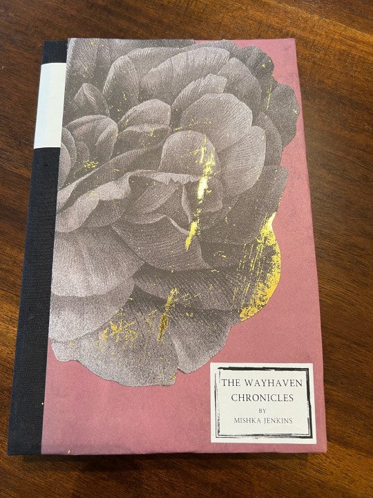
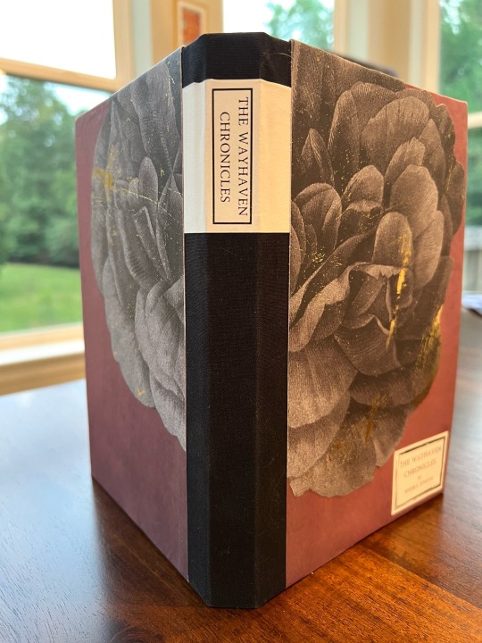
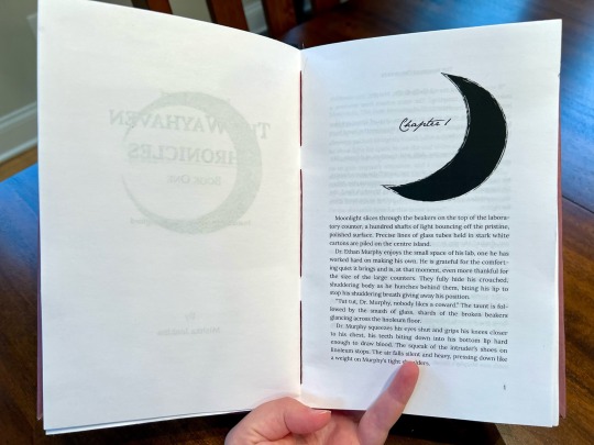
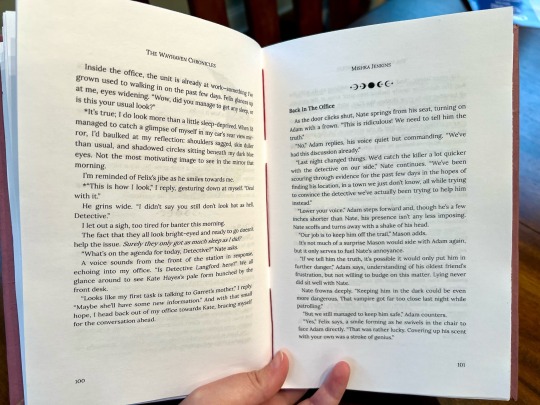
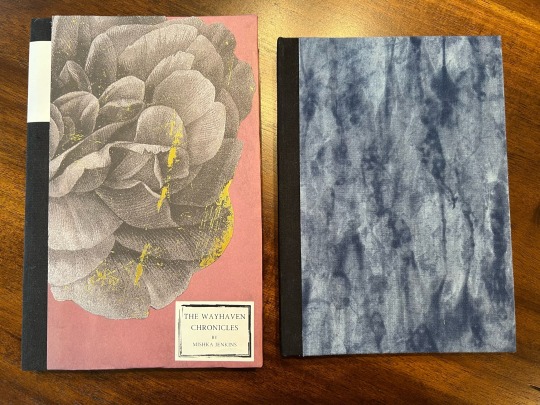
It's done! Attempt number two at book making is complete! It's still just Ethan's Wayhaven Book 1 run. I did a big overhaul of the typeset compared to the first one, which I was trying to make small to minimize the page count. This came out about 130 pages longer and the text seems to breathe much better now. I also added a couple of basic graphics, a moon in the chapter headings and little moons as section headings. I used variegated red embroidery thread for sewing the signatures for just a pop of ominous color between the pages. It is a game about vampires after all.
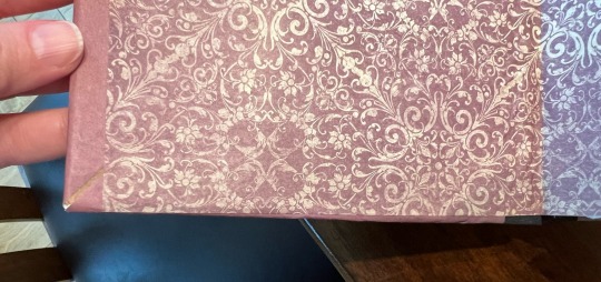
Working with paper instead of cloth for the cover was a mixed bag. It looks gorgeous in a way I couldn't do with cloth but it was harder to get just right and I'm not sure it will hold up the best long term. But as a second attempt, that's ok. I tried new things and learned new things this one which was the goal and overall I think it's a more attractive finished product, or at least more visually interesting.
The breakdown on mistakes is under the cut. It's mostly for my benefit so I can remember later but please learn from my learning if you would like!
First off here's a comparison of my first and second attempts.
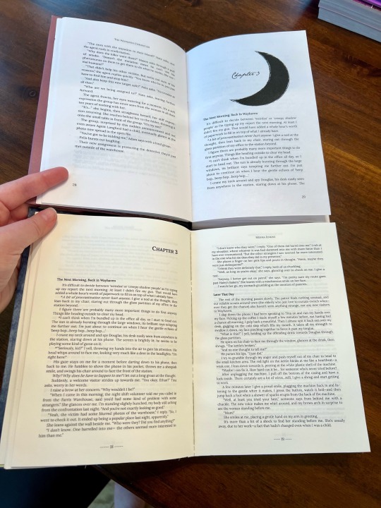
The paper I used for the first wasn't exactly 8.5x11 as noted before and I think it was even narrower than I realized before I tried to trim the pages. It is a significantly shorter book! Also the typeset differences. I'm really happy with how the new one came out.
Mistakes and improvement for the future.
Paper, Paper, Paper - I didn't even attempt to use interesting paper for this, just regular printer paper. Not needing to worry about trimming was so nice. I bought 9x12 sketch paper thinking it would fit in my printer, it did not, and I wasn't going to trim every single page to size so I have that now in my crafting pile. Maybe I'll make some blank journals with it. I do like the slightly off white color and heavier weight of the paper I used the first time and if I put in a fancy paper order I'll take that into consideration.
Paper: Part 2 - I want the scrapbook paper I have to be heavier and the cardstock to be lighter. Once I put glue on the paper it was so hard to work with because it wanted to wrinkle but also felt like it might tear if I tried to smooth it too much or reposition it. I ended up backing the piece on the front cover with a piece of printer paper and that seemed to help.
Mull - I've been using cheesecloth. I didn't starch it last time so I tried that this time but also saw something about putting glue over the whole piece of mull first then attaching it instead of holding it over the spine and dabbing/brushing glue on top. Bad choice. The mull is a mess and it isn't flat on spine, it was weird and stiff and there's slight gaps in between signatures as a result. I couldn't rip it off though so it is what it is. Won't be doing that again in the future though. Minus the mull issue I was really happy with the textblock though.
Endpapers - Again fighting the thinner craft paper. I should have sewn these on but I didn't. However I couldn't add them later because of the mull issue once I realized that so they are fully glued to the first page for added strength instead of being tipped on. Making them then and sewing them on takes more time but might be the better route to go in the future.
Gluing - I feeling like have terrible gluing technique. Things feel too wet but then if I use less or add some water for easier brushing on it doesn't stick as well. I think this is just a practice thing but considering how much gluing there is, it is a little frustrating.
Labels - Tried that for the first time with paper. Not sure how I feel about it . I think it looks alright but mostly it was about the paper quality and durability. Story of this build.
The Casing In - It was not great.
The back is alright but I really messed up the front cover. I think I pushed it too far back into the hinge so the cover doesn't quite close all of the way and is why there's such a large fore edge wrap space. I also think I made my spine piece slightly too narrow so that didn't help either. Ah well. Warping could also be from needing to glue the extra backing paper to the cover paper first and it's just too much glue pull in one area with nothing to balance it.
She's done though and once again I'm carrying over lots good knowledge for the next one. If I saw it sitting on someone else's shelf and they told me they made it I would be super impressed so I should give myself that credit as well.
#life at nerdy holler#nerdy makes a book#bookbinding#the wayhaven chronicles#I might actually try to sit and read this one
38 notes
·
View notes
Note
Hello! I’m a long time follower and I noticed that your screenshots got better in terms of quality! 😁 Did you get a new PC? And do you have any tips on how to take better gameplay screenies/editing? Thanks! Hope you have a lovely day 💕
Hi Noni and thanks. Hope u have a lovely day where ever u are too ❤
Btw, I recently answer the same or might be slightly same as this ask and also I include some tips how I take my screenshot. Its still the same method I use but here are more related what u ask or u can just refer both.
1st, I have a laptop and a PC (my husband gave me his old PC and upgrade it for me). If I'm at home, I will use my PC more then my laptop cause recently I did upgrade my graphic card for both Laptop and PC for my IRL work, also I use DX11 for the sims and I recently use re shade in my game that why my screenshot look better quality but I'm not really call my screenshot look that better, I'm still play around with taking screenshot here and there or don't be shy to ask other simmers their tips too and I upgrade my sims camera overhaul. I have a few part of how I have a better screenshot, since I'm too perfectionist and sometime I do have "Jealousy" in me, when I see other simmers have more better quality of screenshot 😅. So this is what I call "what works for me" and hope it's work for u too.
Choosing the right Re shade / G-Shade Preset
Choosing the right re shade / gshade are the second most important for me or maybe every one will agrees with me and not every reshade preset suit your style. I've try a lot of preset and end up stick with what i'm currently use. So choose wisely.
Gameplay, Build, Interior and Exteriors screen shot:
Recently there's a rain in the house bug that haven't being fix yet, so I use UI cheat to clear the sky cause it will effect my screenshot and the screenshot will look not good for me. I don't really edit my gameplay screenshot. It's all from my re shade that I use (u can check my previous ask regarding this). I only edit my screenshot when the picture look dark or enhance it but so far I already love what my re shade gave. And last I don't really play with my sims in their house, i use to bring them out to a community lot or somewhere that have an outdoor light and play with in game time too. I already explain this in the previous ask post.
Cas screenshot for Sims submission / intro post / Look book
I only use SRWE to take cas screenshot and my setting size are 2000 X 1500 or 3000 x 2500 (this will make your screenshot more HD or sharpen look).
What I use for editing my post.
I use Canva and Pixlr for editing cause its have everything and easy for me if i need anything from template to editing. I'm not use to PSD since it's give me alot of time to figure out 😅.
and that it from me and hope this tips work with u and thanks for noticing my changes of my screenshot 💜
10 notes
·
View notes
Text
5 sims 4 mods to improve your graphics
Gentle CAS Lighting mod by northern siberia winds
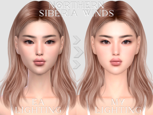
default cas lighting replacement for sims and pets.
softer glow and shadows;
base game;
conflicts with other cas lighting mods for sims, you can only install one such mod in your game!
DOWNLOAD
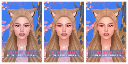
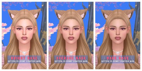
2. BETTER IN-GAME LIGHTING MOD v1.1 by northern siberia winds
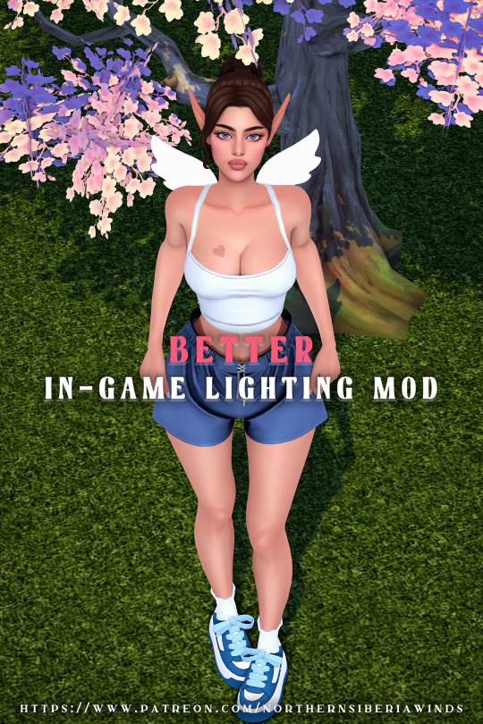
This is a custom lighting mod to improve the graphics on your sims and their surroundings. This is a set but you can only place one of the lighting effects in your mods folder, more than one will cause issues with your gameplay.
DOWNLOAD
3. GShade

Gshade allows you to use presets in the sims, Sadly I do not have gshade myself as for it isn't available on Mac at least not the one you need to use presets in the game.
DOWNLOAD
4. Reshade
This I was able to get on my Mac book but it just ended up being too confusing for me so I kinda just raged quit and never bothered to attempt using it.
DOWNLOAD
5. Overhaul 01 - Simp's GraphicsRules Override by Simp4sims
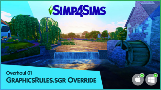
Here is a graphics mod that does support both Mac and windows! I do recommend reading the entire patron post because it has a very well way of describing what this mod is, how it works, and where to find the folders to place the override it. They just do a better job at explaining it.
DOWNLOAD
#sims 4 graphics#sims 4 graphic mods#sims 4 mods#sims 4 cc#sims 4 custom content#ts4 custom content#sims 4 download#sims4cc#the sims 4 custom content#sims 4 override#ts4 overrides#musthavemodssims4
71 notes
·
View notes
Note
do you have any recommended gshade presets?
Almost all Reshade presets work with Gshade too! a little tip, with gshade you don't really need to worry about downloading anyone's recommended shaders, Gshade already has everything one needs in it. also if your game doesn't look like the reference photo's it's likely they edited them so don't let yourself get too frustrated. Any who, here are a couple of suggestions:
I would love it if y’all shared your suggestions in the comments, too! Ty💖
Ghibli waters and Comic-book are similar to my personal presets💖
here are some world overrides I also rec for more aesthetic: fluffy clouds / @apricotrush 's food & appliances are just lovely💕
︶︶︶︶︶︶︶︶︶︶︶︶︶︶︶︶︶︶︶︶
this is a little tutorial on a graphics overhaul, you don't need to do this!!! but I wanted to share this info incase some preset shaders don't show up quite right in somebody's game and/or someone wanted better graphics. big thanks to hazelminesims btw!
this page & link is in her recourses:
#I'm so sorry about all the tong clicks my mom was baking chocolate cake & it made my mouth salivate like a river!🙈#seyvia replies#anon ask#sims community#gshade#presets#simblr
35 notes
·
View notes
Text
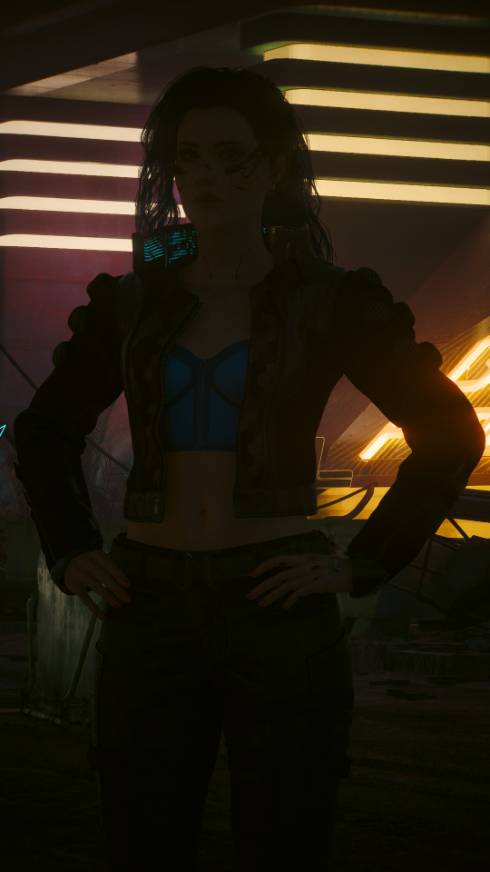


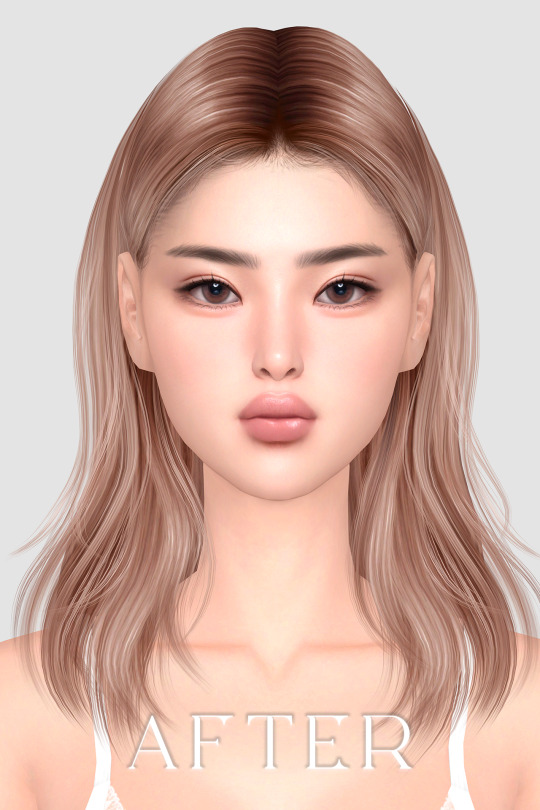
I saw someone recently ask why their shots weren't turning out how they wanted them to despite being able to support the highest graphical settings, so I thought I could share a little behind-the-scenes tidbit re: my approach to lighting and post-editing in VP in case it's useful.
And for my money, lighting is one of the most important factors in getting a shot that I'm happy with. Yes, a high-end graphics card can absolutely help, but that's just one tool of many that can make a difference.
(This info is probably most relevant to folks who can mod their game, but the overall principle can also be applied to vanilla photomode, too. You'll just have to find good in-game light sources since you won't be able to spawn your own, and it might require a little more finagling with the vanilla photomode exposure and contrast settings. Here are some 100% vanilla shots I took recently that I think turned out pretty decent even with those limitations, just to give you some ideas if that's what you're working with.)
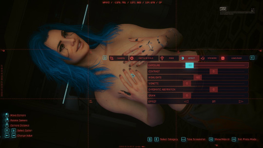
Lighting & Exposure
So referencing the photos above, from left to right:
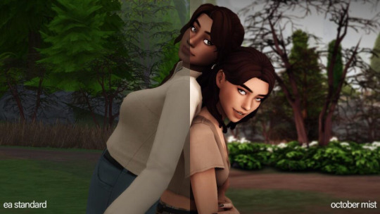
A purely vanilla shot with ray-trace enabled but no lighting tools
The same shot with lighting tools on Valerie
The same shot with lighting tools + some Lightroom editing
Beefy graphics cards can certainly make a difference here since they'll be able to render more nuanced light and shadows, but as you can see in the purely vanilla shot, that ray tracing on its own ain't doing much when it comes to lighting Valerie. The neon lights in the background are pretty, but she's barely even visible in that dark ass street.
In the second shot, Valerie is in the exact same location but has multiple light sources on her. I mostly use CharLi lights these days, which is a free suite of lighting tools available on Nexus, and the customizable ambient lights in AMM, also free on Nexus.
I didn't think to screencap my exact lighting setup, but I'm pretty sure it was something like this:
CharLi spotlight on the left and right of Valerie, tinted pink/magenta
CharLi spotlight on the upper right, tinted teal
(I think I might have had an orange CharLi spotlight too, but it wasn't visible from this angle)
2 CharLi white spotlights directly on Valerie
Probably 1 or 2 AMM customizable point lights on her face (I like using the point lights at very low brightness to accentuate faces and give them a nice glow)
Now putting all these lights on a character could end up way too bright at the default vanilla exposure, especially if you aren't using any kind of major Reshade overhaul (which I do not).
Instead, I just use the vanilla photomode exposure settings to make a scene really dark and then light it back up with my own tools. (This is also a great way to shoot in areas that might have weird lighting effects, and it can be done indoors or outdoors and at all hours of the day.)
Just a simple example of that in these shots:

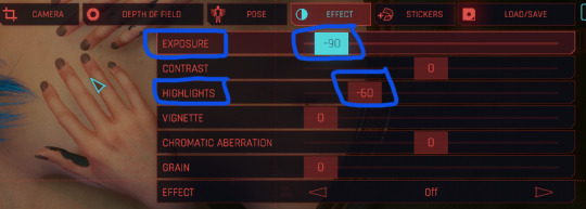
On the left, Valerie has a spotlight on her face and chest--It's pretty bright, too bright for my tastes. On the right, she has the same spotlight, but the overall exposure has been dropped down to -90 and the highlights have been dropped to -60 (now it's a little too dark for my taste--If this was gonna be a real shot, I'd build up more lights, but just wanted to show how much altering the exposure can affect a shot).
Post-Editing
As for making further adjustments to colors, shadow levels, sharpness, etc. of a shot, I know a lot of folks prefer to do that with Reshade presets, but... I don't, haha. I did make a basic shader to reduce the green tint of the game, and I use the Cinematic DOF and Real Long Exposure shaders to get a nice depth of field and reduce hair pixelating. Otherwise, all other adjustments I make are in Adobe Lightroom (or Photoshop if I need to make more precise adjustments).
And it's just a personal preference here. I just don't like having to mess with too many mods and menus in-game--I feel like it increases the chance of something freezing or crashing or me accidentally closing out of photomode. It also helps to give me a new perspective to see the shot outside of the game, especially if it's a portrait-oriented shot. Plus, I just like the process. Gives me one more reason to stare at the blorbos for a little while. :3
I adjust each Lightroom preset as needed depending on the color and exposure of the shots I'm working with, but these are some of the more common settings I modify:
I almost always finetune the exposure and shadows/highlights.
I like to do a global increase for saturation and vibrance.
A lot of my presets increase the saturation of reds and blues and decrease the saturation of yellows and greens, but this can vary; e.g. i like the greens to be vibrant if it's a nature shot.
I also usually make the white balance a little cooler.
I love tinkering with the global curves settings to "flatten" the shadow levels.
And I like really crispy shots, so I always increase the sharpness, and I'll usually bump the texture and add some noise, too.
These are all things that can be done in other similar programs/apps or even with Reshade. If you're just starting out, I think using pre-made presets and filters is a great way to go, and as you get more comfortable with the tools, you can start to make little tweaks and edits to personalize the style.
So anyway, there's some of my process! Everyone's got their own, and what works for me might not work for you--Don't feel like you have to take any of this as gospel or work exactly the way I do. But maybe this will... shed some light (ha ha, I'll see myself out) on how to get started with some VP tools. <3
44 notes
·
View notes
Text
FINALLY, AFTER YEARS OF MESSING WITH THE CODE... IT'S HERE!!!!
THE NEW AND IMPROVED CHARACTER PAGE.
As you know I like web design. Well, I like graphic design in general, but you know me. Recently I had a bit of an issue with a class I was giving and decided to just focus all that energy of loss and anger into something productive... and here it is!
I decided to make the change mainly because I recently tried solo rping with the Cortex Prime system and realized that it was far more easier than I actually wanted to give it credit for Solo RPing. And after a pair of test runs I realized that it also held well for thread roleplaying, so, why not use it?
With that in mind I decided to overhaul everything. The old site was not bad, but it was too wordy and there were things that I didn't like because Google Sites only allows you to work within very limited boxy constraints. And I get it, for the average user it works amazingly! But if you know me, you know I am anything but average.
So I decided to give it a go, and here I am, one month later.
Yes, yes, I know I owe. Expect your thread replies pretty soon. I will be spending time in them for the following few days. For now, give the website a go, tell me if you find anything in particular that does not work. It still needs me to work on the flexibility for mobile devices and the faceclaim list, which I think I will work in a different way, since I end up updating that quite often. So, ignore that and just let me know if all the other things are not working.
Thank you all! Enjoy!
3 notes
·
View notes
Note
what to think of motogp and wta's new logos
what to think indeed


I don't know anything about graphic design, so these are all extremely uninformed opinions. I thought this piece on the race was really helpful (to me, who again doesn't know shit) in explaining some of the practical reasons for the motogp rebrand - and I imagine some of the reasons are broadly applicable for the wta too. like, yeah this does make sense

which I don't feel like was. as much a problem with the old wta logo

idk man. I get the player adds a more cluttered visual element, but the atp logo also still as one of those. iirc this logo has also only been a thing since 2020, so it's not like in the motogp case where it's literally been around forever. you can detach both the text and the symbol and use them on their own. I kinda get why motogp needed a new one more than I do with the wta,, like okay, the wta is defo in a worse state than motogp but I'm not sure the REBRAND is gonna fix anything
setting aside the actual justification for the rebrand... I don't really like either of them. it just looks extremely generic! again, I think the piece from the race was good for explaining WHY this happens --


-- but the thing is, right, I am not a shareholder in motogp and don't actually need to care how commercially smart this change is. I think sometimes there's this thing where you dislike somebody and you then get told 'well you just don't know that there's industry-specific reasons for why it's Like That!!' and it's kinda. okay, that's good information to have, but I have taken in that information and I still don't like it. logos in general have been getting more generic and, sure, maybe that makes sense for commercial reasons, but sometimes you've got to free your mind from your inner capitalist and just. dislike stuff. I don't want all my sports to look like they're trying to sell me vegan soup
also, while I can claim no real nostalgia for either the wta or the motogp logos, to me this is still like. the intro I will always associate with motogp
youtube
the champions tower is one of the cooler branding things motogp has going for it, and the link with the chequered flag just makes it neat and distinctive and on-topic. idk, SURELY there was a way to just integrate this one visible design element into the new logo in a way that still makes it work for the internet age etc etc? I'm not a graphic designer (clearly) so I don't have any great suggestions, but even if you're just making the 'o' have a chequered flag or whatever idk. I don't like this trend
coming back to the wta, we do obviously have to address the elephant in the room - they've changed colours. idk man, the problem with the wta rebrand is I associate that logo with the wta even more than I did the old motogp one with motogp. and I do associate purple with the wta. idk WHY they've made the switch.... I do kindaaaa have time for the argument that 'men's tennis blue women's tennis purple' is maybe kinda dated colour coding. I'm a big fan of the colour purple in isolation, but also I don't necessarily hate moving away from that. that being said.... don't go GREEN, the atp challenger tour is GREEN. now I know they have also recently had a rebrand --


-- but in everybody's heads, that shit is still green!! I watch challenger events, plenty of tennis fans do and even if you don't you do still have a sort of... vague awareness of them. why green?? okay so you can't take blue because the atp's got that, no purple, I'm guessing no red on similar gender coding grounds. I personally would have gone for orange. and in general, obviously the larger issue is that announcing you're going to do a big change a RADICAL new step a huge overhaul and then it's a fucking COLOUR change is like. my brother we are in crisis mode here I think you're gonna have to do better than that
anyway. why does everything just need to look more boring nowadays


can we not at least keep the triangle 'a' with the tennis ball!! could we not have kept the 'a'!!
misc complaints:
what does 'rally the world' even mean

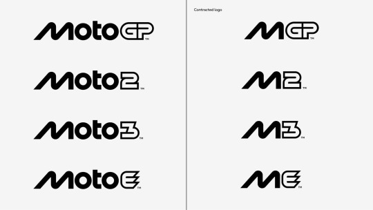
nobody is calling it 'mgp'
don't like that that's in the social media pfp's now... with the wta I do need a bit longer to see about how I feel about the graphics in practise. but also, at the end of the day, I don't care THAT strongly. I have zero real investment in motogp's long-term health, I DO have a lot of investment in women's tennis' future but also it's not going to live or die by this logo change. I will miss both of the old logos and broadly preferred them to what we have now
anyway.


#i can't really remember the current motogp theme tune off the top of my head either but#i do feel in general that motogp just feels more like a generic sport these days#like this is also obviously the valentino effect but noughties motogp in my head is kinda this funhouse mirror situation#that's kinda detached from 'normal sports'. possibly even reality. i do sometimes forget those guys were actual 'athletes'#whereas current motogp i do just follow. as a sport. that does normal sports things. and then i remember it's a continuous thing#do think more generic branding probably contributes around the edges to that. it's just more slick now innit#idt that's a good thing or a bad thing it's just a thing in my head#//#brr brr#racquet tag#batsplat responds#something about '10... casey could no longer drag an unrideable bike to title contention and vale could no longer be spared by the gods#lost receipts i fear. stuff used to just kind of Happen for narrative convenience#//brr brr
2 notes
·
View notes
Text
Alright so now that it's been a day and I've had some time to collect myself, I want to give my thoughts on Xenoblade X Definitive Edition.
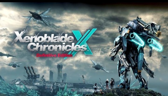
Holy. Fucking. Shit. How is this real.
Ok so, I'm a pretty big fan of Xenoblade X, though I wasn't as much when I first played it in a Xenoblade marathon in the months leading up to 3. I didn't think it was bad or anything, it just didn't click with me the way the rest of the trilogy did at the time.
That is until I played it a second time roughly a year later alongside Xenogears and Xenosaga leading up to Future Redeemed. Before I got to it, I had made an effort to try and figure out the game and avoid the mistakes I had made in my first playthrough.
And I loved it.
Compared to the first time it was crazy, I didn't want to put the game down at all. Naturally after that, I really wanted to see some kind of follow up or for X to get some kind of second chance. Being a late Wii U game in a series that was at the time quite niche meant not a lot of people have gotten to play it. So a remaster on the level of Xenoblade 1's Definitive Edition felt like something X sorely needed as a way for more people to have a chance to play it and as a way to follow up on some of it’s infamous cliffhangers. People have wanted it for years for those reasons as well as the prospect of having the entire series on Switch.
And then Nintendo decides to come in on a random Tuesday out of nowhere and just drop the insane bombshell that a Xenoblade X Definitive Edition is real, is coming to the Switch and seemingly doing all of the above. I genuinely did not think it would ever happen. Monolith have put out statements before talking about how difficult and costly porting X would be, understandably so given how demanding that game was for the Wii U. Between that and just how late we are into the Switch's life, I felt like X on Switch was a pipe dream at best. Plus with the supposed Switch successor rumored to be a notable leap in power, I expected that if an XDE was on the table it would be saved for that to take advantage of the improved hardware.
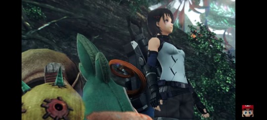
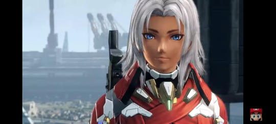
But, here we are, Monolith have pulled out something I never thought possible. So far it seems like the graphics aren't overhauled as much as 1DE, which is fair, X holds up way better, especially in comparison to Xenoblade 1. But of course there are obvious changes to the character models and geaphics overall, so far everyone is looking pretty good so I'd say I'm already pretty happy on that front. There do also seem to be some minor tweaks to character designs, nothing major for the most part namely Lin only has one Monado hairpin instead of two.
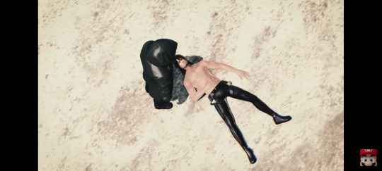
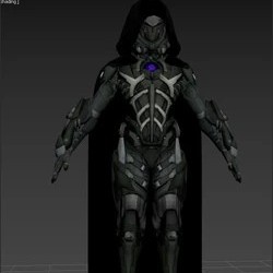
What may be the most notable thing here is that finally after nearly a decade, they are finally following up on some of X's hanging threads with confirmed new story content. We can also see here the character people have called The Black Knight up until now. We never get anything close to a proper look at them in game but datamined models have shown us his model from the ending cutscene. He's we can already see he's been pretty heavily changed from the datamined model which makes sense. That model uses recolored grenada armor with a hood added so it was probably more of a placeholder than anything. I am very much looking forward to seeing where this goes.
What I am most curious about though is how this game will perform on a technical level. The original version was already struggling to run well on the Wii U even after the 15GB worth of performance patches, so I can't help but wonder how this game will turn out on the Switch. There's really no way to know til people get their hands on it.
That's about all we know for certain til we hear more, but there is a fair bit I would like to see from this game, a lot of it being general qol stuff, such as let me change my party or the time of day on the fly, give me better inventory management stuff like that. More options to customise my character would be nice too but given the precedent set by 1DE more armor pieces is probably a given. I would like it if some of the outfit pieces that differed between genders became available to both just to have more options, especially in regard to casual wear.
The biggest thing that I hope they implement though, that personally I think is borderline required for this game is some actual explanation for how the game mechanics work. The main reason I had such a hard time with X the first time is because most of its mechanics are never properly taught to you and they're just not intuitive enough to figure out on your own. Most egregiously this includes Overdrive, not just the cornerstone of X's combat system but an incredibly fun mechanic unique to X that not a lot of players got to fully appreciate because they didn't understand how it works.
I know the Wii U digital manual explained some of these things but people weren't really reading manuals in 2015, much less digital ones that are somewhat disconnected from the actual game. As far as I'm aware the Switch doesn't even have digital manuals like the Wii U so actual tutorials maybe something they need to add if they want any of the presumably many new players to figure out how to play the game.
Other than that though I'm very happy with what we've seen so far. I'm really looking forward to playing this game again with hopefully a much more active online playerbase for things like squad missions or nemesis battles. Will certainly make getting reward tickets much easier and more fun.
#Cannot believe this is the timeline we're in#Xenoblade#Xenoblade Chronicles#xenoblade chronicles x#Xenoblade X#Xenoblade Chronicles X Definitive Edition#XBX#xenoblade x definitive edition
6 notes
·
View notes
Text
New Site Revamp! (+Updates)
Hi! This site hasn't been all that active in a while since I've focused on other interests. Nothing too bad, but if anything, it's helped me learn that being engaged in other interests helps with getting burnt out less.
With that being said, I have a lot of things to say, so as usual, everything else is under the cut.
Site Overhauls
Since releasing my DiffSinger voicebanks, I figured that this site needed a major revamp, and I've been working on it on-and-off when it came to figuring out which theme I wanted to go with. It took a couple of tries to get the theme I wanted, but I've settled with the Vermillion theme from ricecodes. It's responsive, has a dark/light mode, has an all-in-one sidebar for important information, and many more features ^^
I have also removed any unnecessary pages from the site to make it less cluttered. We also moved (most of) the Frequently Asked Questions page to the Ask tab for easier access. Additionally, the Terms of Service page has been renamed to Guidelines, but still need to be followed in order to use the voicebanks and resources hosted on this site. The Menu tab now has a directory of pages and tags via the Navigation section, and an Affiliates section.
Also, Maria and Mario's trivia sections in their character profile pages have been revamped to keep up to date with their current lore.
Affiliate Applications Are Now Open!
I would like to announce that affiliate applications are now open! If you so happen to manage your own voicebanks (regardless of platform), have a website dedicated to said voicebanks, and are at least acquaintances/mutuals with HIRATELIER, you are qualified to apply. Just shoot me an ask with the following info:
Site Name: [INSERT HERE] Creator/Manager: [INSERT HERE] Voicebanks Managed: [INSERT HERE] Icon Image: [INSERT IMAGE URL HERE]
The Affiliates section in the Menu tab should look like this for reference.

DiffSinger Updates
The 1.1.0 update for Fuwa Maria and Fuwa Mario's DiffSinger voicebanks is on the way! I'm not sure when that will happen, but if anything, it could release before or on their 10th anniversary. New updates with DiffSinger mainly have to do with the VR tension parameter option and proper multilingual (XLS) implementation, and there could be more coming in the future.
I'm still in the process of labeling new data for Maria and Mario's datasets, each with 8 new songs. They contain a mixture of strong singing (mostly to further improve their power vocal modes and range) and English singing (to also improve their English pronunciation). There's also a possibility that they may support newer languages via parallel training, and if possible, I would like to implement Tagalog, Chinese and Korean support.
10th Anniversary Plans
Maria and Mario's 10th anniversary is next year, and I have some big plans for it...if everything goes to plan. So far, you can expect the following things once it's their anniversary:
Newly revamped fullbody illustrations for UTAU and DiffSinger (+ new designs...?)
New graphics
Cover + PV
BUT...for the first time in AUSPICIOUS VOICE's history, I'll be celebrating Maria and Mario's half-anniversary, which will be on October 3! It probably won't be as big as the actual anniversary itself, but you can expect a cover, or art, or even both of them. It entirely depends on my time and energy.
I've got a lot on my plate when it comes to juggling a bunch of personal projects, but here's to hoping I can get through all of them without burning myself out.
Peace ✨✌️
3 notes
·
View notes
Text
3 in One Post
For my A-Pal's On this Day Post.
You know I always like getting Doritos to have for a snack. And those cookies look good too since they are what all stores use like anytime I either go to Walmart, Fry's or Albertsons. But the only Doritos I love to eat is Nacho cheese and spicy nacho cheese flavor. But my family doesn't mind Cool Ranch Flavor.
For my P-Pal's On this Day Post.
I bet Lisa would love to cuddle with her. And she can also cuddle with Emme and Jo too like the four can snuggle together along with their loved ones. 😊
And for Response to my P-Pal.
Yeah I remember how those Mafia guys are. Even the ones in Grand Theft Auto depending on the title. And yeah I do own San Andreas as well, but I only have it on PlayStation 2 since I wasn't looking into getting the Remaster versions of the Trilogy since the Graphics feel a little off to me. But with Gumball working alongside the thieves and our OCs as part of the Pokemon Phantom Thieves, I'm sure we can pull off this job really well. 🙂👍
3 notes
·
View notes
Text
For today's rant, I shall talk about how severely overslept Rush Adventure is. Everyone keeps talking about how they want Naganuma do another Sonic game, and that's fine. But then I see them act like Rush doesn't have a sequel besides Colors DS Which I find shit. RA is legit better outside OST, and even then
youtube
Ohtani did bangers the entire game
Like; -The complaint of too many spikes and bottomless pits is effectively null here. Dimps/Sonic Team actually listened for that. Level design in general is super good
-The trick system is massively overhauled, the adrenaline rush is insane
-Bosses aren't horrifically RNG cycled
-Story is more focused, and Blaze/Sonic can do the same levels
-The Jet Ski and Hovercraft minigames are fun
Of course there are problems -Tiles are graphically simplified compared to Rush
-Sonic's model is subtly worse than Rush
-Boat minigame can be seen as divisive for fans
-Finding Johnny for Emeralds
-Not getting enough materials if you suck at the game
But that's significantly less bullshit than OG Rush, and it's a solid title
...and yet the only thing fans got from it was >Blaze needs to kill Robo Pirates (...which we see Whisker/Johnny dying, so no, not possible). Not much on the rest of the game Or just ignore the game cuz Naganuma wasn't involved It's a shame
3 notes
·
View notes
Text
Sony PlayStation 2 - Grand Theft Auto San Andreas
Title: Grand Theft Auto San Andreas / グランド・セフト・オート・サンアンドレアス
Developer: Rockstar North
Publisher: Rockstar Games Inc. (Take-Two Interactive) / Capcom
Release date: 25 January 2007
Catalogue No.: SLPM-65984
Genre: 3D Action


In one word, this game is: Freedom. Freedom to do anything you want. Be anything you want. Do-gooder. Fireman. MEDIC!!! Delivery man. Pimp. Arsonist. Scene kid. A gay hobo who stands at a corner all day. And, best of all, criminal. The gameplay is, in my opinion, the definition of a "sandbox style game". Rockstar did not have to put all of the stuff they put in it. But they did anyway. That is what I wish all game producers would do: focus on the game, not the fancy-shmansy graphics.
Speaking of graphics, they're... wellllll... not horrible. But not great either. Granted, it is quite old. But they do quite suck badly. But they aren't bad.
The story is your typical "gang vs. law" story. Not too bad, but kind of generic to me. But the story isn't too important. A good story is nice, but it's still gameplay that counts. The characters are funny and memorable, however, especially Caesar and Wu Zi Mu.
The music is a mixed bag for me. I hate rap, but even I heard a few decent ones here. I find country music utterly repulsive and bad (no, thank you, Blake Shelton), even here. The funk station has catchy songs. The classic rock station is okay. The alt. rock is pretty good. Master Sounds is also very good. But WCTR, while it has no music, is all of the music I need.
However, the sound isn't too great. Most weapons sound nothing like their real versions. For instance, the rocket launchers in game are like "Fwoooooo... boom.", but real ones are more like "PWOOOoow.... BOOM!" (I think...lol).
One of the best parts of the game in the sound department is definitely the dialogue. Lines such as "You're between me and the joohnn!!!!!!" and "I'm too high fo' dis shit- MOVE!" make this the only time traffic jams are good. Many others like "Do ya showa in doo-doo?" and "Don't matta 'cus I'm short, I hit hard!" make me laugh very hard.
Let's address the elephant in the room - the Japanese release. The Japanese release was initially announced in June 2005, and people went mad. Then, Rockstar found themselves under severe fire due in large part to the "Hot Coffee" scandal, which could lead to San Andreas getting an AO (Adults Only) ESRB rating. In short, hidden sexual content. Then, the Japanese video game regulators came in and decided to overhaul the CERO rating. Now we have CERO A, B, C, D, and finally a new addition - CERO Z. CERO Z means a title is regulated by law and is not meant to be sold to those under the age of 18. Failure to comply with CERO Z standards will result in fines. There was a lot of back-and-forth in regards to this issue, which led to Capcom president Kenzo Tsujimoto speaking out about it and announcing that GTA San Andreas would finally come out in Japan, at least on PlayStation 2, after everything had been checked through. Then later people found out the Japanese release of GTA San Andreas was delayed AGAIN, this time to January 2007. The reason is due to Sony Computer Entertainment Inc.'s increasingly tightened standards of content compliance towards PlayStation 2 games. Sony demanded that Rockstar make more than 60 changes to the game, and Rockstar had to obey Sony because this was the only way to get GTA San Andreas in Japan, exclusively on PlayStation 2.


youtube
youtube
#sony playstation#playstation 2#gta series#grand theft auto#gta san andreas#grand theft auto san andreas#carl johnson#san andreas#capcom#Youtube
1 note
·
View note