#i tried using the lasso tool to draw everything
Text
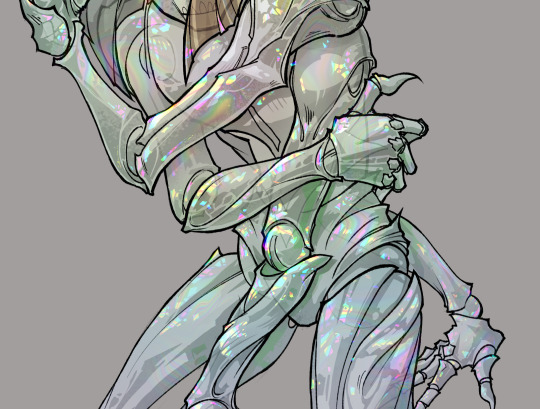
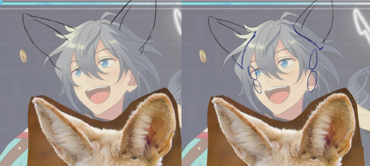
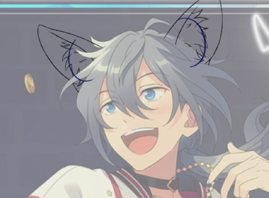
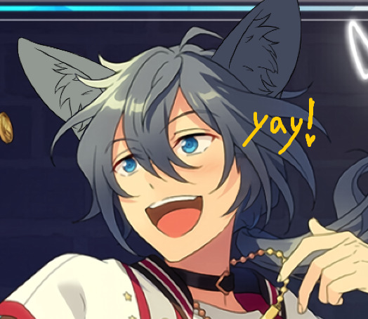
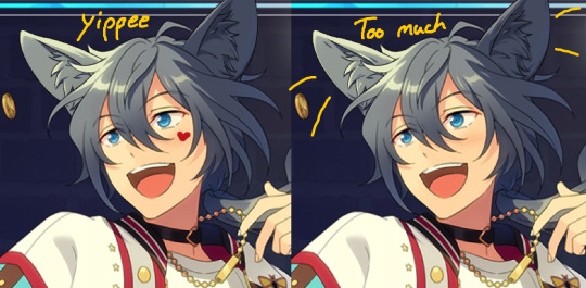
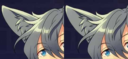
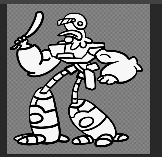
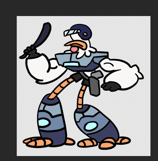
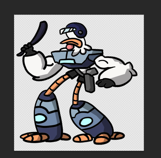
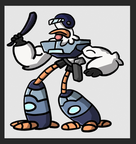
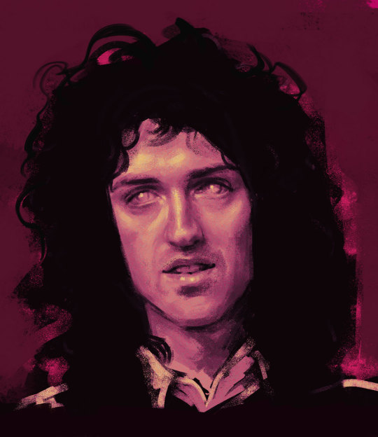
delcatty suited up as my second 'sona, Sync Chrome (+ Sync version below)
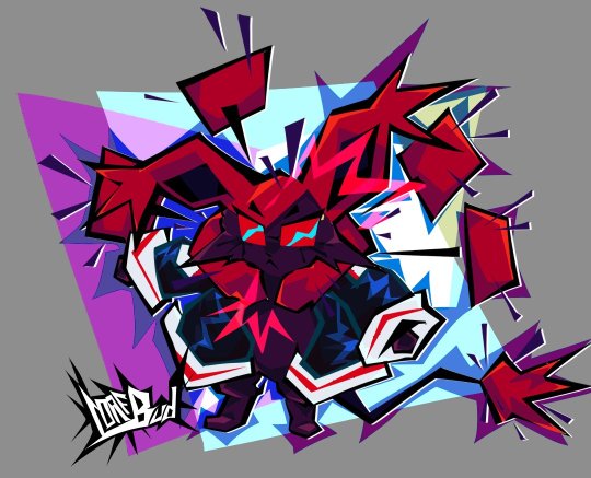
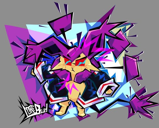
#inspo from that recent reblog lol#delcatty#sync chrome#pokemon#fanart#loafbud art#my ocs#i tried using the lasso tool to draw everything#and i kinda like it???!! 👀#i wish i had a brush in SAI2 that could emulate this look...#I'll have to play around w/ making custom brush shapes
55 notes
·
View notes
Text
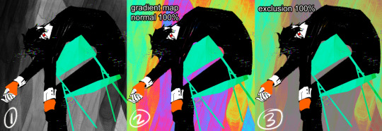
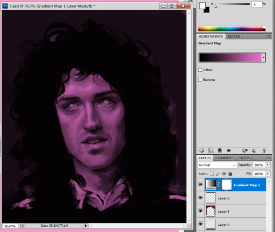
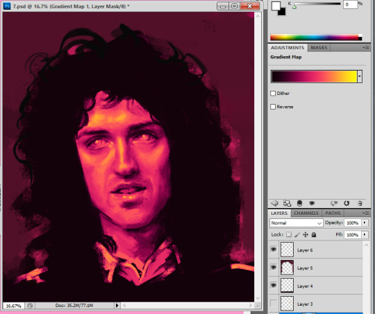
gonna show u guys a little opalescent highlight hack i threw together today
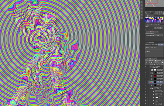
rainbow gradient above your main figure (i usually have all my main figure folders/layers in one big folder, so i can clip gradient maps + adjustments to it!). liquify tool to push the colors around a bit. STAY WITH ME I KNOW IT LOOKS STUPID RN I'M GOING SOMEWHERE WITH THIS
THEN: set it to add/glow (or the equivalent in ur drawing program), lower the opacity a bit, and apply a layer mask. then u can edit the mask with whatever tools you like to create rainbow highlights!!
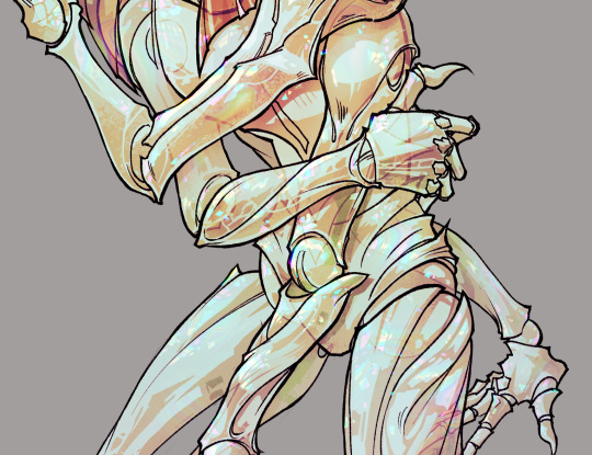
in this case i'm mostly using the lasso fill tool to chip out little facets, but i've also done some soft airbrushing to bring in larger rainbow swirls in some areas. it's pretty subtle here, but you can see it better when i remove the gradient map that's above everything, since below i'm working in greyscale:
more granular rambling beneath the cut!
u could also just do this with a brush that has color jitter, but what i like about using layer masks for highlight/shading layers is how simple and reversible it makes everything. i can use whatever brushes i want, and erasing/redoing things is super low stakes, which is great when i often approach this stuff with a super trial-and-error approach.
example: have u ever thrown a gradient w multiple colors over an entire piece, set it to multiply etc, and then tried to erase it away to carve out shadows/highlights? it's super frustrating, bc it looks really good, but if u erase something and then change ur mind later, u basically would have to like. recreate the gradient in the area u want to cover up again. that's how i used to do things before figuring out layer masks!! but masking basically creates a version of this with INFINITE undo bc u can erase/re-place the base layer whenever u want.
anyway, back to rambling about this specific method:
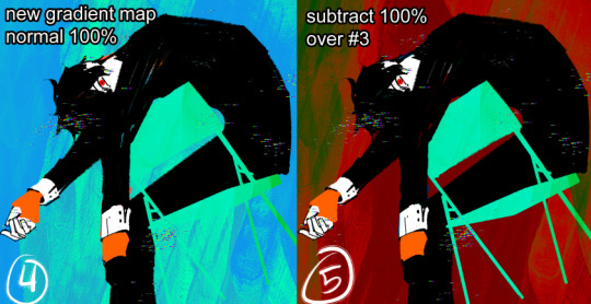
i actually have TWO of these layers on this piece (one with the liquified swirls shown above, and another that's just a normal concentric circle gradient with much broader stripes) so i can vary the highlights easily as needed.
since i've basically hidden the rainbow pattern from myself, the colors in each brushstroke i make will kind of be a surprise, which isn't always great -- but easily fixable! for example, if i carve out a highlight and it turns out the rainbow pattern in that area is way too stripey, i can just switch from editing the mask to editing the main layer and blur that spot a bit.
also, this isn't a full explanation of the overall transparency effect in these screencaps! there's other layer stuff happening below the rainbow highlights, but the short version is i have all this character's body parts in different folders, each with their own lineart and background fill, and then the fill opacity is lowered and there's multiply layers clipped to that -- blah blah it's a whole thing. maybe i'll have a whole rundown on this on patreon later. uhhh i think that's it tho! i hope u get something useful out of this extremely specific thing i did lmao
8K notes
·
View notes
Note
(If you're comfortable with this) could you make a tutorial on how you make your creations??? It'd okay if not, thank you for making them :D
WAA i can try!! baby's first tutorial ft. this guy

🐾 first, a picture of your blorbo
i use waifu2x to up the quality, not always neccessary but it makes everything a bit easier and prettier. i use firealpaca to edit but you can use whatever you like, im not your mom
🐾 probably get a reference
yeah i dont always do this. but you should! i should! so google whatever creature you want to turn blorbo into and maybe scroll for a bit to get a feel for what they look like :3
try to find one at a similar angle to your blorbo picture and paste it/open as a layer. look this is close enough ↓
🐾 onto the actual editing! human ear surgery
in case you prefer just one pair of ears. you have to understand the style so you can imitate it.... so look at their hair, maybe theres more colors or gradients than you can see at a glance or something ! i colorpick a bunch of them and put them over their ears, then blend them together with a low opacity watercolor brush
ALSO, notice the.. lighter glowy aura thing around his ear in the og? i try to imitate details like that too, used watercolor for this again
now maybe you wanna make it look like theres something covering that spot, since theres kinda nothing there now. soo if that looks weird to you, (open a new layer and) put some hair over it. i cant tell u how to imitate Any style so just. study it and keep trying
with enstars here the lines are pretty soft, so i go over it with watercolor brush after doing the general shape. with a higher opacity you could probably just use a softer brush from the start, i just like starting with the basic pen
🐾 the lines!!!
nowww i lower the blorbos opacity to around 50%, bring the reference somewhere i can see and just kinda... start sketching. lot of redrawing and transform tooling here sometimes
TIPS 1. you can clean the lines up at the end so dont stress
2. think of your blorbos new ears as a real tangible part of their body and how they fit on their head since you dont wanna make it look too flat !
3. and for the placement i always end up at roughly one human ear length above their og ears if that makes sense. tried to visualize it
as for inner ear fluffs phew i dont know either. draw a circle and start from there? maybe there are actual animal ears in blorbo artstyle out there you could reference
🐾 coloring 🏳️🌈
finally some progress huh. i color the lines in a contrasting color first so i see the lines properly and dont miss anything, then fill it in with the actual color :3 OH and for gradients i just use the airbrush at the ear tips or sides
noww shading! new layer, basic pen brush and try to follow the shapes in the og art. it's best if you pick the colors from the actual picture!!! take notes mentally and just do your best i dont know how to explain this more
taking this as an example, the shading is mostly in pretty simple wider areas, so not a lot of seperate strands in there. and its again pretty soft around the edges of shades and highlights, so i'll go over it with my beloved watercolor. keep things like that in mind so the creaturing blends in well :3
if you like more detail better you can still go with that. or less detail on a complex artstyle. the world is your oyster
🐾 and the rest
what else could there be???? making the lineart more cohesive for example ★ oftentimes it's not one solid color, thicker or thinner than yours, things like that.
for things like piercings or fangs you can just draw them on top i believe in you <3 if its like an intricate earring use the lasso? magic wand? the one that lets you select an area to copy and move on top of your ear layers
+ remember details like shadows, if you put a tail on top of say blorbos leg there's gonna be a shadow under it! put a layer under the tail ones and freehand draw the shadow, OR copy the tail layer, put the copy under the og one and change color/opacity until it fits
30 notes
·
View notes
Note
Goodness I really love your style,,, if you don't mind me asking or haven't answered already, what is your drawing process like? How do you plan your shapes/colours or does it come to you naturally? It's seriously,, so cool,,, like the main colour is part of the background but I can still comprehend and make out body figures/faces
It's so cool!!!
hmmmmmmmmmm well it depends on the piece really! in general however if i get an idea i do a loose sketch like so:

i knew i wanted to draw tama but i dont like drawing hats, but i didnt want to draw her without the hat because that would mean id have to draw her other eye, which in my brain is a lot of work, so the easiest way to draw her would be to just uhhh use negative space LOL so i used the lasso tool to block out her hair/skin and then inverted the selection, filled with a vaguely textured brush, and then winged it from there.
as you can tell theres Shapes and such that werent present in my initial sketch which is really just a process of me painting over with new layers and trying to decide what looks nice with the least amount of effort. ive said it before but i am legitimately a very lazy artist and try to find shortcuts as much as possible LOL but also i started this off like "no way im not going to draw those transparent forearms/hands!" and then well look what i did. jokes on me
as for colors im very fond of using gradient maps and adjustment layers to make them tie together better or just look more interesting in general.
for example for my friend ryuki i started w/ a monochrome background and tried out a bunch of different gradient maps/blending modes
the bright colors are like fine.. but not quite the vibe i was going for so i duplicated the layer and tried out another gradient map and blending mode
which then i said OK good enough :-)
i have a timelapse here that more or less shows this same process - i had the general idea of what i wanted to do but changed things as i went along. i also did a little post on layer blending modes here
idk if this helps or answers your question at all ? everything i know about art is from trial and error but i do like to share these things in case it can help others or give them ideas :~)
#whats funny and/or sad is that i cant do this kind of art for my own ocs#or rather when i do try i end up thinking about it too hard and dont end up satisfied#also: thank you!#process
46 notes
·
View notes
Text

Rework of my character design.
Ive added shadows to the design as it honestly looked a bit empty and boring. I was not too happy with my previous final version of it so I spent a few hours refining the lines and using the lasso tool to create shadows. I would outline where the shadows would be and then made a new layer in front of that area and then filled it with black, changing the opacity to around 20% on most different areas. Im super happy with how this turned out and the way I was able to capture the shadows that his clothes were making rather than just the creases and light source shadows. You can see on his shirt that on the left side there is a shadow cast from his trench coat. I realised during this alteration that some of the outlines were not fully black again so I erased all of it on the outline layer except for the face as that area was fine. This just meant that I had to redraw some of the texture lines as they were not transparent through to the black background layer I had created to solve this problem earlier. This was frustrating at first but I managed to work through it and will make sure that I don't make this mistake in the future.

How I was able to create all of the shadows. I made sure to label each base layer as I then knew that the designated shadow would be the layer in front of it.
At first and for a while I did not have any of my layers named and it was only when I started this rework that I named everything so that it was easier to navigate my designs layers.

I reworked the shoes quite dramatically as they looked very boring and needed a highlight rather than only a shadow. I first tried to draw highlights with the brush tool but it looked out of place as I was not looking at a reference image at the time.
I decided to go back to my reference image and actually discovered that the entire shape of the boots were wrong and were not facing the correct direction. I choose to then expand and altr the proportions of the boots so that they were a more realistic shape and completely removed the shadows. I then looked at my reference and using the lasso tool on the same layer as the boots, drew the highlights. I started of with a neutral grey to get all of the shapes and then using white drew up the intense reflections that the boots would be making. I think this was a very successful and well needed change to my design and i'm happy I was able to spot this and actually make a change rather than leaving it be as I feel I would usually do. It was very rewarding to finish this design on a high note rather than leaving it in a state i'm not confidently proud of.

This is my reference image that I was following for my outline when I first drew up my original sketch. I hadn't really looked at this image since I finished the outline for my character so it was reassuring to see that my design had come together nicely and did semi accurately look similar to this image.
0 notes
Text
Digital Character Illustration - Class One
For the first part of this class, we pretty much just went over the basics of drawing on Photoshop with a drawing tablet. We learnt/relearnt many commands and learnt new techniques to better our drawing and colouring.
Commands include:
B = Brush
E = Eraser
CMD + Z = Undo
Shift + CMD + Z = Redo
OPT + Delete = Fill selection with foreground colour
Number Keys (1 - 0) = Opacity
CMD + A = Select All
There are even more helpful commands, but these are the ones we used the most.


First we did some page setup, distinguishing between layers and background. The layers are created by clicking the plus icon in the lower right of the layers menu. The background is the only layer present when a new file is made, and has a solid white background, unlike layers created afterward which are transparent.

We then tested lots of brush and eraser types. For example, there are hard and soft brushes, which refer to the rigidness of the lines edge when drawn. There are many other types of brushes, but we just used these for the example. We also played with the sizes of the brushes and erasers, as shown.


Next we tried changing the opacity of the brushes and eraser. I found this very interesting, especially the eraser, as it led to some cool gradients by just making very simple strokes. I think I'll keep this technique in mind when designing my characters.

After that, we messed with the colour wheel, and did some more of everything else over again, just to see how everything meshed together.
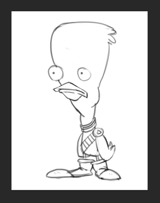
After we had finished getting used to Photoshop, we got our first character template to practice drawing over.

We then setup our layers, so we could draw overtop on a white layer whilst still being able to see our template. We did this by creating a second layer that was filled in with white, and dropping its opacity a little bit, so we could see the template. I drew my first outline, was happy with it. I think I'll be able to get used to the drawing tablet pretty soon.

Next, we started using the pressure brushes, which change thickness depending on how much pressure you put on the drawing tablet with your pen when drawing. I like this brush type a lot, it looks more like a manual drawing, which I think is really cool.
I also coloured it in for fun.
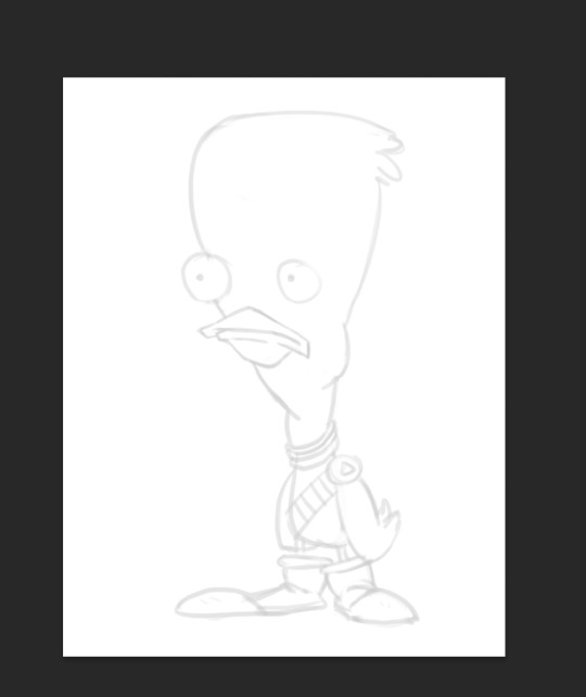
We then learnt a process for designing characters and colouring them, the process was made by Tom Garden, or at least that's what the slideshow said.
It pretty much consisted of choosing a design, drawing line art over your sketch, filling that line art with a base colour in grayscale, then making a new layer for each section of the design that needs a different colour, and adding a different grey to it depending how light/dark you want it, then adding colour to each section, and then adding shadows and highlights on individual layers as well.
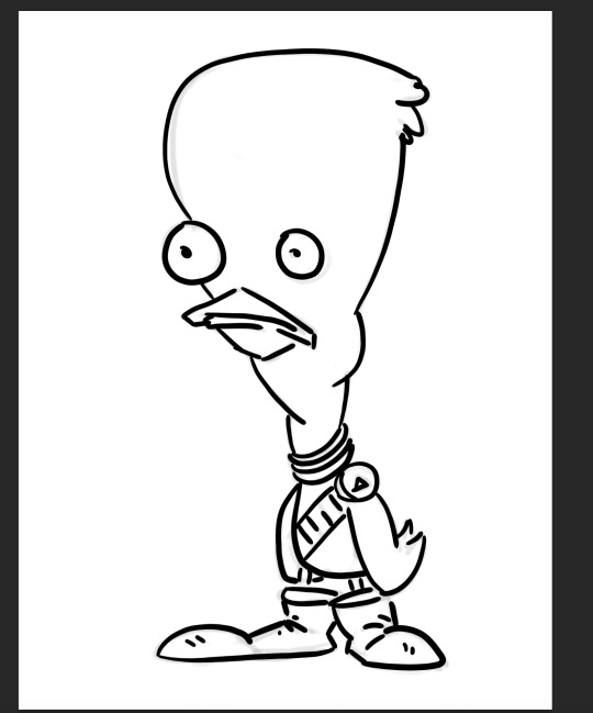
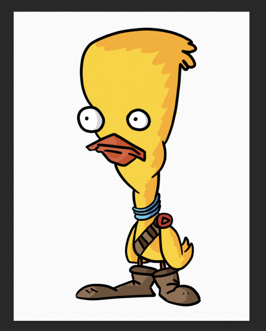
Here's my attempt below

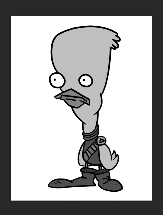
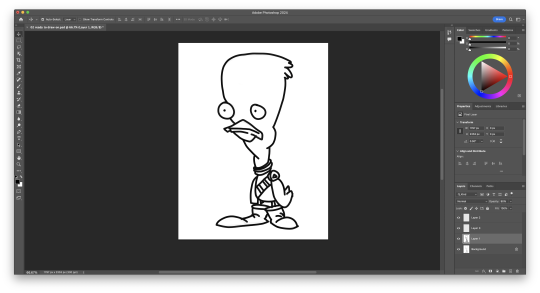
Here is my greyscale of the duck character. Each different type of grey was on it's own individual layer, so I could colour each section individually.
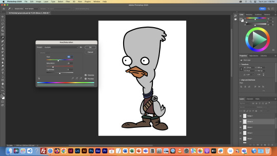
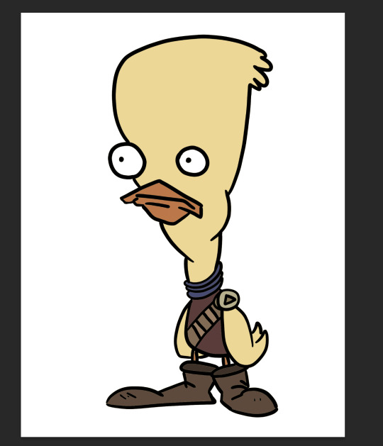
I then used the hue menu (CMD + U) to colorise each section of the design.
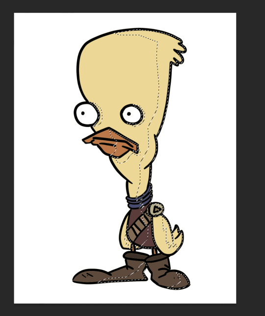
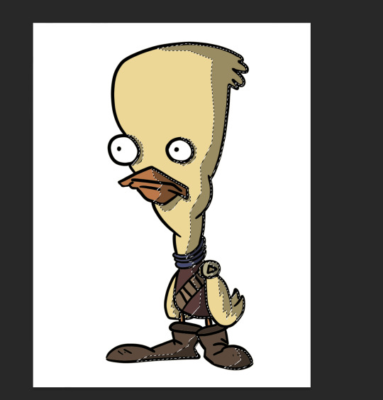
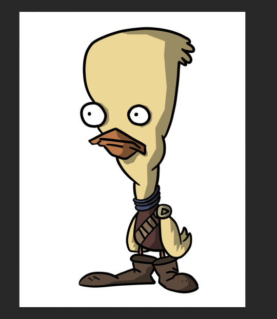
Next I used the polygonal lasso tool to select areas I wanted to add shadow to, on an individual layer, I filled the final selection with black, and made the opacity of the layer 35%, as it said in the instructions.
Finally, I added a couple highlights to the design, such as on the badge, shirt, shoes and beak. This added a little extra tone which I thought was nice. Overall I'm way happier with this one than the original one I coloured, so I'll definitely be using this process in the future.
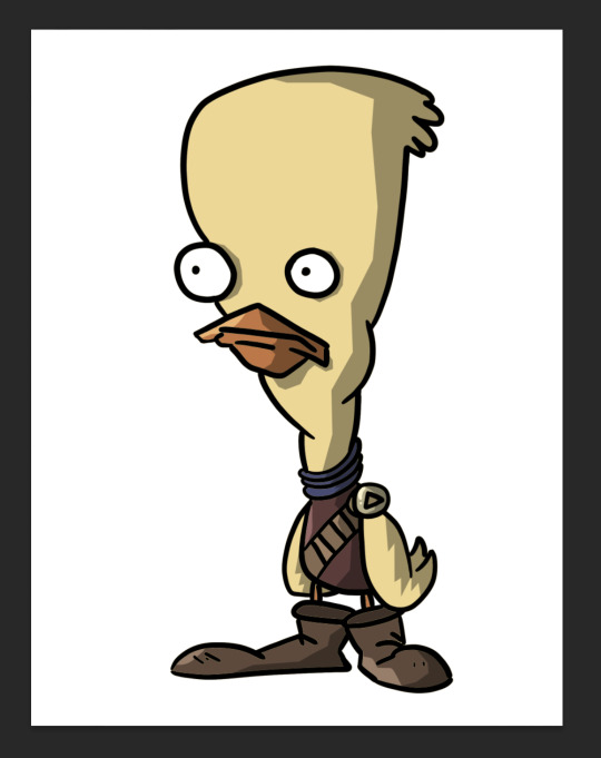
I did this process again for another template we got:
This was a little more intricate of a design than the duck was, so it was a nice step up to see how I would do. I think it turned out pretty good, since I''m doing pretty much all of this for the first time.
Overall this first class was very helpful, I learnt a whole bunch of new things and I can already see the improvement in my digital art compared to my previous stuff.
1 note
·
View note
Text

The tools i used for this photo editing are the drawing tool,the lasso tool,filling tool, and the layering tool a lot. you can i see where i used the drawing with all the red that has been drawing into the photo.And the layering tool was used when when i added the black and white background behind him and the red. The way i used the lasso tool is when i wanted to get rid of big chunks of the background it just made it easier for me. for the filling tool it just helped me colour places more quicker.
The elements i focused on mainly in this photo was the element of colour which was red in this case. also i think i used a little bit of proportion with the red apple in his hand.
The message i was trying to communicate with image is the feeling of something taking over you or the world around you. They way i tried to do this was first you can see that this is was originally a black and white photo so i imagined that as the man in the picture living is a black and white world. Then after that he finds a apple that has colour so he goes to pick it up since he is interested after he picks it up and looks at it everything around him starts to get taking over by the colour of this apple he found.The back ground is being used to show the world he is living and the world that is being taken over. the viewer eyes will mostly focus on the colour and the background because that is where most things are happening.Something i want to work on is mostly just my editing skills i feel like i have the ideas but not the skill to show them so well.
things i took from the internet:
- black and white background
- photo of man ray
1 note
·
View note
Note
you have beautiful art work! do you have any tips on getting into lineless art?
tty!!! omg another question that im not qualified for im like a little baby making lineless art but hmm yeah it feels like a kind of hurdle (at least it did for me). like there were things i liked when other people did it but somehow for a long time the process never worked out LOL
these things are probably just very specific to me (but maybe somehow they will help you????) idk i am a lazy person so i dont like the sketch > lineart > colour pipeline like lineart usually just takes too much time so i lose steam when working and also it just loses the Energy. when i first started doing lineless stuff i tried to sketch and then either paint over/ under it but the shapes never looked nice?? thats just my personal problem though
so really my advice is just wing it LMAO. no im kidding. at first i started like. painting over my sketches with really small brushes to try and preserve detail but its kinda inefficient to me (old art bleeeh)


also nowdays my brain just thinks in flat planes. basically for me everything lineless whether its just blocking out flat colours or a painting is just all about building up nice shapes and then constructing form over it. i like to do tiny studies of photographs and make them really small on the canvas so you concentrate a lot on the dominant shapes first rather than on individual forms and details and ive found its quite helpful for me (and its just fun)! they never have to be accurate or anything it just helps with spacing/ learning to make nice shapes in


(im sorry if i tried to make these smaller they would get cut off which is strange)
also using those fill lasso tools like in heavypaint/ csp is always fun for making fun shapes (i like messing with heavypaint cus theres lots of interesting textures and tools)
but thats just my own gripes with drawing that ended up manifesting into lineless art DFGHJ im sure there are more efficient and Smart approaches + i am always looking to streamline my pipeline to make better art. i hope this was helpful somehow though!!
#maybe dont rb this lol klfdmgsfh it has personal art in it#ask#anon#SORRY NON SPLAT ART AND OLD SPLAT ART i have no recent good examples#the structure of this ask is like Everywhere#i never proofread anything ever if i said something strange no i didnt
77 notes
·
View notes
Note
how do you edit the illustrations and what program do you use? could you make a tutorial explaining it better please?
Hi!
I made some tutorials here and here. I'm not good at explaining so I'll make another one so I hope you understand better.
!!! I advise reading the whole tutorial first before trying it.!!!
This tutorial is for PC/MAC programs but can also be used for phone programs.
I'll make this in 3 parts because Tumblr won't let me put more than 10 images per post and I need a lot of images to explain what I'm talking about.
Part 2
Part 3
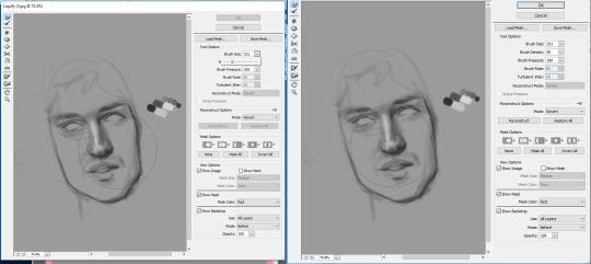
First, the main program that I use it's Paint Tool SAI. This is a program mainly for artists, but it's also good for editing. it's not free (unless you're a pirate), but you can go with some other programs that are free like Paint NET, Krita, GIMP, PIXLR, etc. I tried them all at least once and I think are also good for editing, especially Paint NET and PIXLR which I use regularly.
So, for this tutorial, I'm going to edit this image using Paint tool SAI but I'll also explain a bit for Paint NET.

First, insert a new layer, so you can easily erase something if you make a mistake. Press the icon that I encircle it with red.

Now, we can actually start editing.
I'll start with the hair. My gardiene's hair looked like the wig from Music Event 2017:

We will clean the place first. In Paint tool SAI you can do that with a brush. I use mostly the airbrush with different densities and while regularly right-clicking so I can copy the colors around, and blur, so I can make everything smooth.

Airbrush
Use small strokes if you have places where you don't have to clean much and bigger ones where you have to clean a lot.

Blur
I forgot to mention something here before you use blur, there's a couple of things. Depending on what density (the level of visibility) you use, you might stomp on something like this. So, chose a low level.

A way not to worry about this is if you copy the original image and paste it over, like this:

Now, in Paint NET there's a tool called Clone Stamp.

This basically lets you copy a small portion of an image in another place. To move the place you just left-click once while pressing CTRL, move the cursor and when you are sure of your place, let go of the CTRL button and left-click again to claim the spot. The semi-transparent circle is the place where you take the image part and the bold one is where the part goes. I get them close to each other obviously. The things marked with red are the hardness (up) and opacity (down). Those together are helping in making different types of brushes.

Ok, so I've cleaned most of the things. If yours looks messy don't be scared, it's ok to look a little messy. You'll cover that up anyway.
Next, we can finally actually start with the hair part. Here you have 2 options: you draw the hair manually or use the wig from the game. I'm going with the second option. The thing here is that the wig is very small in comparison with the illustration, so we'll have to use some drawing anyway (this depends mostly on the part of the image and how close is the character to the camera).
I'm my other tutorials I mentioned something about cutting pieces of the clothes you want to convert in order to have a better result. I'll do the same here.
I'm going to split it in 4 parts:

Some parts may be even used multiple times to "fill" the head. You can blame the perspective here. You can use the Lasso or there's a brush named Select to copy the part, then you can paste it on your image. On Paint tool SAI, it will automatically add a new layer when you paste something, but in Paint NET you need to insert yourself a new layer.
Part 3
Part 2
35 notes
·
View notes
Note
Heyo. Question for you.
Sometime I'll be in Firealpaca trying to just crop the white space or shadows out of a picture so I can make it transparent. And I always try the magic pen tool to just select what I want to and then just delete everything else but it never really works and I always end up just going in and erasing stuff manually. I've tried messing with the tolerance but haven't had any real success. Am I doing something wrong or is there a better way to do this maybe?
Thanks a bunch!
Hi! Ok, so I want to clear some things up before I properly answer:
* you're trying to crop things out - usually cropping means cutting off an excess part, but in digital graphics this more exact - an image can be cropped to exclude some frame or outer parts, but not the inside of it. So I assume you mean that you want to just cut out parts of a picture and make it transparent. So:
* the magic pen is usually not a good tool for this, especially if this area is a traditional drawing scan (lots of different-colored pixels, so even with the tolerance higher, hard to get an exact area) so what I usually do is use the Lasso tool or even the Select tool (Polygon), to get a general area. You can also use the Magic Wand first, then the other selection tools, but what helps is pressing Shift to add to the selection. Your select tool cursor will have a little plus under it to indicate this. Press Ctrl to remove selections.
* what you can also do is that if the selections are not fine enough for you, use the Select Pen and Eraser Pen to refine the edges of these selections. These two are under the other selection tools. Works basically the same way as a regular pen, but you instead draw and erase selections. Select the tool and then select the kind of brush you would like to edit with. This works pest with a brush that is close to what you want the edges to look like. You can also use the transparent brush feature in Firealpaca while in the Select Brush. Press Z for temporary transparency while drawing or Shift+Z to switch your brush to transparent. I would reccommend using a hard-edged brush to get a clean look for your transparent area and avoid problems when viewing the work.
* If you accidentally deselect while making your selection better, you can undo the deselection. If you need to save your selection, make a new layer and fill it with black.
Hope this helps!
8 notes
·
View notes
Text
classic
pairing: Jack Daniels (Agent Whiskey) x reader
wordcount: 3k
warnings: none, tropes on tropes on tropes, weird descriptions of things
summary: good, old fashioned fan fiction chaos
notes: there’s no getting around it - everything I write with Jack is inevitably influenced and inspired by @scribbledghost s version of him, particularly her neighbor!whiskey. I tried not to, but I still feel I should give credit!
>>
It was the kind of razor your grandfather would have used – more of a knife than anything, because of course it was.
Of course this would be edge that your housemate used to slide along his jaw and chin and cheeks to make that perfect mustache before work in the mornings. He was the type to love old fashioned, traditional, dangerous things - it made sense. After all, that was why you were staying in the guestroom of his ranch home while your apartment was being renovated. Old fashioned courtesy between friends, of course.
Dangerous.
Jack had caught you watching him, impressed in spite of yourself as the sharp blade scraped over his neck, neatly slicing the hairs on his throat, and pushing your heart into yours. It was unnecessarily intense, dramatic, the touch of risk for the sake of vanity. It made you swallow, awed that he wasn’t covered in little cuts, and almost aroused at how casually he used something so akin to a weapon. And that alone made him smirk, cocky, as though he had been waiting for you to notice, hoping to impress you.
A few days later he’d coaxed you to him, settled in a chair with his legs spread wide with confidence as he handed you the tool, smug with confidence – almost a challenge. He had gotten wrecked at work – he actually had, and it was the perfect excuse to draw you close, make you bend to his will. Schoolyard tactics, really, but all of this was, and it was worth it to have your eyes on him alone, face a breath away from his.
It was about trust more than anything. Not that you would ever hurt him, but the power of being over him was heightened by the intimacy as you lathered the cream over his skin.
His deep eyes bore into you, not flickering to the blade as you tried to focus on your task. If he had asked you a different time, another day, you maybe could have refused, but somehow his wanting your steady hand felt heavy with implication.
Ignoring the quickening steps of your heart, your fingers grasped his chin, shaving away the stubble he’d let grow just for this. Each slice of smooth skin revealed left a thick line of froth and hairs on the blade, and you got to breathe as your turned away to wipe it off. You could feel his gaze, still, but you couldn’t bring yourself to meet it. Hovering over him while he was seated, touching his jaw, leaning close, and meeting those brown eyes would have been too much.
Your denial was as a solid as a wall with half sunk into the ground with cement – almost rooted in your fear of rejection.
It was a challenge to ignore the shots of adrenaline that filled you when he’d reach around you to grab something in the fridge, his chest against your back, hand on your hip. Already you had shoved down the butterflies in your stomach when he’d offered you a place to stay, carried your boxes, and called you sweetheart. You had spent far to long ignoring the way he hadn’t brought a single girl home since you’d been there to fold now and admit anything. Because if you did, there was a chance you would lose your friend forever, and that was out of the question.
You kept your eyes down to keep your hands steady.
For his part, Jack’s plan was only half working. He liked your attention, liked the way your breath hitched as you wiped him clean. But you were closer than you had ever been, patting in the aftershave and you wouldn’t look at him, wouldn’t open the door for him to push the tools and towels aside and kiss you. All he wanted was to grab hold of you and pull you into his lap and make you melt against him but there wasn’t a moment.
You’d been friends for a long time, been there for each other countless times and he had yearned for you almost as long. At first, he tried to deny it too, grabbing at random women and hating himself when he imagined they were you as he pulled them into his room.
Then he’d given that up, stopped pretending anyone could replace you, that anyone else occupied his dreams, anyone else could be as good a fit for him, and went after you full speed. It had honestly been innocent to invite you to stay, instinct instilled in him from his childhood. Still, he had begun to see the opportunities for the two of you to enjoy intimate domesticity right away, when he’d cooked you dinner and you’d talked at his table for hours, finally not worried about having to drive home. He ached for that – not ever really having to leave you, and he spent more nights than he’d like to admit thinking of knocking on your door.
Only… you were still in your denial phase. Not sleeping around just pretending it was normal to sink into his arms after a bad day, to let your friend play with your hair until you fell asleep, to watch his lips as you gently helped him shave.
It was too vulnerable, to high of a risk to go after you with the chance that you weren't ready. The last thing he wanted was to scare you away.
-
“What, really?” you said, genuinely surprised. When you’d accepted to stay, he’d promised you there would be no problems, but now you felt guilty.
His mama was coming to town, and would more than likely be staying with him.
“I’ll find somewhere else!”
Jack was already shaking his head at you, like you were missing the joke, but he looked… almost nervous? You couldn’t tell, it wasn’t something you saw on his face often.
“Actually, sweetheart, I was hoping you could do me a favor,” he was asking, but it’s not like you could actually say no you him, when he shot that winning smile your way. It was like not petting a puppy – and you were the opposite of allergic to cowboy secret agents.
“You know Mama Daniels,” he said and you smiled, having spent many a summer helping her in her garden, and being thanked with dinners heavy with butter and love. “She’ll like you here, she’ll be over the damn moon.” And you conceded. It would be more than nice, to spend time with such a wonderful woman, an Jack had invested in a very comfortable couch. For a week you enjoyed a hopeful bliss, that she would help remind you Jack was just your friend.
The sun was shining through the windows, the winding almost singing a quiet, breathy song, and everything was as spotless as you could manage. Well worn quilts were clean, and you had set up a little station for yourself in the living room determined to make it your home for the week.
Then she came with a jacket that matched her slacks and shoes with little buckles and a paisley suitcase full of presents for her son, who she insisted wasn’t really grown. She hugged you and scolded you for being at work instead of coming to pick her up, and finally settled at the kitchen table, her intentions clear. You were to sit and catch up - Jack was already pulling the sweet tea you’d made from the fridge and a reused sewing tin filled with butter cookies appeared out of her purse.
Meekly, you sat, knowing if you didn’t eat the cookies in quantity, she would pout her whole visit. You could feel Jack settle at your side as she talked, warm and solid, a comfort, despite the heat of the day.
The cookies disintegrated on your tongue, melting with a burst of sweet before the bite was gone. They were full of love and maternal affection and things that you hated to spend money on and made all bad thoughts disappear. You were thankful your mouth was full of one when she mentioned, offhandedly, how plum delighted she was when she found out the two of you were finally dating. Abruptly, you remembered just how wrong your previous hope was.
The sweet lady had been hinting for you to marry her son since before he’d mastered his first lasso, and apparently, she was sure that moment was well on its way.
“And living together, no less!” she was beaming with pride, tradition apparently irrelevant as she chatted happily about it.
Turning to the man by your side, you found him choking, trying to breathe through the cookie he’d accidentally inhaled. There was a white ring around his irises as he stared at you, panicking and aptly confused. Sure your face matched his, you jerked your head at his mother, a silent argument ensuing.
Did you do this?
No!
What do we do?
We can’t break her heart!
It went unnoticed. You felt helpless, drinking your tea and trying not to have a small meltdown in front of a very misinformed lady who had brought you cookies.
He was your friend! And sure, you liked the weight of his arm around your shoulders or could get lost in the drawl of his voice but that was normal! It was normal to be so comfortable with him as the beginning, end, and highlight to each of your days.
Sounding weak even to yourself, a crack, solid and formidable, formed in the wall you created to protect yourself and the friendship you had built.
“Ma’am, I’ll be back in a moment,” you whispered, grabbing your phone as you grasped at air, hoping beyond logic that you could pretend it was an important call.
You didn’t exactly run away, but you walked very quickly outside, mourning the loss of your little guestroom, and the privacy it offered.
Jack would never, ever smack his mama but he did want to say some choice words. Nothing could have prepared him for the last two minutes of his life, first the embarrassment of the misunderstanding and then… the fear in your eyes.
He hated it, hated it so much more than he ever thought he could, hated that it was probably his fault it was there. And he hated that it shrouded the longing he had begun to see there, these past few weeks. Long strides carried him after you, hearing his own voice distantly saying words, explaining maybe, as he left the table.
There was a tree, trunk too wide to wrap your arms around, thicket of leaves creating bean-shaped shadow on the ground, by one corner of his home.
You were behind it, almost like a child, letting the bark press lines into your forehead. The dappled lighting did wonders for you – you looked the perfect picture of a storybook wanderer in distress.
Jack slowed, overwhelmed with the desire to encompass you in his arms, slay your dragons, and whisk you away. Now was not the time.
He kept his voice soft, reaching for you in place of his hands, trying hopelessly to find the root of your panic.
You were just as quiet, telling him it was fine, you would pretend, as long as you’d talk tonight, after she went to sleep. His heart was creating dramatic movie scenes where you would float into his room, declaring your love for him, before settling in his arms, but he shook them away, agreeing.
Smile over-bright, you touched his smooth cheek a moment too long, before pushing past him back towards the house.
He allowed the afterglow of his daydream to wash over him only a moment before he jogged go catch up with you.
-
The quilt on Jack’s bed had chickens on it, of all things. It was one of those that had clearly been homemade, years and years ago, taken care of, but worn at the edges with memories and use. One pillow had a dent for his head, the other was squashed into an unrecognizable shape
You didn’t know that it wasn’t like that, before. That his arms had only started searching for something to hold onto since you had been around.
All of his room was new to you – it made you feel strange, realizing that for weeks you’d been in his home but not this part of his space.
The afternoon his mother came, he’d been called into the field. You had never quite seen the look on his face as he reasoning fell on deaf ears – desperation and frustration like ants ruining honey on a picnic. The flannel across his back bunched as his shoulders had filled with tension before he stripped it off to change into his work clothes. Jack kissed his mothers cheek and spewed instructions for the both of you, some apologies spilling out and others kept just behind his eyes as he grasped your hand.
His final command was for your ears alone - that you take his room, and you’d been too panicked to refuse. The last three days, the smell of him and the memorabilia scattered around the space kept you company when his mother went to sleep and you slept in his bed for the first time, alone.
It was surprising how sentimental he was. His hooks had another cowboy hat on them, a little wider, brown, and considerably more worn. There was a stack of printed photos in a little box by his bed – it was open, and some of the photos had oil-worn fingerprints along the edges. You found ones of you, and your heart flipped inside your chest.
You should have realized it was impossible to deny yourself, your feelings, with him surrounding you like this. Each thing you learned, each reminder of him practically reached off of the walls, as if he were there, coaxing your heart into his hands. It felt silly, almost, that you even tried to ignore it - you had missed him the moment his hand left yours. Now you had all the time to process, surrounded by his neatly folded shirts and the line of his favorite boots.
The idealized illusion of your relationship had only lasted half a day of living with his mother. Her warm brown eyes were too much like her son’s – you couldn’t lie to them. It was good though, for her to hold your hand a listen to you talk as the birds gossiped outside the window and steam seeped out of the pie you helped her bake. Miraculously, she wasn’t disappointed with you, commending your honestly, and explaining that if she was patient until now, then she could certainly continue to do so.
The more you talked to her, the more you suspected that she was right, all along. She helped you dig up the walls, her kind determination the shovel you needed for those concrete roots.
You would work and talk and tuck yourself into his chicken-clad blanket at night and finally, finally let yourself think of him, allow yourself to be in love with him. You didn’t know he had started actually living in his room again, when he’d started letting himself love you. That he thought of your smile when he’d found his old quilt. Still, the more you thought, the more you could admit to yourself that maybe, just maybe, he loved you too.
That was how Jack found you - absorbed in your thoughts - the whiskey in his hand as forgotten as the mission and the agent he’d played for the past seventy eight hours and twenty one minutes.
He watched through the half open door, words failing him as you sat up, startled and the way your eyes searched for injuries made him want to eat you alive.
There was nothing that could’ve prepared him for the sight of you in his bed, even though he had told you to be there and three days to daydream about it. It was intensely intoxicating, having someone care for you so intimately.
With his sheets sliding down around your waist, you looked as good as the pie on the counter, as if a single snapshot could encompass everything he wanted home to be.
You were wearing a shirt he’d given you, years ago, and he swallowed, hard.
“Are you up for that talk?” his voice was rough. It would have been nice, to relish in the feeling of you checking him over, attention on him as he unwound, but he couldn’t wait. This moment was three days overdue.
“I told your mom we aren’t dating,” you blurted and he smiled, having guessed as much. Smoothing the blanket, your hand patted the spot next to you, your legs crossing.
In that, Jack knew something had changed since he left you. The flickering fear had fled your eyes, and you seemed settled into your skin more than ever before.
He sat next to you, having played over how this talk would go a million times, and still not finding the right words. Confidence was easier to find when he was flirting, poking at you, but seemed foreign in the din lights of his bedroom. Instead he shifted trying to lean back with his arm along the headboard, hoping he didn’t seem like a teenager trying to buy himself time.
You began to talk, saving him, and all the things you’d processed with his mama tumbled out of you before you were realizing that you were confessing how much he truly meant you. In hindsight, it shouldn’t have been strange how comfortable you felt, but in the moment, you were in awe.
Jack was as handsome as always, if a little roughed up, like he’d worn the same clothes a few days in a row. You wanted to run your fingers over the short, patchy beard he had going, and without a second thought, you did, feeling his cheeks move as he smiled crookedly and leaned into the touch.
There was only a moment of quiet, crickets outside, before he said, “I missed you, too.” And then, “Will you stay, sweetheart?”
When you whispered, “Where else would I go?” he kissed you.
It was late, and there were still words unsaid, questions to be answered, but you both let yourselves get lost, exploring each other. Long moments passed, letting all the pent up yearning overflow like cool water after a long, hot day. Then the next steps came out, whispered between kisses and as he moved over you, shucking the final walls between you, you found yourselves actually dating, and maybe even actually living together.
Old fairy tales and historic romances played in the back of your mind, inserting their logic into your life like had never quite made sense before.
And you wondered if you had time in the morning, and his mama didn’t give you too much grief, if he would let you help him shave, and eat pie for breakfast. Because for the life of you, you couldn’t think of a single reason why not.
<<
Taglist:
@fangirl-316 @scribbledghost @writeforfandoms @0celestialbitch0 @beautyagegoodnesssize
#this got away from me#jack daniels x you#jack daniels x reader#agent whiskey x reader#agent whiskey x you#kingsman#maybe i don't know people
57 notes
·
View notes
Note
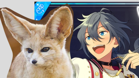
The way you draw Albedo gives me life, thank you for blessing my eyes. I'm new to digital art, and was wondering if you had any tips or know any good art programs to use. :)
Hi!!this message is super sweet jajdjajd thank you anon I love drawing albedo so it means the world to me that you like my albedos 🥺🥺 I have lots to say for the rest of the post - so I'll put it under the cut! Thank you again for the message and I hope it helps, sorry if it's wordy haha
If you're a mobile user (Samsung, apple) Ibispaintx is the best free option! You only need to watch a few ads for full Access to brushes, and you can even make your own! It's pretty much the procreate of android and is available for most devices!
Hi!!this message is super sweet jajdjajd thank you anon I love drawing albedo so it means the world to me that you like my albedos 🥺🥺f you're a mobile user (Samsung, apple) Ibispaintx is the best free option! You only need to watch a few ads for full Access to brushes, and you can even make your own! It's pretty much the procreate of android and is available for most devices! , and you can even make your own! It's pretty much the procreate of android and is available for most devices!
For computer/graphic tablet, I have no experience with it so I do apologize.. but I've seen many people use Photoshop and even medibang :D
On to a few general tips if you want to get good:
1) learn to use layers/layer modes. Layers help you a whole lot in making things easier for you (eg do the lineart on the top layer so you don't colour over it) and layer modes can enhance the harmony of your work (make it brighter or darker)
2) reference and use tutorials! This reply would become a literal book if I tried to list everything - but laovann and rossdraws have some easy to follow tutorials about beginner mistakes and tips too! To practice, I like to trace over images (but I don't post then or claim them as my own)
3) learn about the functions of your application to make full use of it! Ibispaintx's YouTube channel has a guide for almost every function they have and you can mull through then when you're bored (they even have cool tutorials for jewels or drawing with a Watercolour effect) such functions include the lasso tool, bucket tool and several more :)
( I am so so so sorry for the late reply!! I didn't get a notification for this omg) and I'm sorry for how long this is!! If you'd like to know more u can always drop another message :3
6 notes
·
View notes
Text
Movie Poster Designs !🌿 (THE JUNGLE BOOK)
These are my film poster designs linked to my movie the jungle book I’ve created these different movie posters using techniques and skills I have learnt during my time at West Suffolk College I’m really happy with all of the outcomes I have experimented with different styles colours type faces and I’m happy with how they’ve come out and that I have a selection to choose from.
My target audience for the jungle book movie poster is for children and I tried to show this in my work And I think I have done a good job of applying that.

This was the first poster I created and it is my favourite I feel like I have used a wide range of techniques in this poster that I have learnt in previous lessons and I feel it works really well Together. Around the outside I have used my illustrations of leaves and half toned these images that I scanned in from my hand drawn poster. With the scans I then used the polygon lasso tool and went round the edge of my original image and then followed the steps to half tone the image after I had got the halftone image I then copied and pasted multiple layers and layered them on top of each other to give a Fuller look and look like you’re looking through the wilderness into the jungle.With the background I chose the colour black as it made the other colours stand out. The type face I used was called roaring jungle to create this typeface of individual letters representing characters I had to create it on illustrator I typed the phone out on illustrator and then I ungrouped and created each individual letter into an outline so I could manipulate them and have them different sizes. I’m really happy with how the type of jungle came out as are used each letter to represent a character the J represent Mowgli The U represent Baloo the bear the N is for shere Khan the G is for kaa and finally the LE represent Bagheera.
I turned the typeface into different characters as my target audience is children and children would be drawn to the title due to the different patterns on the letters and it gives you an insight into what the film is about and what the film contains.
One thing that I would change is when looking at the film poster is the colour of the font to the colour of the leaves because the different colours of green don’t work with each other and I feel like if I had the fun the same colour as the leaves it would link better.
Another thing that I would change is adding more colour to the leaves on the outside adding some orange yellow colours too separate individual layers rather than having different towns of green and brown.
If I was to do the movie poster again I may have added some sort of texture to the background so it is not so black and may have different tones within the background.
But overall when looking at this movie poster I’m really happy with how it came out and I feel like I have targeted it at the right audience which is children.

Here is another example of my movie posters I created this on photo shop using the same steps of the majority of my film posters which is half toning I follow the same steps as above with the half toning on my scans of my illustrations.This movie poster is similar too The movie poster above in the way of the type of concept with this type I decided to focus on one character in the movie which is Kaa the snake . In the movie the jungle book there is scenes in it where the snake hypnotises different characters so I tried to bring that into my movie poster by using Kaa’s eyes as the O’s in book And the rest of the letters are used as the print on Kaa’s body My aim was for the eyes to bring the audiences attention to the poster and sort of “hypnotise them” into being drawn to the poster I really like how this is come out I create my own version of the eyes from the jungle book and use different colours to create the body of car but still symbolise him from the 1967 film of the jungle book. Again are use the same background which is the black as it makes everything else stand out which is my main goal as I want my target audience of children to be drawn to the colours of the greens grounds and more and again the typeface that I have used gives the audience an insight into what is to come in the film.
If I was to do this post again I would add maybe the tone of the snake in the middle of the two O’s to show you that it is a snake even though you can tell and another thing that I would have done differently would be adding more texture to the typeface what I mean by this is adding black outlines to the shapes and giving shading on the letters.But overall I’m really happy with how this movie poster came out and I’m happy that I have used the character on my type so it draws the children’s attention and I feel like I’ve use the right colour palette to represent the jungle book.

This is the same movie poster as above but with a different border I’m not so happy with this movie poster as the edges of the illustrations are pixelated and the texture of the drawing is not smooth and you can see individual pen marks where I have coloured the illustrations in another thing that I don’t really like about this movie poster is the fact that I haven’t built up the edge of the poster like I have done with the others and I feel like there’s too much black seeping through from the background and the text which is darker to the border is being swallowed up by the background and is not the first thing that you are attracted to and that was my aim for my movie poster so I don’t think that I will be using this as my final outcome but I’m happy that I have experimented with my scan of my illustration and used itIn one of the posters to see how it would come out. I still am happy with how the illustration came out as it does represent the jungle as there are different styles of jungle leaves in it and I am happy with the colours that are used but when it is merged with digital work it doesn’t work well together and I feel like I needed to have digitally drawn them for them to work rather than hand drawn them.

This is the fourth movie poster that I experimented with and overall I’m happy with the outcome of it again I have used an element from the movie the jungle book to represent different characters for example in this movie poster I have used again the eyes of Kaa as they have bright colours in them and that will attract my target audience which is children and I have tried to use the eyes to draw people‘s attention like the same thing Kaa does in the movie with the other characters
With the typeface I have stuck with a basic colour of green so that the eyes which a multi colours stand out more which was my aim I have used the same tone of green as I have used on the outside with my halftone effect and I feel like it works well together and doesn’t clash the border around it is from the halftone workshop that we done with Jodi and are used it on these film posters as I liked the way that they came out as they gave a bushy and wilderness effect to create this bushy affect I laid up the original image and rotated some and used different colours to give it texture and definition and depth.
If I was to do this poster again I would change the shapes of the eyes to represent different characters such as Mowgli baloo and Bagheera as they all have different shaped eyes and I could use that to introduce different characters but not giving too much away. Another thing that I could’ve done is taken the eyes away from the whole poster and use the same colours that are in the eyes on the background to give it a tunnel effect look so the background is not so dark.
But overall I’m really happy with this movie poster as it’s one of my favourite outcomes that I have done and would be considering to have it as my final outcome.
1 note
·
View note
Text
Hey, so a little bit ago someone asked me if i would do a tutorial type thing on how to achieve realistic drawings and although this would probably fair better as a video my voice is shit and i can make sure i get everything down if i type it out.
I think the best way to do this is take you through one of my drawings? My latest Brian drawing i saved a decent amount throughout it so i can kind of comment on each process of the drawing. For the this drawing i drew it on Photoshop CS5 which is important bc i do utilise a lot of the tools there so if you use smth different then im sorry but im sure there are alternatives! I’m going to talk you through this drawing:
Because i dont use natural skin colours in my drawings i start drawings in black and white because i find that easier to control the tones? and then i can colour the drawing afterwards in whatever colour and play about with it instead of sticking with a colour from the get go.
I start with painting the entire background a light ish grey because 1) its nice to work highlights and shade into a mid tone and 2) having pure white as a background can be a bit uninspiring? even with my sketchbooks i always make backgrounds before i do anything on them.
I then take a large brush, i use a mid-dark toned grey for this, i don’t like going in super dark super fast, and kind of mark out where everything goes super loosely, precision and proportions really don’t matter at this point, it will probably look bad but that’s fine! you’ll refine it as you go on! the brush i use for this stage is usually just a soft non textured brush, but i don’t think the brush you use at this point really matters. My drawing will kind of look like this at this point:

I then go in with a smaller brush with a darker colour and kind of refine the face a little bit, i really take in the shapes of the face i’m drawing and try and get a good base to then really work on the shading/highlighting. Again, although this is your base to work on the proportions aren’t super important, it may still look bad but whatever is wrong with it you can just draw right over it to correct it! This is why i try and not give up on drawings even if they aren’t going the way i’d like it to because you can always correct it! my drawings never look amazing when i start them but i like to work into them as much as i can and i usually end up with something i’m proud of! anyways lmao, this is what my drawing will look like at this point:

This is when i start the proper like working into the drawing with highlighting and shading and things. I also change my brush at this point! Honestly any brush will do but i really like the aesthetic of having a super textured brush, I do sometimes change up my brush every so often but the brush ive been using more often than not is this brush:

Also at this point i try and not use pure black or pure white, if you’re trying to go for a realistic look then i feel pure white n black really don’t factor into a face.I also think if you use more mid tone colours then there’s more of a natural gradient? which looks more realistic i feel. Of course if you like the aesthetic of having a high contrast then go for it! this is just how i personally like to do it.
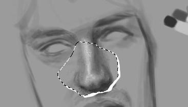
I know a lot of people work by gradually working the whole face, like do loose highlights and dark tones on the whole face and then refining it but i like to do each part of the face one by one and i usually always start with the nose, this isn’t important lmao i just enjoy drawing noses so it’s what i start with. i think the use of highlight is super important to utilise when drawing the nose because its what suggests form,, this is my drawing will look like at this point:

I do end up darkening the shadow on the right side of his nose and the bottom of his nose but i usually get to this point and then move on and then once i do more ill go back and try and bring more dimension to the drawing.
Also! one of the best tools on photoshop that you can utilise and in some of my drawings it’s my saving grace is the liquify tool. Basically if you do the drawing and get to a point it would be hard to paint over then u can use liquify, as i was doing other parts of the face i realised that the nose was supposed to be a little to the left and the eyebrows had to be lower down so you if you open up liquify you can just click and drag the nose to where you want it to be so:
it’s a super helpful tool that really helps you get the facial features exactly where you need it, i used it a couple times throughout this drawing. I don’t think sai has it but you can use the lasso tool and rotate it or whatever and just draw over the little break it makes in the canvas:
so the next thing i do is the eyes and eyebrows. I’m usually not the greatest at getting the exact eye shape but again, liquify is your best friend. An important thing to note is the angle of the eyebrows in relation to the middle of the nose, Brian’s eyebrows are quite straight so i tried to keep them that way. I also started darkening up the drawing, i didn’t quite go full black, the darkest colour i used is like just off black. This is what i have so far:
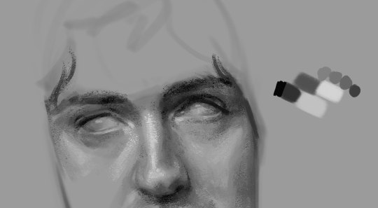
Also another important thing to remember is the lighting of the image, in the image the right side of his face is more shadowed so the shadow on the left side of his nose wont be as intense as the right side and things like the bags under his eye on the right side would be slightly more prominent. Also because of the brow bone, theres more highlight on top of the brows and usually a shadow underneath because the brows are more elevated and the eyes are sunken in a lil bit. There will be a lil bit of highlight on the inner corner of the eyes though.
In the next part of the drawing i just add a little bit to the forehead and cheeks :

I think by this time i had adjusted a couple of things like the angle his face was at was a little bit too tiled in my original draw so i just free transformed it and fixed the angle and the face i think was a little bit too wide so i just pulled it in a little bit. I think another thing to remember that places like the cheeks and forehead wont be pure highlight, especially with like men and older faces there will be more subtleties, with Brian he has highlight on the top of his cheekbones but the highlight is kind of broken up with the line that comes down under his eye and the forehead isnt a smooth bump above the eyebrows, especially with the lighting of the image the highlights get broken up a little bit.
The next drawing is a little fast forward, i forgot to save in between but ill try and talk through everything:

When finishing up I realised the left eye/eyebrow was a little too high so i liquified that baby up to bring it down just a little bit. Another thing i sometimes struggle with is getting the exact shape of the face and angle of the jaw but you can just keep on drawing on top of it until it looks vaguely right.
For the lips and mouth i think its kind of just a matter of trying to get a sense of the shape, look at the cupids bow and the length between the top lip and the bottom of the nose and how far the lips come out in relation to the nose as well, i think as well the shadow underneath the bottom lip is usually all you need to suggest the shape of the lip, it doesnt look all too natural if theres like a solid like to show the shape of the lip, the top lip though, because of the way the light is sitting on his face is almost completely shadowed, so the highlight on the cupids bow that goes down to the edge of the mouth is what helps give the mouth form. With teeth because they’re in his mouth so they’re not going to be super bright so i didnt add any highlight to them and just used a dark tone to outline the shape of them at the bottom and used a little bit of shading in between them to differentiate between them.
For the eyes i usually just leave them without the pupils because it’s my brand but it wasnt looking quite right to me so i added a little outline of the pupils, i didnt want to do the full pupil because i like adding a lil smth interesting in the eyes but i like the way they turned out!
The jaw you can usually bring out with the shadow of the neck. I didnt really feel like drawing the outfit so i kind of just did a couple of lines so show that he was wearing a shirt with a collar.
Also for brian because he has so much hair i more often than not just use flat colour for his hair and because his hair is so dark it usually works fine but with people like Roger who has lighter hair is doesnt usually work out well? especially with a more realistically drawn face. I was originally going to keep the entire background that colour but it wasnt looking quite how i wanted to. I coloured first though, and tbh my colouring process really doesnt take me that long, the longest part is just working out what colours id like to use and what looks good with the drawing I've made.
So for colouring i use the gradient tool, you have have a gradient thats two colours that will make your drawings look like this
but recently ive started using the gradients with three colours so the highlighted sections will be a different colour to the base colour, i really like the way this comes out, without any other editing itll look smth like this:
I like to play about with the settings a little bit because i do enjoy the way this looks but it’s kind of a bit overpowering and i think sometimes the details of the drawing can get lost when you overdo it a bit?
If you go through this itll give you many different versions of that gradient and i like to go through it and see which i feel compliments the drawing
heres a couple examples

The one i ended up going for was dissolve but it was a bit too intense so i turned the opacity down to 57%

which gave it a kind of static feel which i was in to, to finish it up i added a tiny bit to show some shoulders and then i wanted to add a tiny bit of a background so i used a flat pinky colour and put that around his hair and then on top of the background i added a little bit more into the hair.

and added so more vibrant pink into it as well just to spice her up a little bit.
124 notes
·
View notes
Note
What do you use for digital drawing?
So, right now I’m using Clip Studio Paint, and it’s REALLY excellent. They have half off sales I guess pretty frequently so I got it for 25$, and it was super super worth it. Like, it’s worth at least 25$ just for how much better the fill tools are than anything else I’ve ever used, lmao
Before I tried clip studio I was using firealpaca, which I switched to from medibang plus for I don’t remember what reason because they’re almost identical and I can’t remember the differences? lol. They’re both free software and REALLY nice, I like em a lot! For me, when I tried clip studio, it was like ‘… oh, this has everything I love about firealpaca but better’ lol
I USED TO do all my sketches in Mischief because it has a nice feel and an infinite canvas, but a) they’re not supporting it anymore and b) it doesn’t have a lasso selection tool, so it got really annoying trying to resize/ adjust small bits and pieces of a sketch with like… rectangles….. now I’m mostly sketching by just opening a really big canvas in csp but I DO miss that infinite pan/ zoom
as for what I physically use for drawing, I have a microsoft surface which uses a pressure sensitive stylus pen :D
2 notes
·
View notes
Note
Hey! I was wondering if you had any tips for aspiring artists ((especially in terms of finding their own style))? Thanks c: (ps love love LOVE your art!!)

and I say dun worry about finding a style if because if you’re just starting out I think it’s more important to focus on learning the fundamentals (figure drawing, perspective, etc.) and getting good/comfortable at just drawing and observing in general than trying to find a look/make a nice drawing.
Plus your style will develop naturally and change on its own time as you find new influences/ artists/learn more skills/get better as an artist.
Also it’s not necessarily a bad thing if you don’t really have a set style (I used to always worry that my art wasn’t cohesive enough because my style jumps around a lot).
Since it’s Mermay here’s an example of style shifts haha:
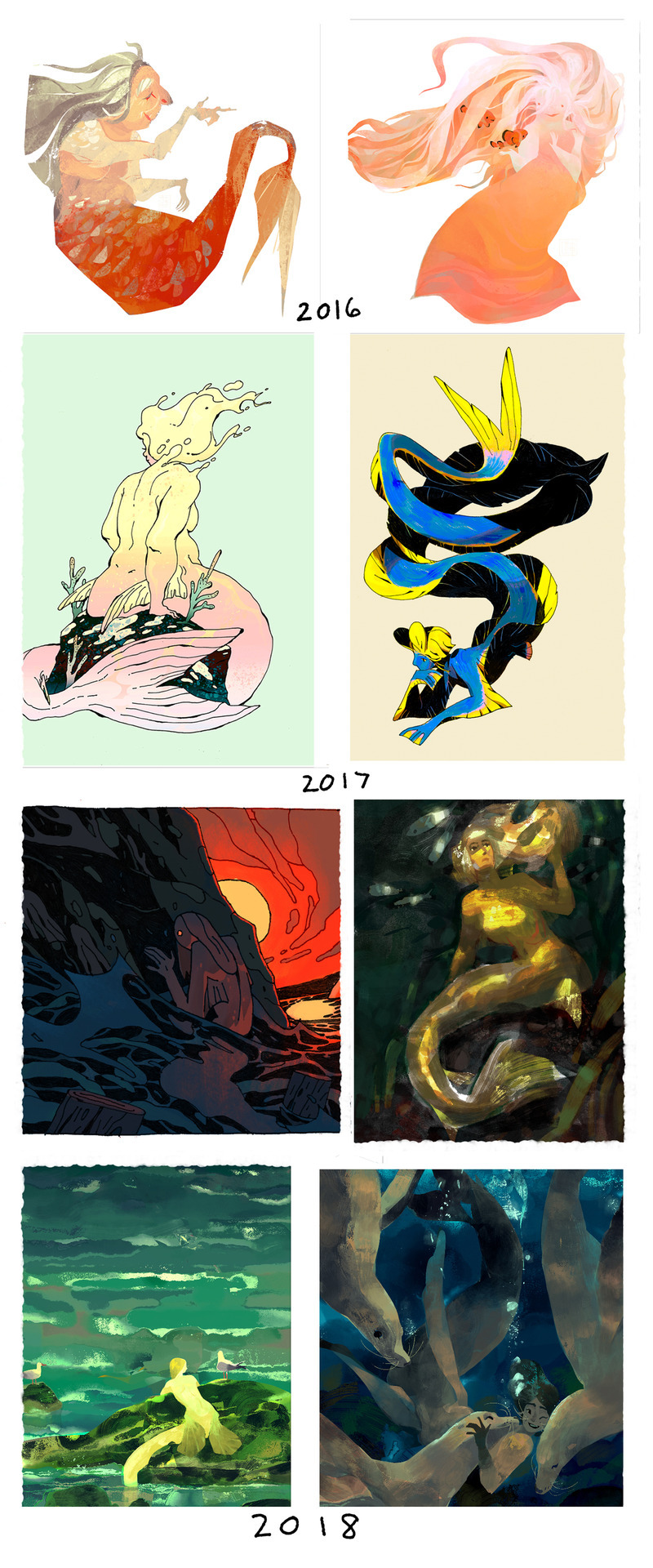
2016 was lasso tooling and more shape/animation style based with lots of brushy textures everywhere.
2017 tried using watercolors and got interested more in lines/ink; merms ended up more ‘realistic’ in terms of proportion (the ribbon eel is 2018 whoops)
2018 continued with the ink thing and tried to stylize more; went back to the textured digital painty look for this year’s Mermay.
BUT SO UH YEAH POINT IS DON’T WORRY ABOUT STYLE. Don’t be afraid of making ugly sketchy drawings/studies because they’re a part of improving and learning and draw stuff you like/don’t like.
I think I read this somewhere before (but I cannot honestly remember where or find it, if anybody knows, please let me know!) but pretty much think of your style like a cooking pot, and you’re putting in different things and maybe taking some stuff out and everything you add or take out will change whatever’s cooking in the pot. Or maybe you see something in someone else’s cooking pot that you kinda want to add to your own.
Ended up kinda answering a lot for style finding mainly but hope that answered your q and have fun artin’ : O
(p.s. thanks so much! ^ ^)
#art ask#anon ask#art style ask#SORRY I JUST REALIZED IT'S LIKE I'M SAYING#DON'T WORRY#ABOUT ART HAHA#I just meant for the art style bit#oof that's probably the most I've ever written for an ask haha#some more asks incoming
369 notes
·
View notes
Last Seen Blogs

sowoozis
may your trials end in full bloom;
wifeofasith
TROPHY WIFE

bhartbhavy
Untitled
bhartbhavy
Untitled