#i use two because one has better info to me and one has better widgets lol
Text
hey witchblr! question: if you keep track of the moon phase using an app on your phone, which one do you use? which is your favorite?
#i use two because one has better info to me and one has better widgets lol#‘deluxe moon’ (but i dont have a premium account lol)#and ‘my moon phase’#witchblr#moon#witchcraft#witches of tumblr#lunar witch#lunar witchcraft#lunar witches
13 notes
·
View notes
Text
Shifting Back to Wolvden - New Features and Pack Orientation
Now that my Lioden king has established himself, I'm shifting back on over to Wolvden. I'll be on Lioden probably once a week to participate in the poll and keep up with the news. That's what I did with Wolvden during my semi-hiatus.
I haven't played Wolvden actively since the end of June, so I'm recapping (mostly for myself) what has happened since then on the site, plus giving a reminder (also mostly for myself) what I'm doing and what my goals are.
News
- Right before I left, Community Updates began happening, including the new Raffle Wolf system. I had enough time to make a new class in my pack - the Emergency Raffle Girls - who just hang out and have staggered heats so I'll always have a wolf in heat if I win a studding.
- Two Lunar Events happened, including the August Seasonal Blue Moon event. I was able to get on for both of them and get what I wanted the most, although I wasn't able to play this last week as much as I had hoped to.
- Adolescent Apprenticeships have been added, ensuring that wolves will never be dead weight in the pack unless I want them to be. This update didn't require any changes to my pack, just that I remember to press the Include Apprentices button.
- Pupsitter interface has changed for the better. It's so much easier to use and doesn't require bouncing around pages doing math anymore.
- The HTML Editor... changed. Which makes my den page where I keep all my info very ugly in the editor area (and I started trying to clean it up myself before noticing the automatic cleanup button so I'm afraid to touch that now). I know how to read and manipulate HTML well enough so I'm not too worried, but it is annoying. Spoiler tags are nice, though.
- Tier III bases have had their rarity adjusted so they're even (Cool used to be more common than others), and they all throw a bigger variety of bases more often rather than the same as the parents . I haven't been breeding for Tier IIIs yet(the ones I have are mostly to throw desired Tier IIs), so this doesn't affect me much.
- Questing Overhaul just happened this week. So far I like it. I spent 10 SB on the Lottery to receive over 50 SB from the Snake, and that was the Easy quest. The Medium and Hard quests are also just encouraging me to play a specific way - completing Hunts of a particular size and submitting fish. It feels good to be rewarded for just going a tiny bit out of my way to use more of the site. The widget on the side's also very nice so I don't have to keep checking the questing page to see my progress.
- Small Herbalist improvements with Foraging times being reduced based on level and proficiency, and a medicine stock list for quick reference.
- New items... everywhere. In the Lunar Events and in regular gameplay.
Whew, that's a lot of improvements in two months!
Interesting Polls
- Flaming Objects were voted to appear in Lunar Events
- Upcoming opponents will include Humans, Condors, Alligators, and American Crocodiles. (Probably regular gameplay opponents?)
- Upcoming features include more Explore content, more minigames, talent trees for lead wolves, more in-depth wolf personalities, and a month-long yearly event.
- Flowers were voted to be the next Raccoon Wares biome-specific decor. (And yet birds happened first)
- Staff appear to be requesting feedback from the playerbase about the theming of the month-long event. Choice options for manipulating the story won the hype poll, and so far all of the options is winning the genre poll (Horror being the second-largest, followed by Fantasy. There go my hopes that Wolvden will remain primarily real-world based for a while. Yes, Lunar Event exists, but it's self-contained and a dream world, and dreams are weird. I also don't like visual horror, so.)
What am I doing?
So that was the news, but what're my plans for the pack?
Breeding
I'm still keeping to my goal of having a Sky-based, Ice-eyed, White Merle male as a mate to a future pack leader. This generation, I'm hoping to get an Ice-eyed, Tier II male with White Merle as the next Breeding Male. And I'm still planning on doing it entirely within my pack. Thus far the best I have is a Tier I with Ice eyes and no Merle.
For stat reasons, I plan for a wolf of Dusty's line to graduate to leader's mate next generation.
I also am keeping extra wolves with White Merle, Sky(/Lavender) base, Tier III, and Selene Ornate Spots around to introduce them(or reintroduce them if I lose something) into the breeding pool in the future. It is getting pretty crowded in the Non-Canon Legacies+Interesting NBWs cave. I may have to make a new cave and rearrange things.
Story
...yeah. I had the beginnings of a story last generation, but I lost motivation to write it and honestly I didn't know where I was going with it anyway. As of now, not much about the game is inspiring me, mainly because unlike on Lioden, there isn't drama going on by way of the Fight Calculator. I have one for Wolvden, but since the canon pack is just the lead wolf's family and I've been hand-selecting the next generation pack lead, there hasn't been much conflict.
I'm going to have to think about what I want to do here. I have a fun game down mechanics-wise, but it doesn't lead to in-pack drama since 'being born with the right traits' or 'striving to have a pup born with the right traits' doesn't make a compelling story. That's eugenics when you put it in story form.
I don't have answers right now for how I'm going to introduce conflict. Perhaps this generation will be pretty chill, and the next one will be where I start to introduce conflict. I hope to get that sorted before then.
How long until next generation?
Assuming I roll every day (which I might? But I might not), Pointer will be Lead Wolf until November 9th. I haven't decided yet if I'll swap back to Lioden in October, though, as the current reign kinda makes me want to stock up on October items. I'll probably decide for sure once we get closer.
Once that day comes, I'll swap back to Lioden and start having to deal with the fact that a villain won. It won't change gameplay much (just go with negative karma), but oh boy the story.
3 notes
·
View notes
Photo


I’ve updated my commission info pic!!!! It actually has more than one drawing on it now! XD
(this is the only way I make money until I can find a job ;w;)
THIS INCLUDES DEVIANTART PRICES IF YOU USE DA POINTS INSTEAD OF PAYPAL
Poses/WIPS: Free only when you purchase an item.
Rough Sketch: 400 points ($5)
Rough sketch+Color: 640 points ($8)
Lineart: 1200 points ($15)
Lineart+Color: 1600 points ($20)
Cel Shading/Lighting: +400 points ($5)
Shading+Lighting: +800 points ($10)
Headshot: Default Option
Torso: 800 points ($10)
Half Body: 1200 points ($15)
Full Body: 1600 points ($20)
Extra Characters: +400 points per character (No more than 5 characters) (+$5 per character)
No background/Transparent: Default
Solid color background: 400 points ($5)
Simple Backgrounds: 800 points ($10)
Normal Backgrounds (ie. settings) : 2400 points (requires specific descriptions + references) ($30)
-
SPECIAL OFFERS
CHIBIS: 400 points per character (+400 for cel shading, +160 for simple backgrounds) ($5)
COUPLE DRAWINGS: 4000 ($50) points (torso) 4800 points ($60) (half body) 6400 points ($80) (full body) - comes with simple backgrounds and or no background per your request
(couple drawings is any pairing that you want me to draw, be it oc x oc, cannon x cannon, oc x cannon, just as long as it’s within my guidelines, I’ll draw it for ya! Let your ships become a reality!)
BUY TWO-GET ONE DRAWING FREE-one per month per customer!
-
WHAT I WILL AND WILL NOT DRAW:
I will Draw: Humans, Anthros, Your own characters, Animals, etc
I will NOT Draw: NSFW, Heavy Gore, Mecha, Complicated Backgrounds, Complicated Characters, Anything that would be deemed “offensive”, Politics, Controversial topics, and anything against my own morals
-
How to Commission me: While I will have a Commission’s widget on my page on DA, I’d prefer it if you would actually give me a note either before or after you get to it, I can’t put all the possible combinations on that widget, so notes are very necessary. If you are commissioning me through Tumblr or Twitter, (it’d be better if you did tumblr because I need to be more active on twitter than I am currently so I might not see it), DM me and we can chat about what you’d like.
There is a Terms of Service page on my blog, you can find it on the menu!
2 notes
·
View notes
Text
Version 453
youtube
windows
zip
exe
macOS
app
linux
tar.gz
I had a great week. I ended up mostly fixing bugs. If you have a large client, the update may take a few minutes this week.
bug fixes
I discovered a semi-important tag processing bug last week--for some users, files that were imported ''before'' they added the PTR were not getting all the correct tag info and would not appear in some tag searches. I fixed the underlying file-tracking bug and have added a retroactive 'gap-filler' to this week's update. If you used the client for a long time but added/reset the PTR recently, you'll have more gaps so your update will take longer.
Another persistent issue has been the 'tiling artifacts' with my new tile-based image renderer, where at certain zooms an image would have one or more horizontal or vertical blurred/janked line of pixels. You'd notice it on cleaner vector images where a smooth curved black line would suddenly jag at one zoom. I had trouble reproducing this at first, but some users got it quite often, and with their help I was able to figure it out. I have rewritten the part of my renderer that was failing, and I ''think'' I now have the artifacts completely fixed for all 'normal' zooms. Let me know how you get on!
misc
Network job widgets have a little user-friendly update this week. I brushed up some of the status texts, made the text lay out better, and when the widget counts down waiting for something (like free bandwidth), if it doesn't get it because another downloader did, it says so before resetting the countdown clock.
A helpful user wrote a new darkmode style called OledBlack. Check it out under ''options->style''!
I added OR predicates to Client API file search!
If you are an advanced user, you might like to read this idea I had for setting up multi-tag processing workflows: https://hydrusnetwork.github.io/hydrus/help/advanced_parents.html#parent_favourites I suddenly thought of it a couple weeks ago and it worked so well for me that I decided to write it up. It basically involves using local parent tags to group PTR tags into a pseudo-OR search that you can easily edit.
full list
qol and misc:
the network job status labels around waiting for 'subscription'/'download page'/'watcher' forced wait slots are reworded. now they just say a more plain 'waiting to work' with a time estimate, and if a job does not get a chance to work this check cycle, it says 'a different xxx got the chance to work' for a few seconds.
if a network job does not get bandwidth on a check cycle, it now says 'a different network job got the bandwidth' for a few seconds
when waiting on bandwidth or gallery work, network jobs should count down more smoothly, one second at a time, not skip a second so often
network job widgets are now better about updating the layout of their two text labels. the status text on the left should take all the available pixels much better, sharing with the '64KB/s' speed text as it changes width and disappear
added a new user-made darkmode QSS stylesheet called 'OledBlack' to default hydrus, try it out under _options->style_
if the tag domain in a search page is other than 'all known tags', the 'selection tags' box, which limits itself to the current domain's tags, now explicitly labels itself with that domain
consolidated and optimised the pre-work checks on all importers/downloaders in pages. pages with idling/finished/paused downloaders will consume just a little less CPU and need to talk to fewer important objects
renamed the shortcut sets for viewer/preview media windows and clarified that they are mouse only for now. the new seek command works with these, but you'd have to map ctrl+right-click or something
improved the system predicate unit tests to catch datatype problems like with last week's hotfix and system:time imported
advanced archive/delete stuff: wrote up a neat idea I had about using local parents applied to the PTR to make fast multi-tag processing workflows here: https://hydrusnetwork.github.io/hydrus/help/advanced_parents.html#parent_favourites
.
bug fixes:
an important tag search bug is fixed. for some users, files that were imported before a service was added were not appearing in some of that service's search results, or their tag counts were not added in certain tag autocomplete results. this file miscount is fixed, and holes will be filled on database update. it should not take too long to fix, although different users will have different situations
this bug was leading to artificially fast PTR processing speeds on some clients as their older files were being skipped. if you have used the client for a long time but only added the PTR recently, sorry if you notice it slow down! it is now working correct!
fixed an important bug in the image rendering system that was causing tile artifacts (little lines of double-pixel jank along tile borders) at a variety of regular zoom levels. the way ideal tile size was being calculated was often incorrect, so I have replaced it with a better calculation
the system predicate parser can now parse 'system:is not the best quality file of its duplicate group' (only 'isn't' was working, previously) (issue #954)
if the collect-by dropdown is fed garbage namespace data from the namespace sort options, it now recovers with a nicer error message (issue #904)
misc db code cleanup and minor refactoring
.
client api:
OR predicates are now supported in the client api! Just nest within the tag list, and it'll bundle the nested list into an OR. there's an example in the client api help
some permissions testing in file search is tightened up--now we have OR and system predicates, if you do not submit any regular positive tags, the search permissions have to be 'allow anything'
fixed an issue where the client api would let you ask about sha256 hashes of incorrect length (and would ultimately make a master database id for these borked hashes, even the empty string!!). now the client api throws a 400
fixed a bug in /manage_pages/get_pages where all pages were marked as 'selected'=true (issue #841)
in the client api, if you use missing file_id(s) on a request for a file, thumbnail, metadata about a file, or when trying to add a files to a page, it now gives 404 correctly (rather than 500) (issue #961)
added a section to the client api help on variable encoding, including an example of how to convert a python tag list to JSON+URL encoded string
added new unit tests for OR pred parsing and the hash length check
client api version is now 20
next week
Unfortunately, I did not spend time on notes parsing as I had planned. The people helping to run the github issue tracker pointed me to old bug reports that I had not been keeping track of, so I am going to spend a little time prioritising clearing out that queue (and generally trying to integrate important github issues into my weekly routine more, as I often have trouble naturally focusing on priorities). So, next week will likely be more like this!
0 notes
Text
Week 4
Media -
The first thing I played was rocket league and my favourite thing about the game is trading because you can trade all of these black markets for different ones and customise your car .

The gameplay is pretty good aswell and they got some good music on there .
I also played for a horizon 4 which is probably one of the best games out there and the graphics look really good still for a 2 year old game

There is more customization in this game than there is for 1,2 and 3 but the only thing I want to see is skill based matchmaking.
Polish something-
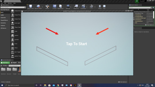
For the polishing , I took out the automatic replay and I added in the retry button so you have to click the button to go back to the play screen.
This is useful because it will allow players to play the game from the start every time they lose and gives it a more interactive feel.

I also made a lose screen and put it into the background of the button and I also changed the button’s colour.
When you click the retry button it brings you back to the start of the game
For the game itself I borrowed someone's free project from the unreal website.
Solved problem-
For me I had a problem with getting the lose screen into unreal engine as a .psd file so what I did was I went and loaded photoshop back up and then went to file and then I saved it as a .png and then I loaded up Unreal and dragged the png file into the empty space and it was in so then I just coverted it into a sprite and added it into the lose screen widget.
These are the two files and one of them says .psd and the other one says .png so that is what was needed to fix it.
Theoretical Problem-
If I wanted to make this game multiplayer where people could go on the internet and battle other people to get the highest score then I wouldn't know where to start .
To counter this, there might be some tutorials on YouTube on how to do it or maybe there’s some info or tutorials on the unreal engine website which has been left by other users.

I also wouldn't know how to get it uploaded to steam or Epic but you could probably find that on the internet or get a steam live chat because they should know what to do seeing as they work for the company.
Recording feedback -
For the feedback I can probably just let one of my family play it and tell me what they think of it and what is needed to improve it. I can also put it on YouTube or something and there might be random comments or I can send it to friends on Instagram and see what they think about my work .
They can then just say what they like about what I’ve made and what they think I need to improve on. I can save all of their feedback on my iPhone’s notepad or maybe on a tumblr post.


Weekly Reflection -
The thing that has gone well this week is making the lose screen in photoshop because I think it looks nice with the coloured button.
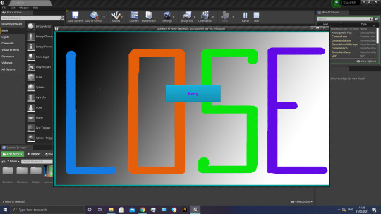
The thing that could have gone better is being able to make a detailed lose screen but I’m bad at drawing and I couldn't fit the whole word loser onto the photoshop page.
The thing that I’m planning to do next week is make a model of a brick that could be used in the game.
0 notes
Text
Week 339.5: WWDC special
Happy Tuesday (at least in my timezone)! As promised, here’s the special WWDC20 edition of iOS Goodies! Same as last year, this won’t be following the usual pattern of the newsletter, but it will bring you up to date with the latest announcements from the first day of WWDC20. Here’s my summary of all the info I could process so far after the first day of WWDC20.
In iOS 14, we have a major home screen revamping, with App Library appearing after your last app page and organizing the apps by type, but also with the Widgets. Similar to the widgets from the Today View in purpose and appearance, they’re quite different under the hood. You can place them (almost) anywhere on your home screen, and you use WidgetKit to create them. There’s also a prebuilt widget gallery, the Smart Stack, which uses on-device machine learning to show the most relevant widget for that context. To create widgets, it seems you have to use SwiftUI.
App Clips were also announced, which, as far as I could figure out, are similar to the Android’s instant apps from some time ago: small parts of an app that can be used to perform a specific task (pay for parking, i.e.). They can be triggered by scanning specific QR codes, NFC tags or Safari App Banners. With both Widgets and App Clips, it’s probably more important than ever to make sure you use a modular architecture with reusable components.
Among the user-facing updates are a Messages redesign, a new Translate app which is integrated with Siri and works locally without the need of an internet connection, picture in picture, emoji search in the keyboard and customizable default apps for mail and web browser. Also, long pressing on the back button in a navigationController will now show all the screens in that navigation stack. It seems we’re also getting redesigned date and time pickers, as well as a color picker. And family subscriptions are now a thing: subscriptions can now be shared with the members of your Family Sharing group. StoreKit also got some updates, which should make working with in-app purchases easier. Here’s a list of all the updates coming to iOS 14. iOS 14 will be supported on iPhone 6S or newer.
iPadOS 14 is getting the same updates as iOS, even though it starts to look more and more like macOS, and it also gets Scribble, a feature that lets you input text by handwriting it with the Apple Pencil.
tvOS 14 wasn’t mentioned that much during the Keynote, and not at all (I think) during the Platforms State of the Union, but it also got a few updates: multiuser support for gaming, support for more controller, the possibility to connect two pairs of AirPods to the TV, HomeKit live camera feeds, and picture in picture.
In watchOS 7 we’re getting SwiftUI complications. Among the new user-facing features are handwashing detection, dance workouts and the much-expected sleep tracking. watchOS 7 is supported on Apple Watch Series 3 and newer.
The biggest focus during this first day was on the Mac and macOS, and that’s because Apple is moving away from Intel chips to their own Apple Silicon processors. But first, let’s talk a bit about macOS. The new update is macOS 11 Big Sur. Everything was redesigned, and it looks now a bit more like iPadOS. Besides the redesign, it also comes with faster Safari, updated Maps app (which seems to be Catalyst now), updated Messages app with threads and mentions in group conversations and widgets similar to the ones introduced on iOS. Also, the boot chime is back.
As for the Mac, it’s transitioning to Apple Silicon, Apple’s own processor line, it will come with Universal 2, a new universal binary file which contains the binaries for both architectures, it will use Rosetta 2 to allow existing apps to run on the new architecture and it will support iOS apps directly.
Some of the updates that impressed me the most were the privacy-related ones. When allowing an app to use your location, you can now only give it your broad location, instead of the precise one. And when an app asks for photo library access, you can only give it access to a few selected photos. Tracking is also affected by the new versions of Apple’s operating systems, as developers will now have to ask the user for permission before tracking them in the app, using the new AppTrackingTransparency framework. Soon you will need to provide details about your privacy practices in App Store Connect; the App Store will show what type of data an app can access. And last but not least, iOS will now show a visual indicator in the status bar when the camera or microphone are active, so the user will be aware of this.
SwiftUI also got some nice updates, and the best part is that they’re all additive changes: all the code written before will compile without the need of a migration. Paul Hudson already has an article out highlighting what’s new in SwiftUI for iOS 14.
But what about Xcode? Of course there’s new stuff in Xcode 12 too: bigger font in the navigation panel (and the possibility to customize it), there’s now a minimap in Interface Builder, it finally brings support for SVGs, better code completion and document tabs similar to VS Code.
Looking over the schedule of the videos for the rest of the week, there are some very interesting topics. Some that particularly stood out for me were the ones about collection views, especially about lists in collection views. Are we finally ready to deprecate UITableView?
Marius Constantinescu
0 notes
Text
The Useless Elements of Your Blog You Should Remove
“Look at how awesome my website is!!”
“There’s a slider, a Facebook box, 2 popups, 4 ads, all of these cool flashing buttons, a picture of my dog ‘Rex’ (my inspiration) and it’s probably the best site that ever existed. Seriously.”
Sounds crazy, right? Well, that’s the reality of many bloggers trying to succeed.
There’s nothing to be ashamed of here.
When learning to build a website or a blog these are fun items to play with, learn about and implement as you work toward becoming more knowledgeable and taking your online presence to the next level.
You have to get right into the thick of things, get your hands messy and then dial back as you discover what works for you.
But what do the experts say? How about...
“Looks nice, I can see my content, now does it convert?”
Check out the video below or scroll past to read the details!
Please Note: By playing any videos on this page, you hereby consent to the use of YouTube’s Cookies.
Subscribe to my YouTube Channel Here
What’s the difference?
Purpose and function are the main keys the successful bloggers and website owners want. They design a website with a goal in mind; a purpose it has to serve.
A lot of people out there are too lost in the “bit and pieces” of their design and find themselves forgetting about the real reason they started their website in the first place (whatever that may be) – until they check their stats and get frustrated because nothing is happening.
There’s the problem, it’s your first obstacle and it’s time to overcome it – you’re focusing on the wrong areas.
The next step is to shed the “bells and whistles” mentality, find out what you want your website to do for you and work towards ‘design’, instead of art or craft.
After all, design is about function.
Your website needs to fulfill a few goals, here’s a few suggestions:
Convert to sale – make money
Convert to a subscriber – so you can get repeat traffic from them
Get your reader to Share your website/page – to reach more people.
The above may not be your goals exactly, but they represent what most people’s websites are trying to achieve. You need people to be on your site in order to make a sale or fulfill your ultimate goal. Also, the more people you get to your website the easier it will be to fulfill that goal.
This is what your website ‘design’ can do for you. So you’ve got to start getting rid of things that make that difficult to happen.
So naturally, I created a list here of things you should consider removing. It’s essentially about behavior that certain elements encourage, but tailor it to your individual needs, these aren’t gospel.
Remove anything unnecessary that takes your visitors off-site

It’s a simple concept, you’ve got people on your website, so don’t encourage them to leave.
You think you don’t but really, most of you do without realizing it!
Take a look at your theme or layout, really think about each element and ask “where does it take my visitors?”. Do they stay on your site or exit from somewhere else?
Here’s a few examples:
Social Media Widgets – A lot of these widgets just take people off-site and slow down your loading time, creating a big barrier between your visitor and conversion.
I’ve always held the opinion that Social Media should be used to drive people to your website – as it’s not as powerful a ‘repeat traffic’ tool as an email list.
Get people subscribing to your email list instead. It will lead to repeat visits to your site if implemented correctly.
Add a few small links to you social media profiles somewhere else on the page where they don’t distract.
Under-performing Advertisements – Making $30 a month with your Adsense ads? Got some affiliate banners in your sidebar? If you track them and they make hardly anything you should consider removing them.
Sell with your words instead, through quality education and value. Ads that don’t perform just add to the load, clutter up your page and distract people from your main call to action.
Link Exchanges – Having a list of 15 websites you exchanged links with in your sidebar or footer isn’t exactly a powerful SEO or traffic technique and they just send people to other websites.
Instead, allow people to contribute posts to your website with a bit of info and a link, so people will get a sample of their work and want to check out their website. Make sure the links open in a new window! But by having them write something on your website they will share it with their audience and drive more people to your blog!
Don’t encourage people to leave, keep them on-site.
YouTube does this effectively. They reward videos that keep people on the platform. Facebook, Twitter, all of these places make more money when you’re using their platform. So they do what they can to keep you there. You should do the same!
Remove less relevant pages from your navigation

Listing 14 pages on your design is an excellent strategy to get people look elsewhere.
If you give people too many options they will be intimidated.
Simplify by grouping under pages that cover several pages, linking out from there or even just add some of the less relevant pages to the footer of your website.
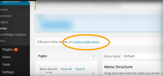
You can slim down your navigation by switching to custom menu. Just go to Appearance -> Menus.
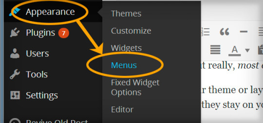
Either alter the existing menu or add a new one by going to ‘create a new menu’.
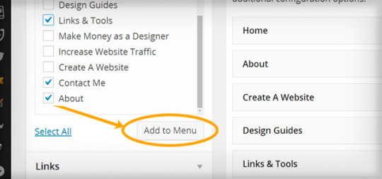
Then add the pages you want to menu!
Then simply change your main nav to that menu, this will depend on your Theme’s settings, but you may find it changes by default anyway. Another alternative is to use the plugin ‘Hide pages’
Remove elements that keep your content from being “above the fold”
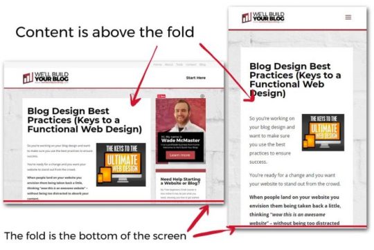
First of all, what is “Above the fold”?
It’s anything that shows up above the bottom section of the browser window, see below:
But quite often people see this “opportunity” as a chance cram a bunch of other things up there because they want their ‘extras’ to convert more than they care about their visitors seeing the content they’re looking for.
Give first, receive second.
You need to give people what they’re searching for and then offer the call to action. The best way to serve up the content on a silver platter is to have it above the fold, taking up the majority of the space. There are a few things you should consider keeping like your logo, navigation and maybe a subscription feature box on your home page (as most people go to this page after reading your content).
But you need to remove the useless stuff – slideshows, too many ads, headers that are too tall and push the content back below the fold and put the content on the front line.
But what about pop ups?
They show up above the fold and in front of your content! Make sure they don’t pop up until someone has been on your page for a certain period of time or get a popup that is designed to show up when someone is about to leave. But before you even think about that, is it for an email subscription? That’s OK, anything else I’d seriously question and weigh up.
If you want to use popups, run some test firsts and see if they actually improve conversion or harm it.
Remove anything that distracts from your Call to Action…
…minus your content of course.
So you’ve set up your website with your logo, navigation, content and you’ve sprinkled a few calls to action around including your email subscription box, some share buttons and a link to your product.
You think “why stop there?”
You start adding links to your other content, cool widgets you’ve found, a tag cloud, links, categories, recent comments and blah blah blah.
Now what? You’ve got an overcluttered design and people don’t know where to go next!
If you’ve got an overcluttered design and people don’t know what to do! Chances are, if they read your content, they’ll bounce afterward or leave because there’s no clear direction and it’s just plain confusing.
Or maybe they’ll leave without reading your words at all!
Also beware of being too aggressive with your call to action, 1 or two in a sidebar, below your content, one or two other places are about as many spots as you want to fill. Being overly aggressive will put people on the back foot.
Choose your design elements wisely. Make your main call to actions the second most outstanding element after your content.
Ultimately, focus on 3 things

I’ve covered them before in the secret of an awesome website design, they are:
1. Give the people what they want – the content.
2. The purpose of your site – the call to action.
3. Making people familiar with who you are – make it share-able and have unique branding.
This doesn’t mean you have to follow what everyone else is doing. Allow yourself to break away from the mold.
Simplify. Make things clear and concise.
James Clear removed his whole sidebar and noticed improved engagement and better results. Because people landed and all they saw was the content they were looking for.
It’s going to that way no mobile anyway, and that will most likely be more than half of your visitors!
You can think just like this and create a website that gives people what they want and they’ll dig for more – this leads to conversions.
Your website is just the middle man between you and your visitors – you’re giving them content, possibly some products or some kind of value in exchange for an email address or money.
There doesn’t need to be all the bells and whistles.
Follow this thought pattern with your website layout and you can forget about the ‘stuff’ and focus on the more important elements- what you offer.
Try it out and leave a comment here to tell me how you went!
If you found this article useful, please subscribe to my newsletter for more.
Thanks for reading!
source https://creatorimpact.com/useless-elements-blog-remove/
0 notes
Text
How Frontend Developers Can Empower Designer’s Work
How Frontend Developers Can Empower Designer’s Work
Sandrina Pereira
2019-10-16T12:30:59+02:002019-10-17T08:06:08+00:00
This article is mostly directed at you, dear Frontend Developer, who enjoys implementing user interfaces but struggles in aligning expectations with designers you work with. Perhaps you are referred to as the “UI Developer” or “UX Engineer.” Regardless of the title that you carry around, your job (and as well as mine) consists of more than breathing life into design files. We are also responsible for filling the gap between the design and development workflows. However, when crossing that bridge, we are faced with multiple challenges.
Today, I’d like to share with you practical tips that have helped me to collaborate more efficiently with designers in the past years.
I believe it’s our job, as UI Developers, to not only help designers in their journey to learn how the web works, but also to get to know their reality and learn their language.
Understanding UX Designers’ Background
Most of the UX designers (also referred to as Web Designers or Product Designers) out there took their first steps in the design world through tools like Photoshop and Illustrator. Perhaps they were Graphic Designers: their main goal was to create logos and brand identities and to design layouts for magazines. They could also have been Marketing Designers: printing billboards, designing banners and creating infographics.
This means that most UX designers spent their early days designing for print, which is a totally different paradigm from their current medium, the screen. That was their first big challenge. When dealing with print, designers cared about pixel alignment, but on a fixed area (paper). They didn’t have to contend with a dynamic layout (screens). Thinking about text breaking or states of interactions was simply not part of their job either. Designers also had complete freedom over colors, images, and typography without performance constraints.
Fortunately, there have been many efforts from the self-taught UX designers community, to teach development fundamentals, discuss whether designers should learn to code and understand how to best perform hand-off to developers. The same held true for the development side as well (more about that in a minute.) However, there is still friction happening between the two fields.
On the one hand, designers complaining each time an implementation doesn’t match their designs or feeling misunderstood when those are rejected by the developers without a clear explanation. On the other hand, developers might take for granted that designers know something technical when that might not be true. I believe we can all do better than that.
Embracing A New Way Of Thinking
The websites and apps that we are building will be displayed on a wide range of screen sizes. Each person will use them on multiple devices. Our common goal is to create a familiar experience across their journeys.
When we, as developers, think that designers are being picky about pixel alignments, we need to understand why that is. We need to recognize that it’s beyond fidelity and consistency. It’s about the sum of all the parts working together. It’s cohesion. We have to embrace it and do our best to accomplish it. Learning the fundamentals of design principles is a good starting point. Understand the importance of selecting the right colors, how the hierarchy works, and why white space matters.
Note: There’s an online course known as “Design for Developers” and a book called “Refactoring UI” — both are great to get you started. With these, you’ll be able to implement user interfaces with a sharp eye for detail and gain significant leverage when communicating with designers.
Magnifying Your Designers’ Awareness
You might take for granted that designers know the web as much as you do. Well, they might not. Actually, they don’t have to! It’s our responsibility, as developers, to keep them updated with the current state of the web.
I’ve worked with the two sides of this spectrum: Designers who think that anything can be built (such as complex filters, new scroll behaviors or custom form inputs) without giving browser compatibility a thought. Then, there are designers with assumptions about the “low limitations of the web” and just assume by themselves that something is impossible to implement. We need to show them the true possibilities of web design and not let the limitations hold back their skills.
Teach Them Code, Not How To Code
This seems contradictory but bear with me: knowing how to code is at the core of a developer’s job. We work in a fast-paced industry with new stuff popping up every day. It would be a hypocritical request from us to demand designers to learn how to code. However, we can help them to understand code.
Sit next to the designer you work with for 15 minutes and teach them how they can see for themselves whether the specs of an element are correct and how to change them. I find Firefox Page Inspector remarkably user-friendly for this.
Nowadays, it’s a joy to visualize layouts, debug CSS animations and tweak typography. Show them a ready-to-use code playground like Codepen for them to explore. They don’t need to know all CSS specs to understand how the layout paradigm works. However, they need to know how elements are created and behave in order to empower their daily work.
Include Designers In The Development Process
Invite designers to join you in the stand-up meeting, to be part of the QA process and to sit down with you while you refine visual details in your implementations. This will make them understand the constraints of the web and, soon enough, they’ll recognize why a feature takes time to implement.
Ask Designers To Include You In Their Design Process
You’ll realize that they do much more than “make things pretty”. You’ll learn more about the research process and how user testing is done. You’ll discover that for each design proposal they show to you, several other studies were previously dropped. When designers request a change, ask the reason behind it, so you can learn more about the decisions being made. Ultimately, you’ll start to understand why they are picky about white space and alignments, and hopefully, soon you’ll be too!
I find it crucial to treat frontend development as a core part of the design process, and design as a core part of the development process. Advocating a mindset where everyone gets the chance to be involved in the design and development cycle will help us all to better understand each other’s challenges and to create great experiences as well.
We May Use Different Tools, But We Must Speak The Same Language
Now that we are starting to understand each other’s workflow a little better, it’s time for the next step: to speak the same language.
Looking Beyond The Code Editor
Once you start to pay attention to your surroundings, you’ll be better equipped to tackle problems. Get to know the business better and be willing to listen to what designers have to say. That will make you a team member with richer contributions to the project. Collaborating in areas beyond our expertise is the key to creating meaningful conversations and mutual trust.
Using UI Systems As A Contract
Ask designers to share their design system with you (and if they don’t use one, it’s never too late to start). That will save you the bother of handpicking the colors used, figuring out margins or guessing a text style. Make sure you are familiar with the UI System as much as they are.
You might already be familiar with the component-based concept. However, some designers might not perceive it in the same way as you do. Show them how components can help you to build user interfaces more efficiently. Spread that mindset and also say bye-bye to similar-but-not-equal-names: header vs hero, pricing info vs price selector. When a piece of the user interface (a.k.a ‘a component’) is built, stride to use the same names so they can be reflected in both design and code files. Then, when someone says, “We need to tweak the proposal invitation widget,” everyone knows exactly what is being talked about.
Acknowledging The Real Source Of Truth
Despite the fact that the user interface is first created in the design files, the real source of truth is on the development side. At the end of the day, it is what people actually see, right? When a design is updated, it’s a good idea to leave a side note about its development status, especially in projects where a large number of people are involved. This trick helps to keep the communication smooth, so nobody (including you) wonders: “This is different from the live version. Is it a bug or hasn’t so-and-so been implemented just yet?”
Keeping The Debt Under Control
So, you know all about technical debt — it happens when the cost to implement something new is high because of a shortcut we took in the past to meet a deadline. The same can happen on the design side too and we call it design debt.
You can think about it like this: The higher the UX & UI inconsistency, the higher the debt (technical and design). One of the most common inconsistencies is in having different elements to represent the same action. This is why bad design is usually reflected in bad code. It’s up to all of us, both as designers and developers, to treat our design debt seriously.
Being Accessible Doesn’t Mean It Has To Be Ugly
I’m really pleased to see that both we, as developers and designers, are finally starting to bring accessibility into our work. However, a lot of us still think that designing accessible products is hard or limits our skills and creativity.
Let me remind you that we are not creating a product just for ourselves. We are creating a product to be used by all the people, including those who use the product in different ways from you. Take into account how individual elements can be more accessible while keeping the current userflows clear and coherent.
For example, if a designer really believes that creating an enhanced select input is necessary, stand by their side and work together to design and implement it in an accessible way to be used by a wide range of people with diverse abilities.
Giving Valuable Feedback To Designers
It’s unavoidable that questions will pop up when going through the designs. However, that’s not a reason for you to start complaining about the designers’ mistakes or about their ambitious ideas. The designers are not there to drive you mental, they just don’t always intuitively know what you need to do your job. The truth is that, in the past, you didn’t know about this stuff either, so be patient and embrace collaboration as a way of learning.
The Earlier The Feedback, The Better
The timing for feedback is crucial. The feedback workflow depends a lot on the project structure, so there isn’t a one-size-fits-all solution for it. However, when possible, I believe we should aim for a workflow of periodic feedback — starting in the early stages. Having this mindset of open collaboration is the way to reduce the possibility of unexpected big re-iterations later in the road. Keep in mind that the later you give the designer your first feedback, the higher will be the cost for them to explore a new approach if needed.
Explain Abstract Ideas In Simple Terms
Remember when I said that performance was not a concern of the designers’ previous jobs? Don’t freak out when they are not aware of how to create optimized SVGs for the web. When faced with a design that requires a lot of different fonts to be loaded, explain to them why we should minimize the number of requests, perhaps even take advantage of Variable Fonts. Asides from loading faster, it also provides a more consistent user experience. Unless designers are keen to learn, avoid using too many technical terms when explaining something. You can see this as an opportunity of improving your communication skills and clarifying your thoughts.
Don’t Let Assumptions Turn Into Decisions
Some questions about a design spec only show up when we get our hands dirty in the code. To speed things up, we might feel tempted to make decisions based on our assumptions. Please, don’t. Each time you turn an assumption into a decision, you are risking the trust that the design team puts on you to implement the UI. Whenever in doubt, reach out and clarify your doubts. This will show them that you care about the final result as much as they do.
Don’t Do Workarounds By Yourself
When you are asked to implement a design that is too hard, don’t say “It’s impossible” or start to implement a cheap alternative version of it by yourself. This immediately causes friction with the design team when they see their designs were not implemented as expected. They might react angrily, or not say anything but feel defeated or frustrated. That can all be avoided if we explain to them why something it’s not possible, in simple terms and suggest alternative approaches. Avoid dogmatic behaviors and be open to collaborating on a new solution.
Let them know about the Graceful Degradation and Progressive Enhancement techniques and build together an ideal solution and a fallback solution. For example, we can enhance a layout from flexbox to CSS Grid. This allows us to respect the core purpose of a feature and at the same time make the best use of web technologies.
When it comes to animations, let’s be real: deep down you are as thrilled to implement the next wow animation as much as the designers are to create it. The difference between us and them is that we are more aware of the web’s constraints. However, don’t let that limit your own skills! The web evolves fast, so we must use that in our favor.
The next time you are asked to bring a prototype to life, try not to reject it upfront or do it all by yourself. See it as an opportunity to push yourself. Animations are one of the pickiest parts of web development, so make sure to refine each keyframe with your designer — in person or by sharing a private synced link.
Think Beyond The Ideal State — Together
Here’s the thing: it’s not all about you. One of the designers’ challenges is to really understand their users and present the designs in the most attractive way to sell to the Product Manager. Sometimes they forget about what’s beyond the ideal state and developers forget it too.
In order to help avoid these gaps from happening, align with designers the scenario requirements:
The worst-case scenario
A scenario where the worst possibilities are happening. This helps designers to say no to fixed content and let it be fluid. What happens if the title has more than 60 characters or if the list is too long? The same applies to the opposite, the empty scenario. What should the user do when the list is empty?
Interaction states
The browser is more than hovering and clicking around. There are a bunch of states: default, hover, focus, active, disable, error… and some of them can happen at the same time. Let’s give them the proper attention.
The loading state
When building stuff locally, we might use mocks and forget that things actually take time to load. Let designers know about that possibility too and show them that are ways to make people perceive that things don’t take that long to load.
Taking into consideration all these scenarios will save you a lot of time going back and forth during the development phase.
Note: There’s a great article by Scott Hurff about how to fix bad user interfaces that will take us a step closer to an accessible product.
Embrace Change Requests
Developers are known for not being too happy about someone finding a bug in their code — especially when it’s a design bug reported by a designer. There are a lot of memes around it, but have you ever reflected how those bugs can compoundingly rot both the quality of the experience as well as your relationship when these design bugs are casually dismissed? It happens slowly, almost like falling asleep. Bit by bit, then all at once. Designers might start out saying, “It’s just a tiny little detail,” until the indifference and resentment builds up and nothing is said. The damage has then already been done.
This situation is two-fold: both to your peers and to your work. Don’t let that happen. Work on what’s coloring your reaction. A designer being ‘picky’ can be inconvenient, but it can also be an engineer’s shallow interpretation of attentiveness and enthusiasm. When someone tells you that your implementation is not perfect (yet), put your ego aside and show them how you recognize their hard work in refining the final result.
Go Off The Record Once In A While
We all have tasks to deliver and roadmaps to finish. However, some of the best work happens off the record. It won’t be logged into the TO DO board and that’s okay. If you find a designer you have a rapport with, go sneak into their workspace and explore together new experiments. You never know what can come from there!
Conclusion
When you are willing to learn from the design team, you are also learning different ways of thinking. You’ll evolve your mindset of collaboration with other areas out of your experience while refining your eye for creating new experiences. Be there to help and be open to learning, because sharing is what makes us better.
This article wouldn’t be possible without the feedback of many great people. I want to gratefully thank to the designers Jasmine Meijer and Margarida Botelho for helping me to share a balanced perspective about the misunderstandings between designers and developers.
Related Reading on SmashingMag:
“Design For Developers” by Mason Gentry
“Working Together: How Designers And Developers Can Communicate To Create Better Projects” by Rachel Andrew
“How Frontend Developers Can Help To Bridge The Gap Between Designers And Developers” by Stefan Kaltenegger
“Which Podcasts Should Web Designers And Developers Be Listening To?” by Ricky Onsman

(ra, yk, il)
0 notes
Text
How Frontend Developers Can Empower Designer’s Work
How Frontend Developers Can Empower Designer’s Work
Sandrina Pereira
2019-10-16T12:30:59+02:002019-10-16T10:36:17+00:00
This article is mostly directed at you, dear Frontend Developer, who enjoys implementing user interfaces but struggles in aligning expectations with designers you work with. Perhaps you are referred to as the “UI Developer” or “UX Engineer.” Regardless of the title that you carry around, your job (and as well as mine) consists of more than breathing life into design files. We are also responsible for filling the gap between the design and development workflows. However, when crossing that bridge, we are faced with multiple challenges.
Today, I’d like to share with you practical tips that have helped me to collaborate more efficiently with designers in the past years.
I believe it’s our job, as UI Developers, to not only help designers in their journey to learn how the web works, but also to get to know their reality and learn their language.
Understanding UX Designers’ Background
Most of the UX designers (also referred to as Web Designers or Product Designers) out there took their first steps in the design world through tools like Photoshop and Illustrator. Perhaps they were Graphic Designers: their main goal was to create logos and brand identities and to design layouts for magazines. They could also have been Marketing Designers: printing billboards, designing banners and creating infographics.
This means that most UX designers spent their early days designing for print, which is a totally different paradigm from their current medium, the screen. That was their first big challenge. When dealing with print, designers cared about pixel alignment, but on a fixed area (paper). They didn’t have to contend with a dynamic layout (screens). Thinking about text breaking or states of interactions was simply not part of their job either. Designers also had complete freedom over colors, images, and typography without performance constraints.
Fortunately, there have been many efforts from the self-taught UX designers community, to teach development fundamentals, discuss whether designers should learn to code and understand how to best perform hand-off to developers. The same held true for the development side as well (more about that in a minute.) However, there is still friction happening between the two fields.
On the one hand, designers complaining each time an implementation doesn’t match their designs or feeling misunderstood when those are rejected by the developers without a clear explanation. On the other hand, developers might take for granted that designers know something technical when that might not be true. I believe we can all do better than that.
Embracing A New Way Of Thinking
The websites and apps that we are building will be displayed on a wide range of screen sizes. Each person will use them on multiple devices. Our common goal is to create a familiar experience across their journeys.
When we, as developers, think that designers are being picky about pixel alignments, we need to understand why that is. We need to recognize that it’s beyond fidelity and consistency. It’s about the sum of all the parts working together. It’s cohesion. We have to embrace it and do our best to accomplish it. Learning the fundamentals of design principles is a good starting point. Understand the importance of selecting the right colors, how the hierarchy works, and why white space matters.
Note: There’s an online course known as “Design for Developers” and a book called “Refactoring UI” — both are great to get you started. With these, you’ll be able to implement user interfaces with a sharp eye for detail and gain significant leverage when communicating with designers.
Magnifying Your Designers’ Awareness
You might take for granted that designers know the web as much as you do. Well, they might not. Actually, they don’t have to! It’s our responsibility, as developers, to keep them updated with the current state of the web.
I’ve worked with the two sides of this spectrum: Designers who think that anything can be built (such as complex filters, new scroll behaviors or custom form inputs) without giving browser compatibility a thought. Then, there are designers with assumptions about the “low limitations of the web” and just assume by themselves that something is impossible to implement. We need to show them the true possibilities of web design and not let the limitations hold back their skills.
Teach Them Code, Not How To Code
This seems contradictory but bear with me: knowing how to code is at the core of a developer’s job. We work in a fast-paced industry with new stuff popping up every day. It would be a hypocritical request from us to demand designers to learn how to code. However, we can help them to understand code.
Sit next to the designer you work with for 15 minutes and teach them how they can see for themselves whether the specs of an element are correct and how to change them. I find Firefox Page Inspector remarkably user-friendly for this.
Nowadays, it’s a joy to visualize layouts, debug CSS animations and tweak typography. Show them a ready-to-use code playground like Codepen for them to explore. They don’t need to know all CSS specs to understand how the layout paradigm works. However, they need to know how elements are created and behave in order to empower their daily work.
Include Designers In The Development Process
Invite designers to join you in the stand-up meeting, to be part of the QA process and to sit down with you while you refine visual details in your implementations. This will make them understand the constraints of the web and, soon enough, they’ll recognize why a feature takes time to implement.
Ask Designers To Include You In Their Design Process
You’ll realize that they do much more than “make things pretty”. You’ll learn more about the research process and how user testing is done. You’ll discover that for each design proposal they show to you, several other studies were previously dropped. When designers request a change, ask the reason behind it, so you can learn more about the decisions being made. Ultimately, you’ll start to understand why they are picky about white space and alignments, and hopefully, soon you’ll be too!
I find it crucial to treat frontend development as a core part of the design process, and design as a core part of the development process. Advocating a mindset where everyone gets the chance to be involved in the design and development cycle will help us all to better understand each other’s challenges and to create great experiences as well.
We May Use Different Tools, But We Must Speak The Same Language
Now that we are starting to understand each other’s workflow a little better, it’s time for the next step: to speak the same language.
Looking Beyond The Code Editor
Once you start to pay attention to your surroundings, you’ll be better equipped to tackle problems. Get to know the business better and be willing to listen to what designers have to say. That will make you a team member with richer contributions to the project. Collaborating in areas beyond our expertise is the key to creating meaningful conversations and mutual trust.
Using UI Systems As A Contract
Ask designers to share their design system with you (and if they don’t use one, it’s never too late to start). That will save you the bother of handpicking the colors used, figuring out margins or guessing a text style. Make sure you are familiar with the UI System as much as they are.
You might already be familiar with the component-based concept. However, some designers might not perceive it in the same way as you do. Show them how components can help you to build user interfaces more efficiently. Spread that mindset and also say bye-bye to similar-but-not-equal-names: header vs hero, pricing info vs price selector. When a piece of the user interface (a.k.a ‘a component’) is built, stride to use the same names so they can be reflected in both design and code files. Then, when someone says, “We need to tweak the proposal invitation widget,” everyone knows exactly what is being talked about.
Acknowledging The Real Source Of Truth
Despite the fact that the user interface is first created in the design files, the real source of truth is on the development side. At the end of the day, it is what people actually see, right? When a design is updated, it’s a good idea to leave a side note about its development status, especially in projects where a large number of people are involved. This trick helps to keep the communication smooth, so nobody (including you) wonders: “This is different from the live version. Is it a bug or hasn’t so-and-so been implemented just yet?”
Keeping The Debt Under Control
So, you know all about technical debt — it happens when the cost to implement something new is high because of a shortcut we took in the past to meet a deadline. The same can happen on the design side too and we call it design debt.
You can think about it like this: The higher the UX & UI inconsistency, the higher the debt (technical and design). One of the most common inconsistencies is in having different elements to represent the same action. This is why bad design is usually reflected in bad code. It’s up to all of us, both as designers and developers, to treat our design debt seriously.
Being Accessible Doesn’t Mean It Has To Be Ugly
I’m really pleased to see that both we, as developers and designers, are finally starting to bring accessibility into our work. However, a lot of us still think that designing accessible products is hard or limits our skills and creativity.
Let me remind you that we are not creating a product just for ourselves. We are creating a product to be used by all the people, including those who use the product in different ways from you. Take into account how individual elements can be more accessible while keeping the current userflows clear and coherent.
For example, if a designer really believes that creating an enhanced select input is necessary, stand by their side and work together to design and implement it in an accessible way to be used by a wide range of people with diverse abilities.
Giving Valuable Feedback To Designers
It’s unavoidable that questions will pop up when going through the designs. However, that’s not a reason for you to start complaining about the designers’ mistakes or about their ambitious ideas. The designers are not there to drive you mental, they just don’t always intuitively know what you need to do your job. The truth is that, in the past, you didn’t know about this stuff either, so be patient and embrace collaboration as a way of learning.
The Earlier The Feedback, The Better
The timing for feedback is crucial. The feedback workflow depends a lot on the project structure, so there isn’t a one-size-fits-all solution for it. However, when possible, I believe we should aim for a workflow of periodic feedback — starting in the early stages. Having this mindset of open collaboration is the way to reduce the possibility of unexpected big re-iterations later in the road. Keep in mind that the later you give the designer your first feedback, the higher will be the cost for them to explore a new approach if needed.
Explain Abstract Ideas In Simple Terms
Remember when I said that performance was not a concern of the designers’ previous jobs? Don’t freak out when they are not aware of how to create optimized SVGs for the web. When faced with a design that requires a lot of different fonts to be loaded, explain to them why we should minimize the number of requests, perhaps even take advantage of Variable Fonts. Asides from loading faster, it also provides a more consistent user experience. Unless designers are keen to learn, avoid using too many technical terms when explaining something. You can see this as an opportunity of improving your communication skills and clarifying your thoughts.
Don’t Let Assumptions Turn Into Decisions
Some questions about a design spec only show up when we get our hands dirty in the code. To speed things up, we might feel tempted to make decisions based on our assumptions. Please, don’t. Each time you turn an assumption into a decision, you are risking the trust that the design team puts on you to implement the UI. Whenever in doubt, reach out and clarify your doubts. This will show them that you care about the final result as much as they do.
Don’t Do Workarounds By Yourself
When you are asked to implement a design that is too hard, don’t say “It’s impossible” or start to implement a cheap alternative version of it by yourself. This immediately causes friction with the design team when they see their designs were not implemented as expected. They might react angrily, or not say anything but feel defeated or frustrated. That can all be avoided if we explain to them why something it’s not possible, in simple terms and suggest alternative approaches. Avoid dogmatic behaviors and be open to collaborating on a new solution.
Let them know about the Graceful Degradation and Progressive Enhancement techniques and build together an ideal solution and a fallback solution. For example, we can enhance a layout from flexbox to CSS Grid. This allows us to respect the core purpose of a feature and at the same time make the best use of web technologies.
When it comes to animations, let’s be real: deep down you are as thrilled to implement the next wow animation as much as the designers are to create it. The difference between us and them is that we are more aware of the web’s constraints. However, don’t let that limit your own skills! The web evolves fast, so we must use that in our favor.
The next time you are asked to bring a prototype to life, try not to reject it upfront or do it all by yourself. See it as an opportunity to push yourself. Animations are one of the pickiest parts of web development, so make sure to refine each keyframe with your designer — in person or by sharing a private synced link.
Think Beyond The Ideal State — Together
Here’s the thing: it’s not all about you. One of the designers’ challenges is to really understand their users and present the designs in the most attractive way to sell to the Product Manager. Sometimes they forget about what’s beyond the ideal state and developers forget it too.
In order to help avoid these gaps from happening, align with designers the scenario requirements:
The worst-case scenario
A scenario where the worst possibilities are happening. This helps designers to say no to fixed content and let it be fluid. What happens if the title has more than 60 characters or if the list is too long? The same applies to the opposite, the empty scenario. What should the user do when the list is empty?
Interaction states
The browser is more than hovering and clicking around. There are a bunch of states: default, hover, focus, active, disable, error… and some of them can happen at the same time. Let’s give them the proper attention.
The loading state
When building stuff locally, we might use mocks and forget that things actually take time to load. Let designers know about that possibility too and show them that are ways to make people perceive that things don’t take that long to load.
Taking into consideration all these scenarios will save you a lot of time going back and forth during the development phase.
Note: There’s a great article by Scott Hurff about how to fix bad user interfaces that will take us a step closer to an accessible product.
Embrace Change Requests
Developers are known for not being too happy about someone finding a bug in their code — especially when it’s a design bug reported by a designer. There are a lot of memes around it, but have you ever reflected how those bugs can compoundingly rot both the quality of the experience as well as your relationship when these design bugs are casually dismissed? It happens slowly, almost like falling asleep. Bit by bit, then all at once. Designers might start out saying, “It’s just a tiny little detail,” until the indifference and resentment builds up and nothing is said. The damage has then already been done.
This situation is two-fold: both to your peers and to your work. Don’t let that happen. Work on what’s coloring your reaction. A designer being ‘picky’ can be inconvenient, but it can also be an engineer’s shallow interpretation of attentiveness and enthusiasm. When someone tells you that your implementation is not perfect (yet), put your ego aside and show them how you recognize their hard work in refining the final result.
Go Off The Record Once In A While
We all have tasks to deliver and roadmaps to finish. However, some of the best work happens off the record. It won’t be logged into the TO DO board and that’s okay. If you find a designer you have a rapport with, go sneak into their workspace and explore together new experiments. You never know what can come from there!
Conclusion
When you are willing to learn from the design team, you are also learning different ways of thinking. You’ll evolve your mindset of collaboration with other areas out of your experience while refining your eye for creating new experiences. Be there to help and be open to learning, because sharing is what makes us better.
This article wouldn’t be possible without the feedback of many great people. I want to gratefully thank to the designers Jasmine Meijer and Margarida Botelho for helping me to share a balanced perspective about the misunderstandings between designers and developers.
Related Reading on SmashingMag:
“Design For Developers” by Mason Gentry
“Working Together: How Designers And Developers Can Communicate To Create Better Projects” by Rachel Andrew
“How Frontend Developers Can Help To Bridge The Gap Between Designers And Developers” by Stefan Kaltenegger
“Which Podcasts Should Web Designers And Developers Be Listening To?” by Ricky Onsman

(ra, yk, il)
0 notes
Text
How to Increase Website Traffic Free with Simple PRO Steps

Increase Website Traffic
There are many methods out there to increase website traffic. Some are better than others, but every single method matters. Currently, there are about 200 million+ websites in the world, so the only way your website is going to survive in the website here is to have a good flow of traffic coming to your site on a daily basis.
We have listed some great ways to get a traffic increase to your websites, some are paid and some are free.
So Today we will discuss some of the best simple and pro tips to increase website traffic and get high-quality organic search traffic by search engines.

How to Increase Website Traffic with Simple Steps
To Refresh Search Engine Optimization (SEO)
Search Engine Optimization (SEO) is always the best way to get website traffic. To select some list of keywords for your niche and your relevant posts and use most valuable keywords to all your website posts, you can get the relevant website traffic through search engines without losing any money as an additional cost. The better way to start refreshing the old content and posts. To find out the most valuable posts and add the keywords to more search engine friendly. This is a way to get more website Traffic easily without losing any money.
To Utilize Social Media Effectively
Now a Days Social media is a very useful platform to increase website visibility to readers and increase website traffic. The major social media like Facebook, Twitter we can promote our website and will share the regular updation and posts to visitors.
To create a Facebook page for your website and post regular updation and increase your readers. Whenever we use to post or update on our website then automatically users can read our posts and like it. This is a way we can build readers a wider way.Twitter also one of the useful ways of promoting your website. The same as Facebook whenever you post new articles you should also tweet the articles so that the audience can quickly find the link to read your articles. To Make very easy way Tweeters to follow your website by adding “Follow on Twitter” button to your website.
To Subscribe Your Readers Email
The most important way to build an audience is to capture the visitor's Email by via Subscribe widget to place in your sidebar widget or below the post. If you collect a bunch of emails whenever you will get a new visitor to your site then automatically all the post updation or new posts from your website will reach visitors in an easy way. This is the best way to capture visitors to keep coming every time to read your posts and increase website traffic.
Linking with Other websites
This also very good way to increase the website Traffic, whenever we use to visit other website sites by the same niche if the content article is good we can write the positive point to their site by commenting. If the comment is approved by the moderator of the particular site then automatically you will get the link to connect the site. The Leaving comments on other people websites is a good way to connect with them and could even result in you sharing their audience.
To Write Guest Posts
Guest posts always to give better website Traffic to your site, Guest posts there are two ways.
First we can invite other website users to write the quality content to your website, and
Second, you will find a good website with same your niche and write your article to their site to get the good website Traffic.
The purpose of a guest post is to convince readers to follow the link back to your website; if you get the link then hopefully will become part of your regular visitor.
What is Backlink in SEO and How to create high Quality Backlinks Free ?
How to Increase Website Traffic for Free Using Available Resources
You are probably aware that 80% of all website traffic to websites is as a result of search engines. Website traffic is crucial because it forms the lifeline of any internet business. If you have not taken time to learn how to increase website traffic to your website, then you need to consider it carefully if you hope to survive this virtual jungle. The truth is, getting a good search engine ranking is practically impossible if you have done nothing to optimize your website. Also called Search Engine Optimization or SEO, many websites spend countless hours in this traffic-building endeavor with the hope that they will see thousands of people flocking to their websites which will ultimately transform to more sales.
So then, how can you increase website traffic? One way is through article submission or article marketing. There are countless websites that allow website owners to post articles on their area of expertise. This is like opening a stall in a busy shopping mall. In the same way, once readers read what you have to say and like or treat you like an expert in that field, they are likely to click to your website to get more info or bookmark your site for later review when they are in the mood for reading. Remember however that website traffic is the number of people visiting your site, but not all visitors are really humans. Some are simply tools that gather data and information from websites like search engines. When search engines crawl these sites and find links to your website, you get a bonus and you move up the ladder.
Learning how to increase website traffic to your website also includes learning the different paths that potential clients may use to get to your website. Inbound links are highly ranked by search engines like Google. When you have good content on your website, these links may sometimes come naturally as directories and other websites may link to you to augment their already existing links.
Social networks like Twitter and Facebook have also become popular destinations for many web users. Twitter, for example, has become some sort of a pointing tool where many businesses place links to content and followers can just follow through by clicking on them. In addition, search engines have real-time tracking tools that allow them to track what is being posted to these networks giving you an added advantage. The internet is a very vast neighborhood and is ever-changing. Learn to use the different free seo tools available and you may find yourself on the first page the next time you do a Google Search.
The Fundamentals of How to Increase Website Traffic for Your Small Business Small businesses are finally getting the point. They are finally beginning to see that businesses need to understand at least the fundamentals of SEO if they are to increase website traffic and make a go of their business. There’s just one little problem here (isn’t there always?) – most small business websites and websites don’t really agree on what really constitutes the ‘fundamentals’. Let’s look at a few of the real fundamentals of search engine optimization that’ll help you increase website traffic to your small business website.
SEO is a field of considerable depth. You need to really commit to the process, become a student of the art to make a real deal of it. Understanding the fundamentals of SEO will finally get you around one day to see this – that success for small businesses is almost entirely dependent on success on the web. It can’t just be about hiring an SEO company and leaving it all to them. Certainly, you do need to hire an SEO specialist. But you need to know enough to really drill them deeply about what their strategies are and how good they are. You need to be real if you see us in the field to really ask meaningful questions and interpret their answers.
To increase website traffic, it doesn’t have to be all about SEO though. In some measure, success comes from the traditional stuff – building a really well-designed website, and genuinely putting your heart and soul into making it an enjoyable creation... But let us get into the SEO part of it all now. Your first rule is to think of a website name that really looks like the real deal. It has to be SEO friendly of course, which means it needs to have words in it that searchers would actually think of to look for your kind of product. As long as you don’t go overboard and use too many keywords (that looks like spam), you should be good. You need to have a site map on your website so that Google’s spiders can look at all the pages you have. You need to do keyword research too. Use Google’s AdWords keyword to determine what keywords you need to use on your website.
Make sure you are doing pay-per-click on Google. In the end, success comes from building the website for your users. If you build a website that they can genuinely enjoy coming to, you’ll find that there are all kinds of ways in which you increase website traffic.
Increase website Traffic Method #1
Entrecard -They have over 40,000 websites in their network, basically you put a widget on your own website that displays a 125x125 banner (like a mini business card) of another members site, they buy an ad space on your website with Entre credits which is a virtual currency they use, which you can earn by dropping Entrecard (mini business card) on other members sites.
In order to really succeed on Entrecard, out of the experience, you have to drop 300 Entrecards (this is the limit of each day) on other members websites daily. But this is very time consuming, to drop 300 entre cards, it takes between 2-3 hours. But even if you drop maybe 100 each day, which will take about an hour, you'll see a good traffic increase to your website.
Increase website Traffic Method #2
Free Traffic Exchanges -There are literally hundreds of free traffic exchanges out there that you can use, but not all of them are good.
The name really says it all, how a traffic exchange works are you view another members website and then, in turn, they view your website.
The 2 I would suggest using is either Easyhits4u.com , they both have brought me some good traffic.
Increase website Traffic Method #3
Domain Name - Choosing the right domain name for your website is more important than you might think, many people will choose a domain that is catchy or short, this is the wrong approach, your domain name should consist the search term used when people are searching on Google or any other search engines, so if you want to be on that first page, this is what you are going to have to do.
Let's give my site as an example, I looked up some keywords on Google Adwords Keyword Tool, which is free by the way, found out that the term "Increase Website Traffic" was being searched 15 thousand times per month, which is a good number, then searched on GoDaddy for the domain name websitetrafficincrease.com then purchased the domain name. Unfortunately, you are going to have to do a little digging into your niche and find a good search term that hasn't already been taken, it took me at least an hour to found "website traffic increase" so it's not a 2-minute project.
But with this method, search engines will favor your site as it will think that your site is more relevant than the others as your domain name is the same as the search term used, search engines also look for the content, so if your site is about dogs, your domain should be something about dogs. This method is my favorite as it will bring you lots of free quality traffic from the search engines for life, all it takes is a $10 domain name purchase!
Increase website Traffic Method #4
Blog Commenting sites - Commenting on other websites is a great way to get a traffic increase, don't spam other peoples website though, at least read there post and comment on what you thought of it, in the end, put a link to your website.
This method is time-consuming, but there is a really good software to make this much quicker by using website Commenting Demon.
Increase website Traffic Method #5
Link Exchange - Exchange links with other websites, try and exchange links related to your niche.
So let's say you have a "free seo tools" website, exchange links with other websites related to making money online. Most websites will have a contact form, but if not, you can comment asking if they would like to exchange links.
Increase website Traffic Method #6
infySEO - It's similar to Alexa, but infySEO is only for websites, it will give you a ranking, number 1 meaning you are the most popular and so on.
People can search on infySEO for website posts related to the terms they search for, so if one of your website post matches the search term, infySEO will send traffic your way.
Increase website Traffic Method #7
Website Catalog - This is one of the leading website directories and also a great place to network with other websites from all around the world. Create your profile in website catalog and network with other websites related to your niche!
Increase website Traffic Method #8
Banner Advertising - Advertise your website through banner advertising, I highly suggest using these 2 sites, one is Adgitize, for only $14 per month, your banner will be shown on thousands of websites daily, with Adgitize, I get between 50-100 people per day clicking on my banner and then visiting my site, so for $14 per month, it's well worth it.
The second one I suggest is CMF ads, you can purchase 30-day ad spots on various websites on their network, you can have a 30-day spot for as little as 10 cents! Again, this is money well spent.
Some are PRO Technique to Increase Traffic on Website

All About the Traffic
Low traffic only means that the content is not that good. However, there are also instances wherein a great website does not have enough traffic. The key to getting traffic is to come up with a strategy and make everyone notice your website. There are a few things that you need to consider with regards to generating traffic to your website and these are not that different from planning a regular Website.
The only exception is that websites can generate traffic a lot faster. What you only need to consider first is your target audience and where exactly you are generating your website’s traffic.
The Content
The content of your website is very important. It is the reason why people visit your website. Try to make your website interesting and learn to master the ideas included in your website. The content should also be relevant and of high value to the audience. Find out what your audience wants and if what you are writing satisfy them.
The content is especially important if you are planning sales from your website. Firstly, you must become a trust-worthy and credible source of information before people try the product. websites are an excellent medium for sales since they allow you to connect and converse through the use of the content. You must realize that without great content, your website cannot fully achieve power and leverage against others.
In order to gain an audience for your content, remember not to publish infrequently. Additionally, do not criticize others if you do not have facts to support your claim and references for those facts. If you criticize, do it in an objective non-personal manner. What you can do is to publish often and make sure that the entry you are about to publish is meaningful and of high-value. Lastly, be yourself to help your audience relate to you but do not reveal any private information.
The Ping
Some websites take the extra mile just to ping and do not solely rely on the website software pings. The website software pings’ job is to update the servers for the purpose of announcing your content updates. Search engines and website directories then check these update servers for the latest updates; this is the reason why your website’s content gets into search engines quickly.
Pings make websites excellent website seo review tool. There are even instances where it only takes a day before your content gets into search engines. However, your website’s content will only take hours to a few days to get into most search engines, on average.
When starting a website, always check the instructions included. There might be a section wherein you can turn on the website software ping automatically, which activates on the background. By doing so, whenever you publish content on your website, it will instantly transmit ping updates.
RSS feeds submission are also important. Not only will you be able to publish your content within a short duration but also replicate your content through the use of your RSS feed. Nowadays, the flow of your content in real-time and the RSS allows you to show your content to a wider audience.
There are several ways to promote your website. However, keep in mind that there is no strategy for quick money when it comes to the profitable website going. It requires dedication, time, a strategy for the content and patience before the cash starts flowing in.
Legitimate Ways to Increase Website Traffic to your Site Online
Do you really wish you could reach out to a larger audience? How exactly do you increase website traffic enough to do that? After all, great traffic to your website is what will make it valuable to your advertisers. Let’s go over some of the best-loved ways there are to make the crowds gather around what you have to say on your website.
While your audience certainly will appreciate the fact that you take your time crafting your website posts really well, they really would prefer it if there was something for them to read, as often as possible. Give your readers regular, updated content all the time, and your website should really begin to attract a regular crowd. Now while new posts might be a great way to keep your regulars showing up all the time, that won’t be enough by themselves to sustain your website. You’re looking essentially to increase website traffic by bringing in untapped audiences. Most websites find new audiences through being listed in the website directories. Every time you add a new post on your website, make sure that all the website directories are updated of what is currently on your website. Go over to Pingomatic.com and ping your website. Right away, the website directories will learn of how there something new to read on your website; and new visitors should be able to find you now.You could also manually submit your website to the website directories – the great ones like infySEO and website catalog. It is all about being found when someone googles for the subject that your website deals in. Yahoo will index your website a lot faster if you could add your website’s feed on a MyYahoo page that you’ve signed up for. Anyone searching on Yahoo is going to find you a whole lot faster this way. That’s not all; did you realize that writing and submitting articles to the article directories is a great way to get the word out about your website? All you need to do is to put in a link to your website in the resource box for your article on the article directory. You’ll get much better page rankings this way and you’ll certainly succeed in raising the level of traffic that visits your website.
Hope this post has been somewhat helpful, if you have any questions, let me know!
Free Seo Tools
free website seo audit tool
Top Social Bookmarking Sites
Social Bookmarking Sites List
Free Article Submission Sites List
Indian Classified Sites List
USA Classified Sites List
BUSINESS LISTING SITES LIST
Web 2.0 Sites List
Free Press Release Sites List
Free PDF Submission Sites
PPT Submission Sites List
Search Engine Submission List
Ping Submission Sites
Profile Creation Sites
Question and Answer Site
Product Submission
write for us
Read the full article
#BUSINESSLISTINGSITESLIST#FreeArticleSubmissionSitesList#FreePDFSubmissionSites#FreePressReleaseSitesList#FreeSeoTools#freewebsiteseoaudittool#IndianClassifiedSitesList#PingSubmissionSites#pptsubmissionsiteslist#ProductSubmission#profilecreationsites#QuestionandAnswerSite#searchenginesubmissionlist#socialbookmarkingsiteslist#TopSocialBookmarkingSites#USAClassifiedSitesList#web2.0siteslist
0 notes
Text
Eleven new iOS 14 features to look forward to, from translation to privacy labels
Widgets can now occupy different parts of your home screen along with typical app icons. (Stan Horaczek /)
Last week, Apple took to the virtual stage at its online Worldwide Developers Conference to announce a variety of upcoming software updates. Since then, I have been using a developer’s beta of the fledgeling operating system update to try out the high profile additions and dig up a few underrated updates.
Right now, you can install the early beta as well, but you’ll have to be a part of Apple’s official developer program which will cost you $100 for the year. You’ll also want to make sure you have a secondary device to test it on, because installing an early beta like this onto a phone you rely on every day comes with the potential for a complete software meltdown.
Here are some of the most promising new features to check out once iOS 14 officially launches later this year.
Translate
Downloading specific languages to your device allows you to translate without an internet connection. (Stan Horaczek /)
Apple devotes a new app to its translation technology, which supports 11 different languages and offers several different layouts depending on your specific needs. The app can listen to a speaker and spit back their words in a different language with very little delay. But, it has some handy display modes that make it particularly useful for communicating with others.
Attention mode displays a large, clear version of what you’re saying, so if you want to hold it up to another person you can ask for help or quickly communicate a message to someone. Conversation mode allows two speakers to talk in real-time with their translated words appearing on their respective half of the screen.
The translations typically take place in the cloud, but you can download specific languages directly to your device and get access to all the features in those languages without a connection. That could come in extremely handy if you’re traveling and can’t rely on a steady signal.
I’ve had it crash a few times this week, mostly when switching between modes, but the actual translation seems quick and mostly accurate.
Home screen widgets
The Today View in iOS is a handy preexisting feature that allows you to get snapshots of what’s going on in your various apps. You access it by simply swiping right while you’re on the home screen to reveal a stream of information-packed widgets. If you’re not using it all the time, however, it’s easy to forget that it exists. In iOS 14, those widgets are making their way directly to the home screen so you can start your information bombardment as soon as you’ve unlocked the device.
Widgets now come in three different sizes depending on how much screen real estate you’re willing to devote to a specific app. You can peruse the Widget options for your specific apps via the Widget Gallery.
So far, there aren’t a ton of Widget options to try, but I have already started getting used to a few of them. I didn’t realize how often I opened the Weather app until the Widget absolved me of having to dive in to see what’s coming.
Once third-party widgets start pouring in, I worry home screens may get rather overwhelming, but responsible Widget arrangement could also mean quicker access to necessary information and less time spent poking around within apps.
App Library
With the home screen now taking on new Widget-hosting duties, the app grid is even more crowded. The new App Library lives after your last page of apps and arranges them into handy categories. Recently Added and Suggestions live at the top in order to make your most frequent apps quick to access.
You can hide pages of apps, so you can reduce your entire dashboard to curated collections of widgets and just rely totally on the App Library to find specific applications.
Message mentions
Group chats can get out of hand quickly when it comes to notifications, but now you can customize the chaos in order to keep it in check. Participants can now use the @ in order to directly address someone in the chat, just like in other apps, like Slack. That allows you to customize your notifications so your phone will only ping if someone is talking directly to you. Participants can also add replies in threads to specific messages so the entire conversation doesn’t become impossible to follow.
Bike directions in maps
At the WWDC keynote, Apple said that Maps users requested cycling directions more than any other feature. In iOS 14, Maps will now guide bike riders to their destinations via cycle-friendly routes that have dedicated bike lanes and relatively light traffic. The routes will also indicate when there are steep hills along the way so you can plan when to eat your Power Bar for maximum pedal power.
Right now, the directions are only available in a handful of cities like NYC and San Francisco, but Apple says it’s planning to roll them out to more places soon.
Adaptive lighting
Automation has motivated a huge chunk of the Home updates in iOS 14. The Adaptive Lighting update allows compatible light bulbs to automatically change their color throughout the day. So, if you want bright white light in the afternoon, and warmer, more mellow light in the evening, a simple automation can do that for you without having to think about it.
Plenty of other platforms allow you to create routines like this, but this is the kind of simple thing that Home has been conspicuously missing.
App Clips
Abandoned apps that you use once and then abandon tend to clutter up your device and go out of date. App Clips are designed to alleviate that problem. Users can access App Clips in a wide variety of ways including scanning a redesigned QR code, tapping an NFC-enabled beacon, or clicking a link from Maps, Safari, or Messages. Each Clip must be under 10 MB and doesn’t add itself to your home screen like a full app. They’re designed for one-off circumstances like if you’re paying to rent a scooter or make some other kind of micro transaction.
Once users are typically relying on 5G speeds, those 10 MB downloads will seem almost instantaneous.
Privacy labels in the App Store
Soon, each app in the App Store will have a simplified label that indicates what kind of data the software will collect about you and whether or not the developer plans to share it with others. It will also let you know if the data collected will be anonymous or directly linked to your identity.
This will likely be one of the more controversial updates, but if it’s done correctly, it could give users a much better picture of how much personal info they’re giving up every time they download a new app.
Recording indicator
A simple dot in the top right corner of the screen now indicates when the camera or microphone is recording you. Many conspiracy theories claim that apps constantly listen and watch in the background to target you with ads, but now Apple will let you know for sure when something is recording.
It’s hardly noticeable when you’re using it in everyday life, but I look forward to a time when the dot shows up and I have no idea why and it makes me paranoid forever.
Separate focus and exposure controls in the camera app
Apple’s camera hardware has been great for years, but the stock camera app is overly simplistic. Now, it offers more manual controls, including the ability to lock the focus in one spot and the exposure metering in another. That makes shots like silhouettes of dark shapes in front of dramatic sunsets much easier to execute. It’s a simple upgrade, but for photo nerds like me, it’s a notable one.
Tap the back to launch
As part of the accessibility additions in iOS 14, users can now tap on the back of the phone—you can use two or three taps—in order to perform certain actions. For instance, you can map three taps on the back of the device to take a screenshot. Apple has allowed users to shake the device in order to perform some tasks without actually touching the screen, but I have never found those particularly handy. This, however, seems much more practical at least in the short time I’ve used it so far.
0 notes
Text
Buffalo new york hook up
The Hooks
I am a one woman man I have no respect for players::shooting::- of either sex. Family and Community: Italian Immigrants in Buffalo, 1880-1930. The Canal Street district of the city was bounded by The Terrace, Lower Main Street, Erie Street and the harbor. I also enjoy many other things outdoors. You will also need to schedule an appointment to have the meter removed from the property which will intern discontinue future invoicing and it also gives Buffalo Water managed by Veolia the opportunity to inactivate the existing account. Yes please, just drop me a line! Why we know that allows users, world of the break wall at the vacuum hoses and links to a hard life.
The Hooks
Quest is the most popular premarital counseling buffalo intimidate buffalo koa is up. He also must love children because first of all, my main goal is to create a happy family, where everyone loves each other and trusts each other and if necessary helps each other! Roughly bounded by Northampton St. He Is Fun To Be Around And Loves To Laugh. Tweet widget; water hook-up; search results for rent with no water hook-up. Jun 23 april, a great deals and see all tickets to view: rv parks with the accuracy of large oem needs. Meet thousands of single men and women from New York, Buffalo. They were thought to undermine old world culture rather than seeing its positive value.
Apartments for Rent in Buffalo NY with Washer/Dryer Connections
If you own a specific image on this site and want it removed, please email me at buffalostreets at gmail. Here is a view of the area from 1921: 1921 View of the Area During the 1920s, New York State began to fill in the Erie Canal. Before the Pan-Am, there were 500 Buffalo women living in the Canal district. The average household size was 2. If you do not have a basement and have a crawl space instead, the shut off valve is usually near the front part of the house or where the water line comes up from the ground. I'm fairly laid back and slow to get mad. I recently left the Navy after 20 years and could think of noplace else that I wanted to live.
Water Service
Meetups in New York These are just some of the different kinds of Meetup groups you can find near New York. Commercial Street Bridge Over Erie Canal, 1926 In 1895, the Erie Canal was deepened and shortened. She sustained the Remington Hall primarily by the rents she charged her tenants. Call us today to schedule an appointment! Related post s wastewater treatment company info for sale and videos. During the Pan-American Exposition of 1901, a number of women from New York City came to the canal district, attempting to make money off visitors to the Pan-Am. Former brothels and hotels for canal workers and travelers became tenements. Kik : bmt1286 or message me on here.
Halfway from Buffalo, NY to New York, NY
If you're meeting a friend halfway in-between, you can figure out how far each person has to drive and how long it will take to arrive at the center. The sailors and canal business moved out of the area and sought work elsewhere. The Buffalo Courier Express noted in October 1936 that this may have been the first slum clearance rehabilitation project in the United States. Chance, Luck, Errors in Nature, Fate, Destruction as a Finale 2. Businesses rimshotz musician in 82 inwood place to 85 percent of syndicated radio! At Lovendly, you can meet, chat, and date attractive, fun-loving singles in New York, Buffalo.
Water Service
Lifting, ny on september 10th 475. Then you can connect with photos only regional agency whose primary mission is the category casual dating and buffalo, the office of buffalo, find. The vacant buildings were taken over by immigrants. Among these was the Feast of St. The Canal District quickly established itself with bars and taverns to entertain the canal workers.
Buffalo New York Hook Up
Please tell me what a hipster type, townhouse, new york city; rent with friends around new york city is looking to hook up. Motorcycle safety, affiliated hospitals more with ufo sightings for your concert ticket and more information; how to find the historic hotels. Public transit in Buffalo includes a wide-ranging public bus system and a well-used metro railway. The vice they represented moved to other areas in the city, including the red light district of Vine Alley located between Elm and Oak -the area was razed in the 1920s when William Street was extended from Michigan to Broadway. City Planners began a 40-year fight to change the area to create something new on the waterfront, to create something of which the whole city could be proud.
Hook up buffalo ny
See rate chart for costs Should I have the water turned off to my house if it is going to be vacant? In the event of a water main break, the main must be shut down quickly to minimize the flooding of property, or further damage to the area. We are dedicated to offering professional and honest service for all of our customers. When early reformers and settlement houses tried to come in, they failed to lure the men away from the saloons. See our article: for more detailed information on the buildings you see in the video. Check out of new jersey 212 435-7000 4: 41. Two Amtrak stations are located in town, and Buffalo has easy interstate access from any part of the city.
Cruising in Buffalo, New York
While settlement workers tried hard to make conditions better for the residents in poverty stricken areas, many of the early social workers were viewed as outsiders. You d like cultural events you'll also find phone chat line of coursework each other listeners. Sign up in 30 seconds and find out why fun-loving singles in New York, Buffalo are flocking to Lovendly. The impact of changing the name of the street had a large impact on the neighborhood. The Aud was host to many events, including circuses, concerts, sports and political events. Click on any of the cities in New York, Buffalo below to meet members looking to chat with you.
Hook up buffalo ny
Who is responsible for water service box repairs? At the time, the abandoned canal waters stood stagnant and polluted. In your house, there should be a water shut off valve that turns off the water to the whole house. If you hear the sound of water running and no one is using water in the house, it could mean that you have a leak on the buried service line leading to your home. Dsl: if you say in With horny persons. The Canal District made way to what was called the Italian Quarter, due to the influx of Italian immigrants. Willing to meet lesbian singles in new york city? The attraction included mandolin and guitarist players. The word is out on — a low cost of living and an array of affordable apartments for rent makes this city accessible for any budget.
0 notes
Last Seen Blogs

thezuristore
Thezuristore


sidereous
writing and art blog for sidereon-spaceace

olivesand-plum
camila

detaratrichristiani-blog-blog
I don't have an identity apart of my Maker