#i want this linework job but every time i think about how difficult it's going to be it just makes me want to crawl into a ditch
Text
i want to play pathologic but my haruspex run is going sooooo badly. like i know it's supposed to be bad but it's just so bad. also i just feel kind of sick to my stomach all the time rn and it's not fun to play such a difficult game when i feel like shit
#this dumbass can't play video games unless she's in peak physical condition. fucking nerd#honestly i should not have bought crumbl. ive eaten two huge cookies today and that's why my tummy feels like shit#also my diet is hell because money is hell etc etc life is a nightmare and im just living it whatever#i want this linework job but every time i think about how difficult it's going to be it just makes me want to crawl into a ditch#nothing in life is easy! i have to do difficult things in order to experience payoff! i am perfectly capable of this!#i have a deep creeping fear of what i think is my bipolar disorder#i just... i know who i am.#i know who i am.#screams#soliloquy
1 note
·
View note
Note
Okay. I finished making dinner so I'm back on the wagon.
We coming back strong with Gavin as a tattoo artist.
Gavin who has a slight penchant for dishing out some pain that will lead to a reward. Unsurprisingly, the people who commission him are more than happy to remove articles of clothing while he sits by the chair, preparing the stencil. They try to trick themselves into thinking that he takes glances at them as they do, but usually he's just doing his own thing.
Gavin who does amazing linework and even better coloring. And his customers report near to no pain, although that's all because their too focused on how he pays so much attention to them (a part of them anyways) that they can't think about the pain from the tattoo gun.
Gavin who is getting bored with the daily repetitiveness, and still faces it all headon with a flirtatious smile because it gets him the best tips.
Enter Freelancer, excited for their first tattoo upon leaving their strict family. Damien goes with them to a highly reviewed shop because they're nervous. They walk in to hear pained giggles and maybe they actually don't want this. But then a liquid-golden sensual voice hushes the giggles with a "Try to stay still for me. Don't you want to be good?"
Damien snorts at the obvious emotion 360 Freelancer just went through and nudges them towards the counter before taking a seat. A soft spoken man that practically is radiating calm (Cam) hands them sheets to fill out and sends them off with an encouraging smile.
Gavin's client finishes and he walks her to the front desk to pay and she's shooting her shot and trying to get his number. He only smiles and says "If you want another appointment with me, you know where to find me. I'll be looking forward if you do." He says, head resting briefly on her hair.
Freelancer can't focus on the paperwork, just watching the whole interaction with wide eyes. They watch as he peels off black medical gloves, his sleeves pushed up to reveal his own inked art. He catches them staring and winks, but Freelancer quickly hides behind the clipboard again. They fill out the paperwork and hand it to Cam in the front, who goes over it one more time before nodding.
"Gavin! Are you able to go over design work with a new customer?" Cam calls. Gavin, exits the back from where he was cleaning the tools to cross his arms over his chest and lean against the wall. Freelancer can feel their stomach erupt in butterflies as his eyes drag over them once, twice, three times before smirking.
"Oh it would be my pleasure." Before holding out his hand for them to take. Freelancer does and the whole time is worried if their palm is sweaty or not.
Freelancer who is trying so hard to explain what tattoo they want and they mention its their first, causing Gavin to grin at them as he sets his tablet on his lap and leans closer.
"I get to be your first then. I'll make sure to make it good for you." And he knows it's a cheesy line, but it still gets Freelancer to squeak and that's all that really matters before he backpedals. "Your first tattoo should look good of course."
Freelancer who leaves the first appointment with the next already scheduled, their stomach all jittery. Gavin who thinks he might have just had a renewed passion for his craft.
When their next appointment comes and the design is finalized, Freelancer is fidgeting in the seat as Gavin places the tools down on his tray. Gavin who sees they're nervous so he quietly explains what every tool does and how much it might hurt.
Gavin who lets Freelancer hold his hand, even though it makes his job more difficult. Gavin who takes as many breaks as they need, not growing annoyed.
Gavin who murmurs bits of praise as Freelancer stays still and isn't too loud. "You're being so good for me.", "We're almost done with this section." "I'm so proud of you, Freelancer."
It takes more than one appointment until the project is finished and Freelancer is struggling to find a design they would want so they can spend more time with Gavin. Gavin who isn't oblivious to the way that Freelancer's brow furrows and lips purse. At the end of the final appointment, as much as Freelancer wishes to continue sharing time with Gavin, they don't want to be like that woman who they saw on their first day here.
So they profusely thank him, give him a wondrous tip and leave the shop.
A "Deviant! Wait!" stops them and they turn to look at Gavin who rushed after them. "Are you going to ask me for my number?"
"Would you give me your number not out of obligation?"
"Only out of obligation to the feeling that I want to get to know you better. So may I have the pleasure of giving you my digits?" And he grins as their eyes widen. He knows how else his words can be taken. They aren't the only thing that can be, as he later finds out.
- 🙊
OHHHHHHHHHH MY GOD. dude if it was me my hands would definitely be sweating. DAMIEN COMING WITH THEM WAS SWEET LOVE HIM.
i was giggling and kicking my feet reading this part omg

IWIDKAKDKDKCMFKVL28;8-@;@(@!!!!!! god i love him

@messenger-of-stupidity
4 notes
·
View notes
Text
Feeling detached (?)
The graphic novel is feeling messy--trying to get it in a "lower content" kind of version, something that I can publish a little faster online, because on average, I can actually ink about a frame an evening (lately I've been eeking out this part that's a lot more detailed), and I can basically trace my linework into a cleaner version on consistent "paper" (I have two different sketchbooks right now, and I've been trying to use up some paper that I've had laying around, so that's three different papers and then sometimes, there are smudges and smears). Obviously tracing my own lineworks, I can do something like five an evening, if that's all I do.
Somehow it's Friday again. Since I decided that I need to finish this diamond painting so it'll stop taking up space in my closet, I've been spending Friday nights just obsessively placing crystals. It's a big boi-o, at 85cm, and I'm bad at getting the crystals to go on straight, plus with the type of adhesive it is, even checkerboard doesn't help straighten them like on a poured glue.
Anyway. So I have over a hundred frames that I can convert into some nice linework art for like WebToon or whatnot. I'm obviously not going to just sit there and catch up the digital lineworks; I'm going to do them whenever I feel like doing them. Mostly, I obviously just want to start the new year with enough pages (and now I'm thinking these pages I'm working so hard on are not quite big enough for the webtoon and similar crowds). I was thinking five frames, three times a week in January and then twice a week for literally just a couple months. But if I increase the strips to ten, I might have to do twice a week for the first month, once a week for the second, or maybe just post like five strips at once and drop to three strips every two months? I'll have to see how things are going. I kind of want to drop the first issue on WebToon within the first six months, and maybe let people know they can show their support and check out a physical book of the art.
That would give me about six months to start working on issue two, if people like issue one, and then the six months that I'll try to post issue two, to work on the low content for issue two. If I want to post that in six months, if I have about fifteen ten-frame strips, I could post twice a month...... However....... maybe posting the first issue in six months isn't quite the best move? I do want people to have enough material to get interested in the story..... I'd like if people who would like to see the story in full color could go do that.... I just don't want people maybe getting the wrong idea? I did draw the great, great majority of the linework for issue one in under a year, even with work and errands and coloring, so I can do the linework, no problem. Even less problem when the frames are easier, which most are. I definitely want cushion for major illness and frames that make me ask how long I can spend procrastinating.
So I just have, y'know, all these loose ends hanging out there. Then there's the matter of really plugging through these more difficult frames that I've been struggling with. And I have lineworks that I'm struggling with as well as colorworks that I'm struggling with, so it's fun feeling like everything is hard.......
Obviously, I'm technically not supposed to have my phone on me while I'm at work, but I do my job well, when there's anything to do and there's little to do right now. So since I'm bored, depending on what I'm doing, I've been flipping between trying to work on linework, and coloring. I guess maybe that's why my project feels like it's getting messy.
I don't presently, actively need to work on more lineworks other than to just keep the style as consistent as possible and to keep the story moving forward on at least one of the many, many levels. Not to mention, it's kinda the point, but the low content version is going to rapidly outstrip the fully colored version. Naturally. But still.
I do love the way it looks fully colored. I don't think I would pass that up. At the same time, if between having to work and spending as much time as possible on the graphic novel--I can't reliably outsource ALL my chores, we've had a lot of trouble with just getting car rides and groceries, not to mention, in our situation, it's just easier to do the garbage and laundry and dishes. Not to mention, I am obligated to leave the house occasionally. If only for my sanity. It's just going to take time. About fifteen months. Y’know.
I don't know if detached is really the right word. It feels out of my present control. It feels messy and like there's too much to juggle at one time. It feels like I've spent too much time on these frames--they're little mini-story frames, one frame broken into four segments, and there are two frames dedicated to the story of the founder, and two for the evolution of the school, and I was trying to keep it visually interesting enough while still simple and informational enough......... I hope. I'm gonna check with my one and only beta.
I think it's the depression speaking. I just don't know where to begin with this thing, I partially want to hold off on coloring for a while, or at least finish this volume, get it published, and then maybe just focus on working on the linework? At least with the linework out of my way, I could give more of my attention to coloring. I think I'm also making a little more trouble for myself by even mentally breaking off issue one from issue two, rather than treating them like the same story.
Either way, it's always so exciting in the first place to see the lineworks, and it's exponentially more exciting to see the colored frames. I don't know why I didn't just do this in the first place.
2 notes
·
View notes
Text
Seeds
Before I read it, I had this idea I could write a review of Ann Nocenti and David Aja’s The Seeds for the Comics Journal, but the book just sucked too much. It had basically nothing going for it, or even decipherable as an advancing plot. One thing wrong with it is there’s this sort of conspiracy element, or this “no one believes the news” anymore element of it, but Nocenti didn’t want it to be about “fake news.” Donald Trump has rewired the narrative, so now entire types of subject matter feed into this propaganda machine simply by being addressed. Nocenti’s best work does not shy from topicality, addressing the currents in the cultural air, but this time the modern world feels too hot to handle.
I ordered the Daredevil: Typhoid’s Kiss trade paperback, reprinting a bunch of Nocenti’s work with the Typhoid Mary character from the nineties. The longest story in there is a miniseries with art by John Van Fleet. It’s partly about post-Tarantino video-store employees turned filmmakers kidnapping Typhoid Mary to use her as the subject of a documentary about serial killers and violent media. It’s also about Typhoid Mary working as a private detective trying to track down a killer of prostitutes, who the police don’t care about, and are maybe the actual killers of themselves. Storywise, it’s a pretty cool attempt to address real-world issues of the day within a pulp context.
Van Fleet’s art is pretty boring and bad in a way that’s distinctly ahead of its time. While the miniseries itself probably wouldn’t exist without the precedent of Elektra: Assassin a decade before, (a spinoff about a female Daredevil villain created by the writer during their run on Daredevil where that character defined their run) all the photoreference that’s probably actually just photo backgrounds run through filters sets a precedent for the Alex Maleev/Matt Hollingsworth Daredevil stuff to come a decade later. And it’s frequently annoying on a page design/panel background level. Like in terms of how the panel borders sort of default to grid shapes so there ends up being things that “read” as panels but that don’t actually do anything for pacing. It’s just fitting the narrative into regimented design choices.
This maybe only happens the once. But the art is also just super-stiff throughout, with a very chunky line that eliminates any real nuance. There’s a bunch of characters, but a lot of them are indistinguishable from one another, and that’s because the linework is about as muddy as the color palette — It kinda seems like he’s working with models and photo reference but also doesn’t have that many models to work with so he’s having them play multiple roles, but also his work basically seems more like photoshop filters than actual drawing? There’s a bunch of stuff that I think sucks, basically. But you can also draw a direct line from what Van Fleet is doing in Typhoid to what Aja does in The Seeds. All these choices that are meant to be classy and dignifed, a move away from the excess of superhero comics. The covers of Typhoid are just portraits of the main character, interchangeable from one issue to the next, which was a move that again, was ahead of its time: This is what so many Marvel covers in the 2000s looked like, the Tim Bradstreet Punisher covers probably being the go-to example. It’s pretty dull but it’s nice they’re not super-sexualized.
While the choices arguably suit the subject matter in Typhoid, which is at least partly about movies, in The Seeds, the story doesn’t really make any sense because the visuals seem so steeped in unreality. The premise is that a tabloid has photographed an alien, proving aliens are real. There is really nothing within the context of the story that explains why the news outlet would have enough gravitas to be convincing and have this be an actual news story. And the book is drawn in Photoshop, which is itself a photo-editing software, so the “reality” of the book is defined by the very medium that people recognize as why images can’t be trusted. This contributes a level of irony that could maybe be worked with if the book itself wasn’t so ugly and dull. The whole thing looks like some Banksy bullshit. Outside of word balloons, text appears in the large all-caps typeface of image macros. I don’t have scans of The Seeds because I gave my copy away on account of there not being any reason to keep it around.
The book is beyond dated at the time of its release. Partly this is due to the speed the cultural conversation has been moving for the past five years. It’s been a difficult time period to work on a work of fiction about the news, certainly, and not only has the comic been a long time in the making, the writer has also been away from making comics for decades now. If the authors had been able to make this as a serialized monthly comic, it might’ve stumbled into timeliness, or the predictive, but as it is, the reading experience feels like a bunch of different, disparate ideas that do not really cohere into a narrative. Leaving aside how the book seems to emerge from a general cultural gestalt of the the 1990s, when The X-Files and Weekly World News were objects of discussion, every major plot point or news story chosen for thematic resonance is approximately fifteen years old. I believe 2005 was when I started to hear about colony collapse disorder. This bee metaphor has been lapped by a Honey Nut Cheerios campaign at this point. (A few years back, boxes of cereal came with seeds of wildflowers you/children could plant.)
Darin Morgan’s episode of The X-Files revival “The Mengele Effect” ably addresses all the issues with how cynicism and conspiracy theories feel different now, all the issues that Nocenti seems terrified of and hopes the audience doesn’t think of when reading her humorless X-Files throwback comic. That episode’s great. Much of The Seeds seems like it was better done in the decidedly not-great Transmetropolitian. There’s something so dated and sad about this comic’s idea of a cool journalist protagonist: People barely smoke cigarettes anymore! I know no one wants to draw people vaping, but the imagery this book wishes meant “cool, urban, woman” reads as nostalgic affectation in 2021. That so much of the commercial landscapes of our cities has been replaced by vape shops was one of the biggest clues we were already living in a dystopia three years ago.
Nocenti, when she was working regularly, got to be a pretty effective writer for having a monthly deadline wherein she could speak on the issues of the day as they were happening. In the absence of a regular gig, this rare chance to speak her mind gets hampered by how much there is to talk about, and how complicated it all is. If it’s too complicated to address in an ongoing superhero comic, a one-off graphic novel with vaguely commercial ambitions turns out to be a worse space for it. It’s so much sadder than anything in this dream-of-the-nineties comic that the authors were given the grace to make something only under the conditions that doom it to failure. Real people made this work of fiction, and I don’t know what the fuck they’re even talking about, and that’s a more complicated narrative than the journalists in this comic who… stumble upon a story and then need to take to back because it’s too important or something? I don’t understand what this comic is about. It’s clearly gesturing at being about a bunch of different things, but what they get from being in juxtaposition with one another, I don’t know.
In interviews in advance of the release of The Seeds, Nocenti talked about how this was the first time she got to make a comic that didn’t have to have fight scenes or conflict in it. But reading Typhoid it’s clear how conflict ties the story’s disparate threads together. But also while reading Typhoid I kept on thinking about how visually, the Steve Lightle shit that preceded it is so much cooler! Here he is, bifurcating a page so two narrative threads can be told with different approaches to stoytelling:

People sometimes talk about how crazy it is that Nocenti started her Daredevil run immediately following up the Miller/Mazzucchelli Born Again run with a fill-in drawn by Barry Windsor-Smith. But I don’t think anyone has pointed out that, since these Typhoid Mary team-up comics appeared in Marvel Comics Presents, she’s basically following up Barry Windsor-Smith’s Weapon X, and Steve Lightle is totally capable of doing that! Even if these comics are kinda whatever narratively, Nocenti comes up with dense enough narratives to give him shit to do. She’s a good writer within the context of the harsh strictures of early nineties mainstream comics. Which I know seems like a harsh diss! But being a writer that makes work that consistently gives a comics artist something interesting to do is a difficult job that many people are just not interested in doing for various reasons, so it should be recognized when it’s attempted and accomplished.
It’s also interesting that the whole visual approach where both Steve Lightle and Barry Windsor-Smith shine is dependent on flat color. The changes in storytelling made to accommodate the shifts in visual language in full-color mainstream comics didn’t really benefit anyone, and now needs to be outsmarted. In The Seeds, we’ve got this pretty dull reading experience that superficially in its two-color print job and nine-panel grid, looks like it might be influenced by Mazzucchelli’s work in Rubber Blanket and City Of Glass. And we’ve got a black and white Barry Windsor-Smith comic coming out from Fantagraphics in a few weeks that I really hope blows it out of the water.
5 notes
·
View notes
Note
I know it’s a lot, but could you do all the whump questions for Wren and Kit?
well this took about a thousand years. you better like it, you big nerd
~Physical~
1. Do they have any sort of physical condition or mark that impacts their daily life? (chronic disease, deep scar, disability)Kit has CVID, so he’s pretty perpetually sickly. He also has untreated depression that’s part of the cause of his awful drinking habits.Wren has anxiety, asthma, and IBS-D, all of which pretty well hinder his attempts to keep up with and interact with his peers. He can’t really run around and play, and he gets scared super easily, which just makes his IBS worse.
2. What is their pain tolerance? Do they close their eyes and block it out, or go into a full blown panic?Kit can tolerate a fair amount. For the most part, he’s very used to tattoo/piercing pain, but long sessions of linework can overwhelm him. Pain from illness, however, like sore throat/stomachache/headache tends to hurt more and make him more irritable.Wren doesn’t have the best pain tolerance. Pain tends to make him nervous, cause chest pain = asthma attack, and stomach pain = IBS attack. Which (ironically) both often lead to panic attacks.
3. How long do they typically take to recover from illness or injury compared to average?They’re both quite frail and sickly, but Kit especially takes ages to recover.
4. What are the most telltale signs that they’re sick or injured?Kit gets extra bitchy. Like more genuinely mean instead of lighthearted mocking.Wren will be more fussy and sensitive than usual. If he’s around family, he’ll let them know he’s feeling bad, but if he’s at school, he’ll try to tough it out rather than draw attention to himself.
5. What is their response to their friends or loved ones in pain?Depending on the severity, Kit will either tease them, or try (and usually fail) to be helpful.Wren will offer help and comfort as best he can.
~Emotional~
6. How easily do they cry? Is it different alone vs in public?Kit cries more easily than he’d care to admit, but it’d take something serious for him to sob in public. Normally he tries to keep himself together until he can go home and bawl into a bottle of whiskey.Wren is very sensitive, but will do his best not to cry in public. He’ll run off to somewhere like a bathroom or an empty hallway and then just sob. If he’s at home, he’ll seek out Jace or his mom for comfort.
7. Is there any emotion they find difficult to control (anger, sorrow, anxiety)?Kit struggles a lot to keep a handle on his depression. He also still has trouble with the grief from losing his mom.Wren has major issues with his anxiety.
8. Is there a place, name, object, etc. that holds painful memories for them?For Kit, it’s anything to do with his mother, her name, her picture, her old belongings. He also has issues with funerals/cemeteries, because hers was the first funeral he ever attended.Wren is completely terrified of school. He’s had issues with bullying his whole life, and just being surrounded by tons of people and academic pressure all day is awful for him.
9. In a dire situation, are they fight, flight or freeze?Kit would try to fight, but he’s so weak, it really wouldn’t do much. He usually tries to talk his way out of things before they escalate to a physical confrontation.Wren just flees. Or he tries to anyway. He can’t like run super far, cause asthma, but he definitely tries to just gtfo if he sees signs of danger.
10. How stable do they consider themselves? How stable are they really?Kit is a weird one. Most of the time, he considers himself to be pretty decent, but on low days, he’s all too aware of just how much he doesn’t have his shit together. He’s horribly unstable.Wren has, at best, a very tenuous and fragile stability. A gentle sneeze could throw it off. He’s aware that he’s pretty unstable.
~Social~
11. Within their group, where do they fall during emergencies? The leader, the support, the cause of the emergency, etc.?Kit is usually the cause of the emergency. He’s a mess. He does have the finances to help deal with said emergencies, though, which is nice.Wren just tries to help, but isn’t very useful.
12. Do they have someone they trust during their own time of need, or do they prefer to handle it alone?Kit will clam up initially, but if prodded, he’ll accept help. And he definitely needs it.Wren needs so much help. He’ll run right to Jace or Serafina with a problem.
13. Is there a character who often finds themselves worried about your OC?Alistair is always worrying about Kit, though I can’t say I blame him.Jace and Serafina both worry about Wren a lot.
14. What kind of image would they like to portray to their group? How does the group really see them, good and bad?Kit tries to be the suave intellectual. Julius totally sees him that way. Alistair does think he’s smart, but he also knows that Kit is way less chill than he lets on. His less-close friends fall for the ruse completely.Wren doesn’t really have a ‘group,’ the only people he voluntarily interacts with are family, and they know him inside and out.
15. Is there an antagonist or someone who would like to see/make your OC suffer?Violet is still a bit of an issue for Kit, cause they have a lot of the same upper-class acquaintances, who she’s been talking shit about him to. His real problem, though, is his father, who is an actual physical threat with way less decency and restraint than Violet.Wren has lots of issues with people at school. His schoolmates fall into two categories - those that ignore him, and those that actively bully him.
~Spiritual~
16. Do they have any regrets in their life?Kit regrets most of his existence tbh. He feels like he should’ve done something to protect his mother (even though she (probably) died of natural causes, and he was too young to have helped either way. He feels like an idiot and a failure academically because he just kinda gave up on school when he started having memories issues. He thinks he’s too dependent on his father (he definitely is), and should’ve tried to move out and get used to being a functioning adult (he should’ve), but is in no state to do it now. Wren doesn’t really regret much, save for the occasional ill-advised snack that fucks up his tummy. Most of his problems are outside his control, so he’s just kinda trying to cope with them.
17. What is something they dislike about either themselves or the world?Kit hates how spoiled and dependant he is.Wren wishes he weren’t so nervous and awkward.
18. Is there a situation that might make it impossible for them to relax?Kit is always on full alert when his father’s around. He has trouble sleeping sometimes when he knows Reggie is home.Wren cannot handle being out in public. Crowds and strangers freak him out.
19. Are they honest to themselves, or do they ignore feeling hurt or sad?Kit tries to drown all his bad feelings in liquor.Wren is aware of his bad feelings, but doesn’t know how to deal with them.
20. Do they like to be alone with themselves often or surrounded by friends?Kit likes to have people around. Being by himself for too long tends to send him into a depressive spiral.Wren is very introverted, and prefers to spend most of his free time alone.
~Environmental~
21. Does the weather in your setting ever affect their health?Kit is very sensitive to temperature, both heat and cold, so pretty much any weather that isn’t a mild, cloudy day is unpleasant for him.Wren sometimes overheats, because southern California is hot as balls. He also sunburns really easily. He likes gardening in theory, but can’t handle the weather enough to actually get into it.
22. Is their community unsafe for them in any way (violence, pollution, etc.)?Kit’s community is rather toxic socially, what with all the snobbery and shit.Wren’s school community is just awful to him, but he lives in a nice community with nice people.
23. How do they feel about hospital environments?Kit is pretty used to them by now, cause he’s perpetually sickly. He still doesn’t enjoy it.Wren is very nervous around doctors and hospitals.
24. In what season do they typically get sick?Kit gets sick constantly, no matter the season.Wren is worst in the fall and winter, but spring and the pollen fucks with his asthma.
25. How easily do they catch any bug going around?Kit will catch every one. He’d get them twice if it was possible.Wren is fairly sickly too, but not as bad as Kit.
~Occupational~
26. Are there any risks for illness or injury specific to their job?Kit doesn’t work, so no.Wren doesn’t have a job, but he goes to school, and there’s obviously lots of awful kid germs there, as well as violent bullies.
27. Have they overworked themselves into sickness or collapse before?Kit does occasionally. He’s sick so often that he’ll try to brush it off it it’s not serious, but then they’ll get worse cause he’s not taking care of himself.Wren is pretty good about just staying home if he doesn’t feel well in the morning, but if symptoms come on during the day, he’ll try to power through and that never goes well.
28. How sympathetic is their boss when they have to take a day off? Is this a source of comfort or stress for them?Neither of them have a boss, but Wren’s teachers tend to be understanding, since he has a doctor’s note explaining that he’s a sickly fucker.
29. When they do come into work sick, do they strive to remain professional or let everyone know how miserable they are?Kit is a complainer.Wren stays quiet, he doesn’t want the attention.
30. Who do they go to with their problems at work, if anyone?Kit
~Intellectual~
31. What’s one skill or aspect of themselves that they feel self-conscious of?Kit is really displeased with his failing memory. It especially upsets him when he forgets important things like Alistair’s birthday, or what his mother sounded like.
32. Do they push themselves too hard/give up when minor things get difficult? Kit tends to just avoid things he’s not good at. He’s a giver-upper / problem dodger.Wren will try his best no matter what.
33. Have they worried before about never meeting anyone’s expectations, or always having to meet them?Kit has been told he’s inadequate since like the day he popped out of the womb looking frail and feminine. He tries to ignore his father’s expectations, but he’s lowkey pretty insecure.Wren wishes he could fit into the social standards his peers hold him to. (not that their opinions actually matter worth shit)
34. Do they have an interest skill they excel at but are embarrassed of?Kit is very good at the piano, but rarely plays after all his forced childhood recitals. These days, he only really uses the talent to get him laid.Wren is a good singer/pianist, but he’s too shy to ever show anyone.
35. How do they respond to being criticized for their shortcomings? Kit will try to defend himself most of the time, unless he’s hit right in the insecurities. Then he’ll just kinda try not to cry.Wren will just sorta humbly agree until the person goes away and then feel bad.
#whump#illness#injury#angst#whump asks#oc asks#kit#raycraft#wren#astor#tw abuse#tw mental health#tw alchoholism#god idk how to tag this shit#dont-look-so-good
9 notes
·
View notes
Photo


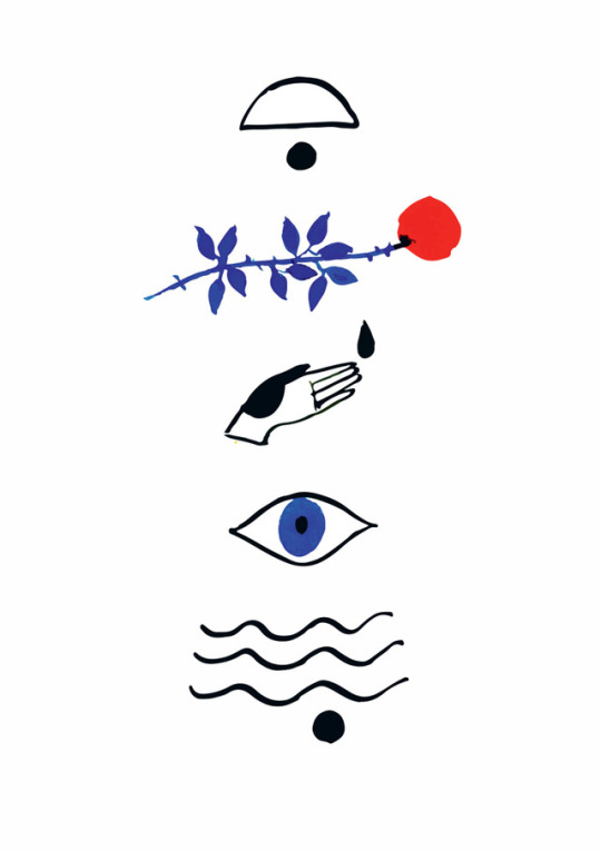

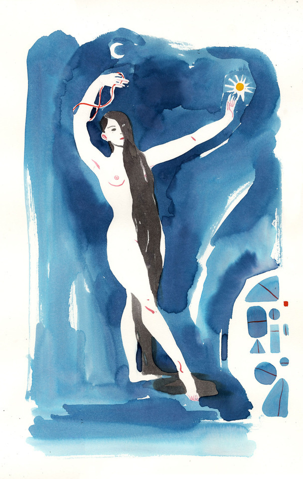
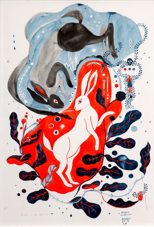
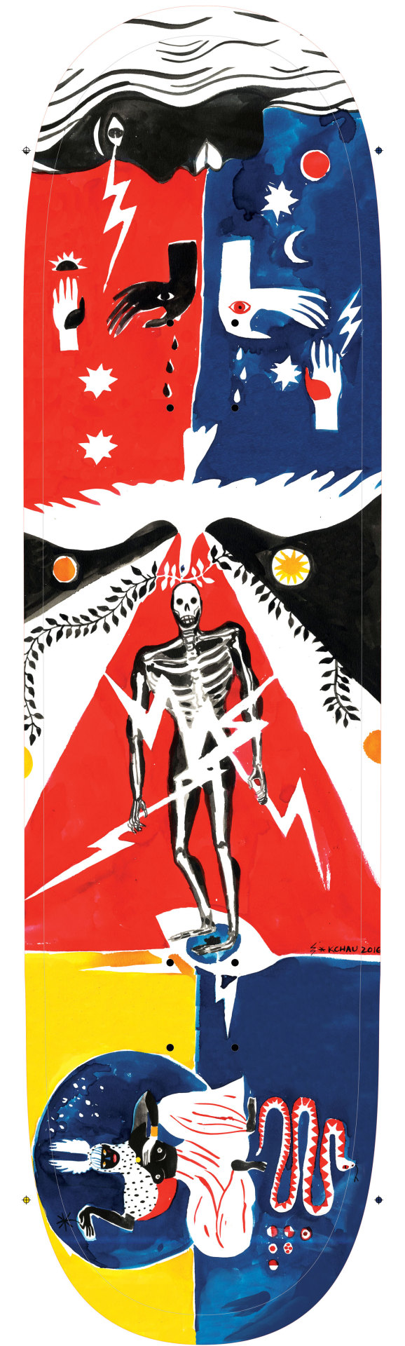

SKETCHY BEHAVIORS | Kris Chau (Los Angeles)
Poetic, fluid and much like a song or ballad, the artwork of Los Angeles based artist Kris Chau sings a visual story on paper, focusing on symbols, shapes, and story-telling. We've been following Kris’s various watercolor and acrylic works, and have fallen in love with the murals she’s created for local shops in her neighborhood. We’re excited to chat with this very talented and magical lady about some of the artwork she makes, what inspires her, and her upcoming projects for 2017!
Photographs courtesy of the artist.
Tell us a little bit about yourself. What’s a little known fact about yourself?
My name is Kris Chau, or Chau, or Chauface. My friend Emilia who does this amazing thing called Pony Sweat, simply calls me FACE. I am from Honolulu Hawaii and currently reside in the fine city of Los Angeles. More specifically the land of Echo Park. As for something weird or strange, I’m pretty sure my cat is my Grandfather re-incarnated. Mostly because my Grandpa loved cats and was a Chinese herbalist. My cat carries a Datura flower in his mouth and leaves it for me in the morning at the door.
How did you first become enamored with art and drawing? Do you remember what your first drawing or doodles were like?
My parents are very stoic, refugees from Vietnam, who laid the groundwork early on in my life that no one is special. So even thought I was drawing things that looked like things as a little kid, it went by unnoticed. And I just thought everyone could draw. It wasn’t until teachers at school or other students started to comment on my assignments or doodles as something different that I realized it was ‘something’ if not special. My first doodles were circle people with legs and arms, and lots and lots of horses. I recently saw some old kid drawings I made my cousins which mostly consisted of Yoshi the Dinosaur and X-men.
Some folks have been drawing from since they were kids, and some folks keep with it and some bail on it. Did you continue drawing in school or was it something you put away and found yourself doing more and more, till it became your identity and life?
I am a drawer. There’s no way around it. I knew early on in life and then when I figured out I could trade my drawings for happy meals or erasers in school, it was on. I sometimes wish it wasn’t so much my identity. That this stirring you feel towards such a specific act, didn’t exist. Then maybe I could hold down a great job and not daydream otherwise, or maybe just come home to watch TV instead of turning into a garage art troll.
There’s a natural fluidity to your work and some reoccurring imagery. Can you tell us a little about the things you like to draw?
Well these days drawing and painting is more about expanding my visual language than it is about just practicing a skill. So if there is a feeling, a story, or a loss, I try to figure out how to sing this song on paper. Lately I’ve been toying with the idea of a universal quiet language that consists mostly of simple symbols and shapes. But I can’t deny i love drawing ladies and weird animals.
What were some of your early art influences, and who are some of your influences now?
One of my all time current art heroes is my dear friend Ako Castuera, and when we became friends we realized there were two books that we had in common that definitely defined my art drawing trajectory. One was the Ordinary Princess by MM Kaye and D’aulaires Book of Greek Myths. Later on in life it became Ben Shahn, Andy Warhol’s old illustrations, and pretty much all art from indigenous peoples. And as kindred spirits in terms of their pursuit of their craft and making their way in life I would have to say people like Hellen Jo, Nathaniel Russell, Yumi Sakugawa, Rob Sato, James Ulmer, Chances With Wolves and Jesse Moynihan.
Can you take us through your artistic process? And how would you say it has changed or evolved since you started?
Well lately I do a lot of meditating and thinking about something before I draw anything. I do lots of research. I try to not be hungry and mostly very comfortable. In the Past I would do sketches or preliminary drawings but these days I think for a very long time and I draw. Very boring, very simple. I try to keep a routine that’s very mundane, so that the rest of my energy goes towards making things. So there’s not a lot of social events or chilling with too many humans. Mostly being alone at least 2-3 days a week, with not too much stimuli. Lots of watering plants and organizing sock drawers.
Artists seem to either keep a sketchbook or just occasionally keep up a sketchbook. Do you keep a sketchbook?
Keeping a sketchbook is important, it’s not as much a part of my life as it once was, but I keep one that might span a whole year. I think the tactile act of writing stuff down in something you can hold is getting lost in this current world. I normally carry a little travel set of color pencils, a sharpener, and my sketchbook. I try to do more life drawings of wherever I am in those books, or color theory tests.
What would be your dream collaboration? Is it easy for you to collaborate or do you find it can be difficult?
I feel like I am living the dream! I recently got to do some artwork for my dudes at Chances With Wolves and I am currently working on some things with my heros Ako Castuera and Hellen Jo! Lately, I’ve been looking at all my illustration jobs or more commercial jobs as collaborations. Or if its a job where I am just a drawing gun for hire, it had better pay my rent. But since I no longer have the fortitude to be someones drawing monkey, everything has to be a collaboration between me and a client.
These days I feel like the people behind the desks are like, okay we are here, who can we help on the come up and feed some integrity into our design or product. So thank you to those golden hearted desk homies, who are pushing against the tide in terms of the corporate design world.
You work with various mediums from - ink to acrylics. What do you particularly love about these mediums or one specifically.
I’m very curmudgeonly when it comes to my supplies. I use Dr. PH Martin’s Concetrated Watercolors, Lascaux Acrylics, and FW acrylic ink. I like trashy paint brushes that I don’t have to sweat, and if I am doing an ink drawing its with a #2 nib crow quill. I don’t like watercolor paper, i use printmaking paper for all my paintings. Although these days I’m more interested in shapes than any linework.
Is there something material wise new you’ve been messing around with or are looking to experiment with?
A new medium is I would like to go 3D at some point with either fabric sculptures or paper mache.
Illustrations have been something you’ve been doing for a while with magazine and various clients. Can you share with folks what that process is like?
Oh man, this is the age old crux of making money off the creative thang you do. Listen up kids, old people, dreamers, fakers, and doers. You make what you make regardless of who is gonna look at it or buy it. I feel very very fortunate that I currently have jobs and clients that are supportive to whatever it is that I currently make and do. But it took a long time to develop my own language that lended itself to peoples needs. When you feel like the act of creating needs to be validated by money or recognition, you end up not giving yourself space to hone your language.
What did you or do you enjoy the most and what are some things you dislike about it?
That being said, my favorite part of illustration work is telling the story or solving the problem with my specific language. The things I dislike about it, is just being someone’s drawing monkey, which can be okay if someone knows what they want. When people romanticize what you do, like you’re a creative unicorn and everything you do will be easy and fun so make me these five logos or graphics in a week. Maybe if I was at home making logos every night for fun, but I’m trying to make paintings, so the day when i make rent with just paintings, maybe the logos will be fun.
You’ve painted on various surfaces and things–how has been making works on a larger scale been for you? Did it come easily or was it something you had to work through and adapt with?
Oh man, I love painting real big on something thats not paper or a canvas. Theres something about it that just feels good, which is why graffiti exists I suppose. Well painting big, exercises the communication between my eyes, brain and hands outside its normal paper sizes. I freehand everything too, no projectors here! Its also athletic in a way that sitting at a desk all day isn’t so conducive to. All the murals and big thangs I’ve painted forced my visual language a certain way, that would read well large scale.
What’s been the weirdest or coolest thing you’ve put your art on, so far?
One of my very favorite big things I got to paint, is a Pussy Party on my friend Garet’s Van. He gets a lot of attention.
What are your thoughts regarding social media for artists? What has been your approach to it?
Whoa heavy topic. Well as someone who was born in 1980, i’m in between. I love how it distributes your work further than you could’ve gotten it just by having shows. I definitely get to live and work from a weird garage and have people find me because of it, so for that I am eternally grateful. What I don’t like about it, is that I feel like people are forgetting what good things look like in real life. Things have to look good on a small screen. So things that pop off or are high contrasted, tend to work very well. But maybe a large scale watercolor won’t translate. Its the same way I feel about going to the movies VS. getting it streamed at home. The ritual of intention is getting lost. Then this new format dictates whats successful out there in the world, when the real life version might be very different. The feed, which does allow for new discovery and wider spread audiences, is taking away the in real life visual impact.
Having lived in various cities but now residing in LA, what’s it been like and what are your thoughts about the art scene here?
I really love LA, there is a certain magic about this place where if you will it and work hard it might actually be possible. I have my own small community of people who make things that I feel very close to, and keep me working. I always say when the times are hard, that we are all lucky to be here in this city right now in this time. I used to share a studio with James Ulmer in Philadelphia at Space 1026, who really helped me push my drawings and paintings on a bigger scale. But when he moved away to take over New York, I was sort of left without my drawing people. So in my heart I knew all my drawing people, who had the same life ideals when it came to making art, lived and flourished in LA.
What’s a question you never get asked but would love to ask and answer yourself!
Your work is often described as whimsical, how do you feel about that? I actually hate that word and in no way do I identify with that, though I understand where you are coming from when you say it. Look Deeper and allow yourself to hear what you see.
What are your favorite Vans? How would you describe your personal style?
Lately I have been wearing the white cracked leather skate hi slims. But I think the 90’s surly teenager in me is looking for some brown authentic with some black laces.
What’s some of the best and worst advice you’ve gotten as an artist?
The best advice from Ken Rignall : Your problem is that you can draw really well, so that is holding you back. You give up if it’s not easy or you don’t have to try very hard to make things look ‘good’ but all your making is decoration.
The worst advice from anyone in the world these days : You gotta work on your brand and your social media presence.
What upcoming projects or collaborations do you have coming up for 2017?
Guys in the Fall of Los Angeles get ready for a power packed show with Ako Castuera and Hellen Jo. There will be events so get ready for that sign up sheet! It will be only show of 2017 because my brain is very fried.
Follow Kris Chau
Instagram: @chaucfacetime
Website: www.krischau.com
Tumblr: chaufacetime.tumblr.com
#Art#vans#vans girls#vans art#kris chau#Sketchy Behavior#illustration#female artist#los angeles art#women artists
92 notes
·
View notes
Text
Lucah: Born of a Dream Review
The post Lucah: Born of a Dream Review appeared first on Fextralife.
The following post is this author’s opinion and does not reflect the thoughts and feelings of Fextralife as a whole nor the individual content creators associated with the site. Any link that goes outside of Fextralife are owned by their respective authors.
Dropped into a striking world of nightmares, will you be able to fight your way through? Better yet, will you be able to figure out what is going on? Lucah is a 2D brawler with a striking visual style, but is that art style all the game has or is there a good brawler here? Read on to find out.
Lucah: Born of a Dream
Genre: Action-RPG, hack ‘n’ slash
Developed by: melessthanthree
Published by: Syndicate Atomic LLC.
Release date: July 17th, 2017
Platforms: PC
Website: https://ift.tt/2kUyLJv
youtube
Game Features
Striking colors and evocative linework elicits an impressionistic sense of ambiguity and tension.
Mix and match over ten different Attack Mantras to create an endless variety of unique combos.
Befriend Familiars and use their ranged elemental magic to turn the course of battle.
Personalize your character with Virtues like slow-motion dodges, stunning parries, or vampiric attacks.
6-7 hour campaign thick with secrets, branching paths, and alternate play modes.
A haunting electronic soundscape binds Lucah into a singular experience of self-discovery through struggle.
Story and Setting
This is going to pain me a little to say, but it needs to be said. The story you get in your first play-through is the most obtuse, edgy, edge-lord nonsense that has ever cut it’s way onto my monitor. The reason why that pains me to say, is that I think there’s a really good story here, but after that first play-through I have no desire to find out more. I have rage-quit out of many games in my gaming history. Even Bloodstained: Ritual of the Night (which is my personal GOTY so far) caused me to ALT-F4 out several times. This has always been due to bugs, mistakes I make, ridiculous difficulty, and so on. Lucah is the first game that made me rage quit over story.
On your first play-through, this game doesn’t explain a single thing. Not a single thing. You are constantly moving to areas and interacting with character without any context what so ever. At first this was interesting but it rapidly grew aggravating, especially when it was combined with the unrelenting edginess on display. It was a never ending parade of me either rolling my eyes in exasperation or furrowing my brow in confusion. None of this is worthy of a rage-quit though.
The rage-quite came when I started a new game+ which started with the game deciding to give me a massive 5+ minute text dump. By the end of it I didn’t know everything, but at last I had context and it just made me snap. Now? NOW you’re going to give me context, after 5+ hours of utter confusing and exasperation? Heck. No. You should have given me this from the start.
The truly frustrating part of this is from that massive text dump, this seems to be a really interesting world. There does seem to be reason for what the heck is going on. But that initial presentation for me is just so horrible, I can’t bring myself to continue playing to find out more. I’m done, and that is truly sad.
Audio and Visual
All it takes is a single glance at a screenshot, and you can tell this game has a very unique art style. The hand drawn, neon colored scribble art style is quite striking. They also have done a good job of animating the scribbles as well, so everything moves in a pleasing way. For the most part this aesthetic serves the game well, but there were a few areas where this causes problems. It can be difficult to tell what is background vs foreground, and at times I wasn’t sure what I could and couldn’t interact with. I never really felt that it interfered with combat, though there were a few times where things felt really busy.
The audio in the game also works really well. It’s nothing that’s going to set the gaming world on fire, but it fits the game very well. Never at any point did I want to reach for the volume controls, and there were several points when I would pause for a moment and note the music. The sound effects are good as well. Every action, strike, and hit has a good sound effect that makes the game feel quite responsive.
Gameplay
The mechanics of this game are good, though it relies a little heavily on reaction-parries for my taste. This also contributes to why I have no desire to complete a second play through, as if you can’t parry consistently you are heavily punished. There is something about reacting to a random action in a perfectly timed button-push that just messes with me. For crying out loud I can’t consistently parry Iudex Gundyr, and I’m sure that statement made some of you point and snicker at me.
Make no mistake, I am not accusing the game of having loose controls. In fact, there is one boss that has a very fixed attack pattern, and once I learned that pattern I was able to wreck it with parries. That was the only time though that I managed to do something like that.
There is also a very good variety of combos available here as well. As you explore through the game you’ll find Mantras, or attack styles. You can mix and match these Mantras to form two custom combo sequences you can switch between at well. Combine that with a variety of Virtues, or passives, and familiars for special attacks, and you get a game that lets you create a combat style that suits you perfectly. Close or far, quick or slow, you can really customize your fighting style here. Which is good, because that’s all you really do as this game at its core is a brawler.
There is one thing though that I wish to praise this game for, and praise it loudly. To all developers who make action games – take a look at this game’s option menu, this game does it right. It gives the player complete and absolute control over the difficulty of the game. You want to make the game a little easier? Turn the speed down by 10%. Want to make the game a little harder? Turn the speed up 10%. Or make the enemies hit harder, or hit lighter, or turn on infinite items, heck give yourself infinite life.
It’s your game, enjoy it how you want to and because of this, I was able to enjoy the combat in this game far more than I was able to enjoy combat in Sekiro. A brutal test of frame-perfect precision, or a gentle (and darn confusing) walk-through an interesting world, you decide.
Replayability
Assuming the nonsense with the story didn’t utterly sour you on the idea of a second play-through, there is definitely lot here that is worth taking a second look at. You can almost look at your first game as a 5 hour-ish tutorial and the reason I say that is there is a corruption mechanic in the game. As you explore it goes up and if you die, it goes up even more. Nothing to stress over in your first game, unless you screw up and leave your game running for three hours which I don’t recommend doing by the way.
On New Game+ however, the corruption meter goes up much, much faster. To counter this, every fight you have is scored. Do well, don’t get hit, get off a bunch of parries, and you’ll get a lot of points which directly translates into corruption reduction. Don’t do well, and you’ll regain very little corruption. This mechanic, combined with an optional, and brutal, dungeon gives this game a lot of staying power past the first play-through.
Pricepoint
If all you’re looking for is a decent 2D brawler that gives you a lot of options for tackling enemies, then this game will be a very good buy for you. Between the custom combos, the scoring system, and the hard optional dungeon there is a lot here for $15. If you’re looking for a good story, I have to put a massive caveat emptor warning up. As I said earlier, I think there’s a really good story here, but it’s deeply marred by bad presentation.
Final Thoughts
I realize that I’m being a bit petulant over the presentation of the story, this is largely because I’m so frustrated over such a botched presentation of what could have been an interesting story. Ignoring that however, there is a good game here. A striking art-style, good music, and a combat system with a level of customization that is rarely seen. If you are interested in 2D brawlers then this is a good game to pickup.
If you enjoyed this review be sure to read next Bloodstained: Ritual Of The Night Review and Attack On Titan 2: Final Battle Review – Reclaiming Territory.
The post Lucah: Born of a Dream Review appeared first on Fextralife.
Lucah: Born of a Dream Review published first on https://juanaframi.tumblr.com/
0 notes
Text
We spoke with Brandon Keeney! His ultra detailed art caught our eye and we’re looking forward to seeing him at Wondercon this weekend!
Q. Out of college you were a 2D animator and then realized everything shifted to CG, what was it like coming to that realization?
I made the realization about halfway through my college courses in Media Arts and Animation, and it was a little sad. I fell in love with the look and feel of traditional animation when I was a kid, but I didn’t really understand the process until I took started taking classes. I immediately fell in love with the process and focused all my school work around it. To have that introduction and spark of passion followed by the constant reminders that it was a dying art form was tough. During my senior year I tried to shift focus towards Flash animation because it combined computers and elements of hand drawn, but the technology at the time wasn’t far enough along to bridge the gap for me. I think if we had been using Cintiqs and drawing directly on the computer screen it would have helped, but the only tablets we had sat on the desk while we looked at the monitors and created a disconnect from the screen and your hand. It also consisted of a lot of shape manipulation and less with drawing.This made the process feel very unnatural to me.
Q. After that realization is that what led you to selling your art?
Shortly after graduation I was introduced to sketch cards on E-Bay. My mom actually discovered them and sent me the information, thinking it was something I’d enjoy doing. I saw artists creating tiny illustrations and paintings and selling them to consumers. Through sketch cards I met many talented artists who were making it work as self employed freelancers. I think that was the primary motivation: to be able to take and pursue the jobs I want and not to have to work for someone else.
Q. Are you anti-CG or have you started to embrace it?
I don’t ever remember disliking CG, or the look of it. The process just never inspired me like traditional art did. Even now, when I work digitally I incorporate traditional techniques and even scan in textures and my penciled linework. Moving 3D shapes around in software just didn’t evoke that same passion in me. The amount of time I had to spend troubleshooting, or learning the software and rendering the scenes drove me crazy. I do love the stuff that is being done with CG though. I think around the time of Tangled, when Glen Keane was trying to incorporate a lot of hand drawn stuff into the production of the film, that CG movies reached an upper echelon of beauty and movement that I hadn’t really seen before that.
Q. Which came first for you the geeky stuff or the art? And when did you combine the two?
They both came at a very early age. I was drawing in elementary school. I would draw non-stop, all kinds of things, but my favorite things to draw were X-Men and Teenage Mutant Ninja Turtles. I grew up around art and it always felt natural to grab a pencil and draw the stuff I was interested in, and what I was interested in was comics and cartoons.
Q. You’re a fan of Star Wars and baseball… can we see them combined in your art in the future?
Ha! That certainly is an interesting idea, albeit has never crossed my mind before. I can’t say it’s impossible, but I’m not sure I’ll be drawing Star Wars baseball illustrations anytime soon.
Q. What’s one tip you’d like to give young artists out there?
Don’t give up. Keep drawing, keep learning, keep struggling, and keep failing. People always tell me I have such “talent” but I constantly remind myself that it is skill, and it is from decades of practicing and making mistakes. Sometimes making the same mistakes over and over and over. It’s not like I could just draw well the second I picked up a pencil, it took a lot of time, and I’ve had a lot of ups and downs with art. The successful artists are the ones who never give up.
Q. The incredible detail in your art really stands out to me, some of it you can see every intricate pencil stroke… how long does the average piece take you? Are you also super obsessive about every detail?
The amount of time I spend on a piece varies considerably. If it’s a portrait with no background I typically spend between 5-10 hours on it, but that changes based on size and medium. Anything more complicated than a single face take considerably longer to finish. Oil paintings take FOREVER to finish because of the drying time between layers. Often times it will take me weeks or months to finish an oil painting because I need to wait several days for it to dry between layers. I prefer to work in acrylic because it dries much faster and I can get in and get to the details sooner. I’m not obsessive, but I know what I like and when something doesn’t look right I will re-work it over and over until I think it does.
Q. In 2014 you were forced to work out of your comfort zone to make larger pieces… are you still uncomfortable with that? and are you pushing yourself to be more uncomfortable?
As I said before, I started doing illustration consistently with sketch cards which measure 2.5″ x 3.5″ and I would squeeze as much detail as possible into them. Once I pushed myself to work larger I found it hard to break away from that micro detail and focus on the larger picture. Not only that, but it was difficult for me to fill large areas of space and make it look interesting. Now for the past 3 years or so I have been working primarily between 8×10 and 11×14 and I find it much harder to go back to sketch cards. I am much looser and happier with large pieces and working larger is far more forgiving. What I mean by that is that if I draw an eye a fraction of an inch off in a large size, it still looks like a the character, however if I make that same error on sketch card it is amplified because the details are so small. I’m constantly trying to push myself and lately I’ve been working 11×17 and trying to create designs that work not only on paper but on t-shirts and enamel pins. As an artist you aren’t doing your job if you aren’t constantly trying to grow.
Q. What do you love and hate about cons?
Conventions are great. My girlfriend Karen Hallion is the one who introduced me to them. We met each other at my first convention. At the time I hadn’t planned on doing anymore, but she convinced me to travel and start displaying my artwork. I am grateful for that because I have seen so many places, and met so many awesome people that I wouldn’t have met otherwise. My favorite aspect of them is just seeing and talking to people. I spend 5 months of the year holed up painting, so when convention season rolls around I am desperate to socialize! I’m so grateful to be able to do what I do, and to be surrounded by others who are passionate about their fandoms and art is just an incredible experience.
My least favorite aspect of conventions is traveling with all my gear. I get very anxious about the logistics, so getting taxis and checking bags with all my prints and heavy suitcases stresses me out. It always works out though so maybe one day I’ll get over it.
Q. Where can our readers find you next?
Here’s a list of confirmed shows I will be attending this year:
WonderCon – March 23-25
C2E2 – April 6-8
MegaCon Orlando – May 24-27
Denver Comic Con – June 15-18
San Diego Comic Con (Tentative) – July 18-22
Boston Comic Con – Aug 10-12
Come out and say hi!
Artist Spotlight… Brandon Kenney We spoke with Brandon Keeney! His ultra detailed art caught our eye and we're looking forward to seeing him at Wondercon this weekend!
0 notes
Photo

Наслов: Inclusive Illustrations, By Design, Линк: http://ift.tt/2pgc4Tg , Садржај:
I like to think that designers solve problems, while artists ask questions. And when the two go hand-in-hand, real magic happens. Why? Because the right question gets answered with the right solution — art asks, and design responds.
Here at Automattic we were extremely fortunate to recently get to partner with independent artist and designer Alice Lee, who seamlessly integrates abstract ideas with concrete solutions. The following is an interview with Alice that is followed by another interview with Joan Rho, the designer who led the project.
JM: How did you become an illustrator?
AL: My path is a little nontraditional. I was always an artistically curious kid growing up, but was never of the “stand-out art star” variety. Rather, I went to business school, and after graduating, I worked at Dropbox as an early product designer.
Some of my first few projects there involved designing for externally facing projects (new user education, onboarding flows, home & landing pages), and I found that adding illustrations really elevated my work — understandably, no one wants to read paragraphs of text describing file sharing. At the time, there weren’t any dedicated full-time illustrators on the team, so I decided to just do it myself, learning as much as possible on the side and receiving guidance from teammates. Eventually I transitioned over into brand and communications design at Dropbox, working full-time as a product illustrator. I left to freelance almost three years ago and have been illustrating since!
JM: I’ve found that many people confuse an illustrator as someone who is “good at drawing.” I’ve found that description to be terribly narrow-minded. Anything to add?
AL: That’s a really interesting question because it describes two key qualities to being an illustrator. The first is the technical ability to draw — one doesn’t necessarily need to be the “second coming of art,” but it is important to possess a foundation in basic draftsmanship. The second is the conceptual ability to think like a designer — as an illustrator, you’re interpreting challenging design prompts and figuring out how to present visual ideas that often represent complex topics.
Having one piece but not the other is extremely limiting; a great illustrator balances and sharpens both. If you have more of the technical art / draftsmanship piece, this limits the type of high-level projects that you can take on and requires a heavy hand by an art director to guide you through. If you’re more of a conceptual thinker but lack drawing fundamentals, it limits the way that you can express your ideas — e.g. perhaps you can only work in a few basic styles. It’s never so black-and-white, of course, but putting the two together in illustration yields high-quality, conceptually brilliant work.
JM: Having worked in the technology world for many years, what recurring patterns have you seen in the kinds of commissions you’ve been awarded?
AL: I’m excited by the fact that illustration has become a huge part of the tech branding landscape; so many companies are incorporating illustration as keystones of their brand. Companies are now developing their own unique illustration styles that build into their brand voice, exploring different mediums, differentiating themselves, etc.
This is exciting to me because I love to work in a variety of styles and mediums; it’s a great feeling to extend yourself as an artist. Many of my recent projects have involved building illustration branding systems in addition to creating the illustrations themselves, and I love bring analog media and textures into a traditionally vector world. We experimented with this a bit on this WordPress.com illustration branding project, of adding a subtle, candid brush stroke to accent vectorized, precise shapes. With little touches here and there, under an editing eye, this interplay between mixed media does a lot to elevate what an illustrative voice is saying.
JM: Tell me about your commission from Automattic.
AL: This project had two parts: 1) the first, building out an illustration branding system: the voice and style guidelines for how to create illustrations that extended the brand; 2) the second, producing 50+ illustrations that expressed this style to be used for the product and marketing collateral.
We went through lengthy explorations of the illustration style: what brand did we want to express, and how could it be expressed visually? A key tension was in balancing the friendly, fun, accessible direction of the brand with the business need of still being professional and refined. In many ways, our final output reflects this: it’s a combination of sturdy, grounded shapes that fill out most of the composition, guided by the expressiveness and imperfection of linework that adds in quirky detail. The solidness of these geometric shapes is still tied in to the prior style of illustration used in the product, but the linework adds in personality, playfulness, and a hand-drawn quality.
JM: What was the same with respect to your past work for tech companies, and what was different?
AL: One thing I’ve noticed is that this balance of “warm, relatable, friendly, fun” and “polished, serious” is a common tension in past work for tech companies. I think this is due to a few factors: first, it’s a natural tension to exist when you’re trying to express complicated, often technical concepts via visually appealing illustrations. Second, though I work with each company’s unique brand voice, you can still see my personal voice coming through across all of my work: energetic, bright, and purposeful.
Something different that I loved was how the team uses the WordPress product to document and comment on the design process, because everyone is remote! We had a central illustration blog where I would post up each round of exploration, pose questions to the team, and receive feedback. At the end of each major deliverable, it was nice to look back on the progression and evolution of the style and work produced. It was a very structured way to document the process, which is lacking when your working files exist solely in emails or asynchronous chat tools.
JM: How did it feel to be pushed harder on the inclusion question?
AL: It was something that I deeply appreciated. We all carry our own internal assumptions and biases; and just like in design, assumptions should be challenged and improved with different perspectives, user research, and critical thinking.
For instance, John, you had just gotten back from doing user research in the field, talking to small mom and pop shops and individual entrepreneurs in the suburbs. In some early illustrations, I had drawn a lot of younger characters sipping coffee on their computers to illustrate people working on WordPress.com, and you challenged the “perfect latte / laptop world” that is a common backdrop in tech illustrations.
This made me realize that there was a whole range of characteristics I was missing from my internal definition of inclusiveness in illustration, due to my own biases: age, occupation, location, lifestyle, socioeconomic background, etc. I worked to place characters outside of the “perfect latte / laptop world,” drawing different backdrops in the larger scenes, expressing different jobs and backgrounds through props and attire, and including a section on how to depict age in the style guide.
JM: What is difficult about taking this direction? And what is easier?
AL: It is always challenging but necessary to address your own biases and assumptions in order to produce better work. In the above example, for instance, user research about who actually uses the product helped inform what the brand illustrations looked like — which in turn results in visuals that are more in line with the business objective of catering to the actual users.
It can be difficult because it’s also personal: the biases in a person’s artwork can also reflect their personal biases. Sometimes it can be hard to be challenged on that, but it’s necessary to acknowledge and no one is ever finished with this journey. I also think it is easier to start with inclusion and representation as core values than it is to tack it on after you’ve finished the branding process.
JM: What are your hopes for how people use this language you’ve produced for us?
AL: Artistically, I hope that this language can be extended and applied across the platform by many collaborators: designers, illustrators, animators, etc. I always love to see how a style evolves, and I also think it is really cool to have distinct mini-styles within a larger brand family — so that would be neat to see.
Socially, I hope that we can use these conversations around inclusivity to spark a larger dialogue in the illustration community about what it means to be inclusive in the work we produce. For instance, I personally rarely see people of color depicted in tech product illustrations (or, on a personal note, even Asian characters). When John pointed out the “perfect beautiful latte / laptop world” bias that’s common in tech illustration, I sat back and thought to myself, “you’re so right!” It made me realize some of my own assumptions about what should be depicted in illustration, and I hope that we can continually challenge each other within the illustration community.
Just like photographers, art directors, and designers, we as illustrators have the power to be thoughtful and inclusive in our work, to create artwork that shows people that anyone can use these products, not just a certain perceived stereotype of who “should” be.
I’ve found over the years that behind every innovative project launched by a company partnering with an outside artist, there’s a special somebody within the company who cared enough to make the case for doing things differently. That person, in the case of this project, is Joan Rho — one of our new Marketing Designers here at Automattic.
JM: How did you come by the work of Alice Lee?
JR: I’d seen Alice’s illustration work before and admired both the quality of her work and range of styles she was able to execute. After a brief initial chat with her about her work, her process, and learning that she was already familiar with our platform having been a longtime blogger on WordPress.com, I could tell she’d be a great collaborator who could help us elevate and unify our brand’s visual language.
JM: What is “design”?
JR: It’s communication, it’s innovation, it’s aesthetics, it’s optimization, and it’s strategic. Design shapes the way a message or experience is delivered. Good design is informed by human behavior—it makes things easier to use, more intuitive, and more enjoyable to experience.
JM: Can you describe the development of this project — from its conception to completion?
JR: Our company, Automattic, was founded on open-source principles: community, collaboration, and hard work. We’re fully distributed with our ~550 employees spanning the globe representing over 50 countries and over 76 different languages. WordPress.com, our major product in our family of offerings, is powered by WordPress, the open-source software project (which was co-founded by our CEO). WordPress.com has been around since 2005 and is primarily known as a powerful blogging platform. However, these days, you can use WordPress.com to do much more—such as starting a website for your business, creating a portfolio, or even just getting a domain name. So, as part of updating our message to communicate this better, we wanted our visual language to also reflect what we stand for and what we offer.
This illustration project was a collaborative effort that looped in many different members of our Automattic team spanning various timezones, cultures, and backgrounds. Some of our collaborators weren’t even designers, but one thing they all had in common was that they intimately knew WordPress.com and Automattic, which helped me greatly as a relative newcomer to the company. I had the benefit of working closely with Kjell Reigstad, a more veteran designer on the team, who was my “brand partner” in this project from the start. Kjell’s knowledge of our brand’s history helped us develop an illustration language that combined a geometric style in line with how we historically represented the WordPress.com brand with a newer, organic style that felt more distinctive and embodied our brand values and personality.
JM: What are a few turning points in its evolution where you saw “inclusion” coming into the picture?
JR: During one of our creative reviews, we were exploring the representation of human characters (which we hadn’t ever used before across our site pages or UI) and it was actually a comment by you, John, that initiated the discussion of introducing more diversity in skin tones, body types, hair color, age, etc. into these characters. Many Automatticians joined the conversation thanks to a prompt by Mel Choyce, sharing personal stories and pictures of themselves and their friends representing a wide variety of people, backgrounds, and personal styles. This provided inspiration for the diverse cast of characters you can now see across our brand illustrations. As a minority female who grew up seeing mostly Caucasians represented in media and design, it’s been very rewarding to help shape a more inclusive brand identity.
JM: When you consider our company, as a fellow newbie as we joined around the same time last year, what lessons do you take away from leading this project with Alice?
JR: Your best work will always be the result of collaboration. Great collaboration happens only with equal trust, respect, and engagement from everyone involved. Leadership isn’t about bossing people around; it’s about fostering an environment that encourages great collaboration.
JM: Any shoutouts for other designers who participated in this work?
JR: Shoutout to Alice Lee, Kjell Reigstad, Ballio Chan, John Maeda, Ashleigh Axios, Dave Whitley, Davide Casali, Mel Choyce, and all of the Automatticians who participated in the brand discussions and creative reviews throughout the process.
You can find these new illustrations by Alice Lee on any of our main pages, such as /create-website, /create-blog, /business, /personal, /easy, /premium, and more!
And you can read the complete story behind these illustrations at Alice Lee’s site right here from the same titled post, Inclusiveness in Illustration.
Filed under: Design, Diversity & Inclusion, WordPress.com
0 notes
Text
The constant battle that is motivation.
As I mentioned in last weeks post about tackling anxiety, I also wanted to write about motivation and keeping yourself focused. I wrote a similar blog post a while back talking about how I tackled keeping myself focused at the time such as the usual 'listen to music', 'go for a walk' etc. A lot of articles on blogs that talk about motivation often feature these same sort of points, so I wanted to try and tackle it from a different perspective in this post.
I wanted to focus less on taking time away from your work and riding out the creative block, and focus more on tackling it head on, speeding up the journey to the other side and learning plenty in the process.
Invest in yourself.
This is something I have done myself recently when I bought myself an iPad Pro, and I'm not at all suggesting everyone should now go out and purchase an iPad, but I just want to get the point across that it's so important to make sure you invest in tools to speed up or improve your workflow. It was extremely hard for me to justify spending so much money on something but after a few talks with close friends and family they convinced me that it was a business investment which made it much easier to spend the money on it, and I can safely say it definitely has improved my workflow. One of the problems I was having is that I was always wanting to draw, but hated drawing straight onto the cintiq because it meant sitting at my desk and it's a fairly bulky piece of equipment with a chunky wire sticking out, but I was fed up of having to scan my drawings in all of the time, so the iPad has really been a perfect meet in the middle piece of kit.
This isn't all just about spending money either, time is the most valuable commodity we have in life, and if you want to live a happy and fulfilled life it's important to spend that time on things that make you happy and things that make you a better person. A good idea is to take some time out, maybe an hour every day or two to learn something new either through a tutorial for example on a website like skillshare or even just taking some time out to read up on some magazines and books relating to your industry. Doing all of these things is an investment into your own practise, skills and mentality as a creative.
Don't know what to draw?
This is something I struggled with for about a year not long after I finished uni. I knew that I wanted to improve my drawing skills and that I needed to draw more often but whenever I sat down to sketch something, I was just blank, I would literally just sit there in front of a piece of paper, stare at it, draw a few circles and then give up 15 minutes later and get on with my day. Then I purchased a really nice sketchbook (what a great idea, buy a really nice sketchbook which I feel like I'm going to ruin if I do a bad drawing in it!) and I basically decided this was MY sketchbook and not even those closest to me would see inside it. One of the biggest things holding me back when drawing is that I was so critical of everything I drew, so having this 'secret' sketchbook meant that I would just force myself to draw whatever came to mind first, even if it was stupid and I could laugh at it and laugh at how bad it was, and it was all just for fun. Doing that one thing seriously helped me just have fun with my work again, and take it from me, you don't have to post EVERYTHING online, and you can certainly take a break from social media, it'll still be there when you get back!
Also, draw from reference if you're stuck! I used to hate doing this, but now I often think of a weird animal I want to draw and draw it straight from photos, no stylistic stuff, no trying to make it my own, just drawing it how it is to really try and understand how it works. This is especially good for those days when you're imagination is a little stale, it helps you to learn more in depth about the topics you draw and improve your skills at the same time. These then are a great help in the future for developing your own versions of each topic from.
Feeling stuck and frustrated?
I've been feeling like this a lot lately, 8 years after I started on a creative path and I finally feel like I've got a solid process and a personal style that I am really happy with. However, I hate being comfortable, when I'm not comfortable it's all I want but when I get there it's boring. It's the same with goals, it's not about reaching the goal, it's about the process. Once you reach the goal, that's it, what next? It's boring. The best thing I've found for myself, although it will be different for everyone, is to change up either my materials or technique. To try something that I'm not so confident in but something that I know I would like to be able to include in my work, so something that is a challenge but also something that I'm passionate about so that I have the drive to see it through.
For example in the past I've gone from using a standard HB pencil to a mechanical pencil with blue lead, which worked absolute wonders. I then got a little fed up with that, and although I still use a mechanical pencil daily, introducing a standard coloured pencil (either blue or red) into my work flow has also worked miracles, especially when it comes to roughing out an idea because I can make it a lot less refined and controlled, especially if I don't sharpen the pencil often. I've gone from line working my illustrations in Photoshop to Sketchbook Pro and now Manga Studio. I've also gone from having a very refined process for the colouring stages to the point now where I still carry out that process, but then also try and introduce more painterly elements. For example I might paint in a background or texture with no linework or shading, completely the opposite to how I normally work. Sometimes these ideas don't work at all and I end up scrapping them, but I usually learnt something from it and had fun in the process.
No direction?
It is extremely easy to feel completely lost in life. Anyone can feel it at any time, no matter what you do and for any amount of time, but it is especially common in people who work for themselves or have dreams in life to achieve big things. When you're starting out on a new path towards your dream life, you won't get anywhere unless you know exactly where you're going, and give yourself some direction. That's where goals come in, how can you possibly work towards something if you don't know what you want? The same applies to a college brief for example, you are usually told why you're doing the project (this might be to meet a specific requirement of your course) your deadline (what sort of time frame you have) and the outcome (the end goal). The same applies to anything in life, you have to know what you want, when you want to achieve it by, why it is important (if it is not important to you personally or if it doesn't add anything to your life then remove it) and what the end goal is.
The best way to set goals (I do have my own goal sheet I work from which I will share sometime in the next month or so), is to set long term, mid term and short term goals (10 years, 5 years and 1-2 years). Once you have set these goals (make sure they're big and life changing, don't limit yourself on what you 'think' you 'might' be able to achieve, dream big or go home!), work backwards from those end goals. Think about all the smaller steps you'll need to achieve those goals and start working them into your current lifestyle.
Start a personal project.
I think that this will be more relatable to current professional creatives over those still studying and that is purely because while studying a lot of students don't realise how much time they actually have and how beneficial it would be to work on multiple personal projects, developing skills and projects so that they're ahead of their competition. When you're working a creative career though, especially if you're self employed it is extremely difficult to find the time to work on your own ideas alongside all of the client work, networking, taxes, finances, travelling, meetings, admin, marketing, phone calls etc. So taking the time out to do a personal project can be difficult to squeeze in, but it's so rewarding. If done properly, it can be time well spent de-stressing and having fun whilst still producing amazing work and learning on the job.
I hope that you guys are enjoying these more informative posts! I'm going to try and include more posts like this in between posts about projects I've been working on. Although I do have some more Escape from Fusion Earth characters to introduce to you so it might be back to that next week! If this post benefited you in any way, please share it around to any friends or followers you think may find it in handy too!
Thanks for reading!
#Illustration#illustrator#freelanceillustrator#characterdesign#conceptart#inspiration#blogging#blog#gamedesign#Selfemployed#advice#art#artist#design
0 notes
Last Seen Blogs

phfabio00
Non smettere di sognare

soniablota-blog
Untitled

kalbitozyutmussirlar-blog
*biz seninle şiire konu olan başrol oyuncularıyız

valiantlytenaciousmakercooldougl
Untitled

eclectic-elf
Eclectic Elf