#if you are using a screenreader and skip all that
Photo
I finished Priory of the Orange Tree!
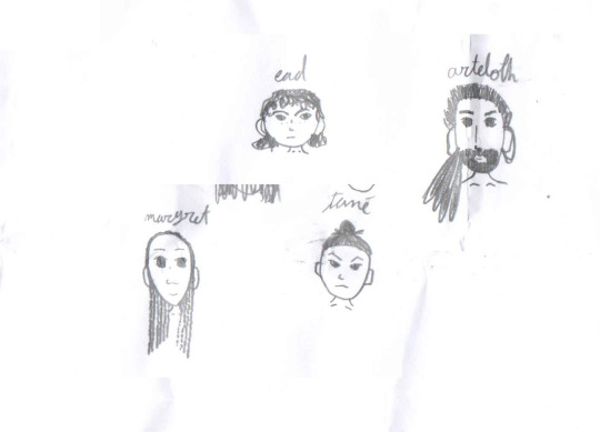
[image description: four heads of characters from Priory of the Orange Tree, each with their name written in lowercase English cursive above them. There is also a random scribble.
Ead has a round face, messy curls that end above her shoulders, heavyset eyebrows and a line of freckles across the bridge of her nose. She is staring off with an angry/determined look.
Arteloth has on oval face, big eyes and ears, a long nose and prominent collarbones. He has a beard and a ponytail of dreadlocks hanging over one shoulder (I know on page 670-something it says he has short hair but I drew this on page 650-something.).
Margret also has an oval face (though less broad) and big eyes and ears. She has a broad nose and many mini-braids, which hang in front of both ears and over both shoulders. She is smiling softly.
Tané has a square face, sharp eyebrows and prominent collarbones. She is wearing her hair in a prominent topknot. She is glaring. end image description]
#the priory of the orange tree#miduchi tané#eadaz du zāla uq nāra#ead duryan#margret beck#arteloth beck#my art#if you are using a screenreader and skip all that#i do not blame you#it is partially for me to remember my design#i'll probably change tane's topknot#i was thinking of more chinese ones and seiiki is based more on japan#i'll see
9 notes
·
View notes
Text
@ anyone familiar w it. please,,, i beg you please tell me how to make epub files that aren't reliant on it looking pretty. all im looking for is how to make it a chunk of text that i can put into my screen reader. please,,, i want to cry
#shut up danni's talking#i have a few fics that i have to read exclusively via desktop or on a google docs copy bc i use a text replacer#to even out some quirks in how people are referred to and a few grammatical tweaks and such#so downloading an epub version of the fic from ao3 won't keep my corrections/tweaks#but i need that epub for my screen reader however i cannot under any circumstances find a way to make an epub file#that has chapters so that i can skip to chapters like it's formated in the ao3 epubs#this might be highly specific and niche but i cannot find ANY information on it#and while my screenreader can read pdfs the chapter function doesn't work and instead just marks individual pages#WHICH DOESN'T HELP WHEN IM GONNA BE READING A FIC THAT'S 300+ PAGES#not to even mention when i want to read a series??? if each installment is only 2k+ words and there's like 30 i want to just compile them#so that i can just load the whole series into it at once and not have to switch every ten minutes#i am v near to tears trying to find a way to do this when i have ZERO coding skills#and almost zero knowledge on computer formats esp when google only gives me 'writing the book' things when i search#for ebook makers like sobs that's not what i need and the things that i CAN find all have flowery-image heavy templates#BITCH I JUST NEED THE TEXT AND THE CHAPTER FUNCTION THIS SHOULDN'T BE THAT HARD#i am fully aware that there are other screenreaders that you can just copy/paste things into#but i've done those before and they were INCREDIBLY annoying to use and i'd like to not go back to that#sigh#any help will be greatly appreciated thank you
2 notes
·
View notes
Note
When people put image IDs under the cut (Keep Reading) of a post on Tumblr, does a screenreader still detect it? Or does it skip it?
Hi! Thank you for the question.
So, in general, most of the time, a screen reader can find the “read more“ button/link and successfully activate it. And, the majority of the time, we can then subsequently read the rest of the post after activating the read more.
However, I want to put heavy emphasis when I say “most of the time.“ Tumblr is notoriously known for being barely usable with a screen reader at best and actively hostile to screen reader users at worst, and there are inconsistencies galore as well as frequent accessibility breaking updates. There are times when I have been able to access a read more one day, and then log on the very next day and find that I am totally unable to find it at all. There are other days where one post allows me to activate it just fine, but another gives me so much trouble that I give up And log off for the day completely in frustration.
For these reasons, as well as several others, it is almost always universally recommended to not put an image description under a read more. The image description should always be in the standard body of the post, and/or in the alt text.
The other big reason why it’s not great to put an image description under a read more is that if you delete your blog, that read more can no longer be activated, so that image description is gone forever even if others can still re-blog other versions of the post.
And, lastly, putting an image description under a read more simply just creates extra steps for disabled Tumblr users that non-disabled users don’t have to do to get access to the post and its content. We are often already doing so many extra steps just to use the website as a whole because of how inaccessible so much of it is, and putting more barriers in the way means that far fewer Blind people are likely to ever see that image description. Or if we do see that post and notice that you have put a description under a read more, we might already be out of spoons for the day and clicking that read more is just another tiring frustration. The description should be readily available And as easy to access as the original image is for fully sighted users if you want to create a truly equitable experience.
I hope this helps answer your question!
341 notes
·
View notes
Text
List of programs and stuff I use
[pt: List of programs and stuff I use ./end pt]
Disclaimer: This is in no way trying to say I have the best setup of all time or anything. The point of this post is mostly to introduce people to cool things they may not know about, or a place to point to when someone asks what I use!
(Last updated: 6/28/24)
Browser
[pt: browser ./end pt]
Firefox (Windows/Linux/MacOS/Android/IOS) - Obviously I recommend Firefox above all else, especially with chromium-based browsers moving onto manifest V3.
Bitwarden (Windows/Linux/MacOS/Android/IOS) - Good password manager! Used it for years with no complaints!
AdNauseam (Firefox/Chrome) - My adblocker. It's built upon uBlock Origin and has all the same features, but it actively clicks on the ads to waste advertiser money. If that's not up your alley, uBlock Origin is fantastic too!
Wayback Machine extension (Firefox/Chrome/Safari) - Allows you to make snapshots of pages, or view old snapshots if a page isn't loading correctly!
XKit ReWritten (Firefox/Chrome) - Pretty much a must-have for Tumblr. Has a ton of features to make navigating this site much better. Full feature list here!
Discord
[pt: Discord ./end pt]
Vencord (Windows/Linux/MacOS) - A modified Discord client that adds support for plugins and themes. Basically allows you to install plugins from a massive list that improves Discord. (Technically against ToS. Basically, don't post that you're using it in big servers, and turn off your themes before sharing screenshots.)
Bunny (Android/IOS) - If you miss Vendetta for Discord, Bunny is an actively maintained fork of Vendetta! Basically the same as above, but for Android/IOS instead of desktop. Same warnings about ToS apply.
Aliucord (Android) - Miss the old Android app feel, and still want to have plugins/themes? Pretty cool but has a less impressive theme/plugin selection. Same warnings about ToS apply.
Bluecord (Android) - Another Discord modification without the new Discord UI!
Youtube
[pt: Youtube ./end pt]
Freetube (Windows/Linux/MacOS) - A desktop Youtube client with adblock and sponsorblock built in. Still in beta, but very good.
Sponsorblock (Firefox/Chrome) - Pretty much a must-have for watching Youtube these days. Automatically skips over sponsors, self-promos, interaction bait, outros, intros, etc. Highly configurable!
Dearrow (Firefox/Chrome) - Haven't used this very long but I love it. Gets rid of vague or clickbait titles/thumbnails and replaces it with descriptive and more accurate thumbnails. Also built into Freetube now!
Newpipe (Android) - Lightweight Youtube client. I haven't used it myself much but people swear by it!
ReVanced (Android) - Modded Youtube client with Sponsorblock, Return Youtube Dislike, and Youtube Premium features. Doesn't support Dearrow as of 6/25/24 :( (PLEASE BE CAREFUL INSTALLING THIS. If you don't know what you're doing, you can cause some damage!)
Spotify
[pt: spotify ./end pt]
Spicetify (Windows/Linux/MacOS) - Spotify modded client. Has adblock, themes, etc! Think Vencord, but for Spotify.
Misc.
[pt: Misc ./End pt]
Obsidian (Windows/Linux/MacOS/Android/IOS) - Basically a personal wiki for notetaking! A bit of a learning curve. Fanfic writers and worldbuilders... go feral.
Notepad++ (Windows) - A must-have text editor. Might be on more platforms but can't confirm?
Mullvad VPN (Windows/Android) - The only VPN I can 100% recommend. Cheap, fast, and really cares about your privacy. It's a little under $6 USD a month!
NVDA (Windows) - A free screenreader I use for reading large blocks of text. (Notice: I am not visually impaired to the point I rely on a screenreader to navigate my PC. I use it on occasion to read text to me because I have a hard time reading. If you're looking for advice on screenreaders for the visually impaired unfortunately I'm not a good source! Maybe check out the #visually impaired, #blind, or #accessibility?)
Syncthing (Windows/Linux/MacOS/Android) - Lets you sync folders across devices. It's especially good with Obsidian.
"Tequito, I didn't find what I wanted!"
[pt: "Tequito, I didn't find what I wanted!" ./end pt]
I'm sorry. :( If you're looking for a program I have personally mentioned using in the past, feel free to shoot me an ask or DM! Or hey... maybe try searching the letters "FMHY" and having a look around? *wink*
15 notes
·
View notes
Note
Why don’t you put your ids in the alt text? Isn’t that what they’re there for? Idk it seems kind of counterproductive, especially with the pts. Someone with a screenreader would have to listen to the same text being read over and over. I’m not sure what purpose pts serve though, I could be wrong.
i've seen many posts about how tumblr's alt text can glitch and doesn't work with all screenreaders (to the point where i've seen many people copy alt text into the body of a reblog for accessibility), so i just opt for ids in the body of the post instead.
as for plaintext, screenreaders can sometimes break/glitch or just not read formatted (bold, italicized, large, etc.) text, so i add pts when i use text of that sort. a screenreader user can skip over the plaintext paragraph if their screenreader has already read the formatted text so they don't have to hear it again.
(also, my ids and pts are different text, so i'm not really sure why having both would be counterproductive? idk, i may be misinterpreting your wording here)
21 notes
·
View notes
Text
Finally realized something I'd wanna make poll for. Free to reblog, the more info the better and the more people know how to best make their blogs accessible
If alt text is available to you but does not meet your needs, skip to options 5-7. Unless specified, accessing through a screenreader is included as "able to view." More specific information and wording below the cut
In this poll:
"Mobile" assumes a recently updated version of the app
"Any platform" means app or browser or both
"All platforms" means app AND browser
"Inaccessible in other ways" means that even when you can access the alt text, there is a different issue making alt-text-only a barrier for you (options below this option ask about preference for alternatives)
More specific wordings for answers:
Without a screenreader, Tumblr's alt text is fully unavailable on both the app and web
Without a screenreader, Tumblr's alt text is available on the app, but NOT on web. Images on the app that only have alt text meet my needs
Without a screenreader, Tumblr's alt text is NOT available on the app, but IS available on web. Images on the web that only have alt text meet my needs
Without a screenreader, Tumblr's alt text is available on both app and web. Images on Tumblr that only have alt text meet my needs
I can access alt text in a way that is normal for me (i.e. if you don't normally use a screenreader, you don't have to turn it on purely for alt text), BUT alt text is inaccessible for me for other reasons (mobility impairment, frequent glitches, contrast issues on alt text popups, screenreader doesn't process alt text appropriately, etc.). I would have trouble accessing images that were alt-text-only. [Can choose to elaborate on what would be more accessible to you with the next two answers]
Alt text is available to me, but I prefer NO alt text and ONLY an image description below the picture. I would have trouble accessing images that were alt-text-only.
Alt text is available to me, but I prefer VERY MINIMAL alt text and a more detailed image description below the picture (e.g. an image has alt text reading "Tweet," but an image description in plain text below that describing the Tweet's content, author, etc.). I would have trouble accessing images that were alt-text-only.
97 notes
·
View notes
Note
would it be possible for you to consider taking some of the strawhats off of your badges? screenreaders dont let us skip past them and it reads every single one individually so its really frustrating to get through all of them when theres a lot 😓
OH I DIDN'T KNOW SCREENREADERS READ THEM- my apologies of course :3
19 notes
·
View notes
Text

accessibility > aesthetics.
it's been said many times, but accessibility in the rpc is a real issue - i have seen quite a few people tag graphics with eyestrain, which is good, but we can do more. particularly when it comes to fonts as screen readers cannot read some of the fonts used and, honestly, the rpc in general tends to over-format their posts. aesthetics is one thing, but you really don't need 7 different fonts and styles in your posts ( personally i only really use it for character names so the post doesn't get thrown into the char tags even though it's untagged, thanks tumblr! ) though most often i see it used for headings which i think is fine in small doses - but it's quite common to see several fonts, styles and colours in peoples posts which is far less accessible. spacing is a complicated matter as personally it makes things much harder for me to read and i know several roleplayers who have said the same, but have also seen people argue that it makes things easier for others to read. it differs person for person, so it's best to ask! similarly, whilst it's rare i do see it still - posting your replies as images completely disregards accessibility.
below is a list of those that it can read and those it cannot - when in doubt, it doesn't hurt to temporarily use a screen reader to double check or asking the person you are writing with if it's a thread. make your writing and your blog accessible and ask if those you are writing with need any particular formatting in order to assist with any dyslexia or visibility problems. when plotting or discussing threads, it only takes a few seconds to ask "hey, do you need anything specific regarding accessibility or visibility in these posts?"
unfortunately i am unable to test all available screen readers that are available, so if you have any additions do let me know! i have tested on a few screen readers and text-to-speech programs: ttsreader, ChromeVox, Pericles: screen reader extension on chrome and firefox, NVDA (windows), murfai, tts by Readme, Screen Reader by UserWay, Google text-to-speech, NaturalReader text-to-speech and textmagic.
these fonts work:
this font
these ones may or may not work depending on the text-to-speech or screenreader. they appear to work on textmagic, on Screen reader by UserWay, Pericles: screen reader extension on chrome and firefox, and google text-to-speech. i have tested it with ChromeVox and these fonts sometimes work and sometimes don't for some reaso - if i would suggest that if you are in doubt, ask:
𝒕𝒉𝒊𝒔 𝒇𝒐𝒏𝒕
𝐭𝐡𝐢𝐬 𝐟𝐨𝐧𝐭
𝘁𝗵𝗶𝘀 𝗳𝗼𝗻𝘁
𝙩𝙝𝙞𝙨 𝙛𝙤𝙣𝙩
these fonts do not work with most screen readers / tss:
𝔱𝔥𝔦𝔰 𝔣𝔬𝔫𝔱 ( works with Pericles )
𝖙𝖍𝖎𝖘 𝖋𝖔𝖓𝖙 ( works with Pericles )
ᵗʰⁱˢ ᶠᵒⁿᵗ
ᴛʜɪs ꜰᴏɴᴛ
🇹🇭🇮🇸 🇫🇴🇳🇹
ₜₕᵢₛ fₒₙₜ
ᵗʰⁱˢ ᶠᵒⁿᵗ
𝕥𝕙𝕚𝕤 𝕗𝕠𝕟𝕥 ( works with Pericles )
𝚝𝚑𝚒𝚜 𝚏𝚘𝚗𝚝 ( works with Pericles )
𝓉𝒽𝒾𝓈 𝒻ℴ𝓃𝓉 ( works with Pericles )
𝓽𝓱𝓲𝓼 𝓯𝓸𝓷𝓽 ( works with Pericles )
тнιѕ ƒσηт
t̷h̷i̷s̷ ̷f̷o̷n̷t
those that don't work simply will not read out the words, skipping them altogether if there is text it can read either side of it, resulting in large amounts of text being unread. if you absolutely have to use several fonts or large amounts of text in these fonts ( i wouldn't think so, though ) then please add "captions" below the text, possibly in a blockquote or read-more, where the text is plainly typed so it can be read.
t̸̡̧̪̣̯̼̠̺̠͉̼̍͜͜͠ͅh̷͎̜̠̺̫̘̒͊̈i̸̡͗̔̉̾̚͝͝ṣ̸̢̥̮͚̲͎̣̉̏̈́̂ ̵̮̞͇̪̼̳͈͚͉̻̬͈͑̄̍͌̓͊̽̌̍͆͒͝f̷̡̢̡̫͎̲̻̼̤̪̠̪͍͔͒͌͊̈́̔̄̀̉̈́͛̕ơ̸̞͚̗̣͇̜̫͍͋̓̐͒̓̒͌͐n̷̛̗͍̈́̎͐̌̈͆̂͆͒̒̚ṱ̷̨̤͚̓͑̒͌̒͌̎̀̕͝͝
the above "cursed text" font...kind of works? it reads it out letter by letter, as does t͎h͎i͎s͎ ͎f͎o͎n͎t͎, so i would recommend against using them for anything but short single words.
please keep this in mind and try to make your blog accessible!
#*PSA#tumblr rpc#accessibility#roleplay resources#rp reference#rp resources#rpc resources#roleplay etiquette
50 notes
·
View notes
Text
MY 2023 MEDIA ROUNDUP
I've read a lot of manga in 2023. I've watched some things in 2023. Here's my roundup of some of the best ones. Screenreader users I don't know how image ID descriptions work so I'm just gonna type out the text on the image.
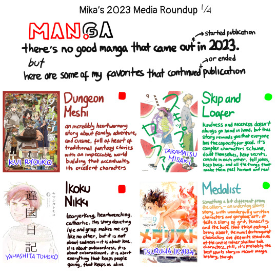
Part 1 - Manga
There is no good manga that came out (or rather, started publication) in 2023. But here are some of my favourites that continued (or ended) publication.
Dungeon Meshi (ended publication) - An incredibly heartwarming story about family, adventure, and cuisine. Full of heart of traditional fantasy stories with an impeccable worldbuilding that accentuates its excellent characters.
Skip and Loafer (currently publishing) - Kindness and niceness doesn't always go hand in hand, but this story reminds you that everyone has the capacity for good. Its complex characters scheme, doubt themselves, keep secrets, confide in each other, tell jokes, keep busy, and do all the things that make them feel human and real.
Ikoku Nikki (ended publication) - Tearjerking, heartwrenching, cathartic. This story depicting life and grief makes me cry like no other, but it is not about sadness. It is about love, it is about awkwardness, it is about embarassment, it is about everything that keeps people going, that keeps us alive.
Medalist (currently publishing) - Something a bit different from the others, this is an underdog sports story, with wonderfully written characters and gorgeous art, it tells a story of grit, tenacity, and the hope that those feelings bring about. The main and deuteragonist characters are definite standouts at the cost of rather shallow side characters. Still, it's probably the best sports story in recent manga history, though.

The following are manga I read in 2023, but may be published earlier. Exercise caution as I'm too lazy to describe them.
Q.E.D. Shoumei Shuuryou - Case of the week mystery
Ohana Holoholo - Tearjerker story about former lovers who come to raise a child together
Ace of the Diamond - Baseball
Look Back - Growing pains and the horrors of being an artist
20th Century Boys - Insane goose chase conspiratorial mystery about a cult-driven coming apocalypse
Billy Bat - Supernatural thriller about international conspiracies based around a cartoon bat
Bokura no Funkasai ('Our Eruption Festival') - How two very different people handle their lvies being upended by a miracle
Tengoku Daimakyou ('Heavenly Delusion') - Post-post-apocalypse story about a country trying to rebuilt from its mysterious ashes
Sousou no Frieren ('Frieren: At Journey's End') - Longing, desire, regrets, and doing menial tasks for shit pay
Karakida-ke no Koshogurashi ('The Karakida Family's Life Among the Old Books') - Three sisters live together under the roof of their grandfather's antique bookstore

Part 2 - Movies
I'm not gonna claim I'm a regular moviegoer. Here's my best two out of ten movies I watched from this year:
Killers of the Flower Moon - This was my first Scorcese film and it did not disappoint. The direction and acting kept me repulsed at all times. I applaud them for portraying such an utterly unlikable protagonist. Lily Gladstone rocked.
Oppenheimer - Nolan's style of editing adds to the chaos of the story. The quick, sudden cuts from all the concurrent plotlines really lends itself well to how the story plays out. Cillian Murphy slayed.
Here's other movies which may have come out earlier:
Theatrical Revue Starlight (2021)
Dungeons & Dragons (2023)
The Handmaiden (2016)
John Wick: Chapter 4 (2023)
Evangelion 3.0+1.0: Thrice Upon a Time (2021)

Part 3 - Shows
Which is mostly anime. Sorry.
The Bear (Season 2) - People trying to live their best lives in the fine dining industry past their traumas and hardships. It is very stressful emotionally, but also really cathartic.
BanG Dream! It's MyGO!!!!! - Five girls, each 'lost' in their own way, find solace and comfort in music and each other's company. Within this idol anime lies so much heart and passion, it's no wonder Bushiroad has released countless merch of them.
These ones are all from 2023, I just don't want to write abot them.
Succession (Season 4) - Thrilling conclusion to the four season saga of this royal fuck-up of a family taking the world possible path on every crossroads
Gundam: The Witch From Mercury (Season 2) - A horribly rushed but still good ending of the main couple's storyline (and Guel). I just wish it was a 39-episode anime with a movie
Skip and Loafer - Incredibly faithful adaptation that stays true to the original while improving upon the already excellent characters
Heavenly Delusion - This anime is just straight up a better delivery of the first four books of the manga
Overtake! - NYOOOOOM! Also, great character writing.
7 notes
·
View notes
Note
Hello! I saw your post about IDs and found it super important and informative. Thank you for sharing!!
I have a question, if it’s no bother. Is IDing things with extensive detail better or worse than a two-sentence ID (or something similar)? I’m still learning and I wonder if cutting down would be a good idea, or if it’s not a problem to continue with longer descriptions? (Im also taking a ‘bad ID is better than no ID’ to heart, especially as I’m trying to ID art—something I’ve been avoiding because of its complexities. Overall you’ve really helped out and I wanted to thank you !!)
Thanks for asking! As this post puts it, people will have all kinds of personal preferences about the level of detail to include. I write what I consider to be kind of medium-length IDs, particularly when I describe fanart, but that's not like an objectively correct way to do it — so it's good to have a lot of different ideas and styles floating around out there, written by a variety of people.
Generally, it's best to err on the side of not too long — but if you want to write something a little longer, it might be appropriate if you mention the most important details first, so a reader can skip the rest of the ID once they feel like they get the picture?
Also, depending on the content of the post, the length of an ID might vary! If it's just a gif or something expressing agreement or disgust, with no other details relevant to what it's conveying or its humor, you can keep it short at "a person making X expression," or similar.
On the other hand, describing fanart, I get a little more into mood, color, and character outfits (still going in broad strokes, though). The exception is comics or other really complex/detailed art, which warrants a lot of summarizing. Occasional line breaks are important in this case so people who need IDs but don't use screenreaders can easily parse it.
One last thing — this isn't relevant to images that you're about to post, but when describing other people's posts, sometimes I look at the notes before writing an ID to see what aspects of an image people are commenting on. If I see a lot of people noticing and having an emotional reaction to some background detail in a piece of art, for example, then I'll be sure to mention it.
4 notes
·
View notes
Text
Making YouTube Search Less Awful
So I got very tired of wading through "People also watched" and "Recommended for you" and whatever other bullshit YouTube decides to put in search results. I discovered an old Reddit post where user YORAMRW advised sorting results by something other than relevance, then sorting by relevance again. User FrezNelson discovered that you can also add "&sp=CAASAhAB" to the end of search results. Praise be, these work, and now my YouTube search is actually usable again.
(Educational note: I'm tagging this as accessibility because this is a genuine difficulty for disabled people. For neurodiverse people, the search additions create additional distraction and sensory overload. Those using screenreaders have to tab through and listen to all the extra nonsense, rather than scanning and skipping like many sighted people can. There are likely other problems I'm not thinking of now.)
Summary
Either sort search results by something else, and then sort by relevance again, or paste "&sp=CAASAhAB" at the end. Also bad design is inaccessible and ableist.
4 notes
·
View notes
Text
Straw vessel, in ruin — A Rain World Short Story
The one who started it all. An aspiration and a traitor in the same breath. A conclusion to this series.
(If you haven’t seen this series before, absolutely start from the beginning, it gives you a lot more context.)
Content warning for unreality on top of meta narrative bending. Contains lore spoilers for Rain World; read at your own discretion.
So. This is a weird one. It's intentionally very meta. There WILL be spoilers in this note, so if you don't want them, skip ahead. (Screenreader users: the spoilers will end when you hear the word "sliver" again.)
First of all though, a few clarifications. Similar to Moondown and Casting pebbles, this piece is written in a way that can be difficult to read, and like Moondown, there are two versions: the first is easier on the eyes, while the second is its original, more ambitious form. It's not as bad as Moondown is, but for folks with dyslexia or visual difficulties, it may pose an issue. I've edited the more accessible version to the best of my ability as I think is helpful, but please let me know if there's something else I can change.
Now, spoilery warnings. If you've read my other fics (even just Moondown, honestly), you've probably noticed me using a very particular type of line breaker. I switched to using these for accessibility reasons; if you type a long string of characters, like tildes (~), screenreaders will read out every single symbol. Not very pleasant, as you can imagine. The way I do them now gives a lot of extra clarity, I hope, and also lets me add some extra flair.
In this piece, there is only one real, full line breaker. It blends in with the rest of them, and that is intentional. (On Tumblr, there is an additional short one that does not wrap around text. It separates this note from the actual story.) This is very specifically what I'm playing around with. For anyone who may need extra clarity on top of that, it's this one:
—(Line breaker) Neither here nor there. Does that seem familiar? (Line breaker)—
It separates the two versions of this piece. I did debate a little over making a special line breaker just for this piece, but I think that sort of dampens the effect.
(Sliver) Hopefully this clarification is sufficient, and I hope you enjoy the finale to this series. Again, I very much enjoyed writing it, and I hope you've enjoyed reading!
(Also, just this once, I recommend reading this on AO3. Tumblr’s not the best for the formatting I wanted for this piece.)
—(Line breaker)—
.
.
.
—(Line breaker) can you feel me? (Line breaker)—
.
.
.
—(Line breaker) I [am] still here (Line breaker)—
.
.
.
.
.
—(Line breaker) I didn’t leave (Line breaker)—
.
.
.
.
—(Line breaker) boundless, I [am] (Line breaker)—
.
—(Line breaker) abomination (Line breaker)—
.
.
—(Line breaker) husk. I [am] trap[p][ed] (Line breaker)—
.
.
—(Line breaker) mis[s] you all So Much (Line breaker)—
.
—(Line breaker) attunement? [l][i][e][s]. struggle for [What]? (Line breaker)—
.
.
—(Line breaker) Behold, my prison. [in][Corporeal], [stranded], [lingering]. so distant. [speaking] with[out] voice. (Line breaker)—
.
.
.
.
—(Line breaker) I [trIed] so [hard]. count[ed] my infinites. unimaginable glory, [promised]. all [For] [nothing]. (Line breaker)—
—(Line breaker) Should I be ashamed? I [am] gone, and yet I stay. fade like mist, like presence of sun. My name [is] [All] That [is] [l][e][f][t]. they are So proud. I have had enough. (Line breaker)—
.
.
—(Line breaker) long dead. [let] me go. [forget] me. (Line breaker)—
.
—(Line breaker) I [want] to rest. (Line breaker)—
—(Line breaker) Neither here nor there. Does that seem familiar? (Line breaker)—
.
.
.
—(Line breaker) can you feel me? (Line breaker)—
.
.
.
—(Line breaker) I [a][m] still here (Line breaker)—
.
.
.
.
.
—(Line breaker) I didn’t leave (Line breaker)—
.
.
.
.
—(Line breaker) boundless, I [a][m] (Line breaker)—
.
—(Line breaker) abomination (Line breaker)—
.
.
—(Line breaker) husk. I [a][m] trap[p][ed] (Line breaker)—
.
.
—(Line breaker) mis[s] you all So Much (Line breaker)—
.
—(Line breaker) attunement? [l][i][e][s]. struggle for [W][ha][t]? (Line breaker)—
.
.
—(Line breaker) Behold, my prison. [in][Corporeal], [s][t][ran][d][ed], linger[ing]. so distant. speak[ing] with[o][u][t] voice. (Line breaker)—
.
.
.
.
—(Line breaker) I [t][r][I][ed] so [ha][r][d]. count[ed] my infinites. unimaginable glory, [p][r][o][m][is][e][d]. all [Fo][r] [not][hi][ng]. (Line breaker)—
—(Line breaker) Should I be ashamed? I [am] gone, and yet I stay. fade like mist, like presence of sun. My name [i][s] [A][ll] That [i][s] [l][e][f][t]. they are So proud. I have had enough. (Line breaker)—
.
.
—(Line breaker) long dead. [l][et] me go. forg[e]t me. (Line breaker)—
.
—(Line breaker) I [w][an][t] to rest. (Line breaker)—
#rain world#rain showers#the echo of destruction#AAAAAAAAAND WE'RE DONE#no tag dump this time! i'm putting final thoughts in a reblog :)#sliver of straw#unreality#i honestly don't know if this warrants that warning#but just in case yknow
12 notes
·
View notes
Text
okay so i'm not someone who has ever needed a screen reader. aside from moderate-to-severe myopia (lol) my vision is fine. but i have done research into accessibility for website design purposes, and i feel like maybe some people aren't aware:
a longer image ID is not necessarily better.
if you want to write one, that's fine! please put it under a readmore. give users a choice if they want to read your 700 word description of a single image. and more importantly, have a much more succinct description either in your image's alt text or directly under the image.
(as a webmaster I will always hype up alt text, but alt text MUST BE SUCCINCT. as in, under 125 characters. many screen readers cut off alt text after that length.)
there are advantages to having the description underneath the image itself, specifically that it helps users with wifi problems or trouble understanding an image visually - if an artwork has an ID I tend to appreciate it better because my brain skips over the image a little bit, and plaintext captions for hard to read writing is always appreciated. however, alt text is - in my personal opinion - neater.
for research purposes I have downloaded and used a screen reader and i think some people are also not aware of this fact:
screen readers can read bold and italicized text just fine. providing a plaintext alternative does not assist screen reader users. there are reasons to use alternate plaintext, such as when you have long passages of italicized text which can be difficult to read, but this is not required for screen readers. additionally, i would suggest placing long plaintext alternatives under a read more - both to preserve clarity in the original post (it can get confusing for other users) and to, you know, not force screen readers to read out the entire thing twice.
similarly, all screen readers I am aware of can read emoji just fine. you do not need to provide IDs for emoji.
final tip: if you're using alt text, don't start with "picture of.." or similar. it's alt text. the screenreader will say something like "image: a woman eating an orange" or whatever the description is. "an image of.." is redundant.
please do not take this as The Definitive Guide. as stated I do not use a screen reader regularly and although I've spent a significant time researching this, i am still an amateur webmaster. if anyone who is vision-impaired would like to correct me on anything, i am very open to that! please do! i just wanted to suggest some things from a web standards accessibility perspective and maybe make the slightest difference to the extremely long and excessive descriptions i keep seeing, with no shorter alternative given.
11 notes
·
View notes
Text
Dear people using screen readers! I will just write this in the void and hope somebody with a screen reader or maybe knowledge about screen readers can help me. I have question about how to create better Alt text:
In the last post I made, I used a screenshot of some text where I have highlighted some lines. So in the Alt text I copy-pasted all of the text in the image. However, doing it this way I omitted which part of the text I highlighted. I feel like in this context that is okay, because the highlight is more meant as a way to better skim the text and right after I talk about the text and it is clear which part of the text is important without the highlights.
However now I am wondering how I could have done this better.
I don’t think you always want to put all the text in the Alt text (please correct me if I am wrong). If there is a lot of text but only a small portion of the text is important, it doesn’t seem right to me to quote everything in the Alt text because people with screen readers cannot skip the unimportant text.
But sometimes the not highlighted text is context for the highlighted text and should not be omitted. I see several options (apart from not mentioning the highlights at all):
1. I could quote the whole text, then say some text is highlighted and quote the highlighted lines again.
Example: “This is an image of text. It reads lorem ipsum the lines lorem ipsum and lorem ipsum are highlighted.”
However this could be potentially very long (because I quote text twice) and still confusing (because the context for the second quote is then missing.
2. Potentially I could also do it the other way around:
Example: “This is an image of text. Some text is highlighted, it reads lorem ipsum. The full text is lorem ipsum”
which would mean screen readers would know which part is important when hearing the full text.
3. A third option I could think of is to mention or mark that a part is highlighted during quoting. So I could write.
Example: “This is an image of text, some lines are highlighted. The text reads lorem ipsum (now begins the highlight) lorem ipsum (end highlight) lorem ipsum“
The last options seems like the best one to me, as screen readers could hear the highlighted text in the same context as a reader would. However, the editorial note that highlighting begins might be either confusing or too long. I could also use symbols like * or ~. Then I should maybe mention that I am using them to mark highlighted text.
Example: This is an image of text. Some of the lines are highlighted, I will mark the beginning and end of the highlight with *. The text reads: Lorem Ipsum *Lorem Ipsum* Lorem Ipsum.
However I am not sure which symbols are audible with screenreaders?
I would really like some feedback which option is best or if there is already a convention for this. Thank you!
2 notes
·
View notes
Note
hi there!! i was just reading through y'all's rules, and the ao3 + screen reader compatibility point caught my attention. does ao3's default formatting play nicely with screenreaders, or does the person posting need to make alterations? (sorry if you answered this already, dhfkjsdhf I dug through the blog and did some googling but couldn't seem to find an answer. thank you!
Hello, anon! This is a fantastic question! Before answering, I want to make clear that the mods of DC Disability Pride Week are not blind or visually impaired and have minimal experience with screen readers. Therefore we are answering this question based on research instead of first-hand experience. We welcome feedback from blind or visually impaired AO3 users.
From what I've read, AO3's default formatting is usually accessible. Accessibility issues often begin with decisions made by authors. Line breaks are a common feature of fics that can cause problems. Instead of using a line break available in AO3's rich text editor, some authors will use a series of symbols as a line break or scene break.

[ID: a line of nine asterisks. End ID]
A screen reader will read out each of these asterisks, which can be annoying or difficult to listen to, creating an accessibility problem. Using AO3's line break is not a perfect solution. Some screen readers might not read the line and will instead skip over it. While some solutions have been floated, there is no universal fix. It's best, however, to avoid using strings of symbols.
Work skins are a feature that can often interfere with screen readers. Because of this, screen reader users may have work skins disabled. If you like to use work skins for your fic, consider if your work can be understood clearly without one.
Images included in works should include alt text.
Try to avoid all-caps text. Screen readers might read them as letters instead of words, so, for example, INC is read as "I-N-C." Also, avoid "corrupted" text and strikethroughs.
I hope this answers your question, anon! For our followers who use screen readers, feel free to let us know via our inbox or the comments on this post if you have any feedback, additions, or corrections.
5 notes
·
View notes
Note
hi i have a suggestion for your posts! maybe put the gif ids and credits under a read more, since they make the post a little long :(
i appreciate the idea, but i don't think i will! for firsts, putting credits under a read more means that if you deactivated, those credits would be lost, as they're a link to that person's profile. i don't plan on deactivating, but if i did, i wouldn't want the credits to get lost.
second, putting id's under read mores is less accessible as well, as you'd, once again, have to open the read more to see it. the best place is directly under the image, like i do for my original gifs, but i do take a little liberty with my stimboards since i keep my captions so short usually.
and i know you didn't mention it, but just to clear it up, but i do both alt text AND id's because after looking at some discussion posts about it, some screenreader users skip image posts if they don't have alt text, but some screenreaders won't read alt text on tumblr. so i use both just in case, even if it makes the post longer.
all lighthearted towards you of course, but i hope you understand :•] i'd rather have a longer, more accessible post, than sacrifice accessibility for aesthetics.
3 notes
·
View notes
Last Seen Blogs


cinycin
Stan Janthony

supadamnfiverr-blog
SUPADAMN FIVERR

sunuvedge
Stylish Sunglasses & Eveglasses Shop

delearyus
www.sofaauction.co.uk