#in the old version of the game I had I think... four different variables?
Explore tagged Tumblr posts
Visit Tumblr Blog
Explore Tumblr blogs with no restrictions, modern design and the best experience.
Last Seen Tumblr Blogs


Fun Fact
Tumblr is available in 18 languages.
Note
I feel like this has been asked before, but i can't seem to find it, but every vessel had "stats" right?, which brings me to my question:
Could you maybe tell us vaguely what the stats are? (if i remember this all correctly)
Also a question regarding the color of the sigils that we pick in the beginning, do they mean something, do they influence something?
Yes, there are stats tied to each helspawn! :)
The game doesn't make it explicitly clear (by design, lol) but there are three stats: brawn, dexterity, and cunning. Throughout the game, certain choices might increase one of these.
Sylvans start with +2 brawn and +1 dexterity, barghests start with +2 dexterity and +1 cunning, nokken start with +2 cunning and +1 dexterity, and basilisks receive 1 point in each.
Your weapon style also adds points: the greatsword adds +2 brawn and +1 dexterity, dual blades +2 dexterity and +1 cunning, and shield and flail adds +2 cunning and +1 brawn.
As for the helvling's markings, their colour doesn't really influence the story besides various different flavour texts. ^^
#asks#in the old version of the game I had I think... four different variables?#ah yes they were vigour speed mind and glamour#these have just been sort of incorporated into the 'playbook' of each entity
58 notes
·
View notes
Text
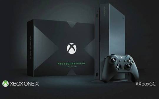
Microsoft Xbox One S review
The Good The Xbox One S is a slick looking game console that's 40 percent smaller than the original and ditches the infamously gigantic power brick. It can display 4K video from streaming services and Ultra HD Blu-rays, and supports HDR contrast on video and games. The updated controller works with other Bluetooth devices, too.
The Bad 4K, Ultra HD Blu-ray and HDR settings only work with newer TVs, and may require some trial and error. The updated controller feels cheaper than its predecessor. Project Scorpio, the more powerful Xbox One successor, arrives in late 2017.
The Bottom Line The Xbox One S is the console Microsoft should have delivered three years ago, but there's little reason to upgrade if you already own the original box.

The Xbox One S is the version of the console that Microsoft should've first released back in 2013 instead of the lumbering beast that we got. It's better in a number of ways, making it even more of a worthy alternative to Sony's PlayStation 4.
Xbox One S offers a far more attractive enclosure, options for a bigger hard drive, a slightly redesigned controller and some video perks for owners of 4K TVs. It starts at $300, £250 or AU$400 for the 500GB version; $350, £300 or AU$500 for a 1TB model; and $400, £350 or AU$549 for 2TB.
That last model is available to buy as of today in the US (and includes the vertical stand that otherwise costs $20 when purchased separately in the US), while those with the smaller hard drives will be available later in August, bundled with games such as Madden 17 and Halo. (Additional bundles will follow later in the year -- including a pricier 2TB Gears of War 4 version in October -- and may vary by region.)
Sounds like a slam dunk, right? Unfortunately, it's never that simple. The One S doesn't get an across-the-board "buy it now" recommendation for two reasons. First off, it doesn't deliver huge improvements for anyone who already owns an Xbox One. But more importantly, Microsoft has already promised that the next Xbox -- dubbed Project Scorpio -- will be arriving in late 2017 with with the seriously amped-up graphics and VR-ready hardware that audiences are clamoring for.
When it's all said and done, the Xbox One S should be primarily viewed as a slimmed-down version of the Xbox One that introduces a mildly updated controller and provisions for 4K display. It's not going to warp you into a state-of-the-art gaming experience. Pragmatically, you're probably better off nabbing an older Xbox One, which are now being sold at fire-sale prices. But if you are getting an Xbox One for the first time, have an interest in the bundled games and aren't saving your pennies for 2017's Project Scorpio, the One S is certainly a good all-round gaming and entertainment deal.
Note: I found a site where you can complete task and get free Xbox gift card Codes
What's new in the Xbox One S
There's a short but significant list of improvements and changes to the Xbox One S.
Smaller, cleaner design: To start, it's 40 percent smaller, which considering its power supply is now internal, is impressive. It's also stark white, with some slick plastic moldings flanking the entirety of the box. I think it's the best-looking Xbox Microsoft has ever designed.

The One S can also stand vertically, too. The 2TB model we received for review packs in a stand. If you buy one of the other models, you can get the stand separately for $20.
4K and HDR video: Xbox One S gets a fairly beefy upgrade on its video capabilities, with 4K resolution (3,840x2,160, or four times as sharp as standard 1080p HDTVs) and HDR (high dynamic range, which is basically enhanced contrast and color). Keep in mind: those features only work on compatible TVs and 4K functionality only works with a small but growing list of compatible video content. 4K can currently be accessed through streaming video services such as Amazon and Netflix (as long as you have the bandwidth to support it and pay for their premium tier) and those new 4K Ultra HD Blu-ray discs. Certain games, meanwhile, will eventually be able to take advantage of HDR visual improvements, but don't look for PC-like 4K graphics -- the games are merely upscaled to 4K.
So no, you're not getting native 4K gaming out of an Xbox One S. In fact, only a limited number of games will feature HDR and none of them are out yet. They are Gears of War 4, Forza Horizon 3 and 2017's Scalebound.
New controller design: The Xbox One controller has been updated for the S, too. It has a more streamlined top section, better range and textured grips. It can also use Bluetooth to connect, which opens the door for compatibility with other devices -- no more annoying dongles, at least on Bluetooth-compatible PCs.
Unfortunately, I'm not a fan of the new controller's design. It's not a drastic departure from the original, but there's just enough of a change to make it feel cheaper. The plastic textured grips don't feel good the way rubberized ones do, but thankfully the triggers seem unchanged. The D-pad also feels slightly less tactile -- I even noticed differences between two of the new controllers side by side.
IR blaster and receiver: Still present is the IR port for controlling the console with a remote, but the Xbox One S also features an integrated IR blaster to control or power on other devices in the room.
And it still does everything the old Xbox One does: The good news is that you're not losing anything with the Xbox One S compared with its predecessor. Around back the console offers a lot of the same ports as the original Xbox One, though noticeably absent is a dedicated Kinect port. You can still attach Kinect to the Xbox One S, you'll just need a special $40 (!) adapter. Either way, the omission of a Kinect port should give you an idea of how that peripheral is regarded at Microsoft HQ.
HDMI-in and -out ports are still there, so you can still make use of the Xbox One's live TV integration if that's something that appeals to you, but I never found it overly useful.
Suffice it to say, the One S plays all existing Xbox One games, and a growing list of Xbox 360 games. It also includes all of the encouraging software improvements Microsoft has made over the past few years, including the redesigned interface, support for the Cortana digital assistant (using a microphone headset), compatibility with the Windows Store and, soon, additional cross-play options with Windows PC gamers on certain titles.
4K and HDR scorecard
I want to personally thank the Xbox One S for introducing me to the hot mess that is the world of 4K and HDR formats. I considered myself fairly fluent in the language of home theater, but I was bewildered at the insane of amount of granularity and confusion that the format is currently plagued with.
Odds are you won't be able set up in 4K right out of the box. I needed to download two separate updates for the Xbox One S to finally realize it was attached to a 4K TV, at which point it offered to bump up the resolution output to 4K.

I hooked the console up to four different TVs and had mixed results with each, so I tapped CNET's David Katzmaier to help me test out the rest of the Xbox One S' 4K and HDR capabilities.
What we learned is that getting all of these finicky display technologies to work together in sync will require some trial and error -- and patience.
Our major issue was getting our TVs to recognize HDR. The problem (which isn't solely the Xbox One S' fault) is that some TVs with HDR require a specific "UHD" or "deep color" setting to be turned on in order for HDR to work. These modes usually turn a TV's brightness all the way up and activate automatically when HDR content is detected. But none of our TVs detected the Ultra HD Blu-ray HDR signal that was being output by our "Star Trek" Blu-ray.
It wasn't until we forced the Xbox One S to output a higher bit depth (10-bit up from the console's default setting of 8-bit) did we get a clean HDR signal. Furthermore, we had issues maintaining a video signal altogether when our TV was in that special "UHD/deep color" setting for HDR but the Xbox One S was outputting a signal lower than 10-bit.
Sound confusing? That's because it was. And this was with the help of one of the best TV reviewers on the planet. It's possible your setup goes smoother, but there are definitely a lot of variables and boxes to check when entering the world of 4K, Ultra HD and HDR to make sure it all works correctly.
There's a really helpful 4K detail screen in the system display settings that gives you a heads up of which requirements for 4K, HDR and so on are currently being met. Definitely check that out.
Tragically, all of this time-consuming troubleshooting to get HDR to switch on isn't always worth it. In fact, it's sometimes nearly impossible to tell just by looking at the image onscreen. We tried. The takeaway? 4K and HDR are nice novelties, but I'm not sure even the most discerning eyes can always tell the difference. And because only a fraction of games will even support HDR (the aforementioned trio of Gears of War 4, Forza Horizon 3 and Scalebound), it makes upgrading a tough sell. Not to mention the fact that all the games you'll ever play on Xbox One S won't be in true native 4K resolution -- they'll just be upscaled to fit.
That said, there are plenty of 4K Blu-rays out there, and Netflix can stream some content in 4K (as long as you pay for its Premium tier). If you are in the specific position of owning a 4K TV and are looking for an Xbox One, the S is what you should be buying.
It's worth noting that the Xbox One S doesn't handle the higher-end audio options out there such as Dolby Atmos. The most you'll get out of the console is a seven-channel surround signal.
Looking forward to Project Scorpio
Microsoft's messaging about its console offerings can get confusing. It's best to think of the Xbox One and One S as their own tier. In terms of graphical horsepower, they're equal. The next jump in visuals and performance will come along with Project Scorpio, which is being targeted for the 2017 holiday season.
Details on that machine are scant at best, but it's safe to say it will significantly outperform the Xbox One and One S, the PlayStation 4 and -- if we're going on rumored specs -- the PlayStation 4 step-up console, the PS4 Neo.
This will usher in a sizable upgrade in all aspects of gaming with native 4K resolution output and HDR support. And Microsoft has already pledged that Scorpio will be "VR ready," presumably for a forthcoming virtual-reality headset.
The current messaging as to how games will work across Xbox One platforms seems simple enough. Any Xbox One (be it a standard, S or Project Scorpio) will be able to play any Xbox One game, though the Scorpio will be able to take advantage of better graphics, performance, frame rate and resolution. This seems to mostly fall in line with the PS4 Neo plan as well.
If we're just comparing raw specs, Project Scorpio's rumored details still fall short of what an Nvidia GTX 1080 graphics card is capable of.
Decisions, decisions
Under most circumstances, no, you don't need to buy an Xbox One S. If you already own an Xbox One or even plan to wait for whatever Project Scorpio winds up being, it's tough to rationalize a purchase.
If you're looking to enter the Xbox One space and you don't feel like waiting a year or more for Project Scorpio, an Xbox One S might be the right purchase for you as long as you have or plan to get a 4K TV.
If a 4K TV isn't in your future, you may want to look at the original Xbox One. It's already as low as $250, £250 or AU$500 and it's entirely possible Microsoft will drive the price even lower if it's looking to sunset the model and clear out remaining inventory.
1 note
·
View note
Photo

Atari Flashback Classics is the most ⊟
I’ve had Atari Flashback Classics on Switch for months, intending to cover it. There have been a lot of things going on around here that aren’t video games, and for a few reasons this one is intimidating. Every time I get a few minutes to think about this, I open it up again and play a few more games on it to try to get an idea of... what I want to say about it. This is one of the many subjects about which I haven’t been able to generate a cogent opinion.
I will note, however, that this collection made it possible to try a different game, or five different games, every time I went back to it.
Every time I open the game, I discover something I’ve never played. Since these are mostly ancient 2600 games, those aren’t exactly life-altering addictions. I hate to act like games expire, being a retro game fan myself, but most 2600-era games hit modern sensibilities as somewhere between “inscrutable” and “briefly amusing.” But there are fully 150 games on the collection, between arcade, 2600, and even 5200 games, and the whole is more than the sum of its many, many parts.
It turns out that the ideal presentation for these games is “I got a system and a pile of carts at a garage sale, what even is this stuff.” And that’s the experience provided by Flashback Classics -- trying cart after cart, with little context or organization other than alphabetical order, trying to figure out what each of these things is about with a couple of friends (or kids). Basically, Atari retroactively became WarioWare.

Some Atari games are easy to pick up because they’re self-explanatory. Breakout is an instant read even if you’ve never played it. Bounce the thing into the things. There are four different versions of Breakout on here, by the way.
Some other Atari games take a moment to process, either because the graphics are abstract or the gameplay doesn’t naturally follow from looking at them. I grew up (somehow) a Frog Bog/Frogs and Flies fan, but to the new player it’s totally opaque that it’s a fly-eating competition with a time limit of a day. Without that context, you jump from lily pad to lily pad eating flies for... a while... then it stops. I still don’t understand how to play Save Mary, a game ostensibly about lowering materials to create a platform on which an NPC can stay above water. I see it played here, but I couldn’t work it myself.
youtube
But in this presentation, the lack of context is an asset. You can blindly jump from game to game, from “what’s this?” to “What is this!??!?” and derive a sort of meta-entertainment from the agglutination of variably entertaining games. My kids wouldn’t like Circus Atari as a standalone game, but as part of a buffet gaming feast, who doesn’t love a seesaw-based Clown Breakout?
In every game I tried, the interface made it as simple as possible to integrate into the Atari life. 2600-based games start with a transparent overlay of an Atari console, with all of its weird switches available and labeled. Games that use alternate controllers, like the Whack-a-Mole-esque Holey Moley, feature a sensible controller overlay, in that case a nine-digit grid activated by tilting on the analog stick.

The Switch has become home to a wide variety of excellent retro releases, and its existence proves that they can be excellent in different ways. Sega’s single-game Ages remasters add thoughtful modern features to obsessively preserved old games. Digital Eclipse’s SNK Classics Collection offers not just an entire historical period for one company, but includes the research and ephemera to put it in context -- plus niceties for the modern gamer (I really can’t say enough about that collection, even in a review of a different one!)
But Atari Flashback Classics doesn’t really do any of those things. It succeeds by providing quite-good (to my eyes) emulation of an absurdly large number of games, all of which look and control as well as they possibly can, in an interface that makes it easy to sample them. Much easier, in fact, than if you were fumbling with real Atari hardware. There’s history to be traced in here, especially given multiple versions of the same game, and you’re free to explore it yourself. Or you’re free to gather your friends and play as much Warlords as possible.
JOIN CLUB TINY AND OUR DISCORD Support Tiny Cartridge!
41 notes
·
View notes
Text
WILD ARMS 2 - Withered Ruins
Wild Arms 2 is a personal favorite of mine and so an easy target to go back and pick through. Thousand Arms is populated with original enemies in design and origin, but like many of the classic RPGs that the Wild Arms franchise draws upon for influence, Wild Arms 2 is chock full of neat and often obscure monsters drawn from myth, folk lore, historical grimoires and fiction, as well as other inspirational genre sources like Dungeons & Dragons and western horror films. So, I’ll try to not only comment on the monsters and how they relate to their dungeons but also their origins going forward!
Starting with what is basically the canonical "first” of three prologue chapters; our central protagonist, Ashley Winchester, is a militia soldier deployed to an old abandoned and structurally unstable ruins to rescue an orphan boy, kidnapped by disgruntled and disenfranchised laborers.
The dungeon has 3 basic enemies, 1 boss, and 1 secret enemy that pops up WAAAAYYY later in disc 2...

The most accessible (knowledge wise) and the weakest is the Kobold. Other than being a well known magical creature of German folk lore, it is also a common enemy in other RPGs. Dungeons & Dragons in particular memorably depicts them as reptilian humanoids in the service of greater Dragon races. JRPGS frequently depict them as dog-like or otherwise furred savage humanoids. They are also frequently in the company of other mythological spirits like the Undine, Salamander, and Sylph as a representative of Earth, rounding out the set of Four Elements. Oddly none of these depictions adhere to much integrity to the source folk lore.
Although usually invisible, a kobold can materialize in the form of an animal, fire, a human being, and a candle. The most common depictions of kobolds show them as humanlike figures the size of small children.
Legends tell of three major types of kobolds. Most commonly, the creatures are house spirits of ambivalent nature; while they sometimes perform domestic chores, they play malicious tricks if insulted or neglected... Another type of kobold haunts underground places, such as mines. A third kind of kobold, lives aboard ships and helps sailors.
Kobolds who live in human homes wear the clothing of peasants; those who live in mines are hunched and ugly; and kobolds who live on ships smoke pipes and wear sailor clothing.

Given the context what we see here is a type 2 Kobold; child-sized, vaguely humanoid, somewhat animal-like, and haunting the dusty remains of crumbling sandstone ruins. Later Wild Arms games will shift towards depicting them as Earth spirits, complete with a dramatic redesign, but this iteration doesn’t have any specifically Earth based attacks. Curiously however, its bestiary entry does in fact list a weakness to Air magic and resistance to Earth magic.

The other common enemy in this dungeon is the Stirge. An original monster to the original Dungeons & Dragons as part of the Greyhawk supplement. Initially more bird-like, save it’s long blood sucking proboscis, later editions would shift the Stirge’s design more toward insectoid, and later still toward a leathery aberration unlike any insect or avian entirely.
Here the Stirge retains both its leathery wings, and its signature ability to drain its enemy of HP. But otherwise, it varies drastically in that it seems to borrow from H.R. Geiger’s Alien Facehugger some, playing into the monster’s tactics of grasping onto its prey with pincer like claws before draining them of blood, although it replaces the variable beak-like appendages of classic designs with a striking tail.

Somewhat rarer is the Gagison of all things, a very obscure choice for an early dungeon; a spirit only briefly mentioned in The Book of Abremelin. He also appears in the Shin Megami Tensei games under the name “Gagyson” (An image of which I used above in the absence of any historical illustrations) where his descriptions mention:
His name means "one farms striped mullet". Originally a Hebrew minor god of plague. While in "The Book of Abramelin" he is a low-ranking demon subordinates to Arioch.
In line with being a supposed “minor god of plague,” the Wild Arms 2 version does utilize the Disease status ailment.

So what I really love here is how perfectly “First Dungeon” this set up really is: It showcases 3 different kinds of monsters (from folk lore, from pop culture, and from myth) but despite disparate origins, they do all paint a cohesive picture... The cutscenes showing the exterior of the dungeon show a desert terrain, the sandstone architecture has an earthen tone, both of which place comfortably place the Kobold in this dungeon. In addition the Stirge, while traditionally a dark forest dwelling monster, has been known to have desert and jungle varieties, and the ability to drain HP fits with the withering theme, as does the Gagison’s Disease ability. All together these three give off the impression of a dungeon not only “withering” in physical form, but in regards to an earthly life force; It is a place abandoned, drained of life, sickly, and falling apart –a prevalent tone for the planet Filgaia at large, and indeed a major theme of the later plot of the game.

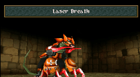
But then we come to the Boss monster, Kalivos. Despite some flavor thrown into the ending cutscene that mentions explosive secretions, Kalivos does not actually use any kind of explosive or Fire based special attacks. Instead Kalivos had two massive rending claws and a Laser Breath attack. (One fun feature of Wild Arms 2 is the segmentation of boss monsters into a core enemy and various specialized body parts. Defeating specific limbs awards their own exp and disables their own set of attacks and abilities.)
But here’s the thing... I have absolutely NO idea what the hell Kalivos is supposed to be...
It’s the name of a town on the island of Crete in Greece, apparently? The Greek town is written as Κάλυβος, which technically ought to sound something like “Kah-loo-bohs” I think? It might actually be a reference to Calibos, from Clash of the Titans (who, oddly enough, isn’t a mythological figure, but a character original to the 1981 film) but honestly there aren’t enough shared features between them to really pin that reference down: Horns? A tail/whip? A tangential relation to a kidnapping?
More over, even if it was in fact Calibos, that wouldn’t really add to the “Withered” theme of the dungeon?

Anyway, that’s really all I’ve got to say about this one.
#wild arms 2#jrpg#psx#dungeons and dragons#d&d#stirge#smt#shin megami tensei#persona#gagyson#gagison#kobold#clash of the titans#calibos#kalivos
10 notes
·
View notes
Text
Pokémon White Randomized Nuzlocke Run [Part 3]
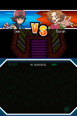
It’s time for hunting for thieves with Burgh! Long may no one else die in the process!
Team headcount:
Boeing (Latios)
Frogger (Seismitoad)
Ptera (Archeops)
Palm (Shroomish)

I’ll also throw the Miracle Seed on Palm, since I forgot to do that last time.
Hm. This is technically part of the same route Palm came from, but it’s a different area. I think if the randomizer considers it part of a different area, I will too. So if it has something from the outside part, I won’t catch it. If it turns out they both happen to have some things in common, and the first one was one of those, oh well. It was the first one in the area.
Stepping forward to find out if we get a new one or not.

I don’t want it.
This might be a bad idea, but I think I’m going to let Palm just murder it. I do not want an Octillery, and then I’ll still only have one thing from Pinwheel Forest. It might be something I end up regretting, because as of right now, if my team wipes, I have nothing eligible to start over with, but.
Exp gotten, Grape avenged one more time.
So far there is nothing in this forest except for Octillery. What is this hell.

I do not like the Patrat line. I might never like it again. Appropriate that Team Plasma currently seems to do almost nothing else.

Okay, so for future reference, the insides of Pinwheel Forest are counted as a different area by the Randomizer. That future might not be so far off, depending on how this goes. The important thing is that something besides an Octillery can exist in these woods.
I have photo evidence.
Without it, even I wouldn’t believe at this point.

Awesome, recovered the skull. Considering the size, I am not sure how a boy my age manages to do anything with it but not be crushed by it, but thankfully the plot is uninterested in such complications. Skull get.

I have no memory of what that means. I assume it means that if I live long enough, I’m gonna beat you up.
Oh good, we give the skull to Lenora. She’s someone I have faith in to be able to lift it. She is very mighty, and when I don’t think about the consequences of our battle I still am highly appreciative of her.
I basically don’t do anything for the next twenty minutes but run around and let Ptera kill stuff. I am overusing Ptera because Ptera can one-shot everything into oblivion, and that’s a comfort.
But.
There is good news after I remember I have other pokemon.

Boeing
no longer has Psywave.
I’d never really bothered looking up the accuracy, I just was sad when the damn thing never hit. It turns out, in addition to having variable damage, Psywave has 80% accuracy.
I have never hated a move so much.
It’s gone now.
Boeing can murder things.
Together, friend. We will make it to the end of this.

Oh, the bridge! This is the one with the bridge! Bridges, even!

Best part of this generation for sure.

Now we’re in sections I think I remember a little more about. Mostly in relation to how often I ended up lost in this place. It’s not really that difficult, but for many, many years all of the towns and other locations were nice and neat 2D things. You might not know where to go next in some spots, but having trouble figuring out where you were wasn’t really a thing.
Along comes Castelia City, and it’s all “hold my drink,” and I, a mere ten-year-old, trip down back alleys trying to find out what in the heck I’m meant to be doing.
Now I, a mere ten-year-old, will probably do much the same. With an active interest in seeking out any grass.

The real question here is which evolution stone I want. I can’t use Panpour. So I guess... hm. I might as well go with the Fire option? I think I mussed with the evolution settings, so I’m not sure if I need them or not (I shouldn’t need to trade anything to get it to evolve, but past that, it’s one giant shrug). I also don’t have anything in my party that needs a stone yet, and there is no way to guess at what I might find in the future.
What I do know is I have a Grass and a Water pokemon, so let’s just round that out. That’s what the chimp options are there for, after all.
Fire Stone get.

I have zero memory of what’s up with the ship, but boats usually mean trainers to fight. Whatever the case, it is presently plot-locked.

We’re going through the city to try to gather all the Dancer trainers for a squad, which basically means beating up more of the Pan-squad, and a guy in the alley jumps out and gives us Flash.
Pokemon games are the best.
Dance squad assembled. Now that I think about it, I think this might be the version where rotating battles are introduced. I also think that might not be the right name, but the important bit is that three pokemon are participating at once and you can rotate through. I bring this up now because I’m wondering if talking to these guys again will set one off.
...Nope. I do get an Amulet Coin, though. Those are always good to have.

A building full of trainers I didn’t remember! That’s much better than running back to Pinwheel Forest or going ahead for grinding. Too bad this resource doesn’t renew itself.
Oh, nice. The guy to our right gave us Quick Balls and Timer Balls. Those are some of my favorites.
I’m not touching the Gym until everyone’s 30. I already regret that decision, but you know something else I regret? No longer having a Fire type. So yeah, this is the program and we’re sticking to it.
A Hyper Potion and Revive are also in this building. One of those has no use to us, so yay free money. Here’s hoping that we don’t use up the other one right away. I’m already imagining the horror that is the Elite Four.
Also, since I never play these games with the volume on (ancient suspicions about battery life from the era of AAs), can I just say how wonderfully spooky the Scientist theme is?

Heeeeeey. That is a good thing to have.
Time to check if I’m able to go forward, or if my grinding has to be stuck at Pinwheel Forest. As much as I like the bridge, let me tell you my preference.
Forward enough, anyway.

I think there will be some sort of roadblock ahead, but I should be able to come across my next teammate first. And some Fishermen.

Palm enjoyed meeting the Fishermen.
First encounter spotted.
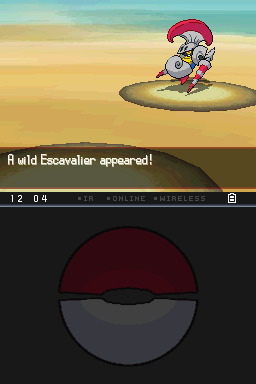
Huh. I don’t think I’ve ever used one of these in a game before. The evolution is never worth bothering with unless you’re shooting for the pokedex entry, and I think by the time you run into its first form, you’ve already got most of your team arranged already.
The real question is if I have something that won’t kill it...
I think Cut might be the answer.

...I am the worst trainer ever, fml.
So. Uh.
The Escavalier is caught.
Apparently it knew something besides Fury Attack and Leer. Funny story, that.
Boeing is dead.

Ahahaha. Wow. I do not want you. You murdered my best friend. You are also now more necessary than you were. So. You need a name.
You’re a dark knight.
First girl on the team is named Batman.
Batman does not kill.

The real challenge of this game is going to be whether or not I can ever have six usable pokemon at a time. Dang. This is much rougher than anticipated. Boeing was one of those beasts I thought would be with me until the very end.
Of course, the same can be said for all that now lie here. I was definitely arrogant enough to assume that I could go through the game with none of you dying.
Serves me right, I suppose.
I really hope I don’t need to teach something else Cut now.
Goodbye, Boeing. We had four levels of being useful together. You taught me to hate Psywave, and your sacrifice brought Batman to the team. In time she will learn to honor that.

Batman is Adamant and loves to eat. That is about the best Nature I could ask for. She isn’t going to be very useful at the moment, but she has the Exp. Share now, so. We’re going to change that.
This run just got much harder. Again.

Apparently Bug is the theme of this desert.
That is one definite disadvantage to starting with a Psychic pokemon. Bug hurts. It doesn’t help that I almost constantly forgot what Boeing’s typing was.
Huh. Geodude also frequent this area.
It’s funny. Out of what’s available, so far I’ve been pretty darn happy with what I’ve ended up with. I mean, I would prefer Batman being a little weaker so I still had Boeing, but Escavalier is not awful. And I’ve never used one before. All praise the randomness.
You know what else is funny?
All the wild Escavalier here need multiple hits even with moves that are effective. All those turns I spent Cutting Batman down to size, allowing room for Boeing’s death, were unnecessary.
Haaaaa. Live and learn.
Unless you’re Boeing.
Frogger’s just going to murder everything in this route while the meager party slowly grows to level 30. Once more I feel my boredom setting in, but at this point I don’t think being less cautious is really a good idea. Getting six pokemon in my party has become something to strive for instead of the expectation.
-checks in an hour later-

Someone save me from this hell.
I think when the time comes, I’m going to take Ptera and Palm back to Pinwheel. The level differences aren’t that great, and ALL the Blaziken kills would probably do them both some good. Ptera can probably take the things in the desert, but his Defense is terrible if something goes wrong (which it easily might) and I’m not so sure about Palm. Either way Palm’s getting the Exp. Share for it, and that’s probably still twenty minutes away, because grinding.
I really wish I hadn’t accidentally killed Timon and Boeing.
You never realize what a useful tool letting pokemon faint is until you can’t. Sigh.

I am going to giggle like a small child every time that question pops up. My only good decisions in this run are their names.
Fun fact: Grinding is boring.
Batman and Frogger are all set, so I did make my way back to Pinwheel Forest in the hopes of helping Palm’s unfortunate Nature out with some better EVs and just generally having him and Ptera fight against things they could kill in one hit.
That’s working out.
This is taking forever.
I refuse to do this for the next gym. Isn’t failure the spice of any challenge?
I don’t even know what the next Gym is... Wait. Is it the electric model one? I think it might be. I remember liking her. I like her pokemon less. Flying electric squirrels are hardish to kill.
Ptera learned Acrobatics. So that’s neat.
Two. More. Levels. Come on. Bring on the massive surge of wild Blaziken.
Have I already pointed out that this is one of the generations where exp is calculated in part by level differential? The more I need the less I get.

At long last. It is done.
In your memory, Timon.

Dude, c’mon. It was going to be touching. I was going to murder all your Bugs and be like, “this is for all the things I accidentally got killed on my way here!” and now you’ve gone and ruined it with your plot interruptions. Sigh.
I’m supposed to go to one of the piers. If I’d been reading the text instead of mashing buttons I probably would know which one, but walking down each option and trying them all in order is fun, right? Right.
It’s always the last one you check.

I remember just enough of the story to say that was one heck of a mistake they done made.
Oh wait, Bianca’s pokemon? Oh. That’s much sadder.
Team Plasma grunt shows up, and it’s time to run after it. After all, I am ten. I am the most reliable aid anyone could ask for in a situation such as this.
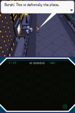
I say, brilliant deduction, Burgh!
There is probably art of Burgh and Looker somewhere on the internet. They solve crimes.
Guess who has thirteen levels on Team Plasma like a boss. It is all four of my remaining pokemon. Yay.
They keep bringing up the Seven Sages, and I keep not remembering any of them except for one. My memory was that there was the one guy. And even that guy was pretty blurry. Now there are seven?
I just wanna catch stuff and pick fights hurry up plot.
The plot hears my requests and punishes me with an infodump about pokemon mythology of the region. Why this.
For my current purposes, I don’t care, but I actually like Black and White’s background for Unova. I like stories about heroes and dragons, and having the cover legendaries being relevant in things that aren’t just glamorized sidequests. It’s a fun game.
The monsters are just so much funner.
Let us try this again!

I love all the gyms in this generation.
Our first victim starts with a level 20 Sewaddle and a level 20 Venipede.
Ptera covers his claws in their blood.
...Okay, that one’s a little too dark. The opponents’ monsters aren’t actually dying, just fainting. My guys are the only ones who can die, adding new weight to Batman’s name. She will go into battle for justice, never inflicting lethal damage, yet she might one day fall.
Burgh’s pokemon are probably mid-20s. It’s fair to say I didn’t need to grind as much as I did, and it’s also fair to say I’d do it all over again because the last Gym was traumatic.
I wonder if part of how they decide Gym Leaders is asking them what they’ll do if they get their own building and carte blanche to design it. That should be the new Sorting question: What Type would your Gym be, and what are your thoughts on its interior design?
I think one of them this gen has you being shot through the air with cannons.
We look so serious.
Burgh does not.
First up is a level 21 Whirlipede. I feel fairly confident in saying that Ptera is up to the challenge.
Following that is a level 21 Dwebble. It does not have Sturdy.
Last is a level 23 Leavanny, and if you think these short sentences are a really uninspired way of describing such an epic fight, you’d be right, but they did not have much to work with. Ptera took everything that didn’t have an Ability preventing such acts down in one hit.

His prize.
He has the option of learning DragonBreath, and I normally wouldn’t bother with it, but considering how worried I am about whether or not I’ll manage to have six pokemon in a party at once, AncientPower with its 5 PP taking up a move slot is... maybe not what I want to go with.
On the other hand, Ptera’s a physical attacker and DragonBreath only does 60 with no STAB.
We are abandoning the way of the dragon, Ptera.
That was Boeing’s realm.
Badge get! Now, are we going to be able to leave the Gym without the plot calling?
No. The answer is no.

Look, it’s free exp! I mean one of my best friends!
With that invitation received, our time in Castelia comes to a close. This segment saw our most painful loss yet. Hopefully that has taught me a thing or two about being careful, but those lessons tend to be really temporary with me and video games.
Until next time.
3 notes
·
View notes
Text
Smashing Podcast Episode 5 With Jason Pamental: What Are Variable Fonts?
Smashing Podcast Episode 5 With Jason Pamental: What Are Variable Fonts?
Drew McLellan
2019-12-17T05:00:00+00:002019-12-17T07:36:22+00:00
In this episode of the Smashing Podcast, we’re talking about variable fonts. What are they, how do they differ from regular fonts, and how can they help in the design and performance of our websites? Drew McLellan talks to a font of knowledge on the matter, Jason Pamental.
Show Notes
Weekly update:
Brand Illustration Systems: Drawing A Strong Visual Identity
Struggling To Get A Handle On Traffic Surges
Building A CSS Layout: Live Stream With Rachel Andrew
Web Design And Development Advent Roundup For 2019
Should Your Portfolio Site Be A PWA?
Variable Fonts
Find Jason on the web at rwt.io
Web Typography News newsletter
Variable Fonts: What web authors need to know
Ellen Lupton’s book Thinking with Type
Erik Spiekermann’s book Stop Stealing Sheep & Find Out how Type Works
Transcript
Drew McLellan: He’s a design strategist, UX leader, technologist, expert in web typography, and invited expert on the W3C Web Fonts Working Group. He writes, speaks, and works with teams and brand owners on how to set type better on digital platforms. He’s spoken with organizations like Adobe, Audible, Condé Nast, GoDaddy, IBM, and given presentations and workshops and conferences all over the world. His newsletter, Web Typography News, is popular with those wanting latest updates and tips on typography on the web. He’s clearly an expert in web typography. But did you know he represented Sweden at Lawn Croquet in the 1984 Olympic Games? My smashing friends, please welcome Jason Pamental. Hello, Jason. How are you?
Jason Pamental:I’m smashing. Especially after that intro.
Drew: I wanted to talk with you today obviously about web typography because that’s really your thing. You are a real expert with web typography. About that in general, but in particular, talk a little bit about variable fonts. I’ll be the first to admit I’m no typography expert. I mean, please consider me as uninformed as anyone listening. You cannot patronize me with any information about typography. I guess we’ve had usable web fonts on the web for probably about a decade now. Is that right?
Jason:Yeah. Actually, wasn’t it you that started something on Twitter a couple days ago? It was like November 9th in 2009. It’s like 10 year in two days since Typekit launched. I know Font Deck was right in the same time frame. Then Google Fonts and Monotype Service not long after. I had a beta invite that was given to me by my friend, John Cianci, who is actually now still a colleague of my wife’s at the agency where she works to Typekit sometime in 2009. That was a complete reinvention of my interest in the web. I mean, it was nothing short of a revolution for me. I mean, I’d always loved typography when I’d studied it in school, but we couldn’t do anything with it on the web for 15 years. That was pretty amazing.
Drew: There must be designers working on the web now having had web fonts for 10 years plus potentially. There are designers working on the web now who have never designed a site without the ability to select from a huge range of typefaces.
Jason:Yeah, it’s true. Nobody without that experience had to push the pixels uphill in both directions like we did growing up. We’re not some cranky old men shaking their fists at the sky. But yeah, it is kind of amazing just with all of the things that have changed on the web, the idea that some people never experienced in any other way is remarkable.
Drew: By the time we got web fonts, that was a massive shift in how we started to use typography on the web because we could really start to use typography on the web. There were obviously things that we could do with web safe fonts, but we were pretty limited to a very restricted palette. But there’s potentially now another big shift almost as significant perhaps with variable fonts. I mean, what are variable fonts? What do they do for us? Where do we begin?
Jason:I always try and start with giving people a frame of reference. So when we think about using fonts on the web, the thing we have to remember is that currently with “traditional” fonts, every font is an individual width, weight, slant, variant of that typeface. For every one we want to use on the web, we have to load a file. For a typical website where you’re using it for body copy, you’re loading, usually, four fonts: the regular, bold, italic, and bold italic. All of those things have to get loaded. Each one of those is a little bit of data that has to be downloaded and processed and rendered.
Jason:So typically, what we’ve done over the years is constrain ourselves to using that very small number of fonts, which is actually not particularly great typography practice. It’s much more common in graphic design to use a much broader range. You might use eight or 10 different weights and variants of a typeface in a given design. On the web, we’ve been very constrained because of performance. The big difference in a variable font is all of those permutations, those variations are contained in a single file. That format is really efficient because what it’s doing is storing the regular shape of that character and then what are called the deltas of where the points along those curves would move to render it as bold or thin or wide or narrow.
Jason:So by only storing the differences, you don’t have to store the whole outline. It’s a much more efficient format. While it’s not as small as a single font file, it’s still much smaller than all of the individual ones taken separately. If you look at something like Plex Sans from IBM, all of those separate files might be nearly a megabyte where two variable font files that contain all the widths and weights in the upright in one file, the italics in the other is like 230K. That’s for really, really complete character sets. Most people could use a subset of that and get it even smaller. I’ve generally been seeing those file sizes around 50 to 100K for a typical Western language website need. That’s not that different from loading… Once you load three or four individual font files, you’re probably loading more data than that. It’s an interesting win for performance, but it also then opens up the whole range of the typeface for us to use on the web through CSS.
Drew: So it’s almost like delivering the recipe rather than the meal. Rather than here’s the italic version, here’s the bold version. It’s like, “Here’s the regular version and to make it italic, you would do this, to make it bold, you would do that.” That reduces the file size that goes down over the wire.
Jason:Yeah. Well, in a way, it’s giving you all the ingredients and then you can make any recipe you want. Because you could really go everywhere from… To go back to the Plex example, from 100 to 700 weight where 700 is sort of the typical bold, 400 would be kind of a normal weight. But then you have much lighter. So you could do really big and really fine line headings or block quotes or different items or like emphasis, and then be able to kind of modulate what you want bold to be at different sizes. There’s all kinds of different things that you can do for better typography, better user experience, all the while getting better performance. That’s the gatekeeper.
Drew: So there’s almost an infinite number of tweaks of steps between what we would think of today as regular and bold? You actually got the ability to go anywhere along that axis to tweak between the two?
Jason:Right. What I think is really exciting to me as somebody that studied graphic design and has looked fairly closely at print design for many years, the idea of what bold is really should change based on the size of the text that you’re rendering. So by default, that 400 and 700 for normal and bold is kind of what the web defaults to. But in truth, the only reason you’re calling out bold is you want some emphasis, you want something to stand out. But the heavier the font gets out of small size, the harder it is to read. It kind of fills in the little open spaces. Instead of using 700 for body copy when it’s set at that roughly 16 pixel size or whatever we’re using there, you use maybe 550, 575 where you get enough emphasis but the letter forms are still more open. Then as it gets bigger, you might use a heavier weight.
Jason:But again, it’s sort of your choice at that point. By modulating that for getting the right level of emphasis, but still maintaining really good legibility, we have so much more flexibility. I’m really hoping that as these become more popular and more widely used, that we can start to teach people to be a little bit more nuanced with the way they use that range and actually get more expressive and also more readable at the same time.
Drew: One thing I’ve noticed implementing designs as a front end and implementing designs that I’ve been given is that different color contrast combinations and light text on a dark background versus dark text on light background, the weights can look completely different. So presumably, this would help to even out and sort of finesse the visual and the reading experience based on changes like that?
Jason:Absolutely. That’s one of the things that I usually will showcase in workshops and talks is adding in support for that light mode media query. You can flip that contrast but then you do want to do it in kind of a nuanced way. Depending on the typeface, it can end up looking really heavy or kind of spindly with a serif typeface. Sometimes you want to go a little heavier or a little lighter, but you then also tend to need to space the lettering out when you have it on a dark background or else the letter forms kind of bleed together. There’s little things that you can adjust in the typography. The media query is dropped dead simple. I mean, it’s like two lines of code to add that to your site. Then it’s what you do with that. It’s not necessarily just inverting the colors. Sometimes you need to adjust for contrast, but also tweak the type itself for better legibility.
Drew: So presumably, it’s not just weight that can be varied in a variable font. There are other ways we can change our font as displayed?
Jason:Yeah. It’s completely up to the type designer. I think it’s really good to reinforce that this is not a free for all in the browser. The browser can only render what has been enabled in the font. Ultimately, it’s the type designer who says the weight ranges this to this. You might have a width axis. It would get a little bit narrower or a little bit wider, but there’s also the ability to have what are called registered axes. There’s width, weight, slant, italic, and optical size. Those are all sort of core things that are mapped to CSS properties. Slant allows an angle in between one and another, so upright and I’ve actually seen ones with a reverse slant as well as a forward slant. That’s totally open. Italic is generally on or off but not necessarily. You can actually have… Well, there are type designers that have experimented with changing the letter forms over gradually as you shift from normal to italic, and sort of substituting letters along the way. That’s kind of an interesting thing.
Jason:But then there’s the ability to have custom axes. The type designer can define whatever custom axes they want to vary. You’ve seen ones that add sort of a gravity spread drippiness and all kinds of fun twisting shapes, or extending serifs, changing the height of the ascenders and descenders. On the lowercase letter forms, changing whether or not they are serifs or not. There’s all kinds of things that you can do. It’s really up to the imagination of a type designer. I think we’re only scratching the surface as to what could realistically happen with all those things. It’s all accessible through CSS.
Drew: Yeah. All of these properties can be tweaked just through the normal CSS that you’re delivering with the rest of your design. What sort of things can we do in CSS to sort of trigger those changes? Is it just like we would do with a responsive layout where we have media queries to trigger that?
Jason:There’s all kinds of ways you can do it. There’s a small change that you have to make. I’m assuming that we’ll provide a bunch of links to some stuff that will help people kind of play around with this stuff. I mean, I’ve written a bunch. Hopefully, that will help people out. Then on the use side, the font weight axis is just mapped to font weight. Instead of saying regular bold, you just supply a number. You can change that with media queries. You can change it with JavaScript. You can kind of do it whatever you want with that. I’ve been using a technique called CSS Locks that I learned from Tim Brown to basically use math. CSS custom properties and calculations to scale it from, once you hit a small break point up to a large break point, it kind of smoothly scales the font size and line height.
Jason:Then you can also use a little bit of JavaScript to do the same thing with their weight if you want to. The weight axis maps to font weight, the CSS property. The width axis in the font will map to font stretch, and that’s just expressed as a percentage. I should note that many type designers are not necessarily thinking through how this is expressed so you might see weight ranges that do weird things like go from 400 to 650. You still have to express it as a percent, but it works. It’s fine. You just need to know what normal is and all the fonts are documented. Then with anything other than those two, currently, there’s a little bit uneven support in the implementation for slant and italic. A lot of those things you sort of need to fall back to using font variation settings and then you can supply several things at once. It’s kind of like font feature settings. It’s sort of a lower level syntax where you can supply a comma separated list of this four letter axis and the value, the next one, the next one.
Jason:The one thing that people need to keep in mind is that when you use font variation settings, you lose all the semantic understanding of that and you lose the fallback. Font weight and font stretch are universally supported in all the browsers. You should definitely use those attributes. For anything else, you might use font variation settings. But the advantage to using font weight the way you normally would is if the variable font doesn’t load, the browser can still do something with that. Whereas if it doesn’t understand variable fonts, or it doesn’t load, if everything is in font variation settings, then you lose all of the styling information. That’s just a little side note there just in terms of what is supported where. But I should also say that it is supported in all the shipping browsers that you’re likely to encounter in most circumstances. I-11 doesn’t work, but you can deliver static web fonts, and then use ad supports in your CSS to change over to the variable fonts. Then you’ll avoid any duplicate downloads of assets and it works really well. I have that in production on several sites already.
Drew: I think like many of the sort of more modern web technologies you’re seeing, if there’s a variable font that has been bubbling away quietly for a while, and is only when it sort of finally boils over and we get support in browsers and people like yourself making noise about it and letting everyone know that it’s there. It can almost feel to the standard designer or developer who’s just day-to-day getting on with their job and not tracking all the latest downloads. It can seem like it’s come out of nowhere. But I guess this has been bubbling away for quite… I mean, you mentioned the two slightly different implementations that we’re now dealing with. There’s a sort of older and a newer standard for implementing?
Jason:Well, it’s actually not older and newer. They’re both very intentional. I’ll come back to that in a second because it is really worth kind of understanding what the difference is with those. But you’re right. The format was introduced just over three years ago, was in September of 2016. We actually had the first working implementation in the nightly build of Safari three weeks later. It was pretty remarkably quick that we had working browser. Safari was the first one to ship full support for it. I think it was when High Sierra came out. I don’t know, it was like Safari 12 or something like that.
Jason:But not that long after, we ended up getting support shipped in Firefox, Edge, and Chrome. We’ve actually had browser support for almost two years. But there weren’t a ton of fonts. There’s been this sort of steady evolution. The support for using them on the web has actually been there longer than anywhere else. I mean, technically, this format works on desktop OS as well. So if you have a TTF format, you can install it in your desktop OS on Windows or Mac, and you can use it in any application. You can’t always get to vary the axes the way you might want to play with them kind of infinitely, but there are this notion of named instances embedded in that font file that map it back to what we’re used to.
Jason:In Keynote, for example, there’s not explicit support for variable fonts, but the format does work if there are things like in Tech Sense, again, condensed, light. You’ll have those normal, regular, regular bold, narrow, etc, all would be available in a drop down menu just like installing the whole family. Then if you’re in Illustrator or Photoshop or now InDesign that just shipped last week or Sketch that shipped a couple weeks ago, they all support variable fonts now, so that you can then access all of the different axes and play with it to your heart’s content. But in the browser, that’s where we’ve had a lot more to work with. Taking a cue from your wife, I have been kind of beating this drum for a while trying to get people to be more aware of it. Then thanks to the work that the Firefox team has done in creating developer tools. With Jen Simmons kind of pushing that along, we have incredible tools to work with on the browser that help us understand what the fonts are capable of.
Drew: You mentioned type designers and the font capabilities. There are lots of fonts that are available?
Jason:Well, a lot of people are doing it now. Probably the best and most comprehensive place to go look for them is Nick Sherman’s site, v-fonts.com, v-fonts.com. That’s just a catalog site. It’s rapidly becoming really, really big. There’s more variable fonts coming out all the time now. There’s not a huge number of open source ones, but if you search on GitHub for variable fonts, you actually will find a whole bunch of projects there. But Google has launched a beta of their new API with about a dozen variable fonts available there. There’s more coming from them. They just released Recursive at recursive.design, which is a fantastic new typeface from Stephen Nixon. The Plex variable, one is available, that’s open source. Then there’s tons of commercial ones.
Jason:The cool thing about that is Monotype has released some pretty big ones. But it’s lots of smaller foundries and individual designers that are just kind of leading the way in experimenting with this format. I think that’s really great for design and great for the web that we’re seeing all of these new designs from new designers or smaller designers that are kind of breaking this new ground. Because I like to see them succeed with this because they’ve really taken the initiative to kind of put some great stuff out there.
Drew: Are we seeing any updating of existing fonts to be variable fonts to have families replaced by a single variable font? Is that happening at all?
Jason:It is. The ones that Monotype released are updates to some really classic typefaces. FF Meta was one that I helped them launch by designing the demo for that last year. They’ve got that. Univers, Frutiger, Avenir, I think those are the ones that they’ve released so far, those four. Those are really kind of core classic brand typefaces. They’re working on more. I know they have at least another half dozen or so that are kind of in various stages of production. I know that Dalton Maag which does a ton of custom typeface work for large corporations has several really nice variable fonts. I’ve been doing some work with TypeTogether. They also have several really great typefaces. I know that one…
Jason:I’ve shown at some of the conferences where I’ve spoken about these things that Adidas has their own too that they’ve been using for all of their brand work in print for almost two years now. Which is really, really remarkable stuff. But also Mark Simonson is working on a variable version of Proxima Nova. That’s kind of a big deal. That’s been one of the best selling web fonts of all time. It’s happening. It’s happening in bits and pieces kind of all up and down the scale. But even something as simple as subscribing to David Jonathan Ross, Font of the Month Club, will get you a variable font almost every month. I mean, he’s been really incredible on the stuff that he’s been putting out. It’s like $72 for the year or something like that. He’s been putting out all kinds of really beautiful stuff.
Drew: It is quite interesting then, because obviously, with the capabilities of variable fonts, you could create new designs that make use of these. But potentially, there could be sites that are in production where there are variable font versions now available where somebody could go back, revisit that, and replace out multiple font files with a new implementation based on a new variable font version.
Jason:Yeah, absolutely. That’s some of the questions that I get fairly regularly. Recently, I was looking at a pretty large sports broadcasting website that the development team asked me about that same question. I looked, and sure enough, for two of the typefaces they’re using, there are variable fonts available. A quick bit of research showed us that we could replace four instances of one typeface and three of the other with two variable font files and take over 70% of the file size away in five requests. I mean, it would be a question win from a performance standpoint. For really large scale site, when you look at removing almost 300K of data download across millions of users, that actually adds up to real dollar savings and bandwidth cost. Even from that purely practical standpoint without rewriting any of their CSS, just replacing those fonts, it’s already going to be a significant win for them in performance, in page render time and then in actual bandwidth costs for them.
Drew: In practical terms, is it as simple as it sounds, just swapping one out for the other?
Jason:It can be. I think the perfect example of that is something that Google sort of casually let slip at ATypI in September that they have started doing that with Oswald to the tune of 150 million times a day. They made a variable font version of it, and they just started surfing it on websites that were using enough instances where it would yield a significant benefit. They didn’t tell anybody. They didn’t tell the site owners. Nobody had to do a thing. Because it had the right mapping of the weight axis so the defaults would just work. 150 million times a day is a lot of font serving. That’s starting to give them some better insights into what would this landscape look like for them if they could start to switch over the top five web fonts that they serve? I’m assuming Open Sans is probably one of those. I know Lato is probably in there, Roboto.
Jason:So if you look at those and look at what optimized versions of those might look like, then you can see that there are some very clear reasons why Google would be interested in that. Then if you look on the other side, just the design space and how much truer to a brand voice a company could be if they’re working with the whole range of their own brand typeface rather than having to swap in different ones or be more limited in their palette. So there’s really interesting things to learn and explore on kind of both ends of that spectrum.
Drew: It sounds like an exciting brave new world of typography and opportunities for doing type in a more sort of sensitive and potentially more creative way on the web than we’ve had been able to do before.
Jason:Well, that’s certainly what I hope. I think that one of the biggest barriers to adoption with fonts on the web at all stages has been performance. So what happens? How long does it take to load? What does that mean to the render time on the page? We’ve got those issues of that sort of flash of invisible text or unstyled text. Grappling with all those things, really, it comes back to how long does it take everything to get there? How does the browser react to that? There’s lots of things we can do to mitigate some of those issues. But it really comes down to if we have a better font and a better way to serve it, then all of those issues become much less significant. So having that in place, then we get to be way more expressive. We can really try and push the design end of this and try and be a little more creative.
Drew: Because you’ve written lately sort of expressing the feeling that perhaps the web has drifted into a bit of a trap of designing an article template per site maybe with some variations for a few different types of content. But everyone’s sort of drifting towards this medium.com style of single column of text very readable to my eyes. Nicely typeset. Is that such a bad thing?
Jason:I don’t think it’s bad. I just think it’s going to get boring. I mean, when Medium came out, that was pretty novel. I mean, I think that one column of… Like you say, it was pretty nicely typeset copy. It has nice an area. It wasn’t crowded. It wasn’t cramped and sidebars and all this other stuff. There’s always going to be questions of business model and what will support that. That’s why a really beautiful redesign of, I think, it was the Seattle Times that Mike Monteiro for Mule Design did a few years ago. Absolutely gorgeous until it launched. Then they had these massive banners down either side of the column and it just kind of took away all that whitespace. It was a real shame.
Jason:I understand that companies have to make money. There are ramifications to that. So it would be wonderful to have that be one option. To have that nice clean layout. But it shouldn’t be the only one. We have all these capabilities in CSS that allow us to do really interesting things with margins and layout. I mean, it’s not even just the fact that we have grid now. But the fact that we can do calculations in the browser in CSS allows us to do a lot more interesting stuff. You layer in with that, the ability to be much more expressive with type, then we could start to look at what they do in magazines. Vanity Fair doesn’t have one article template. They have six or seven or eight. If you really look at how they lay those things out, there’s a tremendous amount of variability but it is playing within a system.
Jason:So when we create a design system for our website, instead of stopping at just one layout, we have a relatively easy way to build some switches into our content management systems. Most of them support a fair amount of flexibility. There’s no reason why we couldn’t give people a choice. I want to use layout one, two, three, four, five, six. That’s going to introduce different margins, different offsets. Maybe introducing the ability to create some columns. There’s lots of different things that we could do that would make for a much more interesting web. I think that type can play a really big part in that.
Drew: Is type our savior when it comes to adding a bit more personality back to the web?
Jason:Well, I think it can be. I think we’ve had this long evolution on the web towards better usability. But I think that one of the casualties there is when all we’re ever concerned about is that utilitarian, is it usable approach? That tends to beat out personality. Then when every single website is… Again, we had web fonts come along and that created a new level of expressiveness that we didn’t have before. Then all of a sudden, we could… Displays got better. So serifs came back into the mix. We could use those again on the web. These things added some life. Then we’ve kind of optimized back to everybody using one or two San-serifs. It’s Open Sans or it’s Roboto or Oswald or whatever. We’re kind of back to the same thing where there are tons of really good, really readable typefaces. We haven’t really taught this current generation of UX designers who are often the ones driving a lot of this anything about typography. Anything about how expressive it can be, how much it can alter the mood and the tone.
Jason:So we have a huge number of people that are dictating the design direction of things on the web who have ideas about type that are perhaps not as well-informed as somebody who studied graphic design and those notions of readability. We need to bring those things together. It’s not one or the other. It’s an and. It needs to be.
Drew: Especially when we talk about personality and about tone and mood. From a business point of view or from what we’re talking about is aspects of a brand. So in making everything look the same, are we losing the ability to communicate a brand to customers?
Jason:Absolutely. Not to dive into politics, but I think the whole… One of the major issues that we certainly experienced in the US, and I’m sure it’s not that different from what happened in the UK over the last few years. When all the news is consumed through a single platform, and everything looks the same, there’s no distinction of voice. So it’s something like 75% of adults in the US say that they get a significant portion of their news from Facebook. I mean, let’s set aside just how generally horrifying that is. But given that everything is presented uniformly, there’s no difference between an article from The Guardian, to New York Times, The Wall Street Journal, The Washington Post, and Joe’s right wing news. It’s all presented exactly the same.
Jason:When we see that logo, that type style, the Guardian is so characteristic. The Wall Street Journal is so characteristic. We recognize instantly when we see it, even just a headline. We know where that came from. Then there’s this automatic association with that brand and that authenticity. When you strip all of that away, you’re left with, “Okay, I’m going to evaluate this on a headline. Then it’s on, who wrote a better headline? That’s not a lot to go on. So I think that we have lost a tremendous amount. If you look at what Apple News Plus is trying to do, there are some efforts on a part of a few companies to try and reintroduce that. Blundell did a really interesting job of that in Europe. They launched in the US, but I’m not really sure they’re ever really that successful. That was a platform that would allow you to subscribe and see content from all these different top level newspapers and publications. It would always be in their own design. So that was really kind of an interesting approach there. It was always preserving the brand voice, that authenticity and that authority that would go along with that news. It really helped provide some cues for you as a reader to kind of evaluate what you’re reading.
Jason:I think that’s important. I think it’s not something to be taken lightly.
Drew: Thinking back to RSS readers in days gone past, the same sort of problems we were seeing then where everyone’s content was being just distributed via RSS and appearing in a reader in identical format, identical layout. I think you do lose something of the personality and the voice.
Jason:Yeah. It’s true. I don’t think that’s an entirely solvable problem. I think if you can imagine an RSS reader with a different typeface for every headline, it would be crazy. There’s a reason why that that doesn’t work that well, but there has to be some middle ground. Type does play a role in that. Then certainly, once you get back to the website, there is that sort of instant recognizability that will help that experience stand apart from seeing it anywhere else.
Drew: So say I’m a designer. I’m working in a small agency. I’m turning out designs for all sorts of different clients. I look at my work. I think, “This is all good. This is readable, but it’s got no personality in it.” Where do I start to actually put back some interest, some excitement, and not just lean on this sort of uniform UX driven layout that I’ve sort of conditioned myself to use?
Jason:Well, I think the thing to do is if you’ve never studied typography, you haven’t necessarily kind of trained your eyes to see what the differences are in one typeface to another. Even when you have studied graphic design, you have to remind yourself of these things all the time. So I think oftentimes that I’ll recommend, and actually, I wrote about this a few weeks ago because I kept getting asked like, “Where do you start?” I made a list of books that I think are really helpful. So something like Ellen Lupton’s book, Thinking with Type is a fantastic introduction to looking at type and seeing it. Erik Spiekermann’s book, Stop Stealing Sheep is a great one although I think at the moment, it’s out of print. I think that he might be working on another edition but that’s so… If you find that one, that’s a good one as well.
Jason:Those will help introduce you to the terminology and understanding what the differences are between the different styles of text. Then once you have that basic introduction, it gives you a better frame of reference when you look at other websites. Getting a sense of like, why does this one feel warmer than that one? What are the combinations of type? What are the characteristics? As a web developer often does or web designer often does, you inspect an element, see what the typeface is that’s being used there, and that can start to help build a palette of ones that you become familiar with. Very often, designers do hone in on a few that they get to know well and they tend to use them on a lot of different projects. That’s not necessarily a bad thing. It’s certainly better now if you’re working with a variable font and you can be that much more varied.
Jason:So you can decide that on this website, this is what I want to call normal. This is the width that I want to use and the other aspects of it. So even using the same typeface across websites because you have access to the full range of characteristics, it could still look quite different.
Drew: So I think there’s a lot of reading to be done. I’m sure we’ll add some links to the show notes of all the excellent articles you’ve written up and some references to these books and what have you. Because I think there’s so much to learn. I think we’ve always got to be learning with these things. The learning never ends.
Jason:It’s true. It is true. That is something that I’ve enjoyed immensely when I started writing this newsletter. Every week when I’m writing it, I’m reading more of the specs. I’m reading more of what other people have discovered and written. There’s tremendously knowledgeable folks out there. Rich Rutter, for instance, from Clearleft, wrote a fantastic book called Web Typography. He was one of the founders of Font Deck, which was one of the very first services to launch. He’s always been kind of the most scholarly of authors about this stuff. I mean, he’s really tremendously thoughtful in the way he puts those things together. But there’s a bunch of people doing really interesting stuff. That has kind of forced me to kind of keep up with what other people are doing all the time, which is really fantastic.
Drew: Is there anything in particular that you’ve been learning lately?
Jason:The stuff that I’ve been learning the most is actually the corners of the specs. I think it’s something that… I mean, again, probably the biggest influence for me on that is probably Rachel [Andrew]. That she’s always talking about like, “Well, if you actually read what’s written here, there’s actually really good stuff to know.” So in reading exactly what the specs are, there’s a tremendous amount of great typographic control that is available to us. Then layering into that different things like mix blend modes and CSS and learning more about different size units and how they interact together and learning how to use and where you can use CSS custom properties. I keep reading little bits more and more and then kind of compare that to what the browsers are doing. It really has been a tremendous experience for me in what I’ve been learning every week. Even having been doing this stuff for 25 years, there’s still like a new gem every time I dig into one of these things.
Drew: That’s fantastic. Thank you. So if you dear listener would like to hear more from Jason or perhaps hire him to work with you on your web typographic challenges, you can follow him on Twitter where he’s @jpamental, or find his website at rwt.io where you can also find the web typography newsletter to sign up to. So thanks for talking to us today, Jason. Do you have any parting words?
Jason:Yeah, experiment. I mean, there’s lots of open source stuff to play with. I think once people get this in their hands and get familiar with it, that I think they’ll start to see more and more how much fun they can have with this stuff and how much more expressive they can be. I think I was talking to the design director at The Wall Street Journal actually on Friday. I was then talking to their design team. We were talking about it’s great that you have a design system that standardizes things, but it’s then like any good design where you break that rule. That’s where the exciting things really happen. So we’ve gotten this necessary evolution of like getting really good at the system. Now we’ve got to break it some. That’s when we can get excited again. Break the rules. That’s my best advice, I think.

(dm, ra, il)
0 notes
Text
Testing Fun-times 10/7/17
Testing Fun-times is what I like to call any testing-related stories I have. This one is kind of a one-off, but expect to see multiple in a couple of months. It's been like three or four years since I made a clean new file for testing, and having just redone the opening, this seemed like an opportune time to do that. I was mostly interested in just dialogue and cutscene movement and SFX and that jazz, and that went fine (if you take your time reading and going over everything, it's about an hour before you leave the Necromancer Camp and really start the game), but...
Unfortunately, I couldn't make it through that without finding a major bug, with the skills Web Stream and Wide Web. Second fight involved a Spider, you see. Web Stream Binds everyone in a horizontal line, Wide Web is a vertical line. Turns out, they were discarding the effects landed on anybody but the final target. Early game's lack of character slots meant that often empty tiles were hit, making it seem like it failed to work at all. Further, it was being exceptionally unreliable, even by Ailment standards. Then, after all that was said and fixed, I was STILL having issues, because it took me WAAAY too long to figure out that Web Stream was reporting its Ailment count too low because it was taking an average and not the sum like Wide Web was doing.
I made a significant change to Ailments to boost them. How they work is they take a bunch of stats, mash 'em together, and get a result typically around the low 100s. This number is then run through 3-7 randomizers, with that number as the max possible outcome. Now, there's one less random iteration, and replaced with it starting at one maximum possible roll. This means that even on a reeeeally bad roll, an Ailment will almost certainly hit at least once. Before, you'd be stunned at how often an Ailment could go from landing with a potency of 7 to completely flopping.
So while I'm here, knees deep in code, I just needed to take a look at Wild Spin, possibly the buggiest move I've ever made. It's a Weapon Skill on Labrys' that hits two targets in front of the user, then Confuses the user a little. Draug uses axes, and so it was one of the first new Weapon Skills I tested, around the time Beams and Walls were created (see, uh, above for more issues related to that). Its sheer number of issues kinda turned me off of testing for a while, and maybe why I've been avoiding a serious playthrough for so long.
Issue One. The Cursor range was buggy, showing some spots as unavailable to hit, despite the fact they should be. Turns out, part of the code for 4x (one monster taking four tiles) versions of battles was overwriting this, and setting part of it to an invalid state. The Ranged Wall -rain series and Nova suffered from a similar bug, so I fixed them, as well. Nova proved marginally more difficult, because it turns out they were set to think of themselves as Wall spells, which caused complications.
Issue Two. It didn't actually return anything TO the user. This actually is a problem I've made for myself a lot, having characters able to have infinite turns by repeating an action. Self-casting Buffs and Defend in particular had serious issues with this. Not really that hard, just make sure it targets the source as a target and not as a source.
Issue Three. You don't have time to read what it did, causes two animation splashes to the last target, and delays on an empty info bar with nothing for the player to glean. I forgot to set it to target the owner's tile, so the backlash effect was still shown at the previous target. As for the text, within Wild Spin/Bone Barrage/Rampage's (other Beam/Wall style self-harm moves) specific code, I added the delay there, and then told it to skip later if the spell coming in was Wild Spin/Bone Barrage/Rampage. So you get to read how much damage they did, then afterwards you see a little self-damage splash with no pause or text. Maybe quirky, but it shows off the self-damage aspect and doesn't make the fight drag awkwardly, so I'm happy.
As you can see, fixing one spell sidetracks into fixing close to a full dozen others. This is how it usually goes, and it's by no means a bad thing. If nothing else, I know those other spells work now, and I feel them sharing code and ideas means there's some kind of solidarity within spells; that there is some predictability for the player to expect how a spell functions. Dunno, rambling.
Anyway, I'll probably do more of these kind of updates regularly once I get into serious testing. I just wanted to get through the opening to have a file with functioning stats since the major update to them. Those changes essentially stripped all old files of those, as they go by different names/variables now. It's real annoying to have to make it read in a bunch of stats just to test anything at all, you know?
1 note
·
View note
Photo

BOOKIE IS OFFICIALLY READY TO JOIN THE ACADEMY!
› SONG HOSEOK › 25 YEARS OLD › PARACHRONAL COGNITION › 8 YEARS IN THE ACADEMY
POWER
Parachronal Cognition: the ability to perceive how time plays out in parallel timelines. Wielders of this ability can view parallel timelines that have differing past/present instances, or look into countless possible future paths. Proficient users may contact their parallel selves or other individuals while viewing the parallel timelines.
STRENGTHS
Future Visions: Bookie may predict possible outcomes of events and choices of others. Soulbound: Bookie is proficient enough to communicate with other versions of himself without any extra burden on his part. Etched in Stone: Bookie has full access to his own and any other timelines’s and parallel-selves’s past events and memories. Number’s Game: Bookie gains complete probability computation of any future possibility through various means, such as seeing percentages, variables, and choices as if they were tangible.
WEAKNESSES
Cosmic Feedback: Bookie receives pain with varying intensity that is equivalent to the amount of parallel futures that he chooses to access and perceive at one given moment.
Own’s Destiny: Bookie cannot influence other people’s choices by simply sharing those people’s parallel futures in hopes of pushing them towards that parallel path as this shuffles and changes the possible parallel futures, therefore deeming the act of sharing to adjust another’s timeline path counterproductive.
One on One: Bookie is strictly limited to conversing with one individual or parallel self at any given time while he is in the act of viewing parallel timelines.
Mirror Reflection: Bookie may only contact or communicate with individuals of other timelines if there is a personal connection to Bookie’s personal memories.
Raw Data: Bookie computes probabilities in real-time and oftentimes me slightly overwhelmed when he considers all possible options or outcomes at hand.
Sleight of Hand: Bookie is unable to inflict any changes to probability through his powers and may only affect probability through normal human means, like cheating or rigging systems.
Scatterbrained: Bookie is prone to consciousness overload due to the amount of parallel selves viewing his timeline or attempting to contact him. (Think more than one person calling a landline, and “please leave a message!”)
Disillusioned: Bookie starts to suffer from Parallel Viewing, a phenomena where he views the present of other timelines melding with his own (though the timelines are still separate entities), as he becomes more fatigued or stressed, where the intensity and severity of this vision is proportional to his total tiredness.
ORIGINS
Hoseok, the eldest son of four in the Song family, enjoyed a semblance of life in relative normalcy. With a mother and father possessing precognitive abilities, it was of little surprise that he inherited the family’s Sight. Unlike his parents however, Hoseok perceived events and gained knowledge neither through slumbering dreams nor sensory touch, but instead through sheer concentration. Visions of different breakfasts next morning turned into visions of answers to next week’s exams, which turned into visions of him experiencing his first bicycle crash that scheduled to happen next month. The boy spoke out in fear and desire of avoiding certain accidents or fatalities, in which his father forewarned him to “allow Destiny to show the paths, then choose one to follow.” Involuntary trauma pushed Hoseok to numb out random calamities, while his mother pushed him to pursue ‘scenes of optimism’ to help tide over all the collected images he deemed useless. “Nothing you see is worthless, my son. Use this newfound knowledge and choose a path that that benefits you. Even if it seems futile sometimes, know that you are the writer of your own Destiny,” she said. Repeatedly, the boy grew with these words echoing within his drums, seemingly finding not a single vision that did not contain his parents’s vision.
At first, the powers turned him playful. Guessing games eventually grabbed a hold of him, making rock-paper-scissors and hide-and-seek no more than literal child’s play. Conversely, remembering every little detail became as simple as clapping his hands. Birthdays were never forgotten, nor were favorite colors. Curious questions asked were rarely entertained again for hearing the answer would be redundant to the tiny boy. Never had it occurred to his young self that accessing his memories was no longer a mental effort, but rather a retro-cognitive one. Having library after library of previous knowledge aided in his excellence at schooling, forming him a spectacular, yet lazy student throughout the years. Life only became more intense as he gradually realized that some of his memories were not of his own volition, and yet he could vividly play out each sequence as easy as breathing. Seeking advice from his loving mother yielded explanations that he could only accept at the time: “You’re just a smart boy. Do not fuss.” Fortunately, the voices in his head would come knocking to say otherwise.
Twelve years of age, it was then where he had his first interaction with the B. Hive, a collection of other Hoseoks who pursued to perfect the next iteration of Hoseok, or at least improve him in his current prime timelines. Altogether, they represent the ‘B.’ of their timeline. Face to face with a familiar, graying man, Hoseok was introduced to the life of a B. Keeper that goes by the name ‘Brain.’ It was here, somewhere in a time between his childhood and his expiration, that brought forth the true expansiveness of his powerful abilities. “They, other Bs alike you, call me Brain, though know that I am no more knowledgeable than you, fellow B. I only desire to unlock that potential within you.” Scenery changed before his eyes, as he revisits his childhood up to a scene unrecognizable by him. “Find this building. And, these people!” Brain exhibited people with amazing abilities different from his own Dazzled by such a display, Hoseok accepted his fate as a member of the B. Hive. Days ahead went by where an adolescent Hoseok continued to practice his ability in future vision, culminating possible likely outcomes and influencing the events surrounding said outcomes in order to attain one favorable to him. To him, trying to predict the next card to come out a deck or guessing someone’s private log-ins became his recent, normal routine.
Expanding the horizons of his powers ended up with him delving in scenarios an average teenager would not be around. Ultimately, Hoseok was struck with an addiction, constantly winning prizes either in cold cash or personal information. Visions of someone’s next personal information or where they hid lucrative belongings where accessible to him. The teen always remained small-scale, blackmailing fellow peers into giving him won to keep their secrets safe with him and recovering wallets that had been previously forgotten by their careless owners. A simple five-minute sit-in would open up a couple handfuls of past outcomes or possible futures of the setting he would be at, and though Hoseok might not always return with a haul, the few times he turned out to be successful made it all worth it to pursue. As his gains increased, so did his greed.
Dipping into this treasure trove charmed him. Hoseok started participating in local bets, especially on sports. Abusing his power to predict with better odds allowed him to push hard onto underdog teams or unlikely scenarios that were destined to likely happen. The list became endless: guessing what round a boxing match would end; determining whether a player would hit their triple-double; or even calling exactly when a goal would be scored. His focus enhanced the more he divulged, doubling his small allowance and strengthening his precognition in a single afternoon. People actively evaded his pools of choice as his infamy rose. Things worsened so quickly that rather than trying to play the House and others, Hoseok began hosting his own sessions with his peers and upperclassmen. Along with aligning to the path he wanted, the teen took on the local nickname ‘Bookie’ to better stand out among the B. Hive and his friends, seeing that his specialty suited such a reclassification.
Midway through his secondary education, Bookie experienced more and more disasters through his vision. Nearly all of the events were avoided by him, until one Friday evening. Heading to his usual hangout downtown proved to be a pain, as an image of a vehicle crashing through a large window kept reappearing. Unable to ignore these invasions of the mind, the man concentrated on the specific time and place. Locating the setting, his eyes flipped through the picture book, only to realize that although minor details change: shirt colors; the people sitting; or the paper posts, a woman in blue would always suffer the same fate of being the first to collide with the automobile. To him, this type of scenario was unexplainable and incomprehensible because some timelines always had some type of intervention that resulted in a different branch of significant time, then it had hit him. Abruptly, his feet started up a sprint to the next block over, with him spotting the lady. Like a madman, Hoseok screamed to get down and dove to yank the girl out of the way. His head shot back up before he braced his ears for the impact, yet nothing occurred. Angry, the woman got back to her feet to scoff and scold him. A finger flies in the air to point at him in scolding fury but alas, the vehicle finally hits its mark right on time. Shards flew everywhere, with Hoseok barely managing by with only a few scrapes. Now, a horrific scene lay before him.
Disdained as a couple of weeks pass by, Bookie laid low, unwilling to manipulate his parachronocognition due to the incident. His mind became distracted, replaying the scene over and over in the confines of his head, only broken by the greetings of a gleaming stranger. “You’re that kid, right? The one that ran in the shop. Ten days ago, was it?” Frustration built up within as he halfheartedly returned an answer before confusion had set in. “Yes, I was there, too. Oh, where are my manners?” Out extended a hand towards him, Hoseok accepting the shake before conversing. “A scout for the Avenger’s Academy. Yes, the very one! And, we would love to have more heroes like you.” Spreading the news of his invitation to his parents set even more confusion into his heart and soul, with both his mother and father saying that they foresaw him bringing home such news. Yet, to him, this future was blurry and unavailable.
Happily, the years went by at the academy without many stops. Bookie was a studious person not by choice, after all. Besides his regular, mandatory classes in mathematics and literature, he dedicated most of his extra time researching quantum physics and space, seeing that they might have applications to him. Other than a single day in a meditation class and brain exploration, the man would spend eternities in the recesses of his mind, communing with fellow Hoseoks of other universes. In turn, he socially suffered and spent more time literally with himselves, until finding an odd bunch of other fellow ‘outcasts’ with extraordinary powers of their own. Quickly, he adapted to provide the logistics and maneuvers to this group. Additionally, his habits have yet to dissipate as he still ‘collects’ information on others and recovers lost items here or there. Unsavory conduct such as gambling have been set mostly aside for him due to the many restrictions in place, but he has gotten away with a few harmless bets. Overall, Bookie finds that there is a future for him here in more than just learning and perhaps use his unique knowledge to help the Academy in the future.
0 notes
Text
Ginnifer Goodwin and Allen Leech Talk Parallel Universes and the Question "What If?"
On and off camera, actors Ginnifer Goodwin and Allen Leech are extremely charming people. When they're together, the effect is magnified. This shouldn't be a big surprise — Goodwin rose to fame playing a literal Disney princess (Snow White/Mary Margaret) on ABC's Once Upon a Time and Leech stole hearts on Downton Abbey as rebellious Irish chauffeur Tom Branson, who won over the aristocratic Crawley family's youngest daughter, Sybil.
The two have paired up for Constellations, Nick Payne's Olivier-nominated play receiving its Los Angeles premiere at the Geffen. Leech, in his U.S. stage debut, plays Roland, a beekeeper, and Goodwin, making her L.A. stage debut, is Marianne, a quantum physicist. The pair's lives intersect in a dizzying array of vignettes that find them living out the variable facets of parallel lives in alternate universes in an attempt to probe the cosmic forces at play when it comes to finding (and losing) love. Shifting rapidly between scenes that can be altered by a single word or turn of phrase, the two delve into what's perhaps the most common existential query: "What if?"
Before being cast, Goodwin had been feeling an intense "homesickness for theater." She realized she had fallen out of touch with the scene, so she called up the Drama Bookshop in New York and had boxes of plays shipped to her house. She fell in love with Constellations, and when she read that the Geffen would be doing it, she begged her reps to get her in a room with director Giovanni Sardelli. "Given the themes of the play, there was something uncanny about all that coming together," she says.
Leech came on board after Goodwin was already in place; in fact, he heard about the production through Goodwin's Once Upon a Time co-star Jennifer Morrison. He had seen the play in its original run in London's West End and had wanted to be a part of it ever since.
Though they came to the project individually, Goodwin and Leech are a captivating pair who seem as if they've worked together for years rather than a few weeks. They radiate warmth even over the phone, regularly finishing each other's sentences and breaking into peals of laughter. Goodwin says the challenges of the play feel like "doing gymnastics for a straight hour and a half"; without missing a beat, Leech proclaims, "Yeah, it's actually Cirque du Soleil's version of Constellations." While Goodwin waxes poetic about the centuries-old tradition of theatrical storytelling, Leech jokes about how the first actor must have earned eye rolls from his friends.
Both face the challenge of readjusting to theatrical performance after spending the past several years working primarily in television but agree that it's something they've relished, particularly the luxury of a multiweek rehearsal period and the space to experiment. "The really lovely and almost decadent thing we get to do is we get to play for four weeks," Leech says.
Goodwin notes that the experience has highlighted the immediacy of stage acting. "[Film and television] is an editor's medium, and so the onus is off of you to actually deliver everything at once," she says. Leech adds, "There's such a vulnerability when you're onstage. We're kind of protected within when you're on TV and film. There is that rawness being onstage, just you're here and they're here and we're going to do this."
Goodwin says this both thrills and scares her: "There's an authenticity of theater that can be felt, and there's a lot of pressure in this one, in one go, to tell a story with utter truth."
Beneath their easy banter and giggles is a sense of deep trust and mutual respect. The two actors have only one another — there are no props and minimal sets, and neither leaves the stage for the entirety of the 90-minute intellectual maze of the play. "This is an insanely rewarding experience because we are actually able to go there because I do trust Allen, and I know he makes me a better actress, so I don't need 87 other cast members," Goodwin says. Leech echoes the sentiment, saying, "When you're lucky enough to work with someone and feel that you have to up your game because you see what they're bringing to the table, that's what I feel every day with Ginny."
The two admit that the play's structure, where scenes replay with a hair of difference and universes shift abruptly, has proved challenging. "It is impossible," Goodwin says of learning the lines and keeping the sequences straight. "People think of Shakespearean language as being very challenging, but the truth is you have so much to rely on because there is rhythm and rhyme, and there are rules to his structure that make it actually really easy to memorize for a lot of his plays as if they are songs. But what we have here in little repetitions and just slight deviations, it's a real mind fuck." Leech says the trick is to lend each scene a distinct "emotional signature" to keep the subtle variations straight.
Goodwin is no stranger to parallel universes. As Snow White/Mary Margaret on Once Upon a Time, she often coexisted in separate worlds, but the character's qualities remained consistent throughout. "This is a bit more of a stretch because most of these universes don't line up with other universes in the play," she says. "The characterizations only deviate slightly because the characters are coming to the table with different past experiences, but only slightly different past experiences."
Though the scientific consensus is that multiverses do exist, we can't consciously experience them. Actors, however, lead parallel lives in alternate universes by the very virtue of their profession. "What we do for a living does involve our living parallel universes all the time," Goodwin says.
Leech adds, "What if I had been this or done this or made this choice? We do get to act them out, and that's the beauty of it. We all have that Sliding Doors moment in life where you think, 'Imagine I had said that,' or 'Imagine I had called that person,' or 'What had happened if I'd been there four or five minutes earlier, or a second earlier?' And that's what this play examines."
For Goodwin and Leech, it's given them the opportunity to reflect more deeply on this possibility and their ability to live so many lives through their work. Goodwin joyfully says there is another life where she's a literary editor, while Leech jokes, "I hope somewhere there's a parallel universe where I'm a much better actor."
[x]
19 notes
·
View notes
Note
Hi! Your blog made me interested in The Man from UNCLE. But there is no translation to my language, and I need big motivation to watch it in english. If you don't mind and have free time, could you tell what you like most about this show :)
Tell you what I like most about my current great fannish love? Twist my arm, why don’t you. ;)
Actually, one of the first posts I made about The Man from UNCLE was an extended introduction to the show (it’s in four parts starting here on tumblr, or you can read the whole thing in one place on DW). That’s the long version, though – let’s see if I can’t summarise a little.
How do I love UNCLE, let me count the ways. I love its tongue-in-cheek approach to the spy genre. I love its shameless optimism – from the very idea of a benevolent international espionage organisation, to the guts it took to put a Russian character in a starring role on prime-time US TV at the height of the Cold War – and I love even more that it worked (within 6 months, that same Russian character was the hottest new thing on TV, with a fanbase big enough to make international news). But if you want just the thing I love most, that would be the characters, and their wonderful relationship.
This is the show that all but created the classic odd-couple buddy-cop partnership. You’ve got Illya, the mysterious loner with the bone-dry wit, the agility of a ninja, a disarmingly cute smile and a hidden playful streak a mile wide. You’ve got Napoleon, the obligatory James-Bond style womaniser, with his sharp suits with his martinis – but only if James Bond was suddenly a gentleman who treats women with genuine respect, who’ll back off when he’s not welcome without complaint. I love how they take to their jobs with style and humour. I love watching David McCallum in motion, doing his own stunts like the little ninja badass that he is, and I love watching Robert Vaughn pulling silly expressions with his wonderfully elastic face when things aren’t working out. We are all indebted to the show’s tireless dedication to gratuitous bondage and getting both its stars soaking wet at the least excuse.


They’ve both had to carry episodes solo on occasion, but I don’t think it’s much exaggeration to say that the chemistry between these two losers is absolutely what makes the show click.
Here’s the thing: these two shouldn’t get on. Their outlooks on life, their interests, their nationalities, everything ought to clash – and yet the worst the friction gets is some mutual teasing, a lot of excellent banter, and a running competitive streak that helps keep things fun. They don’t just compliment each other’s skill sets, their teamwork is seamless, their camaraderie all but fathomless, and their partnership so effortless they seem to communicate entire strategies with little more than an exchange of glances. About the only thing that will get either of them to disobey a direct order is if the other’s life is in danger (which it often is – heck, Illya has been captured multiple times purely to get Napoleon’s attention). But at the same time, so much about their relationship is left subtextual or unspoken that there’s no end of unanswered questions leftover, a fandom’s worth of different interpretations of what’s going on under the surface, and a wealth of territory left for ficcers to explore. And then there’s the flirting.

Look, I don’t know exactly how the original 60’s audience would’ve interpreted some of these scenes, but rarely have I needed the double-meaning of the word ‘provocative’ so regularly.
But I think a lot of what keeps me invested is just how happy you can see them making each other, should they ever manage to get that far. As long as the job comes first, marriage and family are permanently off the table, but they do, at least have each other.
If you’re new to the show, one thing to note is there’s no overarching plot and next to no continuity, and not all the episodes are must-watches. The tone and the quality of the scripts varies widely, and everyone you ask will probably have different opinions on which were the good parts (more on that in my extended intro post, if you want to hear more about just what you’re getting into). If you’re going on cold, I’d personally recommend Vulcan, Brain-Killer, Shark, Deadly Games, Project Strigas, King of Knaves, Terbuf and Deadly Decoy as a starters course – if none of those particularly grab you, it may not be for you. If they do, then welcome to the fandom!I could go on about everything else I love about it – I love how women on the show can be innocent and naive, aggressively sexual or even gleefully villainous and are still basically treated as capable human beings worthy of respect. I love how chill and friendly the fandom is, how we’ve still got people who watched the show when it first aired around happily mixing with kids who discovered it last year, and that there are literally decades worth of old fanworks to hunt through. And as anyone who’s seen all my posts on the subject could probably guess, I love how much random old trivia there is to learn about the series, and how there still seems to be new stuff to find in the episodes or buried in old articles, even after the fans have been looking for this many years. Seriously, it’s old, it’s cheesy, the script quality was (highly) variable, the budget was relatively modest, and there are parts that have not aged that well. But it’s fun, and charming, and Robert Vaughn and David McCallum had the sort of chemistry that could carry almost anything with style.
54 notes
·
View notes
Text
Devlog - 24.02.17
(Cross posted from https://triple.aye.net)
Oops, I missed a week and the devlog is late. Sorry! Game Dev and all that. Shipping late’s what we do…
I put off posting as I was hopeful that I’d have something nice to show, but things haven’t quite worked out as planned:
Next Game
I added a damage effect – the “damage beans” – on the screen edges to indicate that the player’s been hurt. It’s a simple post-process overlay, but with a normal map added you get a nice distortion of the screen as it fades in and out. Standard stuff for the most part. Except I have two versions, one that’s a blood-splat, and one that’s a nice high-res picture of actual baked beans. :D
I’ve also had a quick play with the audio system in UE4. My natural inclination is to integrate FMOD, but I’m hearing from fellow developers on Mastodon that UE4’s system is pretty good, and from the quick tests it might well be. Audio attenuation and geometry occlusion definite seem to work, which could be enough for what I need.
But for the last 10 days or so I’ve been playing around with look and feel tests.

This skybox got me into a lot of trouble.
My intention with Next Game is to do everything quite low-poly and avoid as much texturing as possible. One reason for that is to look different, but texturing and modelling take time, and time/money aren’t something that I have a lot of. If I have to get into texturing then I’d probably go for something old-school, like Gibhard or Strafe, but for obvious reasons I’d like to avoid that. I think every man and his dog will be doing that style in a year or two…
Unfortunately having a super realistic skybox lead me down a path where geometry got a bit too complex, and things rapidly looked incongruous when flat-shaded with high quality lighting. Basically, I couldn’t get it to look good unless it was extremely high-contrast. Which was unplayable. Although, I did spend a day flirting with an entirely black-and-white grading that I might go back to for some levels.
Anyway, I’ve thrown away all that work. All the geometry modelled so far, the test level, the greybox, all the materials and all the textures. That stung a bit.
This week I started again, but from a better footing: I chose a nice, harmonious, palette, and put a simple gradient in the sky-box. The palette is very limited: four base colours, four shades of each colour, and a gradient from top to bottom of each colour. I will most likely add to that over time, but for now this is working well.
UV-unwrapping can be done extremely quickly. Anything single colour can just be atlas unwrapped and pushed over the appropriate shade in the texture, while things with gradients just need a little more attention to align them properly over the gradient. Because the palette is fixed, everything sits in the scene, and with some lightmass settings tweaked I’m getting really rich colour gradients, colour bounces being picked up and deep shadows. It looks better, basically. It’s also super colourful, to the point of being cartoony – far too much for this game – but I find it easier to turn everything up to 11 and then slowly dial it in over time. (Early screenshots of Lumo are practically black because I was shooting for a Scooby-Doo vibe. The final game looks nothing like it…)
What needs sorting out now is the correct scale for things. My character moves extremely quickly, and rocket jumps go for miles. This will take a bit of two-and-fro, but that’s next week’s mission. At the minute everything’s a little too big but I find it quite endearing.
Iterate, iterate.
Neutrino
Still train-coding my way through this and the big news is, the tile map editor that I said I’d never write is basically done. It’s missing the ability to create re-usable brushes from placed tiles, so I might go back and add that at some point, but bar some tidying up and deciding on the save format it’s doing what I’ll need. This throw up a couple of interesting things.
I was about to delve into the murk of C’s directory and file-handling, which is annoyingly different depending on the platform, but decided to have a quick search through Github to see what was already out there, and came across this little gem: Tinydir, works brilliantly.
While testing the tilemap editor I thought I’d throw in some massive numbers to see how it performed. Turns out things started crawling pretty quickly, which was er, a shock. After pushing it through Richard Mitton’s Very Sleepy the hot spot seemed to be in how I’m populating the VBOs, which again, was a bit of a surprise. This was supposed to be an optimised version of what I’d written a few years back on iOS…
For some reason I was only getting ~8k sprites per frame. I was expecting quite a few more. The culprit was this line:
mTransform = mTranslate * mRotation * mScale;
Pretty standard stuff, this is just creating the translation matrix which I’m pushing all my vertices through before copying the result into the VBO. (Yes, at some point I should just do all that into the shader…) I’ve done this before and had much better performance, except then I was using my own math class, and this time I’m using OpenGL Math. I figured it’d be better to pass off the optimisation and maintenance of my maths stuff to, well, people that know some maths.
So I dug into the operator * overload:
GLM_FUNC_QUALIFIER tmat4x4<T, P> operator*(tmat4x4<T, P> const & m1, tmat4x4<T, P> const & m2) { typename tmat4x4<T, P>::col_type const SrcA0 = m1[0]; typename tmat4x4<T, P>::col_type const SrcA1 = m1[1]; typename tmat4x4<T, P>::col_type const SrcA2 = m1[2]; typename tmat4x4<T, P>::col_type const SrcA3 = m1[3]; typename tmat4x4<T, P>::col_type const SrcB0 = m2[0]; typename tmat4x4<T, P>::col_type const SrcB1 = m2[1]; typename tmat4x4<T, P>::col_type const SrcB2 = m2[2]; typename tmat4x4<T, P>::col_type const SrcB3 = m2[3]; tmat4x4<T, P> Result(uninitialize); Result[0] = SrcA0 * SrcB0[0] + SrcA1 * SrcB0[1] + SrcA2 * SrcB0[2] + SrcA3 * SrcB0[3]; Result[1] = SrcA0 * SrcB1[0] + SrcA1 * SrcB1[1] + SrcA2 * SrcB1[2] + SrcA3 * SrcB1[3]; Result[2] = SrcA0 * SrcB2[0] + SrcA1 * SrcB2[1] + SrcA2 * SrcB2[2] + SrcA3 * SrcB2[3]; Result[3] = SrcA0 * SrcB3[0] + SrcA1 * SrcB3[1] + SrcA2 * SrcB3[2] + SrcA3 * SrcB3[3]; return Result; }
Ow. That’s creating a lot of vec4 variables over the course of a few thousand sprites.
I admit, I’m learning GLM as I go, and maybe there’re some functions to do mat4 multiplications in place but the docs make my nose bleed, and to be honest I couldn’t be arsed to trawl through it all.
So instead of using a glm::mat4, my matrix is now a simple array, allocated at the start of the function, that only contains the scale and rotation. I can push the sprite corners through this and add the translation, and remove a lot of obviously zero multiplications from the process.
vBL.x = (vBL_Pos->x * s_mTransMat[0]) + (vBL_Pos->y * s_mTransMat[1]) + vPos->x; vBL.y = (vBL_Pos->y * s_mTransMat[3]) + (vBL_Pos->y * s_mTransMat[4]) + vPos->y; vBL.z = vPos->z; etc. etc.
This is fine for 2D stuff, which is all I intend to use this engine for.
And the result? About a 15x speed-up. In fact, I get exactly the same number of sprites out of a single thread on my X1 laptop, as I do on my big fat devrig: ~150k @ 60fps.
I’ll probably look to multi-thread this once the physics engine and fmod have been integrated, but for now it’s more than good enough for a little shoot-em-up.
The moral of the story: Future Gareth, you should probably look into how to use GLM properly.
2 notes
·
View notes
Text
A Language Autobiography of Samantha Arnold
Author Note
Samantha C. Arnold, English Major of University of Maryland Global Campus. This paper was required as a final project for ANTH 346 7380 Anthropology of Language and Communication and had no financial backings.
Correspondence concerning this article should be addressed to Samantha C. Arnold Contact: [email protected]
A Language Autobiography of Samantha Arnold
Introduction
According to the Funk & Wagnalls New World Encyclopedia “English belongs to the Anglo-Frisian group within the western branch of the Germanic Languages, a subfamily of the Indo-European Languages.” (1). There are different dialects of English even within America. As a child I learned American English with a series of dialects reflecting my families background. The purpose of this research paper is to create an ethnographic autobiography of my Language. In order to fully describe my experience with Language this contains the following sections: Family Languages, Language Learning, Speech Communities, Written Language, and Cultural Importance & Socio-Economic Impact,
Family Languages
The four adults most responsible for my language learning were my Father, Mother, Maternal Grandmother, and Speech Therapist. My speech therapist was from Maine and had a slight accent, my focus with her was pronouncing the sound associated with the letter “R” in English or, the phoneme /r/ which is pronounced [ɹ]. Which was difficult for me to form as I was exposed to such different ways of speaking as a child. My Father was raised in Kentucky and has a slightly southern accent. My Mother was raised in Maryland and has a range of dialects she consistently codeswitches between including formal English, Southern, and Baltimore City based slang. My Grandmother was raised in California as was her Mother. However, her Father was raised in Ireland and spoke both English and Gaeilge, the Irish term for Irish, as a child. “Article 8 of the Constitution of Ireland (Irish: Bunreacht na héireann) of 1937 Irish is the first language of the country, with English fulfilling a supplementary function.” (Hickey, 1). Irish is a vital part of my Great-Grandfather’s cultural identity but it was not passed onto through the family.
Language Learning
While Interviewing my Mother and Grandmother I was able to gather vital information regarding my experience with early language learning. According to these interviews I was spoken to without the use of baby talk by my mother and exposed to the Radio from birth. My other family members did use baby talk. At 7 months pregnant my mother began reading to me books. At 6 months old I was allowed to watch television and often engaged in dancing and singing or pointing at the screen. By 8 months old I was trying to speak but was not comprehensible to adults. My first word was “no.” At 1 year old I was able to mimic words and phrases in a comprehensible way. By 18 months I was able to form sentences, in particular I would sing the entire Barney introduction song. At 18 months old I would sit actively with books and point at the pictures while my mother read the page and asked me engaging labeling based questions. We would label colors and shapes. At 3 years old I would write with crayons and began to identify letters. According to my Grandmother at 3 years old while in the backseat of the car, I announced to her “I am talking in my head.” It seemed normal to announce the activities we were doing, and this was my first time expressing clearly that I was thinking. I would ask questions why and what questions and be given adult level answers. This was not by parental design but rather due to my insistent questioning. By 5 years old I was actively reading and writing. By 7 years old I had learned both print and cursive.
Speech Communities
I have belonged to the speech communities of every school I have attended and every job I have had. I learned a small amount of ASL in elementary school specifically how to sign for more, quiet, please, thank you, and the letter B which was used to signify that you needed the bathroom pass. I studied Spanish for two years in high school as a graduation requirement, and participated in a unique Pidgin language as Spanish and English merged with our lesson. The use of this Spanglish like language faded and changed rapidly as our vocabulary and understanding of Spanish grammar improved. The major markers of my professional language use are the ability to use the prescribed grammar and proper English forms of language. I learned technical terminology and the slang required for Marketing, Print Production and Car Sales in my professional life. These are often including abbreviations and profession specific terms like SaaS (Software as a Subscription), Vector Images, 4WD (Four Wheel Drive). In my social life during high school and college I learned 1337 or Leet as a dialect of English through the internet as well as the text writing system associated with cellphones.
Written Language
At 3 years old I was able to use symbols to identify and label things. This includes categorizing colors, and shapes. As well as understanding that a drawing of smile represented a happy person or an apple represented an apply. 5 years old I was identifying all 26 letters of the English alphabet appropriately. By 7 years old I was able to write and read in cursive, a more stylized and flowing version of the English alphabet. In my high school Spanish Course, I learned to use the additional letters of the Spanish Alphabet appropriately. I also learned how to type properly on a computer in a course designated “keyboarding” which was intended to replace cursive as the most professional means of written communication.
At that time, I received my first cell phone and began to engage in texting. Abbreviations like txt (text), kk(okay), brb (be right back), and the use of varied emojis in conversation was normalized. This would closely resemble a symbol language. As I got older the emojis began to be used to represent things outside of their literal image, for instance an eggplant would be used to represent a penis or the desire to have sexual contact. After I had normalized the use of textual communication on my cellphone, I began communication through the internet with my friends on the MMORPG (Massive Multiplayer Online Role-Playing Games) WOW (World of Warcraft).
At this point I began to use symbols to represent other things. An asterisk would be used around text to show that it was a description of physical action, parenthesis would be used to show internal thoughts. Entire dialogues between me and my friends would consist of conversations where we wrote down how we would have altered the physical actions of our characters on screen to represent our real-life behaviors, including affect behaviors like hugging. My use of the internet expanded and chat rooms or skype conversations would occur. In these conversations we would often use 1337 a written form of English which numbers and keyboard symbols would be used in place of letters. It has its own lexicon including words like “uber” which means super in German.
In my professional life my writing is often maintained through the use of email or Instant messenger, but will occasionally include instructional and training materials. Often the language use is varied more in my professional writing short hand than in my speech. For instance, one would not say “4WD” they would say “Four Wheel Drive.” You would be considered strange if you were to state all of the written abbreviations while others are expected. Another term that describes a vehicle and is said exactly as it is written would be “4x4” or “Four by Four.”
Cultural Importance & Socio-Economic Impact
Codeswitching is the ability to change the code or language being used based on situation. Throughout my life I have codeswitched consistently in multiple settings. While I speak with my family, I will not use curse words out of respect, and will often speak more loudly and simultaneously with others to actively participate in the conversation. In other settings with my social circle I will speak more quietly but maintain speaking often at the same time as a means of active engagement. In my digital life, I will not participate actively, but rather will wait for a reply before continuing as the pacing expected is much slower than in person communication. While in professional settings I will wait until the person I am speaking with has finished before I begin speaking as a sign of respect that I am listening and understand what they have to say. The speech communities I am participating in will each have their own cultural expectation of what is considered respectful. Successfully codeswitching is necessary to maintain respect and understanding across those barriers.
These changes in behavior occur based on the speech community I am participating in. But on occasion I will have a cross in speech communities. One of these crosses would be speaking with a coworker and a superior in a text thread, placing me in a position of middle power. The concept of middle power “is the subjective sense that one’s power is neither consistently higher nor lower than the power of one’s interaction partners.” (Anicich, 1). While in this position I am required to maintain professional and friendly conversation simultaneously without making either person feel isolated or compromising future ability to move forward.
“[T]he concepts of “middleness” and codeswitching are crucially intertwined. Middleness refers to being an equal distance from the extremities of some continuum. All else being equal, as one approaches an extreme end of a variable’s continuum (e.g., relative power), the probability of encountering situations that require directional code-switching with respect to the underlying variable decreases.” (Anicich, 5). My Grandmother has told me she is not very successful as codeswitching in written communication. While her friendly demeanor and lack of formal grammar in speech feels natural, in written it becomes a singular run on sentence which appears to be highly unprofessional. This is one of many things that has prevented her from moving forward in her career. My Mother on the other hand is highly capable in written and verbal speech. She goes so far as to change the pitch of her voice during customer service interactions to help defuse situations. She will listen to her guests and watch their movements to properly adjust her speaking to match theirs. This has allowed her to move upward in her professional career. My language defaults typically to the more acceptable or proper use of American English and does not limit my professional success in businesses where Women are already in management roles.
However, I find in my personal experience the ability to speak with men in the same manner they speak with me is not viewed well. Rather than assuming the exact same tone, I must alter my phrasing and my posture to seem sweet or less aggressive than a man in the same role would be expected to behave. The machine running process for print production has always made sense to me, yet on four separate occasions I was asked to speak to the manager, or a man about the machines. It is often assumed simply by the sound of my voice on the phone that I am not the manager, or person in the shop running the machines, but rather a receptionist. The expectation of salary negotiation and benefit negotiation often carries additional levels that my male counter parts do not have to address. Specifically, conversations about if I will start a family and when will come up at every job interview. These are shifts in the cultural perception of businesses that are run primarily by men. Currently two of three of my supervisors are female.
Conclusion
My ability to code switch and uses the English which is considered to be the most proper displays to most communities that I have a high language competence. This means that others perceive me as well educated, of a high status, and hold power in society. English as I speak it most frequently is deemed to be the correct or highest standard, pairing that with the fact that I am a white woman creates a strong cultural connection to success. I face struggles of perceived weakness in comparison to men due to the pitch of my voice or framing of my body. Yet, I do not face many of the struggles that a woman of color would face speaking in the same way. I certainly do not struggle with being told my root language is bad or wrong forcing me to hide my cultural identity. Rather my family language of Gaeilge has nearly died out on its own accord. The slang-based dialects I use in my everyday life are often associated with intelligence and computer savvy, connecting me to groups that share the same fandoms, and passions. These include the groups like Nerdfighteria, WOW community, and Marching Band. The groups I have been a part of have introduced me to different ways to use language, and I have introduced different ways of thinking about the world to others through that language. Language and culture are intertwined consistently evolving together and altering one another.
References
Anicich, Eric M. and Jacob B. Hirsh. "The Psychology of Middle Power: Vertical Code-Switching, Role Conflict, and Behavioral Inhibition." Academy of Management Review, vol. 42, no. 4, Oct. 2017, pp. 659-682. EBSCOhost, doi:10.5465/amr.2016.0002.
English Language. (2018). th, 1; Retrieved from http://search.ebscohost.com.ezproxy.umuc.edu/login.aspx?direct=true&db=funk&AN=en044200&site=eds-live&scope=site
Hickey, Raymond. “Irish.” Belgian Review of Philology and History, vol. 90, 2012, pp. 973–999., doi:https://doi.org/10.3406/rbph.2012.8271. https://www.persee.fr/doc/rbph_0035-0818_2012_num_90_3_8271
0 notes
Text
Every iron the same length – is that the secret?
The full story behind Bryson DeChambeau’s single-length iron revolution
One of the most important developments in the recent history of golf club technology began with a single sentence buried in a cryptic tome. Homer Kelley’s 1969 book, The Golfing Machine—its pages bursting with insightful and highly technical swing treatises—has long thrilled and baffled readers. When he was 15, Bryson DeChambeau borrowed a well-thumbed copy from his swing coach Mike Schy. “Mind blown,” says DeChambeau. Chapter 10, section 7 covers what Kelley termed “customized” swing planes. With his idiosyncratic punctuation, Kelley wrote about a Zero Shift swing: “…one Basic Plane Angle is to be used throughout the stroke without ‘a Variation’—that is, No Shift.” Those 18 words raced through young Bryson’s mind for days. Was it really possible to be on the same plane with clubs as different as a sand wedge and a 3-iron?
DeChambeau spent a summer experimenting and glumly concluded that, in fact, he had 13 different planes, owing to the varying length of each club. Having been raised as a golfer to think untraditionally, DeChambeau came up with a solution that seemed blindingly obvious to him: Make every iron the same length with the same weight, the same shaft flex and the same lie angle (72°), allowing the exact same swing plane to be repeated over and over. (Woods and hybrids would largely be left alone, at least for the time being.)
Schy was supportive of the experiment, so a set of old clubs was chopped up in the name of science. Into some old Nike VR heads they inserted 37.5-inch shafts, which is the length of a traditional 6-iron. In any set, the heads of the wedges are heavier than those of the slender long irons. After running a series of calculations in the supercomputer that doubles as his brain, DeChambeau determined that an ideal uniform weight for the heads in a single-length set would be 282 grams. Lead tape was used to make the heads on the longer irons heavier; the extra mass made up for a shorter swing arc. To shed weight on the wedges, holes were drilled in the back of the head and metal was gouged out of the backline of the sole; losing that mass was counteracted by the increased swing speed that came with the longer shaft.
When the work was complete, DeChambeau raced to the first fairway at Dragonfly Golf Course, the humble public track he grew up haunting in Madera, Calif. From 160 yards, he selected an 8-iron. The club felt a little long and light but not overly so. He hit a lovely draw pin-high. On the second hole he dropped a ball 210 yards from the flag and reached for his reconstituted 5-iron. This was the moment of truth: If the shorter, heavier long irons worked, his underlying theory of a single-length set was sound.
DeChambeau flushed the shot. “It was in the air for what felt like forever,” he says. The suspense was awful. Was the ball going to be 20 yards short? Twenty yards long? It landed three feet from the flag.
Less than a decade later, single-length irons are a rapidly growing part of the equipment market. DeChambeau didn’t invent the concept—Tommy Armour Golf tried (and failed spectacularly) to sell a version in the 1980s—but he is now the public face of a fundamentally different way of playing the game. He has had some help along the way. While an undergrad at SMU, DeChambeau became close to David Edel, a fellow obsessive whose Texas-based boutique company has long turned out some of the most gorgeous (and expensive) putters and irons on the market. Edel spent years perfecting the single-length clubs that DeChambeau used to win the 2015 U.S. Amateur and NCAA title, going through three dozen handcrafted sets. From the beginning, Edel could feel a revolution brewing that transcended DeChambeau’s idiosyncrasies.
“One of the hardest things for amateurs is to consistently produce a good strike with their irons,” says Edel. “On every swing the club feels different, because it is. With a wedge you have to squat down and stand close to the ball, and it’s a short, heavy club. With a long iron you’re more upright, the ball is farther away, and the club is long and light. No wonder people struggle! Eliminating all of those variables automatically makes the game easier. That is the holy grail of golf equipment, and we found it.”
DeChambeau turned pro after a stellar showing at the 2016 Masters. Cobra Golf had won what its vice president of R & D, Tom Olsavsky, calls “the Bryson recruiting lottery,” but at the outset of his pro career DeChambeau still had Edel irons in his bag. DeChambeau and Edel are both strident and headstrong, and that spring they suffered a falling out that neither cares to discuss. The engineers at Cobra had already been fooling around with single-length sets, but suddenly they had a mandate to build one for their new star, who, naturally, was intimately involved in every detail. “Bryson brought so much knowledge to the process,” says Mike Yagley, Cobra’s senior director of innovation and AI. “We learned along with him.”
When DeChambeau claimed his first Tour win, at the John Deere Classic, in July 2017, he was wielding Cobra irons. A year and a half (and four more DeChambeau victories) later, Cobra has sold some 40,000 single-length sets worldwide, helping a small-scale company gain two more percentage points of market share in 2017 and move up to fourth in overall iron sales. Now Cobra is going all-in on its One Length line, with three different head designs and hybrids on the same shaft. (“They look like a toy, but they’re as long as all of our other hybrids,” says Olsavsky.) Importantly, Cobra has also rolled out an extensive fitting system and introduced a trial program in which consumers can test out a set of One Length clubs for two weeks for a mere $20. All of this is designed to help educate and entice golfers to think different, to borrow a handy marketing phrase.
Even without DeChambeau in the fold, Edel Golf remains committed to the single-length concept. It has over 100 fitting accounts across the country and a bespoke fitting system through Club Champion, and has also introduced a demo program in which the open-minded can have three irons at a time delivered to them to test, for $150. If Cobra is trying to reach every kind of golfer, Edel is more of a high-end niche product—its irons feature a smaller head with a thinner topline and unique Paderson shafts made of Kevlar. Each club sells for $245, more than double the most expensive Cobra model. “As the market gets bigger, there’s room for more variety,” says Edel.
It remains to be seen if an industry behemoth like Callaway will take the plunge. The biggest barrier to entry might be the simple fact that there is not enough Bryson to go around. Every Tour player endorses some kind of gear. They’re paid mercenaries, peddling hyperbole. DeChambeau is offering something much more rare: authentic enthusiasm. “I have zero doubt this is the best way to play golf,” he says. “Not just for me, but for everybody.”
The larger golf world is catching on.
SOURCE: golf.com
The post Every iron the same length – is that the secret? appeared first on Bass Lake.
0 notes
Text
I have zero doubt this is the best way to play golf
The full story behind Bryson DeChambeau’s single-length iron revolution
One of the most important developments in the recent history of golf club technology began with a single sentence buried in a cryptic tome. Homer Kelley’s 1969 book, The Golfing Machine—its pages bursting with insightful and highly technical swing treatises—has long thrilled and baffled readers. When he was 15, Bryson DeChambeau borrowed a well-thumbed copy from his swing coach Mike Schy. “Mind blown,” says DeChambeau. Chapter 10, section 7 covers what Kelley termed “customized” swing planes. With his idiosyncratic punctuation, Kelley wrote about a Zero Shift swing: “…one Basic Plane Angle is to be used throughout the stroke without ‘a Variation’—that is, No Shift.” Those 18 words raced through young Bryson’s mind for days. Was it really possible to be on the same plane with clubs as different as a sand wedge and a 3-iron?
DeChambeau spent a summer experimenting and glumly concluded that, in fact, he had 13 different planes, owing to the varying length of each club. Having been raised as a golfer to think untraditionally, DeChambeau came up with a solution that seemed blindingly obvious to him: Make every iron the same length with the same weight, the same shaft flex and the same lie angle (72°), allowing the exact same swing plane to be repeated over and over. (Woods and hybrids would largely be left alone, at least for the time being.)
Schy was supportive of the experiment, so a set of old clubs was chopped up in the name of science. Into some old Nike VR heads they inserted 37.5-inch shafts, which is the length of a traditional 6-iron. In any set, the heads of the wedges are heavier than those of the slender long irons. After running a series of calculations in the supercomputer that doubles as his brain, DeChambeau determined that an ideal uniform weight for the heads in a single-length set would be 282 grams. Lead tape was used to make the heads on the longer irons heavier; the extra mass made up for a shorter swing arc. To shed weight on the wedges, holes were drilled in the back of the head and metal was gouged out of the backline of the sole; losing that mass was counteracted by the increased swing speed that came with the longer shaft.
When the work was complete, DeChambeau raced to the first fairway at Dragonfly Golf Course, the humble public track he grew up haunting in Madera, Calif. From 160 yards, he selected an 8-iron. The club felt a little long and light but not overly so. He hit a lovely draw pin-high. On the second hole he dropped a ball 210 yards from the flag and reached for his reconstituted 5-iron. This was the moment of truth: If the shorter, heavier long irons worked, his underlying theory of a single-length set was sound.
DeChambeau flushed the shot. “It was in the air for what felt like forever,” he says. The suspense was awful. Was the ball going to be 20 yards short? Twenty yards long? It landed three feet from the flag.
Less than a decade later, single-length irons are a rapidly growing part of the equipment market. DeChambeau didn’t invent the concept—Tommy Armour Golf tried (and failed spectacularly) to sell a version in the 1980s—but he is now the public face of a fundamentally different way of playing the game. He has had some help along the way. While an undergrad at SMU, DeChambeau became close to David Edel, a fellow obsessive whose Texas-based boutique company has long turned out some of the most gorgeous (and expensive) putters and irons on the market. Edel spent years perfecting the single-length clubs that DeChambeau used to win the 2015 U.S. Amateur and NCAA title, going through three dozen handcrafted sets. From the beginning, Edel could feel a revolution brewing that transcended DeChambeau’s idiosyncrasies.
Schy was supportive of the experiment, so a set of old clubs was chopped up in the name of science. Into some old Nike VR heads they inserted 37.5-inch shafts, which is the length of a traditional 6-iron. In any set, the heads of the wedges are heavier than those of the slender long irons. After running a series of calculations in the supercomputer that doubles as his brain, DeChambeau determined that an ideal uniform weight for the heads in a single-length set would be 282 grams. Lead tape was used to make the heads on the longer irons heavier; the extra mass made up for a shorter swing arc. To shed weight on the wedges, holes were drilled in the back of the head and metal was gouged out of the backline of the sole; losing that mass was counteracted by the increased swing speed that came with the longer shaft.
When the work was complete, DeChambeau raced to the first fairway at Dragonfly Golf Course, the humble public track he grew up haunting in Madera, Calif. From 160 yards, he selected an 8-iron. The club felt a little long and light but not overly so. He hit a lovely draw pin-high. On the second hole he dropped a ball 210 yards from the flag and reached for his reconstituted 5-iron. This was the moment of truth: If the shorter, heavier long irons worked, his underlying theory of a single-length set was sound.
DeChambeau flushed the shot. “It was in the air for what felt like forever,” he says. The suspense was awful. Was the ball going to be 20 yards short? Twenty yards long? It landed three feet from the flag.
Less than a decade later, single-length irons are a rapidly growing part of the equipment market. DeChambeau didn’t invent the concept—Tommy Armour Golf tried (and failed spectacularly) to sell a version in the 1980s—but he is now the public face of a fundamentally different way of playing the game. He has had some help along the way. While an undergrad at SMU, DeChambeau became close to David Edel, a fellow obsessive whose Texas-based boutique company has long turned out some of the most gorgeous (and expensive) putters and irons on the market. Edel spent years perfecting the single-length clubs that DeChambeau used to win the 2015 U.S. Amateur and NCAA title, going through three dozen handcrafted sets. From the beginning, Edel could feel a revolution brewing that transcended DeChambeau’s idiosyncrasies.
“One of the hardest things for amateurs is to consistently produce a good strike with their irons,” says Edel. “On every swing the club feels different, because it is. With a wedge you have to squat down and stand close to the ball, and it’s a short, heavy club. With a long iron you’re more upright, the ball is farther away, and the club is long and light. No wonder people struggle! Eliminating all of those variables automatically makes the game easier. That is the holy grail of golf equipment, and we found it.”
DeChambeau turned pro after a stellar showing at the 2016 Masters. Cobra Golf had won what its vice president of R & D, Tom Olsavsky, calls “the Bryson recruiting lottery,” but at the outset of his pro career DeChambeau still had Edel irons in his bag. DeChambeau and Edel are both strident and headstrong, and that spring they suffered a falling out that neither cares to discuss. The engineers at Cobra had already been fooling around with single-length sets, but suddenly they had a mandate to build one for their new star, who, naturally, was intimately involved in every detail. “Bryson brought so much knowledge to the process,” says Mike Yagley, Cobra’s senior director of innovation and AI. “We learned along with him.”
When DeChambeau claimed his first Tour win, at the John Deere Classic, in July 2017, he was wielding Cobra irons. A year and a half (and four more DeChambeau victories) later, Cobra has sold some 40,000 single-length sets worldwide, helping a small-scale company gain two more percentage points of market share in 2017 and move up to fourth in overall iron sales. Now Cobra is going all-in on its One Length line, with three different head designs and hybrids on the same shaft. (“They look like a toy, but they’re as long as all of our other hybrids,” says Olsavsky.) Importantly, Cobra has also rolled out an extensive fitting system and introduced a trial program in which consumers can test out a set of One Length clubs for two weeks for a mere $20. All of this is designed to help educate and entice golfers to think different, to borrow a handy marketing phrase.
Even without DeChambeau in the fold, Edel Golf remains committed to the single-length concept. It has over 100 fitting accounts across the country and a bespoke fitting system through Club Champion, and has also introduced a demo program in which the open-minded can have three irons at a time delivered to them to test, for $150. If Cobra is trying to reach every kind of golfer, Edel is more of a high-end niche product—its irons feature a smaller head with a thinner topline and unique Paderson shafts made of Kevlar. Each club sells for $245, more than double the most expensive Cobra model. “As the market gets bigger, there’s room for more variety,” says Edel.
It remains to be seen if an industry behemoth like Callaway will take the plunge. The biggest barrier to entry might be the simple fact that there is not enough Bryson to go around. Every Tour player endorses some kind of gear. They’re paid mercenaries, peddling hyperbole. DeChambeau is offering something much more rare: authentic enthusiasm. “I have zero doubt this is the best way to play golf,” he says. “Not just for me, but for everybody.”
The larger golf world is catching on.
SOURCE: golf.com
The post I have zero doubt this is the best way to play golf appeared first on Soldiers Creek.
0 notes
Text
Make every iron the same length with the same weight
The full story behind Bryson DeChambeau’s single-length iron revolution
One of the most important developments in the recent history of golf club technology began with a single sentence buried in a cryptic tome. Homer Kelley’s 1969 book, The Golfing Machine—its pages bursting with insightful and highly technical swing treatises—has long thrilled and baffled readers. When he was 15, Bryson DeChambeau borrowed a well-thumbed copy from his swing coach Mike Schy. “Mind blown,” says DeChambeau. Chapter 10, section 7 covers what Kelley termed “customized” swing planes. With his idiosyncratic punctuation, Kelley wrote about a Zero Shift swing: “…one Basic Plane Angle is to be used throughout the stroke without ‘a Variation’—that is, No Shift.” Those 18 words raced through young Bryson’s mind for days. Was it really possible to be on the same plane with clubs as different as a sand wedge and a 3-iron?
DeChambeau spent a summer experimenting and glumly concluded that, in fact, he had 13 different planes, owing to the varying length of each club. Having been raised as a golfer to think untraditionally, DeChambeau came up with a solution that seemed blindingly obvious to him: Make every iron the same length with the same weight, the same shaft flex and the same lie angle (72°), allowing the exact same swing plane to be repeated over and over. (Woods and hybrids would largely be left alone, at least for the time being.)
Schy was supportive of the experiment, so a set of old clubs was chopped up in the name of science. Into some old Nike VR heads they inserted 37.5-inch shafts, which is the length of a traditional 6-iron. In any set, the heads of the wedges are heavier than those of the slender long irons. After running a series of calculations in the supercomputer that doubles as his brain, DeChambeau determined that an ideal uniform weight for the heads in a single-length set would be 282 grams. Lead tape was used to make the heads on the longer irons heavier; the extra mass made up for a shorter swing arc. To shed weight on the wedges, holes were drilled in the back of the head and metal was gouged out of the backline of the sole; losing that mass was counteracted by the increased swing speed that came with the longer shaft.
When the work was complete, DeChambeau raced to the first fairway at Dragonfly Golf Course, the humble public track he grew up haunting in Madera, Calif. From 160 yards, he selected an 8-iron. The club felt a little long and light but not overly so. He hit a lovely draw pin-high. On the second hole he dropped a ball 210 yards from the flag and reached for his reconstituted 5-iron. This was the moment of truth: If the shorter, heavier long irons worked, his underlying theory of a single-length set was sound.
DeChambeau flushed the shot. “It was in the air for what felt like forever,” he says. The suspense was awful. Was the ball going to be 20 yards short? Twenty yards long? It landed three feet from the flag.
Less than a decade later, single-length irons are a rapidly growing part of the equipment market. DeChambeau didn’t invent the concept—Tommy Armour Golf tried (and failed spectacularly) to sell a version in the 1980s—but he is now the public face of a fundamentally different way of playing the game. He has had some help along the way. While an undergrad at SMU, DeChambeau became close to David Edel, a fellow obsessive whose Texas-based boutique company has long turned out some of the most gorgeous (and expensive) putters and irons on the market. Edel spent years perfecting the single-length clubs that DeChambeau used to win the 2015 U.S. Amateur and NCAA title, going through three dozen handcrafted sets. From the beginning, Edel could feel a revolution brewing that transcended DeChambeau’s idiosyncrasies.
Schy was supportive of the experiment, so a set of old clubs was chopped up in the name of science. Into some old Nike VR heads they inserted 37.5-inch shafts, which is the length of a traditional 6-iron. In any set, the heads of the wedges are heavier than those of the slender long irons. After running a series of calculations in the supercomputer that doubles as his brain, DeChambeau determined that an ideal uniform weight for the heads in a single-length set would be 282 grams. Lead tape was used to make the heads on the longer irons heavier; the extra mass made up for a shorter swing arc. To shed weight on the wedges, holes were drilled in the back of the head and metal was gouged out of the backline of the sole; losing that mass was counteracted by the increased swing speed that came with the longer shaft.
When the work was complete, DeChambeau raced to the first fairway at Dragonfly Golf Course, the humble public track he grew up haunting in Madera, Calif. From 160 yards, he selected an 8-iron. The club felt a little long and light but not overly so. He hit a lovely draw pin-high. On the second hole he dropped a ball 210 yards from the flag and reached for his reconstituted 5-iron. This was the moment of truth: If the shorter, heavier long irons worked, his underlying theory of a single-length set was sound.
DeChambeau flushed the shot. “It was in the air for what felt like forever,” he says. The suspense was awful. Was the ball going to be 20 yards short? Twenty yards long? It landed three feet from the flag.
Less than a decade later, single-length irons are a rapidly growing part of the equipment market. DeChambeau didn’t invent the concept—Tommy Armour Golf tried (and failed spectacularly) to sell a version in the 1980s—but he is now the public face of a fundamentally different way of playing the game. He has had some help along the way. While an undergrad at SMU, DeChambeau became close to David Edel, a fellow obsessive whose Texas-based boutique company has long turned out some of the most gorgeous (and expensive) putters and irons on the market. Edel spent years perfecting the single-length clubs that DeChambeau used to win the 2015 U.S. Amateur and NCAA title, going through three dozen handcrafted sets. From the beginning, Edel could feel a revolution brewing that transcended DeChambeau’s idiosyncrasies.
“One of the hardest things for amateurs is to consistently produce a good strike with their irons,” says Edel. “On every swing the club feels different, because it is. With a wedge you have to squat down and stand close to the ball, and it’s a short, heavy club. With a long iron you’re more upright, the ball is farther away, and the club is long and light. No wonder people struggle! Eliminating all of those variables automatically makes the game easier. That is the holy grail of golf equipment, and we found it.”
DeChambeau turned pro after a stellar showing at the 2016 Masters. Cobra Golf had won what its vice president of R & D, Tom Olsavsky, calls “the Bryson recruiting lottery,” but at the outset of his pro career DeChambeau still had Edel irons in his bag. DeChambeau and Edel are both strident and headstrong, and that spring they suffered a falling out that neither cares to discuss. The engineers at Cobra had already been fooling around with single-length sets, but suddenly they had a mandate to build one for their new star, who, naturally, was intimately involved in every detail. “Bryson brought so much knowledge to the process,” says Mike Yagley, Cobra’s senior director of innovation and AI. “We learned along with him.”
When DeChambeau claimed his first Tour win, at the John Deere Classic, in July 2017, he was wielding Cobra irons. A year and a half (and four more DeChambeau victories) later, Cobra has sold some 40,000 single-length sets worldwide, helping a small-scale company gain two more percentage points of market share in 2017 and move up to fourth in overall iron sales. Now Cobra is going all-in on its One Length line, with three different head designs and hybrids on the same shaft. (“They look like a toy, but they’re as long as all of our other hybrids,” says Olsavsky.) Importantly, Cobra has also rolled out an extensive fitting system and introduced a trial program in which consumers can test out a set of One Length clubs for two weeks for a mere $20. All of this is designed to help educate and entice golfers to think different, to borrow a handy marketing phrase.
Even without DeChambeau in the fold, Edel Golf remains committed to the single-length concept. It has over 100 fitting accounts across the country and a bespoke fitting system through Club Champion, and has also introduced a demo program in which the open-minded can have three irons at a time delivered to them to test, for $150. If Cobra is trying to reach every kind of golfer, Edel is more of a high-end niche product—its irons feature a smaller head with a thinner topline and unique Paderson shafts made of Kevlar. Each club sells for $245, more than double the most expensive Cobra model. “As the market gets bigger, there’s room for more variety,” says Edel.
It remains to be seen if an industry behemoth like Callaway will take the plunge. The biggest barrier to entry might be the simple fact that there is not enough Bryson to go around. Every Tour player endorses some kind of gear. They’re paid mercenaries, peddling hyperbole. DeChambeau is offering something much more rare: authentic enthusiasm. “I have zero doubt this is the best way to play golf,” he says. “Not just for me, but for everybody.”
The larger golf world is catching on.
SOURCE: golf.com
The post Make every iron the same length with the same weight appeared first on Stoneybrook Golf Course.
0 notes
Text
Weapons of Math Destruction, Cathy O'Neil
What are WMDs?
“The first question: Even if the participant is aware of being modeled, or what the model is used for, is the model opaque, or even invisible?... A key component of this suffering is the pernicious feedback loop. As we’ve seen, sentencing models that profile a person by his or her circumstances help to create the environment that justifies their assumptions. This destructive loop goes round and round, and in the process the model becomes more and more unfair.The third question is whether a model has the capacity to grow exponentially. As a statistician would put it, can it scale? This might sound like the nerdy quibble of a mathematician. But scale is what turns WMDs from local nuisances into tsunami forces, ones that define and delimit our lives. As we’ll see, the developing WMDs in human resources, health, and banking, just to name a few, are quickly establishing broad norms that exert upon us something very close to the power of law....
So to sum up, these are the three elements of a WMD: Opacity, Scale, and Damage”
“Shell Shocked: My Journey of Disillusionment
...
My challenge was to design an algorithm that would distinguish window shoppers from buyers. There were a few obvious signals. Were they logged into the service? Had they bought there before? But I also scoured for other hints. What time of day was it, and what day of the year? Certain weeks are hot for buyers. The Memorial Day “bump,” for example, occurs in mid-spring, when large numbers of people make summer plans almost in unison. My algorithm would place a higher value on shoppers during these periods, since they were more likely to buy. The statistical work, as it turned out, was highly transferable from the hedge fund to e-commerce—the biggest difference was that, rather than the movement of markets, I was now predicting people’s clicks. In fact, I saw all kinds of parallels between finance and Big Data. Both industries gobble up the same pool of talent, much of it from elite universities like MIT, Princeton, or Stanford. These new hires are ravenous for success and have been focused on external metrics—like SAT scores and college admissions—their entire lives. Whether in finance or tech, the message they’ve received is that they will be rich, that they will run the world. Their productivity indicates that they’re on the right track, and it translates into dollars. This leads to the fallacious conclusion that whatever they’re doing to bring in more money is good. It “adds value.” Otherwise, why would the market reward it? In both cultures, wealth is no longer a means to get by. It becomes directly tied to personal worth. A young suburbanite with every advantage—the prep school education, the exhaustive coaching for college admissions tests, the overseas semester in Paris or Shanghai—still flatters himself that it is his skill, hard work, and prodigious problem-solving abilities that have lifted him into a world of privilege. Money vindicates all doubts. And the rest of his circle plays along, forming a mutual admiration society. They’re eager to convince us all that Darwinism is at work, when it looks very much to the outside like a combination of gaming a system and dumb luck. In both of these industries, the real world, with all of its messiness, sits apart. The inclination is to replace people with data trails, turning them into more effective shoppers, voters, or workers to optimize some objective. This is easy to do, and to justify, when success comes back as an anonymous score and when the people affected remain every bit as abstract as the numbers dancing across the screen. I was already blogging as I worked in data science, and I was also getting more involved with the Occupy movement. More and more, I worried about the separation between technical models and real people, and about the moral repercussions of that separation. In fact, I saw the same pattern emerging that I’d witnessed in finance: a false sense of security was leading to widespread use of imperfect models, self-serving definitions of success, and growing feedback loops. Those who objected were regarded as nostalgic Luddites. I wondered what the analogue to the credit crisis might be in Big Data. Instead of a bust, I saw a growing dystopia, with inequality rising. The algorithms would make sure that those deemed losers would remain that way. A lucky minority would gain ever more control over the data economy, raking in outrageous fortunes and convincing themselves all the while that they deserved it. After a couple of years working and learning in the Big Data space, my journey to disillusionment was more or less complete, and the misuse of mathematics was accelerating. In spite of blogging almost daily, I could barely keep up with all the ways I was hearing of people being manipulated, controlled, and intimidated by algorithms. It started with teachers I knew struggling under the yoke of the value-added model, but it didn’t end there. Truly alarmed, I quit my job to investigate the issue in earnest.”
On perverse incentives caused by WMDs.
“Students in the Chinese city of Zhongxiang had a reputation for acing the national standardized test, or gaokao, and winning places in China’s top universities. They did so well, in fact, that authorities began to suspect they were cheating. Suspicions grew in 2012, according to a report in Britain’s Telegraph, when provincial authorities found ninety-nine identical copies of a single test. The next year, as students in Zhongxiang arrived to take the exam, they were dismayed to be funneled through metal detectors and forced to relinquish their mobile phones. Some surrendered tiny transmitters disguised as pencil erasers. Once inside, the students found themselves accompanied by fifty-four investigators from different school districts. A few of these investigators crossed the street to a hotel, where they found groups positioned to communicate with the students through their transmitters. The response to this crackdown on cheating was volcanic. Some two thousand stone-throwing protesters gathered in the street outside the school. They chanted, “We want fairness. There is no fairness if you don’t let us cheat.” It sounds like a joke, but they were absolutely serious. The stakes for the students were sky high. As they saw it, they faced a chance either to pursue an elite education and a prosperous career or to stay stuck in their provincial city, a relative backwater. And whether or not it was the case, they had the perception that others were cheating. So preventing the students in Zhongxiang from cheating was unfair. In a system in which cheating is the norm, following the rules amounts to a handicap...
Each college’s admissions model is derived, at least in part, from the U.S. News model, and each one is a mini-WMD. These models lead students and their parents to run in frantic circles and spend obscene amounts of money. And they’re opaque. This leaves most of the participants (or victims) in the dark. But it creates a big business for consultants, like Steven Ma, who manage to learn their secrets, either by cultivating sources at the universities or by reverse-engineering their algorithms. The victims, of course, are the vast majority of Americans, the poor and middle-class families who don’t have thousands of dollars to spent on courses and consultants. They miss out on precious insider knowledge. The result is an education system that favors the privileged. It tilts against needy students, locking out the great majority of them—and pushing them down a path toward poverty. It deepens the social divide. But even those who claw their way into a top college lose out. If you think about it, the college admissions game, while lucrative for some, has virtually no educational value. The complex and fraught production simply re-sorts and reranks the very same pool of eighteen-year-old kids in newfangled ways. They don’t master important skills by jumping through many more hoops or writing meticulously targeted college essays under the watchful eye of professional tutors. Others scrounge online for cut-rate versions of those tutors. All of them, from the rich to the working class, are simply being trained to fit into an enormous machine—to satisfy a WMD. And at the end of the ordeal, many of them will be saddled with debt that will take decades to pay off. They’re pawns in an arms race, and it’s a particularly nasty one.”
On opaque ranking systems that boil universities down to ordinal rankings without explicitly describing the variables used to compare them.
“Perhaps it was just as well that the Obama administration failed to come up with a rejiggered ranking system. The pushback by college presidents was fierce. After all, they had spent decades optimizing themselves to satisfy the U.S. News WMD. A new formula based on graduation rates, class size, alumni employment and income, and other metrics could wreak havoc with their ranking and reputation. No doubt they also made good points about the vulnerabilities of any new model and the new feedback loops it would generate. So the government capitulated. And the result might be better. Instead of a ranking, the Education Department released loads of data on a website. The result is that students can ask their own questions about the things that matter to them—including class size, graduation rates, and the average debt held by graduating students. They don’t need to know anything about statistics or the weighting of variables. The software itself, much like an online travel site, creates individual models for each person. Think of it: transparent, controlled by the user, and personal. You might call it the opposite of a WMD.“
Biases in hiring WMDs
“Defenders of the tests note that they feature lots of questions and that no single answer can disqualify an applicant. Certain patterns of answers, however, can and do disqualify them. And we do not know what those patterns are. We’re not told what the tests are looking for. The process is entirely opaque. What’s worse, after the model is calibrated by technical experts, it receives precious little feedback. Again, sports provide a good contrast here. Most professional basketball teams employ data geeks, who run models that analyze players by a series of metrics, including foot speed, vertical leap, free-throw percentage, and a host of other variables. When the draft comes, the Los Angeles Lakers might pass on a hotshot point guard from Duke because his assist statistics are low. Point guards have to be good passers. Yet in the following season they’re dismayed to see that the rejected player goes on to win Rookie of the Year for the Utah Jazz and leads the league in assists. In such a case, the Lakers can return to their model to see what they got wrong. Maybe his college team was relying on him to score, which punished his assist numbers. Or perhaps he learned something important about passing in Utah. Whatever the case, they can work to improve their model. Now imagine that Kyle Behm, after getting red-lighted at Kroger, goes on to land a job at McDonald’s. He turns into a stellar employee. He’s managing the kitchen within four months and the entire franchise a year later. Will anyone at Kroger go back to the personality test and investigate how they could have gotten it so wrong? Not a chance, I’d say. The difference is this: Basketball teams are managing individuals, each one potentially worth millions of dollars. Their analytics engines are crucial to their competitive advantage, and they are hungry for data. Without constant feedback, their systems grow outdated and dumb. The companies hiring minimum-wage workers, by contrast, are managing herds. They slash expenses by replacing human resources professionals with machines, and those machines filter large populations into more manageable groups. Unless something goes haywire in the workforce—an outbreak of kleptomania, say, or plummeting productivity—the company has little reason to tweak the filtering model. It’s doing its job—even if it misses out on potential stars. The company may be satisfied with the status quo, but the victims of its automatic systems suffer. And as you might expect, I consider personality tests in hiring departments to be WMDs. They check all the boxes. First, they are in widespread use and have enormous impact. The Kronos exam, with all of its flaws, is scaled across much of the hiring economy. Under the previous status quo, employers no doubt had biases. But those biases varied from company to company, which might have cracked open a door somewhere for people like Kyle Behm. That’s increasingly untrue. And Kyle was, in some sense, lucky. Job candidates, especially those applying for minimum-wage work, get rejected all the time and rarely find out why. It was just chance that Kyle’s friend happened to hear about the reason for his rejection and told him about it. Even then, the case against the big Kronos users would likely have gone nowhere if Kyle’s father hadn’t been a lawyer, one with enough time and money to mount a broad legal challenge. This is rarely the case for low-level job applicants. * Finally, consider the feedback loop that the Kronos personality test engenders. Red-lighting people with certain mental health issues prevents them from having a normal job and leading a normal life, further isolating them. This is exactly what the Americans with Disabilities Act is supposed to prevent.
The majority of job applicants, thankfully, are not blackballed by automatic systems. But they still face the challenge of moving their application to the top of the pile and landing an interview...The hiring market, clearly, was still poisoned by prejudice...As you might expect, human resources departments rely on automatic systems to winnow down piles of résumés. In fact, some 72 percent of résumés are never seen by human eyes. Computer programs flip through them, pulling out the skills and experiences that the employer is looking for. Then they score each résumé as a match for the job opening. It’s up to the people in the human resources department to decide where the cutoff is, but the more candidates they can eliminate with this first screening, the fewer human-hours they’ll have to spend processing the top matches. So job applicants must craft their résumés with that automatic reader in mind. It’s important, for example, to sprinkle the résumé liberally with words the specific job opening is looking for. This could include positions (sales manager, chief financial officer, software architect), languages (Mandarin, Java), or honors (summa cum laude, Eagle Scout). Those with the latest information learn what machines appreciate and what tangles them up... The result of these programs, much as with college admissions, is that those with the money and resources to prepare their résumés come out on top. Those who don’t take these steps may never know that they’re sending their résumés into a black hole. It’s one more example in which the wealthy and informed get the edge and the poor are more likely to lose out.”
#cathyoneil#weaponsofmathdestruction#math#book#quotes#reading#algorithmic bias#machine learning#ai ethics#quant
0 notes