#interactivedesigner
Explore tagged Tumblr posts
Visit Tumblr Blog
Explore Tumblr blogs with no restrictions, modern design and the best experience.
Last Seen Tumblr Blogs


Fun Fact
Tumblr.com is the 103rd most visited website in the world.
Text
Smart QR Codes: The Future of Digital Intelligence
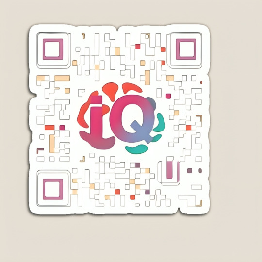
#QRCode#IQDesign#SmartQR#CreativeDesign#ColorfulQR#TechStyle#InnovativeDesign#QRStyle#TechFashion#DigitalArt#FunctionalArt#TShirtDesign#IQCode#InteractiveDesign#CustomQR#GraphicTees#CustomApparel#MerchLife#PrintOnDemand#DesignInspiration#FashionDesign#CreativeTees#ApparelDesign#CustomClothing#StreetwearDesign#DesignersOfInstagram#UniqueTees#ClothingBrand#FashionArt#StyleInspiration
2 notes
·
View notes
Text

#3DVisualization#InteractiveDesign#3DModeling#ProductDesign#ArchitectureInnovation#VirtualReality#AugmentedReality#RealTimeRendering#AIinDesign#MarketingInnovation
2 notes
·
View notes
Text
#WebDesign#WebsiteDesign#DigitalDesign#OnlineDesign#CreativeDesign#ResponsiveDesign#ModernDesign#UserFriendlyDesign#VisualDesign#InteractiveDesign#UIUXDesign#GraphicDesign#WebDevelopment#DesignSolutions#DigitalCrafting#Mississauga#Ontario#Toronto#Canada#Ottawa#Calgary#Montreal#Vancouver#Edmonton
2 notes
·
View notes
Text

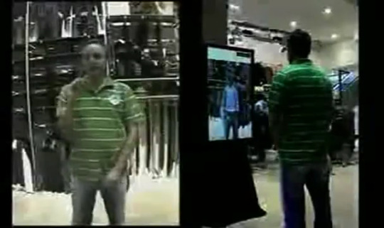
↑ The Hallensteins Virtual Changing Room made me realize it was actually possible to turn speculation into reality. It also won a Silver Lion at Cannes in 2007.


↑ I was based out of the Saatchi & Saatchi, NZ headquarters located at The Strand in Auckland. Though my role also covered the team in the Wellington office.
↗ My digital team at Saatchi & Saatchi, NZ. Tom was in NYC, but insisted we Photoshopped him into the back row. Pua, posing in the blue rugby shirt, also acted in a number of New Zealand TV shows, including the long-running Power Rangers series.
Saatchi & Saatchi, NZ
"The secret to great magic is mesmerizing storytelling." - David Blaine
Our New Zealand adventure began with what we were certain was phishing bait—a letter to Margaret from an “estate detective.” Our corporate attorney brother-in-law in Montreal validated our suspicions, but her estate lawyer cousin in Auckland, far less jaded by North America’s steady diet of cybercrime headlines, seemed confident it was legit—and also not uncommon. The sum was barely worth the trouble, but if real, would fund a trip and long-overdue visit to Margaret’s paternal family. January was high-summer in the Southern Hemisphere, and already enough to tempt us out of a Canadian winter. But man—that was a long flight!
In addition to reconnecting with Kiwi relatives in Auckland—who made me feel like I’d known them all my life—we spent a week along the Bay of Plenty in New Zealand’s coastal sheep country, where I finally understood why the Māori call these islands the “land of the big sky.” We also cycled through Wellington and Christchurch in the South Island, which Kiwis will proudly tell you is the “true New Zealand.” Somewhere along the way, I randomly dropped a coffee-invite email to Aimee Miller at Saatchi & Saatchi. Our schedules didn’t align, but she connected me with Tom Eslinger, their Creative Director for Digital, who happened to be in New York while I was here. On our call, he explained that he was transitioning into a new role as Chief Creative Officer for Publicis, Saatchi’s parent company, and was searching for a replacement.
"Look, I need someone with bigger experience than my creatives in New Zealand, but I can't convince people to move there," he said. "If you're already interested in moving, it'll make my life a heck of a lot easier!"
↓ Sheep everywhere.


↑ Flying a sport kite on 9 Mile Beach against that big sky.
↗ Cycling to the top of Evans Pass around Christchurch in the South Island.
This turned into a 13,800 km detour.
Tom flew me to LA a month later for a face-to-face with him, Jason Dooris, and Mike O'Sullivan. I remember doing a double-take to make sure I read first-class correctly on the ticket, because until then, business travel always meant the cheapest option a company could justify. This old-school luxury, which I’d only heard about through my mentors from the Mad Men era, would soon become the norm—and frankly, the only tolerable way to handle long-haul flights. The meeting wasn’t so much an interview as an agreement on timing and logistics. I’d partner with Jason, who handled client management, and with Mike, the Executive Creative Director for Australia–New Zealand, on integrated campaigns. Saatchi would cover all relocation costs, and we targeted a September 2006 start date.
The globalization of tech during the rise of Web 2.0 was already fueling a Canadian brain drain—mostly to the U.S.—and several close collaborators, including Fabio Costa and Peter Hong, had landed exciting roles in New York and the Bay Area. I loved Blast Radius, but by then it was part of a dwindling breed of independent digital shops being acquired or outpaced by agencies offering digital as part of integrated strategy. Saatchi was global, paid three times more, and gave me a wider playground for experimentation. Of course, I would soon learn that great creative freedom came with great responsibility—but we’ll get to that later. In the meantime, we rented our house to our friend Karol at a discount (on the condition she cared for our cat Bosley, sparing her a three-month quarantine if we brought her along), packed up everything into a shipping container, and set off—via Manhattan for a Saatchi global creative director workshop, and San Francisco for friends and family. This was also Margaret's introduction to first-class air travel, and like me, she was immediately smitten by luxury.


↖︎ Arriving at the Saatchi & Saatchi, NZ office for the first time.
↑ Brian quietly focused at his desk.
↗ Jason and I solving a client brief together.
Whether or not it was Tom’s intention, I arrived in our new land with my ego riding a few notches up—creative leaders were expected to be bold and edgy, after all. And coming off the high of finishing Ironman Canada, I felt invincible at 35. Despite the pitfalls, it's an appropriate time in a person's career to hit that powerful intersection of drive, foolishness, and reward, and imagine anything was possible.
Time, team, support, leadership, market economy—and the convergence of social platforms, mobile, and rich media—all combined to make this a particularly innovative period for us. Being a big fish in a small pond also gave me the credibility to propose and execute brave ideas. Which, as it turned out, was exactly what Tom wanted—needed, in fact, to win awards. That was the only metric that mattered to his bosses.
He explained when this initially confused me: “Awards raise brand and stock value. Some offices, like New Zealand, exist to win awards. Revenue is secondary. C’mon, how much money can you really make from a small economy?”
Once I reconciled this outlandish model, it freed my imagination from the pragmatic, profit-oriented mindset I’d been conditioned to operate within. The goal for account teams became finding clients willing to experiment—and my job was to pitch ideas so bold, so convincingly, that clients believed they could win. I was learning the art of creative theatre. Of course, obligatory clients like Telecom NZ and New Zealand's home-grown eBay, TradeMe, had practical problems that needed to be solved. Telecom, for instance, was exploring elaborate technical solutions to reduce support calls for ADSL modem setups—until I took them through an exercise that showed them we could cut calls by 80% just by including a well-designed, IKEA-style quick-install sheet. But when Cannes season rolled around, it was the big ideas that took over.

↑ Winning a Gold Lion at Cannes, Stark was an early social media campaign that subtly seeded the word "Starkish" into New Zealand's everyday vernacular months before the Vodka drink launched.
Adobe Flash ruled the browser, and Java dominated the pre-iPhone mobile applet space—but digital tools were still wildly fragmented. Creative teams had to be scrappy, resourceful, and inventive to get things done on the lean budgets and tight timelines afforded to us as the poor cousins to mainstream media. When I arrived, two interns had just launched a brilliant campaign for a new vodka drink called Stark from DB Breweries—subtly seeding the word “Starkish” into everyday Kiwi slang months before the product went-to-market. For just $12K, it became shorthand for anything cool—like “those sneakers are starkish”—an early, genius example of social media marketing, that also won a Gold Lion.
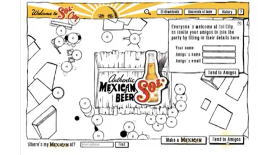
↓ Sol City was a virtual city where users created sombrero-wearing Mexican caricatures that could explore and interact with other players.
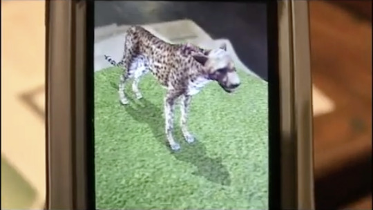

↑ Experimenting with 3D AR Animals on mobile phones for the Wellington Zoo, visitors could learn about animals from QR codes on the exhibit labels.
↗ We created Bluetooth Sniper for the NZ Army that used Bluetooth to ping mobile phones when they were near one of the outdoor signs, asking them to respond with the coordinates of a hidden sniper.
They were an example of the kind of raw, fearlessly creative talent I got to work with. My senior creative lead, Brian Merrifield—a quiet Flash designer—brought home another Gold Lion in 2007 for Sol City, an irreverent, slightly politically incorrect viral experience that let users explore a whimsical virtual city filled with user-generated sombrero-wearing Mexican caricatures, riffing on the classic “Mexican riding a bicycle” joke. At one point, we had so many Cannes Lions, we used them as doorstops. But while Lions were the outcome—and edgy microsites got all the buzz—real impact, to me, has always meant transformation: using technology in category-defining ways to solve real problems. Techno-pop culture has a fickle curve, and whenever I sense a trend peaking, my instinct is to look for the next emerging signal instead. That’s how I began to grow my team. The Hallensteins Virtual Changing Room encapsulated that idealism most completely—but it inevitably, and necessarily, required some additional ingredients.
Auckland, I began to discover, was a strange melting pot of hidden international talent—wonderfully brilliant outcasts who might have held top roles in the U.S., Europe, or the U.K., but had chosen, for one reason or another, to trade rank, privilege, and pay for refuge in this harmless little corner of the world. One of them was Steve Castellotti, originally from Philly, who came to New Zealand so he could viably live on a sailboat. I met him through his Kiwi business partner, Paul Treacy, who was soliciting contracts with Saatchi on behalf of their company, EyeMagnet. They had developed a private streaming platform capable of delivering centrally managed digital content to any screen, anywhere. Paul installed one of their units—originally about the size of a G4 Cube—for free at Saatchi, so we could run a playlist of Mike’s TV commercials on the big screen in reception.
After showing me how easy the system was to use, he said, “If you have any ideas, my business partner can build anything.”
youtube
↑ A later cut of the case study for the Hallensteins Virtual Changing Room, produced for posterity when I was at Quizative.

↑ Installing the hardware at their flagship store in downtown Auckland.
↗ In-store customer using the AR changing room to try-on clothes.
Around that time, we were brainstorming an integrated campaign for Hallensteins. It included the usual brand TV, conventional media, and UX updates to their online shopping portal. But then I floated a problem: customers—particularly men, who made up a large share of Hallensteins’ demographic—didn’t like trying on clothes. Yet shopping online meant you never really knew how something would fit. What if we could let them try on clothes… without actually trying them on?
I’d recently been inspired by the gesture-based interface in Minority Report, and asked Steve, “Is it possible to deploy an augmented reality changing room in stores using your platform—and control it with hand gestures?”
Steve didn’t say I was nuts, which would’ve been the typical response, even from a lot of engineers today. Instead, he said, “Hmm, interesting… let me get back to you tomorrow.” The next day, he returned with a crude working prototype using an off-the-shelf security cam as the input device. “I think it’s possible,” he said.
“Then all we need is a great design,” I replied. For which I recruited Denise Burchell—formerly from Frog Design—who was now in Auckland with her eccentric partner Jeff, an original Silicon Valley startup guru. I shared my vision for the user experience, connected her with Steve, and within 45 days, we had a polished version. The only hurdle left was selling 80 of these to the client for rollout across New Zealand.
That’s where Sandra Cook came in. She was a German I hired as an account manager, who had married a Kiwi rock-star, Steve Cook. She combined classic German pragmatism with a dose of Kiwi “Number 8 wire mentality,” making her the quintessential get-shit-done person every kick-squad team needs. We worked together on the stagecraft, leading with the expected elements of the integrated campaign, then finishing with one-more-thing: framing the opportunity, pondering our what-if, and teasing a few screens of the design. Sandra had set up our live demo in another room, and when the clients asked, "Wow, is this all even possible?" I finally had my Steve Jobs moment.
I said, "It is. Would you like to see it?"
It felt magical—not just for Hallensteins, but for my team, and for me. A lot of hard work, against the odds, went into this, and it was the first time I’d dared to pull off something this ambitious. To see—and sense—an audience become completely mesmerized by the spell we were weaving was a reward no amount of money could buy. But there had been no egos, no politics, no excuses. Working with an A-team was pure performance, perfectly executed through purposeful design, breakthrough engineering, and persuasive presentation. And although it only won a Silver Lion at Cannes that year, it set the tone for many other innovative ideas this team delivered.
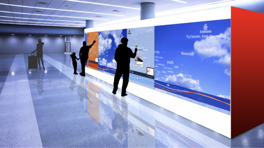

↑ An ambitious multi-panel touch-screen Flight Wall we designed for Emirates Airlines in their main airport, allowed passengers to create an entertainment playlist for their journey that synced to their cabin seat.
↗ An overhead mounted interactive screen featuring word Clouds, meant to evoke the feeling of driving a Lexus convertible.
#creativeleadership#designcareer#midcareershift#innovationindesign#designjourney#creativetechnology#augmented reality#digitalinnovation#interactivedesign#canneslions#awardwinningdesign#creative team#performance#stagecraft
0 notes
Text


Is Framer Replacing Figma? The Future of UX Design Tools.
At TheFinch Design, we’re always exploring the latest design trends and tools to elevate user experiences. Today, we’re diving into the hot topic: Is Framer replacing Figma?
Both tools are leaders in the UX/UI design space, but each serves unique needs:
Figma is ideal for collaborative, team-based workflows and creating scalable design systems.
Framer is perfect for those looking to bring interactivity and complex animations to life in their prototypes.
Swipe through our latest post to learn about the strengths and differences of each tool.
Whether you’re looking to streamline collaboration or build interactive prototypes, we can guide you in choosing the right tool that aligns with your business goals.
Have questions or need advice on your next design project? Let’s talk! Drop a comment or reach out directly to TheFinch.Design for expert support.
0 notes
Text
How Interactive Design Creates Meaningful Digital Experiences

Today’s users expect more than just static web pages—they crave experiences. In the digital world, grabbing attention isn’t just about content, it’s about how that content interacts with users. That’s where Interactive Design steps in.
It’s not a luxury anymore—it’s a necessity for those wanting to stand out in a crowded digital landscape.
What Is Interactive Design?
Interactive Design is the process of crafting digital environments that encourage user engagement. It turns a flat experience into an active journey, giving users control, feedback, and purpose as they explore your content. Whether it’s a subtle button animation, a swipe feature, or a dynamic quiz—these touches influence how people connect with your site.
Rather than telling users what to do, interactive elements guide and respond. This creates a sense of collaboration and clarity between the user and the interface.
Why It Matters More Than Ever
We’ve all visited a website that felt overwhelming—or worse, forgettable. When user interaction is missing, so is the emotional connection. Interactive design enhances:
user flow
content discovery
information retention
accessibility
time-on-site
user confidence
From responsive navigation menus to scroll-based animation, these small changes offer big results.
Sites that focus on these principles not only improve user satisfaction but also perform better on search engines.
EEAT & SEO: A Natural Fit
Following Google’s EEAT principles—Experience, Expertise, Authoritativeness, and Trustworthiness—is no longer optional. It’s essential. Interactive design supports each element by:
Showing Experience through user-tested functionality.
Demonstrating Expertise via seamless navigation and clarity.
Earning Authoritativeness by providing content that’s easy to engage with.
Building Trustworthiness by being responsive and clear in every interaction.
The more natural your site feels, the more Google sees it as helpful. And that helps with indexing, ranking, and staying visible.
It’s Not Just for Designers
You don’t need to be a developer to appreciate the benefits of interaction. Whether you're running a blog, an e-commerce site, or an online portfolio, adding simple elements—like hover effects or feedback forms—can increase engagement and time on page.
Start small: Add a clickable FAQ section, a live poll, or a sliding carousel for your latest posts.
These enhancements encourage users to explore your content deeper, which naturally boosts on-site behavior metrics—another SEO signal.
Looking Ahead
The internet is shifting. Users now expect faster, smarter, and more engaging platforms. Websites that deliver this through Interactive Design will not only meet those expectations but exceed them.
#InteractiveDesign#UXDesign#WebDesignTips#DigitalExperience#UserEngagement#EEAT#SEOcontent#DesignMatters#HumanCenteredDesign
0 notes
Text
Exploring 3D Design and Its Impact on Graphic Design
In recent years, 3D design has made a significant impact on graphic design. It’s no longer just about flat images; designers are now incorporating depth, realism, and interactivity into their creations. This evolution has opened up new possibilities, pushing the boundaries of creativity and visual storytelling.

1. The Rise of 3D Design
3D design has grown from being a niche skill to a mainstream trend in the graphic design industry. With advancements in software such as Blender, Cinema 4D, and Autodesk Maya, creating three-dimensional designs has become more accessible to graphics designers. These tools have allowed designers to experiment with complex forms and structures, resulting in eye-catching visuals that were once unimaginable.
2. Enhancing User Experience
Incorporating 3D elements into design can significantly improve user experience (UX). 3D designs can be used to create more interactive websites, product visualizations, and immersive marketing materials. For example, by adding 3D models of products on websites, customers can rotate and zoom in to get a better understanding of the product. This interactivity boosts engagement and enhances the overall user experience.
3. Applications of 3D Design in Graphic Design
There are various applications of 3D design within graphic design, including:
Product Packaging Design: 3D renders of packaging allow clients to visualize the end result before production.
Branding: 3D logos and brand marks create a more memorable and dynamic identity.
Advertising: 3D elements are used in ads to grab attention and add an extra layer of creativity, making campaigns stand out.
Web Design: With the use of 3D graphics, websites become more interactive and visually striking, improving the overall appeal.
4. The Future of 3D in Graphic Design
As technology continues to evolve, 3D design will undoubtedly play an even larger role in graphic design. With the integration of virtual reality (VR) and augmented reality (AR), graphics designers are presented with exciting opportunities to create fully immersive experiences that merge digital and physical worlds.
Designs will move from simple 3D elements to fully immersive environments, allowing users to interact in more meaningful ways. This could change the way we experience branding, advertising, and digital content altogether.
The integration of 3D design into graphic design is more than just a trend—it’s a shift in how we create and consume visual content. As continue to explore new techniques, the boundaries of what’s possible in design will continue to expand. By embracing 3D design, designers can stay ahead of the curve and create compelling, engaging, and visually stunning work.
#3DDesign#GraphicDesign#UserExperience#InteractiveDesign#ProductDesign#Branding#VisualStorytelling#CreativeInnovation
1 note
·
View note
Text
Platform Design and Development of Digital Memory Traces
Platform Design and Development of Digital Memory Traces - Applying our use case driven approach, we designed and built the Digital Memory Traces platform. It offers functionalities to support the definition and development of service ideas by addressing media collection and use as well as social interactions. The definition of different media types and functionalities to participate and engage is key to targeting a wide user community. The media types used during intake and developed throughout the project emanate from our model. Applying this model, we identified the following formats: Story, Memory Fragment, Reflection, Statement, and Photo. To capture the experiences of sharing memories, we introduced an additional format: Experience. Our platform applies storytelling and encourages a close look and social interaction, which is solely created in a co-creation manner.

The discussion in the preceding pages has confirmed the need for web-based applications that facilitate participation, creation, sharing, and co-creation of personal content-based information services. We refer to these web-based applications as media-sharing platforms. The literature focused on the micro level – the individual creating, capturing, storing, and sharing personal content intelligence. Business services need stories, with people in them, to engage, interact, and motivate clients. Therefore, at a macro level, we need to rethink how to facilitate mass creation, sharing, and embedding of stories, photo collections, reflections, goals, and 'memories'.
User Interface Design
The focus is on students and teachers-developers, thus promoting change in teaching and learning, contributing to improving the learning process. The user can access DMT, using the functionalities that allow exploring the traces, visualizing results obtained from parameters defined in a trace, starting the configuration of a trace, and obtaining snippets using the parameter estimation process. Snippets are pieces of multimedia that the machine learning algorithm selects for human annotation in order to help it learn how to spot a specific category. They include segments of videos and are painful interactive processes of data collection where human annotation is required. At the moment, the application does not have the used data stored in an adequate way, constituting future work. User access to the application, except for adding new algorithms and/or editing estimates, is conditioned on authorization.
Based on the study of similar applications and user experience design principles, it explains how the visual design should be, underlining the importance of brevity, or the user's ability to interact with less content, making extensive use of the horizontal scroll and load more. This is very useful for educational settings, where it is difficult for a person to interact with a great amount of simultaneous information. It suggests research on the design of data quality measures with an ergonomic approach and using them in the user interface, between machine learning researchers and the audience they seek to serve, in the context of machine learning for video data. Machine learning research has been primarily concerned with accuracy, or minimizing the difference between algorithm and human labeling assignments. They suggest a positive approach, assuming that they can design sampling schemes, factors that affect performance, and conditions that will improve sample annotation compliance.
Technical Architecture
The platform can be seen as two different layers. The lowest one is the storage, and the upper one joins storage and preservation. Under the preservation layer, creation and some specific retrieval actions are added. This approach finishes the basic concept framework of the proposed platform. Fine-tuning of the technical architecture incorporates a number of specific requirements for the platform. The first basic requirement is the digital preservation of creative, intellectual human activities that include the representation of these activities in a large number of different ways. There are basically two approaches to cope with this problem: the use of any additional metadata, which helps to describe every memory and its meaning in a highly accurate way, and the development of memory infrastructures that benefit from information redundancy and a high degree of tolerance even when part of this metadata is missing, noisy, or just wrong. These may be added to the platform as they become stable and compatible, provided they satisfy platform flexibility requirements.
In addition, another requirement must be added to allow for easy and highly intuitive access to the platform's contents. However, the search engines at this level are limited to exploring contents, not meaning and interpretation. For the same heavy computer costs, analyzing abstract contents is expected to be supported by professional expert systems available in a third-party environment as plugins. This will bring additional difficulties to the integration task, since some memory contents may be linked to specific professional analyses providing specific meaning. Moreover, the application of these professional expert systems is just complementary with respect to the memory contents distribution and availability. For these basic needs, an easy-to-access service layer is provided. It is aimed at replacing standard repository accesses with plug-in explorative services. These professional services access the data storage level using both stored memory contents and an extended semantic metadata tool and data infrastructure.
User Experience Considerations
Consideration of the user experience during the design of DMT was an ongoing and underlying theme. Trustworthiness develops as a more understated and latent aspect of educational technology. We understand our technology is a means that students can use for learning and that this raises the issue of how to design technology so that our users can trust it. Trustworthiness is related to our comprehension of the integrity of the information, and it is important because students rely on the technology to deliver accurate representations. A trustworthy system does not make itself known; it is something that is achieved through human-computer interaction. Trustworthiness is related to prolonged, active, and intense mental activities, motivational inertia, and satisfaction. The contributions to trustworthiness of these shortcuts are as follows: if a user has a good experience when they use an information system, then the user will be confident in the capabilities of the system. This is true whatever the design philosophy, and if certain user expectations are not met, the level to which a user trusts the system decreases.
Researchers must draw on standard methods and guidelines for keeping the users' interest; otherwise, it can lead to the loss of the users' trust in using the system or having faith in the choices the system has made for them. Factors to be taken into account involve component arrangement and format, timing of programs, upload time, protocol consistency, high quality, maintaining the aesthetics of design, minimizing cognitive overload, and minimizing human effort. Overall, taking these factors into consideration enhances the attractiveness and comprehension of trustworthiness for the user, which can then result in the user being confident when they use a decision support system, and it can also provide satisfaction to their needs. There will be trust in the system and consequently satisfaction. However, an undersupported, low-readiness system is just the opposite. The user's levels of trust, confidence, and satisfaction will drop, and both goals and the potential that technology can afford decrease. The alliances that have been built with the repositories and their responses to the study are perceived as ongoing and not just for the students.
Within this context, the trust issue is actually about the confidence students have. It is not about the repository or systems per se; ontologies, in fact, play a key role in this. Cognitive research suggests that finding confidence in information actually matches up to people trusting their own; in the end, it is our own minds that we need to trust, and it is our minds that, in part, are being enhanced by the technology as related to the intended learning outcomes. It is not just a question of aiding memory, but a question of the user having control and accountability, knowing what happened, and being allowed to verify as much as is possible to ensure that a trace of memory was achieved. Indeed, a human agent can be created to establish knowledge by interpreting and/or generating information from the user; therefore, the role of the repository enters into a cognitive partnership. Such an approach grants the student a sense of security and recognition for the real effort placed into creative memory work. Such an infusion of trust factors is a strong link to the achievement of high cognitive performance awareness. These findings, when explored during the design of eiron, not only shape the design themselves but also foster a sense of trust to a degree as issues are anticipated and dealt with.
#PlatformDesign#DigitalMemoryTraces#TechInnovation#UserExperience#UXDesign#AppDevelopment#WebDevelopment#DigitalDesign#MemoryTech#SoftwareDevelopment#DesignThinking#DigitalPlatforms#MemoryTrace#TechnologyTrends#FutureOfUX#InteractiveDesign#DataIntegration#UserEngagement#DesignInTech
1 note
·
View note
Video
youtube
Divi Users Are Going Crazy Over This Expanding Module Trick!
Learn how to create an amazing interactive expanding module on button click in the Divi Theme using simple tools and code! In this step-by-step tutorial, we’ll show you how to use Divi Sections, the Blurb Module, Button Module, and Code Module to build a clean and professional expanding content effect. With just a bit of easy CSS and toggle JavaScript, you can add stunning interactivity to your website without any extra plugins.
0 notes
Text
🌟 Transform Your Space with LED Interactive Projection🌟
Looking for a creative way to enhance your commercial space? LED interactive projection brings a dynamic and engaging experience to staircases, restaurants, and more! 🚀🎨
✅ Staircases – Turn ordinary steps into mesmerizing digital art or interactive pathways. Perfect for malls, hotels, and entertainment venues! 🏙️✨ ✅ Restaurants – Create immersive dining experiences with animated tabletops, themed visuals, or interactive menus. 🍽️🌟
💡 Whether for branding, entertainment, or customer engagement, LED projection is the future of interactive design!
#AsianDavinci#LEDProjection#InteractiveDesign#SmartSpaces#RestaurantTech#RetailInnovation#ImmersiveExperience
0 notes
Text
The Role of 3D Visualization in Modern Business: Enhancing Efficiency and Creativity

In the fast-paced world of modern business, 3D visualization plays a crucial role in both enhancing creativity and improving operational efficiency. Companies are using 3D models to streamline design processes, allowing for faster revisions and reduced costs. In marketing, 3D visualization is engaging customers with immersive product experiences, driving higher conversions and customer satisfaction. Businesses are also leveraging 3D visualization for training, project presentations, and collaboration. This post explores how 3D visualization is becoming an indispensable tool for driving success in the modern business landscape, Read More.
#3DVisualization#InteractiveDesign#3DModeling#ProductDesign#ArchitectureInnovation#VirtualReality#AugmentedReality#RealTimeRendering#AIinDesign#MarketingInnovation
2 notes
·
View notes
Text
Visit Iconadda to view a wide collection of free interface
The icons are required to enhance the user interface, which sites, apps and designs are more visually appealing and intuitive. Designers, developers and ads can download high quality images for free for an extended library of free icons of any type of areas.Whether you need a PNG or SVG icon, our site provides a simple download and use experience for your applications.
Why choose IconAdda free icon? Better design: Each of our icons is designed to maintain a sophisticated look. Many formats: Icons are available for download in SVG, PNG and some other formats, making them flexible for different types of use cases. Totally free: avail yourself of a vast collection of icons without border or license fee. Simple to use: Simply download them and bring them into your projects right away.
5. Medical and healthcare icon This set of icons consists of symbols of hospitals, physicians, medical and healthcare and is designed to be used on health services, applications and digital platforms. 6. Messaging and communication icon These icons, such as e-mail symbols, voice bubbles and information, are best suited for chat applications, e-mail services and customer support platforms. 7. Symbols for travel and tourism With a symbol of hotels, monuments, airplanes and adventure-related symbols, this trip is best suited for businesses and blogs.
AND MANY MORE CATEGORIES
How to use IconAdda to download free icons Iconadda is simple to use! Simply browse our categories, choose the free icon you require, choose the format you prefer (SVG, PNG and more), and download them straight away.
Design icons to suit your requirements All our SVG icons are safe to eat, so you can alter colors, score them or alter them to suit the demands of your project. Our symbols can be tailored to your style, whatever you do with a presentation, mobile app or website.
Conclusion For all those looking for a large choice of free interface icons on a variety of fields, Iconadda is here. Improve your design work by hundreds of quality SVG, PNG and vector icons at ease. Get our free icon and increase your designs now by starting your search.
#InterfaceIcons#UIUXDesign#DigitalIcons#WebUI#AppDesign#FlatIcons#MinimalIcons#ModernUI#UserInterface#DesignAssets#WebIcons#DashboardIcons#UIElements#GraphicDesign#VectorIcons#InteractiveDesign#CreativeUI#MobileAppIcons#WebDesignAssets#UXDesignTools
0 notes
Text
Redefining Digital Experiences: Emerging Trends in UI/UX Services for 2025
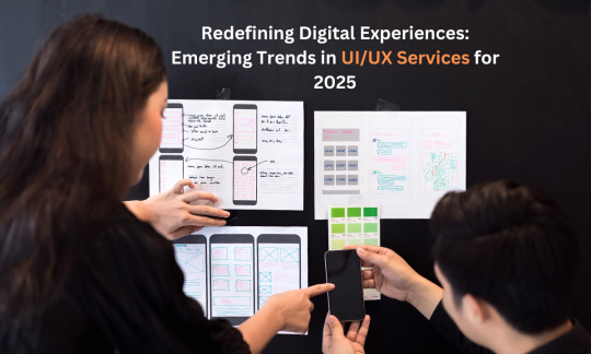
Design has become an integral part of every business. It has the power to attract attention from users, which means for businesses to stay on top, they must take their innovative design practices to the next level. UI/UX design services companies are on their mission to meet the modern needs of businesses by creating smooth, interactive and aesthetic experiences. Let’s take a look at some of the latest trends in UI/UX design services.
Latest Trends in UI/UX Designs
1. AI and Machine Learning for Personalization
To curate customised user experiences, artificial intelligence and machine learning can be extensively used. UI/UX design services companies are using two of these for the analysis of preferences, patterns, and behaviours of users, which result in the best personalized interfaces that can adapt according to the needs of individual users for increased engagement and satisfaction like never before.
2. Effective Technologies: AR, VR, and So On
The impact of augmented reality (AR) and virtual reality (VR) is getting bigger day by day in this digital world. From gaming purposes to doing virtual try-ons in retail industries, UI/UX design services companies are bringing clarity to the fact that AR and VR can connect the physical and digital worlds together.
3. Interfaces Based on Voice and Gestures
Voice and gesture-based controls are going to be the next significant step in industries like healthcare, automotive, and smart home devices. UI/UX design services companies are trying to craft interfaces that can help businesses implement hands-free interaction to increase accessibility and usability, so that they can have the flexibility to cater to a broader audience.
4. Sustainable and Ethical Design Practices
As sustainability is an inevitable factor in today’s world, UI/UX design is no exception. Creating interfaces that need fewer resources and making sure that data privacy and transparency are maintained are important.
Accepting these new trends is the only way by which UI/UX design service companies can impress their customers through factors like adaptability, sustainability and interactivity. All of these trends have resulted in a more intuitive interaction of users with all products and services they purchase. The future of UI/UX is bright, and those who invest in it today are set to lead tomorrow.
#UIUXTrends2025#DigitalExperience#UXDesign#UITechnology#FutureOfDesign#EmergingTrends#UserExperience#UIUXInnovation#DesignThinking#UXResearch#InteractiveDesign#WebDesign#MobileUX#NextGenUI#CreativeDesign#HCI#DigitalTransformation
0 notes
Text
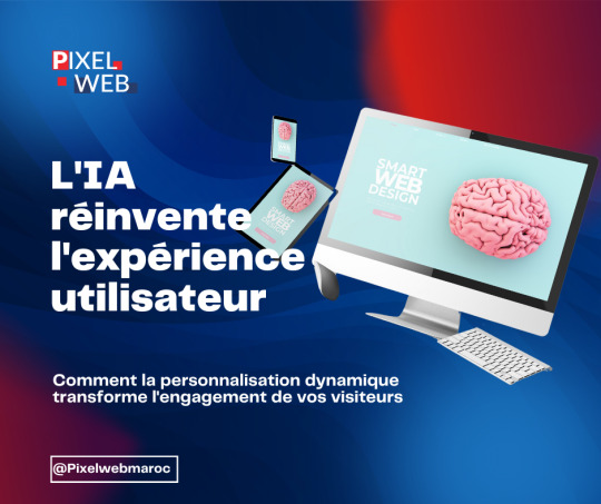
L'intelligence artificielle ne cesse de repousser les limites du web design ! 🚀
Plongez dans notre guide complet sur la personnalisation dynamique de l'UX grâce à l'IA. Transformez l'expérience de vos visiteurs et boostez vos conversions avec des techniques innovantes.
→ Personnalisation en temps réel → Analyse comportementale → Conversion optimisée → Solutions intelligentes
Découvrez comment votre site web peut devenir plus intelligent ! 🤖✨
#ux#webdesign#ai#artificialintelligence#uxdesign#webdev#userexperience#digital#tech#design#technology#future#webdevelopment#coding#development#designer#techblog#websitedesign#digitaldesign#innovation#creativecoding#designthinking#uxinsights#techtrends#futureweb#aitech#modernweb#digitalinnovation#interactivedesign
0 notes
Text
Design. Animate. Inspire.
Whether it’s breathtaking visuals or engaging game mechanics, we bring imagination to reality. 💡✨
📍 Discover our creativity: https://fathamster.studio/
0 notes
Text


Check out the new product 🔥🔥 QR Code Scan and Smile
A unique t-shirt design featuring a black-and-white QR code cleverly embedded with the hidden message, “Scan for a Smile.” Surrounding the code, playful and colorful doodles of hearts, stars, and swirls add a vibrant and cheerful touch, making the design interactive and fun. This artwork blends modern tech with a lighthearted vibe, creating a conversation starter and a trendy, quirky addition to casual wear.
#scan for a smile#qr#qr code#meme#code#funny#scan#QR code#QR scanner#QR generator#QR technology#QR payment#QR marketing#QR stickers#QR menu#QR reader#QR business card#QR tracking#QR design#ScanForASmile#InteractiveDesign#QuirkyArt#TechAndFun#QRCodeTee#PlayfulDoodles#CreativeTShirt#FunFashion#HiddenMessage#CasualTrendyWear#SmileThroughArt
0 notes