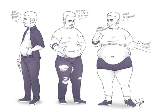
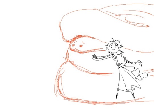
#it was tight but i made it
Text
first vulture kill! mostly by accident, too. this one chased me into the bridge and i started throwing shit at it to try and deter it, but then my spear knocked its mask off and it got even Madder and started chasing me, so i just. finished it off sdkjjksd
i will say, climbing the wall with a vulture mask is So so so much easier than without. literally i got up to the upper wall shelter in one try, the cyans didn't even bother me. absolutely magical.
#i did almost run out of time the cycle i killed the vulture#it was a fairly short one and i wanted to save at the wall#it was tight but i made it#and now i have a vulture mask :)#oh i just remembered i ditched my explosive spear in SI oops#ah well
4 notes
·
View notes
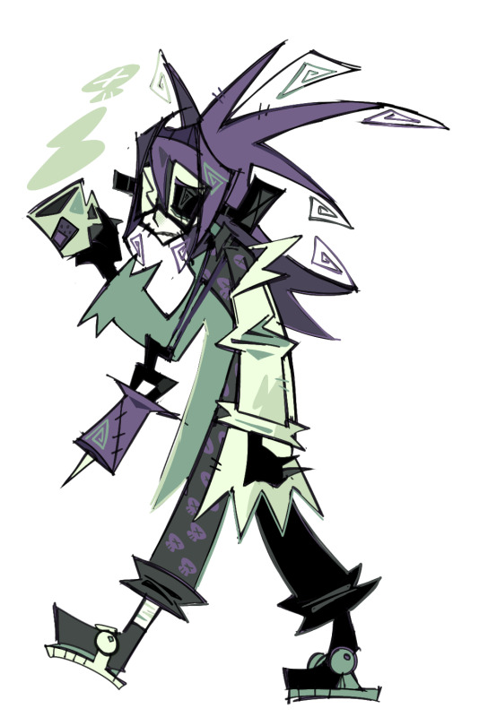
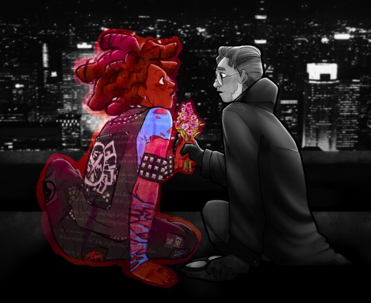
Text

i want us both to eat well
#more g4g art !#he tries So fucking hard for jl . so hard#i dont know if there are many moments of reprieve during jl’s childhood but i think#he thinks of what his sister did for him and his brother and he copies that . slowly slowly like hes worried he’ll mess up#and i think he hums jl to sleep and then bawls his eyes out every night#i thought a lot about how young he was post war pre canon#when i was drawing this#and i think . hes such a good parent#i think jl looks back at his childhood and thinks that he was happy . that jc made sure he was happy#and he only realises later that when jc was so silent and stared into space before baby jl ran up to him and jc smiled#small but a smile#that he was struggling so bad . but he tried so hard to keep jl happy#and i think jl goes up and sits with him quietly now because at least if his brother doesnt want to come home to hug him jl can#hug him just as tight#so what if theyre a family of two theyve got each other#ough . they make me all weepy and miserable#UMMM DETAILS the ribbons on the tree jcs eyebags and black nail polish#ok the end💥#allcheng gotcha for gaza#art tag#mdzs#jiang cheng#jin ling#jin ling and his jiujiu#mxtx#mo dao zu shi#魔道祖师#cql#the untamed#the grandmaster of demonic cultivation
609 notes
·
View notes
Text
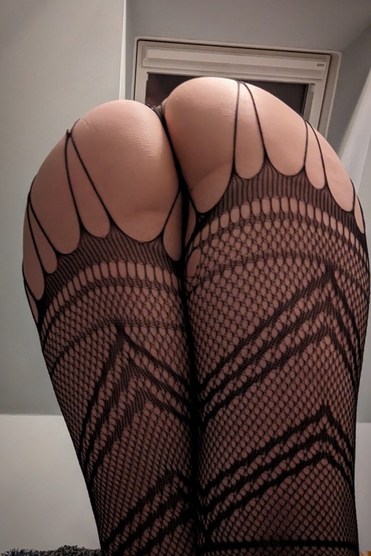
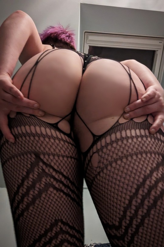

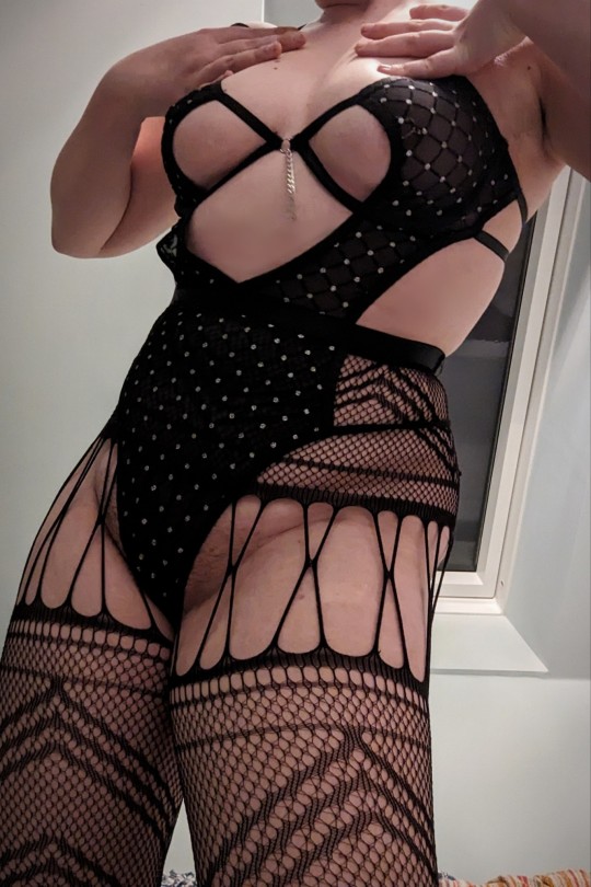
I did remember it was a Friday!!! So, fishnet.
Treat me ~ Tip Me ~ More of me
#I love these tights and this bodysuit. I have such fabulous taste. These will always be some of my go-to pieces for fun pics#Fishnet Friday#Happy fishnet Friday to all those who may celebrate ✨#Congratulations on surviving the week my loves. It's been a rough one here but we made it.#satans knitwear#girls with piercings#alt pinup#pinup girl#pretty lingerie#Fishnet tights#cheeky#Black strappy lingerie#My tumtum contains much fruity cider and cheesy garlic bread. So thats a Friday evening well spent.
725 notes
·
View notes
Text

Papyrus doodle page! He’s so silly
(I’ve been drawing his brother much more lately, I hope he isn’t too mad at me lol)
#okay idk if this is really simp art#but I love papyrus a normal amount#even when he’s on the back burner at the moment..#I haven’t drawn him a while I swear he’s a different skeleton every drawing lol#not like I draw sans more consistently#I really like how condensed I made this#fitting him in tight spots is fun <3#but yeah I got blasted with a papyrus love beam so here#papyrus#undertale#silly art
504 notes
·
View notes
Text
why Aurora's art is genius
It's break for me, and I've been meaning to sit down and read the Aurora webcomic (https://comicaurora.com/, @comicaurora on Tumblr) for quite a bit. So I did that over the last few days.
And… y'know. I can't actually say "I should've read this earlier," because otherwise I would've been up at 2:30-3am when I had responsibilities in the morning and I couldn't have properly enjoyed it, but. Holy shit guys THIS COMIC.
I intended to just do a generalized "hello this is all the things I love about this story," and I wrote a paragraph or two about art style. …and then another. And another. And I realized I needed to actually reference things so I would stop being too vague. I was reading the comic on my tablet or phone, because I wanted to stay curled up in my chair, but I type at a big monitor and so I saw more details… aaaaaand it turned into its own giant-ass post.
SO. Enjoy a few thousand words of me nerding out about this insanely cool art style and how fucking gorgeous this comic is? (There are screenshots, I promise it isn't just a wall of text.) In my defense, I just spent two semesters in graphic design classes focusing on the Adobe Suite, so… I get to be a nerd about pretty things…???
All positive feedback btw! No downers here. <3
---
I cannot emphasize enough how much I love the beautiful, simple stylistic method of drawing characters and figures. It is absolutely stunning and effortless and utterly graceful—it is so hard to capture the sheer beauty and fluidity of the human form in such a fashion. Even a simple outline of a character feels dynamic! It's gorgeous!
Though I do have a love-hate relationship with this, because my artistic side looks at that lovely simplicity, goes "I CAN DO THAT!" and then I sit down and go to the paper and realize that no, in fact, I cannot do that yet, because that simplicity is born of a hell of a lot of practice and understanding of bodies and actually is really hard to do. It's a very developed style that only looks simple because the artist knows what they're doing. The human body is hard to pull off, and this comic does so beautifully and makes it look effortless.
Also: line weight line weight line weight. It's especially important in simplified shapes and figures like this, and hoo boy is it used excellently. It's especially apparent the newer the pages get—I love watching that improvement over time—but with simpler figures and lines, you get nice light lines to emphasize both smaller details, like in the draping of clothing and the curls of hair—which, hello, yes—and thicker lines to emphasize bigger and more important details and silhouettes. It's the sort of thing that's essential to most illustrations, but I wanted to make a note of it because it's so vital to this art style.
THE USE OF LAYER BLENDING MODES OH MY GODS. (...uhhh, apologies to the people who don't know what that means, it's a digital art program thing? This article explains it for beginners.)
Bear with me, I just finished my second Photoshop course, I spent months and months working on projects with this shit so I see the genius use of Screen and/or its siblings (of which there are many—if I say "Screen" here, assume I mean the entire umbrella of Screen blending modes and possibly Overlay) and go nuts, but seriously it's so clever and also fucking gorgeous:
Firstly: the use of screened-on sound effect words over an action? A "CRACK" written over a branch and then put on Screen in glowy green so that it's subtle enough that it doesn't disrupt the visual flow, but still sticks out enough to make itself heard? Little "scritches" that are transparent where they're laid on without outlines to emphasize the sound without disrupting the underlying image? FUCK YES. I haven't seen this done literally anywhere else—granted, I haven't read a massive amount of comics, but I've read enough—and it is so clever and I adore it. Examples:


Secondly: The beautiful lighting effects. The curling leaves, all the magic, the various glowing eyes, the fog, the way it's all so vividly colored but doesn't burn your eyeballs out—a balance that's way harder to achieve than you'd think—and the soft glows around them, eeeee it's so pretty so pretty SO PRETTY. Not sure if some of these are Outer/Inner Glow/Shadow layer effects or if it's entirely hand-drawn, but major kudos either way; I can see the beautiful use of blending modes and I SALUTE YOUR GENIUS.
I keep looking at some of this stuff and go "is that a layer effect or is it done by hand?" Because you can make some similar things with the Satin layer effect in Photoshop (I don't know if other programs have this? I'm gonna have to find out since I won't have access to PS for much longer ;-;) that resembles some of the swirly inner bits on some of the lit effects, but I'm not sure if it is that or not. Or you could mask over textures? There's... many ways to do it.
If done by hand: oh my gods the patience, how. If done with layer effects: really clever work that knows how to stop said effects from looking wonky, because ugh those things get temperamental. If done with a layer of texture that's been masked over: very, very good masking work. No matter the method, pretty shimmers and swirly bits inside the bigger pretty swirls!
Next: The way color contrast is used! I will never be over the glowy green-on-black Primordial Life vibes when Alinua gets dropped into that… unconscious space?? with Life, for example, and the sharp contrast of vines and crack and branches and leaves against pitch black is just visually stunning. The way the roots sink into the ground and the three-dimensional sensation of it is particularly badass here:

Friggin. How does this imply depth like that. HOW. IT'S SO FREAKING COOL.
A huge point here is also color language and use! Everybody has their own particular shade, generally matching their eyes, magic, and personality, and I adore how this is used to make it clear who's talking or who's doing an action. That was especially apparent to me with Dainix and Falst in the caves—their colors are both fairly warm, but quite distinct, and I love how this clarifies who's doing what in panels with a lot of action from both of them. There is a particular bit that stuck out to me, so I dug up the panels (see this page and the following one https://comicaurora.com/aurora/1-20-30/):

(Gods it looks even prettier now that I put it against a plain background. Also, appreciation to Falst for managing a bridal-carry midair, damn.)
The way that their colors MERGE here! And the immense attention to detail in doing so—Dainix is higher up than Falst is in the first panel, so Dainix's orange fades into Falst's orange at the base. The next panel has gold up top and orange on bottom; we can't really tell in that panel where each of them are, but that's carried over to the next panel—

—where we now see that Falst's position is raised above Dainix's due to the way he's carrying him. (Points for continuity!) And, of course, we see the little "huffs" flowing from orange to yellow over their heads (where Dainix's head is higher than Falst's) to merge the sound of their breathing, which is absurdly clever because it emphasizes to the viewer how we hear two sets of huffing overlaying each other, not one. Absolutely brilliant.
(A few other notes of appreciation to that panel: beautiful glows around them, the sparks, the jagged silhouette of the spider legs, the lovely colors that have no right to make the area around a spider corpse that pretty, the excellent texturing on the cave walls plus perspective, the way Falst's movements imply Dainix's hefty weight, the natural posing of the characters, their on-point expressions that convey exactly how fuckin terrifying everything is right now, the slight glows to their eyes, and also they're just handsome boys <3)
Next up: Rain!!!! So well done! It's subtle enough that it never ever disrupts the impact of the focal point, but evident enough you can tell! And more importantly: THE MIST OFF THE CHARACTERS. Rain does this irl, it has that little vapor that comes off you and makes that little misty effect that plays with lighting, it's so cool-looking and here it's used to such pretty effect!
One of the panel captions says something about it blurring out all the injuries on the characters but like THAT AIN'T TOO BIG OF A PROBLEM when it gets across the environmental vibes, and also that'd be how it would look in real life too so like… outside viewer's angle is the same as the characters', mostly? my point is: that's the environment!!! that's the vibes, that's the feel! It gets it across and it does so in the most pretty way possible!
And another thing re: rain, the use of it to establish perspective, particularly in panels like this—

—where we can tell we're looking down at Tynan due to the perspective on the rain and where it's pointing. Excellent. (Also, kudos for looking down and emphasizing how Tynan's losing his advantage—lovely use of visual storytelling.)
Additionally, the misting here:

We see it most heavily in the leftmost panel, where it's quite foggy as you would expect in a rainstorm, especially in an environment with a lot of heat, but it's also lightly powdered on in the following two panels and tends to follow light sources, which makes complete sense given how light bounces off particles in the air.
A major point of strength in these too is a thorough understanding of lighting, like rim lighting, the various hues and shades, and an intricate understanding of how light bounces off surfaces even when they're in shadow (we'll see a faint glow in spots where characters are half in shadow, but that's how it would work in real life, because of how light bounces around).
Bringing some of these points together: the fluidity of the lines in magic, and the way simple glowing lines are used to emphasize motion and the magic itself, is deeply clever. I'm basically pulling at random from panels and there's definitely even better examples, but here's one (see this page https://comicaurora.com/aurora/1-16-33/):

First panel, listed in numbers because these build on each other:
The tension of the lines in Tess's magic here. This works on a couple levels: first, the way she's holding her fists, as if she's pulling a rope taut.
The way there's one primary line, emphasizing the rope feeling, accompanied by smaller ones.
The additional lines starbursting around her hands, to indicate the energy crackling in her hands and how she's doing a good bit more than just holding it. (That combined with the fists suggests some tension to the magic, too.) Also the variations in brightness, a feature you'll find in actual lightning. :D Additional kudos for how the lightning sparks and breaks off the metal of the sword.
A handful of miscellaneous notes on the second panel:
The reflection of the flames in Erin's typically dark blue eyes (which bears a remarkable resemblance to Dainix, incidentally—almost a thematic sort of parallel given Erin's using the same magic Dainix specializes in?)
The flowing of fabric in the wind and associated variation in the lineart
The way Erin's tattoos interact with the fire he's pulling to his hand
The way the rain overlays some of the fainter areas of fire (attention! to! detail! hell yeah!)
I could go on. I won't because this is a lot of writing already.
Third panel gets paragraphs, not bullets:
Erin's giant-ass "FWOOM" of fire there, and the way the outline of the word is puffy-edged and gradated to feel almost three-dimensional, plus once again using Screen or a variation on it so that the stars show up in the background. All this against that stunning plume of fire, which ripples and sparks so gorgeously, and the ending "om" of the onomatopoeia is emphasized incredibly brightly against that, adding to the punch of it and making the plume feel even brighter.
Also, once again, rain helping establish perspective, especially in how it's very angular in the left side of the panel and then slowly becomes more like a point to the right to indicate it's falling directly down on the viewer. Add in the bright, beautiful glow effects, fainter but no less important black lines beneath them to emphasize the sky and smoke and the like, and the stunningly beautiful lighting and gradated glows surrounding Erin plus the lightning jagging up at him from below, and you get one hell of an impactful panel right there. (And there is definitely more in there I could break down, this is just a lot already.)
And in general: The colors in this? Incredible. The blues and purples and oranges and golds compliment so well, and it's all so rich.
Like, seriously, just throughout the whole comic, the use of gradients, blending modes, color balance and hues, all the things, all the things, it makes for the most beautiful effects and glows and such a rich environment. There's a very distinct style to this comic in its simplified backgrounds (which I recognize are done partly because it's way easier and also backgrounds are so time-consuming dear gods but lemme say this) and vivid, smoothly drawn characters; the simplicity lets them come to the front and gives room for those beautiful, richly saturated focal points, letting the stylized designs of the magic and characters shine. The use of distinct silhouettes is insanely good. Honestly, complex backgrounds might run the risk of making everything too visually busy in this case. It's just, augh, so GORGEOUS.
Another bit, take a look at this page (https://comicaurora.com/aurora/1-15-28/):

It's not quite as evident here as it is in the next page, but this one does some other fun things so I'm grabbing it. Points:
Once again, using different colors to represent different character actions. The "WHAM" of Kendal hitting the ground is caused by Dainix's force, so it's orange (and kudos for doubling the word over to add a shake effect). But we see blue layered underneath, which could be an environmental choice, but might also be because it's Kendal, whose color is blue.
And speaking off, take a look at the right-most panel on top, where Kendal grabs the spear: his motion is, again, illustrated in bright blue, versus the atmospheric screened-on orange lines that point toward him around the whole panel (I'm sure these have a name, I think they might be more of a manga thing though and the only experience I have in manga is reading a bit of Fullmetal Alchemist). Those lines emphasize the weight of the spear being shoved at him, and their color tells us Dainix is responsible for it.
One of my all-time favorite effects in this comic is the way cracks manifest across Dainix's body to represent when he starts to lose control; it is utterly gorgeous and wonderfully thematic. These are more evident in the page before and after this one, but you get a decent idea here. I love the way they glow softly, the way the fire juuuust flickers through at the start and then becomes more evident over time, and the cracks feel so realistic, like his skin is made of pottery. Additional points for how fire begins to creep into his hair.
A small detail that's generally consistent across the comic, but which I want to make note of here because you can see it pretty well: Kendal's eyes glow about the same as the jewel in his sword, mirroring his connection to said sword and calling back to how the jewel became Vash's eye temporarily and thus was once Kendal's eye. You can always see this connection (though there might be some spots where this also changes in a symbolic manner; I went through it quickly on the first time around, so I'll pay more attention when I inevitably reread this), where Kendal's always got that little shine of blue in his eyes the same as the jewel. It's a beautiful visual parallel that encourages the reader to subconsciously link them together, especially since the lines used to illustrate character movements typically mirror their eye color. It's an extension of Kendal.
Did I mention how ABSOLUTELY BEAUTIFUL the colors in this are?
Also, the mythological/legend-type scenes are illustrated in familiar style often used for that type of story, a simple and heavily symbolic two-dimensional cave-painting-like look. They are absolutely beautiful on many levels, employing simple, lovely gradients, slightly rougher and thicker lineart that is nonetheless smoothly beautiful, and working with clear silhouettes (a major strength of this art style, but also a strength in the comic overall). But in particular, I wanted to call attention to a particular thing (see this page https://comicaurora.com/aurora/1-12-4/):

The flowing symbolic lineart surrounding each character. This is actually quite consistent across characters—see also Life's typical lines and how they curl:

What's particularly interesting here is how these symbols are often similar, but not the same. Vash's lines are always smooth, clean curls, often playing off each other and echoing one another like ripples in a pond. You'd think they'd look too similar to Life's—but they don't. Life's curl like vines, and they remain connected; where one curve might echo another but exist entirely detached from each other in Vash's, Life's lines still remain wound together, because vines are continuous and don't float around. :P
Tahraim's are less continuous, often breaking up with significantly smaller bits and pieces floating around like—of course—sparks, and come to sharper points. These are also constants: we see the vines repeated over and over in Alinua's dreams of Life, and the echoing ripples of Vash are consistent wherever we encounter him. Kendal's dream of the ghost citizens of the city of Vash in the last few chapters is filled with these rippling, echoing patterns, to beautiful effect (https://comicaurora.com/aurora/1-20-14/):

They ripple and spiral, often in long, sinuous curves, with smooth elegance. It reminds me a great deal of images of space and sine waves and the like. This establishes a definite feel to these different characters and their magic. And the thing is, that's not something that had to be done—the colors are good at emphasizing who's who. But it was done, and it adds a whole other dimension to the story. Whenever you're in a deity's domain, you know whose it is no matter the color.
Regarding that shape language, I wanted to make another note, too—Vash is sometimes described as chaotic and doing what he likes, which is interesting to me, because smooth, elegant curves and the color blue aren't generally associated with chaos. So while Vash might behave like that on the surface, I'm guessing he's got a lot more going on underneath; he's probably much more intentional in his actions than you'd think at a glance, and he is certainly quite caring with his city. The other thing is that this suits Kendal perfectly. He's a paragon character; he is kind, virtuous, and self-sacrificing, and often we see him aiming to calm others and keep them safe. Blue is such a good color for him. There is… probably more to this, but I'm not deep enough in yet to say.
And here's the thing: I'm only scratching the surface. There is so much more here I'm not covering (color palettes! outfits! character design! environment! the deities! so much more!) and a lot more I can't cover, because I don't have the experience; this is me as a hobbyist artist who happened to take a couple design classes because I wanted to. The art style to this comic is so clever and creative and beautiful, though, I just had to go off about it. <3
...brownie points for getting all the way down here? Have a cookie.
#aurora comic#aurora webcomic#comicaurora#art analysis#...I hope those are the right tags???#new fandom new tagging practices to learn ig#much thanks for something to read while I try to rest my wrists. carpal tunnel BAD. (ignore that I wrote this I've got braces ok it's fine)#anyway! I HAVE. MANY MORE THOUGHTS. ON THE STORY ITSELF. THIS LOVELY STORY#also a collection of reactions to a chunk of the comic before I hit the point where I was too busy reading to write anything down#idk how to format those tho#...yeet them into one post...???#eh I usually don't go off this much these days but this seems like a smaller tight-knit fandom so... might as well help build it?#and I have a little more time thanks to break so#oh yes also shoutout to my insanely awesome professor for teaching me all the technical stuff from this he is LOVELY#made an incredibly complex program into something comprehensible <3#synapse talks
761 notes
·
View notes
Text

Just some lil fellas in-person. 🤭
#dragon age#dragon age the veilguard#da rook#bellara lutara#neve gallus#emmrich volkarin#lace Harding#da taash#lucanis dellamorte#da davrin#DAtV#my art#this is a test batch cos I’ve never made my own standees before#tight fit tbh hmmm#I’m not sure if the quality is meant to be that way#they came out alright tho I like the weight and feel of it#like chess pieces heheh#which gives me another idea for another time#just wanted to share the pic here#undecided if I want to make these ones a thing yet
261 notes
·
View notes
Photo
#commission#ronnie reed#wg sequence#wg kink#male feedee#I finally made him take his jeans off lmaoo#I looked at my old art again and I realized#there's no way this guy would actually wear something other than underwear at home#like what was I even thinking#in my defense fat dudes in tight jeans are hot#nothing new under the sun
2K notes
·
View notes
Text

"my oshis graduated" outfit swap
#yeah this one was for me#tsukumo sana#magni dezmond#vtuber#holofateswap#hololive#holostars#holocouncil#holotempus#it's funny bc after they graduated I was like#oh I won't draw them anymore out of respect ^_^#but unfortunately I missed them too much so here I am. drawing them still#I should reiterate that I'm happy that they're taking care of themselves#and that they're happier now!#I just cherish the memories we made together also#I think that's the best way to put it#BLOWS THEM A BIG CHEESY KISS#vespy is also my oshi but I cannot draw big buff men in tight outfits for the life of me. NEXT TIME MAYBE#I already struggle with axel and he's like. not even that bulked up#I'M TRYING MEN </3#oh that tag sounds fucking weird out of context#i'm leaving it though
369 notes
·
View notes
Text


Daniel Brühl as Karlito Karl Lagerfeld
Becoming Karl Lagerfeld (2024) | "Do You Have a Style?"
#daniel brühl#becoming karl lagerfeld#karl lagerfeld#dont mind my shenanigans#i couldnt not gif this scene#i wanna pull the strings#tight lace the boy#i got sick so i havent made gifs in like 2 years lmao#im still sick but this scene inspired me#be gentle#posting bc im a dumbass#reposting bc im also a dumbass
157 notes
·
View notes
Text


Some sorta Wild West AU
#c draws#fallen hero#fhr#ricardo ortega#lady argent#waz testing out some brushes#also I think I might’ve made his pants too tight. sorry ric
281 notes
·
View notes
Text
he gets kranky in the mornings if you know what i mean
#zeno's art#ocs#reassassination#dr krankenstein#ugh i literally want to snap him and watch him start glowing like a glowstick#sorry for being obsessed with this guy who i literally made up in my brain and designed myself#um ok i actually need to sleep#pls ask literally any question you have about reassassination at all i love talking about it#also comm deadlines are pretty tight and exams are literally next week so expect less doodles unfortunately 😭#BUT i will try my best to post my notebook doodles even tho they're shit
151 notes
·
View notes
Text
hey so if yakumo puts up an essence shield does it looks like
this.?
this?
or this??
#behold... MY COMPRESSED PIXELS!!!!#i swear during berserker oli or smth yaku made a shield that was shaped like a snake going AAAAAHHHHHH#and it sorta absorbed all the attack into its maw#which...thinking about it .... wouldn't that hurt extra?#letting an energy blast hit you directly on your (lack of) tonsils?#why wouldn't you block it out with your more solid skin? unless the snake is a indeed magical energy shield snake#and the offending attack is just a tasty snack. like a refreshing smoothie (but with velocity)#which led me to the idea of defensive cinnamon roll snake#they're shielding themselves while rolling up into a tight bun???#or yaku could have scrapped the theatrics and just gone for a simple covering shield like the 1st one#maybe it woul dbe basic round shape overall but with a little snake flair textured like scales. like a honeycomb of protective reptile skin#actually . you know what.#next time yakumo puts up a shield it's just gonna be a massive projection of: 🥺#the massive face will catch anyone offguard.... protective watery eyes emoji#mirage of scales#nu carnival yakumo
72 notes
·
View notes
Text

the flower (reprise)
#spider man: across the spider verse#spider punk#spider noir#hobie brown#noirpunk#to everyone who left me messages: i love you i love you i am hugging you so tight and/or giving you the crispest high fives#you made this possible <3#... this fanfiction was made possible by viewers like you#i love them SO dearly. do you understand#mighty muse give me the strength to write this much again#i havent written 27k of my OWN GODDAMN ORIGINAL SHIT IN LIKE A YEAR#but nooooo these fuckers get all my best material#(i am having so much fun and they are consuming my world)
972 notes
·
View notes
Text
Macbeth Q&A 18th Jan 2024 Part 1
Was lucky enough to get a ticket for the Member's Event at the Donmar Warehouse that took place on the 18th...with the price of the patronages I sure never thought I'd have gotten the chance, but luckily, they also let in some non-members 🥹❤️
The brilliant performance of Macbeth was followed by a very quick cleaning of the stage - thought for sure it would've taken them longer to remove the blood than like 5 minutes - followed by a lovely, little Q&A session.
The Q&A was led by Craig Gilbert (Literary manager) who talked to Annie Grace and Alasdair Macrae (Musicians and part of the acting ensemble) as well as Cush Jumbo and David Tennant.
Anyway, just gonna write down some of the stuff they talked about :) sorry if it's a bit messy! Might be spoilery if you haven't seen it yet but are going to!
To begin with Craig remarked that he didn't think he'd ever seen that many people staying behind for a Q&A before (While I was just wondering why some people even left!? Stressful!).
David introduced himself with "My real name is David "Thane of Paisely" Tennant - while Cush introduced herself with "I´m Cush Jumbo - there's only one of me".
First question was Craig asking them what it was that brought them to the Donmar to do Macbeth - to which David pretty much just replied that 1. It's the Donmar! 2. It's Macbeth! One of the greatest plays of all time in an amazingly intimate space - and that the theatre is famous for its quality of work. So he found it quite hard to think of a reason not to do it!
Cush said she'd worked there before and loves the theatre, how it's so intimate but also a great workspace. Followed by her saying she said yes because David asked her. She talked about how important it was for this play to do it together with the right actor playing opposite you.
David says Max Webster asked him about a year ago if he wanted to do the play - he gave him the dates - and since there weren't any obstacles in the way, David didn't have any excuse not to do it.
He then said that he had slightly avoided Macbeth - there sorta being the assumption that if you're Scottish and has done some Shakespeare plays before you have to do Macbeth. Which he joked was a bit odd since it's not like every Italian has to play Romeo. Then he mentioned that Macbeth is probably a bit more of a jock than he is - that it seemed more like a part for big, burly actors.
Max had laid out his initial ideas to David, a lot of which are in the final production, and David thought he seemed lovely, bright and clever and inventive plus it being the Donmar Warehouse! To which joked that he had last worked there 20 years ago - when he was 8 years old! "It's just one of those spaces" - friendly and epic at the same time where it's such a pleasure to be on the stage.
When Craig asked his next question concerning the sound of the play someone asked him to speak louder as she couldn't hear them - to which David joked that they've gotten so used to whispering. But also said sorry, and that they would!
Alasdair explained a bit about the process of the binaural sound - bit I find it a bit difficult to decipher it all correctly, sorry. He did say that a interesting part of it is that it allows them a controlled environment where they can put all the musicians (and even the bagpipes!) behind the soundproof box so "Poor David and Cush" doesn't have to shout over all the racket.
Craig asked David and Cush what their reaction was when they heard about the concept of the binaural soundscape - to which David replied that it didn't quite exist when they first came onboard - Cush joking they were tricked into it. Then she talked about her and David going on a workshop with Max to get a feeling of how it would all work - and get a sense of how it would sound to the audience, as this was one of the few times, they got to hear that side of it. Their experience of the play being completely different to the experience the audience has.
Cush said they can hear some of the sound - like she can hear some of the animal sounds and David can hear some of the stuff from the glass box - but most of their cues and information comes from timing with each other. She said they won't be able to ever hear what the audience hears - to which David joked "We're busy".
It felt like mixing medias - as it all went quite against their natural stagecraft instinct - but Cush found that in the long run it made things very interesting - like they don't have to worry about getting something whispered to each other - as the audience will hear it anyway.
David said the odd thing is that they don't really know what the experience truly is like. He mentioned that to the sides of the stage there's a speaker for them where they will get any cues that they need to hear. Like they can hear the witches - but they can't hear where they are "positioned" - so they have to learn how to place themselves to fit with what the audience hears. They don't hear everything, though. And the audio they hear is quite quiet, so it doesn't disturb what comes through the headphones.
He thinks it's been exciting - that it's a bit like a mix between film and theatre. It's happening live - but it's also like post-production is happening between them and the audience as it's going on. They just have to trust that the audience is hearing what they are supposed to for it all to make sense.
Cush said she thinks in 10 - 20 years, as these technologies has developed, doing theatre like this will feel a lot more normal - not that they will do it ALL the time, but that they will be doing it - whereas now it's still like an experiment. What Cush really like about the concept is that if was done in a much bigger theatre - then people in the cheapest seats would be able to have an experience much more similar to those in the most expensive seats - they'd be a lot more immersed into the action.
David then talks about how it feels extremely counterintuitive to not go on stage and speak loud enough that the people in the back row can also hear you. And usually, if they can't hear you, you aren't doing your job right! But then it felt very liberating. He loves it.
Cush then talked about how it felt odd waiting in the wings for a cue you can't hear - where you traditionally wait backstage and you can hear your cues, you can hear the rythm and know when it's your turn - so it was quite disconcerting to hear silence. So it's basically down to them now knowing the show and each other's timings - like if David is standing at a certain point, she knows how long she has before she needs to say/do something. So you have to watch each other more closely and really focus on what the others are doing.
David asked the musicians if they can hear everything inside the box, to which Annie replied that they get everything except some extra bits in the soundscape. But they can hear the actors on stage. Annie said it's actually a bit of a mystery to all of them what the audience actually experiences - how the big pictures actually look like - they just have to trust that it's there "Is it there?!".
Someone asked if they had had any adverse reactions from audiences to having to wear the headphones. Quite a bit of laughter all around :P then David said "There's the odd person" and something about if someone hadn't gotten the memo before turning up...but not sure how he ended the line. Then once again says that yes, there's the odd person who doesn't like it and that's fair enough.
The same audience member then said he could see the advantage of it in a big theatre where the distance is big, but not in a small place like the Donmar - to which David very quickly, rather passionately replied that it's not about projection, it's about being able to do things you wouldn't normally be able to do live - where they can speak so quietly that they can't even hear each other when standing next to each other. So even in such a small place, people wouldn't be able to hear that. It's about creating a different play - which isn't to everyone's taste and that's fair enough. But for a play that's been done a hundred and seven million times he thinks it's very valid to try and find a new way into the play - even if it's not for everyone.
Part 2
#David Tennant#Macbeth#Donmar warehouse#Cush Jumbo#I messed up this recording sooooo bad#I didn't see people pull out their phones to record it so I didn't dare do that either...#and man did I get a shitty recording out of it :(#and the audio ain't great either...Craig was sitting the furthest from me and didn't have a mic so can be a bit difficult to hear at times#Cush was sitting the closest to me (not that close - I was still in second row!) and David was sitting next to her#while I didn't have a perfect frontal view - the angle I was at did mean that I still got a perfect view of David's adorable smiles <3#and all his other lovely facial expressions as he often looked to Cush when she was talking and replied to her...#which made it FEEL like he was looking in my direction *sigh*#and he looked so good with his comfy cardigan - skin tight jeans - and his glasses!#You know I have seen David quite a few times by now - but I'm pretty sure this was the first time I saw him wearing his own glasses!#I desperately wish I had managed to capture some pictures or a video---because OMG! He was so lovely <3#Oh didn't know there was a text limit...or that I had written this much...guess I'm continuing in a part 2
218 notes
·
View notes
Text
f!byleth fit for my smash hcs. but really it’s just that one dlc for m!byleth. what can i say, that hat looks really cool. i used to draw her with the skirt, but i think the pants look cooler so thats how it is now. i did try to detail the inner part of her cape to look like the pattern of her wacky tights in her og design.
#mayor doidles#fanart#fe#fire emblem#fe three houses#fire emblem three houses#fe 3 houses#byleth#byleth eisner#f!byleth#digital art#simple/sketch#even tho i was obsessed w 3h when it first released and drew a lot of fanart for it#i don’t think i’ve ever drawn f!byleth’s tights proper. like i just refused to acknowledge them day one#i’m sorry but they just looked sooo bad. especially when standing next to the male design like#she deserved so much better#this isn’t exactly meant to be a replacement/redesign of the f!byleth design for#*ftr#just an outfit that’s easier to draw and fits the character i’ve loosely made for her#but yeah it is also another means to get me to not draw or acknowledge that fashion disaster the fbyleth design is
141 notes
·
View notes
Text

today i bring you the custom lisa swallows and creature dolls i’ve been working on for the past month. tomorrow????
#lisa frankenstein#lisa swallows#creature#custom dolls#american girl dolls#these were SUCH a labor of love but dear god i am so pleased with the outfit for lisa#because i made it all myself minus the tights and boots :3#planning on getting a doll for taffy soon so laffy taffy can join because i love her sm 😭#and then lmao gotta figure out how i want to sew her outfit :’)#meaghan rambles
83 notes
·
View notes
Last Seen Blogs

emccprtraining
emccprtraining

txtees02
Russell Costello

elements-of-four
Bending Expectations
takethebodymarc
alright time out!

malaweqad
Untitled