#synapse talks
Text
why Aurora's art is genius
It's break for me, and I've been meaning to sit down and read the Aurora webcomic (https://comicaurora.com/, @comicaurora on Tumblr) for quite a bit. So I did that over the last few days.
And… y'know. I can't actually say "I should've read this earlier," because otherwise I would've been up at 2:30-3am when I had responsibilities in the morning and I couldn't have properly enjoyed it, but. Holy shit guys THIS COMIC.
I intended to just do a generalized "hello this is all the things I love about this story," and I wrote a paragraph or two about art style. …and then another. And another. And I realized I needed to actually reference things so I would stop being too vague. I was reading the comic on my tablet or phone, because I wanted to stay curled up in my chair, but I type at a big monitor and so I saw more details… aaaaaand it turned into its own giant-ass post.
SO. Enjoy a few thousand words of me nerding out about this insanely cool art style and how fucking gorgeous this comic is? (There are screenshots, I promise it isn't just a wall of text.) In my defense, I just spent two semesters in graphic design classes focusing on the Adobe Suite, so… I get to be a nerd about pretty things…???
All positive feedback btw! No downers here. <3
---
I cannot emphasize enough how much I love the beautiful, simple stylistic method of drawing characters and figures. It is absolutely stunning and effortless and utterly graceful—it is so hard to capture the sheer beauty and fluidity of the human form in such a fashion. Even a simple outline of a character feels dynamic! It's gorgeous!
Though I do have a love-hate relationship with this, because my artistic side looks at that lovely simplicity, goes "I CAN DO THAT!" and then I sit down and go to the paper and realize that no, in fact, I cannot do that yet, because that simplicity is born of a hell of a lot of practice and understanding of bodies and actually is really hard to do. It's a very developed style that only looks simple because the artist knows what they're doing. The human body is hard to pull off, and this comic does so beautifully and makes it look effortless.
Also: line weight line weight line weight. It's especially important in simplified shapes and figures like this, and hoo boy is it used excellently. It's especially apparent the newer the pages get—I love watching that improvement over time—but with simpler figures and lines, you get nice light lines to emphasize both smaller details, like in the draping of clothing and the curls of hair—which, hello, yes—and thicker lines to emphasize bigger and more important details and silhouettes. It's the sort of thing that's essential to most illustrations, but I wanted to make a note of it because it's so vital to this art style.
THE USE OF LAYER BLENDING MODES OH MY GODS. (...uhhh, apologies to the people who don't know what that means, it's a digital art program thing? This article explains it for beginners.)
Bear with me, I just finished my second Photoshop course, I spent months and months working on projects with this shit so I see the genius use of Screen and/or its siblings (of which there are many—if I say "Screen" here, assume I mean the entire umbrella of Screen blending modes and possibly Overlay) and go nuts, but seriously it's so clever and also fucking gorgeous:
Firstly: the use of screened-on sound effect words over an action? A "CRACK" written over a branch and then put on Screen in glowy green so that it's subtle enough that it doesn't disrupt the visual flow, but still sticks out enough to make itself heard? Little "scritches" that are transparent where they're laid on without outlines to emphasize the sound without disrupting the underlying image? FUCK YES. I haven't seen this done literally anywhere else—granted, I haven't read a massive amount of comics, but I've read enough—and it is so clever and I adore it. Examples:


Secondly: The beautiful lighting effects. The curling leaves, all the magic, the various glowing eyes, the fog, the way it's all so vividly colored but doesn't burn your eyeballs out—a balance that's way harder to achieve than you'd think—and the soft glows around them, eeeee it's so pretty so pretty SO PRETTY. Not sure if some of these are Outer/Inner Glow/Shadow layer effects or if it's entirely hand-drawn, but major kudos either way; I can see the beautiful use of blending modes and I SALUTE YOUR GENIUS.
I keep looking at some of this stuff and go "is that a layer effect or is it done by hand?" Because you can make some similar things with the Satin layer effect in Photoshop (I don't know if other programs have this? I'm gonna have to find out since I won't have access to PS for much longer ;-;) that resembles some of the swirly inner bits on some of the lit effects, but I'm not sure if it is that or not. Or you could mask over textures? There's... many ways to do it.
If done by hand: oh my gods the patience, how. If done with layer effects: really clever work that knows how to stop said effects from looking wonky, because ugh those things get temperamental. If done with a layer of texture that's been masked over: very, very good masking work. No matter the method, pretty shimmers and swirly bits inside the bigger pretty swirls!
Next: The way color contrast is used! I will never be over the glowy green-on-black Primordial Life vibes when Alinua gets dropped into that… unconscious space?? with Life, for example, and the sharp contrast of vines and crack and branches and leaves against pitch black is just visually stunning. The way the roots sink into the ground and the three-dimensional sensation of it is particularly badass here:

Friggin. How does this imply depth like that. HOW. IT'S SO FREAKING COOL.
A huge point here is also color language and use! Everybody has their own particular shade, generally matching their eyes, magic, and personality, and I adore how this is used to make it clear who's talking or who's doing an action. That was especially apparent to me with Dainix and Falst in the caves—their colors are both fairly warm, but quite distinct, and I love how this clarifies who's doing what in panels with a lot of action from both of them. There is a particular bit that stuck out to me, so I dug up the panels (see this page and the following one https://comicaurora.com/aurora/1-20-30/):

(Gods it looks even prettier now that I put it against a plain background. Also, appreciation to Falst for managing a bridal-carry midair, damn.)
The way that their colors MERGE here! And the immense attention to detail in doing so—Dainix is higher up than Falst is in the first panel, so Dainix's orange fades into Falst's orange at the base. The next panel has gold up top and orange on bottom; we can't really tell in that panel where each of them are, but that's carried over to the next panel—

—where we now see that Falst's position is raised above Dainix's due to the way he's carrying him. (Points for continuity!) And, of course, we see the little "huffs" flowing from orange to yellow over their heads (where Dainix's head is higher than Falst's) to merge the sound of their breathing, which is absurdly clever because it emphasizes to the viewer how we hear two sets of huffing overlaying each other, not one. Absolutely brilliant.
(A few other notes of appreciation to that panel: beautiful glows around them, the sparks, the jagged silhouette of the spider legs, the lovely colors that have no right to make the area around a spider corpse that pretty, the excellent texturing on the cave walls plus perspective, the way Falst's movements imply Dainix's hefty weight, the natural posing of the characters, their on-point expressions that convey exactly how fuckin terrifying everything is right now, the slight glows to their eyes, and also they're just handsome boys <3)
Next up: Rain!!!! So well done! It's subtle enough that it never ever disrupts the impact of the focal point, but evident enough you can tell! And more importantly: THE MIST OFF THE CHARACTERS. Rain does this irl, it has that little vapor that comes off you and makes that little misty effect that plays with lighting, it's so cool-looking and here it's used to such pretty effect!
One of the panel captions says something about it blurring out all the injuries on the characters but like THAT AIN'T TOO BIG OF A PROBLEM when it gets across the environmental vibes, and also that'd be how it would look in real life too so like… outside viewer's angle is the same as the characters', mostly? my point is: that's the environment!!! that's the vibes, that's the feel! It gets it across and it does so in the most pretty way possible!
And another thing re: rain, the use of it to establish perspective, particularly in panels like this—

—where we can tell we're looking down at Tynan due to the perspective on the rain and where it's pointing. Excellent. (Also, kudos for looking down and emphasizing how Tynan's losing his advantage—lovely use of visual storytelling.)
Additionally, the misting here:

We see it most heavily in the leftmost panel, where it's quite foggy as you would expect in a rainstorm, especially in an environment with a lot of heat, but it's also lightly powdered on in the following two panels and tends to follow light sources, which makes complete sense given how light bounces off particles in the air.
A major point of strength in these too is a thorough understanding of lighting, like rim lighting, the various hues and shades, and an intricate understanding of how light bounces off surfaces even when they're in shadow (we'll see a faint glow in spots where characters are half in shadow, but that's how it would work in real life, because of how light bounces around).
Bringing some of these points together: the fluidity of the lines in magic, and the way simple glowing lines are used to emphasize motion and the magic itself, is deeply clever. I'm basically pulling at random from panels and there's definitely even better examples, but here's one (see this page https://comicaurora.com/aurora/1-16-33/):

First panel, listed in numbers because these build on each other:
The tension of the lines in Tess's magic here. This works on a couple levels: first, the way she's holding her fists, as if she's pulling a rope taut.
The way there's one primary line, emphasizing the rope feeling, accompanied by smaller ones.
The additional lines starbursting around her hands, to indicate the energy crackling in her hands and how she's doing a good bit more than just holding it. (That combined with the fists suggests some tension to the magic, too.) Also the variations in brightness, a feature you'll find in actual lightning. :D Additional kudos for how the lightning sparks and breaks off the metal of the sword.
A handful of miscellaneous notes on the second panel:
The reflection of the flames in Erin's typically dark blue eyes (which bears a remarkable resemblance to Dainix, incidentally—almost a thematic sort of parallel given Erin's using the same magic Dainix specializes in?)
The flowing of fabric in the wind and associated variation in the lineart
The way Erin's tattoos interact with the fire he's pulling to his hand
The way the rain overlays some of the fainter areas of fire (attention! to! detail! hell yeah!)
I could go on. I won't because this is a lot of writing already.
Third panel gets paragraphs, not bullets:
Erin's giant-ass "FWOOM" of fire there, and the way the outline of the word is puffy-edged and gradated to feel almost three-dimensional, plus once again using Screen or a variation on it so that the stars show up in the background. All this against that stunning plume of fire, which ripples and sparks so gorgeously, and the ending "om" of the onomatopoeia is emphasized incredibly brightly against that, adding to the punch of it and making the plume feel even brighter.
Also, once again, rain helping establish perspective, especially in how it's very angular in the left side of the panel and then slowly becomes more like a point to the right to indicate it's falling directly down on the viewer. Add in the bright, beautiful glow effects, fainter but no less important black lines beneath them to emphasize the sky and smoke and the like, and the stunningly beautiful lighting and gradated glows surrounding Erin plus the lightning jagging up at him from below, and you get one hell of an impactful panel right there. (And there is definitely more in there I could break down, this is just a lot already.)
And in general: The colors in this? Incredible. The blues and purples and oranges and golds compliment so well, and it's all so rich.
Like, seriously, just throughout the whole comic, the use of gradients, blending modes, color balance and hues, all the things, all the things, it makes for the most beautiful effects and glows and such a rich environment. There's a very distinct style to this comic in its simplified backgrounds (which I recognize are done partly because it's way easier and also backgrounds are so time-consuming dear gods but lemme say this) and vivid, smoothly drawn characters; the simplicity lets them come to the front and gives room for those beautiful, richly saturated focal points, letting the stylized designs of the magic and characters shine. The use of distinct silhouettes is insanely good. Honestly, complex backgrounds might run the risk of making everything too visually busy in this case. It's just, augh, so GORGEOUS.
Another bit, take a look at this page (https://comicaurora.com/aurora/1-15-28/):

It's not quite as evident here as it is in the next page, but this one does some other fun things so I'm grabbing it. Points:
Once again, using different colors to represent different character actions. The "WHAM" of Kendal hitting the ground is caused by Dainix's force, so it's orange (and kudos for doubling the word over to add a shake effect). But we see blue layered underneath, which could be an environmental choice, but might also be because it's Kendal, whose color is blue.
And speaking off, take a look at the right-most panel on top, where Kendal grabs the spear: his motion is, again, illustrated in bright blue, versus the atmospheric screened-on orange lines that point toward him around the whole panel (I'm sure these have a name, I think they might be more of a manga thing though and the only experience I have in manga is reading a bit of Fullmetal Alchemist). Those lines emphasize the weight of the spear being shoved at him, and their color tells us Dainix is responsible for it.
One of my all-time favorite effects in this comic is the way cracks manifest across Dainix's body to represent when he starts to lose control; it is utterly gorgeous and wonderfully thematic. These are more evident in the page before and after this one, but you get a decent idea here. I love the way they glow softly, the way the fire juuuust flickers through at the start and then becomes more evident over time, and the cracks feel so realistic, like his skin is made of pottery. Additional points for how fire begins to creep into his hair.
A small detail that's generally consistent across the comic, but which I want to make note of here because you can see it pretty well: Kendal's eyes glow about the same as the jewel in his sword, mirroring his connection to said sword and calling back to how the jewel became Vash's eye temporarily and thus was once Kendal's eye. You can always see this connection (though there might be some spots where this also changes in a symbolic manner; I went through it quickly on the first time around, so I'll pay more attention when I inevitably reread this), where Kendal's always got that little shine of blue in his eyes the same as the jewel. It's a beautiful visual parallel that encourages the reader to subconsciously link them together, especially since the lines used to illustrate character movements typically mirror their eye color. It's an extension of Kendal.
Did I mention how ABSOLUTELY BEAUTIFUL the colors in this are?
Also, the mythological/legend-type scenes are illustrated in familiar style often used for that type of story, a simple and heavily symbolic two-dimensional cave-painting-like look. They are absolutely beautiful on many levels, employing simple, lovely gradients, slightly rougher and thicker lineart that is nonetheless smoothly beautiful, and working with clear silhouettes (a major strength of this art style, but also a strength in the comic overall). But in particular, I wanted to call attention to a particular thing (see this page https://comicaurora.com/aurora/1-12-4/):

The flowing symbolic lineart surrounding each character. This is actually quite consistent across characters—see also Life's typical lines and how they curl:

What's particularly interesting here is how these symbols are often similar, but not the same. Vash's lines are always smooth, clean curls, often playing off each other and echoing one another like ripples in a pond. You'd think they'd look too similar to Life's—but they don't. Life's curl like vines, and they remain connected; where one curve might echo another but exist entirely detached from each other in Vash's, Life's lines still remain wound together, because vines are continuous and don't float around. :P
Tahraim's are less continuous, often breaking up with significantly smaller bits and pieces floating around like—of course—sparks, and come to sharper points. These are also constants: we see the vines repeated over and over in Alinua's dreams of Life, and the echoing ripples of Vash are consistent wherever we encounter him. Kendal's dream of the ghost citizens of the city of Vash in the last few chapters is filled with these rippling, echoing patterns, to beautiful effect (https://comicaurora.com/aurora/1-20-14/):

They ripple and spiral, often in long, sinuous curves, with smooth elegance. It reminds me a great deal of images of space and sine waves and the like. This establishes a definite feel to these different characters and their magic. And the thing is, that's not something that had to be done—the colors are good at emphasizing who's who. But it was done, and it adds a whole other dimension to the story. Whenever you're in a deity's domain, you know whose it is no matter the color.
Regarding that shape language, I wanted to make another note, too—Vash is sometimes described as chaotic and doing what he likes, which is interesting to me, because smooth, elegant curves and the color blue aren't generally associated with chaos. So while Vash might behave like that on the surface, I'm guessing he's got a lot more going on underneath; he's probably much more intentional in his actions than you'd think at a glance, and he is certainly quite caring with his city. The other thing is that this suits Kendal perfectly. He's a paragon character; he is kind, virtuous, and self-sacrificing, and often we see him aiming to calm others and keep them safe. Blue is such a good color for him. There is… probably more to this, but I'm not deep enough in yet to say.
And here's the thing: I'm only scratching the surface. There is so much more here I'm not covering (color palettes! outfits! character design! environment! the deities! so much more!) and a lot more I can't cover, because I don't have the experience; this is me as a hobbyist artist who happened to take a couple design classes because I wanted to. The art style to this comic is so clever and creative and beautiful, though, I just had to go off about it. <3
...brownie points for getting all the way down here? Have a cookie.
#aurora comic#aurora webcomic#comicaurora#art analysis#...I hope those are the right tags???#new fandom new tagging practices to learn ig#much thanks for something to read while I try to rest my wrists. carpal tunnel BAD. (ignore that I wrote this I've got braces ok it's fine)#anyway! I HAVE. MANY MORE THOUGHTS. ON THE STORY ITSELF. THIS LOVELY STORY#also a collection of reactions to a chunk of the comic before I hit the point where I was too busy reading to write anything down#idk how to format those tho#...yeet them into one post...???#eh I usually don't go off this much these days but this seems like a smaller tight-knit fandom so... might as well help build it?#and I have a little more time thanks to break so#oh yes also shoutout to my insanely awesome professor for teaching me all the technical stuff from this he is LOVELY#made an incredibly complex program into something comprehensible <3#synapse talks
743 notes
·
View notes
Text

Just gonna have to wait and see, right? Just wait and see! Just gotta wait and see! Who knows, we'll just have to wait and see! It's anybody's guess, we'll just have to wait and see! The future is exciting, we just gotta wait and see!
#personal#my art#Fuck your fake ass 'i am very smart!' intellectualizing “observations” and open your god damn ears.#do something for fucks sake. it's sickening seeing videos of ai crap and seeing rows and rows of repliers using their one brain synapse#to type “wow! very exciting!” “haha this is kind of scary! but in a really interesting way!”#and then they go about their day without a second thought while creative industries burn around them#i go to one of america's top tech schools too and it's enough to make you wanna tear our your hair#every day it's seminars and talks about “the potential consequences of ai!” when the consequences are happening NOW#NO MORE DISCUSSING NO MORE INTELLECTUALIZING NO MORE SOCRATIC SEMINARS NO MORE DEBATING. ACT YOU COWARDS#people are getting hurt RIGHT NOW. stop pretending to care when you clearly don't! just be honest and say you wanna make money#my time here has really made me hate academic spaces. you people are so god damn useless and cowardly.
3K notes
·
View notes
Photo

#selfie bee#hello friends!! how are you doing!! ( ´ ▽ ` )ノ#I'm very very tired today#I woke up very early today because I took a driving lesson!#I have had my licence for many many years now but I haven't driven in so long#and when I tried I just turned on the windshield wipers again and again#so I'm taking some refreshment lessons! I was really afraid of driving again but my new driving teacher is very nice (❁´‿`❁)#my last one scared me a little because he talked a lot about bathroom renovation#I just drove for an hour or so but I was so concentrated that I'm very tired now#I have another lesson tomorrow because I deleted every information in my brain about how to park a car#all those synapses are currently used to remember Godzilla facts#another big news!!#I saw a PHEASANT last week#we almost hit it with the car but luckly it remembered in time that it was a bird and flew away#I've NEVER seen a pheasant before!! ( ´ ▽ ` )#I knew that pheasants were real because my favourite cartoon as a child was animals of farthing wood#and there's pheasants in it and then they get murdered and all the other animals are like 'oh well'#but I had never seen one!#I feel like a stronger person now#one that can drive a car#maybe even park one ᕕ( ᐛ )ᕗ#have a wonderful evening friends#<3
40K notes
·
View notes
Photo


"Auggie, how do you get stitched up and refreshed?"
"I am going to go over to Arlo’s house."
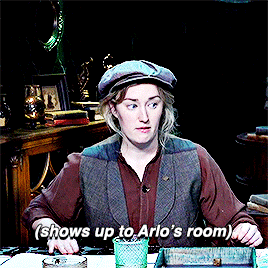
#critical role#candela obscura#ygifs#arlo x auggie#no but they literally are insane for this .....................#arlo: i'm even less able to talk to people now.. | also arlo: auggie!!!!!!!!!!!!!!!!!!!!#he literally could've asked her out and she wouldve said yes right there she literally said of course auggie and after we're going on a date#suit shopping montage of auggie just mumbling how the dagnabbit and arlo straightening his collar for him and he's not BLUSHING#ep3 starts and arlo's like no we've literally been dating for months now and auggie still has no idea he keeps calling me ma'am#charlotte's like so I hear you're in a relationship with ms. black and auggie is like you mean the pact?? ? and she stares at the camera#arlo gets this little lapel pin for his new suit and howard takes 1 look at it like.. so.. auggie.. and auggie's like don't I look spiffy!#if his suit ends up being purple I'm eating a bar of soap#everytime arlo unnecessarily uses auggie's name a little synapse in my head zaps
508 notes
·
View notes
Text
every. single. one. of my ocs is an idiot, including the smart ones.
ESPECIALLY the smart ones...
#gar speaks#this is across the fandom board but this is very centered on my dc ocs.#lei's super academic and a great on her feet but she's stupid#charlie? man's got photographic memory and is a walking magical encyclopedia. he's stupid too#i havent even introduced yall to gabbi yet. literal teen genius. a science prodigy. she's fucking stupid too#im not talking where romance im concerned either although that too but specifically common sense is just not a thing here#there isn't a synapse sparking in this blog#including my own
22 notes
·
View notes
Text
men born after 2002 are so useless all they know is tiktok street interview, mewing, rate women, crypto, gamer fuel, eat hot chip and lie
#txt#literally listening to these 2 gyys talk to each other in this cafe and its horrible#its like my synapses are melting together#its like listening to neandrethals who were left alone in a dark room w nothing but a samsung phone w 700 tiktoks on it
2 notes
·
View notes
Note
you know that one scene in godzilla king of the monsters where godzilla is doing his glowy flashy threat display thing... can talas do that too
YESSS LITERALLY HE CAN DO THAT
Not gonna lie when i first watched the movie i was like oughghghghhg talas was bouncing around in my head like crazy. tbh i associate talas to godzilla a lot in general for whatever reason. the colors for his eel form i actually color picked from a godzilla gif (albeit it had been hue shifted to blue a little but still)
TLDR THOUGH YES he absolutely can AND does flash his lights as a threat
especially in the deep too! he does that edgy thing where in mer form while on the job he'll make himself as bright as possible and basically make himself a big target for whatever he's hunting :)
#ask#anon#talas#honestly that scene alone activated my synapses so bad ive been meaning to talk and/or draw threat displays for that long#i need to get around to it someday
24 notes
·
View notes
Text
bruh sometimes while writing kaz, i actually have to stop and just go “NO??” at this man, it occasionally feels like im writing an insane person 💀
#MAYBE I AM there are so many synapses firing in this mans brain that are just. Not Regular#there is so much wrong with u sweetie u are hurting me. please stop thinking like that sdfjkd#disclaimer. he is never going to stop being insane its just the brand of it is going to change#and this is what makes him so freaking fun to write sdfjsn#still. why am i hurts#tomato talks#one last miracle
6 notes
·
View notes
Text
Hey what if. …….. I remembered how to write again ?
#me talking#it would require 1)my brain to synapse twice a month#at least#and 2)me to look at a screen longer than four minutes#so. who knows when that’s gonna happen.#but boy do I miss it!#I miss those boys ;__;#i miss feeling things and knowing what words to call them
9 notes
·
View notes
Text
all i can think of after seeing this is the “those are his hooves you bitch” meme

in other words, this outfit is absolutely horrendous and i love it
#anyone going to talk about how he went for the hawaiian shirt fashion? no? i will then#i love how if given the chance to be futuristic or fancy or whatever else he still went for the vacation vibes#also fits considering he wanted to distance himself from germa so i kind of like to think that this whole thing#will eventually remind him of stuff#so yeah i've been sweating also cause we saw pudding again. so my sanji synapses all awakened at once#and now i won't rest. wheeze#GG rambles#chapter 1064 spoilers
4 notes
·
View notes
Text
tatsuki fujimoto should read yumi tamura's works if he likes post apocalyptic heartbreaking manga with moments that will fuck you up forever
#eli talks#he should read 7 seeds and have his synapses rewired by 'i think i too did splendidly'#he should read legend of basara and take notes on writing evil twinks#actually scratch that. everyone should read basara and 7 seeds. (ignore the netflix anime)
1 note
·
View note
Text
I've seen a heck of a lot of strangers' blogs today, everyone boppin' away at each other, and, you know... the action of popping open complete strangers' blogs, seeing just that tiniest snapshot of another person's existence, knowing there's a whole-ass human being on the other side...
here we all are, peeking into ten, fifty, a hundred, sometimes yet more stranger's lives, gifting them a tiny little bit of joy, for no reason other than because we can.
each person who's booped a stranger today--you've made a difference in someone else's life, however tiny. perhaps they live halfway across the world from you. they might be your age, or decades older, or much, much younger. they might be from a completely different culture--hell, there's a good chance you don't even have the same first language! there is no reason why you should ever have crossed paths... but here you are, each on one end of the glowing screen, and you've done it. you've reached out and said hey! I see you! <3
isn't that fucking amazing? isn't it insane, how as human beings, our instinct is to reach out and say hello, hi there! can I make you laugh? can I help you out? can I be kind to you? isn't it insane that we've built this whole online world that can cross thousands of miles--yes, often a cruel online world, and yet... today, people who never, by all rights of space and time, should have ever crossed paths, have done so. and they have done it with kindness.
anyway. thank you to all my boopers, and to all the boop-ees: you may be a total stranger, but I love you all the same, fellow beings. <3
#boop#boop o meter#tumblr boop#april fools#(except this post is sincere. because seriously--this is incredible)#synapse talks#anyway it's 1:40am and I'm eepy and need to head to bed soon#(I can still boop despite being past midnight! this may ultimately be detrimental to my sleep schedule but ah well XD)
10 notes
·
View notes
Text
I need someone to say they care about me before I start wallowing dramatically like a sickly Victorian man who just lost his beloved schoolmate to an apprenticeship
#melviships talks#what do you MEAN I get depressive episodes after mania#I'll kill you (my synapses)
1 note
·
View note
Text
remembering the absolute storm of ideas i had in august and how i am currently unable to deliver 😭
#it’s time to do my capstone and i’m pivoting completely away from the subject i spent an entire semester looking at#what having a mental illness event does to a mf. like. now i go between periods of being extremely low energy and extremely scared 😭#jaerambles#thinking about interfaces and archives though. still want to do something about that just not focused on the Events anymore#feeling strange about positionality and legitimacy in ways that make me feel weird about participating.#i’m also stuck. in my family’s house. which is Doing Things to my psyche.#becoming unrecognizable again!!!!#anyway i love u talking in tags. talking in tags save me.#my synapses were connecting at one point though. i want to learn how to harness that energy into something useful someday#for the sake of my sanity though the capstone is going to be not as personal. things that interest me for sure but not personal.
0 notes
Text
Anyways I’m dying I should’ve gone to sleep I will never recover from this
#talking into the mic#(almost said ‘like a good little girl’ my synapses are being rewired and I blame it all on my partner#forgot to close parentheses I’ll do it now)
0 notes
Note
I'm sorry.
This is how Mars programmed the AI.. the coding is probably very simple, so you should be able to change it if you want to.
...N-No. I-I... can't change the code... Th-that'd be unfair... T-To everyone... Besides... y-you're not her... and th-that's okay... because I have someone who filled the void she left... and made me whole again.... And... I've been away from him for far too long now...
1 note
·
View note
Last Seen Blogs

semmi-sincsen
Semmi....
chicago-geniza
ikh vel zayn bafrayt


citerlymen-blog
2Nd ODI, Pakistan Women V Bangladesh Women 2019 | Gaddafi Stadiu
astarklandscape
a stark landscape