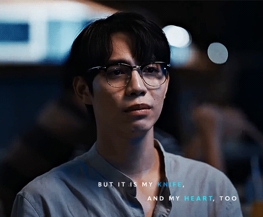
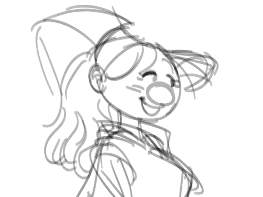
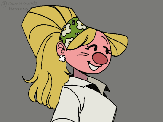
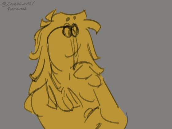
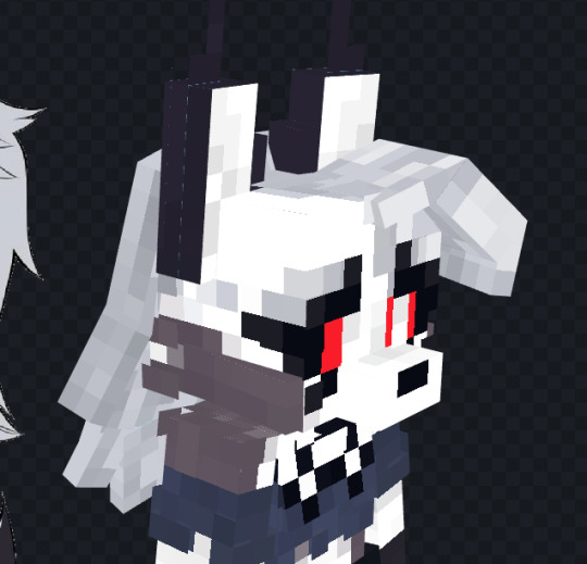
#its just keyframes but its still nice
Text
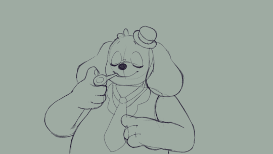
Still gotta tweak this another time and smooth it out but it's not half bad
#might polish this one up later#but we've missed animation!#its just keyframes but its still nice#barnaby b beagle#barnaby beagle#barnaby b beagle fanart#welcomehome#welcome home#welcome home fanart#welcome home fan art#our art#misiu's art
231 notes
·
View notes
Note
Hi! Can I ask how you did the double exposure gifs for your merlin set? They're beautiful btw!
heyy, thank you!! of course!
it's actually not very hard, the trick is to find the right shots for this. here's how i did it (reference gifset), under the cut.

for this tutorial i will be:
— using photoshop cs5 on windows
— assuming you know how to make gifs using the timeline
— have basic coloring, sharpening, groups, and layer masks knowledge
I. CHOOSING THE RIGHT SHOTS
the ultimate trick to pull this off is to choose the right image. in order to do the double exposure, you need a silhouette shot that has these:
a defined and dark silhouette with a background that is not too busy
enough contrast between the silhouette and the background
the silhouette should take at least 50% of the space
not too much movement
here are a few examples of why they work and why they won't:
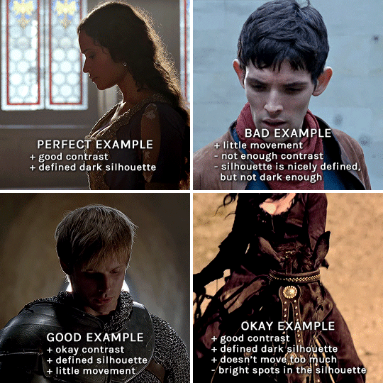
gwen: perfect example since this shot is already quite contrasted with a defined silhouette. there won't be a lot of work needed to make this one work.
merlin: not a great example because even tho there's a somewhat good contrast between him and the background, the silhouette is just too bright, not dark enough.
arthur: another good example, even if there are some bright spots on his face and armor. since he's not moving too much, you can definitely brush some black over him to make his silhouette darker (i'll explain/show later)
morgana: this one could work because the contrast is great, but of course her skintone is very bright against the black clothing. that being said, since the movement is not too bad, it could be possible to brush some black over her and move these layers with keyframes (as mentioned for arthur's example). i haven't tried it tho, but i think it would work well enough.
once you have your silhouette shot, you need another gif for the double exposure. what works best, in my opinion, are:
wide, large shots
shots with no to little camera movement (no pan, zoom, etc), but the subjects in the shot can have little movement of course
pretty cinematography/scenery shots
i find these are easier to find and make it work, it's not as "precise" as with silhouette shots. it's mostly just trial and error to see what works best with the silhouettes.
II. PREPPING THE SILHOUETTE
for the effect to work, we want a silhouette that's dark as possible. i'm gonna use the gwen and arthur shots as examples.
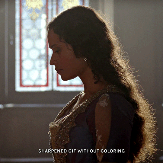
for the gwen gif, i started by sharpening, and then upped the contrast by quite a lot so her silhouette is mostly black, while retaining some nice details. i've used only 3 layers here:

selective color layer: in the blacks tab, playing with the black slider (value: +10)
brightness/contrast layer: added a lot of contrast (+61) and a bit of brightness (+10)
black and white layer: on top, its blending mode set to soft light and at 20% opacity. gives a bit more depth and contrast

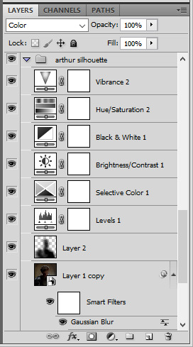
then for the arthur example, i've also sharpened it first, and added contrast layers in this order (the skintone looks horrible, but it won't matter soon lol):
levels layer: black slider at 0, grey slider at 0.76, white slider at 104
selective color layer: in the blacks tab, black slider at +10
brightness/contrast layer: brightness at +1-, contrast at +47
black and white layer: on top, its blending mode set to soft light and at 20% opacity. gives a bit more depth and contrast
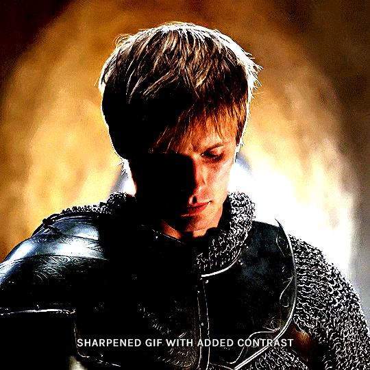
as you can see, half of his face is still quite bright. to correct that, create a new empty layer and put it between the gif and the coloring layers.
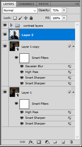
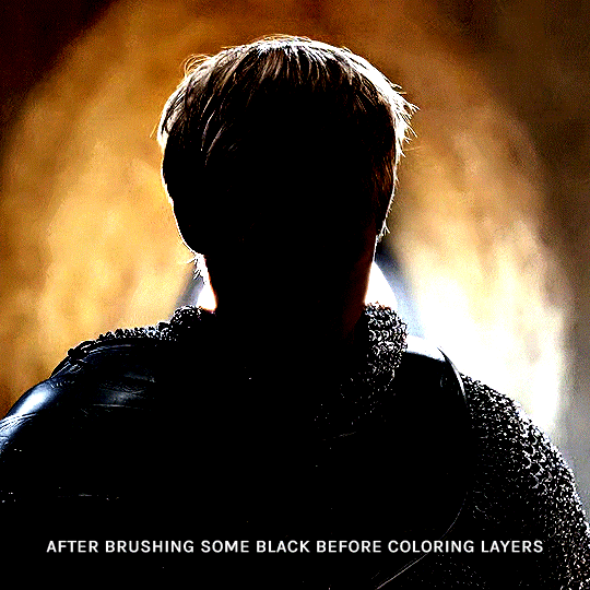
using a really soft brush and the black color, brush some black over his face and body on that new empty layer. you can edit the layer's opacity if you want, i've set mine to 71%. since arthur doesn't move much here, there's no need to keyframe this layer's position. for the morgana example, this is where you'd need to play with keyframes to make it work. here's where i'm at now after this:
you can always edit this layer later if you need, after doing the double exposure blending.
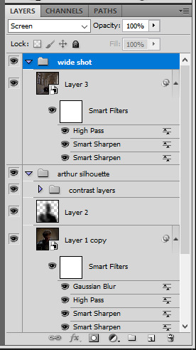
once the silhouette is all ready, you can put all layers in a group and rename it (i've renamed mine silhouette).
III. BLENDING
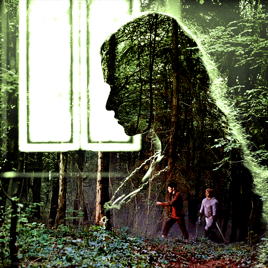
now the fun part! import the wide/scenery shot in photoshop, then resize it to the same height of your silhouette gif. make sure the gif is a smart object layer, and sharpen it. finally, bring this gif onto the silhouette canvas (by right clicking the smart object > duplicate layer). once you have both gifs onto your canvas, put the wide shot gif layer in a group, and set this group's blending option to screen.

you can then position the wide/scenery gif the way you like it in the canvas. this is how it looks for both examples after i've done that:

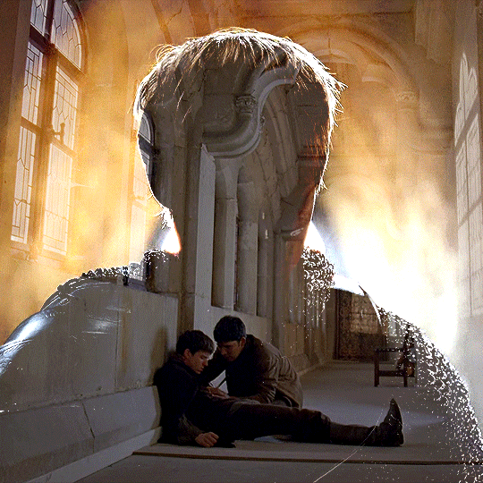
if the blending mode screen doesn't give you the best result, so you can play around with other blending modes (such as lighten and linear dodge in these particular cases), but generally speaking, screen is the real mvp here haha.
IV. COLORING
now that the double exposure effect is done, we need to color the gifs to bring them together. i went with simple coloring here, simply enhancing the colors that were already there. just make sure that the coloring layers for each gif are in their respective groups. here's how i've colored both examples:
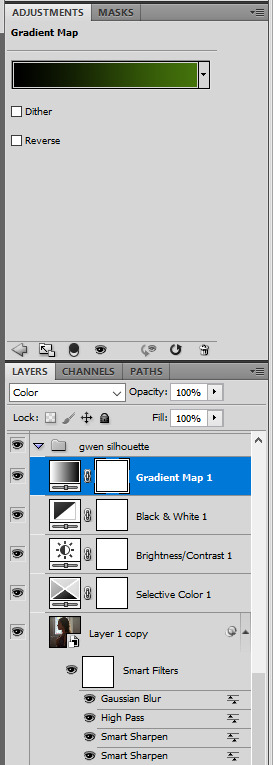
gwen silhouette group: i added a gradient map layer on top of the contrast layers in black to green and set the blending mode to color
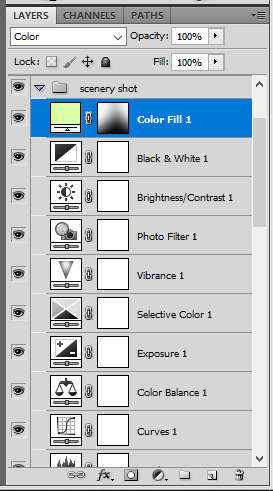
scenery shot group: multiple coloring layers, with a green color fill layer (blending mode set to color), with a layer mask so it only affects the top half of the gif
for the arthur gif, i did something very similar but with warmer colors. i didn't use a gradient map for arthur though:
arthur silhouette group: i made the yellow warmer, closer to orange/red, with a hue/saturation layer, and added more vibrance. didn't feel like it needed a gradient map layer here though.
wide shot group: basic coloring layers to enhance colors from the merlin & daegal shot, and an orange color fill layer set to the color blending mode.
at this point you're pretty much done. just need to add some final touches and typography (if you want).
V. FINAL TOUCHES
a small and completely optional detail, but i wanted to soften the edges of the wide gifs. to do so i've duplicated the smart object gif layer and removed the sharpening filters (right click on smart filter > clear smart filters). put this layer on top of the other smart object layers (but still below the coloring).
then with this same layer still selected, go to filter > blur > gaussian blur... > 10px. this will give you a very blurry gif, but we only want the edges of the canvas to be softer. so add a layer mask to this layer. with a very large and soft brush (mine was at 0% hardness and about 800px size), brush some black onto the layer mask to remove the blur in the middle of the gif.

you can play with this layer's opacity or gaussian blur amount if you want (by double clicking on the gaussian blur smart layer filter). here how both examples look with this gaussian blur layer:

you can also mask some of wide/scenery gifs if you'd prefer, so it shows less outside of the silhouette. just put a layer mask on that whole wide shot group and brush some black or grey on the layer mask. it's what i did for the gwen gif, with a very soft brush and i set the mask density to 72% (i kept the arthur one as is tho):

and that's how i did it! hopefully that was clear enough :)
#alie replies#*ps help#resource#tutorial#allresources#*gfx#usercats#usersmia#userrobin#userfaiths#usertina#usermoonchild#userchibi#uservivaldi#usertreena#userraffa#userriel#userelio#usermadita#usersmblmn
1K notes
·
View notes
Note
I've played through most of the revamped demo (still gotta check some other dialogue differences tho) and I ADORE IT SO MUCH!!!!! After playing through the original demo, I didn't think I could possibly love Keyframes more, yet here we are!!
One of my favorite changes was definitely Jamie's introduction. It was super cute while also showing more of the downside to Jamie's popularity!!.....BUT THE LAUGH CAUGHT ME OFF GUARD LMAO In a good way tho <33
(I'm also not sure if it was intentional, but I noticed a Percy laugh made its way into the demo along with Jamie pfft)
All in all, I loved it sooooo much and can't wait for the extended demo to drop!!! Super proud of the team, y'all have done amazing so far <3 — Hallow 💌
oh, we're so glad it came off the right way!
making sure that jamie came across the way that we wanted him to was a big priority in the rehaul of the initial otojam demo, which marina's alluded to! i'll say on our end that it was and remains fairly significant to us that jamie isn't just the campus boyfriend because we say he is. he's the campus boyfriend and we want to make sure that it shows in the text for better or worse that this is the case!
i think of his little giggle every day.
i mourn it.
we're glad to hear you and others are so excited to see the extended demo! the enthusiasm will get us over to the other side! hopefully sooner than later. hope you have a nice day!
26 notes
·
View notes
Text
i spent too much time today outlining all of cicatrix .⋆☁︎ :・꧂
it should be forty chapters long (give or take if i need to split something up). i have over half of them drafted.
and friends....it's like... good, i think? lots of smutty commentary so not for everyone but it's maybe almost an actual space opera. and the plot points are tight, even if the writing isn't always.
i don't know. it's no Window Across the Galaxy *:・゚✧*:・゚✧ but i'm kind excited about it???


major themes:
chapter seventeen. keyframe.
a moment that felt innocuous at the time but ended up marking a diversion into a strange new era of your life—a chance meeting you’d think back on for years, a harmless comment that sparked an ongoing feud, an idle musing that would come to define your entire career—a monumental shift secretly buried among the tiny imperceptible differences between one ordinary day and the next. In video compression, a key frame defines major changes in a scene. Most frames in compressed video are in-betweens, marking subtle incremental changes, but key frames depict a whole new scene. This technique allows you to move forward without stopping to buffer, even if it makes it harder to rewind.
chapter eighteen. attriage.
the state of having lost all control over how you feel about someone— not even trying to quench the flames anymore, but lighting other fires around your head just hoping to contain the damage. From atria, the chambers of the heart + triage, the sorting of patients in hospital admissions, factoring in the urgency of their illness or injury.
chapter nineteen. tiris.
the bittersweet awareness that all things must end. The way you’re still only settling into vacation while mentally preboarding your flight home, or how soon after starting a new relationship you start to wonder exactly how this one ends. Even before you’ve purchased the carton of milk in your hands, you’re already turning it over, looking for the expiration date. In the end, all goods are perishable. Everything is transient. From Tír na nÓg, the land of everlasting youth in Irish folklore + hubris, excessive pride or arrogance, especially toward a god.
chapter twenty. foilsick.
feeling ashamed after revealing a little too much of yourself to someone—allowing them too clear a view of your pettiness, your anger, your cowardice, your childlike vulnerability—wishing you could somehow take back the moment, discreetly bolting the door after a storm had already blown it off its hinges. Scottish Gaelic foillsich, to expose.
chapter twenty-one. puntkick.
a quiet jolt of recognition that it’s time to become a better version of yourself, sensing that all the strategies that brought you this far are no longer working—that it’s not enough anymore to be cute or nice or righteous or tough—as if you’ve now entered a new phase in the game of life, moving forward with a completely different token. Dutch puntstuk, railway frog, which is the part of a railway switch where two rails intersect. Sometimes you can feel a little kick when your train passes over it, as if the world is trying to signal you’re missing a turn, having traveled too far on the same old track.
chapter twenty-two. falesia.
the disquieting awareness that someone’s importance to you and your importance to them may not necessarily match—that your best friend might only think of you as a buddy, that someone you barely know might consider you a mentor, that someone you love unconditionally might have one or two conditions. Portuguese falésia, cliff. A cliff is a dizzying meeting point between high ground and low ground.
chapter twenty-three. xeno.
the smallest measurable unit of human connection, typically exchanged between passing strangers—a warm smile, a sympathetic nod, a shared laugh about some odd coincidence—moments that are fleeting and random but still contain powerful emotional nutrients that can alleviate the symptoms of feeling alone. Ancient Greek ξένος (xénos), alien, stranger.
chapter twenty-four. nodrophobia.
the fear of irrevocable actions and irreversible processes—knowing that a colorful shirt will fade a little more with every wash, that your tooth enamel is wearing away molecule by molecule, never to grow back. Greek μονόδρομος (monódromos), one-way street + -φοβία (-phobía), fear. Pronounced “noh-droh-foh-bee-uh.”
chapter twenty-five. la gaudière.
a glint of goodness you notice in someone that you wouldn’t expect, which is often only detectable by sloshing them back and forth in your mind until everything dark and gray and common falls away, leaving something shining at the bottom of the pan—a rare element hidden deep in the bedrock, that must’ve been washed there by a storm somewhere upstream. French la gaudière, from Latin gaudere, to find joy.
chapter twenty-six. thrapt. anderance.
anderance. the awareness that your partner perceives the relationship from a totally different angle than you—spending years looking at a different face across the table, listening for cues in a different voice—an odd reminder that no matter how much you have in common, you’re still in love with different people. Dutch ander, another person, someone else. Pronounced “an-der-uhns.”thrapt. awed at the impact someone has had on your life, feeling intimidated by how profoundly they helped shape your identity, having served as a ghostwriter of a work that nevertheless only appears under your name. From thrapped, drawn tight, as with nautical ropes + rapt, carried away with emotion.
chapter twenty-seven. dolorblindness.
the frustration that you’ll never be able to understand another person’s pain, only ever searching their face for some faint evocation of it, then rifling through your own experiences for some slapdash comparison, wishing you could tell them truthfully, “I know exactly how you feel.” Latin dolor, pain + colorblindness. Pronounced “doh-ler-blahynd-nis.”
chapter twenty-eight. amoransia.
the melodramatic thrill of unrequited love; the longing to pine for someone you can never have, wallowing in devotion to some impossible person who could give your life meaning by their very absence. Portuguese amor, love + ânsia, craving. Pronounced “ah-moh-ran-see-uh.”
chapter twenty-nine. mauerbauertraurigkeit.
the inexplicable urge to push people away, even close friends whose company you generally enjoy—like a poker player who keeps folding a promising hand in order to avoid the pain of losing, or tamp down the urge to go all-in. German Mauerbauer, wall-builder + Traurigkeit, sadness.
chapter thirty. holiette. heartmoor.
holiette. a place that seems to hold profound significance to everyone else but you—the sacred temple of some other faith, a random fence post festooned with flowers, a crowd cheering for a team you’ve never heard of—which leaves you trying to coax yourself into feeling something anyway, like inserting your house key into a random lock just to feel if something clicks. From holy, sacred or religiously revered + -ette, denoting an imitation of the real thing. Pronounced “hoh-lee-et.”heartmoor. the primal longing for a home village to return to, a place that no longer exists, if it ever did; the fantasy of finding your way back home before nightfall, hustling to bring in the cattle before the rains come; picturing a cluster of lanterns glowing on the edge of a tangled wood, hearing the rattle and hiss of meals cooking over a communal fire, finding your place in a crowded longhouse made of clay-packed thatch, where you’d sit and listen to the voices of four generations layered into a canon, telling stories of a time when people could still melt into a collective personality and weren’t just floating around alone. From heart + moor, to tie a boat to an anchor. Pronounced “hahrt-moor.”
chapter thirty-one. heartworm.
a relationship or friendship that you can’t get out of your head, which you thought had faded long ago but is still somehow alive and unfinished, like an abandoned campsite whose smoldering embers still have the power to start a forest fire. From heart + earworm, a catchy piece of music that compulsively loops inside your head.
chapter thirty-two. etherness.
the wistful feeling of looking around a gathering of loved ones, all too aware that even though the room is filled with warmth and laughter now, it won’t always be this way—that the coming years will steadily break people away into their own families, or see them pass away one by one, until there comes a time when you’ll look back and try to imagine what it felt like to have everyone together in the same place. From ether, an intoxicating compound that evaporates very quickly + togetherness.
chapter thirty-three. evertheless.
the fear that this is ultimately as good as your life is ever going to get—that the ebb and flow of your fortunes is actually just now hitting its high-water mark, and soon enough you’ll sense the tide of life slowly begin to recede. From ever + nevertheless. Pronounced “ev-er-thuh-les.”
chapter thirty-four. funkenzwangsvorstellung. immerensis.
funkenzwangsvorstellung. the primal trance of watching a campfire in the dark. German Funken, spark + Zwangsvorstellung, obsession. Pronounced “foon-ken-tsvang-svohr-stel- oong.”immerensis. the maddening inability to understand the reasons why someone loves you—almost as if you’re selling them a used car that you know has a ton of problems and requires daily tinkering just to get it to run normally, but no matter how much you try to warn them, they seem all the more eager to hop behind the wheel and see where this puppy can go. Latin immerens, undeserving.
chapter thirty-five. fellchaser.
a long-forgotten mistake from your past that could reappear at any time and rip your life apart, like a boomerang you tossed away years ago that’s only just now looping back around, which you’d have no idea how to handle because you have no idea what it is. From fell, to cause to fall by delivering a blow + molechaser, a low swooping throw of a boomerang.
chapter thirty-six. hubilance.
the quiet poignance of your own responsibility for someone, with a mix of pride and fear and love and humility—feeling a baby fall asleep on your chest, or driving at night surrounded by loved ones fast asleep, who trust you implicitly with their lives—a responsibility that wasn’t talked about or assigned to you, it was assumed to be yours without question. From hub, the central part of the wheel that bears the weight + jubilance.
chapter thirty-seven. moriturism. antiophobia.
moriturism. a tiny jolt of awareness that someday you will die, which leaves you lying awake in bed whispering silently to yourself, Oh, right, this is it; an unsettling reminder that your life is not just a game you’re playing or a story you’ll be telling later, but your one and only glimpse of what the universe has to offer, like a kid waking up in the back seat of the family car at night, having just pulled into a bright neon gas station, looking around for a moment or two, before settling back in for the long road trip, sleeping for miles and miles off into the dark. Latin morituri, “we who are about to die.” antiophobia. a fear you sometimes experience while leaving a loved one, wondering if this will turn out to be the last time you’ll ever see them, and whatever slapdash good-bye you toss their way might have to serve as your final farewell. Greek αντίο (antío), farewell + -φοβία (-phobía), fear. Pronounced “an-tee-uh-foh-bee-uh.”
chapter thirty-eight. tillid.
humbled by how readily you place your life into the hands of random strangers, often without a second thought—trusting a restaurant to check its expiration dates, trusting a construction crew not to cheap out on materials, trusting thousands of other drivers to stay in their lane —people who you may never meet but whose well-being you’re deeply invested in, whether you know it or not. Danish tillid, trust.
chapter thirty-nine. suente.
the state of being so familiar with someone that you can be in a room with them without thinking, without holding anything back, or without having to say a word—to the extent that you have to remind yourself that they’re a different being entirely, that brushing hair away from their eyes won’t help you see any better. Southwest English dialect suent, easy, peaceful, smooth.
chapter forty. suerza. beloiter.
suerza. a feeling of quiet amazement that you exist at all; a sense of gratitude that you were even born in the first place, that you somehow emerged alive and breathing despite all odds, having won an unbroken streak of reproductive lotteries that stretches all the way back to the beginning of life itself. Spanish suerte, luck + fuerza, force. beloiter. to look around in a state of mild astonishment that your life is somehow still going, as if a part of you had just assumed that your allotment of days would’ve been used up by now, standing there like a player at a slot machine, perpetually surprised that your winnings continue to trickle out, but not sure what you’re supposed to do now. From to be + to loiter, to hang around someplace with no particular agenda.
#cicatrix#rocket raccoon fanfiction#gotg fanfiction#rocket raccoon#gotg rocket#rocket raccoon x oc#rocket raccoon fanfic#rocket raccoon smut#rocket gotg
8 notes
·
View notes
Text
2023 gifs in review tag game
tagged by @khaotunq (here!) to post my favorite/most popular gifs throughout the year. thank you!!🩵🩵🩵
I only started making gifs partway through this year, so there was a big learning curve and i still think i'm pretty newbie but it has been a lot of fun and it's nice looking back on how much i think i've improved, though i have so much left to learn next year
i am going to ramble too much because this is my post, fair warning, forgive my self indulgence
april
this was the very beginning, back in the photopea days before i tried photoshop (i am still quite fond of photopea, 1. because it is free and 2, for stills i think it's just as good as photoshop, but i could never figure out how to make gifs look good with its dithering system. i have seen some remarkable gifmakers using photopea tho so that's a my limited skill problem, and i'm glad i used it to dip my toes into the process!)
i only posted 1 set for abaab this month which looks not good but is still a very fun scene, but this was not actually the first thing i made (see below).
may
most popular: msp finale, tinn knowing all the words to gun's song <3
favorite: moonlight chicken, my first ever gifset and the reason i got into gifmaking because i wanted to capture the way moonlight chicken visually returned to locations and shots to underline its theme of loneliness being replaced by community, which is the mlc repetitions series
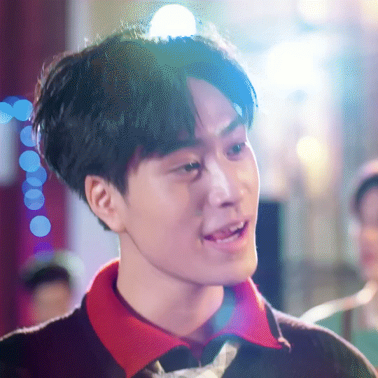

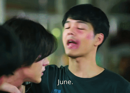
june
most popular & favorite: kiss me again (2018) and the lovely way june say's goodby to his friends (i learned how to add text to gifs for this one, and not only that but timed text! i thought it would get like 5 notes. it's very messy and doesn't look great, but i'm proud that i learned something with it, and i think its very funny and that's all that matters to me)

july
it's photoshop time now!! photoshop beloved you make such beautiful gifs and also you are So Slow and my computer cannot handle you.
most popular: only friends original trailer set
favorite: jimwen looking at each other set (the start of my most belovedest of series, the followup to the first ever meta i wrote)
august
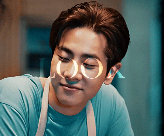
most popular: part 1 of the can't i look at you edits, cool tones edition
favorite: part 2 of the can't i look at you edits, warm toned edition (i love them both but this has two of my all time favorite wen faces)
hey its my profile picture and also i find it very funny that the Os line up with his eyes, and the second gif i love how impossibly happy they look
september
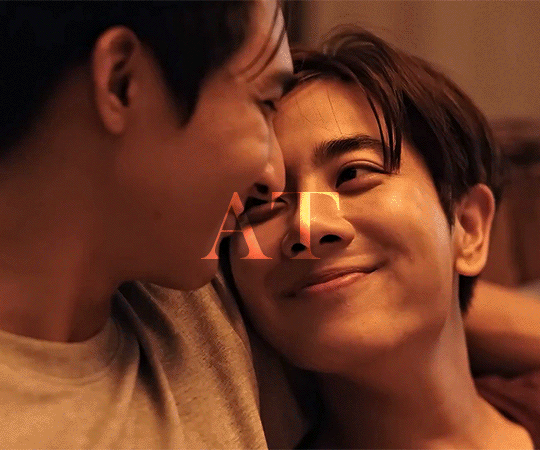
my busiest month in terms of gifs, in large part due to only friends
most popular: topmew and fire
favorite: alanwen poetry edit i spent soooo long learning keyframes for the heartbeat effect and then the ghosting effect was a happy accident thank you person in the background walking past at the right moment
(i also love my charn laws of attraction set because he was a surprise favorite character this year, i loved collecting the quotes for how he speaks of himself)

october
most popular: only friends sandray finale parallel set (it is. very very close to 1k which is. so many).
favorite: he's coming to me edit because it was so fun to make for @dudeyuri
november
most popular: not me sean and black getting along super duper well!
favorite: moonlight chicken haunted house edit, accompanying this meta/creative writing thing. i loved choosing liminal feeling shots for it and i liked how the simple typography turned out
december
most popular: a little jim and wen set i am very fond of
favorite: the moonlight chicken new years set i posted today. i love this little chicken diner

hey look i managed to mention moonlight chicken almost every month (i swear, i watched so many favorite shows this year but i loved making mlc gifs so much)
and that's that! thanks for reading if anyone read til the end.
no pressure tags for some amazingly talented creators who have made some of my favorite sets this year (if you feel like talking about some of your highlights, whether monthly or not, because you all make so much incredible work and i'd love to hear about it) : @hoppipolla @sollucets @icouldhyperfixatehim @celestial-sapphicss @chinzhilla @krystaljungs @moonkhao and anyone who wants to, consider yourself tagged <3
#tag game#bl superlatives 2023#rambling rambles#*mine#this was a fun retrospective!#thank you to all of the amazing creative people in this community that inspired me and taught me so much
15 notes
·
View notes
Text


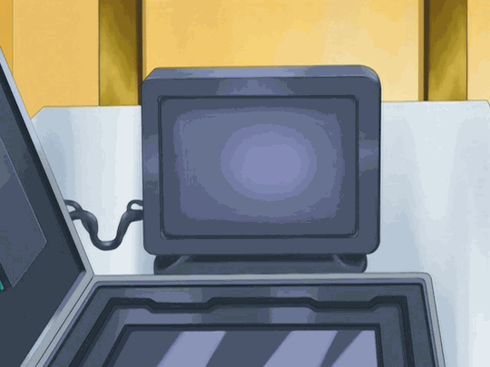
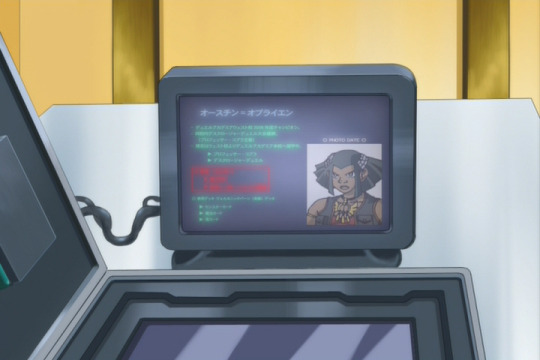
GX Finalized-Subs!113 (WIP): Digging Up Dirt
Working on stuff for 113 and 114 some more, and for 113, I wanted to go ahead and translate this more blink-and-you'll-miss-it bio on O'Brien that Echo sends to Amon early in the episode. It's a quick shot at 64 frames long as the map of Cobra's compound changes to this bio being transferred to Amon, with the bio transfer itself taking up 47 frames (or a quick 1.5-2 seconds), but with my penchant for thoroughness/consistency and what-have-you, I'd have been remiss not to translate it, lol. And since the dub decided to go with... random text (what language even is that lol (they at least go with something like [Latin?] come 5D's text replacements), I made a version for the dub as I've been doing with these text edits (which I may use for reasons later).
(Edit breakdown below; also, pro-tip if viewing in the tags or on the dash: click into the post on my blog, let the gifs load, and then refresh for simultaneous viewing~)
Although, I did worry initially about not being able to translate this because the shot in the Astral_Union DVDRip that I'm working with had the text decently blurry--but luckily, Zichs over on NAC (who's been working on encoding some clearer/higher visual quality DVDrips for GX as well as 5D's+) was able to shoot me a much clearer frame from the DVD footage itself, and while there are a handful of kanji that were still harder to make out, I was able to read much more of the text while making an educated guess or two at what the lines with the harder-to-read kanji were saying. That said, the text in the red box was still pretty unreadable, and it didn't seem any sharp-eyed Japanese fans transcribed any of this, so I had to leave that as-is unfortunately.

So, I worked on this over a few total hours between Thursday night and today, once I translated the text, and first used Photoshop to place the text over a frame of the blank screen (luckily didn't have to do any editing to make it blank, as there's a fair few frames of the blank screen before any of the text starts streaming in--though the dub for some reason places their random-language name-replacement text a few frames early over these blank frames). I gave the text a light outer glow blending to imitate the original light glow on the text, and applied a light Gaussian blur/noise effect.


Once I was happy with how the text looked, I threw the English edits into Sony Vegas, where I first used masking to recreate how the text gradually streams in frame-by-frame. I then masked in the original red box so that it and its text streamed in as it did originally, and masked O'Brien's photo separately over the screen so that I could then recreate the light screen flickering on top of everything. I also applied a very slight extra Gaussian blur on the text since I thought it was a bit too un-blurred, and then just copy/pasted the masking keyframes I applied on the subbed-English edit to the dub-English edit.
Overall, as the gifs above show, think it came out nicely for a quick shot like this!
Also, for reference, I've transcribed the text on this below, along with my initial translation which I had to tweak some to make my edits look nice; "X"s indicate where a kanji was unreadable:
[Japanese]
オースチン=オブライエン
・デュエルアカデミアウエスト校2006年度チャンピオン。
・XXXデスクロージャーデュエル大会優勝。
(プロフェッサー・コブラ主催)
・XXはウエスト校よりデュエルアカデミア本校へ留学中。
▶プロフェッサー・コブラ
▶デスクロージャーデュエル
「RED BOX UNREADABLE」
◦XXデッキ ボルカニックバーン (XX) デッキ
▶モンスターカード
▶魔法カード
▶罠カード
[Initial Translation]
Austin O'Brien
・2006 champion at the Duel Academia's West Campus.
・Winner of the first Disclosure Duel tournament.
(Organized by Professor Cobra)
・Has left the West Campus to study at the Duel Academia's Main Campus.
▶Professor Cobra
▶The Disclosure Duels
[RED BOX UNREADABLE]
◦Primarily utilizes a Volcanic Burn deck
▶Monster Cards
▶Magic Cards
▶Trap Cards
#subbing rambling#GX#yugioh gx#yugioh#ygo#ygo gx#yu-gi-oh gx#Austin O'Brien#Axel Brodie#now to work on some card/animation errors~#between 113 and 114 i counted about... 28 [already fixed 3-4 of them] with the bulk of them in 113#mostly minor quality of watching stuff with some card errors mixed in#stay tuned~
3 notes
·
View notes
Note
Hey, can I ask what your process was for that valentine's animation with cardinal and blue? I keep coming back to it it's really nice
Oh yeah ofc! that makes me glad uaaua
Although. Im not at all in any way an experienced animator i dont animate often so my workflow may differ and change due time! none of it is has a rigid structure and i usually just do whatever feels right.
I also would love to show you what i did for the valentines animation, but the file is very disorganized and slow on my end </3 so ill be using diffrent clips from in the meantime.
to start off ! keep in mind that i use Clip Studio Paint, which has a diffrent workspace from other programs and I only use 5-8 frames per second on an animation canvas with extra space. its just so i can write notes or extra details id like to add whenever im animating! keeps my brain less messy while working.
heres a little visual :^) (literally just my normal workspace witb the timeline and autoaction that i can just hide wenevar i wnt)

the actual process can be summed up to Keyframe > secondary action > "inbetweens" or just little adjustments which is just duplicating still frames and moving and transforming some parts to add a little bit of bounce, > lineart and color.


I dont neccesarily follow that step by step though ! i usually just do frame by frame while going back to fix little errors I may have missed. I also tend to animate other parts of the body first (arms heads eyes) instead of drawing the entire thing one by one so itll be more digestible, especially for things like hair and face in some cases. those usually have their own dedicated folder depending on how complicated they are. Coloring is a whole nother can of worms but theres a lot of clip studio brushes that make the process easier.
again ! im not at all anywhere experienced in animating. ive only animated a few times in years and alot of what i know is just me relaying information from people more experienced. so definitely having some knowledge beforehand even passively helps alot too! Ive heard some act out scenes before putting it onto paper and i did that too.
for the backround painting I dont actually do anything too fancy. all I did is paint each individual parts that i want moving, and moved it slightly around using the keyframe feature to make it look a little lively. Its sorta like a capcut transition feature more than what keyframes traditionally means. I definitely recommend derrek's tutorial on the prgram for a more clearer explanation on it!
and thats about it!!! I listen to music sometimes but other than that my process isnt really that complicated! i really just do watever when it comes to animation and experiment! its a weird learning curve but the payoff is good n swell.
#puppetmail#animation#hope this is readable#</3#animation is usually a hit or miss for me but itdoes feel nice to make something move!#let me know if u have anything else u want me to touch up on in detail! some of these are a little oversimplified but thats it!.
25 notes
·
View notes
Text
loona pm finished!!!

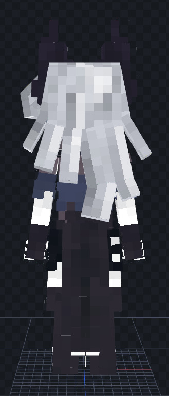

ahhhh i finally finished the texturing on that model i posted yesterday!!!! god this took so long but it was so much fun to make!!!! im really really happy with how the coloring came out, it feels both really standard and regular but also really personal so it still looks like it has a piece of me in it :) also some of the techniques i used for the tail TOTALLY PAID OFF!!! the tail looks absolutely amazing, im so happy that all the texturing and modeling worked well. im planning to go a little bit further with this model than i did the last one and giving it some custom animations, cos it turns out cpm has the ability to do that!!! problem is the animation tool sucks, cause theres no timeline its literally just individual keyframes lol. to prep this model for animation i had to rip out like all the bones and angles in the tail and legs because they have a lot of angles that build on each other so i could put them together in a way thatll make animation easier, at the cost of making the tail n stuff a bit different from the earlier screenshots but ehhh whatever. i think i forgot to prep the hair bits for animation so i might need to finish that tomorrow cos it is like suuuuper late right now. i also need to add the stuff to make armor and elytra work, but thats pretty boring so thats not my problem now. im so so excited for the animation step because the digitigrade legs are going to be AWESOME!!! theres this one mod being developed by \@rohan_furries on twitter which i really want to take inspiration from. i want to make some nice idle animations with the hair flowing, but also make the running animation lean forward more and almost be kinda feral. that would rule so so fucking hard.
anyway. enough modeling 4 tonite. im going to bed goodnigh guys
#loona fanart#loona#loona helluva boss#helluva boss#helluva loona#minecraft#minecraft mod#minecraft modding#3d model#pixel art#furry#furry art
9 notes
·
View notes
Text
Hey, wanna make some mountains? In honor of the launch of the music video I just finished, here’s a tutorial on how to build out 2D layers in 3D space in after effects.
Getting Started
First of all, build your vector layers. You can build them as shape layers directly in After Effects, but I prefer Illustrator. Here’s the file where I organized the vectors for each scene:
I highly recommend using Overlord for moving shape layers back and forth between illustrator and AE. It can preserve layer positions relative to each other or center vector shapes in comps, group and ungroup layers, all kinds of nice things. But also, Adobe software costs enough as is. Look up one of the many tutorials about pasting vectors into shape layers and get your vectors in there!
Wigglin
I wanted my vector layers to squirm a little. Originally it was to mimic the effect of paper cut animation, but once I moved away from that look it was to keep the background feeling alive and, sigh, like its own character. Everything except for very curvy layers (like the bridge in the first scene) has Wiggle Paths > Corners applied to it as a Shape Layer effect. This tutorial by Ben Marriott helped me get the wiggle paths + posterize time cutout effect I was looking for.
In order to keep the amount of wigglin’ consistent from scene to scene, I stored all my layer styles in their own precomp with a slider effect attached, applied Wiggle Paths to each vector, then connected the layer properties with the pickwhip. I ended up with an expression like
this = comp(“Wiggle control comp”).layer(“Wiggle parent”).effect(“Detail Slider”);
Apply it to the Detail attribute of your Wiggle Paths shape effect, and you can adjust the intensity of the look across multiple comps!
Parallax
I’m guessing you’re here for the parallax effect and notes on laying out out vector shapes and textures in 3D space. This tutorial from Camp Keyframe lays it out better than I could, but here’s the short version:
1. Set all your layers to 3D
2. Set your workspace to 2 views and select top view so you can see how your elements are positioned on the z-index
3. Make a null, set it to 3D, and make a camera.
4. Parent null to camera and adjust the position so its z-index matches the z of the camera.
5. Parent null to camera and use null for camera controls hereafter.
6. Parent all unparented layers to null, adjust the null’s scale property, and unparent your layers once they’re where you want them. What we’re doing here is scaling layers as we push them back in the frame, preserving the layout of our original vector comps while arranging them in 3D space. (Even shorter version - mountains are big but far away, rocks are small but close up.)
7. Once your layers are all unparented, move your null around to text the parallax view. Now you can move your camera to pan left and your layers will respond.
Two side notes:
1. If you want an element to follow the motion of the camera, leave it parented to the null and it will stay where you put it in the frame as the background moves.
2. You see that little pixelated line in your switches? That pre-rasterizes your layers. This makes render times way faster because it’s inserting your precomp as a 2D plane, but if you want to blend scenes, turn it off to use your precomps in 3D space.
One more thing!
Even if two elements on screen aren’t touching, you’ll still get nasty collision renders if they’re on the same z-index. Select everything and press P to show your element’s position, and make sure the z is different for each of them.
Final step: textures!
Let me start by saying I did this step incorrectly on this project. If I could do it again, I’d export my shape layers to Procreate, use them as clipping masks, and scribble on them real nice and export them as transparent 2x pngs.
What I did instead was try to get spray and scribble and brush textures in Illustrator. Illustrator does not want to do this, it doesn’t like doing this, and it didn’t like me much by the end of the process. The one benefit was it was easy to name them the same as their corresponding shape layer, which made compositing easier.
Once you’ve imported them as layers, not a png series), it’s just a matter of copying and pasting the scale data (you can copy all dimensions at once if you select the attribute name rather than any one value) and position data. Make sure to set your texture layers to 3D and watch for z-index collisions!
Closing thoughts
I wrote this up in order to be useful to the community and find other folks who are at or near where I am as I learn After Effects. If this was useful to you or there’s something you think would be interesting, please comment or share your work!
7 notes
·
View notes
Text
behind the curtain ep 4
bit late with this one but i wanted to finish laundry first so here we go.. notes on this bitch

right off the bat, yes! i did rotoscoping!
what! after avoiding it since 2017!! shoutout to jennifer @antoniosvivaldi for inspiring me to do that, btw. you should absolutely check out her stuff if you haven't already--her style is so unique and refreshing!
for the most part, i think they turned out swell--after effects behaved itself for once, which like, thank fuck, because i was on a call with fio @maranello and others at 1 in the morning like "haha! i totally know what i'm doing!" narrator voice they did NOT know what they were doing, they were making educated guesses based on past horrible experiences (hence avoiding rotoscoping for years 💀).
but this is meant to be educational lol so! what is rotoscoping? simply put, it's a tracing technique. it has its roots way back in animation when tech was starting to pick up in like the 1920s and artists wanted a more efficient way of animating. rotoscoping is one of those tools that've been used differently from how it was originally intended, which is actually? so cool from like, a media arts study perspective?? because it's commonplace to use it for live-action film and vfx work as a way to mask scenes out and isolate them in addition to its original use of mapping things to isolated scenes. i won't bore you with the stuart hall encoding/decoding stuff, but just know that i find the development of digital art circa adobe dominance fascinating. i am using this century-old animation technique to impose my blorbo upon the eyes of thousands.
ANYWAY. i really liked this particular mask--it has a lot of movement but still manages to flow nicely?

me: [cuts off luke's arm]
fio: i think that's his arm
me: oh... my god
next up: the lightsaber
goodness. where do i start. well first of all i had a vision of something much more 2d when it comes to lightsaber anatomy, lol. but i extended my subscription for maxon and figured--why not take full advantage of this while i've still got it? so i got this 3d model of luke's lightsaber. it's untextured and unrigged and clunky but thankfully it had most of the inner parts so as far as i'm concerned i struck GOLD.
idk what i can really say in terms of like What Is 3d Modelling, because i think people have an understanding of that. so we'll go instead thru my process!
i added materials and added a null object (does that count as rigging? for something as straightforward as this?) to do a simple rotation animation on the first day...

and then i had an idea before bed to separate the parts like that one scene in the clone wars where they show how a lightsaber is assembled, except i haven't watched the scene so god knows how they animated it NKJFGNDFKJGDF. anyway the day after, this was kinda where i got:

keyframing on c4d is a Bitch because u can't just Access The Graph Editor you have to go through the dope sheet and change ur views and it's just. annoying!! coming from an after effects standpoint! but i can see how it's optimized for Actual Animation work so ughgh. we deal. onwards..
asked the team over at usergif and natalie @kenobiis suggested putting in a kyber crystal to fill out the middle. i ended up taking the og "laser" cylinder and modifying/animating it because uh THIS is the real inside of a lightsaber and i am not putting all that into a 3 second gif LMAO. but yeah i fine-tuned the animation and plopped it in after effects, then fiddled with video copilot's saber to make luke's blade.
u might notice the motion blur--that's re:vision's RSMB! i also added a little bit of depth of field with frischluft, but it doesn't show up well in gif form. speaking of things that don't render well:
there is A FUCK TON of aliasing going on. i couldn't make any anti-aliasing settings work for some reason so i ended up trying to smooth it out in ae.. to probably not a lot of effect. i got the very edges around it smoothed out with the classic gaussian blur and a matte choker method, but the black rings are killer. ugh. it's whatever, i figure i'll work something better out for the next time.
finished animation in c4d + the final gif:


the rest
everything else is fairly basic and intuitive i think? obviously used shape layers + alpha mattes, my beloved. i fucked up a little on the text because i think i made my offset keyframes backwards somewhere in the middle of the process but at that point i was too lazy to go back in and fix it. oops!
anyway if u got this far hello thank u i hope this was informative in some way. if u have any questions don't be afraid to ask :D
7 notes
·
View notes
Text
I did literally just say I love Sonic now more than ever so gonna offset my last post about Prime being negative by mentioning a few things I really like about Prime.
One of the biggest ones is just how dope it looks! Really fun stylised 3D animation that looks smooth and has a good focus on like, keyframing and strong poses - combined with the really expressive mdoels it’s a style that really works for Sonic and I can’t wait for more even just to see how it looks.
And on visuals, I really like the character designs! Part of the reason I grind Sonic Dash so hard or why I bought the Tokyo 2020 Olympics is because getting any official opportunity to see the characters in alternate outfits is usually just super fun, especially because of how strict SEGA usually is with that stuff. Prime meanwhile comes around and has given us like 3 extra outfits for several of the core cast with still more to come! That’s just blanket really fun!
I also like that Sonic’s new looks tend to give him neat little abilities. Narratively it doesn’t amount to much but I don’t even feel like it has to - it’s a neat surprise factor/rule of cool thing that adds character to whichever universe we’re in and enhances Sonic’s reactions to those places as well. If anything it’d honestly be cool to have something like that in the games lol.
I like the voice acting a lot! I actually can’t meaningfully expand on that one lol, it just sounds really good, everyone feels well cast to me, it doesn’t feel like many awkward line reads made it through to the final thing. They are just nice. The only person I don’t adore is Eggman but even then, A) I so can’t imagine non-Mike Pollock Eggmen and B) actual Eggman is mostly absent in favour of Mister Doctor Eggman so I’m pretty much solid with it anyway.
I really enjoy New Yoke as a setting a lot. “What if the villain won?” is a classic setting for a reason, even being one that multiple pieces of Sonic media have explored, but I think New Yoke manages to feel particularly fresh even just on execution and aesthetic alone. It helps that it still feels very lived in - there’s a living, breathing population and a band of rebels that operate in secret and there’s Nine’s hideout and just like, cool shit going on lol.
For that matter I like Nine a lot. I literally put Tails as my 5th favourite Sonic character in that list I did a while back and he’s been in virtually every single Sonic game even during some of its most intense Solo Sonica eras - but he can feel very relegated to the background because of the nature of his character sometimes? So it’s really awesome to see Prime use Nine as an excuse to really let Tails play a major role with lots of actual development and stuff. This is helped doubly by the fact that, awkward pixel art aside, the flashback of his actual backstory (as canonised by Origins wow) alone helps him just feel like the real Tails we’re dealing with, just in a different setting. And yeah, the mechanical Tails are just really cool lol. Particularly a fan of the fact that it allows Tails to be up close and personal in combat again - he’s supposed to use his Tails to attack as well but lots of Sonic media has him holding back for support roles in combat, it’s nice that Prime is willing to acknowledge that, yo, Tails can throw hands. And also tails lmaoooooo
I’m not sure how best to word this part specifically also, but I personally was worried that Prime would sorta like, I guess just follow a rigid structure of x episodes in x shatterverse, grab the crystals, and then move onto the next one? The formula not really changing? But it does not do that and we kinda go back and forth between them and there’s things happening between the shatterverses and like, just in general there’s an actually good attempt to keep the structure fresh and interesting.
And the biggest thing of all is that. Prime is actually just really fun lol. There’s a lot of other good things I haven’t mentioned, but it all comes together with what I have to make a show that’s actually just plain old entertaining to watch. I didn’t feel like I was watching the new Sonic show out of obligation, I was just watching it because I genuinely liked watching it. Even my problems with it don’t feel like a huge deal because it’s so good at the moment-to-moment that I wasn’t really thinking about them while watching. Like it’s literally just a good show, and that slaps.
So fuck yeah, Prime is dope.
4 notes
·
View notes
Note
All of the questions for the ask game you reblogged
Putting under a cut for being long
📷 What’s set as your phone’s lockscreen?

Bowser my beloved (couldn't find the original)
🍫 Cheese or chocolate? Chocolate, cheese can sometimes just be straight up gross to me
✨ Do you have any nicknames? I have a few, Kuvvy is the one who started calling me Momo, but my coworkers call me Bluey or Blues clues
🎵 Last song you listened to? Happier in Hell by Royal and The Serpent
✏️ Have you ever written fanfiction? I've tried, I love roleplaying at least, but I have absolutely zero confidence in my writing so
😏 Are you on discord? Yeah, I'm honestly on there a ton more than I'm on here nowadays, I just can't engage with groups much (I don't have much to say)
💛 Do you have any piercings? Used to have my ears pierced but they closed up, but I do have my septum done and I have snakebites with plans for plenty more later down the line
🐰 What do you think says the most about a person? I honestly can't give a straight answer, I just like people who are chill and don't give me an irritated response when they don't understand something right away
🍪 If you were a cookie, what kind would you be? Chocolate chip, I'm basic as fuck
🐶 Are you more of a dog person or a cat person? Cat, I've had dogs, but I've never bonded with them as strongly
🎧 Headphones or earbuds? Headphones a million times over, I can't stand earbuds
🌼 What’s the last thing you said out loud? "Have a good one!" (Was leaving work)
🙃 What’s a weird fact that you know? Maybe not a weird one, but gators can run
🦉 Are you a morning person or a night owl? I'm a night owl who's been conditioned to be a morning person
🧸 Favorite place to nap? My bed 💙
🏳️🌈 Are you a member of the LGBTQIA+ community? I've identified as genderfluid for a long time, but within the last year that's changed to being a trans man, and a hella gay one at that ✨🏳️⚧️🏳️🌈 (I still use they/them though, but I don't like when people use it just to avoid calling me he/him)
🦋 Describe yourself in three words. Tired, stubborn, niceys
👖 Jeans or sweatpants? Jeans for outside, sweatpants for inside
🥤 What’s your go-to Starbucks order? Not a Starbucks fan, there's this cafe though I like to order from that has nice ice lattes, I usually get it with caramel cold foam and a few pumps of brown sugar
🧡 A color you can’t stand? Doo doo green
💎 What’s your most prized possession? My laptop, it's been with me for a decade now, it occasionally has its problems but we're ride or die at this point
☕ Coffee or tea? Coffee, though I've been much less obsessed with it nowadays
🦖 Favorite extinct animal? Not dinosaur wise, passenger pigeons, just something about them, otherwise therizinosaurus
🌙 How long have you been on tumblr? Too long (legit answer though probably 5-6 years with an account)
🌴 Desert island item? Cast iron pan, it's multipurpose
🐸 Describe your aesthetic. Spikes, black with bold colors (usually blue and gold), romantic goth in theory, soft boy in practice
🔮 What’s your dream job? Animator, in depth though probably more of a keyframer or storyboard artist
💙 Relationship status? Yoinked
🌿 Describe your favorite outfit. The one I generally wear everyday is usually just a black hoodie and blue jeans with sneakers
🎤 Is there a song you know all the lyrics to? Hm that's a hard one, but I do know the lyrics to Face Down by Red Jumpsuit Apparatus pretty well
🤎 What color is your hair? Currently it's plain ol brown right now since I shaved it again, but I do plan to dye it black again eventually
💌 Do you talk to yourself? I was talking to myself this morning XD it helps me regulate my thoughts more clearly, and helps me vent without the anxiety of oversharing
💄 Do you wear makeup? I used to, but I can't even stand eye makeup on me anymore, so I just go bare face
🌸 Best compliment you ever received? That I am speed, move aside sonic 💅 but also being complimented on my name
💞 @ your favorite blog. This is hella bias cause we talk all the time but @kuvvydraws
1 note
·
View note
Text
September Art Book Haul
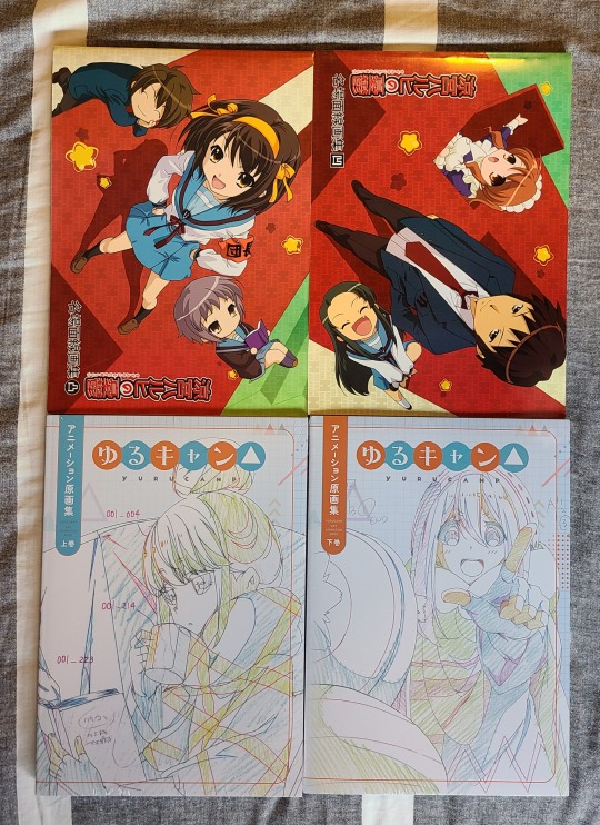


Yeah, a veritable mountain of art books in this haul. It's part of why it's taken me so long to make a post for it, because where do I really begin? Well, the best that I could come up with was to just sorta dive into a few of the "most interesting" entries specifically, while still detailing just what it is that I've got here. So, I'll try me best to grab the most interesting stuff and explain that with this post.
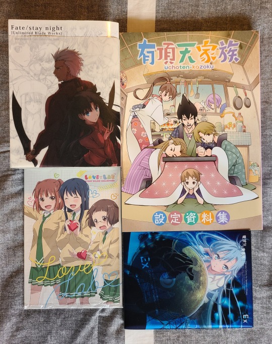
Well, in image number one we've got some cool stuff, two pairs of key animation books for their respective series. Shockingly, the Haruhi set was cheaper than the Yuru Camp, though the latter was also still sealed/brand new and is marginally thicker than the Haruhi ones. I wouldn't say there's anything really "special" with them so I'll skip towards the next image.
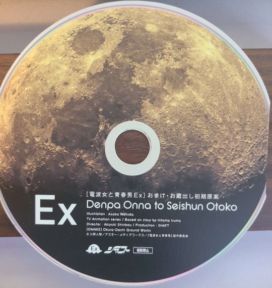
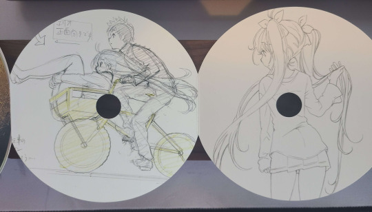
A bit more going on here, as each book is from a different series. The Uchouten Kazoku setting material book is massive, filled to the brim with all sorts of stuff. Definitely makes me want to get the key animation collections and other art books. Also, finally got the first season board/keyframe collection for UBW (and at a good price!). Been searching for a set for absolutely forever, and only in July of this year was a friend of mine able to find the second season one for me for cheap (they were in Japan on vacation). Then there's the little Love Lab board collection, nothing special. I think the most interesting is the Ground Control To Psychoelectric Girl art book. When I first got it I was worried I'd somehow accidentally purchased a Blu-Ray for the series, but it's just the packaging. The disc shaped thing is pretty cool though, it unfolds to show a bunch of different keyframes/Layouts, a nice touch for sure.
Anyways, moving on we've got another hodgepodge of stuff. We've got another Love Lab art book, an Umaru art book (a shame they only did one for the second season), a Lycoris Recoil setting material collection (despite my issues with the story, the visual work done is solid), and a Kanon art book. No, it's not for the anime, I couldn't find one, but I did find one for the visual novel. It exists on the rarer side of KyoAni's works that are adapted, and one of the three visual novels that they've adapted (all of which were very early on in KyoAni's life). Anyways, I suppose you could say it's... rather different, which is interesting. I always find it intriguing how visual novel adaptations go, in terms of timelines, choosing routes, removing and adding content, and stripping the mature scenes. For that last reason, I'm not going to show any of the art here.
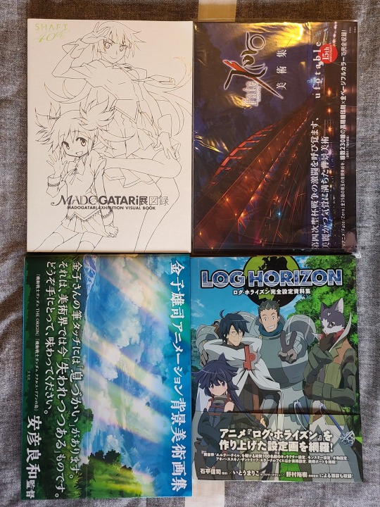
Onto the next batch! This one is very cool, lots of interesting stuff in here. The Madogatari 40th anniversary exhibition art book might just be my favorite in all of the haul. So much art and content from the history of Shaft that you won't find anywhere else. Finally getting to see production material for And Yet The Town Moves is lovely. Similarly, Kaneko Yuuji's art book is incredibly interesting because it shows their process for some of the super awesome concept art for Godzilla Singular Point. While I don't believe the remaining two to be super important in regards to pictures, they're both still very impressive art books. It's been a while since I last watched Log Horizon, but the environment art displayed in its collection is incredibly beautiful, and I mean Fate/Zero, need I say more?


Alright, even more Fate! I've got a lot of art books for the anime, so when I saw a good deal on the box set for the VN art, I knew I had to grab it. It's a shame the box set was only vols 1-3 (plus the character art book), so vols 4 and 5 are sold separately. An incredible treasure trove of content in regards to the series in all kinds of instances and approaches (and of course a fair share of horny). Alongside it, I'm finally making a dent in my Garden of Sinners keyframe collections again. I've know got 3 out of the 8 or 9 volumes available, so at best I'm only a third of the way there. Such a pain to find, but they're surprisingly reasonable in terms of pricing when you do find them.
And last but not least, Shirobako. Even though I got 4 volumes, and even though it was dirt cheap (something like 35CAD for all of them), it's still a drop in the bucket to the amount remaining out there. Anyways, in the image there's the: setting material collection (bottom right), the two keyframe collections for the first season (top and bottom left), and the second mini fan book (top right). A load of content for sure, and lots of great details and whatnot.
All in all, it's an art book haul that fills a lot of gaps in my collection, in more than a few ways. Getting sets for series that I'm a fan of, rounding out collections for certain studios or series. It gets a lot done, and without entirely breaking the bank (I chose seamail to save a solid chunk on shipping). In the coming days/weeks I'd really like to take a deeper dive into some of the more interesting art books to show what they're all about (for example, Kaneko Yuuji did environment art for Eve Music Videos!), so I'll try to keep my promise on that and show some more interesting stuff.
#anime art book#anime art#art book#anime illustration#the melancholy of haruhi suzumiya#suzumiya haruhi no yuutsu#haruhi suzumiya#yuru camp#laid back camp#fate stay night#fate series#unlimited blade works#fate ubw#fate unlimited blade works#fate zero#uchouten kazoku#the eccentric family#denpa onna to seishun otoko#ground control to psychoeletric girl#love lab#kanon#kyoto animation#kyoani#lycoris recoil#lycoreco#himouto! umaru chan#umaru doma#puella madoka magica#madoka magica#puella magi madoka magica
1 note
·
View note
Text
Animating in After Effects
https://drive.google.com/file/d/1Kzl8VVWL4aWy3HIkqhQpMlN5WKIXrTq0/view?usp=sharing
Link to my current ‘animatic’ / tests from using after effects tutorials
Over the past couple of days, Ive been attempting to compile all drawn and 2D animated elements in after effects. This is a software I am relatively new to, and required a lot of YouTube and online tutorials to accomplish what I was after, however I think the effect is really effective.
There are two main scenes/ shots I should go over from this video, about how I’ve created and what should still be left to improve;
SCENE 2 - First look inside
For sake of linearity, ill start with this as its what i out most time into, and equally what I worked on first. This was actually relatively simple, as a lot of planning and components had already been figured out prior. I always knew of how compositionally, the buildings would move and prior to after effects had drafted quickly and roughly in photoshop using tween options.
I looked into using the 3D camera in after effects, as I previously had seen this almost twisting camera motion, that rotates the camera as it moves in. This I felt would work well with the two buildings on side moving out of shot. I also liked the vertical parallax effect that the mid ground and background had when moved at separate rates. The thing I especially liked about the 3D camera however was how I could separate different layers to be attached to the camera, or change the plane/heirarchy etc, this allowed certain things to be moved very easily.
By playing the animations, and having the automated zoom effects, the whole intro sequence felt too clean and automated. And so I added some blur and soft blue gradients that moved along with the foreground buildings. This felt like it was entering inside, and compiled it nicely with the forward movements.
SCENE 1 - Outside the festival
This shot was a lot tricker, as it was essentially just the building illustration and a separated foreground. I managed to construct the prior scene a lot easier I knew going in exactly what I was after, however in this scene - the camera movement of going upwards, reaching the top of the building felt too clean and amateurish. This meant that I needed to work on two key areas. The main element, the foreground felt too static, as I moved it down with keyframes, the pieces felt like they were moved in automation, and was weird to look at - there was no ‘human touch’ to it.
To combat this, I added a quickly drafted animation of leaves and foliage in the foreground. Opening away, as the camera moved forward. This created a nice balance of movement from all angles, and didn't cause too much chaos. The balance of 2d animation and 3d movement, eased the eye. If either element were done the same way together, it would run into the same print problems, but because of squash and stretch style quick movements it created an easy solution, without having to construct an extra scene. The other fix, was by moving the 3D camera in a curved upwards motion - causing the camera to be from someones perspective, still acting on the ground. It helped show the camera not as some sentient being flying upwards and made the movement more natural.
youtube
youtube
youtube
0 notes
Text
Toon boom vs adobe animate

#Toon boom vs adobe animate full#
#Toon boom vs adobe animate software#
#Toon boom vs adobe animate professional#
#Toon boom vs adobe animate tv#
#Toon boom vs adobe animate free#
#Toon boom vs adobe animate software#
Some animation software does not have drawing tools, and that is completely fine if you're working with assets from a third party.īut if you have to make your own assets, you're going to need drawing tools, and you'll need lots of them! If you're inexperienced with animation or need a hasty animation process, this is definitely something to look out for.
#Toon boom vs adobe animate free#
Templates make it easier for you to get started animating with pre-created characters, backgrounds, and assets free to use. If you're not an experienced animator, preloaded templates can be a gift sent from god. We have listed a few features that you should consider in your animation software, depending on your needs! Preloaded templates You should look out for the specific features that tend to your needs. Features to look out for in animation software?Įvery animation software is different, and no animation software can be considered the all-in-one perfect software. Once you get the hang of it, you have a fast animation process.
#Toon boom vs adobe animate professional#
Purpose: Great for creating professional 2D animations with 3D features. Skill level: Intermediate / Professionals
Fast animations (once you get the hang of it).
Gizmo Face Key editing tool for facial features.
360 Head creator for easy angle shifting.
Purpose: Synfig Studio is great for creating professional-grade animations, especially for making cutout animations.
Advanced layering system with over 50 layers.
Purpose: Procreate is the best animation software you will find on an iPad, and it is great for beginners and professionals alike. Skill level: Beginner / Intermediate / Professionals Purpose: CelAction2D is great for professional animators, and its Studio version has nice production workflow features. Price: $409 one-time-fee Animator edition / $745 one-time-fee for Professional edition / $895 per year for Studio edition.
Export both animations and still images.
Real-time animation preview in the software.
Advanced syncing technology for multiple scenes.
Whether it's short films, feature films, or videos. Purpose: The software is great for professionally made animations.
Not as many tools and features as competitors.
#Toon boom vs adobe animate tv#
Used for TV shows like The Simpsons and Rick and Morty. You can easily implement 3D elements to your 2D characters if needed. Purpose: It's great for animated 2D tv-shows and all types of 2D animations. Price: $25/month to $115/month, depending on the version.
Integration with other graphical software like Photoshop.
Advanced palettes, vector & bitmap drawing, and painting tools.
Implement 3D animations to 2D elements.
It has a great keymapping feature that makes it easy to make any type of 3D animation. Purpose: Cinema4D is great for beginners and professionals alike as it offers a large array of tools and features.
Powerslider with great keyframing feature.
It's also a good software for aspiring animators because it's free. Purpose: Blender is great for any professional animation project.
Amazing brush selection for creating realistic animations.
People use it to create assets for films, tv-shows, and games. Purpose: Autodesk Maya, or just Maya, is a great animation software for creating 3D animations.
With Bifrost, you can create incredibly realistic environments.
XGen grooming feature allows you to create layers of fur and hair.
There are plenty of features to make animations for teaching purposes. Purpose: Powtoon is great to use for both marketers and educators alike. Price: Free plan with limited features / Paid plan $19/month
Large projects can become a slow process.
Advanced control of the animation and customization of characters.
With free-to-use assets, it is great for small freelance or marketing projects. Purpose: VistaCreate is easy to get into.
#Toon boom vs adobe animate full#
Price: Free Version with some of the features / Paid version with full features for $10/month.
Good for many marketing formats (social media, presentations, and so on).
Purpose: The Adobe Animate is great for animating 2D, but it is mainly used by beginners or hobbyists.
Asset coding and design all in one software.
Vector brushes that are great for creating 2D vector graphics.
Adobe Animate virtual camera makes it easier to make great camera movements.
This will give you an idea of structuring a frame and story. If you're new to the world of visual creative projects and storytelling, consider reading our article on the basics of filmmaking. In this way, it should be easier for you to decide on what animation software fits your needs! We have gathered the 12 best animation software on the market and their strengths and weaknesses. Have you considered starting your animation journey but just found it too hard to find the best animation software for you? Then look no further!
0 notes
Text
How the VFX Team Behind Marvel’s ‘Loki’ Brought Miss Minutes to Life | Variety
As Marvel continues dipping its toes in TV — snagging 28 Emmy nominations in the process — its latest venture, the Disney Plus miniseries “Loki,” is being hailed as one of the studio’s most unique anti-hero stories to date.
While Tom Hiddleston steals the show as the titular character, perhaps most captivating is the Time Variance Authority (TVA)’s cute, conniving animated mascot, Miss Minutes.
The character voiced by Tara Strong, starts off as warm and bubbly, but as the series progresses, she’s not all she seems to be.
With only a couple of rough sketches of the character, Marvel recruited Luma Pictures to bring Miss Minutes to life, in all her wonderful (and terrifying) forms. Luma VFX supervisor Jared Simeth spoke to Variety about the inspirations behind Miss Minutes and how the team’s animation styles evolved along with the character.
Marvel gave you sketches of Miss Minutes and basically said, “Bring her to life.” Tell me about that process.
Marvel gave us two concept images of Miss Minutes and some animatics for different sequences as a starting point for motion. The brief was basically, “Here’s the character, we’re trying to figure out exactly what the movement should be. Find some inspiration, do some tests and we’ll start figuring out what the character of Miss Minutes is.”
They mentioned Felix the Cat as a starting point, which has a very steppy motion — not very fluid. We also found a lot of different references, earlier animations from the ’20s and ’30s like Betty Boop, which has a much more fluid animation and stretchy arms. We did a bunch of tests and then focused more on a Felix the Cat-type motion, which is what we ended up with.
Miss Minutes’ animation style changes throughout the show, from a more hand-drawn vibe to this glowing 3D model. What was it like creating completely different visuals for the same character?
It was fun in general just working on Miss Minutes, who looks very different from any other Marvel cartoon. And it was fun to play around with the different ways we could adapt her. The first time you see her is in the propaganda video, where we keep it very basic and very steppy. Once she comes into the real world as the holographic portion, she is a little bit more fluid, not quite as steppy, but still in that Felix the Cat vibe for the first few episodes. But as you learn more about the TVA, we see her not just as this mascot, especially toward the end of the series when we understand that she knows more about this than we do and she has an agenda of her own. When she becomes more sinister than we initially think, she starts getting a bit more naturalistic, a little bit more dramatic. Instead of having everything be keyframed, we actually did some motion capture to get a little bit more nuance into the role, which is not normal for cartoon characters. So we’re kind of playing those two things against each other, because she is a cartoon character with a more nuanced performance.
The propaganda video has become a fan-favorite scene of “Loki.” What was the inspiration behind animating it?
Marvel basically gave us a rough animatic, with cut together film footage and little clips from old propaganda animations with a voiceover. We had to come up with how to make it into a 2D animated version that has a nice clean look throughout.
At the same time, they’re also working on the script and figuring out what points they want to hit in the video — what is the TVA, how the world works within the Marvel Universe, etc. — so we had a back-and-forth about which points can be clear and which can be a little bit more ambiguous and whatnot, so there’s also a back-and-forth with the style. Early on, Felix the Cat was the style for both the animation of Miss Minutes and the visual style of the propaganda piece. But that was deemed a little bit too kind of kid-sy, so we started looking into something more grown-up, like “Jonny Quest” and Hanna-Barbera cartoons.
We’d do a design for the Timekeepers in that style, and it seemed too realistic, so we ventured into the style of “The Flintstones,” and that seemed too familiar, so we went for more obscure references. There are these propaganda pieces from the 1950s called “A Is For Atom,” which are about atomic energy, and “Destination Earth,” which is about oil and made by the same company. It has a 1950s style but still feels unique, and so that was our Bible in getting the historical feel. It was really fun to make it almost like a period piece film but in the Marvel Universe.
How did you go about creating facial expressions for the character?
We had to come up with all those nuances just from a few concept images. Her performance goes to so many different levels of character, and whether it’s angry or sad or conniving, it was fun to come up with those looks.
We did a first pass, which was just 2D, of all the main expressions she might have, and then we took that and fleshed it out into our 3D version of Miss Minutes. It was rendered as a 2D-looking character, but we created it all in 3D. It was fun to take one concept, figure out all the different expressions and how our character evolves, and then build that into our assets.
What was the most challenging part of Miss Minutes?
Getting the 3D version to feel hand-drawn was a challenge. We have a lot of tools, but making sure that it looks like a 2D creation and not a 3D creation was definitely a challenge. And it was a fun challenge to figure out all the different versions of her.
At first glance, Miss Minutes serves a similar purpose as Mr. D.N.A. from “Jurassic Park.” Was that a reference?
It was definitely on our minds from the beginning when they sent us the rough animatic. Miss Minutes has a similar role, but it’s more expanded upon than Mr. D.N.A. But they both don’t quite jive with everything going on and feel a little out of place. Especially for the propaganda film, we referenced Mr. D.N.A., as they’re both little helpers who are showing you the way.
37 notes
·
View notes
Last Seen Blogs

bibidris
Bisola Idris👑

mundo1real-blog
un chico solitario

cholochanel
31 RUE CABRON

lauesenjespersen
The Journey of Walter 456
utilitycaster
A forest with rules