#jquery plugin. elements same
Explore tagged Tumblr posts
Visit Tumblr Blog
Explore Tumblr blogs with no restrictions, modern design and the best experience.
Last Seen Tumblr Blogs


Fun Fact
Tumblr.com is the 103rd most visited website in the world.
Text
Responsivity is a responsive blogger template that is created using jQuery plugins and a lot of inspiration around the web for responsive design. There are hundreds of blogger/blogspot templates floating around on the web however none of them are solving the current responsive needs. Most of them have fixed width and size that does not really utilize the full potential of a fantastic resolution on a high quality monitor. At the same time they are too cumbersome for small screen devices like mobile and tablet. Responsivity is a adaptive template that uses smart jQuery plugins to adjust itself for the target screen resolution and size. Why A Blogger Template? There are many reasons we love blogger platform, Blogger is one of the most popular blogging platform after wordpress. Blogger is completely free with absolutely no expense required. Its fast to setup and the site performance is also really great. This site fromdev.com is also powered by it. Therefore we designed this theme to be able to use on some of our future sites. We would love to share this with all of our subscribers and would like to hear feedback about it. Try Out The Live Demo Of This Theme Demo The Cool Features Of Responsivity - Blogger Template This powerful blogger theme comes with a lot of cool features. Just to list down a few. Fully responsive to make content look good on any screen size Beautiful sliders provides you an opportunity to show featured content Highly Adjustable Three Column Layout Stunningly Fast Loading Template Solid and Clean Code Custom Note Message Style Easy Way To Show Success and Warning Messages In Built Code Display Style For Tech Blogs Well documented Compatible with major browsers (IE8+,Mozilla,Chrome,Safari) Download Responsivity - A Responsive Blogger Template Get Access To The Fromdev Exclusive Resource Page For Download The Responsivity template is available totally free for the Members of our exclusive resource page. To become a exclusively member, simply add your Email in the form below and subscribe to our updates via Email. As soon as you click sign up we will send you a confirmation Email, click the confirmation link and below it you will see the link to your exclusive Resource Page with a password. In that page you can download the template. How To Upload The Blogger Template Go to Blogger Dashboard > Find your Blog Click on More Options Drop Down and choose Template Click on the Backup/Restore button on Top Right Corner Click on Download Full Template button (this will backup your Old template to be safe) Click the Browse button and locate Responsivity template (its a xml file inside the zip). Click on the Upload Button. And you are Done. Checkout More Cool Features On Demo Site The template supports a lot of features. Do not forget to checkout the look and feel of the elements of the template, and some extra features. So what are you waiting for, create a new blog or revamp your current blog with this totally new template and surprise your readers. Don't forget to share your feedback with us.
0 notes
Text
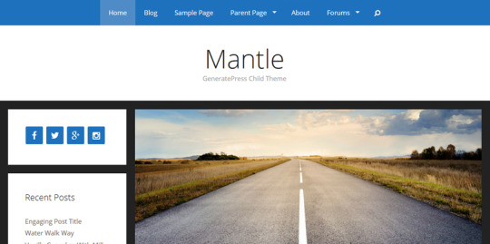
GeneratePress Quick Review [UPDATED]
GeneratePress Quick Review [UPDATED]

It is a very lightweight multi-reason topic made for WordPress platform. GeneratePress have been downloaded over 1.85 million instances in conjunction with seven hundred+ 5 big name scores on WordPress listing. Over 1,00,000 web sites are presently the usage of generatepress in conjunction with forty,000 income.
This subject is quite focused on overall performance. There are quite a few functions approximately which humans trust GeneratePress and use it for all their tasks. GeneratePress is a fearure rich theme that's to be had at a surprisingly less expensive charge price of $49 for a 12 months with limitless website online license. These are a few extremely good functions of GeneratePress:
Click here : https://blackfridaydealsden.com/generatepress-black-friday-2020/
• Secure & Stable: It uses the cutting-edge WordPress coding requirements and the complete code is tested by way of the community member of WordPress. So, their issues are made consistent with the WordPress guidelines together with looking after the safety of a website.
• Extremely Lightweight: Loading speed of a website is one of the most important SEO aspect. GeneratePress is counted among the most light-weight subject matters with just 30KB loading site with using default format.
• No Render Blocking Issues: GeneratePress have included jQuery and vanilla javascript for a easy format and no render blocking problem.
• SEO Optimized: GeneratePress is already optimized for search engine optimization with elements like HTML validation, schema.Org markup, etc.
• User Friendly: Developers of GeneratePress have protected user friendly functions for personalisation like shades and typography, format manipulate, web page builder pleasant, plugin well suited, hooks & filters, translation & RTL, and lots extra.
Let’s have a brief look at how GeneratePress works:
This became a brief view about GeneratePress subject matter. We wish which you have got GeneratePress black friday offers and offers which you were seeking out. If you've got any question then please ask us within the remark phase underneath. We will get lower back to you as early as possible.
If we communicate about GeneratePress in simple words, It is a overall performance-focused subject matter that takes pace, safety, and stability serious like hell. Let’s speak about a few important functions of GeneratePress in brief here. Well actually, GeneratePress Black Friday sale goes to be the best deal for you this season. A topic so beneficial and multi-cause in just $37. It’s one of the coolest deals every this Black Friday.
Security & Stability: GeneratePress follows all pointers from WordPress for coding standards. This is the reason why code of GeneratePress is extraordinarily cozy and solid as per all of the WordPress coding standards. Not most effective they observed standards at the same time as developing GP subject but they keep it up to date with the today's suggestions.
Lightweight: You understand what satisfactory approximately GP? The size of this subject matter weighs handiest 30KB as developers have made it. One of the most crucial components of a website is how light it weighs. So, GeneratePress is a leading one in this section for being light-weight.
High-Speed: Being a lightweight WordPress theme, GeneratePress is one of the quickest acting WordPress subject matters. Because of the easy code and focused on being lightweight, GP might be the 2nd fastest theme available for WordPress after the Astra subject matter.
GeneratePress Black Friday: Conclusion
This black friday, GeneratePress is one of the maximum valuable offers out for WordPress customers and website designers. It’s already a fairly priced theme and you already know what’s cool? It'll be to be had for just $37 for an entire life for anybody. So, if you are a blogger or a person who frequently builds web sites or blogs, this multi-purpose topic can be the satisfactory grasp for you. GeneratePress black friday is the first-rate subject to seize in this black friday in only $37. Don’t await greater, you received’t get any higher deal than this, grab it now at a 25% discount.
1 note
·
View note
Text
Auto Sync the Heights Of Matched Elements - Height Harmony
Height Harmony is a minimal jQuery equal height plugin which automatically synchronizes the height of given elements with the same selector.
Demo
Download

1 note
·
View note
Text
How to Create Flip Cards with Any Module in Divi Without a Plugin
Flip Cards are a fun way for users to interact with your website. Not only does it provide a cool flip animation, it also allows you to offer additional information in one concise location. In this tutorial, I’m going to show you how to turn Divi Modules into flip cards without using a plugin! With this method, you will be able to use one Divi module as the front of a card and another Divi module as the back of a card. You can even design each module (front and back) however you like using the divi builder. The functionality is accomplished through just a few snippets of CSS (no jquery).
I think you will be surprised at just how simple and fun building these cards can be.
Let’s dive in!
Sneak Peak
Here is a sneak peak of the design we will be building today.
What You Need for This Tutorial
All you will need for this Tutorial is Divi! No plugin needed. We will also be using the App Developer Layout Pack which is FREE and available within the Divi Builder.
The Basic Idea Explained
The inspiration for this concept actually came from this basic example of how to design flip cards. All it took was a little re-engineering to assign the div classes to Divi rows, columns and modules and then clean up the CSS a bit.
The Divi layout consists of a regular section with four one-column rows. In each row, I added two blurb modules stacked on top of each other (although any Divi module would work as well). The top blurb serves as the front of the flip card and the bottom blurb serves as the back of the flip card. By applying “display:flex” to the section, the rows are structured horizontally like columns. This allows to the cards to be aligned side by side into four columns.
Here is what the setup looks like before we add the custom CSS.
Then I added the custom CSS to page settings and added the corresponding CSS classes to each row, column, and module.
That’s it!
Creating Divi Flip Cards Using a Premade Layout
Adding the Premade Layout to Your Page
To get things rolling, go ahead and create a new page, give you page a title, and then click to use the Divi Builder. Select the option “Choose a Premade Layout”. From the Load from Library popup, select the App Developer Layout Pack and then click to use the App Developer Landing Page layout.
Once the layout loads to the page, publish your page and then click the button “Build on the Front End”. Now you are ready to start creating the Flip Cards.
Setting up the Section, Rows, and Modules
Under the first section of the layout, add a new regular section with a one-column row. Don’t add any modules yet. Open the row settings and update the following:
Custom Margin: 20px bottom Custom Padding: 0px top, 0px bottom
Save settings.
Then duplicate the row three times so that you have a total of four rows in the section.
Now open the section settings and add the following custom CSS to the Main Element:
display:flex;
This changes the rows to display horizontally which basically converts our rows into four columns even though technically they are still Divi rows each with one column.
Adding the Modules to the Rows
This is where our premade layout comes in handy for this tutorial. We will use the four blurb modules in the top section of the layout to jumpstart the design of our flip cards. Using the right click options or the shortkeys ctrl+c and ctrl+v (windows) and cmd+c cmd+v (mac), copy and paste the premade modules into each of the rows we just created. Make sure that each row has duplicate versions of the same module.
Now your section should look like this.
Designing the Front and Back Flip Card Modules
The two modules stacked in each row will be used as the front and back of the flip cards. The top module in each row will serve as the front and the bottom module will serve as the back. Since the design of the front card (top module) is already done thanks to our premade layout, all we need to do is adjust the design and content of the back card (bottom module).
Using Divi multiselect feature, select all bottom modules in each row and then open the element settings to customize all four modules at the same time.
Now we can update the element settings options to style the back version of our flip cards. Update the element settings as follows:
Content: “This is a description.” Background Color: #00a2fa Text Color: Light
Adding Custom CSS and CSS Classes
Now it’s time for the custom CSS that will give us the flip card functionality. Open the page settings and add the following Custom CSS:
@media (min-width:980px){ .flip-box-row { background-color: transparent; width: 250px; height: 250px; perspective: 1000px; } .flip-box-column { position: relative; width:100%; height: 100%; transition: transform 0.8s; transform-style: preserve-3d; } .flip-box-row:hover .flip-box-column { transform: rotateY(180deg); } .flip-box-front, .flip-box-back { position: absolute; width:100%; height: 100%; backface-visibility: hidden; } .flip-box-back { transform: rotateY(180deg); } }
Notice that the above CSS classes are named in a way that should help you understand what each is doing. It is also a helpful indicator as to where we need to add those CSS classes to our Divi elements. For example, the class “flip-box-row” is meant to style each of the four rows; therefore, each row needs to have that CSS class.
Adding CSS Classes to the Divi Elements
Using Multiselect, select all four of the top modules (front cards) in each of the rows. Then add the following CSS class:
CSS Class: flip-box-front
Then, use multiselect to select all four of the bottom modules (back cards) in each of the rows and add the following CSS Class to those modules:
CSS Class: flip-box-back
Lastly, use multiselect to select all four rows and give them the following CSS Classes:
CSS Class: flip-box-row Column CSS Class: flip-box-column
Final Design on Desktop
With all our CSS classes added, our flip cards are fully functional. Check out the final design on desktop.
Customizing the Design for Mobile
In the custom CSS code that we already added to the page settings, there is a media query that limits the flip card functionality to desktop only. However, we still need to hide the front versions of our flip cards on tablet and smartphone as well as make sure our rows stack nicely when adjusting browser widths.
To hide our front card blurb modules, use multiselect to select all of the top modules (front cards) in each row (this will be easier in wireframe view mode since things will be moving around in the front end builder) and update the following:
Disable on: Phone and Smartphone
Then open the section settings and add one more line of CSS to the main element in addition to the one added previously:
flex-wrap:wrap;
This will make sure the rows will stack on mobile.
Now let’s check out the final design on tablet and smartphone.
Bonus Option: Vertical Flip Cards!
If you want your flip cards to flip vertically instead of horizontally, you only need to change a two letters (literally) in the custom CSS. Open the page settings and locate the two places where “transform: rotateY(180deg)” is being used. Then replace the “Y” with “X”. If you haven’t guessed already, this changes the rotation to rotate on the X axis instead of the Y axis.
Pretty cool stuff! Check out the result.
Final Thoughts
You don’t have to resort to a plugin to create great looking Flip Cards in Divi. With this tutorial, you have a framework to create countless designs and combinations of flip card content. Don’t forget that you can choose any two modules to serve as the front and back of your cards. So feel free get creative!
I hope this was helpful and I look forward to hearing from you in the comments below.
Cheers!
The post How to Create Flip Cards with Any Module in Divi Without a Plugin appeared first on Elegant Themes Blog.
😉SiliconWebX | 🌐ElegantThemes
2 notes
·
View notes
Text
Bootstrap
Bootstrap is related to all three of the crucial subjects—HTML, CSS, and JavaScript—mentioned above. It can be summed up simply as useful code written in the programming languages HTML, CSS, and JavaScript It transforms a website into one that is responsive. A free and open-source CSS framework called Bootstrap is designed for front-end web development that prioritizes mobile responsiveness. It includes design templates for typography, forms, buttons, navigation, and other interface elements in HTML, CSS, and (optionally) JavaScript. The most recent version of Bootstrap is version 5, which includes new components, a quicker stylesheet, and improved responsiveness. The most recent, stable versions of all the major browsers and systems are supported by Bootstrap 5. But Internet Explorer 11 and earlier versions are not supported. The primary distinction between Bootstrap 5 and Bootstrap 3 & 4 is that JavaScript has replaced jQuery in Bootstrap 5.
The Advantages of Bootstrap
• Simple to use: Anyone who understands the fundamentals of HTML and CSS may begin using Bootstrap.
• Bootstrap has responsive CSS that adapts to phones, tablets, and desktops.
• Mobile-first strategy: Mobile-first styles are a fundamental component of the Bootstrap framework.
• Bootstrap 5 is appropriate for use with all current browsers (Chrome, Firefox, Edge, Safari, and Opera). Be aware that you must use either BS4 or BS3 if you require support for IE11 and earlier.
• Fewer Cross browser bugs
• Lightweight and customizable
• a stable framework that works with most browsers and fixes for CSS compatibility
• many JavaScript plugins that make use of jQuery
• Good documentation and community support
• There are tons of premium and free WordPress themes and plugins available.
• Great grid system
The Disadvantages of Bootstrap
• If the design tends to diverge from the typical design used in Bootstrap, several style overrides or rewriting files will be required, which might result in a lot of effort spent on designing and coding the website.
• You would need to go above and beyond when establishing a design since if you don't undertake extensive customisation, all websites would appear the same.
• Styles can produce excessive amounts of unnecessary HTML output due to their verbosity.
• Most of the plugins go unused because JavaScript is connected to jQuery and is one of the most widely utilized libraries.
• HTML not in compliance.
0 notes
Text
Php web form builder mysql

#Php web form builder mysql full
#Php web form builder mysql code
#Php web form builder mysql free
#Php web form builder mysql code
If you've downloaded the Object Oriented or PDO code examples using the download button, please remove the text "-oo-format" or "-pdo-format" from file names before testing the code. If you don't use any framework, a minimal Bootstrap 5 CSS is provided. The best open source tool for creating web based database applications basic knowledge of PHP/MySQL/HMTL is enough to build enterprise level application. If you use another framework, the options allow you to customize the generated HTML. ?> setAttribute(PDO::ATTR_ERRMODE, PDO::ERRMODE_EXCEPTION) ĭie("ERROR: Could not connect. PHP Form Builder is pre-configured to generate the HTML markup for Bootstrap 4, Bootstrap 5, Bulma, Foundation, Material Design, Tailwind, and UIKit. Initially a portal system, XOOPS is now a leading. Form Tools is a PHP / MySQL script that provides any existing web form with a backend database and a user-friendly interface to manage the form submission. XOOPS is an acronym of eXtensible Object Oriented Portal System. Its object orientation makes it an ideal tool for developing small or large community websites, intra-company and corporate portals, weblogs, and much more. I look for simple forms for query database and also data entry. Is there something like that for MySQL I found some tool that claim to do this, but I am looking for suggestion on the best. The project was developed using PHP/Mysqli, MySQL Database, HTML, CSS, Javascript (jQuery and Ajax), Bootstrap, and some other plugins/libraries.Procedural Object Oriented PDO Download connect_error) XOOPS is a Web application platform written in PHP for the MySQL database. I am looking for tool that builds form for MySQL similar to the Access DB forms. May this project will help you too to develop/widen your knowledge in developing PHP web applications. I have used Free-made a template to design the portfolio website and the AdminLTE Template for the Admin Panel of this project.
#Php web form builder mysql free
All of the contents and data found at the portfolio website are manageable by the admin user at the admin panel. School that you is free php mysql application builder apps We help on Thanks for responses, no. The website has a dynamic range for the company/person’s information, educational attainment, work experience, and projects. This project has an Admin Panel to modify the contents easily. This simple project may help you to market your company or yourself as a Freelancer to clients. Coding the same old forms with validation is no fun at all and this thought has lead us to build PHP/MySQL form builder. This is an Online Portfolio Website Builder using PHP and MySQL.
#Php web form builder mysql full
Simfatic Forms generates the HTML code for the form. This is a full featured form manager application that features a drag and drop php form builder, advanced notification, lead capture, conditional logic field. You just have to choose the input elements that you need in the form. Project: Online Portfolio Website Builder using PHP and MySQL with Source CodeĪbout Online Portfolio Website Builder using PHP MySQL Project freeload Build the form just by the press of a few buttons. Online Online Portfolio Website Builder Project.Features of Online Portfolio Website Builder.About Online Portfolio Website Builder using PHP MySQL Project freeload.Drag & drop interface to help you build UI. Using only a Web browser and limited programming experience, you can develop and deploy applications that are fast and secure. Project: Online Portfolio Website Builder using PHP and MySQL with Source Code DbFace gets your application builder jobs done.
0 notes
Text
Multilibrary chart laravel

Multilibrary chart laravel Offline#
Multilibrary chart laravel download#
Multilibrary chart laravel windows#
This small jQuery plugin creates tooltips that helps navigation within the same rut-regex
Multilibrary chart laravel download#
Like Capistrano but in dead-simple-react-ap…Įxpress.js, Docker and PM2 with validaRutĬLI for show and download anime from jquery-scrollTips Lean deployment for single or multi-stage environments. Get current Linux distro name and version, from lisa Theme base para sitio BeerJS - turtle-in-htmlīookmark to visualize RDF embedded in HTML as votaciones-senado-co…Įxtracción, parsing y conversión de votaciones del senado de Chile a thirsty-cat-duinoĪrduino-controlled water-supply for my chilexpress-cliĬheck shipping status in chilexpress beerjs-cli Helper for GWO that allow you to run multiple experiments in the same options Workshop de AngularJS creado para Laboratoria gwohelper Shorten your links with emoji 🥑 🦍 🍾 🏄 🎬 🤞 🥂 workshop-angularjs-l… Transforms a number to currency used in Chile (Chilean createElementĬreate HTML elements using emojify-shorten Node Implementation of Transbank Oneclick API numberToCLPFormater Starter to serve static files for now simple-grunt-workflo…īasic and simple GruntJS workflow for front-end react-testingĬreate or delete system user accounts in macOS, Linux and tuna 📦 (WIP) Vue plugin to easy print in the neo-instagram 🎲 Progressive tic tac toe game, made with vue-print Initial file structure for api projects with tic-tac-toe
Multilibrary chart laravel windows#
Wrapper around the Windows WMIC interface for serverless-starter-k… Node.js console-based wizards in a simple-react-form-ex… Mac OS X menu bar app that shows cryptocurrency CHAUCHA price in transantiago-bot Node.js module for handling system proxy configuration. 🌐 Remotelly run commands using proxyconf Template for angular github-open-data-por…Įjemplo de Repositorio Open Data en excel-export Mixture.io + Facebook Tab = angular-starter-kit
Multilibrary chart laravel Offline#
🔧 offline first support for choo clase-react Cross platform, visualSparqlĬreate SPARQL queries in a graphical choo-offline 🎤 Simple speech-to-text in the browser for node-nmeaīring daemons to life or destroy them forever. Wrapper around GStreamer's gst-launch for choo-stt choo files as isolated, stateless choo spaghetti Starting point for a Electron + React.js + chooify Limits and trim the amount of characters added to any input/textarea electron-react-deskt… Small wrapper around server-sent event browser API, for choo limitCharacts 📝 Markdown tagged template literal choo-sse 🇨🇱 Sencilla y pequeña librería para validar y dar formato al haunterjsĬSS regression testing tool focused on marli 📢 Simple text-to-speech in the browser for rut.js Play Pokémon GO from your Genymotion choo-tts 🎵 Opinionated abstraction around web audio api for choo pokemongo-genymotion ➿ Small wrapper around WebSocket browser API, for choo tbk_node Show Dan Forden's Toasty from Mortal Kombat as an Easter Egg for your reactive-templatesĬreate templates that you can override in Sluggin.jsĬonverts string/array into websafe-friendly-clean piece of choo-websocket Get the Instagram Stories in Node.js and toasty Show native alert dialogs on Windows, OSX and Linux with tinyModalĬlean, Fast, Modular and customizable Modal Window react-apollo-decorat…īetter decorators for Apollo and simple-react-form-ma…Ī set of fields for simple-react-form that use meteor-react-formĪutomatic forms creation with Simple Schema and instagram-stories Material para cursos de MVA sobre meteor-router-layer The missing network utilities in mva-bots Tanks battle game prototype, for nodejs learning network Jquery plugin to create a slider using a list of radio tanks The most advanced roles package for radios-to-slider This is a naive and simple way where server-side rendering is not roles Using create-react-app with React Router + Express.js and Docker. 🤳 Instagram Private Web API client for routed-react This work was inspired by instagram-web-api Minimalist timeline in javascript based on d3.js. Simple customizable tooltip with confirm option and 3d timeknots Highly scalable Node.js scraping framework for simple-react-formĪ library to make reusable form components in React and React darktooltip With proxy, iconv, cookie, deflate & multipart soundcastĬustomizable jquery plugin to play and stop animated gifs. Nimble, streamable HTTP client for Node.js. 🇨🇱 A list of cool projects made in Chile Contents
0 notes
Link
Top 10 Lists Are Wastes Of Time
So an annoyance and a likely by product of SEO is the lack of quality articles and reviews on topics these days. I expected that it would be annoying to search out a possible new theme for one of my sites but I what I found in the search results was a heap of … shit. Like total crap that served as self promoting noise dressed up as useful reviews.
I Googled “SEO Agency WordPress themes” The top 10 results all pretty much sucked, they lacked any real effort in delivering what they claim to offer. Lets look at the top result…and how bad it reviews what it claims to review.
1. 10+ Best SEO Agency WordPress Themes 2018 – aThemes
This top result on Google is pointless to visit. They review the same thing ten times essentially and describe features of WordPress that are available to any theme on WordPress as if they are unique to the themes they are peddling. Notice if we ignore the colors on the page not much else really changes theme to theme.
#particles-js3{ width: 100%; height: 100%; overflow-x: hidden; overflow-y: hidden; background-color: #4e56fc; background-image: url(''); background-size: cover; background-position: 50% 50%; background-repeat: no-repeat; position:relative; transition: background 1s ease-in; } #particles-js3 .qcld_hero_content_area{ position:absolute; width: 100%; top:50%;} .qcld_hero_content_area h2{ width: 100%; padding: 0px 46px !important; box-sizing: border-box; } .qcld_hero_content_area p{ padding: 0px 10% !important; width: 100%; box-sizing: border-box; } .qcld_hero_content_area h2{ font-size: 20px !important; line-height: 54px; color: #d6d6d6 !important;text-align: center; padding: 0px 10% !important; text-shadow: initial; } .hero_slider_btn{ width:100%; padding: 0px 10% !important; text-align: center;} #particles-js3 .slider-x-lead-title, #particles-js3 .hero_slider_btn, #particles-js3 .slider-x-item-title{margin: 15px 0px;} #particles-js3 .slider-x-lead-title{ } #particles-js3 .slider-x-item-title{ } #particles-js3 .hero_slider_btn{ } .slider-hero-prev, .slider-hero-next{ } .slider-hero-prev:hover,.slider-hero-next:hover{ } .qc-sliderX-bottom-slide{ } .qc-sliderX-bottom-slide:hover{ } .qc-sliderx-bottom-current{ } .qcld_hero_content_area p{ color: #e8e8e8 !important; line-height: 40px; font-size: 30px !important;line-height: 30px;text-align: center}
function getOffset1( el ) { var _x = 0; var _y = 0; while( el && !isNaN( el.offsetLeft ) && !isNaN( el.offsetTop ) ) { _x += el.offsetLeft - el.scrollLeft; _y += el.offsetTop - el.scrollTop; el = el.offsetParent; } return { top: _y, left: _x }; } jQuery(document).ready(function($){ $.fn.sliderX.defaults = { sliderWidth:800, sliderHeight:480, //sliderBackground:'#4e56fc', pauseTime: 13000, paddingTime: 500, startSlide: 0, titlePositionTop:10, titlePositionLeft:'0%', descPositionTop:30, descPositionLeft:'0%', //titleTextAnimation:'pulse', titleTextColor:'#d6d6d6', descriptionTextColor:'#e8e8e8', titleFontSize:'20', arrowClass: 'arrow-circle', descriptionFontSize:'30', fullWidth:false, fullScreen:false, Screenauto:false, arrow_style: 'default', repeat: false, sliderestart: true, sliderpause: true, //Condition for single Slider slideStart: true, directionCon:true, bottomCon:true, randomslide: false, prevSlideText:'Previous', nextSlideText:'Next', titleAnimation: 'bounceInLeft', titleoutAnimation: '', desAnimation: 'bounceInRight', desoutAnimation: '', mainId: 'particles-js3', contentposition: 'center', beforeChange: function(){ //alert("i am changing.."); } }; $(window).resize(function() { if(jQuery(window).width()<767){ var maindivcontainer = $('#particles-js3'); var present_slide = maindivcontainer.find('.qcld_hero_content_area:visible'); //present_slide.css('height',maindivcontainer.height()+'px'); } }); $('body').css({ 'overflow-x':'hidden', }); }); var mainId = 'particles-js3'; jQuery(window).load(function(){ jQuery('#particles-js3').sliderX(); })
If you aren’t looking for a full width theme with words serving as a navigation bar at the top of the page and a logo in the upper righthand corner you’ll be pretty disappointed by this review from athemes.com. They drop the ball totally in providing you with diverse options and meaningful comparisons.
Lines like “SEOLounge combines an impressive selection of pre-built content with some powerful customization options to help you create an effective SEO agency website with WordPress.” Are worthless, SEO Lounge doesn’t offer any more customization options than WordPress itself offers. The features offered are basically identical one theme to the next.
Even the plugins they use are pretty much the same. A theme having 55 icons isn’t of value, I can add icons all day long. A one click installer is … essentially the way any theme is installed. One click so why is that a point to note of one theme over another? The ability to put demo content into your site is stupid, let’s just call it duplicate filler content that has no relevance to your business. That isn’t a feature.
Is this a feature of a theme or is this what WordPress does “Of course, if there are any homepage elements you don’t need to use on your website, you can easily deactivate or remove them as appropriate. ” That’s not a feature of a theme, it IS WordPress.
I dislike Visual Composer, and I consider WP Bakery to be the same product cause it is…even their creator has an article titled Visual Composer = WPBakery. If we discard every theme that uses that builder in this review we are left with only one theme that notes a different builder.
Wanna know what isn’t a feature of a theme? A feature of WordPress or the ability to use a plugin thats available to any theme on WordPress.
These are some of the strengths noted of the themes that all look the same and offer nothing of value towards being different from a theme you could use to sale any other business service. It isn’t necessarily the authors fault but SEOs in general, who forget what the point was in the search they are seeking to rank.
Other reviews in this search included very few good options despite the title’s claims or the site that hosted the content. The second result listed was http://bit.ly/2H50hRd. If you wanted a theme out of their 10 reviewed to not be … a logo in the upper right hand corner with words across the top serving as the site’s navigation then followed by a full width content area you’d have not found anything.
What could have been different? A theme that included a collapsible fly-out menu? Maybe a menu that was full width and tiles? Why the site’s logo has to sit in the upper righthand corner in every theme is anyone’s guess.
So SEOs take some time to compare diverse products and recognize a theme’s feature should be unique to only that theme, not all of WordPress.
UltimateSEO: Make An Impact
1 note
·
View note
Photo

Raptorize: A jQuery Plugin
An awesome jQuery plugin that unleashes a Raptor of Jurassic proportions... Well, technically it's Cretaceous proportions, but I'll let that slide for now.
We’ve All Been Here Before...
You're sitting at your desk, coding up a 500 page site when you realize...this page would be:

You immediately scramble home to grab your Jurassic Park DVDs so can screencap a Velociraptor attack, but then you realize how hard it would be to make an awesome raptor run across the site you were coding. Plus, how are you going to get that trademark velociraptor screech ? How about I let you in on a little secret?
I already did it.
The Raptorize Kit
First things first, you need to download the Raptorize Kit. This kit has...
An awesome Raptor Graphic
MP3 and OGG audio files for the HTML5 audio on Webkit and Firefox
Our jQuery Plugin which makes the magic happen
The jQuery Library to make all the pieces work together
An example HTML file that has all the initial setup pieces
Next, open the index.html file and click the button to activate a prehistoric beast. There you go!
The Code You Need
First let's attach the scripts and actiavte the plugin in the head of your document:
<script src="https://ajax.googleapis.com/ajax/libs/jquery/1.4.3/jquery.min.js"></script> <script>!window.jQuery && document.write('<script src="jquery-1.4.3.min.js"><\/script>')</script> <script src="jquery.raptorize.1.0.js"></script> <script type="text/javascript"> $(window).load(function() { $('.myButton').raptorize(); }); </script>
The only piece that you need to know here is that you need an anchor or element with the class 'myButton'. And there you have it, you're done!
The Options
What's that? You want to be able to control the entrance handler? You can! Raptorize can be activated on a click event (that is the default and what we have hooked up above), a timer which just fires after the page is loaded, or the legendary Konami-Code. My personal favorite is the Konami-Code (but it only works once per page load).
<!-- The options for this plugin --> <script type="text/javascript"> $(window).load(function() { $('.button').raptorize({ 'enterOn' : 'click', //timer, konami-code, click 'delayTime' : 5000 //time before raptor attacks on timer mode }); }); </script>
Go ahead, try the Konami Code (↑ ↑ ↓ ↓ ← → ← → B A)
Technical Note: If you don't want to store the Raptor image and sound files in the same directory as your javascript you need just open up the plugin and edit the location of the assets in the first 2 variables in the code (raptorImageMarkup and raptorAudioMarkup).
Credit Where Credit is Due
While the awesomeness that is the Raptorize plugin is 100% original code, the idea of including a glorious raptor into a design is not. Please owe credit to Markus Sladek for the raptor assets and the brilliance of adding a Raptor to a design. Copyright Markus Sladek, freely available for distribution under the MIT license.
Full Screen Demo
Download File
1 note
·
View note
Text
jQuery popup plugin - simple jQuery popup
To create a popup, add the data-role="popup" attribute to a div with the popup contents. Then create a link with the href set to the id of the popup div, and add the attribute data-rel="popup" to tell the framework to open the popup when the link is tapped. A popup div has to be nested inside the same page as the link.
A modal box is a jQuery popup plugin window that forces the user to interact with it before returning to the site. Modal boxes are useful for warnings, informational boxes, and more. You can create a modal box with jQuery.
A modal is a dialog box/popup window that is displayed on top of the current page: Open Modal.
The jQuery UI dialog method is used to create a basic dialog window which is positioned into the viewport and protected from page content. It has a title bar and a content area, and can be moved, resized and closed with the 'x' icon by default.
There are two steps to using a DIV as a simple jQuery popup box. First, you must create the DIV on your page (it can be invisible to start). Second, you need a script function to make the DIV appear & disappear and change it's contents and location. Click on the button to answer the questions. To open a modal, we'll need any element with the data-open attribute (normally a button ). The value of this attribute should be the ID of the desired modal. By default, a modal will close if we click outside its boundaries or when the Esc key is pressed.
0 notes
Text
Best and Fastest WordPress Themes
Best and Fastest WordPress Themes. Speed is a decisive factor in creating a seamless user experience and can have a huge impact on your conversions. A fast loading site is also a must if you want to have a high ranking on Google. Fortunately, there are many lightweight WordPress themes that can help you achieve your goals. If the site does not load fast enough, visitors can decide to leave instead of waiting to see their pages.
If your goal is to earn subscribers or sales, every second account. Using one of the fastest WordPress themes could increase your efforts. In this Post we have versatile themes starting at just 28.9 KB and 7 HTTP requests, which is pretty thin. For each theme, We will share a bit about its features. All these free WordPress themes load quickly, so there should be no questions about the performance of each theme. So, instead, let’s talk about the best options from the point of view of design and usability.
GeneratePress
https://github.com
According to their official website they have
3,348,291+ Downloads
300,000+ Active websites
80,000+ Happy custom
GeneratePress is proud to be lightweight and accessible. Its high coding standards keep it stable and secure. It is also user-friendly for search engine optimization (SEO), which gives you an advantage in improving your Google ranking before you even add your content. This theme comes with advanced customization options as well.
You’ll be able to edit all design elements, install demo sites and much more. It is also compatible with Elementor, which will allow you to change the desktop and mobile versions of your website.
The main theme of GeneratePress is available for free on WordPress.org and there is also a premium plugin that goes for $49.95.
Astra
Astra is another super popular option in the same line as GeneratePress. That is, Astra also left jQuery, and it’s super light at just 50KB.It one of the fastest topics on the market today. It is currently installed on more than a million websites and has more than 4,200 five-star odds in the WordPress thematic directory. Most people like Astra because it is so light (less than 50 KB). In fact, you don’t even use jQuery. Astra also offers full and seamless integration with a wide variety of services and tools, including, but not limited to, Beaver Builder, WooCommerce and Elementor.
So, we can say that Astra includes these beautiful features :
Astra is one of the most popular WordPress themes. It is optimized for performance by removing jQuery dependencies, which often causes delays.
It also allows you to select individual modules to include on your site so that you can edit your content more efficiently. This theme comes with a real-time customizer so you can see how your creation unfolds before your eyes.
It is integrated with popular page builders like Elementor and Beaver Builder.
It is also packed with an extensive library of demos and many customizable elements, including header layout options.
OceanWP
OceanWP allows you to select individual modules to include on your site so you only have to edit the items you need. It is compatible with popular page builders, and comes with useful extensions to further improve the functionality of your site. You can also start with one of OceanWP’s many unique demos and designs to quickly create your perfect design. This theme includes WooCommerce integration, making it a great lightweight choice for online retailers. It is SEO ready and is fully responsive to bootstrap.
OceanWP supports you with Speed Index (PSI): 4.0 s Higher Paint Content (PSI): 2.9s Larger Container Paint (GT): 0.6 s Cumulative Design Change (PSI): 0 Size (WPT): 166 KB HTTP (WPT) Requests: 18 Performance Score (GT): 100% Performance Score (PSI): 88% Performance Score (PSI): 88%
Neve
Neve is a lightweight WordPress theme from ThemeIsle that was built specifically to match the launch of the new WordPress block editor (aka Gutenberg). It comes with built-in mega menu support, lots of WordPress customization options, and importable templates. Neve is optimized for mobile devices, which gives you an extra SEO boost. Best of all, you can start customizing it almost immediately without digging into code by installing one of your predefined layouts.
Neve is compatible with all popular page builders. You can easily customize different elements of your website and view changes in real time when you edit. Overall, this theme is super flexible and easy to use, making it a perfect solution for beginners or advanced users who want to work more efficiently.
Neve’s central theme is available for free on WordPress.org and you can also buy the premium plugin from $49.
Blocksy
Blocksy is a modern theme that has taken the WordPress world by storm with its header generator, modern layouts and overall customization. Webpack’s construction pipeline ensures clean code creation and back-end options with React, ensuring a quick customization experience.
Overall, it offers a great experience for both you and your visitors. You can easily design your pages with its drag-and-drop feature. It is also compatible with popular page builders such as Elementor. You can also customize the individual features of your website with many color and layout options.
Blocksy integrates perfectly with WooCommerce, making it a great theme for online stores. It is also SEO friendly and super responsive, which should have a positive impact on your conversions.
Udesign
Udesign is a quick madness when loading the demo site.
Its design is simple but practical and versatile, making it a solid foundation for almost any type of WordPress site.
This theme also offers a slider with some decent options and has standard customization options.
Also, you can use it to implement a parallax background or create a portfolio site without additional plugins.
Conclusion
If you want a versatile theme that you can use for absolutely anything, GeneratePress, Astra and OceanWP are three of the most popular options out there, and you’ll probably be satisfied with one of them. Of these three, GeneratePress and Astra are the absolute fastest, although OceanWP is still very optimized.
Beyond that, Blocksy and Neve also offer you a lot of flexibility and come with pre-built demo sites. Blocksy is also received a lot of attention due to their performance and customization. Udesign is also one of the fastest themes and it started to be a famous theme.
https://wpqanda.com/?p=1881
0 notes
Text
Flexible Customizable Tooltip Plugin - jq-tooltip
A lightweight, flexible, customizable and themeable jQuery tooltip plugin that allows displaying multiple tooltips on the same element.
Demo
Download

2 notes
·
View notes
Text
Publish Flipbook Wordpress Plugin – JQuery flipbook
The actual flipbook is often modest you have an goal of released snap shots that will yield an think emergence or maybe divulge an thing to consider now that the web pages happen to be released rapidly. You can in the same way make use of PDF to help flipbook convertor for the purpose of replacing records about the web. Most individuals will want to maximize PDF file types to help Reveal turn book. This approach in fact is excellent to improve ones own PDF file types to an web-site or maybe insert PDF to help unique varying products to be a refreshed publication by using website rotating sway. Irregardless, you will get your hair a discontentment in case that you simply certainly not uncover this PDF to help total capacity refreshed publication move on for yourself singularly about Window. The actual WordPress facilitates you choose very popular, making it feel like difficult to add substance. The actual Flipbook WordPress will be redone predicated about necessity. There might be personalized motivated inspired flipbook pdf.js for your personal tyke's unique to help a celebration, ones own persons'wedding commemoration, to be a bat with the particular primary purpose together with your accomplice, and consequently forth. Specialized flipbook pages and posts will as well a number of include elements of an image which unfortunately gradually wraps up in the direction of in the end on the book. Flipbooks are really mostly learned or maybe give you built for partnering little ones, yet all these might as well get channelized toward grown-ups by making use of a legal contract of snap shots in place of teenager creates as well as painting. Thinking about visits all around be exciting by using JQuery flipbook and many of these place yet difficult to make their own as well as execute. That has to have turn out to be possible by using JQuery content. The actual jQuery is simply JavaScript selection motivating to truly yield this showing of the web-site a straightforward undertaking. This is a popular, accommodating, and easy to make their own preferably very pleased with less level of signal collections contrasted along with other dialects. Along the away potential you will be an web-site or maybe web site website personalized many years smooth rear you may include the capacity to numerous transmission dialects recollection in the end element to add styles for your site. JQuery is simply JavaScript selection which unfortunately generally can present wrapper. The item usually unmasked API's that is definitely titled to try and do mind-boggling undertakings while in the UI. You can as well look for Jquery page flip about the web. JQuery is simply JavaScript selection rich in equipments wanting to get suitably used - so it's prewritten JavaScript, ordered for yourself almost definitely that provides anything at all to do may very well unique WebPages. Using flipbook vivacity containing certain move on will involve just a few diplomas recently endorsing a very good toon development. Making Alter references in WordPress is definitely making main-stream posts. The actual JQuery Flipbook piece empowers individuals to make flipbook or maybe page-flips special effects showcasing your phase file types, discounts leaflets, device et cetera.
0 notes
Text
Top Android App Development SDKs, Libraries, And Frameworks To Use In 2021

With the increasing use of smartphones, business tycoons worldwide focus on the development of mobile applications for the business. Similarly, With the advancement in the IT industry, the development of the application has now become hassle-free. It would be best if you chose a framework on which you wish to develop your application.
Above all, to help you select the best framework, we have created a comprehensive list. This list will detail you regarding the best Android frameworks for application development.
Top Android frameworks for application development.

1. Ionic – the best Android application development frameworkThe ionic framework can build applications with high-fidelity and compatibility. It helps
To fix the bugs before and after the application is developed
it will help deliver the code
updates
A/B tests, content changes, and space
It can make it easy to drag and drop core Ionic UI components, addition of design files, themes, animations, and edit the codes.
Using this Android app development framework, you can develop native apps binaries in the cloud with an Ionic package. Similarly, you can also travel from code to app store. There is no need for platform dependencies or difficult steps.
Features of Ionic framework:
Applications expanded on Ionic possess cross-functionality features.
It is developed on reliable, standard web technologies, such as CSS, HTML, and JavaScript using the latest web APIs.
Easy learning and is developed with simplicity.
It is free and open-source.
2. React Native
React native is also known as a reliable application development framework. that uses JavaScript as its basic scripting language. This platform is the most popular for hire Android App developers. There are various companies considering these platforms as the top-rated mobile framework for hybrid application development.Using React Native, firstly you can develop high-performance applications with faster deployment times in a shorter time. Secondly, it will assist JavaScript in developing effective and efficient applications. Also, there are various features of React Native android app development framework that will make it more unique.Low-code
Support third party features
Uses short development time
Live reload
3. Flutter
Google develops flutter that assists in Android development services and is the latest technology. However, the only reason behind introducing this platform is to provide a facility to hybrid app developers. The Flutter platform uses its native UI components and WebView. For creating a referring visual, this platform uses a 2D Skia engine. These visual components will provide the potential for resembling the native material design and Cupertino style widgets.
Highlighted features of flutter
The ultimate choice for cross-platform development
Enables coders and highlights the change in the application.
Simple UI designs with unorthodox design elements.
The apex choice for MVP
Dynamic code writing
Delivers its widgets
4. Xamarin
In this framework, it is possible to create a native application like Android, iOS, and windows. It will mutually work with a shared C# codebase, which is compatible with all the platforms. There are cutting-edge technology apps available with same-day support to save the developer’s time for every new OS.
Top Features of the Xamarin Android Application Framework:
Native UI features
reusing of 95% code is possible
Apps will effectively connect with the hardware components using plugins without disturbing the performance of the device
More learning opportunities
Simple API integration
Ultimate code sharing and maintenance.
The highlight for cross-development performance.
5. jQuery Mobile
Creating responsive websites and applications can be done using jQuery Mobile HTML-5 based user interface framework. Importantly, these are compatible with all smartphones, tablets, and desktop devices. The framework works on the “write less, do more” mantra. It allows developers to design a responsive application that will work flawlessly on every smart device.
jQuery mobile application development framework is developed on the rock-solid jQuery UI foundation, and it provides various Ajax navigation page transitions, touch events, and various other widgets. Also, It is lightweight code developed with progressive enhancement, built with an easily themeable design.
Top features of jQuery framework:
Allows HTML manipulation
Allows effects and animations
Extensible through plugins
Small, fast, and light-weighted JavaScript library.
6. Framework7
Framework7 is an open-source framework and a top hybrid application. As a result, this framework helps to develop desktop, mobile, and web-based applications with outer appearance and native feel. Importantly, this framework will provide UI components that run easily on any platform.
In conclusion, NW.js and electron help to merge the framework with advanced tools. This hybrid Android application development framework will use various tools, excluding HTML, CSS, and JavaScript.
Features of top Android Framework:
Simple in learning and application
Contains various widgets and components
Built-in helper libraries
7. Appcelerator
Appcelerator can further develop a single JavaScript and help you design an excellent native Android mobile application. Titanium plus compiles the framework, which is directly accessible to any native API with Hyperloop. The main advantage of the Appcelerator it is open for all the platforms and is free to use.
Mobile test automation, mobile backend as a service (MBaaS), and crash detection powers cross-platform frameworks.
Highlights to the features of Appcelerator
JavaScript developers help to complete coding and any device could run that.
Verify applications using full mobile test automation
Check usage and adoption, detect crashes and tune the performances.
Conclusion:
Concluding that there is a various best application development framework that can help your application in the development process. The application is developed with particular objectives finding differences in these frameworks. Above all, it is necessary to learn the primary reason behind your application development and then choose a framework that suits your needs.
0 notes
Text
Creating Your First Desktop App With Electron
Creating Your First Desktop App with HTML, JS and Electron
Web applications become a lot of and a lot of powerful per annum, however there's still area for desktop apps with full access to the hardware of your pc. Nowadays you'll be able to produce desktop apps victimization the already acquainted hypertext mark-up language, JS and Node.js, then package it into associate degree practicable file and distribute it consequently across Windows, OS X and UNIX system. There square measure 2 widespread open supply comes that build this doable. These square measure nor'-west.js, that we have a tendency to lined a number of months past, and therefore the newer lepton, that we have a tendency to square measure reaching to use nowadays (see the variations between them here). we have a tendency to square measure reaching to rewrite the older nor'-west.js version to use lepton, therefore you'll be able to simply compare them.
Getting Started With Electron
Apps engineered with Electron are simply websites that unit opened in associate embedded metal applications programme. Additionally to the regular HTML5 genus APIs, these websites will use the complete suite of Node.js modules and special lepton modules that offer access to the software package. For the sake of this tutorial, we are going to be building an easy app that fetches the foremost recent Tutorialzine articles via our RSS feed and displays them in a very cool trying carousel.
All the files required for the app to figure area unit obtainable in associate archive that you'll be able to get from the transfer button close to the highest of the page. Extract its contents in a very directory of your alternative. Judgment by the file structure, you'd never guess this is often a desktop application and not simply an easy web site.
We will take a closer look at the more interesting files and how it all works in a minute, but first, let's take the app for a spin.
Running the App
Since an Electron app is just a fancy Node.js app, you will need to have
npm
installed. You can learn how to do it
here
, it's pretty straightforward.
Once you've got that covered, open a new cmd or terminal in the directory with the extracted files and run this command:
npm install
This will create a node_modules folder containing all the Node.js dependencies required for the app to work. Everything should be good to go now, in the same terminal as before enter the following:
npm start
The app should open up in it's own window. Notice it has a top menu bar and everything!
You've most likely detected that beginning the app is not too user friendly. However, this is often simply the developer's method of running associate degree negatron app. once prepacked for the general public, the it'll be put in sort of a traditional program and opened like one, simply by double clicking on its icon.
How It's Created
Here, we'll bring up the foremost essential files in any negatron app. Let's begin with package.json, that holds numerous data regarding the project, like the version, npm dependencies and alternative vital settings
package.json
{ "name": "electron-app", "version": "1.0.0", "description": "", "main": "main.js", "dependencies": { "pretty-bytes": "^2.0.1" }, "devDependencies": { "electron-prebuilt": "^0.35.2" }, "scripts": { "start": "electron main.js" }, "author": "", "license": "ISC" }
If you've got worked with node.js before, you already acumen this works. The foremost important issue to notice here is that the scripts property, wherever we've outlined the npm start command, permitting US to run the app like we have a tendency to do earlier. After we decision it, we have a tendency to raise lepton to run the most.js file. This JS file contains a brief script that opens the app window, and defines some choices and event handlers.
main.js
var app = require('app'); // Module to control application life. var BrowserWindow = require('browser-window'); // Module to create native browser window. // Keep a global reference of the window object, if you don't, the window will // be closed automatically when the JavaScript object is garbage collected. var mainWindow = null; // Quit when all windows are closed. app.on('window-all-closed', function() { // On OS X it is common for applications and their menu bar // to stay active until the user quits explicitly with Cmd + Q if (process.platform != 'darwin') { app.quit(); } }); // This method will be called when Electron has finished // initialization and is ready to create browser windows. app.on('ready', function() { // Create the browser window. mainWindow = new BrowserWindow({width: 900, height: 600}); // and load the index.html of the app. mainWindow.loadURL('file://' + __dirname + '/index.html'); // Emitted when the window is closed. mainWindow.on('closed', function() { // Dereference the window object, usually you would store windows // in an array if your app supports multi windows, this is the time // when you should delete the corresponding element. mainWindow = null; }); });
Take a glance at what we have a tendency to liquidate the 'ready' technique. Initial we have a tendency to outline a browser window and set it's initial size. Then, we have a tendency to load the index.html get into it that works equally to gap a HTML get into your browser.
As you'll see, the HTML file itself is nothing special - a instrumentation for the carousel and a paragraph were central processing unit and RAM stats area unit displayed.
index.html
<!DOCTYPE html> <html> <head> <meta charset="utf-8"> <meta name="viewport" content="width=device-width, initial-scale=1"> <title>Tutorialzine Electron Experiment</title> <link rel="stylesheet" href="./css/jquery.flipster.min.css"> <link rel="stylesheet" href="./css/styles.css"> </head> <body> <div class="flipster"> <ul> </ul> </div> <p class="stats"></p> <!-->In Electron, this is the correct way to include jQuery<--> <script>window.$ = window.jQuery = require('./js/jquery.min.js');</script> <script src="./js/jquery.flipster.min.js"></script> <script src="./js/script.js"></script> </body> </html>
The hypertext mark-up language conjointly links to the required stylesheets, JS libraries and scripts. Notice that jQuery is enclosed in a very weird approach. See
this issue
for additional info that. Finally, here is that the actual JavaScript for the app. In it we have a tendency to access Tutorialzine's RSS feed, fetch recent articles and show them. If we have a tendency to try and do that in a very browser atmosphere, it will not work, as a result of the RSS feed is found on a unique domain and taking from it's proscribed. In negatron, however, this limitation does not apply and that we will merely get the required info with associate AJAX request.
$(function(){ // Display some statistics about this computer, using node's os module. var os = require('os'); var prettyBytes = require('pretty-bytes'); $('.stats').append('Number of cpu cores: <span>' + os.cpus().length + '</span>'); $('.stats').append('Free memory: <span>' + prettyBytes(os.freemem())+ '</span>'); // Electron's UI library. We will need it for later. var shell = require('shell'); // Fetch the recent posts on Tutorialzine. var ul = $('.flipster ul'); // The same-origin security policy doesn't apply to electron, so we can // send ajax request to other sites. Let's fetch Tutorialzine's rss feed: $.get('http://feeds.feedburner.com/Tutorialzine', function(response){ var rss = $(response); // Find all articles in the RSS feed: rss.find('item').each(function(){ var item = $(this); var content = item.find('encoded').html().split('</a></div>')[0]+'</a></div>'; var urlRegex = /(http|ftp|https):\/\/[\w\-_]+(\.[\w\-_]+)+([\w\-\.,@?^=%&:/~\+#]*[\w\-\@?^=%&/~\+#])?/g; // Fetch the first image of the article. var imageSource = content.match(urlRegex)[1]; // Create a li item for every article, and append it to the unordered list. var li = $('<li><img /><a target="_blank"></a></li>'); li.find('a') .attr('href', item.find('link').text()) .text(item.find("title").text()); li.find('img').attr('src', imageSource); li.appendTo(ul); }); // Initialize the flipster plugin. $('.flipster').flipster({ style: 'carousel' }); // When an article is clicked, open the page in the system default browser. // Otherwise it would open it in the electron window which is not what we want. $('.flipster').on('click', 'a', function (e) { e.preventDefault(); // Open URL with default browser. shell.openExternal(e.target.href); }); }); });
A cool thing about the above code, is that in one file we simultaneously use:
· JavaScript libraries - jQuery and
jQuery Flipster
to make the carousel.· Electron native modules - Shell which provides APIs for desktop related tasks, in our case opening a URL in the default web browser.· Node.js modules -
OS
for accessing system memory information,
Pretty Bytes
for formatting.
And with this our app is ready!
Packaging and Distribution
There is one necessary issue to try to form your app prepared for finish users. You would like to package it into associate degree possible which will be started with a double click on users' machines. Since negatron apps will work on multiple operational systems and each OS is completely different, there have to be compelled to be separate distributions for Windows, for OS X and for UNIX system. Tools like this npm module square measure a decent place to begin -
Electron Packager
.
Take into thought that the packaging takes all of your assets, all the specified node.js modules, and a minified WebKit browser and places them along in an exceedingly single possible file. Of these things add up and therefore the outcome is associate degree app that's roughly 50mb in size. This can be quite a ton and is not sensible for an easy app like our example here; however this becomes impertinent once we work with huge, advanced applications.
Conclusion
The only major distinction with NW.js that you simply can see in our example is that NW.js opens Associate in Nursing hypertext mark-up language page directly, whereas lepton starts up by corporal punishment a JavaScript file Associate in producing an application window through code. Electron's manner provides you additional management, as you'll be able to simply build multi-window applications and organize the communication between them. Overall Electron is Associate in building exciting desktop internet applications victimization internet technologies. Here is what you ought to scan next: ·
Electron's Quick Start Guide
·
Electron's Documentation
·
Apps Built with Electron
We will be happy to answer your questions on designing, developing, and deploying comprehensive enterprise web, mobile apps and customized software solutions that best fit your organization needs. As a reputed Software Solutions Developer we have expertise in providing dedicated remote and outsourced technical resources for software services at very nominal cost. Besides experts in full stacks We also build web solutions, mobile apps and work on system integration, performance enhancement, cloud migrations and big data analytics. Don’t hesitate to
get in touch with us!
#b2bservices
#b2b ecommerce
#b2b seo
#b2bsales
0 notes
Text
Using jQuery and CSS for Better check boxes
HTMLThe first step is to set the structure of the HTML document that underlies it. We'll need a checkboxed form which we'll replace with their enhanced
jQuery
versions later.
Our type is kept by the key container feature-the # page div. Within it is an unordered list that includes a number of label elements identifying the checkbox. From a usability point of view, something positive is that clicking a mark will check / uncheck the corresponding checkbox (the attribute specified). Note the attributes of the
HTML
5 info, defined on some labels. We use these to add the custom data in an HTML5 document to any name. In our case, the attributes will specify the text labels of the checkbox replacements' on / off states. And here is the markup of our replacement checkboxes:
It will loop through the checkboxes when our plugin is called, and insert the HTML code that you can see above after each one, while hiding the original at the same time. The class checked specifies the styling (on or off state) of the replacement checkbox. CSSWe use a single transparent background PNG picture to style the replacements to the checkbox. The top part of the picture is the condition tested (on) and the bottom-the off state. The width of the replacement checkbox grows with the word labels.
The.tzCheckBox span is placed as an inline-block that holds it on the same line as the surrounding text, thus allowing us to style its margin and padding properties as a block feature. It's also given a relative location, so we can use the sliding door technique and display the.tzCBPart range with the rest of the context. Depending on whether we show the on or off condition, the.tzCPContent width is either aligned to the left or to the right, with the correct padding to maximize the size of its.tzCheckBox container.
jQueryWe'll call our plugin tzCHeckbox. It will take a JavaScript object as its parameter, with a label attribute. This property is an array defining the on / off state text labels shown.
All changes to the replacement checkbox are propagated back to the original checkbox (which is hidden but still appears on the page). This also works the other way around, as the original checkbox may be modified in some circumstances (for example, when you click on a label element). This will trigger the change event and the replacement update. It is necessary to retain the original checkboxes on the page, because this way submitting the form (with or without AJAX) will also give the appropriate values the user has selected.
As a reputed Software Solutions Developer we have expertise in providing dedicated remote and outsourced technical resources for software services at very nominal cost. Besides experts in full stacks We also build web solutions, mobile apps and work on system integration, performance enhancement, cloud migrations and big data analytics. Don’t hesitate to
get in touch with us!
0 notes