#kpop gif tutorial
Text
𝓣utorial
"Como fazer header com gif no canvas"

💭 Me pediram para ensinar a fazer a header que estou usando no momento, e como a explicação iria ficar muito grande decidir criar esse tutorial. Levem em conta que esse é meu primeiro tutorial, então se não ficar bom peço desculpa antecipadamente.
A header:


Vamos lá:
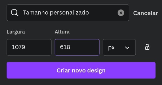
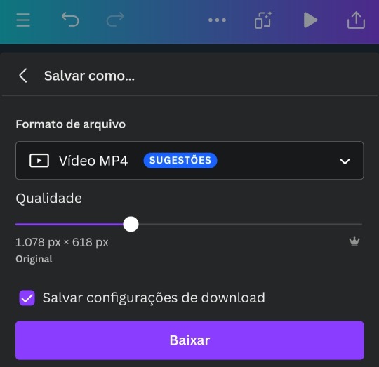
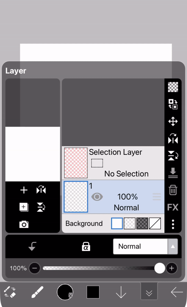
▫️ Abra o app e crie um novo design personalizado com o tamanho 1079x618
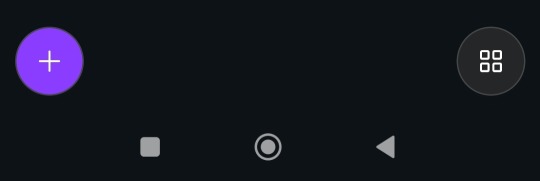
▫️Com o design aberto você vai clicar no "+" na parte de baixo. (imagem 1)
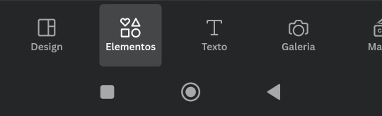
▫️Depois clique em "Elementos" (imagem 2)
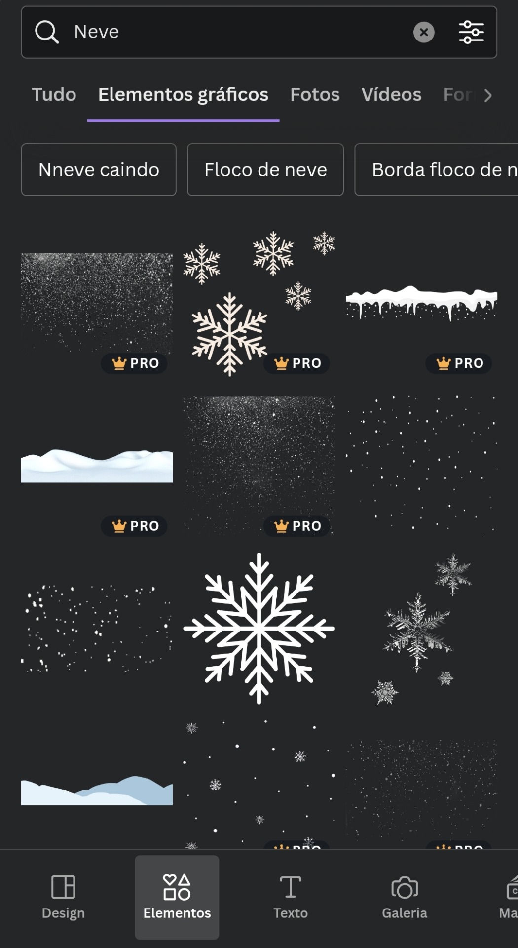
▫️Agora você vai na barra de busca e escreva o nome da figura que você quer usar.
▫️Depois você clica na aba "Elementos gráficos".
▫️Escolha a figura que quer usar e adicione no design em branco.
▫️Faça isso até encontrar tudo que quer usar.
▫️O gif de neve caindo você encontra em "Elementos gráficos" também.
▫️Agora use sua imaginação e crie um design completo usando apenas figuras.
▫️Depois de editar tudo você salva e baixa no formato de "Vídeo MP4", por causa do gif de neve.
▫️Se você salvar o design como gif de primeira, o tumblr não aceita como capa. Bom, pelo menos no meu celular não funciona.
▫️Depois de fazer tudo isso, você vai nesse link aqui e transforma o vídeo em gif e salve na sua galeria.
▫️E tá pronto o sorvetinho... ops, digo o design 🤭😉
t𝗎𝗍𝗈𝗋𝗂𝖺𝗅ㅤ©ㅤestrelinha-s • 𝗅𝗂𝗄𝖾ㅤ𝖺𝗇𝖽ㅤ𝗋𝖾𝖻𝗅𝗈𝗀ㅤ𝗉𝗅𝖾𝖺𝗌𝖾.
#﹫estrelinha-s ᐧ 𝗇𝖾𝗐 𝗉𝗈𝗌𝗍 𝗇𝗈𝗐.#ㅤ📎 ㅤ' ㅤ tutorialㅤ ♡#tumblr tutorial#kpop#kpop tutorial#tumblr headers#my tutorials#aesthetic headers#random headers#arquivo#messy headers#aesthetic christmas#aesthetic
43 notes
·
View notes
Text

log 117 : ( ̄へ ̄)(❁´Ɛ`❁)🤳🏼
#GIFFING IS HARD. HELP#although pp is LEAGUES above using your regular 'make gifs online' sites lol#tumblr user applejongho i owe you my life for that tutorial video#i have no idea what i'm doing i just want this scene giffed lol#yeosang#wooyoung#woosang#ateez#kpop#the more i look at these the more insane i go... i... didn't notice woo's fingers in yeosang. in his. well i shan't say#shrimp gifs
879 notes
·
View notes
Text
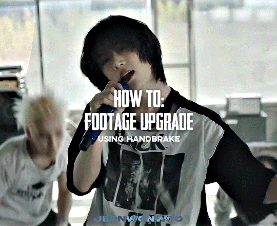
☆ UPSCALING LOW QUALITY FOOTAGE
what i used:
• 2021 macbook pro with m1 chip (390/500gb storage used she's hanging in there)
• photoshop 2020
• mpv (for screencaps but this isn't needed!)
• handbrake (available for linux, mac and windows here)
• video source to gif
what is handbrake?
basically its a software that helps you change the format of videos, such as for certain devices or screens, or in the case that we're going to utilise, quality and frame rate!
disclaimer:
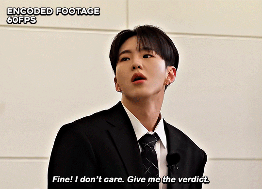
handbrake is super easy to use and very beginner friendly for this procedure and it can make a video go from 30fps to 60fps however it does not replace the quality of true 4k/blue/master-pro res files. in the gif below, this is the level of detail in a master pro-res file.

getting started
it's easiest first to note the timestamps of the video you want to encode, and keep in mind that unless your computer is incredibly powerful, i wouldn't try to encode an hour worth of footage in one run! my laptop could handle about 30 seconds in one go before she started toasting.
using handbrake:
once you've downloaded the software, open the software and it will come up with a pop up window asking you to open the video source (that is presumably saved within your folders) and go ahead and do so!
in the range section, use the drop down button to navigate to seconds and enter your timestamp. the duration on the side will show how long of the footage you're gonna encode is!

then go down to the save as, and give your footage 'to be snipped' a name. this isn't necessary but useful because if you're planning to say, encode 3 or 4 small parts of footage in one sitting, each encoding instance will overwrite the previous one. so i just call mine 'cut 1', 'cut 2' and so on.

next go to preset, and there you'll see such a wide variety of options that you can play around with, with differing qualities, frame rates, sound options, and so on. for the sake of this tutorial, i'm using 'superhq 2160p60 4k av1 surround' and i've used the drop down menu to select it! then go ahead and press start! the time taken to complete depends on the duration of footage that you sent to encode! you'll find your encoded video as an .mp4 file in your designated folder (which you can change via browse at the bottom)
what next?
• if you prefer to open footage directly into photoshop (my ps can't handle it), then go for it!
• if you screencap as i do, then just use mpv or whatever screencapping program you prefer to make the screencaps and open in ps in your usual manner.
• you can use the timestamps to further process the video through vapoursynth to denoise, but i've yet to try that!
the results
for this first set of example footage, i used footage from the be the sun concert file, which is almost 2 hours in length and 4gb in file size.


you can see the difference in the smooth frame rate of the footage, as well as the quality of the sharpening!
and to utilise the bane of gifmaking, a gose episode, notorious for dodgy pixelated frames and less hd quality in 1080p on youtube, i ran it through the same settings!
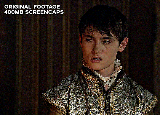
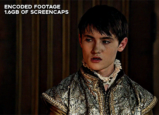
these are the exact same files, downloaded using 4k video downloader and with the same sharpening, but see how on the original file, the sharpening looks a bit more harsh and 'outlined' while it seems to sit softer on the encoded 4k version!
so i mainly use handbrake for dvd files, or not-so-hd 1080p youtube videos or videos that seem a bit clunkier but i had never tried them on a tv/film file so take a look below! i used a 1gb (so not very good quality) of a show (as compared to its 4gb files).
as i said at the start in the disclaimer, handbrake can't replicate true file quality, as you'd expect to see in a proper hd bluray/t*rrent file of a show but there's an interesting difference in the frame rate. personally it's not something i would utilise much there but its all up to individual preference on how someone prefers to have their gifs <3
this is a very basic run-through of how i used handbrake, as i haven't really explored all its features and i use this as a quick process when i'm running through seventeen dvd/dl files but i feel like it would work well on general youtube videos (such as interviews, episodes, behind the scenes) and feel free to send an ask/message for any help/clarification! <33
#ps help#usergif#gif tutorial#kpop gif tutorial#seventeen#completeresources#2605#userace#niniblr#emification#usershreyu#heymax#arieslofi#tusermlee#userbloomingwarrior#uservivaldi#userzil#userfanni#userrozza#usermoonchild#userraffa#tuserjen#usernik
317 notes
·
View notes
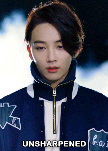
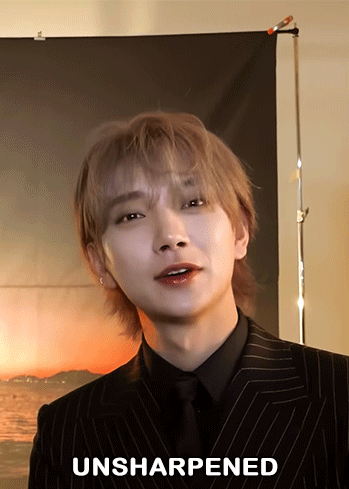
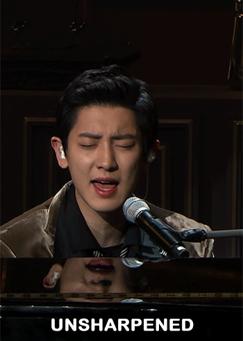
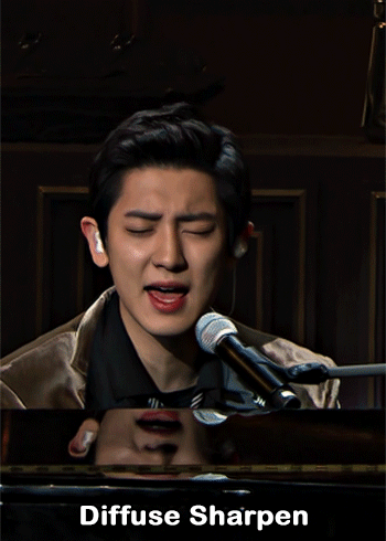
Text

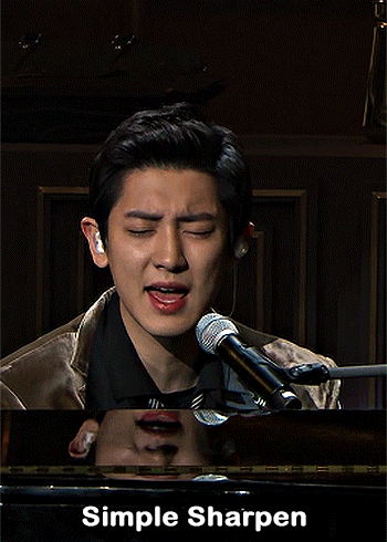
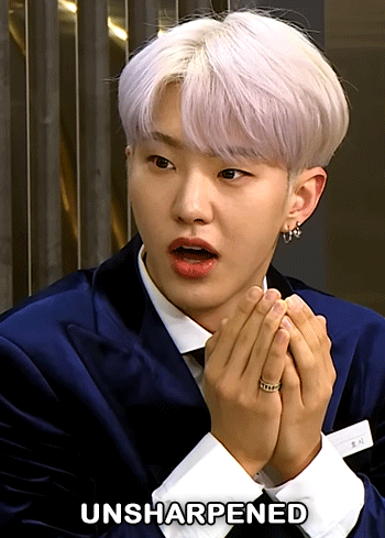
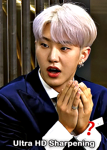
— i've been asked abt sharpening a few times but i thought that i would just share my actual actions i use but with some guidelines because it can really differ between different video sources and no sharpening is always exactly the same

— i've included different examples of video sources that i use for gifs alongside each type of sharpening action because not all actions will work for every gif. while it's always a matter of preference (whether u prefer a softer/more sharpened gif) some sharpenings can whitewash a gif so i added a little question mark as a warning to be mindful of that and make adjustments!
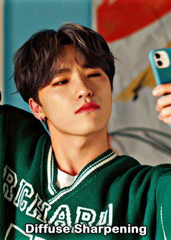
— there are three (technically four) different actions. one is ultra hd sharp and works best on really good quality footage such as master mvs or good film/show footage! the second is a simple sharpening that can be used on all videos and the third is a softer sharpening that utilises the diffuse setting and it has a glowy option w blur as well!
— take a look below at how the sharpenings look on different videos 💙
💌 MASTER/BUGS/BLU-RAY VIDEOS
video source: here (gdrive)
file size: 2gb


💌 4K YOUTUBE VIDEO
video source: here (yt)
file size: 470mb
💌 1080HD OR LESS VIDEO
video source: here (yt)
file size: 77mb


💌 TS FILE
video source: here (k24hrs + dm for password!)
file size: 3.21gb
video specifications: qtgmc 60fps preprocesser + bm3d denoise (2)

💌 GOING SEVENTEEN
because it varies so much it requires an example of its own
video source: here (yt)
file size: 606mb


YOU CAN FIND THE SHARPENINGS HERE <3
if you ever need any help or clarification feel free to ask!! no need for credit if you use, but of course please don't claim the actions as your own <3
#allresources#yeahps#photoshop tutorial#gif action#kpop resources#ps help#creations#creations: action#userace#usershreyu#userjoanna#tuserose#useraashna#usernik#useratz#useraurore#usernanda#userkaison#userngocchi
590 notes
·
View notes
Text
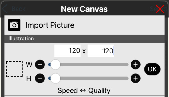
ver. PT-BR: olá amigos, não tinha nada de bom pra fazer, então trouxe um pequeno tutorial de como dá pra fazer icons pelo ibispaint + photopea pelo celular, de um modo (meio) rápido e fácil — do meu jeitinho, claro!
⠀⠀⠀ ⠀⠀⠀ ⠀⠀⠀passo a passo . . . ou quase
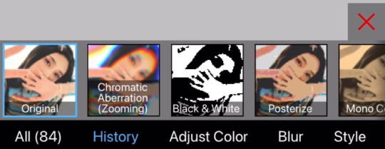
⠀⠀⠀1. abra o ibispaint e selecione o tamanho do icon! escolhi 120x120, que é o que mais uso (pro spirit fanfics):
⠀⠀⠀⠀2. escolha a foto ou imagem desejada (utilizo do pinterest e/ou do insta) e ajuste como quiser – ex:
⠀⠀⠀⠀3. logo depois que posicionar do jeito desejado, você tem a opção de colocar algum dos filtros do próprio ibis! eu uso o “chromatic aberration (zooming)” na ordem “G-B-R”
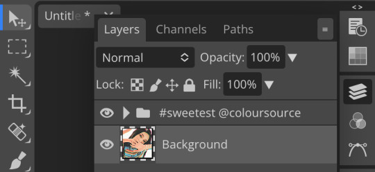
⠀⠀⠀⠀4. salve a imagem normalmente e abra o photopea, aperte em arquivo no canto superior da tela > novo > adicione o seu icon + o psd/coloring que você queira e aperte em camadas (terceiro ícone da coluna direita na vertical) – apertando em camadas terá a camada que contém o psd, então arraste para cima da camada do seu icon, desse modo:

(todos créditos do psd são da yiza, coloursource no devianart <3)
⠀⠀⠀⠀ 5. voltando ao icon, selecione a camada que contém apenas o icon (sem o psd)
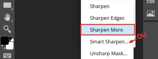
vá em filtros, aperte em afiar/sharpen e você pode escolher entre (num português literal) “afiar inteligente / smart sharpen” ou “afiar mais / sharpen more”
caso escolha o afiar inteligente, recomendo colocar a quantidade: 190% ou 200% e o raio: 1px
(pode aplicar os dois também que dá certo)
⠀⠀⠀⠀ 6. depois, vá novamente em arquivos e aperte em exportar como png (para manter a qualidade)
dessa forma você aprendeu a como fazer icons pelo celular + ibis + photopea e assim ficaria eles:


⠀⠀⠀⠀ obs: infelizmente o tumblr pelo celular tira a qualidade do icon, mas você pode ver que pelo computador/web a qualidade permanece boa — no spirit também!
essa é a forma pelo ios, não sei dizer se no android tem uma diferença grande, mas é isso, um beijo da anitta 💋✋
⠀⠀⠀⠀dúvidas/pedidos? mande um ask sz
#icons#icons 120x120#spirit fanfics#edits#tutorial#icons kpop#icons pelo celular#photopea#ibispaintx#como fazer#como fazer icons#miedit
115 notes
·
View notes
Text
﹉﹉﹉﹉﹉୨♡୧﹉﹉﹉﹉﹉
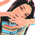
cool toned eyeshadow


🌈 𝐜𝐨𝐥𝐨𝐮𝐫𝐠𝐫𝐚𝐦
• pin point eyeshadow - 02 pink&mauve, 04 pink&lavender
• shade reforming - 02 pure pink, 04 fantasy sunset
𝐂𝐥𝐢𝐨 🍧
• Pro Eye Palette - Over the Path, Atelier in Hannam, Picnic by the Sunset, Botanic Mauve
• Shade&Shadow - Soft Depth
• Pro Eye Mini - Blooming Mauve
💒𝐋𝐢𝐥𝐲𝐛𝐲𝐫𝐞𝐝
• Mood Keyboard - Cool membership, Lavender Dial, Ash Mauve
• Little Bitty - sentimental, loving, romantic, dreamy
• Mood Cheat - Pink Sweets
• Mood It - Bloom It
𝐏𝐞𝐫𝐢𝐩𝐞𝐫𝐚🍒
• All Take Peritage - Prestige Pink,
• All Take Mood - Muteful Rose, Cherry Cool Rush, Pink;terest, Lavender Pink, Hip Grey,
• All Take Mood Technique - Shall We Cherry, In My Mute Pink
𝐔𝐧𝐥𝐞𝐚𝐬𝐡𝐢𝐚💚
• Glitterpedia - all of glitter, lavender fog, dusty rose,
• Mood Shower - ballerino shower
🌙 𝐑𝐨𝐦&𝐧𝐝
• Better Than Palette - Light&Glitter, Shade&Shadow, Dusty Fog Garden, Dreamy Lilac Garden, Cheeky Cheeky Garden
• Better Than Eyes - Dry Rose


﹉﹉﹉﹉﹉୨♡୧﹉﹉﹉﹉﹉
use IHRTNAN77 on yesstyle
for $$ off!
#gyaru#pink#coquette aesthetic#bubblegum coquette#girlblogger#wonyoung#gal#makeup#kbeuaty#kbeauty#korean#korean makeup#korea#japan#japanese#jbeauty#kpop#clio#ive#yujin#lilybyred#unleashia#peripera#colourgram#rom&nd#eyeshadow#makeup tutorial
57 notes
·
View notes
Note
can I ask how you make ur gifs ! they're super cute !! 💘


ofc you can & tysm!! read down below . . . (✿˘ ˘)
step 1.
→ grab any video of your liking (I recommend for it to be under 10 secs or you can crop the video to make it 10 secs or under!)
I either download one from pinterest or screenrecord clips from youtube
step 2.
→ crop the video, make it a square
step 3.
→ go to capcut
→ import your video
→ click the adjust button in the tab at the bottom
→ settings:
saturation: 10
sharpen: 100
highlights: 10
shadows: -5 or -4
...if it looks too orange you don't have to do this or you can adjust it to your liking! :) i recommend to keep the sharpen setting.
step 4.
→ make it into a gif i use ezgif.com
→ i do this for my settings:

step 5.
→ the gif has to be under 10MB for you to be able to upload it to tumblr so you can resize the gif

→ just adjust the width lower the number but not too much unless the size is rlly big!!

step 6.
→ then just download the video and save it to your camera roll.
― that's all! ty for using my gifs 💝
i hope this makes sense im super bad at explaining 😭...
24 notes
·
View notes
Text
⠀⠀⠀⠀⠀⠀⠀⠀⠀⠀⠀⠀⠀ carrd #3.
#carrd inspo#my carrd#carrd profile#carrd help#carrd#carrd info#carrd inspiration#carrd theme#carrd things#carrd tutorial#carrd template#carrd ideas#anime carrd inspo#kpop carrd#kpop carrd inspo#anime carrd
160 notes
·
View notes
Note
tut on how 2 be aesthetic or something?? like emojis and such and whens the proper time to use them , lowercase uppercase, fonts, an other kewl stuff you know!! graphics and cards!! i wanna know all bc urs is SO COOL AND PRETTYYYYY!!
OMG TY TYY ANON ^_^

for fonts and emojis I usually use this app or Pinterest so if u search symbols you’ll probably find some !!
proper time to use them is probs like in intros in stuff or if u just want ur post to be pretty in general!
for my banners — so basically your gonna wanna go to pinterest and search “ ____ aesthetic “ or “ ____ moodboard “
then go on ibis paint and make a collage like this

after you make the collage go back on Pinterest and search “ ____ pngs “ then once you find the ones you want go to remove.bg ( it removes the white bg from the pngs )
then, you add all the pngs and add some effects to your liking and your done!!!
dm me if u need help!

10 notes
·
View notes
Text


Aurora
• capa feita para pedido pessoal
Fanfic atualmente disponível no Spirit Fanfics.
youtube
#watch me edit#speed cover#wme#tutorial#hyewon#capa de fanfic#capa pra fanfic#capa para spirit fanfics#capa para social spirit#capa para spirit#capa para fanfic#loona#fanfic#kpop#fanfic cover#capa design#capista#olivia hye#gowon#colagem#capa de fanfic romântica#capa de fanfic divertida#capa simples#capa de fanfic simples#design simples#maluyoongi capas#maluyoongi edits#maluyoongi#capa com gif#photoshop
49 notes
·
View notes
Text
youtube


Korean-style men's haircut with super-voluminous, defined and fluffy effects - Vern Hairstyles 87
⚠️Key elements of creating a Korean drama male lead hairstyle:
✴️Precisely adjust hair volume with Vern scissors✂✂
Voluminous hair roots that effortlessly shape into defined lines with a simple run of your fingers through the hair
✴️Soft and smooth hair ends, natural and easy-to-control hair follow
🌟Long-lasting and non-deformable hairstyle
✴️Scissors over comb
Natural and appealing hairstyle 💓‼️
✴️Highlights✨
Make defined lines more prominent, enhancing the sense of design
✍🏻📋⋆Mastering the above points, join Vern to easily and swiftly create cutting and coloring effects⚡️
#haircut tutorial#salon equipment#video#hair tools#hair trendy#men hairstyles#hairdressing#hairstylish#salon shears#kpop#korea hair#thick hair#hair transportation#Youtube
0 notes
Text
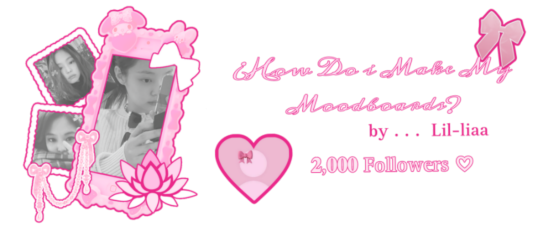
𝓛𝓮𝓪𝓻𝓷 with 𝐋𝐢𝐚!! ♡
2,000 𝒔𝒑𝒆𝒄𝒊𝒂𝒍 followers ♡⋆౨ৎ˚⟡˖ ࣪


Hi!! It's Liaa and if you don't know me i'm a kpop mbd creator i'm not sooo old or recent, but I do have some notable tips that I can give you if you need a push to improve (or start creating) your moodboards based on my criteria and experience ♡ bonus at the end!
Before you r e a d this : This guide is not a rule! You don't have to apply all the tips, feel free to apply them depending on your own style and taste.

In choosing the image on which the mb is based I want to separate them into 3 levels
Easy: An image that has common and striking colors that you can find popular aesthetics - easy to combine, harmony in colors etc!
Not so difficult: an image that has one or more not so popular colors,a background or image a little more complete, with aesthetics not so seen or visual
Difficult: The image has a color filter (dying) It has extra decoration or accessories, it has a specific bright (or duller) color (it means in any case that any image to combine will have to be edited to get the exact color)
Not everything is as difficult as I describe it! Getting started tips to make it much easierrr
# 𝐓𝐈𝐏 𝟏 : ¿Where to find?
Ways to find the aesthetic you are looking for!
Searches on Pinterest
Color + color aesthetic
Color- X Soft X Bright X Palid X Dark
Object - Subject-Color-Animal-Place-Serie/movie-country- Aesthetic
𝓐𝓮𝓼𝓽𝓱𝓮𝓽𝓲𝓬𝓼 that you may be 𝐥👀𝐤𝐢𝐧𝐠 for
I recommend this website that, apart from showing you many aesthetics, tells you the story of how it came about and more info!
Click to "Find aesthetic"

# 𝐓𝐈𝐏 𝟐 : ¿How to decorate it?
1. Collages on PICSART cute and easy♡ Make sure that the images complement each other from one side to the other so that there is balance and very importantly give it a center image!
2. Dividers You can make them yourself (On PICSART again) or find them here on tumblr!
I also have my own dividers if you want to check them out ദ്ദി ˉ͈̀꒳ˉ͈́ )✧
3. Gifs I always move the images a little to make it more striking! (you can do it in capcut and create the gif here on tumblr♡) another tutorial of example gif here
4. Texts! separate the angles you can always put a poem or some lyric music! (To add color to the text I have a tutorial here) You can always add "bios", symbols or kaoemojis since they are closely linked to the aesthetics in the texts
5.Pngs: It's very cutee and also gives an extra resource ((I don't use it as much as before but it can work well on quite a few mbds) I would recommend putting it in the middle
# 𝐓𝐈𝐏 𝟑 : ¿How to combine images? (My way to do it!)

Taking into account the general color palette, look at the image and check if the most prominent colors are warm or cold (including the background will be very useful) this way it will be easier for you to combine the tones without really having to find the exact color of the image! It will make it look much better.
# 𝐓𝐈𝐏 𝟒 : Center and sides
Keep in mind the center of your moodboard! As it is still a square (think like it's a painting) you can have more balance if you put certain colors or certain photos on one side or the other and put the main photo (or a collage) in the middle! So that it harmonizes and draws more attention.
# 𝐓𝐈𝐏 𝟓 : Tonal degrees
Always keep in mind what tonal degree the color of the photo has. Depending on that, you can look for images with the same tonality! As I already mentioned, if it is more opaque or stronger or brighter, it makes it much easier to identify a better combination.
# 𝐓𝐈𝐏 𝟔 : Combination
At first glance, you might be able to identify the most prominent colors in a photo, but taking into account color theory, the color of that photo only exists when it is contrasted by another, that is, based on the combination of colors with each other.
So when choosing photos to match, look for the two colors together in the photo to give a more similar impression even if the colors are not exact (In any case, you can also edit the color of images that have the same tone as your photo by changing the image and the difference would not be noticeable)
# 𝐓𝐈𝐏 𝟕 : More ways to apply aesthetics . . .
Related objects: depending on the image, there are also usually certain objects that can be related to the aesthetics of the photo. You can always add details with reference to the aesthetics that, without necessarily matching the photo, can look good.
Angles and sizes: Looking at the reference photo we can find photos that have the same dimensions as this one will make it look pretty good and make sense to put together
Requirements for adding a photo: to make it easier to combine you can write down things to keep in mind so that they combine, for example:
1.Color and Color palette
2.Size, shapes and angles
3.Common objects
4.Balancing abundance (for example if a photo has a lot of details, you have to find similar ones and at the same time find photos that have less details to give it a better impression.)
# 𝐓𝐈𝐏 𝟖 : Your own Style and have fun!
Don't rush into having your own style, eventually your mbds will be guided by your tastes and then you will have your own stamp unconsciously so don't rush!
Have fun and take your time making mbds, that's the secret formula to making a good moodboard♡
𝓑𝓸𝓷𝓾𝓼 𝐁𝐎𝐍𝐔𝐒𝓑𝓸𝓷𝓾𝓼
Match Technique 💋🎀: My painful technique for making everything match so well comes from my perfectionism and I'll tell you what I do,sometimes the photos match each other perfectly (which is perfectly fine lol if you want you can leave it like that) but to make sure.. what I do is separate each of the images and compare them to each other to see the contrast and thus realize if they really match.
Searching: ¿How did we get to the final result? There will always be many times in sex where you simply won't like the result, I always recommend having at least two stages when looking for a good result.
This requires quite a bit of experimentation.
Stage 1 "Draft" : Where you look for the basis of what you want
Stage 2 "Improvements" : You look for the parts that don't fit and why.
Stage 3 "Details": The finishing touches!
𝐓𝐲𝐬𝐦 𝐟𝐨𝐫 𝐑𝐞𝐚𝐝𝐢𝐧𝐠! These are my own techniques and I know that probably not everyone puts so much science into this but I hope I have helped you improve certain things 💕 xoxo
(English is not my first language, I would really appreciate it if you could tell me to correct any mistakes!)
#𓇻゜𐬹#🗣𝓣𝗎𝗍𝗈𝗋𝗂𝖺𝗅 ; 𝓑𝔂 𝗟𝗶𝗮#(๑>◡<๑) © 𝐅 𝐑 𝐀 𝐌 𝐄 𝐒 @his-tomorrows⭒ 𝇈 𝅄#and @mochilly#moodboard#messy moodboard#kpop gg#coquette moodboard#kpop moodboard#soft moodboard#pink moodboard#aesthetic#aesthetic moodboard
45 notes
·
View notes
Photo


#BE THE SUN.PSD 💎 a base psd file for washed-out lighting in concerts — and more!
☆ a basic psd that i initially made for the really washed out pale footage of seventeen’s be the sun concert but it’s pretty versatile and simple to use anywhere!
☆ contains an optional levels layer for a matte finish! it can be easily tweaked to adjust to the brightness levels (such as under stage lights) 💡
PSD HERE.
#seventeen#yeahps#allresources#photoshop tutorial#ps help#ps resources#kpop resources#gif psd#kpop psd#useraashna#usershreyu#userjoanna#annietrack#shuaria#cheytermelon#uservince#hanatonin#tuserose#isaishi#usersan#creations#rosieblr#useraweks#usernik
482 notes
·
View notes
Text


4 years ago today my dear friend @kpopingenue and I were talking and she sent me the MV for Wonderland because she liked it and thought I would too.
And, thus, my Ateez journey began.
I jokingly call it a slow burn relationship. I loved their music from the first time I listened to Wonderland but it took a few months before I checked out their albums and listened to their b-sides.
Even after that I still didn't know all their names (which is nothing against them, I'm the same with a lot of kpop groups I've been listening to for ages. I've been listening to Stray Kids for almost as long as I've been listening to Ateez and I still only know half the members).
Eventually, and I remember this clearly, in December 2021 I had a very vivid dream about buying Zero Fever Part 2 and I took that as a sign and ordered it as soon as I woke up.
It was funny because I knew some of the members at this point but not all of them and I had to text a photo of my photocards to a friend because I knew one of them was San, but I had no idea who the other one was (it was Yeosang).
After that, it became a pay day treat. Every month when I got paid, I'd treat myself to an Ateez album until I had them all. I now have at least one version of every album including all the Japanese ones.
And I finally sat down and watched a guide because if I was going to start collecting albums I should probably learn who everyone was.
Even after that I still struggled telling Yunho and Jongho apart for the longest time, and I have no idea why because now that I know them well I can see that they don't look anything like each other.
So, this carried on for a couple more years. I was happily collecting my albums and watching new MVs when they came out, but I still, for whatever reason, hadn't crossed the bridge into the fandom side of things. I was just quietly enjoying them by myself.
Then Will came out, and I don't know why, but that album rewired something in my brain. Suddenly I was fully obsessed. I watched Hongjoong's behind the scenes of Matz vlog, and suddenly I wanted to make gifs, but proper gifs not just a using a screen recorder which was all I'd ever done before.
I had an ancient version of Photoshop (which I have now upgraded) so I found a gif making tutorial for beginners. The gifs I made were very basic, but I had made them, and I was proud of myself for learning a thing.
Then I decided that to practice and learn new colouring styles, it would be fun to make gifs of all the Ateez MVs. So I did! It took a good few weeks of making a new set every evening, but I did it, and I can definitely see how I've improved as I've gone along.
And there we have it. 4 years from watching an MV to collecting albums to learning how to make gifs. And along the way I've reconnected with some old friends who love Ateez, and made some amazing new friends too. I went to my first ever cupsleeve in May, and I've been to a couple more since then, with another one on the calendar for later this month (happy birthday Mingi). And next time they come to the UK I am definitely going to try and get tickets, which will also make them my first kpop concert.
It's taken me a long time to get here, but the important thing is I made it.
Happy Ateez-versary to me!
#my gifs#ateez#ateez gifs#hongjoong#kim hongjoong#hongjoong gifs#seonghwa#park seonghwa#seonghwa gifs#yunho#jeong yunho#yunho gifs#yeosang#kang yeosang#yeosang gifs#mingi#song mingi#mingi gifs#san#choi san#san gifs#wooyoung#jung wooyoung#wooyoung gifs#jongho#choi jongho#jongho gifs
45 notes
·
View notes
Note
oi lenda, poderia ensinar como faz header de boa qualidade no spirit? se nao for muito incomodo, claro! 🥺
primeiramente: obrigada pela pergunta!!!
segundamente: nas headers que faço, utilizo imagens do pinterest – geralmente com uma boa qualidade –, é opcional, mas você pode buscar por palavras chaves para encontrar o tipo de imagem desejada (ex.: “color + aesthetic”):
(caso não encontrar alguma em hd, ainda sim dá pra utilizá-las, pois não muda muita coisa no final)
sendo mais específica agora: você seleciona o tamanho 1200x350* (que o spirit pede) e coloca aleatoriamente as imagens intercalando entre fotos, print de música, mensagens, perfil do ig, etc! adicione alguns desenhos/textos/pngs aleatórios pra fazer uma colagem bonita (é o famoso confia no processo).
(você pode remover o fundo do desenho/foto transformando em png ou colocá-lo no modo de mesclagem - multiplicação)
assim que sentir que está bom, você tem a opção de aplicar coloring/efeito/filtro e finalizar com nitidez/topaz – ou qualquer outra finalização que você ache melhor. no momento eu utilizo a afiar inteligente (quantidade: 190% | raio: 1px) do photopea!
seguindo essa dica, assim ficaria a header:
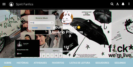
espero que esteja entendível ☝️ e vale lembrar que essa é a forma que eu faço minhas headers baseadas num estilo tipo colagem!!! se cuidem, mwah 💋
#headers#edits#header#colagem#ask#kpop edits#spirit fanfics#tutorial#como fazer#como fazer headers#miedit
56 notes
·
View notes
Photo


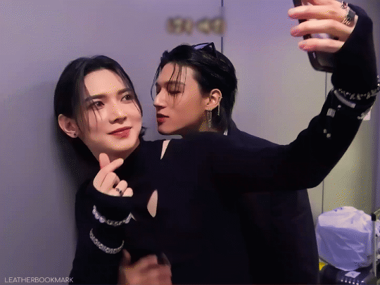
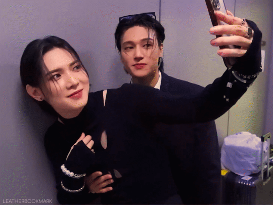
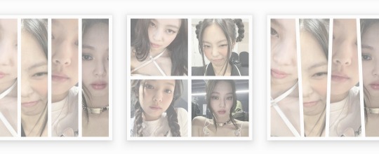
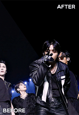
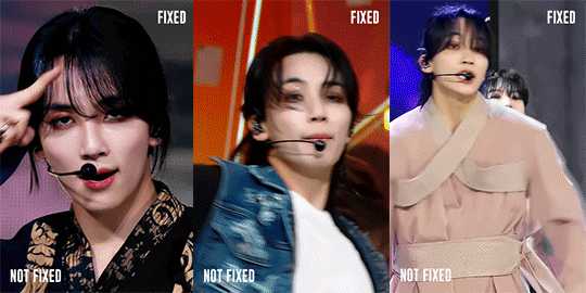
Hi everyone! I just wanted to share my coloring/giffing process for stages because I love making performance sets and I know that giffing kpop stages is a daunting task, not just for new gifmakers, but also more experienced ones. This is in no way saying my way is the best or right way to color, but I hope this will somehow help alleviate some challenges for anyone who is afraid or hesitant to gif stages.
Disclaimer: I am not a professional and although this blog is relatively new, I’ve been giffing for a little bit over 3 years with a lot to learn still. This tutorial is focused on K-Pop stages and doesn’t necessarily apply to other types of gifs. Also, I try my best to explain why I do things the way I do here so this is going to be long (image and word heavy).
With that in mind, let’s get started! I’ll be using our precious Jeonghan in Seventeen’s Super performances for this tutorial :D
BEFORE WE BEGIN
This tutorial is mostly focused on coloring; however, I believe the quality of your video file, sharpening, and timing also factors a lot into whether your gif looks good or not. For reference, I use VapourSynth and Photoshop 2020 cc for making gifs. Vps is not necessary to make good gifs but it does help make my process easier and quicker.
Files: For performance gifs, I only use .ts files because that ensures all of them come out in the highest quality possible. Please refer to this post for more information and where to get them (thank you op <3).
Sharpening: I use Vps for sharpening, denoising, and deinterlacing .ts files. I tend to keep my KNLM settings between 1.2 to 2, depending on how noisy the original video is, and FineSharp between 0.3 to 0.5. Any additional denoising/sharpening is done in PS.
Timing: Because I deinterlace with qtgmc 60 slow, the resulting video import will be 0.2 for the frame delay. Gifs that are too fast or too slow will compromise the quality of your gif. For stages, I like to use 0.3 as the final frame delay for 60 fps files and 0.4 for 30 fps.
Exporting: My export settings are Adaptive Diffusion since I find that to look the best.
BASE LAYER
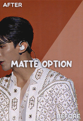
As you can see even without coloring and just based on the file, sharpening, and timing, I already have a nice gif to work with. I like to start by correcting the original lighting and colors so that I have a nice canvas for coloring. I do this with a levels layer and use the eyedropper tools to designate what I want to be white (bottom eyedropper) and black (top eyedropper). Here, I zoomed in on the highlight of his mic for white and chose the darker area of his mic for black. I also adjust the brightness a little.
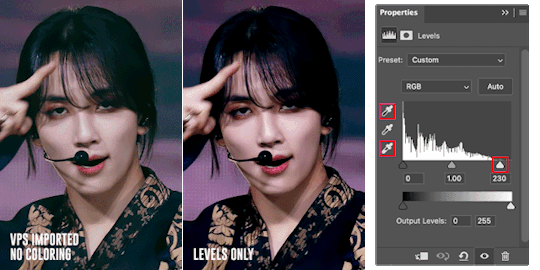
The gif is now much more vibrant and less faded. I think the lighting here looks okay but, sometimes, a curves layer is needed to even out the lighting. Below, I am trying to lower the saturation of the red as well as make his skin even (aka not shiny) so that I can color later.
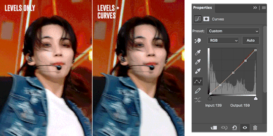
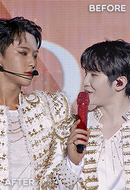
Just an FYI: The curves layer also has the same eyedropper tools found in the levels layer so you can skip the levels step if you prefer to use the curves layer only. I find that using the eyedroppers to designate what is truly white and what is truly black helps significantly in correcting lighting. For example, if your gif’s covered in a purple color and your darkest pixel is a dark purple, when you pick that pixel to be black, PS will correct your gif’s color table and get rid of the purple. The same happens when you designate the brightest pixel to be white.

Here is an example. Notice in that in the first gif, it looks faded and is filled with a purple filter and lighting. A single levels adjustment layer using the eyedropper tools to designate a true white (the highlight of his hairpin) and black (his hair) color removed the filter and made the colors of the gif more vivid and saturated.
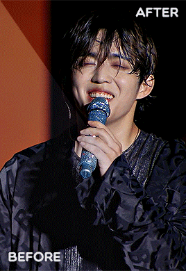
COLOR LOOKUP/GRADIENT MAP
Next is my favorite layer, the color lookup. This adjustment layer takes your gif’s color table and matches to a selection of presets. I generally use this at a lowered opacity to even out or add color to an idol’s skin while also darkening the background. If your PS doesn’t have this option, I find that gradient maps set to the right colors and opacity have the same effect. Here are two examples of the different color lookup layers I used at different fills.


The Fall Colors adjustment gave his skin some life and warmth while the Crisp Warm adjustment darkened and gave the gif more saturation.
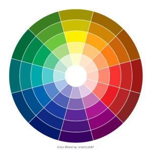
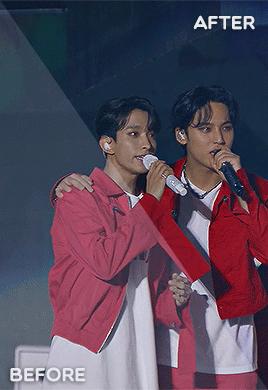
CORRECTING BLUE VS. RED BACKGROUNDS
Generally, Kpop stages have backgrounds consisting of cool (blue, purple, green) and warm (yellow, orange, red) colors. I personally prefer a cooler background because it is much easier to manipulate and will not affect the skin tone of the idols (unless there is blue lighting on their skin). Warm colored backgrounds are harder to manipulate because you run the risk of messing with their skin.
Gifs that have too many colors end up looking pixelated so my goal when fixing backgrounds is to turn cyans/greens/purple into blue and manipulate the blue using the hue/saturation and selective color layers. As for warm colored backgrounds, I darken and desaturate as much as I can without affecting the skin. Any sort of magenta can also be treated in the same way.
I like to make my backgrounds into gray/black or at least very desaturated so that the idol can shine and be the main focus of the gif. Having less colors will help improve the quality of the gif so don’t be afraid to play with the hue/saturation sliders. Here are just a few examples of the adjustment layers that I used for the gifs above.

That will usually work if the lighting doesn’t change. If the lighting changes, then you might want to change your approach. For the following gif, there is a flashing light that fills the entire gif with blue light, including his face. In this case, I can’t darken the blues because it will end up giving him a weird gray color when it flashes. Instead, I go the opposite direction and lighten the blue using the hue/saturation layer.

Make sure to pay attention to every frame to see how the hue/saturation layers affect the rest of the gif. Here are the adjustment layers for this gif.

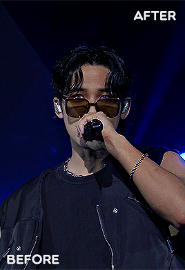
COLORING SKIN
Correcting backgrounds will always end up affecting the color of the idol’s skin so it’s best to minimize the effects as much as you can so that you have an easier time coloring. The layers that I use to color skin are color balance, selective color, and hue/saturation.
I start with color balance, adding in a mixture of yellow, red, and magenta to the midtones. To counteract the warmth, I add cyan and blue to the shadows; I rarely mess with the highlights unless necessary. I use selective color to darken reds and yellows with black. If the yellows/red are too pink, I darken with cyan. If the yellows/reds are too yellow, I darken with magenta and lessen the yellow. If the yellows/reds are too cool, I darken with magenta and yellow.
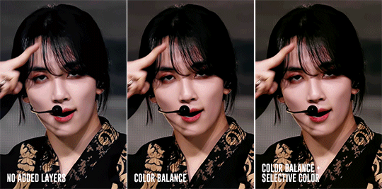
Above, you can see that he’s kind of pale without any added layers. The color balance layer added warmth in yellows and reds and the selective layer added some depth to the shadows. These were all minor adjustments but they had a great impact on how the gif ended up looking.

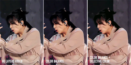
For this gif, I noticed that he was just a bit too pale after the color balance and selective color layers so I added a channel mixer layer to add a tiny bit of pink into his skin.
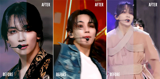
Here is another example. There are a lot of other skin coloring tutorials out there that do a better job of explaining the do’s and don’ts than I can but as a good rule of thumb, try not to make their skin too yellow or pink and you’re good! :D Refer to this tutorial for more information.
FINISHING TOUCHES
The remaining adjustment layers I use are exposure, brightness/contrast, and vibrance. Everyone has a different preference for these layers and that’s what makes creators’ gifs unique from one another. So, adjust these layers as you’d like! For me, I like increase the exposure and balance it with a decreased offset and gamma correction with the exposure layer. I also like to decrease contrast in the brightness/contrast layer and increase both saturation and vibrance.
It’s best to find a good balance between brightness, exposure, and contrast. If you increase exposure, make sure it’s balanced by something else so that your idol won’t end up looking too white. Gifs that are too bright will end up looking pixelated and grainy. If the noise in your gifs is not an artistic choice, then making sure everything is balanced will help reduce noise and make your gifs look crisp and smooth.
Giffing stages is hard, but it’ll get easier with practice and time/dedication. It takes me a total of 2 to 3.5 hours to make 2x2 performance set from start to finish and 2 days for a 9 pc set like Fear, not to mention that I had to recolor the first Super stage 3 different times. I’ve also had my fair share of bad looking sets. Stages are difficult but they’re doable! If you have any questions, feel free to send me an ask.
Here is the link to the psds I used to make these gifs. Happy giffing~!
#ps tutorial#gif tutorial#coloring tutorial#mymine#flashing tw#eyestrain tw#long post#tagging some mutuals just in case you wanna see it#feel free to ignore <3#isaishi#hanatonin#tuserose#tusersali#userzaynab#userhev#sonafied#emification#shuaria#resources
306 notes
·
View notes
Last Seen Blogs
dark-trifoi
Introverting...🌻

thomasmundellfarmersinsuran-blog
Untitled

theloststarboy
Theloststarboy

sophiarauss
Sophia Rauss

cupcake-torture
Behold! My current hyperfixation!