#needs a little work my screens are super different between my tablet and my monitor
Text


new skin who this
#minecraft#<3#needs a little work my screens are super different between my tablet and my monitor#but for now it's okay
5 notes
·
View notes
Text
Lovely Sins || Chapter 4

Summary: You were a researcher investing six strange beings that you didn’t quite understand. They had strange powers that you and your partner Mark Lee were tasked with testing the extent off. It was your typical day really but as time progressed between you and the seven of these men, you found yourself growing attached. Will the seven of these men restore some of your humanity? And could you help them escape?
Pairings: Reader x Super M (OT7)
Genre: Sci-fi AU || Angst, Fluff, Smut (Eventually)
Warnings: Violence, Experimentation, Cussing, Torture, Dark Themes. (Will have some dark things going on please read at your own risk!)
A/N: I have been super busy lately, so sorry for taking so long to get anything out. Hopefully I can have the next chapter of Catalyst out soon too. These chapters are gonna be a little shorter since its been a while. Sorry.
Word Count: 2.5 k
Previous || Master List || Next
Tag-list: @reiki-chan @j-pping (Ask me or message me to be added!)
Kicked out.
You were kicked out of Mark’s office as soon as Subject 2 had shown up, with possible answers as to what exactly happened between Ten and 109. You wanted to know but as much as you insisted in being there Taemin stayed rooted in his spot that you didn’t need to hear this. That he didn't want you to hear this. Not yet.
Mark informed you that he would find a good way to share with you what information Taemin had shared with him, and essentially ushered you out of the office..
It wasn’t fair.. They were your subjects as well! It was your place as their researcher to know important information! You let out a huff and stomped over to your office. You threw yourself into your desk chair settling at your computer to work, even if you were severely frustrated at what just occurred.
✦
The younger man gestured to the chair you just occupied for Taemin to take a seat. Once the older man had settled, even if he looked uncomfortable, Mark spoke.
“So why is this information so important that my partner couldn’t be in the room to hear it?” Mark said using a stern voice. He didn’t like to pull his authority especially with someone older than him, but it had to be done. He wanted to have you with him, but this information was too important for him not to pass on just because he couldn’t meet one simple demand.
Taemin let out a small sigh, his blank look not moving off of his face. “It has to do with her. I may not be the most active in the sector despite my free roam but I notice more than you think I do.” Subject 2 said.
He straightened out in his chair, pushing himself to sit a little straighter. “I run into Ten often when the two of you aren’t here. It wasn’t unusual for him to act out like that especially when it comes to her.” Taemin said, his voice plain and flat.
“Subject 10 isn’t one to show violent tendencies. So you are suggesting that he becomes violent with things that have to do with her?” Mark asked, the writing end of his pen sitting between his fingers, ready to write anything down. He didn’t like where this was going. If that was the case then Subject 10 would have to be removed from their observation. Especially if he was too dangerous.
“More like he becomes violent if someone does something to upset her or hurt her.” The older man stated. “He has threatened me before over something I just casually mentioned. Thinking I was upsetting her somehow.”
Mark paused letting the words sink in for a moment trying to figure out what exactly Ten’s motivations were. “So is he attracted to her in a romantic manner?” If he was, it was another reason for the higher ups to take their subjects. Results would become bias if this was the case.
“No..” Taemin said, making Mark feel relieved but as soon as the older went to speak again Mark stopped him by holding up a single finger.
Quickly the researcher typed something in on the computer doing a quick few things here and there before turning back to Taemin.
“Alright now we can talk freely without Higher ups getting a recording of this conversation.”
Taemin was a little confused but he wasn’t going to ask just yet. “Not yet anyway. He is possessive of her that is for sure, but I’m certain he is possessive of you as well.” He took a small breath before speaking again. “That incident with 109. I saw the injuries on her arm. I saw her running to help him that night. Afterwards when she made her rounds I could easily see the bandage.” Taemin adjusted in his seat again. “Based on what I know about Ten it wasn’t unusual.”
Mark was deep in thought, but he was listening intently to what Subject 2 was saying. “So this started because she decided to help 109? That 109 is in the condition he is in because he hurt her?” Mark asked leaning back in his chair, dark eyes firm on the older man in his office.
“I’m saying 109’s damage is Ten taking some sort of revenge. He is attached to both of you, in my current opinion a little too attached.” Current? The word had caught Mark off guard for a moment. “But if you had been the one in her situation, the one with the injury, I think the outcome would have been the same.”
He was attached to both of the researchers? It would make sense considering how often Subject 10 would barge into their offices. He would spend his free time in either of their company. He basically acted as their friend occasionally stepping into a flirty territory with either of them. Of course neither of the two researchers would accept his joking affection.
Mark let out a small sigh, before speaking up again. “I can’t believe I’m asking this especially to one of my own subjects.. But,” Mark let out a huff before straightening up, fingers tapping lightly against the desk. “What do you think should be done? Should we turn Ten over to another sector as our protocol states?”
Taemin shrugged. “This is outside of my concern. I don’t care what you guys do.” Subject 2 stood up from the chair, before speaking again. “But.. I suggest not transferring him. If you aren’t careful Ten might wind up being more violent than he already is.”
Taemin opened the door, noting that your office door was closed and you were nowhere in sight. “He ignored you when you tried to talk to him, didn’t he?”
Mark nodded.
“Well it sounds to me that he is punishing himself.” Taemin said, before stepping out of the door letting the researcher think to himself.
Mark hummed. “So I guess we just let this play out. Monitor him closely..” The researcher mused to himself, letting his thoughts take him again. Despite his current closed off nature, Ten would have to be watched closely if he is punishing himself for his actions.. Hopefully it wouldn’t turn into some sort of physical punishment for himself.
Mark let another stressed sigh. Just more to add to his already stressful workload, but what was worse was how he was gonna have to break this to you. He didn’t even know how to take the information himself.
“Oh my god..”
✦
It had been a few days at this point. Mark had refused to tell you what he and Taemin talked about always saying he ‘didn’t know how to word it yet.’ You wanted to know. These were your subjects so of course you pressed on the subject ready to jump in and fix whatever the situation was. And maybe.. Just maybe you could get 10 back to normal, and restore the progress made with 109, but the more you pressed for the info the more Mark brushed you off, and avoided you. Honestly.. It hurt.
At this point you just expected Mark to ignore you, to never tell you the information he said he would share with you. You sat slouched in your chair in your office, eyes going over data for the nth time since you returned to your office. Your morning rounds not even changing. Everything was the same, and now the one time something was different you weren’t even allowed to go talk to either subject the guards still stationed outside both of their containment. What were you going to do?
You rubbed your hands on your face for a moment giving you eyes a break from looking at the screen for such a long time. The question of what to do about the situation repeated in your mind. Your partner, your long time trusted partner, wasn’t even helping you. Your subjects.. None of them could help except for subject 2 but he wouldn’t talk to you.
Your mind ran through the events of the day, of the interaction between the three subjects that happened the morning before Ten attacking 109. Maybe.. Maybe you could talk to Subject 4 and 88? Maybe they could provide some insight on the situation?
…
It couldn’t hurt.
With a sigh you pushed back from your desk, standing and stretching yourself out before grabbing your tablet. You stepped out into the empty hallway, your eyes scanning through it before moving down the long hallway that was your sector. Subject 2 and Subject 4’s rooms sat closest to the offices so you didn’t have to move too far to reach the containment.
As soon as you stepped into the containment, the two subjects' attention was on the door, both of them alert and not particularly happy looking, you knew they probably didn’t like you but they were really your only hope.
You walked over to the glass that seperated the containment from the first floor observation, plopping yourself down onto the floor with a sigh. Their gazes locked onto you but you didn’t mind.
You sat with your legs crossed, elbow resting on your knee with your hand holding your head. Your tablet sat on the floor in front of you, your gaze on the screen that held the controls for Subjects 4’s containment. You tapped at a couple things before allowing communication between the two rooms.
When you spoke your voice was plain and tired. It was clear to tell that you haven’t been resting well since the event that occured. “Hello you two.”
They just stared at you, this was outside your normal rounds. Outside of what you normally did for testing so you didn’t blame them for being hesitant.
“Look I’m here for some conversation and maybe you can give me some answers. I don’t suppose Mark has been here?”
88 was the one to speak up first. “Mark? That’s his name?”
You nodded. You knew these two didn’t tend to call either of you by your names so it didn’t surprise you that they didn’t know, or at least 88. 4 had been here long enough to know your names but you could tell that he didn’t particularly care about using them.
“Yes, he is Mark, and I’m Y/N.” You responded.
“Y/N..” Kai echoed. “It’s a nice name.”
“Thanks,” You said mutely, you weren’t really here for compliments. “Look I know the two of you probably aren’t aware but there was a situation. An altercation happened between two of the other subjects the other day.”
“And that has to do with us, how?” Subject 4 stated harshly trying to figure out exactly what your intentions were.
“One of the subjects involved was Subject 10. The one the two of you interacted with the morning before the incident.” You stated flatly, eyes gauging the two of them for any kind of reaction. Subject 4 looking somewhat curious while 88 seemed a little shocked by the news.
“You don’t seem surprised, Subject 4.” You observed simply.
“I..” One time he didn’t have some sort of harsh tone for you. That was all he ever had for you these days. “I don’t know. I don’t know him well enough but despite his innocent looking demeanor there was something different?” It was a question. He was unsure.
Kai shook his head. “I don’t see it. He didn’t seem the type, at least not without a good enough reason.”
“That is what has me confused. Ten doesn’t have a past he remembers. He just remembers this place so what would he have a connection to enough to be willing to harm another subject who is contained?” You asked more so musing to yourself than to them but you would welcome any feedback they could give you.
The two subjects looked back to each other, not really able to provide an answer to your question.
You could feel their eyes turn back to you even if your gaze was towards the ceiling, your mind searching for any possible answer to your question as to why this happened.
"Maybe.." You heard 88's voice. It was quite like he wasn't sure if he should say anything but there wasn't a protest from either you or subject 4 so he continued.
"Maybe it has to do with you? Or uhh.. Mark? I remember subject 10 stating he liked the two of you." 88 was hesitant about sharing this information. You could hear it in his tone. Whether he thought it was private information or if he was wrong in his words you didn't know. "That is the only possibility I can think of but even if I remember that correctly I don't see how that would cause him to lash out." Kai said.
As subject 88 spoke, it felt like the prices were falling in place. It made sense.. Ten saw your wound from 109 when Mark confronted you about it. You knew he was concerned about it considering how his amusement had slipped away from his face as soon as he saw it. Your subject was concerned about you.. He cared for you more than you realized.. How could you not have seen this?
The subjects must have seen the change on your face because as soon as your face grew grim subject 4 was the one to speak up.
“Y/N..?” His voice was soft when he spoke, concern laced in his tone. You almost didn’t even realize it was subject 4 that had spoken to you.
You looked up meeting Subject 4’s gaze, concern was all you could see. No longer was there a cold front he put up every time you were around. A small glimpse of the person you used to know, but as much as you wanted to relish in that moment you couldn’t. There were too many concerns flowing through your mind.
You stood, grabbing your tablet in the process, gaze locked towards the ground. “I..” You started. “I have to go.”
“Wait.. Y/N!” The subjects called after you as you hurried out of the containment. You ignored their calls. With this new information… You had to talk to Mark. Was this what he was hiding from you?
You hurried down the long stark hallway, your mind not even paying attention to what was around you. You needed to talk to Mark, you needed to speak with your research partner.
You stood outside Mark’s office door. You knew he was here. You also knew he locked his office to avoid you. As much as you wanted to be annoyed by his behavior you couldn’t at the moment. The concern for your subjects, the concern for what you learned plagued your mind causing anxiety to bubble up inside of you.
If this was the cause of the situation, if you were the cause of this situation.. You didn’t know what you would do. All of this over an accident.. 109 hadn’t meant to hurt you. It was an accident.. And now 109 was hurt because of Ten.. Ten was most likely hurting too from being locked away. All of this because of you, all of this because an accident.
You let out a shaky sigh before raising your hand to knock on Mark’s office door.
#superm#super m#byun baekhyun#kim jongin#lee taemin#lee taeyong#mark lee#chittaphon leechaiyapornkul#ten#wong yukhei#lucas#kai#ot7 x reader#superm x reader#angst#fluff#smut#exo#shinee#nct#wayv#magic writes#lovely sins
80 notes
·
View notes
Text
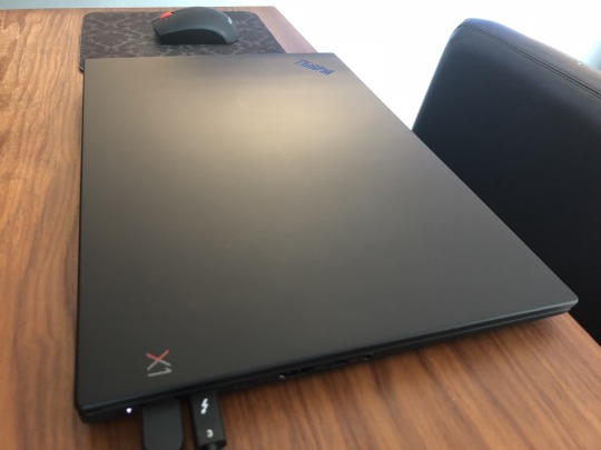
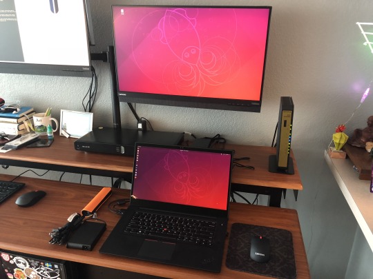
Lenovo Thinkpad X1 Extreme Review, Overview, Thoughts
I've had my Lenovo Thinkpad X1 Extreme for a month now. I usually would do a full review and talk about all the specs, but I think I'm going to do something different.
For those that are curious, click these links for more information:
Lenovo Thinkpad X1 Extreme US Site
Lenovo PSREF Thinkpad X1 Extreme Entry
For reference, I bought one with:
Intel® Core™ i7-8850H
32GB 2400MHz DDR4 RAM (2666 MHz installed, but run at 2400 because Intel limit)
Intel UHD Graphics 630 in processor and NVIDIA GeForce GTX 1050 Ti Max-Q, 4GB GDDR5 memory
15.6" (396mm) HDR 4K (3840x2160) with Dolby Vision, anti-glare, LED backlight, IPS, 400 nits, 16:9 aspect ratio, 1200:1 contrast ratio, 100% gamut, 170° viewing angle, multi-touch, anti-reflection (AR)
Pen Stylus Support
M.2 SSD / PCIe NVMe x2, 1 TB ea
Disclaimer: I am a Lenovo INsider. That said, my opinions are my own, and I purchased this device because I wanted it, and I'm writing this review/overview because I feel like it.
Okay, let's begin.
This machine is an X-Series Thinkpad. Everything in that line is meant to be ultraportable, slim, and easy to take with you. Lenovo claims you can get up to 15 hours of battery life on the 4 cell, 80Wh battery.
Yeah, there's no way you'll get close to that.
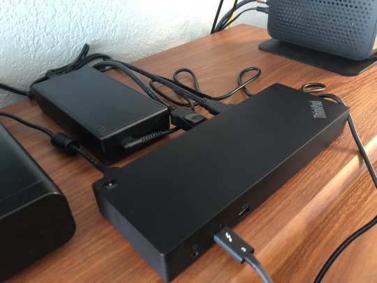
I knew that going in, and bought the machine anyway for two reasons. It charges extremely fast, and the charger they send you with the laptop is, for 135w, absolutely tiny. My advice is that you buy an extra charger to keep at your desk for a couple of reasons.
First, your tiny charger will always just live in your bag. Second, the docking options situation. There are two routes to take if you want to go with all Lenovo kit. There's Lenovo's Thinkpad Thunderbolt Dock (40AC0135US), and the elusive, you have to search carefully for it, using the compatibility finder, otherwise it's invisible, Thinkpad Thunderbolt 3 Workstation Dock (40AN0230US).
I bought the regular Thinkpad Thunderbolt Dock unaware the Workstation Dock existed. Regular TB dock didn't charge my X1 Extreme very well, and my two 4K Monitors flickered, because the dock isn't designed to do work that way with a machine this powerful. I regretted the purchase for a half second.
Then, I looked at the Workstation Dock on the Lenovo Website, and immediately over at the dock I bought for my Thinkpad P40, now largely useless, with it's proprietary connection. I'd bought the right dock after all, because it will work with any machine I buy in the future with a Thunderbolt port. All I needed was to move the Thunderbolt cable to a different port, and buy another 135w+ charging cable.

And, that's exactly what I did, and it's awesome. True I was connecting two cables instead of one to dock my machine at my desk, but you kind of will anyway. If you're only ever going to buy Workstation grade Thinkpads that have the charging and Thunderbolt ports right next to each other (the connections are wrapped together), pay the extra $100 for the Workstation Dock. Otherwise, naw.
Ubuntu also works with the Thunderbolt Dock. Very rarely it hangs on boot, and I have to unplug the dock, but this hasn’t happened since a recent BIOS update. I've only gotten Ubuntu to push the laptop display, and one other 4K monitor. There's probably a way to do more, but I haven't discovered it yet, and maybe won't as that's plenty for what I do.
I'm going to talk about the actual machine now. ;-D
The X1 Extreme is geared toward the creative that is trying to decide between a 15" MacBook Pro, a 15" Dell XPS 9570, and whatever else compares. It is for the person that needs a powerful machine they can easily take with them, with a premium display option for visual asset creation.
The Dell XPS 9570 does have one advantage over the X1 Extreme, you can buy a "Premier Sleeve" fitted to the device. If anything should have had a custom folio, sleeve, or bag, it's the X1 Extreme. The MacBook Pro doesn't really have any advantage except for access to a few professional programs available only on MacOS. If you know what they are, then you know what I mean. It's not really an advantage as much as it is a harsh reality.
Dell is a worthy competitor for Lenovo these days, and I would definitely check out their things. When you do, compare warranty options, service, duration, and cost. Then, probably buy a Lenovo unless Dell somehow has a better option. I haven't seen that to be the case, but that's the main reason to go with Lenovo. If it breaks, they just handle it.
For now, I recommend people avoid buying the iMac Pro, a 2018 MacBook Pro, and (probably) the new MacBook Air. Apple is actively making machines that could, with a software update, prevent you from repairing your own device, or seeking a 3rd party for service. They are also lobbying to prohibit you from doing so by law, working against Fair Repair Act legislation.
ANYWAY, moving on.
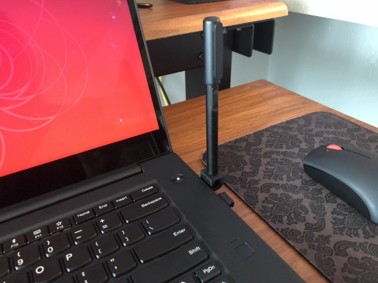
Drawing on the screen with a stylus pen is great, if not a little awkward at first, if you're used to a tablet. The screen will lay flat if that's your preference, and I thought it would be kind of a problem, but I adapted pretty quickly. I would have bought a 2-in-1 Yoga device over the X1 Extreme, but Lenovo doesn't really make one for the creative crowd right now.
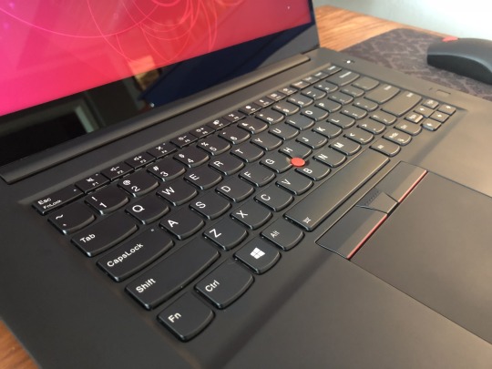
And, that's okay, because the X1 Extreme has the nicest display I've ever used on a laptop. I can't bear to put a screen protector on it. It's lack of a Yoga-style hinge is forgiven. The keyboard, styling, aesthetics, packaging, soft-touch exterior, and the ease of upgrading the user serviceable internals are all great.
I popped it open and added a second M.2 SSD easily. The only hard part was finding one of those tiny screws as neither the X1X or the SSD I bought came with a spare.
What I can't forgive is that my X1 Extreme came dirty. I opened up the excellent X1-branded packaging and found factory drit on my device, and stuck in the cracks around the display. This was very obvious because the X1X is a shade darker than other Thinkpads I think. Even the Thinkpad emblem is metallic black (super nice touch, it's like Dethklok designed the exterior).
Also, the display has some light leakage in the corners. While I only notice it on boot with a black screen, it's these small details that chip away at what should have felt like an extremely premium buyer's experience. If someone drops this kind of money on a laptop, none of that should happen. Doubly so, if Lenovo really wants a device to be a MacBook Pro "Killer", and appeal to creatives that pay attention to such things.

Yes, but, what if that isn't you. What if you really want a Max-Q gaming rig with 12 military-grade requirements and 200 quality checks because playing Fallout 4 in a real dust storm might be awesome? Gaming rigs almost never have better than a decent display, and playing any game on the X1 Extreme is kind of a unique experience.
Playing games that I have 500 to a 1000 hours on feels new, like I'm seeing colors and depth I hadn't seen before. I'm usually the first to discount such things, because I'm kind of a retro-gamer, but with newer games like Warframe and Fallout 76, the experience is much enhanced. Even better, the machine runs cool and quiet, relatively speaking, while running games.
Yes, it gets warm, and yeah you can kinda hear the fans, but no where close to what I've felt coming off traditional gaming rigs. Also, I can play Fallout 4, or Age of Wonders III for 2-3 hours before the screen dims and I'm looking for an outlet. And, that brings me to my final observation about this laptop.
For a lot of people, this device could be your only machine. I was jumping between my Thinkpad P40 for work stuff, and travel, and a desktop for games. The X1 Extreme isn't the Thinkpad P41, or P42 I was hoping for, but it does the job, and does it well, with precious few compromises.
I can't wait to make more text, visual assets for book covers, and pixel art with it.
3 notes
·
View notes
Text
Broken Tablet
Short Version: Got a new “pen display” tablet but there are technical difficulties & I’m not sure how I like it. No update today and updates might be on hiatus or I may do some traditional non-story arc stuff while I figure this out. Sorry this sucks right after a cliffhanger. More details in the read more below the images.
Drawing with the new tablet:

Drawing with the old tablet:

Some bad news everyone, my tablet stopped working on me. So there is no update today. :C
That being said I got myself a new tablet. I got a Ugee 2150 pen display which is a cheap knock off of the wacom cintiq. There are some pros and cons though... I’m having trouble with getting it to work right. The tablet’s pressure seems off, and the mapping to the screen randomly jumps to only half the screen or it maps to my other monitor. It’s super annoying but if I can figure out how to get that situated then that will be a huge issue out of the way. I am hoping (or maybe dreading?) that it is my old tablet driver fighting with the new tablet driver, but I’m reluctant to get rid of the old tablet drivers yet...
Besides that I have some pros and cons with this thing when I can get it to work right. I’ve only had a few hours with it working so some of the cons might be user error.
Cons
There seems to be a minor lag when I draw with this. And it is just enough to drive me nuts. Its not super bad and when I force myself to draw slower I can get it to work but I don’t want to draw slower :/
Where your pen is and where the cursor shows up is slightly off due to the glass between the screen and the pen. I knew that this would happen and I think with time I can get used to this, I need to play with it more.
The angle of the screen throws the colors way off. Like when I was coloring the image above it looked terrible and only when I moved back from the screen a distance or angled myself into the perfect position would the colors look right. Maybe it’s the lighting in my room or maybe there is something I can do for this. Idk.
The screen resolution is tiny. I didn’t think that would be a huge problem but it makes using the art programs harder cause the tools are cramped and I have less drawing area. Maybe there is a way to adjust that but I haven’t found it yet.
I don’t think I can change the pen buttons like I could with the old tablet. I had the transparency or erase set up as my old pen button but I might not be able to do that with this one. This one has an erase option but it doesn’t seem to work or maybe it doesn’t work with my art program.
Drawing with this hurt my neck and back. Maybe its cause I’m looking down at the tablet since it is a screen instead of looking up at the computer screen.
Screen can get hot but I have a little glove thingy I bought with it that pretty much negates that. I’ll have to see what a longer drawing session does with that.
It’s super bulky. It takes up a ton more space then a regular tablet and unless I figure something else out it is forced to take up a ton of real-estate on my desk. I can’t tuck it away like I do a regular tablet.
Pros
It’s pretty cool. There is just something bad ass about using one of these things and despite the above issues I really want to give it a chance.
I can use it as a 2nd computer screen. I haven’t yet but my second screen has also been acting up so if it does die I’ll probably use it as a second screen till I can afford to get higher resolution one.
It’s nice to see the drawing come to life under your pen. the disconnect that you usually get from drawing with a different tablet isn’t there, its much more similar to drawing in real life.
adjustable angles. It can be 90 degree to about 45 degree angle.
the angles force me to move my arms more which although is extra work, it is a better practice. drawing with your shoulder and arm is far better then wrist drawing.
I’m going to play with this thing and see what I can do but I may just have to buy my old Huion tablet again. If I can find work arounds for some of the above issues I might be good but If I have to relearn how to draw using this kind of tablet... I just don’t think I have the time or patience to do that at this time and in the middle of a major story arc to boot.
Thanks for your patience while I get this all figured out!
65 notes
·
View notes
Text
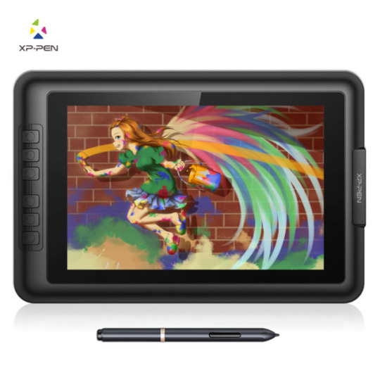
XP-Pen Artist 10S v2
Yeah... that’s a mouthful ain’t it?
I recently got myself a graphics tablet... with a SCREEN!! I’ve been wanting one of those since I knew they existed, but for the longest time only the insanely-priced Cintiqs were available.
In recent years, it turns out, other manufacturers have branched into screened graphics tablets also--slowly bringing down the price to an attainable level.
I got my Artist 10S for £199.99 from Amazon. Let me tell you how it went.
From the Top
I have done art before. I was half-decent at it when I was around 10 or so. But it’s been a while. I got myself a decent “dotted” sketchbook and started sketching things out in it to run my RPG sessions. That’s really what gave me the bug to get into drawing again. And to actually buy a tablet to do so!
I downloaded Krita, a free Photoshop-like application for artists. It’s super-powerful, once you figure out how it works. But there are plenty of tutorials online about that if you’re interested in checking it out.
...But anyway, Krita has some nice smoothing algorithms you can turn on for drawing with a pen tablet. The pen doesn’t have tilt and rotation detection, but pressure sensitivity works well with Krita and gives me plenty of expressiveness to get on with. And I was pretty instantly busting out some sweet curves!
It was a pretty amazing experience, really--getting to draw freehand while also having the capability of undo, erase, etc. I’m not saying it brought a tear to my eye, but it was a nice moment. 😂
Config
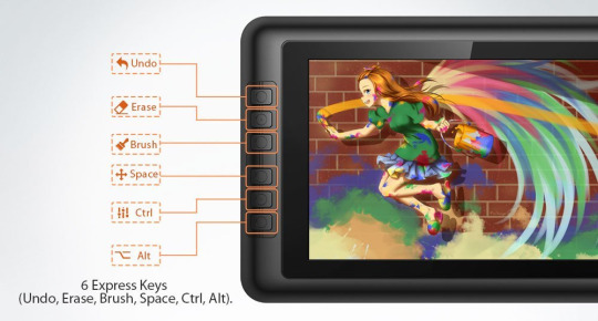
The tablet has 6 “Express Keys” along the side, which are configurable to key combinations. When you hold them down, that key is held down (this’ll become important later). I currently have them set to things like canvas pan/zoom/rotate, and a couple of other “hold to use” shortcuts.
The pen is somewhat triangular along the barrel, meaning it won’t roll around on your desk. But it’s smoothed out enough to feel just fine in your hand. It has two barrel buttons, though these are only configurable to mouse various clicks and a preset “brush/eraser” toggle (which didn’t work with Krita out of the box). There is no “eraser” button at the other end (like a pencil with an eraser at the other end)... but I’d find that too fiddly and time consuming to flip it around anyway.
The lack of options for the pen is a little disappointing. Things like this are insanely easy to implement in code--as demonstrated by the express key options. So there’s not really any excuse for it other than the company being small, and this product originally belonging to a different company XP-Pen... bought out or something? I dunno. We’ll get onto them in due course.
Oh, a little side note... the configuration app is only readily accessible from a system tray icon (in Windows). This is fine when you first install the drivers. (And then install the updated drivers so the tablet actually works.) But it has a habit of just... disappearing. After Hibernation or Sleep, that icon tends to wander off somewhere.
And all XP-Pen have to say on that score is to give instructions on how to make it appear again--which only works half the time and may require a restart anyway. I’ve since figured out where the config application itself is kept, and made a shortcut to it in my start menu. In case anyone else is having the same troubles as me, here’s the file path: “C:\Windows\SysWOW64\tabcfg.exe”

Screen
This tablet has a screen! Still getting over that XD
The screen is only 10.1″ corner to corner, which is a little smaller than the average screen tablet such as the Cintiqs. But it’s plenty big enough when it’s sitting right in front of your for actual drawing.
Another reason I pulled the trigger on buying one of these is to get a second screen. I often watch various Youtube videos in the background while I’m playing games and whatnot. I used to prop my Chromebook up next to my regular monitor. This worked fine, but pausing everything when someone came in to speak to me (just a politeness thing I like to employ; nothing sneaky going on)... was a bit of a hassle. And balancing the audio between devices had its own fiddliness (besides the piddly Chromebook speakers not being able to get loud enough for quieter videos).
But now, with two monitors hooked up to the same computer, everything’s a lot easier. I can move windows between screens easily enough. And pausing a video is as simple as moving the mouse over to the other screen and clicking.
Colour Calibration
However! I am having some trouble with the colours. I was drawing away just fine, a simple cartoon character to try out the shading tools and so on and get used to Krita. Then for whatever reason, I saw the picture on my main monitor. The skin tone was way off--too red for what I was actually going for. It seems the tablet screen likes to give everything a yellow tint--making picking colours pretty tricky.
I’ve tried keeping a preview window open on my main monitor so I can see the “true” colours, but this is really not conducive to a productive work space. Or something ^^
I spend a few days trying to configure the colour management side of things from Windows and NVIDIA (the tablet has back light brightness buttons and that’s it)... but it’s just darned fiddly! I can never quite be sure if it looks right or not--or if both screens at least look similar. All I want is a “click on a colour on the screen, and remove some yellowness from it.” You wouldn’t have thought it would be that hard to do, would you?
But instead I had to use gamma, brightness, and contrast sliders. I think I get brightness and contrast... and I thought I knew what gamma was. But it just never turns out quite how I expect. All I want is a step-by-step tutorial on “First, get your gamma correct across all colours. Here’s how you do that...” And so on and so forth.
There are plenty of test-card images out there, which are a good start. But nothing giving you a list of instructions.
See, if you fix the brightness and contrast, it doesn’t necessarily mean things look right. So then you mess with the gamma and nothing makes sense any more. It seems as though you need to adjust all 3 at the same time to be sure you’re actually making any progress.
I even had a Windows bug where my colours wouldn’t stick. I had to create a new user account (with all the headaches of setting things up all over again) just to fix that issue and make any progress whatsoever!
/sigh/
And this doesn’t even talk about the contrast issues it already has. No matter what I do, it’s too bright in some areas and too dark in others. And with my colours fixed the way they are now, they look closer to my main monitor but not perfect. And they make some things just look a tad awful, across the board.
I’m managing, though. Using it for art--at least black and white art--is great, and as long as I focus on the tablet itself, the colours work just fine.
I did contact XP-Pen, to see if they had a solution. Most companies allow you to download an .icc file--a colour profile so the computer can correct a monitor’s output perfectly--but they just straight-up don’t. After 3 workdays of waiting, they told me to use Windows’ built-in calibration tools--which of course I’d been bashing my head against for the past week.
In case anyone else is having similar colour problems, I’ll give you the settings I used to half-fix it. Note that this is far from perfect, but it certainly seems a lot better than it was before, to my eye.
As I have an NVIDIA graphics card, I used their control panel to change the settings to the following values:
Red: 85% Brightness, 25% Contrast, 0.69 Gamma.
Green: 62% Brightness, 25% Contrast, 0.89 Gamma.
Blue: 90% Brightness, 25% Contrast, 0.72 Gamma.
I think the “All channels” part is just an average of the 3 colours. But in case it’s not...
All channels: 77% Brightness, 25% Contrast, 0.76 Gamma.

XP-Pen
That brings me onto the company itself. From what I understand, they’re a small company out of China? Or maybe the US? Or both? It’s really hard to tell from their website.
But anyway... I can only assume they’re too small a company to really provide decent support for their products. The response time is way too high, considering the price tags attached to their products. And the “shrug” attitude instead of providing solutions didn’t go down well with me.
Now, there are devices out there that calibrate a screen for you. The cheapest I could find is £90, and comes with a single-computer license. And that’s fair enough; most people don’t need them, and the ones that really need them are photography professionals who have to be willing to shell out some cash or produce poor work. But I’d prefer not to have to get one just to use it once and never look at it again.
The thing is, with this calibration thing, XP-Pen saying something very telling to the customer. They aren’t willing to get a calibration tool themselves, use it on a tablet, and make the resulting .icc file available for all of their customers to use--at least as a good starting point. Instead, they insist that each individual customer buys one themselves if they want any hope of getting relatively accurate colours from their purchase.
I may contact them again, to point this out to them. I mean, it may be that my unit is simply faulty and should be replaced... but then it should be replaced.
/sigh again/
Overall
I am happy with using the tablet. The tech is amazing, for the price. But such a lack of support is really dragging down the experience.
I highly recommend getting a screen tablet. If not this one, then perhaps another. Maybe your Artist 10S won’t have this issue at all and it’ll be perfect right off the bat.
It’s so awesome to be able to draw on your screen, and has really helped me get back into art-ing. I can already see improvement in my skill over the past week, through drawing every day after such a long time not drawing at all!
1 note
·
View note
Link
Laptop users have been focused for a very long time on whether the iPad Pro is going to be forced upon them as a replacement device.
Depending on who you believe, Apple included, it has at one point been considered that, or a pure tablet with functions to be decided completely by the app development community, or something all its own.
But with the iPad Pro, the Smart Keyboard and the new version of Apple’s Pencil, some things are finally starting to become clear.
The new hardware, coupled with the ability and willingness of companies like Adobe to finally ship completely full-featured versions of Photoshop that handle enormous files and all of the tools and brushes of the desktop version, are opening a new door on what could be possible with iPad Pro — if Apple are ready to embrace it.
Pencil
Does the double tap gesture feel natural? Yep. I’ve been using electronic drawing surfaces since the first generation Wacom that had a serial port connector. Many of them over the years have had some sort of ‘action button’ that allowed you to toggle or click to change drawing modes, invoke erasers or pallets and generally save you from having to move away from your drawing surface as much as possible.
That’s the stated and obvious goal of the Apple Pencil’s new double-tap as well. Many of the internal components are very similar to the first generation Pencil, but one of the new ones is a capacitive band that covers the bottom third of the pencil from the tip upwards. This band is what enables the double tap and it is nicely sensitive. It feels organic and smooth to invoke it, and you can adjust the cadence of tap in the Pencil’s control panel.
The panel also allows you to swap from eraser to palate as your alternate, and to turn off the ‘tap to notes’ feature which lets you tap the pencil to you screen to instantly launch the Notes app. When you do this it’s isolated to the current note only, just like photos. One day I’d love to see alternate functions for Pencil tap-to-wake but it makes sense that this is the one they’d start with.
I never once double tapped it accidentally and it felt great to swap to an eraser without lifting out of work mode — the default behavior.
But Apple has also given developers a lot of latitude to offer different behaviors for that double tap. Procreate, one of my favorite drawing apps, offers a bunch of options including radial menus that reflect the current tool or mode and switching between one tool and another directly. Apple’s guidelines instruct developers to be cautions in implementing double tap — but they also encourage them to think about what logical implementations of the tool look like for users.
The new Pencil does not offer any upgrades in tracking accuracy, speed or detection. It works off of essentially the same tracking system as was available to the first Pencil on previous iPad Pros. But, unfortunately, the Pencil models are not cross compatible. The new Pencil will not work on old iPad Pros and the old pencil does not work on the new model. This is due to the pairing and charging process being completely different.
Unlike the first one, though, the new Pencil both pairs and charges wirelessly — a huge improvement. There is no little cap to lose, you don’t have to plug it into the base of the iPad like a rectal thermometer to charge and the pairing happens simultaneously as you charge.
The ‘top’ (for lack of a better term) edge of the iPad Pro in horizontal mode now features a small opaque window. Behind that window are the charging coils for the Pencil. Inside the Pencil itself is a complimentary coil, flanked by two arrays of ferrite magnets. These mate with magnetic Halbach arrays inside the chassis of the iPad. Through the use of shaped magnetic fields, Apple pulls a bit of alignment trickery here, forcing the pencil to snap precisely to the point where the charging coils are aligned perfectly. This enables you to slap the pencil on top quickly, not even thinking about alignment.
The magnetic connection is tough — almost, but not quite, enough to hold the larger iPad Pro in the air by the pencil — and it should hold on well, but it’s fairly easy to knock off if you come at it from the side, as you would when pulling it off from the front.
There’s also a pleasant on screen indicator now that shows charge level.
When the Pencil launched, I brought it to my Dad, a fine artist who sketches more than anyone I know as a part of his creative process. He liked the tracking and the access to digital tools, but specifically called out the glossy finish as being inferior to matte and the fact that there was no flat edge to rest against your finger.
The new Pencil has both a matte finish and a new flat edge. Yes, the edge is there to stop the pencil from rolling and also to allow it to snap to the edge of the iPad for charging, but the ability to register one edge of your drawing instrument against the inside of your control finger is highly under-valued by anyone who isn’t an artist. It’s hugely important in control for sketching. Plenty of pencils are indeed round, but a lot of those are meant to be held in an overhand grip – like a pointing device that you use to shade, for the most part. The standard tripod grip is much better suited to having at least one flat edge.
Your range of motion is limited in tripod but it can provide for more precision, where the overhand grip is more capable and versatile, it’s also harder to use precisely. The new Pencil is now better to use in both of these widely used grips, which should make artists happy.
These fiddly notions of grip may seem minor, but I (and my drawing callous) can tell you that it is much more than it seems. Grip is everything in sketching.
The Pencil is one of the most impressive version 2 devices that Apple has released ever. It scratches off every major issue that users had with the V1. A very impressive bit of execution here that really enhances the iPad Pro’s usability, both for drawing and quick notes and sketches. The only downside is that you have to buy it separately.
Drawing and sketching with the new Pencil is lovely, and remains a completely stand-out experience that blows away even dedicated devices like the Wacom Cintiq and remains a far cut above the stylus experience in the Surface Pro devices.
Beyond that there are some interesting things already happening with the Pencil’s double tap. In Procreate, for instance, you can choose a different double tap action for many different tools and needs. It’s malleable, depending on the situation. It’s linked to the context of what you’re working on, or it’s not, depending on your (and the developer’s) choices.
One minute you’re popping a radial menu that lets you manipulate whole layers, another you’re drawing and swapping to an eraser, and it still feels pretty easy to follow because it’s grounded in the kind of tool that you’re using at the moment.
Especially in vertical mode, it’s easy to see why touch with fingers is not great for laptops or hybrids. The Pencil provides a much needed precision and delicacy of touch that feels a heck of a lot different than pawing at the screen with your snausages trying to tap a small button. Reach, too, can be a problem here and the Pencil solves a lot of the problems in hitting targets that are 10” away from the keyboard or more.
The Pencil is really moving upwards in the hierarchy from a drawing accessory to a really mandatory pointing and manipulation tool for iPad users. It’s not quiiiite there yet, but there’s big potential, as the super flexible options in Procreate display.
There’s an enormous amount of high level execution going on with Pencil, and by extension, iPad. Both the Pencil and the AirPods fly directly in the face of arguments that Apple can’t deliver magical experiences to users built on the backs of its will and ability to own and take responsibility of more of its hardware and software stack than any other manufacturer.
Speakers and microphones
There are now 5 microphones, though the iPad Pro still only records in stereo. They record in pairs, with the mics being dynamically used to noise cancel as needed.
Th speakers are solid, producing some pretty great stereo sound for such a thin device. The speakers are also used more intelligently now, with all 4 active for FaceTime calls, something that wasn’t possible previously without the 5-mic array due to feedback.
Let’s talk about ports, baby/Let’s talk about USB-C
I’m not exactly an enormous fan of USB-C as a format, but it does have some nice structural advantages over earlier USB formats and, yes, even over Lightning. It’s not the ideal, but it’s not bad. So it’s a pleasant surprise to see Apple conceding that people wanting to use an external monitor at high res, charge iPhones and transfer photos at high speed is more important than sticking to Lightning.
The internal and external rhetoric about Lightning has always been that it was compact, useful and perfect for iOS devices. That rhetoric now has an iPad Pro sized hole in it and I’m fine with that. A pro platform that isn’t easily extensible isn’t really a pro platform.
It’s not a coincidence that Apple’s laptops and its iPad Pro devices all now run on USB-C. This trickle down may continue, but for now it stems directly from what Apple believes people will want from these devices. An external monitor was at the top of the list in all of Apple’s messaging on stage and in my discussions afterwards. They believe that there is a certain segment of Pro users that will benefit greatly from running an extended (not just mirrored) display up to 5K resolution.
In addition, there are a bunch of musical instruments and artist’s peripherals that will connect directly now. There’s even a chance (but not an official one) that the port could provide some externally powered accessories with enough juice to function.
The port now serves a full 7.5W to devices plugged in to charge, and you can plug in microphones and other accessories via the USB-C port, though there is no guarantee any of them will get enough power from the port if they previously required external power.
Pretty much all MacBook dongles will work on the iPad Pro by the way. So whatever combos of stuff you’ve come up with will have additional uses here.
The port is USB 3.1 gen 2 capable, making for transfers up to 10GBPS. Practically, what this means for most people is faster transfer from cameras or SD Card readers for photos. Though the iPad Pro does not support mass storage or external hard drive support directly to the Files app, apps that have their own built in browsing can continue to read directly from hard drives and now the transfer speeds will be faster.
There is a USB-C to headphone adapter, for sale separately. It also works with Macs, if that’s something that excites you. The basic answer I got on no headphone jacks, by the way, is that one won’t even fit in the distance from the edge of the screen to the bezel, and that they needed the room for other components anyway.
The new iPad Pro also ships with a new charger brick. It’s a USB-C power adapter that’s brand new to iPad Pro.
A12X and performance
The 1TB model of larger iPad Pro and, I believe, the 1TB version of the smaller iPad Pro, have 6GB of RAM. I believe, according to what I’ve been able to discern, that the models that come with less than 1TB of storage have less than that – around 4GB total. I don’t know how that will affect their performance, because I was not supplied with those models.
The overall performance of the A12X on this iPad Pro though, is top notch. Running many apps at once in split-screen spaces or in slideover mode is no problem, and transitions between apps are incredibly smooth. Drawing and sketching in enormous files in ProCreate was super easy, and I encountered zero chugging across AR applications (buttery smooth), common iPad apps and heavy creative tools. This is going to be very satisfying for people that edit large photos in Lightroom or big video files in iMovie.
The GeekBench benchmarks for this iPad are, predictably, insane. Check out these single-core/multi-core results:
iPad Pro 12.9” 5027 / 18361
MacBook Pro 13” 2018 5137 / 17607
MacBook Pro 15” 2018 6-core 5344 / 22561
iMac 27” 2017 5675 / 19325
As you can see, the era of waiting for desktop class ARM processors to come to the iPad Pro is over. They’re here, and they’re integrated tightly with other Apple designed silicon across the system to achieve Apple’s ends.
There has basically been two prevailing camps on the ARM switch. One side is sure Apple will start slowly, launching one model of MacBook (maybe the literal MacBook) on ARM and dribbling it out to other models. I was solidly in that camp for a long time. After working on the iPad Pro and seeing the performance, both burst and sustained, across many pro applications, I’ve developed doubts.
The results here, and the performance of the iPad Pro really crystalize the fact that Apple can and will ship ARM processors across its whole line as soon as it feels like it wants to.
There are too many times where we have ended up waiting on new Apple hardware due to some vagary of Intel’s supply chain or silicon focus. Apple is sick of it, I’ve heard grumbling for years about this from inside the company, but they’re stuck with Intel as a partner until they make the leap.
At this point, it’s a matter of time, and time is short.
Camera and Face ID
The camera in the iPad Pro is a completely new thing. It uses a new sensor and a new 5 element lens. This new camera had to be built from the ground up because the iPad Pro is too thin to have used the camera from the iPhone XR or XS or even the previous iPads.
This new camera is just fine image quality wise. It offers Smart HDR, which requires support both from the speedy sensor and the Neural Engine in the A12X. It’s interesting that Apple’s camera team decided to do the extra work to provide a decent camera experience, rather than just making the sensor smaller or falling back to an older design that would work with the thickness, or lack thereof.
Interestingly, this new camera system does not deliver portrait mode from the rear camera, like the iPhone XR. It only gives you portrait from the True Depth camera on front.
iPad photography has always gotten a bad rap. It’s been relegated to jokes about dads holding up tablets at soccer games and theme parks. But the fact remains that the iPad Pro’s screen is probably the best viewfinder ever made.
I do hope that some day it gets real feature-for-feature parity with the iPhone, so I have an excuse to go full dad.
Of similar note, both hardware and software updates have been made to the True Depth array on the front of the iPad Pro in order to make it work in the thinner casing. Those changes, along with additional work in neural net training and tweaking, also support Face ID working in all “four” orientations of the iPad Pro. No matter what way is up, it will unlock, and it does so speedily — just as fast as the iPhone XS generation Face ID system, no question.
I also believe that it works at slightly wider angles now, though it may be my imagination. By nature, you’re often further away from the screen on the iPad Pro than you are on your phone, but still, I feel like I can be much more ‘off axis’ to the camera and it still unlocks. This is good news on iPad because you can be in just about any working posture and you’re fine.
Keyboard
Like the Pencil, the Smart Keyboard Folio is an optional accessory. And, like the Pencil, I don’t think you’re really getting the full utility of the iPad Pro without it. There have been times where I’ve written more than 11,000 words at a stretch on iPad for very focused projects, and its ability to be a distraction free word production machine are actually wildly under sung, I feel. There are not many electronic devices better for just crashing out words without much else to get in the way than iPad with a good text editor.
Editing, however, has always been more of a mixed bag. I’m not sure we’re quite there yet with the latest iPad Pro, but it’s a far better scenario for mixed-activity sessions. With the help of the Pencil and the physical keyboard, it is becoming a very livable situation for someone whose work demands rapid context switching and a variety of different activities that require call-and-response feedback.
The keyboard itself is fine. It feels nearly identical to the previous keyboard Apple offered for iPads, and isn’t ideal in terms of key press and pushback, but makes for an ok option that you can get used to.
The design of the folio is something else. It’s very cool, super stable and shows off Apple’s willingness to get good stupid with clever implementation.
A collection of 120 magnets inside the case are arranged in the same Halbach arrays that hold the pencil on. Basically, sets of magnets arranged to point their force outwards. These arrays allow the case to pop on to the iPad Pro with a minimum of fuss and automatically handle the micr-alignment necessary to make sure the the contacts of the smart connector make a good connection to power and communicate with the keyboard.
The grooves that allow for two different positions of upright use are also magnetized, and couple with magnets inside the body of the iPad Pro.
The general effect here is that the Smart Keyboard is much much more stable than previous generations and, I’m happy to report, is approved for lap use. It’s still not going to be quite as stable as a laptop, but you can absolutely slap this on your knees on a train or plane and get work done. That was pretty much impossible with its floppier predecessor.
One big wish for the folio is that it offered an incline that was more friendly to drawing. I know that’s not the purpose of this device specifically, but I found it working so well with Pencil that there was a big hole left by not having an arrangement that would hold the iPad at around the 15-20 degree mark for better leverage and utility while sketching and drawing. I think the addition of another groove and magnet set somewhere on the lower third of the back of the folio would allow for this. I hope to see it appear in the future, though third parties will doubtlessly offer many such cases soon enough for dedicated artists and illustrators.
Design
Though much has been made about the curved corners of the iPad Pro’s casing and the matching curved corners of its screen, the fact is that the device feels much more aggressive in terms of its shape. The edges all fall straight down, instead of back and away, and they’re mated with tight bullnose corners.
The camera bump on the back does not cause the iPad to wobble if you lay it flat on a counter and draw. There’s a basic tripod effect that makes it just fine to scribble on, for those who were worried about that.
The overall aesthetic is much more businesslike and less ‘friendly’ in that very curvy sort of Apple way. I like it, a lot. The flat edges are pretty clearly done that way to let Apple use more of the interior space without having to cede a few millimeters all the way around the edge to unusable space. In every curved iPad, there’s a bit of space all the way around that is pretty much air. Cutting off the chin and forehead of the iPad Pro did a lot to balance the design out and make it more holdable.
There will likely be, and I think justifiably, some comparisons to the design of Microsoft’s Surface Pro and the new blockier design. But the iPads still manage to come in feeling more polished than most of its tablet rivals with details like the matching corner radii, top of the line aluminum finish and super clever use of magnets to keep the exterior free of hooks or latches to attach accessories like the Smart Keyboard.
If you’re debating between the larger and smaller iPad Pro models I can only give you one side of advice here because I was only able to test the new 12.9” model. It absolutely feels better balanced than the previous larger iPad and certainly is smaller than ever for the screen size. It makes the decision about whether to mov e up in size a much closer one than it ever has been before. Handling the smaller Pro in person at the event last week was nice, but I can’t make a call on how it is to live with. This one feels pretty great though, and certainly portable in a way that the last large iPad Pro never did – that thing was a bit of a whale, and made it hard to justify bringing along. This one is smaller than my 13” MacBook Pro and much thinner.
Screen
The iPhone XR’s pixel masking technique is also at work on the iPad Pro’s screen, giving it rounded corners. The LCD screen has also gained tap-to-wake functionality, which is used to great effect by the Pencil, but can also be used with a finger to bring the screen to life. Promotion, Apple’s 120hz refresh technology, is aces here, and works well with the faster processor to keep the touch experience as close to 1:1 as possible.
The color rendition and sharpness of this LCD are beyond great, and its black levels only show poorly against an OLED because of the laws of physics. It also exhibits the issue I first noticed in the iPhone XR, where it darkens ever so slightly at the edges due to the localized dimming effect of the pixel gating Apple is using to get an edge-to-edge LCD. Otherwise this is one of the better LCD screens ever made in my opinion, and now it has less bezel and fun rounded corners — plus no notch. What’s not to like?
Conclusion
In my opinion, if you want an iPad to do light work as a pure touch device, get yourself a regular iPad. The iPad Pro is an excellent tablet, but really shines when it’s paired with a Pencil and/or keyboard. Having the ability to bash out a long passage of text or scribble on the screen is a really nice addition to the iPad’s capabilities.
But the power and utility of the iPad Pro comes into highest relief when you pair it with a Pencil.
There has been endless debate about the role of tablets with keyboards in the pantheon of computing devices. Are they laptop replacements? Are they tablets with dreams of grandiosity? Will anyone ever stop using the phrase 2-in-1 to refer to these things?
And the iPad hasn’t exactly done a lot to dispel the confusion. During different periods of its life cycle it has taken on many of these roles, both through the features it has shipped with and through the messaging of Apple’s marketing arm and well-rehearsed on-stage presentations.
One basic summary of the arena is that Microsoft has been working at making laptops into tablets, Apple has been working on making tablets into laptops and everyone else has been doing weird ass shit.
Microsoft still hasn’t been able (come at me) to ever get it through their heads that they needed to start by cutting the head off of their OS and building tablet first, then walking backwards. I think now Microsoft is probably much more capable than then Microsoft, but that’s probably another whole discussion.
Apple went and cut the head off of OS X at the very beginning, and has been very slowly walking in the other direction ever since. But the fact remains that no Surface Pro has ever offered a tablet experience anywhere near as satisfying as an iPad’s.
Yes, it may offer more flexibility, but it comes at the cost of unity and reliably functionality. Just refrigerator toasters all the way down.
THAT SAID. I still don’t think Apple is doing enough in software to support the speed and versatility that is provided by the hardware in the iPad Pro. While split screening apps and creating ‘spaces’ that remain in place to bounce between has been a nice evolution of the iPad OS, it’s really only a fraction of what is possible.
And I think even more than hardware, Apple’s iPad users are being underestimated here. We’re on 8 years of iPad and 10 years of iPhone. An entire generation of people already uses these devices as their only computers. My wife hasn’t owned a computer outside an iPad and phone for 15 years and she’s not even among the most aggressive adopters of mobile first.
Apple needs to unleash itself from the shackles of a unified iOS. They don’t have to feel exactly the same now, because the user base is not an infantile one. They’ve been weaned on it — now give them solid food.
The Pencil, to me, stands out as the bright spot in all of this. Yes, Apple is starting predictably slow with its options for the double tap gesture. But third party apps like Procreate show that there will be incredible opportunities long term to make the Pencil the mouse for the tablet generation.
I think the stylus was never the right choice for the first near decade of iPad, and it still isn’t mandatory for many of its uses. But the additional power of a context-driven radial menu or right option at the right time means that the Pencil could absolutely be the key to unlocking an interface that somehow blends the specificity of mouse-driven computing with the gestural and fluidity of touch-driven interfaces.
I’m sure there are Surface Pro users out there rolling their eyes while holding their Surface Pens – but, adequate though they are, they are not Pencils. And more importantly, they are not supported by the insane work Apple has done on the iPad to make the Pencil feel more than first party.
And, because of the (sometimes circuitous and languorous) route that Apple took to get here, you can actually still detach the keyboard and set down the Pencil and get an incredible tablet-based experience with the iPad Pro.
If Apple is able to let go a bit and execute better on making sure the software feels as flexible and ‘advanced’ as the hardware, the iPad Pro has legs. If it isn’t able to do that, then the iPad will remain a dead end. But I have hope. In the shape of an expensive ass pencil.
via TechCrunch
0 notes
Text
Review: The iPad Pro and the power of the Pen(cil)
Laptop users have been focused for a very long time on whether the iPad Pro is going to be forced upon them as a replacement device.
Depending on who you believe, Apple included, it has at one point been considered that, or a pure tablet with functions to be decided completely by the app development community, or something all its own.
But with the iPad Pro, the Smart Keyboard and the new version of Apple’s Pencil, some things are finally starting to become clear.
The new hardware, coupled with the ability and willingness of companies like Adobe to finally ship completely full-featured versions of Photoshop that handle enormous files and all of the tools and brushes of the desktop version, are opening a new door on what could be possible with iPad Pro — if Apple are ready to embrace it.
Pencil
Does the double tap gesture feel natural? Yep. I’ve been using electronic drawing surfaces since the first generation Wacom that had a serial port connector. Many of them over the years have had some sort of ‘action button’ that allowed you to toggle or click to change drawing modes, invoke erasers or pallets and generally save you from having to move away from your drawing surface as much as possible.
That’s the stated and obvious goal of the Apple Pencil’s new double-tap as well. Many of the internal components are very similar to the first generation Pencil, but one of the new ones is a capacitive band that covers the bottom third of the pencil from the tip upwards. This band is what enables the double tap and it is nicely sensitive. It feels organic and smooth to invoke it, and you can adjust the cadence of tap in the Pencil’s control panel.
The panel also allows you to swap from eraser to palate as your alternate, and to turn off the ‘tap to notes’ feature which lets you tap the pencil to you screen to instantly launch the Notes app. When you do this it’s isolated to the current note only, just like photos. One day I’d love to see alternate functions for Pencil tap-to-wake but it makes sense that this is the one they’d start with.
I never once double tapped it accidentally and it felt great to swap to an eraser without lifting out of work mode — the default behavior.
But Apple has also given developers a lot of latitude to offer different behaviors for that double tap. Procreate, one of my favorite drawing apps, offers a bunch of options including radial menus that reflect the current tool or mode and switching between one tool and another directly. Apple’s guidelines instruct developers to be cautions in implementing double tap — but they also encourage them to think about what logical implementations of the tool look like for users.
The new Pencil does not offer any upgrades in tracking accuracy, speed or detection. It works off of essentially the same tracking system as was available to the first Pencil on previous iPad Pros. But, unfortunately, the Pencil models are not cross compatible. The new Pencil will not work on old iPad Pros and the old pencil does not work on the new model. This is due to the pairing and charging process being completely different.
Unlike the first one, though, the new Pencil both pairs and charges wirelessly — a huge improvement. There is no little cap to lose, you don’t have to plug it into the base of the iPad like a rectal thermometer to charge and the pairing happens simultaneously as you charge.
The ‘top’ (for lack of a better term) edge of the iPad Pro in horizontal mode now features a small opaque window. Behind that window are the charging coils for the Pencil. Inside the Pencil itself is a complimentary coil, flanked by two arrays of ferrite magnets. These mate with magnetic Halbach arrays inside the chassis of the iPad. Through the use of shaped magnetic fields, Apple pulls a bit of alignment trickery here, forcing the pencil to snap precisely to the point where the charging coils are aligned perfectly. This enables you to slap the pencil on top quickly, not even thinking about alignment.
The magnetic connection is tough — almost, but not quite, enough to hold the larger iPad Pro in the air by the pencil — and it should hold on well, but it’s fairly easy to knock off if you come at it from the side, as you would when pulling it off from the front.
There’s also a pleasant on screen indicator now that shows charge level.
When the Pencil launched, I brought it to my Dad, a fine artist who sketches more than anyone I know as a part of his creative process. He liked the tracking and the access to digital tools, but specifically called out the glossy finish as being inferior to matte and the fact that there was no flat edge to rest against your finger.
The new Pencil has both a matte finish and a new flat edge. Yes, the edge is there to stop the pencil from rolling and also to allow it to snap to the edge of the iPad for charging, but the ability to register one edge of your drawing instrument against the inside of your control finger is highly under-valued by anyone who isn’t an artist. It’s hugely important in control for sketching. Plenty of pencils are indeed round, but a lot of those are meant to be held in an overhand grip – like a pointing device that you use to shade, for the most part. The standard tripod grip is much better suited to having at least one flat edge.
Your range of motion is limited in tripod but it can provide for more precision, where the overhand grip is more capable and versatile, it’s also harder to use precisely. The new Pencil is now better to use in both of these widely used grips, which should make artists happy.
These fiddly notions of grip may seem minor, but I (and my drawing callous) can tell you that it is much more than it seems. Grip is everything in sketching.
The Pencil is one of the most impressive version 2 devices that Apple has released ever. It scratches off every major issue that users had with the V1. A very impressive bit of execution here that really enhances the iPad Pro’s usability, both for drawing and quick notes and sketches. The only downside is that you have to buy it separately.
Drawing and sketching with the new Pencil is lovely, and remains a completely stand-out experience that blows away even dedicated devices like the Wacom Cintiq and remains a far cut above the stylus experience in the Surface Pro devices.
Beyond that there are some interesting things already happening with the Pencil’s double tap. In Procreate, for instance, you can choose a different double tap action for many different tools and needs. It’s malleable, depending on the situation. It’s linked to the context of what you’re working on, or it’s not, depending on your (and the developer’s) choices.
One minute you’re popping a radial menu that lets you manipulate whole layers, another you’re drawing and swapping to an eraser, and it still feels pretty easy to follow because it’s grounded in the kind of tool that you’re using at the moment.
Especially in vertical mode, it’s easy to see why touch with fingers is not great for laptops or hybrids. The Pencil provides a much needed precision and delicacy of touch that feels a heck of a lot different than pawing at the screen with your snausages trying to tap a small button. Reach, too, can be a problem here and the Pencil solves a lot of the problems in hitting targets that are 10” away from the keyboard or more.
The Pencil is really moving upwards in the hierarchy from a drawing accessory to a really mandatory pointing and manipulation tool for iPad users. It’s not quiiiite there yet, but there’s big potential, as the super flexible options in Procreate display.
There’s an enormous amount of high level execution going on with Pencil, and by extension, iPad. Both the Pencil and the AirPods fly directly in the face of arguments that Apple can’t deliver magical experiences to users built on the backs of its will and ability to own and take responsibility of more of its hardware and software stack than any other manufacturer.
Speakers and microphones
There are now 5 microphones, though the iPad Pro still only records in stereo. They record in pairs, with the mics being dynamically used to noise cancel as needed.
Th speakers are solid, producing some pretty great stereo sound for such a thin device. The speakers are also used more intelligently now, with all 4 active for FaceTime calls, something that wasn’t possible previously without the 5-mic array due to feedback.
Let’s talk about ports, baby/Let’s talk about USB-C
I’m not exactly an enormous fan of USB-C as a format, but it does have some nice structural advantages over earlier USB formats and, yes, even over Lightning. It’s not the ideal, but it’s not bad. So it’s a pleasant surprise to see Apple conceding that people wanting to use an external monitor at high res, charge iPhones and transfer photos at high speed is more important than sticking to Lightning.
The internal and external rhetoric about Lightning has always been that it was compact, useful and perfect for iOS devices. That rhetoric now has an iPad Pro sized hole in it and I’m fine with that. A pro platform that isn’t easily extensible isn’t really a pro platform.
It’s not a coincidence that Apple’s laptops and its iPad Pro devices all now run on USB-C. This trickle down may continue, but for now it stems directly from what Apple believes people will want from these devices. An external monitor was at the top of the list in all of Apple’s messaging on stage and in my discussions afterwards. They believe that there is a certain segment of Pro users that will benefit greatly from running an extended (not just mirrored) display up to 5K resolution.
In addition, there are a bunch of musical instruments and artist’s peripherals that will connect directly now. There’s even a chance (but not an official one) that the port could provide some externally powered accessories with enough juice to function.
The port now serves a full 7.5W to devices plugged in to charge, and you can plug in microphones and other accessories via the USB-C port, though there is no guarantee any of them will get enough power from the port if they previously required external power.
Pretty much all MacBook dongles will work on the iPad Pro by the way. So whatever combos of stuff you’ve come up with will have additional uses here.
The port is USB 3.1 gen 2 capable, making for transfers up to 10GBPS. Practically, what this means for most people is faster transfer from cameras or SD Card readers for photos. Though the iPad Pro does not support mass storage or external hard drive support directly to the Files app, apps that have their own built in browsing can continue to read directly from hard drives and now the transfer speeds will be faster.
There is a USB-C to headphone adapter, for sale separately. It also works with Macs, if that’s something that excites you. The basic answer I got on no headphone jacks, by the way, is that one won’t even fit in the distance from the edge of the screen to the bezel, and that they needed the room for other components anyway.
The new iPad Pro also ships with a new charger brick. It’s a USB-C power adapter that’s brand new to iPad Pro.
A12X and performance
The 1TB model of larger iPad Pro and, I believe, the 1TB version of the smaller iPad Pro, have 6GB of RAM. I believe, according to what I’ve been able to discern, that the models that come with less than 1TB of storage have less than that – around 4GB total. I don’t know how that will affect their performance, because I was not supplied with those models.
The overall performance of the A12X on this iPad Pro though, is top notch. Running many apps at once in split-screen spaces or in slideover mode is no problem, and transitions between apps are incredibly smooth. Drawing and sketching in enormous files in ProCreate was super easy, and I encountered zero chugging across AR applications (buttery smooth), common iPad apps and heavy creative tools. This is going to be very satisfying for people that edit large photos in Lightroom or big video files in iMovie.
The GeekBench benchmarks for this iPad are, predictably, insane. Check out these single-core/multi-core results:
iPad Pro 12.9” 5027 / 18361
MacBook Pro 13” 2018 5137 / 17607
MacBook Pro 15” 2018 6-core 5344 / 22561
iMac 27” 2017 5675 / 19325
As you can see, the era of waiting for desktop class ARM processors to come to the iPad Pro is over. They’re here, and they’re integrated tightly with other Apple designed silicon across the system to achieve Apple’s ends.
There has basically been two prevailing camps on the ARM switch. One side is sure Apple will start slowly, launching one model of MacBook (maybe the literal MacBook) on ARM and dribbling it out to other models. I was solidly in that camp for a long time. After working on the iPad Pro and seeing the performance, both burst and sustained, across many pro applications, I’ve developed doubts.
The results here, and the performance of the iPad Pro really crystalize the fact that Apple can and will ship ARM processors across its whole line as soon as it feels like it wants to.
There are too many times where we have ended up waiting on new Apple hardware due to some vagary of Intel’s supply chain or silicon focus. Apple is sick of it, I’ve heard grumbling for years about this from inside the company, but they’re stuck with Intel as a partner until they make the leap.
At this point, it’s a matter of time, and time is short.
Camera and Face ID
The camera in the iPad Pro is a completely new thing. It uses a new sensor and a new 5 element lens. This new camera had to be built from the ground up because the iPad Pro is too thin to have used the camera from the iPhone XR or XS or even the previous iPads.
This new camera is just fine image quality wise. It offers Smart HDR, which requires support both from the speedy sensor and the Neural Engine in the A12X. It’s interesting that Apple’s camera team decided to do the extra work to provide a decent camera experience, rather than just making the sensor smaller or falling back to an older design that would work with the thickness, or lack thereof.
Interestingly, this new camera system does not deliver portrait mode from the rear camera, like the iPhone XR. It only gives you portrait from the True Depth camera on front.
iPad photography has always gotten a bad rap. It’s been relegated to jokes about dads holding up tablets at soccer games and theme parks. But the fact remains that the iPad Pro’s screen is probably the best viewfinder ever made.
I do hope that some day it gets real feature-for-feature parity with the iPhone, so I have an excuse to go full dad.
Of similar note, both hardware and software updates have been made to the True Depth array on the front of the iPad Pro in order to make it work in the thinner casing. Those changes, along with additional work in neural net training and tweaking, also support Face ID working in all “four” orientations of the iPad Pro. No matter what way is up, it will unlock, and it does so speedily — just as fast as the iPhone XS generation Face ID system, no question.
I also believe that it works at slightly wider angles now, though it may be my imagination. By nature, you’re often further away from the screen on the iPad Pro than you are on your phone, but still, I feel like I can be much more ‘off axis’ to the camera and it still unlocks. This is good news on iPad because you can be in just about any working posture and you’re fine.
Keyboard
Like the Pencil, the Smart Keyboard Folio is an optional accessory. And, like the Pencil, I don’t think you’re really getting the full utility of the iPad Pro without it. There have been times where I’ve written more than 11,000 words at a stretch on iPad for very focused projects, and its ability to be a distraction free word production machine are actually wildly under sung, I feel. There are not many electronic devices better for just crashing out words without much else to get in the way than iPad with a good text editor.
Editing, however, has always been more of a mixed bag. I’m not sure we’re quite there yet with the latest iPad Pro, but it’s a far better scenario for mixed-activity sessions. With the help of the Pencil and the physical keyboard, it is becoming a very livable situation for someone whose work demands rapid context switching and a variety of different activities that require call-and-response feedback.
The keyboard itself is fine. It feels nearly identical to the previous keyboard Apple offered for iPads, and isn’t ideal in terms of key press and pushback, but makes for an ok option that you can get used to.
The design of the folio is something else. It’s very cool, super stable and shows off Apple’s willingness to get good stupid with clever implementation.
A collection of 120 magnets inside the case are arranged in the same Halbach arrays that hold the pencil on. Basically, sets of magnets arranged to point their force outwards. These arrays allow the case to pop on to the iPad Pro with a minimum of fuss and automatically handle the micr-alignment necessary to make sure the the contacts of the smart connector make a good connection to power and communicate with the keyboard.
The grooves that allow for two different positions of upright use are also magnetized, and couple with magnets inside the body of the iPad Pro.
The general effect here is that the Smart Keyboard is much much more stable than previous generations and, I’m happy to report, is approved for lap use. It’s still not going to be quite as stable as a laptop, but you can absolutely slap this on your knees on a train or plane and get work done. That was pretty much impossible with its floppier predecessor.
One big wish for the folio is that it offered an incline that was more friendly to drawing. I know that’s not the purpose of this device specifically, but I found it working so well with Pencil that there was a big hole left by not having an arrangement that would hold the iPad at around the 15-20 degree mark for better leverage and utility while sketching and drawing. I think the addition of another groove and magnet set somewhere on the lower third of the back of the folio would allow for this. I hope to see it appear in the future, though third parties will doubtlessly offer many such cases soon enough for dedicated artists and illustrators.
Design
Though much has been made about the curved corners of the iPad Pro’s casing and the matching curved corners of its screen, the fact is that the device feels much more aggressive in terms of its shape. The edges all fall straight down, instead of back and away, and they’re mated with tight bullnose corners.
The camera bump on the back does not cause the iPad to wobble if you lay it flat on a counter and draw. There’s a basic tripod effect that makes it just fine to scribble on, for those who were worried about that.
The overall aesthetic is much more businesslike and less ‘friendly’ in that very curvy sort of Apple way. I like it, a lot. The flat edges are pretty clearly done that way to let Apple use more of the interior space without having to cede a few millimeters all the way around the edge to unusable space. In every curved iPad, there’s a bit of space all the way around that is pretty much air. Cutting off the chin and forehead of the iPad Pro did a lot to balance the design out and make it more holdable.
There will likely be, and I think justifiably, some comparisons to the design of Microsoft’s Surface Pro and the new blockier design. But the iPads still manage to come in feeling more polished than most of its tablet rivals with details like the matching corner radii, top of the line aluminum finish and super clever use of magnets to keep the exterior free of hooks or latches to attach accessories like the Smart Keyboard.
If you’re debating between the larger and smaller iPad Pro models I can only give you one side of advice here because I was only able to test the new 12.9” model. It absolutely feels better balanced than the previous larger iPad and certainly is smaller than ever for the screen size. It makes the decision about whether to mov e up in size a much closer one than it ever has been before. Handling the smaller Pro in person at the event last week was nice, but I can’t make a call on how it is to live with. This one feels pretty great though, and certainly portable in a way that the last large iPad Pro never did – that thing was a bit of a whale, and made it hard to justify bringing along. This one is smaller than my 13” MacBook Pro and much thinner.
Screen
The iPhone XR’s pixel masking technique is also at work on the iPad Pro’s screen, giving it rounded corners. The LCD screen has also gained tap-to-wake functionality, which is used to great effect by the Pencil, but can also be used with a finger to bring the screen to life. Promotion, Apple’s 120hz refresh technology, is aces here, and works well with the faster processor to keep the touch experience as close to 1:1 as possible.
The color rendition and sharpness of this LCD are beyond great, and its black levels only show poorly against an OLED because of the laws of physics. It also exhibits the issue I first noticed in the iPhone XR, where it darkens ever so slightly at the edges due to the localized dimming effect of the pixel gating Apple is using to get an edge-to-edge LCD. Otherwise this is one of the better LCD screens ever made in my opinion, and now it has less bezel and fun rounded corners — plus no notch. What’s not to like?
Conclusion
In my opinion, if you want an iPad to do light work as a pure touch device, get yourself a regular iPad. The iPad Pro is an excellent tablet, but really shines when it’s paired with a Pencil and/or keyboard. Having the ability to bash out a long passage of text or scribble on the screen is a really nice addition to the iPad’s capabilities.
But the power and utility of the iPad Pro comes into highest relief when you pair it with a Pencil.
There has been endless debate about the role of tablets with keyboards in the pantheon of computing devices. Are they laptop replacements? Are they tablets with dreams of grandiosity? Will anyone ever stop using the phrase 2-in-1 to refer to these things?
And the iPad hasn’t exactly done a lot to dispel the confusion. During different periods of its life cycle it has taken on many of these roles, both through the features it has shipped with and through the messaging of Apple’s marketing arm and well-rehearsed on-stage presentations.
One basic summary of the arena is that Microsoft has been working at making laptops into tablets, Apple has been working on making tablets into laptops and everyone else has been doing weird ass shit.
Microsoft still hasn’t been able (come at me) to ever get it through their heads that they needed to start by cutting the head off of their OS and building tablet first, then walking backwards. I think now Microsoft is probably much more capable than then Microsoft, but that’s probably another whole discussion.
Apple went and cut the head off of OS X at the very beginning, and has been very slowly walking in the other direction ever since. But the fact remains that no Surface Pro has ever offered a tablet experience anywhere near as satisfying as an iPad’s.
Yes, it may offer more flexibility, but it comes at the cost of unity and reliably functionality. Just refrigerator toasters all the way down.
THAT SAID. I still don’t think Apple is doing enough in software to support the speed and versatility that is provided by the hardware in the iPad Pro. While split screening apps and creating ‘spaces’ that remain in place to bounce between has been a nice evolution of the iPad OS, it’s really only a fraction of what is possible.
And I think even more than hardware, Apple’s iPad users are being underestimated here. We’re on 8 years of iPad and 10 years of iPhone. An entire generation of people already uses these devices as their only computers. My wife hasn’t owned a computer outside an iPad and phone for 15 years and she’s not even among the most aggressive adopters of mobile first.
Apple needs to unleash itself from the shackles of a unified iOS. They don’t have to feel exactly the same now, because the user base is not an infantile one. They’ve been weaned on it — now give them solid food.
The Pencil, to me, stands out as the bright spot in all of this. Yes, Apple is starting predictably slow with its options for the double tap gesture. But third party apps like Procreate show that there will be incredible opportunities long term to make the Pencil the mouse for the tablet generation.
I think the stylus was never the right choice for the first near decade of iPad, and it still isn’t mandatory for many of its uses. But the additional power of a context-driven radial menu or right option at the right time means that the Pencil could absolutely be the key to unlocking an interface that somehow blends the specificity of mouse-driven computing with the gestural and fluidity of touch-driven interfaces.
I’m sure there are Surface Pro users out there rolling their eyes while holding their Surface Pens – but, adequate though they are, they are not Pencils. And more importantly, they are not supported by the insane work Apple has done on the iPad to make the Pencil feel more than first party.
And, because of the (sometimes circuitous and languorous) route that Apple took to get here, you can actually still detach the keyboard and set down the Pencil and get an incredible tablet-based experience with the iPad Pro.
If Apple is able to let go a bit and execute better on making sure the software feels as flexible and ‘advanced’ as the hardware, the iPad Pro has legs. If it isn’t able to do that, then the iPad will remain a dead end. But I have hope. In the shape of an expensive ass pencil.
0 notes
Text
DC Universe Review: Superhero Streaming Service is a Good Start
https://ift.tt/2NKfOI6
DC Universe is a slick blend of comics reader and superhero movie and TV streaming service, but still has room to grow.
facebook
twitter
google+
tumblr
Review
TV
Mike Cecchini
DC Entertainment
Sep 15, 2018
DC Universe
Now that it's finally here, there’s a lot to like about DC Universe, the combination comics service and superhero-centric streaming service from DC Entertainment. The platform itself is attractive, as is the reasonable price point, and it offers a few things that its chief competitors, namely Marvel Unlimited and ComiXology Unlimited simply don’t do.
The mission statement of DC Universe is right there in its name. It really does want fans to look at it as the primary portal into, well, the DC Universe, and it makes no distinction between comics, movies, TV, or animated interpretations of its characters. DC has always traded on the concept of its Multiverse as a key point of difference in its mythology. While most of their comics take place in one prime timeline, DC long ago embraced string theory, postulating that alternate versions of their characters, contradictory continuity elements, and more can all be explained by the existence of a Multiverse in which all things are possible. If Grant Morrison were writing this review, he would say that DC Universe turns you into a Monitor, with an Orrery of Worlds of your very own that you can access and observe from assorted devices. He’s not, though, so you should probably forget I said anything like that.
I’m not going to get to deep into the weeds dealing with expected launch bugs such as the occasional crash or glitch. Having spent time with DC Universe on Android and Apple devices, as well as a Roku, I can confirm this is a top notch platform, and any minor issues should be resolved fairly quickly. Right now, my main issue seems to be getting the “lists” feature to work as anything other than “favorites.” DC Universe allows you to create reading lists, much the same way you would a Spotify playlist, something missing from its competitors, and a potentially fun way for users to share with each other. I’ve also noticed that you can’t seem to access the full library of movies from the home screen when using Roku, which also lacks the “browse all” feature for both comics and video that is present on other devices. Again, these seem like hiccups, and I expect they’ll be resolved soon enough, and so far it's less buggy than chief competitor Marvel Unlimited is...and that launched six years ago.
For $7.99 a month (or $6.25 if you go for the annual subscription), there’s enough hours of superhero programming to make this worthwhile for fans. There’s the expected titles like Batman: The Animated Series (which really looks great), Young Justice, and Justice League Unlimited, as well as all nine seasons of Super Friends and a nicely remastered Wonder Woman TV series. The Christopher Reeve Superman movies are there (I certainly hope you’ve all seen Superman: The Movie by now...the sequels, however, are a mixed bag), as are the Tim Burton and Joel Schumacher Batman films. There are no DCEU movies (yet), and only the first two movies of Christopher Nolan’s Dark Knight trilogy, with Dark Knight Rises currently absent. I suspect the absence of that film is a revealing one. Something tells me that the omissions of more recent blockbusters and current TV shows has something to do with assorted cable TV rights that still need to expire before they can all be herded under the DC Universe umbrella. I expect they’ll get here eventually, but it will take some time.
That TV and movie selection includes some hidden gems, too. The dreadful but strangely compelling Legends of the Superheroes is here, which contains (among other things) the first live action versions of Flash, Green Lantern, Hawkman, and other Justice League members. The Spirit TV movie is here, too, which stars former Flash Gordon star Sam J. Jones as Will Eisner’s most famous creation. Any Batman: The Animated Series fan would do well to check out the Max Fleischer Superman cartoons from the 1940s, which were a tremendous visual influence. The inclusion of the generally underrated Superman and the Legion of Super Heroes animated series is a nice surprise, too. It’s a nice enough library, and should hold everyone over until the original programming starts to arrive in October with Titans.
As a comics reader, DC Universe is a smooth, visually pleasing experience. When reading on a tablet, I still prefer the “traditional” full page to a panel by panel guided view, but the guided view works well for those who want it, and it can be set to autoplay on the TV version, for those who want to try comics reading as a communal experience...or who just want a cool assortment of comic art playing on their TV in the background.
But it’s the selection of comics itself where DC Universe shows its first real weakness. Boasting 2,500 “curated” titles at launch, DC Universe has plenty to offer fans who may only know these characters through movies or TV, and who just want to poke around and either see some of the stories that inspired them. But more serious readers will likely be disappointed by the number of comics available.
2,500 may seem like a lot, but to a hardcore fan, it isn’t. I do still think that at its current price point, DC Universe is a bargain for superhero fans, and will justify itself even more once original programming like Titans, Doom Patrol, Young Justice: Outsiders, Swamp Thing, and others start to land. But comic fans are greedy, and we’ve been spoiled by the expansive Marvel Unlimited library. DC’s chief competitors offer virtually everything they’ve ever published for $9.99 a month, albeit without any kind of streaming video, social, or reading list components. But what that Marvel Unlimited selection facilitates is the comic book equivalent of a binge watch. You can get lost in the library, and burn through issue after issue for hours on end, and there’s little danger that you won’t find what you’re looking for. There are barriers to that here.
Perhaps a tiered pricing system, that would allow hardcore fans (like myself) to pay an extra few bucks for a more expansive library, would do the trick. I would certainly pay more for the opportunity to binge read even more relatively obscure pieces of DC history, like Roger Stern and Tom Lyle's Starman or the original Max Allan Collins, Terry Beatty, Dick Giordano Wild Dog. On the other hand, I can’t help but feel that the current system will leave even casual fans frustrated. Many key series offer less than the equivalent of the first trade paperback worth of issues. Darwyn Cooke's essential, flawless The New Frontier only offers the first of its six issues, which is kind of like if you sat down to watch a movie on Netflix and it cut you off after the first 15 minutes. Little things like this make the comics end of DC Universe feel like more of a tease than a gateway drug and I fear it will help further the impression that comics are an impenetrable morass of never ending, soap opera-esque storytelling.
I also find, as I find in pop culture in general, a distinct Batman bias in the selection, but I guess that’s to be expected, since everybody loves that mopey, pointy-eared rich kid so much. But Superman books are woefully underrepresented, as are heavy hitters like Wonder Woman and Flash. The fact that they only offer the first issue of volume 1 of Marv Wolfman and George Perez’s New Teen Titans, mere weeks before the show launches, seems particularly counterproductive. The service will use a typical streaming service model, so expect things to become less Batman-heavy at some point (they did choose Batman Day as launch day, after all), and I wouldn’t be surprised if we see an influx of Shazam books (and hopefully video, as both the live action TV series and the Filmation animated cartoon are both currently absent) as we get into 2019 and that character’s movie debut looms.
Don’t get me wrong, as there are plenty of gems within that selection. Steve Ditko’s Hawk and Dove, 13 issues of All-Star Squadron, all of Peter David’s Aquaman, the entirety of the Legends of the Dark Knight anthology, a solid chunk of the Jon Ostrander Suicide Squad...there’s certainly stuff to keep you occupied. But there are also the some puzzling decisions that I can only assume are errors. There are 36 issues of James Robinson’s brilliant Starman series on here, and it’s tough to imagine a better binge read, or the kind of thing that a fan of deep DC lore would enthusiastically recommend to a newbie. The problem is, the first four issues are there, then #5 is missing, and then it picks up again with #6. Two of Chuck Dixon and Tom Lyle’s excellent Robin minis are available...but not the original, only the sequels. And in the case of Robin III: Cry of the Huntress, it starts with issue #2.
I even have to question why DC Universe remains so beholden to the single issue model, especially for comics published in the last decade or so. Sorting a library by single issue rather than story or volume is great for utilizing the “reading list” feature of the service, and certainly makes sense for comics published prior to the early 2000s, but for those interested in curating a large, personal library of binge-worthy reads, it quickly becomes unwieldy. The single issue format also means DC Universe falls prey to some of the least endearing quirks of Marvel Unlimited. Annuals are treated as separate series, rather than sorted into publication order with the rest of a series, and DC’s frequent zero issues are always sorted at the start of a run...despite the fact that they rarely are the appropriate starting point for any given series and take place in the middle of other stories. Instead of putting all of the Rebirth run of Batgirl and the Birds of Prey under one umbrella, for example, there is Batgirl and the Birds of Prey: Rebirth (the one-shot that kicked off the series), and then a separate entry for Batgirl and the Birds of Prey (whose #1 is really the 2nd issue of the series). ComiXology Unlimited has wisely abandoned the single issue format for a vast chunk of its “Unlimited” selections, which makes for a cleaner navigation experience and an easier sort when browsing, and I’m surprised to see that hasn’t been adopted for DC Universe. Titles like Paul Pope's Batman: Year 100, the inescapable Dark Knight Returns, the gorgeous Atlantis Chronicles, and others would be better served if offered as large serving collected edition style reading experiences, not single issues
It’s far too early to tell how some of the more ambitious features, notably the forums and social components will play out, although to be fair, I spent by far the least amount of time exploring these. While the idea of a DC-focused social network is certainly appealing on its surface, as someone who spends far too much time on the internet already (please note what I do for a living), I’m skeptical that this will become anything other than another platform for trolls and Snyder Cut truthers. DC plans to use this to break news, as well, but the first episode of their DC Daily show feels, at best, like an overstuffed infomercial. All this stuff is easy enough to avoid if you don’t want it, though, as it’s still the video and comics that will get people in the door.
Overall, The platform itself is certainly a step ahead of both Marvel Unlimited and ComiXology Unlimited, but there are definitely things it can learn from both in terms of selection (from Marvel), and presentation/organization (from ComiXology). I do think they may have to work a little harder to really hook the serious comics readers in. I can think of countless titles that either aren’t due for a physical collection any time soon, or are out of print and/or not exactly burning up anyone’s order sheets, and there’s no reason they shouldn’t be permanent fixtures on here. Whether at the monthly rate of $7.99 or the annual of $74.99, DC Universe is a solid value, and as more original programming is added, and should they decide to treat comics as less an appetizer and more a main course, that should only improve.
Mike Cecchini is the Editor in Chief of Den of Geek. You can read more of his work here. Follow him on Twitter @wayoutstuff.
from Books https://ift.tt/2MyYKjC
0 notes
Photo

The best gear for Android developers There are a lot of reasons to love coding. It’s highly rewarding, it can open doors in your career and it gives you a greater understanding of how things work. But it’s also just cool. Sitting in a café in front of a glowing screen filled with code has a certain romantic appeal. To others, you look like some kind of wizard/witch with an uncanny ability to manipulate technology. And there’s something haunting about the glow of the monitor and the quiet whirring of your computer. You feel smart and when everything is working correctly, that computer screen is a window into a world of possibilities. Sitting in a café in front of a glowing screen filled with code has a certain romantic appeal. With that in mind, it’s worth gearing up with the right tech in order to enjoy the experience to its fullest and to help you get into a productive flow state. Here is the best gear for Android developers. Computer This may come as a surprise, but in order to program, you’re going to need a computer. And depending on the precise type of programming you intend to do, you’ll need specific specs. In order to program, you’re going to need a computer Running Android Studio is not particularly hard, though in order to install it along with the Android SDK, Android system images for emulators, and any other software such as Unity or GitHub, you’re going to need a decent amount of hard drive space. Likewise, in order to run the Android emulator smoothly, you’ll want a minimum of 4GB of RAM (ideally 6GB) and an i3 processor (ideally i5, ideally coffee lake). If you can’t run the emulator then you can always test your apps on a physical device, but this is slower and it means you won’t be able to see how your creations work on different screen sizes and hardware. Having a decent graphics card is likewise no bad thing, as this can further help to give the emulator a boost and it can certainly come in handy if you plan on using an alternative engine/IDE like Unity; or if you’ll be creating 3D models in CAD software for your games. An SSD is not necessary as such, but if you like a smooth experience, then it will make a big difference. I hear great things about using busy IDEs on a 4K screen, but that’s a bit of a luxury seeing as that significantly ramps up the price. So, it depends on what you are aiming to build and what you’re willing to put up with. But if you want your experience to be as smooth and as welcoming as possible (and futureproof), then aim for something mid-range, built within the last couple of years. I personally use a Dell XPS 15 (2017) and an MSI Dominator Pro GT72VR 6RE (2016). The latter is certainly overkill, but I wanted VR. My old Surface Pro 3 (i5, 4GB) struggled a lot, so that should give you an idea. Recommendations Dell XPS 15 (i7 7700HQ, 16GB RAM, 512GB SSD, NVIDIA GTX 1050) Dell XPS 13 (i5 8250U, 8GB RAM, 256GB SSD) Surface Pro 2017 (Intel 7th Gen Core i5-7300U, 8GB RAM, 256GB SSD) Surface Book 2 15″ (8th Gen Intel Core i7, 256GB SSD, 8GB RAM, NVIDIA GTX 1060) Surface Pro 4 (i5-6300U, 2.4GHz, 8GB RAM, 256GB SSD) HP Spectre x360 (15.6″, UHD, i7, 8GB RAM, 512GB SSD, NVIDIA GeForce 940MX) Mobile devices If you’re going to be a mobile developer, then you’ll need a mobile device. This will give you a piece of physical hardware to test your apps on (which does have advantages over emulators in the right circumstances – for instance if you want to test a service for an entire day). It will also help you to find the pain points that come from every day use, which then present opportunities for you to create those essential new apps. How can you understand your target audience if you don’t use the hardware and software you’re developing for? So, what is the best smartphone for Android developers? The answer has to be the Pixel 2 (or the original will do). By getting Google’s latest hardware, you are guaranteeing yourself the earliest possible access to the latest Android updates, meaning you can start testing new features right away. That said, you’ll get by just fine with any modern-ish phone if you combine that with running the emulator. Depending on the type of developer you’re going to be, you might also want an additional rooted phone or tablet to experiment with. This will also give you the option to use custom ROMs and upgrade to newer versions of Android more quickly. Recommendations Pixel 2 Pixel 2 XL Pixel Pixel XL Samsung Galaxy S8 Monitor While they’re certainly not as bad as Premiere Pro, Android Studio and Unity both have a lot of windows and panels to manage. Thus, having a little extra screen real-estate can make a big difference. I heard somewhere that a 22” monitor could boost productivity by 30% over a 19” one. DELL concluded something similar regarding dual monitor displays. While I would take any precise figures with a BIG pinch of salt, I can attest that having a wider space to work with does make a difference. You’ll swap between windows less and you’ll find it easier to work from resources and quickly look things up on the web. If you’re anywhere near as dense as I am, then switching between windows will mean staring blankly at the screen before remembering what you changed your view for. I use an LG Ultrawide, because it was super cheap and it does the job nicely. Of course, going 4K will give you even more useable space (if you have the specs to power it). Likewise, going for a higher refresh rate will make for beautiful video and game playback but certainly isn’t essential. Recommendations LG 25UM58-P 25-Inch 21:9 UltraWide FHD IPS Monitor Omen by HP 32 Inch Gaming Monitor (2560 x 1440 QHD, 5ms 75Hz Refresh) Asus VP28UQC 28″ 4K UHD Keyboard and mouse Your keyboard is your main interface with your computer and it is through this that you will be entering all of your code. So yeah, it’s kind of important. The ‘correct’ advice here would be to get yourself a mechanical keyboard with some nice clacky keys. I invested in a Corsair Strafe RGB on this advice and I do really like the way it lights up and dances. But in all honesty, this comes down to personal preference. I actually prefer shallower keys myself and find that I would rather use Microsoft’s Universal Folding Keyboard a lot of the time! The best advice then is not to buy online, but actually head to a store and try the keys out for yourself. What I will say for bigger keyboards is that it does pay to have programmable shortcuts and easy access to function keys (which goes for productivity in general). I also know some people can’t live without a numpad, especially for software like Blender. In which case, laptop users may even wish to invest in a portable numpad. Recommendations Corsair Gaming CH-9000121-UK Strafe RGB Cherry MX Blue Microsoft Surface Ergonomic Bluetooth Keyboard Mechanical Numeric Keypad GATERON Blue Swith Wired Ice Blue Backlit Numpad Creature comforts To be honest, none of this stuff is essential. While I say that my Surface Pro 3 used to struggle, I still managed to build two moderately successful apps with it and even do a fair amount of video editing. Computers don’t build apps, people do. Or something. That said, a decent computer and ultrawide monitor can make your experience a lot more comfortable. The following pieces of kit are definitely even more optional but could make your experience all the more comfortable: Headphones – I personally can’t get into a flow state without some decent music turned up really I get a lot of use from my Spotify account! If you plan on working on the go, then add in some noise cancelling too. I’m using the COWIN E-7 Active Noise Cancelling Bluetooth Headphones and I can recommend. LEDs – The ‘gamer aesthetic’ is something that doesn’t appeal to everyone, but I personally find that colored lights put me in a productive/techy mood. An LED strip costs very little and it’s a great way to pimp your battlestation. Large Desk – I know how important it is to have a large desk because I don’t have one. I’m constantly cramped and keeping a book open next to my keyboard is not an option. Being able to spread out can make a big difference and especially if you have multiple monitors or devices you want to use at once. I used to use the Innovex Orbit Desk which was pretty great. Chair – And speaking of comfort, having a comfortable, ergonomic chair is not only a great way to make coding more enjoyable, it’s also a good choice for your health in order to avoid painful backs and necks. Working on the move (just for fun) If you like the idea of coding on the move, then you do have a few options. The GPD Pocket is an awesome 7” laptop that you can fit in your laptop but which runs full Windows 10. It has an Intel Atom X7, which isn’t the best, but is backed up with a generous 8GB of RAM and 128GB storage. While the emulator won’t run that well, you can nevertheless run Android Studio on it without a hiccup (and Unity at a push!). If you keep your Android Studio projects in Dropbox then, you can quickly open them up while you’re on the train or lying in bed to try out ideas or just bring your project on a little. Or how about development on your Android device? You can do this with AIDE (which I have discussed before) or you can build cool tools with QPython (which I have also discussed). Add in a bluetooth mouse and keyboard and you have a faintly ridiculous, but also kind of cool (?), way to code wherever you happen to be. The Microsoft Universal Folding Keyboard and Arc mouse are great choices because they can be folded flat and stowed away in a pocket. Of course a power bank can also be helpful for making sure you have enough juice to keep you going with all these gadgets. Recommendations GPD Pocket Arc Touch Wireless Optical Foldable Mouse Microsoft Universal Foldable Bluetooth Keyboard Anker PowerCore 20100 – Ultra High Capacity Power Bank 4.8A Output Closing comments Of course, those are just my picks for the best gear for developers. Sound off down below with anything I missed/your favorite options. I’m always looking out for ways to upgrade my set up, so I’m looking forward to seeing what you come up with! , via Android Authority http://bit.ly/2oj8LHu
0 notes
Text
A secret shopper’s perspectives on the EHR and clinical workflow
As someone who has practiced medicine using both paper and electronic records, and someone who's been focused on the health tech scene for the past 20 years, you might think I've seen it all. Indeed, during my 35 year career in medicine and tech I've traveled the world and learned a lot about healthcare, clinical practice and the intersection between medicine and technology. However, there's nothing like being a secret shopper to get a little reality check on where things stand with electronic health records and clinical workflow.
For the past couple of months, and likely continuing for most of the next year, I am charged with helping a family member through treatments for an all-too-common medical problem--cancer. That means I am accompanying my family member through diagnosis, surgery, chemotherapy, radiation therapy, and eventually medical monitoring and follow-up. Let me tell you, there's nothing like being in the trenches of a patient care experience to see how far we've come, and how far we still need to go to fix healthcare.
The hospital and health system we are visiting uses one the major EHR solutions. However, even within the same institution, departments seem anything but connected. When we have multiple appointments on the same day in different departments, we are still filling out paper forms asking the same questions in every department we visit. Worse yet, even when we make our second or third visits to those departments we are again presented with forms to fill out. Wouldn't it be better to fill out that information on a tablet device or kiosk and make it available to all departments at once? Wouldn't it be better on subsequent visits for us simply to review the information on an electronic screen and edit or update it as needed? Where's the single version of the truth?
In the exam room I've noted how much time clinicians and support staff are spending in front of the computer, rather than with the patient. The only doctors not doing this are the super-specialists who foist most of that burden on scribes or other members of their support staff. Furthermore, the computers in the exam rooms are mounted to a wall or sitting on a counter, often forcing the user to have his or her back to the patient. Clinicians must assume a kind of sideways posture with head bobbing back and forth between the machine and the patient. Where are the mobile devices--the laptops, tablets, and smartphones? Has anyone really given a thought to the importance of mobility in clinical workflow?
Then there's the clinical user interface that looks like it came from the dark ages. It took one of our providers about ten minutes just to key in an order for a durable medical supply and print it out for our insurance company. The user interface to the institution's patient-facing portal is equally bad. A web-savvy teenager could likely do better. Today's portals need to look and work more like Facebook or LinkedIn than something from the dawn of the Internet.
Another inefficiency I have observed isn't so much about bad tech as stupid billing mandates. Even when visiting different physicians in different departments on the same day, during each visit staff enter the exam room to take and document vital signs. Over and over again the thermometer and blood pressure come out, even though vital signs were just taken and documented 30 minutes ago in a different department. I finally asked why this was necessary only to be told that unless it is done the physician will not be paid. Has anyone considered what this totally unnecessary and duplicative workflow is costing our hospitals and health systems in wasted staff time? Let's stop the insanity.
By now, I'm sure you are thinking I've grown old and crotchety. I probably have. But please future generations of software developers, EHR vendors, regulators, and others; can't we do better for our clinicians and patients? I'm sure we can.
If you would like to become more familiar with the work Microsoft is doing in health and the healthcare industry (in cloud computing, mobility and devices, productivity and collaboration, and advanced analytics) please contact your account executive or visit Microsoft in Health.
Bill Crounse, MD Senior Director, Worldwide Health Microsoft
Technical Dr. Inc.'s insight:
Contact Details :
[email protected] or 877-910-0004
www.technicaldr.com
0 notes
Link
Webdesigner Depot http://j.mp/2zqFyTl
Every modern website needs a responsive design. This does require more effort but the end result is worthwhile.
I actually recommend testing your ideas with responsive design tools to see how your site looks at each stage. You can look for usability issues on different screen sizes all from one handy tool.
And these free tools are my top picks for responsive testing since they’re all super easy to use. Best of all these support many device sizes so you can get a good feeling for how your layout should look from smartphones to desktops.
1. XRespond
The XRespond app calls itself a “virtual device lab” and I’d say that’s pretty spot on.
With this site you can preview how any website looks on a variety of devices. The site works in a long horizontal style where you have to scroll sideways to see all the screen formats.
The label above each screen tells you the exact size and which device it matches to. Plus from the dropdown menu there’s a wide selection of smartphones, tablets, and laptops for testing specific devices.
That dropdown even supports a custom width/height setting if you want to see how your site appears on specific monitors. An excellent testing tool for responsive design and it supports a lot of variety in device styles.
2. Responsinator
One similar app you also might enjoy is Responsinator.
Instead of using a horizontal scrollbar this site lists each device preview in a vertical column. This way you can scroll down through each device and preview the site on each one.
Devices include the most common iPhones and the Android Nexus devices, both with portrait and landscape previews. You’ll also find iPad device previews also in portrait and landscape.
Another cool feature is the switch between HTTP and HTTPS. Responsinator offers both types for previewing sites depending on the URL you enter. It’ll automatically match whatever site you’re previewing to avoid SSL errors.
3. Responsive Design Checker
Need to quickly check if a website really is responsive? Then try using this Responsive Design Checker made specifically for custom screen sizes.
Once you enter a URL you have full control over the responsive testing space. You can alter the width/height however you want and even use it to match certain screen ratios if you use an aspect ratio tool.
In the sidebar you’ll find a ton of predefined screen sizes for common devices like Nexus tablets, Kindles, and even newer phones like the Google Pixel.
The site also supports large screen sizes with desktop monitors up to 24″ wide. Surprisingly these large sizes work well even on small monitors because the preview pane resizes based on ratio, not total pixel width.
So if you’re struggling to test 1920px monitors on your smaller MacBook screen this tool is well worth bookmarking.
4. Google Mobile Test
Google is full of great tools for webmasters and their Mobile-Friendly Test is one such example.
This testing tool isn’t really a previewer and it doesn’t help you spot UI bugs. Instead it’s a dedicated mobile tool for pinpointing issues within your site on mobile.
Once the test runs you’ll either pass or fail as a mobile-friendly site. This is a little too generic for designers but Google offers tips based on problem areas & page elements that could use improvement.
Keep this saved as a trustworthy mobile testing tool. It’s not a complete resource for responsive testing but it’s a great place to gather info and it comes from perhaps the most authoritative company on the web.
5. Matt Kersley’s Responsive Tool
Designer & developer Matt Kersley released his own free testing tool for responsive layouts. This one’s a lot simpler than others and doesn’t have many frills.
Instead it’s a plain inline site previewer with 5 fixed widths: 240px, 320px, 480px, 768px, 1024px.
The preview panes do feature scrollbars so you can move through content effortlessly. However you can’t click any links or browse through other pages within the panes, so this is really best for testing singular pages.
But for a simple tool that gets the job done this works great and it’s one of the few testing tools that offers a 240px width by default.
6. Am I Responsive?
You probably won’t need this tool if you’re looking for pixel-perfect accuracy.
Instead the Am I Responsive? website works best for quick checks and previews on a few common device types.
You simply enter a website URL and it’ll load into four device preview panes: a smartphone, tablet, laptop and desktop. These are not to scale so you’re only looking at the site as a ratio.
But this is really cool for grabbing screenshots of your site to showcase how it looks in various devices. The rendering is accurate to scale and it relies on your browser for proper rendering.
Plus this tool lets you run localhost addresses so you can even check projects you’re building locally on your computer.
7. Designmodo Responsive Test
One other tool I really like is the Responsive Web Design Tester created by Designmodo. This free tool again lets you preview a site in your browser based on certain widths.
But the one cool addition to this tool is the grid-based page setup. You can check your page for pixel points and even study the page’s grid using this webapp.
Alongside the predefined device widths you can also drag the preview pane to fit whatever screen widths you’re testing. It has inputs for the width/height if you need to enter sizes manually too.
But each device icon in the top-right corner lets you select from dozens of common screen sizes making this tool perfect for checking any device you can imagine.
By Jake Rocheleau
Jake is a writer and user experience designer on the web. He publishes articles discussing HTML5/CSS3 and jQuery coding techniques. Find out more on
his website
or you can follow his updates on Twitter
@jakerocheleau More articles
by Jake Rocheleau
http://j.mp/2zqFAdV via Webdesigner Depot URL : http://j.mp/2pqwnsE
0 notes
Text
7 Free Tools For Testing Responsive Layouts
Every modern website needs a responsive design. This does require more effort but the end result is worthwhile.
I actually recommend testing your ideas with responsive design tools to see how your site looks at each stage. You can look for usability issues on different screen sizes all from one handy tool.
And these free tools are my top picks for responsive testing since they’re all super easy to use. Best of all these support many device sizes so you can get a good feeling for how your layout should look from smartphones to desktops.
1. XRespond
The XRespond app calls itself a “virtual device lab” and I’d say that’s pretty spot on.
With this site you can preview how any website looks on a variety of devices. The site works in a long horizontal style where you have to scroll sideways to see all the screen formats.
The label above each screen tells you the exact size and which device it matches to. Plus from the dropdown menu there’s a wide selection of smartphones, tablets, and laptops for testing specific devices.
That dropdown even supports a custom width/height setting if you want to see how your site appears on specific monitors. An excellent testing tool for responsive design and it supports a lot of variety in device styles.
2. Responsinator
One similar app you also might enjoy is Responsinator.
Instead of using a horizontal scrollbar this site lists each device preview in a vertical column. This way you can scroll down through each device and preview the site on each one.
Devices include the most common iPhones and the Android Nexus devices, both with portrait and landscape previews. You’ll also find iPad device previews also in portrait and landscape.
Another cool feature is the switch between HTTP and HTTPS. Responsinator offers both types for previewing sites depending on the URL you enter. It’ll automatically match whatever site you’re previewing to avoid SSL errors.
3. Responsive Design Checker
Need to quickly check if a website really is responsive? Then try using this Responsive Design Checker made specifically for custom screen sizes.
Once you enter a URL you have full control over the responsive testing space. You can alter the width/height however you want and even use it to match certain screen ratios if you use an aspect ratio tool.
In the sidebar you’ll find a ton of predefined screen sizes for common devices like Nexus tablets, Kindles, and even newer phones like the Google Pixel.
The site also supports large screen sizes with desktop monitors up to 24″ wide. Surprisingly these large sizes work well even on small monitors because the preview pane resizes based on ratio, not total pixel width.
So if you’re struggling to test 1920px monitors on your smaller MacBook screen this tool is well worth bookmarking.
4. Google Mobile Test
Google is full of great tools for webmasters and their Mobile-Friendly Test is one such example.
This testing tool isn’t really a previewer and it doesn’t help you spot UI bugs. Instead it’s a dedicated mobile tool for pinpointing issues within your site on mobile.
Once the test runs you’ll either pass or fail as a mobile-friendly site. This is a little too generic for designers but Google offers tips based on problem areas & page elements that could use improvement.
Keep this saved as a trustworthy mobile testing tool. It’s not a complete resource for responsive testing but it’s a great place to gather info and it comes from perhaps the most authoritative company on the web.
5. Matt Kersley’s Responsive Tool
Designer & developer Matt Kersley released his own free testing tool for responsive layouts. This one’s a lot simpler than others and doesn’t have many frills.
Instead it’s a plain inline site previewer with 5 fixed widths: 240px, 320px, 480px, 768px, 1024px.
The preview panes do feature scrollbars so you can move through content effortlessly. However you can’t click any links or browse through other pages within the panes, so this is really best for testing singular pages.
But for a simple tool that gets the job done this works great and it’s one of the few testing tools that offers a 240px width by default.
6. Am I Responsive?
You probably won’t need this tool if you’re looking for pixel-perfect accuracy.
Instead the Am I Responsive? website works best for quick checks and previews on a few common device types.
You simply enter a website URL and it’ll load into four device preview panes: a smartphone, tablet, laptop and desktop. These are not to scale so you’re only looking at the site as a ratio.
But this is really cool for grabbing screenshots of your site to showcase how it looks in various devices. The rendering is accurate to scale and it relies on your browser for proper rendering.
Plus this tool lets you run localhost addresses so you can even check projects you’re building locally on your computer.
7. Designmodo Responsive Test
One other tool I really like is the Responsive Web Design Tester created by Designmodo. This free tool again lets you preview a site in your browser based on certain widths.
But the one cool addition to this tool is the grid-based page setup. You can check your page for pixel points and even study the page’s grid using this webapp.
Alongside the predefined device widths you can also drag the preview pane to fit whatever screen widths you’re testing. It has inputs for the width/height if you need to enter sizes manually too.
But each device icon in the top-right corner lets you select from dozens of common screen sizes making this tool perfect for checking any device you can imagine.
50+ Hours of Javascript Training – only $39!
Source p img {display:inline-block; margin-right:10px;} .alignleft {float:left;} p.showcase {clear:both;} body#browserfriendly p, body#podcast p, div#emailbody p{margin:0;}
7 Free Tools For Testing Responsive Layouts published first on http://ift.tt/2fA8nUr
0 notes
Text
7 Free Tools For Testing Responsive Layouts
Every modern website needs a responsive design. This does require more effort but the end result is worthwhile.
I actually recommend testing your ideas with responsive design tools to see how your site looks at each stage. You can look for usability issues on different screen sizes all from one handy tool.
And these free tools are my top picks for responsive testing since they’re all super easy to use. Best of all these support many device sizes so you can get a good feeling for how your layout should look from smartphones to desktops.
1. XRespond
The XRespond app calls itself a “virtual device lab” and I’d say that’s pretty spot on.
With this site you can preview how any website looks on a variety of devices. The site works in a long horizontal style where you have to scroll sideways to see all the screen formats.
The label above each screen tells you the exact size and which device it matches to. Plus from the dropdown menu there’s a wide selection of smartphones, tablets, and laptops for testing specific devices.
That dropdown even supports a custom width/height setting if you want to see how your site appears on specific monitors. An excellent testing tool for responsive design and it supports a lot of variety in device styles.
2. Responsinator
One similar app you also might enjoy is Responsinator.
Instead of using a horizontal scrollbar this site lists each device preview in a vertical column. This way you can scroll down through each device and preview the site on each one.
Devices include the most common iPhones and the Android Nexus devices, both with portrait and landscape previews. You’ll also find iPad device previews also in portrait and landscape.
Another cool feature is the switch between HTTP and HTTPS. Responsinator offers both types for previewing sites depending on the URL you enter. It’ll automatically match whatever site you’re previewing to avoid SSL errors.
3. Responsive Design Checker
Need to quickly check if a website really is responsive? Then try using this Responsive Design Checker made specifically for custom screen sizes.
Once you enter a URL you have full control over the responsive testing space. You can alter the width/height however you want and even use it to match certain screen ratios if you use an aspect ratio tool.
In the sidebar you’ll find a ton of predefined screen sizes for common devices like Nexus tablets, Kindles, and even newer phones like the Google Pixel.
The site also supports large screen sizes with desktop monitors up to 24″ wide. Surprisingly these large sizes work well even on small monitors because the preview pane resizes based on ratio, not total pixel width.
So if you’re struggling to test 1920px monitors on your smaller MacBook screen this tool is well worth bookmarking.
4. Google Mobile Test
Google is full of great tools for webmasters and their Mobile-Friendly Test is one such example.
This testing tool isn’t really a previewer and it doesn’t help you spot UI bugs. Instead it’s a dedicated mobile tool for pinpointing issues within your site on mobile.
Once the test runs you’ll either pass or fail as a mobile-friendly site. This is a little too generic for designers but Google offers tips based on problem areas & page elements that could use improvement.
Keep this saved as a trustworthy mobile testing tool. It’s not a complete resource for responsive testing but it’s a great place to gather info and it comes from perhaps the most authoritative company on the web.
5. Matt Kersley’s Responsive Tool
Designer & developer Matt Kersley released his own free testing tool for responsive layouts. This one’s a lot simpler than others and doesn’t have many frills.
Instead it’s a plain inline site previewer with 5 fixed widths: 240px, 320px, 480px, 768px, 1024px.
The preview panes do feature scrollbars so you can move through content effortlessly. However you can’t click any links or browse through other pages within the panes, so this is really best for testing singular pages.
But for a simple tool that gets the job done this works great and it’s one of the few testing tools that offers a 240px width by default.
6. Am I Responsive?
You probably won’t need this tool if you’re looking for pixel-perfect accuracy.
Instead the Am I Responsive? website works best for quick checks and previews on a few common device types.
You simply enter a website URL and it’ll load into four device preview panes: a smartphone, tablet, laptop and desktop. These are not to scale so you’re only looking at the site as a ratio.
But this is really cool for grabbing screenshots of your site to showcase how it looks in various devices. The rendering is accurate to scale and it relies on your browser for proper rendering.
Plus this tool lets you run localhost addresses so you can even check projects you’re building locally on your computer.
7. Designmodo Responsive Test
One other tool I really like is the Responsive Web Design Tester created by Designmodo. This free tool again lets you preview a site in your browser based on certain widths.
But the one cool addition to this tool is the grid-based page setup. You can check your page for pixel points and even study the page’s grid using this webapp.
Alongside the predefined device widths you can also drag the preview pane to fit whatever screen widths you’re testing. It has inputs for the width/height if you need to enter sizes manually too.
But each device icon in the top-right corner lets you select from dozens of common screen sizes making this tool perfect for checking any device you can imagine.
50+ Hours of Javascript Training – only $39!
Source
from Webdesigner Depot http://ift.tt/2zyOIc9
from Blogger http://ift.tt/2zyVcYI
0 notes
Text
7 Free Tools For Testing Responsive Layouts
Every modern website needs a responsive design. This does require more effort but the end result is worthwhile.
I actually recommend testing your ideas with responsive design tools to see how your site looks at each stage. You can look for usability issues on different screen sizes all from one handy tool.
And these free tools are my top picks for responsive testing since they’re all super easy to use. Best of all these support many device sizes so you can get a good feeling for how your layout should look from smartphones to desktops.
1. XRespond
The XRespond app calls itself a “virtual device lab” and I’d say that’s pretty spot on.
With this site you can preview how any website looks on a variety of devices. The site works in a long horizontal style where you have to scroll sideways to see all the screen formats.
The label above each screen tells you the exact size and which device it matches to. Plus from the dropdown menu there’s a wide selection of smartphones, tablets, and laptops for testing specific devices.
That dropdown even supports a custom width/height setting if you want to see how your site appears on specific monitors. An excellent testing tool for responsive design and it supports a lot of variety in device styles.
2. Responsinator
One similar app you also might enjoy is Responsinator.
Instead of using a horizontal scrollbar this site lists each device preview in a vertical column. This way you can scroll down through each device and preview the site on each one.
Devices include the most common iPhones and the Android Nexus devices, both with portrait and landscape previews. You’ll also find iPad device previews also in portrait and landscape.
Another cool feature is the switch between HTTP and HTTPS. Responsinator offers both types for previewing sites depending on the URL you enter. It’ll automatically match whatever site you’re previewing to avoid SSL errors.
3. Responsive Design Checker
Need to quickly check if a website really is responsive? Then try using this Responsive Design Checker made specifically for custom screen sizes.
Once you enter a URL you have full control over the responsive testing space. You can alter the width/height however you want and even use it to match certain screen ratios if you use an aspect ratio tool.
In the sidebar you’ll find a ton of predefined screen sizes for common devices like Nexus tablets, Kindles, and even newer phones like the Google Pixel.
The site also supports large screen sizes with desktop monitors up to 24″ wide. Surprisingly these large sizes work well even on small monitors because the preview pane resizes based on ratio, not total pixel width.
So if you’re struggling to test 1920px monitors on your smaller MacBook screen this tool is well worth bookmarking.
4. Google Mobile Test
Google is full of great tools for webmasters and their Mobile-Friendly Test is one such example.
This testing tool isn’t really a previewer and it doesn’t help you spot UI bugs. Instead it’s a dedicated mobile tool for pinpointing issues within your site on mobile.
Once the test runs you’ll either pass or fail as a mobile-friendly site. This is a little too generic for designers but Google offers tips based on problem areas & page elements that could use improvement.
Keep this saved as a trustworthy mobile testing tool. It’s not a complete resource for responsive testing but it’s a great place to gather info and it comes from perhaps the most authoritative company on the web.
5. Matt Kersley’s Responsive Tool
Designer & developer Matt Kersley released his own free testing tool for responsive layouts. This one’s a lot simpler than others and doesn’t have many frills.
Instead it’s a plain inline site previewer with 5 fixed widths: 240px, 320px, 480px, 768px, 1024px.
The preview panes do feature scrollbars so you can move through content effortlessly. However you can’t click any links or browse through other pages within the panes, so this is really best for testing singular pages.
But for a simple tool that gets the job done this works great and it’s one of the few testing tools that offers a 240px width by default.
6. Am I Responsive?
You probably won’t need this tool if you’re looking for pixel-perfect accuracy.
Instead the Am I Responsive? website works best for quick checks and previews on a few common device types.
You simply enter a website URL and it’ll load into four device preview panes: a smartphone, tablet, laptop and desktop. These are not to scale so you’re only looking at the site as a ratio.
But this is really cool for grabbing screenshots of your site to showcase how it looks in various devices. The rendering is accurate to scale and it relies on your browser for proper rendering.
Plus this tool lets you run localhost addresses so you can even check projects you’re building locally on your computer.
7. Designmodo Responsive Test
One other tool I really like is the Responsive Web Design Tester created by Designmodo. This free tool again lets you preview a site in your browser based on certain widths.
But the one cool addition to this tool is the grid-based page setup. You can check your page for pixel points and even study the page’s grid using this webapp.
Alongside the predefined device widths you can also drag the preview pane to fit whatever screen widths you’re testing. It has inputs for the width/height if you need to enter sizes manually too.
But each device icon in the top-right corner lets you select from dozens of common screen sizes making this tool perfect for checking any device you can imagine.
50+ Hours of Javascript Training – only $39!
Source p img {display:inline-block; margin-right:10px;} .alignleft {float:left;} p.showcase {clear:both;} body#browserfriendly p, body#podcast p, div#emailbody p{margin:0;}
http://ift.tt/2oZDI69
The post 7 Free Tools For Testing Responsive Layouts appeared first on Unix Commerce Web Design Services & Solutions.
from WordPress http://ift.tt/2z3riPY
via IFTTT
0 notes
Text
iPad Pro w/ Apple Pencil vs. Wacom Cintiq Companion
Hello everyone!For Christmas this year, I received an iPad Pro 12.9in and an Apple Pencil!
As someone who has been practicing digital art for almost 10 years now, I thought it made sense to throw my two cents into the internet about this tool. I also included a few other people's thoughts on each device to try and make the review as well rounded as possible!
Keeping in mine that my Cintiq Companion 1 is three years old now, and my iPad is the latest 2016 edition, you can take this review with a grain of salt if you like.
Let me first start by listing the tools I have used to draw with...
Drawing Tablets I've used:
Wacom Bamboo Tablet (No longer available)
Wacom Intuous 4 Tablet (No longer available?)
Wacom Cintiq Companion (First gen, 2013, Windows 8)
and now:iPad Pro 12.9 w/ Apple PencilDrawing
Programs I've used:
Photoshop Elements
Corel Painter
Sketchbook Express
Paint Tool Sai
Fire Alpaca
Photoshop CC
Procreate App
Medibang Paint App
The Cintiq
I've had a Wacom Cintiq Companion v1 since 2012-2013 ish, and I have always loved it. I took to drawing directly on the screen pretty fast, and since beginning to use it, I've always had a slight disconnect when returning to regular drawing tablets. I'm just not as used to it anymore, but I do use them in a pinch.
The Cintiq has an amazing Tempered Glass screen which gives the texture of the drawing a really nice feel, though it seems to make its accuracy suffer, it's very easy to tell that you are drawing on a SCREEN and theres a bit of glass between you and your drawing, but you hardly notice it when drawing usually.
However, Wacom recently, in my opinion, has been going down hill with its portable tablets...I haven't tried out/seen anyone usng the Mobile Studio, but maybe that one is better! Sure looks promising!
My cintiq's charger has been broken for some time now, and after doing some research I found out that any tablet manufactured before July 2014 has a really bad charging problem...and Wacom will fix it for free, but it's been known to just be a band-aid fix. Many friends have said this about their external drawing tablets from Wacom in recent years as well. It makes me miss my old Intuos 4!
My Cintiq has a battery life right out of the box of between 8-10 hours. I use photoshop extensively to draw, and sometimes switch between that and other programs, making 8 hours about the max I can get out of it. After a year or so, that went down to 5-8. So I wouldnt use this more at home than on the go.
Pros:
OS is up to you (Mac or PC available)
Desktop Applications (Creative Cloud, etc)
Pen w/ eraser on back- Comes with Stand/Case/Pen in one cost
Sort of Portable
Custom Brushes/Downloadable Brushes
Can use on its own w/ no external monitor
Pressure Sensitive
Cons:
Heavy heavy heavy!
Very thick
Fan gets loud
Included stand is pretty bad
Calibration is off near the edges (Granted, not many people draw near the edges)- Wacom usually has problems
Horrible Battery life
Takes a long time to charge
Screen resolution is odd
Colors are always slightly off
While my review is of the Cintiq Companion 1, I've noticed not much difference in my friend's Cintiq 2, aside from the battery charge lasting a little longer, and it being a bit lighter in weight, but they had this to say:
"Haven't used the iPad so i'm biased - t's the industry standard, I like having the touch keys while drawing, i like the texture of the surface, and it's powerful enough to run Adobe programs without lag, I also like that it's fairly portable if you don't mind the weight. The color on screen I think is sliiiiightly off bc whenever I transfer it from there to my phone or elsewhere something is just... off with the colors. Cintiq is powerful. Use it if you're like professional, because Adobe programs and other stuff. Plus it's a laptop. But if you're just looking for something to do digital art on, the iPad is cheaper and will do it for you from what I hear. I enjoy [my cintiq companion 2], it does what I need it to and that's all I asked for."
The iPad Pro 12.9in w/ Apple Pencil
Now to be fair, I've only had my iPad for a week and a half, but I think that's even more impressive, because I love it WAY more than my cintiq
The battery life of the iPad is already way longer than my cintiq ever had. I've charged my iPad once since unboxing it. (it was unboxed at about 70%) and thats with extensive drawing every day. Apple says it gets between 10-18 hours of life depending on what you're doing, and boy is that true The downside is that this thing takes FOREVER to charge again, but for how long it lasts, I suppose it's a small price to pay.
The Apple Pencil has an amazing battery life and charges incredibly fast. I've topped it off once since getting it, and it charges fast. Charging it for 15 seconds supposedly gets you another 30 minutes of life. I haven't tested that out, but I wouldn't doubt it honestly. I was able to charge it from 12% to 100% in just 20 minutes, and that's the only time I've had to charge it!
The Apple Pencil feels great on the iPad, and glides really nicely and naturally. It didn't take me long to get used to it at all, it's very much like drawing on the cintiq screen which I liked. However the pressure sensitivity is even more accurate, and the ability of the pencil to draw exactly where you put down your tip is INCREDIBLE. It's very much like drawing on paper.
The size is also great, as it's like drawing on any A4 paper if you draw portrait, and the real-estate of the screen drawing landscape is even nicer. The resolution is much more comfortable than the cintiq's, and I don't feel like I'm drawing in a super cramped area. (Though this all depends on the App you use, I'm not a fan of Medibang Paint as I feel like everything is so squished!)
The Apple Pencil also has the ability to draw tilted. The cintiq's stylus has this too, but it's not as accurate or helpful. This is what makes the Apple Pencil a PENCIL and not a stylus.
However, the Pencil and iPad, which are sold separately, don't come with anything to hold the Apple Pencil in, so I had to buy a sling for it, which was only 6$, but still. It's an expensive item and you're going to want to keep it, not lose! Before buying the sling, I was constantly worried about misplacing my pencil. I don't mind not having a stand as the iPad Pro is so comfortable to draw with it in your lap, sitting anywhere you like. If you're looking for a stand for it, they're pretty cheap on Amazon
Pros:
Better Pressure Sensitivity/Accuracy
Amazing Battery Life
Extremely Portable
Cheap or free Apps W/ Great Quality. Bridging the gap for Photoshop.
Pencil feels great to draw with
iOS Updates
Custom Brushes/Downloadable Brushes
Feels more natural to draw on
No Lag
Cons
Pencil/Tablet sold separately
Slow to charge
Case/Accessories all sold separately (I'm told Mobile Studio Cintiq will also have everything sold separate)
No Desktop Apps (Photoshop, Creative Cloud, etc)
No cursor to show how big your brush is (in Procreate at least)
ONLY compatible with iOS for iPad
Not a full computer
I was lucky enough to have professional Comic Artist, K. Lynn Smith of "Plume" give me her thoughts on the iPad Pro as well!
"Pros, extremely fun to draw on, it replicates pencil and paper perfectly and it's portability is amazing. You can draw anywhere. Cons: not a lot of storage space on the iPad, sometimes the airdrop goes wonky, and though the programs available are amazing, there are some options not available...like assistance in drawing a perfect circle or stamp/clone tool. "
You can read Plume here!
The Final Word
In all Honesty, I think I'll be using my iPad Pro for most of my digital work from now on. Between all the apps and features, especially with ProCreate, this tablet is really bridging the gap between a Ciintiq and an iPad. Procreate specificaly is missing a few things such as a crop tool, and a text tool. It also doesn't have quite as many ways to edit as Photoshop does, but it's got most of them and enough that it doesn't bother me. You can also save your files from this app as JPEGS, PNGs, PSDs, and GIFs, to name a few.
My Cintiq is currently on it's way out and wheezing its way through life , but I don't think I'll be totally getting rid of it in case I need to bring something from my iPad over for photoshop, but honestly, I do that with my traditional work already so that really isn't an issue to me.
If you're looking to get into digital work, I recommend the iPad Pro 12.9 and Apple Pencil over the current Cintiq Companions. When adding in all the things you'll need, it comes out to the same price as a Cintiq Companion.
While the Cintiq and Wacom ARE the "Industry Standard", you really cannot tell the difference any longer, and I know of many professionals who use strictly the iPad Pro 12.9! Most studios/Art Directors care about what the work looks like, not what you made it on. (unless you're animating!)
0 notes
Last Seen Blogs

research-images
research/images

givemeacallsometime
53 | Daddy

detail-term-deep
Untitled

bigtitshotbodies
Big Tits & Hot Bodies

inside-mychest
Humanity's Strongest Soldier