#obs lava lamp
Text
object show characters lately be like "lol gonna take some severe damage to my left eye." ...this is not a criticism.
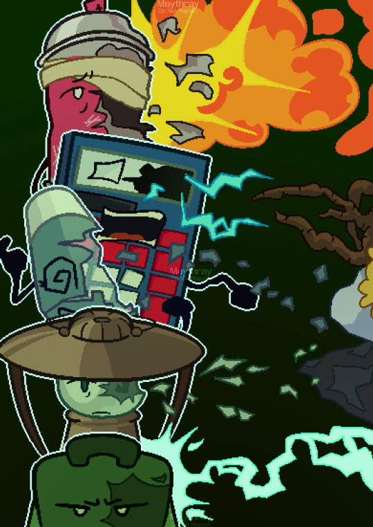
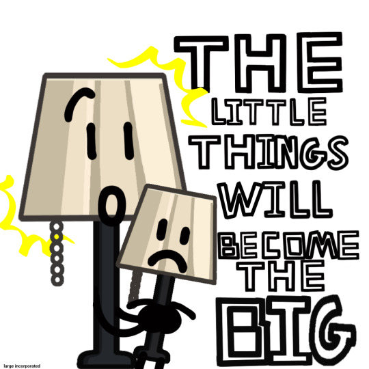
Objectober Day 24: Material
#objectober#tnm#the nightly manor#tnm spraypaint#obs#obsolete battle show#sacri#obs calculatory#obs lava lamp#hfjone#onehfj#hfjone liam#hfjone airy#objectober2022#mayart#AGAIN SORRY ABOUT ALL THE TAGS... D:#anyways this took way longer than i expected it to i just kept wanting to redo things#1k
2K notes
·
View notes
Text
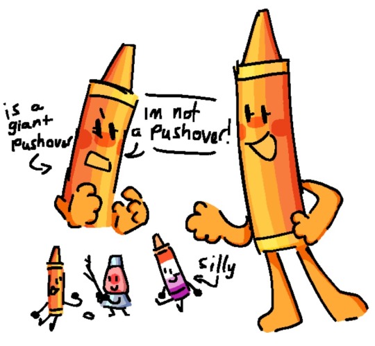
obs is pretty cool methinks
#MORE PEOPLE SHOULD SEE THIS SHOW#SO COOL SO COOL SO COO#obsolete battle show#obs crayon#obs lava lamp#tiny little lava lamp#this is about crayon tho#crayon is my fav obs chr :)#i could detect crayon’s lesbianism from a mile away /JJJJ
45 notes
·
View notes
Text
Giggling
20 notes
·
View notes
Text

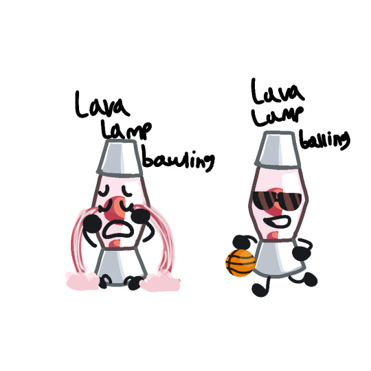
lava lamp plays my singing monsters confirmed canon
#obsolete battle show#obs#object show#object shows#obsolete battle show lava lamp#obs lava lamp#sacristuff#sacriverse#my singing monsters#this goes so hard
10 notes
·
View notes
Text
started watching obs and this came into my mind so i drew it
#calculated battlegrounds#cb#obs#obsolete battle show#lava lamp obs#obs lava lamp#calculated battlegrounds lava lamp#lava lamp calculated battlegrounds#cb lava lamp#lava lamp cb#obsolete battle show lava lamp#lava lamp obsolete battle show
18 notes
·
View notes
Text
lava lampd
#obs fanart#object show fanart#obs#obsolete battle show#osc#object shows#lava lamp fanart#lava lamp#obs lava lamp
1 note
·
View note
Text

random freak rarepair my friend sold me on
#binary ribs come back to me#object shows#osc#object show community#sacriverse#sacristuff#obs#obsolete battle show#ribs#reality is breaking squalidly#binary ribs#binary obs#lava lamp obs#binarylamp#marshie art
139 notes
·
View notes
Text
genuinely what is with object show characters and left eye injuries. what's up with that. why's it always the left one
#cup/lava lamp/calculatory obs all left side of face#that spraypaint guy from tnm too#airy too...#pickle ii also sorta counts i guess. he. Thought? it was his left eye LOLLL#bri talks#brifdi#it's a fun trope im not bashing it but WHYS UT ALWAYS TJE LEFT SIDE LOL
15 notes
·
View notes
Text
🌴🌈💊<< FINISHED!!!!!!! :3
#object show community#osc#object shows#obsolete battle show#oh my god im going insane#fionna and cake#adventure time#simon petrikov#fionna campbell#cake the cat#cup obs#jerald obs#lava lamp obs
12 notes
·
View notes
Text
Ive made this animatic burner humanized on youtube, Check em out!
Animatic here
#milkart#osc#art#fanart#object shows#object show community#sacriverse#sacristuff#obsolete battle show#burner#burnerosc#5sos3#battle for grandma#bfg#kit burner#hanger burner#record burner#paint roller 5sos#lava lamp obs#marshie art#tissue burner#milkdraw#burner osc#burner object show
17 notes
·
View notes
Text
Day 7
24 notes
·
View notes
Note
moon olo and moon obs should meet. as a treat. (an sacriverse and olo saga crossover in general would be cool though)
YES
moon just causally breaks reality again "heY gUyS"
#i stil like to believe he can do that even if i think that was proven false-#with that one lava lamp line#maybe????? was it all of the non cannon stuff that was her dreams???? like all of it#obs spoliers#<- bc of my tags
4 notes
·
View notes
Text
OBS doodle dump..AGAIN


Some obs oc stuff too omg
#obs#obsolete battle show#obs lava lamp#lava lamp obs#large inc#large incorporated#calculatory obs#obs calculatory#pill bottle obs#obs pill bottle#obs oreo#oreo obs#art#doodles
17 notes
·
View notes
Text

MOON MOON MOON MOON MOON MOON MOON MOON MOON MOON MOON MOON MOON MOON
#BLENDER AS WELL (THE SILLIEST BEING EVER ACTUALLY)#LAVA LAMP (AS SHE APPEARS IN OBS 7)#AND!!!!! 100000% CALCULATORY
4 notes
·
View notes
Text
i am Normal for lava lamp obz.
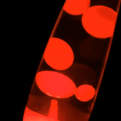
thatz her. The lava lamp.
#ZHEZ ZO UNDERRATED#ZOMEONE POZT ABOUT HER#PLZ#ZHEZ THE ZILLY EVER#AUTIZM#:((#lava lamp obs#obs#object show
2 notes
·
View notes
Note
On a scale of Blegh to Slay Girl, which OB character design is the best and worst?


I'll be talking about my own thoughts in this post, but if you're interested in seeing a larger sample size's opinion on this question, you can check out the results of this poll! Vil was initially hardcore in the lead, but over time (I think because someone datamined and shared Malleus's full body OB design during the period in which the poll ran) Malleus overtook him.
From personal Blegh (worst/least liked) to Slay Girl (best/most liked):
Azul — This is the first “real” look we’ve had of his true form, and it doesn’t leave a good impression on me. It’s not that I don’t like Azul’s look as an octopus, the proportions of his tentacles just seem… off?? Like I feel like they should be much longer than they actually are. Additionally, the design of the tentacles makes them look plasticy and fake, almost like pool toys you’d blow up and then whack around in the water.
I also feel like because of Azul being an octopus, the design feels a little empty and the designers overcompensated by cover up the empty space (ie slapping random stuff on). The placement of the shells on his lower body is very weird on him, and compared to his collar (the necklace, the coral spiking off his shoulders) there’s not a lot happening here. The harsh black blot against the grey-purple of his skin also looks very jarring (which, as you’ll see, will continue to be a point of contention for me as we get into other OBs). Perhaps the only element I like in Azul’s OB is his crown, which resembles King Triton’s (you know, after Ursula yoinked it from him). It’s not too much embellishment like the elements at his collar, and it’s not oddly placed like the shells are.
Vil — I like his sleeves, veil, and little metal talons!! I also appreciate this his single glowing eye has blot running down like tears or running mascara! … That’s about it. I find that nothing else about his look does it for me 💦 Vil’s chest feels… oddly empty?? It’s like he has no form at all there because of how unnaturally smooth it is. And while I kind of get where the devs are going with the religious imagery and the incorporation of peacock feathers, I don’t think it all visually meshes very well together. The blot that his fabric fades into ends up looking like weird clumps of hair sticking onto the ends of Vil’s train and sleeves because no one was there to hold them up for him to keep them clean.
His crown is meant to make him look regal and imposing, but I just giggle a little because it looks so… chunky that it comes off as comedic and top-heavy (like he’ll keel over from the weight of it any second now). Yes, I understand it’s the same crown as that of the Beautiful Queen; I just think the extra things they added to it (ie the peacock feathers in the halo) gives additional weight that isn’t needed. I’m not sure if I get the weird spikes at his waist either; it was probably to better color distribute the scarce white in his look, but I feel like some other design element would have made it look less disjointed.
Malleus — This look is what I jokingly call “Nosferatu”; it reminds me a LOT of a stereotypical vampire, from the cape and slicked back hair to the zombie-like tint to the skin and draconian is this considered a pun clothing. The skin (being a reference to Maleficent) is, of course, a muted green color. That… just makes Malleus look hella seasick to me DX maybe like he has some cyanosis coming on??? In any case, I don’t like it. hdisbskskxos ANOTHER THING, THE GLOW IN THE DARK/LIGHT UP HORNS AND TAIL ARE SO FUNNY 😂 It doesn’t make me take him seriously as a threat when he’s over here lighting up like a lava lamp.
The main thing that makes me like this design a little over Vil’s is that the colors of neon green and deep blue-purple offer a greater contrast between the super dark parts of his clothing. There are also little details I appreciate, like how the blot on Malleus’s face forms little black scales like that of a dragon or a lizard and the continuous incorporation of thorns throughout the design. There are thorns over his torso, thorns crawling up his waist, thorns forming the “cage” of his skirt, and thorns climbing up from his cape—it really sells the imagery that his own insecurities and loneliness are swallowing him. The thorns on his chest are of particular interest to me 👁️ It’s like Malleus has “walled off” his heart to intruders, refusing to let them into his perfect dream world where no one leaves him. It just works well thematically!!
Jamil — I know Jamil’s OB design is really unpopular. I didn’t initially like it that much either, but the more and more I thought about it, the more I realized that while I don’t think the outfit is awful, it’s Jamil’s physical traits that drive people off from him. I actually really enjoy many elements of his OB: the tattered veil, how his skirt flares out at the end, the shoes, the beads, the draping cloth of his sleeves… The problem is, that’s not what my eyes are immediately drawn to. I’m way too busy staring at his snake hair and fake facial hair to notice anything else 😂
The snake hair looks so goofy (I think because of them lacking a lot of detail), and I'm not sure if the hair turban was a good choice either. I think it gives kind of clashing ideas as well??? The idea of snake hair invokes thoughts of Medusa, who is more closely linked to Greek mythology (which, thematically speaking, is more of an Ignihyde thing than a Scarabia thing; I’m not saying that Idia should have snake hair, but the fact that it was put on Jamil who had no association with Greek mythology may feel slightly off). The blot pooling at his chin and forming pseudo facial hair is also pretty silly (I know it's to mimic Jafar's goatee, but it's still weird to see on Jamil). Altogether, it creates a weird initial impression, especially when combined with the various over-the-top facial expressions Jamil makes while in this form.
Riddle — Here’s the part where I admit I probably ranked Riddle high due in part to nostalgia and because I’m really into Alice in Wonderland motifs 🤡 I think it’s a nicely balanced design, not only because of the even distribution of black and red in the dress (plus white as a much needed accent color), but you very clearly get the “Queen of Hearts” vibe without the very obvious overabundance of hearts everywhere. There’s a lot of neat little details, like the roses at his waist, the “spider legs” of playing cards, the loops of the bow that form a “heart” behind him, and the incorporation of suits into his choker and various other areas.
One thing that I think helps Riddle really stand out is just how small he is compared to everyone else; his OB outfit helps to further emphasize that, with the length of his dress’s train curling around him. We see the size difference highlighted in the battle against him as well. Riddle’s Phantom looks over him while he floats slightly hunched over, as if a puppet on strings. It makes me think of how his mother still has a strong hold on him, so she’s the one “in control” of his strings, the one influencing his toxic behavior. That lends Riddle’s OB a lot more personality in my eyes.
Idia — Cringe lines aside, I like how different and dynamic Idia’s OB is! The electronic mouth guard helps him be a lot more expressive than he usually is, and all the blue flames and swirling blot creates a super distinctive look. (I’m especially a fan of the vortex of blot that makes up the lower half of his design.) Blue and black work really well together, and I also feel like that color combination is good for emphasizing the sleek, cybernetic armor Idia sports, with the black part being metal and the blue part being the lights/energy/magic/electricity coursing through that powers it.
I guess the one big con against Idia’s design is that it doesn’t much resemble Hades. However, I tend to find that I have a preference for more subtle design elements in OBs, so I don’t really mind this. There’s enough sprinkled in to get the idea, from the stripe of cloth hanging from Idia’s clavicle to the slender (resembling the robes of Hades), pointed fingers of his gloves (again, similar to Hades), and even the vortex of his armor (like the spirits of the underworld swirling around). A lot of the tech elements help make Idia stand out and tie back to the trauma he experienced, so I think retaining the robotic nature of the OB is a must!
Leona — The single major qualm I have with this design is his lack of footwear 🥲 I never want to see bare feet (I won’t go into detail, but let’s just say it’s related to a traumatic childhood memory). Other than that, I think this is the most cohesive design of the OB boys. It's not too much, but it's also not too little, and the colors aren't too garish, nor too much black.
The slicked back hair and furry collar resemble a lion's mane, and even something as understated as Leona's silhouette is made to better resemble his Disney counterpart (Scar's body shape is replicated using a corset of sorts). The blot covering his hands also gives him sharper nails, similar to a lion's claws. Leona's jewelry is also an interesting choice; the necklaces, of course, resemble the teeth of a predator, but everywhere else the jewelry seems very shackle and chain-like, perhaps alluding to how Leona feels resigned to his fate because of something he cannot control (his birth order). He's trying to break free of those attempts to keep him down, rebelling against people's low expectations of him.
The fabric that's draped over his lower half is a little on-the-nose; it's ramshackle and stitched together, resembling "scars" (geddit, cuz "Scar"). In the context of an OB though, I think I can overlook this. All of them feel broken, so seeing torn and ruined elements only makes sense. You can see his tail chilling inside of that cage of stitched fabric, but just barely because there's also golden cloth in front mostly covering it. To me, this is a good thing because tails on humanoid characters kind of unnerves me 😅
Anyway, those are my thoughts on all the OB designs ^^ I hope that was at least somewhat interesting to read.
#Malleus Draconia#Leona Kingscholar#Azul Ashengrotto#Jamil Viper#Vil Schoenheit#Idia Shroud#Riddle Rosehearts#notes from the writing raven#question#spoilers#Ursula#King Triton#Evil Queen#Maleficent#Scar#Queen of Hearts#Hades
93 notes
·
View notes
Last Seen Blogs

cclarkrealestate
Real Estate Life
big-man-ner
#1 bully
a-lost-daemon
lostdaemon

nklphucle351
Các bước nội soi buồng tử cung
mischiev
Delattre Art